1. Introduction
Talk with a vision. Image in the graphic representation to communicate.
If we would start this contribution with a question, we should ask what is the meaning each of us wants to give to “his own” architecture, to “his own” city, to “his own” life.
And how can we communicate this with vision and especially through images?
Can the “visual story” become a mirror reflecting our culture, our soul?
We are going through a historical moment of which reflection on “visual culture”, but also the most widespread practice of the “act of seeing”, is back to being very contemporary, supported by an ever wider use of images in any types of communication [
1]. In this sense, it is undoubtedly fundamental the role of icons in numerous and different disciplines areas [
2]. As we [
3] have just stated, it has been experimented with an introductory workshop for students (NOTE 1) titled “The page as visual narrative”. The course offered to the students the opportunity to experiment two visual communication projects (with particular attention to graphic) on two distinct realities (Cambiano city and the distillery Mazzetti d’Altavilla in Monferrato), ranging between theory and practice, between vision laws and graphic applications starting from existing works and products and interacting with the “costumer”. The course offered a series of practical experiences on a theoretical basis, with the purpose of confirming how communication should be planned and calibrated according to different targets, to discover and learn methodological approaches to the communication project: between visual perception and typographical and editorial rules. The features of the page’s architecture have been analyzed, which are its communication skills, reinforcing their objectives: hierarchies, proportions, alignments, colors and symbols.
In the visual and graphical project of the workshop, phases and classic themes of the communication process [
3] were discussed:
- (1)
The sender and the consignee (the target);
- (2)
The message; information consisting of signs and senses structured according to particular rules of one or more codes;
- (3)
Codes: in this case, essentially graphical, formal, chromatic;
- (4)
The sensory vehicle (vision);
- (5)
The context, particularly important, indicating the complexity of the conditions under which the communication takes place, and more precisely the situation, known or assumed, which is also partially shared by sender and consignee. It is part of the “subjects” to which the message refers and attributes meaning, that is its representatives.
The following features have been critically analyzed:
- (a)
Emotional function, intended to involve the observer;
- (b)
Conventional function, “force function”: when the intention of the sender is to change the behavior of the consignee or to directly involve him, stimulating his response. It is therefore the fundamental function of those messages that expect a precise response from the consignee: for example, order, provocation, help request, and persuasive speech forms, first of them publicity;
- (c)
Poetic function: more precisely it could be referred as “self-reflective”: it intends to reinforce the expressiveness of the message;
- (d)
Metalinguistic function, when the message “speaks about itself”.
Finally, it has been shown that to plan and realize an effective “visual narrative” [
4] it is imperative reading up, studying, reflecting, comparing ... and even more: an indispensable practice for visual communication, analysis and project.
In the universe of graphic representation (as a result of the vision culture) the sign as a graphic trace is one of the most powerful, meaningful and expressive elements of language, from the most direct aspects, material and “natural” ones (speed, pressure, tracing), to the more cultural and artistic ones entrusted to the metaphorical and evocative aspects [
5]. Therefore, the contribution considers (as Nouvelle Réthorique, from Hjelmslev to Greimas, even in evocative terms) the sign as a graphic trace in its “signifier” (expression level) and “meaning” (content level) [
6].
This is confirmed by examples such as: Chinese painting, Gestalt (form psychology) [
2,
7], Liberty graphics, futuristic psychographies (ex. Marinetti and Benedetta Cappa) [
8,
9,
10], American abstract expressionism (form Robert Motherwell and Mark Rothko to the dripping of Jackson Pollock, up to Hans Hartung), without forgetting the founding experience of Keith Haring [
11,
12].
And the same can be said for images.
The concept of “conceptual image” it is confirmed as the first objective (for both the tested cases), relating to communicative and persuasive objectives: content, target, context, and related “ways” of the graphic project as “visual narrative” [
13]. Among the display modes, special attention was paid to images: visuals, signs, graphics. As well as the visual, graphic, geometric, iconic, chromatic, metalinguistic codes. Working from the whole page together with its hierarchical and topological relationships between the parts, up to the individual iconic seeds (iconemi) [
6].
While experimenting with structurally similar methodological approaches, the two different situations proposed have been faced sometimes with different characterizations.
Among the unifying aspects—or common in any case—it is emphasized the color one: the warm and rosé colors (widely present in the graphic products of both applications) tend to evoke the brick as a traditional raw material in Cambiano historical buildings; while in the case of Mazzetti distillery the same hot colors allude to the “preciousness” of the “noble” grappa, a product linked to the traditions of Monferrato territory.
2. The Visual Narrative of Cambiano
Through a visual narrative—creative and dynamic—and sophisticated realization of brochures and posters, the future architects have dealt with the use of shapes, images and colors that recall the land and the typical products of Cambiano, highlighting the characteristics of the city in a journey of signs and symbols, discovering the territory, culture, art and history, dedicated to potential tourists or visitors, but also to the citizens, in order to better share in a greater and more detailed way the peculiarities of Cambiano, the identity and the ethical dimension of its cultural territory.
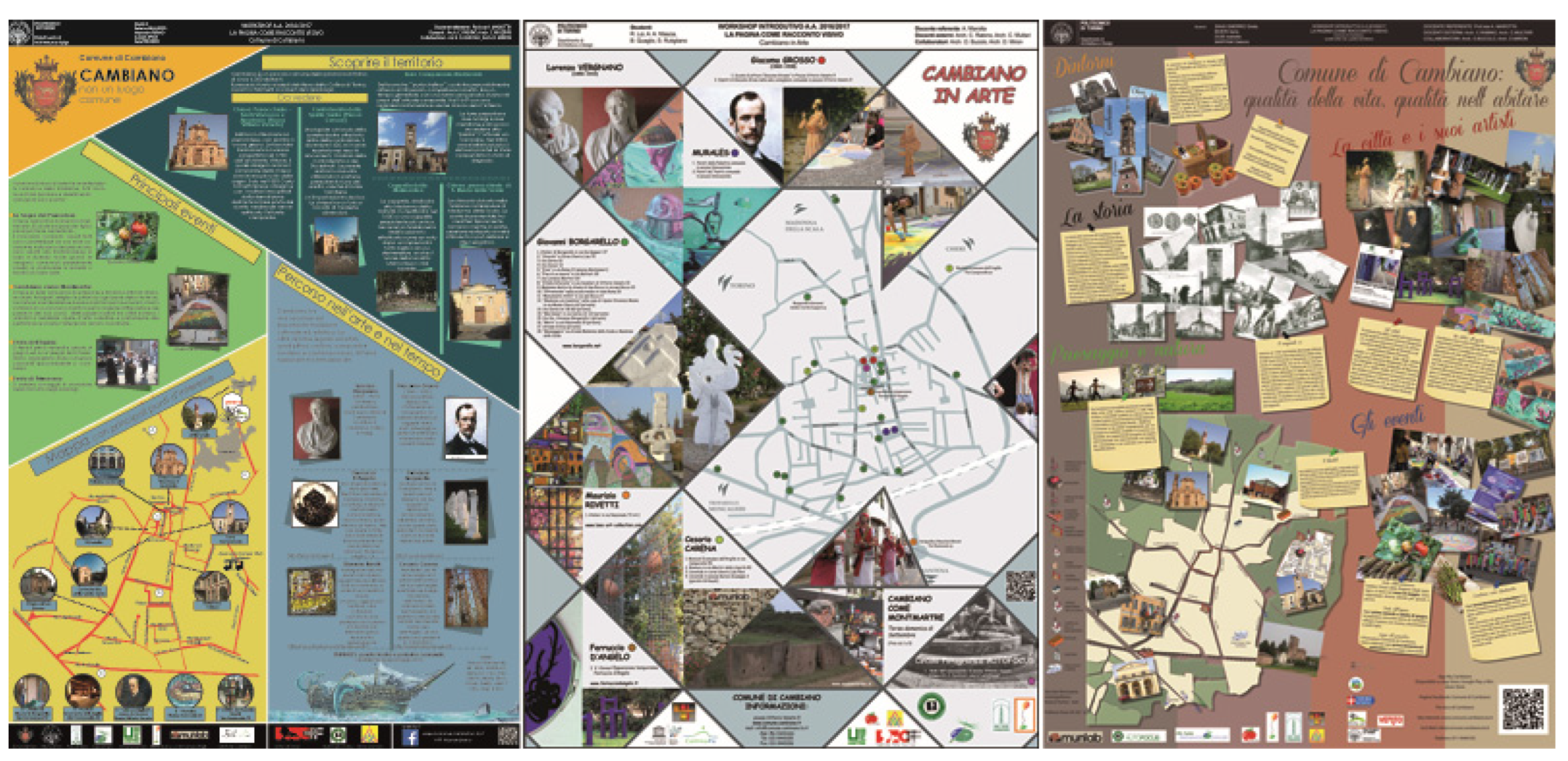
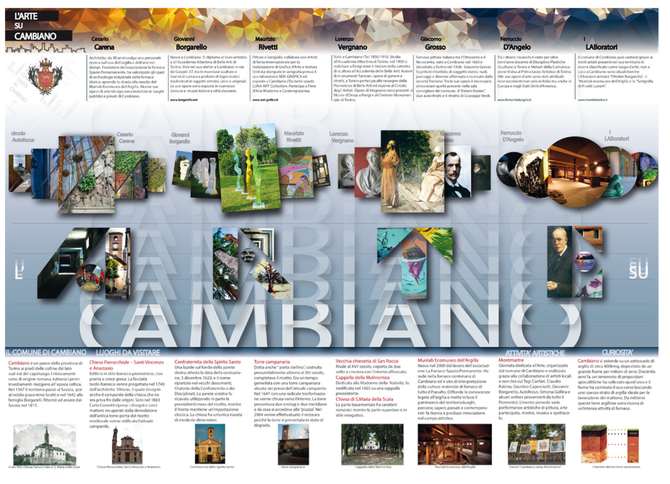
The promotion of the cultural artistic Heritage of the city and its territory has been put into effect through the realization of four permanent exhibition panels and brochures to illustrate and promote monuments and peculiarities of the country and its surrounding area, as well as the disseminated art heritage. (
Figure 1 and
Figure 2).
At the same time as the students classroom training information material on urban historic heritage has been obtained from the comission (municipal administration) to start a process of critical content selection.
Subsequently, territorial realities have been involved in the artistic and cultural promotion of the city: historians, artists, playful/cultural associations, traders and the municipal administration as well. Another decisive phase was the presentation to the citizens of Cambiano of the compositions, in a convincing spirit of sharing: from the “objective” information to the more evocative images, as those derived from the historical memory of the city.
In its outer face there is a map showing the artwork and the location of the artists’ ateliers.
3. The Visual Narrative of Distilleria Mazzetti d’Altavilla
Concerning the communication study in the most commercially relevant area, after the presentation of the particular corporate reality chosen for the workshop (the historical Distilleria Mazzetti d’Altavilla in Casale’s area), the students concentrated on the study and the practical realization of new solutions of communication through the image.
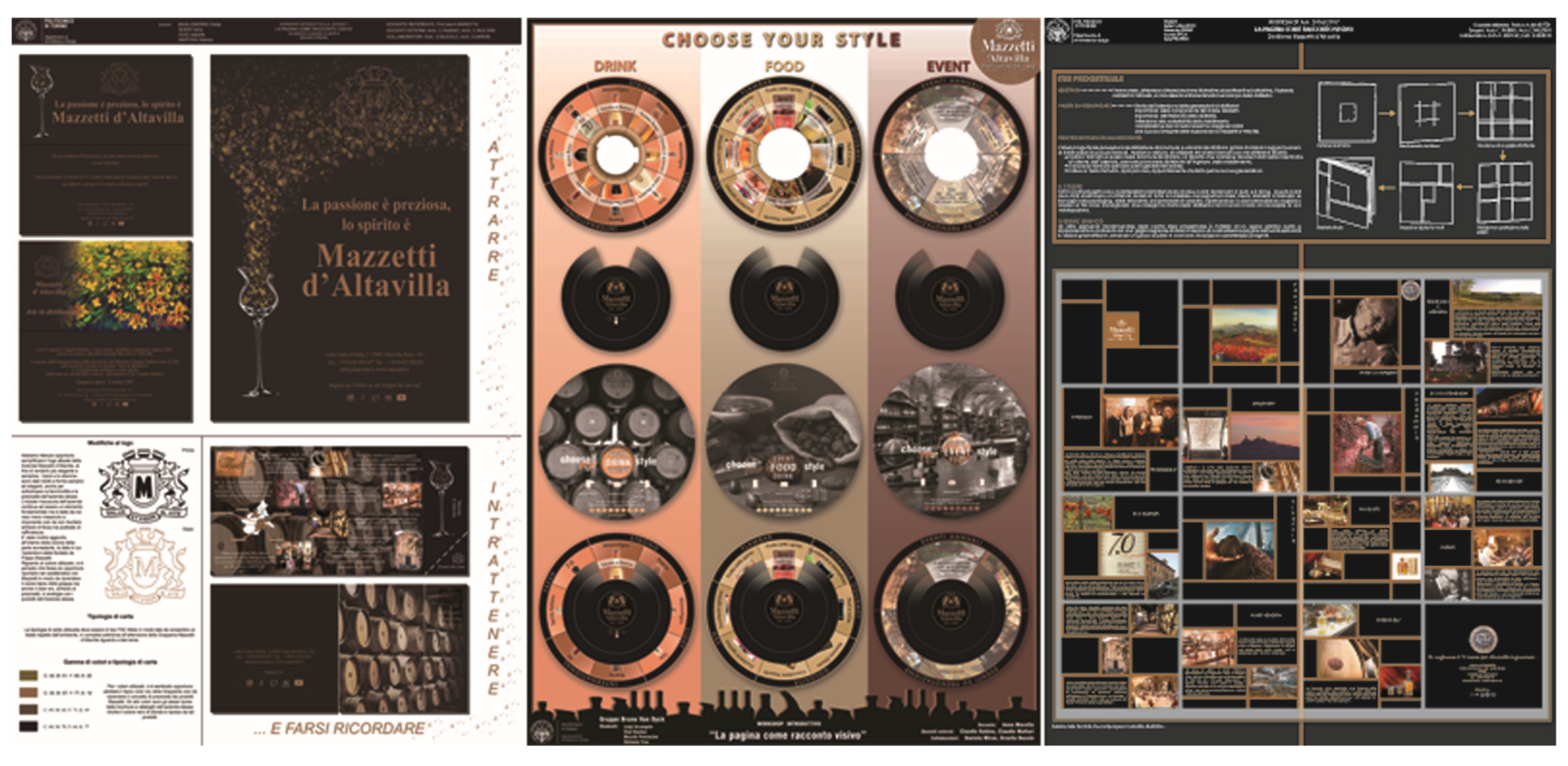
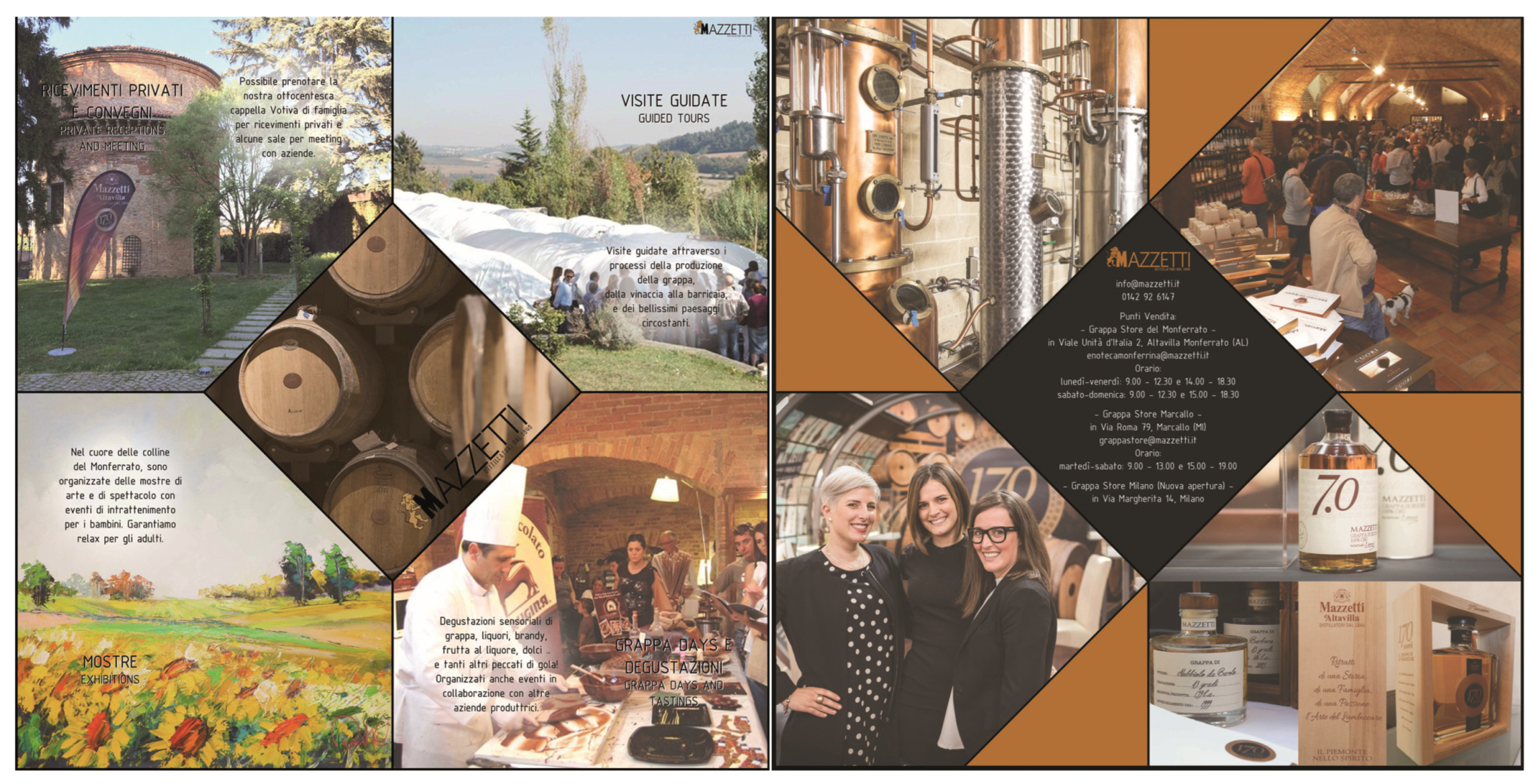
The realization of four exhibition panels and four illustrative brochures (
Figure 3 and
Figure 4) has put in practice the concept of “visual narrative” to evoke, in the modern communicative reality, history, products and philosophy of Mazzetti d’Altavilla company. Distillers since 1846, they represent the oldest and most typical distillery of Piedmont, just back from celebrations for the 170 years of uninterrupted activity and for the family management primacy at the seventh consecutive generation devoted to an excellent distillation [
14].
The preliminary phase of the workshop included the acquisition of information material (then delivered to the students) by the customer (Distilleria Mazzetti d’Altavilla), about sampling of various graphic communication products already made, in order to be studied and elaborated in terms of major responsiveness and effectiveness compared to the needs of the client.
The specific classroom training of the students, in addition to the already mentioned basic criterias, saw the presentation of the company and the related products, with attention to the various formal types (including packaging) distributed on national and international territory. Analyzing the potentialities and the criticalities of the examined material, the next step for the students was choosing the graphic format to make the drafts of the new dissemination tools, able to present and promote new concepts of “visual narrative” to evoke—in the modern communicative reality—history, products and philosophy of the most ancient companies, such as the Mazzetti d’Altavilla.
Taking into account that the promotional material was intended for people of various social backgrounds, including those specialized in distillates, as well as those who are not, the workshop aimed to educate to this reality through a study and a visual communication path, indispensable to describe and “open the eyes” on this particular phenomenon, in all its forms. One of the main goals to be pursued in the graphic design was the easy reading but also the appealing character, able to attract and interest various public categories.
They include possible innovative solutions for packaging and material of the productive and cultural activities promoted by the company.
4. Visual Image between Knowledge and Graphic Design, Conscious and Educated
In summary, all the products of the two applications appear particularly eloquent, born from the concept of complex visual image, the main subject in the graphic design. Following some fundamental results, for the main characters, and the salient meanings.
5. Cambiano
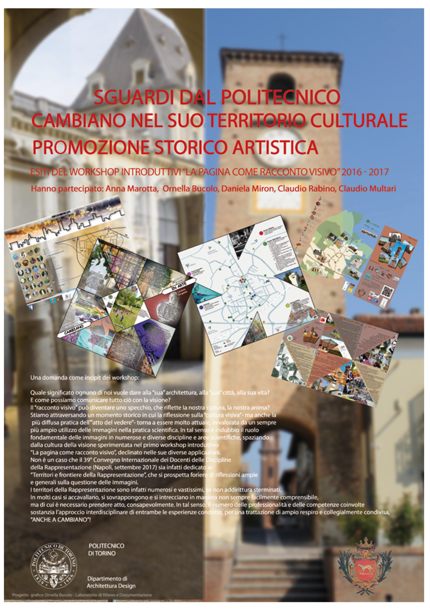
Some of the geometric, compositive and chromatic rules taught in the class were applied for the poster of the Workshop’s presentation outcomes for Cambiano (
Figure 5): the great geometry of the composition is reflected in the bilateral symmetry of the two large vertical columns, similar in size but different in colors. The right side of the panel shows a pink brick bell tower standing on an intense blue sky, while on the left we can see an architecture, an urban environment essentially declining on gray tones. The two columns are “sewn” and unified by the title in red. On the right side you can see the beautiful detail of a small bell tower emerging from the background, in a view inside the arc of the bell tower on the foreground, accentuating its verticality.
Further decoration elements are differently oriented panes (almost a dynamic game) showing many glimpses of the city, while in the center you can see the map with the urban paths. Of particular visual importance is—in the first square on the left—the skyline of the city, a strong sign precisely for its synthetic way of describing a unitary image of the places. The overall icon of the poster is therefore composed of so many smaller images, correlated with each other, and confirming one of the main rules of graphic composition.
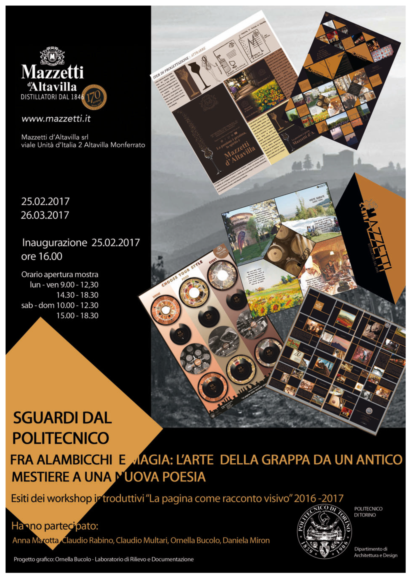
To complete what is stated in the case now shown, let’s go to the second proposed application in the workshop. For example, if we want to consider as a linguistic code the compositive geometry of the page as a visual narrative, we can analyze the poster prepared for presenting the event at Mazzetti d’Altavilla in Monferrato (
Figure 6). In this case geometry must first be cosidered as the vision coordinator at all levels, from general to particular.
It is in this sense that the great geometry of the page directs and orientes the look in the great hierarchy of the visual narrative, thus showing an image (composed of several systems strongly connoted in a geometric sense, as well as chromatic), leaning against a black background holding and framing them. The color as well works as a background to all cognitive information: time, place, date, organizers and so on [
15].
A prominent element is formed by the large square with sloping sides 45 degrees from the frame, which marks a strong variation and therefore a polarization, even more valued and characterized by the orange color strongly contrasting the black background. The same color appears to be derived from grappa (similar to gold), referred to as a “natural sign”. Finally, the color variation between white, black and orange is a gestaltic artifact that articulates a text that would otherwise have become monotonous.
On the black background there are six strongly characterized images in a geometric and chromatic sense. The regular geometry is confirmed as the viewer’s compiler; each of the panels have a regular and elementary geometric subdivision, and some images are simply organized as an orthogonal arrangement, then assembled and thus recognizable by the background color. For example, the two downstairs are organized in three columns with orange bottom, gray and dove-gray on the left; while the one on the right shows images on a homogeneous black background.
The central panel is the most varied chromatic, especially thanks to the intention to better evoke the characters of environments and places. The different inclinations of each single image within the single pane give dynamism to the overall image, forming a link between all panels.
Of particular communicative effectiveness in the visual sense is emphasizing the true “photographic image” of the typical Monferrato panorama made on variations of the gray tones, which exalt geometries of the individual frames and their chromatic balance without coming into conflict with each other.
6. Conclusions
The examples shown here reveal how the expression plan (in our case the visual and graphic medium) is heavily dependent on the content (the message): technical and executive choices are never neutral or random, but are influenced by experience, culture, Issuer’s state of mind (as well as the character of the Receiver) and thousand other factors.
It has thus been confirmed that the “territories” of Visual Communication are numerous and vast, if not even exterminated. In many cases, they gather, add, and intertwine in a way that is not always easy to understand, but that must be consciously realized. In this sense, the intertwining of the various skills and competences involved, supports the interdisciplinary approach of both experiences, for a broad and collectively shared discussion.
Every moment we see, every visual and perceptive act, is not so different from the more general “vision of the world”, as the conception of life, which each one possesses. Visual communication is therefore indispensable in the formation of architects and specialized professionals, but also to educate them to “open the eyes” in reality, in all its forms. Because vision is a powerful means to communicate to the world, and the same applies to visual narrative as an instrument (in administrations, companies and workplaces) to communicate with its stakeholders and citizens. But it is also essential to better share the “tangible and intangible” quality of their products and heritage, in a broader and more thorough manner, as well as their own mission and ethical dimension.
(NOTE 1), These are freelance training activities offered to Master’s degree. In addition to the workshop discuss in this cotribution, we remember another one entitled “Digital invasion: from point cloud to HBIM” for the use of a most instrumental image. From the subjective view and the most distinctive tones of the first workshops project to an objective view and analysis of the existing one, which is the subject of the second activity: in the workshop titled “Digital invasions: from point cloud to HBIM”, we worked with the proper tools of photogrammetry (images of the state of fact) and acquisition by Laser Scanner for the production/rework of the points clouds of architectural elements of Castello del Valentino. Comparison between the two acquisition methods and various applications for obtaining point clouds (Structure from Motion Vs Terrestrial Laser Scanner) has allowed students to mature a critical awareness about time, results, cost and metric accuracy. The geometric database has been reworked in BIM environment by evaluating the deviation between dot clouds and virtual modeling of the outcome of info-graphic result: consistent with the most recent results of the Scientific Community it has been worked on both the purely geometric/graphical part (Grade—graphic details level at different scales) both on the content part, as a measure of LoD (Level of Development, development levels related to heterogeneous information assets), including information on the manifestations of the various pathologies of degradation affecting such architectures.
