Abstract
Social networking platforms connect people from all around the world. Because of their user-friendliness and easy accessibility, their traffic is increasing drastically. Such active participation has caught the attention of many research groups that are focusing on understanding human behavior to study the dynamics of these social networks. Oftentimes, perceiving these networks is hard, mainly due to either the large size of the data involved or the ineffective use of visualization strategies. This work introduces VizTract to ease the visual perception of complex social networks. VizTract is a two-level graph abstraction visualization tool that is designed to visualize both hierarchical and adjacency information in a tree structure. We use the Facebook dataset from the Social Network Analysis Project from Stanford University. On this data, social groups are referred as circles, social network users as nodes, and interactions as edges between the nodes. Our approach is to present a visual overview that represents the interactions between circles, then let the user navigate this overview and select the nodes in the circles to obtain more information on demand. VizTract aim to reduce visual clutter without any loss of information during visualization. VizTract enhances the visual perception of complex social networks to help better understand the dynamics of the network structure. VizTract within a single frame not only reduces the complexity but also avoids redundancy of the nodes and the rendering time. The visualization techniques used in VizTract are the force-directed layout, circle packing, cluster dendrogram, and hierarchical edge bundling. Furthermore, to enhance the visual information perception, VizTract provides interaction techniques such as selection, path highlight, mouse-hover, and bundling strength. This method helps social network researchers to display large networks in a visually effective way that is conducive to ease interpretation and analysis. We conduct a study to evaluate the user experience of the system and then collect information about their perception via a survey. The goal of the study is to know how humans can interpret the network when visualized using different visualization methods. Our results indicate that users heavily prefer those visualization techniques that aggregate the information and the connectivity within a given space, such as hierarchical edge bundling.
1. Introduction
Social Networks are platforms for people to meet others from different backgrounds from every corner of the world. Earlier, chat rooms were the only way for people to connect using the internet. Introduction of “Profiles” in Social networking sites made the users’ lives much more comfortable, where one can find more information about the any other person. Over the past few decades, the traffic for social network sites increased drastically. This drastic change is due to benefits such as similar interest group connection, idea sharing, and e-commerce businesses finding their potential customers, to name a few. Fast growing social networking sites are mostly user-friendly and it is another reason for the increase in network traffic. Interestingly, most of these social networks are free to use, as they profit through advertisements, number of visits per page and by providing paid features such as games, applications, tutorials, discussion forums and so on. Specialized social networks such as LinkedIn and Xing are widely considered during the recruitment process because of applicants’ information on qualification, skills, experience, and interests. Today, the era of social networks not only widens the doors for communication but also initiates interests for research groups to study human behavior on social networks. To that end, the first step is to visualize the real data in order to understand the network dynamics and structure—thus our interest in developing “VizTract”: a graph abstraction visualization tool (Code for VizTract) that helps the user to interpret the network base efficiently. In this work, we use the Facebook dataset from the Social Network Analysis Project (SNAP) from Stanford University [1] to discern the user participation in social circles. The social circles here are analogous to interest groups in the real world and nodes are the social network users. In this dataset, the terms network and graph are interchangeably used to represent the Facebook network, and addresses social groups as circles, social network users as nodes and the edges between the nodes as interactions.
VizTract aims to present the relationships among the circles in the network built from 4039 nodes and 88,234 edges, in a nutshell. Using our visualization tool, we can find the most significant person in a circle based on the number of interactions he has within a circle. Any visualization technique should honor certain norms, and, in most cases, these norms are from either predefined or trial and error methods [2]. Creation of such visualization should give the user the global view of the concept without missing the details, and the interactions when employed should help the user to navigate through every node and get the required information about that node. When we attempt to visualize the Facebook data respecting the norms, we encounter the following challenges:
- The time needed to visualize a graph with thousands of nodes and edges being considerably large. Visualizing such networks using state-of-art graph drawing methods results in visual clutter.
- Display of interactions and node information are equally important in network visualization. Presenting this information as a label to a node or as a tool-tip using standard graph drawing methods will occlude and obscure the nodes and the edges.
- Sometimes, visualizing such networks has also resulted in the loss of details especially during interactions.
- Displaying any information can be more effective when we avoid hyperlinks to other pages and scrolling the pages up and down.
In VizTract, the Facebook network is divided into the main graph and subgraph to show the hierarchical structure of the network. The main graph is an overview that represents the interactions between circles, whereas the subgraph represents the interactions between the nodes in a specified circle. To make the visualization of the whole network more convenient to the user, we provide both the main graph and subgraph on the same frame, along with a box to describe both the graphs’ information. The visualization techniques used in this work are the force-directed layout, circle packing, cluster dendrogram, and hierarchical edge bundling. Selection, path highlight, mouse-hover, and bundling strength are the interaction techniques used in this work. Pie chart representation helps when a user actively participates in more than one circle.
The organization of this paper is as follows: in Section 2, we provide the results from the user evaluation study for the VizTract; next, we present the implementation details of all the combinations of the main graph and the subgraph visualizations of the Facebook network; and we discuss the user-study, evaluation, and participants’ background. In Section 3, we explain how we handle the challenges mentioned above through brief implementation details of various visualization methods and interactions. In Section 4 and Section 5, we discuss different visualization techniques including their characteristics, advantages, and disadvantages that have been implemented to represent the data. In Section 6, we briefly mention the related work, followed by the conclusions and future work.
2. Results
VizTract is a Data-Driven Documents (D3) (D3: Data Driven Documents) based interactive tool that aids with the visual complexity of the Facebook network. Using two graph visualizations with four different layout combinations, VizTract tool is also user-friendly. The main graph represents the interactions between the circles, and the subgraph represents the interactions between the nodes within the same circle. To evaluate this VizTract tool, we create a survey using a web-based form. The intention behind the user study is to find out which of the combinatorial visualizations is more intuitive for the given hierarchical edge bundling layout in the main graph. For this user study, we select a group of 10 participants who are bachelor’s degree students in different fields in the university. We believe that subjects from diverse backgrounds will aid us with different users’ perspectives and the difference in opinions. We also create a user profile questionnaire to know about the user background. This survey is provided to the users after every visualization and the form consists of two sections: the first section is composed of eight questions on visualization techniques and the second section is composed of seven questions on the user profile. The responses are aggregated for each of the questions in the user evaluation form as shown in Figure A2. These responses are used to evaluate the perceived effectiveness of the visualizations and interactions. The stacked bar charts shown in Figure 1, Figure 2, Figure 3 and Figure 4 depict the results of the user evaluation study concerning the visualization methods. Figure 1 represents the overall ratings provided by the users for all the visualizations methods—the effectiveness of the visualization as shown in Figure 2. Similarly, the response of the second question is used to evaluate the effectiveness of all interactions provided. The positive and negative responses for this question are shown in Figure 3. The user response to the sixth question is used to evaluate the aptness of the colors used in the visualization. Figure 4 represents the positive and negative responses provided by the users for the effectiveness of the choice of colors used for this visualization.
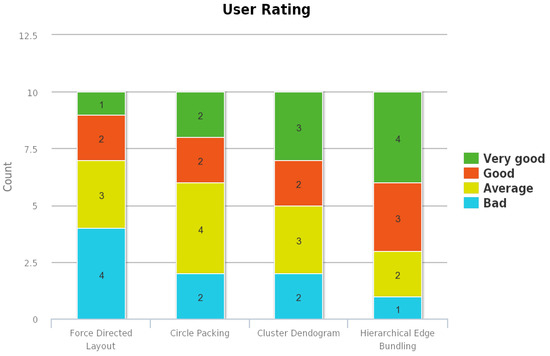
Figure 1.
Stacked bar chart representing the distribution of User Rating for all the visualizations.
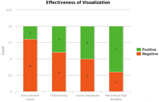
Figure 2.
Stacked bar chart representing the distribution of effectiveness for all the visualizations.
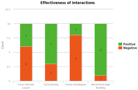
Figure 3.
Stacked bar chart representing the distribution of effectiveness for all the interactions provided.
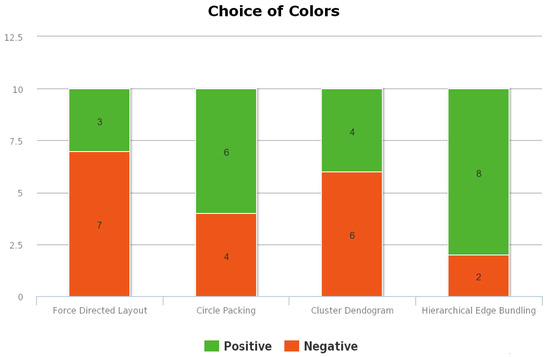
Figure 4.
Stacked bar chart representing the distribution of effectiveness for choice of colors used.
The most liked combination is the one in which both the main and subgraph constitute hierarchical edge bundling. This visualization combination has received the highest user rating mainly because the users are provided with the tension bar through which the bundling strength of the edges can be adjusted. As the same visualization technique is employed in both the main graph and subgraph, the interaction between circles and interaction between nodes within a circle are effective. The second most liked combination is the one in which hierarchical edge bundling is used in the main graph, and cluster dendrogram is used in the subgraph. In this visualization, the nodes in the subgraph are visualized using a tree structure. Each node in the subgraph is represented as a leaf node, and they are connected to a root node which represents the circle. The third most liked combination is the one in which hierarchical edge bundling is used in the main graph, and circle packing is used in the subgraph. In the subgraph, the circle is represented as a parent circle of the circle packing layout, and each node is also represented as a circle within this parent circle. The least rated visualization combination is the one in which hierarchical edge bundling is used in the main graph, and force-directed layout is used in the subgraph. As there is a lot of visual clutter when there are many nodes and edges within a circle, this visualization has received the lowest ranking for the effectiveness of the visualization. As there are no interaction techniques provided in the subgraph, this combination has received less user preference. Our results indicate that users heavily prefer those visualization techniques that aggregate the information and the connectivity within in a given space.
2.1. VizTract User Interface
In this section, we discuss the implementation details of the Facebook data visualization. VizTract provides both the abstract and detailed view of interactions between nodes and circles in the Facebook network. The user interface of the VizTract consists of a single page that is divided into three frames, namely the main graph, the subgraph, and the data description. The main graph shows the interactions between circles, the subgraph shows the interaction between the nodes within the same circle, and data description shows the details of the nodes. To use “D3” for visualization, we include the D3 [3] script in the HTML user interface Figure A1. The steps involved in the implementation of this huge network visualizations are explained in the later sections.
2.1.1. VizTract Main Graph
This visualization is that of the interactions between the circles. The first step in this implementation of this graph is the initialization of variables required for hierarchical edge bundling visualization, which are the diameter (size of the layout), layout type (cluster and bundle), and SVG(Scalable Vector Graphic) component [4]. The next step is to load the JSON(JavaScript Object Notation) data about the interactions between circles and create variables for each node and link. Then, generate the bundled splines [5] between the nodes using the D3.js bundle layout. Note that, for D3 to generate the splines, the JSON data in the input file should be a specific format as described in Section 4. For each link, an SVG radial line element is created and added to the parent SVG graph. Similarly, nodes are also added to the parent SVG graph. The following code shown in Listing 1 does this functionality:
| Listing 1: Adding nodes and edges to the graph. |
| var link = svg . append ( " g " ). selectAll ( ". link" ), |
| var node = svg . append ( " g " ). selectAll( ". node" ); |
| link = link |
| . data ( bundle( links ) ) |
| . enter ( ). append ( " path " ) |
| . each ( function (d) {d. source = d[0] , d. target = d[d. length − 1 ]; }) |
| . attr ( " class ", " link " ) |
| . attr ( "d" , line ); |
| node = node |
| . data ( nodes. filter ( function (n) { return ( !n. children && n imports. length > 0 ); })) |
| . enter ( ). append ( " text" ) |
| . attr ( " class " , " node " ) |
| . attr ( " dy " , " .31em " ) |
| . attr ( " transform ", function (d) { return " rotate ( " + (d. x − 90) + " ) |
| translate ( " + (d. y + 8) + " ,0 ) " + ( d. x < 180 ? " " : "rotate (1 8 0)"); } ) |
| . style ( " text-anchor ", function (d) { return d. x < 180 ? " start " : " end "; }) |
| . text ( function (d) { return d. key ; }) |
| . on ( " mouseover ", mouseovered ) |
| . on ( " mouseout ", mouseouted ) |
| . on ( " click ", mouseclicked ); |
Here, we observe that, for each node, the event listeners for mouseover, mouseout, and click events are registered. These mouseover and mouseout listeners help in highlighting the edges connected to a node, when a user hovers over it. Listing 2 is the code snippet of both the listeners:
| Listing 2: Mouse action listeners for the nodes. |
| function mouseovered (d) { |
| node |
| . each ( function (n) { n . target = n . source = false; }); |
| link |
| . classed (" link—target " , function (l) { if ( l . target === d ) |
| return l . source . source = true; }) |
| . classed (" link—source " , function (l) { if ( l . source === d) |
| return l . target. target = true; }) |
| . filte ( function (l) { return l . target === d || l . source === d; } ) |
| . each ( function ( ) { this . parentNode . appendChild ( this ) ; } ) ; |
| node |
| . classed ( " node—target " , function (n) { return n . target ; } ) |
| . classed ( " node—source " , function (n) { return n . source ; } ) ; |
| } |
| function mouseouted (d) { |
| link |
| . classed ( " link—target " , false ) |
| . classed ( " link—source " , false ) ; |
| node |
| . classed ( " node—target " , false ) |
| . classed ( " node—source " , false ) ; |
| } |
As shown in the code of the listener, we filter all the edges in the graph which has the hovered node either as its source or target and then the style (color) of these edges are changed to highlight them. When the user selects a circle, the click listener is activated and is used to generate the subgraph which shows the connections between nodes of the selected circle. Apart from that, the listener is also used to update the data description view with the details about the selected node. The code for generation of the subgraph and the event handlers used in that graph is explained below Section 2.1.2. Here is the code snippet that updates the data description view with information about the selected circle. This code is part of the event handler for “click” event on the nodes in the main graph as shown in Listing 3:
| Listing 3: Code to update the information section. |
| d3 . select ( " # textual " ) |
| . append ( " text " ) |
| . text ( "Number of nodes in the circle : " + innernode [ 0 ] . length ) |
| . attr ( " style " , " display : block " ) ; |
| d3 . select ( " # textual " ) |
| . append ( " text " ) |
| . text ( "Number of edges in the circle : " + innerlink [ 0 ] . length /2) |
| . attr ( " style " , " display : block " ) ; |
| d3 . select ( " # textua l " ) |
| . append ( " text " ) |
| . text ( "Most connected node in this circle is : " + nodeID) |
| . attr ( " style " , " display : block " ) ; |
We provide interaction to enable the user to select the tension in the bundled splines between nodes. The input element used here is a scroller. The code snippet which adjusted the tension is in Listing 4 as follows:
| Listing 4: Code for the tension bar. |
| d3 . select ( " input [ id= innerscroll ] " ) . on ( " change " , function ( ) { |
| line . tension ( this . value / 1 0 0 ) ; |
| inne rlink . attr ( " d" , function (d , i ) { return line ( innersplines [ i ] ) ; } ) ; |
| } ) ; |
2.1.2. VizTract Subgraph
The implementation steps involved in developing the subgraph are similar to that of the main graph. The first step is the initialization of variables like the height and width of the graph, the layout, and SVG graph element. The only difference here is that the layout changes depend on the visualization used in the subgraph. The different visualizations used in the subgraph are force-directed, circle packing, cluster dendrogram, and hierarchical edge bundling. The implementation details of each of these layouts are shown in Section 2.2.1, Section 2.2.2, Section 2.2.3 and Section 2.2.4, respectively.
2.2. Graph Layout Techniques
Now, the next step is to load the JSON file/s containing information of all the links and nodes in the network. Then, we filter out nodes and edges which belong only to the selected circle. This implementation logic to filter the nodes and edges depends on the visualization layout used in the subgraph, as the input data format is different for each of the visualization layouts.
2.2.1. Force Directed Diagram
To visualize the nodes and edges within the specified circle using force-directed diagram [6], we filter out all the links whose source and target both belong to the selected circle. Then, from these links, we count the distinct nodes that belong to that circle. We use the circle Id of the selected circle in the main graph visualization to filter out the edges. The code snippet for the same is shown in Listing 5 as follows:
| Listing 5: Node filtering based on the selected circle in force directed layout. |
| var links = data . links ; |
| var selected = [ ] ; |
| links . forEach ( function ( link ) { |
| var id = parseInt (d . key ) ; |
| if ( link . sourcegroup . indexOf ( id ) > −1 && link . targetgroup . indexOf ( id ) > −1) |
| selected . push ( link ) ; |
| } ) ; |
| links = selected ; |
| var nodes = { } ; |
| links . forEach ( function ( link ) { |
| link . source = nodes [ link . source ] || ( nodes [ link . source ] = {name : |
| link . source , group : link . sourcegroup } ) ; |
| link . target = nodes [ link . target ] || ( nodes [ link . target ] = {name : |
| link . target , group : link . targetgroup } ) ; |
| } ) ; |
2.2.2. Circle Packing
In the circle packing [7], we first load the data from the JSON file that contains information of each circle with all its internal nodes. From this data, we select the information of a specific circle which the user selected in the main graph. Then, we load another JSON file that contains the information of the edges between all the nodes in the network. From all the edges, we then filter out only those edges that have their source and target in the selected circle. The code snippet for the same is shown in Listing 6 as follows:
| Listing 6: Edge filtering based on circleId of selected circle in circle packing layout. |
| var children = root . children [d . key ] ; |
| var links = data . links ; |
| var selected = [ ] ; |
| link s . forEach ( function ( link ) { |
| var id = parseInt (d . key ) ; |
| if ( link . sourcegroup . indexOf ( id ) > −1 && link . targetgroup . indexOf ( id ) > −1) |
| selected . push ( link ) ; |
| } ) ; |
2.2.3. Cluster Dendrogram
In this visualization, we filter all the nodes which belong to the selected circle first, using its circle Id. As we use the cluster dendrogram visualization [8], we do not filter the links between the nodes of the selected circle. Here, we create a node to represent the circle and connect all the nodes in that circle to this node. The code snippet for the same is shown in Listing 7 as follows:
| Listing 7: Visualization of a circle as a cluster dendrogram. |
| var nodes = cluster . nodes ( root . children [d . key ] ) , |
| var links = cluster . link s ( nodes ) ; |
| var node = popup . selectAll ( " cd-node " ) |
| . data ( nodes ) |
| . enter ( ) . append ( " g " ) |
| . attr ( " class " , " cd-node " ) |
| . attr ( " transform " , function (d) { return " translate ( " + d . y + " , |
| + d . x + ) " ; } ) |
| node . append ( " circle " ) . attr ( " r " , 4 . 5 ) ; |
| node . append ( " text " ) |
| . attr ( " dx " , function (d) { return d . children ? −8 : 8 ; } ) |
| . attr ( " dy " , 3) |
| . style ( " t ext-anchor " , function (d) { return d . children ? " end" : " start " ; } ) |
| . text ( function (d) { return d . name ; } ) ; |
2.2.4. Hierarchical Edge Bundling
To visualize hierarchical edge bundling [4], only the nodes and edges with in the specified circle filter out the nodes which belong to this circle. Then, we iterate through all the edges of these nodes and select only those edges which connect this node to the other nodes in the selected circle. To perform both the tasks, we use the circle Id of the selected circle in the main graph visualization. The code snippet for the same isshown in Listing 8 as follows:
| Listing 8: Filtering of nodes based on circleId of the selected circle in hierarchical edge bundling. |
| var nodes = innercluster . nodes ( innerpackageHierarchy ( classes , d . key ) ) ; |
| var max_imports = 0 ; |
| var nodeID = 0 ; |
| for ( var i =2; i < nodes . length ; i ++) { |
| var imports = 0 ; |
| for ( var j =0; j < nodes [ i ] . imports . length ; j ++) { |
| if ( parse Int ( nodes [ i ] . imports [ j ] . substring ( 0 ,d . name . last IndexOf ( " . " ) ) |
| . replace ( " Circle " , " " ) ) == d . key ) { |
| imports = imports + 1 ; |
| } |
| } |
| if ( imports == 0 && nodes . length > 3 ) { |
| if ( i < nodes . length −1){ |
| nodes [ i ] . imports . push ( " Circle "+d . key +" . "+ nodes [ i +1 ] . key ) ; |
| nodes [ i +1 ] . imports . push ( " Circle "+d . key +" . "+ nodes [ i ] . key ) ; |
| } |
| else { |
| nodes [ i ] . imports . push ( " Ci r c l e "+d . key +" . "+ nodes [ 2 ] . key ) ; |
| nodes [ 2 ] . imports . push ( " Ci r c l e "+d . key +" . "+ nodes [ i ] . key ) ; |
| } |
| } |
| if ( imports > max_imports ) { |
| max_imports = nodes [ i ] . imports . length ; |
| nodeID = nodes [ i ] . key ; |
| } |
| } |
The next steps are to generate bundled splines from links and add the nodes and edges to the initialized SVG graph element. The code for this is similar to what we have in the main graph, described in Section 2.1.1. Even here, we define mouseover and mouseout event handlers for each node that are used to highlight all the edges of a particular node. If the visualization layout used in the subgraph is of hierarchical edge bundling, then we provide a scroller to adjust the tension in the bundled spline curves, which is similar to what we have in the main graph. It allows the users to improve the tension and reduce the clutter in a case when there is a huge number of edges in the circle.
2.3. Data Description Frame
There is no specific code implemented for the functionality of this frame. The event listeners for the nodes in the main graph update this frame with the information about the selected nodes on user interaction. The implementation details of the event listeners of the main graph can be found in Section 2.1.1. The aim of the visualization is to provide both an overview and details of the interactions between nodes and circles in the Facebook network.
3. Discussion
VizTract provides both the abstract and detailed view of interactions between nodes and circles in the Facebook network. To accomplish this, we use two different displays: the former visualization is the representation of the interactions between circles, while the latter represents the interactions between nodes within a circle. For any visualization project, user study plays a crucial role in the implementation of the visualization techniques. We built this visualization tool to visualize this Facebook data addressing the challenges below:
- How to reduce the complexity of a continuously growing social network?It is one of the most prominent questions answered through this work. One way is to represent the data hierarchically in a single frame. It not only reduces the complexity but also avoids redundancy of the nodes. This also helps the user to save his time by avoiding scrolling up, down, sideways to see the whole network. This visualization should reduce the time rendering, clutter created due to overlapping of nodes and edges.
- Among all the visualization techniques used such as force-directed layout, circle packing, cluster dendrogram and, hierarchical edge bundling, which technique should be more effective and why?All the visualization techniques have their pros and cons. For example, force-directed layout helps to understand how big the network is, but it is tedious. Circle packing helps us to know how many inner circles that each circle consist of, but it is complex. Cluster dendrogram helps us to get the tree-like structure of every circle, but it is very space consuming. Hierarchical edge bundling helps us to bundle the edges and reduce visual clutter. We provide the characteristics of each of these visualization techniques in detail in the later sections.
- For visualization of sub circles, which visualization technique should be more helpful?For visualization of nodes within a circle, we use force-directed layout and circle packing though they are highly time-consuming and not very informative. Cluster dendrogram and hierarchical edge bundling fetched out better results.
- Which interaction technique is used for the existing visualization?The four techniques that we use are selection, path highlight, mouse-hover and, bundling strength adjustment. Selection is used to choose any node as per users’ choice. Path highlight is used to show all the connections that a node has to the remaining nodes. Mouse-hover technique helps us to navigate through that particular node, while a clear view of the remaining network is still present. In hierarchical edge, bundling layout has a special interaction called “bundling”, which is used to regulate the connectivity strength in a network. Therefore, these interactions are apt for the Facebook network.
- How can we visualize the main and subgraph on the same frame?To make the visualization of the whole network more convenient to the user, we provide both the main and subgraph on the same frame along with a small box that includes the data description. It is implemented based on the idea of CluE [9], which is used to get the extended view.
- How to evaluate this visualization tool?We conduct a user evaluation study by inviting students from various backgrounds to participate in the survey. Each participant experiences VizTract tool, along with instructions and evaluation forms. The survey aims to know how humans can interpret these networks concerning visualizations and interactions, after providing the required background knowledge and guidelines to experience the tool. The chauffeuring process [10] is the motivation for the user evaluation study in this work. The chauffeuring process ensures that the small set of participants had to think-aloud, articulating what they wanted to find out and why. The variation to the chauffeuring process in our setup is that we supply the background knowledge of social circles and visualization techniques to all the participants. Our user evaluation study focuses on convenience and aesthetics standpoint of the VizTract. Similar to [11], an online survey is conducted on a large group to test the effect of aesthetic on the usability of data visualization.
- Visual Clutter: Visualizing the networks with several nodes using any standard graph drawing methods such as force-directed layout mostly results in visual clutter. To address this issue, we use a visualization where not all nodes are not displayed; instead, the nodes belonging to a circle are represented as a single node. It decreases the number of nodes to visualize drastically and reduces the clutter.
- Rendering Time: The amount of time consumed to render a graph with thousands of nodes and edges is considerably large with the state-of-art techniques. We use D3 methods to encapsulate multiple nodes belonging to a circle as a single node.
- Data Description: Display of information about a node such as node Id, circle Id and number of its neighbors in a circle are also important for the network visualization. Presenting this information as a label to a node or as a tool-tip using a standard graph drawing methods such as force-directed layout will occlude the nodes and obscure the edges. To overcome this problem, we provide a separate view to show the details of a node to the user.
- Loss of Detail: An important thing to be noticed is that to overcome the visualization challenges mentioned above, we abstract the nodes belonging to the same circle as a single node. It results in loss of details about the interaction between nodes within that circle. To solve this issue, we facilitate the interaction using which a user can select an abstracted circle and view the connections between the nodes in that circle. Thus, VizTract ensures that a user always has access to both the overview and the detailed view of the network.
4. Materials and Methods
In this section, we provide background knowledge on social circles and then summarize the data preparation efforts to develop VizTract, followed by a brief introduction on D3 and the visualization techniques used in this work. To this end, we briefly discuss the previous works that are closely related to this work.
4.1. Background
4.1.1. Discovery of Social Circles
The social circles are akin to groups or communities in real world social network and they follow specific characteristics, for instance people within a particular circle possess similar properties such as interests, hobbies, likes/dislikes and so on. Each circle depicts its features that are different from other circles. These circles can overlap or form a bigger circle that consists of few smaller circles. An ego-network is considered as an input in [12] to obtain social circles. An ego-network of a node consists of all the nodes to that are connected directly along with the edges between them [13]. For the study conducted in [12], the goal is to discover the set of circles for each of these ego networks and parameters behind each circle formation. Pairwise feature extraction is performed to get shared properties between two nodes. During this process, to get the information about hierarchy as well as overlapping information of circles, the nodes that have common circles has given an option to form a connection among them [12]. For the given ego-network, the affiliations of the nodes are modeled as “latent variables”, and the similarities among the alters as “a function of common profile information”. In [12], an unsupervised learning method is proposed to know how profile similarity properties tend to form circles that are strongly connected. This unsupervised algorithm is also used to optimize these variables as well as to identify the similarity among nodes. In machine learning, finding the solution to the unknown structure with an unlabeled data is often referred to as “unsupervised learning” [14]. In the case of unsupervised learning, the training data given to the learner is not labeled. Therefore, there is no fault or reward for the evaluation of the obtained solution. In [12], as the unsupervised learning is used, an assumption is made on individual ego networks. These ego-centric networks usually are small in size, and user profiles are tree structured. The feature comparison is performed by comparing the paths in these trees, and a significant performance is achieved by a substantial allocation of a node to multiple circles in [12]. The ideal number of circles are chosen, by introducing a particular function that can reduce similarity to the Bayesian Information Criterion (BIC) [12]. In statistics, BIC is used as a criterion to select a model from the given set of finite models [15] and the model with the lowest BIC is chosen usually.
4.1.2. Facebook—The First Social Network
A social network is a complex structure that is formed based on the number of connections among users or groups. A wide range of social network analysis [14] is being accomplished to understand the dynamics, patterns and the critical characteristics of these structures and one of such social structures is “Facebook”. Facebook is an online social networking site that has been in operation since 4 February 2004 [16]. This kick-start intends to connect the students of Harvard University online, but gradually the membership to this website is extended to other universities and then to slowly to other colleges and high schools around the world [16]. Since 2006, anyone who is older than 13 years are allowed to register to this site based on the local laws. Once a person becomes a member of this social network, he can connect to his friends; he can also customize his profile including the privacy settings. People with similar interests can group, play games (single and multiplayer) and many such free of cost fancy features attract people to be a part of this website [16]. By the end of 2018, Facebook had over 2.2 billion active users throughout the world and reached a market capitalization of 431.8 billion dollars. Many institutions conduct surveys for numerous research purposes, collecting this massive social network data. Similarly, Stanford University is actively working on SNAP since 2004 [1]. This SNAP library consists of significant data for various web and blog data-sets as well as sizeable social network data-set collection from the sites like Facebook, Google+, Twitter and so on. These enormous data-sets are available as open source in 2009 [1].
4.1.3. D3: Data Driven Documents
D3 is a JavaScript library for visualization of the data effectively and customizes the visualization as per the developer needs [3]. D3 makes the visualization more appealing with the help of Hyper Text Mark-Up Language (HTML), Cascading Style Sheet (CSS), and Scalable Vector Graphics (SVG). Along with these frameworks, D3 makes a powerful visualization tool for modern browsers, yet adhering to web standards. Especially when it comes to animation and interactions such as zooming and panning, D3 along with these frameworks form an effective tool [3]. The following are some of the reasons for choosing D3 for this work:
- Built-in functionalities,
- Code customization,
- Dynamic Visualization,
- Effective creation,
- Graphical flexibility,
- Low processing time.
In this work, the raw data is in Comma Separated Values(CSV) format. We use python scripting to convert the data in CSV format to JSON format. We read this data using D3.js and used D3.js API(Application Programming Interface) to visualize the Facebook data.
4.2. Data Preparation for VizTract
Data has been obtained from the participants of the survey conducted using the Facebook app by [1]. This data-set includes circles, nodes, and ego-nets. Due to the user privacy protection policy, the internal ids of the users are anonymized by giving a new value to each id, and these interpretations are obscured. For example, A has a feature “political = Democratic party”, the modified date will show “political = anonymized feature 1” [1]. Hence, we can know if two users have the same political affiliations but not what their actual affiliations represent. Facebook data is made freely available on the SNAP website as a downloadable zipped folder of size 5 MB. As the data is completely in CSV format, the size of the folder is huge. This folder includes five different kinds of files which are used to describe the entities of the network. They are nodeId.edges, nodeId.circles, nodeId.feat, nodeId.egofeat, and nodeId.featnames. These files are provided for a selected number of nodes [12]. The statistics of the Facebook dataset are shown in Table 1. In this section, we describe the structure and data contained in each of these files in detail:

Table 1.
Information of dataset used in VizTract with Strongly Connected Components (SCC) and Weakly Connected Components (WCC).
- NodeId.edges: The edges in the ego network for the node “nodeId”. Edges are undirected in this Facebook data. The “ego” node does not appear, but it is assumed that they follow every node Id that appears in this file.
- NodeId.circles: The set of circles for the ego node. Each line contains one circle, consisting of a series of node Ids. The first entry in each line is the name of the circle.
- NodeId.feat: The features for each of the nodes that appear in the edge file.
- NodeId.egofeat: The features for the ego user.
- NodeId.featnames: The name of each of the feature dimensions. Feature value is ‘1’ if the user has this property in their profile and ‘0’ otherwise. This file has been anonymized for Facebook users since the names of the features will reveal private data.
To visualize this social network, we use the information from the files nodeId.edges and nodeId.circles in this work. The first attempt to visualize this Facebook data is to implement Force-directed layout. The first step to visualize this data is to merge the information from all the nodeId.edge files and all the nodeId.circle files. The data from all these files are read and written to a single file in JSON format, where each edge in the graph is represented as a JSON object. The structure of the JSON object to represent an edge is shown in Listing 9:
| Listing 9: JSON data format used to represent a edge. |
| { |
| source : source_nodeId , |
| target : target_nodeId , |
| sourcegroup : [ circle Id_one , circle_two , . . . ] , |
| targetgroup : [ circle Id_one , circle_two , . . . ] |
| } |
As the names suggest, the source and target attributes represent the nodeIds of the source and the target, respectively. The source group and the target group attributes are lists which contain the names of the circles to which the source and target belong, respectively. The generated data file containing this JSON information for every edge in the graph is of size 12.8 MB. The total number of edges in this data file is 170,174, and the number of nodes is 3959. When this enormous data set is represented as a graph using a Force-directed layout. This visualization has a lot of clutter and also takes a lot of time to load the whole graph. To overcome these problems, we implemented other visualization techniques in this work.
4.2.1. Data Conversion for Visualization of Interaction between Circles
We process the data to visualize the interaction between circles. The information from both nodeId.circles and nodeId.edges has to be merged to get information about the interaction between circles. The initial step in this process is to assign every node to a specific circle. A node ‘n’ is assigned to a circle ‘c’ if the number of neighbors of this node ‘n’ in ‘c’ is highest when compared to any other circle. In the next step, we count the number of edges between each of the circles and write this information in a JSON format to a file which is used by D3.js for visualization. The Listing 10 shows an example JSON structure written to the file:
| Listing 10: JSON data format used by D3.js. |
| { |
| " imports " : [ |
| " Circle 0 . 0 " , " Circle 1 3 . 1 3 " , " Circle 2 1 . 2 1 " , " Circle 3 4 . 3 4 " , |
| " Circle 3 5 " . 3 5 , " Circle 4 1 . 4 1 " |
| ] , |
| "name" : " Circle 3 4 . 3 4 " |
| } |
The process involved in generating the JSON file is described in the flowcharts in Figure 5 and Figure 6. To assign each node to a specific circle, first we read each of the nodeId.circle files and map a circle with all the nodes listed in the nodeId.circle files. Note that here a single node can be mapped to multiple circles. The participation of a node in a circle is considered to finalize the assignment of a node to a circle. The node’s participation in a circle is calculated by counting its neighbors in that circle shown in Listing 11.
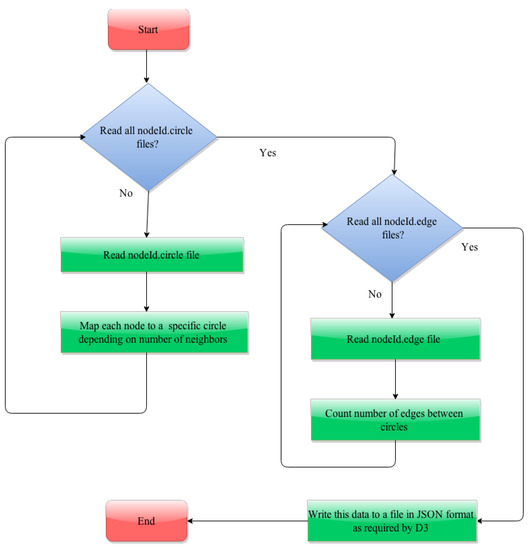
Figure 5.
A flow chart to show the steps involved in the generation of the JSON (JavaScript Object Notation) file containing the interactions between circles.
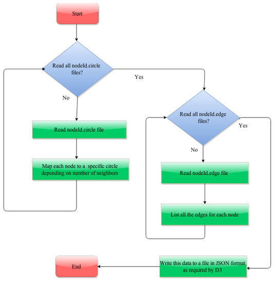
Figure 6.
A flow chart to show the steps involved in the generation of the JSON file containing the interactions between nodes.
| Listing 11: Assignment of a node to a circle. |
| for f in os . listdir ( " Datasets " ) : |
| if f . endswith ( " . circles " ) : |
| f = open ( " Datasets /"+f , ’ r ’ ) |
| for line in f : |
| words = line . split ( "\ t " ) |
| circle ID = int (words [ 0 ] . replace ( " circle " , " " ) ) |
| for word in words [ 1 : len (words ) ] : |
| value = str (word . replace ( "\n " , " " ) ) |
| if int ( value ) > maxNodeID: |
| maxNodeID = i n t ( value ) |
| if circle ID in circles . keys ( ) : |
| circles [ circle ID ] . append ( value ) |
| else : |
| circles [ circle ID ] = [ value ] |
4.2.2. Data Conversion for Visualization of Interaction between Nodes in a Circle
To visualize the interactions between nodes within a circle, we need to process both nodeId.circle and nodeId.edge files similar to the data conversion for interaction between circles. The first step is to read each of the nodeId.circle files and map each node to a specific circle. In the next step, we read each of nodeId.edge files and enumerate all its neighbors. This information is written in JSON format to a file. Listing 12 is an example JSON structure written to the file:
| Listing 12: JSON structure describing the node and its neighbors. |
| { |
| " name " : " Circle 3 5 . 1 9 6 1 " , |
| " size " : 5 , |
| " imports " : |
| [ |
| Circle 4 1 . 2 3 1 7 , " Circle 3 4 . 2 5 3 5 " , " Circle 2 1 . 2 3 0 1 " , |
| Circle 3 6 . 2 1 2 8 , " Circle 3 4 . 2 4 8 7 " |
| ] |
| } |
Note that this file contains information of all the links of a node irrespective of circle to which its neighbors belong. The following code snippet shown in Listing 13 illustrates the generation of edges.
| Listing 13: Generation of edges |
| for f in os . listdir ( " Datasets " ) : |
| if f . endswith ( " . edges " ) : |
| f = open ( " Dataset s /"+f , ’ r ’ ) |
| count = 0 ; |
| for line in f : |
| nodeIds = line . split ( " " ) |
| source = nodeIds [ 0 ] . replace ( "\n " , " " ) |
| target = nodeIds [ 1 ] . replace ( "\n " , " " ) |
| scid = getCircleID ( source ) |
| tcid = getCircleID ( target ) |
| if scid != −1 and t c id != −1 : |
| countlinks ( int ( scid . replace ( " Circle " , " " ) ) , int ( tcid . replace ( " Circle " , " " ) ) ) |
| source = str ( scid + " . " + source ) |
| target = str ( tcid + " . " + target ) |
| if source in link s . keys ( ) : link s [ source ] . append ( target ) |
| else : link s [ source ] = [ target ] |
4.2.3. Data Parsing
In any computer language or a natural language, the process of analyzing and chunking of data without losing the rules of grammar is known as parsing. This parsed data is more easy to use than the original data. As mentioned in Section 4.2.1 and Section 4.2.2, the CSV data is converted to JSON format, and now it can be easily parsed by D3.js. To read the JSON (JavaScript Object Notation) data from a file, we use the following API in D3.js.
- D3.json(url[callback]) This API reads a JSON file with the mime type “application/json” at the specified URL. If the callback function is specified, it is invoked asynchronously, and the parsed JSON data is passed to that function. If any error occurs when reading the JSON data from the URL, the callback function is invoked with two arguments: the error and the JSON data is undefined. If the callback function is not specified, the request that is returned can be issued by “xhr.get” as well as handled by “xhr.on.”
- xhr.get([callback]) This API is used to issue a get request. The specified callback will be invoked asynchronously when the request is made or when it returns an error. On error, the callback is invoked with two arguments: the error and the response value as undefined. If no callback is specified, the “load” and “error” listeners should be registered using “xhr.on”.
- xhr.on(type[,listener]) This API is used to add or remove an event listener of a specific type to a request. The type must be one of beforehand, progress, load, and error. If an event listener of the same type is already registered, the existing listener is removed and the new one is added. To remove a listener, null has to be passed as a listener. If no listener is specified, current listener of the specified type is returned.
4.2.4. Data Filtering
As shown in the JSON structure mentioned in Section 4.2.1, each node is represented as a JSON object containing attributes name, size, and imports. The “name” attribute of the node is of form cirlceId.nodeId where circle Id is the name of the circle to which the node belongs and the node Id is the name of the node. The “size” attribute gives the degree of the node. The “imports” attribute is a list containing names of all the nodes to which a node is connected. The names of the nodes in this list are also of the form circleId.nodeId. To visualize the interaction between nodes within the same circle, the data read from the JSON file mentioned in Section 4.2.2 has to be filtered to get only the nodes of a specific circle and the links that connect a node to its neighbors belonging to that same circle. To achieve this, the filtering of the nodes is performed based on its circle Id and similarly to filter edges of this node to the neighbors in the same circle, the circle Id of each of its neighbors is used. This functionality of the node and edge filtering based on circle Id is implemented as a JavaScript function which is invoked on user interaction. The dataset that we prepared for this work is used later in [17], PerSoN-Vis (Personal Social Network Visualizer), which helps visualize the ego-networks of person and helps them explore the interactions with their social contacts.
4.3. Visualization Techniques
Visualization is a way to represent the information in a pictorial form. The idea behind this visual perception is that it is easy to understand, and it also stays longer in one’s memory than other techniques. In this section, we discuss the characteristics of multiple visualization techniques employed in this work along with their pros, and cons. To show the hierarchical structure for the whole network, we divide the entire graph into two divisions, namely the main graph and subgraph. The visualization techniques we select for the Facebook network are the force-directed layout as shown in Figure 7, circle packing as shown in Figure 8, cluster dendrogram as shown in Figure 9, and hierarchical edge bundling as shown in Figure 10. To understand the frequency of increased participation by the user, we introduce pie-chart representation. Although these visualization techniques are useful in their way, we also describe the advantages and disadvantages of each of these methods concerning the data-set. While visualizing the main graph and subgraph, we try combinations of hierarchical edge bundling to the remaining three visualization techniques, and we explain these combinations in the following sections along with pros and cons of each combination.
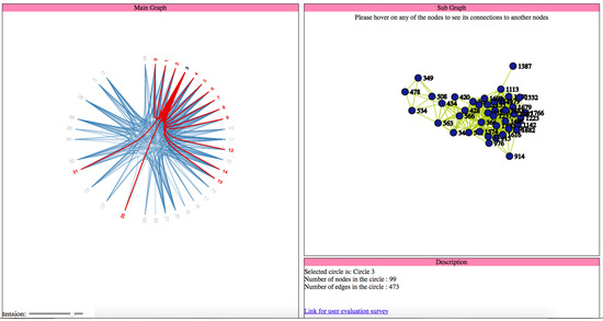
Figure 7.
User interface for visualization using hierarchical edge bundling for the main graph and force directed layout for the sub graph.
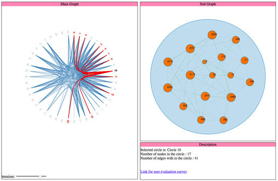
Figure 8.
User interface for visualization using hierarchical edge bundling for the main graph and circle packing for the sub graph.
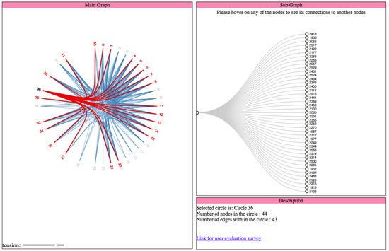
Figure 9.
User interface for visualization using hierarchical edge bundling for the main graph and cluster dendrogram for the sub graph.
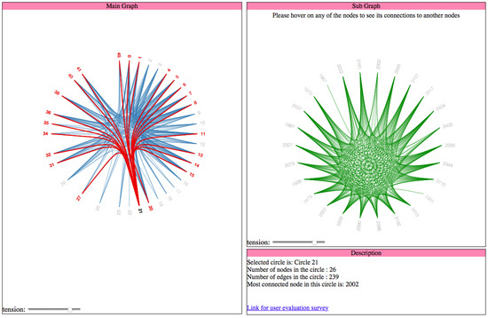
Figure 10.
User interface for visualization using hierarchical edge bundling for both main and sub graphs.
4.4. Visualization of Main Graph
This main graph is a part of the whole network that is designed to represent the interactions between the circles.
4.4.1. Force-Directed Layout
The force-directed layout is a widely used graph drawing algorithm [6]. With the self-explained name, the peculiarity of this layout is its special feature called “force”. In two- and three-dimensional spaces, this layout places the nodes of the graph in such a way that all the edges are more or less equal in length [6]. By initializing the forces to the set of edges and set of nodes, the number of edges that cross each other is also reduced, depending on their location relatively. These forces can then be used either to motion simulations of nodes and edges or to minimize their energy [6]. The concept of this force between the nodes depends on Hooke’s law and Coulomb’s law to attract and repel the nodes in the graph with each other, respectively [18]. Due to these spring like forces, the edges are likely to have the same length in an equilibrium state, whereas the nodes with zero degree are most likely to be drawn further apart due to their repulsive nature [18]. Sometimes, these forces can also be predefined based on the requirement of the project. Interestingly, gravity is used to pull different disconnected graphs to a fixed point in a drawing space as well as to draw those nodes which have higher centrality to more central positions [18]. Otherwise, these nodes fly apart because of the repulsive forces. On the other hand, for the connected graphs, similar magnetic fields can be used by placing the repulsive forces on both nodes and edges for avoiding any overlap in the final graph drawing. To show the increased participation of the user in more than one circle, we use pie-chart representation for that node as shown in Figure 11, Figure A3, Figure A4 and Figure A10.
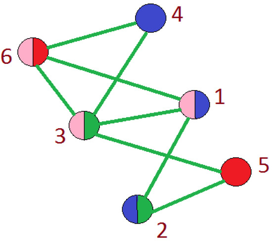
Figure 11.
Represents participation of a user in more than one circle.
Pie Chart: A diagram to illustrate the proportions is numeric based on the number and size of portions in a circular graph is known as “Pie Chart”. It is also popular as “Circular Chart ”. In our data, many users are actively participating in more than one circle. Thus, in order to show the amount of their participation in various circles, we use a pie-chart. The pie-chart mainly relies on the colors as it helps the user to interpret a user’s participation easily. The number of partitions in the pie chart represents the number of circles in which a user participates. The reason for selecting a pie chart along with force directed layout is its effectiveness in the visualization of multiple participation. During the research, we analyze the following pros and cons of using a force-directed layout for the Facebook network.
Advantages:
- This layout is quite flexible to adapt to the extensive data.
- It is versatile to extend with the pie-chart.
- Because of the spring-like physical properties and repulsive forces, the output of the algorithm is intuitive to predict.
- It stands for its simplicity when it comes to the implementation part.
- This layout can be used for online and dynamic graph drawings because of its interactions flexibility.
Disadvantages:
- Because of our large dataset, the quality is not as good as we expected it to be.
- For a given ‘n’ number of nodes in the graph, the running time of this layout is O(), and the estimated number of iterations is O(n). It takes a lot of time to visit all the pairs of nodes and to compute their repulsive forces.
4.4.2. Circle Packing Layout
In this layout, to visualize the hierarchy, all the leaf nodes are packed into the parent node. This way it also helps us to get the size of the parent node, while the leaf node can be any arbitrary value [7]. Circle packing is a useful visualization technique as it represents the groups and the structural relationships among them [7], especially when large data-sets like Facebook is used. In this layout, the other tangent circles are used to represent the brother nodes that are at the same level. Hence, it serves data as a spatial extension. As the number of brother nodes increases in the circle, this layout can increase the density and the convex shape relatively. Because of this distinctive characteristic, a pair of brother nodes always packed into its parent node such that no overlapping of circles takes place while they touch each other [7]. This arrangement of nodes based on the surface area covered by the circles and is given by packing density [7]. Theoretically, this layout can effectively visualize the hierarchical structure at one shot without occupying much space [7]. If any provided interactions, it is simple to zoom in to get the details of the leaf node. Because of these small properties, it can also be generalized for higher dimensions’ sphere packing, cylindrical packing and so on [7]. The circle packing to visualize the hierarchical structure for one circle in the whole network as shown in Figure A5. While using this circle packing for our big data, we observe the following advantages and disadvantages:
Advantages:
- It is efficient to display big files on a single screen,
- User-friendly interface while zooming in and out,
- High efficiency and robustness,
- Explicit bird view of the whole network,
- When compared to traditional file management systems it requires less operation.
Disadvantages:
- A lot of clutter when all the nodes and edges of the Facebook data-set are visualized,
- No scope to reduce to overlapping of edges.
4.4.3. Cluster Dendrogram Layout
A dendrogram is a tree-like structure used in a hierarchical environment, in order to show the arrangement of clusters in the hierarchy, generated during the clustering process [8]. It is the most helpful tool while performing cluster analysis. Typically, a dendrogram consists of a starting point called ‘Root’. The point where the edges either originate or end is called ‘Node’. A terminal node is called ‘Leaf’. With the help of these three entities, we get the hierarchical structure with multiple levels starting from root node (level 0) to the leaf node(level (n − 1)), where the depth of the graph is ‘n’ [8]. Using the clustering dendrogram layout, we also get the ultra-metric distance in addition to the hierarchical representation of the network. That is, every edge in the dendrogram correlates to a cluster, while every node along with its position recognizes the distance to which different clusters can merge [8]. Cluster dendrogram visualization of Facebook dataset is shown in Figure A6. We observe the following advantages and disadvantages when applied to the data-set.
Advantages:
- As all the nodes are spaced evenly in a tree structure, the overlapping problem of nodes and edges is solved;
- Shows that the hierarchical structure is much more efficient because the clustering is obeyed based on the similarity of the nodes;
Disadvantages:
- The leaf nodes from distinct cluster seemed closer than the ones in the same cluster,
- Occupies a lot of space.
4.4.4. Hierarchical Edge Bundling Layout
The visualization as mentioned earlier techniques are helpful to show the adjacency relationships on a tree structure; however, when we visualize the additional adjacency links on a tree structure by addition of links directly, it always leads to visual clutter. Thus, the study conducted in [4] proposed a space-efficient layout named hierarchical edge bundling for tree structures. It is a generic layout to combine the existing tree visualization methods as per the developer’s choice as well as to integrate into the existing tools [4]. The two nodes having the adjacency relation along with their hierarchical structure as well as the path along with their hierarchy have a ’control polygon’ of a spline curve. That curve is later used to visualize the relation. We use this layout for bundling of the adjacency edges. A spline curve is a mathematical representation of a curve formed by joining certain points. It is beneficial for user interface design that involves smooth curves, complex shapes, and surfaces [5]. The concept of “control polygon of a spline curve” is pictorially described in [4]. Here, points P0 and P4 are connected by a straight line, which is replaced by a spline curve along the hierarchical directed path between P0 and P4. The specialty of this layout is the ’bundling’ feature, which is used to regulate the connectivity strength in a network, explained in Section 2. A low-level data such as data regarding node to node connectivity is obtained from low bundling strength, while high-level data such as implicit information among parent nodes, while the high bundling strength derives the explicit information among the child nodes. The visual clutter in bundled visualization reduced with hierarchical edge bundling that interprets actual connections easily. Here, the display ultimately shows the systems that are strongly or weakly connected. The sparsely connected nodes of our dataset are visible with an encircled region as shown in Figure A9.
4.5. Visualization of Sub Graphs
To represent the interactions between the nodes that are within the same circle, we visualize a subgraph. We obtain the concept of the subgraph from “CluE—An Algorithm for expanding Clustered Graphs” [9]. However, it is a challenge to represent large data in abstract and to visualize it on a limited display. The abstract representation of hierarchically structured data has much public application in various domains as mentioned in the related work section. Abstract representations are used when there is a scope of grouping or clustering based on the similarity of the entities. The prominent characteristic of these kinds of abstract representation is to show adjacency relations and structural relations of the graph nodes simultaneously. For compound graphs, this phenomenon is known as hierarchy crossing edges [9]. These clustered graphs along with specific interactive techniques are helpful to understand and get more insight about every level in the complex diagrams. It aids users to create an intuitive mental map of certain compound graphs. Depending upon the number of child nodes, the algorithm will generate an area-aware layout for the cluster that needs expansion. Due to this, one can get more insights into the graphs as required. We integrate this algorithm while we visualize the main graph, such that it leads to a subgraph. A subgraph is a detailed view of an individual circle that represent the interactions between the nodes within a specified circle. Here, we visualize four combinations of subgraphs for a specific hierarchical edge bundling in the main graph, i.e.,
- Main Graph–Hierarchical Edge Bundling; Sub Graph–Force-Directed Layout,
- Main Graph–Hierarchical Edge Bundling; Sub Graph–Circle Packing,
- Main graph–hierarchical edge bundling; Sub Graph–Cluster Dendrogram,
- Main graph–Hierarchical Edge Bundling; Sub Graph–Hierarchical Edge Bundling.
4.6. Visualization of Interactions
Interactions play a significant role to display large data, and these interactions are as equally important as the visualization techniques. The importance of interactions is to amplify user perception and cognition. In this section, we discuss the reasons for selecting these interaction methods as they expand the usability and accessibility horizons. Using these interactions, we successfully display this huge Facebook network on small display:
- By interactive visualization of sources, the working memory of the user broadens,
- It reduces the search space, as it displays large chunks of data on a small display,
- The data organized in space along with its time relationships, and this helps in understanding the patterns,
- Inference of perceptual information easy.
Any interaction technique should contain two main aspects that are usability and accessibility. Usability is the scope of a point until the user can use which a product or an application to achieve determined goals efficiently, effectively and satisfactorily. Accessibility of the system is to describe the ease of usage, understand-ability, and reach-ability. In this section, we explain the interactions applied for visualization of the Facebook data-set, navigation through the network and the advantages of the interaction techniques used. The interaction techniques used in this work are mouse-hover as shown in Figure A11, selection of the node as shown in Figure A12 and Figure A13, highlighting the path to its neighbors as shown in Figure A14 and bundling strength adjustment as shown in Figure A15 and Figure A16.
4.6.1. Mouse-Hover
Mouse-hover is an interaction technique; a graphical regulating entity that is activated when the user “hovers” or moves the pointer over a triggered area. This technique is also famous as Mouse-hover or a hover-box (Mouse Hover Interaction).Generally, these graphical regulating entities are common in internet browsers. The uppermost layers trigger these mouse-hovers if any multiple layers exist as shown in Figure 12. Sometimes, the user may not know its existence as the events might call any function that can affect the program internally. It is an easy task for designers to define these mouse-over events in their projects using JavaScript and CSS when compared to other state-of-art techniques.
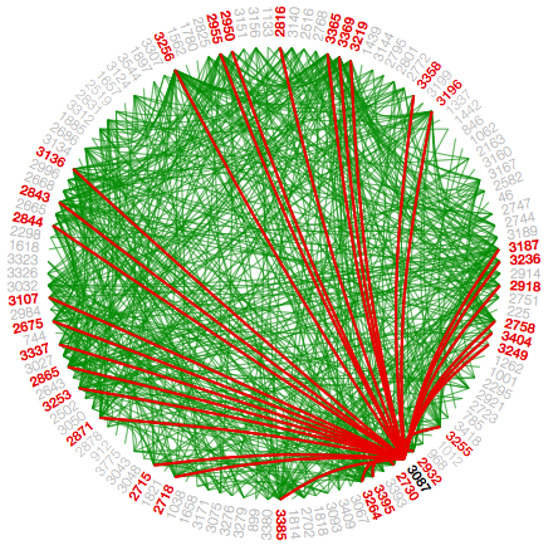
Figure 12.
Represents the Mouse-hover interaction in hierarchical edge bundling visualization.
In this visualization, we use the mouse-hover technique as shown in Figure 12 for the following tasks:
- In force-directed layout, in order to show the interaction of participation of a node in more than one circle as shown in Figure 11, Figure A3, Figure A10, and Figure A4.
- In hierarchical edge bundling, to show the number of connections a circle has to the other circles.
4.6.2. Selection
The selection interaction (Selection Interaction using D3) derives from the menu of the node that enables the convenience for selecting a node depending on the number of possible similarities. During this process, the arbitrary combination of various selection operations and conditions are possible. In D3.js, CSS is used to select the items in which an array of items taken from the specified document. For instance, we select select by tag (“lib”), class(“.university”), attribute(…), unique identifier(…) or containment(…). We can also unite or intersect using selectors as logical OR—“.this.that” and logical and—“.this.that”, respectively. Once items are selected, certain operations are applied, obtained from text, style, attributes, and properties content. Apart from attribute values remaining, all needs evaluation for an individual item, whereas attributes declared are either functions or constants. In addition, we also apprehend the data that is made available for data-driven modifications. This additional feature provides an opportunity to enter/exit the sub-selections to add/remove items depending upon the response due to alterations in data. As we operate on a whole selection in a single go instead of an individual piece, we do not use any recursive functions or for loops for document modifications in D3.js. Hover—if we access the items directly, this interaction provides flexibility to the user to loop over the elements manually with the help of an “each” operator in D3.js, with which invokes an arbitrary function. A selection can also be sent to a chain of operators.
Some of the visual properties for a selection interaction techniques are to get the color, shape, border color and style, x- and y-coordinates, height, and width of the shape. Two high-level methods used in D3.js for selecting an item while accepting the strings. They are ‘select’ and ‘select all’. When select() is called, it retrieves only the first similar item, but when selectall() is called, it retrieves all the similar items in the order of document traversal. When jQuery lib or some other developer tools are integrated, these methods can also accept nodes.
- d3.select(selector) When this method is called, it retrieves the first match for the given selector string in the order of document traversal. When no items match the given selector string in the document, it returns empty selection.
- d3.select(node) This method will not traverse through DOM, but it is used to select a particular node when reference to a node is provided with the help of d3.select(this). D3.select(this) can be either made available locally within an event listener or globally such as ‘document.body’.
- d3.selectAll(selector) When this method is called, it retrieves all the relevant matches for the given selector string in the order of document traversal in a top-down fashion. When no items match the given selector string in the document, it returns empty selection.
- d3.selectAll(nodes) This method will not traverse through DOM, but it is used to select a particular array of items when reference to these nodes are provided with the help of d3.selectAll(this.childNodes).
- d3.selectAll(this.childNodes) This method can be either made available locally within an event listener or globally such as ’document.links. The argument passed to this function doesn’t have to be an array all the time; it can also be any pseudo array persuaded into an array such as NodeList.
In this visualization, we use this node selection technique as shown in Figure 13 for the following reasons:
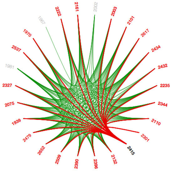
Figure 13.
Represents a selection interaction in Hierarchical Edge Bundling.
- In the main graph, selecting a circle not only shows all the connections to the other circles, but it also generates a subgraph of that circle to show the interactions in that circle.
- In the subgraph, we show all the connections a node has to the remaining nodes in that circle.
- The selection also results in the display of information regarding the selected node/circle in the description frame.
4.6.3. Path Highlight
Since the Facebook data-set is so huge with adjacency, we integrate path highlighting interaction technique in this work. The intention behind this interaction technique is to provide coherent visibility of the path such that the user can distinguish various path for the same node. When a node/circle hovers upon, the color of the paths from that node/circle to the other nodes/circles, which are connected to it directly are changed, to differentiate these paths from the different paths as shown in Figure 14 and Figure A14. We use the path highlight interaction for both visualizations that is in the main graph to show the interactions between circles and in the subgraph to show interactions within a circle.
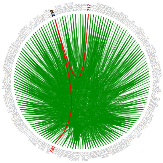
Figure 14.
Represents the path highlights for the selected node.
4.6.4. Bundling Strength
The hierarchical edge bundling layout has a unique interaction called ‘bundling’, which is used to regulate the connectivity strength in a network [4]. A low-level data such as data regarding node to node connectivity can be obtained from low bundling strength as shown in Figure 15 and Figure A7, while high-level data such as implicit information among parent nodes and explicit information among the child nodes is obtained from the high bundling strength as shown in Figure 16 and Figure A8. The Listing 14 represents JavaScript code for tension bar.
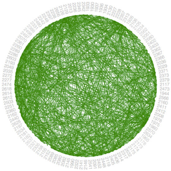
Figure 15.
Represents hierarchical edge bundling visualization with low bundling strength.
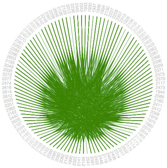
Figure 16.
Represents hierarchical edge bundling visualization with high bundling strength.
| Listing 14: JavaScript code for tension bar. |
| d3 . select ( " input [ id= scroll ] " ) . on ( " change " , function ( ) { |
| line . tension ( this . value / 1 0 0 ) ; |
| link . attr ( " d" , function (d , i ) { return line ( splines [ i ] ) ; } ) ; |
| } ) ; |
Advantages of these interaction techniques are as follows:
- It improves the visual perception of the user.
- When hovered on a node, it provides intuitiveness to the user to click the node.
- Easy to navigate even with the great number of nodes,
- Quick to get node details when required,
- Efficient and effective,
- Instantaneous response.
5. Related Work
An extensive empirical survey conducted in [19,20] demonstrates the taxonomy of visualization techniques structuring the field into four main categories: (1) visual node attributes vary properties of the node representation to encode the grouping; (2) juxtaposed approaches use two separate visualizations; (3) superimposed techniques work with two aligned visual layers; and (4) embedded visualizations tightly integrate group and graph representation. In [9], CluE (The Cluster Expander of Compound Graphs) is introduced, which expands cluster nodes in compound graphs and is modeled to multiple layout algorithms. This study helps users to maintain their mental map of underlying graph, by keeping the unexpanded nodes in their relative layers with a minute change in their original coordination. This algorithm is tested on LayMan [21], a layout managing tool that provides a natural focus+context visualization view of the underlying common fault tree model and leads to produce compact abstract representation of the failure scenario, which helps in navigating over the critical parts of the underlying failure scenario. Later, 2D plus 3D visual interactive environment called ESSAVis++ introduced in [22] also adopt this kind of graph extraction technique to help users navigate through the graph representation of the failure mechanism. A visualization tools comparison study conducted in [23] show that visual-based tools really help in analyzing the common fault tree models more accurately and efficiently. The method of compound graphs is also employed in [24] for the bio-molecular interaction networks along with force-directed layout, where the networks are placed into cellular components to quickly identify the location of the network elements, especially for the densely populated locations. In [25,26], the stereoscopic depth is utilized to encode the different levels-of-details in compound graphs and the interaction operations provided by the ExpanD technique for expanding or contracting the nodes in order to align graph nodes in the 3D space with minimum occlusion.
6. Conclusions
Social networks are technological platforms that connect people from all around the world. Because of their user-friendliness and easy accessibility, the traffic on social networks is increasing drastically. Such active participation has opened doors for many research groups to study the dynamics of the social networks. Often in these kinds of studies, it is difficult to visualize such complex social network data mainly due to either large data or the visual clutter. Thus, we develop VizTract to ease the visual perception of complex social networks. VizTract is a two-level graph abstraction visualization technique that consists of the main graph and subgraph to visualize both hierarchical and adjacency information in a tree structure.
VizTract is designed for networks with hierarchical information. We use the Facebook dataset from SNAP. We define “Social groups” as “Circles”, “Social network users” as “Nodes” and “Interactions” as edges between the nodes. To make the visualization of the whole network more convenient to the user through VizTract, we establish both the main graph and subgraph on the same framework along with a data description box. VizTract aims to reduce visual clutter without any loss of information during visualization. VizTract enhances the visual perception of complex social networks to understand the dynamics of the network structure better. VizTract within a single frame not only reduces the complexity but also avoids redundancy of the nodes and the rendering time. The visualization techniques used in VizTract are the force-directed layout, circle packing, cluster dendrogram, and hierarchical edge bundling. All of these visualization techniques have pros and cons such as the following: force-directed layout helps to understand how big the network is, yet it is tedious; circle packing helps to know how many inner circles each circle consists of, yet is complex; cluster dendrogram helps to get the tree-like structure of every circle yet is space-consuming, hierarchical edge bundling helps us understand the child-parent circles, significant circles amongst all.
Furthermore, interactions play a significant role to display large data, and these interactions are as equally important as the visualization techniques. The interaction techniques afforded for VizTract are selection, path highlight, mouse-hover, and bundling strength. Selection is to choose any node as per user’s choice. Path highlight is used to show the connections a node has to the all the remaining nodes. The mouse-hover technique helps us to navigate through that particular node, while a clear view of the remaining network is still present. Bundling strength is used to regulate the connectivity strength in a network. These interaction methods expand the usability and accessibility horizons. Using these interactions, we successfully display this huge Facebook network on a small display on VizTract. Then, a user evaluation study is conducted by inviting students from various backgrounds to participate in a survey. Each participant experiences all the combinations of visualizations on VizTract, specific instructions to follow and answer the questionnaire. The purpose of the study is to better understand how humans perceive the interpretability of the network when visualized using different visualization methods. In the end, based on the responses gathered from all the users, aggregated results indicate that hierarchical edge bundling is the method considered better for interpretability by the users.
VizTract addresses the visual clutter issues by decreasing the number of nodes to visualize drastically. The amount of time consumed to visualize a graph with thousands of nodes and edges is considerably large with the state-of-art techniques. VizTract reduces rendering time because we encapsulate multiple nodes belonging to a circle as a single node. Display of information about a node such as node Id, circle Id and number of its neighbors in a circle is also important in network visualization. Presenting this information as a label to a node or as a tool-tip using a standard graph drawing methods such as force-directed layout will occlude the nodes and obscure the edges. To overcome this problem, we provide a separate view to show the details of a node to the user in VizTract. Another important thing to notice is that, in order to overcome the visualization challenges mentioned above, we abstract the nodes belonging to the same circle as a single node. It results in loss of details about the interaction between nodes within that circle. To solve this issue, we facilitate the interaction using which a user can select an abstracted circle and view the connections between the nodes in that circle. Thus, VizTract ensures that a user always has access to both the overview and the detailed view of the network. However, in the VizTract tool, we do not visualize the interactions between nodes belonging to different circles. These interactions are abstracted and shown as interactions between circles. The future work include addressing this issue by extending the work and appending new visualizations to show the interactions between nodes of different circles. In an era of enormous social network datasets that are continuously studied for new insights on human social behavior, we expect that a tool like VizTract will help researchers on this new field of Computational Social Sciences.
Author Contributions
R.A.: Conceptualization, data gathering and processing, implementation of various visualization techniques, creation of user interface and evaluation forms, formal analysis, conducted the user study, analyzed the results, writing-original draft preparation. I.G.: Supervision, helped in writing and organizing this paper.
Funding
This research received no external funding.
Conflicts of Interest
The authors declare no conflict of interest.
Appendix A
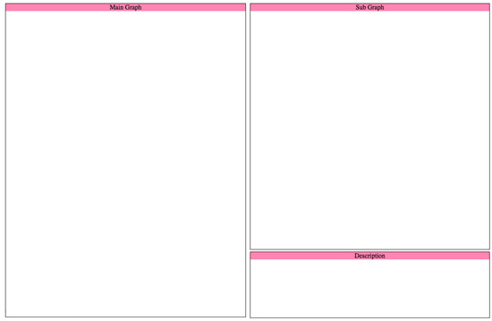
Figure A1.
An HTML skeleton layout to visualize the main and sub graphs.
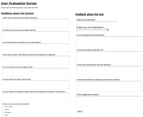
Figure A2.
Evaluation form for the user study.
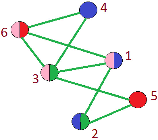
Figure A3.
Representation of multiple participation of a nodes in more than one circle.
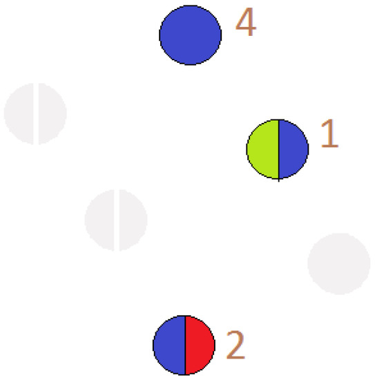
Figure A4.
Representation of a node participating in more than one circle.
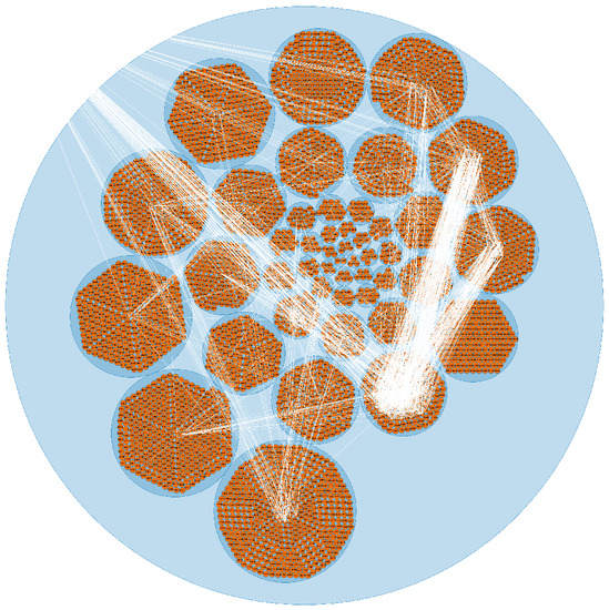
Figure A5.
Representation of the Facebook data-set using circle packing visualization.
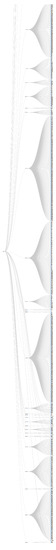
Figure A6.
Representation of the Facebook data-set using cluster dendogram Visualization.
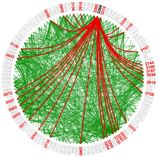
Figure A7.
Representation of the Facebook data-set using Hierarchical Edge Bundling Visualization with low tension.
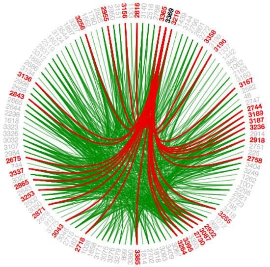
Figure A8.
Representation hierarchical edge bundling visualization with high tension.
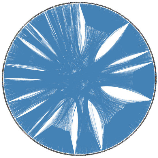
Figure A9.
Representation of the whole Facebook data-set using hierarchical edge bundling visualization.

Figure A10.
Demonstration of a mouse-hover interaction in force directed layout when a node participates in more than one circle.
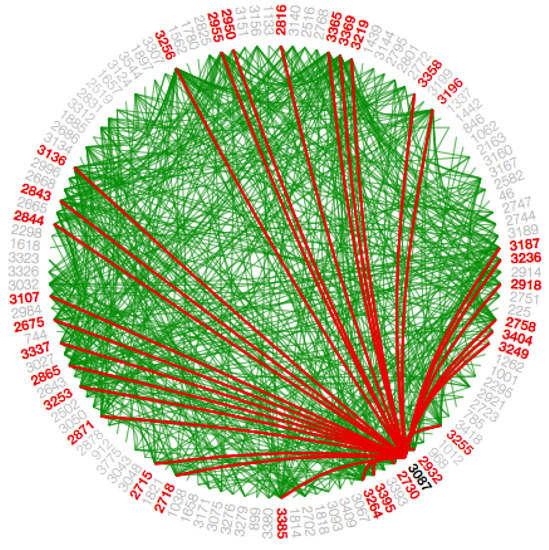
Figure A11.
Demonstration of a mouse-hover interaction in hierarchical edge bundling visualization technique, in order to show the number of connections a circle has to the other circles.
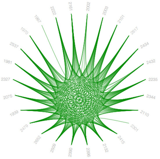
Figure A12.
Demonstration of a graph when no selection interaction is selected.

Figure A13.
Demonstration of a graph when selection interaction is selected.
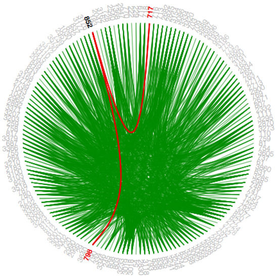
Figure A14.
Demonstration of highlighting the path for the selected node.
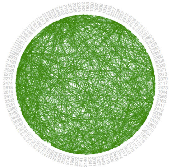
Figure A15.
Representation of a graph using hierarchical edge bundling visualization with low bundling strength.
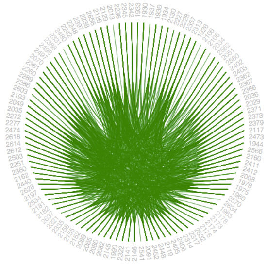
Figure A16.
Representation of a graph using hierarchical edge bundling visualization with high bundling strength.
References
- Leskovec, J.; Krevl, A. {SNAP Datasets}:{Stanford} Large Network Dataset Collection. June 2014. Available online: https://snap.stanford.edu/data/ (accessed on 21 February 2019).
- Ware, C. Information Visualization: Perception for Design; Elsevier: Amsterdam, The Netherlands, 2012. [Google Scholar]
- Bostock, M.; Ogievetsky, V.; Heer, J. D3 data-driven documents. IEEE Trans. Vis. Comput. Graph. 2011, 17, 2301–2309. [Google Scholar] [CrossRef] [PubMed]
- Holten, D. Hierarchical edge bundles: Visualization of adjacency relations in hierarchical data. IEEE Trans. Vis. Comput. Graph. 2006, 12, 741–748. [Google Scholar] [CrossRef] [PubMed]
- De Boor, C.; De Boor, C.; Mathématicien, E.U. A Practical Guide to Splines; Springer: New York, NY, USA, 1978; Volume 27. [Google Scholar]
- Noack, A. Modularity clustering is force-directed layout. Phys. Rev. E 2009, 79, 026102. [Google Scholar] [CrossRef] [PubMed]
- Collins, C.R.; Stephenson, K. A circle packing algorithm. Comput. Geom. 2003, 25, 233–256. [Google Scholar] [CrossRef]
- Forina, M.; Armanino, C.; Raggio, V. Clustering with dendrograms on interpretation variables. Anal. Chim. Acta 2002, 454, 13–19. [Google Scholar] [CrossRef]
- AlTarawneh, R.; Schultz, J.; Humayoun, S.R. Clue: An algorithm for expanding clustered graphs. In Proceedings of the 2014 IEEE Pacific Visualization Symposium (PacificVis), Yokohama, Japan, 4–7 March 2014; pp. 233–237. [Google Scholar]
- Slingsby, A.; Dykes, J.; Wood, J. Exploring uncertainty in geodemographics with interactive graphics. IEEE Trans. Vis. Comput. Graph. 2011, 17, 2545–2554. [Google Scholar] [CrossRef] [PubMed]
- Cawthon, N.; Moere, A.V. The effect of aesthetic on the usability of data visualizations. In Proceedings of the 2007 11th International Conference Information Visualization (IV ’07), Zurich, Switzerland, 4–6 July 2007; pp. 637–648. [Google Scholar]
- Leskovec, J.; Mcauley, J.J. Learning to discover social circles in ego networks. In Advances in Neural Information Processing Systems; NIPS Proceedings Beta: USA, 2012; pp. 539–547. Available online: https://papers.nips.cc/paper/4532-learning-to-discover-social-circles-in-ego-networks (accessed on 21 February 2019).
- Halgin, D.S.; Borgatti, S.P. An introduction to personal network analysis and tie churn statistics using e-net. Connections 2012, 32, 37–48. [Google Scholar]
- Nasrabadi, N.M. Pattern recognition and machine learning. J. Electron. Imaging 2007, 16, 049901. [Google Scholar]
- Konishi, S.; Kitagawa, G. Bayesian information criteria. In Information Criteria and Statistical Modeling; Springer: New York, NY, USA, 2008; pp. 211–237. [Google Scholar]
- Phillips, S. A brief history of facebook. The Guardian, 25 July 2007. [Google Scholar]
- Ezaiza, H.; Humayoun, S.R.; AlTarawneh, R.; Ebert, A. Person-vis: Visualizing personal social networks (ego networks). In Proceedings of the 2016 CHI Conference Extended Abstracts on Human Factors in Computing Systems, San Jose, CA, USA, 7–12 May 2016; pp. 1222–1228. [Google Scholar]
- Oden, T.J.; Pires, E.B. Nonlocal and nonlinear friction laws and variational principles for contact problems in elasticity. J. Appl. Mech. 1983, 50, 67–76. [Google Scholar] [CrossRef]
- Vehlow, C.; Beck, F.; Weiskopf, D. The state of the art in visualizing group structures in graphs. Eurographics Conference on Visualization (EuroVis)-STARs; The Eurographics Association, 2015; Volume 2. Available online: http://www.corinna-vehlow.com/wp-content/uploads/2015/08/Vehlow_2015_Eurovis15_STAR-Visualizing-Group-Structures-in-Graphs.pdf (accessed on 21 February 2019).
- Vehlow, C.; Beck, F.; Weiskopf, D. Visualizing group structures in graphs: A survey. Comput. Graph. Forum 2017, 36, 201–225. [Google Scholar] [CrossRef]
- AlTarawneh, R.; Humayoun, S.R.; Schultz, J.; Ebert, A.; Liggesmeyer, P. Layman: A visual interactive tool to support failure analysis in embedded systems. In Proceedings of the 2015 European Conference on Software Architecture Workshops, Dubrovnik, Cavtat, Croatia, 7–11 September 2015; p. 68. [Google Scholar]
- AlTarawneh, R.; Bauer, J.; Humayoun, S.R.; Ebert, A.; Liggesmeyer, P. Essavis++: An interactive 2d plus 3d visual environment to help engineers in understanding the safety aspects of embedded systems. In Proceedings of the 2014 ACM SIGCHI Symposium on Engineering Interactive Computing Systems, Rome, Italy, 17–20 June 2014; pp. 201–204. [Google Scholar]
- AlTarawneh, R.; Steiner, M.; Taibi, D.; Humayoun, S.R.; Liggesmeyer, P. Does visualization speed up the safety analysis process. In Computer Safety, Reliability, and Security, Proceedings of the SAFECOMP 2014 Workshops: ASCoMS, DECSoS, DEVVARTS, ISSE, ReSA4CI, SASSUR, Florence, Italy, 8–9 September 2014; Springer: Cham, Switzerland, 2014; pp. 431–443. [Google Scholar]
- Heberle, H.; Carazzolle, M.F.; Telles, G.P.; Meirelles, G.V.; Minghim, R. Cellnetvis: A web tool for visualization of biological networks using force-directed layout constrained by cellular components. BMC Bioinform. 2017, 18, 395. [Google Scholar] [CrossRef] [PubMed]
- AlTarawneh, R.; Humayoun, S.R.; Ebert, A. Utilization of variation in stereoscopic depth for encoding aspects of non-spatial data. In Proceedings of the 2015 IEEE Symposium on 3D User Interfaces (3DUI), Arles, France, 23–24 March 2015; pp. 143–144. [Google Scholar]
- AlTarawneh, R.; Humayoun, S.R.; Ebert, A. Can we interpret the depth?: Evaluating variation in stereoscopic depth for encoding aspects of non-spatial data. In Proceedings of the 9th Nordic Conference on Human-Computer Interaction, Gothenburg, Sweden, 23–27 October 2016; p. 14. [Google Scholar]
© 2019 by the authors. Licensee MDPI, Basel, Switzerland. This article is an open access article distributed under the terms and conditions of the Creative Commons Attribution (CC BY) license (http://creativecommons.org/licenses/by/4.0/).