
Towards a Model of Urban Evolution Part IV: Evolutionary (Formetic) Distance—An Interpretation of Yelp Review Data


Abstract
:1. Introduction
2. Encoding Yelp Data in TUEM
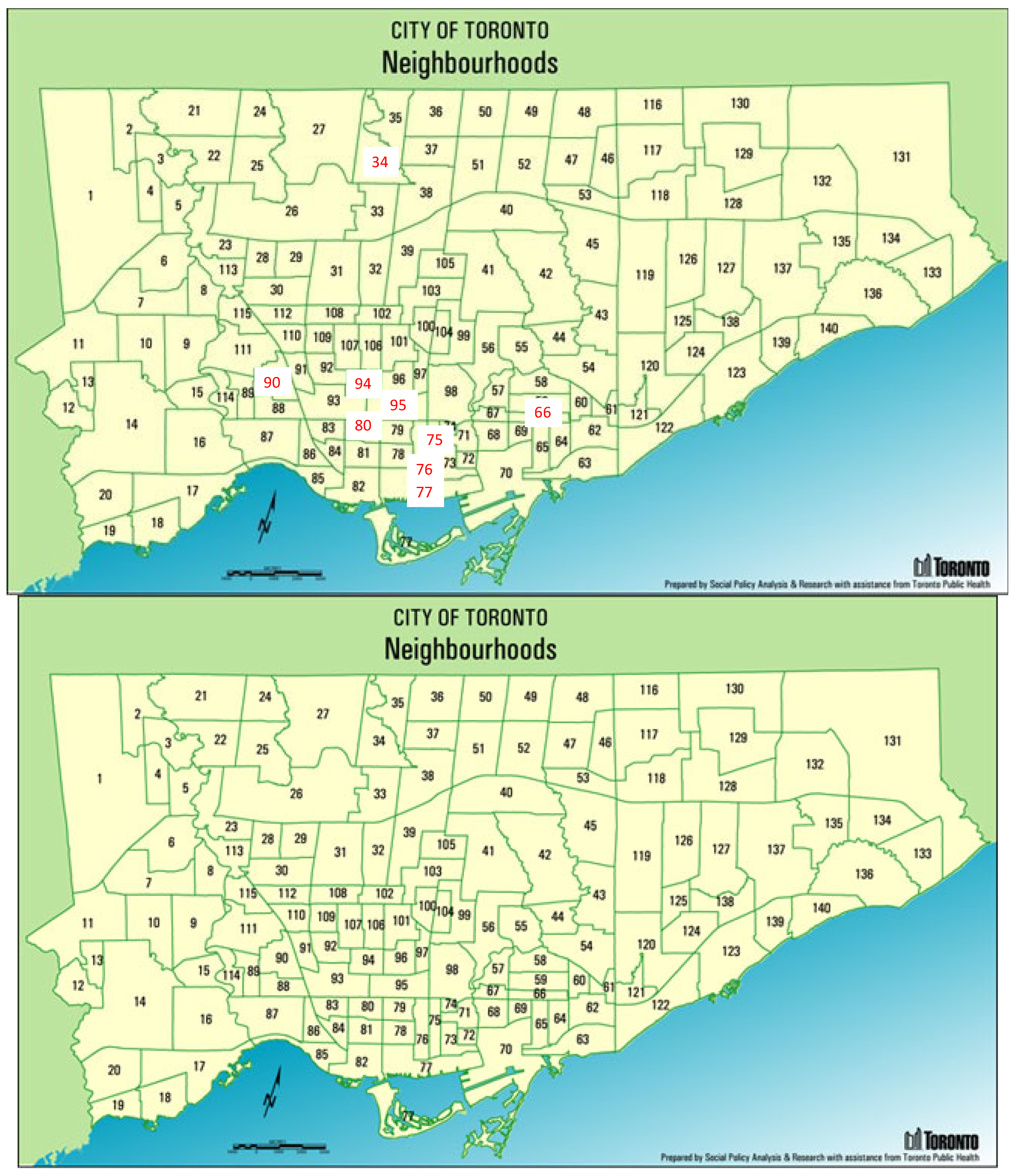
- Annex (95)—High income predominately residential with retail;
- Bathurst Manor (34)—Middle income bedroom community;
- Bay Street Corridor (76)—Middle to high income mixed commercial and residential;
- Church-Yonge Corridor (75)—Middle income with retail;
- Danforth (66)—Middle income with retail;
- Junction Area (90)—Middle and low income with retail;
- Palmerston–Little Italy (80)—Middle income residential;
- Waterfront Communities-The Island (77)—Middle income with retail and commercial;
- Wychwood (94)—Middle to high income residential.
- Time stamp.
- Business ID: a unique identifier for the business being reviewed.
- Neighbourhood ID: a unique identifier for the neighbourhood in which the business is located. There are 140 neighbourhoods in Toronto.
- User ID: a unique identifier for the reviewer. There are 73,504 unique reviewers in this set.
- Categories: one or more categories, from the Yelp taxonomy of business categories, that the business is classified as. There are 854 unique categories (excluding top level categories) in this Yelp dataset.
- Spatial Areas (C): a spatial area c corresponds to a Toronto neighbourhood.
- Forms (P): a form p corresponds to a unique Yelp business ID.
- Groups (G): a group g corresponds to a unique User ID, i.e., reviewer.
- Activities (A): an activity a corresponds to the implicit activity of reviewing.
3. Formeme and Signature Distances
4. Signature Distances: Unaggregated Data
4.1. Longitudinal Analysis
- Number of non-unique elements in component: total number of elements across the three components, P, A and G, of H.
- Number of unique elements in component: total number of unique elements across the three components, P, A and G, of H.
- Intersection of elements with prior year: total number of unique elements across the three components, P, A and G, in the intersection of this year’s elements (metric #1) with the prior year.
- Union of elements with prior year: total number of unique elements across the three components, P, A and G, in the union of this year’s elements (metric #1) with the prior year.
- Intersection %: Percentage of unique elements that are common to this year’s metric #1 and the prior year.
- Cumulative intersection since year 1: total number of unique elements across the three components, P, A and G, in the intersection of this year’s elements (metric #1) with all prior years.
- Cumulative Intersection %: Percentage of unique elements that are common to this year’s metric #1 and all prior years.
4.2. Transversal Distance
- The lines listing the neighourhoods specify the number of unique elements for each of the components P, G, and A.
- Intersection of elements specifies the number of unique elements in the intersection of the two neighbourhoods.
- The union of elements specifies the number of unique elements in the union.
- The intersection % specifies the number of unique elements in the intersection divided by the number in the union.
5. Signature Distances: Aggregated Forms
- Form f: single business category;
- Activity a: Review—same for all formemes;
- Group g: group ID—the reviewer’s unique User ID;
- Weight w.
- -
- <category 1, Review, Group 28, 0.333>
- -
- <category 2, Review, Group 28, 0.333>
- -
- <category 3, Review, Group 28, 0.333>
5.1. Longitudinal Distance
5.1.1. Longitudinal Case: Waterfront Communities-The Island (77)
5.1.2. Longitudinal Case: Annex (95)
5.1.3. Observations
5.2. Transversal Distance
5.2.1. Transversal Case: Annex (95)—Church-Yonge Corridor (75)
5.2.2. Transversal Case: Annex (95)—Bathurst Manor (34)
5.2.3. Transversal Case: Annex (95)—Waterfront Communities-The Island (77)
6. Signature Distances: Aggregating Groups
- The aggregate group whose defining forms contained the formeme’s form;
- the aggregate group with the largest number of forms used to define the aggregate group.
6.1. Longitudinal Distance
6.1.1. Waterfront Communities-The Island (77)
6.1.2. Annex (95)
6.2. Transversal Distance
6.2.1. Transversal Case: Annex (95)—Bathurst Manor (34)
6.2.2. Transversal Case: Annex (95)—Waterfront Communities-The Island (77)
6.2.3. Transversal Case: Annex (95)—Hurch-Yonge Corridor (75)
7. Transversal Distances between Toronto and Montreal Neighbourhoods
8. Discussion
“is a small, semi-suburban and scenic neighbourhood, … there’s some scenic spots and great parks, … a bit out of the way from the busier parts of the city, … isn’t a place where you go to party, … one of the parts of the city where the middle-aged and elderly might outnumber the younger folks. A lot of families move out here to settle and buy homes for the long run. As such, many of the residents of this area are long-term inhabitants who want to enjoy the feeling of suburbia but still be close to downtown, … bit out of place, especially since there are some industrial zones nearby, … find restaurants, drugstores and groceries. Though there aren’t too many choices for amenities overall …” (https://nexthome.ca/neighbourhoods/montreal-sault-au-recollet/142959/, accessed on 27 January 2021)
9. Conclusions
Author Contributions
Funding
Acknowledgments
Conflicts of Interest
Appendix A. Formal Model
- formeme that communicates a fragment of a genome. This fragment may be assimilated by another spatial area, first as a change to hunome H, and if it survives, eventually as a change to U;
- the source of the signal a spatial area receives. Where a signal comes from affects how it is received;
- method of communication. A formeme may be communicated in more than one way, and depending on the method of communication, the signal may travel only within c (intra-spatial signal), or between c’s (inter-spatial signal), or both (bi-spatial signal);
- the capacity of a signal to alter the recoding costs in the area that receives the signal; and
- the number of times the signal has been received. A signal that is received with a high frequency may have a higher probability of assimilation in H.
Appendix B. Aggregate Groups
| Group ID | Yelp Categories | Group Size |
| Group-1 | [‘American (New)’, ‘Bars’] | 7135 |
| Group-2 | [‘American (New)’, ‘Breakfast & Brunch’] | 5475 |
| Group-3 | [‘American (New)’, ‘Canadian (New)’] | 9337 |
| Group-4 | [‘American (Traditional)’, ‘Bars’] | 7124 |
| Group-5 | [‘American (Traditional)’, ‘Canadian (New)’] | 5675 |
| Group-6 | [‘Bars’, ‘Breakfast & Brunch’] | 9845 |
| Group-7 | [‘Bars’, ‘Burgers’] | 5485 |
| Group-8 | [‘Bars’, ‘Cafes’] | 5093 |
| Group-9 | [‘Bars’, ‘Canadian (New)’] | 12,015 |
| Group-10 | [‘Bars’, ‘Cocktail Bars’] | 5216 |
| Group-11 | [‘Bars’, ‘Coffee & Tea’] | 6709 |
| Group-12 | [‘Bars’, ‘Italian’] | 7428 |
| Group-13 | [‘Bars’, ‘Japanese’] | 6398 |
| Group-14 | [‘Bars’, ‘Lounges’] | 5344 |
| Group-15 | [‘Bars’, ‘Pubs’] | 9029 |
| Group-16 | [‘Bars’, ‘Sandwiches’] | 5703 |
| Group-17 | [‘Bars’, ‘Specialty Food’] | 5103 |
| Group-18 | [‘Breakfast & Brunch’, ‘Canadian (New)’] | 8484 |
| Group-19 | [‘Breakfast & Brunch’, ‘Coffee & Tea’] | 6466 |
| Group-20 | [‘Breakfast & Brunch’, ‘Italian’] | 5701 |
| Group-21 | [‘Breakfast & Brunch’, ‘Sandwiches’] | 5565 |
| Group-22 | [‘Cafes’, ‘Coffee & Tea’] | 5689 |
| Group-23 | [‘Canadian (New)’, ‘Coffee & Tea’] | 5520 |
| Group-24 | [‘Canadian (New)’, ‘Italian’] | 5910 |
| Group-25 | [‘Canadian (New)’, ‘Pubs’] | 5280 |
| Group-26 | [‘Coffee & Tea’, ‘Desserts’] | 5143 |
| Group-27 | [‘Ethnic Food’, ‘Specialty Food’] | 5061 |
| Group-28 | [‘Italian’, ‘Pizza’] | 5874 |
| Group-29 | [‘Japanese’, ‘Sushi Bars’] | 7071 |
| Group-30 | [‘American (New)’, ‘Bars’, ‘Canadian (New)’] | 6863 |
| Group-31 | [‘American (New)’, ‘Breakfast & Brunch’, ‘Canadian (New)’] | 5258 |
| Group-32 | [‘American (Traditional)’, ‘Bars’, ‘Canadian (New)’] | 5031 |
| Group-33 | [‘Bars’, ‘Breakfast & Brunch’, ‘Canadian (New)’] | 6658 |
| Group-34 | [‘Bars’, ‘Canadian (New)’, ‘Italian’] | 5057 |
| Group-35 | [‘Bars’, ‘Canadian (New)’, ‘Pubs’] | 5280 |
References
- Fox, M.; Silver, D.; Adler, P. Towards a Model of Urban Evolution II: Formal Model. Urban Science. 2022. Available online: https://osf.io/preprints/socarxiv/9pvq2/ (accessed on 1 April 2022).
- Silver, D.; Adler, P.; Fox, M.S. Towards a Model of Urban Evolution I: Context. Urban Science. 2022. Available online: https://osf.io/preprints/socarxiv/yubkr/ (accessed on 1 April 2022).
- Silver, D.; Fox, M.; Adler, P. Towards a Model of Urban Evolution Part III: Variation, Selection, Retention. Urban Science. 2022. Available online: https://osf.io/preprints/socarxiv/gtpfw/ (accessed on 1 April 2022).
- Silver, D.; Silva, T.H. Complex Causal Structures of Neighbourhood Change: Evidence from a Functionalist Model and Yelp Data. SocArXiv 2021. Available online: https://osf.io/preprints/socarxiv/wprf8/ (accessed on 1 April 2022). [CrossRef]
- Olson, A.W.; Zhang, K.; Calderon-Figueroa, F.; Yakubov, R.; Sanner, S.; Silver, D.; Arribas-Bel, D. Classification and regression via integer optimization for neighborhood change. Geogr. Anal. 2021, 53, 192–212. [Google Scholar] [CrossRef]
- Silver, D.; Clark, T.N.; Navarro Yanez, C.J. Scenes: Social context in an age of contingency. Soc. Forces 2010, 88, 2293–2324. [Google Scholar] [CrossRef]
- Han, J.; Pei, J.; Yin, Y. Mining frequent patterns without candidate generation. ACM Sigmod Rec. 2000, 29, 1–12. [Google Scholar] [CrossRef]
- Dias, F.; Silver, D. Neighborhood dynamics with unharmonized longitudinal data. Geogr. Anal. 2021, 53, 170–191. [Google Scholar] [CrossRef]
- Keidar, N. The Making of Urban Knowledge: Ideas, Cities, Gurus. Ph.D. Thesis, Department of Sociology, University of Toronto, Toronto, ON, Canada, 2021. [Google Scholar]
- Silver, D.; Byrne, U.; Adler, P. Venues and segregation: A revised Schelling model. PLoS ONE 2021, 16, e0242611. [Google Scholar] [CrossRef] [PubMed]
- Silver, D.; Silva, T.H. A Markov model of urban evolution: Neighbourhood change as a complex process. PLoS ONE 2021, 16, e0245357. [Google Scholar] [CrossRef] [PubMed]


| Yr 1 | Yr 2 | Yr 3 | Yr 4 | Yr 5 | Yr 6 | |
|---|---|---|---|---|---|---|
| Yr 1 | 0.536 | 0.649 | 0.743 | 0.81 | 0.84 | |
| Yr 2 | 0.582 | 0.698 | 0.781 | 0.816 | ||
| Yr 3 | 0.597 | 0.713 | 0.76 | |||
| Yr 4 | 0.592 | 0.669 | ||||
| Yr 5 | 0.549 | |||||
| Yr 6 |
| Year (1096) | Dist. from Prior Year | Dist. from Year 1 | Waterfront Communities-The Island (77) Exp # 10.0 | P | G | A | Total |
|---|---|---|---|---|---|---|---|
| 1 | Number of non-unique elements in component | 4031 | 4031 | 4031 | 12,093 | ||
| Number of unique elements in component | 644 | 1723 | 1 | 2368 | |||
| 2 | 0.536 | 0.536 | Number of non-unique elements in component | 4462 | 4462 | 4462 | 13,386 |
| Number of unique elements in component | 709 | 2275 | 1 | 2985 | |||
| Intersection of elements with prior year | 511 | 399 | 1 | 911 | |||
| Union of elements with prior year | 842 | 3599 | 1 | 4442 | |||
| Intersection % | 60.7 | 11.1 | 100.0 | 20.5 | |||
| Cumulative intersection since year 1 | 511 | 399 | 1 | 911 | |||
| Cumulative union since year 1 | 842 | 3599 | 1 | 4442 | |||
| Cumulative Intersection % | 60.7 | 11.1 | 100.0 | 20.5 | |||
| 3 | 0.582 | 0.649 | Number of non-unique elements in component | 5798 | 5798 | 5798 | 17,394 |
| Number of unique elements in component | 809 | 3190 | 1 | 4000 | |||
| Intersection of elements with prior year | 569 | 507 | 1 | 1077 | |||
| Union of elements with prior year | 949 | 4958 | 1 | 5908 | |||
| Intersection % | 60.0 | 10.2 | 100.0 | 18.2 | |||
| Cumulative intersection since year 1 | 430 | 196 | 1 | 627 | |||
| Cumulative union since year 1 | 1013 | 6170 | 1 | 7184 | |||
| Cumulative Intersection % | 42.4 | 3.2 | 100.0 | 8.7 | |||
| 4 | 0.597 | 0.743 | Number of non-unique elements in component | 8054 | 8054 | 8054 | 24,162 |
| Number of unique elements in component | 838 | 4692 | 1 | 5531 | |||
| Intersection of elements with prior year | 636 | 640 | 1 | 1277 | |||
| Union of elements with prior year | 1011 | 7242 | 1 | 8254 | |||
| Intersection % | 62.9 | 8.8 | 100.0 | 15.5 | |||
| Cumulative intersection since year 1 | 373 | 117 | 1 | 491 | |||
| Cumulative union since year 1 | 1150 | 10,024 | 1 | 11,175 | |||
| Cumulative Intersection % | 32.4 | 1.2 | 100.0 | 4.4 | |||
| 5 | 0.592 | 0.81 | Number of non-unique elements in component | 11,463 | 11,463 | 11,463 | 34,389 |
| Number of unique elements in component | 938 | 6567 | 1 | 7506 | |||
| Intersection of elements with prior year | 683 | 999 | 1 | 1683 | |||
| Union of elements with prior year | 1093 | 10,260 | 1 | 11,354 | |||
| Intersection % | 62.5 | 9.7 | 100.0 | 14.8 | |||
| Cumulative intersection since year 1 | 332 | 82 | 1 | 415 | |||
| Cumulative union since year 1 | 1306 | 15,221 | 1 | 16,528 | |||
| Cumulative Intersection % | 25.4 | 0.5 | 100.0 | 2.5 | |||
| 6 | 0.549 | 0.84 | Number of non-unique elements in component | 12,699 | 12,699 | 12,699 | 38,097 |
| Number of unique elements in component | 989 | 7596 | 1 | 8586 | |||
| Intersection of elements with prior year | 757 | 1254 | 1 | 2012 | |||
| Union of elements with prior year | 1170 | 12,909 | 1 | 14,080 | |||
| Intersection % | 64.7 | 9.7 | 100.0 | 14.3 | |||
| Cumulative intersection since year 1 | 300 | 54 | 1 | 355 | |||
| Cumulative union since year 1 | 1438 | 21,085 | 1 | 22,524 | |||
| Cumulative Intersection % | 20.9 | 0.3 | 100.0 | 1.6 |
| Annex (95) | Bathurst Manor (34) | Church-Yonge Corridor (75) | Danforth (66) | Junction Area (90) | Palmerston-Little Italy (80) | Waterfront Communities-The Island (77) | Wychwood (94) | |
|---|---|---|---|---|---|---|---|---|
| Annex (95) | 0.997 | 0.736 | 0.96 | 0.948 | 0.824 | 0.81 | 0.936 | |
| Bathurst Manor (34) | 0.998 | 0.975 | 0.982 | 0.993 | 0.998 | 0.983 | ||
| Church-Yonge Corridor (75) | 0.967 | 0.958 | 0.857 | 0.771 | 0.952 | |||
| Danforth (66) | 0.822 | 0.926 | 0.98 | 0.834 | ||||
| Junction Area (90) | 0.899 | 0.974 | 0.796 | |||||
| Palmerston-Little Italy (80) | 0.901 | 0.882 | ||||||
| Waterfront Communities-The Island (77) | 0.967 | |||||||
| Wychwood (94) |
| Exp # 10.0 | P | G | A | Total |
|---|---|---|---|---|
| Annex (95) | 447 | 963 | 1 | 1411 |
| Bathurst Manor (34) | 4 | 11 | 1 | 16 |
| Intersection of elements | 0 | 5 | 1 | 6 |
| Union of elements | 451 | 969 | 1 | 1421 |
| Intersection % | 0.0 | 0.5 | 100.0 | 0.4 |
| Exp # 10.0 | P | G | A | Total |
|---|---|---|---|---|
| Annex (95) | 447 | 963 | 1 | 1411 |
| Church-Yonge Corridor (75) | 437 | 1176 | 1 | 1614 |
| Intersection of elements | 0 | 373 | 1 | 374 |
| Union of elements | 884 | 1766 | 1 | 2651 |
| Intersection % | 0.0 | 21.1 | 100.0 | 14.1 |
| Exp # 10.0 | P | G | A | Total |
|---|---|---|---|---|
| Annex (95) | 447 | 963 | 1 | 1411 |
| Waterfront Communities-The Island (77) | 644 | 1723 | 1 | 2368 |
| Intersection of elements | 0 | 426 | 1 | 427 |
| Union of elements | 1091 | 2260 | 1 | 3352 |
| Intersection % | 0.0 | 18.8 | 100.0 | 12.7 |
| Active Life | Financial Services | Local Services | Real Estate |
| Arts & Entertainment | Food | Mass Media | Religious Organizations |
| Automotive | Health & Medical | Nightlife | Restaurants |
| Beauty & Spas | Home Services | Pets | Shopping |
| Education | Hotels & Travel | Professional Services | |
| Event Planning & Services | Local Flavor | Public Services & Government |
| Yr 1 | Yr 2 | Yr 3 | Yr 4 | Yr 5 | Yr 6 | |
|---|---|---|---|---|---|---|
| Yr 1 | 0.471 | 0.591 | 0.701 | 0.778 | 0.803 | |
| Yr 2 | 0.53 | 0.661 | 0.754 | 0.782 | ||
| Yr 3 | 0.563 | 0.684 | 0.722 | |||
| Yr 4 | 0.559 | 0.622 | ||||
| Yr 5 | 0.494 | |||||
| Yr 6 |
| Year (1096) | Dist. from Prior Year | Dist. from Year 1 | Waterfront Communities-The Island (77) Exp # 10.1 | P | G | A | Total |
|---|---|---|---|---|---|---|---|
| 1 | Number of non-unique elements in component | 11,891 | 11,891 | 11,891 | 35,673 | ||
| Number of unique elements in component | 313 | 1720 | 1 | 2034 | |||
| 2 | 0.471 | 0.471 | Number of non-unique elements in component | 12,927 | 12,927 | 12,927 | 38,781 |
| Number of unique elements in component | 334 | 2271 | 1 | 2606 | |||
| Intersection of elements with prior year | 289 | 399 | 1 | 689 | |||
| Union of elements with prior year | 358 | 3592 | 1 | 3951 | |||
| Intersection % | 80.7 | 11.1 | 100.0 | 17.4 | |||
| Cumulative intersection since year 1 | 289 | 399 | 1 | 689 | |||
| Cumulative union since year 1 | 358 | 3592 | 1 | 3951 | |||
| Cumulative Intersection % | 80.7 | 11.1 | 100.0 | 17.4 | |||
| 3 | 0.53 | 0.591 | Number of non-unique elements in component | 16,278 | 16,278 | 16,278 | 48,834 |
| Number of unique elements in component | 376 | 3188 | 1 | 3565 | |||
| Intersection of elements with prior year | 316 | 507 | 1 | 824 | |||
| Union of elements with prior year | 394 | 4952 | 1 | 5347 | |||
| Intersection % | 80.2 | 10.2 | 100.0 | 15.4 | |||
| Cumulative intersection since year 1 | 277 | 196 | 1 | 474 | |||
| Cumulative union since year 1 | 400 | 6161 | 1 | 6562 | |||
| Cumulative Intersection % | 69.2 | 3.2 | 100.0 | 7.2 | |||
| 4 | 0.563 | 0.701 | Number of non-unique elements in component | 22,715 | 22,715 | 22,715 | 68,145 |
| Number of unique elements in component | 377 | 4689 | 1 | 5067 | |||
| Intersection of elements with prior year | 351 | 639 | 1 | 991 | |||
| Union of elements with prior year | 402 | 7238 | 1 | 7641 | |||
| Intersection % | 87.3 | 8.8 | 100.0 | 13.0 | |||
| Cumulative intersection since year 1 | 272 | 117 | 1 | 390 | |||
| Cumulative union since year 1 | 415 | 10,013 | 1 | 10,429 | |||
| Cumulative Intersection % | 65.5 | 1.2 | 100.0 | 3.7 | |||
| 5 | 0.559 | 0.778 | Number of non-unique elements in component | 33,404 | 33,404 | 33,404 | 100,212 |
| Number of unique elements in component | 399 | 6564 | 1 | 6964 | |||
| Intersection of elements with prior year | 360 | 999 | 1 | 1360 | |||
| Union of elements with prior year | 416 | 10,254 | 1 | 10,671 | |||
| Intersection % | 86.5 | 9.7 | 100.0 | 12.7 | |||
| Cumulative intersection since year 1 | 270 | 82 | 1 | 353 | |||
| Cumulative union since year 1 | 438 | 15,207 | 1 | 15,646 | |||
| Cumulative Intersection % | 61.6 | 0.5 | 100.0 | 2.3 | |||
| 6 | 0.494 | 0.803 | Number of non-unique elements in component | 37,211 | 37,211 | 37,211 | 111,633 |
| Number of unique elements in component | 422 | 7592 | 1 | 8015 | |||
| Intersection of elements with prior year | 373 | 1253 | 1 | 1627 | |||
| Union of elements with prior year | 448 | 12,903 | 1 | 13,352 | |||
| Intersection % | 83.3 | 9.7 | 100.0 | 12.2 | |||
| Cumulative intersection since year 1 | 264 | 54 | 1 | 319 | |||
| Cumulative union since year 1 | 470 | 21,068 | 1 | 21,539 | |||
| Cumulative Intersection % | 56.2 | 0.3 | 100.0 | 1.5 |
| Yr 1 | Yr 2 | Yr 3 | Yr 4 | Yr 5 | Yr 6 | |
|---|---|---|---|---|---|---|
| Yr 1 | 0.47 | 0.571 | 0.663 | 0.709 | 0.727 | |
| Yr 2 | 0.531 | 0.642 | 0.695 | 0.715 | ||
| Yr 3 | 0.559 | 0.631 | 0.658 | |||
| Yr 4 | 0.531 | 0.57 | ||||
| Yr 5 | 0.496 | |||||
| Yr 6 |
| Year (1096) | Dist. from Prior Year | Dist. from Year 1 | Annex (95) Exp # 10.1 | P | G | A | Total |
|---|---|---|---|---|---|---|---|
| 1 | Number of non-unique elements in component | 5060 | 5060 | 5060 | 15,180 | ||
| Number of unique elements in component | 246 | 962 | 1 | 1209 | |||
| 2 | 0.47 | 0.47 | Number of non-unique elements in component | 5188 | 5188 | 5188 | 15,564 |
| Number of unique elements in component | 250 | 1231 | 1 | 1482 | |||
| Intersection of elements with prior year | 214 | 230 | 1 | 445 | |||
| Union of elements with prior year | 282 | 1963 | 1 | 2246 | |||
| Intersection % | 75.9 | 11.7 | 100.0 | 19.8 | |||
| Cumulative intersection since year 1 | 214 | 230 | 1 | 445 | |||
| Cumulative union since year 1 | 282 | 1963 | 1 | 2246 | |||
| Cumulative Intersection % | 75.9 | 11.7 | 100.0 | 19.8 | |||
| 3 | 0.531 | 0.571 | Number of non-unique elements in component | 6637 | 6637 | 6637 | 19,911 |
| Number of unique elements in component | 258 | 1573 | 1 | 1832 | |||
| Intersection of elements with prior year | 226 | 228 | 1 | 455 | |||
| Union of elements with prior year | 282 | 2576 | 1 | 2859 | |||
| Intersection % | 80.1 | 8.9 | 100.0 | 15.9 | |||
| Cumulative intersection since year 1 | 206 | 88 | 1 | 295 | |||
| Cumulative union since year 1 | 308 | 3251 | 1 | 3560 | |||
| Cumulative Intersection % | 66.9 | 2.7 | 100.0 | 8.3 | |||
| 4 | 0.559 | 0.663 | Number of non-unique elements in component | 8596 | 8596 | 8596 | 25,788 |
| Number of unique elements in component | 279 | 2201 | 1 | 2481 | |||
| Intersection of elements with prior year | 232 | 277 | 1 | 510 | |||
| Union of elements with prior year | 305 | 3497 | 1 | 3803 | |||
| Intersection % | 76.1 | 7.9 | 100.0 | 13.4 | |||
| Cumulative intersection since year 1 | 198 | 44 | 1 | 243 | |||
| Cumulative union since year 1 | 330 | 5076 | 1 | 5407 | |||
| Cumulative Intersection % | 60.0 | 0.9 | 100.0 | 4.5 | |||
| 5 | 0.531 | 0.709 | Number of non-unique elements in component | 9973 | 9973 | 9973 | 29,919 |
| Number of unique elements in component | 282 | 2722 | 1 | 3005 | |||
| Intersection of elements with prior year | 241 | 357 | 1 | 599 | |||
| Union of elements with prior year | 320 | 4566 | 1 | 4887 | |||
| Intersection % | 75.3 | 7.8 | 100.0 | 12.3 | |||
| Cumulative intersection since year 1 | 188 | 21 | 1 | 210 | |||
| Cumulative union since year 1 | 354 | 7267 | 1 | 7622 | |||
| Cumulative Intersection % | 53.1 | 0.3 | 100.0 | 2.8 | |||
| 6 | 0.496 | 0.727 | Number of non-unique elements in component | 11,027 | 11,027 | 11,027 | 33,081 |
| Number of unique elements in component | 300 | 3054 | 1 | 3355 | |||
| Intersection of elements with prior year | 254 | 416 | 1 | 671 | |||
| Union of elements with prior year | 328 | 5360 | 1 | 5689 | |||
| Intersection % | 77.4 | 7.8 | 100.0 | 11.8 | |||
| Cumulative intersection since year 1 | 184 | 13 | 1 | 198 | |||
| Cumulative union since year 1 | 367 | 9680 | 1 | 10,048 | |||
| Cumulative Intersection % | 50.1 | 0.1 | 100.0 | 2.0 |
| Annex (95) | Bathurst Manor (34) | Church-Yonge Corridor (75) | Danforth (66) | Junction Area (90) | Palmerston-Little Italy (80) | Waterfront Communities-The Island (77) | Wychwood (94) | |
|---|---|---|---|---|---|---|---|---|
| Annex (95) | 0.995 | 0.53 | 0.935 | 0.908 | 0.7 | 0.668 | 0.899 | |
| Bathurst Manor (34) | 0.996 | 0.973 | 0.98 | 0.99 | 0.998 | 0.976 | ||
| Church-Yonge Corridor (75) | 0.947 | 0.927 | 0.757 | 0.593 | 0.919 | |||
| Danforth (66) | 0.706 | 0.876 | 0.966 | 0.759 | ||||
| Junction Area (90) | 0.835 | 0.955 | 0.704 | |||||
| Palmerston-Little Italy (80) | 0.84 | 0.814 | ||||||
| Waterfront Communities-The Island (77) | 0.948 | |||||||
| Wychwood (94) |
| P | G | A | Total | |
|---|---|---|---|---|
| Annex (95) | 246 | 962 | 1 | 1209 |
| Church-Yonge Corridor (75) | 249 | 1176 | 1 | 1436 |
| Intersection | 173 | 373 | 1 | 547 |
| Union | 332 | 1765 | 1 | 2098 |
| Intersection % | 52.1% | 21.1% | 100% | 26.1% |
| P | G | A | Total | |
|---|---|---|---|---|
| Annex (95) | 246 | 962 | 1 | 1209 |
| Bathurst Manor (34) | 11 | 11 | 1 | 23 |
| Intersection | 6 | 5 | 1 | 12 |
| Union | 251 | 968 | 1 | 1220 |
| Intersection % | 2.4% | 0.5% | 100% | 1% |
| P | G | A | Total | |
|---|---|---|---|---|
| Annex (95) | 246 | 962 | 1 | 1209 |
| Waterfront Communities-The Island (77) | 313 | 1720 | 1 | 2034 |
| Intersection | 182 | 426 | 1 | 609 |
| Union | 377 | 2256 | 1 | 2634 |
| Intersection % | 48.3% | 18.9% | 100% | 23.1% |
| Yr 1 | Yr 2 | Yr 3 | Yr 4 | Yr 5 | Yr 6 | |
|---|---|---|---|---|---|---|
| Yr 1 | 0.204 | 0.364 | 0.539 | 0.67 | 0.703 | |
| Yr 2 | 0.308 | 0.497 | 0.64 | 0.676 | ||
| Yr 3 | 355 | 0.537 | 0.58 | |||
| Yr 4 | 366 | 0.433 | ||||
| Yr 5 | 0.238 | |||||
| Yr 6 |
| Year | Distance from Prior Year | Distance from Year 1 | Waterfront Communities-The Island (77) Exp # 11 | P | G | A | Total |
|---|---|---|---|---|---|---|---|
| 1 | Number of non-unique elements in component | 2398 | 2398 | 2398 | 7194 | ||
| Number of unique elements in component | 313 | 418 | 1 | 732 | |||
| 2 | 0.204 | 0.204 | Number of non-unique elements in component | 3016 | 3016 | 3016 | 9048 |
| Number of unique elements in component | 334 | 579 | 1 | 914 | |||
| Intersection of elements with prior year | 289 | 39 | 1 | 329 | |||
| Union of elements with prior year | 358 | 958 | 1 | 1317 | |||
| Intersection % | 80.7 | 4.1 | 100.0 | 25.0 | |||
| Cumulative intersection since year 1 | 289 | 39 | 1 | 329 | |||
| Cumulative union since year 1 | 358 | 958 | 1 | 1317 | |||
| Cumulative Intersection % | 80.7 | 4.1 | 100.0 | 25.0 | |||
| 3 | 0.308 | 0.364 | Number of non-unique elements in component | 3922 | 3922 | 3922 | 11,766 |
| Number of unique elements in component | 376 | 806 | 1 | 1183 | |||
| Intersection of elements with prior year | 316 | 45 | 1 | 362 | |||
| Union of elements with prior year | 394 | 1340 | 1 | 1735 | |||
| Intersection % | 80.2 | 3.4 | 100.0 | 20.9 | |||
| Cumulative intersection since year 1 | 277 | 33 | 1 | 311 | |||
| Cumulative union since year 1 | 400 | 1713 | 1 | 2114 | |||
| Cumulative Intersection % | 69.2 | 1.9 | 100.0 | 14.7 | |||
| 4 | 0.355 | 0.539 | Number of non-unique elements in component | 5308 | 5308 | 5308 | 15,924 |
| Number of unique elements in component | 377 | 1265 | 1 | 1643 | |||
| Intersection of elements with prior year | 351 | 48 | 1 | 400 | |||
| Union of elements with prior year | 402 | 2023 | 1 | 2426 | |||
| Intersection % | 87.3 | 2.4 | 100.0 | 16.5 | |||
| Cumulative intersection since year 1 | 272 | 33 | 1 | 306 | |||
| Cumulative union since year 1 | 415 | 2921 | 1 | 3337 | |||
| Cumulative Intersection % | 65.5 | 1.1 | 100.0 | 9.2 | |||
| 5 | 0.366 | 0.67 | Number of non-unique elements in component | 7125 | 7125 | 7125 | 21,375 |
| Number of unique elements in component | 399 | 1700 | 1 | 2100 | |||
| Intersection of elements with prior year | 360 | 61 | 1 | 422 | |||
| Union of elements with prior year | 416 | 2904 | 1 | 3321 | |||
| Intersection % | 86.5 | 2.1 | 100.0 | 12.7 | |||
| Cumulative intersection since year 1 | 270 | 33 | 1 | 304 | |||
| Cumulative union since year 1 | 438 | 4541 | 1 | 4980 | |||
| Cumulative Intersection % | 61.6 | 0.7 | 100.0 | 6.1 | |||
| 6 | 0.238 | 0.703 | Number of non-unique elements in component | 8703 | 8703 | 8703 | 26,109 |
| Number of unique elements in component | 422 | 2091 | 1 | 2514 | |||
| Intersection of elements with prior year | 373 | 67 | 1 | 441 | |||
| Union of elements with prior year | 448 | 3724 | 1 | 4173 | |||
| Intersection % | 83.3 | 1.8 | 100.0 | 10.6 | |||
| Cumulative intersection since year 1 | 264 | 33 | 1 | 298 | |||
| Cumulative union since year 1 | 470 | 6529 | 1 | 7000 | |||
| Cumulative Intersection % | 56.2 | 0.5 | 100.0 | 4.3 |
| Yr 1 | Yr 2 | Yr 3 | Yr 4 | Yr 5 | Yr 6 | |
|---|---|---|---|---|---|---|
| Yr 1 | 0.207 | 0.302 | 0.456 | 0.535 | 0.562 | |
| Yr 2 | 0.286 | 0.449 | 0.53 | 0.556 | ||
| Yr 3 | 0.334 | 0.429 | 0.459 | |||
| Yr 4 | 0.284 | 0.342 | ||||
| Yr 5 | 0.243 | |||||
| Yr 6 |
| Year | Distance from Prior Year | Distance from Year 1 | Annex (95) Exp # 11 | P | G | A | Total |
|---|---|---|---|---|---|---|---|
| 1 | Number of non-unique elements in component | 1369 | 1369 | 1369 | 4107 | ||
| Number of unique elements in component | 246 | 220 | 1 | 467 | |||
| 2 | 0.207 | 0.207 | Number of non-unique elements in component | 1629 | 1629 | 1629 | 4887 |
| Number of unique elements in component | 250 | 287 | 1 | 538 | |||
| Intersection of elements with prior year | 214 | 36 | 1 | 251 | |||
| Union of elements with prior year | 282 | 471 | 1 | 754 | |||
| Intersection % | 75.9 | 7.6 | 100.0 | 33.3 | |||
| Cumulative intersection since year 1 | 214 | 36 | 1 | 251 | |||
| Cumulative union since year 1 | 282 | 471 | 1 | 754 | |||
| Cumulative Intersection % | 75.9 | 7.6 | 100.0 | 33.3 | |||
| 3 | 0.286 | 0.302 | Number of non-unique elements in component | 2072 | 2072 | 2072 | 6216 |
| Number of unique elements in component | 258 | 386 | 1 | 645 | |||
| Intersection of elements with prior year | 226 | 39 | 1 | 266 | |||
| Union of elements with prior year | 282 | 634 | 1 | 917 | |||
| Intersection % | 80.1 | 6.2 | 100.0 | 29.0 | |||
| Cumulative intersection since year 1 | 206 | 30 | 1 | 237 | |||
| Cumulative union since year 1 | 308 | 816 | 1 | 1125 | |||
| Cumulative Intersection % | 66.9 | 3.7 | 100.0 | 21.1 | |||
| 4 | 0.334 | 0.456 | Number of non-unique elements in component | 2758 | 2758 | 2758 | 8274 |
| Number of unique elements in component | 279 | 607 | 1 | 887 | |||
| Intersection of elements with prior year | 232 | 41 | 1 | 274 | |||
| Union of elements with prior year | 305 | 952 | 1 | 1258 | |||
| Intersection % | 76.1 | 4.3 | 100.0 | 21.8 | |||
| Cumulative intersection since year 1 | 198 | 30 | 1 | 229 | |||
| Cumulative union since year 1 | 330 | 1378 | 1 | 1709 | |||
| Cumulative Intersection % | 60.0 | 2.2 | 100.0 | 13.4 | |||
| 5 | 0.284 | 0.535 | Number of non-unique elements in component | 3278 | 3278 | 3278 | 9834 |
| Number of unique elements in component | 282 | 709 | 1 | 992 | |||
| Intersection of elements with prior year | 241 | 45 | 1 | 287 | |||
| Union of elements with prior year | 320 | 1271 | 1 | 1592 | |||
| Intersection % | 75.3 | 3.5 | 100.0 | 18.0 | |||
| Cumulative intersection since year 1 | 188 | 30 | 1 | 219 | |||
| Cumulative union since year 1 | 354 | 2030 | 1 | 2385 | |||
| Cumulative Intersection % | 53.1 | 1.5 | 100.0 | 9.2 | |||
| 6 | 0.243 | 0.562 | Number of non-unique elements in component | 4022 | 4022 | 4022 | 12,066 |
| Number of unique elements in component | 300 | 943 | 1 | 1244 | |||
| Intersection of elements with prior year | 254 | 47 | 1 | 302 | |||
| Union of elements with prior year | 328 | 1605 | 1 | 1934 | |||
| Intersection % | 77.4 | 2.9 | 100.0 | 15.6 | |||
| Cumulative intersection since year 1 | 184 | 30 | 1 | 215 | |||
| Cumulative union since year 1 | 367 | 2913 | 1 | 3281 | |||
| Cumulative Intersection % | 50.1 | 1.0 | 100.0 | 6.6 |
| nnex (95) | Bathurst Manor (34) | Bay Street Corridor (76) | Church-Yonge Corridor (75) | Danforth (66) | Junction Area (90) | Palmerston-Little Italy (80) | Waterfront Communities-The Island (77) | Wychwood | |
|---|---|---|---|---|---|---|---|---|---|
| x (95) | 0.994 | 0.443 | 0.37 | 0.917 | 0.883 | 0.623 | 0.585 | 0.874 | |
| nor (34) | 0.996 | 0.995 | 0.958 | 0.969 | 0.988 | 0.997 | 0.968 | ||
| Bay Street Corridor (76) | 0.338 | 0.942 | 0.921 | 0.739 | 0.425 | 0.914 | |||
| Church-Yonge Corridor (75) | 0.933 | 0.908 | 0.697 | 0.482 | 0.897 | ||||
| Danforth (66) | 0.505 | 0.823 | 0.958 | 0.602 | |||||
| Junction Area (90) | 0.774 | 0.943 | 0.535 | ||||||
| Palmerston-Little Italy (80) | 0.812 | 0.743 | |||||||
| Waterfront Communities-The Island (77) | 0.938 | ||||||||
| Wychwood (94) |
| Exp # 11 | P | G | A | Total |
|---|---|---|---|---|
| Annex (95) | 246 | 220 | 1 | 467 |
| Bathurst Manor (34) | 11 | 4 | 1 | 16 |
| Intersection of elements | 6 | 2 | 1 | 9 |
| Union of elements | 251 | 222 | 1 | 474 |
| Intersection % | 2.4 | 0.9 | 100.0 | 1.9 |
| Exp # 11-2 | P | G | A | Total |
|---|---|---|---|---|
| Annex (95) | 246 | 220 | 1 | 467 |
| Waterfront Communities-The Island (77) | 313 | 418 | 1 | 732 |
| Intersection of elements | 182 | 42 | 1 | 225 |
| Union of elements | 377 | 596 | 1 | 974 |
| Intersection % | 48.3 | 7.0 | 100.0 | 23.1 |
| Exp # 11 | P | G | A | Total |
|---|---|---|---|---|
| Annex (95) | 246 | 220 | 1 | 467 |
| Church-Yonge Corridor (75) | 259 | 257 | 1 | 517 |
| Intersection of elements | 173 | 41 | 1 | 215 |
| Union of elements | 332 | 436 | 1 | 769 |
| Intersection % | 52.1 | 9.4 | 100.0 | 28.0 |
| Annex (95) | Bathurst Manor (34) | Bay Street Corridor (76) | Lachine-Ouest | René-Lévesque | Sainte-Marie | |
|---|---|---|---|---|---|---|
| Annex (95) | 0.994 | 0.488 | 1.0 | 0.565 | 0.962 | |
| Bathurst Manor (34) | 0.996 | 0.974 | 0.994 | 0.931 | ||
| Bay Street Corridor (76) | 1.0 | 0.627 | 0.973 | |||
| Lachine-Ouest | 0.999 | 0.994 | ||||
| René-Lévesque | 0.952 | |||||
| Sainte-Marie |
| Exp # 12 | P | G | A | Total |
|---|---|---|---|---|
| Annex (T) | 258 | 766 | 1 | 1025 |
| René-Lévesque (M) | 273 | 993 | 1 | 1267 |
| Intersection of elements | 174 | 155 | 1 | 330 |
| Union of elements | 357 | 1604 | 1 | 1962 |
| Intersection % | 48.7 | 9.7 | 100.0 | 16.8 |
| Intersection % in Annex (T) | 67.4 | 20.2 | 100.0 | 32.2 |
| Intersection % in René-Lévesque (M) | 63.7 | 15.6 | 100.0 | 26.0 |
| Exp # 12 | P | G | A | Total |
|---|---|---|---|---|
| Bay Street Corridor (76) | 327 | 1133 | 1 | 1461 |
| René-Lévesque | 273 | 993 | 1 | 1267 |
| Intersection of elements | 201 | 218 | 1 | 420 |
| Union of elements | 399 | 1908 | 1 | 2308 |
| Intersection % | 50.4 | 11.4 | 100.0 | 18.2 |
| Intersection % in Annex (T) | 61.4 | 19.2 | 100.0 | 28.7 |
| Intersection % in René-Lévesque (M) | 73.6 | 22.0 | 100.0 | 33.1 |
| Year | Form (P) | Group (G) | ||
|---|---|---|---|---|
| Annex | Waterfront | Annex | Waterfront | |
| 2 | 75.9 | 80.7 | 7.6 | 4.1 |
| 3 | 66.9 | 69.2 | 3.7 | 1.9 |
| 4 | 60 | 65.5 | 2.2 | 0.7 |
| 5 | 53.1 | 61.6 | 1.5 | 0.7 |
| 6 | 50.1 | 56.2 | 1.0 | 0.5 |
Publisher’s Note: MDPI stays neutral with regard to jurisdictional claims in published maps and institutional affiliations. |
© 2022 by the authors. Licensee MDPI, Basel, Switzerland. This article is an open access article distributed under the terms and conditions of the Creative Commons Attribution (CC BY) license (https://creativecommons.org/licenses/by/4.0/).
Share and Cite
Fox, M.S.; Silver, D.; Silva, T.; Zhang, X. Towards a Model of Urban Evolution Part IV: Evolutionary (Formetic) Distance—An Interpretation of Yelp Review Data. Urban Sci. 2022, 6, 86. https://doi.org/10.3390/urbansci6040086
Fox MS, Silver D, Silva T, Zhang X. Towards a Model of Urban Evolution Part IV: Evolutionary (Formetic) Distance—An Interpretation of Yelp Review Data. Urban Science. 2022; 6(4):86. https://doi.org/10.3390/urbansci6040086
Chicago/Turabian StyleFox, Mark S., Daniel Silver, Thiago Silva, and Xinyi Zhang. 2022. "Towards a Model of Urban Evolution Part IV: Evolutionary (Formetic) Distance—An Interpretation of Yelp Review Data" Urban Science 6, no. 4: 86. https://doi.org/10.3390/urbansci6040086
APA StyleFox, M. S., Silver, D., Silva, T., & Zhang, X. (2022). Towards a Model of Urban Evolution Part IV: Evolutionary (Formetic) Distance—An Interpretation of Yelp Review Data. Urban Science, 6(4), 86. https://doi.org/10.3390/urbansci6040086