Article

The Design Process in the Development of an Online Platform for Personalizing Wearable Prostheses: A Preliminary Approach

1
School of Design, Polytechnic University of Cávado and Ave, 4750-810 Barcelos, Portugal
2
Research Institute for Design, Media and Culture, School of Design, Polytechnic University of Cávado and Ave, 4750-810 Barcelos, Portugal
3
2Ai, School of Technology, Polytechnic University of Cávado and Ave, 4750-810 Barcelos, Portugal
*
Author to whom correspondence should be addressed.
Designs 2025, 9(2), 39; https://doi.org/10.3390/designs9020039
Submission received: 14 January 2025 / Revised: 21 February 2025 / Accepted: 25 March 2025 / Published: 31 March 2025
(This article belongs to the Section Smart Manufacturing System Design)

Abstract

:
This study is part of the research project Dep-Project: Design and Embodiment of Wearable Prostheses, funded by the Foundation for Science and Technology (FCT), whose main objective is the development of wearable myoelectric prostheses for upper limbs, which are economically accessible, socially accepted, and personalizable. In this context, the need arose to create an online platform with an intuitive interface, which would facilitate the access to persons with upper limb amputation to information about prosthetics and allow them to personalize their prosthesis, according to their aesthetic preferences. Thus, this work aims to demonstrate the importance of designing interfaces for greater inclusion, as well as demonstrating and describing the efficiency of the design process adopted with the aim of potentially being adopted in similar cases. The methodology adopted was Design Thinking, an approach centered on user needs. The development of the platform involved the creation of user personas, information architecture, user flows, wireframes, wireflows, and a design system. The interactive prototype underwent usability testing to evaluate the user experience and identify possible areas for improvement. The results, obtained through the System Usability Scale (SUS) post-test questionnaire, revealed a high success rate, which confirmed the efficiency of the designed solution.

1. Introduction

This present study arose within the scope of the research project Dep-project: Design and development of wearable prostheses (DEP), funded by the Foundation for Science and Technology (FCT), Portugal, which has as its main objective the development of wearable myoelectric prostheses for upper limbs that are economically accessible, socially accepted and personalizable [1,2].
In recent years, technological advances have revolutionized the field of medicine, particularly regarding to the development of assisted health devices, such as wearable prosthetics [3]. However, despite these technological advances, many of these prostheses still lack personalization, which often results in prostheses that do not respond to the needs and individual preferences of users.
Personalization is seen as an essential element in reducing the social stigma associated with the use of prosthetics and promoting the inclusion of people with amputations. By allowing prosthetics to reflect the identity and individual preferences of each user, this contributes to improving their social acceptance and self-esteem [4]. Furthermore, the aesthetic component of prostheses, by reflecting the user’s personality, tends to promote a greater sense of comfort and confidence in social environments, which can help to significantly improve users’ emotional and psychological well-being [5].
In this context, the objective of this study was to create an intuitive and accessible online platform that allows users with amputation (of the upper limbs) to autonomously interact and personalize, on the online platform, their wearable myoelectric prostheses according to their personal preferences.
This article is organized into seven sections. Section 2 presents a literature review of the main areas studied in this project, and from this, a set of interface design guidelines was proposed to promote the inclusion of users with disabilities; Section 3 describes the methodologies applied in this study; Section 4 includes a comparative analysis of the main references of platforms intended for the personalization and acquisition of prostheses; Section 5 details the platform design and development process, with due implementation of the established guidelines; Section 6 presents the results obtained in the usability tests carried out; and Section 7 presents the discussion of the results, the main conclusions, and suggestions for future research.

2. Literature Review

This chapter presents a detailed analysis of various content and research sources, aiming to synthesize relevant information related to the study’s topic. This research addresses the areas of accessibility, usability, and inclusive design within the context of interface design, which are fundamental for developing digital solutions that promote the inclusion of users with disabilities. Based on the conducted literature review, a set of interface design guidelines was structured to provide clear guidance for professionals seeking to develop inclusive and accessible digital solutions for users with disabilities.

2.1. User Interface Design

User Interface (UI) Design is a process that involves the design of interfaces on computerized devices, focusing on the aesthetics and functionality of these interfaces, aiming for an intuitive and effective navigation for users [6,7]. Therefore, during the development of the interface, it is important to consider the user’s expectations regarding accessibility, visual appearance, and usability [8]. According to Garrett [9], the UI Design process involves the selection and organization of elements such as menus, buttons, typography, color, and icons, where interfaces are structured in a clear and understandable way. Thus, the effectiveness of an interface is achieved when users identify and use these elements immediately [9].
However, when approaching User Interface Design, it is essential to also consider User Experience Design, as they are interconnected. According to Norman and Nielsen [10,11], user experience transcends the physical use of a product, encompassing all interactions, feelings, and perceptions experienced by users, from the first to the last interaction with the product.
Peter Morville expands this view by introducing the seven fundamental factors for a good user experience, represented in the diagram known as the User Experience Honeycomb [12]. According to the author, interfaces must respond to users’ needs (useful factor), be easy to use (usable factor) and present an aesthetic and minimalist design (desirable factor). Furthermore, they must facilitate navigation and location of information (findable factor) and be accessible to all types of users, including those with some type of disability (accessible factor). It is equally important that interfaces integrate elements that convey trust (credible factor) and provide value to users, giving them the feeling that their needs are being met (valuable factor). By applying Peter Morville’s model, it is ensured that an accessible, reliable, and satisfactory digital solution is created for all users, providing a positive user experience [13].
In the context of developing digital solutions aimed at individuals with disabilities, two of Morville’s factors, accessibility and usability, stand out. These factors are fundamental to the inclusion of these often-marginalized users in the digital environment, allowing them to interact effectively and equitably with digital products. Therefore, each of these concepts will be addressed in subsequent subchapters, aiming for an in-depth understanding of each one.

2.2. Accessibility

According to the World Health Organization [14], more than 1 billion people, representing about 16% of the world’s population, live with some type of disability. These people’s access to technology and information and communication systems, such as the Internet, is recognized as a fundamental right, according to article 9 of the United Nations Convention on the Rights of Persons with Disabilities [15]. In this context, digital accessibility plays an essential role in ensuring equal opportunities and promoting the social inclusion of these individuals.
Accessibility refers to the ability of websites, tools, and technologies to be designed and developed so that individuals with any type of disability—hearing, cognitive, physical, speech, and visual—can use them [16]. Implementing accessibility principles enables these individuals to perceive, understand, navigate, interact with, and contribute to the web in an equitable and unhindered manner.
In order to ensure this accessibility, the World Wide Web Consortium (W3C) developed the Web Content Accessibility Guidelines (WCAG), which aim to make the web accessible to all people, regardless of their capabilities or limitations [17]. These guidelines include ensuring adequate spacing between form fields to minimize errors, considering that people with disabilities are more likely to experience difficulties when completing forms. It is equally important to provide large clickable areas, as users with physical disabilities may have difficulty accurately clicking on small areas. Given the increased likelihood that users with disabilities will make mistakes, it is critical to enable them to correct them, ensuring they complete tasks without obstacles and frustration. On the other hand, the W3C recommends using simple and concise language to make content more accessible to all users, including those with reading difficulties or cognitive limitations. Finally, it is important to implement visual indicators that highlight the current focus on the platform, and navigation mechanisms between sections (such as menus and navigation hierarchies) to facilitate navigation through the interface.
Additionally, Vettorino proposes complementary practices that increase digital accessibility [18]. These include the use of subtitles in videos to ensure the inclusion of users with hearing impairments and the adoption of color contrast to facilitate reading for individuals with color blindness. To avoid triggers that may trigger seizures or physical reactions in users with disabilities, the author recommends providing advance warnings. To improve readability, Vetorrino recommends using fonts suitable for online reading, avoiding decorative or difficult to interpret fonts. Finally, the author recommends avoiding technical jargon in order to ensure that the content is clear and understandable for all users, including those with cognitive difficulties.
All of these practices are essential to make the interface accessible, allowing all users, regardless of their limitations, to interact effectively and intuitively with the online platform. Implementing these guidelines not only promotes the inclusion of users with disabilities but also contributes to a fairer and more equitable digital environment. Therefore, in order to ensure that the online platform to be developed was in compliance with WCAG, several measures have been adopted, namely:
  • Guaranteed high color contrast throughout the interface to make reading easier for individuals with color blindness;
  • Implementation of a menu with clearly identified page titles to facilitate user orientation on the platform;
  • Use of a typography that ensures legibility, combined with clear language that is understandable by all users;
  • The absence of triggers that could trigger physical reaction in users;
  • Organization of navigation in both the header and footer of the interface;
  • Implementation of well-structured navigation hierarchies;
  • Displaying clear and informative error messages about what problem occurred;
  • Implementation of a digital accessibility tool, allowing user to personalize the interface according to their individual needs.
By implementing these measures, it is possible to ensure that the online platform is effectively accessible to all users, including those with an upper limb amputation.
Digital accessibility is a fundamental pillar to ensure that all users, regardless of their limitations, can interact efficiently and intuitively with digital interfaces. However, accessibility does not operate in isolation, being intrinsically linked to another essential concept in the user experience, usability. While accessibility focuses on removing barriers and responding to the specific needs of users with disabilities, usability expands on this principle by evaluating how all people, regardless of their context, can interact with a system in an effective, efficient and satisfactory way. In this sense, the next subchapter addresses how usability contributes to improving the user experience.

2.3. Usability

Usability is one of the seven factors identified by Peter Morville as fundamental in creating a good user experience [12]. According to Nielsen [19], usability assesses the ease with which users interact with an interface and the effectiveness of that interaction in relation to their needs.
With the intention of evaluating the effectiveness, efficiency and user satisfaction of interfaces, Nielsen developed the ten usability heuristics, known as an integral part of “Heuristic Evaluation” [20]. This method aims to identify usability problems in interface design, allowing for improved interactions and offering a more efficient user experience [21]. These heuristics prove to be a fundamental procedure in the development of more intuitive and adaptable digital solutions, aligned with user needs. Thus, heuristics played a relevant role in the analysis of the interfaces of competing platforms, in which a comparative evaluation was carried out between them. The results of this analysis and the respective conclusions are presented in Section 4.
Tidwell complements these principles by proposing a set of practices aimed at developing effective, easy to use, and user-friendly interfaces [22]. Among these practices, the creation of a well-structured information architecture stands out, where the contents are organized in a clear and intuitive way, facilitating the location of information. The author also suggests the implementation of multiple navigation patterns, such as navigation hierarchies that allow the user to easily view and navigate through the different pages they have visited, as well as assistants (such as wizards) that guide the user progressively in carrying out complex tasks. Providing clear feedback on user actions is another essential point, which can be visual (such as color change or movement), auditory or tactile. The author emphasizes the importance of interfaces being accessible, capable of adapting to the needs of users with different abilities, promoting an inclusive experience. To prevent errors from occurring, it suggests including confirmation messages in critical actions that users perform, ensuring greater security in the use of the interface. Consistency in the interface is another essential principle, where elements and functionalities should be uniform throughout the interface, helping users quickly understand how to interact with it. In this context, visual hierarchy gains prominence, directing users’ attention to the most important elements through size, color, or position. Finally, the author highlights the use of white spaces to improve readability, reduce visual noise, and contribute to cleaner and more functional interfaces.
Shneiderman et al. present principles that align with those proposed by Tidwell, such as maintaining consistency in the interface, providing informative feedback, preventing errors, and allowing users to correct them [23]. In addition to these principles, Shneiderman et al. highlight that the interface must include features such as clear explanations (through tutorials and clear instructions) and shortcuts (such as using the “Delete” key to erase), taking into account factors such as age range and disabilities [23]. The authors also recommend structuring interactions into clear steps, with a beginning, middle and end, so that users can easily understand when a task is successfully completed. Furthermore, the interface must give the user a sense of control, allowing them to start and stop actions, as well as navigate freely. Finally, to minimize user memory load, they emphasize that relevant information should always be visible and accessible in the interface, ensuring that users can quickly locate and interact with that information.
Krug proposes practices aligned with those of Tidwell and Shneiderman et al., such as consistency in the interface through a cohesive color palette and uniform icons, and the provision of immediate feedback on user actions [24]. In addition to these practices, the author argues that the interface should be simple and functional, in order to facilitate reading and interaction, and that pages should be organized hierarchically, positioned at the top of the page and with the user’s current location highlighted visually. Additionally, elements such as menus, buttons, and links must be clear and informative, making it clear what will happen when interacting with them. The content, in turn, must be properly organized, with clear and descriptive titles, well-structured text blocks and important elements highlighted in color or bold, in order to help users quickly find the information they are looking for. Krug recommends that navigation menus and submenus be intuitive and easy to access, allowing users to quickly locate desired options [24]. Additionally, it is recommended to provide help resources such as an FAQ section, tutorials, and chatbots that offer direct support. Finally, the author suggests using alternative text (alt text) on images, graphics and other visual elements, allowing screen readers to describe visual content for visually impaired users.
All of these principles contribute to the creation of interfaces that provide an efficient, intuitive and inclusive usability experience for users with disabilities, and effectively respond to the needs of these users.
Based on these practices, and with the aim of ensuring that the online platform to be developed provided a satisfactory user experience for users with disabilities, several measures were implemented, namely:
  • Providing visual feedback in response to user actions;
  • Possibility for the user to undo or correct their choices, as well as restart the prothesis personalization process;
  • Adoption of a consistent visual language throughout the interface;
  • Implementation of confirmation messages for critical actions performed by the user;
  • Structuring interactions in the personalization and payment processes into well-defined and organized stages;
  • Providing support, including a chatbot and an FAQ section;
  • Development of a well-structured information architecture;
  • Implementation of an effective visual hierarchy in the interface.
By applying these measures, the platform offers an inclusive and satisfactory user experience to all users, especially those with disabilities. By prioritizing elements such as visual feedback, consistency in visual language, clear and informative messages, and accessible support, the platform ensures intuitive and efficient navigation.
Usability, by ensuring intuitive, consistent and effective interactions, enables the creation of digital experiences that respond to users’ needs. However, for these experiences to be truly complete, it is necessary to go beyond functionality and efficiency. It is in this context that the role of inclusive design comes into play. Inclusive design complements usability by expanding the reach of digital solutions, ensuring that they are accessible, usable, and meaningful to all users, regardless of their limitations or characteristics. Therefore, the next section explores how to integrate inclusive design practices into digital solutions, with the aim of promoting a more equitable and inclusive digital experience.

2.4. Inclusive Design

Inclusive design aims to create products that are accessible and usable by as many people as possible, with special attention to groups that are often excluded when interacting with interfaces [25]. This process focuses on aspects of human diversity that may influence a person’s ability to use a product, such as ability, age and ethnicity [26]. In this sense, in order to ensure the effectiveness of this approach, it is essential to involve these groups in the design process [27].
With the aim of contributing to this inclusion, Swan et al. formulated the “7 Principles of Inclusive Design” [28]. In the context of a digital platform, the application of these principles involves several essential practices to ensure an accessible and satisfactory experience.
Firstly, it is essential that elements such as buttons, menus, and text blocks have adequate size and spacing. This approach makes interaction easier for all users, especially those with motor disabilities, by reducing selection difficulties and avoiding accidental touches. Furthermore, it ensures readability for visually impaired users, allowing content to be easily viewed without straining the eyes. Interface adaptability is another essential principle to ensure a satisfactory experience in any context of use. An example of this is the use of color contrast, which improves readability in outdoor environments and ensures effective viewing, especially for visually impaired users. Consistency in design, through the application of familiar patterns, is essential to promote user familiarity with the interface, and this is especially important for those with cognitive disabilities. Furthermore, it is recommended to use clear language and create a coherent page architecture to facilitate navigation and understanding of the content, benefiting users with cognitive disabilities. It is equally important that the user has control over the interface, with resources such as interface adaptation being made available, which allows the user to interact with the content according to their needs. This adaptation makes interaction more comfortable and accessible, especially for users with visual, motor, or cognitive disabilities. On the other hand, the interface should prioritize content, helping users’ complete tasks and find information efficiently and effortlessly. Finally, consider the value of available resources and use them to enrich the experience of multiple users by providing efficient and diverse ways to locate and interact with content.
By adopting this approach, individual user needs are considered, regardless of their specific capabilities. In this way, it is possible to develop an online platform that, in addition to respecting diversity, promotes inclusion and equal opportunities, ensuring a meaningful and accessible experience for all users.
The online platform to be developed will be designed to ensure not only the inclusion of users with physical and visual disabilities, specifically people with upper limb amputations and colorblind people, but also of all users. To this end, several measures will be adopted, with the aim of offering an intuitive and functional interface, aligned with the needs of each user, as presented in Section 5.6.
In the literature carried out, a consensus was found on practices to improve accessibility and promote the inclusion of users with disabilities. In this sense, a set of guidelines was outlined to design accessible and inclusive interfaces for these users, seeking to group and synthesize the information presented in this literature review.

2.5. Interface Design Guidelines to Promote the Inclusion of Disabled Users

The proposed interface design guidelines were developed based on the literature review carried out, based on authors such as Vettorino [18], Tidwell [22], Shneiderman et al. [23], and Krug [24]. Current reference design guidelines were also considered, such as the W3C accessibility principles [17], Nielsen’s heuristics [20], and Swan et al.’s inclusive design principles [28].
With these guidelines, it is intended to provide clear and practical guidance for professionals seeking to develop accessible digital solutions that promote the inclusion of users with disabilities. Thus, 19 guidelines were outlined, organized into five categories: Accessibility, Design, Navigation, Information, and Error prevention and correction.
1. 
Accessibility
A. 
Provide interface adaptation—the interface must offer features that allow users to interact with the content according to their preferences and individual needs [20,22,28]. In this sense, the implementation of digital accessibility tools that allow the change in elements such as typography, colors, text sizes, and other visual aspects is an effective approach to serving the diversity of users with disabilities.
B. 
Navigate by keyboard—the navigation on the platform must be operable for all users, regardless of assistive technology or devices used [23]. It is essential that the interface allows keyboard navigation, using commands such as directional arrows, Ctrl + C, Ctrl + V, Delete, among others. This functionality guarantees accessibility for people with motor limitations or who depend on alternative interaction devices.
C. 
Incorporate subtitles—the platform must provide subtitles for videos and audios, so that hearing-impaired users can fully understand the content presented [18].
D. 
Provide advance warnings—the interface should provide advance warnings on videos and other multimedia content, alerting users to potential stimuli that may trigger seizures or physical reactions in people with conditions such as photosensitive epilepsy [18].
E. 
Use alternative texts—the platform should use alternative texts (alt text) on images, graphics, and other visual elements, allowing screen readers to describe the visual content for visually impaired users [24].
2. 
Design
F. 
Maintain visual consistency in the interface—elements should be consistent across the platform to create a cohesive and predictable experience for users [20,22,23,24,28]. To achieve this, familiar design patterns should be adopted, such as a harmonious color palette with adequate contrast (to make it easier to read by people with color blindness), visually consistent icons and layouts, legible typography and uniformly positioned navigation across all pages.
G. 
Maintain an aesthetic and minimalist design—the design must be clear, objective and focused on the essential elements to ensure efficient and intuitive interaction, avoiding unnecessary elements that may distract or overload the user [20,22,24]. To this end, white spaces should be used to improve readability, highlight important information and contribute to visually cleaner and more functional interfaces.
H. 
Implementation of visual hierarchy—a well-defined visual hierarchy is essential to organize the platform in a logical and structured way, facilitating the understanding of information and navigation for users [22,24,28]. Content should be properly organized, with clear and descriptive headings, well-structured blocks of text, and important elements highlighted in color or bold to help users quickly find the information they are looking for.
I. 
Appropriate interface elements—the interface should provide interaction elements, such as buttons, menus and text fields, that are adequately sized and spaced, allowing comfortable interaction for all users [17,28]. In the case of users with physical disabilities, large clickable areas should be made available, as these users may have difficulty accurately clicking on small areas.
3. 
Navigation
J. 
Provide multiple navigation patterns—the platform should provide navigation hierarchies that allow the user to easily view and navigate through the pages they have visited, as well as assistants (such as wizards) that guide them progressively in performing more complex tasks [17,22,24].
K. 
Implementation of navigation hierarchies—the platform must inform the user about all the steps he has taken, through navigation hierarchies, offering a clear visualization and allowing easy navigation through the pages already visited [17,20,22,24]. Therefore, these hierarchies should be positioned at the top of the page, with the user’s current location highlighted visually using a different color or in bold, and the pages separated by the “>” symbol.
L. 
Provide immediate feedback—the platform should provide clear and immediate feedback on user actions, whether through visual (such as color or movement changes), audio, or tactile changes, ensuring that users are always informed about the outcome of their interactions [20,22,23,24];
M. 
Clear structuring of interactions—the interactions should be structured into clear steps, with a beginning, middle and end, in order to ensure that users understand when a task is successfully completed [23];
N. 
Maintain a well-structured information architecture—the information architecture of a platform must be well structured, with content organized in a clear and intuitive way, making it easier for users to locate and understand information [22,28].
4. 
Information
O. 
Use simple, familiar, and concise language—the platform should present information in simple, familiar, and concise language, ensuring that it is easily understood by all users, including those with reading difficulties or cognitive limitations [17,18,20,28].
P. 
Minimize user memory load—the platform should reduce user memory load by keeping relevant information always visible and accessible in the interface, so that it can be located and interacted with quickly [20,23,24]. Elements such as menus, buttons, and links should be clear and informative, and visited and unvisited links should be clearly differentiated. Additionally, navigation menus and submenus should be intuitive and easy to access, allowing users to quickly find the desired options.
Q. 
Provide help and documentation—the platform should offer help and support documentation in an easily accessible way, presenting it in a clear and straightforward manner [20,22,24]. This includes tutorials, an FAQ section, and a support chatbot that effectively assist users.
5. 
Error prevention and correction
R. 
Prevent the occurrence of errors—the platform must be designed in such a way as to prevent errors [17,20,22,23]. Proper spacing between form fields is an important measure to prevent errors, especially for people with physical disabilities, who may face greater difficulties when filling them out. Furthermore, the implementation of confirmation messages in critical actions ensures greater security and confidence in interactions carried out in the interface.
S. 
Help recognize, diagnose, and correct errors—the platform should offer features that allow errors to be corrected quickly and easily [17,20,22,23]. These include clear and understandable error messages that precisely indicate the problem and offer suggestions for fixing it. Additionally, the user must have the ability to do or redo actions, ensuring greater flexibility and control over interactions.
The guidelines presented provide a solid foundation for improving accessibility, usability, and clarity on platforms targeted at users with disabilities, with the aim of creating more inclusive and efficient experiences. By considering essential aspects such as accessibility, visual consistency, navigation, information language, and error prevention, it is possible to improve the user experience, regardless of their limitations.
These guidelines will serve as the foundation for the development of a prototype platform dedicated to the personalization of wearable prosthetics. The prototype will incorporate the principles presented, ensuring an inclusive, efficient design focused on the needs of all users, with special attention to those with amputation of one of the upper limbs, promoting a more accessible, intuitive, and satisfactory experience.

3. Methodologies

This study required a user-centered approach, thus, aligning with the principles of Design Thinking. Subsequently, during the execution of the usability tests, it was necessary to apply a data collection instrument, where the System Usability Scale (SUS) was chosen.

3.1. Design Thinking

With the aim of developing an online platform that would assist users in the process of personalizing their wearable prosthesis, a user-centered methodology, Design Thinking, was adopted. This approach focuses on understanding users’ needs, challenges and experiences. In this case, the Design Thinking model proposed by the Nielsen Norman Group was implemented, consisting of three main phases [29]: Inspiration, Ideation, and Implementation. The design process, following these three key stages, is visually represented in the flowchart illustrated in Figure 1.
Initially, a literature review was carried out covering areas essential to the study, such as accessibility, usability, and inclusive design in the context of interface design. Based on the review conducted, a set of interface design guidelines was outlined to promote the inclusion of users with disabilities. After defining the guidelines, a comparative study of platforms that stand out in the personalization of prostheses was conducted, in order to obtain a comprehensive view of existing solutions.
Based on these insights, the development of the platform was initiated. First, user personas were created, which represent hypothetical profiles based on potential users of the platform. Next, the information architecture was developed to organize the content in an accessible and clear way for users. After that, user flows, wireframes, wireflows, and a design system were developed, which culminated in the creation of a high-fidelity prototype. After the prototype was developed, a comparative analysis was carried out with other existing platforms. Finally, usability tests were carried out on this prototype, using the System Usability Scale (SUS) to assess its usability and identify areas for improvement.

3.2. System Usability Scale (SUS)

The System Usability Scale (SUS) is a tool used in UX research to acquire valid and quantifiable data about the usability of an interface. Developed by John Brooke [30,31], the SUS consists of a post-test questionnaire composed of 10 questions, in which participants, after completing the usability tests, rate each question using the Likert scale, which ranges from 1 (disagree strongly) to 5 (strongly agree). The results are converted into a score from 0 to 100, which makes it easier to interpret them in the context of other solutions [30]. Thus, after completing the questionnaire, the user will obtain a total score based on their answers, and this score will be characterized according to the scale created by Jeff Sauro (Figure 2) [32].
This procedure has been tested over the last 30 years and has proven to be an effective and reliable method when it comes to evaluating the usability of interfaces [32]. In this context, the SUS application was carried out in order to evaluate the usability of the developed platform, thus allowing an in-depth understanding of its effectiveness and efficiency.

4. User Experience Benchmarking

This chapter presents a comparative analysis of the main platforms dedicated to the personalization of prostheses, conducted through a benchmarking procedure. The objective of this strategy is to identify, compare, and evaluate the functionalities and resources offered, in order to determine which ones should be incorporated to most effectively meet the user’s needs. The platforms selected for this analysis were ALLELES Design Studio, UNYQ, Unlimited Tomorrow, Open Bionics and Esper Bionics [33,34,35,36,37].
An initial review of these platforms was carried out in the early phases of the project [38]; however, as the project progressed, a more in-depth analysis was conducted, which will be presented below. Therefore, Table 1 presents a detailed comparison of the functionalities of each platform, covering aspects such as the approach used in personalization and the resources made available. On the other hand, each platform was analyzed based on usability heuristics.
After analyzing the selected platforms, common characteristics were identified between them and points of differentiation that guided the development of the platform.
Among the common aspects, all platforms feature interfaces with a responsive layout, ensuring adaptability to different devices and a consistent experience for users. Furthermore, all platforms are aimed at both people with amputations and clinics, thus responding to the needs of both audiences. Another common feature is the presentation of images of people with amputations using the prosthesis, thus increasing the confidence and interest of potential users in relation to the product.
At the differentiating points, Unlimited Tomorrow allows the interface to be adapted according to the user’s needs, through a digital accessibility tool, an essential resource for individuals with disabilities. UNYQ stands out for making the platform available in multiple languages, while Open Bionics offers occupational therapy. In terms of content, most platforms, with the exception of Esper Bionics, provide information about prosthetic covers and colors, inspiring stories of people with amputations and a blog.
As for functionalities, user registration, online personalization of prosthetics, and the integration of a chatbot to assist users during the personalization and navigation experience are only present on the ALLELES, UNYQ, and Open Bionics platforms. Among them, ALLELES stands out for offering a greater variety of options in the prosthesis personalization process. The 360-degree visualization functionality of prostheses is exclusive to the ALLELES and Unlimited Tomorrow platforms.
In terms of error management, only ALLELES and Unlimited Tomorrow allow to undo actions if you make a mistake. As for visual design, most platforms adopt light backgrounds with predominant colors, which favor the reading and perception of information. However, although ALLELES uses a dark background, the high contrast of its typography ensures good readability. Esper Bionics stands out for the minimalism of its interface and the satisfactory interaction and dynamism it provides. Regarding error identification, all platforms except Esper Bionics help users recognize and correct errors, such as not filling in mandatory fields in forms. Finally, support documentation is available on all platforms except Esper Bionics, where they provide detailed guidance to guide the user through essential tasks such as the prosthesis acquisition process and proper use of the prosthesis.
This analysis highlights the diversity of approaches and functionalities between the platforms, highlighting elements that can be incorporated into the development of the new platform. Although the platforms have several characteristics in common, each one adopts a distinct approach, aligned with its identity and objectives. In this sense, the interface design must be adapted according to the strategy and individual objectives of each brand.

5. Prototype Development

This chapter presents the fundamental steps for the design, development, and conception of the platform. The process began with the creation of user personas, which served as a basis for defining the information architecture and user flows. Subsequently, wireframes and wireflows were developed. Finally, the design system was created, a set of visual elements that ensure visual consistency across the entire platform. This system was implemented in all platform interfaces, which resulted in the creation of a high-fidelity prototype.

5.1. User Personas

Creating and developing a digital platform requires understanding users, prioritizing their needs throughout all phases of the design process. In this sense, user personas were created, which are fictional representations of specific user profiles that can interact with a product, service, or system.
In this study, the personas were developed based on information provided by the researcher responsible for the DEP research project, of which this work is integrated. According to the information provided, the main target audience for this project is people with upper limb amputations, with a special focus on young people and adults. Thus, three user personas were developed (Table 2) with the aim of understanding the needs of both people with upper limb amputations and their family members directly involved. Each user persona was structured into five sections, specifically, personal characteristics, description, goals, and frustrations.

5.2. Information Architecture

Information Architecture is a methodology used to structure, organize, and label information on a platform so that it can be easily found and understood by users. This way, it is possible to provide an efficient and pleasant browsing experience.
Based on the analysis of the platforms, the creation of user personas, and the identification of the main functionalities and relevant sections, an organized and well-structured information architecture was created. The content was organized in such a way as to facilitate navigation and understanding of the information, while the sections were hierarchized in a logical manner, allowing users to quickly find what they are looking for.
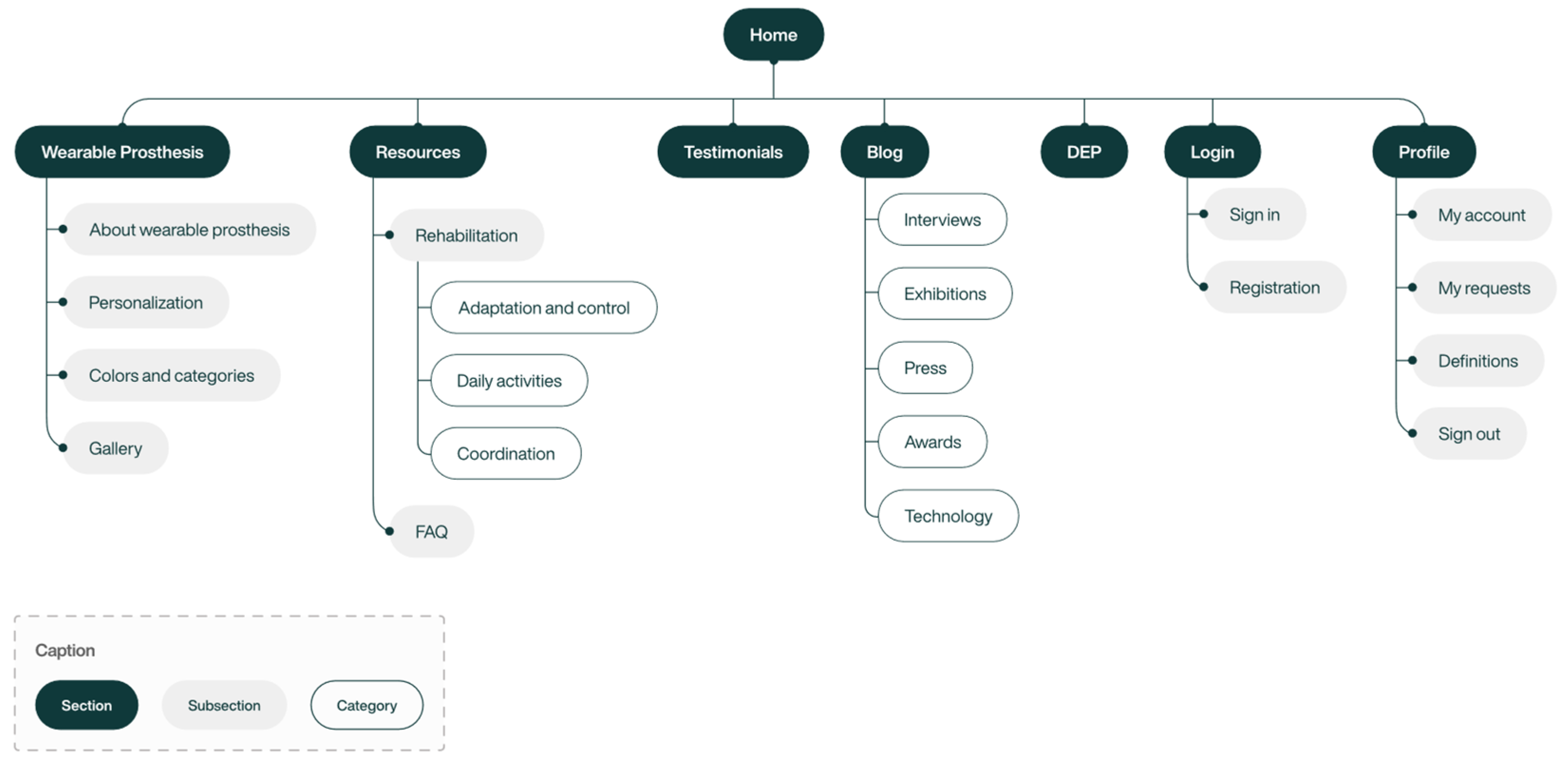
The information architecture (Figure 3) presents all the fundamental sections that define the structure of the platform interface, which is segmented into eight sections: Home, Wearable prosthesis, Resources, Testimonials, Blog, Dep, Login, and Profile.
This information architecture was developed with the aim of creating an intuitive and well-hierarchized interface, in order to ensure that users can easily navigate and understand all the available functionalities and sections. The priority was to ensure that users can quickly find what they are looking for and perform tasks simply and efficiently.

5.3. User Flows

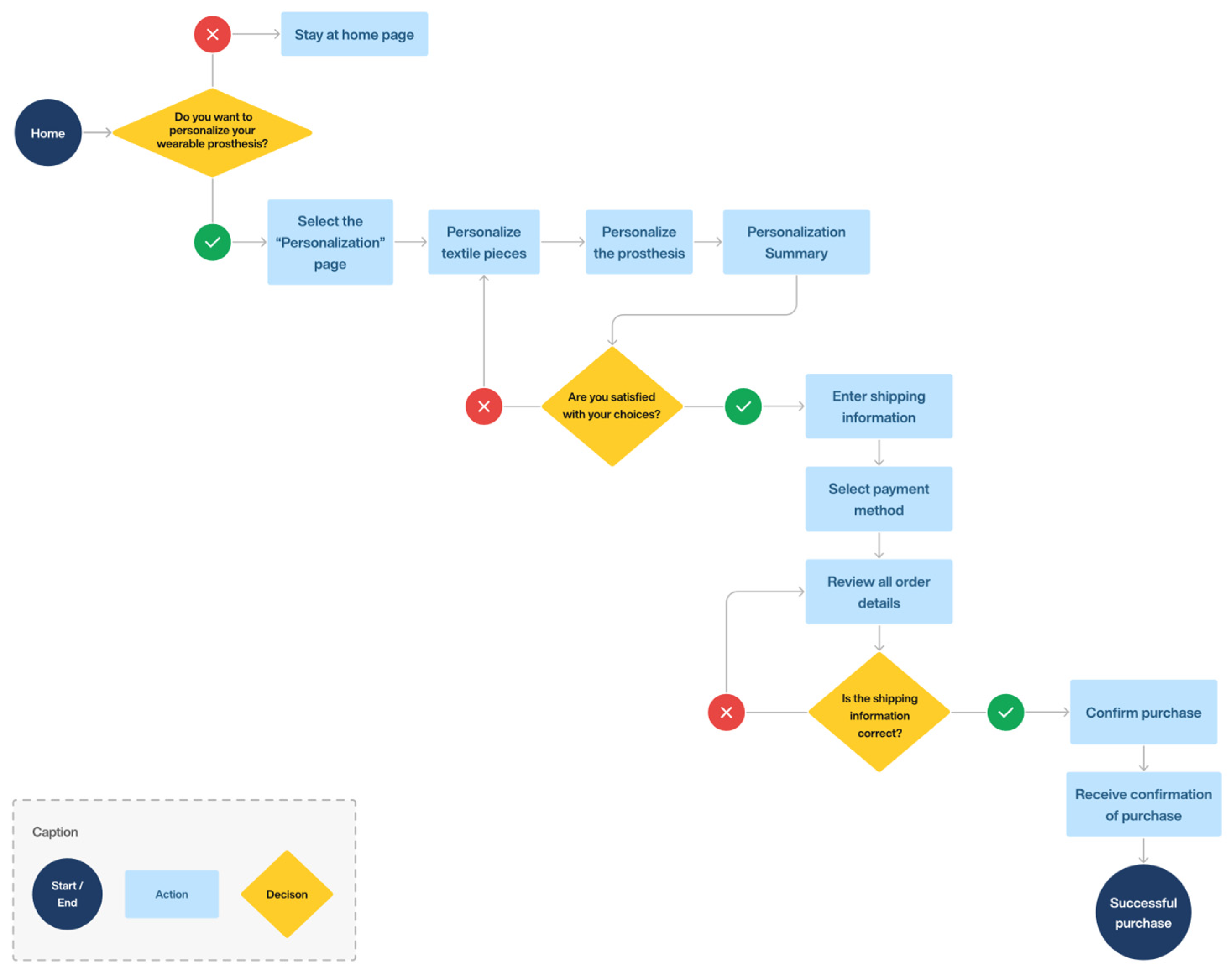
User flows are visual representations that demonstrate all the possible paths a user takes to achieve a specific goal when interacting with a product, from the entry point to the final interaction. These representations help ensure that the final product is intuitive and responsive to user needs. In this way, two main user flows were developed, specifically the login and the personalization and purchase process, which are applicable to all users.
The login user flow (Figure 4) demonstrates a fluid and intuitive experience, designed to facilitate users’ access to the platform quickly and efficiently. The user flow of the personalization and purchase process (Figure 5) presents a fluid and user-centered path, allowing the personalization and acquisition of prostheses in a simple, clear, and functional way. Both flows reflect a design focused on usability and user satisfaction.
After understanding the user interactions and navigation flows on the platform, we moved on to the wireframe and wireflow development phase. This step was essential to ensure that the layout structure and transitions between pages were intuitive, in order to effectively respond to users’ needs.

5.4. Wireframes and Wireflows

The wireframing process consists of creating potential solutions for the interface design, which demonstrate the organization and arrangement of essential elements, such as menus, buttons, text blocks, images, and videos. These representations focus on the structure and functionality of the interface, avoiding the inclusion of visual elements, such as color, graphics, or content, in order to ensure that there is no interference with the main focus [39]. In addition, wireflows integrate the visual structure of wireframes with the arrows and connections of user flows, which results in the description of user interactions and actions within the interface. This procedure reduces the likelihood of future errors and allows us to assess whether the design provides an intuitive and efficient user experience [40].
The information architecture developed was fundamental to starting the wireframes, as it enabled the efficient organization of the main contents and functionalities of the interface. This approach allowed for rapid exploration of design ideas, making it easier to visualize the different possibilities for layout and structuring the interface. Thus, wireframes served as a preliminary prototype to validate design ideas before moving on to more detailed phases of development.

5.5. Design System

After the wireframing process, a design system was developed (Figure 6), where essential visual elements such as color and typography were defined in order to ensure consistency and coherence across the platform.
In terms of color (Figure 6a), blue was chosen as the main color, recognized in the health sector for transmitting harmony, tranquility, security, and trust [41]. Furthermore, the blue was adapted to different shades, ensuring greater flexibility in the interface, and these were applied to elements such as buttons. Neutral colors were also defined, consisting of gray, white, and black, which were used in backgrounds and texts, and semantic colors that serve to communicate important information, such as green to indicate success, yellow for alerts, and red for errors. As for typography (Figure 6b), the Helvetica Now Display font was chosen, a modern sans serif font, recognized for its legibility and clean aesthetics, ideal for use in digital interfaces.
With the design system established, it was possible to move forward with its practical application in the interface, ensuring consistency and efficiency across all pages of the platform and resulting in the creation of a high-fidelity prototype.

5.6. Prototype

The prototype of the wearable prosthesis personalization platform was developed based on the previously established guidelines, with the purpose of evaluating their effectiveness.
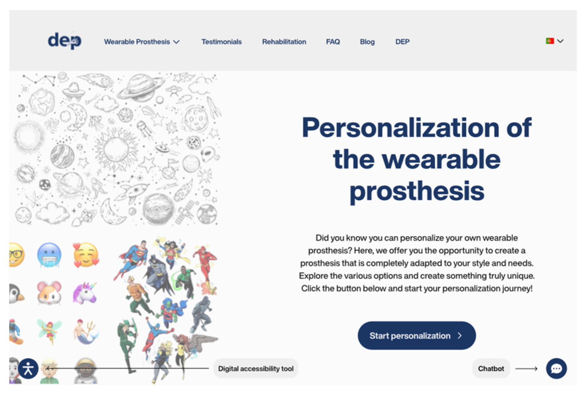
The platform was designed to offer a clear visual and functional experience, promoting intuitive and efficient navigation. To achieve this objective, priority was given to the hierarchy and adequate organization of the content, through clear titles and well-structured text blocks, in accordance with guidelines H (“implementation of visual hierarchy”) and N (“maintain a well-structured information architecture”). This approach allows users to quickly understand the structure of the platform, easily finding the desired information. Furthermore, it was sought to ensure the visual consistency of the interface by adopting a harmonious color palette, uniform layout, and legible typography, in line with guideline F (“maintain visual consistency in the interface”) (Figure 7).
The home page (Figure 7), as the main entry point for users Into the platform, was structured to offer a pleasant and intuitive experience. The information is organized in well-defined blocks with alternating background colors, white spaces and a harmonious arrangement of elements, applying guideline G (“maintain an aesthetic and minimalist design”). This approach favors readability and facilitates the understanding of information, allowing for fluid and efficient navigation. In addition to the visual structure, the homepage was designed to present the main functionalities and resources of the platform, providing the user with direct access to the most relevant information (Figure 7). This approach prioritizes clarity, eliminating unnecessary elements that could distract the user, in line with guideline G (“maintain an aesthetic and minimalist design”).
On the platform, the buttons were developed with a significant size, taking into account the precision difficulties of users with physical disabilities, applying guideline I (“appropriate interface elements”). To minimize the user’s memory load, each button includes explanatory text and provides visual feedback by changing its color when the cursor hovers over them, applying the L direction (“provide immediate feedback”). Additionally, special attention was paid to the presentation of information throughout the platform. A simple and familiar language was adopted in order to ensure that the information is easily understood by all users, regardless of their level of familiarity with technologies, following the O guideline (“use simple, familiar, and concise language”).
Regarding navigation, to minimize the user’s memory load, a fixed menu was implemented at the top of the platform, in which the page titles are clearly visible and properly identified, in line with guideline P (“minimize user memory load”) (Figure 8). This structure allows users to quickly find the desired information, facilitating interaction with the platform and providing a more accessible and satisfactory experience. Additionally, when hovering the cursor over the different sections of the menu, a line appears below the text, providing clear visual feedback and indicating clickable elements (Figure 8). This feature follows the L guideline (“provide immediate feedback”), ensuring intuitive and unambiguous navigation.
All pages on the platform feature a navigation hierarchy in the top left corner, which shows the user’s route within the platform, thus following guideline K (“implementation of navigation hierarchies”). The user’s current location is visually highlighted in bold, making it easy to clearly identify which page they are on. This indication is complemented by a visual navigation history, which displays the pages previously visited by the user, separated by the symbol “>” between the different navigation levels (Figure 8). This gives the user a clear view of their path within the platform, which increases confidence while browsing and allows them to easily return to previous sections. Additionally, the top menu provides visual feedback on the user’s current location, with a line below the section they are in, further reinforcing their orientation within the platform, in compliance with guideline L (“provide immediate feedback”) (Figure 8).
As a complement to the fixed menu, a footer was added that offers an alternative for accessing the platform’s various pages. This resource provides a comprehensive overview of all available sections, as well as direct links to essential pages such as terms of service, privacy policies, and other important resources. The footer acts as a reinforcement to the navigation structure, allowing users to access essential information anywhere on the platform. This approach aligns with the J guideline (“provide multiple navigation patterns”), ensuring that navigation is practical and efficient regardless of the user’s position in the interface. Thus, by integrating multiple navigation methods, accessibility for all users is improved.
To ensure even more inclusive navigation, all pages include a digital accessibility tool and a support chatbot (Figure 9). These features were designed to offer immediate assistance, especially to users with specific needs, in line with guidelines A (“provide interface adaptation”) and Q (“provide help and documentation”). The chatbot offers quick responses, while the digital accessibility tool allows the interface to be adjusted to the needs of each user. Together, these tools provide a more inclusive and accessible experience, allowing people with disabilities to interact more efficiently with the platform.
In addition to these features, a page dedicated to frequently asked questions has also been made available to ensure that users can quickly find answers to their questions, in line with the Q guideline (“provide help and documentation”). With these implementations, the platform ensures that all users, regardless of their limitations, have full control over their interaction, promoting a personalized, inclusive, and efficient browsing experience.
The personalization process was developed with a focus on simplicity and ease of use, ensuring that users can achieve their end goal efficiently and effectively. In this way, the M guideline (“clear structuring of interactions”) was applied, where the user is guided through clear and intuitive steps from the beginning of personalization to the completion of payment, thus simplifying interaction with the platform.
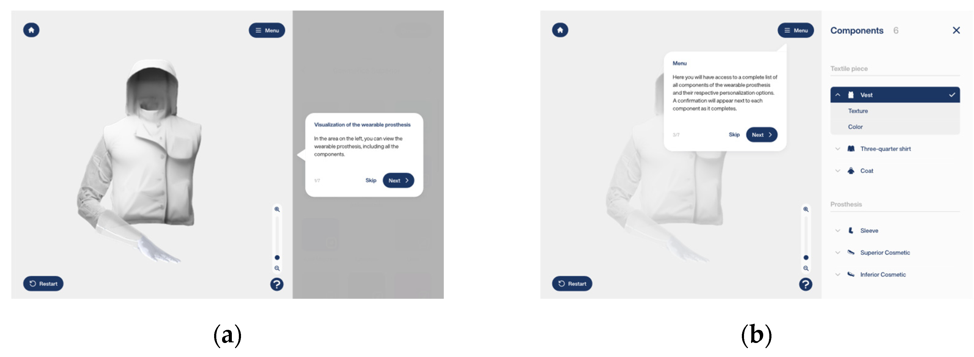
When accessing the personalization page, the user is greeted by an intuitive onboarding process that provides a complete introduction to the process (Figure 10). This guide details each available functionality and feature using clear, accessible language. The approach follows the Q guideline, which recommends providing help and documentation to make the platform easier to use. The goal of onboarding was to ensure the user understands all the options available to tailor their personalization experience, allowing for confident navigation and simplified interaction.
Furthermore, the personalization process is designed to provide complete flexibility to the user. During the steps, it is possible to undo, correct, or completely restart the process. This feature reinforces the feeling of control and freedom throughout the interaction, allowing the user to correct possible errors intuitively and efficiently. This approach is aligned with the S guideline, which emphasizes the importance of helping users recognize, diagnose, and correct errors. Additionally, to maintain consistency throughout the personalization process, the navigation flow is presented uniformly with “next” and “previous” buttons fixed to a top bar, ensuring fluid and predictable navigation. Likewise, personalization options and prosthetic visualization are presented consistently across all pages, creating a cohesive experience that aligns with guideline F (“maintain visual consistency in the interface”). Additionally, personalization options, namely colors, are accompanied by the universal ColorAdd code, a system that uses specific symbols to represent each color, ensuring that people with color blindness can identify them correctly.
In the payment process, the user will find a guided and organized experience, designed to provide clarity and peace of mind during the process. An information bar (Figure 11) was implemented that displays progress in real time, allowing the user to know what stage of the process they are at and what is missing for its completion, in line with guideline M (“clear structuring of interactions”). This functionality provides greater control and reduces anxiety about the next steps, reinforcing confidence and promoting a more satisfactory user experience. With these implementations, the personalization process not only makes the platform more accessible but also ensures that the user has continuous support at every step, from the initial entry to the completion of payment.
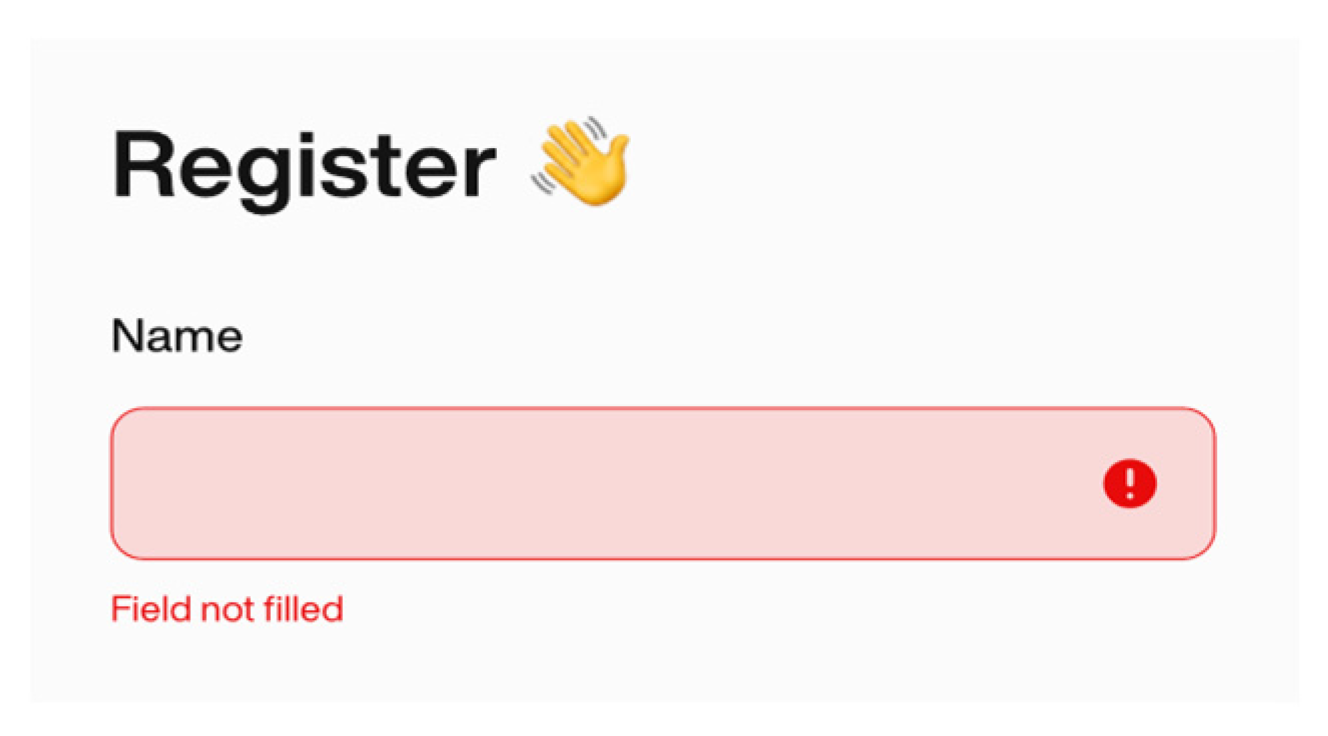
On the online platform, if the user does not fill in a mandatory field on the form, an error message is displayed, clearly identifying the problem (Figure 12). This functionality is aligned with the S guideline (“help recognize, diagnose, and correct errors”), which highlights the importance of providing clear and useful feedback in error situations. Error messages follow a consistent pattern in format, color, language, and position, making the interaction clearer and more understandable. These are designed to be visible and specific, highlighting the fields that need attention and explaining in a straightforward way what needs to be adjusted. This intuitively guides the user to solve the problem, which reduces frustration and increases efficiency when interacting with the platform.
Finally, the platform includes confirmation messages for critical actions (Figure 13), such as the option to restart the personalization process, in line with the R guideline (“prevent the occurrence of errors”). These messages are presented clearly and directly, explaining the implications of the action and offering options to confirm or cancel. Additionally, they have been implemented to ensure that the user has the opportunity to review their decision before proceeding, reducing the risk of accidental errors and ensuring that the user has full control over the process.
Some guidelines, such as B (“navigate by keyboard”), C (“incorporate subtitles”), D (“provide advance warnings”), and E (“use alternative texts”), were not implemented in the platform prototype. This limitation is due to the fact that the functionality required to meet these guidelines is beyond the currently feasible scope for development. Although these guidelines were not prioritized at this stage, it is recognized that their inclusion is essential to ensure a more inclusive and accessible browsing experience, especially for users with disabilities.
The platform was designed with a strong commitment to inclusion, especially prioritizing the needs of users with upper limb amputations. However, it goes beyond this audience, extending its functionalities to any person with a disability. The main objective was to create an accessible, personalized, and intuitive experience, so that everyone, without exception, can navigate and use the platform autonomously and satisfactorily.
Digital inclusion is one of the pillars of the platform, and to ensure this, a digital accessibility tool was incorporated that allows personalized adjustments to the interface, such as changing the font size and contrast. This way, it is possible to meet the specific needs of each user, allowing for fluid and obstacle-free navigation. Another fundamental implementation was the ColorAdd symbol system, which makes it easier for people with color blindness to identify colors, promoting a more inclusive and accessible visual experience.
Another important aspect was the guided onboarding, which offers a simple and clear tutorial on the interface in the customization process. This feature ensures that anyone, regardless of their level of familiarity with technology, can use the platform intuitively and without difficulty. To further facilitate interaction, the interface was designed with appropriate interactive elements, such as large and spaced buttons, which help users with motor difficulties to navigate without obstacles. The choice of accessible language was equally fundamental, allowing the content to be understood by different user profiles, including those with little digital experience.
In short, the platform was designed to be an inclusive, accessible and easy-to-use tool, with the aim of providing a barrier-free experience for people with different types of disabilities. Through features such as interface customization, guided onboarding and interactive elements designed to facilitate navigation, it guarantees autonomy, independence, and inclusion for all users.

5.7. Comparative Analysis of the Prototype with Similar Existing Platforms

After completing the development of the platform, a comparative analysis was carried out between the developed platform and the main platforms dedicated to the personalization of prostheses, previously analyzed in Section 4. This analysis aimed to evaluate the effectiveness of the developed platform in relation to fundamental criteria, such as usability, user experience, and available functionalities. Thus, Table 3 presents this comparative analysis, allowing a detailed view of the differences and similarities between the developed platform and the main solutions available on the market.
The analysis of the selected platforms allowed us to identify common characteristics and aspects that differentiate the DEP platform from its competitors.
All platforms analyzed are aimed at people with amputations. However, while some also serve clinics directly, DEP adopts a hybrid model, prioritizing users with amputations, but maintaining an essential connection with clinics. This connection begins when the user comes to the clinic to have their amputation scanned, recording fundamental information, such as the diameter of the stump and other data relevant to the adaptation of the prosthesis. Then, the user needs to register on the platform, entering an access code provided by the clinic, which contains their medical data.
On the DEP platform, the user has complete freedom to customize their prosthesis, choosing finishes, decorative elements, and other available options. After completing the customization and completing the purchase, the customization information is automatically integrated into the patient’s medical record and sent to the responsible clinic. Although customization is performed exclusively by the user, the production of the prosthesis takes place in a laboratory, under the supervision of prosthetists, ensuring precise manufacturing without interfering in the user’s creative process. Upon completing the prosthesis, the clinic contacts the user so that they can come to the unit and receive their prosthesis, along with instructions on its use and necessary care. This model ensures an efficient process, allowing the user to have autonomy in customization, while the clinic takes care of the technical part of production and adaptation.
Another distinctive aspect of DEP is that initially the platform will only be available in the desktop version, due to time constraints. However, as will be discussed in Section 7, future expansion to a mobile version is recommended, aiming at greater accessibility and convenience for users.
Regarding the personalization process, the DEP platform stands out for being the only one to offer detailed onboarding, guiding the user through all the options available in the interface and ensuring complete understanding of these. This feature provides an intuitive and accessible experience, allowing any user, regardless of their level of familiarity with technology, to navigate the platform simply and effectively. Furthermore, onboarding provides security throughout the process, enabling the personalization of the prosthesis to be carried out with confidence and autonomy.
Like the ALLELES, UNYQ, and Unlimited Tomorrow platforms, DEP allows online personalization of the prosthesis. However, it resembles ALLELES in offering real-time visualization of changes. Furthermore, similar to ALLELES and Unlimited Tomorrow, DEP provides a 360-degree visualization feature of the prosthesis, allowing the user to explore every detail of the final design before production, ensuring a more realistic perception of the final product.
In terms of resources, DEP incorporates a set of rehabilitation exercises, a feature also presented in Open Bionics. However, DEP differentiates itself by segmenting exercises into specific categories, such as adaptation and control, daily activities, and coordination, offering support that is more targeted to users’ needs. Furthermore, the DEP platform goes beyond traditional aesthetic personalization options by allowing the inclusion of illustrative elements in the prosthesis. This level of personalization can have a significant impact on the user’s self-esteem and identity, making the prosthesis more personalized and aligned with their personal style. On the other hand, like other platforms, DEP also presents testimonials from users who purchased the prosthesis, including real images that reinforce the credibility and reliability of the product offered. Additionally, like most competing platforms, DEP has a blog that has categories such as exhibitions, awards and achievements.
Regarding digital accessibility, DEP, like Unlimited Tomorrow, provides an interface personalization tool, considering specific needs, such as color blindness and dyslexia. In addition, the platform has a chatbot to quickly answer users’ questions. However, DEP stands out as the only one that combines a digital accessibility tool, a chatbot, and a language switching feature with multiple language options. This integration makes DEP a more complete solution, ensuring an inclusive, intuitive and adaptable experience for different user profiles, facilitating access and usability for a wider audience.
Overall, the DEP platform stands out for its comprehensive approach, integrating features that provide a complete, inclusive and fluid experience for users. Differentiating itself from traditional solutions, DEP offers a detailed onboarding that makes the interface easier to understand, a real-time visualization system that allows users to instantly follow the changes made and a 360-degree visualization functionality, providing a realistic perception of the prosthesis before finalizing the purchase. Additionally, the platform enriches the user experience by including targeted rehabilitation exercises, advanced personalization options, and an informative blog. With this approach, DEP consolidates itself as one of the most complete solutions on the market, offering not only an innovative product, but also an intuitive and efficient experience. However, it is worth noting that the future integration of additional accessibility features, the development of a mobile version of the platform and greater collaboration with clinics can make it even more complete, reinforcing its prominent position in the market.

6. Usability Testing

After the prototype was developed, usability tests were carried out with the aim of evaluating the effectiveness, efficiency, and satisfaction of users when browsing the platform. In usability testing, Nielsen’s iterative process [42] was followed, which recommends that each test include a minimum of 5 users and in total involve at least 15 users in order to detect all usability problems in the design.
In this sense, four in-person testing sessions were held, where the prototype was refined based on the feedback received in each phase. The first three phases had five participants each, while the last phase had two. The first session involved participants with high levels of digital literacy, aged between 22 and 41 years old. The second session involved participants with training and experience in the field of interface design, aged between 22 and 26, who provided valuable feedback in terms of user experience, visual aesthetics, and the accessibility of the prototype. The third session included participants from an older age group, between 48 and 55 years old, with low levels of digital literacy, which were essential to assess the usability of the platform by less experienced users. The last session featured participants with physical disabilities—one with a shoulder disarticulation and another with a wrist disarticulation—aged between 48 and 62, who were essential to assess the usability of the platform by users with physical limitations.
Participants performed a series of tasks using the computer, with the intention of collecting feedback on the platform under analysis. The tasks were presented individually, and the behavior of each user was analyzed and recorded during their execution. Subsequently, participants answered the System Usability Scale (SUS) post-test questionnaire, developed by Brooke [30,31], allowing quantitative measurement of the prototype’s usability, on a scale of 0 to 100. The SUS allowed for a simple and effective assessment of the degree of usability and user satisfaction when interacting with the prototype.

Usability Test Results

In the first testing session, users with high levels of digital literacy reported using the internet daily and said they felt confident when browsing online. Participants found the platform intuitive, easy to use and aesthetically pleasing. They also emphasized the organization of information and the harmony between textual and visual content, with images playing a complementary and elucidative role. Additionally, the homepage was praised for its organized structure, being valued for its direct and clear access to the platform’s main features and content. The average SUS results were 90 points, classifying the platform’s usability as “best imaginable”, according to the evaluation scale proposed by Sauro [32] (Table 4). After the first phase, some improvements were implemented, such as reducing the number of verifications when creating an account.
In the second phase of usability testing, participants with training and experience in interface design confirmed their daily use of the internet and reported feeling very confident when browsing online. They found the platform intuitive, aesthetically pleasing, and easy to use, highlighting the balance between the amount of textual information and images, which contributed to a clear and well-structured presentation. The onboarding process related to personalization was particularly praised, highlighting the clarity and fluidity of the instructions, which made understanding the process simple and straightforward. Additionally, the organization of the personalization options was also a praised aspect, with participants noting that the options were arranged in a logical and visually accessible way, which made it easier to identify them quickly. The average SUS results were 92.5 points, classifying the platform’s usability as “best imaginable” (Table 5). After this second phase, some improvements were implemented, such as adjusting the contrast of the “Home” button in the personalization process.
In the third phase of usability testing, carried out with participants from older age groups and low levels of digital literacy, it was observed that these users were not very familiar with navigating platforms. Despite this limitation, all participants reported feeling confident using the internet. Furthermore, some participants mentioned that they do not have the habit of using a computer, preferring to use their cell phones for their online activities. All participants found the platform intuitive, aesthetically pleasing, easy to use, accurate, and concise. Furthermore, they highlighted that the images complemented the information well and that the navigation menu was well structured. During the tests, it was observed that participants who were not used to using the computer faced difficulties in handling the mouse; however, they were able to complete the tasks without any major problems. The average SUS results were 79.5 points, classifying the platform’s usability as “good” (Table 6).
In the final phase of usability testing, participants with physical disabilities confirmed daily internet use and reported feeling confident when browsing online. During the tests, it was observed their familiarity with navigating platforms, their ease in interacting with the platform’s interactive elements and in carrying out the proposed tasks. Participants highlighted several positive aspects of the interface, describing it as visually appealing, with a clear organization of information and an intuitive menu that made it easy to navigate the platform. The onboarding process was highlighted as a valuable resource for providing clear and helpful guidance, making it easy to understand the entire personalization process. Participants noted the personalization process as simple and well-guided, with all options properly organized and easily recognizable. The presence of images alongside textual information was also highlighted, and according to participants, these images, in addition to making the page content less dense, reinforce the information and convey greater confidence. The average SUS results were 86.25 points, classifying the platform’s usability as “best imaginable” (Table 7).
In addition to validating the usability and intuitiveness of the platform, participants with disabilities played an essential role in improving the design, providing suggestions that were integrated into the final version. During testing, they identified inconsistencies in the login process, resulting in adjustments to make navigation more fluid. Although the sample was small, the contribution of this group reinforces the importance of involving users with upper limb amputations at all stages of development, ensuring that their specific needs are considered from the early stages of design.
Taking into account all usability testing sessions, data from the SUS questionnaires were gathered to obtain an overview of the platform’s usability. According to Sauro [32], a score of 80 or higher in the SUS is required for a platform’s usability to be classified among the top 10%. Thus, as shown in Table 8., the developed prototype obtained an average of 87.06 points, which gives it an “A+” grade, indicating that the platform’s usability is considered to be the “best imaginable”.
The usability test results confirmed that the developed platform meets the needs of users with physical disabilities as well as other users, regardless of their level of familiarity with technology or age group. Overall, participants found the platform intuitive, easy to navigate, and aesthetically pleasing. The effective use of images and the clear organization of the content were highlighted positively, contributing to a better understanding of the information.
Even among users with low levels of digital literacy, there was a feeling of confidence when interacting with the platform. Specific difficulties, such as handling the mouse, did not prevent participants from completing the proposed tasks, demonstrating that the platform is accessible even for less experienced audiences.
Additionally, the data collected through the SUS questionnaires revealed a positive assessment of the platform’s usability, with a high score, indicating a satisfactory user experience. Thus, it can be concluded that the platform meets the usability requirements, providing a pleasant, intuitive, and efficient experience to all users, including those with physical disabilities.

7. Discussion, Conclusions, and Future Work

Based on an in-depth literature review, a set of good practice guidelines for interface design were studied and defined in order to fulfill the objective of developing a prototype, an inclusive online platform that enables its users, namely citizens with disabilities, to personalize and purchase wearable prosthetics.
The results obtained confirmed much of the evidence found in the literature review, reinforcing the importance of user-centered design. With regard to design, it has been found that visually clean and consistent interfaces, with a clear organization of content and well-structured elements, play a fundamental role in promoting a satisfactory, fluid, and intuitive navigation experience [20,22,23,24,28]. It was also evident that the implementation of well-designed menus and clearly evident hierarchies facilitates user navigation through the platform [17,20,22,24]. Structuring interactions into clear steps proves particularly effective in more complex processes, helping to simplify the user experience and promote greater clarity at each step [21]. As for information, it has been shown that interactive elements with clear descriptions of their functions, combined with adequate dimensions, contribute to comfortable and intuitive interaction [17,20,23,24,28]. In parallel, the use of simple and objective language facilitates the understanding of the information presented, making the platform accessible to different user profiles [17,18,20,28]. When it comes to error prevention and correction, it was noticeable that implementing confirmation messages for critical actions reduces the likelihood of unwanted errors, while clear error messages help users diagnose and correct problems effectively, minimizing frustration and promoting a positive experience [17,20,22,23].
The results of the usability tests and the scores obtained in the SUS questionnaires demonstrated the high usability of the designed online platform, as well as the viability of the Design guidelines resulting from this study. The application of usability tests proved to be an essential step in the design process, allowing not only the validation of the proposed solution, but also the identification of opportunities for improvement.
The “Design Thinking” methodology played a fundamental role in the development of the platform. This approach enabled a broad understanding of the needs and particularities of a person with an amputation. Steps such as creating personas, developing information architecture, defining user flows, and creating wireframes and wireflows, combined with usability testing, allowed us to achieve a precise understanding of user profiles and their specific needs.
This study demonstrated that interface design, when implemented rigorously, contributes significantly to the inclusion of users with disabilities, providing accessible and intuitive navigation.
Although this study achieved the established objectives, it presented some limitations that must be corrected.
Firstly, the sample of participants used in the tests was limited, which may have restricted the generalization of the results. Thus, in terms of future work, the importance of expanding the sample of participants is highlighted, especially with the inclusion of users with amputations, in order to enable a study with greater representation. Additionally, it would be pertinent to carry out tests with users with amputations who already use prosthetics, in order to better understand how they interact with their prothesis in the platform environment. Furthermore, it is essential to perform usability testing with a more diverse group, particularly individuals with visual, hearing, cognitive, and speech impairments, to ensure that the platform is accessible and fully meets the needs of these users.
Another limitation concerns the exclusive focus on the desktop version of the platform, resulting from time limitations. Therefore, for future work, it would be pertinent to develop a mobile version, considering the additional challenges that this adaptation may present.
In addition to the future work already mentioned, there are several initiatives that can add significant value to both the development of the platform and the user experience, in addition to contributing to increasing the scalability of the platform. One way would be to integrate Artificial Intelligence, which could revolutionize the way users customize their prosthetics. AI could analyze design preferences, offering automatic and highly personalized recommendations, and this would be possible through a questionnaire, in which the user would provide information about their lifestyle and aesthetic preferences. Another essential strategy would be the creation of strategic partnerships with rehabilitation clinics and hospitals. By establishing solid connections with these establishments, the platform could be directly recommended to patients who are in the rehabilitation process and need customized prosthetics. This would not only increase the user base but also validate the platform as a reliable and professional tool in the field of healthcare and rehabilitation. Still within the scope of expanding the user experience, an interesting functionality would be the possibility of remote monitoring of the prosthesis. This would allow doctors or physiotherapists to monitor, in real time, the patient’s adaptation to the prosthesis, being able to make adjustments remotely, without the need for face-to-face consultations.
Another relevant point for future work would be the expansion of the platform to different devices, aiming at a more accessible, intuitive, and efficient experience in the personalization of wearable prostheses. One such possibility is integration with Augmented Reality, which would allow users to view, in real time, three-dimensional models of their prosthetics directly on their limbs, facilitating style adjustments before manufacturing. Using compatible devices, such as smartphone cameras or augmented reality glasses, users could interact with the interface more intuitively, virtually trying out different personalizations and identifying the best option for their needs.
Furthermore, it is suggested that the platform be technically implemented in a real environment, which would be essential to evaluate its practical efficiency and collect valuable feedback on user interaction with the platform. Based on these insights, it would be possible to make adjustments and refinements, ensuring that the platform evolves in line with the real needs of users. During the implementation of the platform, it is recommended to integrate accessibility features, such as voice commands, keyboard navigation, and text dictation, as these features are essential to provide a more accessible and inclusive experience for users with upper limb motor limitations. The adoption of these features would significantly improve usability, promoting greater autonomy and facilitating user interaction with the platform.
Finally, it would be important to apply, test and validate the guidelines that were not applied in this study, namely, B, C, D, and E: “Navigate using the keyboard”, “Incorporate subtitles”, “Provide advance warnings” and “Use alternative texts”. Implementing and testing these guidelines are fundamental steps to ensuring even more comprehensive accessibility, consolidating the platform as an effective solution for a diverse audience.
By implementing these future works, it is expected to significantly improve the platform, making it not only more accessible but also more inclusive for users with amputations.
In summary, the design process described and the set of guidelines presented in this article offer a robust model that can be applied to other digital solutions that aim to include users with disabilities. This study highlights how user-centered design can transform the digital experience into something more inclusive, efficient, and accessible for this type of user.

Author Contributions

Conceptualization, S.P., N.M., D.M. (Demétrio Matos), D.M. (Daniel Miranda), and V.C.; methodology, S.P., N.M., D.M. (Demétrio Matos), and V.C.; software, S.P., N.M., D.M. (Demétrio Matos), and V.C.; validation, S.P., N.M., D.M. (Demétrio Matos), and V.C.; formal analysis, S.P., N.M., D.M. (Demétrio Matos), and V.C.; investigation, S.P., N.M., D.M. (Demétrio Matos), D.M. (Daniel Miranda), and V.C.; resources, S.P., N.M., D.M. (Demétrio Matos), and V.C.; data curation, S.P., N.M., D.M. (Demétrio Matos), D.M. (Daniel Miranda), and V.C.; writing—original draft preparation, S.P., N.M., D.M. (Demétrio Matos), D.M. (Daniel Miranda), and V.C.; writing—review and editing, S.P., N.M., D.M. (Demétrio Matos), and V.C.; visualization, S.P., N.M., D.M. (Demétrio Matos), and V.C.; supervision, N.M., D.M. (Demétrio Matos), and V.C.; project administration, N.M., D.M. (Demétrio Matos), and V.C.; funding acquisition, D.M. (Demétrio Matos), D.M. (Daniel Miranda) and V.C. All authors have read and agreed to the published version of the manuscript.

Funding

This research was funded through FCT—Fundação para a Ciência e a Tecnologia, I.P., in the framework of the project «Ref: PeX_2022.09053.PTDC», as well as under the projects UIDB/05549:2Ai and UIDP/05549:2Ai. Additional support was provided by a Research Grant with the reference IPCA|ID+|BI-03/2023|UIDP/04057/2020.

Data Availability Statement

Data are contained within the article.

Conflicts of Interest

The authors declare no conflicts of interest.

Abbreviations

The following abbreviations are used in this manuscript:
DEPDesign and embodiment of wearable protheses
FCTFoundation for Science and Technology
UIUser Interface
W3CWorld Wide Web Consortium
WCAGWeb Content Accessibility Guidelines
FAQFrequently Asked Questions
SUSSystem Usability Scale
UXUser Experience
AIArtificial Intelligence

References

  1. Polytechnic University of Cávado and Ave. Design and Embodiment of Wearable Protheses. 2023. Available online: https://knowledge.ipca.pt/research-management/projects/36 (accessed on 8 November 2023).
  2. ID+ Research Institute for Design, Media and Culture. Design and Embodiment of Wearable Protheses. 2024. Available online: https://idmais.org/project/dep/ (accessed on 20 January 2024).
  3. WHO. Assistive Technology. 2024. Available online: https://www.who.int/news-room/fact-sheets/detail/assistive-technology (accessed on 10 February 2024).
  4. Ibanez-Arricivita, I.; Blackler, A.; Woodruff, M.; Swann, L.; Winter, A. A Co-Design Approach to Aesthetic Customization of Prosthetics. In DRS2024: Boston; Gray, C., Chehade, E., Hekkert, P., Forlano, L., Ciuccarelli, P., Lloyd, P., Eds.; Design Research Society: London, UK, 2024. [Google Scholar]
  5. Sansoni, S.; Speer, L.; Wodehouse, A.; Buis, A. Aesthetic of Prosthetic Devices: From Medical Equipment to a Work of Design. In Emotional Engineering Volume 4, 1st ed.; Fukuda, S., Ed.; Springer: Cham, Switzerland, 2016; pp. 73–92. [Google Scholar]
  6. Stevens, E. What Is UI Design? A Complete Guide for 2025; UX Design Institute: Dublin, Ireland, 2024; Available online: https://www.uxdesigninstitute.com/blog/what-is-ui-design/ (accessed on 14 December 2024).
  7. Contents, A. Qual a Diferença Entre UX e UI Design?—Entenda de uma vez; UX Collective: New York, NY, USA, 2019; Available online: https://medium.com/aela/qual-a-diferen%C3%A7a-entre-ux-e-ui-design-entenda-de-uma-vez-95b4aeb68479 (accessed on 20 November 2023). (In Portuguese)
  8. Indeed. What Is User Interface (UI)? 2024. Available online: https://www.indeed.com/career-advice/career-development/user-interface (accessed on 3 October 2024).
  9. Garrett, J. The Elements of User Experience: User-Centered Design for the Web and Beyond, 2nd ed.; New Riders Publishing: Thousand Oaks, CA, USA, 2011. [Google Scholar]
  10. Nielsen, J. What Is UX? (Part 1 of 2 of Jakob Nielsen’s UX Basics Article). 2023. Available online: https://jakobnielsenphd.substack.com/p/what-is-ux (accessed on 10 November 2023).
  11. Norman, D.; Nielsen, J. The Definition of User Experience (UX); Nielsen Norman Group: Dover, DE, USA, 2009; Available online: https://www.nngroup.com/articles/definition-user-experience/ (accessed on 28 October 2023).
  12. Morville, P. User Experience Design; Semantic Studios: Scottsville, VA, USA, 2004; Available online: https://semanticstudios.com/user_experience_design/ (accessed on 12 May 2023).
  13. Wesolko, D. Peter Morville’s User Experience Honeycomb; UX Collective: New York, NY, USA, 2016; Available online: https://danewesolko.medium.com/peter-morvilles-user-experience-honeycomb (accessed on 20 May 2023).
  14. WHO. Disability. 2023. Available online: https://www.who.int/news-room/fact-sheets/detail/disability-and-health (accessed on 15 July 2023).
  15. United Nations. Article 9—Accessibility. 2023. Available online: https://social.desa.un.org/issues/disability/crpd/article-9-accessibility (accessed on 26 July 2023).
  16. W3C. Introduction to Web Accessibility. 2024. Available online: https://www.w3.org/WAI/fundamentals/accessibility-intro/ (accessed on 28 May 2024).
  17. W3C. Web Content Accessibility Guidelines (WCAG) 2.2. 2023. Available online: https://www.w3.org/TR/WCAG22/ (accessed on 9 June 2023).
  18. Vettorino, M.Z. Web Accessibility: The Ultimate Guide; HubSpot: Cambridge, MA, USA, 2024; Available online: https://blog.hubspot.com/website/web-accessibility (accessed on 20 June 2024).
  19. Nielsen, J. Usability 101: Introduction to Usability; Nielsen Norman Group: Dover, DE, USA, 2012; Available online: https://www.nngroup.com/articles/usability-101-introduction-to-usability/ (accessed on 16 January 2024).
  20. Nielsen, J. 10 Usability Heuristics for User Interface Design; Nielsen Norman Group: Dover, DE, USA, 2023; Available online: https://www.nngroup.com/articles/ten-usability-heuristics/ (accessed on 2 August 2023).
  21. Schroeter, E. 11 Usability Heuristics Every Designer Should Know; CareerFoundry: Berlin, Germany, 2023; Available online: https://careerfoundry.com/en/blog/ux-design/usability-heuristics/ (accessed on 20 August 2023).
  22. Tidwell, J. Designing Interfaces, 2nd ed.; O’Reilly Media: Sebastopol, CA, USA, 2010. [Google Scholar]
  23. Shneiderman, B.; Plaisant, C.; Cohen, M.; Jacobs, S.; Elmqvist, N.; Diakopoulos, N. Designing the User Interface: Strategies for Effective Human-Computer Interaction, 6th ed.; Pearson: London, UK, 2018. [Google Scholar]
  24. Krug, S. Don’t Make Me Think, Revisited: A Common Sense Approach to Web Usability, 3rd ed.; New Riders: Indianapolis, IN, USA, 2014. [Google Scholar]
  25. Kendrick, A. Inclusive Design; Nielsen Norman Group: Dover, DE, USA, 2022; Available online: https://www.nngroup.com/articles/inclusive-design/ (accessed on 27 November 2023).
  26. IDRC. What Is Inclusive Design? 2022. Available online: https://idrc.ocadu.ca/about/philosophy/ (accessed on 8 December 2024).
  27. Vinney, C. 7 Principles of Universal Design to Make Your UX Inclusive; CareerFoundry: Berlin, Germany, 2021; Available online: https://careerfoundry.com/en/blog/ux-design/universal-design-principles/ (accessed on 6 December 2023).
  28. Swan, H.; Pouncey, I.; Pickering, H.; Watson, L. Inclusive Design Principles. 2017. Available online: https://inclusivedesignprinciples.info/ (accessed on 3 December 2023).
  29. Gibbons, S. Design Thinking 101; Nielsen Norman Group: Dover, DE, USA, 2016; Available online: https://www.nngroup.com/articles/design-thinking/ (accessed on 9 March 2024).
  30. Brooke, J. SUS: A ‘Quick and Dirty’ Usability Scale. In Usability Evaluation in Industry, 1st ed.; Jordan, P., Thomas, B., McClelland, I., Weerdmeester, B., Eds.; Taylor & Francis: London, UK, 1996; pp. 189–194. [Google Scholar]
  31. Brooke, J. SUS: A retrospective. J. USA Stud. 2013, 8, 29–40. [Google Scholar]
  32. Sauro, J. 5 Ways to Interpret a SUS Score; Measuringu: Denver, CO, USA, 2018; Available online: https://measuringu.com/interpret-sus-score/ (accessed on 28 August 2024).
  33. ALLELES Design Studio. 2023. Available online: https://alleles.ca/ (accessed on 5 December 2023).
  34. UNYQ. 2023. Available online: https://unyq.com/ (accessed on 15 December 2023).
  35. Unlimited Tomorrow. 2024. Available online: https://www.unlimitedtomorrow.com/ (accessed on 20 January 2024).
  36. Open Bionics. 2024. Available online: https://openbionics.com/en/ (accessed on 13 February 2024).
  37. Esper Bionics. 2023. Available online: https://esperbionics.com/ (accessed on 27 December 2023).
  38. Peixoto, S.; Martins, N.; Matos, D.; Carvalho, V.; Miranda, D. Dep-Project: Comparative Analysis of Online Solutions Aimed at Personalization and Purchasing Prostheses. In Advances in Design and Digital Communication IV, 1st ed.; Martins, N., Brandão, D., Eds.; Springer: Cham, Switzerland, 2024; Volume 35, pp. 184–199. [Google Scholar]
  39. Soegaard, M. How to Create Wireframes: An Expert’s Guide; Interaction Design Foundation: Aarhus, Denmark, 2023; Available online: https://www.interaction-design.org/literature/article/create-wireframes (accessed on 20 June 2024).
  40. Laubheimer, P. Wireflows: A UX Deliverable for Workflows and Apps; Nielsen Norman Group: Dover, DE, USA, 2016; Available online: https://www.nngroup.com/articles/wireflows/ (accessed on 28 June 2024).
  41. Clemente, M. Psicologia das Cores: Descubra o Significado (e o Poder) de Cada cor no Marketing; Rock Content: São Paulo, Brazil, 2024; Available online: https://rockcontent.com/br/blog/psicologia-das-cores/ (accessed on 2 July 2024). (In Portuguese)
  42. Nielsen, J. Why You Only Need to Test with 5 Users; Nielsen Norman Group: Dover, DE, USA, 2000; Available online: https://www.nngroup.com/articles/why-you-only-need-to-test-with-5-users/ (accessed on 16 August 2024).
Figure 1. Design process flowchart.
Designs 09 00039 g001
Figure 2. System Usability Scale (SUS) (adapted from [32]).
Designs 09 00039 g002
Figure 3. Platform information architecture organization chart.
Designs 09 00039 g003
Figure 4. Login user flow.
Designs 09 00039 g004
Figure 5. Personalization and purchasing process user flow.
Designs 09 00039 g005
Figure 6. Design System: (a) Platform color palette; (b) typographic sizes used on the platform.
Designs 09 00039 g006
Figure 7. Homepage: (a) Header of the platform, sections of the prosthesis personalization and everything about them, with the respective buttons; (b) Testimonials and rehabilitation sections with respective buttons and a footer.
Designs 09 00039 g007
Figure 8. Navigation menu and user’s current location on the platform.
Designs 09 00039 g008
Figure 9. Digital accessibility tool and a support chatbot.
Designs 09 00039 g009
Figure 10. Onboarding of the personalization process: (a) Visualization of the wearable prosthesis; (b) personalizable components.
Designs 09 00039 g010
Figure 11. Payment process information bar.
Designs 09 00039 g011
Figure 12. Error message informing the error made.
Designs 09 00039 g012
Figure 13. Confirmation message regarding personalization restart.
Designs 09 00039 g013
Table 1. Comparative analysis of functionality of the digital platforms.
PlatformsALLELES
Design Studio
UNYQUnlimited
Tomorrow
Open
Bionics
Esper
Bionics
Target audience:
people with amputations
XXXXX
Target audience: clinicsXXXXX
User adaptation X
RegistrationXX X
Online personalization of the prosthesisXXX
360-degree visualization of the prosthesisX X
Covers and/or colors of the prosthesisXXXX
Occupational therapy X
Stories of people with amputationsXXXX
News and/or blogXXXX
Images of the product in useXXXXX
Variety of languages X
Digital accessibility X
ChatbotXXX
Responsive platformXXXXX
Visibility of system statusXXXXX
Match between the system and the real worldXXXXX
User control and freedomX X
Consistency and standardsXXXXX
Error preventionXXXXX
Recognition rather than recallXXXXX
Flexibility and efficiency of use X
Aesthetic and minimalist designXXXXX
Help users recognize, diagnose and recover from errorsXXXX
Help and documentationXXXX
Table 2. User personas.
CategoriesPersona 1Persona 2Persona 3
NameEduarda OliveiraRaul GarciaCarolina Santos
Age24 years old33 years old45 years old
OccupationFashion designerSurf instructorFull time mother
DescriptionAfter losing part of her right arm as a teenager due to a road
accident, she faced challenges when adapting to a life with a prosthesis that, although
functional, doesn’t reflect her identity.
He recently had his right arm amputated in a surfing
accident. He hasn’t yet
purchased a prosthesis because he has had difficulty finding one that meets his aesthetic preferences. He recognizes the importance of exercise as a part of recovery and reintegration into surfing.
Carolina is the mother of
Francisca, who was born with a congenital disability in her left arm. She is committed to
finding a personalized
prosthetic that meets her daughter’s aesthetic tastes. However, she has color
blindness, which affects her color perception and can make the process of personalizing her daughter’s prosthesis difficult.
GoalsMore comprehensive
personalization options, so she can adapt the design, style and details according to her aesthetic
preferences.
Acquire a prosthesis that not only meets his functional needs, but also his aesthetic and
personal preferences.
A platform that considers not only daughter Francisca’s
aesthetic preferences, but also her own visual condition.
She seeks access to testimonials from people with similar
experiences, as he believes that
listening to other people’s stories and reports can be valuable
emotional support.
Find practical resources to help him on his recovery journey.She wants to easily navigate the process of personalizing and purchasing her daughter’s
prosthesis.
FrustrationsLack of personalization options that suit her aesthetic
preferences.
Scarcity of personalization
options that match his aesthetic and individual preferences.
She can’t personalize a
prosthetic because the
platforms she finds don’t take her color blindness into
account.
Lack of visualization of the
prostheses from various points of view, as well as in detail.
Lack of different types of
exercises that help him with his rehabilitation.
Her colorblind condition makes it difficult to select certain
colors and designs, which makes her worried about the
final appearance.
Table 3. Comparative analysis of the prototype with similar existing platforms.
PlatformsDEPALLELES
Design Studio
UNYQUnlimited
Tomorrow
Open
Bionics
Esper
Bionics
Target audience:
people with
amputations
XXXXXX
Target audience:
clinics
XXXXX
User adaptationX X
RegistrationXXX X
Onboarding on
prosthesis
personalization
X
Online
personalization
of the prosthesis
XXXX
360-degree
visualization
of the prosthesis
XX X
Covers and/or colors of the prosthesisXXXXX
Occupational therapyX X
Stories of people
with amputations
XXXXX
News and/or blogXXXXX
Images of the
product in use
XXXXXX
Variety of languagesX X
Digital accessibilityX X
ChatbotXXXX
Responsive platform XXXXX
Visibility of system statusXXXXXX
Match between the system and the real worldXXXXXX
User control and freedomXX X
Consistency and standardsXXXXXX
Error preventionXXXXXX
Recognition rather than recallXXXXXX
Flexibility and
efficiency of use
X X
Aesthetic and
minimalist design
XXXXXX
Help users recognize, diagnose and recover from errorsXXXXX
Help and
documentation
XXXXX
Points242019221710
Table 4. Results of the SUS questionnaires from the first testing session.
ParticipantEducationDigital LiteracySUS ResultGradeAdjective
112th GradeHigh97.5A+Best Imaginable
2BachelorHigh85A+Best Imaginable
3BachelorHigh85A+Best Imaginable
4BachelorHigh100A+Best Imaginable
5MasterHigh82.5AExcellent
Table 5. Results of the SUS questionnaires from the second testing session.
ParticipantEducationDigital LiteracySUS ResultGradeAdjective
1BachelorHigh95A+Best Imaginable
2BachelorHigh92.5A+Best Imaginable
3BachelorHigh90A+Best Imaginable
4MasterHigh90A+Best Imaginable
5BachelorHigh95A+Best Imaginable
Table 6. Results of the SUS questionnaires from the third testing session.
ParticipantEducationDigital LiteracySUS ResultGradeAdjective
112th GradeVery low75BGood
212th GradeMedium82.5AExcellent
312th GradeMedium90A+Best Imaginable
412th GradeLow77.5B+Good
512th GradeLow72.5C+Good
Table 7. Results of the SUS questionnaires from the fourth testing session.
ParticipantEducationDigital LiteracySUS resultGradeAdjective
1BachelorHigh82.5AExcellent
212th GradeHigh90A+Best Imaginable
Table 8. Results of the average of the SUS questionnaires.
Testing SessionsSUS ResultFinal SUS AverageGradeAdjective
190(90 + 92.5 + 79.5 + 86.25)/4 = 87.06A+Best Imaginable
292.5
379.5
486.25
Disclaimer/Publisher’s Note: The statements, opinions and data contained in all publications are solely those of the individual author(s) and contributor(s) and not of MDPI and/or the editor(s). MDPI and/or the editor(s) disclaim responsibility for any injury to people or property resulting from any ideas, methods, instructions or products referred to in the content.