

The Influence of Packaging Color on Consumer Perceptions of Healthfulness: A Systematic Review and Theoretical Framework

Abstract
:1. Introduction
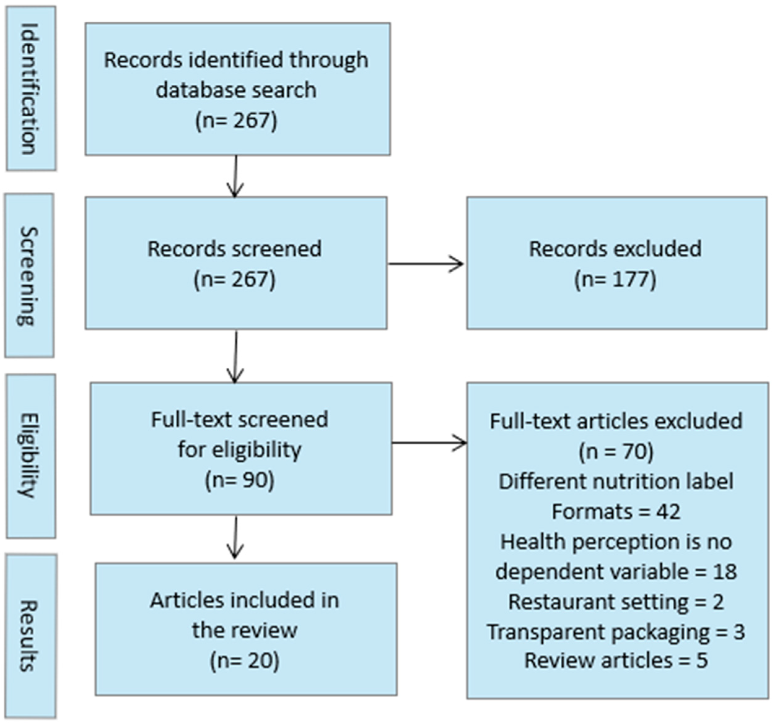
2. Method
2.1. Study Eligibility Criteria
2.2. Search Strategy
2.3. Study Selection and Results
3. Results
3.1. Warm vs. Cool Color Hues
3.2. Color Brightness and Saturation
3.3. Variations of More Than One Aspect of Color
3.4. Color Coding of Front-of-Pack Nutrition Labels

| Reference | Analytical Method | Product | Country | Key Findings |
|---|---|---|---|---|
| Aschemann-Witzel et al. [25] | choice task and questionnaire | 20 sweet and 20 salty snacks | Germany and Poland | When German consumers were explicitly instructed to make healthy food choices, color-coded nutrition labels led to healthier food choices compared to uncolored nutrition labels. This effect was stronger when the nutrition label was color-coded according to a traffic light system (green = healthy, orange = moderately healthy, red = unhealthy) than when it was monochromatic (different shades of blue). This effect was only observed in Germany and not in Poland. The presence or format of a nutrition label had no effect on the healthiness of consumer choices when consumers could choose according to their preferences. |
| Hallez et al. [16] | choice task and questionnaire | soft drinks, salty snacks | Belgium | Cool packaging colors, such as green and blue, compared to warm packaging colors, such as red and orange, led to higher perceptions of health and sustainability for drinks and foods. Cool packaged drinks were perceived as less tasty and were less likely to be selected compared to warm packaged drinks. This effect was not observed in the snacks category. |
| Huang and Lu [6] | questionnaire | milk, cereal, yogurt, potato chips, ice cream, ice tea | Canada | Utilitarian food products, which are consumed mainly to satisfy physical needs such as thirst or hunger, were perceived as healthier when the packaging color was blue compared to red. For hedonic food products, which are consumed mainly for affective pleasure, no effect of packaging color on healthiness perception was observed. Higher perceived product healthiness also led to higher purchase intention. |
| Kunz et al. [5] | questionnaire | snacks and drinks | Austria | A positive correlation between healthiness and tastiness was observed. Presenting the images only in grayscale vs. color had no effect on healthiness ratings. Moreover, increased versus decreased color saturation led to higher healthiness and tastiness ratings, and this effect was mediated by the perceived freshness of the products. |
| Mai et al. [21] | questionnaire and Implicit Association Test | pizza, chocolate, yoghurt, cream cheese, potato chips, fruit bar, juice | Germany | Light-colored product packaging led to a higher perception of healthiness, and this effect was observed even after consumers had tasted the product. However, light packaging color had a negative impact on taste, leading to lower purchase intention, especially when consumers had to make heuristic taste inferences and when health was not the primary consumption goal. |
| Marques da Rosa et al. [18] | questionnaire | buttery and cereal cookies | Brazil | Buttery and cereal cookies were perceived as healthier in a red-to-yellow package than in a blue-to-green package. In addition, the healthiness of cookies in angular packaging was rated higher than that of cookies in round packaging. No interaction effects were detected. |
| Mead and Richerson [22] | questionnaire | potato chips and nutritional bars | USA | Consumers associate vivid, highly color-saturated food packages with less healthy foods compared to less color-saturated food packages. This effect is mediated by conceptual fluency, as consumers are regularly exposed to unhealthy foods in highly saturated packaging and have learned this association. Consumers with higher levels of nutritional knowledge are less likely to judge foods based on packaging color saturation. On the contrary, consumers with high vs. low restrained eating behaviors are more likely to make inferences about the healthiness of a product based on packaging color saturation. |
| Meng and Chan [31] | questionnaire | crackers | USA | A positive influence of a green nutrition label and a negative influence of a red nutrition label compared to a black nutrition label on the healthiness perception of a product was observed for men but not for women. Text-based health information on the nutrition label influenced health perceptions for both genders. |
| Nyilasy et al. [29] | questionnaire | cereals | USA | Consumers perceived healthy cereals with red and green nutrition labels as less healthy than those with uncolored nutrition labels, regardless of which nutrient values were colored green and red. For unhealthy foods, there was no effect of colored versus uncolored nutrition labels on consumers’ perceptions of healthiness. |
| Pettigrew et al. [26] | choice task and questionnaire | cereals | Australia, China, India, New Zealand, UK, USA | In Australia, China, India, New Zealand, the United Kingdom, and the United States, consumers understood traffic-light-colored nutrition labels (green = healthy, orange = moderately healthy, red = unhealthy) better than uncolored labels. Only in Canada did participants understand the health ratings better with monochrome than with colored labels. Colored nutrient summary labels were the most understandable compared to monochrome labels with nutrient-specific information. |
| Pettigrew et al. [28] | choice task and questionnaire | cereals | Australia | Colored nutrition labels were better understood than black and white nutrition labels. The most effective labels included only the color coding and abbreviated star rating, not the detailed nutrient icons. |
| Plasek [14] | questionnaire | functional smoothie | Hungary | Products with white-blue packaging were four times more likely to be perceived as healthy, and products with white-green packaging were twice as likely to be perceived as healthy as products with white-red packaging. Packaging color had the greatest impact on consumers’ health perceptions compared to product claims related to ingredients, organic origin, health claims, shape, and country of origin. |
| Sant’anna et al. [17] | focus groups and choice experiment | sodium reduced cracker | Brazil | When consumers were asked to choose a reduced-sodium product, blue versus red packaging combined with the phrase indicating the percentage of sodium reduction increased the likelihood that a reduced-sodium product would be chosen. |
| Schnurr [24] | questionnaire | nuts and muesli | USA and Europe | A cute, colorful packaging design compared to a less colorful, neutral packaging design leads to a lower perception of healthiness for virtue products that are consumed primarily to satisfy physical needs. This effect was not observed for vice products, which are consumed for their hedonic value. A colorful, cute packaging design creates images of fun in consumers’ minds that they imagine they would experience while consuming the product. |
| Schuldt [27] | questionnaire | chocolate candy bar | USA | Consumers perceived a candy bar with a green calorie label as healthier than a candy bar with a red calorie label, even though the calorie content presented was the same. When comparing a green to a white calorie label, only consumers who focused on healthy eating perceived the candy bar with the green label as healthier. |
| Sucapane et al. [19] | questionnaire | plant-based meat alternative products | Canada and USA | A “meat alternative” product descriptor combined with a mismatching green versus matching red packaging color led to lower perceptions of eco-friendliness and trial likelihood. A “plant-based” product descriptor combined with matching green versus mismatching red packaging had a negative effect on predicted satiety. No effect of packaging color on health perceptions was observed. |
| Tijssen et al. [23] | Implicit Association Test and questionnaire | low-sugar dairy drink and low-fat sausage | Netherlands | The hue, brightness, and saturation of a product’s packaging color influence consumers’ perceptions of its healthiness. Consumers implicitly and explicitly perceive products with cooler colors (e.g., blue), higher brightness, and lower color saturation packaging as healthier but less attractive than products with warmer colors, lower brightness, and higher color saturation. |
| Vasiljevic et al. [30] | questionnaire | chocolate and cereal bar | UK | Consumers perceived a white label with a smiling emoticon as healthier than a red or green label with a smiling emoticon. The influence of the colored label on consumers’ perception of health was only observed in combination with a smiling emoticon, not with a frowning emoticon or no emoticon. |
| Vila-López and Küster-Boluda [32] | questionnaire | juice with milk and fruit and candy bar | Spain | Product packaging with blue versus red or black nutrition claims was perceived as healthier. Visual cues (font color) had a stronger influence on consumers’ attitudes towards the product than informative cues (nutrition claim). No differences were found between hedonic and functional products. |
| Wąsowicz et al. [20] | focus group and questionnaire | pizza, yoghurt | Poland | Certain colors have greater potential to be associated with product healthiness, but this varies across product categories. Consumers perceived blue and green, as well as red and yellow, as healthy, depending on the product category. For example, the color red was perceived as healthy in the pizza category because it indicates the presence of fruits and vegetables, but unhealthy in the yogurt category because red is associated with artificial colors. |
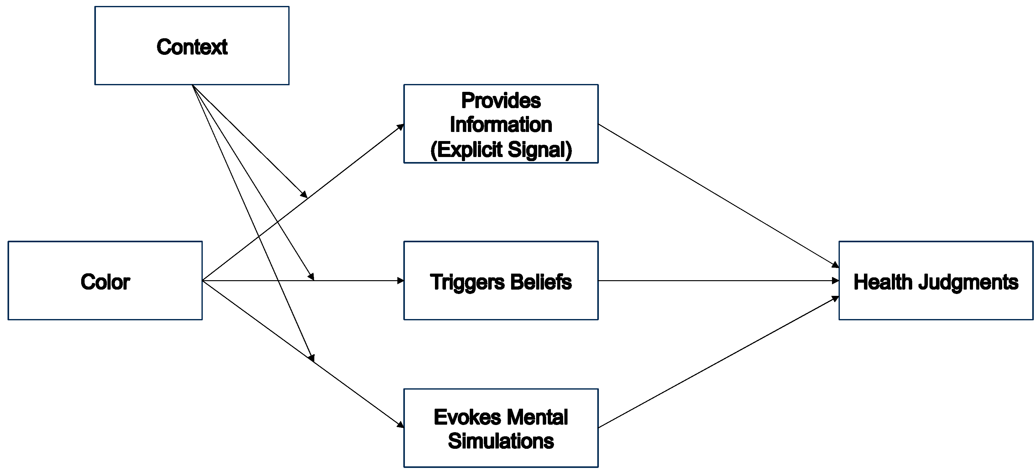
4. A Cognitive Ecological Color Theory
4.1. The Use of Color as Information
4.2. Colors as Triggers of Beliefs
4.3. Colors Influencing Mental Simulations
5. Discussion and Conclusions
Author Contributions
Funding
Data Availability Statement
Conflicts of Interest
References
- ISPO Shoppen per Autopilot: So Fallen Kaufentscheidungen. Available online: https://www.ispo.com/maerkte/shoppen-autopilot-so-fallen-kaufentscheidungen (accessed on 12 September 2023).
- Velasco, C.; Salgado-Montejo, A.; Marmolejo-Ramos, F.; Spence, C. Predictive Packaging Design: Tasting Shapes, Typefaces, Names, and Sounds. Food Qual. Prefer. 2014, 34, 88–95. [Google Scholar] [CrossRef]
- Becker, L.; Van Rompay, T.J.L.; Schifferstein, H.N.J.; Galetzka, M. Tough Package, Strong Taste: The Influence of Packaging Design on Taste Impressions and Product Evaluations. Food Qual. Prefer. 2011, 22, 17–23. [Google Scholar] [CrossRef]
- Karnal, N.; Machiels, C.J.A.; Orth, U.R.; Mai, R. Healthy by Design, but Only When in Focus: Communicating Non-Verbal Health Cues through Symbolic Meaning in Packaging. Food Qual. Prefer. 2016, 52, 106–119. [Google Scholar] [CrossRef]
- Kunz, S.; Haasova, S.; Florack, A. Fifty Shades of Food: The Influence of Package Color Saturation on Health and Taste in Consumer Judgments. Psychol. Mark. 2020, 37, 900–912. [Google Scholar] [CrossRef]
- Huang, L.; Lu, J. The Impact of Package Color and the Nutrition Content Labels on the Perception of Food Healthiness and Purchase Intention. J. Food Prod. Mark. 2016, 22, 191–218. [Google Scholar] [CrossRef]
- Matthews, P.; Simmonds, G.; Spence, C. Establishing Boundary Conditions for Multiple Design Elements Congruent with Taste Expectations. Food Qual. Prefer. 2019, 78, 103742. [Google Scholar] [CrossRef]
- Marozzo, V.; Raimondo, M.A.; Miceli, G.N.; Scopelliti, I. Effects of Au Naturel Packaging Colors on Willingness to Pay for Healthy Food. Psychol. Mark. 2020, 37, 913–927. [Google Scholar] [CrossRef]
- Spence, C. On the Psychological Impact of Food Colour. Flavour 2015, 4, 21. [Google Scholar] [CrossRef]
- Plasek, B.; Lakner, Z.; Temesi, Á. Factors That Influence the Perceived Healthiness of Food—Review. Nutrients 2020, 12, 1881. [Google Scholar] [CrossRef]
- WHO Obesity and Overweight. Available online: https://www.who.int/news-room/fact-sheets/detail/obesity-and-overweight (accessed on 12 September 2023).
- Moher, D.; Liberati, A.; Tetzlaff, J.; Altman, D.G. Preferred Reporting Items for Systematic Reviews and Meta-Analyses: The PRISMA Statement. J. Clin. Epidemiol. 2009, 62, 1006–1012. [Google Scholar] [CrossRef]
- Sokolik, K.; Magee, R.G.; Ivory, J.D. Red-Hot and Ice-Cold Web Ads: The Influence of Web Ads’ Warm and Cool Colors on Click-Through Rates. J. Interact. Advert. 2014, 14, 31–37. [Google Scholar] [CrossRef]
- Plasek, B.; Lakner, Z.; Temesi, Á. I Believe It Is Healthy—Impact of Extrinsic Product Attributes in Demonstrating Healthiness of Functional Food Products. Nutrients 2021, 13, 3518. [Google Scholar] [CrossRef] [PubMed]
- Cabrera, M.; Machín, L.; Arrúa, A.; Antúnez, L.; Curutchet, M.R.; Giménez, A.; Ares, G. Nutrition Warnings as Front-of-Pack Labels: Influence of Design Features on Healthfulness Perception and Attentional Capture. Public Health Nutr. 2017, 20, 3360–3371. [Google Scholar] [CrossRef] [PubMed]
- Hallez, L.; Vansteenbeeck, H.; Boen, F.; Smits, T. Persuasive Packaging? The Impact of Packaging Color and Claims on Young Consumers’ Perceptions of Product Healthiness, Sustainability and Tastiness. Appetite 2023, 182, 106433. [Google Scholar] [CrossRef]
- Sant’anna, L.J.; Araújo, C.I.A.; De Paula, M.C.; Da Moreira, E.D.S.; Lucia, S.M.D.; Filho, T.L. How to Inform about Sodium Reduction on Food Labels? J. Sens. Stud. 2022, 37, e12768. [Google Scholar] [CrossRef]
- Marques Da Rosa, V.; Spence, C.; Miletto Tonetto, L. Influences of Visual Attributes of Food Packaging on Consumer Preference and Associations with Taste and Healthiness. Int. J. Consum. Stud. 2019, 43, 210–217. [Google Scholar] [CrossRef]
- Sucapane, D.; Roux, C.; Sobol, K. Exploring How Product Descriptors and Packaging Colors Impact Consumers’ Perceptions of Plant-Based Meat Alternative Products. Appetite 2021, 167, 105590. [Google Scholar] [CrossRef]
- Wąsowicz, G.; Styśko-Kunkowska, M.; Grunert, K.G. The Meaning of Colours in Nutrition Labelling in the Context of Expert and Consumer Criteria of Evaluating Food Product Healthfulness. J. Health Psychol. 2015, 20, 907–920. [Google Scholar] [CrossRef]
- Mai, R.; Symmank, C.; Seeberg-Elverfeldt, B. Light and Pale Colors in Food Packaging: When Does This Package Cue Signal Superior Healthiness or Inferior Tastiness? J. Retail. 2016, 92, 426–444. [Google Scholar] [CrossRef]
- Mead, J.A.; Richerson, R. Package Color Saturation and Food Healthfulness Perceptions. J. Bus. Res. 2018, 82, 10–18. [Google Scholar] [CrossRef]
- Tijssen, I.; Zandstra, E.H.; De Graaf, C.; Jager, G. Why a ‘Light’ Product Package Should Not Be Light Blue: Effects of Package Colour on Perceived Healthiness and Attractiveness of Sugar- and Fat-Reduced Products. Food Qual. Prefer. 2017, 59, 46–58. [Google Scholar] [CrossRef]
- Schnurr, B. Too Cute to Be Healthy: How Cute Packaging Designs Affect Judgments of Product Tastiness and Healthiness. J. Assoc. Consum. Res. 2019, 4, 363–375. [Google Scholar] [CrossRef]
- Aschemann-Witzel, J.; Grunert, K.G.; Van Trijp, H.C.M.; Bialkova, S.; Raats, M.M.; Hodgkins, C.; Wasowicz-Kirylo, G.; Koenigstorfer, J. Effects of Nutrition Label Format and Product Assortment on the Healthfulness of Food Choice. Appetite 2013, 71, 63–74. [Google Scholar] [CrossRef] [PubMed]
- Pettigrew, S.; Dana, L.M.; Talati, Z.; Tian, M.; Praveen, D. The Role of Colour and Summary Indicators in Influencing Front-of-Pack Food Label Effectiveness across Seven Countries. Public Health Nutr. 2021, 24, 3566–3570. [Google Scholar] [CrossRef]
- Schuldt, J.P. Does Green Mean Healthy? Nutrition Label Color Affects Perceptions of Healthfulness. Health Commun. 2013, 28, 814–821. [Google Scholar] [CrossRef]
- Pettigrew, S.; Dana, L.; Talati, Z. Enhancing the Effectiveness of the Health Star Rating via Presentation Modifications. Aust. N. Z. J. Public Health 2020, 44, 20–21. [Google Scholar] [CrossRef]
- Nyilasy, G.; Lei, J.; Nagpal, A.; Tan, J. Colour Correct: The Interactive Effects of Food Label Nutrition Colouring Schemes and Food Category Healthiness on Health Perceptions. Public Health Nutr. 2016, 19, 2122–2127. [Google Scholar] [CrossRef]
- Vasiljevic, M.; Pechey, R.; Marteau, T.M. Making Food Labels Social: The Impact of Colour of Nutritional Labels and Injunctive Norms on Perceptions and Choice of Snack Foods. Appetite 2015, 91, 56–63. [Google Scholar] [CrossRef]
- Meng, Y.; Chan, E.Y. Traffic Light Signals and Healthy Food Choice: Investigating Gender Differences. Psychol. Mark. 2022, 39, 360–369. [Google Scholar] [CrossRef]
- Vila-López, N.; Küster-Boluda, I. Commercial versus Technical Cues to Position a New Product: Do Hedonic and Functional/Healthy Packages Differ? Soc. Sci. Med. 2018, 198, 85–94. [Google Scholar] [CrossRef]
- Fiedler, K. From Intrapsychic to Ecological Theories in Social Psychology: Outlines of a Functional Theory Approach: From Intrapsychic to Ecological Theories. Eur. J. Soc. Psychol. 2014, 44, 657–670. [Google Scholar] [CrossRef]
- Kunz, S.; Haasova, S.; Pivecka, N.; Schmidt, J.; Florack, A. Food Is All Around: How Contexts Create Misbeliefs About the Health–Taste Relationship. Psychol. Sci. 2023, 34, 568–580. [Google Scholar] [CrossRef]
- Gigerenzer, G.; Fiedler, K.; Olsson, H. Rethinking Cognitive Biases as Environmental Consequences. In Ecological Rationality: Intelligence in the World; Todd, P.M., Gigerenzer, G., Eds.; Oxford University Press: Oxford, UK, 2012; pp. 80–119. ISBN 978-0-19-531544-8. [Google Scholar]
- Elliot, A.J.; Maier, M.A. Color-in-Context Theory. In Advances in Experimental Social Psychology; Elsevier: Amsterdam, The Netherlands, 2012; Volume 45, pp. 61–125. ISBN 978-0-12-394286-9. [Google Scholar]
- Young, S.G.; Elliot, A.J.; Feltman, R.; Ambady, N. Red Enhances the Processing of Facial Expressions of Anger. Emotion 2013, 13, 380–384. [Google Scholar] [CrossRef]
- Elliot, A.J.; Tracy, J.L.; Pazda, A.D.; Beall, A.T. Red Enhances Women’s Attractiveness to Men: First Evidence Suggesting Universality. J. Exp. Soc. Psychol. 2013, 49, 165–168. [Google Scholar] [CrossRef]
- Regan, B.C.; Julliot, C.; Simmen, B.; Viénot, F.; Charles–Dominique, P.; Mollon, J.D. Fruits, Foliage and the Evolution of Primate Colour Vision. Philos. Trans. R. Soc. Lond. B Biol. Sci. 2001, 356, 229–283. [Google Scholar] [CrossRef] [PubMed]
- Labrecque, L.I.; Patrick, V.M.; Milne, G.R. The Marketers’ Prismatic Palette: A Review of Color Research and Future Directions. Psychol. Mark. 2013, 30, 187–202. [Google Scholar] [CrossRef]
- Meyers-Levy, J.; Peracchio, L.A. Understanding the Effects of Color: How the Correspondence between Available and Required Resources Affects Attitudes. J. Consum. Res. 1995, 22, 121. [Google Scholar] [CrossRef]
- Squire, L.R. Memory Systems of the Brain: A Brief History and Current Perspective. Neurobiol. Learn. Mem. 2004, 82, 171–177. [Google Scholar] [CrossRef] [PubMed]
- Van Osselaer, S. Associative Learning and Consumer Decisions. In Handbook of Consumer Psychology; Haugtvedt, C., Herr, P., Kardes, F., Eds.; Psychology Press: London, UK, 2012; pp. 694–724. [Google Scholar]
- Hawthorne, K.M.; Moreland, K.; Griffin, I.J.; Abrams, S.A. An Educational Program Enhances Food Label Understanding of Young Adolescents. J. Am. Diet. Assoc. 2006, 106, 913–916. [Google Scholar] [CrossRef] [PubMed]
- Chen, P.-J.; Coricelli, C.; Kaya, S.; Rumiati, R.I.; Foroni, F. The Role of Associative Learning in Healthy and Sustainable Food Evaluations: An Event-Related Potential Study. Neurosci. Res. 2022, 183, 61–75. [Google Scholar] [CrossRef]
- Wasserman, E.A.; Miller, R.R. What’s elementary about associative learning? Annu. Rev. Psychol. 1997, 48, 573–607. [Google Scholar] [CrossRef] [PubMed]
- De Houwer, J. A Propositional Perspective on Context Effects in Human Associative Learning. Behav. Process. 2014, 104, 20–25. [Google Scholar] [CrossRef] [PubMed]
- MacLeod, C.M. Haifa Century of Research on the Stroop Effect: An Integrative Review. Psychol. Bull. 1991, 109, 163–203. [Google Scholar] [CrossRef] [PubMed]
- Hanss, D.; Böhm, G.; Pfister, H.-R. Active Red Sports Car and Relaxed Purple-Blue van: Affective Qualities Predict Color Appropriateness for Car Types: Affective Qualities and Color Appropriateness. J. Consum. Behav. 2012, 11, 368–380. [Google Scholar] [CrossRef]
- Turnwald, B.P.; Horii, R.I.; Markus, H.R.; Crum, A.J. Psychosocial Context and Food Healthiness in Top-Grossing American Films. Health Psychol. 2022, 41, 928–937. [Google Scholar] [CrossRef]
- Raghunathan, R.; Naylor, R.W.; Hoyer, W.D. The Unhealthy = Tasty Intuition and Its Effects on Taste Inferences, Enjoyment, and Choice of Food Products. J. Mark. 2006, 70, 170–184. [Google Scholar] [CrossRef]
- Haws, K.L.; Reczek, R.W.; Sample, K.L. Healthy Diets Make Empty Wallets: The Healthy = Expensive Intuition. J. Consum. Res. 2017, 43, ucw078. [Google Scholar] [CrossRef]
- Muñoz-Vilches, N.C.; Van Trijp, H.C.M.; Piqueras-Fiszman, B. Tell Me What You Imagine and I Will Tell You What You Want: The Effects of Mental Simulation on Desire and Food Choice. Food Qual. Prefer. 2020, 83, 103892. [Google Scholar] [CrossRef]
- Haasova, S.; Florack, A. Practicing the (Un)Healthy = Tasty Intuition: Toward an Ecological View of the Relationship between Health and Taste in Consumer Judgments. Food Qual. Prefer. 2019, 75, 39–53. [Google Scholar] [CrossRef]
- Pivecka, N.; Kunz, S.; Florack, A. Social Class Differences in Dietary Intake Are Mediated by the Relationship between Health and Taste: Findings from a Cross-Sectional and Longitudinal Study. Food Qual. Prefer. 2023, 109, 104914. [Google Scholar] [CrossRef]
- Clarke, T.; Costall, A. The Emotional Connotations of Color: A Qualitative Investigation. Color Res. Appl. 2008, 33, 406–410. [Google Scholar] [CrossRef]
- Pinkerton, E.; Humphrey, N.K. The Apparent Heaviness of Colours. Nature 1974, 250, 164–165. [Google Scholar] [CrossRef]
- Genschow, O.; Florack, A. Attention on the Source of Influence Reverses the Impact of Cross-Contextual Imitation. J. Exp. Psychol. Hum. Percept. Perform. 2014, 40, 904–907. [Google Scholar] [CrossRef]
- Strack, F.; Schwarz, N.; Bless, H.; Kübler, A.; Wänke, M. Awareness of the Influence as a Determinant of Assimilation versus Contrast. Eur. J. Soc. Psychol. 1993, 23, 53–62. [Google Scholar] [CrossRef]
- Pool, E.; Sennwald, V.; Delplanque, S.; Brosch, T.; Sander, D. Measuring Wanting and Liking from Animals to Humans: A Systematic Review. Neurosci. Biobehav. Rev. 2016, 63, 124–142. [Google Scholar] [CrossRef] [PubMed]
- Topolinski, S.; Lindner, S.; Freudenberg, A. Popcorn in the Cinema: Oral Interference Sabotages Advertising Effects. J. Consum. Psychol. 2014, 24, 169–176. [Google Scholar] [CrossRef]
- Greenwald, A.G.; McGhee, D.E.; Schwartz, J.L.K. Measuring Individual Differences in Implicit Cognition: The Implicit Association Test. J. Personal. Soc. Psychol. 1998, 74, 1464–1480. [Google Scholar] [CrossRef]
- Diamantopoulos, A.; Florack, A.; Halkias, G.; Palcu, J. Explicit versus Implicit Country Stereotypes as Predictors of Product Preferences: Insights from the Stereotype Content Model. J. Int. Bus. Stud. 2017, 48, 1023–1036. [Google Scholar] [CrossRef]
- Florack, A.; Friese, M.; Scarabis, M. Regulatory Focus and Reliance on Implicit Preferences in Consumption Contexts. J. Consum. Psychol. 2010, 20, 193–204. [Google Scholar] [CrossRef]
- Scarabis, M.; Florack, A.; Gosejohann, S. When Consumers Follow Their Feelings: The Impact of Affective or Cognitive Focus on the Basis of Consumers’ Choice. Psychol. Mark. 2006, 23, 1015–1034. [Google Scholar] [CrossRef]
- DeJesus, J.M.; Gelman, S.A.; Lumeng, J.C. Children’s Implicit Food Cognition: Developing a Food Implicit Association Test. Cogn. Dev. 2020, 54, 100889. [Google Scholar] [CrossRef] [PubMed]
- Palcu, J.; Sudkamp, J.; Florack, A. Judgments at Gaze Value: Gaze Cuing in Banner Advertisements, Its Effect on Attention Allocation and Product Judgments. Front. Psychol. 2017, 8, 881. [Google Scholar] [CrossRef] [PubMed]
- Halkias, G.; Florack, A.; Diamantopoulos, A.; Palcu, J. Eyes Wide Shut? Understanding and Managing Consumers’ Visual Processing of Country-of-Origin Cues. Br. J. Manag. 2022, 33, 1432–1446. [Google Scholar] [CrossRef]
- Ding, M.; Song, M.; Pei, H.; Cheng, Y. The Emotional Design of Product Color: An Eye Movement and Event-related Potentials Study. Color Res. Appl. 2021, 46, 871–889. [Google Scholar] [CrossRef]
- Roy, S.; Banerjee, A.; Roy, C.; Nag, S.; Sanyal, S.; Sengupta, R.; Ghosh, D. Brain Response to Color Stimuli: An EEG Study with Nonlinear Approach. Cogn. Neurodyn. 2021, 15, 1023–1053. [Google Scholar] [CrossRef]
- Castiblanco Jimenez, I.A.; Marcolin, F.; Ulrich, L.; Moos, S.; Vezzetti, E.; Tornincasa, S. Interpreting Emotions with EEG: An Experimental Study with Chromatic Variation in VR. In Advances on Mechanics, Design Engineering and Manufacturing IV; Gerbino, S., Lanzotti, A., Martorelli, M., Mirálbes Buil, R., Rizzi, C., Roucoules, L., Eds.; Lecture Notes in Mechanical Engineering; Springer International Publishing: Cham, Switzerland, 2023; pp. 318–329. ISBN 978-3-031-15927-5. [Google Scholar]
Disclaimer/Publisher’s Note: The statements, opinions and data contained in all publications are solely those of the individual author(s) and contributor(s) and not of MDPI and/or the editor(s). MDPI and/or the editor(s) disclaim responsibility for any injury to people or property resulting from any ideas, methods, instructions or products referred to in the content. |
© 2023 by the authors. Licensee MDPI, Basel, Switzerland. This article is an open access article distributed under the terms and conditions of the Creative Commons Attribution (CC BY) license (https://creativecommons.org/licenses/by/4.0/).
Share and Cite
Steiner, K.; Florack, A. The Influence of Packaging Color on Consumer Perceptions of Healthfulness: A Systematic Review and Theoretical Framework. Foods 2023, 12, 3911. https://doi.org/10.3390/foods12213911
Steiner K, Florack A. The Influence of Packaging Color on Consumer Perceptions of Healthfulness: A Systematic Review and Theoretical Framework. Foods. 2023; 12(21):3911. https://doi.org/10.3390/foods12213911
Chicago/Turabian StyleSteiner, Katharina, and Arnd Florack. 2023. "The Influence of Packaging Color on Consumer Perceptions of Healthfulness: A Systematic Review and Theoretical Framework" Foods 12, no. 21: 3911. https://doi.org/10.3390/foods12213911
APA StyleSteiner, K., & Florack, A. (2023). The Influence of Packaging Color on Consumer Perceptions of Healthfulness: A Systematic Review and Theoretical Framework. Foods, 12(21), 3911. https://doi.org/10.3390/foods12213911