Abstract
Connectomics has recently begun to image brain tissue at nanometer resolution, which produces petabytes of data. This data must be aligned, labeled, proofread, and formed into graphs, and each step of this process requires visualization for human verification. As such, we present the BUTTERFLY middleware, a scalable platform that can handle massive data for interactive visualization in connectomics. Our platform outputs image and geometry data suitable for hardware-accelerated rendering, and abstracts low-level data wrangling to enable faster development of new visualizations. We demonstrate scalability and extendability with a series of open source Web-based applications for every step of the typical connectomics workflow: data management and storage, informative queries, 2D and 3D visualizations, interactive editing, and graph-based analysis. We report design choices for all developed applications and describe typical scenarios of isolated and combined use in everyday connectomics research. In addition, we measure and optimize rendering throughput—from storage to display—in quantitative experiments. Finally, we share insights, experiences, and recommendations for creating an open source data management and interactive visualization platform for connectomics.
1. Introduction
The grand challenge of connectomics is to completely reconstruct and analyze the neural “wiring diagram” of the mammalian brain, which contains billions of interconnected nerve cells [1,2,3,4]. Deciphering this vast network and studying its underlying properties will support certain aspects of understanding the effects of genetical, molecular, or pathological changes at the connectivity level. This may lead to a better understanding of mental illnesses, learning disorders, and neural pathologies, as well as provide advances in artificial intelligence [5]. As such, the field of connectomics is rapidly growing, with hundreds of neuroscience labs world-wide eager to obtain nanoscale level descriptions of neural circuits. However, there are many problems in analyzing the individual synaptic connections between nerve cells and signal transmission to other cells, not least of which is scale: connectomics occurs at both the nano and peta scales, as electron microscopy (EM) data at a resolution sufficient to identify synaptic connections produces petabytes of data.
The process of producing a wiring diagram suitable for interactive visualization and analysis at this scale has many steps, and each step brings its own challenges (Figure 1). Throughout this process, interactive visualization is key to helping scientists meet these challenges.

Figure 1.
The typical connectomics workflow includes several steps: image tiles of brain tissue are acquired using an electron microscope, registered in 2D and 3D, and automatically segmented into neurons. Since the output of the automatic segmentation is not perfect, it is mandatory to proofread the result prior to any analysis. Each step of the workflow requires visual exploration, for which we have developed open source software tools (listed below each step).
Acquisition: The process begins with a brain sample, which is embedded into resin, cut into slices, and imaged with an electron microscope. The imaging process is fallible, and can cause severe noise and contrast artifacts. Fast and scalable 2D visualizations enable quick signal-to-noise ratio and contrast assessments across image tiles during acquisition. Rapid progress in automatic sample preparation and EM acquisition techniques make it possible to generate a volume of brain tissue in less than six months, with each voxel of size resulting in 2 petabytes of image data [6,7].
Registration: Each brain slice is imaged in tiles independently in 2D, and so the resulting images must be aligned into a larger 2D section. Then, a stack of sections must be aligned into a 3D scan. Here, visualizing stitched tiles and sections allows quick human assessment of alignment quality in addition to computing quantitative measures [6].
Segmentation: Given the stack of sections, the cell membrane borders and synaptic connections between cells must be discovered, and this requires both manual and automatic labeling methods [8,9]. The resulting segmentations are stored as label volumes which are encoded as 64 bits per voxel to support the labeling of millions of nerve cells (neurons) and their connections (synapses). Visualization of sections of the aligned scan in 2D and renderings in 3D helps us assess segmentation and classification quality.
Proofreading: All available segmentation methods make mistakes [10], and so the results must be proofread by humans before any biological analysis occurs [11,12,13]. For proofreading, intelligent interactive visualization tools are key to minimizing the time committed.
Analysis: At this point, our connectomics data consists of cell membrane annotations for all neurons, and synaptic annotations where neurons connect. This information can be modeled as a graph. Nodes in the graph represent individual neurons and the edges between nodes resemble synaptic connections. The edges can be weighted by quantitative measures, e.g., number of connections or neuron type. This connectivity graph can be flattened and visualized in 2D or rendered in 3D. Typical analysis tools for connectomics range from abstract visualizations which focus on higher level aspects to lower level biologically-correct visualizations [14,15].
Each step from acquisition to analysis requires interactive visual exploration: both to check the quality of the results and to explore the data for insights. However, these tools must be able to scale to the large data at hand.
To this end, we present the scalable BUTTERFLY middleware for interactive visualization of massive connectomics datasets. This system integrates Web-based solutions for data management and storage, semantic queries, 2D and 3D visualization, interactive editing, and graph-based analysis.
Our systems were developed in collaboration with neuroscientists, working on the only-slightly-more-modest goal of imaging a whole rodent brain (Mus musculus, BALB/c strain, females of age P3, P5, P7, P60, with a fresh volume of , brainstem upwards; as well as Rattus norvegicus). Like humans, mice and rats are vertebrate mammals which learn. Many of the brain structures in these rodents are found in humans, and many conditions in humans can be found in rodents at the genetic level [16]. Currently acquired EM image stacks represent only a fraction of a full mouse brain (, ) but are multiple terabytes in size, which provides us with many difficult scalable interactive visualization problems. Our solutions to these problems enable the analysis of the connectome at nano scale and can help lead to scientific discoveries, e.g., Kasthuri et al. [5] recently disproved that physical proximity is sufficient to predict synaptic connectivity.
The Butterfly middleware unifies connectomics tools from each stage of the pipeline. It integrates with the following visualization applications for multi-user environments:
- MBeam viewer, a tool to quickly assess image quality and contrast during acquisition.
- RHAligner, visualization scripts for debugging the registration process.
- RhoANAScope, a visualizer for image data and label overlays during segmentation.
- Dojo, an interactive proofreading tool with multi-user support [11].
- Guided Proofreading, a machine learning proofreading tool to correct errors quickly [12].
- 3DXP, a 3D visualization of neuron geometries.
- Neural Data Queries, a system for semantic queries of neurons and their connections.
All visualization components are Web-based and are part of a multi-user environment. This avoids duplication of the massive connectomics datasets since the majority of the data stays on the server and only a small subset is transferred for each user interaction. To maintain code quality, we use continuous integration and automated testing of each code base change. All software tools are available as free and open source software. In addition, we provide a VirtualBox distribution including all reported visualization tools and the Butterfly middleware. The distribution includes various test data such that the visualization tools can be used in an existing network environment with minimal configuration.
This paper describes the motivation and design decisions for data management and visualization, as well as implementation details of the Butterfly integration with our front-end applications. We relate the stages of the connectomics pipeline, the end-user tools, and the Butterfly middleware. We report on performance and scalability of our visualization landscape, and describe a series of everyday use-cases with neuroscience experts. Finally, we provide insights and recommendations for creating an open source data management and interactive visualization platform for connectomics.
2. Related Work
An overview of existing visualization tools for connectomics is given by Pfister et al. [17]. The article describes visualizations at different scales: (a) macroscale connectivity, with data coming from functional magnetic resonance imaging, electroencephalography, magnetoencephalography, and diffusion tensor imaging [18]; (b) mesoscale connectivity, obtained from light and optical microscopy; and (c) microscale connectivity, which enables imaging at the nanometer resolution using electron microscopes. Recent advances in sample preparation have further enabled nano-imaging [19] and a description of many techniques in this emerging field is given by Shaefer [20]. While our work targets microscale connectomics, in this section we also relate to works at the other two scales.
Visualization tools for connectomics mainly focus on three different areas: (1) visualization to support the segmentation and proofreading of volumes; (2) visualization to explore high-resolution segmented volume data; and (3) visualization to analyze neuronal connectivity. Most visualization tools for connectomics are standalone applications, requiring high-performance workstations and modern GPUs [21,22,23,24,25]; thus, it is harder for these tools to achieve general scalability across both compute and users.
Visual proofreading of segmentations is supported by several tools [21,22,23,26], mostly targeting expert users and offering many parameters for tweaking the proofreading process. However, none of these tools run in a distributed setting and allow non-expert users to correct erroneous segmentations. Several applications allow distributed and collaborative segmentation of connectomics volumes. EyeWire [27] is an online tool where novice users participate in a game to earn points for segmenting neuronal structures using a semi-automatic algorithm. D2P [28] uses a micro-labor workforce approach via Amazon Mechanical Turk where boolean choice questions are presented to users and local decisions are combined to produce a consensus segmentation. Both tools are designed for non-expert users. For experts, Catmaid [29] and the Viking Viewer [30] are collaborative annotation frameworks which allow users to create skeleton segmentations for large data sets. More recently, Neuroblocks [13] proposed an online-system for tracking the progress and evolution of a large-scale segmentation project.
Visualization tools for exploring high-resolution segmented volume data typically run on powerful GPU systems and employ complex multi-resolution strategies. Hadwiger et al. [24] present a volume visualization system for large EM volumes, which was later extended to segmented EM volumes [25]. Several systems, such as Neuron Navigator [31] and Connectome Explorer [15] support interactive or visual queries to further explore these typically very large data sets.
Most visualization tools for connectomics focus on the analysis step and explore the connectivity between neurons that is extracted from the segmented data volumes. Several systems [32,33] are based on WebGL [34] and run directly in a Web browser. Ginsburg et al. [32] propose a rendering system which combines brain surfaces with tractography fibers to render a 3D network of connected brain regions. Similar visualizations can be created using the X toolkit [35], which offers WebGL rendering for neuroimaging data, and SliceDrop [36], which is a Web-based viewer for medical imaging data including volume rendering and axis-aligned slice views. Neuroglancer [33] provides different 2D and 3D visualizations for large datasets.
Notable efforts to allow exploration and reusability of published connectome findings exist. Paired with the scalable brain atlas visualization tool [37], the CocoMac database contains findings on connectivity of the macaque brain [38]. Bota et al. [39] introduce the Brain Architecture Management System, which stores and infers relationships about nervous system circuitry. Query results are here visualized as network diagrams and represented as tabular data. The neuroVIISAS system provides similar visualizations and pairs them with slice-based renderings [40].
Other stand-alone viewers exist with similar network visualization features. The Connectome Viewer Toolkit [41] targets the analysis of macroscopic neuronal structures and brain region connectivity, whereas the Viking Viewer [30] displays a connectivity graph on a cell level. More recently, neuroMap [42] uses circuit wiring diagrams to represent all possible connections of neurons. For nanoscale connectomics, Neurolines [14] allows neuroscientists to analyze the connectivity on the level of individual synapses.
Some research and development has been conducted towards producing a central data management platform for the full connectomics workflow with visualization capabilities. Notable efforts are DVID [43], a centralized data service offering version control and distributed access, and The Boss [44], a cloud-based storage service. Both systems manage data sources in their own specific format and support Neuroglancer for visualization.
Our proposed Butterfly middleware is different from this approach as it provides a platform for creating visualizations for connectomics without having to deal with data wrangling or other low-level issues. Using the middleware, it is possible to concentrate development effort towards the front end rather than the back end. We also propose a series of integrated applications which allow users to visualize connectomics data and debug problems for every stage of the connectomics pipeline.
3. Overview
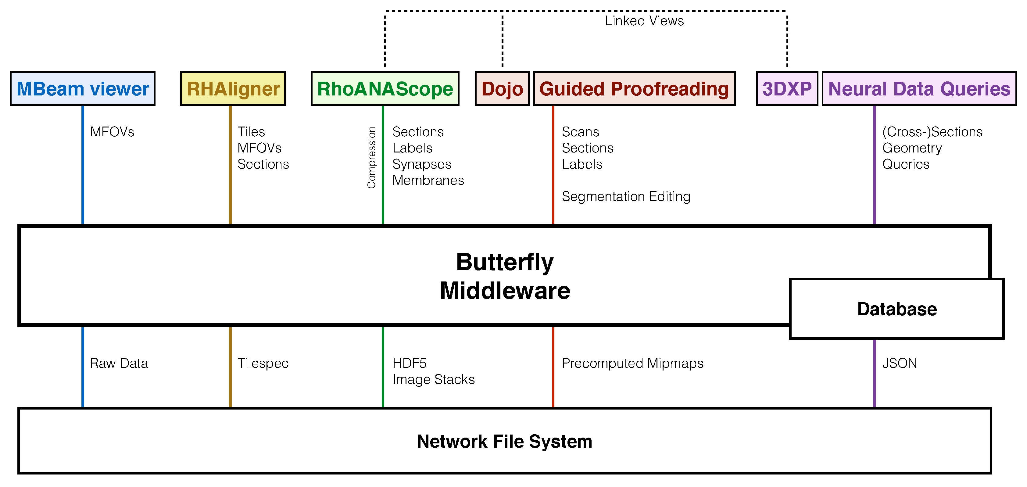
We designed the Butterfly middleware to integrate and unify data management of visualization tools for every step of the connectomics pipeline (Figure 2). Different data formats and their access are abstracted to support a variety of data queries. This reduces heterogeneity among tools, interfaces, and data formats. We use several data management and visualization concepts to enable scalable and interactive applications.
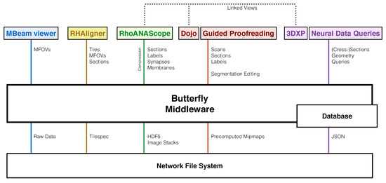
Figure 2.
Our software system includes tools tailored to each stage of the connectomics pipeline, which requires exploring and interacting with data stored in different ways on a network file system (XFS storage): The MBeam viewer enables image quality assessment during image acquisition by rendering multi-beam-field-of-views (MFOVs) from raw microscope data. The RHAligner scripts allow for the monitoring and debugging of the alignment process by rendering the tilespec format which separates transformations and data. RhoANAScope visualizes sections and the corresponding neuron labels, synapse segmentations, and membrane probabilities during segmentation. Dojo and Guided Proofreading are two interactive applications to correct errors in the labeled sections and volumes. For analysis, 3DXP enables the visualization of neuron geometry by rendering meshes. The Neural Data Query application program interface (API) allows querying neurons for their synaptic connections by including JSON formatted data structures. The Butterfly middleware integrates and unifies these heterogeneous applications within a multi-user environment by abstracting data access and supporting a variety of data requests. Besides data integration, our middleware enables linked visualizations for several important use-cases between RhoANAScope, Dojo, and 3DXP (Section 11).
3.1. Volumetric EM Image Data
Volumetric EM image data is often organized hierarchically with different dimensions (Table 1). We demonstrate this with the Zeiss MultiSEM 505 electron microscope with which we capture our imagery. This microscope simultaneously captures 61 image tiles, each of roughly 3000 × 2700 pixels, to achieve acquisition rates of approximately 1 terapixel per hour [6,7]. Each simultaneous capture is called a multi-beam field-of-view, or MFOV. Multiple MFOVs are stitched into a section, which represents a two-dimensional slice of tissue. Thousands of sections are combined into a single 3D scan of tissue.

Table 1.
Our electron microscopy data form a hierarchy of different types and dimensions. Multiple image tiles are acquired at nanometer resolution as an MFOV, and then stitched in sections. Thousands of sections are stacked into a scan. There is a large difference between image data and segmentation data due to the 64 bit encodings required to represent potentially billions of neurons. For segmentation data, we report average compression rates of using the Compresso scheme [45]. For images, we assume a resolution of per voxel and 8 bit encoding. The Butterfly middleware and its applications have been tested on Scan A (), acquired using the Zeiss MultiSEM 505 electron microscope. Scan B is yet to be acquired using the same hardware.
3.2. Data Management Concepts
Connectomics data includes several different data types and data structures. This is driven by different use cases and the goal of performant random access.
Image formats: We acquire image volumes of the mammalian brain at nanometer resolution. Our data is typically anisotropic across sections with in-plane section resolution roughly 7.5 times higher than between sections ( per voxel). Each section of a scan is a gray-scale image typically with 8 bits per pixel. We can store sections individually in general formats such as JPEG, PNG, or TIFF. We also store a collection of sections as volumetric data as HDF5 or multi-page TIFF containers. HDF5 allows random access without loading the full volume into memory.
Tiled storage: A single section of a volume can be many gigabytes in size. For scalable and efficient processing and storage, a section is typically stored split into multiple files using a row/column scheme. Individual tiles are usually of fixed power-of-2 dimensions to enable GPU texture mapping without conversion (e.g., pixels), but can also be arbitrarily sized. Thus, metadata is required to understand a tiled image format. MFOVs are an example of tiled storage.
Label formats: Our labels are segmentation volumes including cell membranes as well as pre- and post-synaptic connections. Neuron segmentations can contain billions of values to uniquely identify each cell. This requires encoding with 32 or 64 bits per pixel, for which HDF5 is the preferred data format. For visualization, we color each identifier using a look-up table with neighboring cells colored distinctly.
Mipmap structures: Mipmaps (i.e., image pyramids, or image quad-trees) are hierarchical sequences of an image at different resolutions [46]. These are created by iteratively downsampling each image by a factor of two in each dimension until the entire image is reduced to a single pixel. For images, we use bilinear downsampling, while for labels we use nearest-neighbor downsampling to not alter the identifiers. Mipmaps are usually pre-computed to allow fast data access, but require a storage overhead of 33 percent. We store each mipmap level as tiled images, generating no representations smaller than a single tile. This reduces some storage overhead and allows partial loading for scalability.
Database: We store relations between label structures with unique identifiers, as well as dimensions and statistics, in a object-oriented database for fast access. This way, we can use queries to explore relationships of neurons and synapses or to request metadata.
Distributed storage and computation: Connectomics requires distributed processing and storage mechanisms to deal with large data. Typically, data is stored on a network file system and interactively explored or edited from client workstations. This is important to avoid unnecessary copies of datasets; however, parallel access of data has to be handled through a transaction mechanism to avoid conflicts between users [47].
Compression: The massive connectomics image and label volumes require compression for storage and for transfer from server to client. We compress EM images using JPEG encoding with average compression ratios of 2–4×. To compress label volumes, we must consider two important components: the per-pixel labels and the per-segment shapes. We use Compresso [45], which is specifically tailored to compress label volumes as it decouples these two components and compresses each separately over congruent 3-D windows. Often, Compresso is paired with an additional general-purpose compression scheme to further reduce the data size; with LZMA, we can compress the label volumes by a ratio of 600–1000× on average.
3.3. Scalability Through Demand-Driven and Display-Aware Web Applications
Efficient connetomics visualizations must provide easy access to large data for many people working across the pipeline. We tackle these problems by building web applications backed by scalable server software. A web-based visualization removes the need for any client-side installation, and multiple users can access the applications at the same time across all kinds of devices such as phones, tablets, laptops, and workstations. Data management is handled by the server, with connectome data being much larger than the total available CPU or GPU memory on a single workstation. The challenge is to minimize data loading and transfer while allowing full-fledged exploration of any size of data. To enable interactive visualizations, we use display-aware and demand-driven rendering. These techniques only transfer and render data which is actually displayed to the user [48,49]. This enables scalability since the resolution of the viewport limits the required data access to a small subset of the full-resolution data. The Butterfly middleware implements this as follows:
Tiled image transfer and rendering: Image data is usually transferred from a server to a client for visualization. Similar to the concept of tiled storage, this transfer usually also involves sending requested data in chunks. These chunks are significantly smaller than the client display and are typically rendered once they arrive to reduce the waiting time for the user.
On-the-fly mipmapping: To avoid processing and reduce storage overhead, it is possible to create a mipmap structure of image and segmentation data on-the-fly. This means full resolution data (typically stored as image tiles) can be downsampled on demand to provide lower-resolution levels of the mipmap hierarchy. This includes a trade-off between how many image tiles need to be loaded from disk for the requested mip level, and how large the image tiles are for transfer and rendering. The MBeam viewer uses this concept. We measure throughput based on different tile sizes for storage and for transfer and rendering (Section 4 and Section 9).
Cut-out service: Demand-driven rendering can be realized using a cut-out service. Such service receives a query for a part of a larger nano-scale image or segmentation volume. The first step is to calculate which image tiles and which mipmap levels are required to deliver the requested part. The cut-out service loads the relevant image tiles at a pre-computed mipmap or, if applicable, generates the mip-level on the fly. The final part of the cut-out logic involves conversion to a requested format including compression, and then responding with the data. We named the Butterfly middleware after a balisong knife, as the cut-out service is one of the core components.
Scalable Editing: Beyond simply providing data, the proofreading stage of the connectomics workflow also requires interactive data editing [11]. Dynamic data structures such as lookup-tables enable non-destructive editing by storing an edit decision list separately from the actual image data, which then informs the rendering process. This allows simple undo, and reduces the data processing and transfer required for edits, especially across users. Once changes are ready to be committed, the modifications target only a small sub-volume of the larger dataset via a cut-out service. This first edits at full resolution, then recomputes the mipmap structure.
The Butterfly middleware makes the use of these data management and scalability concepts transparent as it provides a central access point to connectomics data for our visualization tools. From a user perspective, data processing is no longer limited to (smaller) copies of datasets on single workstations, reducing data duplication and communication overhead. From a developer’s perspective, this reduces maintenance costs and code duplication, and makes it easy to support new data sources and file formats.
4. Visualization during Acquisition
4.1. Motivation
The Zeiss MultiSEM 505 electron microscope can generate roughly 1 terapixel per hour split across many 61-tile MFOVs and sections [6]. Neuroscientists must look at each tile to assess whether acquisition was of sufficient quality, otherwise the relevant area of the physical sample needs to be located and tagged for re-scanning. Previously, this task was performed in our lab with the preview function of Windows Explorer on a local machine, which does not allow the tiles to be viewed in their natural MFOV or section layouts. This assessment procedure is inefficient, slows down the acquisition process, and limits the microscope’s effective throughput.
4.2. Data
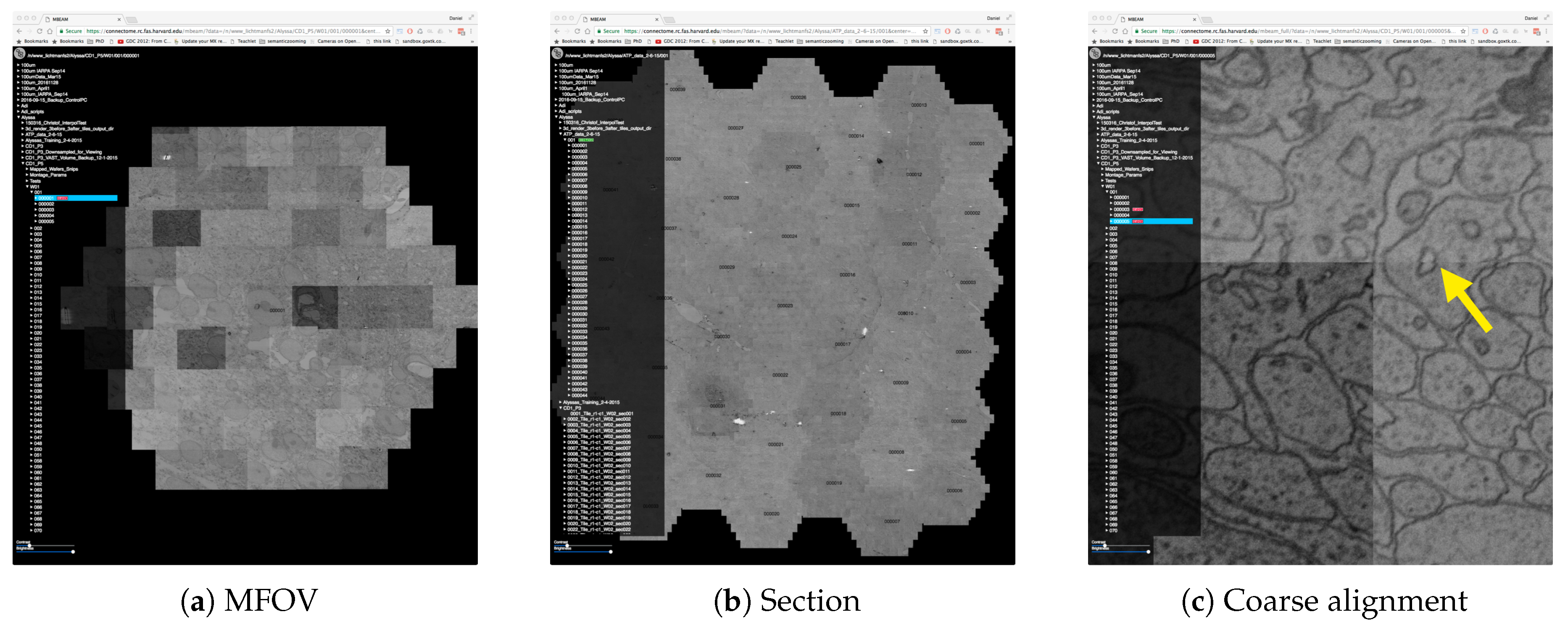
The microscope provides estimates of the 2D locations of image tiles and multiple MFOVs in a section (Figure 3). This alignment method uses a very low-resolution image of the physical sample to identify the borders of each MFOV in a section, and the positions of the acquisition beams are used to align tiles within an MFOV. Imprecise alignment arises from this low-resolution data, from reduced sample points, and from vibrations (which leads to mandatory re-calibrations of beams). The microscope moves the stage to acquire another MFOV. However, this method is fast, and a more sophisticated alignment process would slow down the throughput of the microscope. The alignment coordinates are written to text files for each MFOV and for each section. Acquired data is stored on a network filesystem, typically as JPEG files. In addition to full resolution tiles, the microsope stores thumbnail versions of all image tiles ( pixels or less). For contrast normalization, the Zeiss MultiSEM 505 generates a pixel-wise lookup table across all image tiles of one MFOV. The lookup table is stored in text files as base64 encoded arrays.
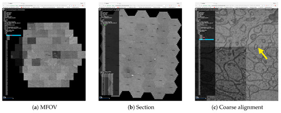
Figure 3.
The MBeam viewer visualizes data during image acquisition using the Zeiss MultiSEM 505 electron micoscope. (a) An individual multi-beam field-of-view (MFOV) is visualized, consisting of 61 images which are coarsely aligned using coordinates from the microscope. Each individual image is 3128 × 2724 pixels in size, resulting in roughly 30 k × 26 k pixels for each MFOV. Multiple MFOVs are stitched together as one section within an image volume. The MBeam viewer visualizes such sections with possibly hundreds of MFOVs. (b) 44 MFOVs stitched to roughly 200 k × 170 k pixels. Demand-driven rendering and on-the-fly mip-mapping enable user interaction in realtime. (c) The zoomed-in view shows the full resolution of the data and stitching artifacts due to coarse alignment (yellow arrow).
4.3. The MBeam Viewer
To improve the tile review workflow, we developed the MBeam Viewer (The MBeam viewer is freely available as open source software at https://github.com/rhoana/mb). This is Web-based to allow both local and remote neuroscientists to inspect tiles. The viewer visualizes tiles within their contextual MFOV and section. As the microscope generates data from across the sample and places new tiles onto the filesystem, the Butterfly server sends them immediately to the MBeam viewer to update the rendering. The user is able to zoom, pan, and scroll through different sections of the acquired data. Seeing the broader context allows our neuroscientists to identify erroneous regions both within and across tiles. The most frequent errors are unfocused images due to specimen height variations, dirt on the specimen, and tape edge errors. Another error is non-uniform contrast and brightness within an MFOV: each of the 61 beams is an independent detector, and so histogram equalization is required between the output images. Due to image content differences between the beams, this equalization can fail. Further, if beam alignment fails, then gaps form between individual image tiles. All of these errors can be detected quickly with our system.
Observations of the traditional process of quality assessment during acquisition have led to the following design choices:
D1. Remote and collaborative visualization: Our data collection occurs four floors underground to protect the electron microscope from vibrations. It is important that each of the microscope technicians, pipeline developers, and neuroscientists are able to quickly assess scan quality. Hence, the MBeam viewer frontend is remotely accessible via a Web browser and supports region of interest sharing for collaborative viewing.
D2. Scalable visualization with on-the-fly mipmapping: Data from the microscope is stored on a high-performance network filesystem to optimize throughput and match the acquisition speed of the microscope. When viewing this data, the resolution of a single image tile (3 k × 2.7 k pixels) roughly matches the resolution of a typical off-the-shelf computer monitor. Assessing the quality of one tile at a time is simply not practical and contextual views of an MFOV or a section increase the assessment speed. Therefore, the Butterfly server creates mipmap representations of each tile to provide zoomed-out overviews. These representations are created online to avoid additional file input and output operations and to reduce storage overhead. Then, the viewer combines a caching mechanism with demand-driven rendering. When a tile is requested for display, we directly send it to the client and render it, resulting in a streaming effect of sequentially appearing tiles. Tile requests always start in the center of the current view and fan out, and are responsive to user pans, zooms, or scrolls. There is a trade-off between visualization response and mipmap generation time and we quantitatively evaluate this design choice in Section 9.
D3. Discovery of MFOVs, sections, and scans: The electron microscope writes data into a directory tree on a network filesystem. A directory holding a typical scan contains thousands of sub-directories for each section, with each of those holding hundreds of sub-directories for each MFOV. Listing such a hierarchical directory structure on a network filesystem is slow, and so data change detection is slow. This also adds many disk operations to the storage system. However, the MBeam viewer needs to detect when new data arrives and whether this data is of type MFOV, section, or scan. Instead of walking through all directories, we find new data by probing the coordinate text files written by the microscope. These files are stored in fixed relative locations and follow a hierarchical pattern which allows us to distinguish data types without directory traversal. This way, data can be written sequentially during acquisition, and we can detect when a researcher moves data around manually. We present the data structure in the frontend and indicate the data type which can be selected for visualization.
D4. Interactive overlays and image enhancement: Acquisition quality can differ between individual image tiles. The MBeam viewer overlays additional information such as tile, MFOV, and section identifiers on top of the image data. This way, the user is able to match poor quality images with the actual data on the network filesystem and in the physical sample to instantiate re-capturing. It is also possible to perform client-side contrast and brightness adjustments for the current view to aid in the visual identification of low-quality tiles.
Our collaborating neuroscientists use the MBeam viewer everyday, and the streaming overview provided is a significant improvement over simply using a file browser. Zeiss, the manufacturer of the MultiSEM 505 electron microscope, installed the MBeam viewer for internal use, liked the simplicity and the open source nature, and extended their microscope control software with similar functionality.
5. Visualization of Registration
5.1. Motivation
The acquired images need to be precisely aligned in 2D and 3D to enable further automatic and semi-automatic processing. For this, we apply a compute-intensive stitching mechanism [50]. This process needs to be monitored and debugged, and parameters need to be fine-tuned. During this process, we store each modification of the input data as a copy so that we can revert back to the original input.
5.2. Data
To compensate for non-linear distortions in our 2D and 3D images, we refine a rigid registration with an elastic process. First, we calculate a scale-invariant feature transform (SIFT) [51] per 2D image tile to detect local keypoints. Then, we minimize a per-tile rigid transformation distance between matched features in each pair of adjacent overlapping tiles.
To align the image stack in 3D, we use the method of Saalfeld et al. [50] to find a per-section elastic (non-affine) transformation. This process begins by finding an approximate affine transformation for each MFOV from a section to an adjacent section. This is followed by overlaying an hexagonal grid onto each section, and matching each vertex to a pixel in an adjacent section using a block matching algorithm: a small image patch around each vertex of the grid is compared against a constrained area in the adjacent section. These blocks are different than the tiles of an MFOV to incorporate oxverlap between tiles. Finally, a spring-based optimization process minimizes the deformation between grid points and outputs a transformation for each image tile. We expand this process to non-neighboring sections to overcome acquisition artifacts. Further, we create a parallel implementation and optimize the elasticity parameters for our datasets.
5.3. The RHAligner Plugin
We inspect MFOV alignment quality by clustering transformations based on the angles of one of the internal triangles of the hexagonal MFOV shape. Changes in these angles represent squash and shear effects. We visually inspect MFOVs whose clustered angles are far from a cluster center. For this, visualizations are key to monitor, debug, and fine-tune the alignment process. This process can fail if the data is noisy or when the optimization process does not find a solution. We have developed the RHAligner plugin (The RHAligner plugin is freely available as open source software at https://github.com/rhoana/rhaligner) for Butterfly to support the visualization of the alignment steps. Several requirements for inspecting the registration lead to the following design choices:
D1. Store transformations and data seperately: Computed transformations during registration are stored for each image tile in a specification format called tilespec [52]. Meta information such as the dimensions of a tile, the file path, and the list of different transformations are stored as part of this JSON data model. This format resulted from a collaboration with neuroscientists at the Janelia Research Campus. Storing transformations separately allows flexibility during the alignment process since the image data itself is not modified. This flexibility is needed to tweak alignment of tiles within MFOVs, sections, and scans.
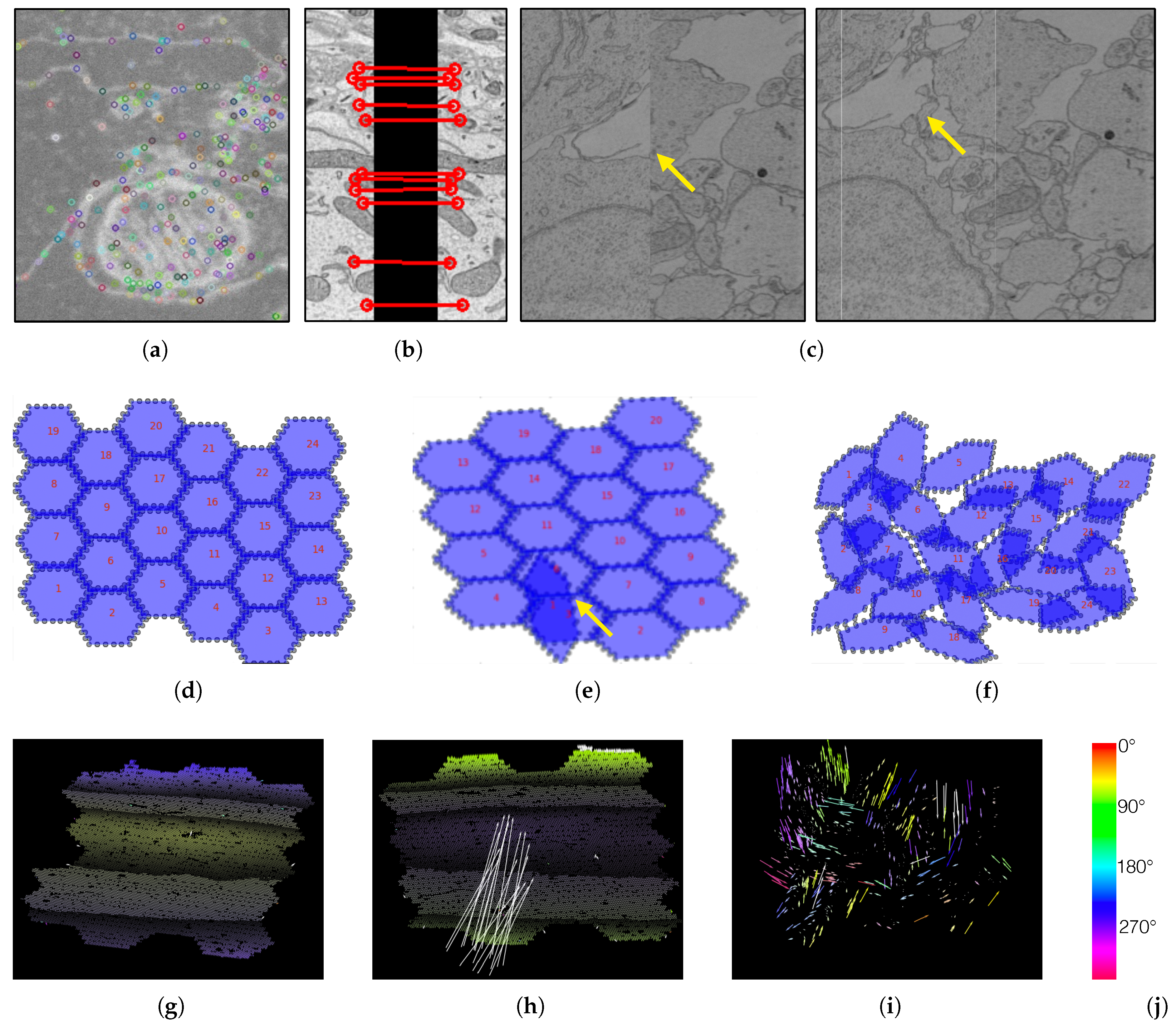
D2. Visualization of SIFT features: The first step of the alignment process is the computation of one scale-invariant feature transform [51] per image tile. If these features do not describe the image tile properly, all successive steps fail. We visualize the SIFT features as overlays on top of the original image tile as shown in Figure 4a.

Figure 4.
We create visualizations to monitor and debug the registration process. (a) We visualize scale-invariant feature transform (SIFT) features within an image tile. (b) We visualize these features when looking at overlapping tiles. (c) We render aligned MFOVs before and after the registration. (d) A correct transformation can be seen where the MFOVs appear to be slightly rotated clockwise. (e) Here we see an erroneous transformation for one MFOV. Further examination reveals that the mismatched MFOV (yellow arrow) is incorrectly matched with the features of the neighboring section. (f) This visualization shows a case where most MFOVs are incorrectly transformed. This is caused by a large rotation of the neighboring section, which has severe impact on the accuracy of SIFT features. The vector fields in the bottom row show the displacement of each single match between adjacent sections (after an affine alignment to align these two sections). We color code by angle. (g) A “normal” matching. The sections are more or less on top of each other, but after the affine alignment the top and bottom parts (purple) are stretched to the bottom left, and the middle (yellow) is stretched towards the top right. Some white arrows are outliers. (h) A case where one MFOV was not pre-aligned properly, and so all its arrows are white. (i) A case where the pre-alignment gave bad results. (j) The color map for visualizing the displacement angles.
D3. Illustration of overlap between tiles: We use SIFT features of overlapping tiles to replace the coarse alignment of image tiles within an MFOV. To debug and monitor this process, we visualize SIFT feature matches between tiles (Figure 4b).
D4. Online rendering of transformations: We added a tilespec reader to the Butterfly middleware. This lets us use the MBeam viewer to visualize the aligned data in 2D and scroll through the stack (Figure 4c). We inspect the alignment of a scan using a zoomed-out view of sections and concentrate on larger neurons while scrolling through the scan. The movement of large structures is relatively easy to track in grayscale images and interruptions due to false alignment are clearly visible. This allows us to find regions which require further refinement.
D5. Abstracted visualization of section alignment: We stitch MFOVs together in 2D sections and perform block matching with adjacent sections in 3D. An MFOV itself is roughly 520 megabytes in size and rendering a section containing hundreds of MFOVs is slow even with display-aware and demand-driven visualization. We add an abstracted visualization of stitched sections to the RHAligner (Figure 4d–f). It is possible to quickly assess the section alignment of adjacent sections using this technique.
D6. Visualize displacement of blocks within an MFOVs: Once we identify failing alignment in a section, we need to know which MFOVs are misaligned—specifically, which blocks of the MFOVs. For this, we visualize the displacement of blocks within each MFOV using vector fields (Figure 4g–i). These renderings are lower resolution to be scalable. However, this makes it difficult to see the arrows of the vector field for large datasets. Therefore, we color code the direction of each displacement according to its angle. If a displacement is larger than a user-defined threshold, we highlight the vectors in white.
Debugging the alignment is manual since the uniqueness of each dataset requires fine tuning of the alignment computation. The developed visualization scripts are used by experts to assess alignment quality and quickly find difficult areas which need parameter optimization. Once the data is fully aligned and the transformations are finalized, we harden the transformations and store the modified scans as volumetric data within HDF5 containers.
6. Visualization of Segmentation
6.1. Motivation
Registered connectomics data is ready to be automatically segmented. We find cell membranes of neurons using an automatic segmentation pipeline [9]. This is a difficult and often error-prone task. These errors take two forms: merge errors, where two neurons are fused together, and split errors, where one neuron is split apart. These errors happen within a section and across sections. We report classification results on the SNEMI3D challenge [10] as variation of information scores of in Knowles-Barley et al. [9,53]. We also detect where neurons exchange information through synaptic connections. Errors can occur during synapse detection when synapses are not found or falsely labeled.
To find regions of error and to debug the segmentation pipeline, we need to look at feature maps such as membrane probabilities. We also need to visually assess segmentation quality and synapse detection since ground truth segmentations are sparse and time-consuming to generate. Similar to visualizations of the alignment process, visualizations aid the complicated process of parameter tuning.
6.2. Data
We use a state-of-the-art automatic labeling of neurons [8,9,53]. Cell membrane probabilities are generated using a convolutional neural network (CNN) based on the U-net architecture [54]. The probabilities are encoded as gray-scale images, then used to seed an implementation of the 3D watershed algorithm which generates an oversegmentation using superpixels. Then, we agglomerate superpixels with a parallel implementation [55] of Neuroproof [56,57]. The resulting segmentations contain labelings of millions of different neurons. For scalability, we run the segmentation steps in parallel as part of a distributed processing framework. We split a scan into blocks of fixed size which we segment in parallel. Once computed, the blocks are merged to create the segmentation of a full scan.
Synapse Detection. Concurrent with the automatic neuron segmentation, we also detect synaptic connections. For this, we use another U-net classifier to label the pre- and post-synaptic pixels near the synaptic connection. We find the synaptic polarity by combining this output with our cell membrane segmentation. Unfortunately, the combined segmentation and synaptic polarity detection method is not yet published and further details will appear in a future paper. Detection performance of can be expected [58].
For segmentations, HDF5 containers are our format of choice. This file format is widely supported and random access is possible without loading the entire volume into memory. Calculated features such as membrane probabilities and synaptic connections are also stored in HDF5 containers.
6.3. RhoANAScope
Visual inspection of segmentation output is required. For this, we developed RhoANAScope (RhoANAScope is freely available as open source software at https://github.com/rhoana/butterfly/bfly/static), a viewer for neuron and synapse segmentations. RhoANAScope visualizes sections and scans of gray-scale EM image data. It supports overlaying multiple layers to match image data to segmentation output or feature maps. Standard interactions such as zooming, panning, and scrolling through the stack enable the exploration of large datasets. To be scalable, we use Web-based demand-driven and display-aware rendering with GPU acceleration. We designed RhoANAScope as follows:
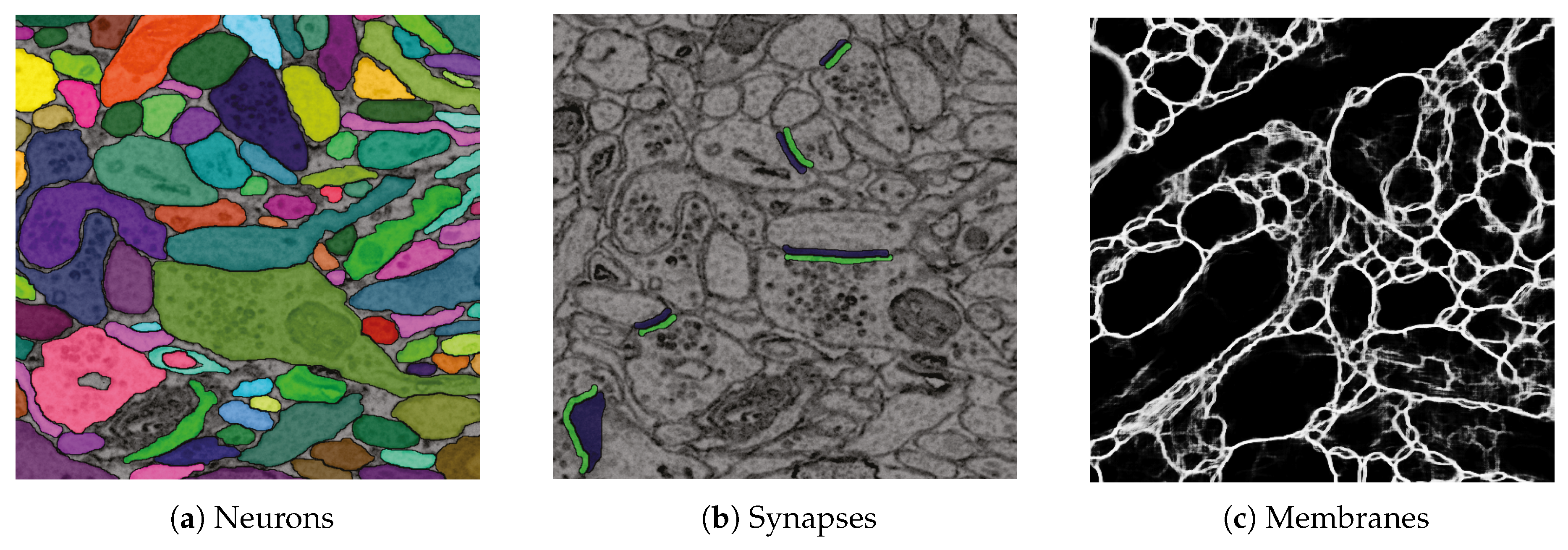
D1. Visualize grayscale images with multiple overlays: The inputs to our automatic segmentation pipeline are fully aligned scans. The pipeline uses these scans to compute membrane probabilities and to generate a cell membrane segmentation. The membrane probabilities and the membrane segmentation overlap spatially with the gray-scale EM scan. Our task is to overlay the data to debug and understand these outputs. RhoANAScope is designed to support multiple layers of image data blended using user-configured opacity values. This way, we can see the original image data while looking at probabilities and membrane output to understand the classifications. We show a section with cell membrane segmentation overlays in Figure 5a, and with synapse detection overlays in Figure 5b. We show membrane probabilities in Figure 5c.

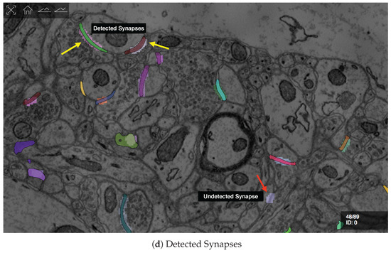
Figure 5.
We developed RhoANAScope: a Web-based visualizer for neuron and synapse segmentations at scale. RhoANAScope visualizes segmentations on top of image data using WebGL. (a) Individual neurons are colored according to their cell membranes. (b) Pre- and post-synaptic markers are colored as green and blue, and indicate information pathways between neurons. (c) We use membrane probabilities to debug the automatic segmentations. (d) RhoANAScope is scalable to large data by implementing display-aware and demand-driven rendering, and supports multiple overlays. Here, we match a groundtruth segmentation of synapses with the output of our automatic synapse detection to view undetected synapses (red arrow) versus detected synapses (yellow arrows). Please note that the synapse detection visualized here is not complete.
D2. Colorize neighboring neurons: When rendering segmentation layers, we colorize the labelings to distinguish between neighboring neurons. The colorization involves a look-up procedure which maps the identifier to an RGB color. We use the following formulas to map labels to RGB color values:
For a given id x, we set each byte for red, green and blue to cycle approximately every seventh id () for R, every other id () for G, and every fourth id () for B, The exact values chosen preserve dramatic changes between neighboring values while adding subtle differences to allow 233,100 unique colors for sequential ID values. The resulting colorization is shown in Figure 5a.
D3. GPU accelerated rendering: Sections can be very large and any overlay doubles the amount of rendered data. We use demand-driven and display-aware rendering for scalability. However, we use GPU accelerated rendering to process the overlays. This way, we can add additional processing such as adding segment borders or applying a color map in cases where looping through the pixels on the CPU is too slow.
D4. Support multiple input formats: We mainly use HDF5 containers for storing segmentations to support random access without loading a full scan into memory. This is not always fast, and other connectomics tools aid scalability by storing sections separately as HDF5 or by providing a JSON type descriptor of the data (e.g., Neuroglancer [33]). We abstract the input format by using the butterfly middleware and support these different storage methods. Adding support for a new file format requires extending Butterfly by adding another derived input source.
D5. Index multiple data sources: During segmentation, different parameters result in different results. This means scans can have many alternate segmentations, and keeping track is difficult. RhoANAScope uses the Butterfly middleware to query directories for their datasets. This mechansism detects file types and meta information (such as dimensions, pixel encodings etc.) and creates a searchable listing of available datasets.
D6. Compression: Storing connectomics data can quickly add up to multiple terabytes or petabytes of data. We support the efficient and segmentation-map-specific Compresso algorithm for reading data and also for transferring data from butterfly to RhoANAScope [45].
Automatic segmentation of 2D nanoscale images is a complex process. We use RhoANAScope to understand the output of our pipeline and to visually assess segmentation quality, but also as an every-day viewer for segmented connectomics data.
7. Interactive Visualization for Proofreading
7.1. Motivation
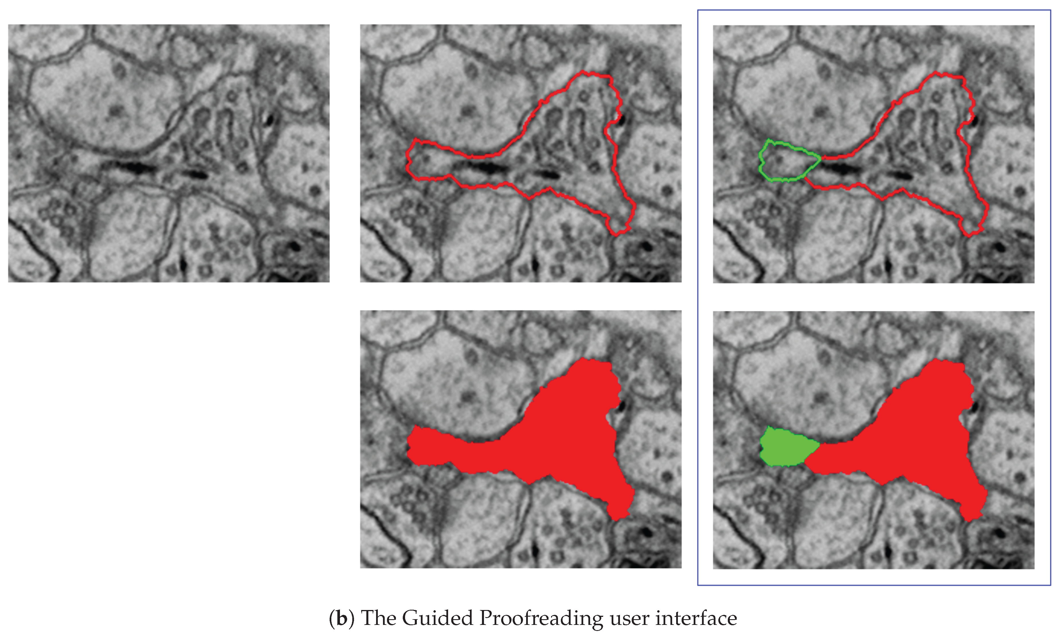
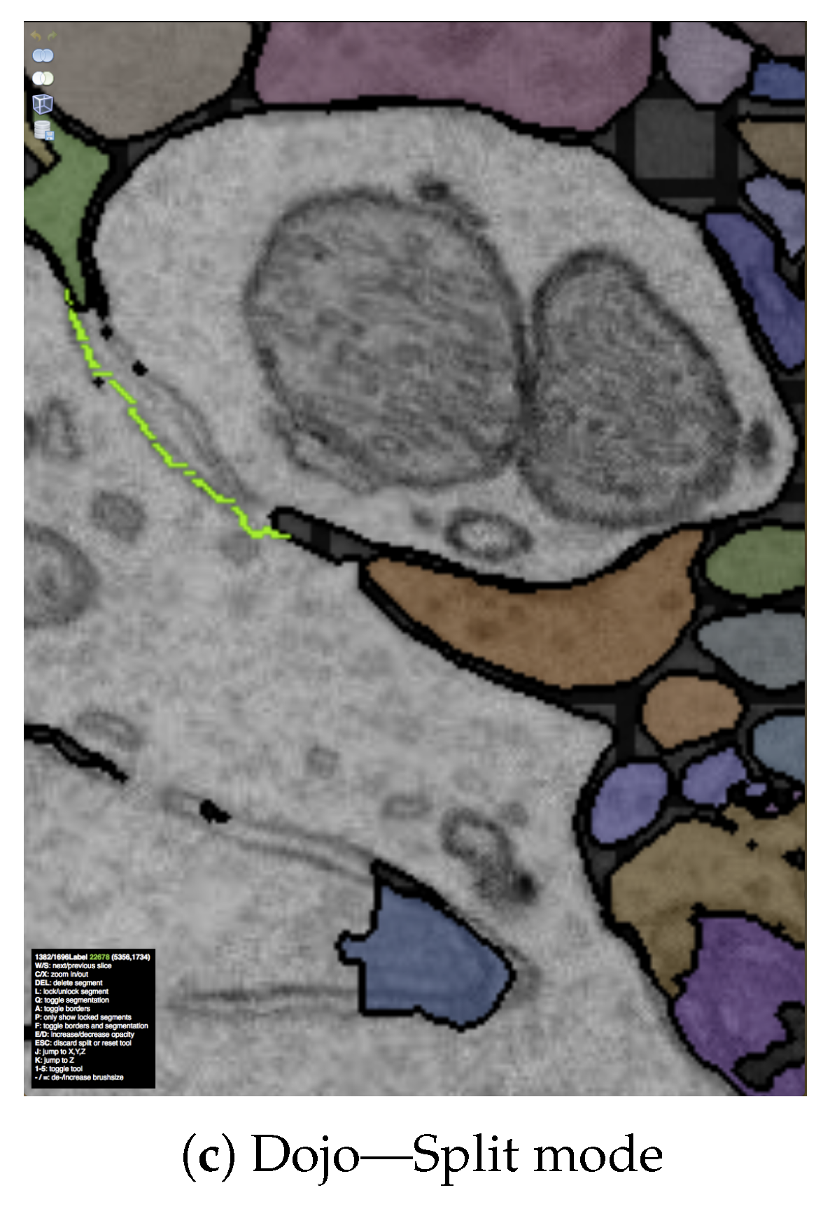
The output of our segmentation pipeline is not perfect. Labeled connectomics data, on average, requires hundreds of manual corrections per cubic micron of tissue [22]. As mentioned previously, the most common errors are split errors, where a single segment is labeled as two, and merge errors, where two segments are labeled as one. With user interaction, we can join split errors (Figure 6a), and we can define the missing boundary in a merge error (Figure 6b). This manual error correction is called proofreading.
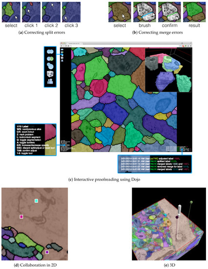
Figure 6.
The output of our automatic segmentation pipeline requires proofreading to correct split and merge errors. These errors can be fixed with simple user interaction: (a) Split errors can be corrected by joining segments; and (b) merge errors can be corrected by drawing the missing boundary. Including these interactions; (c) we build the interactive proofreading tool Dojo with a minimalistic user interface, display-aware and demand-driven visualization, and integrated 3D volume rendering. Proofreaders can collaborate, each with cursors in (d) 2D and (e) 3D. The exclamation mark in (e) is used to request help at a specific region within the data.
7.2. Data
After automatic segmentation, we compute mipmap representations of scans and their corresponding segmentation data. Each section of a scan is stored as a separate mipmap with each mip level stored as tiled images. This allows partial access when requesting zoomed out views of data. However, editing the segmentation then requires partial rebuilding of the mipmap if the image data is changed.
In practice, each mipmap representation includes meta information regarding the dimensions, tiling, data format, and encoding stored within an XML descriptor. The data is organized as a hierarchical directory structure, with zoom levels grouping sub-directories for each section. Then, each section is stored tiled as a row/column format.
7.3. Proofreading Applications
Proofreading is necessary to interactively correct segmentation errors before analysis. For this, we propose Dojo (Dojo is freely available as open source software at https://github.com/rhoana/dojo.), a Web-based proofreading application that supports multiple users. We evaluated Dojo and other proofreading software with novices trained by experts as part of a quantitative user study (between-subjects experiment) [11], and designed mechanisms for quality control [13].
7.3.1. Interactive Proofreading Using Dojo
Dojo enables proofreading in 2D with users able to zoom, pan, and scroll through the stack (Figure 6c). To visualize, we use GPU accelerated demand-driven and display-aware rendering in 2D, and we also incorporate 3D volume rendering. We made the following design choices:
D1. Minimalistic user interface: A proofreading tool has to be simple and easy to understand. This is especially true if we wish to support use by non-experts. The user interface of Dojo is designed to be parameter free and have limited options available through icons (Figure 6c). Textual information is presented small but still readable. This way, the proofreader can focus on the actual data and the task of finding errors.
D2. Interactive splitting and merging: Users of Dojo need to be able to correct split and merge errors efficiently. To correct split errors, the user clicks on one incomplete segment and then on the segments to be joined (Figure 6a). For merge errors, Dojo allows users to split a single segment into two or more by drawing a line across a segment (Figure 6b). Then, the best split line is calculated by using the user input as seed points for a watershed algorithm. Both interactions require minimal interaction and give immediate feedback.
D3. Three-dimensional volume rendering: In Dojo, proofreading happens when viewing a single 2D section. However, we also include 3D volume rendering to visualize segments in the context of the full scan. In a controlled experiment between novice users, we observed that this feature especially allowed non-experts to better understand the three-dimensional property of connectomics data [11].
D4. Dynamic merge table and partial mipmapping: Proofreading requires many corrections of segmentation data. Since our data results from an oversegmentation (Section 6), more split errors than merge errors exist. We use a segment remap table to allow merge operations without actually modifying the image data. Merging a segment with another segment is achieved by adding a look-up or redirection entry to the segment remap table. This dynamic data structure is stored separately from the data and is applied during rendering. For split errors, we calculate which parts of the mipmap need to be updated to properly adjust the segmentation data. This is scalable because each mip level is stored as individual image tiles.
D5. Collaborative editing: Proofreading of larger volumes can be sped up when multiple users correct the data at the same time. In Dojo, we synchronize the modifications of the segmentation data among all connected users via Websockets. This can result in many transfers depending on how many clients are connected. Therefore, we limit the transfer to coordinates and meta information and deliver updated segmentation tiles on request. If two or more users work on the same region of segmentation data, the other users’ cursors are shown as small colored squares (Figure 6d). In 3D, the cursors are displayed as colored pins pointing to a position within the scan. In addition to cursor sharing, users can actively mark an area of the data to seek help from other users (Figure 6e).
Our experiments have shown that the majority of proofreading time is spent by users looking for errors. To reduce this time, we propose the Guided Proofreading system [12] which suggests errors and corrections to the proofreader.
7.3.2. Guided Proofreading
Using classifiers built upon a convolutional neural network (CNN), the Guided Proofreading system (Guided Proofreading is freely available as open source software at https://github.com/VCG/guidedproofreading) detects potentially erroneous regions in an automatic labeling. Then, we present the proofreader with a stream of such regions which include merge and split errors and their corrections. This way, proofreading can be hastened with a series of yes/no decision, which is faster than manual visual search using Dojo.
D1. Split error detection via CNN: We trained a split error classifier based on a CNN to check whether an edge with an automatic segmentation is valid. By choosing a CNN over other machine learning methods, we enable the classifier to learn features by itself rather than using hand-designed features. Our CNN operates only on boundaries between segments and, in particular, on a small patch around the center of such boundaries. We use the grayscale image, the membrane probabilities, a binary mask, and a dilated border mask as inputs. The architecture of our split error classifier uses dropout regularization to prevent overfitting (Figure 7a).

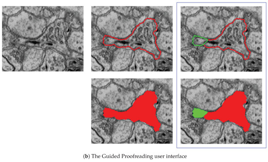
Figure 7.
The Guided Proofreading system reduces the time spent finding potential errors by proposing candidate errors and corrections. (a) The system is informed by a convolutional neural network (CNN) with a traditional architecture. The CNN uses a patch of image data, membrane probability, binary cell mask, and cell border overlap to decide whether a split error between two neurons exists. (b) Then, we present the proofreader with a stream of regions and candidate corrections. Thus, proofreading can be hastened with a series of yes/no decisions, which is about faster than using Dojo.
D2. Merge error detection using the split error classifier: We reuse the split error classifier to detect merge errors. We generate potential borders within a label segment using randomly-seeded watershed, and then test whether each border is a split error. If our CNN reports a valid split, we assume that this border should exist, and therefore we should split the label segment in two.
D3. Single-click corrections: We perform merge and split error detection as a pre-processing step and sort them by probability of error confidence. The Guided Proofreading system then presents the most likely errors one-by-one to the user and also shows a potential correction. Then the proofreader can decide whether to accept or reject a correction with a single click.
Our experiments show that Guided Proofreading reduces the average correction time of 30 s with Dojo to less than 5 s on average. Correcting segmentations of large connectomics datasets still takes a long time, but proofreading applications make this more feasible by supporting multiple users and simple operations. We are currently exploring new ways to proofread synaptic connections.
8. Network Analysis
8.1. Motivation
Analysis is the final step of the connectomics pipeline. Segmented and proofread data includes cell membrane annotations for all neurons and the synaptic connections between them. This information represents a (partial) wiring diagram of the mammalian brain, and this network can be modeled as a weighted graph (i.e., weighted by number of synaptic connections). Such a graph structure is three dimensional, dense, and can be hard to analyze due to the large size. To better understand the data, we need visualizations that render it in 3D and show the biological properties of neurons and their connections. However, typical analysis concentrates on a subset of our data. This means we also need sophisticated methods to query and filter our large wiring diagram.
8.2. Data
As previously mentioned, segmentation data and synaptic connections are typically stored as HDF5 files containing the full scan, or as tiled mipmap data structures. The generated neuron and synapse information is stored as a graph structure in JSON files. We parse these files and store the connection information in a database as part of the Butterfly middleware, so that we can perform efficient indexing and querying.
8.3. Tools for Network Analysis
8.3.1. 3DXP
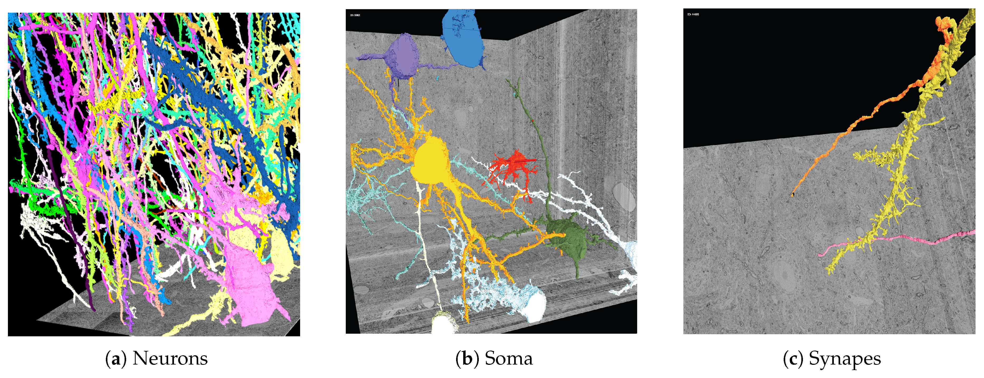
To prepare for 3D analysis, we generate meshes representing neuron geometries by performing marching cubes [59] on our volumetric segmentation data. We have developed 3DXP (3DXP is freely available as open source software at https://github.com/rhoana/3dxp), a Web-based application for exploring volumetric image data and neuron geometries in 3D (Figure 8). This application is fully interactive and allows researchers to analyze individual neurons and their connections by zooming, panning, and scrolling through the scan. We designed 3DXP with the following choices in mind:

Figure 8.
Three-dimensional polygonal mesh reconstructions of automatically-labeled connectomics data using our Web-based 3DXP software (downsampled to 3 k × 3 k × 1.6 k voxels). Since the reconstructions are hundreds of megabytes in size, we stream and render the geometries progressively. The displayed scenes show: (a) twenty neurons stretching through a 100 m volume; (b) multiple cell bodies (soma) visualized; (c) a dendrite with two synaptic connections. All scenes are interactive with zoom, pan, and scroll interactions. It is also possible to mouse click on a mesh region to open other visualizers for further data exploration, e.g., in Dojo.
D1. Progressive rendering: For collaborative research, a shareable dynamic visualization allows more interactivity with the data than statically-generated images or videos. While the visuals must be simple enough to transfer over an internet connection, the most valuable information from detailed connectomics emerges when we can show highly detailed reconstructions. Progressive rendering provides such a solution through multiple meshes of varied levels of detail. 3DXP applies the existing format of POP Geometry [60] to direct bandwidth to the neural projections closest to the interactive camera.
D2. Parallel computation: Rendering meshes at several levels of detail takes too much time to compute on demand for each request. With 3DXP, we precompute meshes at multiple resolutions for all segmentation identifiers in the reconstructed volume. To reduce the number of days required to generate meshes for millions of neurons over trillions of voxels, we divide the full volume into a grid. The volumetric grid allows the parallelization of both mesh generation and conversion to the multiresolution format across any number of simultaneous connected machines with limited memory usage.
D3. Correspondence to EM imagery: The rendered meshes when viewed in isolation provide no indication of the raw data provided as input to the reconstruction. To show the position of a surface within a brain region, 3DXP displays the meshes alongside axis-aligned sections from the electron microscopy image volume. Our researchers need to ensure individual EM scans match at the corresponding depth of a given mesh, so we transfer highly downsampled images of each scan. The users freely move up and down through scans scaled to match the reconstructed meshes.
D4. Animation: Visualizing more neural projections in 3D corresponds to increasing visual complexity. An informative and visually appealing solution involves laying a single EM section to obscure all structures deeper than a given region of interest. The 3DXP viewer supports the creation of animations that interpolate between chosen camera positions, each linked to a single EM section. The user saves each given viewpoint as a keyframe linked to a single section. 3DXP can then step through each section at a constant rate in an animation, moving gradually through the saved viewpoints.
D5. Interoperability: While a 3D visualization is useful, it only partially supports a full understanding of a given volumetric reconstruction. Therefore, we designed the 3DXP viewer to work seamlessly with the 2D tiled image viewers in our system. A user can identify the coordinates of any point on a rendered mesh to immediately view it in 2D. In particular, the interoperability with the Dojo editor allows the discovery of segmentation errors in an exploratory 3D view to immediately facilitate manual corrections in a more focused and higher resolution editing environment.
8.3.2. Neural Data Queries
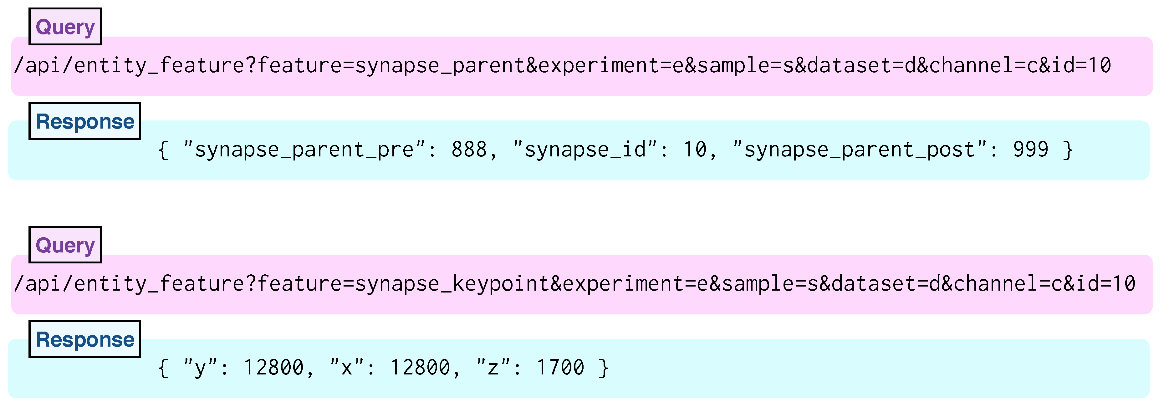
To query, filter, and parse the relationship of neurons and their connections, we developed the Neural Data Queries system (Figure 9). This system offers a well documented API to request the following information: all synaptic connections in a region of interest, the center of a specific synapse, pre- and post-synaptic neurons of a specific synapse, all neurons in a region of interest, the center of a neuron, and all synapses of a neuron. While the Neural Data Queries system returns numeric or text data, it is possible to use this information to render specific neurons and their connections using our visualizers. For this, we report the following design choices:
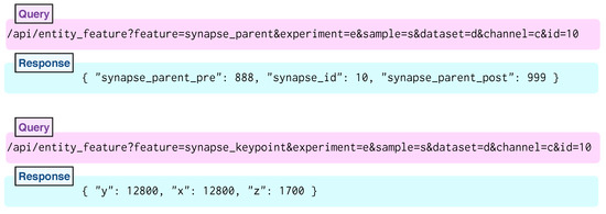
Figure 9.
Two neural data queries and responses show separate properties of a given synapse. Both synapse_parent (top) and synapse_keypoint (bottom) queries request a field of data for synapse label 10 in dataset d of sample s in experiment e. The channel c refers to the tiled volume containing a reconstruction of synapse segments. The top request returns both neuron segment labels representing the presynaptic input and postsynaptic output of the provided synapse. The bottom request returns the coordinates of the center of the requested synapse.
D1. Interoperability: To facilitate communication between 3D mesh and 2D image viewers, the Butterfly middleware supports neural data queries within a shared naming convention and single coordinate frame. For viewers where synapse data is not displayed, a query containing only the coordinates of a region of interest returns a list of the included synapses. Further requests return the information needed for a particular viewing task: either the specific coordinates, or the neuron segments joined by the synapse.
D2. Support for automation: The neural data queries consist of the number of elemental requests needed to express the spatially-embedded connectivity graph over many short and fast queries. Rather than attempt to enumerate all the complex queries of an embedded graph, the neural data queries often return a single property of a single entity. An automated client can request “the synapse location between neuron A and neuron B” in multiple neural data queries. If any ID value in “synapses of neuron A” occurs in the list of “synapses of neuron B”, then a third request can be made for the location of the shared synapse.
D3. Informative feedback: The RhoANAScope viewer makes use of many small neural data queries to asynchronously index all tiled images available for viewing. A single request lists all experiments, which trigger requests for all samples per experiment, then all datasets per sample, and ultimately all tiled image channels per dataset. When manually querying the API, the Butterfly system facilitates manual indexing through helpful error messages for humans. Without any parameters, Butterfly suggests a list of experiments. In response to requests, including a misspelled channel, Butterfly suggests valid channels. The response is the same for any missing or invalid parameter such that humans can interact with the API without prior knowledge.
We specifically designed the Neural Data Queries system together with neuroscientists to support targeted data exploration. Targeted data queries provide endpoints specific to neural reconstructions. API endpoints provide the center coordinates of any neuron ID with a cell body or any synapse ID value. Most importantly, we can return all synapses in a region, all synapses of a neuron, and both neurons for any given synapse. A configuration file listing file paths matches tiled images with the corresponding files for center coordinates and synapse connectivity. An efficient database integrated in Butterfly ensures that each query response is generated in less than 5 s.
9. Performance and Scalability Experiments
All 2D client visualization applications in our system request a view onto a scan volume from the Butterfly server. When a client requests a viewport that is smaller in pixel size than the files in storage, the server must load and transfer subsections from each file, e.g., for a zoomed-in view. When a client requests a viewport that is larger in pixel size than the files in storage, the server must load and combine many image files before transfer, e.g., for a zoomed-out view. For far-zoomed-out views, this combination requires loading many hundreds of files, which can be slow. To provide a faster response, the client sequentially requests only tiles within the total-requested viewport. These are independent of the tiles on network file storage. The server then sends these tiles as parts of the viewport of the client where they are displayed.
Each 2D client application opens with a zoomed-out view completely containing a full tiled image at the lowest available resolution. For an overview of the full volume at a low resolution, users can scroll through all full tiled images in the stack. The speed of this interactive overview depends on the time to load and transfer a full tiled image at a mipmap level within the viewport dimensions. By considering the most zoomed-out view, we compare transfer times without calculating the variable number of tiles needed for many possible zoomed-in views. We measure this tile transfer from the storage system as a second experiment, which applies to pre-computed and on-demand mipmap scenarios.
To optimize client tile transfers of arbitrary sizes from storage systems with an arbitrary numbers of files, we present results from two sets of experiments designed to separately test performance of client tile transfer and file storage. Given the optimal client tile size, the optimal bit rate to read files from a network file system reduces the overhead for each transfer. These experiments measure throughput from data on the network file system to a Web-based client viewer application, and are indicative of the general performance of all reported visualization tools. In this sense, they measure the scalability of our display-aware and demand-driven rendering (Figure 10). We measure both client tile size and file size by the pixel dimensions of the square tiles (denoted either as or pixels.)

Figure 10.
We record throughput of a generalized scalable visualization pipeline, to inform best-practice Butterfly parameter settings. This pipeline replicates the general setup of all reported 2D visualization tools. First, we load data from a network file system. Our middleware then processes these files and transfers tiled images to a 2D visualizer. Our experiments include the file storage experiment and the tile transfer experiment.
Client Tile Transfer Experiment: We measure both the time to transfer a single tile to an image viewer and the time to transfer data that is split into multiple tiles. This helps to answer the question: Which tile size best enables streaming when transferring data from server to client viewer? The size of the client-requested image tiles affects the transfer time from the server, where the optimal client tile size for each request should minimize both the delay between an individual tile appearing in the client and the duration until all tiles fill the client display.
File Storage Experiment: We measure loading speed for a full section of data using different-sized files in storage to answer the question: Which file size is most efficient to read connectomics imagery in a network environment? The size of the image files in storage affects the file read rate from network file storage, where the optimal tiled storage system should minimize the time to load tiles from the file system. For this experiment, we assume we want to read a fixed number of pixels from disk.
9.1. Client Tile Transfer Experiment
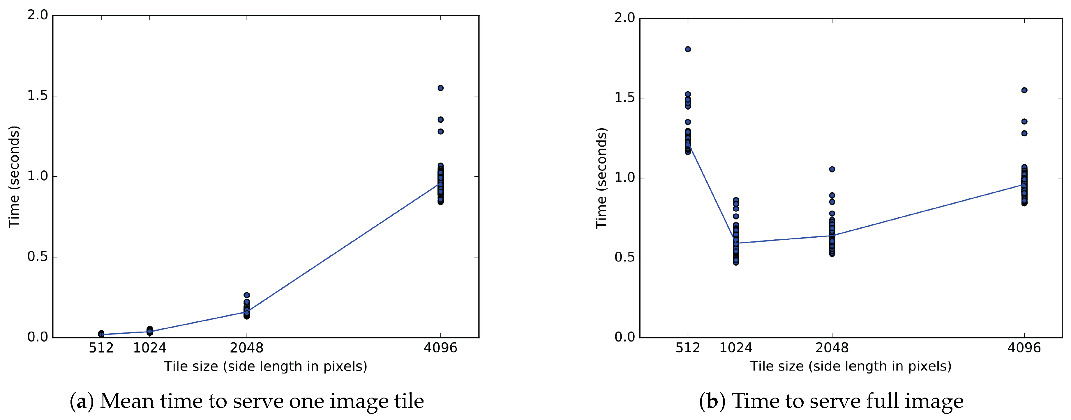
We measure the time to serve an image of pixels from server memory. We send the full image to the viewer as one or more tiles, each fulfilling a separate image request. Because the total data transferred is constant, the time to serve the full image reflects the bit rate for data transfer to the viewer. For one tile of pixels, four tiles of pixels, 16 tiles of pixels, and 64 tiles of pixels, we measure the total time from the start of the first request until the last response completes the full image. The full image transfer time divided by the total number of tiles directly gives the mean time to transfer a single tile to the client. The single tile transfer time also measures the delay between updates to the rendered image. With an increased mean time to transfer a single tile, the user sees tiles render at a slower frequency.
9.1.1. Experimental Setup
The client tile transfer experiment starts a Tornado [61] server from a Python 2.7.11 interpreter on a single CentOS Linux machine on the Harvard Odyssey research computing cluster (The Harvard Odyssey cluster is supported by the FAS Division of Science, Research Computing Group at Harvard University). The viewer contacts the server through an SSH tunnel on the Harvard network from Google Chrome v54 on an Ubuntu Xenial Linux distribution. Before sending data, the server divides a tile of pixels from an existing EM image into all 64 tiles of pixels needed for the first condition. In Chrome on the client, the first request opens HTML and JavaScript for an OpenSeadragon viewer. The viewer starts a timer when ready to make asynchronous requests. After the last image tile arrives, the viewer sends the full duration to the server.
9.1.2. Experimental Results
For the client tile transfer experiment, one-way ANOVA tests showed significance across all 500 repetitions. When measuring time for the full image () or time per tile (), the four conditions of tile size show a significant effect at the level for tiles of 512, 1024, 2048, or 4096 pixel edges.
Relative to a bulk transfer of pixels, Figure 11b shows a longer time to transfer of 64 tiles of 512 pixels, and shorter transfer times for 16 tiles of 1024 pixels or 4 tiles of 2048 pixels. Post hoc comparisons (after Bonferroni correction) indicate that a full image transferred in tiles measuring 1024 pixels in significantly less time than in those measuring 2048 pixels (, ), 4096 pixels (, ) or 512 pixels (, ). For all sizes measured, a full image of pixels transfers the fastest in tiles of pixels. The second fastest tiles of 2048 pixels transfer a full image in more time on average than tiles of 1024 pixels.
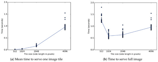
Figure 11.
One experiment uses two metrics measured in seconds to evaluate tiled image transfer to an OpenSeadragon client. (a) The time to send a single client tile depends on the size of the tile and the bit rate. The sides of a single square tile range from 512 to 4096 pixels. Tiles of the two smaller sizes each arrive in less than 40 ms. Tiles measuring 2048 and 4096 pixels per side each arrive in approximately 160 ms and 960 ms, respectively. (b) Only the bit rate affects the time to send a full tiled image of 4096 pixel sides. Sending the full section in one tile of pixels takes 960 ms, but a division into 64 square tiles of pixels increases that time to 1200 ms. Tiles of 1024 and 2048 pixel sides reduce the time to 590 ms and 640 ms, respectively.
Figure 11a shows that transfer time increases for larger tiles of 2048 pixel sides relative to smaller tiles of 1024 pixel sides. The mean delay between individual tiles greatly differs between tiles measuring 1024 and 2048 pixels. Post hoc comparisons after correction indicate that a single pixel tile loads in much less time than a single pixel tile (, ). While any given image contains four times as many tiles of 1024 pixels as tiles of 2048 pixels, each tile of 2048 pixels takes on average 123 milliseconds longer to transfer than each tile of 1024 pixels.
9.2. File Storage Experiment
We measure the bit rate to load from file system divisions of a full 32,768 × 32,768 pixel image, which is at the scale of a single MFOV. We measure the total time to load one file of 32,768 pixels, four files of 16,384 pixels, 16 files of pixels, or 64 files of pixels as square tiles ranging in length from to pixels. This simulates a server that delivers tiles of a given size from multiple files of equal or larger size. Therefore, the solid lines in Figure 12 begin by loading each file as a single tile. This experiment isolates the effects on performance of repeated access to multiple files.
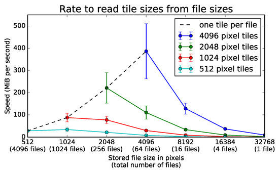
Figure 12.
Rate to read various tile sizes from several file sizes. A server loads all tiles from an image stored on a network file system at a rate given by the number of separate TIFF files used to store the data. The server can use square tiles of variable area to load the full section of 32,768 × 32,768 pixels. The four different colored lines represent square tiles of length 512, 1024, 2048, and 4096. The negative slopes of all solid lines show loading speed decreases with larger files for any given tile dimensions. For any tile size above 512 pixels, the tiles load the fastest from files of the same size. The black dotted line shows that it is most efficient to read an entire file in a single section. Error bars represent one standard deviation above and below the mean over 75 trials.
9.2.1. Experimental Setup
The file storage experiment runs entirely from a Python 2.7.11 interpreter in parallel on fourteen similarly configured CentOS Linux machines on the Harvard Odyssey research computing cluster. For any given condition, the program first stores 32,768 × 32,768 pixels of random noise into a number of tiff files of sizes ranging from pixels through 32,768 × 32,768 pixels. Each trial repeats all conditions in one uniquely labeled folder, and all file names contain an integer sequence unique within a given trial.
After writing all files for a given condition to the network file system, the program separately measures the time to load each tile from part or all of the corresponding file. The sum of all loading times then gives the time to load a constant 32,768 × 32,768 pixels from the network file system regardless of the number of files or size of tiles.
9.2.2. Experimental Results
For the file storage experiment, one-way ANOVA tests showed significance at the level for each line in Figure 12 across all 75 repetitions. When tile size equals file size, files from 512 through 4096 pixels significantly affect bit rate (). For tiles of 512 pixels, files from 512 through 32,768 pixels significantly affect bit rate (). For tiles of 1024 pixels, files from 1024 through 32,768 pixels significantly affect bit rate (). For tiles of 2048 pixels, files from 2048 through 32,768 pixels significantly affect bit rate (). For tiles of 4096 pixels, files from 4096 through 32,768 pixels significantly affect bit rate ().
The dotted black line in Figure 12 gives the bit rate when only one image tile loads from any given file. The rates increase along this line when loading from larger files. Relative to loading single tiles from 1024 pixel files, single tiles load more quickly from 2048 pixel files (, ). Compared to 2048 pixel files, single tiles also load at faster rates from 4096 pixel files (, ). As further analysis shows, the trend favoring large files only holds when the size of the tiles loaded at each instant can be arbitrarily increased.
Each solid line in Figure 12 gives the bit rate when one or more tiles of a constant size load from any given number of files. The rates decrease along these lines when loading tiles of fixed dimensions from smaller sections of larger files. Relative to loading pixel tiles from files of 4096 pixels, tiles of the same size load more quickly from files of 2048 pixels (, ). Compared to files of 2048 pixels, tiles of pixels also load at a slightly higher rate from tiles of 1024 pixels (, ).
The tiled image transfer experiment shows tile dimensions of pixels both optimally reduce delays between individual tiles and loading times for a viewport of pixels. Given a constant tile size of 1024 pixels, the tiled image storage experiment suggests a division of the image volume into files also measuring 1024 pixels. However, when external constraints limit the division of the image volume into larger flies than pixels, larger tile sizes on the scale of pixels should be considered to prevent the limits of the network file system from hindering the transfer of image tiles to the viewers.
10. Implementations and Distribution
We choose the following implementations for the described applications.
The Butterfly middleware: We implement our middleware in Python and use the Tornado [61] Web framework to provide the server. We use OpenCV for image processing and mipmap generation.
MBeam viewer: This application is written in HTML5/Javascript and uses the OpenSeaDragon [62] rendering framework.
RHAligner: The alignment framework and visualization scripts are written in Python and use OpenCV.
RhoANAScope: This is an HTML5/Javascript Web frontend and uses the OpenSeaDragon [62] rendering framework combined with our developed viaWebGL (Rendering via WebGL in OpenSeaDragon is available as open-source software at http://github.com/rhoana/viawebgl/) plugin to use GPU accelerated rendering.
Dojo: The proofreading application Dojo uses a custom WebGL rendering engine and is written in HTML5/Javascript. We use Websockets to support collaborative editing and to synchronize any changes among all proofreaders. For volume rendering, we use the XTK WebGL library [35], which enables volume rendering of medical imaging data.
Guided Proofreading: This classifier is developed in Python using the Nolearn [63] machine learning library. The user interface is written in HTML5.
3DXP: This visualizer renders using the X3DOM WebGL library [64] and the user interface including keyframe recording is written in HTML5/Javascript.
Neural Data Queries: This API is written in Python and integrated into the Butterfly middleware. We use MongoDB [65] for the database.
10.1. Data Access API
The Butterfly middleware provides an application program interface to abstract data access by providing a cut-out service. This abstraction layer enables the requesting client application to not care whether data is stored as pre-computed mipmaps, or if different zoom levels need to be computed online. Further, the client is agnostic to file formats and data storage schemes. For example, segmentations can be stored with different bitrates depending on the number of encoded structures (Section 3.2). The data access API is the core feature of the Butterfly middleware and is documented online (The Butterfly data access API is documented at https://github.com/microns-ariadne/ariadne-nda/blob/master/specs/finished.md).
10.2. Distribution
All applications described in this paper are available as open source software and can be installed individually. However, we also provide a downloadable virtual machine image (Installation instructions for the Butterfly virtual machine image are given at https://github.com/Rhoana/bflyVM) based on Ubuntu linux, bundled with pre-configured installations of Butterfly and all visualization applications. This way, interested users can download the virtual machine, link to a network file system, and immediately access the bundled tools via a Web-browser from anywhere in the local network.
11. Use Case: Splitting Merged Somas
While we have designed each tool to function optimally for separate tasks in the analysis of connectomics imagery, it is also possible for information gained in one interface to inform the interaction in others. To demonstrate this, we present a method for solving the problem of splitting merged somas in nano-scale images, with linked views across several applications.
Gravitational centers of brain cells appear in the segmentation data as large uninterrupted round regions with a single identifier. These regions were segmented using membrane probabilities as described in Section 6. Given an identifier of a cell body within the scanned volume (soma, obtained through visual inspection), 3DXP opens the surface mesh of the identifier in an interactive 3D viewer. For a correct segmentation, we expect any mesh with a cell body to branch into thinner projections that continue past the edge of the volume or terminate in small synaptic connections. Any neuroscience researcher would immediately notice when 3DXP instead shows the projections of one soma grow seamlessly into another cell body.
A single surface mesh with two distinct globular masses indicates that the neuron segmentation contains two mistakenly-merged neurons. After noticing such a mesh, a researcher can visually search various views in 3DXP to inspect unlikely- and unevenly-shaped patterns in the thin projections. When clicking to identify a region of interest, the coordinates automatically open to the corresponding view in the Dojo proofreading tool. In Dojo, the user can follow the contours of the EM image to create a new segmentation label to separate the two merged neurons. After 3D agglomeration on the resulting segmentation, the researcher can separately analyze the two neuron segments.
Figure 13 shows one way a 3D view in 3DXP informs 2D proofreading in Dojo. In addition to improving the current segmentation through proofreading, the software presented here allows analysis of intermediate results to improve the algorithms behind future segmentation. The RhoANAScope viewer can maintain a central directory of all initial EM images, intermediate membrane potentials, and resulting segmentation volumes. Upon finding an unusual error while making corrections in Dojo, a researcher can open the corresponding membrane potentials in RhoANAScope to understand the source of the error in the automated process.
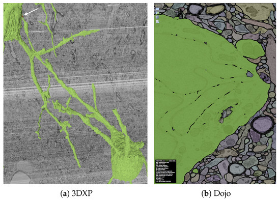

Figure 13.
Three steps in the use case of splitting connected cell bodies. In (a), a single green label includes two large cell bodies. Therefore, the one label contains the joined reconstruction of two neurons. A neural process runs from a broad base off the lower cell body. While the projection correctly passes narrowly behind one branch of the upper neuron, the tip of process mistakenly merges with the surface of the upper soma at a small point shown in red. In (b), the dojo editor displays the false merge between the large upper soma and the small neural process (upper right). Using the same segmentation available to the 3D view, both neurons display as parts of one green segment. In (c), a detailed view shows the same false merge with the segmentation label removed. The membrane between the large soma and the small projection displays as a darkened band in the EM image section. The green line, drawn by the user, allows the separation of the falsely merged neurons.
12. Conclusions
The Butterfly middleware makes working with connectomics datasets easier and more convenient. The simple application programming interface abstracts away the low-level problems that occur when working with massive datasets so that neuroscientists and computer scientists in this field can focus on connectomics as opposed to data management. We demonstrate the scalability and extendability of Butterfly with applications tailored towards every step of the connectomics workflow and provide all developments presented in this paper as open source software to the community. As the field of connectomics matures, more novel and sophisticated visualizations will be needed. We hope Butterfly will help us all to develop these future visualizations.
Supplementary Materials
The following are available online at https://github.com/Rhoana/butterfly/wiki/Supplemental-Material, UML Diagram of the Butterfly middleware and Video.
Acknowledgments
This research is supported in part by NSF grants IIS-1447344 and IIS-1607800, by the Intelligence Advanced Research Projects Activity (IARPA) via Department of Interior/Interior Business Center (DoI/IBC) contract number D16PC00002, and by the King Abdullah University of Science and Technology (KAUST) under Award No. OSR-2015-CCF-2533-01.
Author Contributions
Daniel Haehn is the principal architect of the landscape surrounding the Butterfly middleware and contributed to all presented software tools. John Hoffer performed major engineering of the presented applications. Brian Matejek worked on compression and provided theoretical insights. Adi Suissa-Peleg worked on alignment and performed software engineering. Eagon Meng developed the initial Butterfly image server. William Zhang worked on 3D visualization. Lee Kamentsky developed the segmentation framework. Richard Schalek and Alyssa Wilson acquired connectomics imagery. Ali K. Al-Awami, Felix Gonda, Toufiq Parag, Johanna Beyer, Verena Kaynig, Thouis R. Jones, and James Tompkin provided expert knowledge as well as guidance. Markus Hadwiger, Jeff W. Lichtman and Hanspeter Pfister supervised the project. All authors contributed to the paper.
Conflicts of Interest
The authors declare no conflict of interest.
References
- Lichtman, J.W. The Big and the Small: Challenges of Imaging the Brain’s Circuits. Science 2011, 334, 618–623. [Google Scholar] [CrossRef]
- Seung, S. Connectome: How the Brain’s Wiring Makes Us Who We Are; Houghton Mifflin Harcourt: Boston, MA, USA, 2012. [Google Scholar]
- Hagmann, P. From Diffusion MRI to Brain Connectomics. Ph.D. Thesis, Université de Lausanne de Nationalité Suisse et Originaire de Däniken, Lausanne, Switzerland, 2005. [Google Scholar]
- Sporns, O.; Tononi, G.; Kötter, R. The Human Connectome: A Structural Description of the Human Brain. PLoS Comput. Biol. 2005, 1. [Google Scholar] [CrossRef] [PubMed]
- Kasthuri, N.; Hayworth, K.J.; Berger, D.R.; Schalek, R.L.; Conchello, J.A.; Knowles-Barley, S.; Lee, D.; Vázquez-Reina, A.; Kaynig, V.; Jones, T.R.; et al. Saturated reconstruction of a volume of neocortex. Cell 2015, 162, 648–661. [Google Scholar] [CrossRef] [PubMed]
- Suissa-Peleg, A.; Haehn, D.; Knowles-Barley, S.; Kaynig, V.; Jones, T.R.; Wilson, A.; Schalek, R.; Lichtman, J.W.; Pfister, H. Automatic Neural Reconstruction from Petavoxel of Electron Microscopy Data. Microsc. Microanal. 2016, 22, 536–537. [Google Scholar] [CrossRef]
- Schalek, R.; Lee, D.; Kasthuri, N.; Peleg, A.; Jones, T.; Kaynig, V.; Haehn, D.; Pfister, H.; Cox, D.; Lichtman, J. Imaging a 1 mm3 Volume of Rat Cortex Using a MultiBeam SEM. Microsc. Microanal. 2016, 22, 582–583. [Google Scholar] [CrossRef]
- Kaynig, V.; Vazquez-Reina, A.; Knowles-Barley, S.; Roberts, M.; Jones, T.R.; Kasthuri, N.; Miller, E.; Lichtman, J.; Pfister, H. Large-scale automatic reconstruction of neuronal processes from electron microscopy images. Med. Image Anal. 2015, 22, 77–88. [Google Scholar] [CrossRef] [PubMed]
- Knowles-Barley, S.; Kaynig, V.; Jones, T.R.; Wilson, A.; Morgan, J.; Lee, D.; Berger, D.; Kasthuri, N.; Lichtman, J.W.; Pfister, H. RhoanaNet Pipeline: Dense Automatic Neural Annotation. arXiv, 2016; arXiv:1611.06973. [Google Scholar]
- IEEE ISBI Challenge: SNEMI3D—3D Segmentation of Neurites in EM Images. 2013. Available online: http://brainiac2.mit.edu/SNEMI3D (accessed on 21 August 2017).
- Haehn, D.; Knowles-Barley, S.; Roberts, M.; Beyer, J.; Kasthuri, N.; Lichtman, J.; Pfister, H. Design and Evaluation of Interactive Proofreading Tools for Connectomics. IEEE Trans. Vis. Comput. Graph. 2014, 20, 2466–2475. [Google Scholar] [CrossRef] [PubMed]
- Haehn, D.; Kaynig, V.; Tompkin, J.; Lichtman, J.W.; Pfister, H. Guided Proofreading of Automatic Segmentations for Connectomics. arXiv, 2017; arXiv:1704.00848. [Google Scholar]
- Al-Awami, A.K.; Beyer, J.; Haehn, D.; Kasthuri, N.; Lichtman, J.W.; Pfister, H.; Hadwiger, M. NeuroBlocks—Visual Tracking of Segmentation and Proofreading for Large Connectomics Projects. IEEE Trans. Vis. Comput. Graph. 2016, 22, 738–746. [Google Scholar] [CrossRef] [PubMed]
- Al-Awami, A.; Beyer, J.; Strobelt, H.; Kasthuri, N.; Lichtman, J.; Pfister, H.; Hadwiger, M. NeuroLines: A Subway Map Metaphor for Visualizing Nanoscale Neuronal Connectivity. IEEE Trans. Vis. Comput. Graph. 2014, 20, 2369–2378. [Google Scholar] [CrossRef] [PubMed]
- Beyer, J.; Al-Awami, A.; Kasthuri, N.; Lichtman, J.W.; Pfister, H.; Hadwiger, M. ConnectomeExplorer: Query-Guided Visual Analysis of Large Volumetric Neuroscience Data. IEEE Trans. Vis. Comput. Graph. 2013, 19, 2868–2877. [Google Scholar] [CrossRef] [PubMed]
- Lichtman, J.W.; Pfister, H.; Shavit, N. The big data challenges of connectomics. Nat. Neurosci. 2014, 17, 1448–1454. [Google Scholar] [CrossRef]
- Pfister, H.; Kaynig, V.; Botha, C.P.; Bruckner, S.; Dercksen, V.J.; Hege, H.C.; Roerdink, J.B. Visualization in Connectomics. arXiv, 2012; arXiv:1206.1428v2. [Google Scholar]
- Margulies, D.S.; Böttger, J.; Watanabe, A.; Gorgolewski, K.J. Visualizing the human connectome. NeuroImage 2013, 80, 445–461. [Google Scholar] [CrossRef] [PubMed]
- Hayworth, K.J.; Morgan, J.L.; Schalek, R.; Berger, D.R.; Hildebrand, D.G.C.; Lichtman, J.W. Imaging ATUM ultrathin section libraries with WaferMapper: A multi-scale approach to EM reconstruction of neural circuits. Front. Neural Circuits 2014, 8. [Google Scholar] [CrossRef] [PubMed]
- Schaefer, H.E. Nanoscience: The Science of the Small in Physics, Engineering, Chemistry, Biology and Medicine; Springer: Berlin/Heidelberg, Germany, 2010; Charpter 2. [Google Scholar]
- Janelia Farm. Raveler. 2014. Available online: https://openwiki.janelia.org/wiki/display/flyem/Raveler (accessed on 27 August 2017).
- Knowles-Barley, S.; Roberts, M.; Kasthuri, N.; Lee, D.; Pfister, H.; Lichtman, J.W. Mojo 2.0: Connectome Annotation Tool. Front. Neuroinform. 2013. [Google Scholar] [CrossRef]
- NeuTu: Software Package for Neuron Reconstruction and Visualization. 2013. Available online: https://github.com/janelia-flyem/NeuTu (accessed on 20 May 2017).
- Hadwiger, M.; Beyer, J.; Jeong, W.K.; Pfister, H. Interactive Volume Exploration of Petascale Microscopy Data Streams Using a Visualization-Driven Virtual Memory Approach. IEEE Trans. Vis. Comput. Graph. 2012, 18, 2285–2294. [Google Scholar] [CrossRef] [PubMed]
- Beyer, J.; Hadwiger, M.; Al-Awami, A.; Jeong, W.K.; Kasthuri, N.; Lichtman, J.W.; Pfister, H. Exploring the Connectome: Petascale Volume Visualization of Microscopy Data Streams. IEEE Comput. Graph. Appl. 2013, 33, 50–61. [Google Scholar] [CrossRef] [PubMed]
- Sicat, R.; Hadwiger, M.; Mitra, N.J. Graph Abstraction for Simplified Proofreading of Slice-based Volume Segmentation. In Proceedings of the 34th Annual Conference of the European Association for Computer Graphics, Girona, Spain, 6–10 May 2013. [Google Scholar]
- Kim, J.S.; Greene, M.J.; Zlateski, A.; Lee, K.; Richardson, M.; Turaga, S.C.; Purcaro, M.; Balkam, M.; Robinson, A.; Behabadi, B.F.; et al. Space-time wiring specificity supports direction selectivity in the retina. Nature 2014, 509, 331–336. [Google Scholar] [CrossRef] [PubMed]
- Giuly, R.J.; Kim, K.Y.; Ellisman, M.H. DP2: Distributed 3D image segmentation using micro-labor workforce. Bioinformatics 2013, 29, 1359–1360. [Google Scholar] [CrossRef] [PubMed]
- Saalfeld, S.; Cardona, A.; Hartenstein, V.; Tomančák, P. CATMAID: Collaborative annotation toolkit for massive amounts of image data. Bioinformatics 2009, 25, 1984–1986. [Google Scholar] [CrossRef] [PubMed]
- Anderson, J.; Mohammed, S.; Grimm, B.; Jones, B.; Koshevoy, P.; Tasdizen, T.; Whitaker, R.; Marc, R. The Viking Viewer for connectomics: Scalable multi-user annotation and summarization of large volume data sets. J. Micros. 2011, 241, 13–28. [Google Scholar] [CrossRef] [PubMed]
- Lin, C.Y.; Tsai, K.L.; Wang, S.C.; Hsieh, C.H.; Chang, H.M.; Chiang, A.S. The Neuron Navigator: Exploring the information pathway through the neural maze. In Proceedings of the 2011 IEEE Pacific Visualization Symposium, Hong Kong, China, 1–4 March 2011; pp. 35–42. [Google Scholar]
- Ginsburg, D.; Gerhard, S.; Calle, J.E.C.; Pienaar, R. Realtime Visualization of the Connectome in the Browser using WebGL. Front. Neuroinform. 2011. [Google Scholar] [CrossRef]
- Neuroglancer: WebGL-Based Viewer for Volumetric Data. 2017. Available online: https://github.com/google/neuroglancer (accessed on 29 May 2017).
- Khronos Group. WebGL Specification. 2014. Available online: http://www.khronos.org/registry/webgl/specs (accessed on 31 March 2014).
- Haehn, D.; Rannou, N.; Ahtam, B.; Grant, E.; Pienaar, R. Neuroimaging in the Browser using the X Toolkit. Front. Neuroinform. 2012. [Google Scholar] [CrossRef]
- Haehn, D. Slice:Drop: Collaborative medical imaging in the browser. In Proceedings of the ACM SIGGRAPH 2013 Computer Animation Festival, Anaheim, CA, USA, 21–25 July 2013; p. 1. [Google Scholar]
- Bakker, R.; Tiesinga, P.; Kötter, R. The Scalable Brain Atlas: Instant Web-Based Access to Public Brain Atlases and Related Content. Neuroinformatics 2015, 13, 353–366. [Google Scholar] [CrossRef] [PubMed]
- Stephan, K.E.; Kamper, L.; Bozkurt, A.; Burns, G.A.P.C.; Young, M.P.; Kötter, R. Advanced database methodology for the Collation of Connectivity data on the Macaque brain (CoCoMac). Philos. Trans. R. Soc. Lond. B Biol. Sci. 2001, 356, 1159–1186. [Google Scholar] [CrossRef] [PubMed]
- Bota, M.; Dong, H.W.; Swanson, L.W. Brain architecture management system. Neuroinformatics 2005, 3, 15–47. [Google Scholar] [CrossRef]
- Schmitt, O.; Eipert, P. neuroVIISAS: Approaching Multiscale Simulation of the Rat Connectome. Neuroinformatics 2012, 10, 243–267. [Google Scholar] [CrossRef] [PubMed]
- Gerhard, S.; Daducci, A.; Lemkaddem, A.; Meuli, R.; Thiran, J.; Hagmann, P. The connectome viewer toolkit: An open source framework to manage, analyze, and visualize connectomes. Front. Neuroinform. 2011, 5. [Google Scholar] [CrossRef] [PubMed]
- Sorger, J.; Buhler, K.; Schulze, F.; Liu, T.; Dickson, B. neuroMap—Interactive graph-visualization of the fruit fly’s neural circuit. In Proceedings of the 2013 IEEE Symposium on Biological Data Visualization (BioVis), Atlanta, GA, USA, 13–14 October 2013; pp. 73–80. [Google Scholar]
- DVID. Distributed, Versioned, Image-Oriented Dataservice. 2016. Available online: https://github.com/janelia-flyem/dvid/wiki (accessed on 14 January 2016).
- The Boss: A Cloud Based Storage Service Developed for the IARPA MICrONS Program. 2017. Available online: https://docs.theboss.io/ (accessed on 29 May 2017).
- Matejek, B.; Haehn, D.; Lekschas, F.; Mitzenmacher, M.; Pfister, H. Compresso: Efficient Compression of Segmentation Data For Connectomics. In Proceedings of the International Conference on Medical Image Computing and Computer-Assisted Intervention, Quebec City, QC, Canada, 10–14 September 2017. [Google Scholar]
- Williams, L. Pyramidal parametrics. In Proceedings of the 10th Annual Conference on Computer Graphics and Interactive Techniques, Detroit, MI, USA, 25–29 July 1983; ACM: New York, NY, USA, 1983; Volume 17, pp. 1–11. [Google Scholar]
- Kaiser, G.E. Cooperative Transactions for Multiuser Environments. In Modern Database Systems; ACM Press/Addison-Wesley Publishing Co.: New York, NY, USA, 1995; pp. 409–433. [Google Scholar]
- Jeong, W.K.; Johnson, M.K.; Yu, I.; Kautz, J.; Pfister, H.; Paris, S. Display-aware image editing. In Proceedings of the 2011 IEEE International Conference on Computational Photography (ICCP), Pittsburgh, PA, USA, 8–10 April 2011; pp. 1–8. [Google Scholar]
- Beyer, J.; Hadwiger, M.; Jeong, W.K.; Pfister, H.; Lichtman, J. Demand-driven volume rendering of terascale EM data. In Proceedings of the International Conference on Computer Graphics and Interactive Techniques, SIGGRAPH 2011, Vancouver, BC, Canada, 7–11 August 2011; p. 57. [Google Scholar]
- Saalfeld, S.; Fetter, R.; Cardona, A.; Tomancak, P. Elastic volume reconstruction from series of ultra-thin microscopy sections. Nat. Methods 2012, 9, 717–720. [Google Scholar] [CrossRef] [PubMed]
- Lowe, D.G. Object Recognition from Local Scale-Invariant Features. In Proceedings of the Seventh IEEE International Conference on Computer Vision, Kerkyra, Greece, 20–25 September 1999; IEEE Computer Society: Washington, DC, USA, 1999; p. 1150. [Google Scholar]
- Janelia Farm. The Tilespec JSON Data Model. 2015. Available online: https://github.com/saalfeldlab/render/blob/master/docs/src/site/markdown/data- model.md (accessed on 27 August 2017).
- Nunez-Iglesias, J.; Kennedy, R.; Parag, T.; Shi, J.; Chklovskii, D.B. Machine Learning of Hierarchical Clustering to Segment 2D and 3D Images. PLoS ONE 2013, 8. [Google Scholar] [CrossRef]
- Ronneberger, O.; Fischer, P.; Brox, T. U-Net: Convolutional Networks for Biomedical Image Segmentation. In Proceedings of the International Conference on Medical Image Computing and Computer-Assisted Intervention (MICCAI), Munich, Germany, 5–9 October 2015; Springer: Berlin, Germany, 2015; Volume 9351, pp. 234–241. [Google Scholar]
- Nguyen, Q. Parallel and Scalable Neural Image Segmentation for Connectome Graph Extraction; Massachusetts Institute of Technology: Cambridge, MA, USA, 2015. [Google Scholar]
- Nunez-Iglesias, J.; Kennedy, R.; Plaza, S.M.; Chakraborty, A.; Katz, W.T. Graph-based active learning of agglomeration (GALA): A Python library to segment 2D and 3D neuroimages. Front. Neuroinform. 2014, 8. [Google Scholar] [CrossRef] [PubMed]
- Parag, T.; Chakraborty, A.; Plaza, S.; Scheffer, L. A Context-Aware Delayed Agglomeration Framework for Electron Microscopy Segmentation. PLoS ONE 2015, 10. [Google Scholar] [CrossRef] [PubMed]
- Santurkar, S.; Budden, D.M.; Matveev, A.; Berlin, H.; Saribekyan, H.; Meirovitch, Y.; Shavit, N. Toward Streaming Synapse Detection with Compositional ConvNets. arXiv, 2017; arXiv:1702.07386. [Google Scholar]
- Lorensen, W.E.; Cline, H.E. Marching Cubes: A High Resolution 3D Surface Construction Algorithm. In Proceedings of the 14th Annual Conference on Computer Graphics and Interactive Techniques, Anaheim, CA, USA, 27–31 July 1987. [Google Scholar]
- Limper, M.; Jung, Y.; Behr, J.; Alexa, M. The POP Buffer: Rapid Progressive Clustering by Geometry Quantization. Comput. Graph. Forum 2013, 32, 197–206. [Google Scholar] [CrossRef]
- Dory, M.; Parrish, A.; Berg, B. Introduction to Tornado; O’Reilly Media, Inc.: Sebastopol, CA, USA, 2012. [Google Scholar]
- OpenSeaDragon. 2016. Available online: http://openseadragon.github.io/ (accessed on 27 August 2017).
- Nouri, D. Nolearn: Scikit-Learn Compatible Neural Network Library. 2016. Available online: https://github.com/dnouri/nolearn (accessed on 27 August 2017).
- Behr, J.; Eschler, P.; Jung, Y.; Zöllner, M. X3DOM: A DOM-based HTML5/X3D Integration Model. In Proceedings of the 14th International Conference on 3D Web Technology, Darmstadt, Germany, 16–17 June 2009; ACM: New York, NY, USA, 2009; pp. 127–135. [Google Scholar]
- Chodorow, K.; Dirolf, M. MongoDB: The Definitive Guide, 1st ed.; O’Reilly Media, Inc.: Sebastopol, CA, USA, 2010. [Google Scholar]
© 2017 by the authors. Licensee MDPI, Basel, Switzerland. This article is an open access article distributed under the terms and conditions of the Creative Commons Attribution (CC BY) license (http://creativecommons.org/licenses/by/4.0/).


