Abstract
Vehicles and platforms with multiple sensors connect people in multiple roles with different responsibilities to scenes of interest. For many of these human–sensor systems there are a variety of algorithms that transform, select, and filter the sensor data prior to human intervention. Emergency response, precision agriculture, and intelligence, surveillance and reconnaissance (ISR) are examples of these human–computation–sensor systems. The authors examined a case of the latter to understand how people in various roles utilize the algorithms output to identify meaningful properties in data streams given uncertainty. The investigations revealed: (a) that increasingly complex interactions occur across agents in the human–computation–sensor system; and (b) analysts struggling to interpret the output of “black box” algorithms given uncertainty and change in the scenes of interest. The paper presents a new interactive visualization concept designed to “open up the black box” of sensor processing algorithms to support human analysts as they look for meaning in feeds from sensors.
1. Introduction: Human–Computation–Sensor Systems
A new kind of human–machine system consists of computations performed by sets of algorithms, people in multiple roles at different distances and times from the point of action in the world, and multiple sensors feeding data streams back to the different human roles and algorithms. Furthermore, in a growing number of cases, these human–machine systems also include a sensor platform—a vehicle plus a set of sensors—that moves relative to an area of interest in the world. Altogether, these new human–machine systems are human–computation–sensor systems, which collect and analyze data relative to multiple human stakeholders and their goals [1].
ISR (Intelligence, Surveillance, Reconnaissance) is one data analytics community that now operates as a complex human–computation–sensor system. The technological capabilities and operational demands have created an expanding deluge of data, which in the field of intelligence analysis is referred to as “Big Data” [2]. In terms of effect, big data overwhelms analyst’s ability to exploit the data streams in a timely manner—the data overload problem [3]. Each new generation of sensors provides ever larger data feeds with more pixels per frame, higher frame rates, and higher sensitivity with greater resolution. The amount of data increases by orders of magnitude with wider fields of view while enabling search for smaller events and objects. In addition to the explosion of capability of individual sensors, the range and variety of information available is increasing rapidly. High resolution FMV (Full Motion Video), high resolution and/or wide area 3D laser ranging, wide area hyperspectral, new signals intelligence, open source text, video, web and social media, are all part of a growing array of data sources that must be integrated in an effective manner in order to support decision makers.
To cope with this increase in scale, algorithms must play a large role in the analysis process. There are several reasons for this expanding role of algorithms. First, in some instances, sensor data cannot be analyzed without the aid of algorithms and computational models. Data types like radar, sonar, and hyperspectral must all first be processed before people can assess what is meaningful, new, anomalous, or unexpected [4,5]. Second, the scale of data collection is often greater than the communication bandwidth available to relay it to analysts in a timely fashion [6]. This means algorithms are necessarily close to the sensor and data collection to analyze and select which data are quickly transmitted off the sensor platform and which data must wait until more communication bandwidth is available. Third, algorithms and computational models have grown in capabilities, sophistication, and ease of deployment. For example, with the growing use of cloud-based architectures, the overhead associated with deploying new algorithms and computational models has been reduced. “Big Data” in this context is a problem as well as an opportunity: there is simply too much data that can be collected at too high a rate for human analysts to keep up.
One standard view is that a set of computational models and algorithms processes and interprets the sensor feeds and output key results to human monitors, typically “hits” of targets (what is being searched for) with annotations about confidence [7]. The human monitor then pursues this set of results looking more closely into what look like items of interest, changes, or activities of interest and filtering out the findings that appear to be false hits. This filtered set of findings is used then to build assessments about what is going on in the scene of interest and to make decisions given the activities and changes in that scene.
This concept of how to organize the interaction between people, computational models, and algorithms is widespread and it is an example of the alert/investigate human–machine architecture [8]. There is more than one problem with this architecture. First, it does not scale unless the algorithms are almost always right with few exceptions for the second stage to investigate. Another problem is that this architecture does not account for misses. If the algorithm processing does not determine a piece of sensor data is a detection, then the data will never make it to the second stage, where the first interaction with a person occurs. At the same time, developers consistently overestimate the capability of the algorithms and underestimate the variability of the world. Technically, the performance of the alert/investigate architecture saturates quickly as alerting rate, exception rate, and anomaly rate goes up. As noted by [9,10], current autonomous capabilities are brittle, and this characteristic limits the throughput gains possible in current alert/investigate human–machine architectures.
The rate of alerts, exceptions, anomalies and the capability of the algorithms to find meaningful objects, activities and changes in the scene of interest forces human roles to engage with the algorithms in much deeper and more sophisticated ways. The difficulty is that the hidden assumptions of the alert/investigate architecture make no provisions to support more sophisticated forms of coordination [8]. The standard architecture fails to provide observability about the algorithm’s processing such as what factors influence the performance of the algorithm and fails to provide for directability of the algorithm. Observability is feedback that provides insight into a process; directability is the ability to re-direct resources, activities, priorities as situations change and escalate [11].
What is required to meet the data analytics challenge is a new architecture that addresses the total human–computation–sensor analytics system that consists of a distributed set of sensors, human roles, multiple algorithms, and multiple information sources. Increasing effectiveness of analytic interpretation to match the growth of data requires new forms of coupling between automated processing and human capabilities [10]. This paper takes two steps toward the new architecture. First, the paper provides results of a CTA (Cognitive Task Analysis) that characterizes the interplay across the multiple players—human, computational, and sensing—that are characteristics in human–computation–sensor systems [12]. The CTA is based on a study of one deployment of new sensing and algorithmic capabilities [13] around HSA (Hyperspectral Analysis). Second, the paper introduces an interactive visualization concept that opens up the black box of the algorithms and computations [14,15]. The interactive visualization illustrates how to provide support for observability, which is a basic first step toward team play between the automation and the responsible human roles [11].
2. Cognitive Task Analysis
The CTA identified several features or properties of the observed human–computation–sensor system that have been identified previously for human–machine architectures. Each of these system properties is described as they relate to human–machine architectures more generally. The second portion of this section provides some details from the Hyperspectral Analysis CTA. The findings from the CTA are then related to the human–machine properties that are described first.
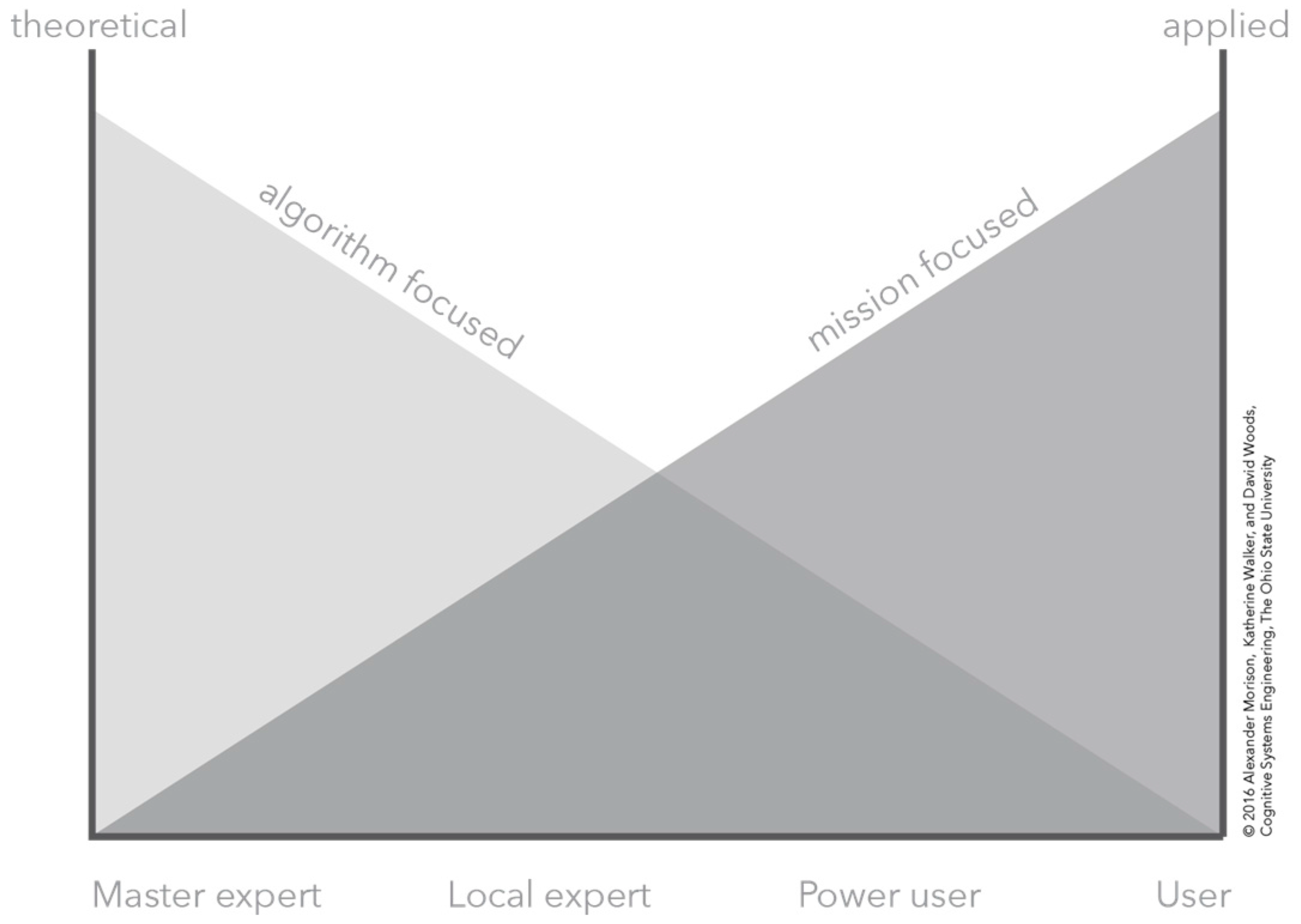
The CTA was conducted with spectral analysts, scientists, and a more experienced analyst responsible for maintaining and updating the HSI algorithm on which the visualization is based. The CTA incorporated observations [16,17], knowledge elicitation techniques [18,19], and a detailed analysis of the algorithm functionality by analyzing the code base. This analysis of the algorithm code base, along with the knowledge elicited from the spectral scientists, provided the standard from which to categorize the different analysts and scientists according to the roles defined in Figure 1. According to the roles shown in Figure 1, the CTA involved three different types of analysts as assessed by their functional understanding of the analysis algorithm. The CTA included five analysts that are classified as “users.” These analysts understood the algorithms and computational models in terms of their ability to make assessments, interpret data, and interpret algorithm output. However, their understanding of how the algorithm produced assessments is limited. In some instances, their understanding can be interpreted as a folk model about how the algorithm might work, which in all cases differed from how the algorithm actually detected signals. The CTA included one analyst that was classified as a “power user.” This analyst has a mathematics background and possesses a basic understanding of programming and programming languages. In addition, this analyst possesses a good understanding about how the algorithm works. However, this analyst’s understanding of why the algorithm performed particular operations or calculations is limited. The CTA also included two spectral scientists that are categorized as “local experts.” These analysts have a background in spectral science, which means they have a strong theoretical understanding of spectral analysis with an understanding of the spectral phenomena. These local experts also possess some knowledge of the algorithm processing although from a theoretical perspective. This means their understanding lacks some of the specific details about how some theoretical concepts are transformed into computations. These local experts also possessed an understanding of other algorithms and tools that were not included as a part of the CTA, but which provided good corroboration to assess their knowledge and understanding of their domain.
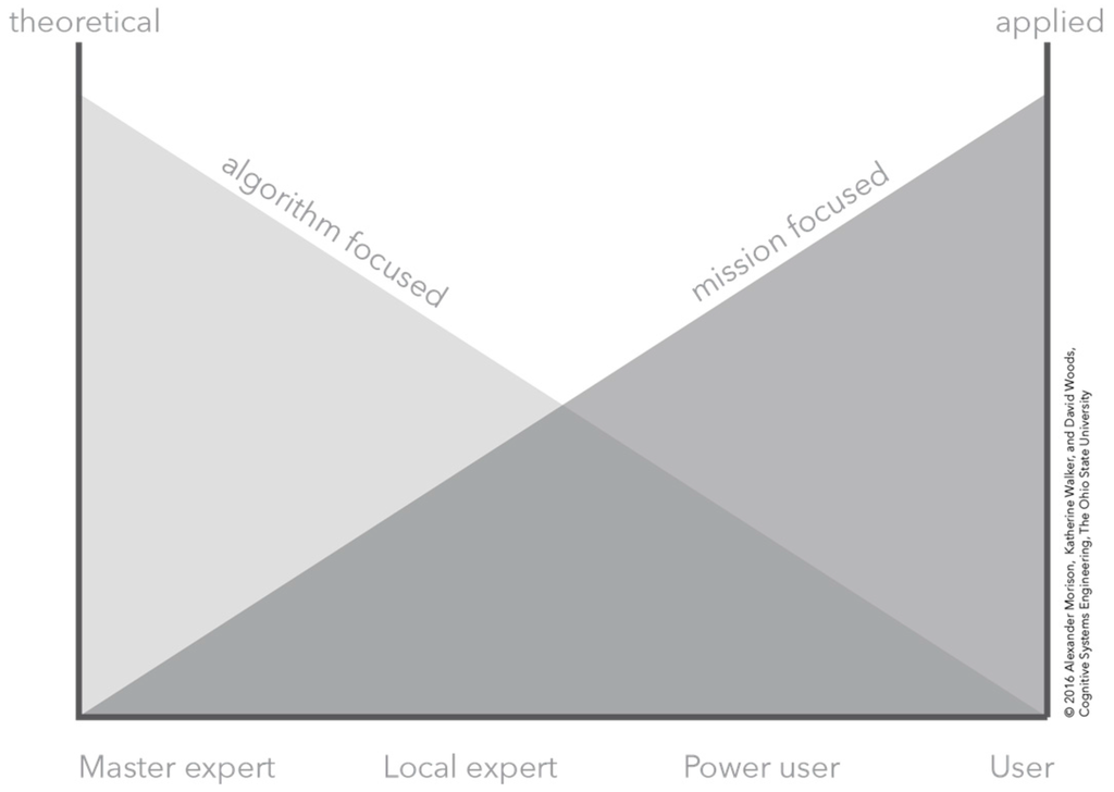
Figure 1.
A conceptual depiction of the relationship between a theoretical or applied understanding of the human–computation–sensor system and the knowledge, expertise, and experience of an analyst.
2.1. Weaknesses of Alert/Investigate Human–Machine Architectures
This architecture consists of two-stage sequential processing, where in the first stage sensor data are processed by a set of algorithms to produce detections or alert, and these alerts are corroborated or refuted by analysts in a second stage. This architecture places the algorithms and computational models as gatekeepers to the data. They transform raw data into output that includes results about the raw data and often parameters or metadata associated with the results, e.g., a probability or confidence interval. Using the raw data, output data, and other data sources, analysts corroborate the information provided by the algorithm and computational models.
2.1.1. Corroboration
First, in the alert/investigate architecture, algorithms are designed to provide an answer. In the case of sensor data, this means detecting, classifying, and identifying objects, events, or activities. Furthermore, answers must be provided despite the fact that in some cases the algorithms and models have some sense of alternatives and some means of ordering these possibilities. These alternatives might be a continuous dimension from which the algorithm selects the top candidate as the answer, i.e., the algorithm output is based on setting thresholds. The alternatives could also be models with a lower posterior probability. Currently, algorithms present their “best” answer with few signals beyond a confidence estimate that would help analysts generate or consider plausible alternatives.
Presenting answers derived from the computations does not support the critical analytic function of corroboration [20,21]. Corroboration is the search for other data that would confirm or reject the current answer. Considering alternative hypotheses or possibilities is one aspect of corroboration. Another aspect is considering factors in sensing the world and in the world that would complicate the processing or mislead an interpretation. A third is knowledge of mission priorities, risks, and context. For example, our observations found that analysts used a variety of criteria such as the total number of alerts, content of the alerts, the order of alerts, and knowledge of the area being sensed to develop a sense which alerts were unimportant and uninteresting.
2.1.2. Brittleness
Two senses of brittleness are applicable to human–computation–sensor systems. The first sense of brittleness is that algorithms and computational models are designed to help analysts detect and identify strong or easy targets, but provide little support for weak or hard targets. There are at least three different classes of hard targets for sensor/computational systems: weak targets—low discriminability between target and background; masked targets—a background material hides a target material; and confusor targets—a background material that is similar to a target material.
A second sense of brittleness is that algorithms and computational models are often designed to detect and identify known targets, but provide little support for discovery, identifying novel cases and detecting anomalies. A clear example is pattern matching in hyperspectral sensing, where unknown materials are identified by matching them to the reflectance patterns of known materials. This means unmatched sensor data are left for analysis later; however, given the scale of inflowing data and potential for alert saturation, unidentified data are rarely revisited.
2.1.3. Low Observability
The need for corroboration leads to a third weakness in human–computation–sensor systems. The computational models and algorithms lack the necessary observability for analysts to interpret the results. This means that analysts have little recourse when it comes to understanding the reasoning for a particular output or result. Furthermore, given algorithms often involve combinations of model fitting, classification, clustering, similarity matching, and thresholding, to name only a few typical operations, identifying the reason for a particular output can be complicated.
2.1.4. Poor Mental Models
The lack of observability coupled with the complexity of these algorithms leads to a fourth weakness in human–computation–sensor systems. Analysts have limited and often times flawed understanding of how the computational models and algorithms they use actually work [22]. Furthermore, the poor models are exacerbated by low observability [23]. For example, in one case, different analysts had different interpretations of how the computational models were performing the analysis. These different interpretations about how the algorithms derived their output affected how analysts interpret the results of the algorithm. In this case, the different mental models led analysts to place different weight or priority on different meta data produced by the algorithm so that they produced different conclusions from the same output.
2.2. CTA of Hyperspectral Imaging as a Sample Human–Computation–Sensor System
The CTA focused on algorithms that perform similarity matching for categorizing materials via HSA and investigated how the algorithms were used to find materials of interest despite complexities and uncertainty. The standard assumption of the automation and algorithm developers was that an algorithm processed the data streams to determine likely matches to materials of interest and presented the result to a single person. The human role could accept the algorithm result or consider other data available (e.g., camera feeds or full motion video feeds) to decide whether the algorithm’s “detect” was actually a material of interest or not.
Investigating how hyperspectral imagery/algorithms were actually used quickly revealed that the standard assumption was false in almost every way. First, the human–computation–sensor system was much more extensive than a single user receiving alerts about possible detects. There were multiple human roles and multiple algorithms that interacted in complex ways depending on the context, the uncertainty, the risks, and the distance from the point of action in the world. The algorithms did provide valuable information, though there was more than one version, the different versions did not provide the same results, and all versions suffered from non-trivial false alarms and misses. As a result of providing value, stakeholders adapted to make use of the value and overcome limitations of the algorithms. How the algorithms were used changed and the number of roles that interacted with the algorithms increased over time.
Second, the investigations revealed that all human roles that interacted with the algorithms had limited understanding of both how the algorithms worked and how to work the algorithms in the context of uncertainty and risk. No one role had a complete, accurate picture of how the algorithms worked and the conditions that affected its performance. All roles that interacted with the algorithms thought they had a better understanding of how it worked than they actually did. This is a common finding when new automated capabilities are introduced with limited means to visualize the functions performed and the factors that degrade performance. The finding is called the problem of “black box” automation (Cook et al. [24] provides a detailed example of this finding with physicians interacting with operating room automation). In addition, the investigations uncovered the fact that algorithm developers made assumptions about how the output of their algorithm would be used that rarely matched how it was used, and these assumptions by the developers were invisible to the roles that made decisions using the results from the algorithms.
Figure 1 provides an overview of four kinds of human roles that interacted with the algorithms. These roles varied in terms of their depth of knowledge about the algorithms themselves. At one end, some roles possessed theoretical, algorithm-focused knowledge on how to make the algorithms work. At the other end, some roles possessed applied, mission-focused knowledge on how to work the algorithm in context of real uncertainties and risks.
The key findings captured in Figure 1 are: all roles possessed partial knowledge about how to use the algorithms and how the algorithms worked; effective analysis and decision making in more difficult situations required integration across these areas of knowledge; and no one role had a complete understanding either of the algorithms themselves or how the algorithms assisted in analysis. The last finding was particularly surprising—even the mathematically sophisticated had gaps in their understanding of the algorithms they managed and updated. In hindsight we realized this arises because of limited resources in the design of automation over the life cycle. The original developers move on; documentation inevitably is incomplete, ambiguous and stale; learning and tuning of the algorithms continues with experience; change is omnipresent in the larger human system that utilizes the sensing—its purposes, its concerns, and its risks (what is informative continues to evolve and change). The standard architecture makes no provision for these life cycle constraints.
Figure 1 also makes the roles and relationships seem cleaner, more coherent, and more stable than occurs in reality. Roles across the levels vary: real-time versus post-mission; mission-centric versus algorithm/computation-centric; strategic versus tactical/operational. Who coordinates with whom varies and what they would like to know about the imagery and computational processing also varies. For example, real-time tactical/operational roles wrestle with corroboration and uncertainties at the level of targets. When part of close-in roles, people are asking: What confusors could be present to throw off the sensor processing? What masking could be going on? What conditions are present that would degrade the sensing process? What other sources of information can be used to corroborate possible hits? Close-in, but at a strategic level, roles desire information about: Are plans achieving goals? Should priorities change? How should plans be modified to maximize impact? Are risks changing?
Generalizing the results from the study of a particular case of new imaging capabilities, Figure 2 provides a schematic of a general human–computation–sensor system. The figure illustrates multiple human and computational roles that jointly synchronize to carry out critical functions at different distances in time and space from the point of action in the scenes of interest being monitored.
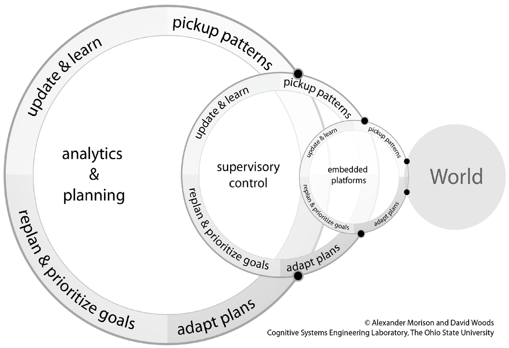
Figure 2.
A general schematic of a human–computation–sensor system.
Many of the distant roles concern the “care and feeding” of the different algorithms, including improving and tailoring them to work better under different conditions, investigating unusual cases or problems, updating libraries, forensics post-mission. The different roles also respond to different kinds of uncertainties. More mission focused roles were concerned with uncertainties relative to goals, priorities and threats while more algorithm centric roles focus on maintaining and extending the ability to process huge amounts of data in more timely ways using less (or less expensive) personnel.
The standard assumptions of “alert and investigate” architectures do not correspond at all to the actual configuration across multiple roles. The results show that systems are a set of time varying interactions across multiple parties in a time pressured and resource pressured environment. These interactions keep changing to take advantage of the new sensing/processing powers and to offset the weaknesses and complexities that result. Ironically, the new sensing capabilities make the system much more ad hoc, distributed, complex, large scale, and working across multiple tempos of operation.
The cognitive task analysis revealed that human–computation–sensor systems are becoming increasingly complex. Part of the complexity arises because the new capabilities are valuable transforming coordination across a larger set of human and machine roles [11]. However, part of the complexity arises because the default human–machine architecture—alert/investigate—is weak and over-simplified.
What kinds of design directions can offset the increasing complexity of human–computation–sensor systems as scale increases? One remedy to improve the design of the joint cognitive system of people and machines is to develop visualizations that make the automation observable [24]. The authors applied representation design techniques to develop an interactive visualization concept that opens up the black box of automatic algorithms that process data from sensor feeds [25].
3. Making Automation Observable
Developing representations that make the processing of automation or algorithms observable requires a deep understanding of the conceptual problem the automation is performing. The first step toward introducing the representation developed is to describe the HSA conceptual problem. At the core of the algorithm investigated is the well-known similarity metric for hyperspectral analysis, Spectral Angle Mapper [26,27]. This similarity metric is described in detail to provide a foundation for an explanation of how the HSA algorithm uses similarity to assign meaning to sensor data samples. These details are sufficient to motivate and explain the representation developed to aid analysts’ ability to interpret and make sense of the automation.
3.1. The Conceptual Problem
The goal of human–computation–sensor systems is to transform sensor data into information that has meaning for human problem holders. The computational algorithms and models have a growing role in this transformation.
The algorithms and models typically use one of several different approaches to assign meaning to sensor data that depends on the particular context. For instance, anomaly detection is one general approach that requires a model of normal or typical performance. Anomalies are data that do not conform to the model of normal performance. Another general approach to assign meaning to sensor data, and the method used in HSA, is to compare sensor data to exemplars or referents with a known meaning. The comparison is made using a metric that assesses the match or similarity between the sensor data and the referents. The visualization presented in this work was designed to handle this general problem, assigning meaning to sensor data by comparing known referents to the sensor data using a similarity metric.
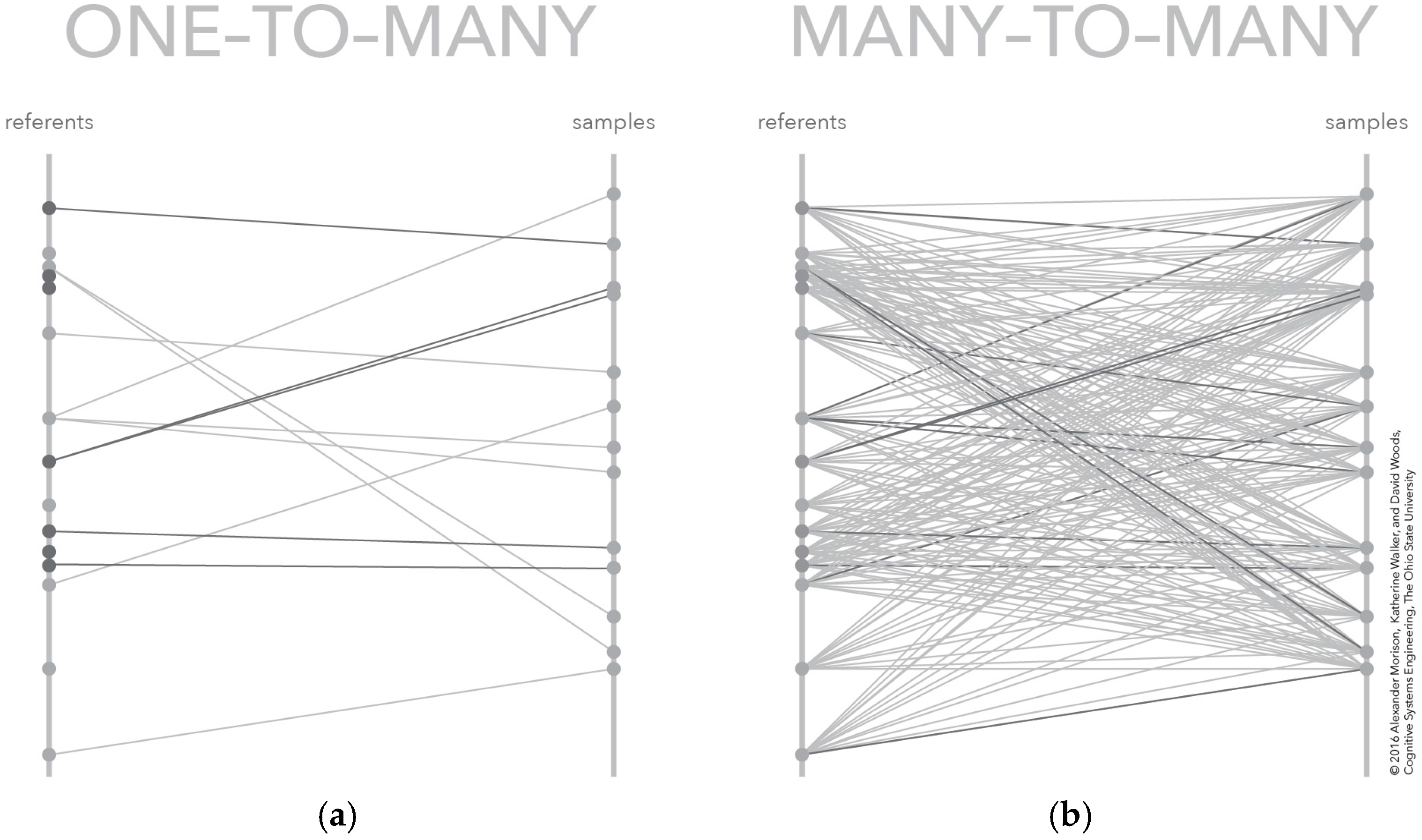
Using similarity or matching to assign meaning to sensor data is simple in concept. Indeed, it is easy to fall victim to the belief that this approach requires no human intervention. All that is required is to provide the sensor data and the referents to an algorithm or model that conditions the sensor data and computes the similarity value, which is then used to decide which data-referent pairs are matches and which are not. This pairing of samples to referents is illustrated conceptually on the left of Figure 3. In this figure, each sample on the right rail is matched to one and only one referent on the left rail. The match between these pairs is shown as a connecting line.

Figure 3.
Two depictions of the conceptual model for similarity matching: (a) the typical algorithm results presented to an analyst, which include only the best referent-sample similarity scores; and (b) the similarity scores for all referent sample pairs, which are typically not provided because of the number of data values.
In practice, the problem is not so straightforward. One challenge is that there is no one best way to compute similarity [28]. In fact, there are families of algorithms for computing matches, similarity being only one family—another family is statistical models. Furthermore, within this similarity family, there are multiple mathematical formulations of similarity [29]. These different formulations will frequently give differing similarity results and no single similarity score is superior to any other across all analytic contexts. Another challenge is that the referent space is not a single, consistent, holistic set. Instead, the referent space is shaped by multiple human roles that operate at different scales. As illustrated in Figure 2, there are expert roles that function at a planning scale that are deciding which referents should be included as part of a referent set for a particular context and purpose. At the supervisory scale there are analysts that are acting as supervisors of the algorithms. This supervision not only includes the potential for further down selection or adjustment of a referent set, but also includes deciding when algorithm matches are accurate or inaccurate. Upon contact with the world, the results from the algorithm process serve as feedback for both roles. For planners, the results act as guidance about the composition of different referent sets. For supervisory control, the results provide information about thresholds and other parameter setting that affect algorithm performance. The selection of thresholds is another central problem that makes similarity matching challenging. For an analyst, the threshold represents a trade-off, regardless of the discrimination power inherent in the computations. This threshold, or criterion from signal detection theory, determines how similar a sensor datum and a referent must be before declaring a match. This criterion affects the number of false positives, or false alarms, and the number of false negatives, or misses, for all realistic levels of discrimination power. This means that the value of the threshold depends on the relative costs associated with misses and false alarms. The first stage computations can be supplemented by a second stage to try to boost discrimination power as in the alert/investigate architecture. Unfortunately, the similarity data provided, the format in which they are provided, and the complexity of these data all make it difficult for people to not only corroborate the output of the algorithm, but also to determine how well the algorithm and the joint human–computation–sensor system are performing relative to the true phenomena in the world [30].
The ability of people to perform effectively as the second stage is limited in several critical ways. Typically: (a) Misses are never presented; (b) only the most similar referent is presented making it difficult if not impossible to compare sensor data to other plausible referents; and (c) the similarity score is a complex composite of different aspects of the underlying sensor data and therefore not easily interpreted as a single score
3.2. Similarity Matching in Hyperspectral Analysis
There are several classes of difficult problems that apply to similarity matching using hyperspectral imagery (as a case of non-injective, non-surjective mapping). The first class of problem is detection of hard targets. There are at least three kinds of hard targets:
- weak targets—low discriminability between target and background;
- masked targets—a background material hides a target material; and
- confusor targets—a background material that is similar to a target material.
Each of these kinds of hard targets is difficult to detect and classify with HSA algorithms alone. The difficulty is in part due to the number of weak detections, which can be in the millions, and the inability to leverage the HSA algorithms to determine which of these weak detections might be worth committing additional analytic resources.
The ability to detect and classify sensor data hinges in large part on the ability of HSA analysts to engage in richer and deeper analytic processing. Richer analysis, in turn, requires a deeper understanding of HSA algorithms and how they transform sensed data into possible material matches. Unfortunately, HSA algorithms are a black box to HSA analysts—raw data are the input, and material detections are produced as output. From an analyst’s perspective, it is unclear what HSA data analysis includes and how it contributes to development of a spectral match, it is unclear what the match scores mean, and it is unclear how materials map to what is interesting for problem holders.
3.3. Example Similarity Computation—Cosine Similarity
The visualization developed emerged from an exploration of a hyperspectral analysis algorithm. At the core of this algorithm is a standard spectral comparison equation called Spectral Angle Mapper (SAM), which is a specific application of cosine similarity.
The SAM uses a geometric interpretation of similarity. This geometric interpretation transforms the spectral distribution collected at a single pixel into an n-dimensional vector. Each band or frequency of the spectral distribution is treated as a dimension of the vector. Thus, a 3, 5, or 10 band spectral distribution is converted into a 3-, 5-, or 10-dimensional vector. Similarly, the referents, or spectral distributions with known material meaning are transformed into n-dimensional vectors. The SAM computes similarity or degree-of-match as the angular difference between one sample vector and one referent vector.
The smaller the angle, the more aligned the two vectors and consequently the more similar the vectors and therefore the underlying spectral distributions. The larger the interior angle between the two vectors, the more misaligned the two vectors and consequently the more dissimilar the vectors—and therefore the underlying spectral distributions. The SAM is formally defined as Equation (1), where Θ is the angle between vectors v1 and v2.
Θ = arccos(v1·v2/|v1||v2|),
The dot product is defined in Equation (2).
v1·v2 = ∑v1iv2i,
The vector magnitude is computed using Equation (3).
|v| = √(∑vi2),
Given the definition of the SAM and the constraints on spectral distributions, the bounds on the metric can be computed. In terms of spectral distribution constraints, the spectral distribution captures spectral energy across bands and is therefore a non-negative value and with normalization can be bounded on the range [0, 1]. The spectral distributions range transfers to the vector representation and therefore the dot product is also bounded to the range [0, 1], where 0 is interpreted as no alignment and 1 is perfect alignment. Then, taking the inverse cosine of this dot product guarantees the angular difference, Θ, between two vectors will be on the range [0°, 90°].
3.4. Many-to-Many Mapping
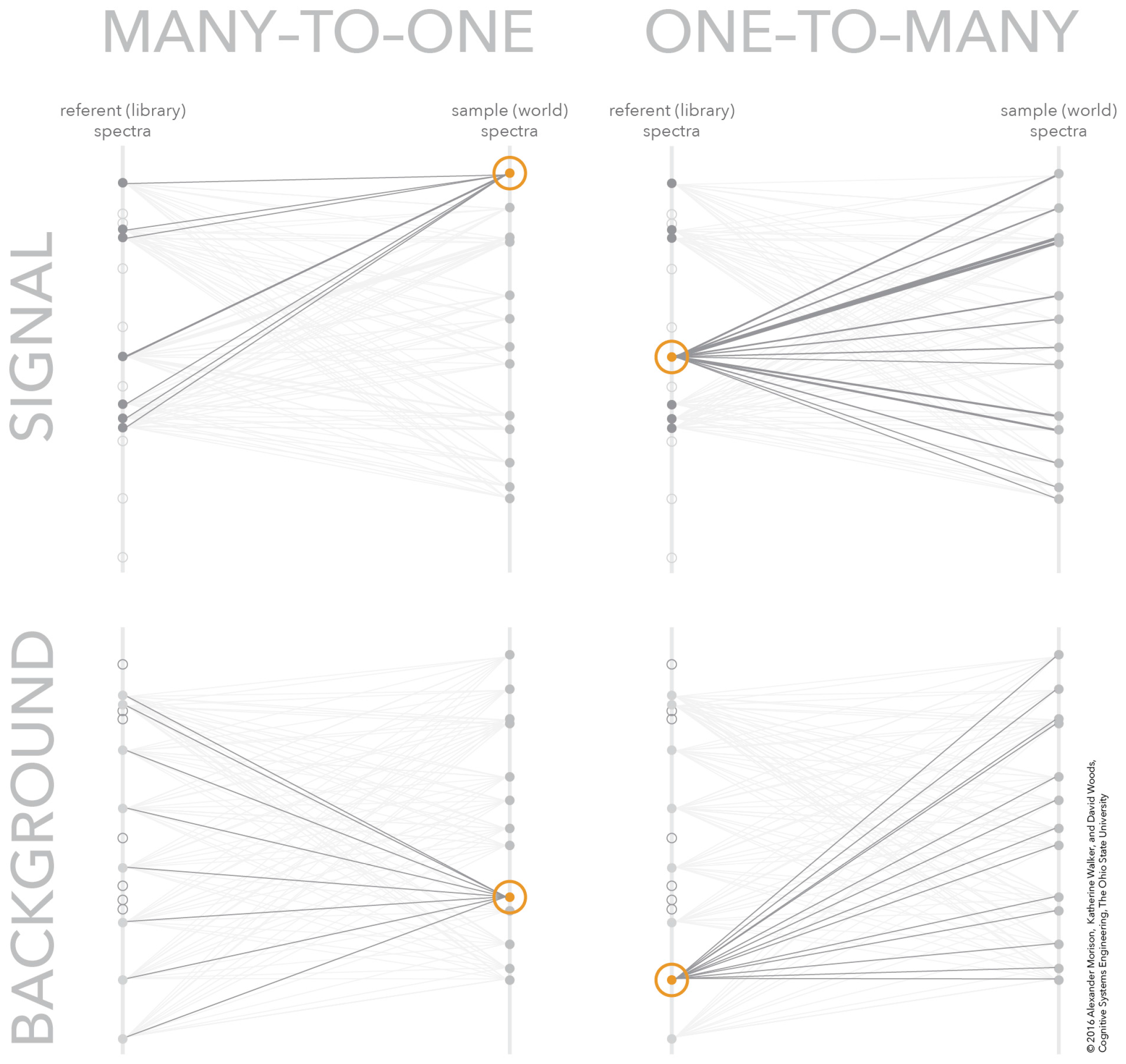
The root representation challenge for making automation visible in this case is the many-to-many mapping problem. This many-to-many mapping problem is common to many sensor data analysis problems because there are multiple samples taken from a scene-of-interest that could be matched to many potential referents. The referents represent different combinations of materials-of-interest, confusor materials, and background materials found in the scene-of-interest. This many-to-many mapping problem is depicted on the right of Figure 3. In this figure, each sample-referent pair has a computed similarity depicted by the connecting line. The number of similarity scores increases with the number of samples and referents. The figure shows 15 referents and 13 samples, which means the number of similarity scores in the many-to-many mapping is 195. Even with this few number of referent and samples, the number of similarity scores in the many-to-many mapping may quickly overwhelm some representations, like these parallel coordinate systems [31,32].
The referent signatures represent different combinations of targets that an analyst is looking to find—signals—and other non-targets an analyst expects to find because they are commonly present in the scene—background (these could be non-targets which could be confused for targets—confusors—as well as other materials and characteristics which could be found in the scene-of-interest). The vertical bar on the left represents the space of referent signatures—with dots depicting individual signatures—and the vertical bar on the right represents the space of sample signatures. The links between these vertical bars is the mapping between these two datasets—some referents in the library of signatures map onto some of the signatures sampled from the world and vice versa. Constructing a many-to-many mapping is non-trivial because the relationship between referents and samples is an ordering over match score. This means the number of orderings is equal to the sum of the number of referent and sample signatures. The complexity increases even more if composites or mixtures of possible targets and non-targets need to be considered. The scale appears overwhelming since there are thousands, or even millions of orderings in the referent-sample space.
One technique for solving the many-to-many mapping problem visually is to convert it into several one-to-many mappings. Breaking the problem into separate one-to-many mappings provides a means to navigate the large data space and find the critical relationships for the given analytic context. Figure 4 shows how the many-to-many mapping in Figure 3 can be decomposed into four, one-to-many mappings. These one-to-many mappings can be coordinated together to create a frame-of-reference for navigating the many-to-many mapping without being overwhelmed with all possible similarity scores. The next section presents the interactive visualization of similarity space, including an overview of how the concept represents how this class of sensor processing algorithms works and an overview of how the new concept allows analysts to work the algorithm for hard matches.
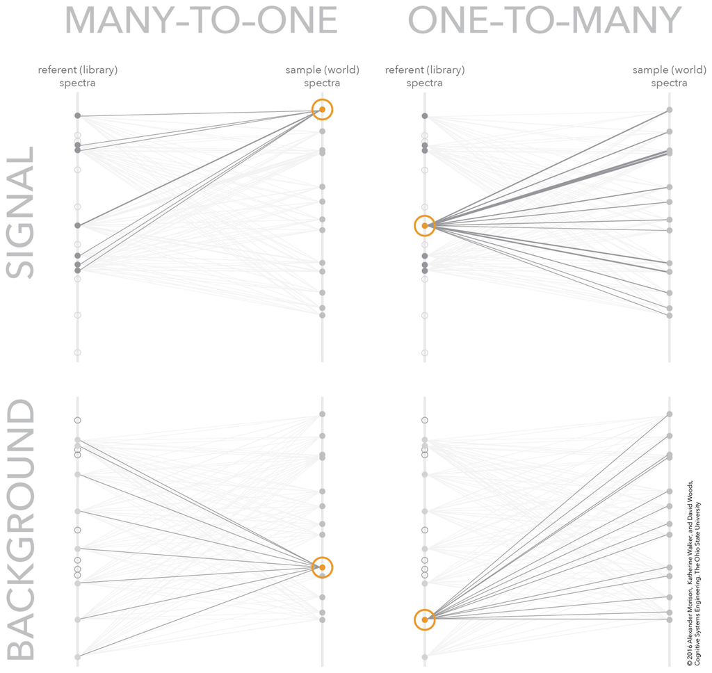
Figure 4.
The many-to-many mapping decomposed into four one-to-many mappings. The one-to-many mappings are one sample to many signal referents (upper-left), one signal referent to many samples (upper-right), one sample to many background referents (lower-left), and one background referent to many samples (lower-right).
4. Interactive Visualization of Similarity Spaces
The design concept begins with the technique of decomposing the many-to-many mapping into interdependent one-to-many mappings. These one-to-many mappings are organized in the display medium to create visual patterns—through properties like symmetry—that correspond to different meaningful relationships between samples and referents. These visual patterns, along with the dynamic interaction, create the ability to explore the huge space of potential many-to-many mappings. A complete understanding of the visualization requires descriptions from multiple perspectives. The first perspective relates the structure and dynamics of the visualization to the underlying conceptual model of how the sensor processing algorithms work. The second perspective provides the meaning of different distributions of samples and referents in the visualization from a snapshot in the dynamic interaction. The third perspective categorizes the different visual patterns according to meaningful relationships between samples and referent.
4.1. Relating Visualization to Conceptual Model
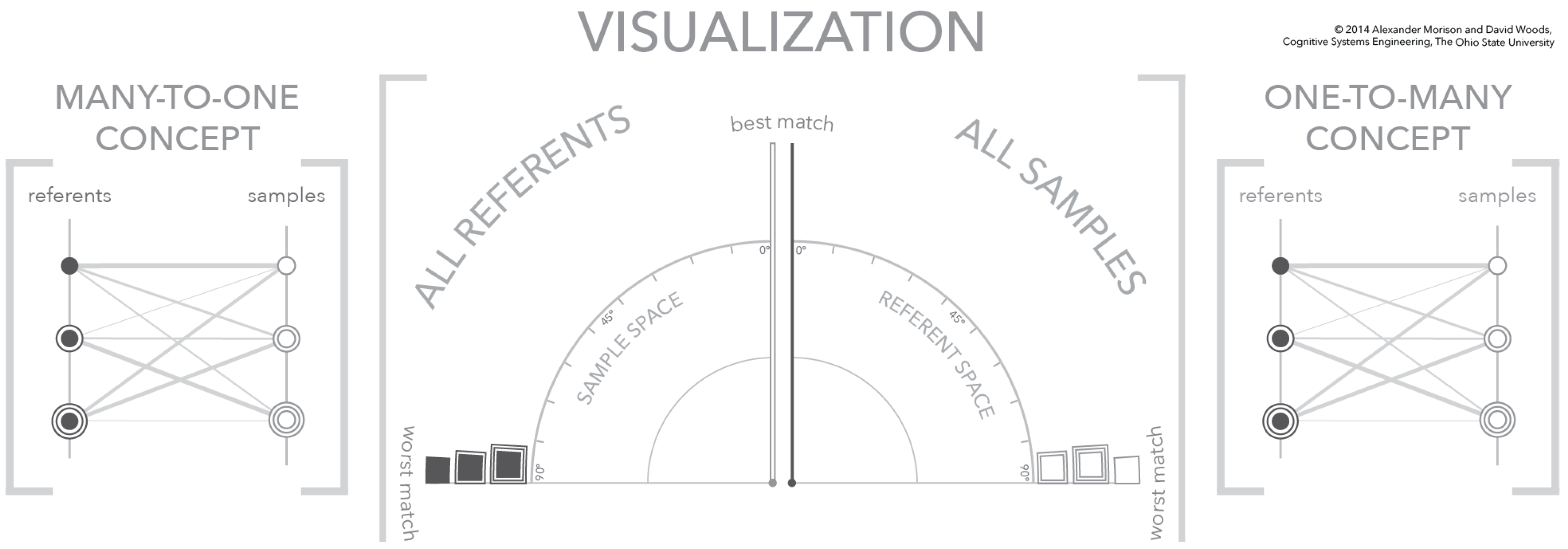
The visualization provides a frame-of-reference for exploring any many-to-many mapping. The visualization supports this exploration by depicting two separate but interdependent one-to-many mappings, a one-referent to many-samples mapping and a one-sample to many referents mapping. In the visualization, these two one-to-many mappings are each depicted as a similarity space. The relationship between the visualization similarity frames-of-reference/space and one-to-many mapping is illustrated in Figure 5.
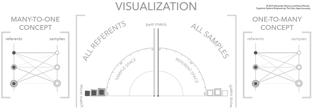
Figure 5.
A three-panel figure that relates the structure of the visualization (center) to the many referents-to-one sample conceptual mapping (left) and the one referent-to-many samples conceptual mapping (right). In addition, this is the first figure—no selected referent or sample—in a three-figure sequence showing the dynamics of the visualization.
There are two relevant organizations to each figure in this sequence; a set of three panels consisting of two conceptual diagrams and the visualization itself. The first organization, and most clearly depicted, are the three panels. In the center panel is a portion of the total visualization, which appears in between two panels depicting the conceptual one-to-many mappings. The left and right conceptual panels use parallel vertical axes to separate samples from referents. On each of these vertical axes are plotted symbols that correspond to individual samples and referents. The similarity of a sample referent pair is depicted as a connecting line, where the line weight encodes similarity, i.e., the larger the line weight the greater the similarity. The conceptual diagrams on the outside use parallel vertical axes to define samples and referents and connecting lines to depict similarity [31]. In contrast, the visualization in the center defines a similarity frame-of-reference/space with an angular coordinate system. The right half of the visualization depicts all samples and the left half depicts all referents using the similarity value as the position within the angular coordinate system.
The figures are also organized into left and right halves with each half depicting one part of the many-to-many mapping. The left half of the visualization and the left panel both depict the many referents-to-one sample mapping, while the right half of the visualization and the right panel both depict the one referent-to-many samples mapping. For explanatory purposes, several visual encodings are made to separate samples from referents, to separate the conceptual model from the visualization, and to provide a unique identifier for each sample and referents. The separation between samples and referents is visually encoded through the fill of the symbols—a dark gray fill indicates a referent and no fill indicates a sample. The separation between conceptual model and visualization is made using the shape of the symbols—the conceptual model uses circles and the visualization uses squares. Furthermore, the uniqueness of each sample and referent is shown by concentric rings—from zero (0) to two (2) concentric rings.
4.2. The Visualization Similarity Space
The visualization in Figure 3 is composed of two, interdependent similarity spaces—a referent similarity space and a sample similarity space. On the right side of the visualization, the referent similarity space depicts the calculated similarity values between all possible samples and a single referent. The selected referent defines the similarity space, a one-to-many portion of the many-to-many mapping. If a geometric interpretation of similarity is used, the selected referent can be interpreted as the reference direction, which is the vertical axis in the referent similarity space. The other graphic elements in the space are the unfilled boxes that represent the individual samples. The position of the samples corresponds to their similarity value with respect to the currently selected referent within an angular frame-of-reference. The origin direction of the angular frame-of-reference is the vertical axis for the referent similarity space. The similarity value ranges from 0° to 90°, where 0° indicates a perfect match between referent and sample and 90° indicates a perfect mismatch. This means that samples that are a good match to the selected referent appear near the vertical axis, while samples that are a poor match to the selected referent appear near the horizontal axis.
The left similarity space is defined similarly to the right space with a few differences. The first difference is that the space depicts all possible referents with respect to a single sample. This means that the vertical axis is defined by a sample, which acts at the spaces origin direction. The points depicted in the space represent different referents and their position corresponds to the degree-of-match to the sample direction. The space is defined from 0° to 90° but increases in a counter-clockwise direction. This means a referent that is a perfect mismatch to the selected sample is positioned at 90° along the horizontal axis.
Changing the visualization to depict a different portion of the many-to-many mapping requires changing the referent for the referent similarity space and the sample for the sample similarity space. The mechanism to select a new referent or new sample relies on the opposing similarity space. For instance, to redefine the referent similarity space, a new referent is selected from the opposing sample similarity space. Similarly, to redefine the sample similarity space, a new sample is selected from the opposing referent similarity space. This method for changing the organizing referent or sample for the respective similarity space allows the entire many-to-many mapping to be accessed. This access is guaranteed because all samples and all referents are depicted within their respective similarity spaces. The ability to re-define a similarity space using the opposing space creates an interdependence between the two spaces. This interdependence is the foundation for creating an exploration over the many-to-many mapping through a sequence of one-to-many perspectives.
4.3. Visualization Dynamics
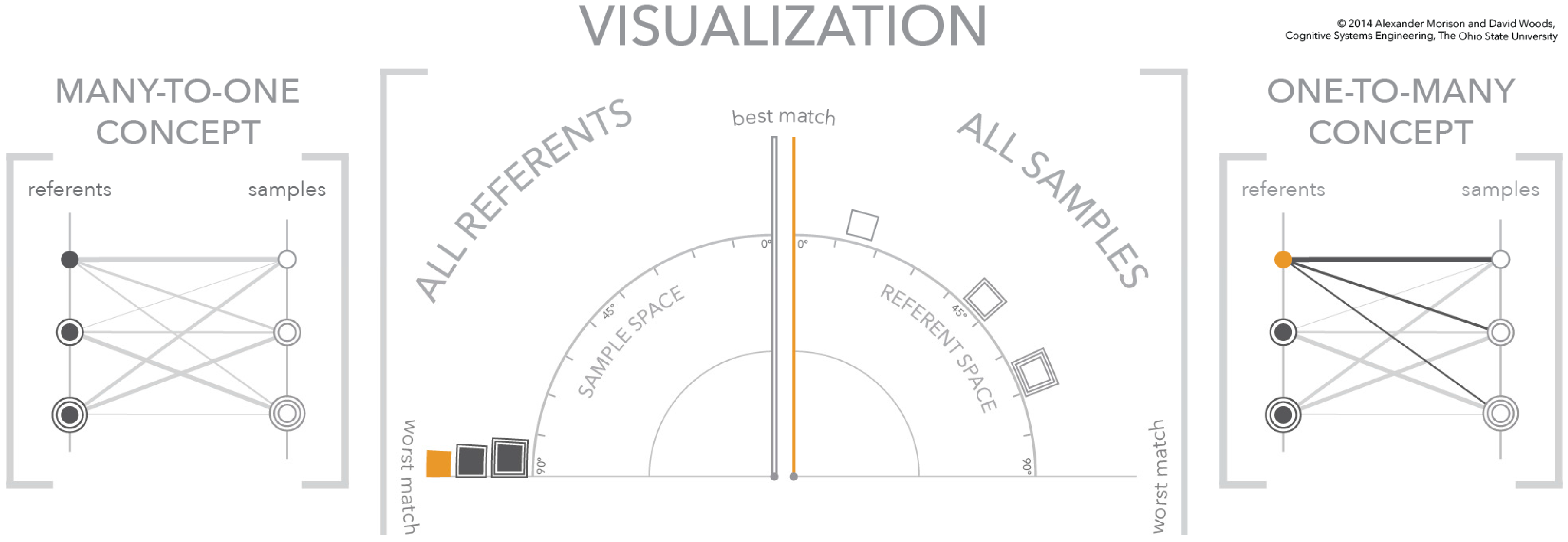
The dynamics of the visualization make use of design principles from human perception including affordances and gestalt principles [33]. The mechanics of navigating a many-to-many mapping using the visualization is demonstrated using a simplified example shown through the sequence of Figure 5, Figure 6 and Figure 7. At the same time, the figure sequence uses the conceptual panels to the left and right of the visualization to relate the state of the visualization to the many-to-many mapping. The mechanics of the visualization are illustrated using three (3) samples and three (3) referents. These samples and referents are differentiated using fills and concentric rings to simplify the image sequence description. These annotations are for explanatory purposes only and are not apart of the visualization. The sequence of figures walks through the selection of referents and signatures and shows how the two similarity spaces respond to these selections. The reduced number of referents and samples simplifies the interaction with the display, the dynamics of the display, and the description of the visualization and concept diagrams. As the number of samples and referents increase, these dynamics remain the same. The first figure shows the starting state for the visualization, where there is no referent or sample selected. Because there is no selected referent or sample, all samples and referents in the visualization are oriented along the horizontal axis at the “worst match” boundary. This occurs mathematically when the compared signature—a referent in the sample space and a sample in the referent space—is a vector of all zeroes, which results in a similarity score of 90°—a perfect mismatch. In the conceptual spaces, this lack of a sample or referent selection means that none of the potential links are emphasized.
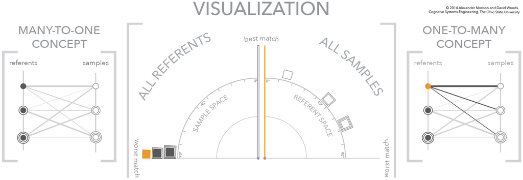
Figure 6.
The second figure in a three-figure sequence showing the dynamics of the visualization. A referent is selected in the sample space—solid orange box—which spreads the samples in the referent space according to the referent-sample similarity scores based on the selected referent.

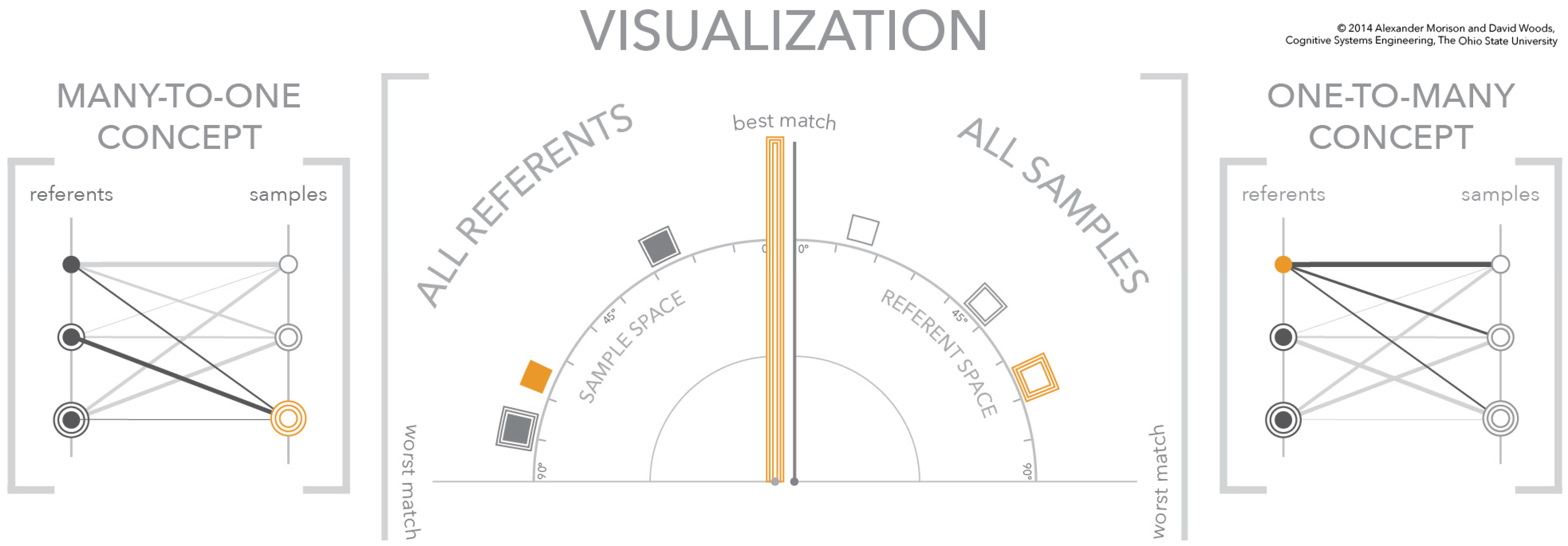
Figure 7.
The third figure in a three-figure sequence showing the dynamics of the visualization. A sample is selected in the referent space—triple outlined orange box—which spreads the referents in the sample space according to the referent-sample similarity scores based on the selected sample.
In the second figure of the sequence, Figure 6, the selection of a referent signature in the left quadrant—shown in orange—changes the state of the visualization. The most fundamental change is to the axis of the right quadrant. The selection of a referent signature in the left quadrant changes the meaning of the axis in the right quadrant to match the selected signature. In other words, this vertical axis is an absolute visual landmark that has a relative meaning, which changes when a referent is selected. This selection also means that the three samples in the space move to positions that reflect their relationship to the selected referent. As depicted, the match order from best to worst is square, square with one concentric square, and square with two concentric squares. This selection is also depicted in the conceptual diagram on the right. The referent circle is highlighted in orange and the links to the three samples on the right are brought to the foreground. The line weight of the links encodes the strength of the similarity between the referent and each sample, where a heavier line weight indicates a better match.
The last figure in the sequence, Figure 7, depicts the selection of a sample, the double outlined box, in the referent similarity space. Just as in the previous figure in the sequence (Figure 6), a selection in one similarity space—the referent similarity space—changes the meaning of the opposing space—the sample similarity space. This change in meaning of the sample similarity space is reflected in the change to the vertical axis. In this figure, for explanatory purposes, the representation of the vertical axis is changed to a double outlined axis to match the selected sample. The new meaning of the sample similarity space changes the positions of the referents within the angular frame-of-reference. These new angular positions reflect the similarity scores between the referents and the newly selected sample, the double outlined box. This means the best match and worst match to the double outlined sample are the single outlined referent and the double outlined referent, respectively. Furthermore, as shown, the referent without an outline is closer to the worst matching referent than it is to the best matching referent.
This sequence of figures connects the visualization frame-of-reference to the conceptual many-to-many mapping. In addition, the sequence illustrated the dynamics of the visualization and the interaction that drives the dynamics. The next step in describing the visualization is to provide the meaning of different configurations of sample-referent pairs.
4.4. Visualization Cases—Clear Signal, No Signal, and Signal with Multiple Plausible Matches
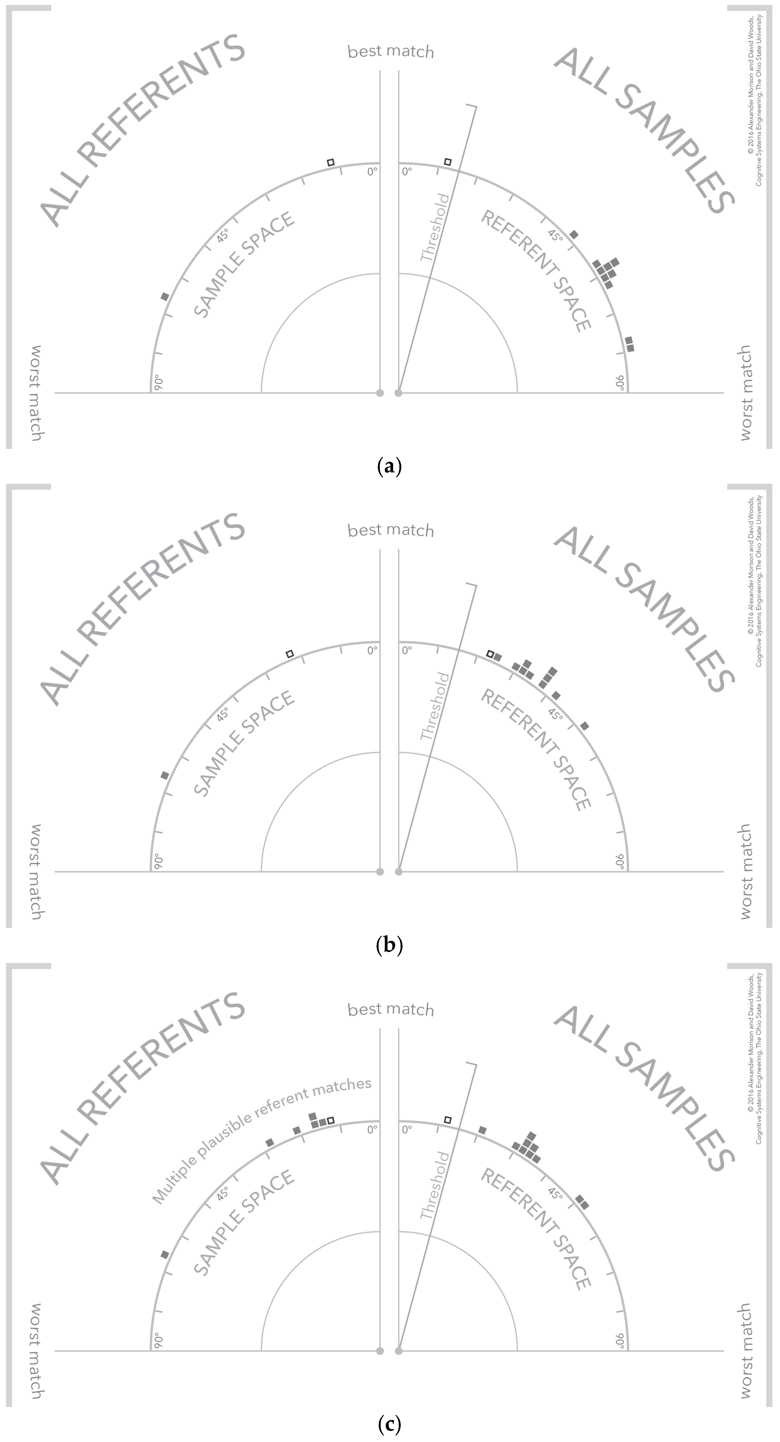
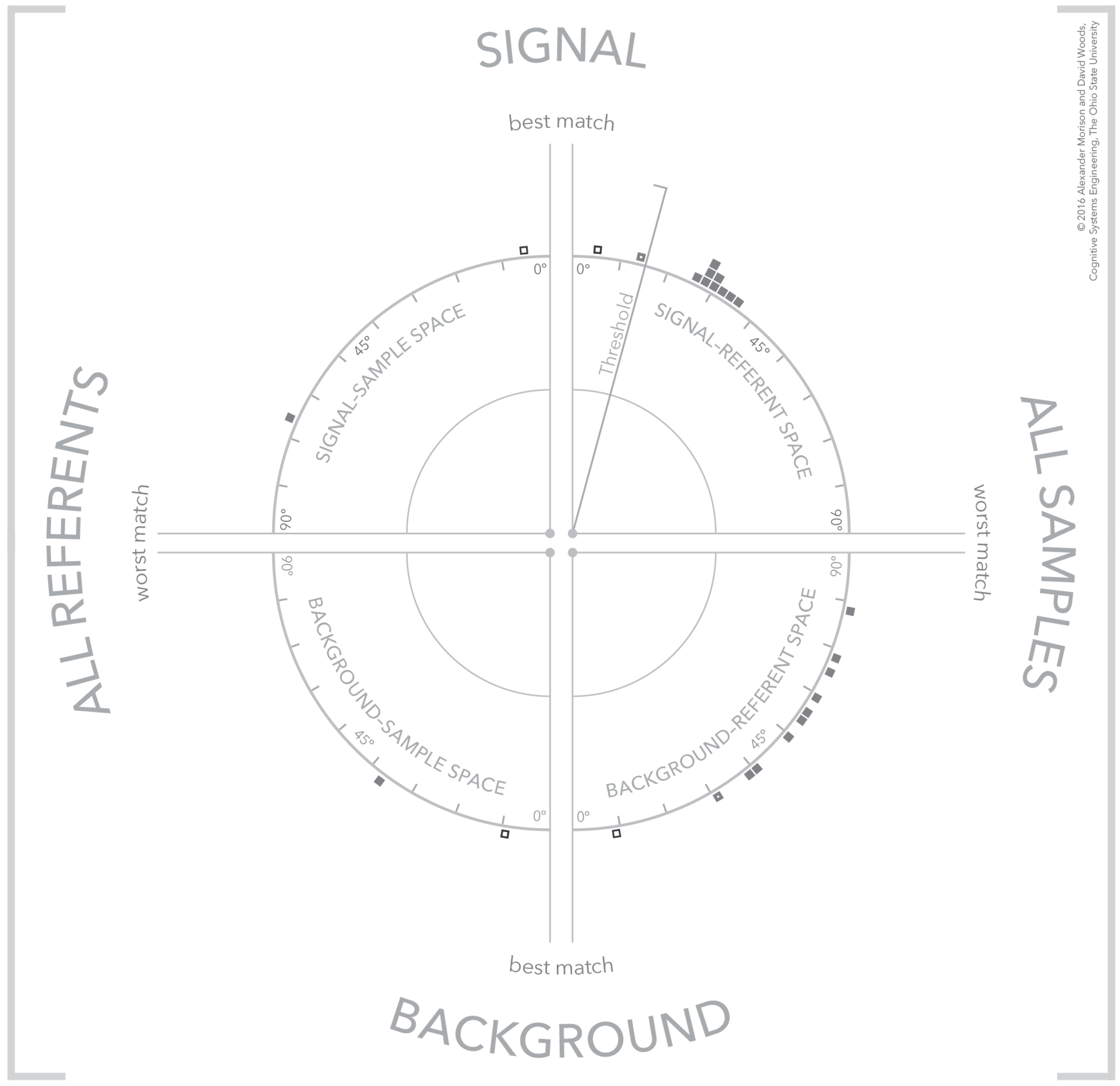
There are configurations of the visualization that convey different meanings about the algorithm results. Three of these configurations are shown in Figure 8 for referents that an analyst is interested in detecting. The selected referent and sample are shown as an outlined box to differentiate them from the other potential referents and samples in the space. The first configuration shown, Figure 8a, is an instance of a single clear or strong detection. A threshold line has been added which is a visual depiction of an algorithm threshold or filter that categorizes similarity values into matches and non-matches. As shown for this strong detection, the referent and sample match above the threshold. But note the other samples in the referent and sample spaces, the other samples are poor matches to the selected referent and the other referent is a poor match to the selected sample. This would be classified as a strong detection given the available referents.
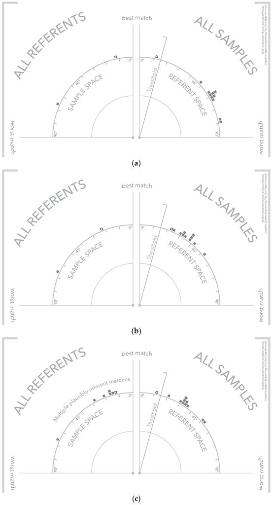
Figure 8.
The visualization demonstrating three different types of samples: (a) a strong signal referent match; (b) no signal detection; and (c) a signal detection with multiple potential referent matches.
Next, consider the configuration of samples and referents in Figure 8b. This is an example of a non-detection because the selected referent and sample fall below threshold. In addition there are no other samples that match the selected referent. The bottom visualization, Figure 8c, depicts a more interesting case where a referent-sample pair exceeds threshold, but other referents are also strong matches for the selected sample. This might occur when referents only differ in slight ways because the underlying exemplars are similar. The analog frame-of-reference makes this close relationship between referents and sample clear. An analyst might use this information to investigate whether one of the non-selected referents accounts for more similarity across samples—that is, the currently selected sample might be an outlier and is in fact more similar to the other samples, but with respect to a different referent.
These examples demonstrate how the visualization of similarity is converted into signal detections, non-detections, and more complex cases where a detection exists but the precise referent is not clearly indicated by similarity alone. In the next section, the visualization is expanded to include two additional similarity spaces—a background referent space and a background sample space. In this expanded version of the visualization, the two similarity spaces described previously depict signals or referents that an analyst is interested in detecting.
4.5. Separating Signal and Background
Algorithms and computational models often use two distinct categories of referents. In the visualization, the first referent category is called signal referent. Signal referents are the subset of all referents that the system is attempting to detect in the sensor data. In the visualization, the second category is called background referent. Background referents are the subset of all referents that the system—the responsible agent—expects to find in the sensor data, because they are in the scene-of-interest. The description and depiction of the visualization thus far do not distinguish between these two categories.
The justification for performing this separation in the visual medium is twofold. First, analysts of sensor data, like spectral analysts, use both referent categories to down select the total sensor data to a subset most likely to contain the sensor data of interest. Second, the algorithms and computational models also use these two categories to perform a similar down selection process to the sensor data.
The visualization is altered to incorporate both referent categories by creating a bottom half that is a mirror image of the visualization shown thus far. This visualization is shown in Figure 9, which depicts the signal referents on top and the background referents on the bottom halves. This means that the graphical elements that correspond to signal referents are depicted in the upper-left quadrant of the visualization and all graphical elements that correspond to background referents are depicted in the lower-left quadrant. As before, the samples are depicted on the right of the visualization. This means that each sample is depicted twice, once in the upper-right quadrant and once in the lower-right quadrant.
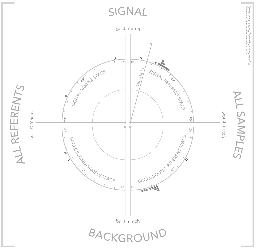
Figure 9.
The visualization illustrating a strong signal detection where the selected sample is a strong match to a signal referent and a poor match to all available background referents.
The background quadrants that form the bottom half of the visualization are parameterized to leverage the same visual landmarks as described in the top half of the visualization. All four quadrants use the same angular parameterization with the same range, however, for the background referent quadrants the origin and direction of increasing value are transformed to provide a consistent visual pattern. The origin for these two quadrants is along the downward vertical axis. Visually, this makes the vertical position of the visualization the area where strong matches occur. The two quadrants differ in their direction of increasing magnitude. The direction of increasing magnitude for the lower right quadrant is counter-clockwise and for the lower-left quadrant is clockwise. Visually, this makes the horizontal axis for the visualization the position for poor matches. The organization of different origin points and directions of increasing magnitude is a key part of the visualization because the organization creates visual patterns across quadrants at the scale of the total visualization. The individual quadrants creating visual patterns at the scale of the entire visualization are described further in the next section.
The data shown in Figure 9 and Figure 10 illustrate two cases where the consideration of signal and background referents simultaneously help interpret the meaning of the similarity results. The case illustrated in Figure 9 is an extension of the clear detection shown in the upper-left visualization of Figure 8. The match between the selected signal referent and selected sample in the top half of the visualization exceeds threshold. Furthermore, at the same time, in the background referent portion of the visualization the same selected sample is a poor match to the available background referents. The combination of a good match to a signal referent and poor match to a background referent indicates a strong detection.
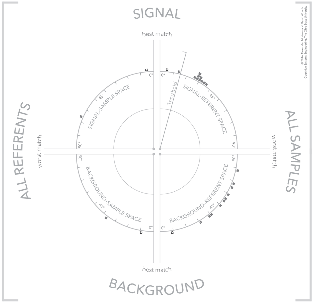
Figure 10.
The visualization illustrating two different types of samples, a confusor (thin outlined box) and a tentative signal detection (thick outlined box).
The case shown in Figure 10 is more complex and demonstrates the power of including the background referent in the analysis of a detection. This figure depicts two samples that are both good matches to the selected referent, shown in the top half of the visualization. The first matching sample is indicated by a thinner outlined box and the second matching sample is indicated by a thicker outlined box. Examining these same two samples in terms of their match to background referents shows the sample that is a better match to a signal referent is also a good match to a background referent. There are applications and contexts where a sample may match both a signal referent and a background referent. These background referents are usually referred to as confusor referents because they are similar to referents that the system would like to detect, but are, in fact, background referents. In contrast, the second detected sample is a weaker match to the selected background referent. Although the similarity score is ambiguous, overall this sample appears a more likely detection than the sample that was a stronger match to the signal referent. There is still ambiguity with this second sample because the background referents in the background-sample space are ordered with respect to the sample that was a stronger match to the signal referent. Additional steps are necessary to corroborate the second sample is also not a match to another confusor referent. One such step is to select the second sample in the background-referent space and examining the reorder of the background referents that occurs. These cases indicate that there are configurations of samples and referents at the scale of the entire visualization that have meaning greater than the individual similarity spaces. These configurations or patterns of samples and referents in the visualization are described in the next section.
4.6. Visual Patterns at Scale
There are configurations of samples and referents in the visualization forming visual patterns that convey meaning about the selected samples [34,35]. These visual patterns reference different categories of samples, which include strong signals, strong background, weak signal, weak background, unknown sample, strong confusor, and ambiguous. These visual patterns are shown in Figure 11. The use of visual patterns creates a fast and efficient mechanism for an analyst to assess the results of a similarity algorithm.
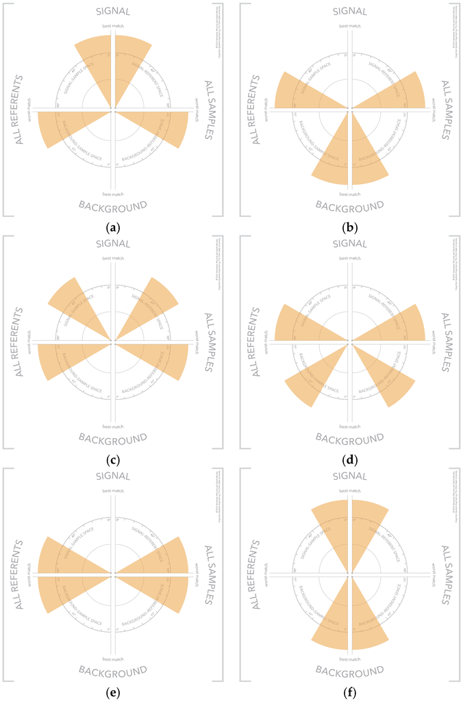

Figure 11.
The visual patterns that indicate different types of samples including: (a) strong signal; (b) strong background; (c) weak signal; (d) weak background; (e) unknown sample; (f) strong confusor; and (g) ambiguous.
5. Discussion
The paper introduces a new visualization that opens up the black box of analysis algorithms that compute similarity between known referents and samples collected from a scene-of-interest. This new visualization addresses several challenges associated with this general problem including, the limitations of thresholds, the navigation and exploration of a many-to-many mapping problem, and the limited visualization support for separating signals from confusors and background. The visualization accomplishes this through the use of analogical representation.
5.1. An Analogical Representation
The visualization presented is a unique analogical representation that uses the similarity values computed by an algorithm/sensor system to depict a visual space. The analogical representation is constructed from multiple, interdependent angular coordinate systems that each depicts a portion of a one-to-many mapping. These coordinated spaces provide analysts the ability to see patterns in the output of algorithms that process sensor data at multiple scales. At the scale of one similarity space, analysts are concerned with the degree-of-match between sample-referent pairs. At the same time, analysts are concerned with patterns that span multiple similarity spaces, which convey meaning about whether a sample is a signal, confusor, masker, or background. The visualization concept provides a means to corroborate a potential match at both of these scales. The visualization is based on and exemplifies several basic techniques for visualizing how a complex process works—in this case, the process is a form of automation [3].
The first technique is to build conceptual spaces by depicting relationships in frames of reference. Frames of reference are a fundamental property of any representation, which enable depiction of concepts like neighborhood, near/far, sense of place, and a frame for structuring relations between entities. As a result, the first step in developing this visualization focused on efforts to discover the multiple potentially relevant frames of reference that capture meaningful relationships. An added challenge in this instance was the integration and coupling of the similarity frames-of-reference to support multiple analytic scales as described above.
The second technique focused on how to connect data to context—the context sensitivity problem. This problem describes the difficulty of highlighting what is interesting in a problem space or conceptual space, when what is interesting depends on context. Creating context sensitive representations in this case was all about dealing with the many-to-many similarity space. This was the important insight discovered during the CTA effort, which is that Hyperspectral Analysis is a many-to-many mapping problem—a problem encountered before in visually representing complex processes.
The third technique that featured in the design is highlighting contrasts. Meaning lies in contrasts, that is, a departure from a reference or expected course. Representations should highlight and support observer recognition of contrasts. Showing contrasts is difficult in the Hyperspectral Analysis case because of the data scale and because the similarity space is a many-to-many mapping. The method for highlighting contrasts is the symmetry between referents and samples that emerge from the visual coordination of the quadrants. With the multi-quadrant version, it is possible to walk through general classes of cases (Figure 9 and Figure 10) and find emergent visual patterns that corresponded to each (visual patterns shown in Figure 11).
A central consequence of employing these techniques is the use of an angular coordinate system. This angular coordinate system has several important visual properties that make it well suited for depicting a continuous variable, like similarity. First, the angular coordinate system is important because it facilitates depicting the entire range of similarity values that are possible for a sample-referent pair. At the same time, the use of an angular coordinate system creates multiple cues to make the relationships between sample-referent pairs more salient. The angular dimension of the polar coordinate system means the horizontal and vertical axes both serve as visual landmarks. The horizontal axis highlights the worst match—90°—and the vertical axis highlights the best match—0°. In addition, in comparison to a Cartesian coordinate system, the polar coordinate system trades off efficiency of space utilization for maximization of the distance between points. Stated in another way, an arc in a polar coordinate system is π/2 times longer than the length of a Cartesian axis. This means that the polar coordinate system maximizes the visual spread of the distribution of points at a cost of space to depict points. Another benefit of the polar coordinate system is that graphical elements plotted within the space undergo a translation in two dimensions and a rotation. The visual translation in two-dimensions is based on a Cartesian view of the polar coordinate system, but effectively creates more visual distance between points plotted in the space. At the same time, a change in position within the polar coordinate system also creates a visual rotation. This rotation acts as an overlapping visual cue to a difference between two points in the space. Of course this visual rotation is dependent on a graphical element with features that make rotation apparent, like oriented edges and corners. For example, a square or rectangle provides strong visual cues to rotation whereas a circle provides no visual cues to rotation. Both of these visual qualities of the polar coordinate system—the two-dimensional translation and the rotation—further enhance the visual spread of the distribution of points. As an aside, it is important to note that the use of polar coordinates in the visualization concept does not specify any particular parameterization. Different parameterizations of the space can be appropriate depending on the details of the algorithm, sensor phenomenology, physical environment, and kinds of targets.
As an example of a pattern-based visualization, the presented visualization forms several distinct visual patterns that have meaning to analysts. These visual patterns leverage symmetry and breaks in symmetry to convey meaning to analysts. The key criteria for pattern-based visualizations are: Does it help observers’ see/discover what is not directly encoded in the visual? Does it help users to notice more than what they were specifically looking for or expecting? Pattern-based visualizations should support discovery [36].
5.2. Analogical or Categorical Forms of Representation
A common approach to simplify large data sets is to use one or another computational mechanisms to turn the data into one or another of a small set of categories. This mechanism provides the users with a categorical representation—the case in question falls into one or another of a small set of categories so that a display then just states which category (perhaps concealed graphically as an icon). The original algorithm plus interface uses this representation solution; essentially, all of the information in the sensing plus computations was reduced to 1 bit at each point across the physical territory that had been sampled (material of interest present or not). This throws away the majority of the data and computations, which in turn left users puzzled about how the sensing plus algorithm formed a result. It became “black box” automation. The categorical representation produced diverse inaccurate mental models of how the algorithm worked and limited user’s ability to work the algorithm in context. The only recourse or corroboration the users can perform is to visually inspect raw data when alerted to a possible detection to determine whether the detection is plausible or implausible.
Users all had experience with alerts/detections that happen to be false alerts on visual inspection. The categorical representation to “simplify” the sensing plus computations created yet another example of the “alert and investigate” human–machine architecture. In this case, as with other cases of “alert and investigate” human–machine architectures, there is an unexpected performance ceiling because limited available resources, in the form of people typically, can only investigate a small number of alerts given the scale of data available. This might be acceptable if the algorithms were almost always correct at the 1 bit resolution, but the algorithms have real but unknown miss and false alarm rates. Furthermore, although it is not well understood, there is a reasonable likelihood that these miss and false alarm rates change with different aspects of context—data collection factors, sensing phenomenology factors, environmental factors, and human activity factors, etc.
Categorization is an extremely strong filter that throws away most of the information rather than organizing the information in a visible structure that supports re-focusing and exploration [3]. Changing the filter slightly by adding a bit or two to the categorization space will not change any of the above factors or limits significantly (e.g., users did ask for more bits in the form of some confidence scale).
The algorithm is computing a degree of match over a large part of a huge space of samples and referents and then throwing away all of the work it did rather than showing a view of the large complex similarity space. The analogical representation introduced in this paper provides means to view the complex similarity space so that different human roles can focus on relevant parts of that space to explore and discover what is interesting for their context.
Despite all the computation thrown away, in principle, the algorithms only compute a portion of the total potential space of referents and samples. This is because libraries grow and sensor sweeps multiply—and because of inherent limits to both the calculations and the sensors. In addition, the total space of in-principle referent-sample pairs depends on what is interesting and how what is interesting can change over time. Therefore, algorithms in truth only operate on some-to-many mappings relative to a changing and growing much larger many-to-many mapping. In fact different human roles are directing the algorithm to partial mappings for relevance and efficiency reasons. In contrast to the categorical representation, an analogical representation of algorithm output can depict this gap between an in-principle many-to-many mapping and the some-to-many mapping over which algorithms actually compute.
What we have done is innovate a way to represent that large complex similarity space analogically that supports emergent patterns and navigation over that space. The frames of reference in the analogical representation provide a means to see parts of the mappings and to see them at different scales. Then the analogical representation provides a way to explore the total in-principle space by shifting over a series of partial mappings. Developing analogical visualizations such as the one presented here does not preclude categorical representations. Categorical representations can be overlaid on top of the analogical framework as if the intelligence behind the computation of the result is engaged in visually grounded dialogue—i.e., “this part looks interesting to me.” Plus this design easily integrates heterogeneous intelligent computations and can accommodate change easily as learning occurs or as other conditions change. A categorical only representation precludes re-examining results to find new patterns and relationships because it is a hard filter. On the other hand, the analogical representation provides a foundation, which can be extended to fluently integrate results from different kinds of intelligent computations in a human–machine partnership that can work with large scales. The analogical plus categorical representation provides the basis for a different human–automation architecture which can escape from the low performance ceiling of the alert and investigate architecture given uncertainty, change, anomalies, and surprises. However, to move to this new architecture first requires innovation of new visualizations and this paper presents one new concept for human–sensor–computation systems.
Supplementary Materials
The prototype visualization is available online at: http://csel.osu.edu/morison/website_test/HSI_Prototype/public_html/index.html.
Acknowledgments
The authors would like to acknowledge Air Force Research Laboratory, Dayton OH for their support.
Author Contributions
The authors contributed equally to the Cognitive Task Analysis, the representation design, and the writing of the paper.
Conflicts of Interest
The authors declare no conflict of interest.
Abbreviations
The following abbreviations are used in this manuscript:
| ISR | Intelligence, Surveillance, and Reconnaissance |
| FMV | Full Motion Video |
| HSA | Hyperspectral Analysis |
| CTA | Cognitive Task Analysis |
| SAM | Spectral Angle Mapper |
References
- Morison, A.; Woods, D.; Murphy, T. Human-Robot Interaction as Extending Human Perception to New Scales. In Cambridge Handbook of Applied Perception Research; Hoffman, R., Hancock, P., Parasuraman, R., Szalma, J., Scerbo, M., Eds.; Cambridge University Press: Cambridge, UK, 2015; pp. 848–868. [Google Scholar]
- Kaisler, S.; Armour, F.; Espinosa, J.A.; Money, W. Big Data: Issues and Challenges Moving Forward. In Proceedings of the 2013 46th Hawaii International Conference on System Sciences (HICSS), Maui, HI, USA, 7–10 January 2013; pp. 995–1004.
- Woods, D.D.; Patterson, E.S.; Roth, E.M. Can We Ever Escape from Data Overload? A Cognitive Systems Diagnosis. Cogn. Technol. Work 2002, 4, 22–36. [Google Scholar] [CrossRef]
- Sonka, M.; Hlavac, V.; Boyle, R. Image Processing, Analysis, and Machine Vision; Cengage Learning: Belmont, CA, USA, 2014. [Google Scholar]
- Jensen, J.R. Introductory Digital Image Processing: A Remote Sensing Perspective; Prentice Hall, Inc.: Old Tappan, NJ, USA, 1986. [Google Scholar]
- Ekbia, H.; Mattioli, M.; Kouper, I.; Arave, G.; Ghazinejad, A.; Bowman, T.; Suri, V.R.; Tsou, A.; Weingart, S.; Sugimoto, C.R. Big Data, Bigger Dilemmas: A Critical Review. J. Assoc. Inf. Sci. Technol. 2015, 66, 1523–1545. [Google Scholar] [CrossRef]
- Chang, C.-I.; Du, Q. Estimation of Number of Spectrally Distinct Signal Sources in Hyperspectral Imagery. IEEE Trans. Geosci. Remote Sens. 2004, 42, 608–619. [Google Scholar] [CrossRef]
- Sorkin, R.D.; Woods, D.D. Systems with Human Monitors: A Signal Detection Analysis. Hum.-Comput. Interact. 1985, 1, 49–75. [Google Scholar] [CrossRef]
- Murphy, R.; Shields, J. The Role of Autonomy in DoD Systems. Available online: https://fas.org/irp/agency/dod/dsb/autonomy.pdf. (accessed on 5 February 2016).
- Smith, P.J.; McCoy, C.E.; Layton, C. Brittleness in the Design of Cooperative Problem-Solving Systems: The Effects on User Performance. IEEE Trans. Syst. Man Cybern. Part Syst. Hum. 1997, 27, 360–371. [Google Scholar] [CrossRef]
- Klein, G.; Woods, D.D.; Bradshaw, J.M.; Hoffman, R.R.; Feltovich, P.J. Ten Challenges for Making Automation a “Team Player” in Joint Human-Agent Activity. IEEE Intell. Syst. 2004, 19, 91–95. [Google Scholar] [CrossRef]
- Crandall, B.; Klein, G.A.; Hoffman, R.R. Working Minds: A Practitioner’s Guide to Cognitive Task Analysis; MIT Press: Cambridge, MA, USA, 2006. [Google Scholar]
- Shaw, G.; Manolakis, D. Signal Processing for Hyperspectral Image Exploitation. IEEE Signal Process. Mag. 2002, 19, 12–16. [Google Scholar] [CrossRef]
- Cook, K.A.; Thomas, J.J. Illuminating the Path: The Research and Development Agenda for Visual Analytics; Pacific Northwest National Laboratory (PNNL): Richland, WA, USA, 2005.
- Keim, D.; Andrienko, G.; Fekete, J.-D.; Görg, C.; Kohlhammer, J.; Melançon, G. Visual analytics: Definition, process, and challenges. In Information Visualization; Springer: Heidelberg, Germany, 2008; pp. 154–175. [Google Scholar]
- Hutchins, E. Cognition in the Wild; The MIT Press: Cambridge, MA, USA, 1995. [Google Scholar]
- De Keyser, V. Why Field Studies. In Design for Manufacturability: A Systems Approach to Concurrent Engineering in Ergonomics; Taylor & Francis: London, UK, 1992; pp. 305–316. [Google Scholar]
- Flanagan, J.C. The Critical Incident Technique. Psychol. Bull. 1954, 51, 327–358. [Google Scholar] [CrossRef] [PubMed]
- Hoffman, R.; Shadbolt, N.; Burton, A.; Klein, G.A. Eliciting Knowledge from Experts: A Methodological Analysis. Organ. Behav. Hum. Decis. Process. 1995, 62, 129–158. [Google Scholar] [CrossRef]
- Trent, S.A.; Patterson, E.S.; Woods, D.D. Challenges for Cognition in Intelligence Analysis. J. Cogn. Eng. Decis. Mak. 2007, 1, 75–97. [Google Scholar] [CrossRef]
- Handel, M.I. Intelligence and the Problem of Strategic Surprise. J. Strateg. Stud. 1984, 7, 229–281. [Google Scholar] [CrossRef]
- Johnson-Laird, P.N. Mental Models and Deduction. Trends Cogn. Sci. 2001, 5, 434–442. [Google Scholar] [CrossRef]
- Norman, D.A. Some Observations on Mental Models. Ment. Models 1983, 7, 7–14. [Google Scholar]
- Cook, R.I.; Potter, S.S.; Woods, D.D.; McDonald, J.S. Evaluating the Human Engineering of Microprocessor-Controlled Operating Room Devices. J. Clin. Monit. 1991, 7, 217–226. [Google Scholar] [CrossRef] [PubMed]
- Woods, D.D. Visual Momentum: A Concept to Improve the Cognitive Coupling of Person and Computer. Int. J. Man-Mach. Stud. 1984, 21, 229–244. [Google Scholar] [CrossRef]
- Yuhas, R.H.; Goetz, A.F.; Boardman, J.W. Discrimination among Semi-Arid Landscape Endmembers Using the Spectral Angle Mapper (SAM) Algorithm. In Proceedings of Summaries 3rd Annual JPL Airborne Geoscience Workshop, Pasadena, CA, USA, 1–5 June 1992; pp. 147–149.
- Clark, R.N.; Swayze, G.; Boardman, J.; Kruse, F. Comparison of Three Methods for Materials Identification and Mapping with Imaging Spectroscopy, 1993. Available online: http://ntrs.nasa.gov/search.jsp?R=19950017433 (accessed on 6 May 2016).
- Harsanyi, J.C.; Chang, C.-I. Hyperspectral Image Classification and Dimensionality Reduction: An Orthogonal Subspace Projection Approach. IEEE Trans. Geosci. Remote Sens. 1994, 32, 779–785. [Google Scholar] [CrossRef]
- Van der Meer, F. The Effectiveness of Spectral Similarity Measures for the Analysis of Hyperspectral Imagery. Int. J. Appl. Earth Obs. Geoinformation 2006, 8, 3–17. [Google Scholar] [CrossRef]
- Card, S.K.; Mackinlay, J.D.; Shneiderman, B. Readings in Information Visualization: Using Vision to Think; Morgan Kaufmann: San Fransisco, CA, USA, 1999. [Google Scholar]
- Inselberg, A.; Dimsdale, B. Parallel coordinates. In Human-Machine Interactive Systems; Plenum Press: New York, NY, USA, 1991; pp. 199–233. [Google Scholar]
- Heinrich, J.; Weiskopf, D. State of the Art of Parallel Coordinates. STAR Proc. Eurograph. 2013, 2013, 95–116. [Google Scholar]
- Ware, C. Information Visualization: Perception for Design, 3rd ed.; Morgan Kaufmann: Waltham, MA, USA, 2012. [Google Scholar]
- Bennett, K.; Toms, M.; Woods, D. Emergent Features and Graphical Elements—Designing More Effective Configural Displays. Hum. Factors 1993, 35, 71–97. [Google Scholar]
- Bennett, K.B.; Flach, J.M. Graphical Displays: Implications for Divided Attention, Focused Attention, and Problem Solving. Hum. Factors 1992, 34, 513–533. [Google Scholar] [PubMed]
- Dunbar, K. Concept Discovery in a Scientific Domain. Cogn. Sci. 1993, 17, 397–434. [Google Scholar] [CrossRef]


© 2016 by the authors; licensee MDPI, Basel, Switzerland. This article is an open access article distributed under the terms and conditions of the Creative Commons Attribution license ( http://creativecommons.org/licenses/by/4.0/).