Article

The Myth of Methuselah and the Uncertainty of Death: The Mortality Fan Charts

1
Durham University Business School, Millhill Lane, Durham DH1 3LB, UK
2
Pensions Institute, Cass Business School, 106 Bunhill Row, London EC1Y 8TZ, UK
3
Actuarial Mathematics and Statistics, School of Mathematical and Computer Sciences, Heriot-Watt University, Edinburgh EH14 4AS, UK
*
Author to whom correspondence should be addressed.
Risks 2016, 4(3), 21; https://doi.org/10.3390/risks4030021
Submission received: 11 May 2016 / Revised: 31 May 2016 / Accepted: 22 June 2016 / Published: 4 July 2016

Abstract

:
This paper uses mortality fan charts to illustrate prospective future male mortality. These fan charts show both the most likely path of male mortality and the bands of uncertainty surrounding that path. The fan charts are based on a model of male mortality that is known to provide a good fit to UK mortality data. The fan charts suggest that there are clear limits to longevity—that future mortality rates are very uncertain and tend to become more uncertain the further ahead the forecast—and that forecasts of future mortality uncertainty must also take account of uncertainty in the parameters of the underlying mortality model.

1. Introduction

As every schoolchild knows, the oldest living man was Methuselah, the grandfather of Noah. Genesis tells us that he survived to the ripe old age of 969 years 1 and died in the same year as the Great Flood. The Sumerian literature goes even further: the Epic of Gilgamesh states that Utnapishtim, the Sumerian equivalent of Noah, was actually granted immortality as a gift from the gods. 2 By any comparison, the current generation of men living on this planet are weaklings, with only a few living to the measly age of 120.
Yet evidence has been growing over the last quarter century that the longevity of men in developed countries has been improving considerably. Demographers such as Vaupel et al. [1], Tuljapurkar et al. [2], Oeppen and Vaupel [3], and Tuljapurkar [4], argue that there is no natural upper limit to the length of human life and that we could be well on the way to living as long as Methuselah. The approach that these demographers use is based on an extrapolation of recent mortality trends. This approach has inevitably come in for criticism because it ignores factors relating to lifestyle and the environment that might influence future mortality trends. On the other hand, another group of demographers (e.g., Olshansky et al. [5,6,7], Mizuno et al. [8], and Loladze [9]) have suggested that future life expectancy might level off or even decline due to factors such as obesity and decreased food-derived health benefits associated with higher levels of atmospheric CO2. But even demographers (e.g., de Grey [10]) critical of the extrapolative forecasting approach adopted by Vaupel still accept the possibility that scientific advances and the socio-political responses to them might lead to substantial increases in life expectancy over the next century.
This debate within the demography profession clearly indicates that there is considerable uncertainty about future trends in mortality. In this article we seek to contribute further to this debate by providing some new mortality projections based on a calibrated mortality model that is known to provide good fit to recent mortality data (Cairns et al. [12]). The calibrations are based on the mortality rates of UK males aged 65 and older. The actual projections take the form of mortality fan charts – these are charts showing some central projection (such as the median, mode or mean) of the forecasted mortality rate, surrounded by bounds showing the probabilities that future mortality will lie within specified ranges. Fan charts are ideal for showing not only the most likely future outcomes, but also the degree of quantitative uncertainty surrounding future mortality rates, and have been used with considerable success by the Bank of England in its efforts to promote public debate on UK monetary policy. 3

2. Mortality Fan Charts

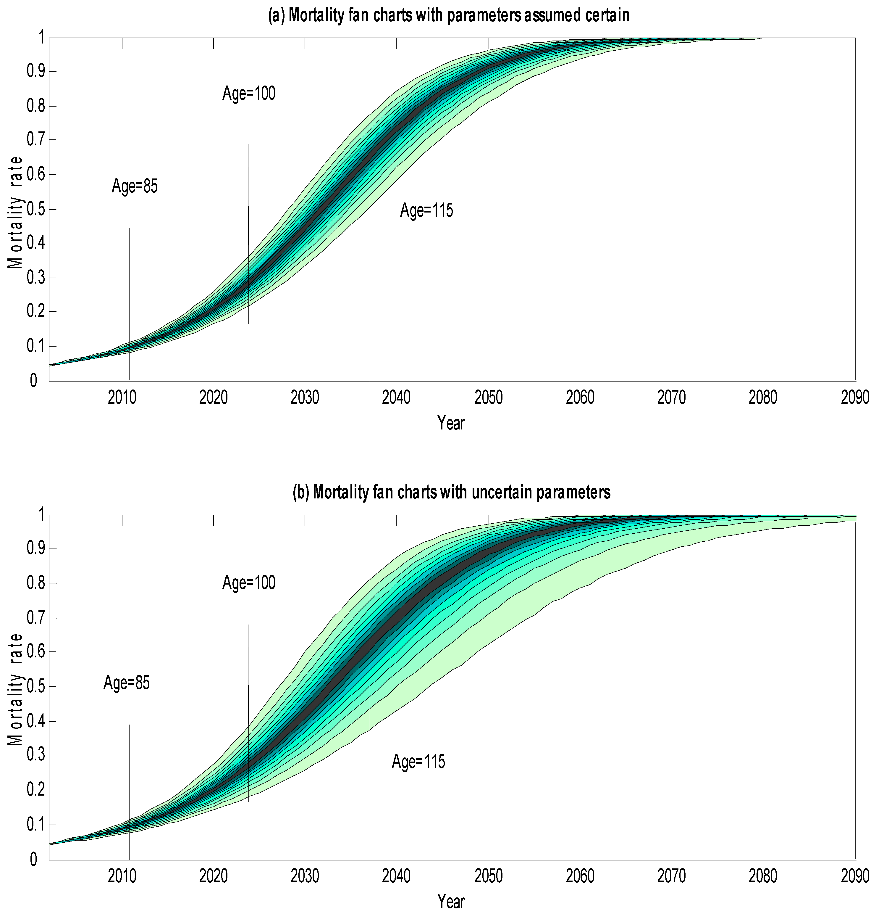
Figure 1 shows the mortality fan chart forecasts for males who were 65 years old in 2002. The fan charts are projected out to a horizon of 100 years, i.e., to 2102. The fan chart in the upper panel of the Figure assumes estimated parameters to be known, while that in the lower panel makes allowance for possible uncertainty in the parameters of the mortality model. For each fan chart, the highest and lowest bounds mark the 90% prediction interval over the forecast horizon (i.e., they suggest that we can be 90% confident that future mortality on any given date will lie between these bounds), the second highest and second lowest bounds mark the 80% prediction interval, and so forth, and the darkest bounds in the central regions of the fan charts represent the most likely mortality outcomes as predicted by the model. 4
Both fan charts have an initial mortality rate of about 2% per annum, but mortality is projected to rise over the horizon period as the cohort ages and approach 1 for extreme old ages. At first sight, the mortality rates for very old ages might appear to be rather low and suggest that a small number of men might reach grand old ages of well over 115. However, the mortality rates in the Figure need to be interpreted against the likely survival probabilities implied by the model, and some illustrative survival probabilities are presented in Table 1. These show, for example, that a man aged 65 in 2002 has about a 2% probability of reaching 100, a 0.2% probability of reaching 105, and an almost negligible probability of reaching 110. Furthermore, even if he reaches 100, his probability of reaching 115 is negligible. This means that the post-115 mortality rates in the Figure are essentially conjectural, as almost no-one will reach those ages. According to these results, the probability of anyone getting to grand old ages like 130 is essentially zero: sadly, Methusalah is a myth.
The widths of the fan chart intervals in Figure 1 show that our mortality projections are very uncertain, and over the range of empirically plausible ages this uncertainty increases as the forecast horizon gets longer.
A comparison of the two fan charts also shows that the fan chart that takes account of parameter uncertainty is much wider than the one that assumes parameters to be known with certainty 5—and, since we do not actually know the true values of the parameters, we would suggest the parameter-uncertainty estimates are likely to be more reliable. As a rough order of magnitude, the gap between the lowermost and uppermost bounds of the parameter uncertainty fan chart is close to twice that of its parameter certainty counterpart. If we take this gap as a rough indicator of our uncertainty about future mortality, we can therefore say that taking account of parameter uncertainty leads our estimates of mortality uncertainty to nearly double. We can also see that parameter uncertainty has a very skewed effect on the fan chart prediction intervals, and pushes the lower bounds down very considerably whilst pushing the upper bounds up only slightly. Thus, taking account of parameter uncertainty significantly decreases the projected mortality rates of the ‘luckier’ members of the cohort, namely those who live longer than implied by the cohort’s generational life table.
To give some indication of the quantitative magnitudes involved, the more reliable parameter-uncertain (i.e., lower) fan chart suggests that we can be 90% confident that the mortality rate of survivors from this cohort will lie (roughly) between 6% and 11% by the time they reach 85, will lie (roughly) between 17% and 53% by the time they reach 100, and will lie (roughly) between 40% and 90% for any who reach 115.
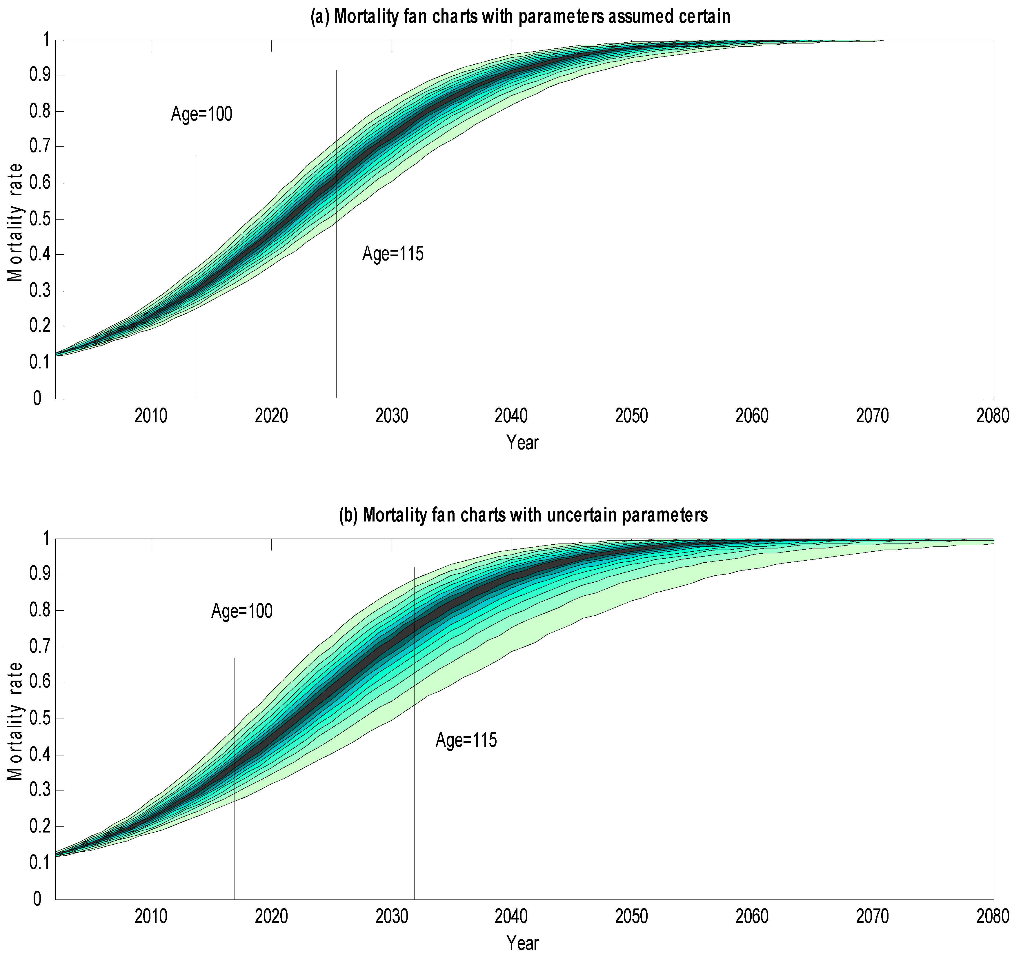
Figure 2 gives the comparable fan charts for the cohort of males aged 75 in 2002. As we would expect, these fan charts start out from a higher base mortality rate (of about 4% per annum) and involve higher mortality rate projections than for the 65-year olds. The broad shapes of the fan charts are similar to those of the earlier fan charts, and we again find that the fan charts are quite broad and (except for implausibly extreme old ages) tend to widen as the horizon lengthens. As before, we also find that the parameter-uncertain fan chart has nearly twice the dispersion of the parameter-certain fan chart, and that the impact of parameter uncertainty is to push the lower bounds well down and to push the upper bounds only slightly up.
To illustrate the quantitative magnitudes, the parameter-uncertain fan chart suggests that we can be 90% confident that the mortality rate of survivors from this cohort will lie (roughly) between 8% and 13% by the time they reach 85, will lie (roughly) between 23% and 48% by the time they reach 100, and will lie (roughly) between 49% and 92% for any who reach 115.
Figure 3 gives the fan charts for males aged 85 in 2002. These are also in line with what we would expect: the fan charts start at a higher base mortality rate (about 12%), involve higher mortality projections and indicate considerable uncertainty which rises with the horizon period for any plausible ages. As before, parameter uncertainty makes the fan charts nearly twice as wide and pushes the lower bounds considerably downwards whilst pushing the upper bounds only slightly up. In this case, we can be approximately 90% confident that the mortality rate for survivors of this cohort who reach 100 will lie between 27% and 48%, and that the mortality rate of any who reach 115 will lie between 53% and 89%.
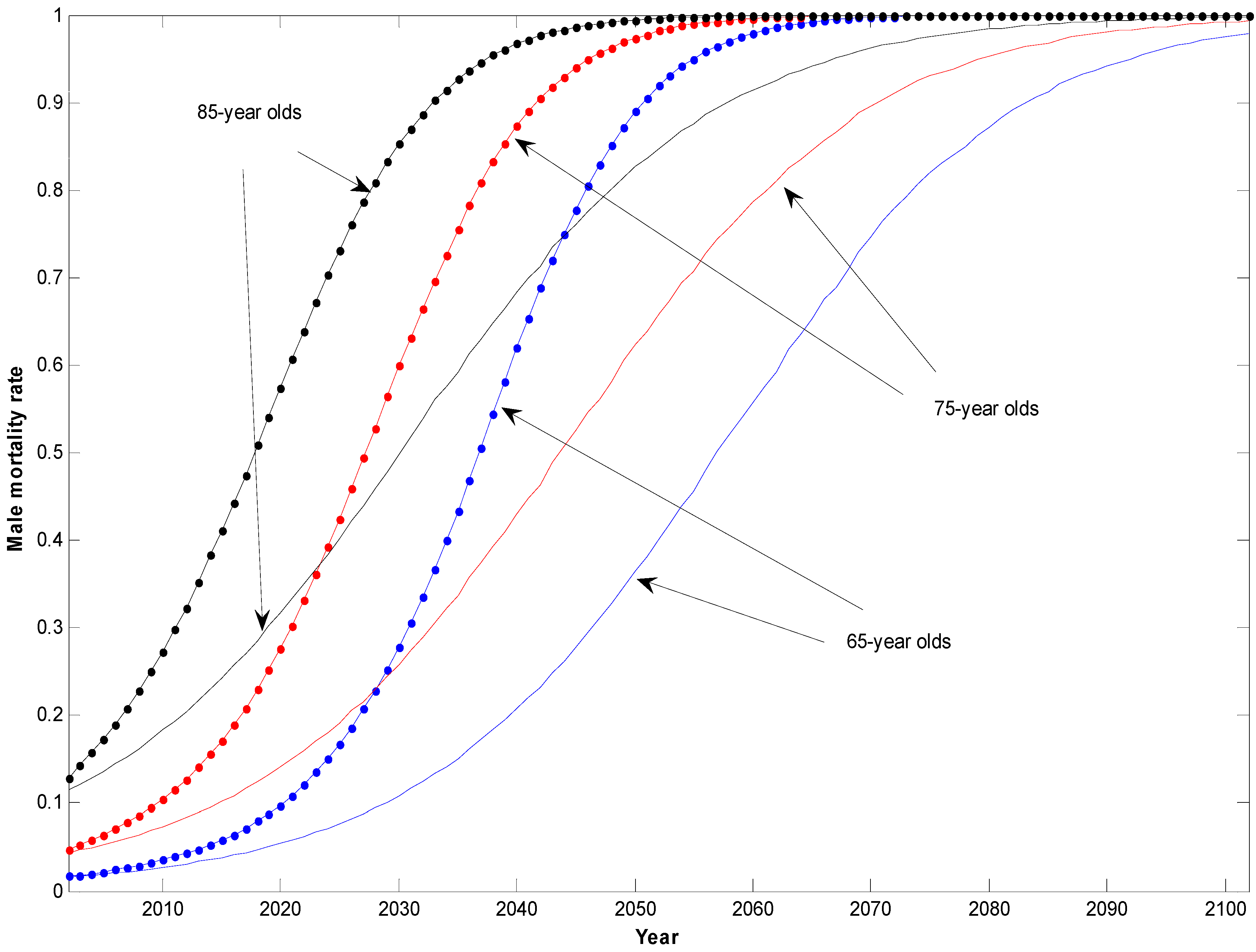
Finally, Figure 4 shows the 90% prediction bounds for all three cohorts derived from the parameter-uncertain fan charts of the previous three Figures. The bounds for the older cohorts are higher and tend to be wider than those for younger cohorts. To illustrate numerically, it takes a horizon of about 25 years before the width of the prediction bounds of the youngest cohort widens to 10%, but it takes about 15 years for the middle cohort and only 10 for the oldest one. The Figure also shows how the bounds become very wide as we go 30 to 40 years out, and then start to narrow again for extreme old ages. Leaving aside extreme ages, we can conclude that mortality rates are very uncertain, and become even more uncertain for older cohorts.

3. Conclusions

The mortality fan charts presented here are a useful way of forecasting future mortality rates. They also quantify the uncertainty in our mortality projections and provide an intuitively revealing way of visually representing that uncertainty: put simply, the wider the fan charts, the more uncertainty there is. They are also quantitatively plausible, in so far as they are based on an underlying mortality model that is known to provide a good fit to the data, and because these data reflect recent mortality improvements.
Our fan charts suggest three main findings. First and foremost, despite recent mortality improvements, the fan chart projections suggest that no-one will live to the very extreme old ages that have sometimes been suggested in the more ‘optimistic’ literature on likely future longevity. According to these results, the idea that anyone will live to the ages reported for any of the unnaturally long-lived Patriarchs in Genesis—let alone Methusalah—is a pipe dream. Second, the fan charts clearly show that future mortality rates are highly uncertain and become more uncertain as the forecast horizon increases. They also show that future mortality rates for older cohorts are more uncertain than those for younger cohorts, other things being equal. Mortality rates are difficult to predict, especially for older cohorts, and this is so even though the mortality model provides a close fit to recent historical data: one is reminded of the old quip that forecasting is a difficult business, especially forecasting the future. Finally, the fan charts show that allowing for parameter uncertainty has a very major impact in widening the dispersion of estimated fan charts: as a rough rule of thumb, we found that allowing for uncertain parameters nearly doubles the dispersion of our fan charts. Failing to allow for parameter uncertainty therefore leads to fan chart forecasts that are far too narrow and that have lower bounds with a significant upwards bias. If we wish to reliably forecast the uncertainty in future mortality, we must therefore take account of the uncertainty in our parameter estimates as well. 6
These findings have obvious and disturbing implications for those providing services to the elderly such as health and long-term care or pensions. If people are living longer than previously anticipated, then provision needs to be made for more services for the elderly and pensioners will be drawing pensions for longer than expected. Someone then has to bear the resulting higher costs. In addition, since future mortality is very uncertain, the fan charts also suggest that the healthcare system, pension funds, life companies and, indeed, the state itself, are all heavily exposed to longevity risk, and their exposure to this risk needs to be managed.

Author Contributions

KD and AJGC wrote the underlying software; all authors contributed to writing the paper.

Conflicts of Interest

The authors declare no conflict of interest.

Appendix: A Mortality Model

The mortality fan charts discussed in this paper are based on an underlying mortality model set out by Cairns et al. [12]. Let q(t, x) be the realized mortality rate in year t + 1 (that is, from time t to time t + 1) of a cohort aged x at time 0. We assume that q(t, x) is governed by the following two-factor Perks stochastic process:
q ( t , x ) = exp [ A 1 ( t + 1 ) + A 2 ( t + 1 ) ( t + x ) ] 1 + exp [ A 1 ( t + 1 ) + A 2 ( t + 1 ) ( t + x ) ]
where A1(t + 1) and A2(t + 1) are themselves stochastic processes that are measurable at time t + 1 (see Perks [18], Benjamin and Pollard [19]). Now let A(t) = (A1(t), A2(t)) and assume that A(t) is a random walk with drift:
A ( t + 1 ) = A ( t ) + μ + C Z ( t + 1 )
where μ is a constant 2 × 1 vector of drift parameters, C is a constant 2 × 2 lower triangular Choleski square root matrix of the covariance matrix V, and Z(t) is a 2 × 1 vector of independent standard normal variables. Cairns et al. (2006) show that this model provides a good fit to UK Government Actuary’s Department (GAD) data for English and Welsh males over 1961–2002. For each set of parameter values, we simulated 10,000 paths of A1(t + 1) and A2(t + 1), and then used these in Equation (A1) to obtain 10,000 simulated paths of q(t, x) over a chosen horizon. For each given t, the quantiles of q(t, x) were then obtained from the relevant order statistics of our ‘sample’ of q(t, x) values. These quantiles give us the bounds of the fan chart intervals.

References

  1. J. Vaupel, J. Carey, K. Christensen, T. Johnson, A. Yashin, V. Holm, I. Iachine, V. Kannisto, A. Khazaeli, P. Liedo, and et al. “Biodemographic Trajectories of Longevity.” Science 280 (1998): 855–860. [Google Scholar] [CrossRef] [PubMed]
  2. S. Tuljapurkar, N. Li, and C. Boe. “A Universal Pattern of Mortality Decline in the G7 Countries.” Nature 405 (2000): 789–792. [Google Scholar] [CrossRef] [PubMed]
  3. J. Oeppen, and J.W. Vaupel. “Broken Limits of Life Expectancy.” Science 296 (2002): 1029–1031. [Google Scholar] [CrossRef] [PubMed]
  4. S. Tuljapurkar. “Future Mortality: A Bumpy Road to Shangri-La? ” Sci. Aging Knowl. Environ. 2005 (2005). [Google Scholar] [CrossRef] [PubMed]
  5. S.J. Olshansky, B.A. Carnes, and C. Cassel. “In Search of Methuselah: Estimating the Upper Limits to Human Longevity.” Science 250 (1990): 634–640. [Google Scholar] [CrossRef] [PubMed]
  6. S.J. Olshansky, B.A. Carnes, and A. Désesquelles. “Prospects for Human Longevity.” Science 291 (2001): 1491–1492. [Google Scholar] [CrossRef] [PubMed]
  7. S.J. Olshansky, D. Passaro, R. Hershow, J. Layden, B.A. Carnes, J. Brody, L. Hayflick, R.N. Butler, D.B. Allison, and D.S. Ludwig. “A Potential Decline in Life Expectancy in the United States in the 21st Century.” N. Engl. J. Med. 352 (2005): 1103–1110. [Google Scholar] [CrossRef] [PubMed]
  8. T. Mizuno, I.-W. Shu, H. Makimura, and C. Mobbs. “Obesity Over the Life Course.” Sci. Aging Knowl. Environ. 2004 (2004). [Google Scholar] [CrossRef]
  9. I. Loladze. “Rising Atmospheric CO2 and Human Nutrition: Toward Globally Imbalanced Plant Stoichiometry? ” Trends Ecol. Evolut. 17 (2002): 457–461. [Google Scholar] [CrossRef]
  10. A.D.N.J. De Grey. “Extrapolaholics Anonymous: Why Demographers’ Rejections of a Huge Rise in Cohort Life Expectancy in This Century are Overconfident.” Ann. N. Y. Acad. Sci. 1067 (2006): 83–93. [Google Scholar] [CrossRef] [PubMed]
  11. N.K. Sandars. The Epic of Gilgamesh: An English Version with an Introduction, 3rd ed. Harmondsworth, Middlesex, UK: Penguin, 1972. [Google Scholar]
  12. A.J.G. Cairns, D. Blake, and K. Dowd. “A Two-Factor Model for Stochastic Mortality with Parameter Uncertainty: Theory and Calibration.” J. Risk Insur. 73 (2006): 687–718. [Google Scholar] [CrossRef]
  13. Bank of England. Inflation Report. London, UK: Bank of England, 1996. [Google Scholar]
  14. M.A. King. What Fates Impose: Facing up to Uncertainty? London, UK: The British Academy, 2004. [Google Scholar]
  15. D. Blake, A.J.G. Cairns, and K. Dowd. “Longevity Risk and the Grim Reaper’s Toxic Tail: The Survivor Fan Charts.” Insur. Math. Econ. 42 (2008): 1062–1066. [Google Scholar] [CrossRef]
  16. K. Dowd, D. Blake, and A.J.G. Cairns. “Facing up to Uncertain Life Expectancy: The Longevity Fan Charts.” Demography 47 (2010): 67–78. [Google Scholar] [CrossRef] [PubMed]
  17. J.S.H. Li, A.C.Y. Ng, and W.S. Chan. “Stochastic Life Table Forecasting: A Time-Simultaneous Fan Chart Application.” Math. Comput. Simul. 93 (2013): 98–107. [Google Scholar] [CrossRef]
  18. W. Perks. “On Some Experiments in the Graduation of Mortality Statistics.” J. Inst. Actuar. 63 (1932): 12–57. [Google Scholar]
  19. B. Benjamin, and J.H. Pollard. The Analysis of Mortality and Other Actuarial Statistics, 3rd ed. London, UK: Institute of Actuaries, 1993. [Google Scholar]
  • 1Book of Genesis 5:27: ‘And all the days of Methuselah were nine hundred sixty and nine years: and he died.’
  • 2Sandars ([11], p. 107).
  • 3The first inflation fan chart was published by the Bank of England in 1996 (Bank of England [13]), and inflation fan charts have been published in each of the Bank’s quarterly Inflation Reports ever since. Some longevity fan charts were published in King [14] and further mortality-related fan charts are shown in Blake et al. [15], Dowd et al. [16] and Li et al. [17].
  • 4Details of the calculations underlying the mortality fan charts are given in the Appendix.
  • 5The principal reason for this increased width is uncertainty in the underlying trend rather than in the volatility of mortality rates. As the time horizon increases, uncertainty in the trend dominates all other sources of risk in influencing the width of the lower side fan chart.
  • 6Of course, in interpreting the fan chart forecasts, we also need to be on our guard against possible biases in the model. (1) The mortality forecasts have a possible upward bias, in so far as they do not take account of future improvements to medical science (e.g., miracle cures of major illnesses) that we cannot predict; (2) On the other hand, the forecasts have a possible downward bias in that they ignore important factors such as the impact of obesity that threaten to increase future mortality but have not yet fed through into the mortality data on which our model is calibrated. Readers who have strong views on these issues might wish to take them into account in interpreting the fan charts.
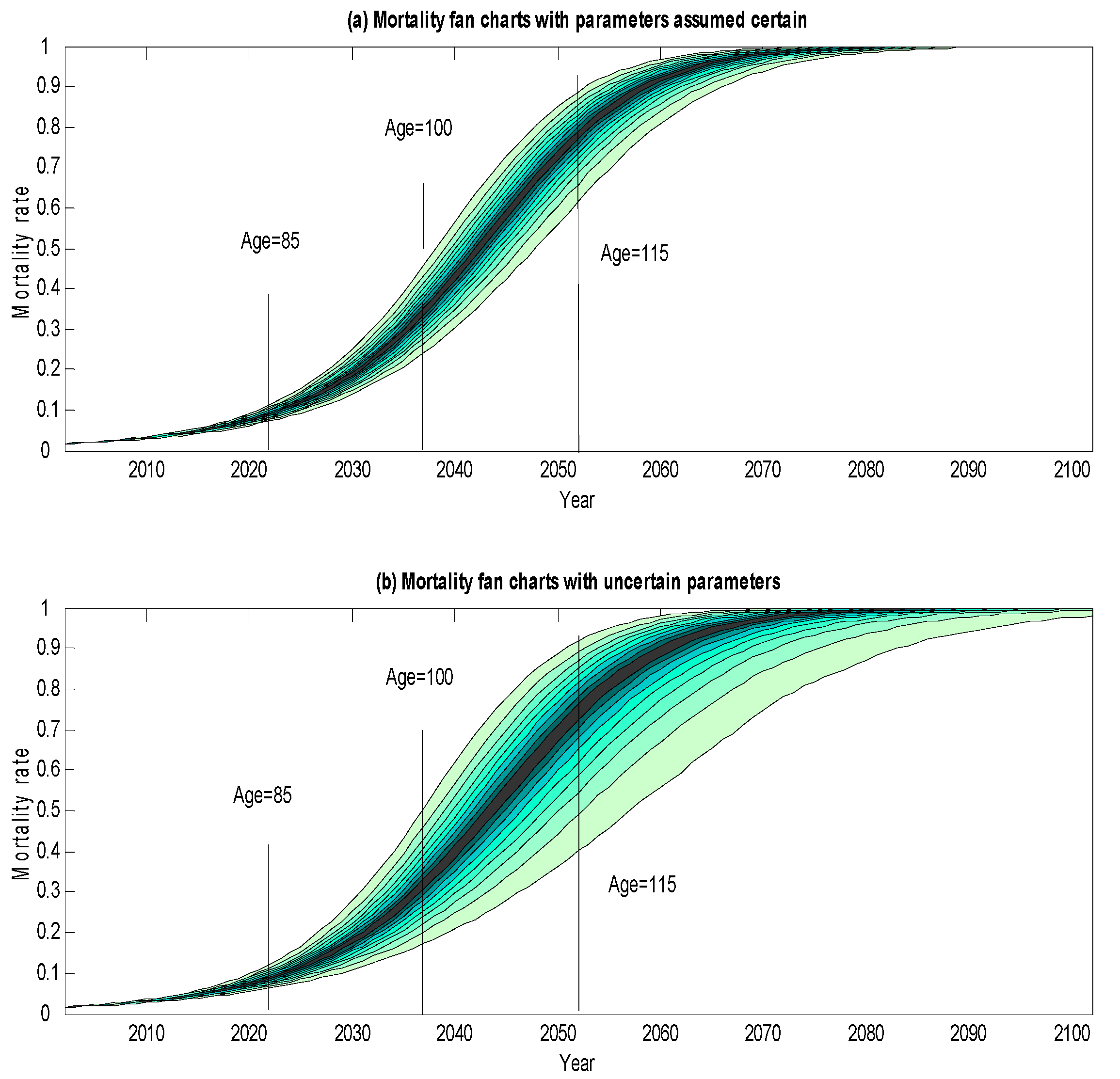
Figure 1. Mortality Fan Charts for Cohorts of Males Currently Aged 65 Years Old. Notes: The chart shows the central 10% prediction interval with the heaviest shading, surrounded by the 20%, 30%, …, 90% prediction intervals with progressively lighter shading. Estimated using 10,000 Monte Carlo simulation trials with the mortality model of Cairns et al. [12] calibrated on Government Actuary’s Department (GAD) data over the period 1982–2002.
Risks 04 00021 g001
Figure 2. Mortality Fan Charts for Cohorts of Males Currently Aged 75 Years Old. Notes: As per Figure 1.
Risks 04 00021 g002
Figure 3. Mortality Fan Charts for Cohorts of Males Currently Aged 85 Years Old. Notes: As per Figure 1.
Risks 04 00021 g003
Figure 4. 90% Prediction Bounds for Male Mortality Rates. Notes: As per the uncertain-parameter fan chart in Figure 1.
Risks 04 00021 g004
Table 1. Projected Survival Probabilities.
Probability Assuming:
Survival to AgeParameters CertainParameters Uncertain
Survival Probabilities for Males Aged 65 in 2002 (%)
7090.7790.78
7578.4278.49
8062.5262.75
8543.6144.19
9024.3425.25
959.3310.23
1001.922.37
1050.150.23
1100.000.01
Survival Probabilities for Males Aged 65 in 2002, Conditional on Reaching 85 (%)
9055.8157.13
9521.3923.16
1004.405.37
1050.340.52
1100.010.01
1150.000.00
Survival Probabilities for Males Aged 65 in 2002, Conditional on Reaching 100 (%)
1057.669.64
1100.130.25
1150.000.00
Notes: Projected survival probabilities are calculated as the median projections using the model and parameter values in the notes to Figure 1. All probabilities are rounded to two decimal places.