
Integrated Analysis of Gene Expression and Protein–Protein Interaction with Tensor Decomposition


Abstract
:1. Introduction
2. Materials and Methods
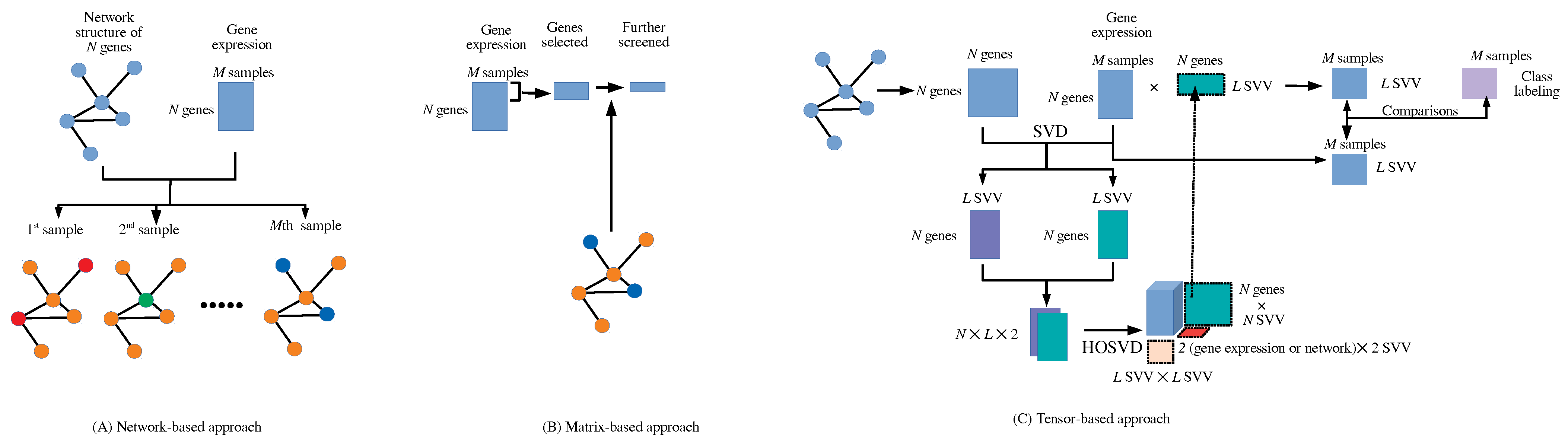
2.1. Integrated Analysis of Matrices and Networks with Tensor
2.2. Comparisons of Coincidence with Class Labels between and
2.3. Identification of Genes Expressed Distinctly between Class Labels and Enrichment Analysis
2.4. PPI Dataset
2.4.1. Stanford PPI Dataset
2.4.2. BIOGRID PPI Dataset
2.5. Gene Expression Profiles
3. Results
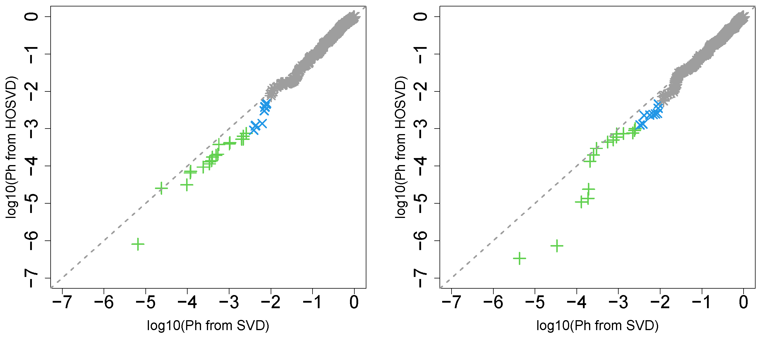
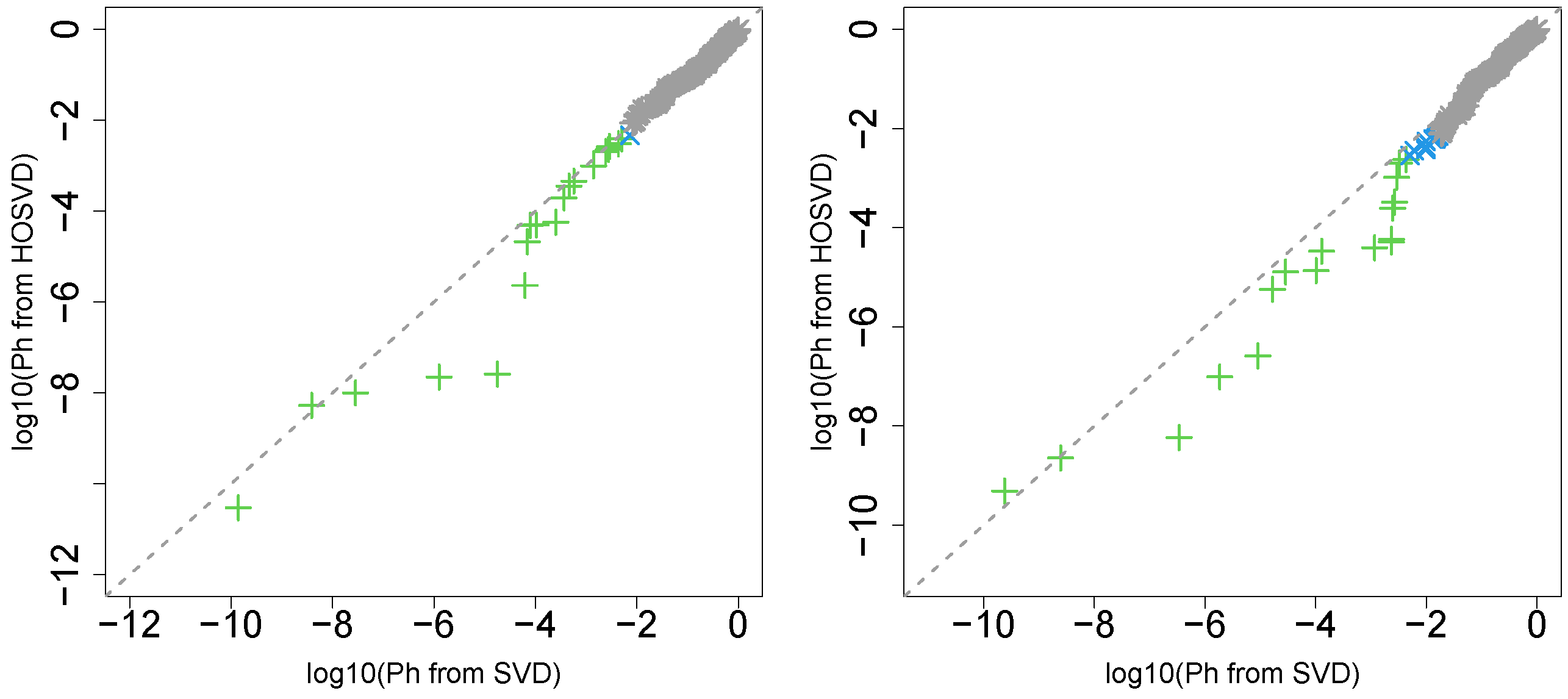
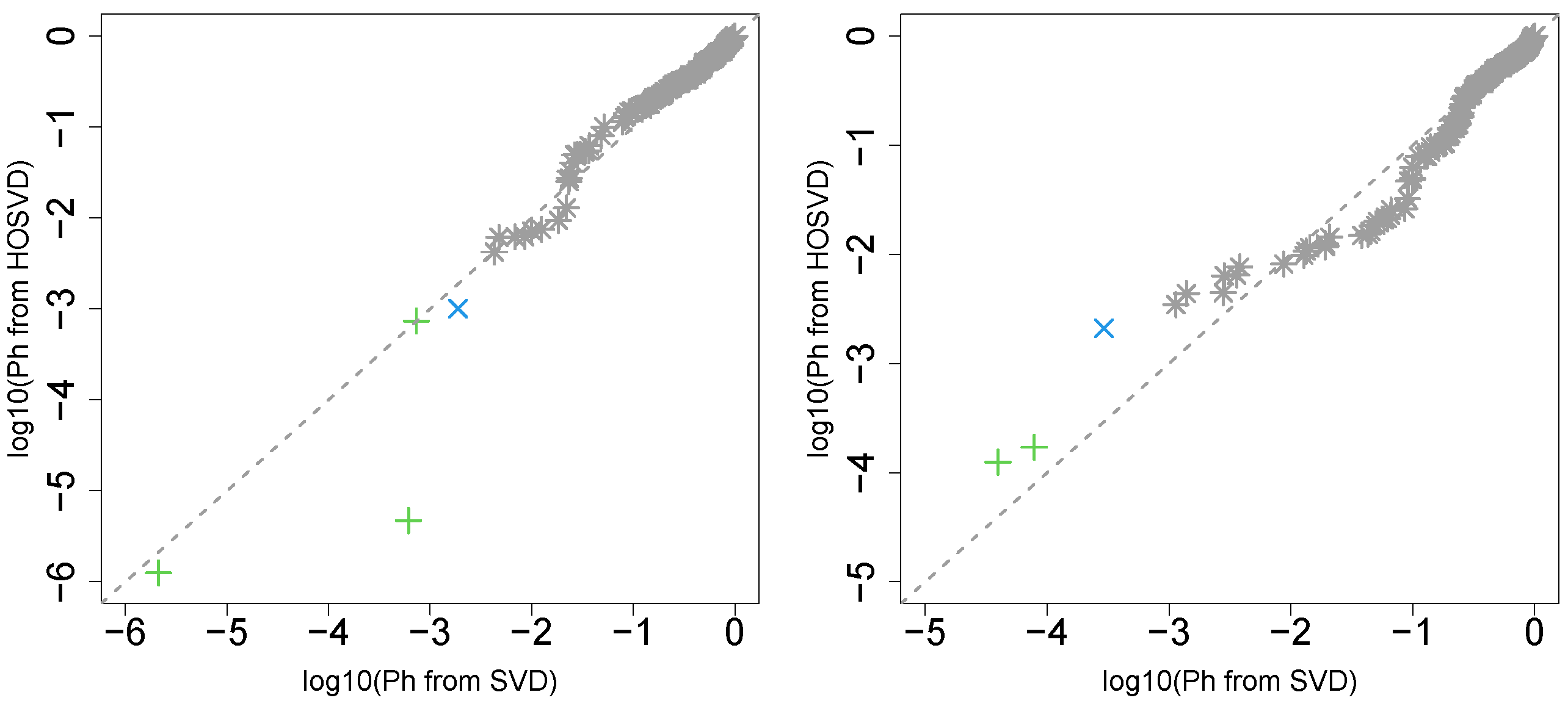
3.1. Identification of Sample Vectors Coincident with Labels
3.1.1. Stanford PPI
“vital_status”
“pathologic_stage”
“pathologic_m”
“pathologic_t”
“pathologic_n”
3.1.2. BIOGRID PPI
“vital_status”
“pathologic_stage”
“pathologic_m”
“pathologic_t”
“pathologic_n”
3.2. Identification of DEGs and Enrichment Analysis
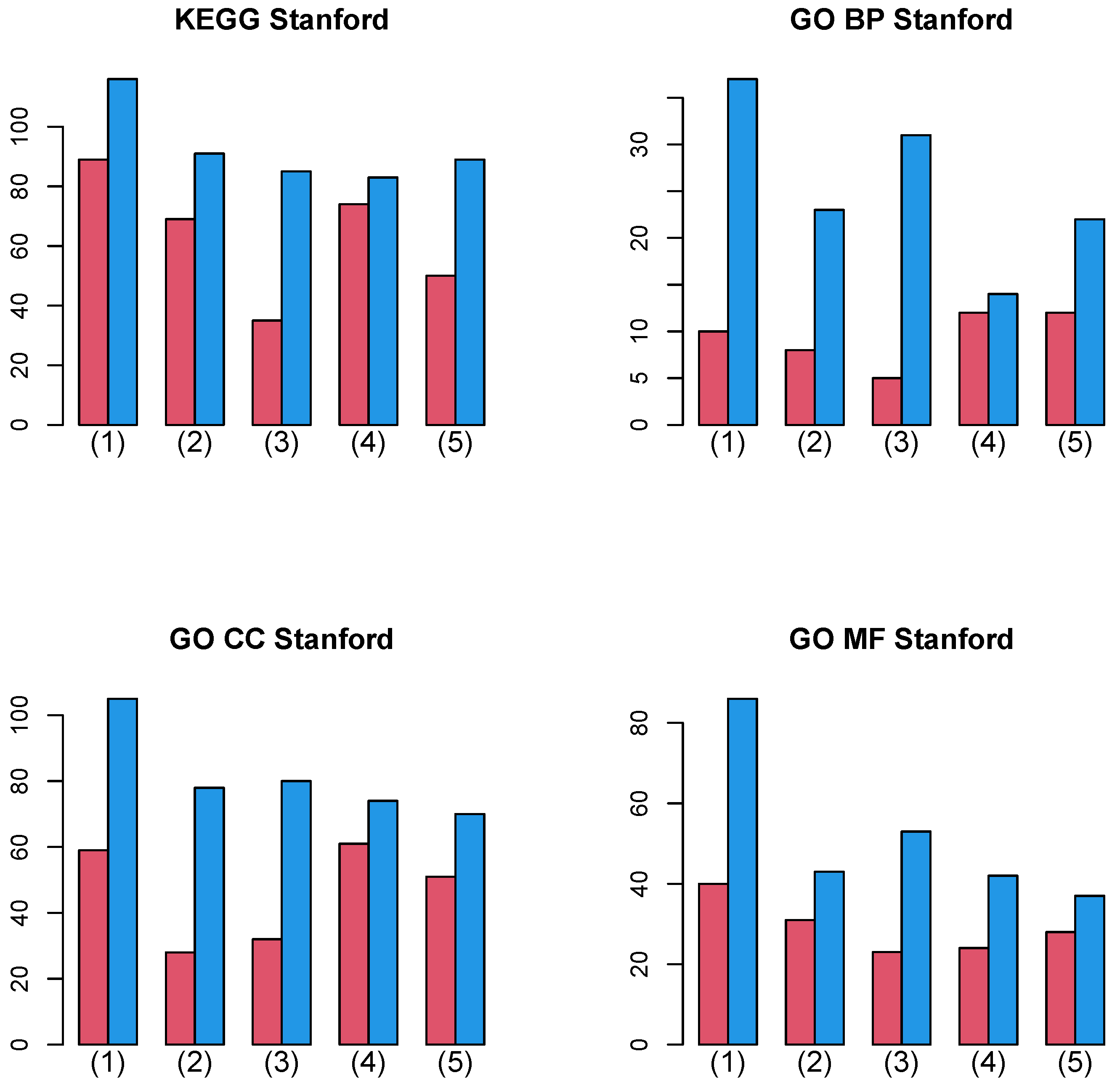
3.2.1. Stanford PPI
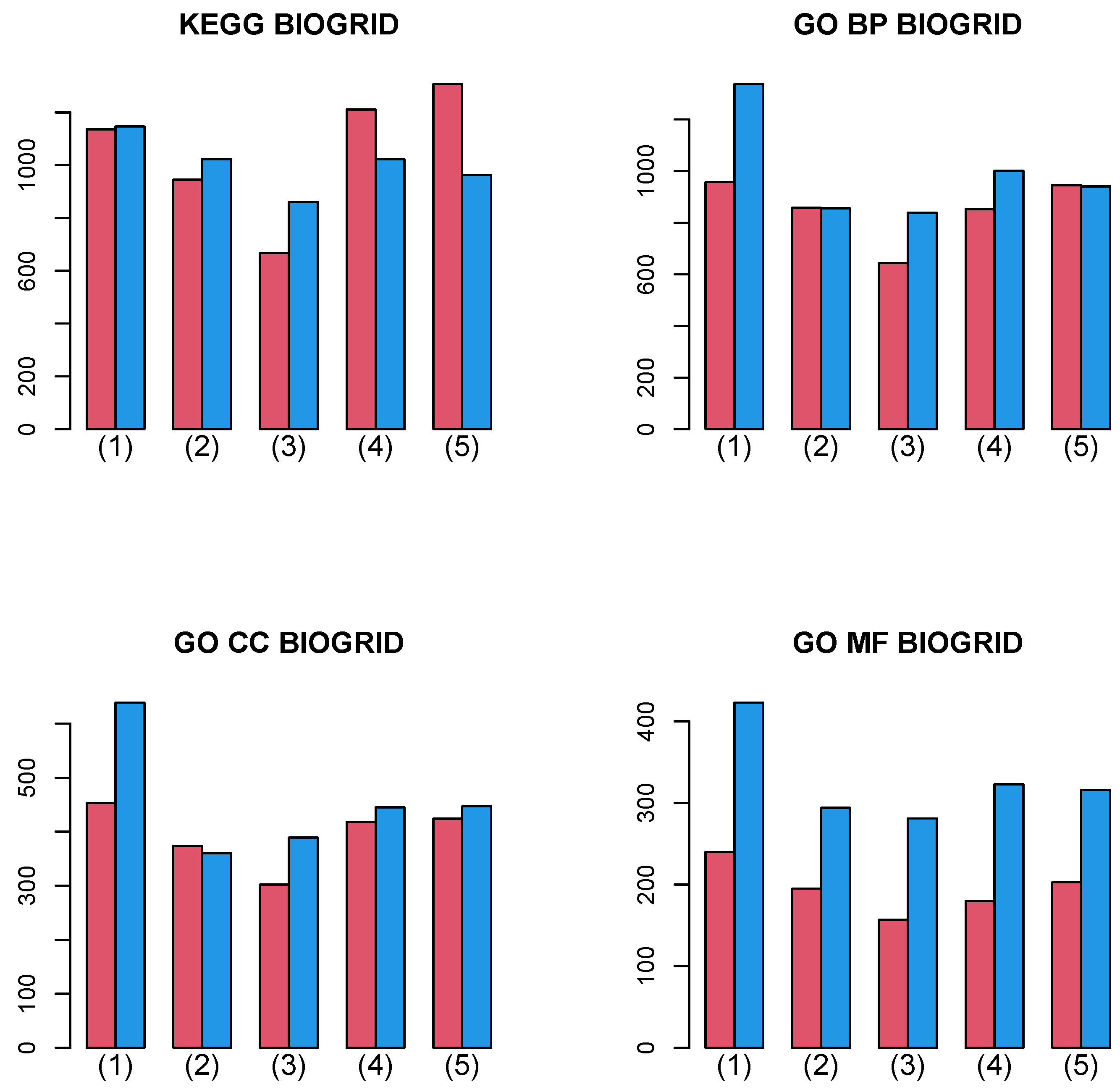
3.2.2. BIOGRID PPI
4. Discussion
5. Conclusions
Supplementary Materials
Author Contributions
Funding
Data Availability Statement
Conflicts of Interest
References
- Jalili, M.; Gebhardt, T.; Wolkenhauer, O.; Salehzadeh-Yazdi, A. Unveiling network-based functional features through integration of gene expression into protein networks. Biochim. Biophys. Acta (BBA) Mol. Basis Dis. 2018, 1864, 2349–2359. [Google Scholar] [CrossRef] [PubMed]
- Elbashir, M.K.; Mohammed, M.; Mwambi, H.; Omolo, B. Identification of Hub Genes Associated with Breast Cancer Using Integrated Gene Expression Data with Protein-Protein Interaction Network. Appl. Sci. 2023, 13, 2403. [Google Scholar] [CrossRef]
- Karimizadeh, E.; Sharifi-Zarchi, A.; Nikaein, H.; Salehi, S.; Salamatian, B.; Elmi, N.; Gharibdoost, F.; Mahmoudi, M. Analysis of gene expression profiles and protein–protein interaction networks in multiple tissues of systemic sclerosis. BMC Med. Genom. 2019, 12, 199. [Google Scholar] [CrossRef] [PubMed]
- Tian, L.; Chen, T.; Lu, J.; Yan, J.; Zhang, Y.; Qin, P.; Ding, S.; Zhou, Y. Integrated Protein-Protein Interaction and Weighted Gene Co-expression Network Analysis Uncover Three Key Genes in Hepatoblastoma. Front. Cell Dev. Biol. 2021, 9, 631982. [Google Scholar] [CrossRef]
- Wu, C.; Zhu, J.; Zhang, X. Integrating gene expression and protein–protein interaction network to prioritize cancer-associated genes. BMC Bioinform. 2012, 13, 182. [Google Scholar] [CrossRef]
- Ewing, R.M.; Chu, P.; Elisma, F.; Li, H.; Taylor, P.; Climie, S.; McBroom-Cerajewski, L.; Robinson, M.D.; O’Connor, L.; Li, M.; et al. Large-scale mapping of human protein–protein interactions by mass spectrometry. Mol. Syst. Biol. 2007, 3, 89. [Google Scholar] [CrossRef]
- Su, L.; Liu, G.; Guo, Y.; Zhang, X.; Zhu, X.; Wang, J. Integration of Protein-Protein Interaction Networks and Gene Expression Profiles Helps Detect Pancreatic Adenocarcinoma Candidate Genes. Front. Genet. 2022, 13, 854661. [Google Scholar] [CrossRef]
- Zhong, J.; Tang, C.; Peng, W.; Xie, M.; Sun, Y.; Tang, Q.; Xiao, Q.; Yang, J. A novel essential protein identification method based on PPI networks and gene expression data. BMC Bioinform. 2021, 22, 248. [Google Scholar] [CrossRef]
- Taguchi, Y.H. Unsupervised Feature Extraction Applied to Bioinformatics; Springer International Publishing: Cham, Switzerland, 2020. [Google Scholar] [CrossRef]
- Taguchi, Y.h.; Turki, T. Adapted tensor decomposition and PCA based unsupervised feature extraction select more biologically reasonable differentially expressed genes than conventional methods. Sci. Rep. 2022, 12, 17438. [Google Scholar] [CrossRef]
- Taguchi, Y.H.; Turki, T. Application note: TDbasedUFE and TDbasedUFEadv: Bioconductor packages to perform tensor decomposition based unsupervised feature extraction. Front. Artif. Intell. 2023, 6, 1237542. [Google Scholar]
- Nakerekanti, M.; Narasimha, V. Analysis on Malware Issues in Online Social Networking Sites (SNS). In Proceedings of the 2019 5th International Conference on Advanced Computing & Communication Systems (ICACCS), Coimbatore, India, 15–16 March 2019; pp. 335–338. [Google Scholar] [CrossRef]
- Xie, Z.; Bailey, A.; Kuleshov, M.V.; Clarke, D.J.B.; Evangelista, J.E.; Jenkins, S.L.; Lachmann, A.; Wojciechowicz, M.L.; Kropiwnicki, E.; Jagodnik, K.M.; et al. Gene Set Knowledge Discovery with Enrichr. Curr. Protoc. 2021, 1, e90. [Google Scholar] [CrossRef]
- Jawaid, W. enrichR: Provides an R Interface to ‘Enrichr’, R Package Version 3.2. 2023. Available online: https://cran.r-project.org/web/packages/enrichR/(accessed on 23 August 2023).
- Wu, T.; Hu, E.; Xu, S.; Chen, M.; Guo, P.; Dai, Z.; Feng, T.; Zhou, L.; Tang, W.; Zhan, L.; et al. clusterProfiler 4.0: A universal enrichment tool for interpreting omics data. Innovation 2021, 2, 100141. [Google Scholar] [CrossRef]
- Dolgalev, I. msigdbr: MSigDB Gene Sets for Multiple Organisms in a Tidy Data Format, R Package Version 7.5.1. 2022. Available online: https://cloud.r-project.org/web/packages/msigdbr/msigdbr.pdf(accessed on 23 August 2023).
- Human Protein-Protein Interaction Network. 2018. Available online: https://snap.stanford.edu/biodata/datasets/10000/10000-PP-Pathways.html (accessed on 23 August 2023).
- Oughtred, R.; Rust, J.; Chang, C.; Breitkreutz, B.J.; Stark, C.; Willems, A.; Boucher, L.; Leung, G.; Kolas, N.; Zhang, F.; et al. The BioGRID database: A comprehensive biomedical resource of curated protein, genetic, and chemical interactions. Protein Sci. 2021, 30, 187–200. [Google Scholar] [CrossRef] [PubMed]
- Kosinski, M. RTCGA: The Cancer Genome Atlas Data Integration, R Package Version 1.28.0. 2022. Available online: https://rtcga.github.io/RTCGA/(accessed on 23 August 2023).
- Kosinski, M. RTCGA.rnaseq: Rna-Seq Datasets from the Cancer Genome Atlas Project, R Package Version 20151101.28.0. 2022. Available online: https://bioconductor.org/packages/release/data/experiment/html/RTCGA.rnaseq.html(accessed on 23 August 2023).
- Kosinski, M. RTCGA.clinical: Clinical Datasets from The Cancer Genome Atlas Project, R Package Version 20151101.28.0. 2022. Available online: https://bioconductor.org/packages/release/data/experiment/html/RTCGA.clinical.html(accessed on 23 August 2023).
- Brooks, A.J.; Putoczki, T. JAK-STAT Signalling Pathway in Cancer. Cancers 2020, 12, 1971. [Google Scholar] [CrossRef]
- Lee, M.; Rhee, I. Cytokine Signaling in Tumor Progression. Immune Netw. 2017, 17, 214. [Google Scholar] [CrossRef]
- Yang, J.; Nie, J.; Ma, X.; Wei, Y.; Peng, Y.; Wei, X. Targeting PI3K in cancer: Mechanisms and advances in clinical trials. Mol. Cancer 2019, 18, 26. [Google Scholar] [CrossRef] [PubMed]
- Yan, H.; Kamiya, T.; Suabjakyong, P.; Tsuji, N.M. Targeting C-Type Lectin Receptors for Cancer Immunity. Front. Immunol. 2015, 6, 408. [Google Scholar] [CrossRef]
- Mughini-Gras, L.; Schaapveld, M.; Kramers, J.; Mooij, S.; Neefjes-Borst, E.A.; Pelt, W.v.; Neefjes, J. Increased colon cancer risk after severe Salmonella infection. PLoS ONE 2018, 13, e0189721. [Google Scholar] [CrossRef] [PubMed]
- Wong, R.S. Apoptosis in cancer: From pathogenesis to treatment. J. Exp. Clin. Cancer Res. 2011, 30, 87. [Google Scholar] [CrossRef]
- Mantovani, A.; Petracca, G.; Beatrice, G.; Csermely, A.; Tilg, H.; Byrne, C.D.; Targher, G. Non-alcoholic fatty liver disease and increased risk of incident extrahepatic cancers: A meta-analysis of observational cohort studies. Gut 2022, 71, 778–788. [Google Scholar] [CrossRef] [PubMed]
- Li, J.; Zhang, D.; Sun, Z.; Bai, C.; Zhao, L. Influenza in hospitalised patients with malignancy: A propensity score matching analysis. ESMO Open 2020, 5, e000968. [Google Scholar] [CrossRef] [PubMed]


| ACC | BLCA | BRCA | CESC | COAD | ESCA | GBM | HNSC | KICH | KIRC | KIRP | LGG | LIHC | LUAD | |
| (1) | ✓ | ✓ | ✓ | ✓ | ✓ | ✓ | ✓ | ✓ | ✓ | ✓ | ✓ | ✓ | ✓ | ✓ |
| (2) | ✓ | ✓ | ✓ | ✓ | ✓ | ✓ | ✓ | ✓ | ✓ | ✓ | ✓ | |||
| (3) | ✓ | ✓ | ✓ | ✓ | ✓ | ✓ | ✓ | ✓ | ✓ | ✓ | ✓ | |||
| (4) | ✓ | ✓ | ✓ | ✓ | ✓ | ✓ | ✓ | ✓ | ✓ | ✓ | ✓ | ✓ | ||
| (5) | ✓ | ✓ | ✓ | ✓ | ✓ | ✓ | ✓ | ✓ | ✓ | ✓ | ✓ | ✓ | ||
| LUSC | OV | PAAD | PCPG | PRAD | READ | SARC | SKCM | STAD | TGCT | THCA | UCEC | UCS | Total () | |
| (1) | ✓ | ✓ | ✓ | ✓ | ✓ | ✓ | ✓ | ✓ | ✓ | ✓ | ✓ | ✓ | ✓ | 27 |
| (2) | ✓ | ✓ | ✓ | ✓ | ✓ | ✓ | ✓ | 18 | ||||||
| (3) | ✓ | ✓ | ✓ | ✓ | ✓ | ✓ | ✓ | 18 | ||||||
| (4) | ✓ | ✓ | ✓ | ✓ | ✓ | ✓ | ✓ | ✓ | 20 | |||||
| (5) | ✓ | ✓ | ✓ | ✓ | ✓ | ✓ | ✓ | ✓ | 20 |
| Pathway | (1) | (2) | (3) | (4) | (5) |
|---|---|---|---|---|---|
| Salmonella infection | 25 | 18 | 17 | 20 | 20 |
| JAK-STAT signaling pathway | 23 | 18 | 17 | 19 | 20 |
| Cytokine-cytokine receptor interaction | 23 | 17 | 17 | 19 | 20 |
| Influenza A | 22 | 17 | 16 | 18 | 19 |
| Pathways in cancer | 22 | 17 | 14 | 19 | 19 |
| Apoptosis | 20 | 18 | 14 | 18 | 16 |
| Ribosome | 20 | 15 | 16 | 16 | 15 |
| Non-alcoholic fatty liver disease | 18 | 16 | 14 | 18 | 16 |
| PI3K-Akt signaling pathway | 16 | 17 | 15 | 18 | 16 |
| C-type lectin receptor signaling pathway | 18 | 15 | 13 | 17 | 16 |
| Pathway | (1) | (2) | (3) | (4) | (5) |
|---|---|---|---|---|---|
| HOSVD (with integration) | |||||
| HALLMARK_MYC_TARGETS_V1 | 10 | 4 | 5 | 6 | 6 |
| HALLMARK_FATTY_ACID_METABOLISM | 6 | 4 | 6 | 5 | 4 |
| HALLMARK_OXIDATIVE_PHOSPHORYLATION | 3 | 1 | 1 | 2 | 2 |
| HALLMARK_APOPTOSIS | 3 | 1 | 2 | — | 2 |
| HALLMARK_PEROXISOME | 2 | 2 | — | 1 | — |
| HALLMARK_IL6_JAK_STAT3_SIGNALING | 1 | — | 1 | — | — |
| HALLMARK_MYC_TARGETS_V2 | — | — | 1 | — | 1 |
| HALLMARK_ALLOGRAFT_REJECTION | 1 | — | — | — | — |
| HALLMARK_APICAL_SURFACE | 1 | — | — | — | — |
| SVD (without integration) | |||||
| HALLMARK_APOPTOSIS | 11 | 5 | 7 | 3 | 3 |
| HALLMARK_FATTY_ACID_METABOLISM | 6 | 3 | 4 | 3 | 3 |
| HALLMARK_PEROXISOME | 2 | 2 | — | 3 | 3 |
| HALLMARK_MYC_TARGETS_V1 | 1 | 2 | 2 | 1 | 1 |
Disclaimer/Publisher’s Note: The statements, opinions and data contained in all publications are solely those of the individual author(s) and contributor(s) and not of MDPI and/or the editor(s). MDPI and/or the editor(s) disclaim responsibility for any injury to people or property resulting from any ideas, methods, instructions or products referred to in the content. |
© 2023 by the authors. Licensee MDPI, Basel, Switzerland. This article is an open access article distributed under the terms and conditions of the Creative Commons Attribution (CC BY) license (https://creativecommons.org/licenses/by/4.0/).
Share and Cite
Taguchi, Y.-H.; Turki, T. Integrated Analysis of Gene Expression and Protein–Protein Interaction with Tensor Decomposition. Mathematics 2023, 11, 3655. https://doi.org/10.3390/math11173655
Taguchi Y-H, Turki T. Integrated Analysis of Gene Expression and Protein–Protein Interaction with Tensor Decomposition. Mathematics. 2023; 11(17):3655. https://doi.org/10.3390/math11173655
Chicago/Turabian StyleTaguchi, Y-H., and Turki Turki. 2023. "Integrated Analysis of Gene Expression and Protein–Protein Interaction with Tensor Decomposition" Mathematics 11, no. 17: 3655. https://doi.org/10.3390/math11173655
APA StyleTaguchi, Y.-H., & Turki, T. (2023). Integrated Analysis of Gene Expression and Protein–Protein Interaction with Tensor Decomposition. Mathematics, 11(17), 3655. https://doi.org/10.3390/math11173655