Article

Functional Data Analysis for the Detection of Outliers and Study of the Effects of the COVID-19 Pandemic on Air Quality: A Case Study in Gijón, Spain

by
Xurxo Rigueira
1,
María Araújo
1,
Javier Martínez
2,*,
Paulino José García-Nieto
3 and
Iago Ocarranza
4
1
CINTECX, GESSMin Group, Department of Natural Resources and Environmental Engineering, University of Vigo, 36310 Vigo, Spain
2
CINTECX, GESSMin Group, Department of Applied Mathematics I, University of Vigo, 36310 Vigo, Spain
3
Department of Mathematics, University of Oviedo, 33007 Oviedo, Spain
4
Possible Incorporated SL, 36211 Vigo, Spain
*
Author to whom correspondence should be addressed.
Mathematics 2022, 10(14), 2374; https://doi.org/10.3390/math10142374
Submission received: 3 May 2022 / Revised: 8 June 2022 / Accepted: 3 July 2022 / Published: 6 July 2022
(This article belongs to the Section Engineering Mathematics)

Abstract

:
Air pollution, especially at the ground level, poses a high risk for human health as it can have serious negative effects on the population of certain areas. The high variability of this type of data, which are affected by weather conditions and human activities, makes it difficult for conventional methods to precisely detect anomalous values or outliers. In this paper, classical analysis, statistical process control, and functional data analysis are compared for this purpose. The results obtained motivate the development of a new outlier detector based on the concept of functional directional outlyingness. The validation of this algorithm is perfomed on real air quality data from the city of Gijón, Spain, aiming to detect the proven reduction in NO 2 levels during the COVID-19 lockdown in that city. Three more variables ( SO 2 , PM 10 , and O 3 ) are studied with this technique. The results demonstrate that functional data analysis outperforms the two other methods, and the proposed outlier detector is well suited for the accurate detection of outliers in data with high variability.

1. Introduction

Air pollution is nowadays one of the most important environmental concerns for the population of urban areas [1,2,3,4,5,6,7,8,9,10]. The reason for this lies in the threat that air pollution poses for the residents of those places, where a broad range of different sources emit great quantities of different pollutants with distinct health effects [11,12,13]. Consequently, a network of stations has been installed that measure the levels of pollution and provide live data. Certain specific pollutants such as nitrogen oxides (NO and NO 2 ), sulfur dioxide ( SO 2 ), particulate matter ( PM 10 and PM 2.5 ), and ground level ozone ( O 3 ) have gained more attention because of the health problems they can inflict on the population [11]. In order to address the problem of air pollution, the national environmental agencies of each country have to define specific limits. In the case of Spain, these limits are outlined in the regulations passed by the European Union, which are afterwards adapted to each member state [14,15].
New environmental laws tend to become stricter in an ongoing effort to fight global warming. However, it still can be normal to see anomalous levels in environmental databases, which are considered outliers. These unusual recordings are classified as local or global outliers based on how they compare to the surrounding values [16,17]. Local outliers are detected through their contrast with their neighbors, while global outliers are those which deviate significantly from the rest of the dataset. From an environmental point of view, global outliers indicate a significant polluting event or an unusual absence of contamination, such as the levels of certain pollutants during the COVID-19 lockdown [18,19,20,21,22]. Observations considered as local outliers can also contain important information regarding uncommon processes, hidden trends or polluting events of less significance. Outliers can just be measuring errors or represent an anomalous behavior in the process studied. These types of values are important, and their identification can lead to the discovery of new useful information and can help in the selection of the right mitigation techniques or measures [23].
Functional data analysis (FDA) is the field of statistics studied, and its methods are implemented in this research for the modeling of this type of data. It was selected to solve the inefficiency of the classical outlier detection methods for vectorial data, which was identified by comparing the results obtained with box plots and statistical control charts, both also tested for the detection of outliers in this research work. Nowadays, FDA has applications in a broad range of fields, including environmental engineering [24,25,26,27,28], industrial processes [29,30], sensors [31,32], and medical research [33]. Functional analysis has the advantage of studying the detection problem from a time-correlated point of view. This is achieved through the conversion of a time-dependent set of discrete observations into mathematical functions. Moreover, in this research, the functional outlier detector proposed by Dai et al. [34] based on directional outlyingness was selected as the best technique. This method can achieve a higher precision and robustness in the detection of outliers as it works with two variables: mean directional outlyingness, which compares the shift of a curve with the rest, and the variation of the directional outlyingness, which compares the shape of a curve with the others.
Although several methods exist for outlier detection, such as the Grubbs test [35] or the test proposed by Jäntschi [36], they have a vectorial basis. In this case, conventional methods were implemented alongside the functional approach, leading to the comparison and study of both results to identify the most effective technique.
Consequently, the main objective of this research work is to validate the implementation of directional outlyingness for the detection of functional outliers in real air quality data from the city of Gijón in Spain. More specifically, the method is validated based on the detection of the COVID-19 2020 lockdown effects on the air quality of this city. Additionally, the effectiveness of this technique is compared to those of classical statistical analysis and statistical process control.
This research paper is divided in several sections. Section 2 introduces the database, the location of the area studied, and the mathematical methods implemented. Next, Section 3 presents the results obtained with every method and the proposed outlier detector, and Section 4 analyzes those results in the Discussion. Lastly, Section 5 concludes the research paper with the most relevant ideas proposed and future research lines.

2. Materials and Methods

2.1. Case Study —Air Quality in Gijon, Spain

The data used on this research was collected by a public air quality station placed in the coastal city of Gijón, Spain. This urban area is located in Northern Spain, within the Autonomous Region of Asturias. The city has a population of 271,717 (2020 census), a density of 1480 habitants/km2, and an area of 182 km2 [37]. The Cantabrian Sea draws a heavy influence on the climate of this region. Defined as an Oceanic climate, the mean temperature of the city is 13.8 ° C, and it ranges from a mean maximum of 19.7 ° C in August to a mean minimum of 8.9 ° C in January. Winds in this area shift in accordance to the season, but they are dominated by two main components. During winter, it blows from W-WSW, while in summer, it comes from E-ENE on the coast [38]. The pluviometry of the city is high, with a total of 920 L/m2 year [39].
Regarding its economy, the port of El Musel plays a key role. Its infrastructure is adapted to the requirements of the modern market, which has helped it become one of the most active ports in Spain and the European continent. The West side of the city concentrates most of its industrial activity, including a steel factory, a coal-fired power plant, a concrete factory and several other facilities. The locations of the station and the main industries in Gijón are shown on Figure 1.
The air quality station that provided the data for this research is positioned in a major avenue of the city. The data studied consists of the daily records of this station for a total of eight years: from 1 January 2014 to 31 December 2021. This results in 2976 points, as all months have been linearly interpolated to have 31 days in order to satisfy the requirements of the conversion from discrete to functional data. The variables studied are: (1) NO 2 , (2) SO 2 , (3) PM 10 , and (4) O 3 . All variables were measured in μ g/m3. The selection of these substances is based on the fact that they are measured in the majority of public air quality stations in Spain and their legal concentration limits are clearly defined in the national and European regulations.
Air pollutants can be classified as primary or secondary. Primary pollutants are the result of natural or man-made process, such as a volcanic eruption or the combustion of fossil fuels, respectively. On the other hand, secondary pollutants are not emitted directly; instead, they form in the air as the result of reactions between primary pollutants. The most important non-natural primary pollutants in this study include [40,41,42]:
  • Sulfur oxides ( SO x ): they are a group of molecules formed of sulfur and oxygen atoms. The vast majority are released into the atmosphere as the result of some human activities, including the burning of oil and coal, and their respective industrial processes. When these fuels are burned, the sulfur in them reacts with the oxygen in the atmosphere, resulting in sulfur oxides. If they are inhaled regularly, it can lead to bronchitis and/or asthma. Moreover, these components can combine with water droplets in the atmosphere, originating acid rain with harmful effects on plants and animals. The most dangerous compound in this group is sulfur dioxide ( SO 2 ), which is usually a product of the combustion of coal and petroleum;
  • Nitrogen oxides ( NO x ): similarly to the previous pollutant, they are a group of molecules formed of oxygen and nitrogen atoms that form when fuel is burned at high temperatures, usually in internal combustion engines, power plants, or industrial boilers. Regarding their environmental impact, nitrogen oxides are of great importance in the formation of photochemical smog. This is due to their bonding capabilities with other atmospheric pollutants (such as the non-methane volatile organic compounds), which affect the formation of ozone at ground level. Moreover, they are poisonous and can react with water in the atmosphere to produce acid rain;
  • Particulate matter ( PM 10 ): very small particles of solid and/or liquid compounds suspended in the atmosphere. Some dark and large enough particles, including dust, dirt, soot, or smoke, can be seen with the naked eye. These particles comprise a great variety of sizes and shapes and can be made up of hundreds of different chemicals. Their sources are fires, fields, constructions sites, unpaved roads, and smokestacks. They can be inhaled, causing serious health problems (asthma, bronchitis, high blood pressure, and heart attack) and even getting into the blood stream. PM 10 refers to particles with aerodynamic diameters equal to or less than 10 μ m.
Secondary pollutants included in this research are [40]:
  • Ground level ozone ( O 3 ): ozone forms naturally in the upper atmosphere, where it is beneficial for life on Earth, as it protects from ultraviolet rays. At ground level, it forms through chemical reactions between NO x and volatile organic compounds (VOCs) emitted from cars, power plants, refineries, chemical plants, etc. This reaction usually takes place in hot summer days within urban settings, and it results in harmful air for animals and plants.
The behavior of these pollutants during the lockdown of the COVID-19 pandemic has been studied by previous research [18,19,20,21,22]. All sources concur on a reduction of the NO 2 levels. Nevertheless, the levels of SO 2 vary accordingly to the industrial activity of the area, PM 10 can be influenced by atmospheric events, and the levels of ground level ozone show an increase in most cases due to the reduction of NO 2 [18]. Consequently, the methods tested will be validated on the NO 2 data, and the technique presented will be applied to study the effects of the other three pollutants during this time.
With respect to the current regulations, the Spanish Royal Decree 102/2011 of 28 January [14], which implements the European Directive 2008/50/CE of the European Parliament and the Council on 21 May 2008 [15], set the limits for air pollutants. These limits are defined as a certain number of exceedances over different time periods.

2.2. Analysis Methods

Three main mathematical approaches were taken to study the time-series data: classical analysis, statistical process control (SPC), and functional data analysis. These three methods are oriented towards detecting anomalies in the data by taking into account several types of information such as raw data points, trends, and/or variations in different time ranges. The classical analysis and the SPC study the information discretely, while functional data analyzes a process as a whole by transforming those singular points in functions over a continuum. The development was performed on Python 3.7 [43] with the aid of the library scikit-fda [44] for the functional analysis.

2.2.1. Classical Analysis

The first step in the classical analysis was checking the normality of the data gathered. This was done based on D’Agostino and Pearson’s [45,46] test, which combines skew and kurtosis to produce an omnibus test of normality, as defined in Equation (1).
K 2 = Z 1 g 1 2 + Z 2 g 2 2
where Z 1 g 1 is the z-score returned by the skew test and Z 2 g 2 is the z-score returned by the kurtosis test. If the null hypothesis can be rejected, there are two options for its analysis: (1) implementing the adapted version of the classical method to non-normal distributions [47], or (2) applying a transformation to normalize the data sample [48]. The most widely used method for the second option is the Box–Cox transformation defined in Equation (2) [49].
X j ( λ ) = X j λ 1 λ , if λ 0 log X j , if λ = 0
Next, box plots are implemented as a first approach to the problem. This statistical method displays graphically the main characteristics of the data studied, including those points which have a higher probability of being considered outliers.

2.2.2. Statistical Process Control

Statistical process control is a method that analyzes the variability of a given data set and allows studying, controlling and detecting anomalies within the information provided. These type of charts were initially developed for industrial processes by Walter A. Shewhart [50] working for Bell Labs in the 1920s. A key feature of control charts is the introduction of rational subgroups. This implies that the data have to be divided into subgroups of a predefined size by the cause of variation detected. Therefore, if this cause of variation follows a daily, monthly, quarterly or annual pattern, the data have to be divided into rational subgroups of equal mode [28].
The analysis process has two main stages. In the learning phase, the aforementioned test of normality is performed, and atypical measurements are removed from the database. It is in this step that the control line is defined from the values of each rational subgroup. This line represents the target value. Moreover, the warning limits are set at a distance of ± 2 standard deviations of the control line, and the out-of-control limits at ± 3 standard deviations [51]. In the second phase, or control stage, the processed data are plotted against time, resulting in the control chart per se. Whether the process is under statistical control can be visually checked on the chart if one or several points exceed the limits established in the first phase.
These charts have been consistently used due to their precision in the detection of small variations. However, since they only study the most recent samples, they fail to detect smaller changes or trends over a long time span. To address this issue, several new sets of rules were defined [52,53] to complement the initial rules and boost the precision of the control charts. In this study, the WECO [54] rules were enhanced with those developed by Lloyd S. Nelson [55]: (1) one point is more than three standard deviations from the mean, (2) nine or more consecutive points are on the same side of the mean, (3) six or more points in a row are continually increasing or decreasing, (4) fourteen or more continuous points alternate in direction, increasing then decreasing, (5) two or three out of three points in a row are more than two standard deviations from the mean in the same direction, (6) four or five out of five consecutive points are more than one standard deviation from the mean in the same direction, (7), fifteen points in a row are all within one standard deviation of the mean on either side, and (8) eight consecutive points exist, with none within one standard deviation of the mean, and the points are in both directions from the mean.

2.2.3. Functional Data Analysis

Functional data are observations of a random continuous process at discrete points [56]. Considering a set of samples x ( t j ) in a set of n p points t j R , where t j represents every time instant, all samples can be considered as discrete observations of the function x ( t ) χ F , with F being a functional space. The function x ( t ) is estimated by taking into consideration that F = s p a n { ϕ 1 , , ϕ n b } is a functional space consisting in a set of basis functions { ϕ k } , with k = 1 , 2 , , n , and n is the needed number of basis functions to define the functional space F. This expansion is explained in Equation (3) [26]:
x ( t ) = k = 1 n b c k ϕ k ( t )
where c k k = 1 n b represents the coefficients of the x ( t ) function regarding the chosen set of the basis functions. The smoothing problem may be expressed as [26]:
min x F j = 1 n p z j x t j 2 + λ Γ ( x )
In Equation (4), z j = x t j + ε j is the result of evaluating x at the point t j , ε j is considered the random noise with zero mean, and Γ is an operator which penalizes the complexity of the solution. The purpose of this penalty is to guarantee a good fit to the data in the sense that z j x t j 2 is small, but also some aspect of the data captured by Γ is kept under control. Lastly, the parameter λ sets the intensity of the regularization. Considering Equation (3), the above can be expressed as:
min c ( z Φ c ) T ( z Φ c ) + λ c T R c
where z = z 1 , , z n p T is the vector of observations, c = c 1 , , c n b T is the vector of coefficients of the functional expansion, Φ is the n b × n p matrix with elements Φ j k = ϕ k t j , and R is the n p × n b matrix with elements:
R k l = D 2 ϕ k , D 2 ϕ l L 2 ( I ) = I D 2 ϕ k ( t ) D 2 ϕ l ( t ) d t
According to Ramsay and Silverman [56], the ridge regression technique is one example of the regularization presented. In this case, what is penalized in the size of regression coefficients. In our case, the problem can be solved with minimization by the ordinary least squares estimate:
c = Φ t Φ + λ R 1 Φ t z
where as λ gets closer to zero, c approaches the least squares solution, but if λ increases, c approaches zero.

2.2.4. Functional Depth

The concept of depth was initially defined for multivariate analysis as a measure of the centrality of a point in comparison with a set of observation. Therefore, in a Euclidean space, the points closer to the center will have a greater depth since the observations presented as points can be distributed from the center to the periphery [27]. This definition has been extended to the functional domain, where the depth concept is considered a measure of the curve x i ’s centrality with respect to a set of curves x 1 , , x n . In this research, several functional depths have been implemented:
  • Fraiman–Muniz depth (Integrated depth): consider F i , t ( x i ( t ) ) as the cumulative empirical distribution function [57] for the curve values x i ( t ) i = 1 n in a time t [ a , b ] ruled by the following expression [58]:
    F n , t x i ( t ) = 1 n k = 1 n I x k ( t ) x i ( t )
    where I ( · ) is the indicator function. Consequently, the Fraiman–Muniz depth of a curve x i in a set of curves x 1 , , x n is defined by:
    FMD n x i ( t ) = a b D n x i ( t ) d t
    where D n ( x i ( t ) ) is the depth of the point x i ( t ) , t [ a , b ] obtained by:
    D n x i ( t ) = 1 1 2 F n , t x i ( t ) ;
  • Modified Band Depth: this functional depth is a second iteration of the graph-based band depth developed by Lopez-Pintado et al. [59]. Considering j as a fixed value within 2 j n , A j is defined as
    A j ( x ) A x ; x i 1 , x i 2 , , x i j t [ a , b ] : min r = i 1 , , i j x r ( t ) x ( t ) max r = i 1 , , i j x r ( t )
    where the set in the interval [ a , b ] for a function x is in the collection of real functions x 1 , , x n , which is in the band defined by the observations x i 1 , x i 2 , , x i j . If λ is the Lebesgue measure on [ a , b ] , λ r A j ( x ) = λ A j ( x ) / λ ( [ a , b ] ) outputs the amount of time that x is inside the band. Subsequently,
    MBD n ( j ) ( x ) = n j 1 1 i 1 < i 2 < < i j n λ r A x ; x i 1 , x i 2 , , x i j , 2 j n
    and
    M B D n , J ( x ) = j = 2 J M B D n ( j ) ( x )
    For the finite dimensional case, the value of M B D n ( j ) ( x ) is specified as the fraction of coordinates of x in the interval defined by j different points from the next sample:
    M B D n ( j ) ( x ) = n j 1 1 i 1 < < i j n 1 d k = 1 d [ a , b ] min x i 1 ( k ) , , x i j ( k ) x ( k ) max x i 1 ( k ) , , x i j ( k )
and then,
M B D n , J ( x ) = j = 2 J M B D n ( j ) ( x )

2.2.5. Outlier Detection

In a set of functional elements, there may be items with different patterns of characteristics compared to the rest. Although they do not have to be errors, functional depths are used to identify these elements defined as outliers. This mathematical method allows comparing data observed over time and representing it by functional curves directly, rather than using mean values, which implies a loss of information. In order to increase the accuracy in the detection of outliers, the idea of directional outlyingness is implemented alongside with a point-wise scalar depth. This method can be applied to both multivariate and univariate functional data with one or multidimensional domains. Moreover, functional directional outlyingness separates functional outlyingness into two main components: shape outlyingness and magnitude outlyingness, which allows studying the centrality of the curves and their variability. A magnitude outlier is an observation which is shifted from the mass of the data. In the other hand, an observation can be a shape outlier because it differs in shape from the mass of the data (even if it lies completely inside the mass of the data) [60].
In a stochastic process, X : I R p , which takes values in the space C I , R p of real continuous functions defined on a compact interval I to R p , for which its probability distribution is F x . Let O be the directional outlyingness defined in the following equation:
O X ( t ) , F X ( t ) = o X ( t ) , F X ( t ) · v ( t ) = 1 / d X ( t ) , F X ( t ) 1 · v ( t )
where d X ( t ) , F X ( t ) : R p [ 0 , 1 ] is a statistical depth function for X ( t ) with respect to F X ( t ) , v ( t ) = { X ( t ) Z ( t ) } / X ( t ) Z ( t ) is the spatial sign of { X ( t ) Z ( t ) } [61], Z ( t ) represents the mean of the distribution F X t with respect to d X ( t ) , F X ( t ) , · denotes the L 2 norm, and w ( t ) is a weight function on I , which can be proportional to the local amount of variability [62] or constant [57,63]. This implementation considers a constant weight function defined by w ( t ) = λ ( I ) , where λ ( · ) is the Lebesgue measure. Based on this concept, Dai et al. [34] introduced several definitions: functional directional outlyingness (FO),
FO X , F X = I O X ( t ) , F X ( t ) 2 w ( t ) d t
mean directional outlyingness ( MO ),
MO X , F X = I O X ( t ) , F X ( t ) w ( t ) d t
and variation of directional outlyingness (VO),
VO X , F X = I O X ( t ) , F X ( t ) M O X , F X 2 w ( t ) d t
FO represents the total outlyingness of the process X , similarly to the classical functional depth. Next, MO studies the relative position (considering both distance and direction) of X on average to the other curves, and MO is the magnitude outlyingness of X . Lastly, VO measures the changes of O ( O ( t ) , F X ( t ) ) regarding the norm and the direction throughout the entire design interval and can be defined as the shape outlyingness of X . Dissimilar to classical functional depth, the functional directional outlyingness is a unique scalar. Classical functional depth consists of mapping X C I , R p fd [ 0 , 1 ] , while functional directional outlyingness is a mapping X C I , R p M O T , V O T R p × R + , which drastically increases the flexibility to analyze curves. Moreover, the weight function, w ( t ) , can be a constant function [57,59] or proportional to the amount of local variability in amplitude [62].
A new outlier detector arises from this methodology. Considering the descriptive statistics for a finite set of time points T k = { t 1 , t 2 , , t k } , MO T k , n , and V O T k , n , Dai et al. [34] found that the distribution of Y k , n = M O T k , n T , VO T k , n T can be well approximated with a (p+1)-dimensional normal distribution when X is generated from a p-dimensional stationary Gaussian process. Following this basis, Dai et al. [34] defined a new outlier detection process consisting of, first, the calculation of the robust Mahalanobis distance of Y k , n with the Rousseeu’s [64] minimum covariance determinant for shape and location of the data. Secondly, the authors utilized the approximation presented by Hardin et al. [65] for the distance distribution and, thirdly, they defined the cutoff value based on the aforementioned approximation. This process was made up by three steps:
  • Obtaining the robust Mahalanobis distance from a sample of size h n :
    RMD 2 Y k , n , Y ¯ k , n , J * = Y k , n Y ¯ k , n , J * T S k , n , J * 1 Y k , n Y ¯ k , n , J *
    where J denominates the group of h points which minimizes the determinant of the corresponding covariance matrix, Y ¯ k , n , J * = h 1 i J Y k , n , i and S k , n , J * = h 1 i J Y k , n , i Y ¯ k , n , J * Y k , n , i Y ¯ k , n , J * T . The robustness of the method is controlled by the sub-sample of size h. For a p-dimensional distribution, the maximum finite sample breakdown point is [ ( n p + 1 ) / 2 ] / n , where [ a ] denotes the integer part of a R [34];
  • Approximate the tail of this distance distribution with Equation (21) according to Hardin et al. [65],
    c ( m p ) m ( p + 1 ) RMD 2 Y k , n , Y ¯ k , n , J * F p + 1 , m p
    where c and m define the degrees of freedom of the F-distribution and the scaling factor, respectively. The value of these two parameters is calculated by a simulation program provided by Hardin et al. [65]. Then a value for the cutoff, C, is chosen as the α quantile of F p + 1 , m p . Dai et al. [34] set α = 0.993 , which is used in the classical box plot for detecting outliers under a normal distribution [34], and the results of the Monte Carlo simulation studies with four different contamination models show that it is more accurate to use the quantile of the F p + 1 , m p than the empirical quantile of the data or the quantile of the χ 2 distribution;
  • Consider as outliers all those curves for which their distance satisfies Equation (22),
    c ( m p ) m ( p + 1 ) RMD 2 Y k , n , Y ¯ k , n , J * > C .
To facilitate the visualization of the results, an ellipsoid obtained with this method is added to the graphical representation [66].

3. Results

The results were obtained and analyzed in three different phases. In the first phase, each air quality variable of the database was studied statistically and graphically with the aid of several box plots. The second phase started with the implementation of the x ¯ chart with monthly rational subgroups to evaluate its precision and offer a general idea of the trends and mean values of each variable. At the same time, the monthly data were studied through functional data analysis with the integrated and the modified band depth, concluding the second phase. Lastly, a second iteration of the Dai et al. [34] outlier detector was proposed to achieve a higher precision on the detection of outliers on data with high variability. This algorithm is considered the third phase of the results.
The validation criteria for each of the methods presented consists in the detection of the lockdown effects in Gijón (14 March 2020–31 April 2020) on air quality parameters. This time frame corresponds to those weeks with the most strict restrictions for the civilian population in Spain. Previous research work has demonstrated the improvements in air quality due to the lockdown of the COVID-19 pandemic [18,19,20,21,22]. All sources agree on a reduction on the levels of N O 2 ; therefore, it can be considered as a verified event able to validate the method presented. However, the variations in S O 2 levels depend on the industrial activity of the area, P M 10 can be influenced by atmospheric events, and the levels of ground level ozone show an increase in most cases due to the reduction of N O 2 [18]. Considering this circumstances, the method was applied to study the behavior of these variables during the lockdown in Gijon, Spain.

3.1. Results of the Classical Analysis

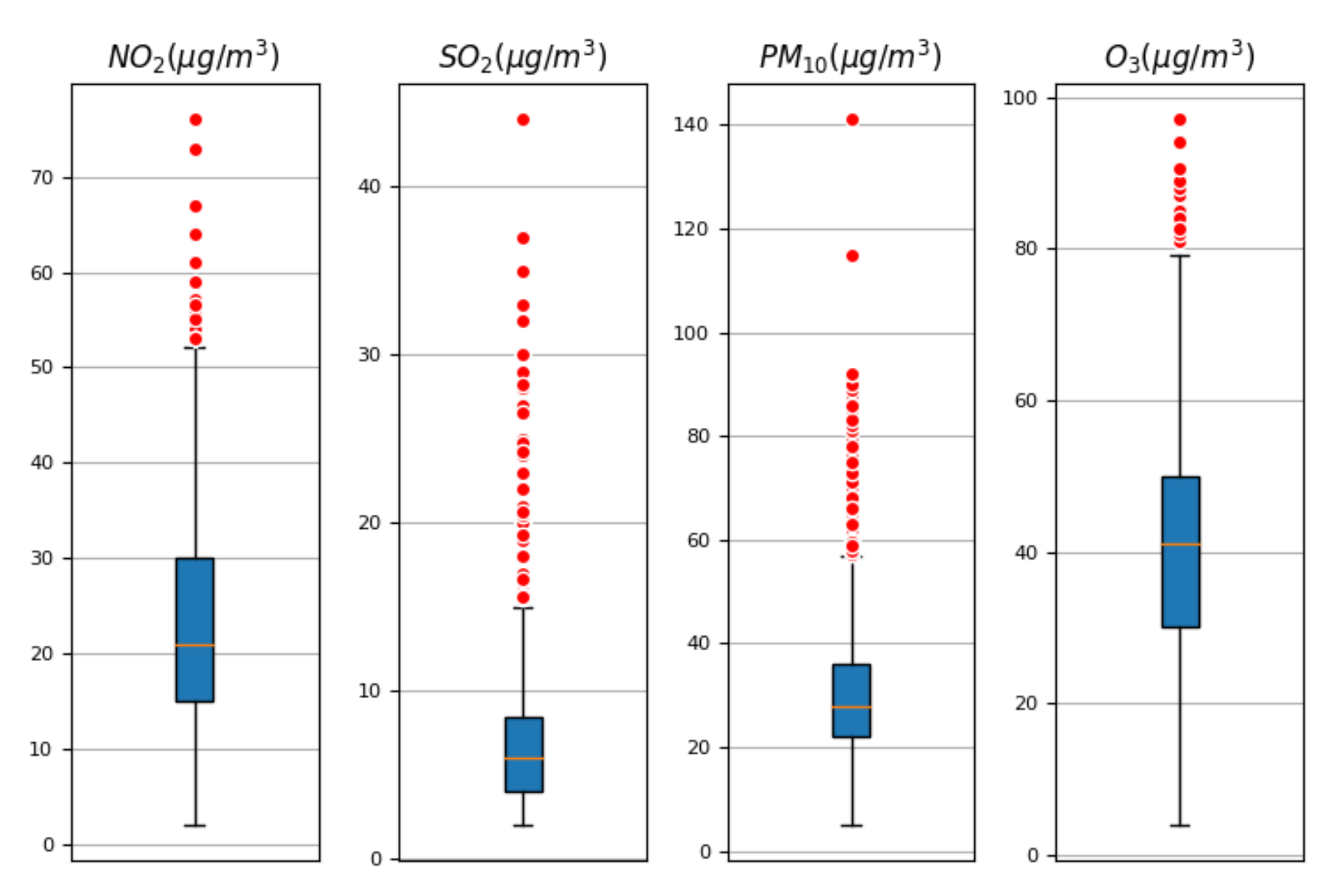
Classical statistical analysis was implemented through box plots as the first approach to the problem presented. The suitability of this method is addressed in Section 4. The box plots of each variable of the data studied are represented in Figure 2.
Since this method only studies points, these values do not consider the trend of the data. As a result, the method becomes highly sensitive to measuring errors or anomalies in the recording of events due to artificial causes. The graphical representation of the NO 2 data displays a mean of 23.19 μ g/m3, a maximum of 76.0 μ g/m3, and a minimum of 2.0 μ g/m3. The value of the first quartile stands at 15.0 μ g/m3, and the third quartile is 30.0 μ g/m3. Regarding the outliers detected, the total number is 23. The analysis of these results confirms that the anomalies of the lockdown on the records of NO 2 are not identified.
The box plot of the SO 2 presents a much higher number of outliers (131). The SO 2 mean is 6.26 μ g/m3, with a maximum of 44.0 μ g/m3 and a minimum of 1.0 μ g/m3. The first quartile of the SO 2 is 3.0 μ g/m3, and the third quartile is 80 μ g/m3. Lastly, there are no outliers detected during the lockdown.
Following up is the box plot of the PM 10 . The mean of this variable is 29.96 μ g/m3, while the maximum and minimum are 141.0 μ g/m3 and 5.0 μ g/m3, respectively. The first quartile has a value of 22 μ g/m3, and the third quartile sets the upper limit of the box at 36.0 μ g/m3. The number of outliers detected in this case is 93, most of them in 2014 and 2021. As for 2020, the outliers in that year are detected in the first and last two months.
The last variable analyzed is ozone ( O 3 ), which has mean, maximum and minimum values of 40.21 μ g/m3, 97.0 μ g/m3 and 4.0 μ g/m3, respectively. Its box plot shows a first quartile of 30 μ g/m3 and a third quartile of 50 μ g/m3. The total number of outliers is 13, which are represented by the red dots. However, there are no anomalous events detected during the lockdown.

3.2. Results of Statistical Process Control and Functional Data Analysis

3.2.1. First Variable: NO2

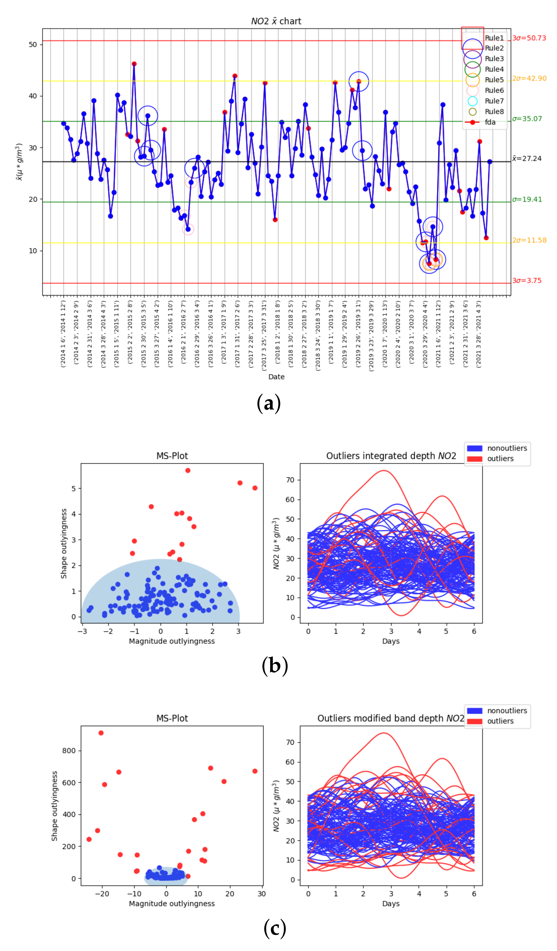
Figure 3 shows the results of the second phase of the NO 2 analysis. In the first place, Figure 3a displays the x ¯ of the whole NO 2 dataset with monthly rational subgroups. The 8 Nelson rules are integrated in this chart and included in its representation, the mean is represented by the black horizontal line, and the green, yellow and red lines define the ± 1 σ , ± 2 σ , and ± 3 σ limits, respectively. Figure 3b shows the functional results obtained with the integrated depth for the NO 2 data; on the left side, the pair of values of the magnitude-shape outlyingness of each function are plotted in Cartesian coordinates with magnitude outlyingness on the x-axis and shape outlyingness on the y-axis. Those points outside the ellipse are considered outliers. On the right side, the NO 2 function of every month is plotted versus time, and each function corresponds to a point on the left. In both cases, outliers are marked in red, while nonoutliers are marked in blue. Lastly, Figure 3c represents the results obtained with the modified band depth in the same manner as Figure 3b.
The x ¯ chart of the data registered by the Argentina Ave. air quality station displays an annual cycle in the levels of this molecule. The highest recordings of NO 2 tend to be between November and February; from this point on, the values start decreasing until reaching the minimum, usually in July or August. After the summer months, the levels of NO 2 rise progressively towards the annual maximum again. The Nelson rules were analyzed in their respective order and omitting those without detection results. Rule number 2 detected November 2021 as an outlier, which implies that there is a trend of values below the mean around those dates. Next, rule number 3 pointed out several outlying values, especially in the beginning of 2015, 2017 and 2019, as well as the end of summer for 2020 and 2021. It is also noticeable how the levels of NO 2 show local minimums between spring and summer of 2020 and 2021, but the lockdown months were not automatically detected as outliers. This method failed to identify those months due to the high variability of the data, which breaks most of the trends and makes it difficult for the system to detect apparently visible outliers.
Regarding the functional data analysis, the two depths yield different results. In Figure 3b, it can be seen that the integrated depth on the magnitude-shape plot shows a very limited number of outliers (1). On the other hand, the magnitude-shape outlier detector implemented with the modified band depth in Figure 3c labels as outliers a considerable number of months (27.1%) as it is subject to overfitting; however, it includes April and May of the lockdown.
In order to improve detection and avoid overfitting, we proposed a series of changes to the modified-band-depth method to increase its precision for high-variability data. In the first place, a time frame of the annual cycle was considered instead of the whole year. Therefore, the year was divided into quarters that ensure less variability. Given the annual cycle, and that the validation rule is the detection of the lockdown’s effect on the NO 2 , the selected months were January, February, March, and April. Secondly, to counter the reduction of data points and achieve a finer detection, the time unit was switched from months to weeks. Lastly, a double filter was implemented on both depth functions to keep the coherency of the results. This new outlier detection algorithm starts by checking the number of outliers detected, and if there are none, it passes. Otherwise, the values of magnitude and shape outlyingness of each point are extracted. Then, a new ellipse is defined based on their distribution, and all those points that lay outside its limits are considered outliers. This ellipse is centered in the origin, and its major and minor axes are defined in Equations (23) and (24).
a = P 80 ( m a g n i t u d e ) P 20 ( m a g n i t u d e )
b = P 85 ( s h a p e )
The results obtained with this new algorithm can be observed in Figure 4. Firstly, Figure 4a displays the x ¯ of the first four months of every year with weekly subgroups. The 8 Nelson rules are also integrated in this chart and included in its representation, the mean is represented by the black horizontal line, and the green, yellow and red lines define the ± 1 σ , ± 2 σ , and 3 ± σ limits, respectively. In this chart, the red dots represent those weeks detected as outliers by the modified band depth. Figure 4b shows the functional results obtained with the new outlier detection algorithm and the integrated depth for the weekly NO 2 data of the first four months of every year; on the left side, the pair of values of magnitude-shape outlyingness of each function are plotted in Cartesian coordinates with magnitude outlyingness on the x-axis and shape outlyingness on the y-axis. Those points outside the new ellipse are considered outliers. On the right side, the NO 2 function of every month is plotted against time; each function corresponds to a point on the left. Outliers are marked in red, while nonoutliers are marked in blue. Lastly, Figure 4c represents the new results obtained with the modified band depth in the same manner as Figure 4b.
Analyzing the Nelson rules by their numerical order and skipping those that do not detect anything, it can be seen how rule number 2 identifies several trends, among which it is worth noting the local maximum on the last week of February 2019 and the effect of the lockdown, also detected by rules 5 and 6. This last rule also identifies February 2016 as an outlier. Besides those results, the Nelson rules are unable to identify all local maximums and minimums. The outlier detection performed with the integrated depth shown on Figure 4b sees an increase in the number of alerts but does not detect the first months of the pandemic; consequently, it is dismissed as a valid method.
The modified band depth in Figure 4c detects the effects of the lockdown and points out 75% of the local maximums and minimums. These results are included in Table 1. It is also important to mention there are several red dots on the x ¯ chart, which are apparently close to the mean. This is due to the loss of information that this control chart suffers from, because it only works with an average value per week, and it has low suitability for data with high variability. The aforementioned points are clearly detected as outliers by the functional method because of their anomalous values of magnitude and shape outlyingness. For example, the first functional outlier (26 January 2015, 1 February 2015) has a magnitude outlyingness of 13.94 and a shape outlyingness of 689.94, while the average for those parameters are 0.02 and 57.55, respectively.
The same analysis sequence is implemented with the rest of variables.

3.2.2. Second Variable: SO2

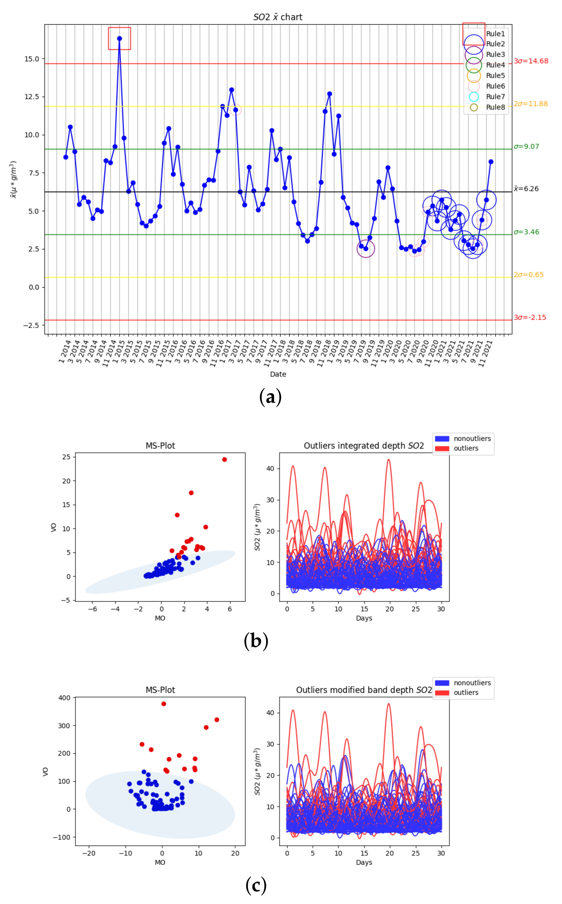
The second phase of the SO 2 analysis includes the x ¯ chart with monthly rational subgroups and the Nelson rules, as well as the functional analysis of the monthly data with the integrated and the modified band depth. These results are presented on Figure 5. The x ¯ chart of this variable on Figure 5a shows an annual cycle. The lowest values tend to take place between May and September before rapidly increasing to the maximums, which happen from November to February. From this point, the values of SO 2 decrease quickly until reaching the yearly minimum, consequently closing the cycle. Regarding the outliers detected in this chart, Nelson rule number 1 points to January 2015 as a month with an average value higher than three times the standard deviation of the mean. The second Nelson rule detects an important number of points below the mean, ranging from November 2020 to November 2021. In addition, rule number 3 detects a group of 7 points continuously decreasing until October 2019. Lastly, the fifth rule defines as outliers those points included in the time frame from July 2020 to October 2020, and September plus October 2021. Despite those results, this method does not detect the first two months of the lockdown as outliers. It can be seen that the levels of SO 2 between November 2020 and February 2021 never reached the peak of the cycle in those months, which is above the mean in all previous years, due to the reduction in the emission of SO 2 during the year 2020.
In Figure 5b, the functional data analysis with the integrated depth detects an increased number of outliers compared to the previous case (18.8%), but no months in 2021 satisfy this condition. The modified band depth of Figure 5c detects 13.5% of the functions as outliers, including January 2021, which is when the annual peak should have taken place.
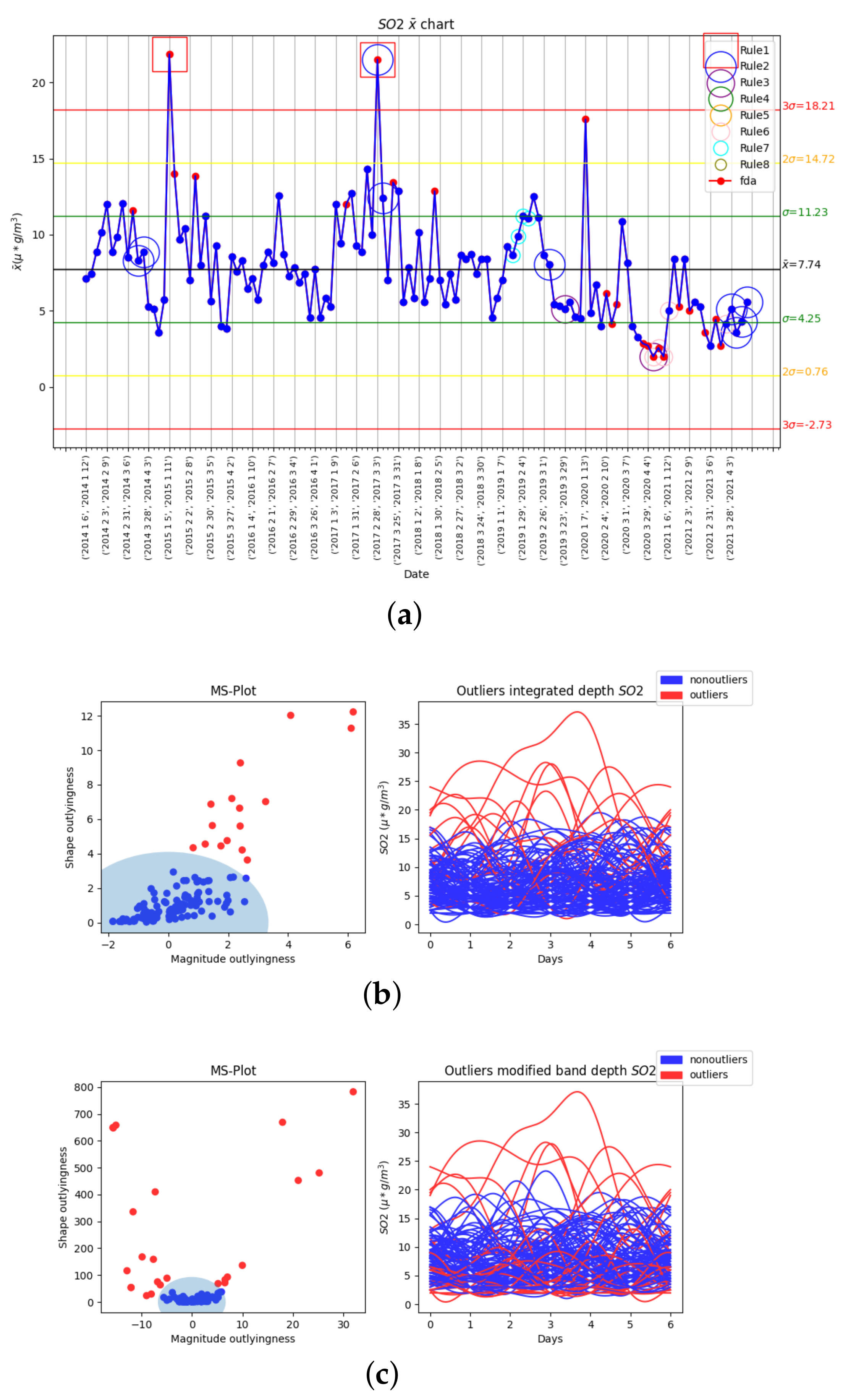
The results obtained in the third phase by studying the first four months of every year, changing the time unit to weeks, and the new outlier detector successfully implemented for the NO 2 are shown in Figure 6. The x ¯ chart of Figure 6a includes the outliers detected with the modified band depth as red dots. Nelson rule number 1 detects the two major outliers higher than three standard deviations from the mean: the second week of January 2015 and the last week of 2017. It is also worth noting how rule number 3 and 5 identify outliers in several weeks of March and April 2020. The integrated depth does not detect the weeks of the lockdown, which represent an anomaly in the levels of SO 2 . Its results are included in Figure 6b. With respect to the modified band depth, the graphical results are shown in Figure 6c, and the numerical results are included in Table 2. Almost half (41%) of the outliers detected are in 2020, including the weeks of the lockdown. Besides these outputs, all local maximums which display values outside the norm are identified.

3.2.3. Third Variable: PM10

The results of the second phase of the PM 10 analysis are displayed in Figure 7. This includes the analysis of the levels of PM 10 with the x ¯ chart and monthly rational subgroups, as well as the functional analysis with both depths on the monthly data. Unlike the previous variables, the annual cycle is not so easily identified. The local maximums tend to appear between November and January, and from there, a rapid decrease takes place, leading to a period of lower values, which contains the minimums from May to July, before increasing progressively to the highest values. Among the Nelson rules, number 5 detects a sequence of points in March 2021 more than 2 standard deviations from the mean. Rule 6 identifies two local minimums on July 2016 and August 2020, leaving all local maximums undetected. Finally, it is noticeable how number 7 detects a consistent trend of values within one standard deviation from the mean on 2017 and 2018. This should not be picked up as an outlier by the functional method based on the concept of functional depth, although the shape outlyingness of those functions can change that result.
The integrated depth shown in Figure 7b only detects October 2014 and March 2021 as outliers, which implies 2.1% of the data set. On the contrary, the modified band depth of Figure 7c detects up to 30% due to the bigger dispersion of the data in the MS plot.
In the third phase, analyzing the first four months of every year, we change the time unit to months and implement the new outlier detector outputs the results shown in Figure 8. On the x ¯ chart shown in Figure 8a, rule 1 identifies the first week of April 2021 as an outlier. Rule 2 detects two chains of values on the same side of the mean on April 2016 and March–April 2021. A downward trend can be seen in 2020, yet it is not detected by any of the Nelson rules. Lastly, Nelson rule 7 again detects the trend between 2017 and 2018. The main difference between the two depths relies on the null detection of the local minimums by the integrated depth displayed on Figure 8b. On the other hand, the modified band depth of Figure 8c identifies the low values of 2015 and 2017 as outliers. Moreover, this depth also detects the slight downward trend of 2020, which results in an outlier in the second week of 2020. Finally, both methods detect all local maximums. These results are included in Table 3.

3.2.4. Fourth Variable: O3

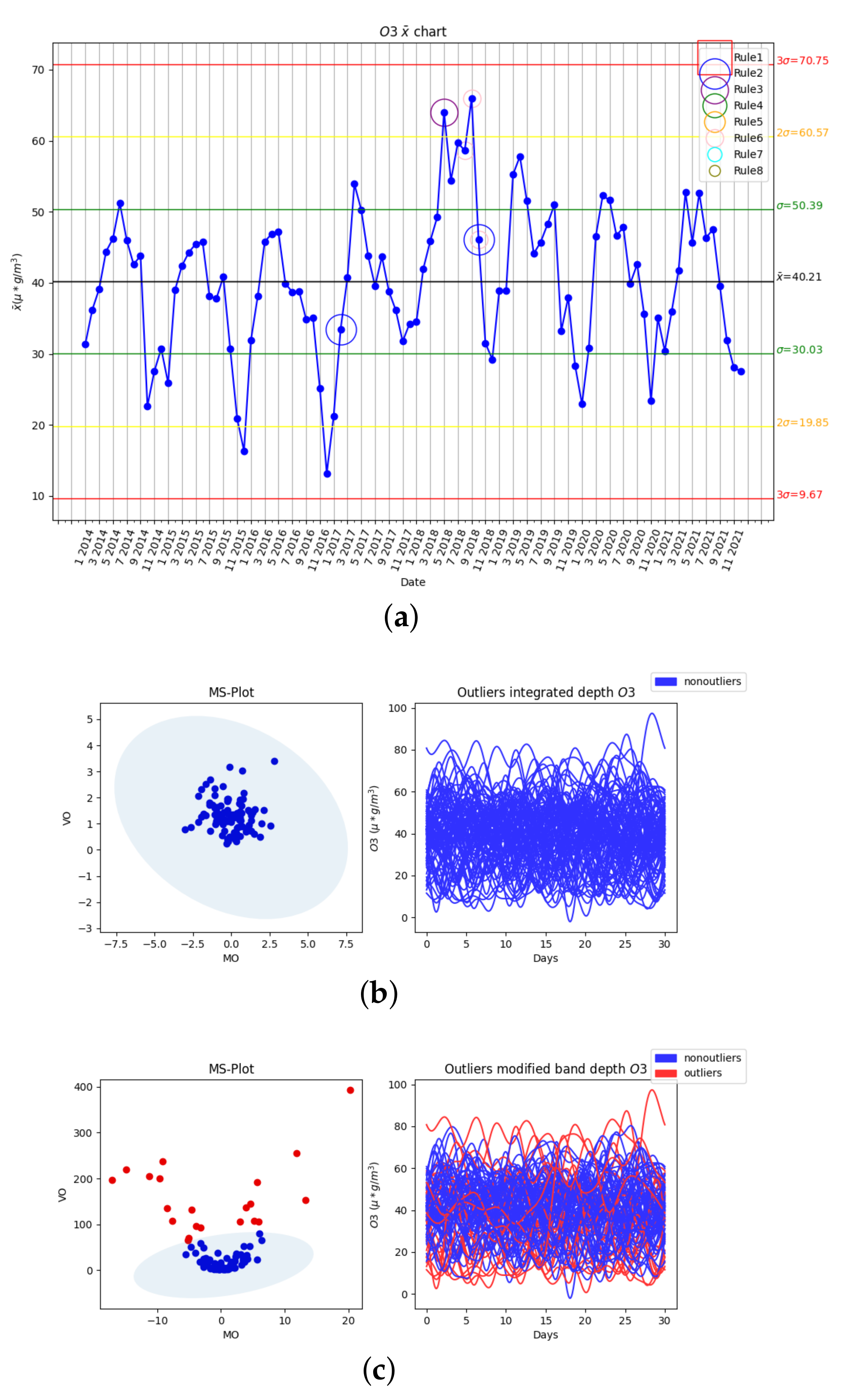
The results of the second phase of the last variable analyzed, O 3 , are shown in Figure 9. In this phase, the O 3 data set is studied by month with the x ¯ chart and the two functional depths: integrated depth and modified band depth. The O 3 presents an easily identifiable annual cycle, which is displayed on the x ¯ chart with monthly rational subgroups of Figure 9a. Within the variability of this cycle, the local minimums usually take place between November and December. Over the course of the next 2 to 3 months, the values of O 3 escalate to the annual maximum, which tends to appear from April to June. After September, the data transitions to the minimum, starting the cycle over. Nelson rule number 2 detects several trends in the data plotted, with those being present on February 2017 (below the mean) and October 2018 (higher than the mean). Rule number 3 defines May 2018 as an outlier, which is a period of anomalies located over two standard deviations from the mean. Lastly, rule number 6 detects an outlying set of values in the end of summer of that same year. This information indicates that between spring and summer of the year 2019, there was a higher concentration of O 3 than usual. Moving on to the functional data analysis, the integrated depth method, shown in Figure 9b, does not detect any month as an outlier, while the modified band depth of Figure 9c defines 21.9% of the months as outliers. This mismatch leads to discarding the integrated depth and the third phase, which consists of studying the first four months of every year, changing the time unit from months to weeks, and implementing the new outlier detector. Its results are displayed in Figure 10.
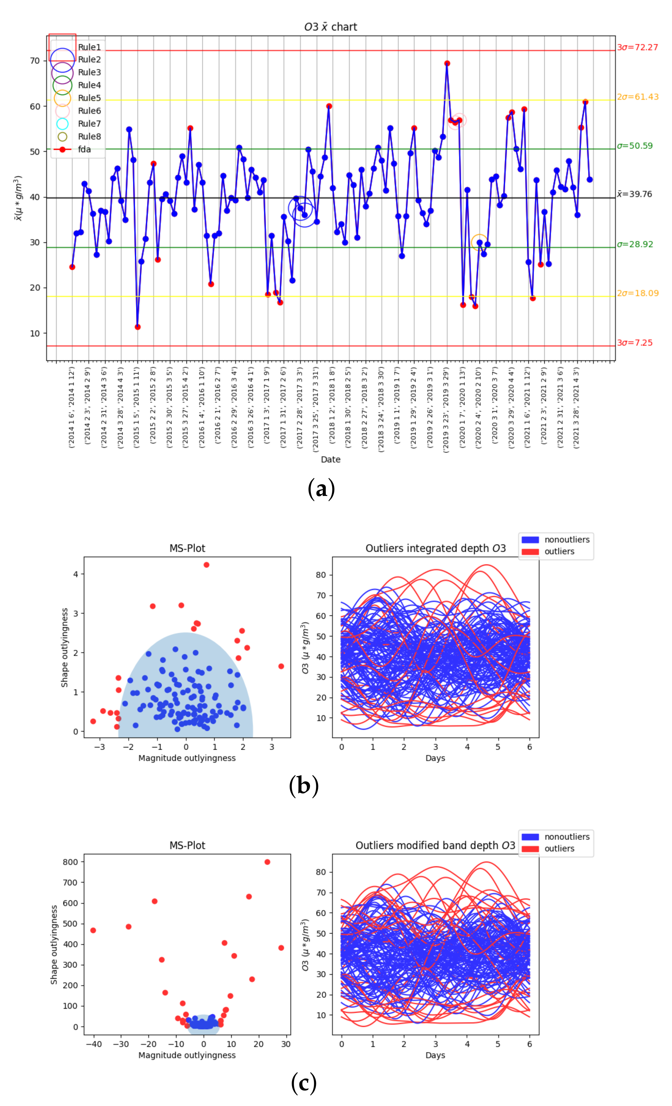
In the x ¯ included in Figure 10a, the Nelson rules do not detect more than 3 trends. Rule 2 identifies more than 9 consecutive points below the mean in 2017, which is correctly detected by the functional data analysis in the right weeks. Rule 5 detects a below-the-mean trend in the first two months of 2020, which is also correctly identified by the functional data analysis with the modified band depth. Lastly, rule number 6 coincides with the functional data methods on a local maximum on March 2020. The modified band depth shown in Figure 10c successfully detects 90% of the local minimums and maximums, including the increasing trend of 2020. In this time frame, the levels of O 3 present a fast increase from the end of February to the end of April, similar to the likes of 2015, 2017, and 2021. In this case, the integrated depth yields more similar results to the modified band depth with a higher sensibility to local minimums, but its performance is still lacking of a higher detection rate of this kind of points, as can be seen on Figure 10b. For example, it does not detect the second week of April 2015, included in Table 4, because it is detected by the modified band depth.

4. Discussion

The classical analysis through box plots offers a first sight into the data by outputting several statistical parameters and representing graphically its spread and skewness. The classical methods tend to be robust with data that present a normal distribution when that distribution is known. Moreover, the classical analysis studies the data set as individual points, while the limits for pollutant particles are usually defined over a fixed time period. Under these conditions, punctual observations are not enough, and the trend has to be studied.
Considering the cons presented, it can be concluded that the box plots are able to detect certain outliers, but in all cases, this number is disproportionate, or the validation events are not identified. The non-normality of the data also plays against this method by making it unable to detect outliers in the range below the minimum limit of the box plot.
Control charts, in this case, the x ¯ chart, are capable of detecting trends. However, they present several flaws that lead to poor results for this type of data. They were initially designed for industrial processes in which the variables do not present such a high variability. Moreover, the concept of rational subgroups and their mean values accounts for an important loss of information that does not contribute to a more accurate detection of outliers. Nevertheless, their results are better and more consistent than those of the box plots, and they offer a great graphical representation of how each variable changes with time.
In contrast, the functional approach studies the whole dataset. Therefore, there is a much smaller loss of information, and this allows a reliable study of the trends hidden in the data. As was explained above, the pollution limits are usually defined as a certain number of deviations that exceed the legal limit over a time period. Moreover, the transformation from discrete information points to functional data smooths the data and reduces the influence of those points which can be instrumental errors and would be detected by the classical analysis and the control charts. Lastly, it is not necessary to know the original distribution of the data.
This research implements the concept of directional outlyingness for functional data [34], which is decomposed in two parts: magnitude outlyingness and shape outlyingness. This method is tested with two functional depths, integrated depth [57] and modified band depth [59]. The results of the outlier detector [34] are displayed on a magnitude-shape plot proposed by Dai et al. [66]. The original outlier detector does not achieve the desired results, which leads to the proposed version of the algorithm. This new iteration of the method is implemented with the modified band depth, uses weeks as the time unit to increase the data points, and studies the year divided in each quarter to reduce the effects of the high variability. These changes, along with the analysis of the distribution of the magnitude and shape outlyingness of each curve, lead to a better clustering of the magnitude-shape pairs of each curve and a more precise detection of outliers.
Regarding the validation of the method, the low values of NO 2 seen in the second half of March and all of April 2020 are successfully detected by the functional model. It also achieves a precision of 75% for local minimums and maximums, and points to certain shape outliers corresponding to weeks of fast changes in the levels of NO 2 . On the other hand, despite the x ¯ being able to detect the effects of the lockdown, it also identifies some annual trends that are perfectly normal compared to how the values evolve in other years.
The analysis of the SO 2 leads initially to the x ¯ chart of Figure 5a, in which there can be seen a below-the-trend on the values of 2020 and 2021. This, indeed, is detected by the proposed method, along with the most relevant local minimums and maximums, which confirms a decrease in the levels of SO 2 in Gijón during March and April 2020. The Nelson rules behave similarly to the previous case, detecting the lockdown but also firing when there is a trend of values close to the mean.
In the case of the PM 10 , the proposed algorithm identifies all relevant local minimum and maximum, including the local maximum at the beginning of March 2020 and the local minimum at the end of April 2020. However, this reduction in the levels of PM 10 during the lockdown is nothing extraordinary compared to the same time period in the previous years. The Nelson rules fail to detect the local minimum and maximum values and point as outliers several ranges of values close to the mean. It is worth noting that the local maximum detected by the functional analysis and the Nelson rules has been verified with the data from other urban air quality station in Gijón, and it is not a measuring error.
Finally, the analysis of the O 3 with the new algorithm performs with a 90% of accuracy on local minimums and maximums, and is able to detect an increase from the minimum of February 2020 to the maximum of April 2020 in the levels of O 3 . This is due to the decrease of NO 2 [18]. In this case, the Nelson rules do not detect more than three trends, and only one agrees with the results of the functional analysis.

5. Conclusions

In this research paper, several mathematical methods have been analyzed and compared for the detection of outliers in environmental data with high variability. These methods were validated on real data from the Spanish city of Gijón. The database contains daily records of several air quality parameters ( NO 2 , SO 2 , PM 10 , and O 3 ) from January 1st, 2014 to December 31st, 2021. More specifically, previous research [18,19,20,21,22] shows evidence on the reduction of NO 2 levels during the COVID-19 lockdown of March and April 2020. Consequently, this proven fact was used to validate all methods.
With this scope in mind, the classical vectorial approach, applied through box plots, remains too simple. Although it provides interesting statistical information, its discrete basis leads to several weak points regarding the time correlation structure of the data set. Moreover, it fails to detect all those outliers or trends that present a behavior far from the average, with high or low values just below the limits. Statistical process control ( x ¯ chart) was the second mathematical method studied. It takes the time series correlation of the data, but the concept of rational subgroups increases the loss of information. Additionally, the non-normality of the data leads to false alarms. However, this method provides an insightful graphical representation of the underlying trends of the data and is able to detect the most noticeable outliers.
The last method implemented was functional data analysis, based on the concept of directional outlyingness. It has the advantage of using full time units, studying the entire time frame of the data in a continuous manner, which implies a smaller loss of information, and it is not affected by the distribution of the data. The functional method presented in this research paper is more precise than the classical analysis techniques and the statistical process control. In addition, the new outlier detector proposed enables the use of this mathematical method for the identification of outliers on environmental data characterized by its high variability. Furthermore, the obtained results have been validated with the effects on the air quality data from a verified event, which in this case is the COVID-19 lockdown in Gijón, Spain. Therefore, it contributes to a better assessment of the air pollution events. Additionally, it is scalable and can be deployed for the processing of other databases from different parts of the globe.
Finally, future research work will be focused on the elimination of the dependence on percentiles to define which functions are outliers. This will be attempted through the testing and implementation of several classification algorithms, such as isolation forest or k-means. Furthermore, the validation of the model presented will enable its application in other data sets that lack additional verified information regarding their outliers.

Author Contributions

Conceptualization, P.J.G.-N., M.A. and J.M.; methodology, X.R. and J.M.; software, X.R. and I.O.; validation, X.R., M.A., J.M. and P.J.G.-N.; formal analysis, X.R. and M.A.; investigation, X.R., M.A. and J.M.; resources, M.A., J.M. and P.J.G.-N.; data curation, X.R.; writing—original draft preparation, X.R.; writing—review and editing, X.R., M.A., J.M., I.O. and P.J.G.-N.; visualization, X.R., M.A.; supervision, M.A. and J.M.; project administration, M.A.; funding acquisition, M.A. All authors have read and agreed to the published version of the manuscript.

Funding

This research was funded by Project PID2020-116013RB-I00 financed by MCIN/AEI/10.13039/501100011033.

Institutional Review Board Statement

Not applicable.

Informed Consent Statement

Not applicable.

Data Availability Statement

Not applicable.

Conflicts of Interest

The authors declare no conflict of interest. The funders had no role in the design of the study; in the collection, analyses, or interpretation of data; in the writing of the manuscript, or in the decision to publish the results.

Abbreviations

The following abbreviations are used in this manuscript:
FDAFunctional data analysis
SPCStatistical process control

References

  1. Schwartz, J.; Ballester, F.; Saez, M.; Pérez-Hoyos, S.; Bellido, J.; Cambra, K.; Arribas, F.; Cañada, A.; Pérez-Boillos, M.J.; Sunyer, J. The concentration-response relation between air pollution and daily deaths. Environ. Health Perspect. 2001, 109, 1001–1006. [Google Scholar] [CrossRef] [PubMed]
  2. García-Nieto, P.J. Parametric study of selective removal of atmospheric aerosol by coagulation, condensation and gravitational settling. Int. J. Environ. Health Res. 2001, 11, 149–160. [Google Scholar] [CrossRef] [PubMed]
  3. Karaca, F.; Alagha, O.; Ertürk, F. Statistical characterization of atmospheric PM10 and PM 2.5 concentrations at a non-impacted suburban site of Istanbul, Turkey. Chemosphere 2005, 59, 1183–1190. [Google Scholar] [CrossRef] [PubMed]
  4. García-Nieto, P.J. Study of the evolution of aerosol emissions from coal-fired power plants due to coagulation, condensation, and gravititational settling and health impact. J. Environ. Manag. 2006, 79, 372–382. [Google Scholar] [CrossRef] [PubMed]
  5. López-Cima, M.F.; García-Pérez, J.; Pérez-Gómez, B.; Aragonés, N.; López-Abente, G.; Tardón, A.; Pollán, M. Lung cancer risk and pollution in an industrial region of Northern Spain: A hospital-based case-control study. Int. J. Health Geogr. 2011, 10, 10. [Google Scholar] [CrossRef] [PubMed]
  6. Gao, H.; Chen, J.; Wang, B.; Tan, S.C.; Lee, C.M.; Yao, X.; Yan, H.; Shi, J. A study of air pollution of city clusters. Atmos. Environ. 2011, 45, 3069–3077. [Google Scholar] [CrossRef]
  7. Megido, L.; Suárez-Peña, B.; Negral, L.; Castrillón, L.; Fernández-Nava, Y. Suburban air quality: Human health hazard assessment of potentially toxic elements in PM10. Chemosphere 2017, 177, 284–291. [Google Scholar] [CrossRef]
  8. Ahmed, M.; Xiao, Z.; Shen, Y. Estimation of Ground PM2.5 Concentrations in Pakistan Using Convolutional Neural Network and Multi-Pollutant Satellite Images. Remote Sens. 2022, 14, 1735. [Google Scholar] [CrossRef]
  9. Choi, H.J.; Roh, Y.M.; Lim, Y.W.; Lee, Y.J.; Kim, K.Y. Land-Use Regression Modeling to Estimate NO2 and VOC Concentrations in Pohang City, South Korea. Atmosphere 2022, 13, 577. [Google Scholar] [CrossRef]
  10. Qi, N.; Tan, X.; Wu, T.; Tang, Q.; Ning, F.; Jiang, D.; Xu, T.; Wu, H. Temporal and Spatial Distribution Analysis of Atmospheric Pollutants in Chengdu—Chongqing Twin-City Economic Circle. Int. J. Environ. Res. Public Health 2022, 19, 4333. [Google Scholar] [CrossRef]
  11. WHO. Review of Evidence on Health Aspects of Air Pollution—REVIHAAP Project: Technical Report; World Health Organization: Copenhagen, Denmark, 2013. [Google Scholar]
  12. Royal College of Physicians. Report of a Working Party February 2016; Technical Report; Royal College of Physicians: London, UK, 2016. [Google Scholar]
  13. Kumar, P.; Druckman, A.; Gallagher, J.; Gatersleben, B.; Allison, S.; Eisenman, T.S.; Hoang, U.; Hama, S.; Tiwari, A.; Sharma, A.; et al. The nexus between air pollution, green infrastructure and human health. Environ. Int. 2019, 133, 105181. [Google Scholar] [CrossRef]
  14. Real Decreto 102/2011, de 28 de Enero, Relativo a la Mejora de la Calidad del Aire. 2011. Available online: https://www.boe.es/buscar/act.php?id=BOE-A-2011-1645 (accessed on 15 April 2022).
  15. Parlaiment, E.; The Council of the European Union. Directive 2008/50/EC of the European Parliament and of the Council. 2008. Available online: https://eur-lex.europa.eu/legal-content/en/ALL/?uri=CELEX%3A32008L0050 (accessed on 15 April 2022).
  16. Lutgens, F.; Tarbuck, E. The Atmosphere: An Introduction to Meteorology; Prentice Hall: New York, NY, USA, 2001. [Google Scholar]
  17. Cooper, C.; Alley, F. Air Pollution Control; Waveland Press: New York, NY, USA, 2002. [Google Scholar]
  18. Betancourt-Odio, M.A.; Martínez-De-ibarreta, C.; Budría-Rodríguez, S.; Wirth, E. Local analysis of air quality changes in the community of madrid before and during the COVID-19 induced lockdown. Atmosphere 2021, 12, 659. [Google Scholar] [CrossRef]
  19. Briz-Redón, Á.; Belenguer-Sapiña, C.; Serrano-Aroca, Á. Changes in air pollution during COVID-19 lockdown in Spain: A multi-city study. J. Environ. Sci. 2021, 101, 16–26. [Google Scholar] [CrossRef] [PubMed]
  20. Slezakova, K.; Pereira, M.C. 2020 COVID-19 lockdown and the impacts on air quality with emphasis on urban, suburban and rural zones. Sci. Rep. 2021, 11, 21336. [Google Scholar] [CrossRef] [PubMed]
  21. Tobías, A.; Carnerero, C.; Reche, C.; Massagué, J.; Via, M.; Minguillón, M.C.; Alastuey, A.; Querol, X. Changes in air quality during the lockdown in Barcelona (Spain) one month into the SARS-CoV-2 epidemic. Sci. Total Environ. 2020, 726, 138540. [Google Scholar] [CrossRef] [PubMed]
  22. Venter, Z.S.; Aunan, K.; Chowdhury, S.; Lelieveld, J. COVID-19 lockdowns cause global air pollution declines. Proc. Natl. Acad. Sci. USA 2020, 117, 18984–18990. [Google Scholar] [CrossRef]
  23. Jeanjean, A.P.; Gallagher, J.; Monks, P.S.; Leigh, R.J. Ranking current and prospective NO2 pollution mitigation strategies: An environmental and economic modelling investigation in Oxford Street, London. Environ. Pollut. 2017, 225, 587–597. [Google Scholar] [CrossRef] [Green Version]
  24. Febrero, M.; Galeano, P.; Gonz, W. Outlier detection in functional data by depth measures, with application to identify abnormal NO x levels. Environmetrics 2008, 19, 331–345. [Google Scholar] [CrossRef]
  25. Matías, J.M.; Ordóñez, C.; Taboada, J.; Rivas, T. Functional support vector machines and generalized linear models for glacier geomorphology analysis. Int. J. Comput. Math. 2009, 86, 275–285. [Google Scholar] [CrossRef]
  26. Torres, J.M.; Nieto, P.J.; Alejano, L.; Reyes, A.N. Detection of outliers in gas emissions from urban areas using functional data analysis. J. Hazard. Mater. 2011, 186, 144–149. [Google Scholar] [CrossRef]
  27. Martínez, J.; Saavedra, Á.; García-Nieto, P.J.; Piñeiro, J.I.; Iglesias, C.; Taboada, J.; Sancho, J.; Pastor, J. Air quality parameters outliers detection using functional data analysis in the Langreo urban area (Northern Spain). Appl. Math. Comput. 2014, 241, 1–10. [Google Scholar] [CrossRef]
  28. Sancho, J.; Iglesias, C.; Piñeiro, J.; Martínez, J.; Pastor, J.J.; Araújo, M.; Taboada, J. Study of Water Quality in a Spanish River Based on Statistical Process Control and Functional Data Analysis. Math. Geosci. 2016, 48, 163–186. [Google Scholar] [CrossRef]
  29. Ordòñez, C.; Martìnez, J.; Saavedra, À.; Mourelle, A. Intercomparison Exercise for Gases Emitted by a Cement Industry in Spain: A Functional Data Approach. J. Air Waste Manag. Assoc. 2011, 61, 135–141. [Google Scholar] [CrossRef] [PubMed] [Green Version]
  30. Sancho, J.; Pastor, J.J.; Martínez, J.; García, M.A. Evaluation of harmonic variability in electrical power systems through statistical control of quality and functional data analysis. Procedia Eng. 2013, 63, 295–302. [Google Scholar] [CrossRef] [Green Version]
  31. Wu, D.; Huang, S.; Xin, J. Dynamic compensation for an infrared thermometer sensor using least-squares support vector regression (LSSVR) based functional link artificial neural networks (FLANN). Meas. Sci. Technol. 2008, 19, 105202. [Google Scholar] [CrossRef]
  32. Ordoñez, C.; Martínez, J.; de Cos Juez, J.F.; Lasheras, F.S. Comparison of GPS observations made in a forestry setting using functional data analysis. Int. J. Comput. Math. 2012, 89, 402–408. [Google Scholar] [CrossRef]
  33. Dombeck, D.A.; Graziano, M.S.; Tank, D.W. Functional clustering of neurons in motor cortex determined by cellular resolution imaging in awake behaving mice. J. Neurosci. 2009, 29, 13751–13760. [Google Scholar] [CrossRef]
  34. Dai, W.; Genton, M.G. Multivariate Functional Data Visualization and Outlier Detection. J. Comput. Graph. Stat. 2018, 27, 923–934. [Google Scholar] [CrossRef] [Green Version]
  35. Grubbs, F.E. Procedures for Detecting Outlying Observations in Samples. Technometrics 1969, 11, 1–21. [Google Scholar] [CrossRef]
  36. Jäntschi, L. A test detecting the outliers for continuous distributions based on the cumulative distribution function of the data being tested. Symmetry 2019, 11, 835. [Google Scholar] [CrossRef] [Green Version]
  37. Lara, R.; Negral, L.; Querol, X.; Alastuey, A.; Canals, A. Estudio de Contribución de Fuentes a PM10 en Gijón INFORME A2-4B; Technical Report; Ministerio para la Transición Ecológica y el Reto Demográfico: Madrid, Spain, 2021. [Google Scholar]
  38. González-Marco, D.; Sierra, J.P.; Fernández de Ybarra, O.; Sánchez-Arcilla, A. Implications of long waves in harbor management: The Gijón port case study. Ocean. Coast. Manag. 2008, 51, 180–201. [Google Scholar] [CrossRef]
  39. Sánchez Lasheras, F.; García Nieto, P.J.; García Gonzalo, E.; Bonavera, L.; de Cos Juez, F.J. Evolution and forecasting of PM10 concentration at the Port of Gijon (Spain). Sci. Rep. 2020, 10, 11716. [Google Scholar] [CrossRef] [PubMed]
  40. García Nieto, P.J.; Álvarez Antón, J.C. Nonlinear air quality modeling using multivariate adaptive regression splines in Gijón urban area (Northern Spain) at local scale. Appl. Math. Comput. 2014, 235, 50–65. [Google Scholar] [CrossRef]
  41. Hu, W.; Zhao, T.; Bai, Y.; Shen, L.; Sun, X.; Gu, Y. Contribution of Regional PM2.5 Transport to Air Pollution Enhanced by Sub-Basin Topography: A Modeling Case over Central China. Atmosphere 2020, 11, 1258. [Google Scholar] [CrossRef]
  42. Cetin, E.; Odabasi, M.; Seyfioglu, R. Ambient volatile organic compound (VOC) concentrations around a petrochemical complex and a petroleum refinery. Sci. Total Environ. 2003, 312, 103–112. [Google Scholar] [CrossRef]
  43. Van Rossum, G.; Drake, F.L. Python 3 Reference Manual; CreateSpace: Scotts Valley, CA, USA, 2009. [Google Scholar]
  44. Ramos-Carreño, C.; Suárez, A.; Torrecilla, J.L.; Carbajo Berrocal, M.; Marcos Manchón, P.; Pérez Manso, P.; Hernando Bernabé, A.; García Fernández, D.; Hong, Y.; Rodríguez-Ponga Eyriès, P.M.; et al. GAA-UAM/scikit-fda: Version 0.7.1; Grupo de Aprendizaje Automatico—Universidad Autonoma de Madrid: Madrid, Spain, 2022. [Google Scholar] [CrossRef]
  45. D’Agostino, R.B. An omnibus test of normality for moderate and large sample size. Biometrika 1971, 58, 341–348. [Google Scholar] [CrossRef]
  46. D’Agostino, R.B.; Pearson, E.S. Tests for departure from normality. Biometrika 1973, 60, 613–622. [Google Scholar]
  47. Chen, Y.K. Economic design of X control charts for non-normal data using variable sampling policy. Int. J. Prod. Econ. 2004, 92, 61–74. [Google Scholar] [CrossRef]
  48. Freeman, J.; Modarres, R. Inverse Box-Cox: The power-normal distribution. Stat. Probab. Lett. 2006, 76, 764–772. [Google Scholar] [CrossRef]
  49. Box, G.E.P.; Cox, D.R. An analysis of transformations. J. R. Stat. Soc. Ser. B 1964, 26, 211–252. [Google Scholar] [CrossRef]
  50. Shewhart, W.A. Economic Control of Quality of Manufactured Product; Van Nostrand Company, Inc.: New York, NY, USA, 1931; p. 501. [Google Scholar]
  51. Grant, E.L.; Leavenworth, R.S. Statistical Quality Control, 5th ed.; McGraw-Hill: New York City, NY, USA, 1980; p. 684. [Google Scholar]
  52. Champ, C.W.; Woodall, W.H. Exact results for shewhart control charts with supplementary runs rules. Technometrics 1987, 29, 393–399. [Google Scholar] [CrossRef]
  53. Zhang, S.; Wu, Z. Designs of control charts with supplementary runs rules. Comput. Ind. Eng. 2005, 49, 76–97. [Google Scholar] [CrossRef]
  54. Electric, W. Statistical Quality Control Handbook; Western Electric Corporation: Indianapolis, Indiana, 1956. [Google Scholar]
  55. Nelson, L.S. The Shewhart Control Chart—Tests for Special Causes. J. Qual. Technol. 1984, 16, 237–239. [Google Scholar] [CrossRef]
  56. Ramsay, J.O.; Silverman, B. Functional Data Analysis, 1st ed.; Springer International Publishing: New York, NY, USA, 2002; p. 317. [Google Scholar]
  57. Fraiman, R.; Muniz, G. Trimmed means for functional data. Test 2001, 10, 419–440. [Google Scholar] [CrossRef]
  58. Díaz Muñiz, C.; García Nieto, P.J.; Alonso Fernández, J.R.; Martínez Torres, J.; Taboada, J. Detection of outliers in water quality monitoring samples using functional data analysis in San Esteban estuary (Northern Spain). Sci. Total Environ. 2012, 439, 54–61. [Google Scholar] [CrossRef]
  59. Lopez-Pintado, S.; Romo, J. On the concept of depth for functional data. J. Am. Stat. Assoc. 2009, 104, 718–734. [Google Scholar] [CrossRef] [Green Version]
  60. Ojo, O.; Lillo, R.E.; Anta, A.F. Outlier Detection for Functional Data with R Package fdaoutlier. arXiv 2021, arXiv:2105.05213. [Google Scholar]
  61. Möttönen, J.; Oja, H. Multivariate spatial sign and rank methods. J. Nonparametric Stat. 1995, 5, 201–213. [Google Scholar] [CrossRef]
  62. Claeskens, G.; Hubert, M.; Slaets, L.; Vakili, K. Multivariate Functional Halfspace Depth. J. Am. Stat. Assoc. 2014, 109, 411–423. [Google Scholar] [CrossRef]
  63. López-Pintado, S.; Sun, Y.; Lin, J.K.; Genton, M.G. Simplicial band depth for multivariate functional data. Adv. Data Anal. Classif. 2014, 8, 321–338. [Google Scholar] [CrossRef]
  64. Rousseeuw, P.J. Multivariate estimation with high breakdown point. Math. Stat. Appl. 1985, B, 283–297. [Google Scholar]
  65. Hardin, J.; Rocke, D.M. The Distribution of Robust Distances. J. Comput. Graph. Stat. 2005, 14, 928–946. [Google Scholar] [CrossRef] [Green Version]
  66. Dai, W.; Genton, M.G. Directional outlyingness for multivariate functional data. Comput. Stat. Data Anal. 2019, 131, 50–65. [Google Scholar] [CrossRef] [Green Version]
Figure 1. Location of the air quality station, which provided the data for this study, and the main industrial sites in Gijon.
Mathematics 10 02374 g001
Figure 2. Results of the first phase of the NO 2 , SO 2 , PM 10 and O 3 analysis. Box plot representation of the air quality data in Gijón from 2014 to 2021. The orange line represents the mean, while the upper limit of the box is the third quartile, and the lower one corresponds to the first quartile. The red dots seen on the chart represent outlying values.
Mathematics 10 02374 g002
Figure 3. Results of the second phase of the NO 2 analysis: (a) x ¯ chart with the monthly rational subgroups and the Nelson rules implemented; (b) (left) Cartesian representation of the magnitude and shape outlyingness of each function with the integrated depth, (right) functional plot of the NO 2 values of each month; (c) (left) Cartesian representation of the magnitude and shape outlyingness of each function with the modified band depth, (right) functional plot of the NO 2 values of each month.
Mathematics 10 02374 g003
Figure 4. Results of the third phase of the NO 2 analysis: (a) x ¯ chart with the weekly rational subgroups of the first four months of every year, the Nelson rules implemented, and the functional outliers detected with the modified band depth marked with red dots; (b) (left) Cartesian representation of the magnitude and shape outlyingness of each function with the integrated depth; (right) functional plot of the NO 2 values of each week; (c) (left) Cartesian representation of the magnitude and shape outlyingness of each function with the modified band depth; (right) functional plot of the NO 2 values of each week.
Mathematics 10 02374 g004
Figure 5. Results of the second phase of the SO 2 analysis: (a) x ¯ chart with the monthly rational subgroups and the Nelson rules implemented; (b) (left) Cartesian representation of the magnitude and shape outlyingness of each function with the integrated depth; (right) functional plot of the SO 2 values of each month; (c) (left) Cartesian representation of the magnitude and shape outlyingness of each function with the modified band depth; (right) functional plot of the SO 2 values of each month.
Mathematics 10 02374 g005
Figure 6. Results of the third phase of the SO 2 analysis: (a) x ¯ chart with the weekly rational subgroups of the first four months of every year, the Nelson rules implemented, and the functional outliers detected with the modified band depth marked with red dots; (b) (left) Cartesian representation of the magnitude and shape outlyingness of each function with the integrated depth; (right) functional plot of the SO 2 values of each week; (c) (left) Cartesian representation of the magnitude and shape outlyingness of each function with the modified band depth; (right) functional plot of the SO 2 values of each week.
Mathematics 10 02374 g006
Figure 7. Results of the second phase of the PM 10 analysis: (a) x ¯ chart with the monthly rational subgroups and the Nelson rules implemented; (b) (left) Cartesian representation of the magnitude and shape outlyingness of each function with the integrated depth; (right) functional plot of the PM 10 values of each month; (c) (left) Cartesian representation of the magnitude and shape outlyingness of each function with the modified band depth; (right) functional plot of the PM 10 values of each month.
Mathematics 10 02374 g007
Figure 8. Results of the third phase of the PM 10 analysis: (a) x ¯ chart with the weekly rational subgroups of the first quarter of every year, the Nelson rules implemented, and the functional outliers detected with the modified band depth marked with red dots; (b) (left) Cartesian representation of the magnitude and shape outlyingness of each function with the integrated depth; (right) functional plot of the PM 10 values of each week; (c) (left) Cartesian representation of the magnitude and shape outlyingness of each function with the modified band depth; (right) functional plot of the PM 10 values of each week.
Mathematics 10 02374 g008
Figure 9. Results of the second phase of the O 3 analysis: (a) x ¯ chart with the monthly rational subgroups and the Nelson rules implemented; (b) (left) Cartesian representation of the magnitude and shape outlyingness of each function with the integrated depth; (right) functional plot of the O 3 values of each month; (c) (left) Cartesian representation of the magnitude and shape outlyingness of each function with the modified band depth; (right) functional plot of the O 3 values of each month.
Mathematics 10 02374 g009
Figure 10. Results of the third phase of the O 3 analysis: (a) x ¯ chart with the weekly rational subgroups of the first four months of every year, the Nelson rules implemented, and the functional outliers detected with the modified band depth marked with red dots; (b) (left) Cartesian representation of the magnitude and shape outlyingness of each function with the integrated depth; (right) functional plot of the O 3 values of each week; (c) (left) Cartesian representation of the magnitude and shape outlyingness of each function with the modified band depth; (right) functional plot of the O 3 values of each week.
Mathematics 10 02374 g010
Table 1. Weekly NO 2 outliers of the improved method with the modified band depth. The first column includes those outlying weeks of the first four months of every year, defined by their first and last day. The second column presents the magnitude outlyingness of those functions, which quantifies how much a function is shifted compared to the rest. The last column shows the shape outlyingness, a parameter that expresses to what degree a function has a different structure than the others.
DateMagnitude OutlyingnessShape Outlyingness
26 January 2015 → 1 February 201513.94689.94
9 February 2015 → 15 February 201527.84670.24
16 February 2015 → 22 February 20154.3581.42
10 April 2015 → 16 April 201511.52403.41
12 February 2019 → 18 February 201912.19179.78
26 February 2019 → 1 March 201911.27113.62
14 January 2020 → 20 January 2020−14.35676.87
22 March 2020 → 28 March 2020−14.39146.50
29 March 2020 → 4 April 2020−9.0545.80
5 April 2020 → 11 April 2020−24.11243.15
19 April 2020 → 25 April 2020−22.03293.41
17 February 2021 → 23 February 2021−20.34909.81
24 February 2021 → 30 February 2021−9.04145.01
28 March 2021 → 3 April 20214.2972.27
11 April 2021 → 17 April 2021−19.23586.20
Table 2. Weekly SO 2 outliers of the improved method with the modified band depth. The first column includes those outlying weeks of the first quarter of every year, defined by their first and last day. The second column presents the magnitude outlyingness of those functions, which quantifies how much a function is shifted compared to the rest. The last column shows the shape outlyingness, a parameter that expresses to what degree a function has a different structure than the others.
DateMagnitude OutlyingnessShape Outlyingness
7 March 2014 → 13 March 20145.62625563.812306
5 January 2015 → 11 January 201531.910835782.922973
12 January 2015 → 18 January 20156.57422882.721158
9 February 2015 → 15 February 20159.991058136.293751
17 January 2017 → 23 January 20176.46267372.093495
28 February 2017 → 3 March 201725.187203480.681219
18 March 2017 → 24 March 201717.930567669.504009
23 January 2018 → 29 January 20187.05356992.688184
7 January 2020 → 13 January 202021.048451452.726218
4 February 2020 → 10 February 2020−7.972081419.256577
11 February 2020 → 17 February 2020−9.399330166.035485
18 February 2020 → 24 February 2020−15.593749649.645403
22 March 2020 → 28 March 2020−6.80789974.728096
29 March 2020 → 4 April 2020−11.164611338.940421
5 April 2020 → 11 April 2020−11.98844154.003313
12 April 2020 → 18 April 2020−12.839921115.184531
19 April 2020 → 25 April 2020−11.98844154.003313
20 January 2021 → 26 January 2021−7.605015158.613293
3 February 2021 → 9 February 2021−14.618797669.824183
24 February 2021 → 30 February 2021−8.99319422.934123
7 March 2021 → 13 March 2021−15.645523645.544555
14 March 2021 → 20 March 2021−7.82810227.494763
Average:0.1154.55
Table 3. Weekly PM 10 outliers of the improved method with the modified band depth. The first column includes those outlying weeks of the first four months of every year, defined by their first and last day. The second column presents the magnitude outlyingness of those functions, which quantifies how much a function is shifted compared to the rest. The last column shows the shape outlyingness, a parameter that expresses to what degree a function has a different structure than the others.
DateMagnitude OutlyingnessShape Outlyingness
13 January 2014 → 19 January 20144.8994.36
7 March 2014 → 13 March 201419.53282.79
14 March 2014 → 20 March 20148.95125.27
19 January 2015 → 25 January 2015−7.7430.78
26 January 2015 → 1 February 2015−5.7944.07
2 February 2015 → 8 February 2015−14.26324.18
23 February 2015 → 29 February 2015−19.06580.55
20 February 2015 → 5 March 2015−13.96303.93
20 March 2015 → 26 March 2015−19.61593.69
10 April 2015 → 16 April 20158.2784.65
15 February 2016 → 21 February 2016−8.82142.91
5 March 2016 → 11 April 2016−13.2180.98
19 March 2016 → 25 March 2016−6.31177.74
26 March 2016 → 1 April 2016−8.2440.49
2 April 2016 → 8 April 2016−6.6457.83
16 April 2016 → 22 April 2016−24.70597.71
10 January 2017 → 16 January 2017−7.4987.34
19 February 2019 → 25 Feb 20198.3023.86
25 February 2020 → 31 February 202010.91149.45
5 April 2020 → 11 April 2020−10.46355.77
17 February 2021 → 23 February 20214.5893.48
28 March 2021 → 3 April 202157.11277.13
18 April 2021 → 24 April 20219.43140.62
Average:−0.0242.04
Table 4. Weekly O 3 outliers of the improved method with the modified band depth. The first column includes those outlying weeks of the first four months of every year, defined by their first and last day. The second column presents the magnitude outlyingness of those functions, which quantifies how much a function is shifted compared to the rest. The last column shows the shape outlyingness, a parameter that expresses to what degree a function has a different structure than the others.
DateMagnitude OutlyingnessShape Outlyingness
6 January 2014 → 12 January 2014−6.3957.99
5 January 2015 → 11 January 2015−40.13466.26
2 February 2015 → 8 February 20157.63405.32
9 February 2015 → 15 February 2015−5.6830.89
3 April 2015 → 9 April 20156.3928.17
18 January 2016 → 24 January 2016−13.93164.05
3 January 2017 → 9 January 2017−17.78607.46
17 January 2017 → 23 January 2017−7.5218.98
24 January 2017 → 30 January 2017−7.5828.62
15 April 2017 → 21 April 201723.21798.25
29 January 2019 → 4 February 20199.77147.90
23 March 2019 → 29 March 201928.24381.43
30 March 2019 → 5 April 20196.2826.29
6 April 2019 → 12 April 201916.52630.17
13 April 2019 → 19 April 20198.2181.09
7 January 2020 → 13 January 2020−15.18323.62
21 January 2020 → 27 January 2020−9.3239.16
28 January 2020 → 3 February 2020−27.23484.60
22 March 2020 → 28 March 20207.3553.58
29 March 2020 → 4 April 202017.65228.64
19 April 2020 → 25 April 20206.278.71
13 January 2021 → 19 January 2021−5.942.77
27 January 2021 → 2 February 2021−7.57111.92
4 April 2021 → 10 April 20217.9979.31
11 April 2021 → 17 April 202110.98344.05
Average0.004748.53
Publisher’s Note: MDPI stays neutral with regard to jurisdictional claims in published maps and institutional affiliations.