To assess the performance of the program in attaining these educational objectives, a survey instrument was designed and administered to program participants across all of the groups at regularly scheduled meetings. Twenty individuals completed the survey. These individuals included students studying computer science, electrical engineering, entrepreneurship and space studies. The overall participation in the project varied with nearly 300 students attending at least one meeting, and a smaller number (which fluctuated during the period described with, generally, between 45 and 75 students attending weekly group and/or general meetings). These results are now presented.
4.1. Overall Results
The survey asked participants to evaluate their status prior to project participation and at present for each of the five key outcome areas (technical skill, spacecraft design comfort, excitement about space, presentation skills and presentation comfort). Participants were asked to respond on a nine-point scale for all status questions. Questions were given in the format:
On a scale of 1 to 9, ________________________________ before starting work on the project:
On a scale of 1 to 9, ________________________________ at the present time:
For each question the above blanks were filled in with the particular item of focus. For example, for questions 13 and 18 the phrase “please rate your technical skill in your area of focus” was filled in resulting in the questions “on a scale of 1 to 9, please rate your technical skill in your area of focus before starting work on the project” and “on a scale of 1 to 9, please rate your technical skill in your area of focus at the present time”. For this question, response choices ranged from 9-expert to 5-average to 1-novice. This scale was also used for questions 16 and 21 (“on a scale of 1 to 9, please rate your level of presentation skills”).
For questions 14 and 19 (“on a scale of 1 to 9, please rate your level of comfort with spacecraft design”), response choices ranged from 9-very comfortable to 5-somewhat comfortable to 1-not comfortable. This scale was also used for questions 17 and 22 (“on a scale of 1 to 9, please rate your level of comfort with giving a presentation”)
For questions 15 and 20 (“on a scale of 1 to 9, please rate your level of excitement with space before starting work on the project”), response choices ranged from 9-very excited to 5-average to 1-novice.
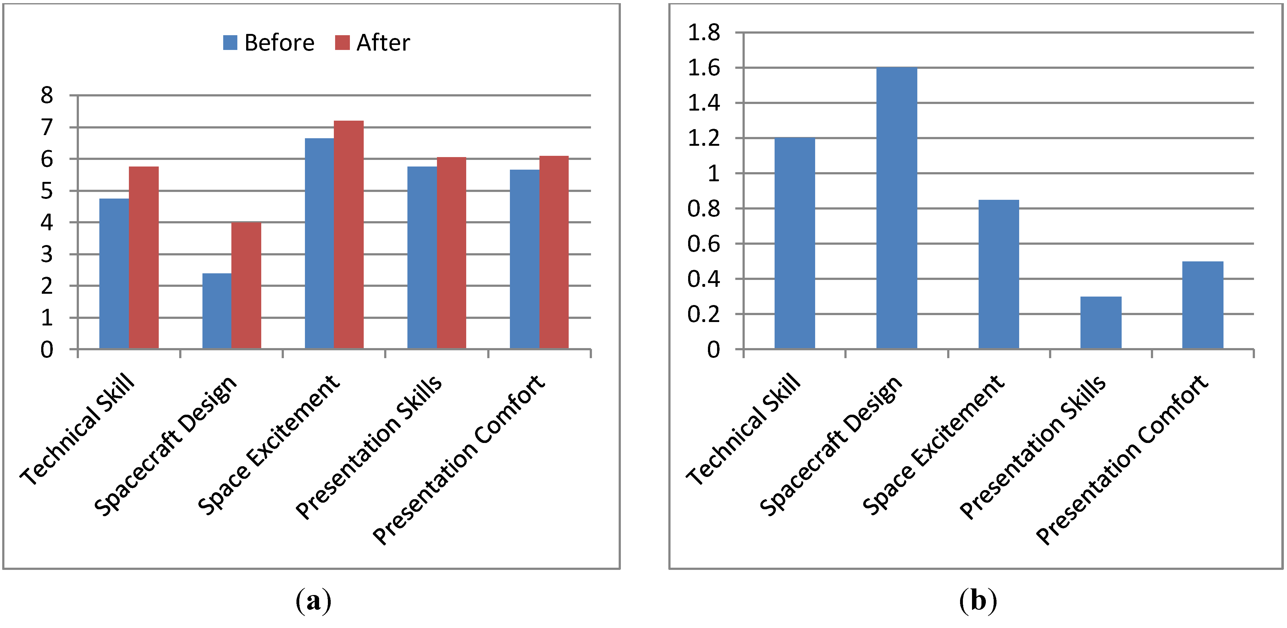
The average responses for each category, before and after participation, are presented in
Figure 1(a). The average improvement, by category is presented in
Figure 1(b). There were a few isolated cases where participants reported lower status-levels after participation as compared to before. For the skill questions, this type of response made no practical sense as there was no conceivable way that the project could have caused someone to regress in their skill level. On the excitement about space and comfort presenting questions, it is of course possible that these attitudes have declined during the time (due to program participation or otherwise). In each instance, the corresponding program impact question showed an average response (4–6 range) so it is presumed that these may be indicative of a change not caused by the program or perhaps participants not correlating their two responses.
Figure 1.
(a) Comparison of Beginning and Ending Status Levels. (b) Improvement by Status, Average.
Figure 1.
(a) Comparison of Beginning and Ending Status Levels. (b) Improvement by Status, Average.
Clearly, it is unrealistic to expect participants to improve in every category; some individuals may have had no or less involvement with areas of the project relevant to a particular category (e.g., presentations). It is thus also useful to look at how much skills improved for individuals who showed some improvement.
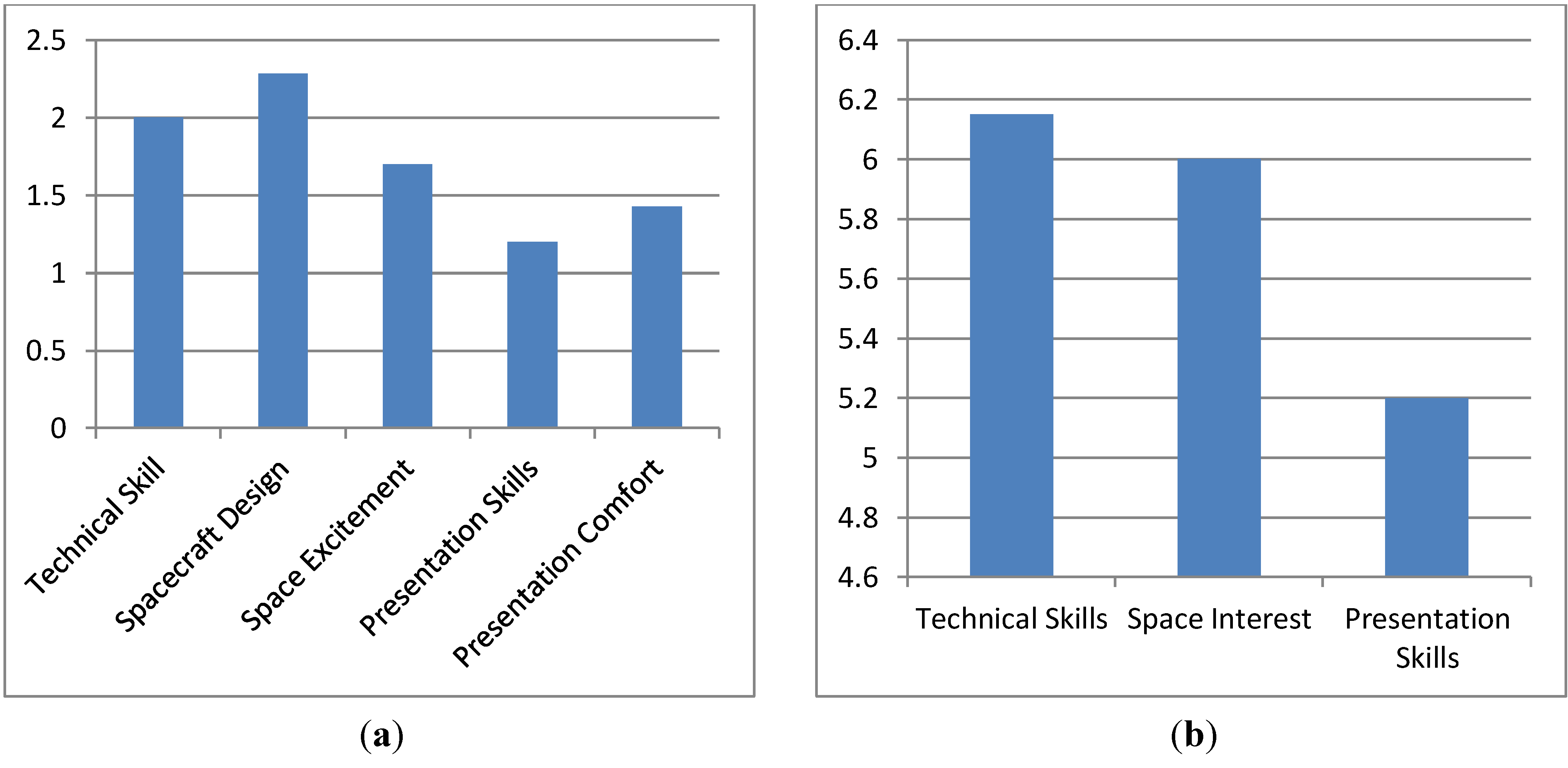
Figure 2(a) presents the average improvement for individuals showing improvement in each category.
Figure 2.
(a) Average Improvement by Status for Students Showing Improvement. (b) Attribution of Program Effect on Creating Change in Status Level.
Figure 2.
(a) Average Improvement by Status for Students Showing Improvement. (b) Attribution of Program Effect on Creating Change in Status Level.
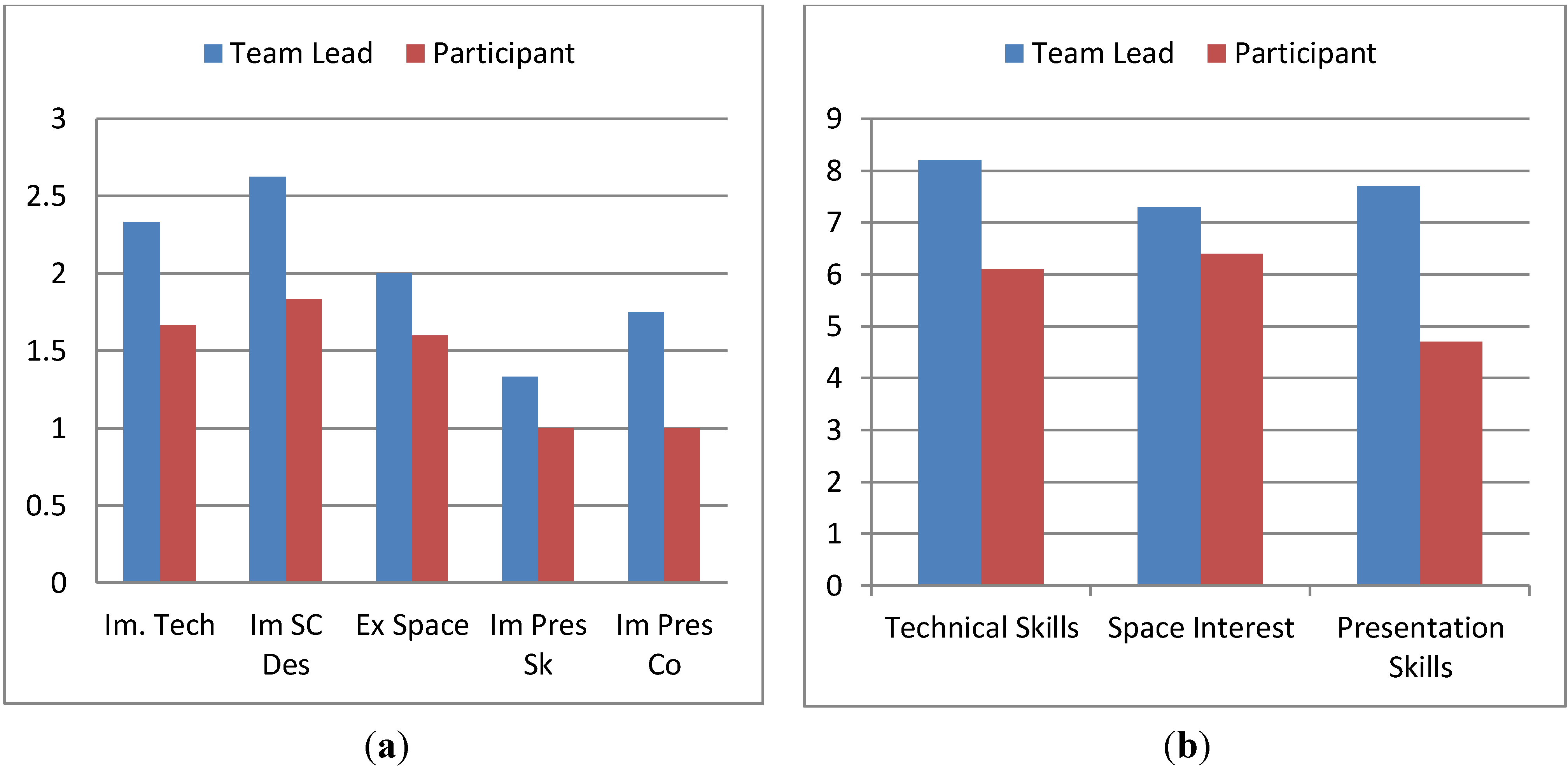
In addition to asking respondents to characterize their pre-participation and post-participation skill levels, they were also asked to characterize the impact of the program on effecting this change. Again a nine-point scale was used with responses ranging from 9-strongly agree to 7-agree to 5-no preference to 3-disagree to 1-strongly disagree. Each of the three questions (23–25) was presented in the format:
Participation in this project has improved my ____________:
Question 23 asked about “technical skills”. Question 24 had respondents characterize the projects impact on their “interest in space”. Question 25 asked about “presentation skills”.
The average responses to these questions are presented in
Figure 2(b). Note that in all cases, the average is on the agree side, to varying extents. One individual who indicated that they hadn’t “really done much” with regards to the project in the open ended question (number 26) influenced this somewhat, with this person’s response excluded the response rise from 6.15 to 6.32, 6 to 6.16 and 5.2 to 5.32, for the technical skills, space interest and presentation skills.
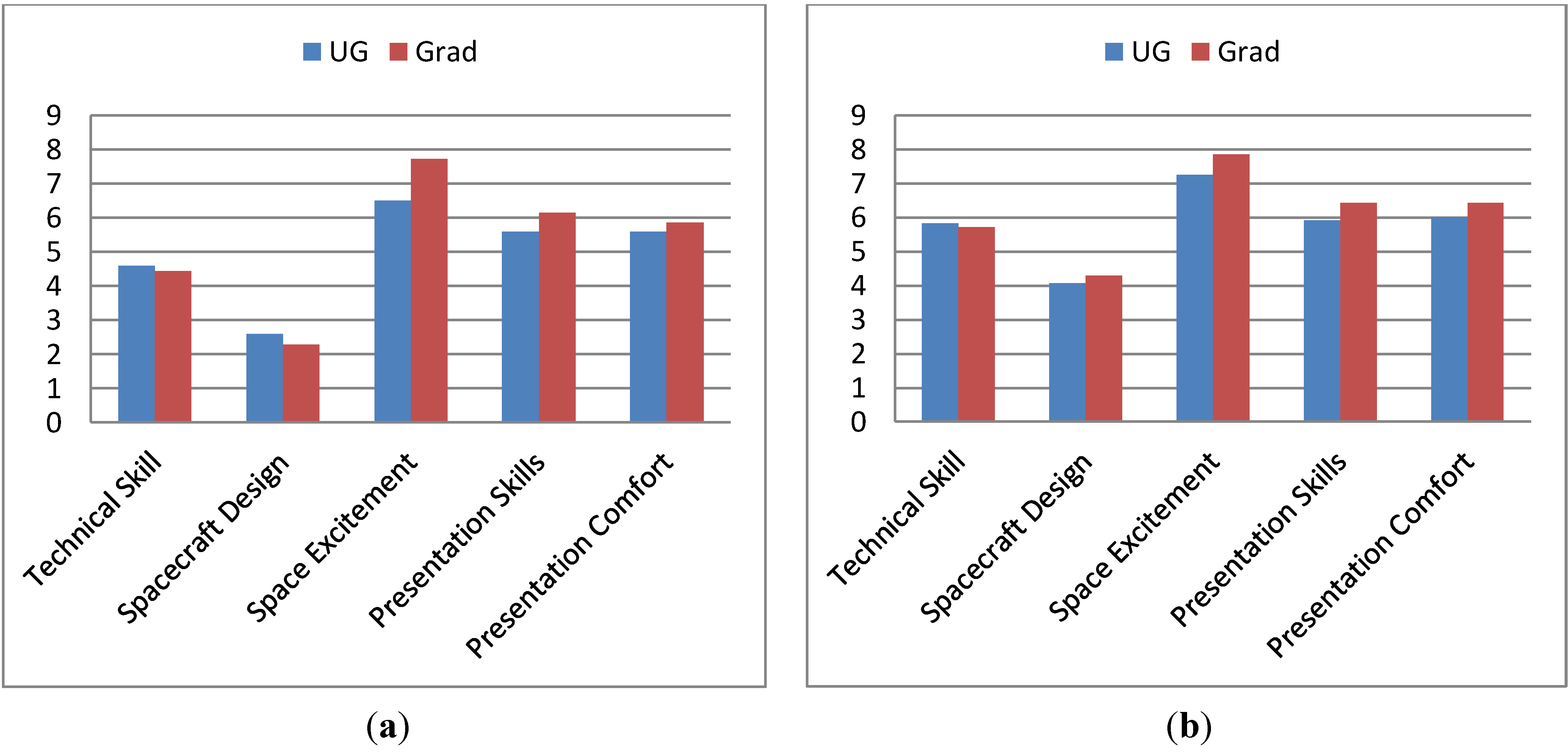
4.2. Comparison of Results between Undergraduate and Graduate Students
As part of the survey instrument, participants were asked a variety of questions relevant to characterizing their academic status and involvement with the project. The next several sections look at starting and ending status levels and the project’s impact in terms of these conditions. This section characterizes these items by whether students were undergraduates or graduate students.
Figure 3.
(a) Beginning Status Levels, Compared between Graduate and Undergraduate Students. (b) Ending Status Levels, Compared between Graduate and Undergraduate Students.
Figure 3.
(a) Beginning Status Levels, Compared between Graduate and Undergraduate Students. (b) Ending Status Levels, Compared between Graduate and Undergraduate Students.
Figure 3(a) presents the pre-participation levels for each category.
Figure 3(b) presents these levels after participation. As these figures demonstrate, the relative levels of pre and post status are fairly consistent between undergraduates and graduate students. Graduate students average higher status levels for space excitement, presentation skills and presentation comfort, prior to participation (undergraduates start marginally higher in the other categories). In spacecraft design, graduate students overtake undergraduates during participation. In all other cases, the group that started with a higher skill level also ended with a higher skill level.
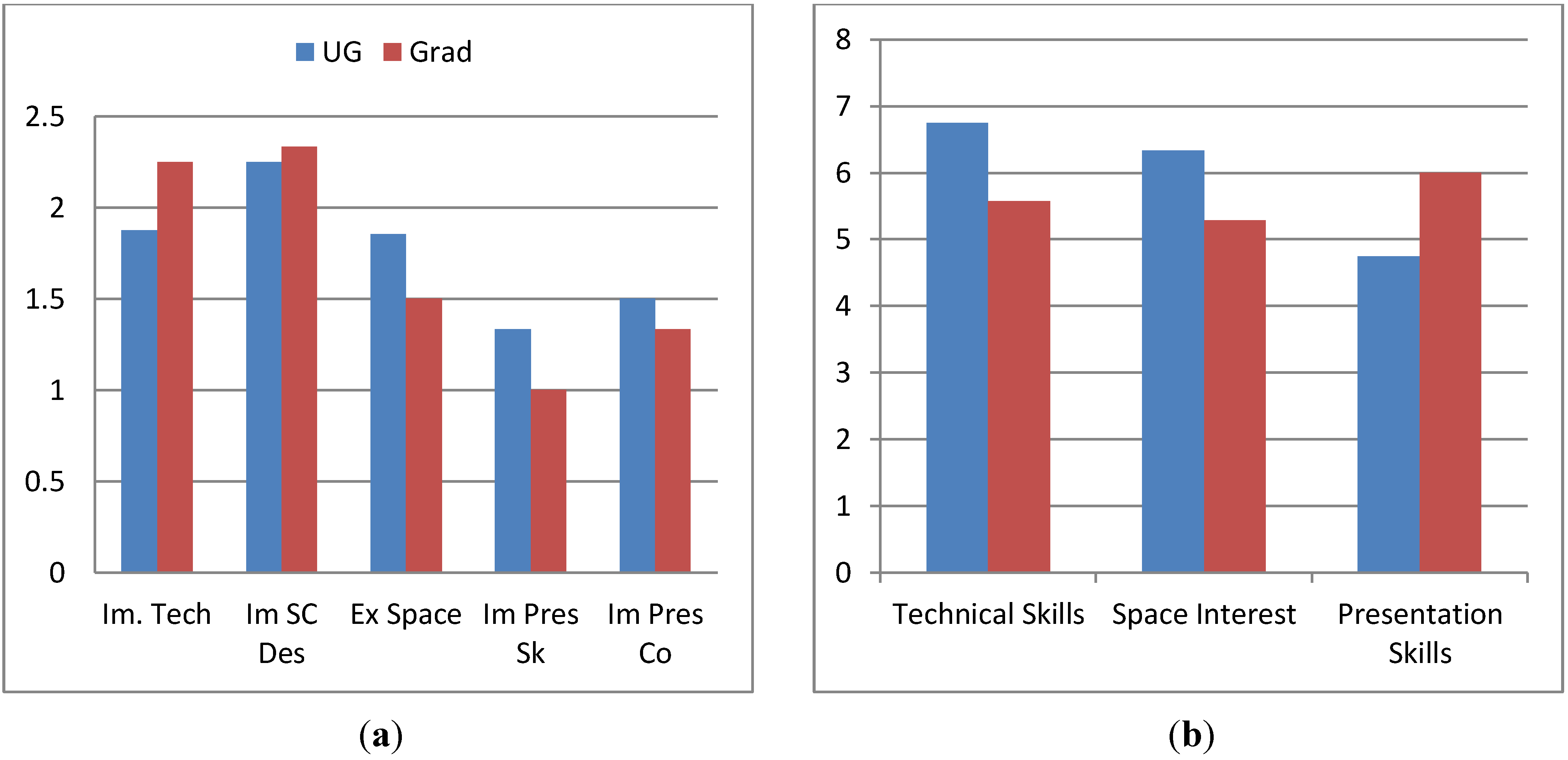
Figure 4(a) depicts the relative average aggregate improvement (the average of the sum of the improvement values reported by each individual) between the two groups. The one previously mentioned individual that reported he or she hadn’t “done much with this project” was included in the graduate students. Excluding this individual raises the average to 6.2 (from 5.17) for the graduate students, which significantly exceeds the level reported by the undergraduates. Note that the individuals whose sum was a negative (decline) score have been excluded from this average. The negative value was excluded in the case of individuals who had other positive scores.
Figure 4(b) shows the percentage of individuals in each category that had an improvement in each particular area.
Figure 4.
(a) Average Aggregate Improvement, Compared between Graduate and Undergraduate Students. (b) Percentage of Participants Showing Improvement in Each Status, Compared between Graduate and Undergraduate Students.
Figure 4.
(a) Average Aggregate Improvement, Compared between Graduate and Undergraduate Students. (b) Percentage of Participants Showing Improvement in Each Status, Compared between Graduate and Undergraduate Students.
In
Figure 5(a), the average improvement for each status has been depicted for both graduate students and undergraduates.
Figure 5(b) shows the responses related to program impact. In two of the three instances (technical skill and space interest) more improvement is shown for undergraduate as compared to graduate students. In the third, presentation skills, significantly more improvement is shown for graduate students. Excluding the individual who indicated a lack of participation, technical skills to rise from 5.57 to 6 (as compared to 6.75 for undergraduates), space interest to rise from 5.28 to 5.67 (as compared to 6.33 for undergraduates) and presentation skills rise from 6 to 6.5 (as compared to 4.75 for undergraduates).
Figure 5.
(a) Average Improvement in Status Levels (for Students Showing Improvement), Compared between Graduate and Undergraduate Students. (b) Effect of Program on Causing Improvement by Status, Compared between Graduate and Undergraduate Students.
Figure 5.
(a) Average Improvement in Status Levels (for Students Showing Improvement), Compared between Graduate and Undergraduate Students. (b) Effect of Program on Causing Improvement by Status, Compared between Graduate and Undergraduate Students.
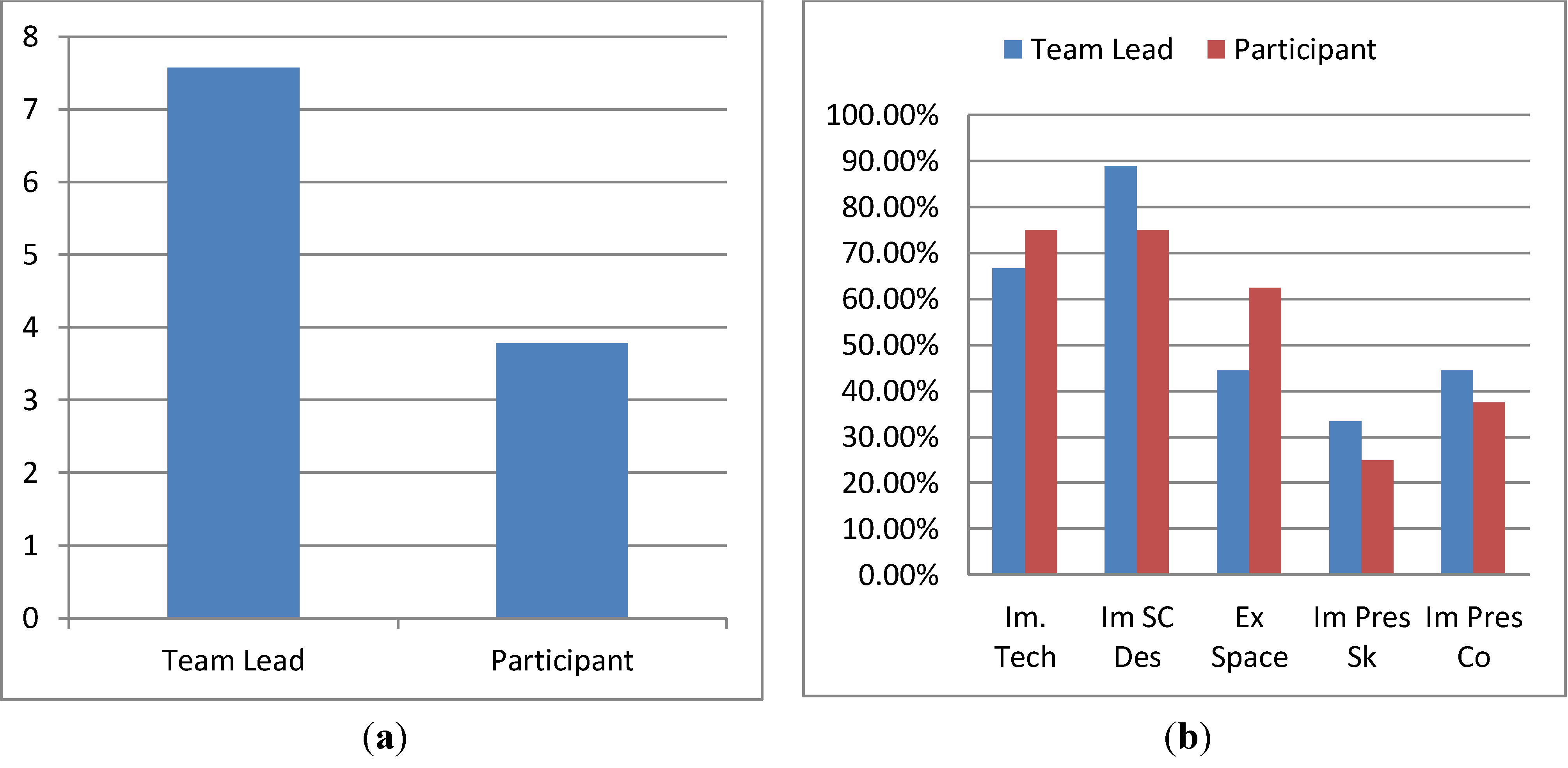
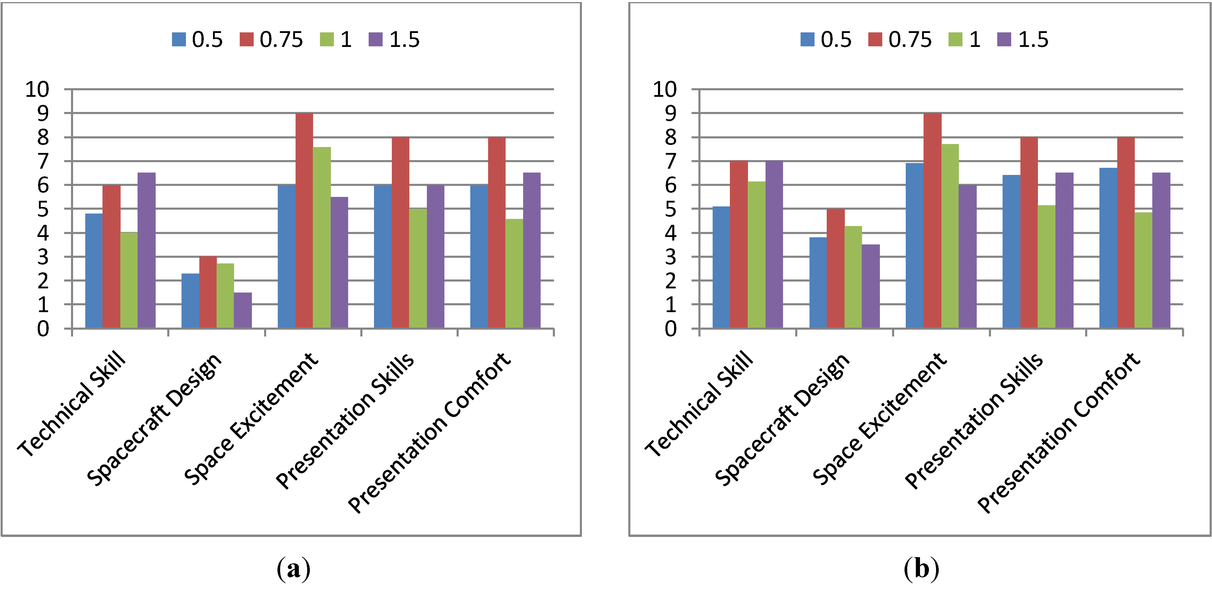
4.3. Comparison of Results between Team Leads and Participants
The relative performance impact of the project on individuals who are team leads
versus who are not is now considered.
Figure 6(a) presents the pre-participation status levels for both team leads and non-team leads.
Figure 6(b) presents the post-participation status levels.
Figure 6.
(a) Beginning Status Levels, Compared between Team Leads and Participants. (b) Ending Status Levels, Compared between Team Leads and Participants.
Figure 6.
(a) Beginning Status Levels, Compared between Team Leads and Participants. (b) Ending Status Levels, Compared between Team Leads and Participants.
Figure 7.
(a) Average Aggregate Improvement, Compared between Team Leads and Participants. (b) Percentage of Participants Showing Improvement in Each Status, Compared between Team Leads and Participants.
Figure 7.
(a) Average Aggregate Improvement, Compared between Team Leads and Participants. (b) Percentage of Participants Showing Improvement in Each Status, Compared between Team Leads and Participants.
Figure 8.
(a) Improvement in Status Levels for those showing improvement in each category, Compared between Team Leads and Participants. (b) Effect of Program on Causing Improvement by Status, Compared between Team Leads and Participants.
Figure 8.
(a) Improvement in Status Levels for those showing improvement in each category, Compared between Team Leads and Participants. (b) Effect of Program on Causing Improvement by Status, Compared between Team Leads and Participants.
The average aggregate improvement for team leads
versus non-lead participations is depicted in
Figure 7(a). This shows that team leads enjoyed over double the benefit of participation as compared with non-lead participants (7.57
vs. 3.78). Excluding the one individual who indicated a lack of involvement increases the participant average to 4.25.
Figure 7(b) depicts the percentage of participants showing improvement in each category for both team leads and non-lead participants. A higher percentage of leads showed improvement in spacecraft design, presentation skills and presentation confidence. A higher percentage of non-leads showed improvement in technical skills and excitement about space.
In
Figure 8(a,b) the level of improvement for each category and the effect of the program are considered, respectively. The average improvement shown by the team leads exceeds the level shown by the non-lead participants across all categories. The impact of the program on causing improvement is also higher across all categories is also higher for the team leads.
The data presented clearly indicates that team leads enjoyed significantly more benefit from participation as compared to the non-lead participants. Not only did they show significantly greater benefit (slightly over double), but they attributed this benefit to participation in the program to a greater extent.
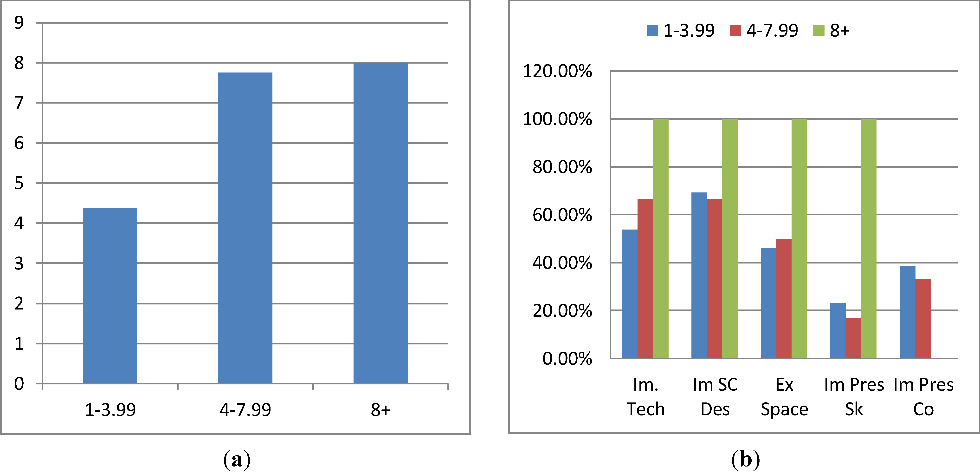
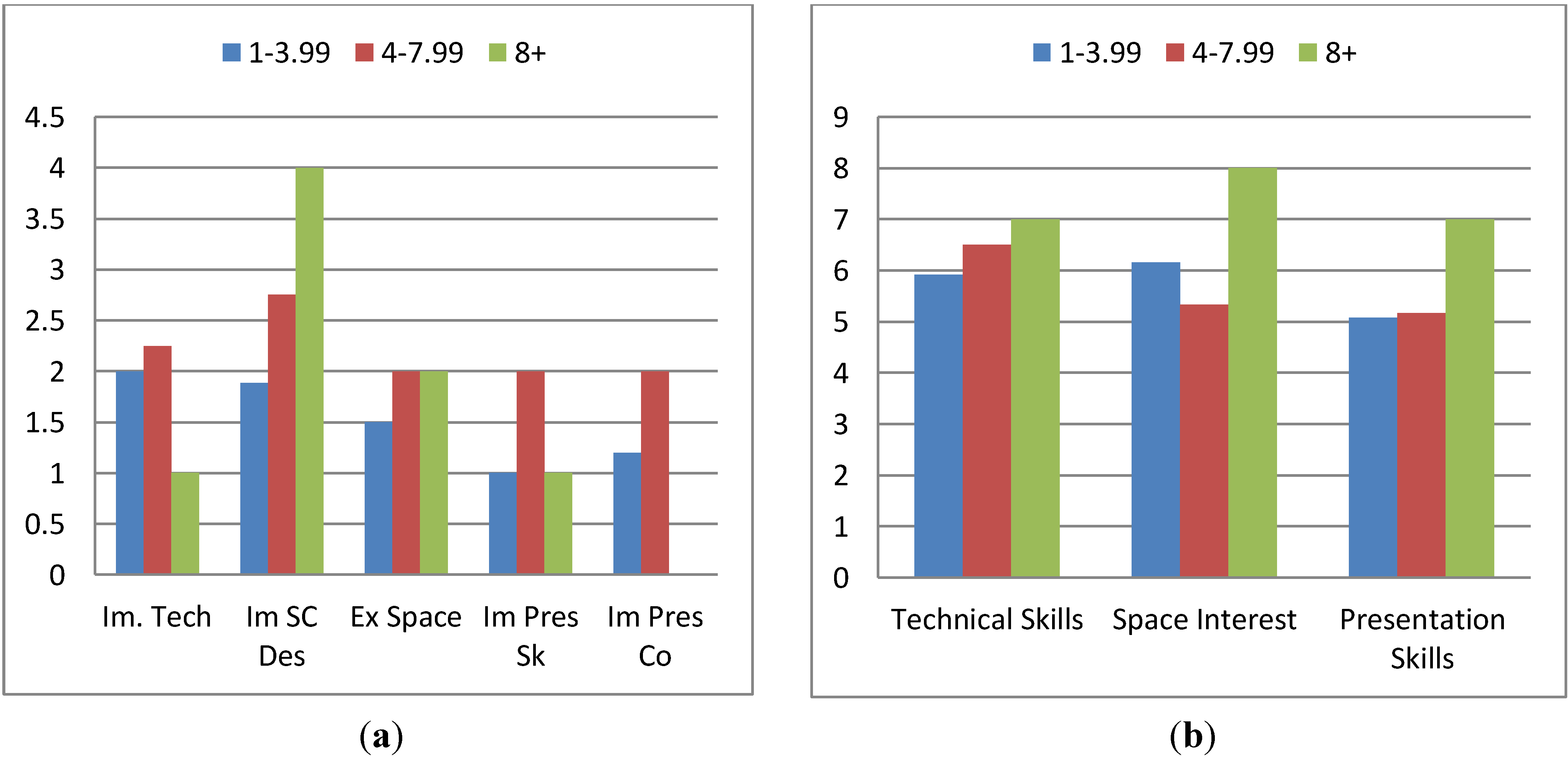
4.4. Comparison of Results by Level of Weekly Participation
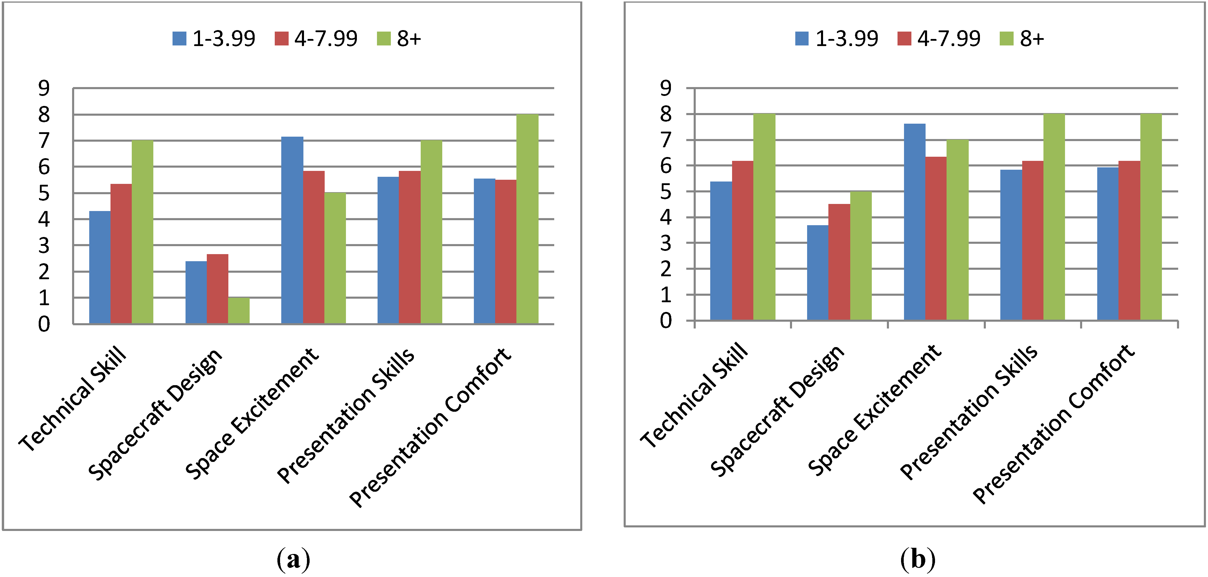
The impact of how much time is spent per week on the project is now considered. Respondents were asked to characterize their participation on the project into one of three categories: 1–3.99 hours per week spent, 4–7.99 hours per week spent or 8+ hours per week spent.
Figure 9(a,b) show the pre-participation and post-participation status levels.
Figure 9.
(a) Beginning Status Levels, Compared between Weekly Levels of Participation. (b) Ending Status Levels, Compared between Weekly Levels of Participation.
Figure 9.
(a) Beginning Status Levels, Compared between Weekly Levels of Participation. (b) Ending Status Levels, Compared between Weekly Levels of Participation.
The average aggregate improvement, by level of weekly participation, is depicted in
Figure 10(a). A correlation between greater work on the project and improvement is shown with those working 1–3.99 hours showing an average aggregate improvement of 4.36 (4.8 with the individual who indicated minimal participation excluded) as compared to 7.75 for those spending 4–7.99 hours and 8 for those spending 8 or more hours per week on the project.
Figure 10(b) indicates the percentage of participants showing improvement for each category in each condition.
Figure 10.
(a) Average Aggregate Improvement, Compared between Weekly Levels of Participation. (b) Percentage of Participants Showing Improvement in Each Status, Compared between Weekly Levels of Participation.
Figure 10.
(a) Average Aggregate Improvement, Compared between Weekly Levels of Participation. (b) Percentage of Participants Showing Improvement in Each Status, Compared between Weekly Levels of Participation.
In
Figure 11(a) the average level of improvement in each category is depicted. Greater improvement is seen in all categories for the 4–7.99 as opposed to the 1–3.99 category. Due to the limited number of individuals responding in the 8+ category, the improvement is centered in two categories (with most of the improvement being located in spacecraft design). Other categories underperform the 3–7.99 and 1–3.99 groups.
Figure 11.
(a) Improvement in Status Levels, Compared between Weekly Levels of Participation. (b) Effect of Program on Causing Improvement by Status, Compared between Weekly Levels of Participation.
Figure 11.
(a) Improvement in Status Levels, Compared between Weekly Levels of Participation. (b) Effect of Program on Causing Improvement by Status, Compared between Weekly Levels of Participation.
The impact of the program on causing the indicated improvement is now considered. The 8 hours per week or more category shows greater attribution of results to the program in each category (as compared to the 1–3.99 and 4–7.99 conditions). The 4–7.99 condition shows more attribution (as compared to the 1–3.99 condition) in two categories (technical and presentation skills), while the 1–3.99 condition shows greater attribution in the space interest category.
The foregoing shows a clear correlation between the amount of time spent weekly on the project and improvement. This is most pronounced between the 1–3.99 and 4–7.99 conditions with only minimal (average) improvement being seen between the 4–7.99 and 8+ categories.
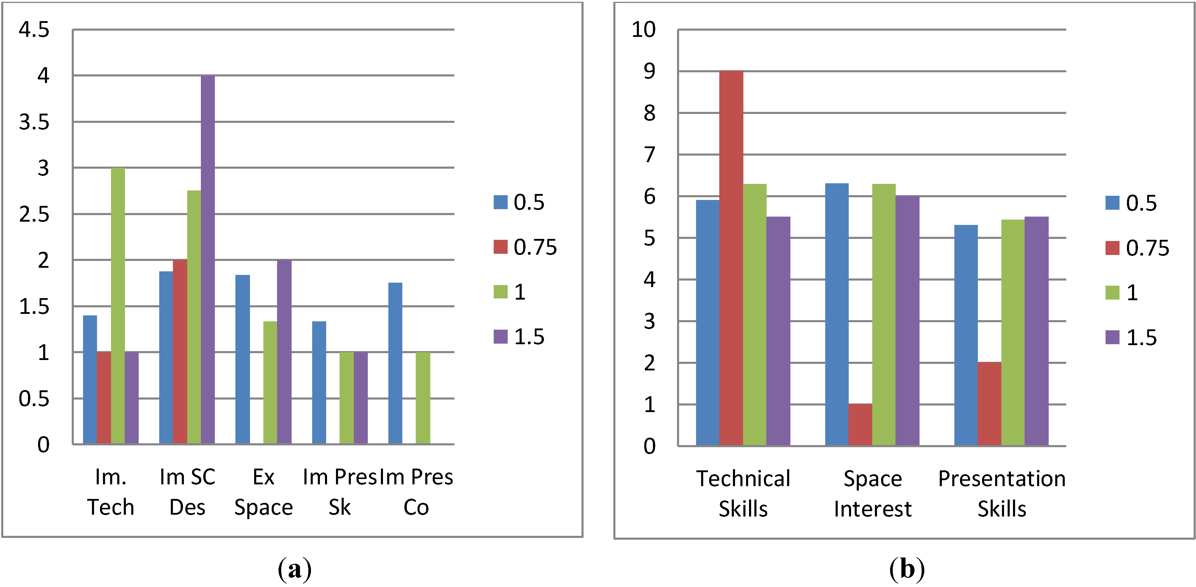
4.5. Comparison of Results by Amount of Time Participating
Correlations between the duration of participation (how long it has been since the individual commenced participation) and results are now assessed.
Figure 12(a,b) show the pre-participation and post-participation status values. There is little time-category correlation demonstrated, as would be expected.
Figure 12.
(a) Beginning Status Levels, Compared by Time Participating (in Academic Years). (b) Ending Status Levels, Compared by Time Participating (in Academic Years).
Figure 12.
(a) Beginning Status Levels, Compared by Time Participating (in Academic Years). (b) Ending Status Levels, Compared by Time Participating (in Academic Years).
Figure 13(a) shows the correlation between the duration of participation and average aggregate improvement. A marginal increase is seen between 0.5 years and 1 year. One individual indicated 0.75 years of participation (via writing this answer in on the survey sheet; it was not a choice) and showed a comparative under-performance (relative to the 0.5 and 1 year categories). Excluding the individual that indicated minimal involvement, the 0.5 year average increases to 6 (from 5.25), surpassing the 5.66 response from the 1-year category. The 8 average increase from the 1.5 year condition still surpasses both.
Figure 13.
(a) Average Aggregate Improvement, Compared by Time Participating (in Academic Years). (b) Percentage of Participants Showing Improvement in Each Status, Compared by Time Participating (in Academic Years).
Figure 13.
(a) Average Aggregate Improvement, Compared by Time Participating (in Academic Years). (b) Percentage of Participants Showing Improvement in Each Status, Compared by Time Participating (in Academic Years).
Figure 14.
(a) Improvement in Status Levels, Compared by Time Participating (in Academic Years). (b) Effect of Program on Causing Improvement by Status, Compared by Time Participating (in Academic Years).
Figure 14.
(a) Improvement in Status Levels, Compared by Time Participating (in Academic Years). (b) Effect of Program on Causing Improvement by Status, Compared by Time Participating (in Academic Years).
It would seem that there is some correlation between the time spent involved and the average level of increase; however, this cannot be stated definitively for a number of reasons. First, it appears there was some confusion related to responses in this category altogether due to the ambiguity between calendar years and academic years. Second, the inclusion and exclusion of outlier, erroneous and ambiguous data points appears to have a particular effect in this category with the exclusion of the individual indicating limited involvement bringing the average of the 0.5 year participants above that of the 1-year participants. Another data point (where the individual indicated agreement/agreement-strong agreement with the statements regarding impact but didn’t indicate skill improvement), if excluded, would raise the 1-year condition to 6.8, bringing the two back into stronger correlation.
Figure 13(b) shows the correlation between the amount of time participating and the percentage of individuals showing improvement in each category. The limited membership of several categories makes this graph very erratic.
Figure 14(a,b) show the improvement in status levels, by category and attribution by category for each duration of participation condition. Again, the limited membership of some conditions makes both of these graphs somewhat erratic.
It would appear that there is a correlation between the duration that the participant has been involved and the level of benefit attained. However, possible ambiguity in the question and limited membership in certain conditions has made this not entirely certain. Refining this question will serve as an area of improvement for future work. Longitudinal tracking is also planned.
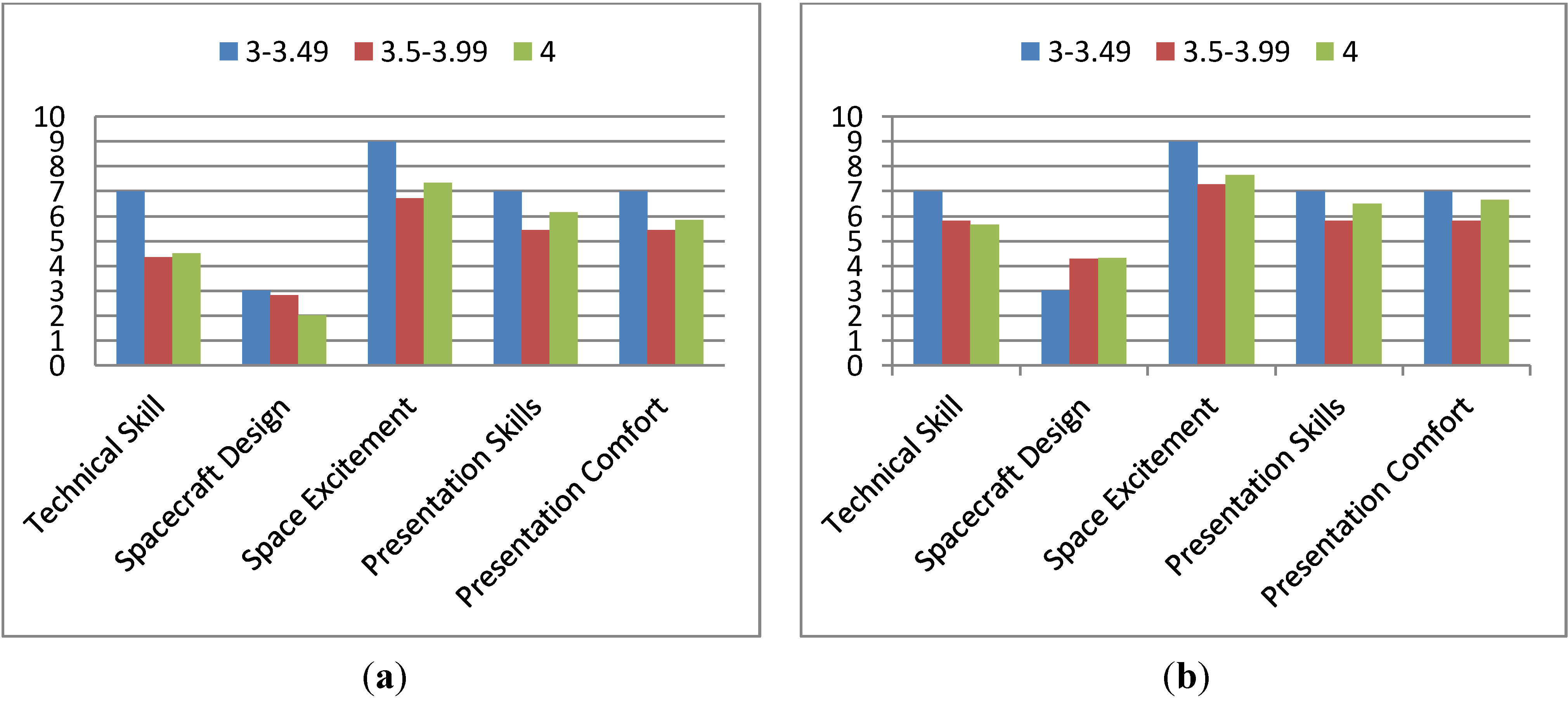
Figure 15.
(a) Beginning Status Levels, Compared by Participant GPA. (b) Ending Status Levels, Compared by Participant GPA.
Figure 15.
(a) Beginning Status Levels, Compared by Participant GPA. (b) Ending Status Levels, Compared by Participant GPA.
4.6. Comparison of Results by GPA
This section compares the various success indicators and the GPA of the participants in an attempt to determine whether there is any correlation.
Figure 15(a,b) present the pre-participation and post-participation status levels respectively. There does not appear to be, as expected, any strong bias towards or away from certain categories which correlates with GPA.
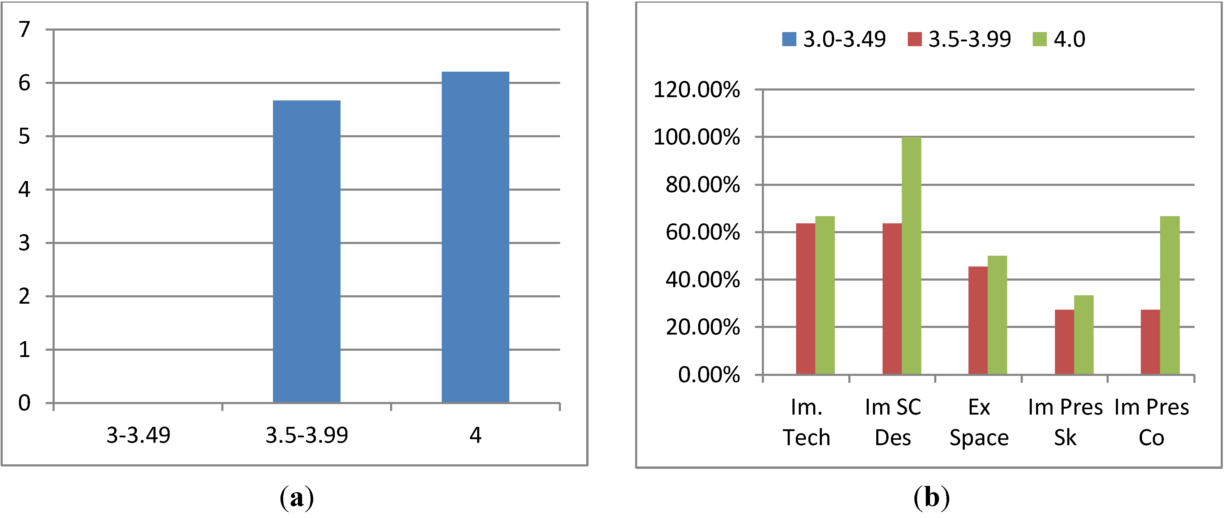
Figure 16(a) shows the average aggregate improvement. This indicates a slight improvement which correlates with increased GPA (5.67
vs. 6.2). Again, excluding the individual who indicated limited participation causes the 3.49–4.00 to overtake the 4.0 GPA condition (increasing it to 6.38). The other data point (where improvement is attributed, but none is shown) is the sole member of the 3.0–3.49 condition, so this has no impact on the 4.0
versus 3.49–4.00 comparison.
Figure 16(b) indicates a higher percentage of individuals in the 4.0 condition experienced an increase in each category as compared to the 3.5–3.99 condition. Excluding the aforementioned individual causes the 3.5–3.99 to overtake in one area (technical skills) and match in another (excitement about space).
Figure 16.
(a) Average Aggregate Improvement, Compared by Participant GPA. (b) Percentage of Participants Showing Improvement in Each Status, Compared by Participant GPA.
Figure 16.
(a) Average Aggregate Improvement, Compared by Participant GPA. (b) Percentage of Participants Showing Improvement in Each Status, Compared by Participant GPA.
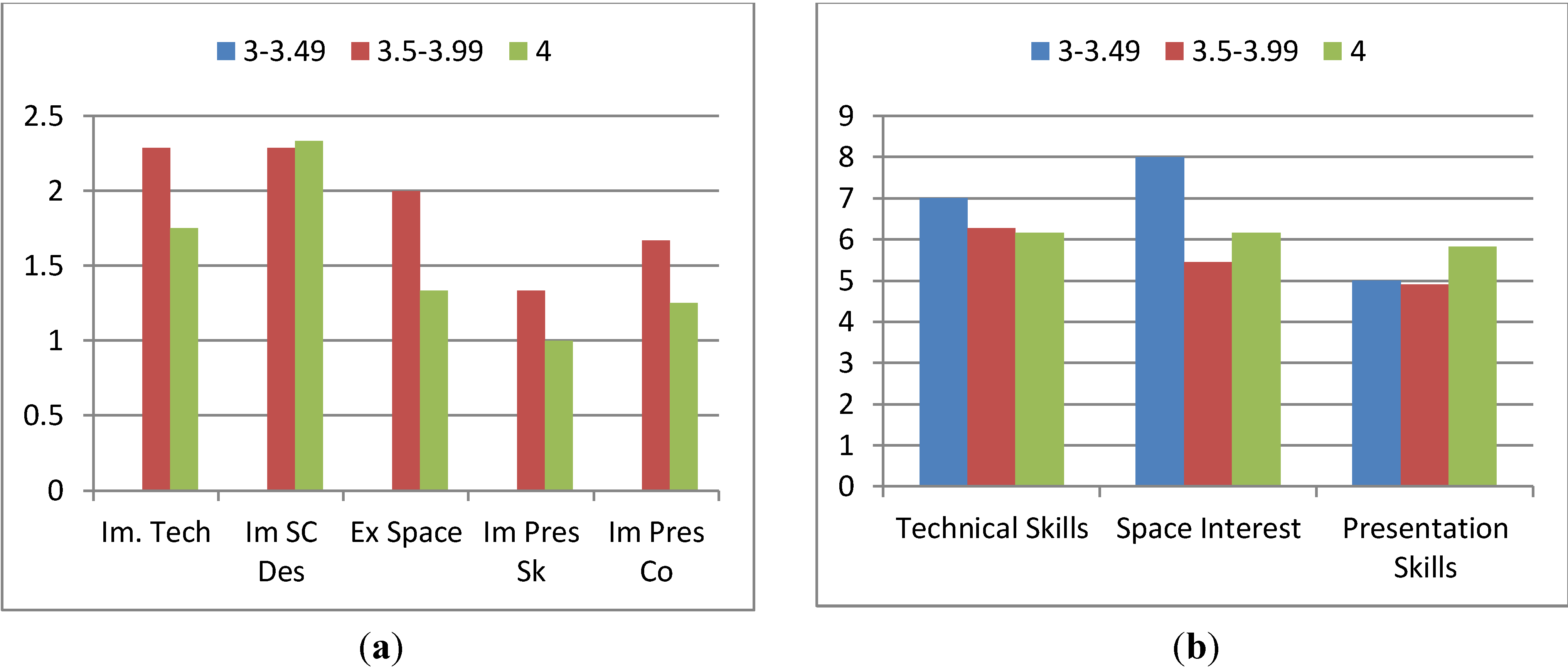
Figure 17.
(a) Improvement in Status Levels, Compared by Participant GPA. (b) Effect of Program on Causing Improvement by Status, Compared by Participant GPA.
Figure 17.
(a) Improvement in Status Levels, Compared by Participant GPA. (b) Effect of Program on Causing Improvement by Status, Compared by Participant GPA.
The average amount of improvement values, shown in
Figure 17(a), show that the 3.5–3.99 category experienced more improvement when improvement occurred, in all but one category (spacecraft design). Results in the attribution responses shown in
Figure 16(b) are mixed with the 3.5–3.99 condition scoring higher in one (technical skills) and the 4.0 condition scoring higher in the other two. The 3–3.49 condition outscores the other two in two conditions (outscoring 3.5–3.99 in all three); however, as there is only a single member to this condition there is insufficient evidence of anything significant about this. Excluding the previously discussed data point does not impact these results.
From the aforementioned, there is insufficient evidence to conclude that GPA had any particular correlation with a gaining value from the program as indicators conflicted. Moreover, in the areas where one was shown to significantly outperform another, there is no practical significance to the result.
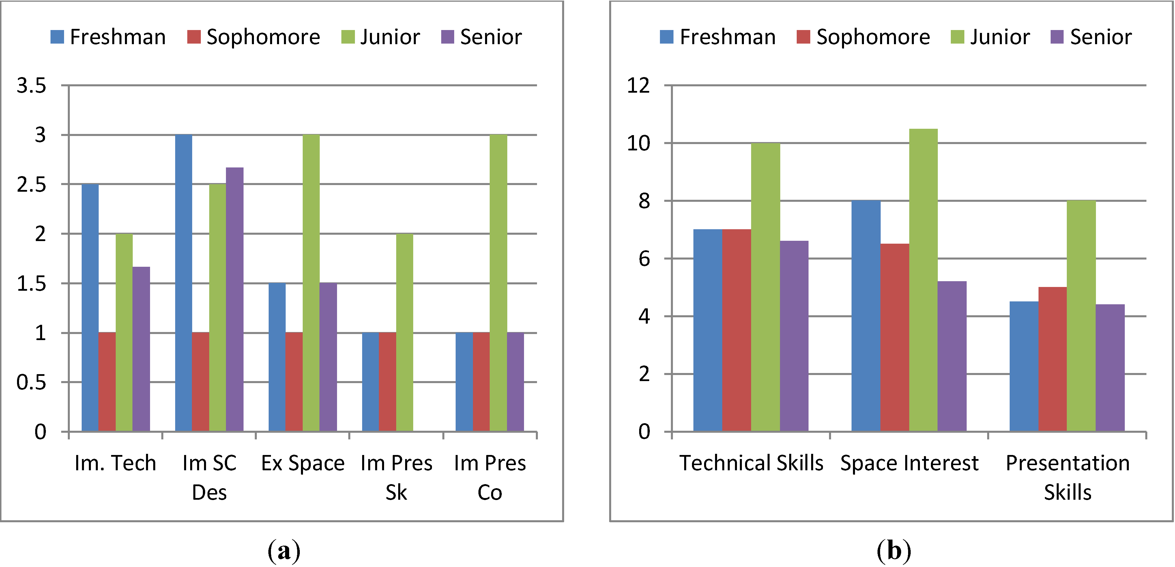
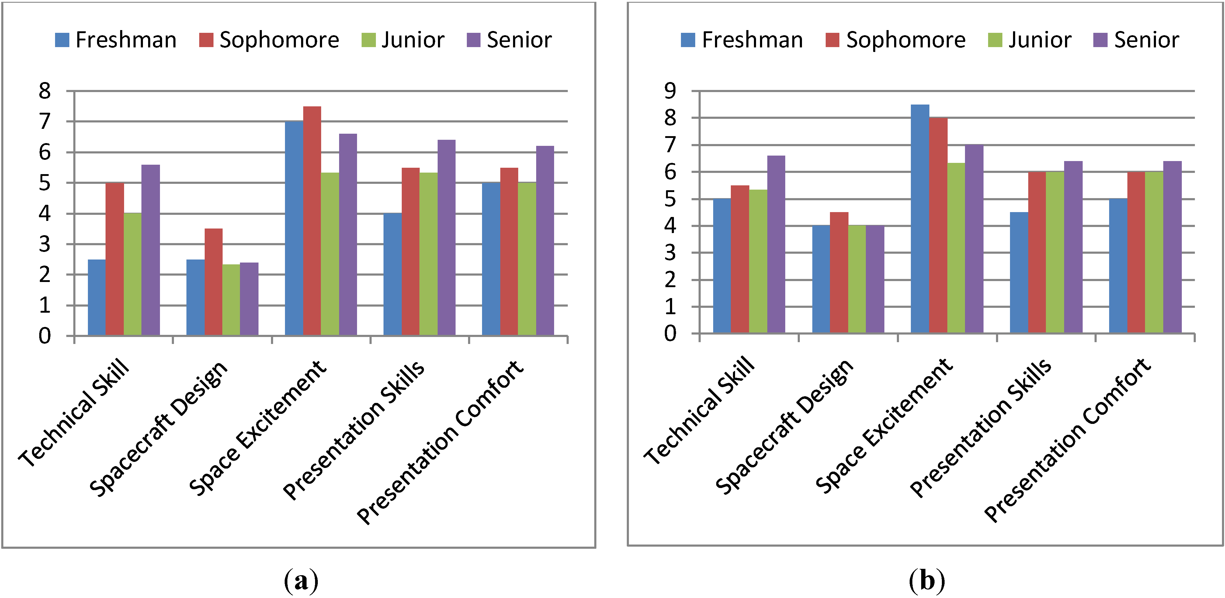
Figure 18.
(a) Beginning Status Levels, Compared by Undergraduate Class Level. (b) Ending Status Levels, Compared by Undergraduate Class Level.
Figure 18.
(a) Beginning Status Levels, Compared by Undergraduate Class Level. (b) Ending Status Levels, Compared by Undergraduate Class Level.
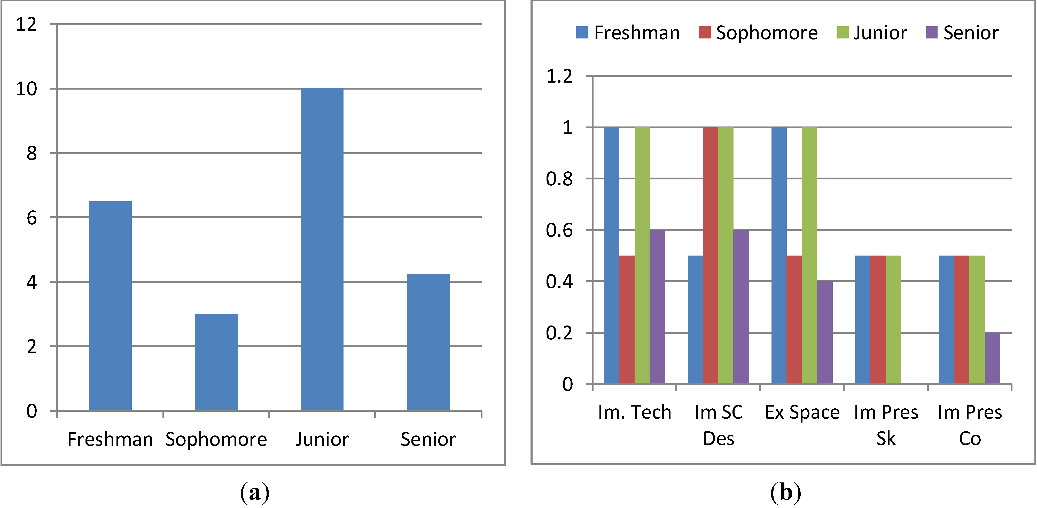
Figure 19.
(a) Average Aggregate Improvement, Compared by Undergraduate Class Level. (b) Percentage of Participants Showing Improvement in Each Status, Compared by Class Level.
Figure 19.
(a) Average Aggregate Improvement, Compared by Undergraduate Class Level. (b) Percentage of Participants Showing Improvement in Each Status, Compared by Class Level.

