
Visualization of Spatial–Temporal Epidemiological Data: A Scoping Review


Abstract
1. Introduction
2. Methods
2.1. Research Questions
- Q1. What are the most commonly visually represented measures of an epidemic, and what are the visualization purposes? We analyzed the epidemic data represented in each paper to identify general trends in the representation of the measures, the information involved, and the final use of the visualization techniques.
- Q2. Which techniques are most frequently used to visualize epidemiological spatial information? We classified the papers based on what type of visualization they used to represent the spatial component of epidemiological data. The classification types were (1) maps, if they used a geographical representation; (2) buildings, if the visualization represented the inside of a building structure; and (3) none, if the visualization technique was conceptual.
- Q3. Which techniques are most frequently used to visualize epidemiological temporal data? We studied the current trend in the visualizations used to represent the temporal component of epidemiological information and whether this took place through the use of time series, temporal granularity (e.g., week, month, and year), or interactive filters.
- Q4. Which combinations of spatial–temporal visualizations are most frequently used to represent epidemiological data? We studied how the papers represented both the spatial and temporal information concerning an epidemic, and whether they used just one technique or a set of several techniques.
- Q5. Do the existing visualizations use individual-level data or aggregated data? We analyzed whether it is common practice to work with individual data or with population-level data.
- Q6. Are there any visualizations of patients who became infected in a hospital? We analyzed how many papers carried out a study of hospital-acquired infections.
- Q7. What software tools are used? We explored the software used in the implementation of the study (e.g., programming languages and data management tools).
- Q8. What datasets and evaluation methods are used? We analyzed which datasets were most frequently used for the development and evaluation of each study, and what methods were used to evaluate them.
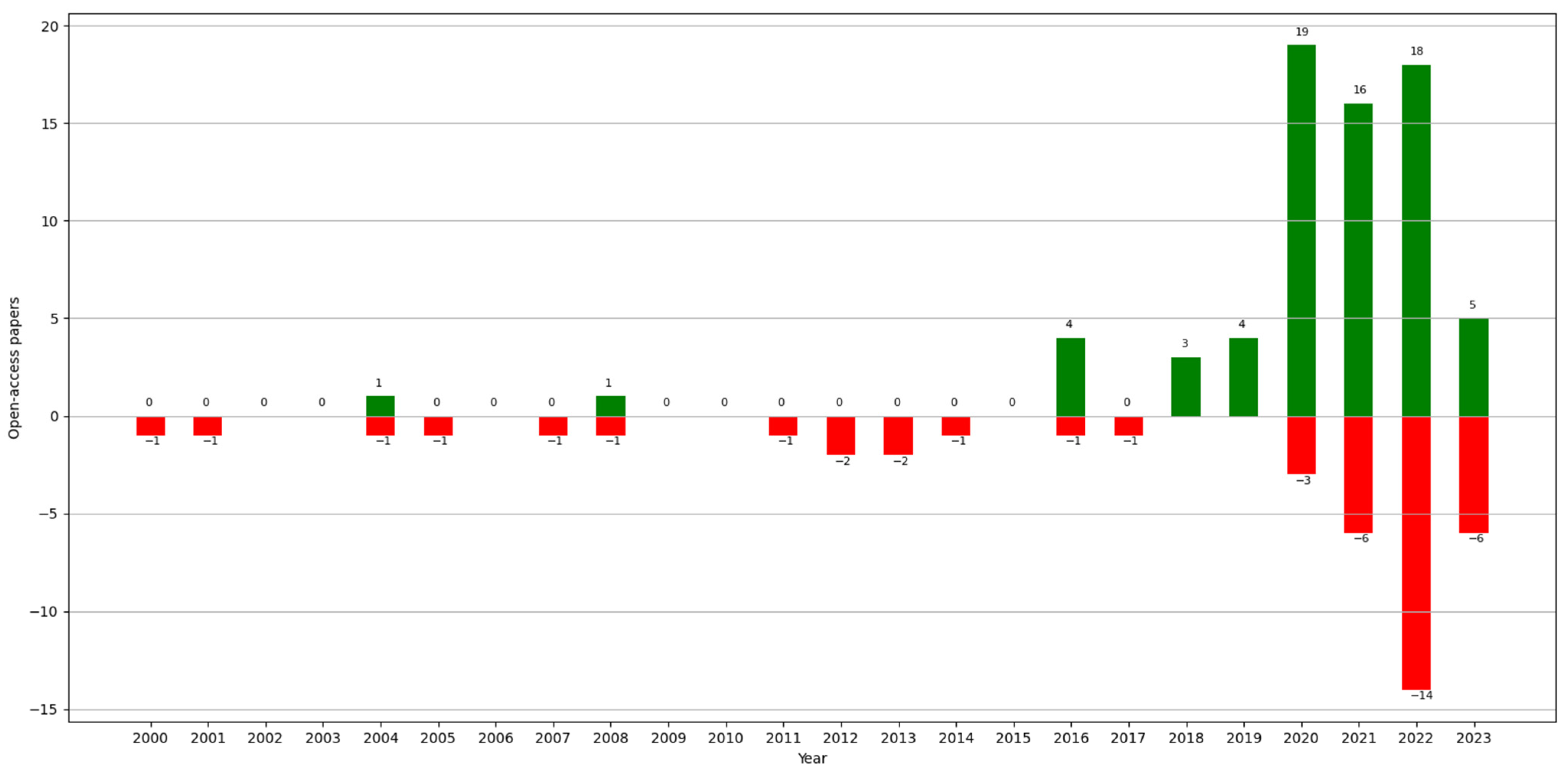
- Q9. Is the dataset open-access? It was of interest to determine how many of the papers presented open-access datasets.
2.2. Data Sources
2.3. Search Strategy
2.3.1. Search Strings
2.3.2. Search Process
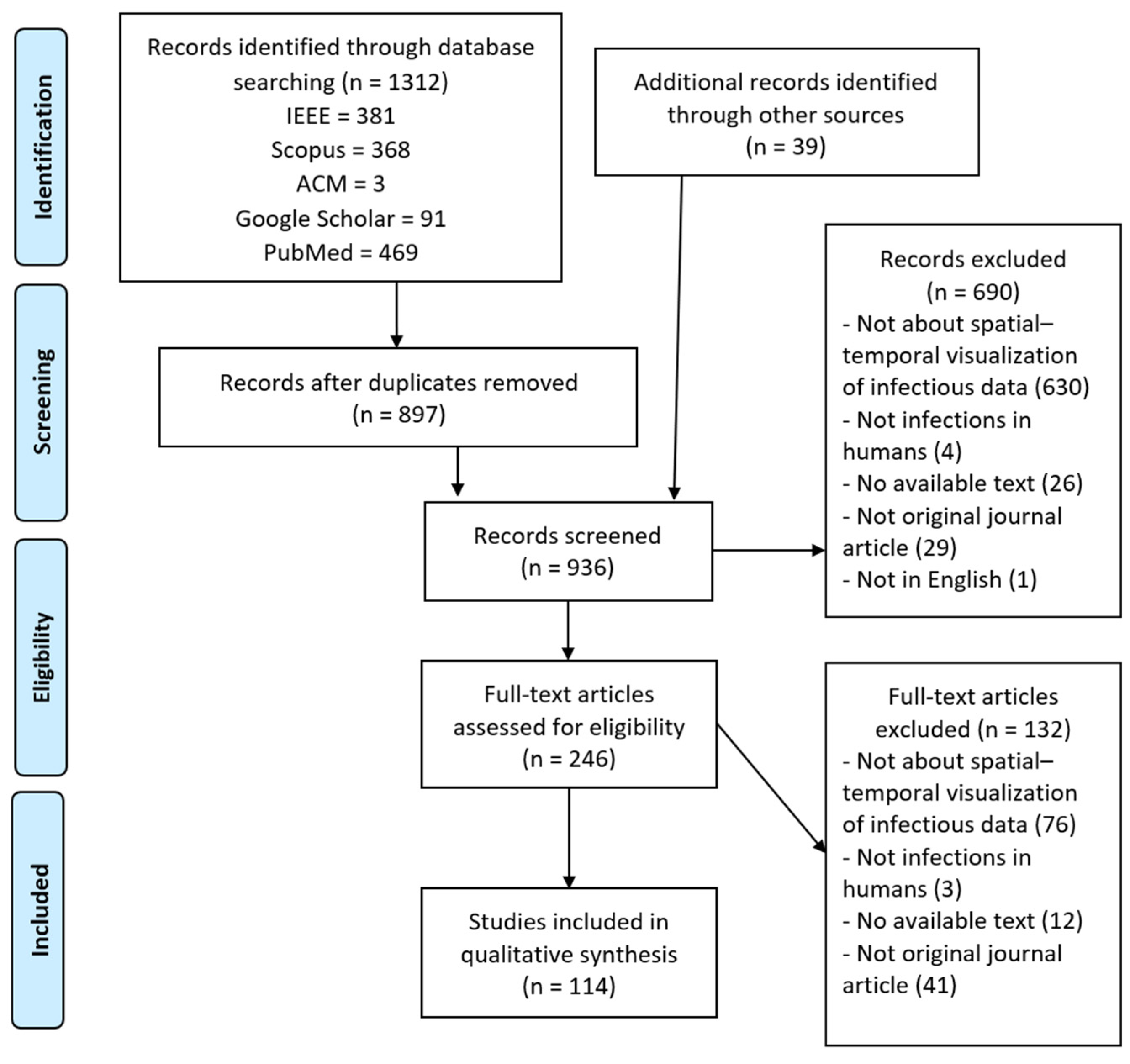
2.4. Study Selection
2.5. Charting the Data
2.6. Synthesis
3. Results
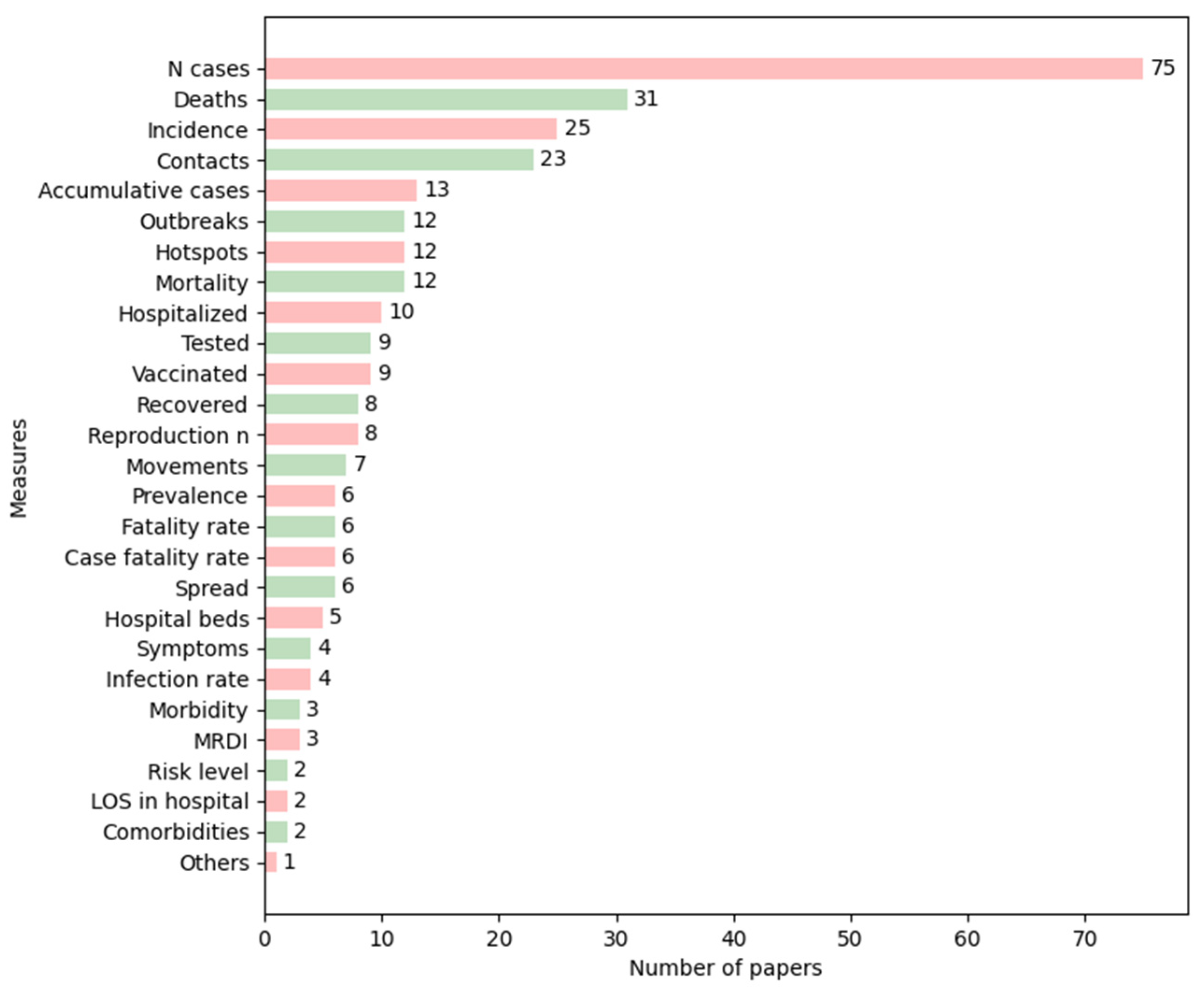
3.1. Q1: What Are the Most Commonly Visually Represented Measures of an Epidemic, and What Are the Visualization Purposes?
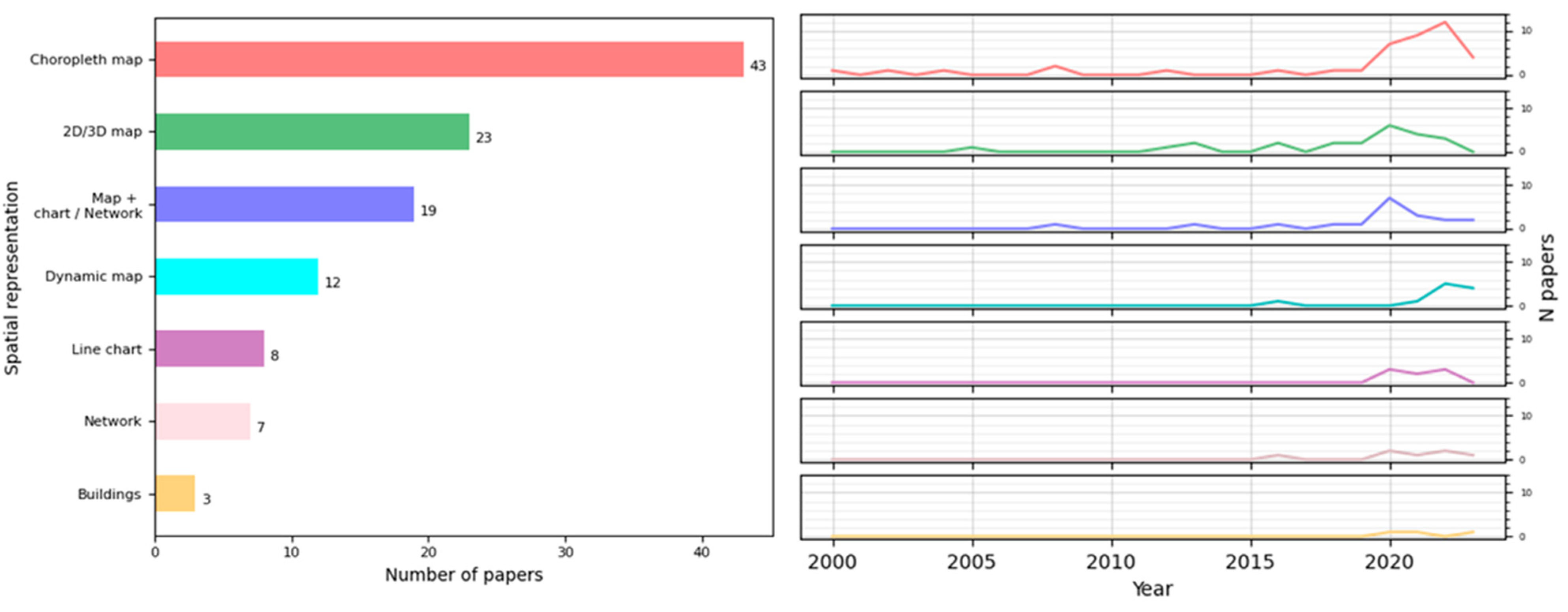
3.2. Q2: Which Techniques Are Most Frequently Used to Visualize Epidemiological Spatial Information?
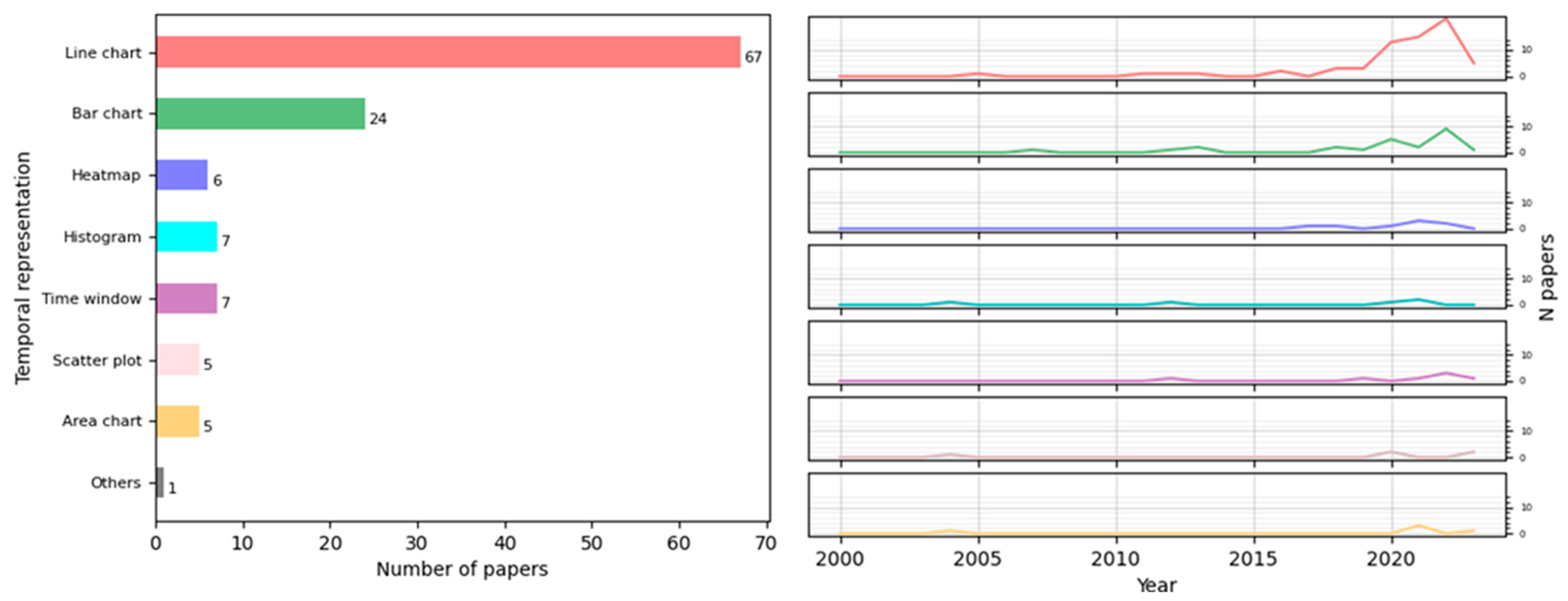
3.3. Q3: Which Techniques Are the Most Frequently Used to Visualize Epidemiological Temporal Data?
3.4. Q4: Which Combinations of Spatial–Temporal Visualizations Are Most Frequently Used to Represent Epidemiological Data?
3.5. Q5: Do the Existing Visualizations Use Individual-Level Data or Aggregated Data?
3.6. Q6: Are There Any Visualizations of Patients Who Became Infected in a Hospital?
3.7. Q7: What Software Tools Are Used?
3.8. Q8: What Datasets and Visualization Evaluation Methods Are Used?
3.9. Q9: Is the Dataset Open-Access?
4. Discussion
5. Conclusions
- There is a need for the development of good practices for the generation of more effective visualizations: we are faced with a situation where, though the need to apply visualizations in the field of health is more recognized (proven by the increase in publications in this field in recent years), we lack a clear methodology for developing and evaluating visualization techniques.
- There is still a lack of studies of epidemiological data at an individual level.
- There is a lack of representations of buildings in both 2D and 3D: this is key to helping identify contacts and the spread of diseases at a local level.
- There is little development of programs that would help decision-making at a hospital level to prevent the spread of infectious diseases or epidemics.
- A very small number of papers studied the acquisition of diseases by patients inside a hospital as the result of any epidemic.
Supplementary Materials
Author Contributions
Funding
Data Availability Statement
Conflicts of Interest
Appendix A

| Datasets | Papers |
|---|---|
| KCDC [131] | [25,39,106,107] |
| COVID-19 analysis tools at Instituto de Informática of the Federal University of Rio Grande do Sul (Brazil) [132] | [22] |
| COVID-19 Data Repository by the Center for Systems Science and Engineering (CSSE) at Johns Hopkins University [133] | [15,23,37,41,42,48,52,84,95,125] |
| NSF Spatiotemporal Innovation Center (STC) dataset on COVID-19 in the US [134] | [82] |
| Arrivals of non-resident tourists at Brazilian national borders by country of residence [135] | [83] |
| Trips abroad by Brazilian resident visitors to countries of destination [136] | [84] |
| Flutrack [137] | [14] |
| Notification on the pneumonia epidemic situation from the China National Health Commission [138] | [25] |
| Press statement by Hubei province Health Commission [139] | [25] |
| Press statement of novel coronavirus (in Japanese) by the Ministry of Health, Labour and Welfare, Japan [140] | [25] |
| CDC [141] | [25,26,50,95,102] |
| Data on school start dates in the US [142] | [26] |
| US Census Bureau [143] | [26,41,44] |
| Statistics Canada and Census datasets [144] | [27] |
| District Health Information System (DHIS) [145] | [31] |
| Taiwan Open Data Platform [146] | [20] |
| Taiwan Centers for Disease Control (TCDC) [147] | [20] |
| Interactions in a French primary school [148] | [122] |
| FoodRisk-Labs [149] | [123] |
| Epidemic Situation by the Ministry of Civil Affairs of Bosnia and Herzegovina [150] | [115] |
| The New York Times Coronavirus in the United States dataset [151] | [44,99] |
| Open Data of Epidemiology by the National Governments Health Secretary [152] | [16] |
| National Epidemiological Surveillance of Infectious Diseases [153] | [32] |
| European Centre for Disease Prevention and Control (ECDC) [154] | [52,100,108,118] |
| COVID-19 situation reports by the World Health Organization (WHO) [155] | [25,37,38,102] |
| Chinese Center for Disease Control and Prevention [156] | [37] |
| National Health Commission of the PCR [157] | [37,38,47,50] |
| COVID-19 from Datadista [158] | [101] |
| US coronavirus cases by county from USAFacts [159] | [17] |
| COVID-19 data from the Italian National Institute of Health [160] | [118] |
| Compendium of US Health Systems [161] | [41] |
| Directorate of Health Services, Government of Kerala, India [162] | [90] |
| NSF Spatiotemporal Innovation Center (STC) dataset on COVID-19 [163] | [113] |
| genEpi dataset [164] | [43] |
| The COVID-19 Tracking Project [165] | [84] |
| COVID-19 dataset from the Presidency of the Council of Ministers- Department of Civil Protection [166] | [84] |
| Tencent COVID-19 dataset [167] | [124] |
| Infectious Disease App by the International Civil Aviation Organization [168] | [45] |
| esCOVID-19 data [169] | [103] |
| Information about different aspects of the Spanish reality from Spanish National Institute of Statistics [170] | [103] |
| Mortality monitoring system from the Spanish Health Institute Carlos III [171] | [103] |
| Information about meteorological data stemming from Spanish State Agency of Meteorology [172] | [103] |
| HIV-1 Transmission Dynamics in Germany [173] | [93] |
| Oxford COVID-19 Government Response Tracker [174] | [125] |
| COVID-19 Data from the NSW Government [175] | [109] |
| Victorian Coronavirus (COVID-19) Data [176] | [109] |
| Locations Visited by Confirmed COVID-19 Cases in Western Australia [177] | [109] |
| Australian Statistical Geography Standard (ASGS) [177] | [109] |
References
- Last, J.M.; International Epidemiological Association (Eds.) A Dictionary of Epidemiology, 4th ed.; Oxford University Press: New York, NY, USA, 2001; ISBN 978-0-19-514168-9. [Google Scholar]
- Combi, C.; Keravnou-Papailiou, E.; Shahar, Y. Temporal Information Systems in Medicine, 1st ed.; Springer Publishing Company, Incorporated: Berlin/Heidelberg, Germany, 2010; ISBN 978-1-4419-6542-4. [Google Scholar]
- Chittaro, L. Information visualization and its application to medicine. Artif. Intell. Med. 2001, 22, 81–88. [Google Scholar] [CrossRef]
- Shneiderman, B.; Plaisant, C.; Hesse, B.W. Improving Healthcare with Interactive Visualization. Computer 2013, 46, 58–66. [Google Scholar] [CrossRef]
- Chen, H.; Zeng, D.; Yan, P. Data Visualization, Information Dissemination, and Alerting. In Infectious Disease Informatics: Syndromic Surveillance for Public Health and BioDefense; Chen, H., Zeng, D., Yan, P., Eds.; Springer: New York, NY, USA, 2010; pp. 73–87. [Google Scholar] [CrossRef]
- Bucalon, B.; Shaw, T.; Brown, K.; Kay, J. State-of-the-art Dashboards on Clinical Indicator Data to Support Reflection on Practice: Scoping Review. JMIR Med. Inform. 2022, 10, e32695. [Google Scholar] [CrossRef]
- Carroll, L.N.; Au, A.P.; Detwiler, L.T.; Fu, T.-C.; Painter, I.S.; Abernethy, N.F. Visualization and analytics tools for infectious disease epidemiology: A systematic review. J. Biomed. Inform. 2014, 51, 287–298. [Google Scholar] [CrossRef]
- Crisan, A.; Gardy, J.L.; Munzner, T. A systematic method for surveying data visualizations and a resulting genomic epidemiology visualization typology: GEViT. Bioinformatics 2018, 35, 1668–1676. [Google Scholar] [CrossRef]
- Chishtie, J.A.; Marchand, J.-S.; A Turcotte, L.; Bielska, I.A.; Babineau, J.; Cepoiu-Martin, M.; Irvine, M.; Munce, S.; Abudiab, S.; Bjelica, M.; et al. Visual Analytic Tools and Techniques in Population Health and Health Services Research: Scoping Review. J. Med. Intern. Res. 2020, 22, e17892. [Google Scholar] [CrossRef]
- Tricco, A.C.; Lillie, E.; Zarin, W.; O’Brien, K.K.; Colquhoun, H.; Levac, D.; Moher, D.; Peters, M.D.J.; Horsley, T.; Weeks, L.; et al. PRISMA Extension for Scoping Reviews (PRIS-MA-ScR): Checklist and Explanation. Ann. Intern. Med. 2018, 169, 467–473. [Google Scholar] [CrossRef]
- Tawfik, G.M.; Dila, K.A.S.; Mohamed, M.Y.F.; Tam, D.N.H.; Kien, N.D.; Ahmed, A.M.; Huy, N.T. A step by step guide for conducting a systematic review and meta-analysis with simulation data. Trop. Med. Health 2019, 47, 46. [Google Scholar] [CrossRef]
- Xie, B.; Tao, C.; Li, J.; Hilsabeck, R.C.; Aguirre, A. Artificial Intelligence for Caregivers of Persons With Alzheimer’s Disease and Related Dementias: Systematic Literature Review. JMIR Med. Inf. 2020, 8, e18189. [Google Scholar] [CrossRef]
- Dicker, R.; Coronado, F.; Koo, D.; Gibson Parrish, R. Principles of Epidemiology in Public Health Practice, 3rd ed.; An Introduction; Centers for Disease Control and Prevention: Atlanta, GA, USA, 2006; p. 511.
- Chorianopoulos, K.; Talvis, K. Flutrack.org: Open-source and linked data for epidemiology. Health Inform. J. Engl. 2016, 22, 962–974. [Google Scholar] [CrossRef]
- Jen, T.-H.; Chien, T.-W.; Yeh, Y.-T.; Lin, J.-C.J.; Kuo, S.-C.; Chou, W. Geographic risk assessment of COVID-19 transmission using recent data: An observational study. Medicine 2020, 99, e20774. [Google Scholar] [CrossRef]
- Galván-Tejada, C.E.; Zanella-Calzada, L.A.; Villagrana-Bañuelos, K.E.; Moreno-Báez, A.; Luna-García, H.; Celaya-Padilla, J.M.; Galván-Tejada, J.I.; Gamboa-Rosales, H. Demographic and Comorbidities Data Description of Population in Mexico with SARS-CoV-2 Infected Patients(COVID19): An Online Tool Analysis. Int. J. Env. Res. Public. Health 2020, 17, 5173. [Google Scholar] [CrossRef]
- Kaul, S.; Coleman, C.; Gotz, D. A rapidly deployed, interactive, online visualization system to support fatality management during the coronavirus disease 2019 (COVID-19) pandemic. J. Am. Med. Inform. Assoc. 2020, 27, 1943–1948. [Google Scholar] [CrossRef]
- Makhsous, S.; Segovia, J.M.; He, J.; Chan, D.; Lee, L.; Novosselov, I.V.; Mamishev, A.V. Methodology for Addressing Infectious Aerosol Persistence in Real-Time Using Sensor Network. Sensors 2021, 21, 3928. [Google Scholar] [CrossRef]
- Su, W.; Fu, W.; Kato, K.; Wong, Z.S.-Y. “Japan LIVE Dashboard” for COVID-19: A Scalable Solution to Monitor Real-Time and Regional-Level Epidemic Case Data. Stud. Health Technol. Inf. Neth. 2021, 286, 21–25. [Google Scholar]
- Cintron, R.; Whitmer, S.L.M.; Moscoso, E.; Campbell, E.M.; Kelly, R.; Talundzic, E.; Mobley, M.; Chiu, K.W.; Shedroff, E.; Shankar, A.; et al. HantaNet: A New MicrobeTrace Application for Hantavirus Classification, Genomic Surveillance, Epidemiology and Outbreak Investigations. Viruses 2023, 15, 2208. [Google Scholar] [CrossRef]
- Neto, O.L.; Paolotti, D.; Dalton, C.; Carlson, S.; Susumpow, P.; Parker, M.; Phetra, P.; Lau, E.H.Y.; Colizza, V.; van Hoek, A.J.; et al. Enabling Multicentric Participatory Disease Surveillance for Global Health Enhancement: Viewpoint on Global Flu View. JMIR Public Health Surveill. 2023, 9, e46644. [Google Scholar] [CrossRef]
- Meneses, M.V.; Riva, A.; Salemi, M.; Mavian, C. ARCA: The interactive database for arbovirus reported cases in the Americas. BMC Bioinform. 2023, 24, 312. [Google Scholar] [CrossRef]
- Shi, A.; Gaynor, S.M.; Dey, R.; Zhang, H.; Quick, C.; Lin, X. COVID-19 Spread Mapper: A multi-resolution, unified framework and open-source tool. Bioinform. Engl. 2022, 38, 2661–2663. [Google Scholar] [CrossRef]
- Mason, L.; Hicks, B.; Almeida, J.S. EpiVECS: Exploring spatiotemporal epidemiological data using cluster embedding and interactive visualization. Sci. Rep. 2023, 13, 21193. [Google Scholar] [CrossRef]
- Chen, C.-C.; Teng, Y.-C.; Lin, B.-C.; Fan, I.-C.; Chan, T.-C. Online platform for applying space–time scan statistics for prospectively detecting emerging hot spots of dengue fever. Int. J. Heal. Geogr. 2016, 15, 43. [Google Scholar] [CrossRef]
- Van Woensel, W.; Roy, P.C.; Abidi, S.S.R.; Abidi, S.R. Indoor location identification of patients for directing virtual care: An AI ap-proach using machine learning and knowledge-based methods. Artif. Intell. Med. 2020, 108, 101931. [Google Scholar] [CrossRef]
- Comba, J.L.D. Data Visualization for the Understanding of COVID-19. Comput. Sci. Eng. 2020, 22, 81–86. [Google Scholar] [CrossRef]
- Muthusami, R.; Saritha, K. Statistical analysis and visualization of the potential cases of pandemic coronavirus. Virusdisease 2020, 31, 204–208. [Google Scholar] [CrossRef]
- Ohannessian, R.; Bénet, T.; Argaud, L.; Guérin, C.; Guichon, C.; Piriou, V.; Rimmelé, T.; Girard, R.; Gerbier-Colomban, S.; Vanhems, P. Heat map for data visualization in infection control epidemiology: An application describing the relationship between hospi-tal-acquired infections, Simplified Acute Physiological Score II, and length of stay in adult intensive care units. Am. J. Infect. Control. 2017, 45, 746–749. [Google Scholar] [CrossRef]
- Xu, X.; Zeng, J.; Liu, R.; Liu, Y.; Zhou, X.; Zhou, L.; Dong, T.; Cha, Y.; Wang, Z.; Deng, Y.; et al. Should we remain hopeful? The key 8 weeks: Spatiotemporal epidemic characteristics of COVID-19 in Sichuan Province and its compar-ative analysis with other provinces in China and global epidemic trends. BMC Infect. Dis. 2020, 20, 807. [Google Scholar] [CrossRef]
- Kissler, S.M.; Gog, J.R.; Viboud, C.; Charu, V.; Bjørnstad, O.N.; Simonsen, L.; Grenfell, B.T. Geographic transmission hubs of the 2009 influenza pandemic in the United States. Epidemics 2019, 26, 86–94. [Google Scholar] [CrossRef]
- Brown, E.M.; McTaggart, L.R.; Dunn, D.; Pszczolko, E.; Tsui, K.G.; Morris, S.K.; Stephens, D.; Kus, J.V.; Richardson, S.E. Epidemiology and Geographic Distribution of Blastomycosis, Histoplasmosis, and Coccidioidomycosis, Ontario, Canada, 1990–2015. Emerg. Infect. Dis. 2018, 24, 1257–1266. [Google Scholar] [CrossRef]
- Séguy, I.; Bernigaud, N.; Bringé, A.; Signoli, M.; Tzortzis, S. A geographic information system for the study of past epidemics: The 1705 epidemic in Martigues (Bouches-du-Rhône, France). Can. Stud. Popul. 2012, 39, 107–122. [Google Scholar] [CrossRef]
- Curtis, A.J. Three-dimensional visualization of cultural clusters in the 1878 yellow fever epidemic of New Orleans. Int. J. Health Geogr. 2008, 7, 47. [Google Scholar] [CrossRef][Green Version]
- Wasley, A.; Alter, M.J. Epidemiology of Hepatitis C: Geographic Differences and Temporal Trends. Semin. Liver Dis. 2000, 20, 1–16. [Google Scholar] [CrossRef]
- Ullah, S.; Daud, H.; Dass, S.C.; Fanaee-T, H.; Khalil, A. An Eigenspace approach for detecting multiple space-time disease clusters: Application to measles hotspots detection in Khyber-Pakhtunkhwa, Pakistan. PLoS ONE 2018, 13, e0199176. [Google Scholar] [CrossRef]
- Sakai, T.; Suzuki, H.; Sasaki, A.; Saito, R.; Tanabe, N.; Taniguchi, K. Geographic and Temporal Trends in Influenzalike Illness, Japan, 1992–1999. Emerg. Infect. Dis. 2004, 10, 1822–1826. [Google Scholar] [CrossRef]
- Meliker, J.R.; Slotnick, M.J.; AvRuskin, G.A.; Kaufmann, A.; Jacquez, G.M.; Nriagu, J.O. Improving exposure assessment in environmental epidemiology: Application of spatio-temporal visualization tools. J. Geogr. Syst. 2005, 7, 49–66. [Google Scholar] [CrossRef]
- Massart, F.; Seppia, P.; Pardi, D.; Lucchesi, S.; Meossi, C.; Gagliardi, L.; Liguori, R.; Fiore, L.; Federico, G.; Saggese, G. High incidence of central precocious puberty in a bounded geographic area of northwest Tuscany: An estrogen disrupter epidemic? Gynecol. Endocrinol. 2005, 20, 92–98. [Google Scholar] [CrossRef]
- Zenilman, J.M.; Glass, G.; Shields, T.; Jenkins, P.R.; Gaydos, J.C.; McKee, K.T., Jr. Geographic epidemiology of gonorrhoea and chlamydia on a large military installation: Application of a GIS system. Sex. Transm. Infect. 2002, 78, 40–44. [Google Scholar] [CrossRef][Green Version]
- Blanc, D.S.; Petignat, C.; Wenger, A.; Kuhn, G.; Vallet, Y.; Fracheboud, D.; Trachsel, S.; Reymond, M.; Troillet, N.; Siegrist, H.H.; et al. Changing Molecular Epidemiology of Methicillin-Resistant Staphylococcus aureus in a Small Geographic Area over an Eight-Year Period. J. Clin. Microbiol. 2007, 45, 3729–3736. [Google Scholar] [CrossRef]
- Dey, S.K.; Rahman, M.; Siddiqi, U.R.; Howlader, A. Analyzing the epidemiological outbreak of COVID-19: A visual exploratory data analysis approach. J. Med. Virol. 2020, 92, 632–638. [Google Scholar] [CrossRef]
- So, M.K.; Tiwari, A.; Chu, A.M.; Tsang, J.T.; Chan, J.N. Visualizing COVID-19 pandemic risk through network connectedness. Int. J. Infect. Dis. 2020, 96, 558–561. [Google Scholar] [CrossRef]
- Park, J.Y. Spatial Visualization of Cluster-Specific COVID-19 Transmission Network in South Korea During the Early Epidemic Phase. medRxiv 2020. [Google Scholar] [CrossRef]
- Wand, H.; Iversen, J.; Law, M.; Maher, L. Quilt Plots: A Simple Tool for the Visualisation of Large Epidemiological Data. PLoS ONE 2014, 9, e85047. [Google Scholar] [CrossRef]
- Ronquillo, J.G.; Lester, W.T.; Zuckerman, D.M. Using informatics to guide public health policy during the COVID-19 pandemic in the USA. J. Public Health 2020, 42, 660–664. [Google Scholar] [CrossRef]
- Pang, M.-F.; Liang, Z.-R.; Cheng, Z.-D.; Yang, X.-P.; Wu, J.-W.; Lyu, K.; Xi, J.-J.; Li, Z.-J.; Shi, G.-Q.; Zhang, Y.-P.; et al. Spatiotemporal visualization for the global COVID-19 surveillance by balloon chart. Infect. Dis. Poverty 2021, 10, 21. [Google Scholar] [CrossRef]
- Crisan, A.; Fisher, S.E.; Gardy, J.L.; Munzner, T. GEViTRec: Data Reconnaissance Through Recommendation Using a Do-main-Specific Visualization Prevalence Design Space. IEEE Trans. Vis. Comput. Graph. 2021, 28, 4855–4872. [Google Scholar] [CrossRef]
- Cahill, G.; Kutac, C.; Rider, N.L. Visualizing and assessing US county-level COVID19 vulnerability. Am. J. Infect. Control 2021, 49, 678–684. [Google Scholar] [CrossRef]
- Chu, A.M.; Chan, J.N.; Tsang, J.T.; Tiwari, A.; So, M.K. Analyzing Cross-country Pandemic Connectedness During COVID-19 Using a Spatial-Temporal Database: Network Analysis. JMIR Public Health Surveill. 2021, 7, e27317. [Google Scholar] [CrossRef]
- Soto, J.C.; Barakat, M.; Hutter, J.A.; Kiely, M.; Moreira, S.; Shapiro, B.J.; Murall, C.L.; Parenteau, N.; Désilets, J.; Lessard, R. Outbreak inves-tigation of SARS-CoV-2 transmission in an emergency childcare centre. Can. J. Public Health 2021, 112, 566–575. [Google Scholar] [CrossRef]
- Ma, Q.; Gao, J.; Zhang, W.; Wang, L.; Li, M.; Shi, J.; Zhai, Y.; Sun, D.; Wang, L.; Chen, B.; et al. Spatio-temporal distribution characteristics of COVID-19 in China: A city-level modeling study. BMC Infect. Dis. 2021, 21, 816. [Google Scholar] [CrossRef] [PubMed]
- Corso, K.A.; Kielbasa, K.; Calkin, A.B. Using standard celeration makes COVID-19 data more meaningful. Fam. Syst. Health 2021, 39, 101–111. [Google Scholar] [CrossRef]
- Johansson, B. Challenges and Controversies in COVID-19: Masking the General Population may Attenuate This Pandemic’s Outbreak. Front. Public Health 2021, 9, 643991. [Google Scholar] [CrossRef]
- Hu, Y.; Kong, L.; Yao, T.; Chen, X.; Du, W. Does lock-down of Wuhan effectively restrict early geographic spread of novel coronavirus epidemic during chunyun in China? A spatial model study. BMC Public Health 2021, 21, 825. [Google Scholar] [CrossRef] [PubMed]
- Belay, E.D.; Abrams, J.; Oster, M.E.; Giovanni, J.; Pierce, T.; Meng, L.; Prezzato, E.; Balachandran, N.; Openshaw, J.J.; Rosen, H.E.; et al. Trends in Geographic and Temporal Distribution of US Children with Multisystem Inflammatory Syndrome during the COVID-19 Pandemic. JAMA Pediatr. 2021, 175, 837–845. [Google Scholar] [CrossRef]
- Manz, K.M.; Mansmann, U. Inequality indices to monitor geographic differences in incidence, mortality and fatality rates over time during the COVID-19 pandemic. PLoS ONE 2021, 16, e0251366. [Google Scholar] [CrossRef] [PubMed]
- Shrestha, S.; Bauer, C.X.; Hendricks, B.; Stopka, T.J. Spatial epidemiology: An empirical framework for syndemics research. Soc. Sci. Med. 2020, 295, 113352. [Google Scholar] [CrossRef]
- de Sousa, P.A.; Rodrigues, C.A.; Nascimento Sobrinho, C.L.; da Cruz, L.A.; Santos Junior, E.G.D.; Nunes, P.C.; Costa, M.G.R.; da Costa Rocha, M.O. COVID-19 epidemic curve in Brazil: A sum of multiple epidemics, whose inequality and population density in the states are correlated with growth rate and daily acceleration. An ecological study. Rev. Soc. Bras. Med. Trop. Braz. 2022, 55, e0118. [Google Scholar]
- Haileselassie, W.; Getnet, A.; Solomon, H.; Deressa, W.; Yan, G.; Parker, D.M. Mobile phone handover data for measuring and ana-lysing human population mobility in Western Ethiopia: Implication for malaria disease epidemiology and elimination efforts. Malar. J. Engl. 2022, 21, 323. [Google Scholar] [CrossRef]
- Simpson, R.B.; Babool, S.; Tarnas, M.C.; Kaminski, P.M.; Hartwick, M.A.; Naumova, E.N. Dynamic mapping of cholera outbreak during the Yemeni Civil War, 2016–2019. J. Public Health Policy 2022, 43, 185–202. [Google Scholar] [CrossRef] [PubMed]
- Sullivan, P.S.; Woodyatt, C.R.; Kouzouian, O.; Parrish, K.J.; Taussig, J.; Conlan, C.; Phillips, H. America’s HIV Epidemic Analysis Dashboard: Protocol for a Data Resource to Support Ending the HIV Epidemic in the United States. JMIR Public Health Surveill. 2022, 8, e33522. [Google Scholar] [CrossRef]
- Ma, W.; Shi, L.; Li, M. A fast and accurate method for SARS-CoV-2 genomic tracing. Brief. Bioinform. 2023, 24, bbad339. [Google Scholar] [CrossRef]
- Su, Y.-J.; Ma, Z.-D.; Qiao, X.; Wang, P.-T.; Kang, Y.-T.; Yang, N.-A.; Jia, W.; Zhao, Z.-J. Geospatial epidemiology of Toxoplasma gondii infection in livestock, pets, and humans in China, 1984–2020. Parasitol. Res. 2022, 121, 743–750. [Google Scholar] [CrossRef]
- Ho, S.Y.-C.; Chien, T.-W.M.; Shao, Y.; Hsieh, J.-H. Visualizing the features of inflection point shown on a temporal bar graph using the data of COVID-19 pandemic. Medicine 2022, 101, e28749. [Google Scholar] [CrossRef]
- Garcia-Carretero, R.; Vazquez-Gomez, O.; Ordoñez-Garcia, M.; Garrido-Peño, N.; Gil-Prieto, R.; Gil-De-Miguel, A. Differences in Trends in Admissions and Outcomes among Patients from a Secondary Hospital in Madrid during the COVID-19 Pandemic: A Hospital-Based Epidemiological Analysis (2020–2022). Viruses 2023, 15, 1616. [Google Scholar] [CrossRef]
- Missaghi, B.; Malik, M.W.; Shaukat, W.; Ranjha, M.A.; Ikram, A.; Barkema, H.W. Associations of the COVID-19 pandemic with the reported incidence of important endemic infectious disease agents and syndromes in Pakistan. BMC Infect. Dis. 2022, 22, 887. [Google Scholar] [CrossRef] [PubMed]
- Dey, S.K.; Rahman, M.; Siddiqi, U.R.; Howlader, A.; Tushar, A.; Qazi, A. Global landscape of COVID-19 vaccination progress: Insight from an exploratory data analysis. Hum. Vaccines Immunother. 2022, 18, 2025009. [Google Scholar] [CrossRef] [PubMed]
- Bai, J.; Phinney, S.; Angell, K.; Grimm, B.; Tegomoh, B.; Figliomeni, J.; Abdalhamid, B.; Khan, A.S.; Donahue, M.; Brett-Major, D.M.; et al. Outbreak of SARS-CoV-2 B.1.617.2 (Delta Variant) in a Youth Camp Associated With Community Spread, Nebraska, June–July 2021. Public Health Rep. 2022, 138, 157–163. [Google Scholar] [CrossRef]
- Zhang, C.; Wang, H.; Wen, Z.; Gu, M.; Liu, L.; Li, X. Asymptomatic Transmissibility Calls for Implementing a Zero-COVID Strategy to End the Current Global Crisis. Front. Cell. Infect. Microbiol. 2022, 12, 836409. [Google Scholar] [CrossRef]
- Kang, D.; Choi, J.; Kim, Y.; Kwon, D. An analysis of the dynamic spatial spread of COVID-19 across South Korea. Sci. Rep. 2022, 12, 9364. [Google Scholar] [CrossRef]
- Yang, Z.; Zhang, J.; Gao, S.; Wang, H. Complex Contact Network of Patients at the Beginning of an Epidemic Outbreak: An Analysis Based on 1218 COVID-19 Cases in China. Int. J. Environ. Res. Public Health 2022, 19, 689. [Google Scholar] [CrossRef]
- Zhangbo, Y.; Zheng, C.; Hui, W. Contact network analysis of COVID-19 Delta variant outbreak in urban China -based on 2,050 confirmed cases in Xi’an, China. BMC Public Health Engl. 2022, 22, 2408. [Google Scholar] [CrossRef]
- Sondag, M.; Turkay, C.; Xu, K.; Matthews, L.; Mohr, S.; Archambault, D. Visual Analytics of Contact Tracing Policy Simulations During an Emergency Response. Comput. Graph. Forum 2022, 41, 29–41. [Google Scholar] [CrossRef]
- Dallas, T.A.; Foster, G.; Richards, R.L.; Elderd, B.D. Epidemic time series similarity is related to geographic distance and age structure. Infect. Dis. Model. 2022, 7, 690–697. [Google Scholar] [CrossRef] [PubMed]
- Taran, A.; Alfanatseh, A.; Rawashdeh, S.; Almayouf, F. The Temporal and Spatial Analysis of Corona Pandemic in Jordan using the Geographic Information System: An Applied Geographical Study. Indones. J. Geogr. 2022, 55, 155–166. [Google Scholar] [CrossRef]
- Rangachev, A.; Marinov, G.K.; Mladenov, M. The demographic and geographic impact of the COVID pandemic in Bulgaria and Eastern Europe in 2020. Sci. Rep. 2022, 12, 6333. [Google Scholar] [CrossRef]
- Ngom, R.; Gueye, A.S.; Lassieur, S.; Oloo, S.; Shahid, R.; Mize, V.; Okot, C.L.; Waogodo, J.C.; Fall, I.S. Five decades of infectious diseases outbreaks in the African region (1970–2018) a geographic snapshot. Soc. Sci. Humanit. Open 2023, 8, 100625. [Google Scholar] [CrossRef]
- Li, M. Epidemic Data Analysis and Visualization System based on Big Data. Int. Core J. Eng. 2023, 9, 206–220. [Google Scholar]
- Yang, C.; Zhang, Z.; Fan, Z.; Jiang, R.; Chen, Q.; Song, X.; Shibasaki, R. EpiMob: Interactive Visual Analytics of Citywide Human Mobility Restrictions for Epidemic Control. IEEE Trans. Vis. Comput. Graph. 2023, 29, 3586–3601. [Google Scholar] [CrossRef]
- Zheng, T.; Zhang, C.; Shi, Y.; Chen, D.; Liu, S. Influencing Factors and Clustering Characteristics of COVID-19: A Global Analysis. Big Data Min. Anal. 2022, 5, 318–338. [Google Scholar] [CrossRef]
- Sha, D.; Miao, X.; Lan, H.; Stewart, K.; Ruan, S.; Tian, Y.; Tian, Y.; Yang, C. Spatiotemporal analysis of medical resource deficiencies in the U.S. under COVID-19 pandemic. PLoS ONE 2020, 15, e0240348. [Google Scholar] [CrossRef]
- Moraga, P.; Dorigatti, I.; Kamvar, Z.N.; Piatkowski, P.; Toikkanen, S.E.; Nagraj, V.P.; Donnelly, C.A.; Jombart, T. epiflows: An R package for risk assessment of travel-related spread of disease. F1000Research 2018, 7, 1374. [Google Scholar] [CrossRef]
- Zhou, S.; Braca, P.; Marano, S.; Willett, P.; Millefiori, L.M.; Gaglione, D.; Pattipati, K.R. Application of Hidden Markov Models to Analyze, Group and Visualize Spatio-Temporal COVID-19 Data. IEEE Access 2021, 9, 134384–134401. [Google Scholar] [CrossRef]
- Healey, C.G.; Simmons, S.J.; Manivannan, C.; Ro, Y. Visual Analytics for the Coronavirus COVID-19 Pandemic. Big Data 2022, 10, 95–114. [Google Scholar] [CrossRef]
- Balogh, A.; Harman, A.; Kreuter, F. Real-Time Analysis of Predictors of COVID-19 Infection Spread in Countries in the European Union Through a New Tool. Int. J. Public Health 2022, 67, 1604974. [Google Scholar] [CrossRef]
- Zhong, H.; Wang, K.; Wang, W. Spatiotemporal pattern recognition and dynamical analysis of COVID-19 in Shanghai, China. J. Theor. Biol. 2022, 554, 111279. [Google Scholar] [CrossRef] [PubMed]
- Yan, W.; Palm, L.; Lu, X.; Nie, S.; Xu, B.; Zhao, Q.; Tao, T.; Cheng, L.; Tan, L.; Dong, H.; et al. ISS-An Electronic Syndromic Surveillance System for Infectious Disease in Rural China. PLoS ONE 2013, 8, e62749. [Google Scholar] [CrossRef] [PubMed]
- Foraker, R.; Landman, J.; Lackey, I.; Haslam, M.D.; Antes, A.L.; Goldfarb, D. Enabling Hotspot Detection and Public Health Response to the COVID-19 Pandemic. Prev. Chronic Dis. 2022, 19, E35. [Google Scholar] [CrossRef]
- Akpan, G.U.; Bello, I.M.; Touray, K.; Ngofa, R.; Oyaole, D.R.; Maleghemi, S.; Babona, M.; Chikwanda, C.; Poy, A.; Mboussou, F.; et al. Leveraging Polio Geographic Information System Platforms in the African Region for Miti-gating COVID-19 Contact Tracing and Surveillance Challenges: Viewpoint. JMIR Mhealth Uhealth Can. 2022, 10, e22544. [Google Scholar] [CrossRef]
- Boudreault, L.; Hebert-Lavoie, M.; Ung, K.; Mahmoudhi, C.; Vu, Q.P.; Jouvet, P.; Doyon-Poulin, P. Situation Awareness-Oriented Dashboard in ICUs in Support of Resource Management in Time of Pandemics. IEEE J. Transl. Eng. Health Med. 2023, 11, 151–160. [Google Scholar] [CrossRef]
- Ulahannan, J.P.; Narayanan, N.; Thalhath, N.; Prabhakaran, P.; Chaliyeduth, S.; Suresh, S.P.; Mohammed, M.; Rajeevan, E.; Joseph, S.; Balakrishnan, A.; et al. A citizen science initiative for open data and visualization of COVID-19 outbreak in Kerala, India. J. Am. Med. Inform. Assoc. 2020, 27, 1913–1920. [Google Scholar] [CrossRef] [PubMed]
- Campbell, E.M.; Boyles, A.; Shankar, A.; Kim, J.; Knyazev, S.; Cintron, R.; Switzer, W.M. MicrobeTrace: Retooling molecular epidemiology for rapid public health response. PLoS Comput. Biol. 2021, 17, e1009300. [Google Scholar] [CrossRef]
- Burkom, H.; Loschen, W.; Wojcik, R.; Holtry, R.; Punjabi, M.; Siwek, M.; Lewis, S. Electronic Surveillance System for the Early Notification of Community-Based Epidemics (ESSENCE): Overview, Components, and Public Health Applications. JMIR Public Health Surveill. 2021, 7, e26303. [Google Scholar] [CrossRef]
- Almeida, J.S.; Shiels, M.; Bhawsar, P.; Patel, B.; Nemeth, E.; Moffitt, R.; Closas, M.G.; Freedman, N.; Berrington, A. Mortality Tracker: The COVID-19 case for real time web APIs as epidemiology commons. Bioinformatics 2021, 37, 2073–2074. [Google Scholar] [CrossRef] [PubMed]
- Mirza, M.; Grant-Greene, Y.; Valles, M.P.; Joseph, P.; Juin, S.; Brice, S.; Dely, P.; Clement, M.G.; Kumar, M.; Silver, M.; et al. Leveraging PEPFAR-Supported Health Information Systems for COVID-19 Pandemic Response. Emerg. Infect. Dis. 2022, 28, S49–S58. [Google Scholar] [CrossRef]
- Baxter, L.; Baynes, J.; Weaver, A.; Neale, A.; Wade, T.; Mehaffey, M.; Lobdell, D.; Widener, K.; Cascio, W. Development of the United States Environmental Protection Agency’s Facilities Status Dashboard for the COVID-19 Pandemic: Approach and Challenges. Int. J. Public Health 2022, 67, 1604761. [Google Scholar] [CrossRef]
- Massri, M.B.; Costa, J.P.; Bauer, A.; Grobelnik, M.; Brank, J.; Stopar, L. A global COVID-19 observatory, monitoring the pandemics through text mining and visualization. Informatica 2022, 46, 49–55. [Google Scholar] [CrossRef]
- Arneson, D.; Elliott, M.; Mosenia, A.; Oskotsky, B.; Solodar, S.; Vashisht, R.; Zack, T.; Bleicher, P.; Butte, A.J.; Rudrapatna, V.A. COVID-Counties is an interactive real time tracker of the COVID19 pandemic at the level of US counties. Sci. Data 2020, 7, 405. [Google Scholar] [CrossRef]
- Tebé, C.; Valls, J.; Satorra, P.; Tobías, A. COVID19-world: A shiny application to perform comprehensive country-specific data visualization for SARS-CoV-2 epidemic. BMC Med. Res. Methodol. 2020, 20, 235. [Google Scholar] [CrossRef] [PubMed]
- Valls, J.; Tobías, A.; Satorra, P.; Tebé, C. COVID19-Tracker: una aplicación Shiny para analizar datos de la epidemia de SARS-CoV-2 en España. Gac. Sanit. 2021, 35, 99–101. [Google Scholar] [CrossRef]
- Salehi, M.; Arashi, M.; Bekker, A.; Ferreira, J.; Chen, D.-G.; Esmaeili, F.; Frances, M. A Synergetic R-Shiny Portal for Modeling and Tracking of COVID-19 Data. Front. Public Health 2021, 8, 623624. [Google Scholar] [CrossRef]
- Martínez Beltrán, E.T.; Quiles Pérez, M.; Pastor-Galindo, J.; Nespoli, P.; García Clemente, F.J.; Gómez Mármol, F. COnVIDa: COVID-19 multidisciplinary data collection and dashboard. J. Biomed. Inf. 2021, 117, 103760. [Google Scholar] [CrossRef]
- Silenou, B.C.; Verset, C.; Kaburi, B.B.; Leuci, O.; Ghozzi, S.; Duboudin, C.; Krause, G. A Novel Tool for Real-time Estimation of Epide-miological Parameters of Communicable Diseases Using Contact-Tracing Data: Development and Deployment. JMIR Public Health Surveill. Can. 2022, 8, e34438. [Google Scholar] [CrossRef]
- Chaudhuri, S.; Giménez-Adsuar, G.; Saez, M.; Barceló, M.A. PandemonCAT: Monitoring the COVID-19 Pandemic in Catalonia, Spain. Int. J. Env. Res. Public Health Switz. 2022, 19, 4783. [Google Scholar] [CrossRef]
- Lee, M.; Kim, J.W.; Jang, B. DOVE: An Infectious Disease Outbreak Statistics Visualization System. IEEE Access 2018, 6, 47206–47216. [Google Scholar] [CrossRef]
- Jang, B.; Lee, M.; Kim, J.W. PEACOCK: A Map-Based Multitype Infectious Disease Outbreak Information System. IEEE Access 2019, 7, 82956–82969. [Google Scholar] [CrossRef]
- Tobías, A.; Satorra, P.; Valls, J.; Tebé, C. COVID19-Global: A Shiny Application to Perform a Global Comparative Data Visualization for the SARS-CoV-2 Epidemic; medRxiv Cold Spring Harbor Laboratory Press: New York, NY, USA, 2020. [Google Scholar] [CrossRef]
- Field, E.; Dyda, A.; Hewett, M.; Weng, H.; Shi, J.; Curtis, S.; Law, C.; McHugh, L.; Sheel, M.; Moore, J.; et al. Development of the COVID-19 Real-Time Information System for Preparedness and Epidemic Response (CRISPER), Australia. Front. Public Health 2021, 9, 753493. [Google Scholar] [CrossRef]
- Kırbıyık, U.; Binder, A.M.; Ghinai, I.; Zawitz, C.; Levin, R.; Samala, U.; Smith, M.B.; Gubser, J.; Jones, B.; Varela, K.; et al. Network Characteristics and Visualization of COVID-19 Outbreak in a Large Detention Facility in the United States—Cook County, Illinois, 2020. MMWR. Morb. Mortal. Wkly. Rep. 2020, 69, 1625–1630. [Google Scholar] [CrossRef] [PubMed]
- Gao, S.; Mioc, D.; Anton, F.; Yi, X.; Coleman, D.J. Online GIS services for mapping and sharing disease information. Int. J. Health Geogr. 2008, 7, 8. [Google Scholar] [CrossRef] [PubMed]
- Myall, A.C.; Peach, R.L.; Weiße, A.Y.; Davies, F.; Mookerjee, S.; Holmes, A.; Barahona, M. Network memory in the movement of hospital patients carrying drug-resistant bacteria. arXiv 2020, arXiv:2009.14480. [Google Scholar]
- Chintala, S.; Dutta, R.; Tadmor, D. COVID-19 spatiotemporal research with workflow-based data analysis. Infect. Genet. Evol. 2021, 88, 104701. [Google Scholar] [CrossRef]
- Ali, M.; Ahsan, Z.; Amin, M.; Latif, S.; Ayyaz, A.; Ayyaz, M. ID-Viewer: A visual analytics architecture for infectious diseases surveillance and response management in Pakistan. Public Health 2016, 134, 72–85. [Google Scholar] [CrossRef]
- Ponjavić, M.; Karabegović, A.; Ferhatbegović, E.; Tahirović, E.; Uzunović, S.; Travar, M.; Pilav, A.; Mulić, M.; Karakaš, S.; Avdić, N.; et al. Spatio-temporal data visualization for monitoring of control measures in the prevention of the spread of COVID-19 in Bosnia and Herzegovina. Med. Glas. (Zenica) Bosnia Herzeg. 2020, 17, 265–274. [Google Scholar]
- Livnat, Y.; Rhyne, T.; Samore, M. Epinome: A Visual-Analytics Workbench for Epidemiology Data. IEEE Comput. Graph. Appl. 2012, 32, 89–95. [Google Scholar] [CrossRef]
- Ramírez-Ramírez, L.L.; Gel, Y.R.; Thompson, M.; de Villa, E.; McPherson, M. A new surveillance and spatio-temporal visualization tool SIMID: SIMulation of Infectious Diseases using random networks and GIS. Comput. Methods Programs Biomed. 2013, 110, 455–470. [Google Scholar] [CrossRef]
- Niu, B.; Liang, R.; Zhang, S.; Zhang, H.; Qu, X.; Su, Q.; Zheng, L.; Chen, Q. Epidemic analysis of COVID-19 in Italy based on spatio-temporal geographic information and Google Trends. Transbound. Emerg. Dis. 2020, 68, 2384–2400. [Google Scholar] [CrossRef]
- Dao, T.P.; Hoang, X.H.T.; Nguyen, D.N.; Huynh, N.Q.; Pham, T.T.; Nguyen, D.T.; Nguyen, H.B.; Do, N.H.; Nguyen, H.V.; Dao, C.H.; et al. A geospatial platform to support visualization, analysis, and prediction of tuberculosis notification in space and time. Front. Public Health 2022, 10, 973362. [Google Scholar] [CrossRef]
- Zambrano, L.I.; Rodriguez, E.; Espinoza-Salvado, I.A.; Fuentes-Barahona, I.C.; Lyra de Oliveira, T.; Luciano da Veiga, G.; Cláudio da Silva, J.; Valle-Reconco, J.A.; Rodríguez-Morales, A.J. Spatial distribution of dengue in Honduras during 2016–2019 using a geo-graphic information systems (GIS)–Dengue epidemic implications for public health and travel medicine. Travel Med. Infect. Dis. 2019, 32, 101517. [Google Scholar] [CrossRef]
- Maciejewski, R.; Livengood, P.; Rudolph, S.; Collins, T.F.; Ebert, D.S.; Brigantic, R.T.; Corley, C.D.; Muller, G.A.; Sanders, S.W. A pandemic influenza modeling and visualization tool. J. Vis. Lang. Comput. 2011, 22, 268–278. [Google Scholar] [CrossRef]
- Luo, W. Visual analytics of geo-social interaction patterns for epidemic control. Int. J. Health Geogr. 2016, 15, 28. [Google Scholar] [CrossRef]
- Weiser, A.A.; Thöns, C.; Filter, M.; Falenski, A.; Appel, B.; Käsbohrer, A. FoodChain-Lab: A Trace-Back and Trace-Forward Tool De-veloped and Applied during Food-Borne Disease Outbreak Investigations in Germany and Europe. PLoS ONE 2016, 11, e0151977. [Google Scholar] [CrossRef]
- Ma, W. Data Analysis and Visualization of COVID-19 Epidemic based on Python. Int. J. Innov. Sci. Res. Technol. 2021, 6, 504–509. [Google Scholar]
- Yu, C.-S.; Chang, S.-S.; Chang, T.-H.; Wu, J.L.; Lin, Y.-J.; Chien, H.-F.; Chen, R.-J. A COVID-19 Pandemic Artificial Intelligence-Based System With Deep Learning Forecasting and Automatic Statistical Data Acquisition: Development and Implementation Study. J. Med. Internet Res. 2021, 23, e27806. [Google Scholar] [CrossRef] [PubMed]
- Qiu, T.; Xiao, H.; Brusic, V. Estimating the Effects of Public Health Measures by SEIR(MH) Model of COVID-19 Epidemic in Local Geographic Areas. Front. Public Health 2022, 9, 728525. [Google Scholar] [CrossRef]
- Yadav, C.P.; Sharma, A. National Institute of Malaria Research-Malaria Dashboard (NIMR-MDB): A digital platform for analysis and visualization of epidemiological data. Lancet Reg. Health-Southeast. Asia 2022, 5, 100030. [Google Scholar] [CrossRef]
- Aigner, W.; Miksch, S.; Schumann, H.; Tominski, C. Visualization of Time-Oriented Data; Springer: London, UK, 2011; ISBN 978-0-85729-078-6. [Google Scholar] [CrossRef]
- Isenberg, T.; Isenberg, P.; Chen, J.; Sedlmair, M.; Moller, T. A Systematic Review on the Practice of Evaluating Visualization. IEEE Trans. Vis. Comput. Graph. 2013, 19, 2818–2827. [Google Scholar] [CrossRef]
- Baker, M. Is There a Reproducibility Crisis? Nature 2016, 533, 452–454. [Google Scholar] [CrossRef]
- KCDC. Available online: http://www.cdc.go.kr (accessed on 9 November 2022).
- Instituto de Informática UFRGS. COVID-19 Analysis Tools. Available online: https://covid19.ufrgs.dev/ (accessed on 9 November 2022).
- COVID-19 Data Repository by the Center for Systems Science and Engineering (CSSE) at Johns Hopkins University. 2022. Available online: https://github.com/CSSEGISandData/COVID-19 (accessed on 9 November 2022).
- NSF Spatiotemporal Innovation Center. COVID-19 in the US Dataset. Available online: https://github.com/stccenter/COVID-19-Data/tree/master/US (accessed on 9 November 2022).
- Moraga, P.; Dorigatti, I.; Kamvar, Z.N. Dataset 1 in: Epiflows: An R package for risk assessment of travel-related spread of disease. F1000Research 2018, 7, 1374. [Google Scholar] [CrossRef]
- Moraga, P.; Dorigatti, I.; Kamvar, Z.N. Dataset 2 in: Epiflows: An R package for risk assessment of travel-related spread of disease. F1000Research 2018, 7, 1374. [Google Scholar] [CrossRef]
- Flutrack. Available online: https://github.com/flutrack/Flutrack.org_webapp_source_code (accessed on 9 November 2022).
- China National Health Commission. Notification on the Pneumonia Epidemic Situation. Available online: http://www.nhc.gov.cn/xcs/yqtb/list_gzbd.shtml (accessed on 9 November 2022).
- Hubei Province Health Commission. Press Statement. Available online: http://wjw.hubei.gov.cn/bmdt/ztzl/fkxxgzbdgrfyyq/xxfb/ (accessed on 9 November 2022).
- Ministry of Health, Labour and Welfare, Japan. Press Statement of Novel Coronavirus. Available online: https://www.mhlw.go.jp/stf/newpage_08906.html (accessed on 9 November 2022). (In Japanese)
- Centers for Disease Control and Prevention (CDC). 2020. Available online: https://www.cdc.gov/coronavirus/2019-ncov/cases-updates/index.html (accessed on 9 November 2022).
- Chao, D.L.; Halloran, M.E.; Longini, I.M., Jr. School Opening Dates Predict Pandemic Influenza A(H1N1) Outbreaks in the United States. J. Infect. Dis. 2010, 202, 877–880. [Google Scholar] [CrossRef]
- United States Census Bureau. U.S. Gazetteer Files. 2015. Available online: https://www.census.gov/geographies/reference-files/time-series/geo/gazetteer-files.html (accessed on 9 November 2022).
- Government of Canada SC. Statistics Canada and Census Datasets. 2015. Available online: https://www12.statcan.gc.ca/datasets/Index-eng.cfm (accessed on 9 November 2022).
- District Health Information System. Available online: http://www.dhiskp.gov.pk/ (accessed on 9 November 2022).
- Taiwan Open Data Platform. Available online: https://data.gov.tw/en (accessed on 9 November 2022).
- Taiwan Centers for Disease Control. Available online: https://www.cdc.gov.tw/En (accessed on 9 November 2022).
- Primary School–Cumulative Networks. Available online: http://www.sociopatterns.org/datasets/primary-school-cumulative-networks/ (accessed on 9 November 2022).
- FoodRisk-Labs. Available online: https://foodrisklabs.bfr.bund.de/foodrisk-labs/ (accessed on 9 November 2022).
- Ministry of Civil Affairs of Bosnia and Herzegovina. Epidemic Situation. Available online: http://mcp.gov.ba/publication/read/epidemioloska-slika-covid-19?pageId=3 (accessed on 9 November 2022).
- The New York Times. Coronavirus (COVID-19) Data in the United States. 2022. Available online: https://github.com/nytimes/covid-19-data (accessed on 9 November 2022).
- National Governments Health Secretary of Mexico. Datos Abiertos Dirección General de Epidemiología. 2020. Available online: https://www.gob.mx/salud/documentos/datos-abiertos-152127 (accessed on 9 November 2022).
- National Epidemiological Surveillance of Infectious Diseases. Available online: https://www.niid.go.jp/niid/en/ (accessed on 9 November 2022).
- European Centre for Disease Prevention and Control. Available online: https://www.ecdc.europa.eu/en (accessed on 9 November 2022).
- WHO. Coronavirus Disease (COVID-19) Situation Reports. Available online: https://www.who.int/emergencies/diseases/novel-coronavirus-2019/situation-reports (accessed on 9 November 2022).
- Chinese Center for Disease Control and Prevention. Available online: https://www.chinacdc.cn/en/ (accessed on 9 November 2022).
- National Health Commission of the PRC. Available online: http://en.nhc.gov.cn/ (accessed on 9 November 2022).
- COVID-19. Datadista. Available online: https://github.com/datadista/datasets (accessed on 9 November 2022).
- USAFacts. US COVID-19 Cases and Deaths by State. 2020. Available online: https://usafacts.org/visualizations/coronavirus-covid-19-spread-map (accessed on 9 November 2022).
- EpiCentro. Coronavirus. Istituto Superiore di Sanità. Available online: https://www.epicentro.iss.it/coronavirus/ (accessed on 9 November 2022).
- Comparative Health System Performance (CHSP) Initiative. Agency for Healthcare Research and Quality. 2018. Available online: https://www.ahrq.gov/chsp/index.html (accessed on 9 November 2022).
- Directorate of Health Services; Government of Kerala, India. Available online: https://dhs.kerala.gov.in/ (accessed on 9 November 2022).
- NSF Spatiotemporal Innovation Center. COVID-19 Dataset. Available online: https://github.com/stccenter (accessed on 9 November 2022).
- Dudas, G.; Carvalho, L.M.; Bedford, T.; Tatem, A.J.; Baele, G.; Faria, N.R.; Park, D.J.; Ladner, J.T.; Arias, A.; Asogun, D.; et al. Virus genomes reveal factors that spread and sustained the Ebola epidemic. Nature 2017, 544, 309–315. [Google Scholar] [CrossRef]
- The COVID Tracking Project. Available online: https://covidtracking.com/data/api (accessed on 9 November 2022).
- Presidenza del Consiglio dei Ministri-Dipartimento della Protezione Civile. Dati COVID-19 Italia. 2022. Available online: https://github.com/pcm-dpc/COVID-19 (accessed on 9 November 2022).
- Tencent. Available online: https://www.tencent.com/en-us/responsibility/combat-covid-19.html (accessed on 9 November 2022).
- International Civil Aviation Organization. Infectious Disease App. Available online: http://quips.anbdata.com/project/dev/5c1c21b205c09f70bfe60eeeeb46316af89506e9.html (accessed on 9 November 2022).
- Escovid19data. 2022. Available online: https://github.com/montera34/escovid19data (accessed on 9 November 2022).
- Instituto Nacional de Estadística (INE). Available online: http://www.ine.es/ (accessed on 9 November 2022).
- Instituto de Salud Carlos III (ISCIII). Available online: https://www.isciii.es/Paginas/Inicio.aspx (accessed on 9 November 2022).
- Agencia Estatal de Meteorología (AEMET); Gobierno de España. Available online: http://www.aemet.es/es/portada (accessed on 9 November 2022).
- Yousef, K.P.; Meixenberger, K.; Smith, M.R.; Somogyi, S.; Gromöller, S.; Schmidt, D.; Gunsenheimer-Bartmeyer, B.; Hamouda, O.; Kücherer, C.; von Kleist, M. Inferring HIV-1 Transmission Dynamics in Germany From Recently Transmitted Viruses. AIDS J. Acquir. Immune Defic. Syndr. 2016, 73, 356–363. [Google Scholar] [CrossRef] [PubMed]
- Oxford COVID-19 Government Response Tracker. Available online: https://github.com/OxCGRT (accessed on 9 November 2022).
- The NSW Government. NSW COVID-19 Data. Available online: https://data.nsw.gov.au/nsw-covid-19-data (accessed on 9 November 2022).
- Victorian COVID-19 Data|Coronavirus Victoria. Available online: https://www.coronavirus.vic.gov.au/victorian-coronavirus-covid-19-data (accessed on 9 November 2022).
- COVID-19: Locations Visited by Confirmed Cases. Available online: https://www.wa.gov.au/government/covid-19-coronavirus/covid-19-coronavirus-locations-visited-confirmed-cases (accessed on 9 November 2022).


| Database | Search String |
|---|---|
| PubMed | (Epidemic [Title] OR “epidemiological data” [Title] OR epidemiology [Title] OR epidemics [MeSH Terms] OR “disease outbreaks” [MeSH Terms] or pandemics [MeSH Terms]) AND (visualization [Title/Abstract]) |
| Google Scholar | (intitle:epidemic OR intitle:epidemiology OR intitle:epidemics) AND (intitle:visualization) |
| ACM Digital Library | (Title: (epidemic) OR Title: (“epidemiological data”) OR Title: (epidemiology) OR Title: (epidemics)) AND (Title: (visualization) OR Title: (“visual analysis”) OR Title: (“temporal visualization”) OR Title: (“spatial visualization”) OR Title: (geographic)) |
| Scopus | (TITLE (epidemic) OR TITLE (“epidemiological data”) OR TITLE (epidemiology) OR TITLE (epidemics) OR TITLE (“disease outbreaks”) OR TITLE (pandemics)) AND (TITLE (visualization) OR TITLE (“visual analysis”) OR TITLE (“temporal visualization”) OR TITLE (“spatial visualization”) OR TITLE (geographic)) AND (LIMIT-TO (LANGUAGE, “English”) |
| IEEE Xplore | ((((“All Metadata”:epidemic) OR “All Metadata”:epidemiology) OR “All Metadata”:epidemics) AND “All Metadata”:visualization AND (((“All Metadata”:indoors) OR “All Metadata”: “hospital patients”) OR “All Metadata”:rooms) OR “All Metadata”:inpatients) |
| Papers | Measures | Real-Time Presentation | Real-Time Detection | Post-Analysis | Trend Prediction and Estimations |
|---|---|---|---|---|---|
| [14,15,16,17,18,19,20,21,22,23,24] | N cases, deaths, incidence, outbreaks, recovered, case fatality rate (CFR), reproduction number, comorbidity, symptoms, hospital beds, spread, vaccinated, contacts, accumulative cases, infection rate, mortality rate, bed occupancy |  | |||
| [25,26] | N cases, contacts, outbreaks, hotspots, movements |  | |||
| [27,28,29,30,31,32,33,34,35,36,37,38,39,40,41,42,43,44,45,46,47,48,49,50,51,52,53,54,55,56,57,58,59,60,61,62,63,64,65,66,67,68,69,70,71,72,73,74,75,76,77,78,79,80,81] | N cases, deaths, incidence, contacts, outbreaks, hotspots, recovered, accumulative cases, mortality, CFR, reproduction number, prevalence, morbidity, infection rate, LOS, tests, movements, spread, occupancy, hospitalized, comorbidities, vaccinated |  | |||
| [82,83,84,85,86,87] | N cases, deaths, fatality rate, hospital beds, LOS, tests, vaccinated, recovered, reproduction number |  | |||
| [88,89,90,91] | Symptoms, n cases, contacts, fatality rate, deaths, spread, cumulative cases, beds |  |  | ||
| [92,93,94,95,96,97,98] | N cases, deaths, incidence, contacts, hotspots, recovered, mortality, hospitalized, symptoms, tests, vaccinated, accumulative cases, accumulative deaths, accumulative tests |  |  | ||
| [99,100,101,102,103,104,105] | N cases, deaths, incidence, fatality rate, recovered, accumulative cases, mortality, hospitalized, hospital beds, vaccinated, contacts, reproduction number, movements |  |  | ||
| [106,107] | N cases, outbreaks, risk level |  |  |  | |
| [108] | CFR, reproduction number |  |  |  | |
| [109] | N cases, deaths, contacts, hotspots, tested |  |  |  | |
| [110,111,112,113] | N cases, deaths, contacts, outbreaks, recovered, movements |  |  | ||
| [114,115,116,117,118,119] | N cases, deaths, contacts, outbreaks, reproduction number, spread, incidence, hotspots |  |  | ||
| [120,121,122,123,124,125,126,127] | N cases, deaths, incidence, contacts, outbreaks, hotspots, recovered, accumulative cases, hospitalized, hospital beds, spread |  |  |
| Papers | Bar Chart | Line Chart | Pie Chart | Map | Color-Coded | Line Heatmap | Animation | Filter of Time | Timeline | Area Chart | Real-Time Graphs | Others |
|---|---|---|---|---|---|---|---|---|---|---|---|---|
| [23,28,57,86,95,97,99,100,103,108,126] | X | |||||||||||
| [14,19,37,49,50,55,62,64,71,76,84,90,92,94,120,124] | X | |||||||||||
| [106] | X | X | X | |||||||||
| [31,107] | X | X | ||||||||||
| [27,118] | X | X | X | |||||||||
| [25,65,121] | X | X | X | |||||||||
| [109] | X | X | X | X | ||||||||
| [79,105,116,119] | X | X | ||||||||||
| [61,89,115,117] | X | X | X | |||||||||
| [114] | X | X | ||||||||||
| [22,38,42,87,111] | X | X | ||||||||||
| [21,113] | X | X | X | X | ||||||||
| [102] | X | X | X | |||||||||
| [125] | X | X | X | |||||||||
| [24,30,44,52,127] | X | X | ||||||||||
| [43,60,78] | X | X | ||||||||||
| [33] | X | X | ||||||||||
| [36] | X | X | ||||||||||
| [41,51,67,70,77,96] | X | |||||||||||
| [29,80] | X | |||||||||||
| [47] | X | X | ||||||||||
| [48] | X | X | X | X | X | X | ||||||
| [17] | X | |||||||||||
| [16,68] | X | X | ||||||||||
| [20,82] | X | X | ||||||||||
| [104] | X | X | ||||||||||
| [72,73,74] | X | |||||||||||
| [15,53,59,81,91,93] | X |
| Technology Group | Software Tools | Papers |
|---|---|---|
| Development | R | [16,19,23,25,28,30,41,45,48,50,54,55,56,57,61,75,83,86,94,99,100,101,102,108,110,117] |
| Python | [27,42,49,65,66,70,77,79,103,109,124] | |
| Java | [74,94,104,106,107,122,123] | |
| Web technology | Indicates it is a web development, but not the tools used | [21,62,63,88,91,94,97,98,103,111] |
| Javascript, JSON | [14,17,18,22,25,47,74,79,80,90,91,92,93,94,95,109,113,124] | |
| R—Shiny | [16,19,99,100,101,102,104,105,108,127] | |
| HTML5, CSS | [17,25,27,106,107] | |
| Web-GIS | [25,119] | |
| PHP | [14,25] | |
| Jquery, Jetty | [85,106,107] | |
| Bootstrap, d3.js | [17,47,74,89] | |
| Twitter API | [14] | |
| Adobe Flex, Java servlet | [116] | |
| Amazon web services | [19,99] | |
| Flask | [79,124] | |
| Apache http server | [17] | |
| VAADIN | [104] | |
| Databases | PostgreSQL | [104,106,107] |
| SQL | [22,82,117] | |
| GraphQL | [18] | |
| R—dplyr, tidyverse | [105] | |
| LevelDB | [80] | |
| MySQL | [79,88,94,124] | |
| Maps | ArcGIS Dashboard | [30,32,37,38,52,55,64,76,82,87,90,109,117] |
| ArcMap (ESRI) | [34,57,116,117] | |
| SaTScan sw | [25,52,114,118] | |
| OpenStreetMap framework | [68,123] | |
| Google Maps | [15,56,65] | |
| Naver Map API | [107] | |
| Kosmo Desktop 3.0 RC1 | [118] | |
| CRISP | [88] | |
| Autocad DXF, Lambert II | [33] | |
| Arc Scene | [34] | |
| Pak-GIS | [114] | |
| Gisgraphy | [123] | |
| CARIS Spatial Fusion Enterprise | [111] | |
| STIS | [38] | |
| MAPINFO | [40,60] | |
| quickMapServices of QGIS | [118] | |
| Mapbox, GeoJSON | [21,22,24,68,90] | |
| Python—Folium | [42] | |
| Quantum GIS | [60] | |
| R—rgdal, maptool, sf | [105] | |
| mapshaper | [113] | |
| Charts | Microsoft Excel | [15,20,29,37,40,46,52,54,61,64,65] |
| SAS sw | [30,32,33,40,97,110] | |
| Python—Plotly | [22,42,46,49,103] | |
| Knime | [113,123] | |
| Matlab | [36,58,60] | |
| JFreeChart | [122] | |
| Statgraphics, Statistica 5.1 | [39] | |
| EPI-INFO STATCALC/OpenEpi | [40,51] | |
| R—ggplot2 | [44,48,105,127] | |
| R—Plotly | [68,99,105] | |
| Javascript—Echarts | [124] | |
| Tableau | [20,49,85,90] | |
| SPSS-PC | [51] | |
| Apex chart.js | [21] | |
| Power BI | [90] | |
| Stata/SE | [67] | |
| GraphPad Prism | [70] | |
| R—Spatial Epi | [71] | |
| Deck.gl | [80] | |
| OpenMRS | [96] | |
| Vega-Lite | [47,48] | |
| Networks | Java universal network/graph (JUNG) framework | [122,123] |
| Gephi | [50,110] | |
| Pajek sw | [51] | |
| Cytoscape | [44] |
| Papers | Standard Methodology | Task Accuracy | User Experience | Task Efficiency | N/A |
|---|---|---|---|---|---|
| [14,16,18,22,24,27,28,29,30,32,33,34,35,37,38,39,41,42,43,44,45,46,47,49,52,53,54,55,56,57,58,59,61,64,65,68,69,70,72,73,75,76,77,78,79,81,82,83,84,85,86,87,88,89,95,98,100,101,102,106,108,110,112,113,117,120,124,127] | X | ||||
| [15,19,20,23,40,50,51,60,66,71,74,85,86,87,99,104,107,111,114,115,118,119,125,126] | X | ||||
| [21,48,62,67,74,80,90,92,93,94,96,97,103,104,109,116,121] | X | ||||
| [25,31,36,63,122] | X | ||||
| [17,91] | X | X |
Disclaimer/Publisher’s Note: The statements, opinions and data contained in all publications are solely those of the individual author(s) and contributor(s) and not of MDPI and/or the editor(s). MDPI and/or the editor(s) disclaim responsibility for any injury to people or property resulting from any ideas, methods, instructions or products referred to in the content. |
© 2024 by the authors. Licensee MDPI, Basel, Switzerland. This article is an open access article distributed under the terms and conditions of the Creative Commons Attribution (CC BY) license (https://creativecommons.org/licenses/by/4.0/).
Share and Cite
Kim, D.; Cánovas-Segura, B.; Campos, M.; Juarez, J.M. Visualization of Spatial–Temporal Epidemiological Data: A Scoping Review. Technologies 2024, 12, 31. https://doi.org/10.3390/technologies12030031
Kim D, Cánovas-Segura B, Campos M, Juarez JM. Visualization of Spatial–Temporal Epidemiological Data: A Scoping Review. Technologies. 2024; 12(3):31. https://doi.org/10.3390/technologies12030031
Chicago/Turabian StyleKim, Denisse, Bernardo Cánovas-Segura, Manuel Campos, and Jose M. Juarez. 2024. "Visualization of Spatial–Temporal Epidemiological Data: A Scoping Review" Technologies 12, no. 3: 31. https://doi.org/10.3390/technologies12030031
APA StyleKim, D., Cánovas-Segura, B., Campos, M., & Juarez, J. M. (2024). Visualization of Spatial–Temporal Epidemiological Data: A Scoping Review. Technologies, 12(3), 31. https://doi.org/10.3390/technologies12030031