Article

The Relationship between Technology Life Cycle and Korean Stock Market Performance

Korean Intellectual Property Office, Government Complex Daejeon Building 4, 189, Cheongsa-ro, Seo-gu, Daejeon 35208, Korea
Int. J. Financial Stud. 2018, 6(4), 88; https://doi.org/10.3390/ijfs6040088
Submission received: 5 August 2018 / Revised: 22 October 2018 / Accepted: 25 October 2018 / Published: 29 October 2018

Abstract

:
Through the three industrial revolutions, technology has enabled rapid changes in society. In a capitalist society, capital is invested where there is utility, for example, economic benefit. We intend to determine that the stock price of a company that uses a particular technology will change with the life cycle of the technology in question. Specifically, we filtered companies that mainly deal with augmented reality and are listed in Korea’s KOSDAQ market. We grouped these companies based on detailed technologies that constitute augmented reality. We used the event study method to calculate the stock returns against a benchmark. As a result, in the “Peak of Inflated Expectations” stage, the portfolios of all companies using augmented reality generally show higher returns than the benchmark. However, it is difficult to ascertain whether a return generated based on one of the detailed technologies that make up augmented reality is higher or lower than that of the benchmark. During the “Trough of Disillusionment” phase, there was neither a consistent trend of cumulative abnormal returns (CAR) nor buy-and-hold abnormal returns (BHAR). However, during this stage, there was a positive correlation of average BHAR and average abnormal returns between the entire sample’s portfolio and each detailed technology firm’s portfolio.
JEL Classification:
G10; G11; G17; O30

1. Introduction

Although there are many factors that affect the economic life span of technology, they can be divided into technical and market factors (Park et al. 2014). These factors affect the value of companies in terms of stock prices. Technology life cycles also analyze technologies based on technical and market factors. A technology life cycle analyzes the current state of a specific technology and considers factors, such as the development stage, interest in the market, market size, and so on. Technology undergoes a process of creation-growth-extinction over time, and its value in society continues to change during this process. Concepts that represent this technology lifecycle include (1) an S-curve, (2) a Hype Cycle, and (3) a Technology Adoption Life Cycle. These life cycle theories assume different shapes when represented graphically, but they have similar interpretations. That is, at first, the speed of generation is slow and user awareness is low. However, the speed of development becomes faster and more recognizable to users as time passes. Ultimately, it reaches a certain limit and a new life cycle begins.
In a capitalist society, the value of an object is represented by capital. As of 2008, four of the top 10 global market capitalization stocks were energy companies. However, in 2016, six out of the top 10 of these stocks were technology companies (Jung and Kim 2017).
In 2000, Cisco Systems, a network equipment company, was the leading global market capitalization IT stock. However, in 2015, Internet of Things companies, such as Alphabet, accounted for a large portion of the global IT market. This suggested changes in society that are based on market capitalization and capital movements depending on which technology is mainly used by IT companies.
Based on these ideas, we will explore the relationships that exist between each stage of the technology life cycle and the stock price of each firm related to the technology. If each technology is widely known and it creates a lot of expectations or earnings, its stock price rises more than the benchmark, but if the technology is not known to be useful or profitable, it may likely be less profitable than the benchmark. This research contributes to the related literature in several dimensions. First, we use technology life cycles as a means of measuring technological progress. The investigation of the relationship between technology life cycles and stock prices provides new insights into the analysis of a dynamic relationship between technology and stock prices. It is more appropriate and practical to use technology life cycles as background data in order to invest in stocks than to use industry life cycles, because such cycles have a much longer term than technology life cycles. Second, we analyze the stock prices of a group of the total firms dealing with a technology mainly and only a small portion of the group. Portfolio construction can be improved based on the result and it may be possible to imitate the performance of the total group with only small investment. In addition, such a relationship can be utilized when the manager of a company wants to increase the value of the company through the stock market. From the investor’s point of view, this can be used to obtain more earnings. Finally, investment professionals, such as brokerage firms, could potentially make use of these relationships in creating new financial products or investment strategies.

2. Literature Review

Recent empirical studies have suggested a dynamic relationship between technology and stock prices. These studies used various means to understand the current state of technology, one being to use information on patents and scientific papers.
Park et al. (2011) divided small and medium enterprises (SMEs) that are listed on KOSDAQ by company level and studied the influence of the R&D intensity (R&D expenditure/sales) and patents on the share price of SMEs. They used data from manufacturers listed on KOSDAQ from 2000 to 2009 and data on Korean patent applications. They demonstrated that the relationship between R&D intensity and stock return was statistically significant and R&D intensity had a negative impact on stock return. In addition, they found that the link between the number of patent applications/registrations and stock return was not statistically significant at the customary significance levels.
Kim and Jung (1995) demonstrated the relationship between patent application disclosure and stock price using cumulative abnormal returns (CAR). They used the daily stock data listed on the Korea Exchange (KRX) and the data on Korean patent applications from 1989 to 1994. The author analyzed a certain period of time before and after the announcement date and obtained a CAR of about 6%, which was statistically significant. When the expenditure on technology development is large or the research is conducted with other entities, such as firms or laboratories, the effect of patent application disclosure is improved. Similarly, Daizadeh (2007) studied the relationship between the number of United States (US) patents, the number of media and publications related to patents, and US stock indices (Dow, etc.) from 1970 to 2004, and found a strong positive Spearman correlation between them.
Nicholas (2008) studied the changes in the market value of patent assets in the 1910s and 1920s and the changes in the market value of patent assets before and after the Great Depression. To carry out this study, the author used the share price of the firms, which had a patentable asset from the 1910s to the 1930s, financial information, the number of patents of the corporation, and the number of times a registered patent between 1975 and 2006 cited the company’s patent. The market value of patent assets in the 1920s was much higher than the value of the patent assets in the 1910s. In particular, high-quality patents had a statistically significant effect on the rise in market value. This effect led to a rise in the stock market in the 1920s. In relation to the Great Depression, there was no evidence that intellectual property helped to gain excess profits from December 1925 through February 1928, but from March 1928 to September 1929, the intellectual property helped to earn excess profits. However, the author showed that, since October 1929, when the Great Depression occurred, patent assets did not bring significant excess returns, even though firms acquired important patents.
Thomas (2001) evaluated company stock price using patent and R&D indicators of the specific company, based on the notion that the quality of a company’s technology is reflected in its patent portfolio. The author used the data of all US firms listed on US stock exchanges at the end of 1999 that had been granted at least 50 US patents over the previous five years and the patent data on an annual basis for the period from the end of 1990 to the end of 1997. Patent indicators that evaluate the stock price of companies include the number of patents, the rate of increase of patent registrations, the influence of registered patents, and the degree of reference to the latest scientific papers, and so on. R&D intensity was used as a research and development index. Thomas (2001) predicted market-to-book (MTB) value that is based on patents and R&D data and defined the value as the technology MTB. A company whose actual MTB value was smaller than the technology MTB was defined as an undervalued company. Thomas (2001) found that over 80% of the undervalued companies at the end of 1990 had a higher MTB two years later, and the most undervalued companies showed a higher yield than S&P500 and NASDAQ from December 1990 to December 1999.
Baek (2005) selected Samsung Electronics to analyze the correlation between the number of patent applications/registrations and share price. The author used Korean patent application data and the stock data from 1982 to 2001. He found that it is difficult to argue whether there was a correlation between the number of patent applications/registrations and share price related to only one company or not because the stock price of one company is affected by so many factors.
Chadha and Oriani (2010) studied the relationship between R&D and stock prices in a country where Intellectual Property Rights (IPR) protection is weak. The authors used the data of manufacturing firms traded on the Bombay Stock Exchange from 1991 to 2005. They demonstrated that R&D in a country with weak IPR protection had more positive influence on stock prices than R&D in a country with strong IPR protection. The results indicated that domestic firms’ R&D investment had a greater impact on stock prices than that of foreign firms’. Mazzucato (2006) reviewed several papers on the relationship between innovation and the stock price and indicated that studies showed that rapid changes in patents and research and development expenditure significantly changed the market value of the company. In particular, the citation weighted patents had more effect on the market value of the company. The author reviewed a study that demonstrated that the relationship between innovativeness (based on R&D expenditures divided by sales and other patent related indicators) and industry level stock return volatility did not have a coherent pattern while using the quarterly return data of 34 industries from 1976–1999. The study also found that firms with higher R&D intensity (R&D expenditures divided by sales) had higher idiosyncratic risk with the monthly firm-level returns and the quarterly firm-level R&D intensity data of five industries from 1974–2003.1 It was assumed that the result of industry level analysis in Mazzucato (2006) was due to the premise that innovation was fixed. In addition, many studies have investigated the relationship between industry life cycle, another means of demonstrating technological progress, and stock price.
Pástor and Veronesi (2009) developed a model showing stock prices of innovative firms during technological revolutions. They used monthly prices of steam-powered railroad stock on the NYSE from 1830–1861. They found that stock prices of innovative firms bubbled during technological revolutions due to good news about the new technology’s productivity, but they fell as time went by. They demonstrated that the bubbles in stock prices were not able to be observed ex ante.
Mazzucato and Semmler (1999) investigated market share instability and stock price volatility during the industry life-cycle. They found that there is greater market share instability and higher stock price volatility in the first phase of each firm’s history. They demonstrated that the market share was more stable and the stock price volatility was lower as the industry life cycle matured. Mazzucato (2002) investigated the results of Mazzucato and Semmler (1999) in more detail. Mazzucato (2002) analyzed the market share change and financial volatility in the early phase of the life cycle of an old high-tech industry (the US automotive industry from 1899–1929) and a new high-tech industry (the US PC industry from 1974–2000). The author used firm- and industry-level the annual sales data and stock prices of each firm. The PC industry and the automotive industry showed the same results in terms of stock price volatility but differed in terms of market share instability. Stock prices were most volatile when technology changes its market share the most. Technological change and new entry caused market share instability in the US automotive industry. However, this did not occur in the US PC industry until the 1990s. Similarly, Mazzucato (2003) showed that stock price changes in the early phase of the industry life cycle were significantly impacted by turbulence in the market structure, and stock price dynamics in the mature phase were affected more by firm- and market- level fundamentals with a data similar to the data used in Mazzucato (2002).
According to Mazzucato (2006), research indicated that innovations by new technologies have a negative impact on capital due to existing technology, resulting in a decline in average industry stock prices. She reviewed a paper that showed that the degree to which stock price was more volatile than the value that was calculated by the efficient market model peaked during the Second and Third Industrial Revolutions due to herd effects, bandwagon effects, and animal spirits in agents’ behavior. Mazzucato (2006) also provided the foundation for a Schumpeterian analysis.
Greenwood and Jovanovic (1999) investigated the relationship between the Information Technology (IT) Revolution and the stock market changes. They found that the ratio of market capitalization to GDP tripled from 1985 to 1996 when the companies related to the IT industry, which entered the market after 1968, began to go public on the stock market. They demonstrated that the share of market value of IT startups replaced the share of market value of mainframe computing firms dramatically from 1980. Hobijn and Jovanovic (2001) and Jovanovic and Rousseau (2003) improved on the model mentioned in Greenwood and Jovanovic (1999). Hobijn and Jovanovic (2001) investigated why the stock markets of some OECD countries declined from the early 1970s to the early 1980s. They argued that the IT Revolution was on the horizon in the early 1970s and major technological change ruined the old firms and it took time for the new capital created by the IT Revolution to become part of stock-market capitalization through IPOs. Hobijn and Jovanovic (2001) found that the first oil shock may have caused the productivity slowdown of the 1970s, but it does not seem to clarify the behavior of the stock market. Jovanovic and Rousseau (2003) studied a creative destruction during the Second Industrial Revolution and the IT Revolution using the US stock-market data from 1890–2000. Jovanovic and Rousseau (2003) found that the value that is created by the IPOs of the IT Revolution did not last as long as IPOs of the Second Industrial Revolution because of a dramatic fall in computer prices and the manufacturers’ quick reaction to the microcomputer.
Cho and Lee (2003) analyzed South Korean stock prices from 1990 to 2002, which is the period when IT technology was developing gradually. During the development of IT technology, the rate of increase of the stock price of IT technology companies was higher and more stable than that of other industry related companies.
Taken together, it can be seen that a company that discloses a patent application or obtains a patent generally shows an increase in stock price, and the higher the quality of the technology, the larger the increase. In the early days of a new industry, share prices and market share change drastically with expectations for the new industry, and as time goes by and the industry grows, the degree of change in both stock prices and market share decreases. In addition, at the beginning of the industry life cycle, the new industry tends to affect the stock price of existing main industries, and the market index tends to decrease.

3. Methodology and Data

3.1. Data

The concepts that deal with the technology life cycle include (1) S-curve, (2) Hype Cycle, and (3) Technology Adoption Life Cycle. Among them, S-curve and Technology Adoption Life Cycle are concepts that are generally applicable to any technology. Moreover, as we cannot accurately determine in which phase each technology exists by using the S-curve and Technology Adoption Life Cycle, we use Gartner’s Hype Cycle to identify which stage each technology is in each year.
Though the theory of the technology life cycle indicates that the technology phases move forward over time, there is a possibility that some phases reverse with time due to the subjectivity of the participating experts.
To solve this problem, among the technologies in the Hype Cycle, we select technologies that meet the following conditions.
1. The technologies should appear at least seven times on the Hype Cycle between 2005 and 2017.
2. They should appear in three or more consecutive stages of the five stages of the Hype Cycle. At least three consecutive phases are required to accurately determine the beginning and the end of a specific phase of the Hype Cycle that is related to a particular technology.
3. If the same technology appears more than once in a Hype Cycle from 2005 to 2017, the following conditions must be met. The stage in the Hype Cycle at point “a” is the same as or later than the stage in the Hype Cycle at point “b” (Here, point “a” and point “b” are time points and point “a” comes after point “b”).
Augmented reality was selected and analyzed as one of the technologies satisfying these conditions. To select a company that mainly engages in business related to augmented reality and to analyze the stock price of the company, the information on the official website of each company, the electronic disclosure system of the Financial Supervisory Service (FSS), and the Korea Exchange (KRX) was used. A sample of companies that satisfy the following conditions was extracted.
1. A company that has been listed and is currently operating continuously.
2. More than half of the sales of the company are related to augmented reality-based technology. In the case of a company with many businesses, it is assumed that the stock price is affected by the business that generates more than half of the total sales because the business that affects the stock price is not known exactly.
3. The company has been listed on or before January 2007. In Gartner’s Hype Cycle, the “Peak of Inflated Expectations” phase of augmented reality began in 2010, and therefore, a corresponding evaluation period is required.
All the companies that meet the above conditions are listed on the KOSDAQ. Companies such as Samsung Electronics and LG Electronics are large companies that operate various businesses and they are listed on the KOSPI market. Therefore, only a portion of total sales is generated by the augmented reality technology. As the other Korean stock exchange, the KONEX, only opened on 1 July 2013, companies that are listed here do not meet the above conditions.
In addition, when they are classified according to the detailed technologies implementing augmented reality, companies that satisfy the above conditions are classified into display companies, camera technology companies, three-dimensional modeling companies, motion recognition technology companies, and so on. However, the display technology company group and the camera technology company group, which include more companies than the minimum number of companies necessary for analysis, were analyzed together with the total augmented reality companies.

3.2. Methodology

We generated three groups of companies that met the conditions listed in the previous subsection. Group A includes all the companies, Group B comprises display companies, and Group C consists of camera companies. Groups A, B, and C consist of 10, three, and two companies, respectively. To compare the stock price of the companies in each group with a benchmark, we calculated the average CAR and buy-and-hold abnormal returns (BHAR) on a monthly basis. We used the KOSDAQ index as the benchmark for calculating CAR and BHAR. We did so by correcting the stock price to eliminate the factors affecting stock prices, such as a decrease in capital and a rights off event.
As the “Peak of Inflated Expectations” is the only stage wherein we can accurately determine the beginning and the end, we considered the period before the “Peak of Inflated Expectations” stage as the “Innovation Trigger” stage, and the period from the end of the “Peak of Inflated Expectations” stage to the present stage as the “Trough of Disillusionment” stage.
The successive stages of the Hype Cycle were used as the evaluation period and the event period of average CAR. Table 1 presents the calculation period.
However, since the listing dates of companies that meet the conditions were different and the evaluation period was the “Innovation Trigger” stage, we considered two evaluation periods. One is the evaluation period from January 2007, the date when the latest listed company was listed on the stock market, to December 2008, and the other is the evaluation period from the date that each company was listed on the stock market to December 2008. Moreover, there was a gap of one year between the evaluation period and event period to eliminate the phase transition effect.
We calculated the average BHAR using the data of the “Peak of Inflated Expectations” and “Trough of Disillusionment” stages because the two stages are the only stages wherein the start and the end points are known and we were able to obtain data during the entire period of the stages.
Moreover, we used a t-test to check whether the average CAR and the average BHAR are statistically significant (Shah and Arora 2014).
We then computed a cross-correlation coefficient between the aforementioned CARs and BHARs of the groups to show the relationship between them. Before calculating a cross-correlation coefficient, we prewhitened the CARs and BHARs with an appropriate ARIMA model and checked whether the prewhitened data were stationary with the Phillips and Perron (PP) test.2

4. Empirical Results

4.1. Average CAR for Evaluation Period: Jan 2007–Dec 2008, Event Period: Jan 2010–Dec 2012.

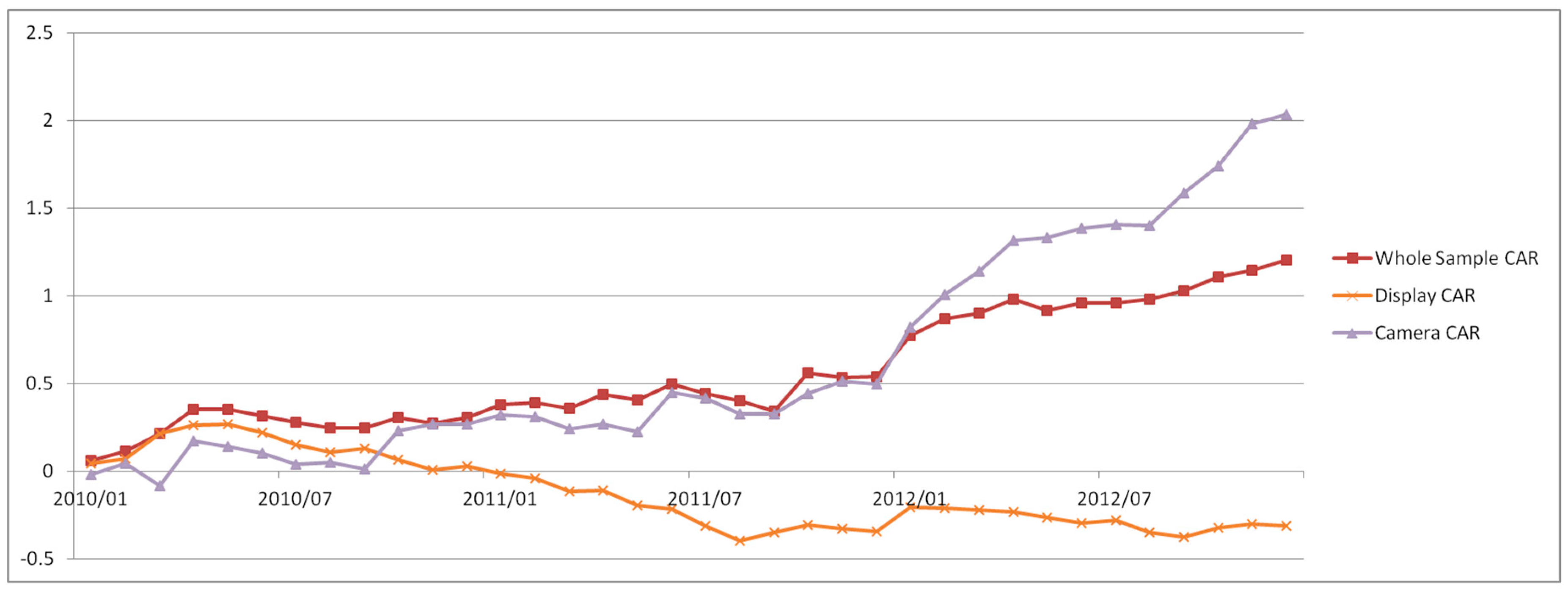
Figure 1 shows the average CAR with the evaluation period from 2007 to 2008 and the event period from 2010 to 2012. The average CAR of the entire sample and camera group tended to show an overall upward trend, with an average CAR of 100% and 200% at the end of 2012, respectively. However the average CAR of the display group was just over 0 in 2010 and −40% at the end of 2012. The average CAR of all the samples was generally statistically significant, but the values of the other two groups were not statistically significant.
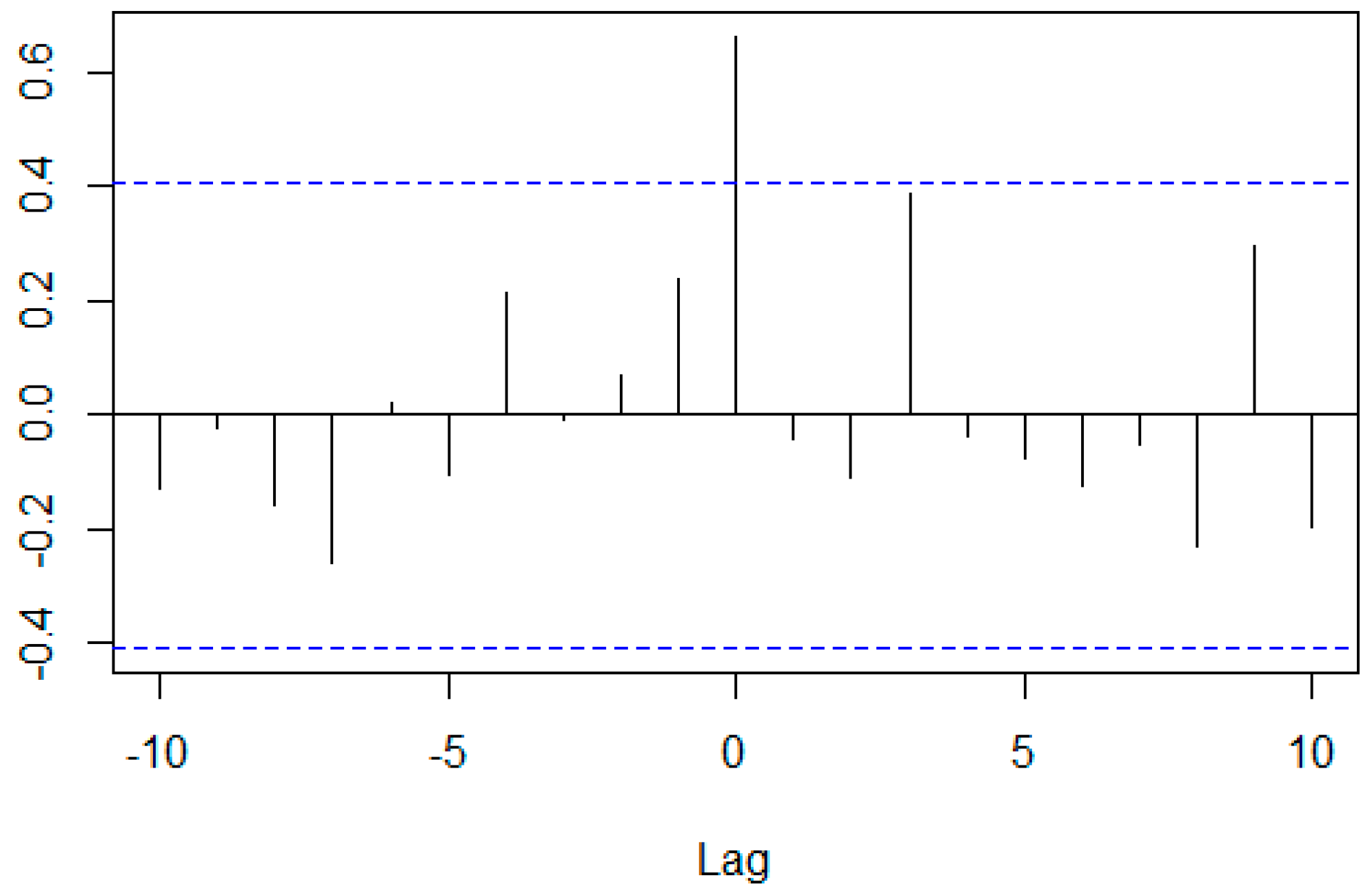
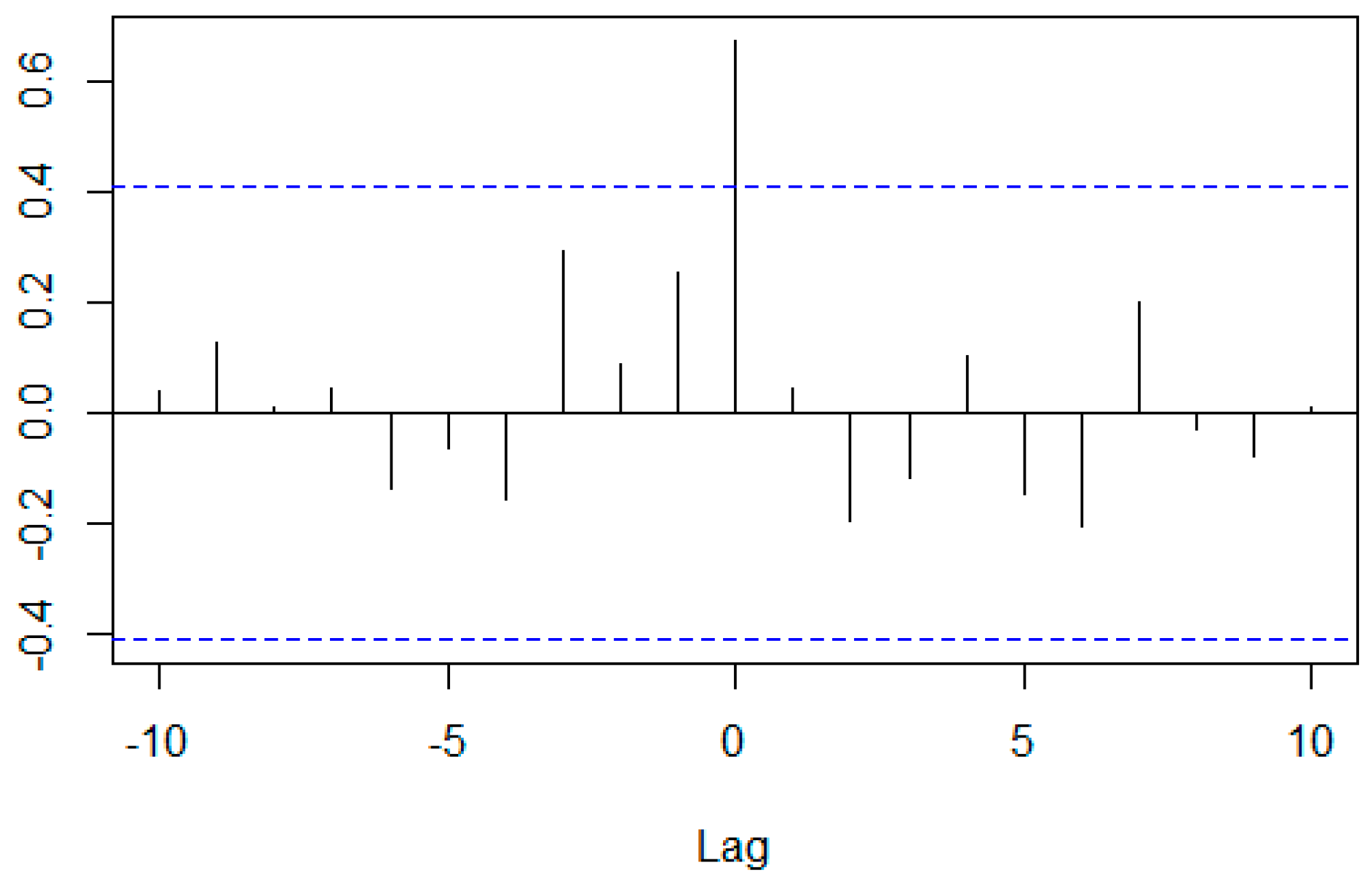
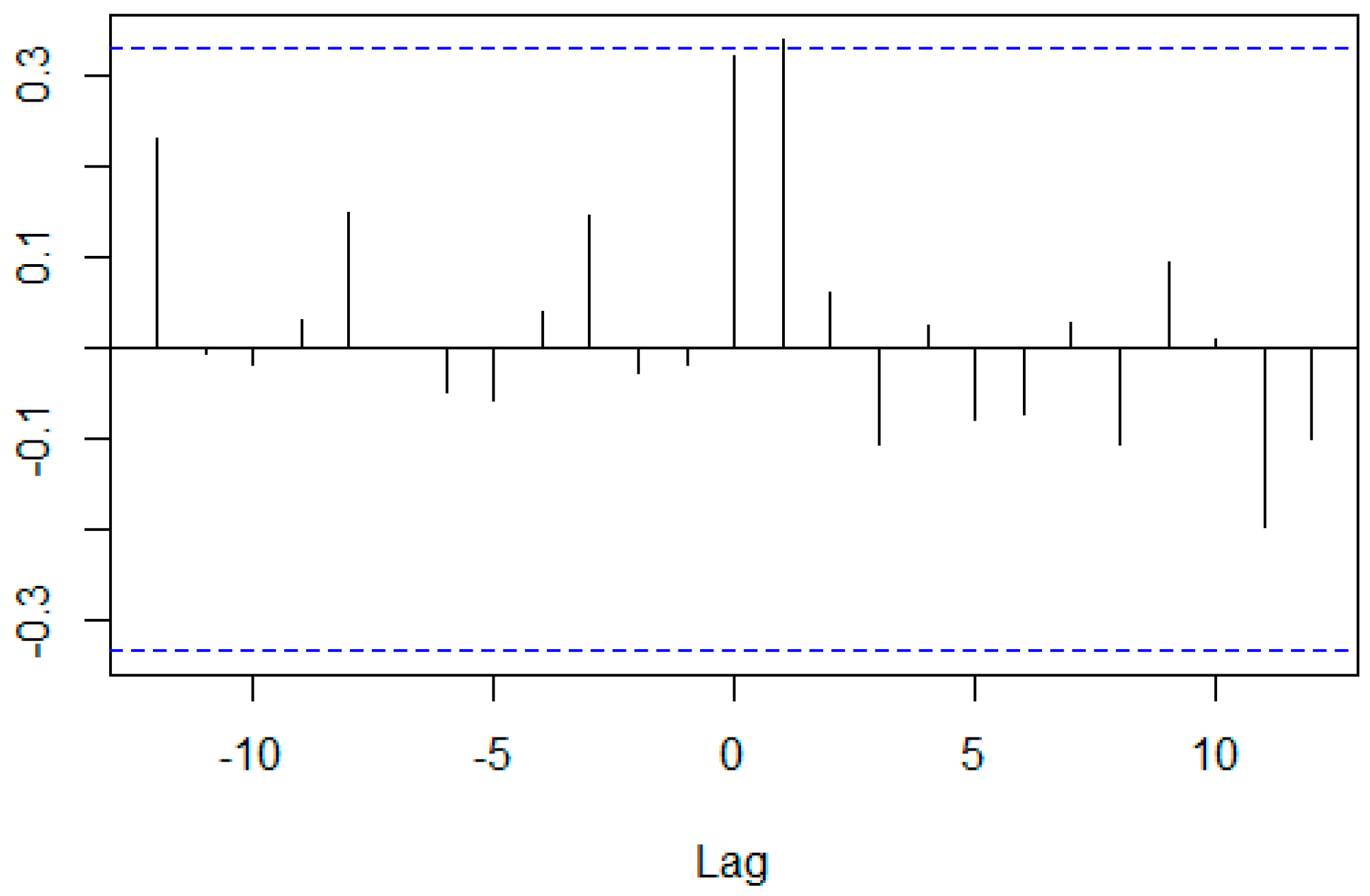
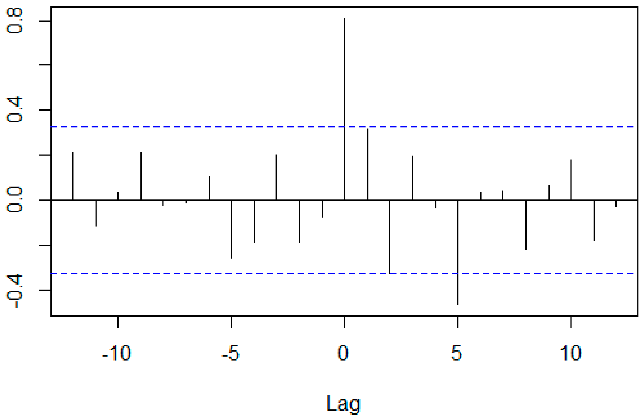
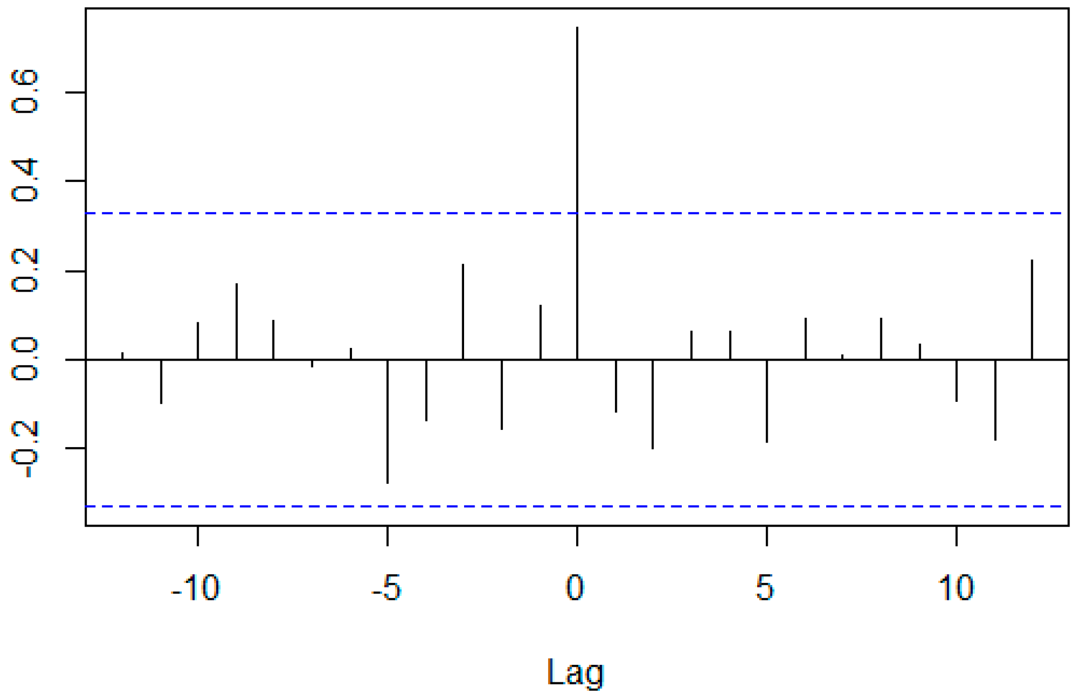
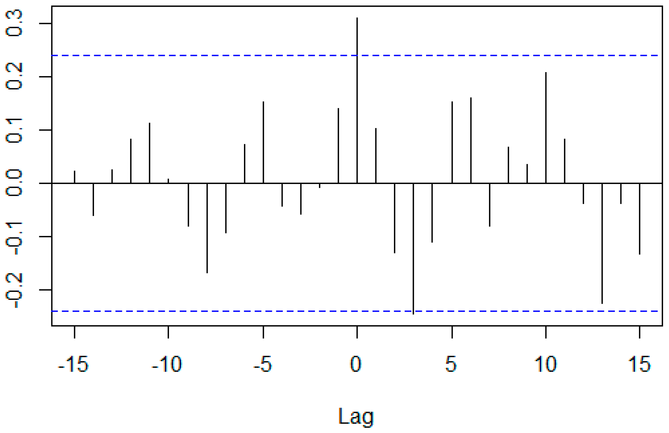
Table 2 and Figure 2, Figure 3 and Figure 4 provide detailed cross-correlation coefficients (CCCs) of the average CARs of the groups, the ARIMA model that was used when the average CARs were prewhitened, and the p-values of the prewhitened time series (TS) computed by the PP test. These show that CCCs for the entire sample and display combination, and for the entire sample and camera combination, were more than 0.65 when the lag was 0. Table 2 shows that all prewhitened data were stationary.

4.2. Average CAR for Evaluation Period: The Month in which Each Company Was Listed-Dec 2008, Event Period: Jan 2010–Dec 2012

Figure 5 shows the average CAR with the evaluation period from the month in which each company was listed to 2008, and the event period from 2010 to 2012. The average CAR of the entire sample group remained at around 30%, but then rose from September 2011, and the average CAR of the camera group also rose moderately until September 2011, after which it rose sharply. The average CAR of the display group showed an overall downward trend. However, in all three groups, the average CAR were generally not statistically significant.
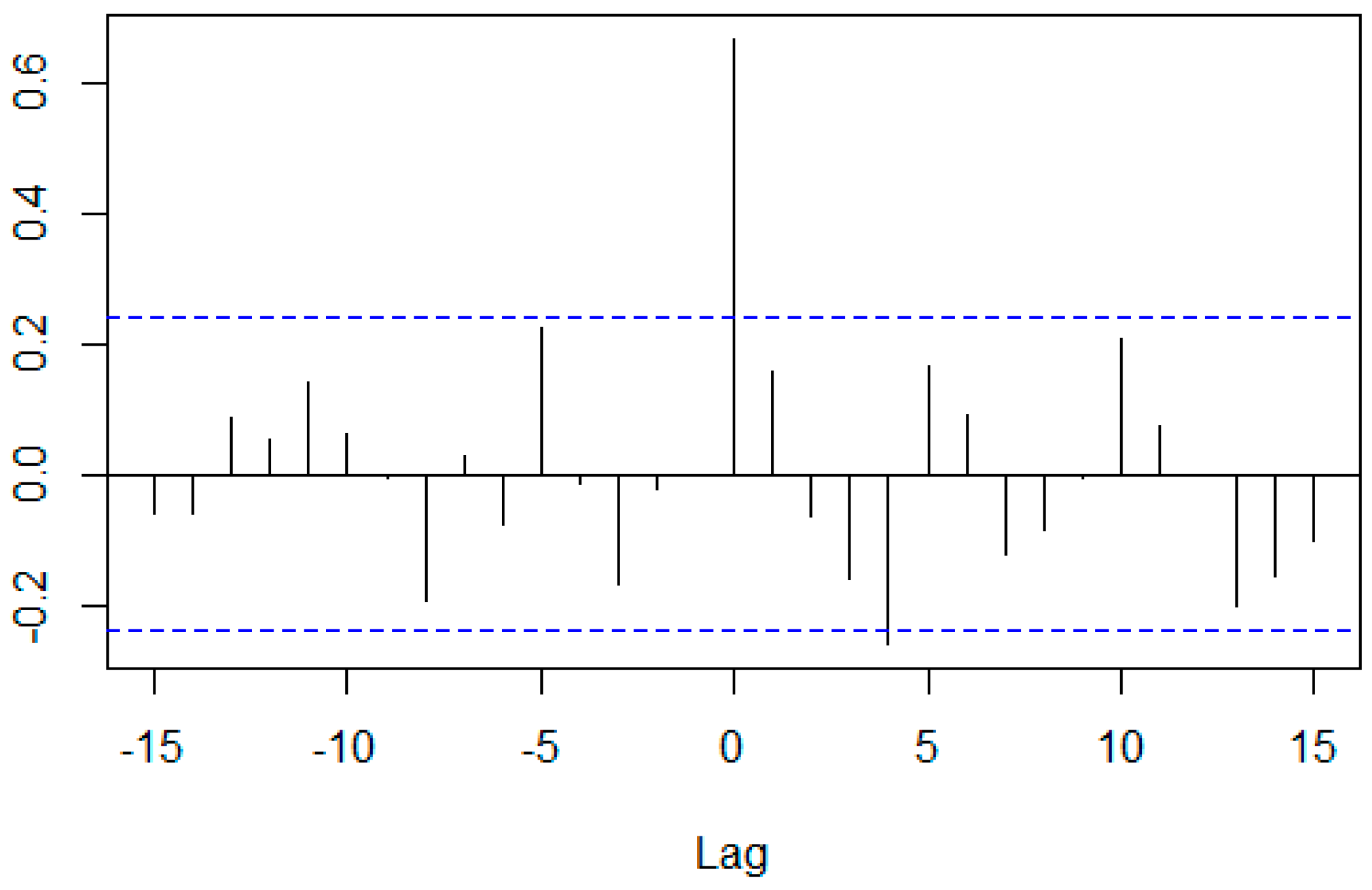
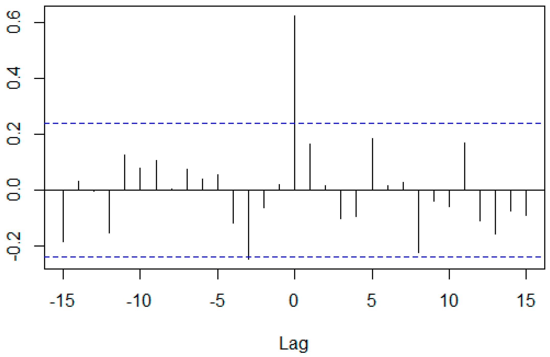
Table 3 and Figure 6, Figure 7 and Figure 8 show that CCCs for the entire sample and display combination, and for the entire sample and camera combination were more than 0.65 when the lag was 0. Table 3 indicates that all prewhitened data were stationary.

4.3. Average CAR for Evaluation Period: Jan 2010–Dec 2011, Event Period: Jan 2013–Jul 2018

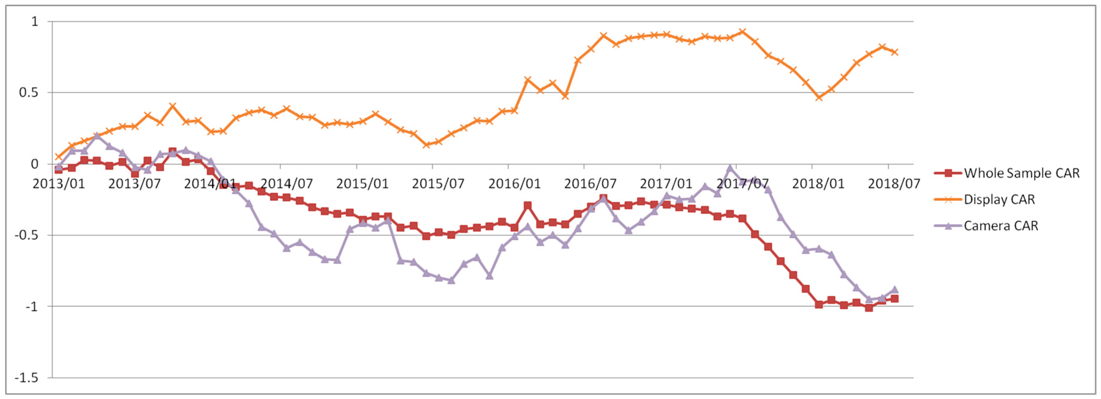
Figure 9 shows the average CAR with the evaluation period from 2010 to 2011 and the event period from January 2013 to July 2018. The average CAR of the entire sample group and the camera group gradually dropped until around August 2015, then gradually increased, and then dropped sharply from July 2017. The average CAR of the display group stabilized until June 2015 and then rose sharply. In this case, the average CAR in all three groups were generally not statistically significant.
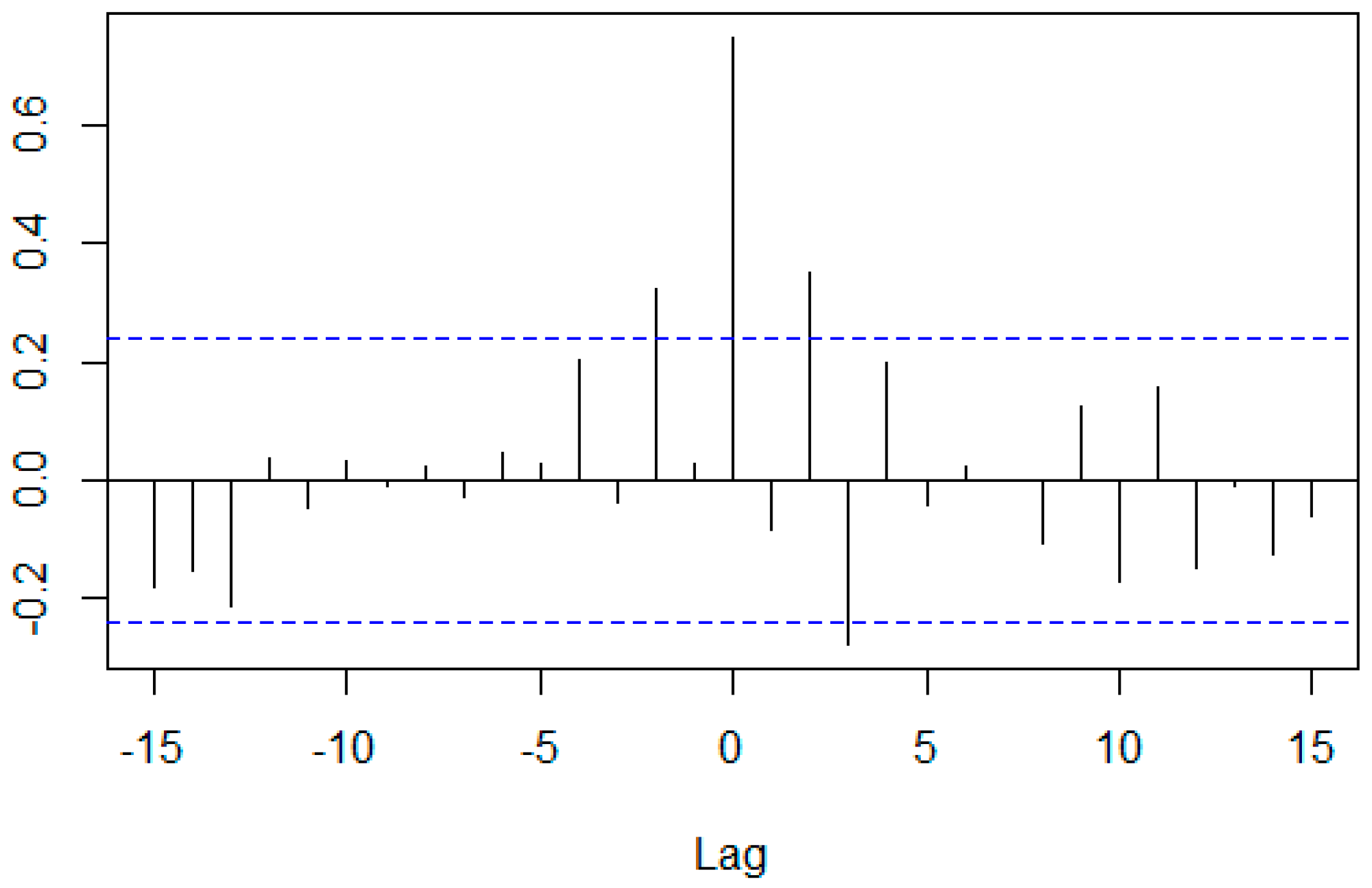
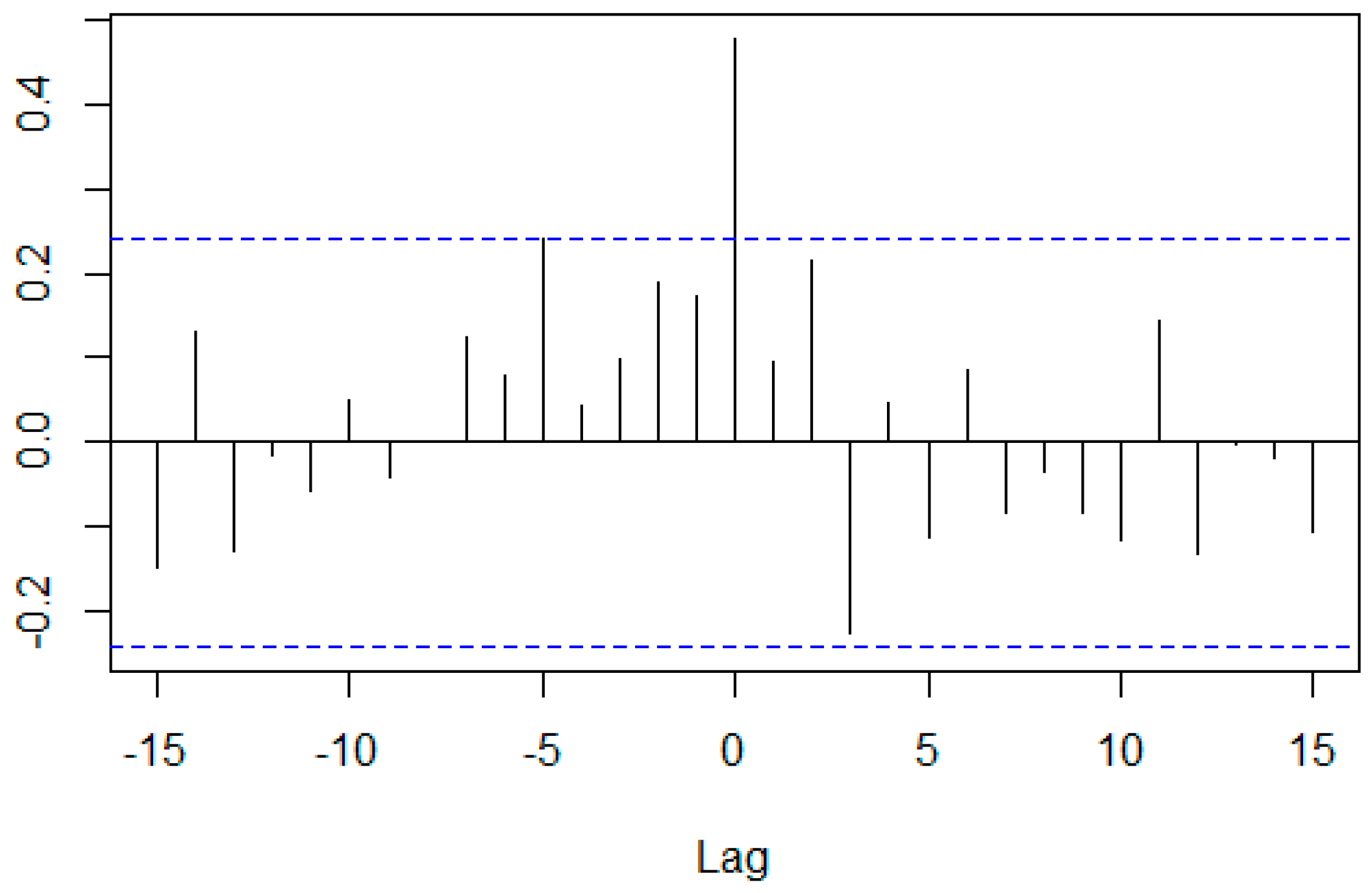
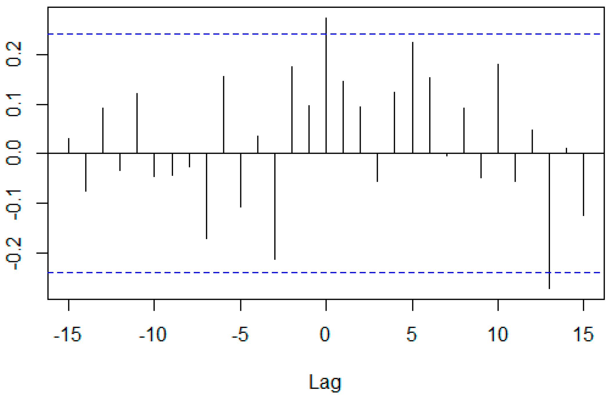
Table 4 and Figure 10, Figure 11 and Figure 12 show that CCCs for all combinations were positive when the lag was 0. However, CCC for the camera and the display combination was rather small when the lag was 0. Table 4 shows that all prewhitened data were stationary.

4.4. Average Buy-and-Hold Abnormal Returns (BHAR) for Jan 2010–Dec 2012

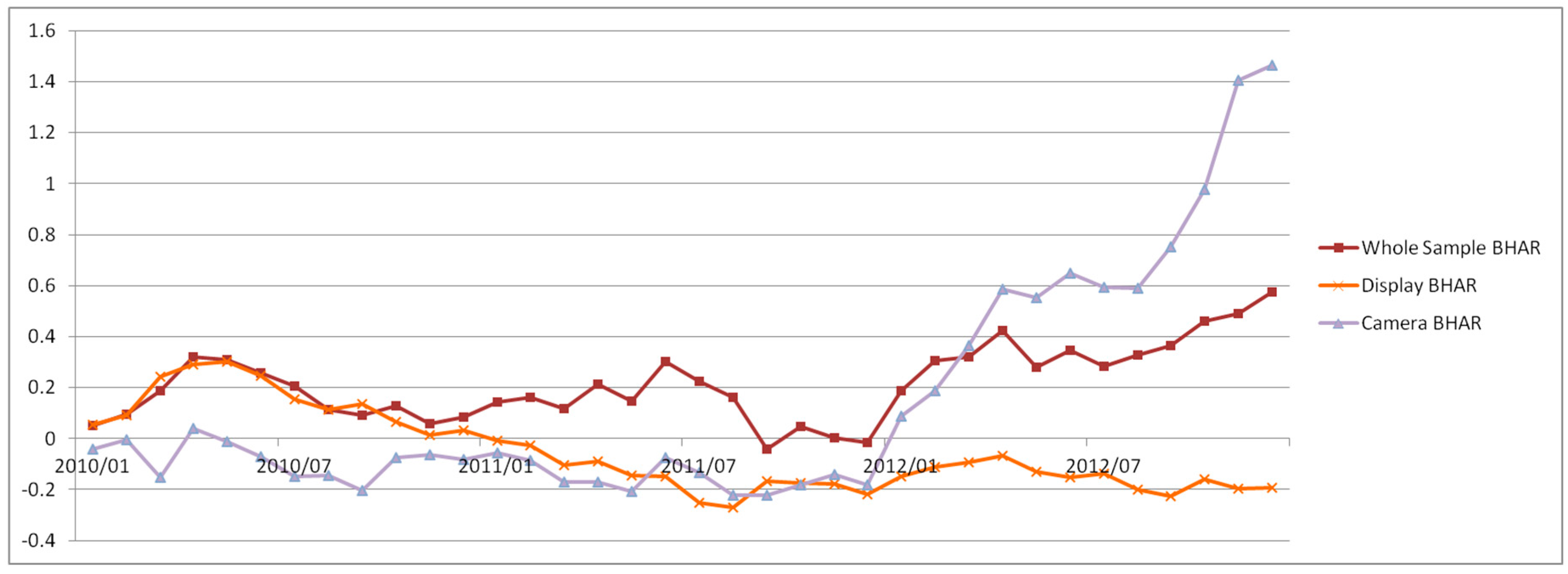
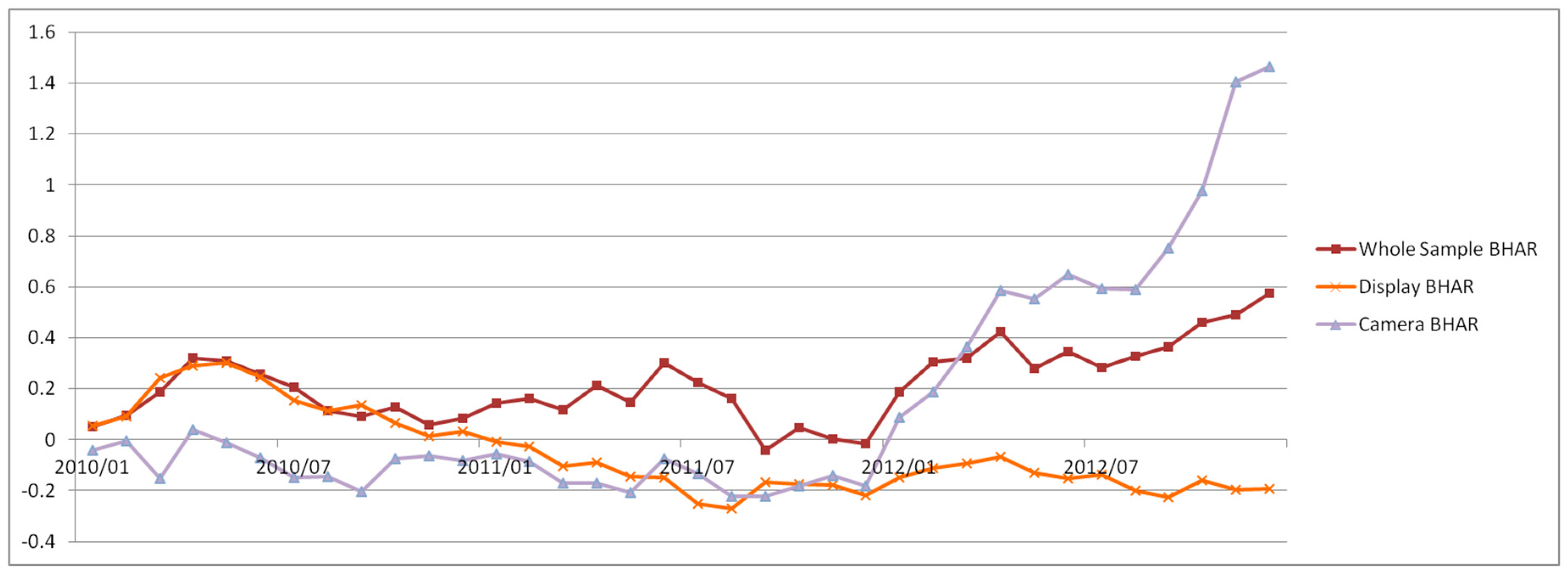
Figure 13 shows the average BHAR from 2010 to 2012. The average BHAR of the entire sample group continued to decline and to fluctuate until September 2011 and then rose continuously. The average BHAR of the camera group fluctuated between 0 and −20% in the early stage, but the average BHAR in January 2012 changed from negative to positive and rose sharply. The display group achieved an average BHAR of around 30% in May 2010, but it declined steadily after that. In this case, the average BHAR of all three groups were generally not statistically significant.
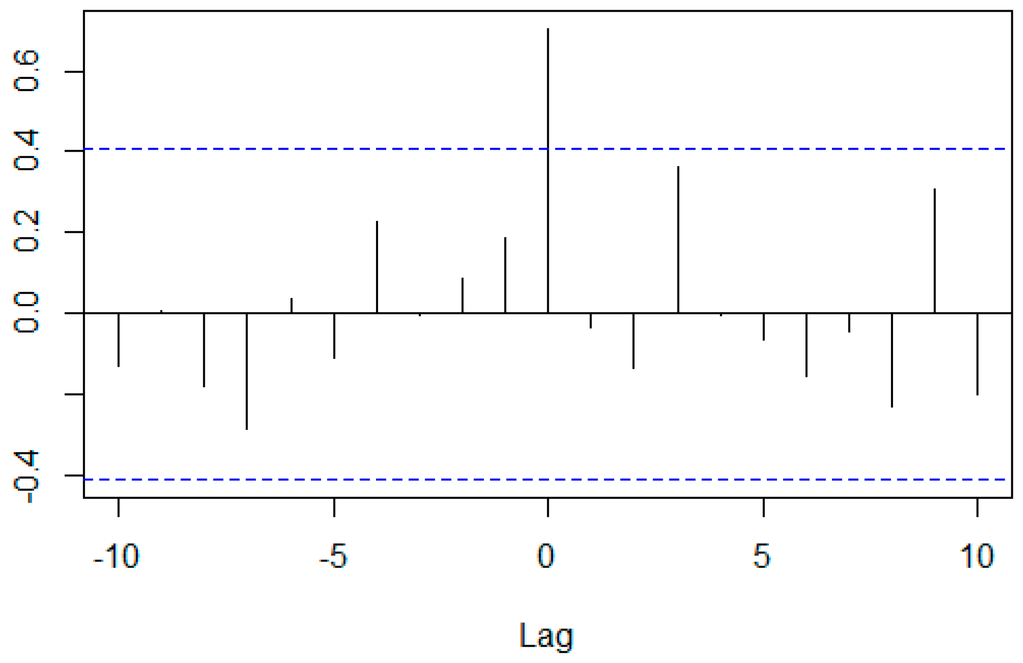
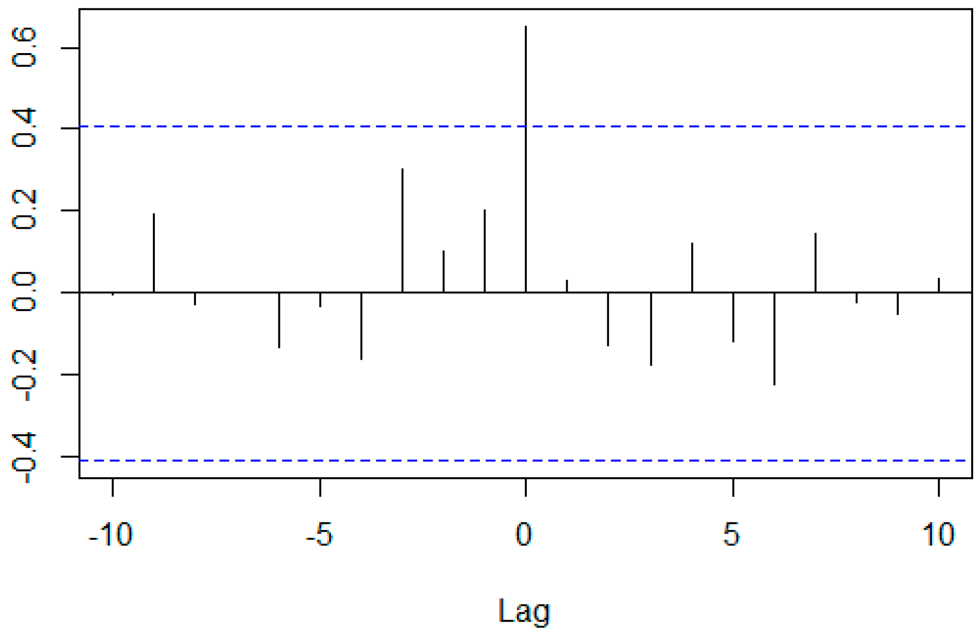
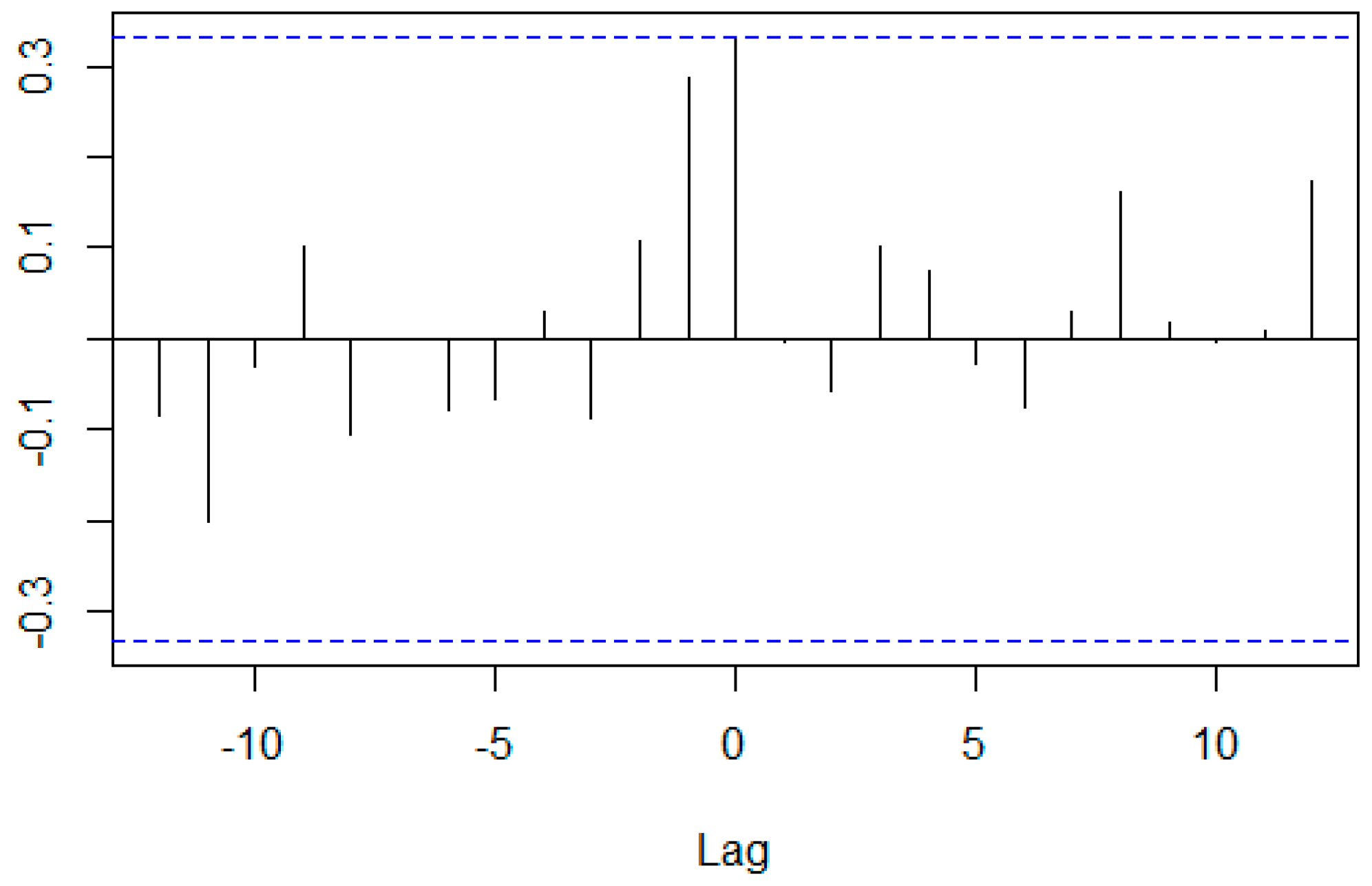
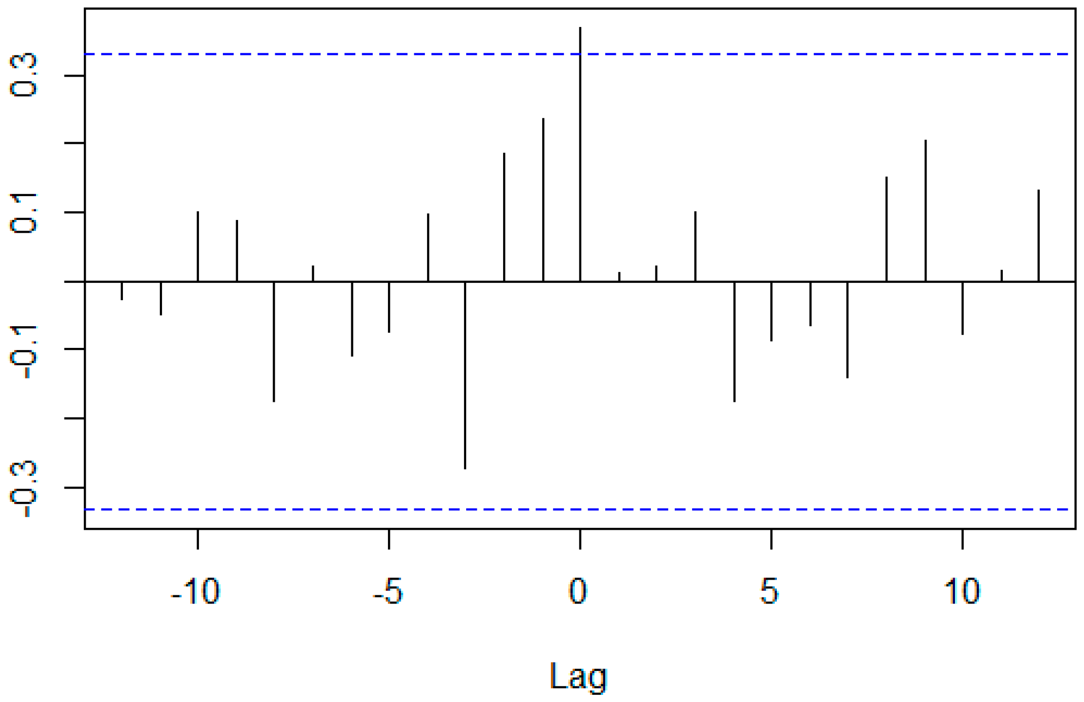
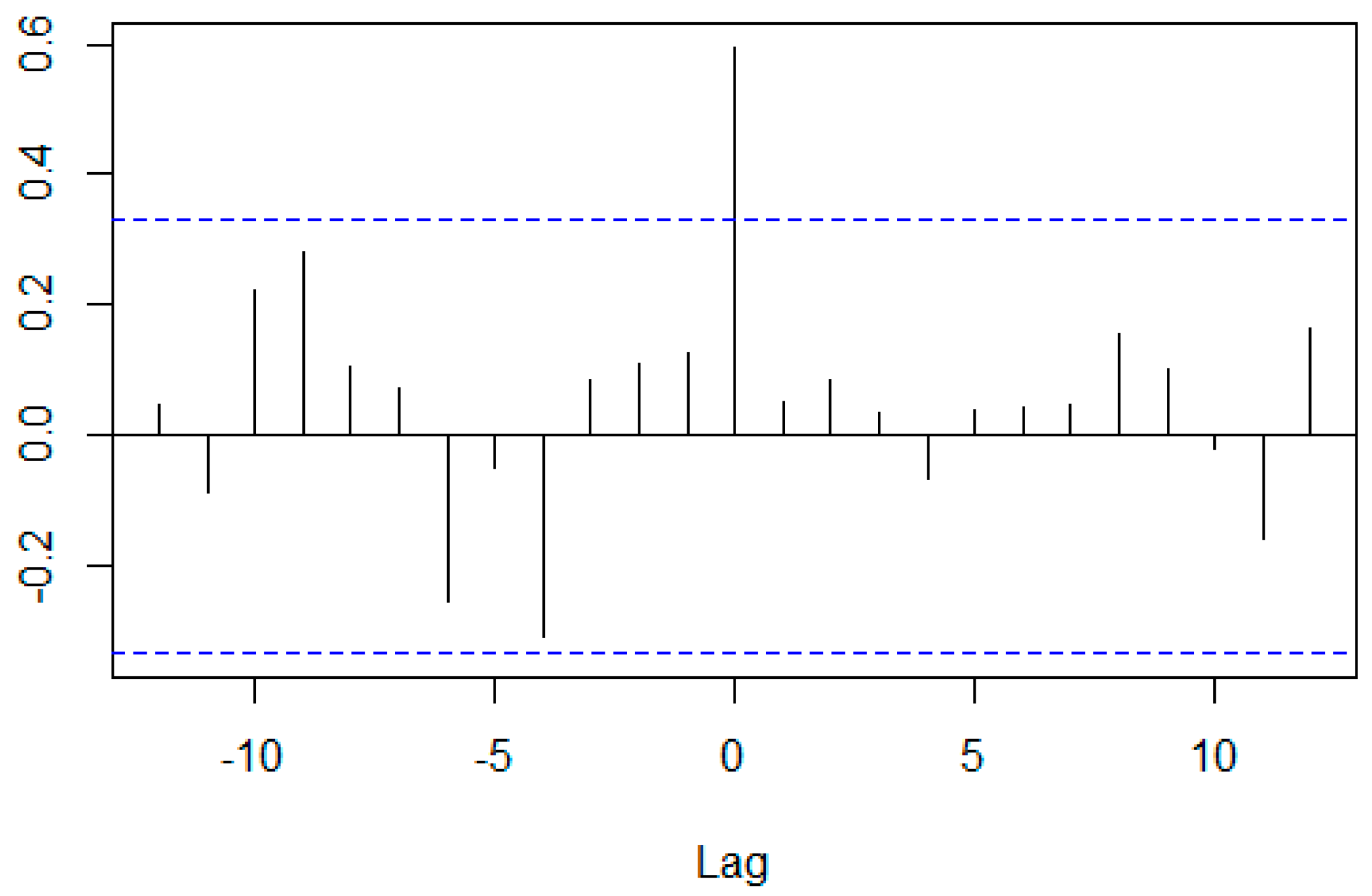
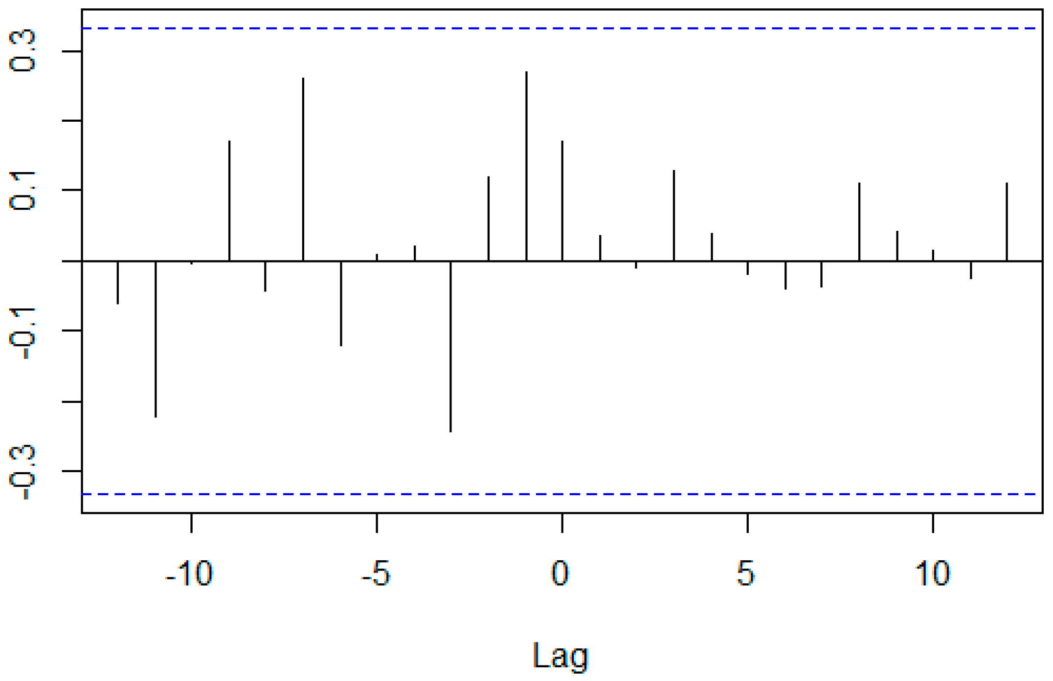
Table 5 and Figure 14, Figure 15 and Figure 16 show that CCCs for the entire sample and display combination, and for the entire sample and camera combination were more than 0.3 when the lag was 0. However, CCC for the camera and display combination was small when the lag was 0, and the CCC for the combination was the largest when the lag was −1. Table 5 shows that all prewhitened data were stationary.

4.5. Average BHAR for Jan 2013–Jul 2018

Figure 17 shows the average BHAR from Jan 2013 to Jul 2018. The average BHAR of the whole sample group fluctuated between 20% and −20%, but plummeted from July 2017 until January 2018. The average BHAR of the camera group fell steadily to around −85% in July 2015, followed by a fluctuating upward trend for the next two years, and the average BHAR of the display group fluctuated between 30% and −40%, falling sharply from July 2017. In this case, the average BHAR in all three groups were generally not statistically significant.
Table 6 and Figure 18, Figure 19 and Figure 20 show that CCC for the entire sample and display combination was more than 0.65 when the lag was 0. However, CCCs for other groups was around 0.3 when the lag was 0. Table 6 shows that all the prewhitened data were stationary.

5. Main Results

For the event period 2010–2012, there is only a difference in the value of the calculation according to the evaluation period, and the average CAR of the entire sample group and the camera firm group tends to increase overall, regardless of the evaluation period. However, the average CAR of the display group tends to stabilize after declining until the second half of 2011. The average BHAR over the same period shows the same results.
When the average CAR and the average BHAR in the “Peak of Inflated Expectations” stage are considered, if a portion of the companies whose major business is related to the technology that exists in the “Peak of Inflated Expectations” stage, such as augmented reality, is set as a portfolio, the average CAR and BHAR of the portfolio do not have any special tendency.
However, it is evident that the portfolios of all companies whose main business is the technology that exists in the “Peak of Inflated Expectations” stage are obtaining better returns than the benchmark. Investors can achieve better investment opportunities by using this result, and financial companies are likely to gain new financial techniques, such as a new type of fund and a technology-based rather than an industry-based sector index. Next, because the average BHAR of the entire sample group and the display company group periodically changes between positive and negative in the “Trough of Disillusionment”, it is difficult to ascertain a certain relationship between the average rate of increase in the share price of each group and the benchmark increase rate, and only the camera company group has a lower return than the benchmark.
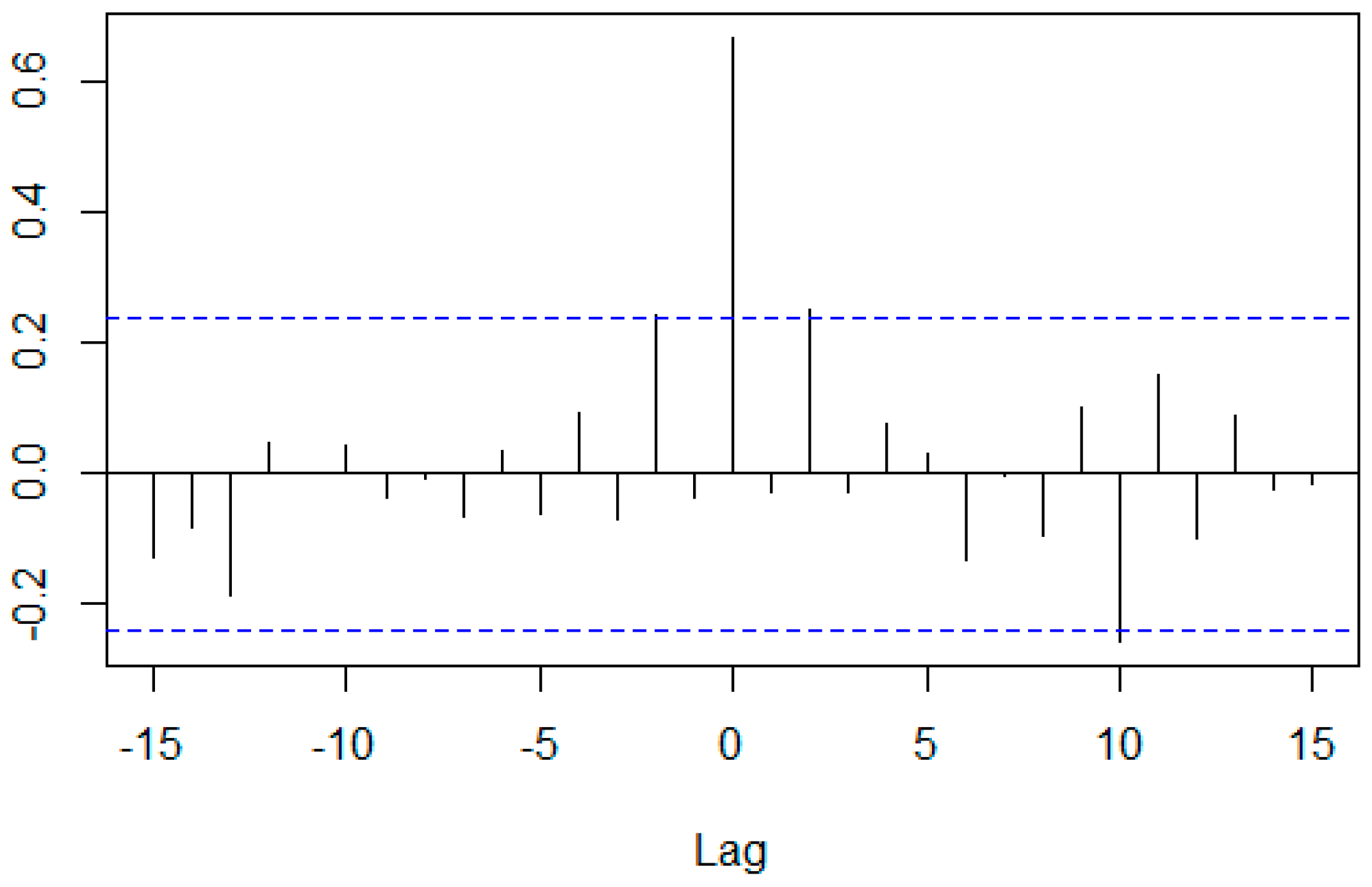
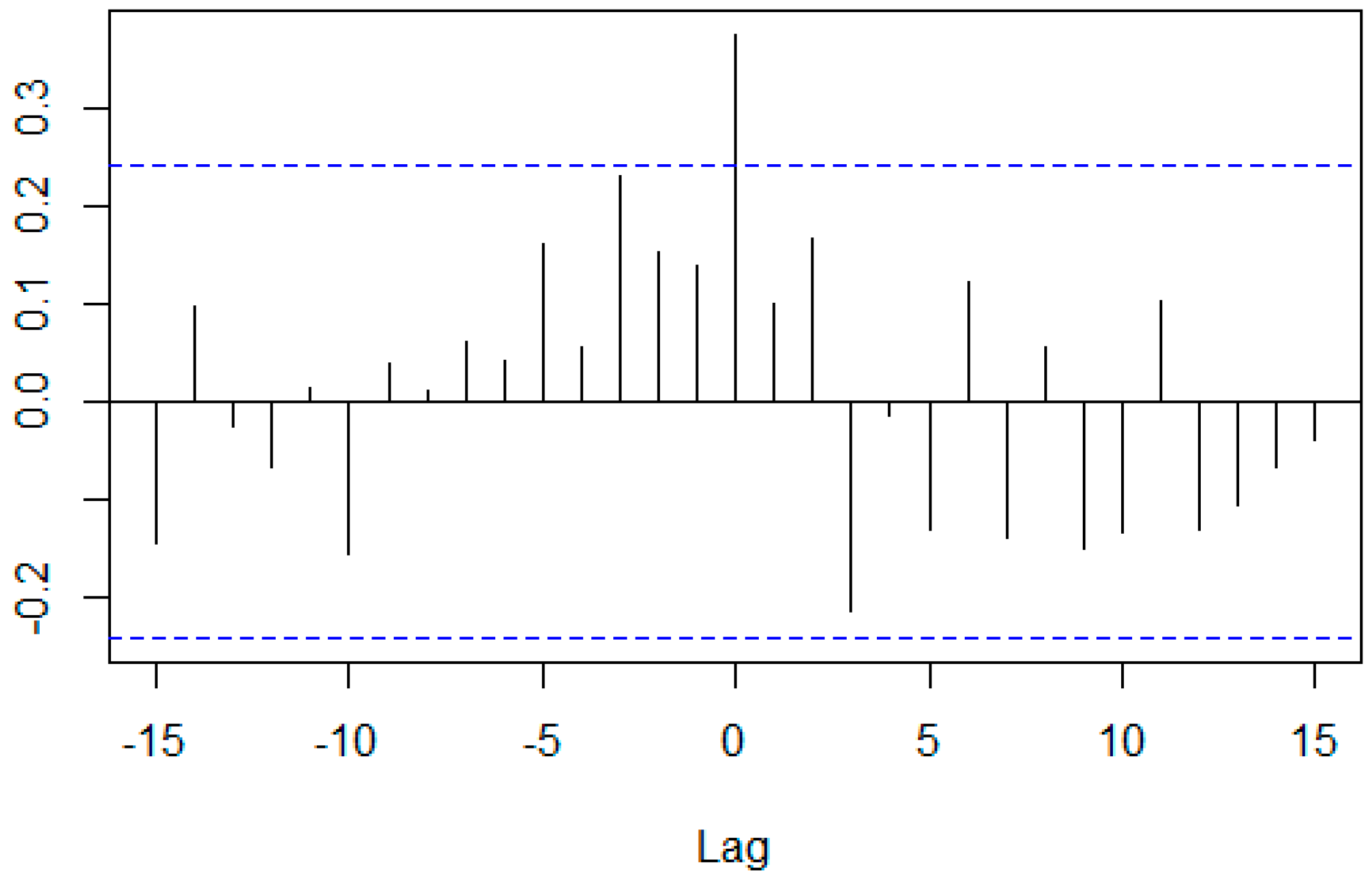
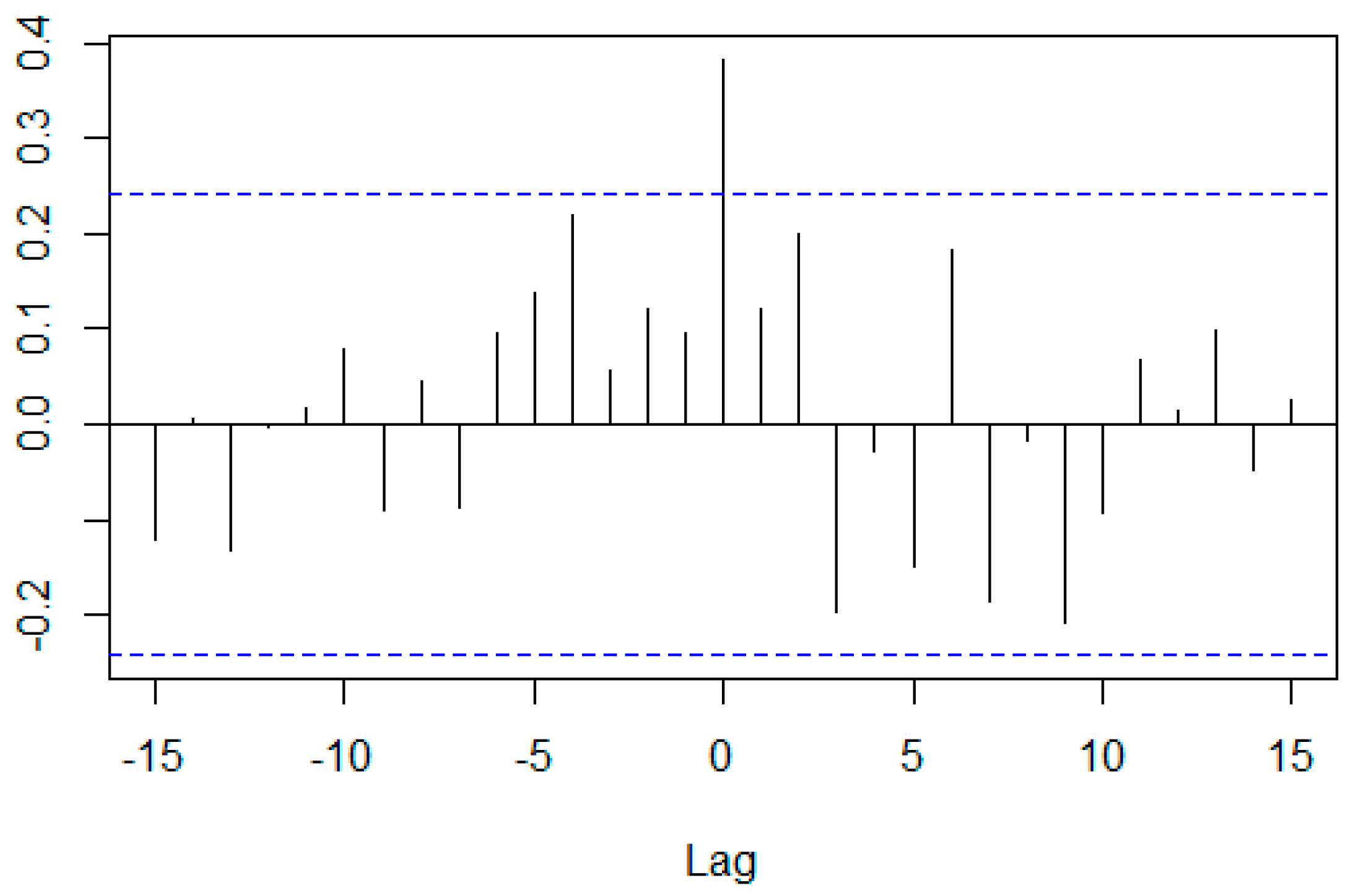
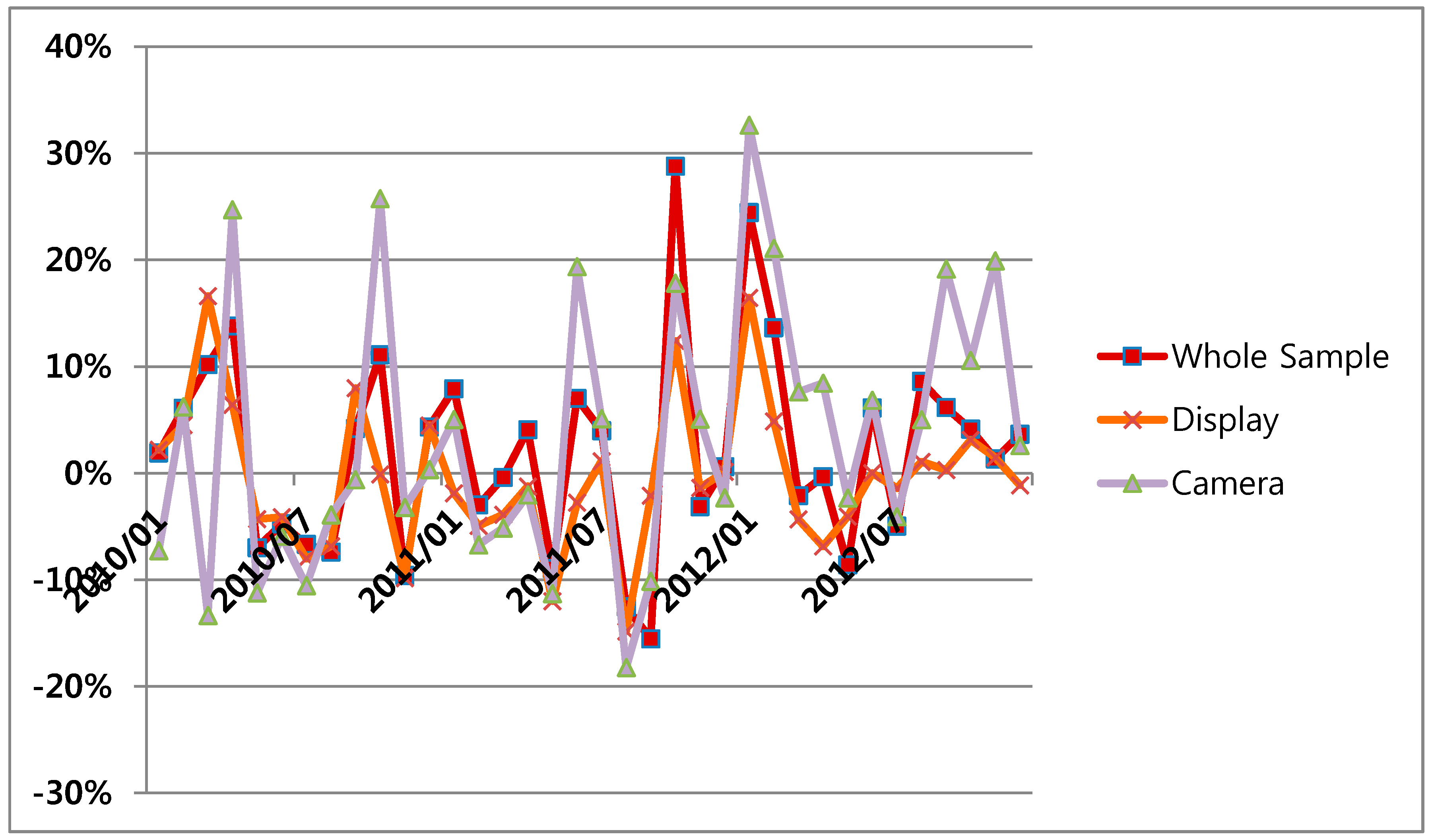
Although CCCs between the average CAR and BHAR of each group at lag = 0 are positive, it was shown that there was sometimes a large difference between the average CARs of each group and between the average BHARs of each group in the two stages. However, a common trend was assumed. For example, the average BHARs of each group tended to fall from the second half of 2013 to the first half of 2015. This can be seen more clearly by calculating the cross-correlation coefficient between the monthly rate of return of each group. Figure 21 and Figure 22 show the monthly rate of return of each group. Figure 23, Figure 24, Figure 25, Figure 26, Figure 27 and Figure 28 and Table 7 present the cross-correlation coefficient between the monthly rate of return. The cross-correlation coefficient was positive and very large, especially for the combination with the entire sample. As the average CAR and the average BHAR have cumulative properties, they are likely to have a common trend, and the difference between the average CAR (or BHAR) of a group and the average CAR (or BHAR) of the other group is not expected to be large.
These show that there is a certain positive correlation between the stock price increase rate of the entire sample group and the detailed technology group during the two phases of the Hype Cycle. It can be assumed that there may be a certain cycle of the share price of companies that has a technology that is in the two phases of the Hype Cycle, or that there is an unknown detailed phase in the two phases of the Hype Cycle. It is also possible that the process of shifting from the “Trough of Disillusionment” phase to the “Slope of Enlightenment” phase, where the technology is accepted and utilized, is affected by the process of change in the users’ perception of augmented reality (Linden and Fenn 2003). It is expected to enable new types of stock trading skills, such as technology-based pair trading or statistical arbitrage trading that is based on this kind of positive correlation (Avellaneda and Lee 2008). If the budget is not available, in order to mimic a portfolio of the entire sample group, a portfolio of detailed technology groups during the two phases can be used instead of a portfolio of the entire sample group.

6. Conclusions and Implications

This paper is primarily aimed at grasping the relationship between a technology at a specific stage of Gartner’s Hype Cycle, which shows the degree of recognition of a technology over time, and the stock price of a company that mainly deals with the technology.
To understand this relationship, we used the event study technique to analyze the stock price of companies that mainly use augmented reality and that satisfy certain conditions of the Hype Cycle.
We obtained interesting results through this analysis. In the “Peak of Inflated Expectations” stage, the portfolios of all companies under consideration were able to obtain higher returns than the benchmark, but when the companies were classified into groups of detailed technology that forms augmented reality, some of the groups obtained more than the benchmark and others less.
For the “Trough of Disillusionment” phase, the value that was computed by the event study method was positive or negative depending on the applied event study technique, evaluation period, and the detailed technology that was used to classify the companies.
However, during the “Trough of Disillusionment” phase, there was a positive correlation of the average abnormal return and average BHAR between groups.
The results of this study can be used in various fields. First, they can be used by companies to determine how to distribute their R&D budget statistically in order to raise their stock prices. Second, investors can use this study as a basis to judge how to achieve high profits in a stable manner. Third, financial companies can use these results to create new financial products. In particular, this application will be more usable if it is used together with the ideas that are presented in other papers.
For example, by analyzing papers and patent data, it is possible to predict the stage of the Hype Cycle of a specific technology and predict the stock price increase ratio of the companies to the benchmark using the technology (Kim et al. 2012; Yoo 2004; Suh and Kim 2016)
When considering that considerable efforts have been made to get the technology to be accepted well by the public during the “Trough of Disillusionment” phase, and the affirmation and negativity of news keywords are correlated with the stock price fluctuation (Schumaker and Chen 2009; Kim 2016), we can predict the cycle of average abnormal return and average BHAR of some portfolios within the phase by analyzing the relationship between the positive and negative levels of average abnormal return and average BHAR of each group during the phase and the positive and negative degree of news keywords.
However, this study suffered from some limitations. Firstly, this study attempted to identify a relationship between a stock price and a technology in the “Peak of Inflated Expectations” and “Trough of Disillusionment” phases of the Hype Cycle, because (1) there were few technologies that satisfy specific conditions suitable for the research regarding the Hype Cycle; (2) the first phase of the Hype Cycle should be utilized as the evaluation period; and, (3) there were few technologies that were in the “Slope of Enlightenment” stage or the “Plateau of Productivity” stage of the Hype Cycle.
If we consider additional technologies besides the technologies published by Gartner Inc. based on additional criteria in the future (Kim et al. 2012), we can apply the event study method to companies that deal mainly with the technologies in the “Slope of Enlightenment” and “Plateau of Productivity” phases. Secondly, the number of companies analyzed in this paper is small, especially the number of members in Group B and Group C. As the history of KOSDAQ is not long and there are only a few companies listed on the KOSDAQ, the number of companies that meet the conditions is small. It would be more reliable if studies on a similar topic to this study were conducted in other stock markets, such as the NASDAQ, where more companies with similar conditions could be listed.

Funding

This research received no external funding.

Conflicts of Interest

The author declares no conflict of interest.

References

  1. Avellaneda, Marco, and Jeong-Hyun Lee. 2008. Statistical Arbitrage in the U.S. Equities Market. Available online: https://www.math.nyu.edu/faculty/avellane/AvellanedaLeeStatArb071008.pdf (accessed on 4 April 2018).[Green Version]
  2. Baek, Jong-Geun. 2005. Samsung Electronics’ patent trend and correlation with stock price. Patent 21 62: 16–21. [Google Scholar]
  3. Chadha, Alka, and Raffaele Oriani. 2010. R&D market value under weak intellectual property rights protection: The case of India. Scientometrics 82: 59–74. [Google Scholar] [CrossRef]
  4. Cho, Sang Sup, and Jang Woo Lee. 2003. A Relationship on the IT Technology and IT Stock in Korea: A Preliminary Looking. Electronics and Telecommunications Trends 18: 89–98. [Google Scholar] [CrossRef]
  5. Daizadeh, Iraj. 2007. Issued US patents, patent-related global academic and media publications, and the US market indices are inter-correlated, with varying growth patterns. Scientometrics 73: 29–36. [Google Scholar] [CrossRef]
  6. Greenwood, Jeremy, and Boyan Jovanovic. 1999. The Information-Technology Revolution and the Stock Market. American Economic Review 89: 116–22. [Google Scholar] [CrossRef]
  7. Hobijn, Bart, and Boyan Jovanovic. 2001. The Information-Technology Revolution and the Stock Market: Evidence. American Economic Review 91: 1203–20. [Google Scholar] [CrossRef]
  8. Jovanovic, Boyan, and Peter L. Rousseau. 2003. The Two Technological Revolutions. Journal of the European Economic Association 1: 419–28. [Google Scholar] [CrossRef]
  9. Jung, HyeongJong, and Si-woo Kim. 2017. Investment Ideas from Market Capitalization Changes. Korea Investment & Securities Co., Ltd. Available online: http://file.mk.co.kr/imss/write/20170713102204__00.pdf (accessed on 1 April 2018).
  10. Kim, Gi-Beom. 2016. A Study on Stock Price Prediction System for Bio Medicine Sector using Opinion Mining and Machine Learning. Ph.D. thesis, Soongsil University, Seoul, Korea. [Google Scholar]
  11. Kim, MinJo, and HyeongChan Jung. 1995. A Disclosure of Patent Application and Share Value. The Korean Journal of Financial Management 12: 121–142. [Google Scholar]
  12. Kim, Jinhyung, Myunggwon Hwang, Do-Heon Jeong, and Hanmin Jung. 2012. Technology trends analysis and forecasting application based on decision tree and statistical feature analysis. Expert Systems with Applications 39: 12618–25. [Google Scholar] [CrossRef]
  13. Linden, Alexander, and Jackie Fenn. 2003. Understanding Gartner’s Hype Cycles. Gartner. Available online: http://www.bus.umich.edu/KresgePublic/Journals/Gartner/research/115200/115274/115274.pdf (accessed on 6 April 2018).
  14. Mazzucato, Mariana. 2002. The PC Industry: New Economy or Early Life-Cycle? Review of Economic Dynamics 5: 318–45. [Google Scholar] [CrossRef]
  15. Mazzucato, Mariana. 2003. Risk, variety and volatility: Growth, innovation and stock prices in early industry evolution. Journal of Evolutionary Economics 13: 491–512. [Google Scholar] [CrossRef]
  16. Mazzucato, Mariana. 2006. Innovation and Stock Prices: A Review of some Recent Work. Revue de l’OFCE, Presses de Sciences-Po 97: 159–79. [Google Scholar] [CrossRef]
  17. Mazzucato, Mariana, and Willi Semmler. 1999. Market share instability and stock price volatility during the industry life-cycle: The US automobile industry. Journal of Evolutionary Economics 9: 67–96. [Google Scholar] [CrossRef]
  18. Nicholas, Tom. 2008. Does Innovation Cause Stock Market Runups? Evidence from the Great Crash. American Economic Review 98: 1370–96. [Google Scholar] [CrossRef]
  19. Park, Jung-Hee, In-Gook Yeo, and Jong-Beom Moon. 2011. Effect of Small and Medium Businesses’ R&D Intensity and Patents on Their P/E Ratios. Journal of Korea Technology Innovation Society 14: 466–87. [Google Scholar]
  20. Park, HyunWoo, WongHyun Sung, JeomYeol Yun, GeunIm Lee, CheulMin Jung, HanJung Ju, and JeongUn Choi. 2014. Technology Valuation Practice Guide. Ministry of Trade, Industry and Energy. Available online: http://www.valuation.or.kr/assess/%EA%B8%B0%EC%88%A0%EA%B0%80%EC%B9%98%ED%8F%89%EA%B0%80_%EC%8B%A4%EB%AC%B4%EA%B0%80%EC%9D%B4%EB%93%9C(2014).pdf (accessed on 6 March 2018).
  21. Pástor, Ľuboš, and Pietro Veronesi. 2009. Technological Revolutions and Stock Prices. American Economic Review 99: 1451–83. [Google Scholar] [CrossRef]
  22. Schumaker, Robert P., and Hsinchun Chen. 2009. Textual analysis of stock market prediction using breaking financial news: The AZFin text system. ACM Transactions on Information Systems (TOIS) 27: 12. [Google Scholar] [CrossRef]
  23. Shah, Priyanka, and Parvinder Arora. 2014. M&A Announcements and Their Effect on Return to Shareholders: An Event Study. Accounting and Finance Research 3: 170. [Google Scholar] [CrossRef]
  24. Suh, Yoonkyo, and SiJeong Kim. 2016. An Exploratory Study of Technology Planning Using Content Analysis & Hype Cycle. Journal of Korea Technology Innovation Society 19: 80–104. [Google Scholar]
  25. Thomas, Patrick. 2001. A relationship between technology indicators and stock market performance. Scientometrics 51: 319–33. [Google Scholar] [CrossRef]
  26. Yoo, Sun-Hi. 2004. A study on the Forecasting Model of Technology Life Cycles by Analysis of US Patent Citation. Journal of Information Management 35: 93–112. [Google Scholar] [CrossRef]
1
Idiosyncratic risk was defined as the ratio between the volatility of firm-level returns over the volatility of market level return volatility.
2
The ARIMA model was chosen based on the Akaike’s information criterion (AIC) and Bayesian information criterion (BIC).
3
The average CAR and the average BHAR for a specific month in a chart are the average of the CAR and the BHAR for each firm from the first month shown in the charts to the specific month.
4
The minimum p-value calculated by PP test in R program is 0.01. The real p-value could be smaller than 0.01.
5
The ma, sar, and drift mean Θ of MA model, Φ of seasonal AR model and drift of ARIMA model, respectively.
6
TS1 refers to the p-value of the first time series of a Group Combination computed by the PP test and TS2 refers to the p-value of the second time series of a Group Combination computed by the PP test. For example, the TS1 of the whole sample and display group is the p-value of a whole sample time series computed by the PP test, and the TS2 of the whole sample and display group is the p-value of a display time series computed by the PP test.
7
The horizontal blue lines are the approximate 95% confidence interval.
Figure 1. Average CAR for Evaluation period: 2007–2008, Event period: 2010–20123.
Ijfs 06 00088 g001
Figure 2. Cross-correlation coefficient between the average CAR of the whole sample group and the average CAR of the display group for Evaluation period: 2007–2008, Event period: 2010–20127.
Ijfs 06 00088 g002
Figure 3. Cross-correlation coefficient between the average CAR of the whole sample group and the average CAR of the camera group for Evaluation period: 2007–2008, Event period: 2010–2012.
Ijfs 06 00088 g003
Figure 4. Cross-correlation coefficient between the average CAR of the camera group and the average CAR of the display group for Evaluation period: 2007–2008, Event period: 2010–2012.
Ijfs 06 00088 g004
Figure 5. Average CAR for evaluation period: the month in which each company was listed-2008, Event period: 2010–2012.
Ijfs 06 00088 g005
Figure 6. Cross-correlation coefficient between the average CAR of the whole sample group and the average CAR of the display group for Evaluation period: the month in which each company was listed-2008, Event period: 2010–2012.
Ijfs 06 00088 g006
Figure 7. Cross-correlation coefficient between the average CAR of the whole sample group and the average CAR of the camera group for Evaluation period: the month in which each company was listed-2008, Event period: 2010–2012.
Ijfs 06 00088 g007
Figure 8. Cross-correlation coefficient between the average CAR of the camera group and the average CAR of the display group for Evaluation period: the month in which each company was listed-2008, Event period: 2010–2012.
Ijfs 06 00088 g008
Figure 9. Average CAR for Evaluation period: 2010–2011, Event period: Jan 2013–Jul 2018.
Ijfs 06 00088 g009
Figure 10. Cross-correlation coefficient between the average CAR of the whole sample group and the average CAR of the display group for Evaluation period: Jan 2010–Dec 2011, Event period: Jan 2013–Jul 2018.
Ijfs 06 00088 g010
Figure 11. Cross-correlation coefficient between the average CAR of the whole sample group and the average CAR of the camera group for Evaluation period: Jan 2010–Dec 2011, Event period: Jan 2013–Jul 2018.
Ijfs 06 00088 g011
Figure 12. Cross-correlation coefficient between the average CAR of the camera group and the average CAR of the display group for Evaluation period: Jan 2010–Dec 2011, Event period: Jan 2013–Jul 2018.
Ijfs 06 00088 g012
Figure 13. Average BHAR for 2010–2012.
Ijfs 06 00088 g013
Figure 14. Cross-correlation coefficient between the average BHAR of the whole sample group and the average BHAR of the display group for Jan 2010–Dec 2012.
Ijfs 06 00088 g014
Figure 15. Cross-correlation coefficient between the average BHAR of the whole sample group and the average BHAR of the camera group for Jan 2010–Dec 2012.
Ijfs 06 00088 g015
Figure 16. Cross-correlation coefficient between the average BHAR of the camera group and the average BHAR of the display group for Jan 2010–Dec 2012.
Ijfs 06 00088 g016
Figure 17. Average BHAR for Jan 2013–Jul 2018.
Ijfs 06 00088 g017
Figure 18. Cross-correlation coefficient between the average BHAR of the whole sample group and the average BHAR of the display group for Jan 2013–Jul 2018.
Ijfs 06 00088 g018
Figure 19. Cross-correlation coefficient between the average BHAR of the whole sample group and the average BHAR of the camera group for Jan 2013–Jul 2018.
Ijfs 06 00088 g019
Figure 20. Cross-correlation coefficient between the average BHAR of the camera group and the average BHAR of the display group for Jan 2013–Jul 2018.
Ijfs 06 00088 g020
Figure 21. Monthly rate of return for Jan 2010–Dec 2012.
Ijfs 06 00088 g021
Figure 22. Monthly rate of return for Jan 2013–Jul 2018.
Ijfs 06 00088 g022
Figure 23. Cross-correlation coefficient between monthly rate of return of the whole sample group and monthly rate of return of the display group for Jan 2010–Dec 2012.
Ijfs 06 00088 g023
Figure 24. Cross-correlation coefficient between monthly rate of return of the whole sample group and monthly rate of return of the camera group for Jan 2010–Dec 2012.
Ijfs 06 00088 g024
Figure 25. Cross-correlation coefficient between monthly rate of return of the camera group and monthly rate of return of the display group for Jan 2010–Dec 2012.
Ijfs 06 00088 g025
Figure 26. Cross-correlation coefficient between monthly rate of return of the whole sample group and monthly rate of return of the display group for Jan 2013–Jul 2018.
Ijfs 06 00088 g026
Figure 27. Cross-correlation coefficient between monthly rate of return of the whole sample group and monthly rate of return of the camera group for Jan 2013–Jul 2018.
Ijfs 06 00088 g027
Figure 28. Cross-correlation coefficient between monthly rate of return of the camera group and monthly rate of return of the display group for Jan 2013–Jul 2018.
Ijfs 06 00088 g028
Table 1. Average cumulative abnormal returns (CAR) analysis period.
Evaluation PeriodEvent Period
Jan 2007–Dec 2008
(Innovation Trigger)
Jan 2010–Dec 2012
(Peak of Inflated Expectations)
Month in which each company was listed-Dec 2008
(Innovation Trigger)
Jan 2010–Dec 2012
(Peak of Inflated Expectations)
Jan 2010–Dec 2011
(Peak of Inflated Expectations)
Jan 2013–Jul 2018
(Trough of Disillusionment)
Table 2. Cross-correlation of average CARs for Evaluation period: 2007–2008, Event period: 2010–2012.
Cross CorrelationCCC
(Lag = 0)
ARIMAp-Value of Prewhitened
Data (by PP)4
Group Combination ModelCoefficient5TS16TS2
masardrift
Whole sample & Display0.663ARIMA(0,1,0)(1,0,0)[12] with drift 0.35313.48090.010.01
Whole sample & Camera0.682ARIMA(0,2,1)−0.8814 0.010.01
Camera & Display0.322ARIMA(0,1,0) 0.010.01
Table 3. Cross-correlation of average CARs for Evaluation period: the month in which each company was listed-2008, Event period: 2010–2012.
Cross CorrelationCCC
(Lag = 0)
ARIMAp-Value of Prewhitened
Data (by PP)
Group Combination ModelCoefficientTS1TS2
masardrift
Whole sample & Display0.703ARIMA(0,1,0)(1,0,0)[12] with drift 0.35162.34820.010.01
Whole sample & Camera0.651ARIMA(0,1,0)(1,0,0)[12] with drift 0.35162.34820.010.01
Camera & display0.328ARIMA(0,1,0) 0.010.01
Table 4. Cross-correlation of average CARs for Evaluation period: Jan 2010–Dec 2011, Event period: Jan 2013–Jul 2018.
Cross CorrelationCCC
(Lag = 0)
ARIMAp-Value of Prewhitened
Data (by PP)
Group Combination ModelCoefficientTS1TS2
masardrift
Whole sample & Display0.749ARIMA(0,1,0) with drift −1.37010.010.01
Whole sample & Camera0.477ARIMA(0,1,0) with drift −1.37010.010.01
Camera & Display0.273ARIMA(0,1,0) 0.010.01
Table 5. Cross-correlation of average BHARs for Jan 2010–Dec 2012.
Cross CorrelationCCC
(Lag = 0)
ARIMAp-Value of Prewhitened
Data (by PP)
Group Combination ModelCoefficientTS1TS2
masardrift
Whole sample & Display0.368ARIMA(0,1,0) 0.010.01
Whole sample & Camera0.594ARIMA(0,1,0) 0.010.01
Camera & Display0.170ARIMA(0,1,0) 0.010.01
Table 6. Cross-correlation of average BHARs for Jan 2013–Jul 2018.
Cross CorrelationCCC
(Lag = 0)
ARIMAp-Value of Prewhitened
Data (by PP)
Group Combination ModelCoefficientTS1TS2
masardrift
Whole sample & Display0.668ARIMA(0,1,0) 0.010.01
Whole sample & Camera0.374ARIMA(0,1,0) 0.010.01
Camera & Display0.382ARIMA(0,1,0) 0.010.01
Table 7. Cross-correlation coefficient between monthly rate of return (lag = 0).
Group CombinationWhole Sample & DisplayWhole Sample & Camera Camera & Display
Coefficient Evaluation Period
Jan 2010–Dec 2012
(Peak of Inflated Expectations)
0.8090.7430.495
Jan 2013–Jul 2018
(Trough of Disillusionment)
0.6660.6240.309