Article

Predicting the Canadian Yield Curve Using Machine Learning Techniques

Department of Finance, Schulich School of Business, York University, Toronto, ON M3J 1P3, Canada
*
Author to whom correspondence should be addressed.
Int. J. Financial Stud. 2025, 13(3), 170; https://doi.org/10.3390/ijfs13030170
Submission received: 12 May 2025 / Revised: 23 July 2025 / Accepted: 25 August 2025 / Published: 9 September 2025

Abstract

This study applies machine learning methods to predict the Canadian yield curve using a comprehensive set of macroeconomic variables. Lagged values of the yield curve and a wide array of Canadian and international macroeconomic variables are utilized across various machine learning models. Hyperparameters are estimated to minimize mispricing across government bonds with different maturities. The Group Lasso algorithm outperforms the other models studied, followed by Lasso. In addition, the majority of the models outperform the Random Walk benchmark. The feature importance analysis reveals that oil prices, bond-related factors, labor market conditions, banks’ balance sheets, and manufacturing-related factors significantly drive yield curve predictions. This study is one of the few that uses such a broad array of macroeconomic variables to examine Canadian macro-level outcomes. It provides valuable insights for policymakers and market participants, with its feature importance analysis highlighting key drivers of the yield curve.

1. Introduction

In this study, we use a range of machine learning frameworks to estimate the Canadian Government bond prices one month ahead. In addition to the investment strategy implications, forecasting bond prices assists policy makers in estimating future yield curves using static or dynamic factor approaches. The yield curve is an important tool in both economics and finance and is used to predict interest rates, financial market distress, recessions, and economic growth. In this study, we intend to predict the yield curve of Canadian government bonds one month ahead using a range of common machine learning algorithms used in time series forecasting.
The predictive power of the yield curve for economic activity and financial conditions is thoroughly established in economic and financial literature. Campbell Harvey’s seminal work (Harvey, 1988) pioneered the use of the yield curve slope to forecast future economic activity and recessions. Subsequent research has expanded on this, demonstrating the predictive utility of various yield curve characteristics. For example, Estrella and Trubin (2006) and Rudebusch and Williams (2009) show that yield spreads effectively predict historical recessions, with the latter highlighting their superior performance over professional forecasters. Furthermore, the yield curve is recognized for containing valuable information on market expectations and financial stress (Adrian et al., 2013), and its influence extends to microeconomic outcomes such as firm innovation (Naderi & Rayeni, 2023). Similarly, Jeenas and Lagos (2024) explore the broader mechanisms of monetary transmission within the economy. Bauer and Mertens (2018) confirm that the yield spread still has predictive power for recessions, even in today’s low-interest-rate regimes.
Consequently, yield curve forecasting has become a popular and active area of research in macroeconomics and finance. Traditional approaches to yield curve modeling and forecasting often fall into categories such as:
  • Macro-Finance Models: Ang and Piazzesi (2003), for instance, develop models integrating macroeconomic factors with latent variables under no-arbitrage conditions to explain yield curve dynamics. These models provide economic interpretability but can be complex and rely on specific structural assumptions.
  • Factor Models: As an example Cochrane and Piazzesi (2005) explore bond return predictability using single factors derived from forward rates, emphasizing statistical parsimony. While effective, these models may not fully capture the influence of a wide range of macroeconomic drivers.
  • Dynamic Latent Factor Models: A prominent example is the dynamic Nelson–Siegel model (Diebold & Li, 2006), an extension of the static Nelson–Siegel model (Nelson & Siegel, 1987). This framework, which allows its parameters to evolve over time, is widely used for its ability to parsimoniously fit and forecast the yield curve using a few latent factors (level, slope, curvature). However, these models inherently rely on specific functional forms and may struggle to capture complex non-linear relationships or leverage a broad spectrum of predictors beyond the latent factors.
The emergence of machine learning (ML) algorithms offers a promising avenue to overcome some of these limitations. ML techniques, known for their ability to uncover complex, non-linear patterns and handle high-dimensional data without imposing strict parametric assumptions, have demonstrated remarkable success in various financial forecasting tasks. For instance, Gu et al. (2020) report substantial economic gains from ML algorithms in equity trading compared to traditional regression-based strategies, while Kelly et al. (2022) demonstrate their strong performance in return prediction across diverse asset classes, particularly in high-dimensional settings common in investment problems. While ML has seen applications in related areas, such as combining with Nelson–Siegel models for inflation forecasting (Hillebrand et al., 2018) or improving equity variance forecasts (Christensen et al., 2023), its systematic and comparative application specifically for direct Canadian government bond yield forecasting remains largely unexplored.
This study aims to bridge this gap by conducting a comprehensive empirical investigation into the efficacy of a range of machine learning frameworks for forecasting Canadian government bond yields one month ahead across different maturities. Our central contribution is to demonstrate how these advanced data-driven approaches can significantly enhance yield curve predictability, particularly in capturing complex dynamics and leveraging a broader set of economic information than typically accommodated by traditional models. By systematically comparing various ML algorithms against established benchmarks, we provide novel insights into their practical utility for both market participants and policymakers in the Canadian context.
Based on the Root Mean Squared Error (RMSE) metric, we identify the Group Lasso algorithm as outperforming the other algorithms used in this study, followed by Lasso. In addition, more than two thirds of the algorithms outperform Random Walk. A Random Walk model assumes that the next value of a dependent variable in the series is equal to its current value plus a random step. Consequently, based on this model, the best prediction for the dependent variable at any point in time is the current value of that variable. Thus, outperforming this model means that the macro data used have explanatory power in forecasting the future yields. Moreover, eight models also outperform the ARIMA model. ARIMA models only use the data from the dependent variable and its lags. Consequently, outperforming this model is another indication that the breadth of data is useful in predicting the future yields of Canadian bonds. The performance of our algorithms in predicting yields is notable, especially considering that our test sample contains significant kinks, which are notoriously difficult to predict in time series problems.
We also perform a feature analysis for our best-performing algorithm (i.e., Group Lasso). The analysis reveals that several key economic indicators, including oil prices, bond-related factors (such as lagged yields), labor market conditions, banks’ balance sheets, and manufacturing-related factors, play a significant role in predicting yield curve movements. These findings are particularly important because they offer policymakers valuable insights into the specific variables that have the most substantial impact on yield rates in Canada. By understanding which factors drive changes in the yield curve, policymakers can make more informed decisions regarding economic policies and interventions, thus contributing to more stable and predictable financial markets.

2. Results

In the table below, we report the summary statistics of our dependent variables.1 The details of ourdata development and details of how we build the data is discussed in section Materials and Methods.
The Table 1 lists the mean and standard deviation for each variable of interest. Dependent variables are Canadian Government bond yields across different maturities that span from one month to more than ten-year maturities. We also list the mean and standard deviation for the training, validation, and test samples separately. Yields, mean and standard deviation are all in percents.
To better understand how yields with different maturities fluctuate over time, we plot all yields by maturity in Figure 1, using different colors to distinguish the training, validation, and test subsamples.
Figure 1 shows the yield values across maturities from one month to maturities above ten years.
In total, the overall sample shows significant trends both upward and downward. The yield for longer-term bonds shows more volatility, which is an indicator of a high level of uncertainty for Canadian macroeconomic and especially monetary environments (M. Zhang et al., 2022). In addition, we see an upward tick during our test period, which corresponds to the Bank of Canada’s hawkish plans to raise interest rates after the surge in inflation (Bank of Canada, 2022).
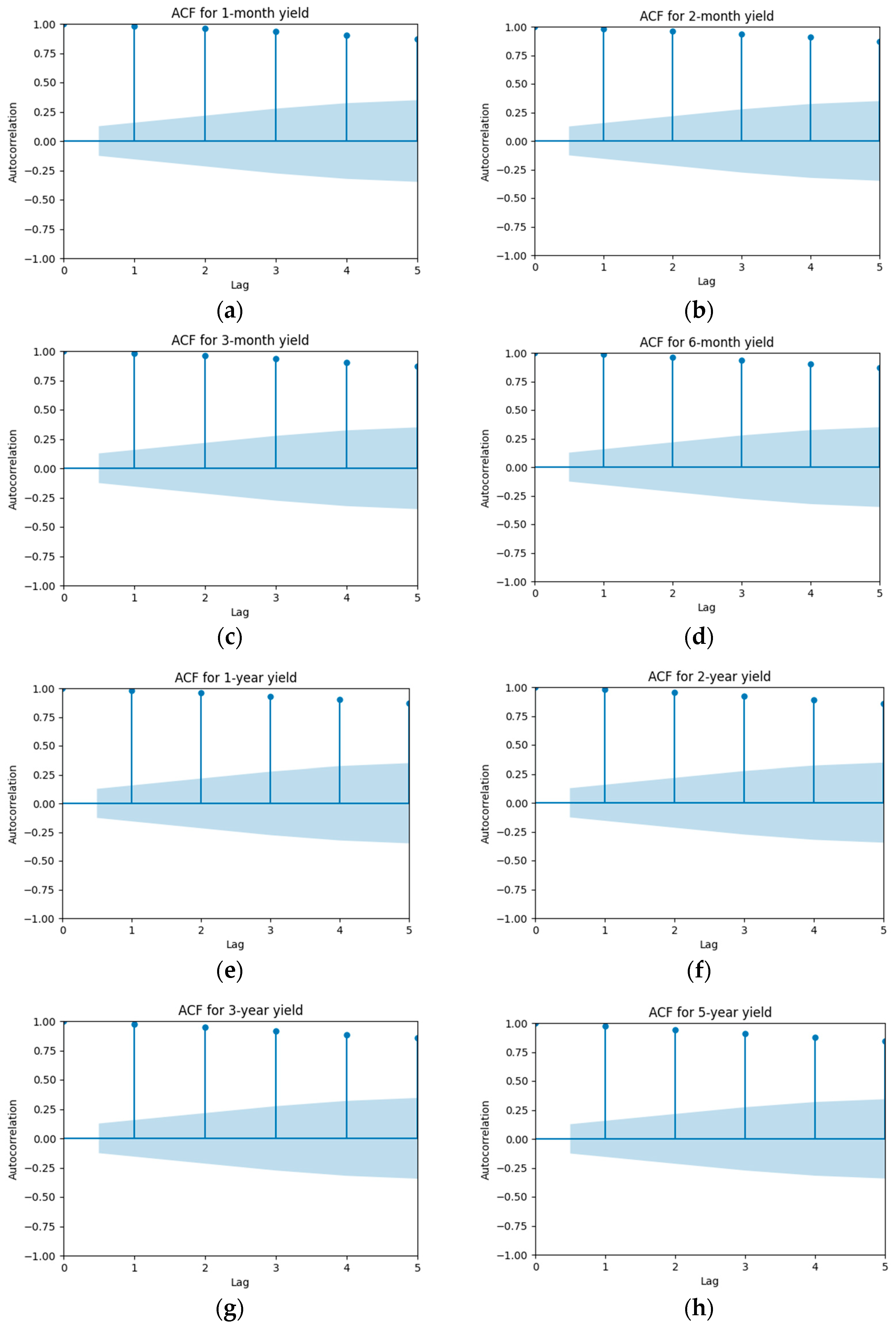
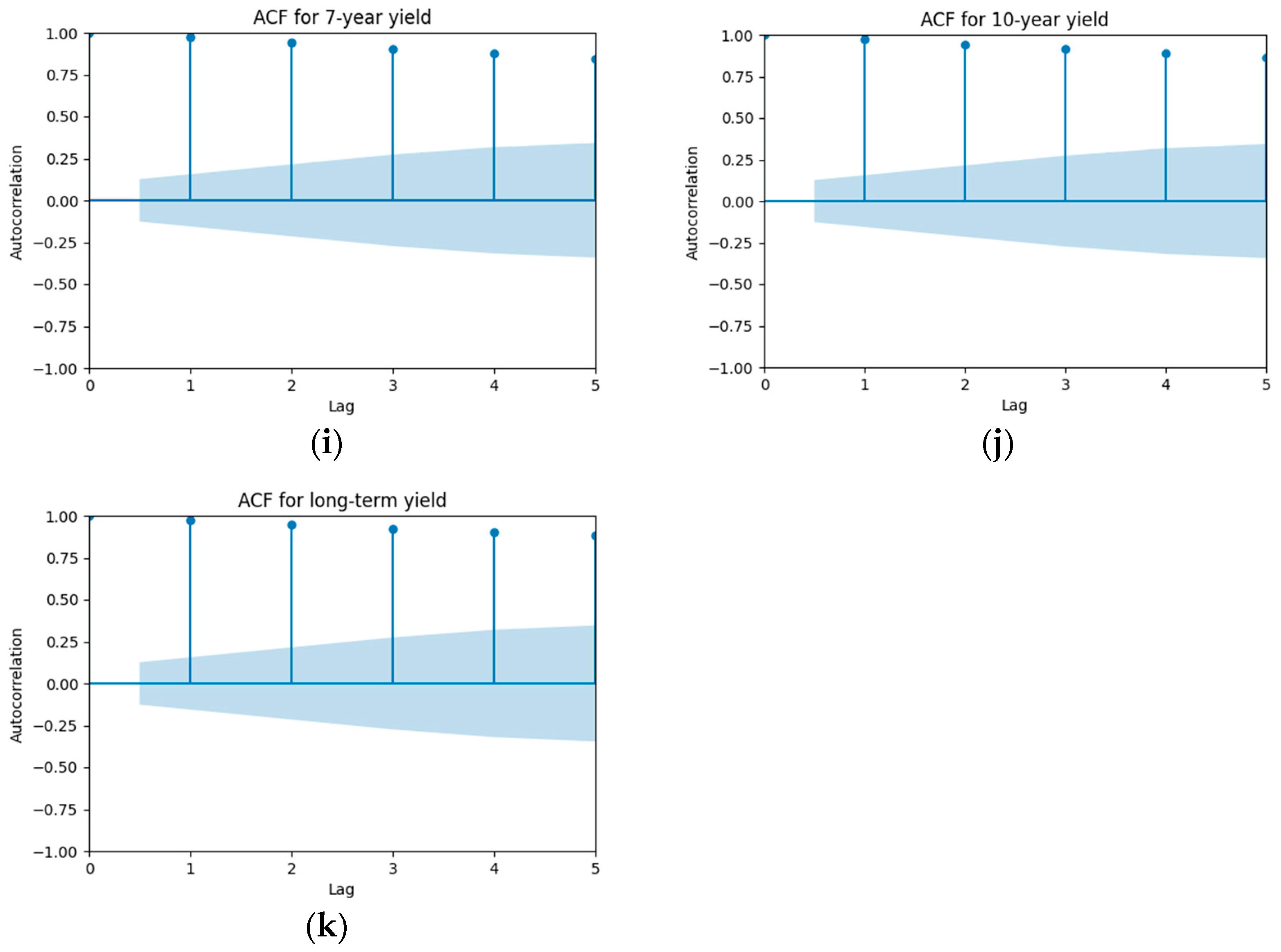
To further analyze the temporal dynamics of the data, we examine the autocorrelation function (ACF) of the time series. The graphs below illustrate the ACF at up to five lags, providing insight into the degree of correlation between current and past values within the series.
Figure 2 displays the Autocorrelation Function (ACF) values for dependent variables across maturities, ranging from one month to over ten years.
As evident from the graphs above, the dependent variables exhibit a significant level of autocorrelation, which persists even after five lags. All the ACF values fall well outside the 95% confidence interval, indicating that they are statistically significant and different from zero. Therefore, it is necessary to apply differencing transformations to remove non-stationarity and provide our models with inputs that have a sufficient level of variation for better estimation.
Next, we examine the distribution of our predictors. In Table A1 in Appendix A, we list the predictors used in each category of variables and provide a discussion of why we use them in our study.
We run twelve algorithms and check which algorithm best fits our data. It is important to note that, for each bond yield, we fit a separate regression based on the model of study.

2.1. Random Walk

The Random Walk algorithm assumes that the future value of a variable cannot be predicted from its past values, meaning that today’s available data do not provide any information for forecasting future values. Under this assumption, the best estimate for the value of a variable at time t is simply its value at time t 1 . In other words, the model posits that changes in the variable are completely random and follow no predictable pattern. Despite its simplicity, the Random Walk is widely used as a baseline or floor benchmark in time series analysis, against which more sophisticated forecasting models are compared. In essence, Random Walk assumes:
Y t = Y t 1 + ϵ t
where Y t is the value of the variable of interest at time t , Y t 1 is the value of the time series at the previous period, and ϵ t is a white noise error term with mean 0 and constant variance. Consequently, the best estimate of Y t is Y t 1 having X t 1 , the available vector of predictors, at time t 1 . In other words:
E ( Y t |   X t 1 ) = Y t 1

2.2. OLS

We use a simple linear regression and regress each of the dependent variables on all the available explanatory variable with one month lag. In essence:
E ( Y t |   X t 1 ) = β X t 1
Since there are no hyperparameters for this algorithm to optimize, we aggregate the training and validation data for the purpose of fitting the data.

2.3. ARIMA

ARIMA (Autoregressive Integrated Moving Average) algorithms are generalizations of ARMA models. While ARMA models integrate both Autoregressive (AR) and Moving Average (MA) components into a single model, ARIMA extends ARMA by incorporating a differentiation component to address non-stationarity. The ARIMA algorithm uses three hyperparameters: p, d, and q. Here, p denotes the order of the Autoregressive part, d represents the order of differentiation, and q specifies the order of the Moving Average component:
Δ d Y t =   ϕ 1 Δ d Y t 1 +   ϕ 2 Δ d Y t 2 +   + ϕ p   Δ d Y t p +   ϵ t   θ 1 ϵ t 1   θ 2 ϵ t 2       θ q ϵ t q
Y t is the value of the time series at time t, ϕ 1 ,   ϕ 2 ,   ϕ p are the parameters of the autoregressive part of the model, θ 1 ,   θ 2 , θ q are the parameters of the moving average and ϵ t is the noise at time t . In addition:
Δ d   Y t =   1     B d Y t
where B is the backshift operator, i.e., B d Y t = Y t k .

2.4. Lasso

Lasso regression (Tibshirani, 1996) is a form of linear regression with regularization. In particular, Lasso minimizes sum of squared residuals and also the absolute value of model coefficients. The regularization method is added to reduce the problem of overfitting in regression:
M i n i m i z e 1 2 n   i = 1 n y i y ^ i 2 + α j = 1 p | β j |
in which y i is the true value, y ^ i is the estimated value, and betas are the coefficients. The only hyperparameter used in Lasso is Alpha, which controls the strength of the regularizations. A higher Alpha means a stronger regularization and motivates more coefficients in the final regression to be zero.

2.5. Group Lasso

Group Lasso (Yuan & Lin, 2006) is an extension of the Lasso regression that allows for structured variable selection when the predictors are naturally grouped. Instead of penalizing each coefficient individually, Group Lasso applies regularization at the group level, encouraging the model to retain or eliminate entire groups of variables:
m i n β 1 2 n i = 1 n y i y i ^ 2 + α g = 1 G p g   | | β g | | 2
where βg is the vector of coefficients in group g , p g is the number of predictors in group g , and | | . | | 2 denotes the L2 norm. The hyperparameter α controls the strength of the group-level penalty. This method tends to either include or exclude all variables within a group, which improves interpretability and reflects the idea that certain features (e.g., all lags of a variable) should be considered jointly. The L2 norm within a group encourages variables in the same group to be selected or dropped together. The L1 sum across groups gives the same sparsity effect as Lasso, with the caveat that some groups of variables will have all coefficients zeroed out. Consequently, Group Lasso is particularly useful in our panel data setting, where variables such as a macroeconomic indicator and its lags are treated as a group. Following this methodology, we group every macro variable with their lags as a group in the Group Lasso.

2.6. Ridge

Similar to Lasso, Ridge regression (Hoerl & Kennard, 1970) aims to reduce the overfit by adding a penalty parameter to the objective function of OLS. However, the penalty term in Ridge regression is the sum of the squared value of coefficients (instead of the sum of absolute values of coefficients):
M i n i m i z e 1 2 n   i = 1 n y i y ^ i 2 + α j = 1 p | β j 2 |
As with Lasso, only an alpha hyperparameter is used in Ridge regression.

2.7. SGD

Stochastic Gradient Descent (SGD) Regression is a linear regression method that uses the Stochastic Gradient Descent optimization technique to minimize the loss function (usually the mean squared error in regression problems). The main idea behind SGD is to iteratively update the parameters of the model in the direction that reduces the error, one data point at a time, rather than using the entire dataset at once (Ruder, 2016). This approach has two benefits. The first key advantages of SGD is that it operates on one or a few samples at a time, rather than using the entire dataset to compute the gradient. This leads to much faster updates, especially for large datasets. Full-batch gradient descent can be computationally expensive and slower to converge due to the overhead of processing the entire dataset in each iteration. Second, the inherent randomness in the SGD updates, by using small batches or single samples, introduces noise into the optimization process. This noise acts as a form of regularization, helping the model to avoid overfitting.
Similar to Lasso and Ridge regressions, SGD applies a penalty function to reduce overfitting. The type of penalty (or regularization method) can either be L1 (similar to Lasso), L2 (similar to Ridge) or an Elastic Net (combination of both). Similar to Lasso and Ridge, we can tune the power of regularization through a parameter called Alpha. In total, there are two hyperparameters for this algorithm to optimize performance: first, the Penalty and the Alpha value.

2.8. Random Forest

This is an ensemble learning algorithm that builds multiple decision trees during training and merges their predictions to improve accuracy and control overfitting. Decision trees build regression (or classification) in the form of a tree. A decision tree consists of nodes and branches. The root node represents the entire dataset, and it is split into subsets based on feature values. Internal nodes represent decision points (based on specific feature values), and leaves represent the final prediction or outcome. Random Forest is an ensemble model as it builds multiple decision trees and aggregates their outcome to arrive at a final prediction. An ensemble approach increases accuracy of predictions overall. What distinguishes Random Forest from other tree-based ensemble models is that each tree is trained using only a random subset of data (sample selection is based on Bootstrap Sampling). In addition, each tree in the ensemble only uses a random subset of predictors to arrive at a prediction.
There are two major hyperparameters for this algorithm, number of estimators (n_estimators) and maximum depth (max_depth). A high number of estimators increases model stability and performance while a low number of estimators leads to underfitting. Maximum depth controls the maximum depth of each decision tree in the forest (Liaw & Wiener, 2002). The depth is the longest path from the root node to a leaf node. Setting this value too high can lead to overfitting, while setting it too low may result in underfitting.

2.9. XGBoost

The Extreme Gradient Boosting algorithm was developed by Tianqi Chen (Chen & Guestrin, 2016) and has since been used across various machine learning time series projects with a high level of success.
Similar to Random Forest, XGBoost is a tree-based algorithm. However, unlike Random Forest, which builds trees independently, XGBoost builds each tree sequentially. Each tree is trained on the residual errors of the prior trees to improve prediction.

2.10. Extra Trees

This algorithm is very similar to Random Forest. Similarly to Random Forest, Extra Trees selects a random subset of features at each split. However, instead of selecting the best split for each node based on a criterion (e.g., Gini impurity or entropy), Extra Trees choose splits randomly from a set of potential thresholds. This helps the algorithm to focus more on variance reduction through randomness and ensemble averaging (Geurts et al. (2006)). The algorithm takes the number of estimators (n_estimators) and maximum depth (max_depth) as hyperparameters, similarly to Random Forest.

2.11. PLS

Partial Least Squares (PLS) algorithms are very useful in environments where there are numerous highly correlated variables at the same time. Essentially, PLS constructs components that represent the variation across explanatory variables. Then, instead of using the whole set of explanatory variables, the algorithm studies the relationship between the components and the dependent variable (Wold, 1982). This in turn reduces the problem of dimensionality in the data. The number of components is a hyperparameter set by the researcher. A large number of components leads to better in sample performance but can also lead to overfitting.

2.12. Neural Networks

Neural Networks are a set of layers of interconnected nodes (neurons) that transform input data into output through a series of weighted connections and activation functions. They are commonly used in tasks such as image recognition, natural language processing, and predictive modeling (LeCun et al., 2015). A Neural Network’s outcome depends on several parameters such as the number of layers, number of neurons in each layer, the loss function, the number of epochs and the optimization algorithm. We fix the loss function, the optimization algorithm, the number of layers and epochs and take the number of neurons at each layer as the hyperparameter to optimize. We use ADAM as the optimization algorithm, Root Mean Squared Error (RMSE) as the loss function, two layers of neurons and ten epochs. Since we only have two layers, there are hyperparameters to optimize: namely, the number of neurons in each layer.

2.13. LSTM

Long Short-Term Memory (LSTM) networks are a type of recurrent neural network (RNN) specifically designed to handle sequence data and capture long-range dependencies. LSTMs are widely used in tasks such as natural language processing, time series forecasting, and speech recognition.2 We add an LSTM layer to the end of the existing two-layer neural network architecture. The parameters are set as the previous neural network architecture. The hyperparameters that are optimized in this algorithm are the number of neurons in the first and second layers and the number of LSTM units.
Below, we list all algorithms used in the study with their corresponding hyperparameters and the values used in the validation step.

2.14. Ensemble Model 1: ARIMA + Lasso + Random Forest

This ensemble model combines the forecasts from three different models: ARIMA, Lasso regression, and Random Forest. The idea behind ensemble models is to reduce model-specific biases and variances by averaging the predictions from models with different strengths and learning mechanisms. We selected these three algorithms because ARIMA is a linear and widely used time series model, and it performs best on our validation set; Random Forest is a powerful nonlinear algorithm commonly applied in time series forecasting; and Lasso is a regularized linear model that removes features with limited predictive power.
In particular, the final prediction is constructed as a simple average of the individual model predictions:
y ensemble ^ = 1 3 y ARIMA ^ + y Lasso ^ + y RF ^
This ensemble model benefits from the time-series forecasting capability of ARIMA, the sparse and interpretable structure of Lasso, and the nonlinear learning strength of Random Forests.

2.15. Ensemble Model 2: ARIMA + Lasso + Random Forest + SGD + PLS + LSTM

This ensemble model combines six algorithms: ARIMA, Lasso regression, Random Forest, Stochastic Gradient Descent (SGD), Partial Least Squares (PLS), and a Long Short-Term Memory (LSTM) neural network. The goal is to leverage the strengths of a diverse set of forecasting methods to improve overall accuracy and robustness. ARIMA is a widely used linear model that performed best on the validation set. Lasso is a linear regression method that performs feature selection through regularization. Random Forest is a flexible and powerful nonlinear algorithm commonly used in time series applications. SGD and PLS are both linear models that are computationally efficient and often used in high-dimensional settings. LSTM is a deep learning model capable of capturing complex sequential dependencies in time series data.
By combining these six algorithms, the ensemble integrates a wide range of modeling approaches—linear and nonlinear, statistical and machine learning, shallow and deep learning—thus representing nearly every major class of time series forecasting method. The ensemble prediction is computed as the simple average of the individual model forecasts, reducing model-specific biases and improving generalization performance:
y ensemble 6 ^ = 1 6 y ARIMA ^ + y Lasso ^ + y RF ^ + y SGD ^ + y PLS ^ + y LSTM ^
In Table 2 below, we list all the algorithms used in the study with their corresponding hyperparameters and the values used in validation step.
This table lists all forecasting models and the hyperparameters used in the validation process. For each model, we present both the range of hyperparameters tested and the final selected values that minimized RMSE on the validation dataset. These settings were subsequently used for the test dataset evaluation.

3. Discussion

After running these algorithms on the training data, we checked the performance of each algorithm on the validation set. Then, we chose the best-performing parameters for each algorithm based on their performance on the validation sample. Finally, we studied the performance of each algorithm on the testing sample. We use the Root Mean Squared Error (RMSE) as the main criterion to study the performance of algorithms across validation and test datasets.3
Since we have eleven dependent variables, we run eleven regressions for each set of algorithms and hyperparameter. Consequently, we need a way to aggregate the results to be able to compare the performance of each set of hyperparameters within a choice of algorithm and to compare the performance of algorithms with each other. We define a performance metric called SRMSE, which is the sum of the Root Mean Squared Error (RMSE) from each regression. By summing the RMSEs, we use this as a single aggregate measure to compare the overall performance of different hyperparameters and algorithms. RMSE is calculated as follows:
R M S E = 1 n i = 1 n y i y ^ i 2
In addition, we also compute the Mean Absolute Error (MAE) of each algorithm-dependent variable. The statistics of MAE are computed as follows:
M A E = 1 n | y i y ^ i |
To arrive at a single metric that represents the performance of each algorithm across all 11 dependent variables, we use SRMSE (sum of RMSE) and SMAE (sum of MAE), which are the sum of RMSE and MAE across all dependent variables for each algorithm, respectively.

3.1. Algorithms’ Performance

Overall, we have 11 dependent variables and run regression against each of them in the training sample with different hyperparameters. We then evaluate the performance of each set of algorithms and hyperparameters (across 13 algorithms, as OLS and Random Walk do not have hyperparameters) on the validation sample using the SRMSE metric and select the best-performing hyperparameters. Each algorithm’s performance results on the validation and test datasets are listed in Table 3.
This table summarizes the performance of different forecasting algorithms based on their best-performing hyperparameters, along with their SRMSE scores on the validation and test datasets. For further information regarding algorithms, refer to Section 2.
The results in Table 3 compare the performance of various algorithms on both validation and test datasets using SRMSE as the performance metric. Group Lasso achieved the best performance on the test dataset with an SRMSE of 2.98, followed by Lasso and PLS. OLS performed the worst across all algorithms. In addition, the majority of algorithms outperformed Random Walk except Neural Networks, LSTM and Ridge. Neural networks and LSTM models performed relatively poorly on the test dataset, despite low SRMSE scores during validation, indicating possible overfitting. Simpler models, such as OLS and Random Walk, ranked lower.
Importantly, while neural networks and LSTM models achieved low validation errors, their test performance deteriorated sharply, providing clear evidence of overfitting. These models likely captured noise in the training data that failed to generalize to unseen periods; this is particularly problematic in a macro-financial context where structural breaks and monetary policy shocks (e.g., rate change announcements by the Bank of Canada) induce discontinuities in yield behavior. In addition, with only 240 monthly observations and a high-dimensional predictor set, these models are prone to overfitting and may fail to generalize effectively. Deep architectures typically require substantially more data to stabilize their learning of nonlinear and sequential patterns. In contrast, simpler models such as Group Lasso, PLS, and ARIMA leverage structural assumptions—e.g., sparsity or reduced-rank projections—that make them well-suited for small-sample environments. This finding is consistent with prior work suggesting that regularization and dimensionality control are critical for reliable forecasting in macroeconomic contexts with limited data.
This contrast between validation and test performance underscores the need to prioritize generalization over in-sample fit. Models that explicitly penalize complexity—such as Group Lasso and Lasso—not only avoid overfitting but also consistently outperform benchmarks such as Random Walk and ARIMA. The results highlight that, in environments characterized by limited data and high volatility, simpler or regularized models often provide more robust forecasts than complex deep learning architectures.
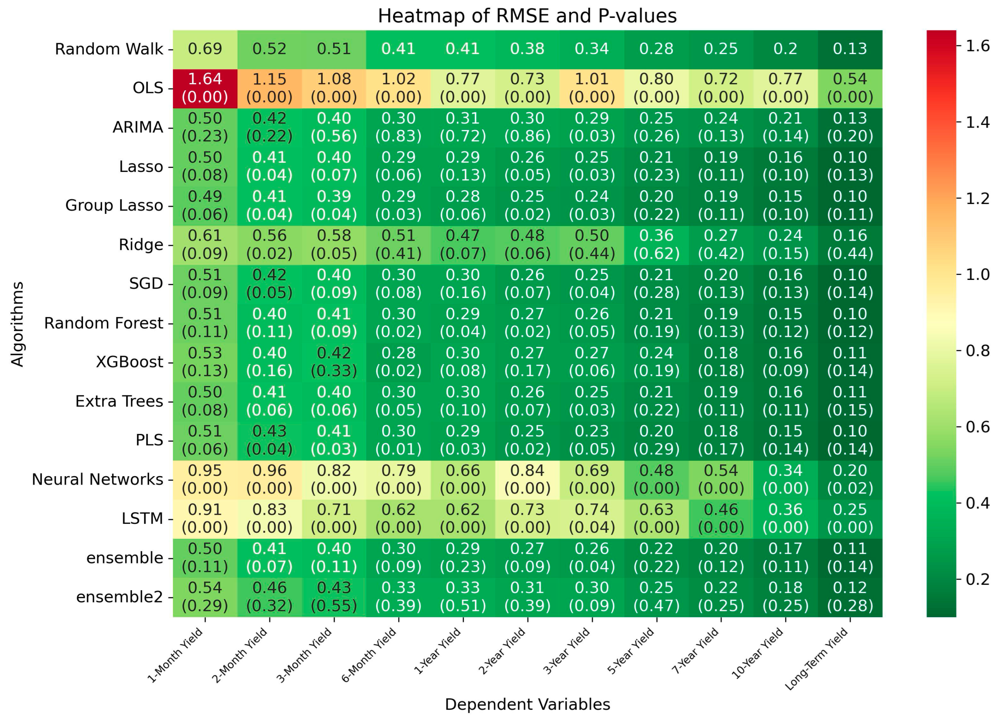
In addition, it is important to assess whether the forecasting performance of each algorithm differs significantly from that of the Random Walk benchmark. To this end, we employ the Diebold–Mariano (DM) test, which statistically compares the predictive accuracy of two competing forecasts based on their loss differentials (here, squared forecast errors). A significant p-value indicates that the algorithm’s performance is statistically better or worse than the Random Walk. To better visualize these results, Figure 3 presents heatmaps of RMSE values for each algorithm, with the corresponding DM test p-values reported in parentheses.
This heatmap figure above displays the root mean squared error (RMSE) of each forecasting algorithm across different Canadian government bond yield maturities. Each cell represents the RMSE for a given model–maturity pair, with color intensity indicating predictive accuracy. The first number in each cell represents the RMSE while the number in the parentheses represents the p-value.
This heatmap displays the root mean squared error (RMSE) of each forecasting algorithm across different Canadian government bond yield maturities, ranging from one-month to long-term yields. Each cell represents the RMSE for a given model–maturity pair, with color intensity indicating predictive accuracy. Specifically, darker green tones correspond to lower RMSE values (i.e., better forecasting performance), while yellow, orange, and red tones denote higher RMSE values (i.e., poorer performance). The color gradient is scaled to the minimum and maximum RMSE observed in the matrix (ranging from 0.10 to 1.68). This visualization allows for a comparative assessment of model performance both across maturities and between models. The p-value from the Diebold–Mariano test, which measures the significance of the difference between each algorithm and the Random Walk benchmark, is reported in parentheses below the RMSE value in each cell.
The results in Figure 3 suggest that short-term yields are significantly more challenging to forecast than medium- and long-term yields. For instance, even the best-performing models such as Group Lasso and ARIMA exhibit higher RMSEs for the one-month and two-month yields (e.g., RMSE of 0.49 and 0.41 for Group Lasso) compared to much lower errors for the ten-year and long-term yields (e.g., 0.15 and 0.10, respectively). This pattern holds across nearly all models, including traditional (OLS, ARIMA), regularized (Lasso, Ridge), and machine learning models (Random Forest, XGBoost, etc.).
This difference likely reflects the relative noisiness and volatility of short-term yields, which are more sensitive to transitory shocks, liquidity effects, and market expectations about imminent policy actions. By contrast, longer-term yields are anchored more by expectations of future economic fundamentals and may evolve more smoothly, making them relatively easy to predict, especially using models that incorporate macroeconomic indicators.
Interestingly, even naïve benchmarks such as the Random Walk model perform reasonably well for long-term yields (e.g., RMSE of 0.13), suggesting that longer-maturity rates exhibit higher persistence or lower month-to-month volatility. However, machine learning models clearly outperform the benchmark across all maturities, with gains more pronounced at shorter maturities.
This variation in difficulty has important implications. First, it highlights the need for models that can capture short-term fluctuations more effectively—possibly through higher-frequency inputs or regime-switching dynamics. Second, it underscores the value of including multiple maturities in evaluation: performance on one segment of the yield curve does not generalize across the curve.
The p-values for short-term yield prediction models indicate stronger statistical significance relative to long-term maturities. For Group Lasso, p-values are generally below the conventional 5% threshold for short-term yields, whereas, for five-year yields, p-values often exceed 20%, suggesting no statistically significant improvement over the Random Walk benchmark at longer maturities. For OLS, p-values are statistically significant across maturities; however, this significance reflects that its forecasts are systematically inferior to those of the Random Walk model.
To further corroborate our results, we plot the heatmap based on MAE metric in Figure 4 below.
This heatmap presents the mean absolute error (MAE) for each forecasting algorithm across Canadian government bond yields of varying maturities, from one-month to long-term bonds. Each cell shows the MAE for a specific model–maturity combination. The color gradient visually encodes the magnitude of the forecasting error: darker green indicates lower MAE (stronger performance), while yellow, orange, and red reflect higher MAE (weaker performance). This figure complements the RMSE analysis and provides a robust check for consistency in model rankings.
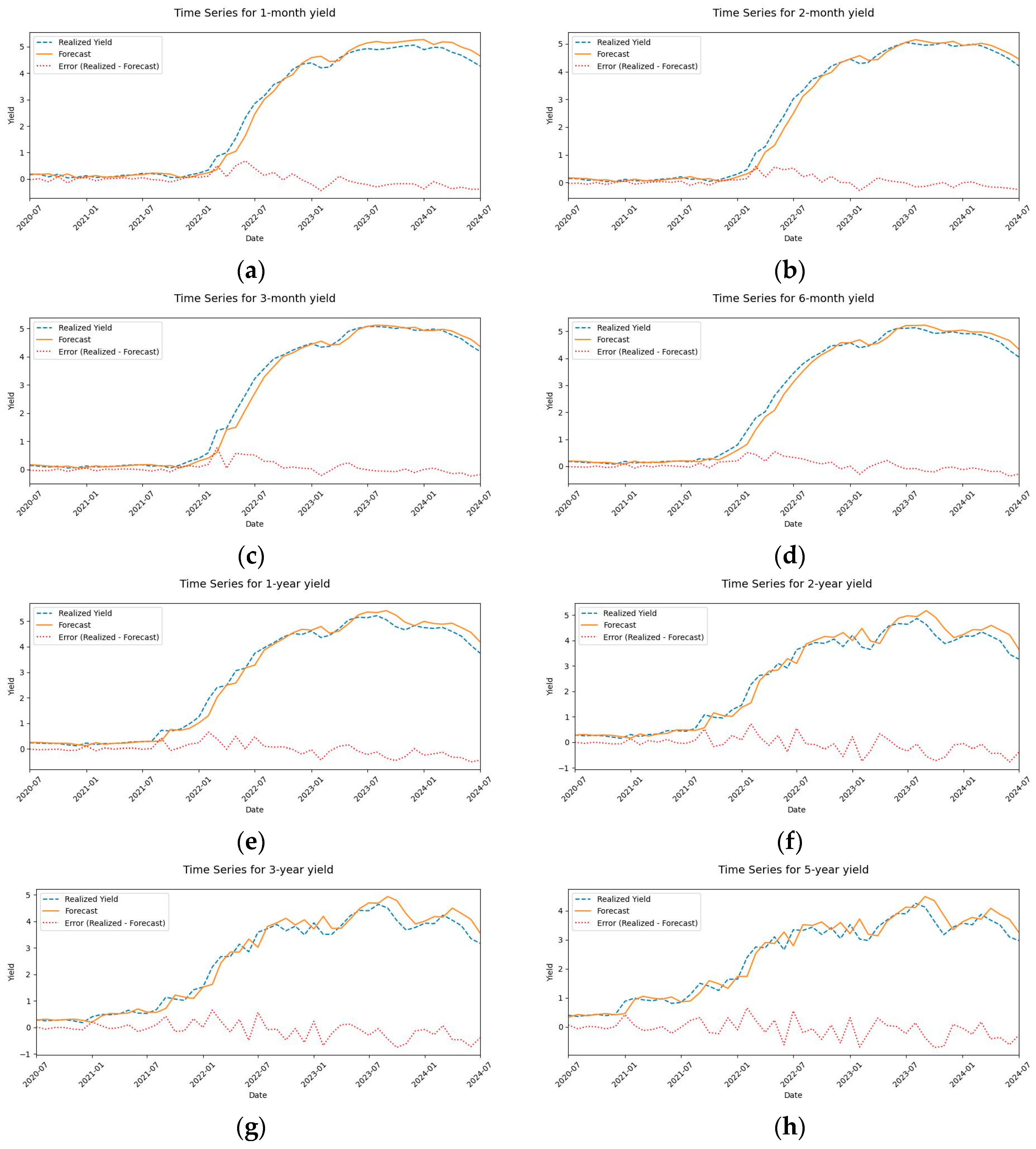
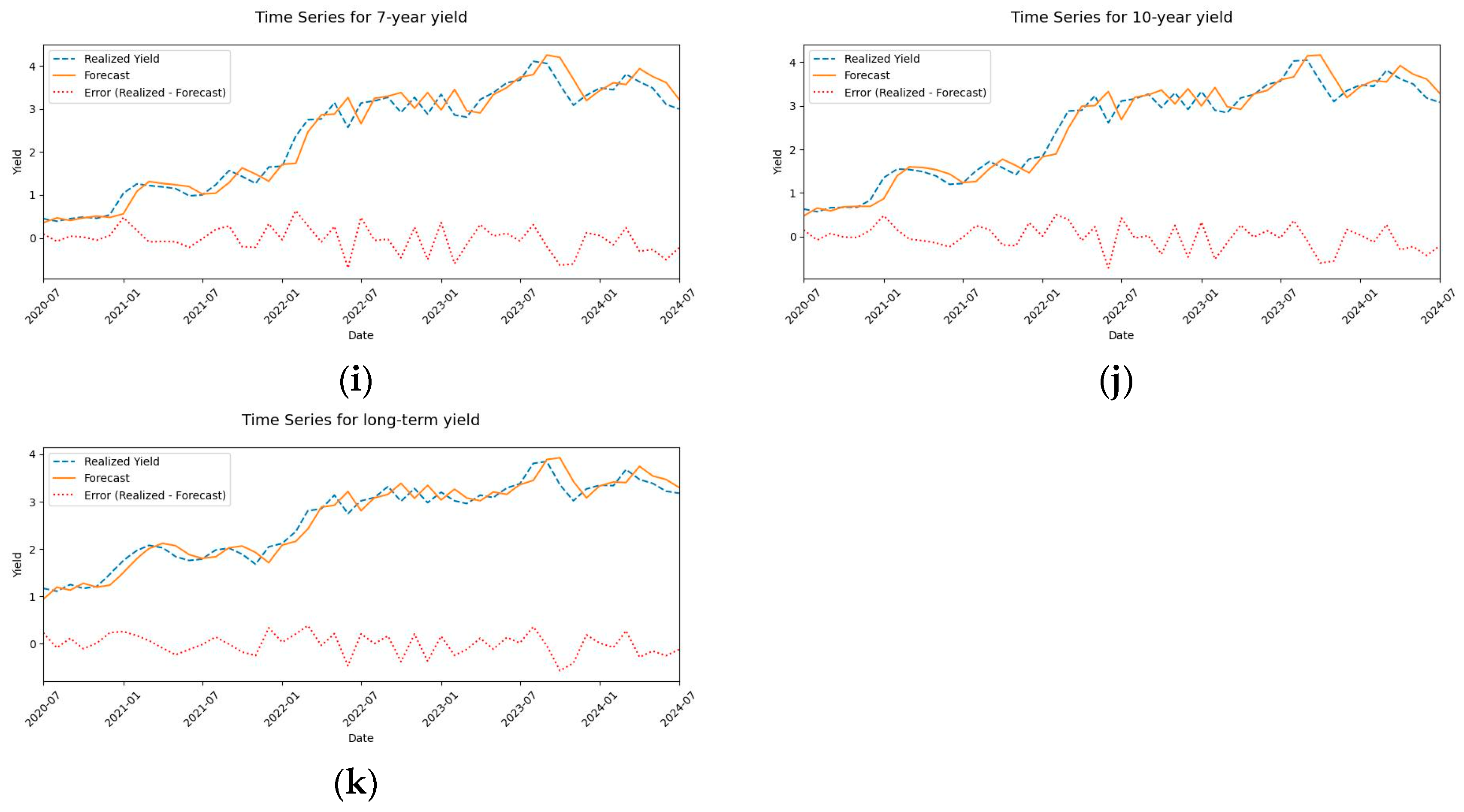
To better understand the performance of our best-performing model over time, we plot the Group Lasso forecast error for each dependent variable in Figure 5. This visualization not only illustrates how forecast errors evolve through the test period but also helps identify periods when the algorithm performed particularly well or poorly. Such temporal patterns can reveal whether the model’s predictive accuracy is sensitive to specific market conditions or economic events, providing insights into the stability and robustness of its forecasting ability.
The line plots below depict the forecast error over time throughout the test subsample. The y-axis represents the forecast error of Canadian government bond forecasts using the Group Lasso method for specific maturities, while the x-axis shows the corresponding dates. The solid amber line represents the model’s forecast while the dashed blue line represents the realized yield. In addition, we plotted the error values in the same graph (dashed red line).
The results given in Figure 5 demonstrate the model’s forecasting accuracy over the test period. The error (depicted in red) fluctuates over time but remains relatively contained for shorter maturities (two months, six months), suggesting stable performance. Second, longer maturities (e.g., ten years) exhibit slightly higher variability, which may reflect greater sensitivity to macroeconomic shifts. In addition, the forecasts (predicted yields) closely track the actual realized yields for most periods, indicating that the Group Lasso method effectively captures yield curve dynamics. The model performs consistently across the yield curve, though errors are marginally higher for longer-term bonds, likely due to their heightened exposure to uncertainty in interest rate expectations.

3.2. Feature Importance

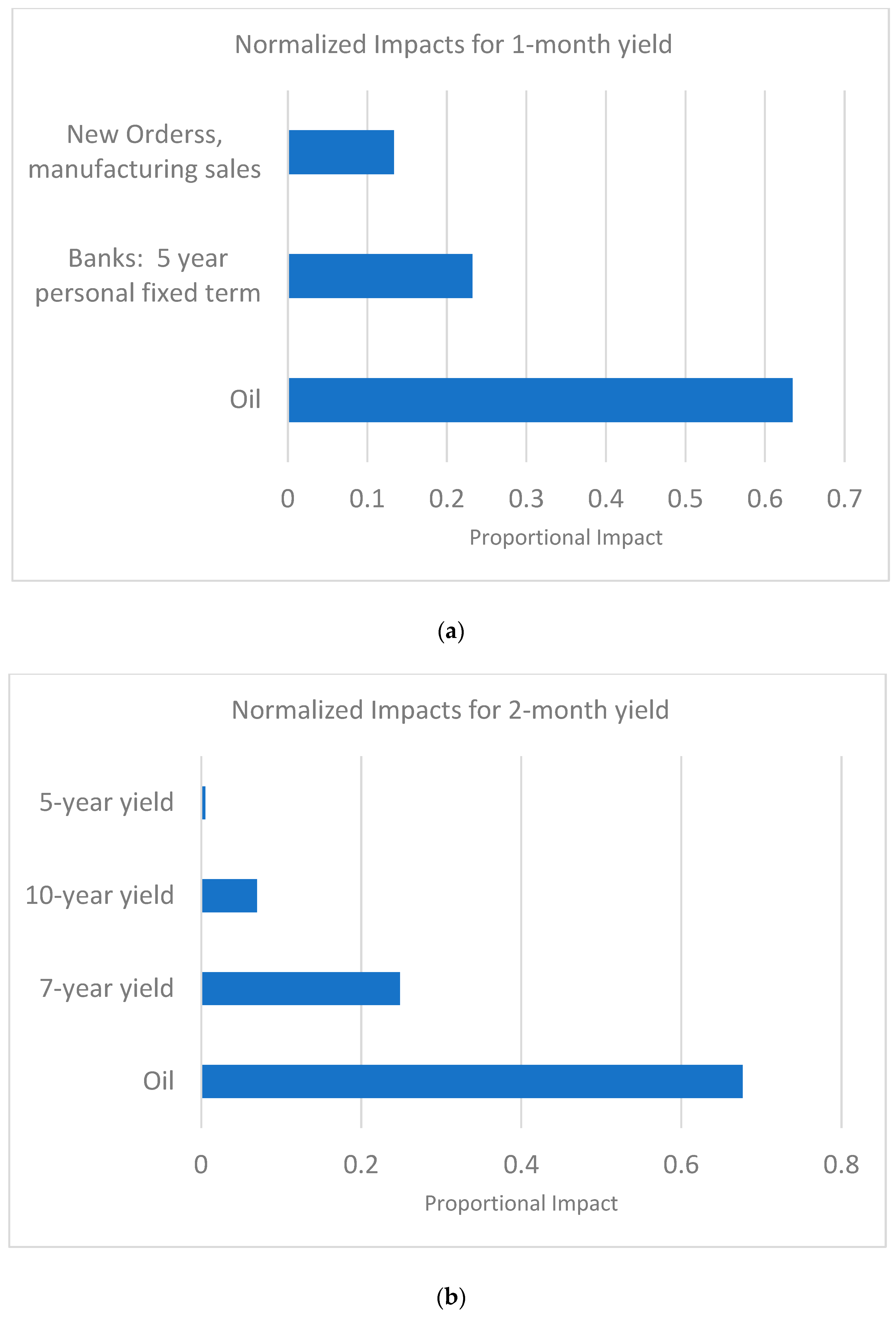
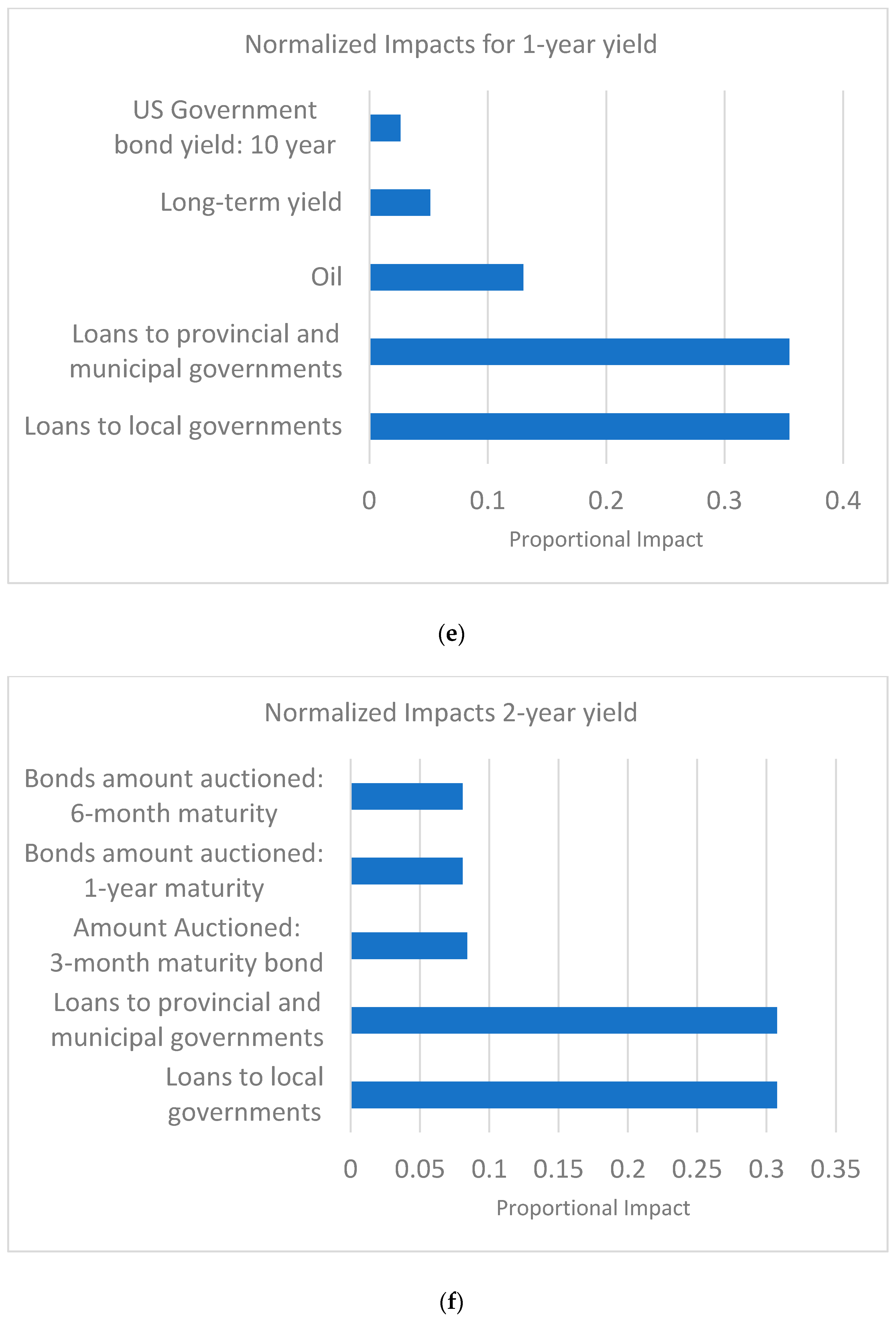
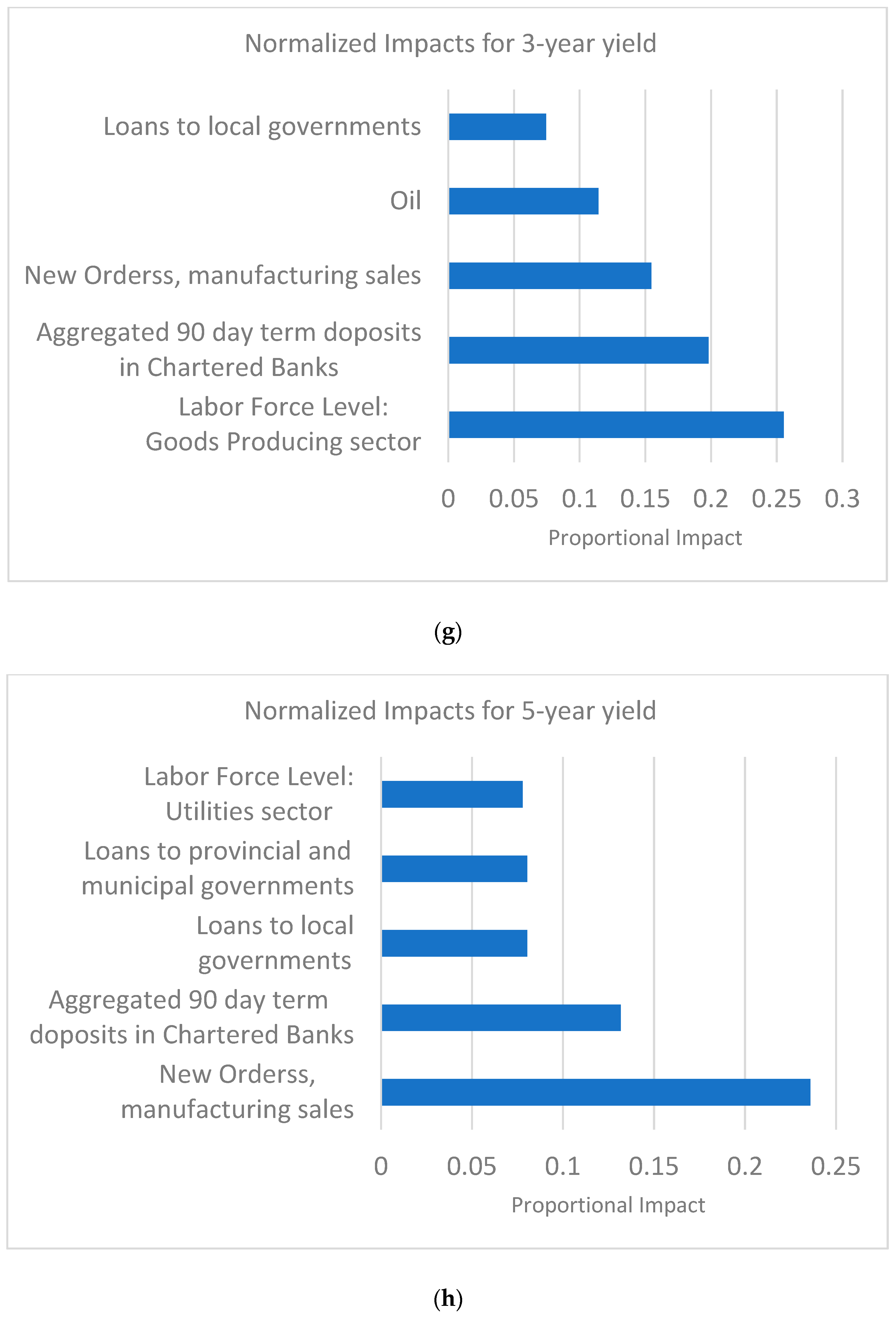
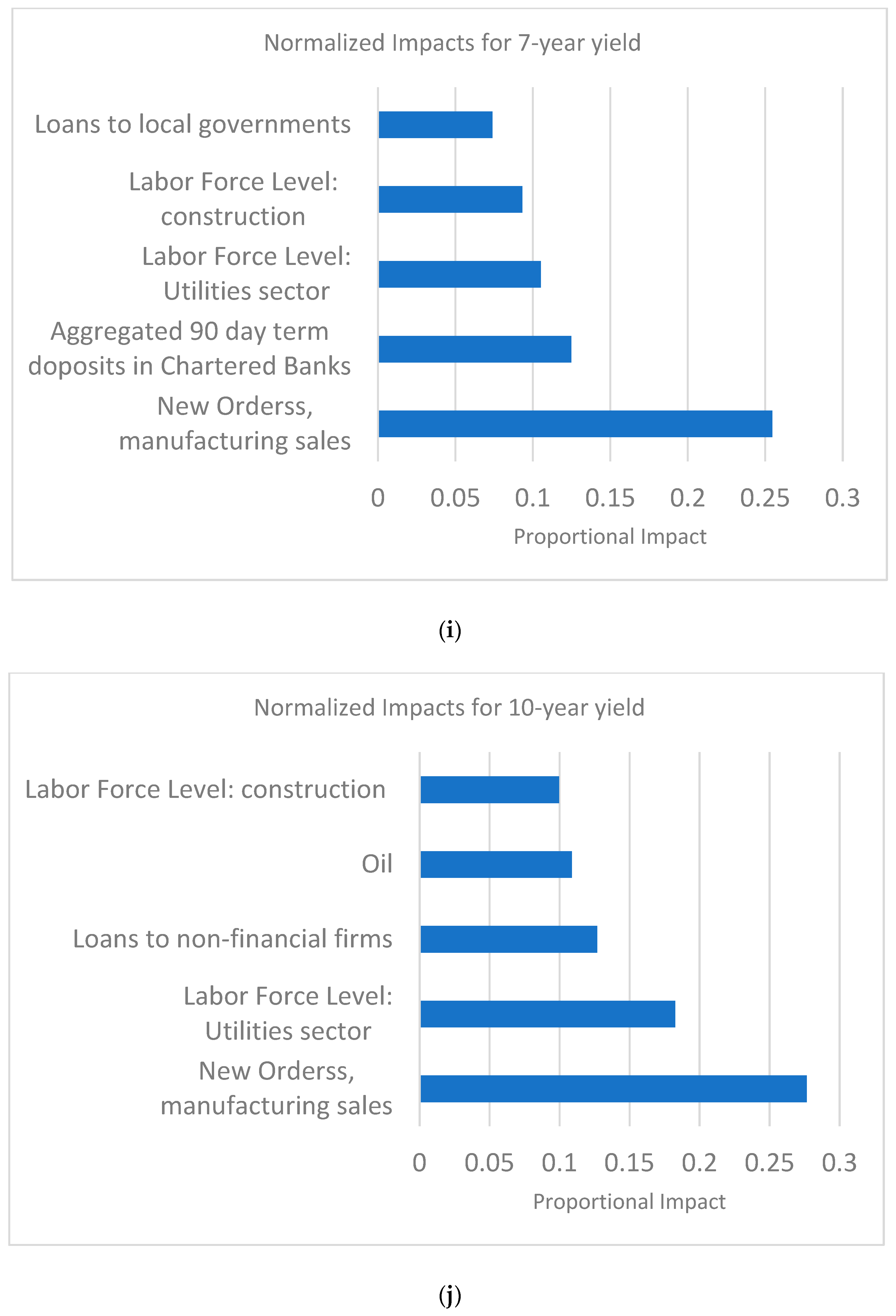
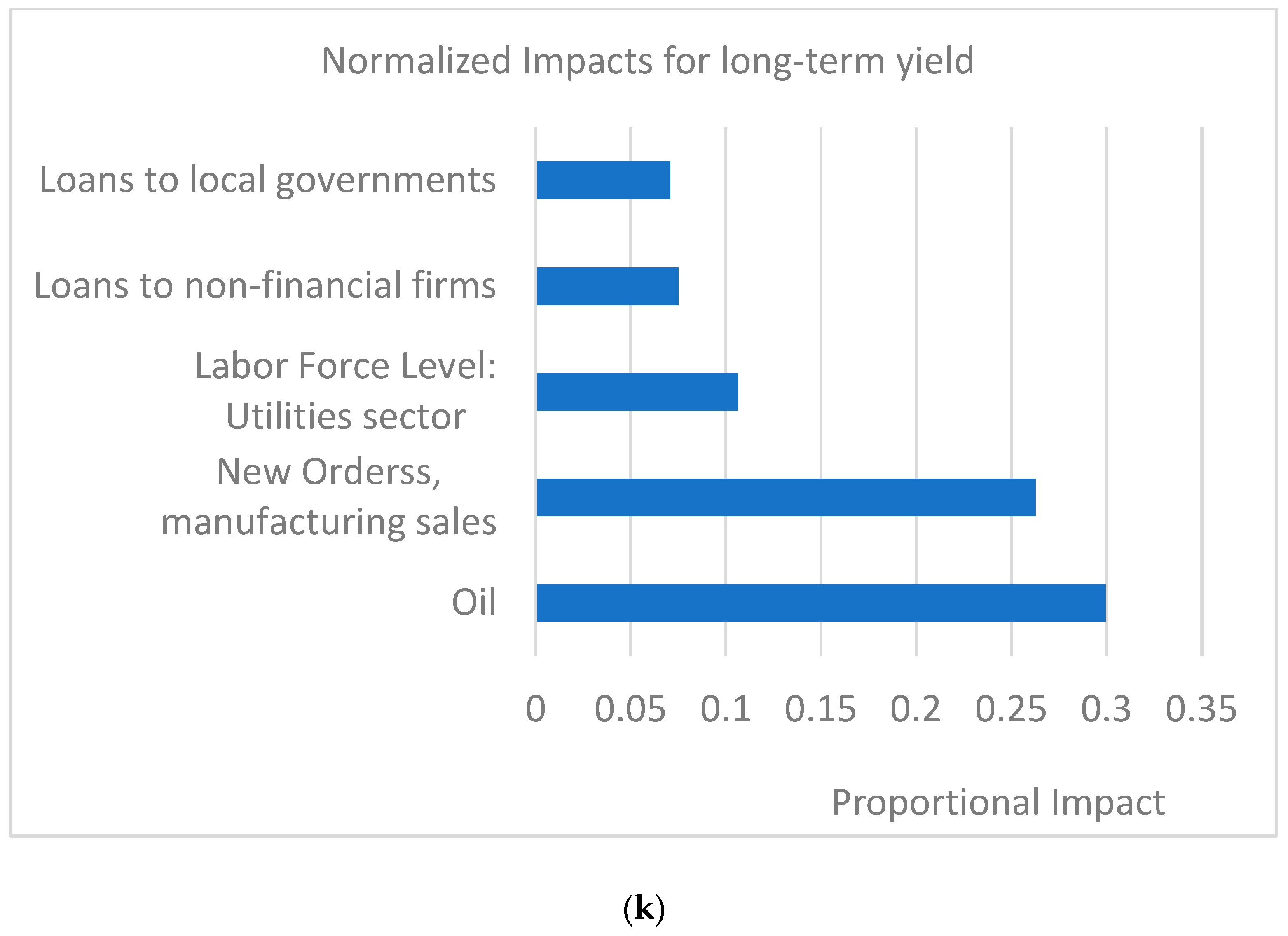
One of the notable features of our best-performing model, Group Lasso, is that it only keeps groups of predictors that have a significant impact on the regression. We can leverage this characteristic of the algorithm to identify the predictors with the highest explanatory power for each dependent variable. By aggregating the feature importance of each variable across all its lags, we then illustrate the impact of each variable that is not omitted from the regression by Group Lasso and for each dependent variable (bond maturity). It should be noted that, since Group Lasso removed the features with limited impact, we might end up with different number of variables in each regression. Please also note that we limit the number of variables illustrated here to 5 variables. In addition, we normalized the impacts between zero and one for better illustration.
The figures below represent the impact of top predictors for each dependent variable. We use Group Lasso to compute feature impacts. The impacts are calculated as the sum of all lagged estimated coefficients for each independent variable and then the values are normalized so that the sum of the impacts is one.
The results presented in Figure 6 show that oil prices are also a key explanatory variable on Canadian bond yields, particularly for short-term maturities. This aligns with market expectations, as oil—being one of Canada’s major exports—strongly influences the government’s fiscal capacity and, consequently, the equilibrium interest rate. Oil prices also remain a key explanatory variable for longer-term bond yields. Oil prices have a significant influence on Canadian bond yields, particularly at shorter maturities, reflecting the country’s economic sensitivity to commodity cycles. As Canada is a major oil exporter, rising oil prices tend to improve the trade balance and increase USD inflows, strengthening the CAD. A stronger currency reduces imported inflation and can dampen inflation expectations, leading markets to revise down future interest rate paths. This effect is also evident in longer-term yields, where oil remains a key determinant through its impact on Canada’s macroeconomic fundamentals and monetary policy outlook.
In addition, Canadian bond-specific variables—such as lagged yields and the total dollar amount of bonds auctioned—exert significant influence on both short- and long-term maturities. This underscores the importance of market microstructure factors and investor expectations in shaping yield dynamics. For longer-term bonds, macroeconomic indicators, including sector-specific employment levels and new manufacturing orders, emerge as key determinants. These variables serve as proxies for future economic activity, influencing long-term expectations of growth and inflation.
Finally, variables capturing the condition of chartered banks’ balance sheets—such as aggregate deposits and lending to both public and private sectors—are found to significantly affect yields, particularly at the long end of the curve. This is consistent with the notion that strong bank balance sheets are indicative of broader financial stability and ample credit supply (Bernanke & Blinder, 1992; Adrian & Shin, 2010). When banks are well-capitalized and actively lending, it signals economic resilience, reduces risk premia, and shapes expectations of future interest rate paths.

4. Materials and Methods

It is common practice among researchers to utilize the dataset from McCracken and Ng (2015), which contains a comprehensive list of monthly indicators for forecasting U.S. macroeconomic variables. The McCracken and Ng (2015) dataset is a valuable resource for researchers aiming to leverage large datasets for macroeconomic predictive analysis of U.S. economic conditions. This dataset is readily available online and serves as a standard for training algorithms for macroeconomic forecasting purposes. Unfortunately, a similar dataset is not readily available for Canada.
To address this gap, we construct a large monthly panel dataset using publicly available data from Statistics Canada and the Bank of Canada. Our dataset contains 63 independent variables covering categories such as labor market conditions, commodity prices, the Toronto Stock Exchange index, inflation, and bond yields. The selection of predictors is inspired by McCracken and Ng (2015); however, due to the relatively limited coverage of Statistics Canada, we include fewer predictors. For each variable, we include up to six monthly lags, bringing the total number of predictors to 446.
It is important to clarify how we address the issue of data availability at prediction time, especially since some variables are released with delays. For each prediction month, we use only the data that would have been available prior to the start of that month, simulating a real-time forecasting environment. For example, if unemployment data for July are released in mid-August, that information would not be available for a forecast made at the beginning of August. In such cases, the most recent available data prior to August are used instead. Similarly, variables with daily or weekly frequency (e.g., bond yields) are down sampled to the last available observation of the prior month.
We forecast the yields of the following variables: Canadian treasury bills with maturities of 1, 2, 3, and 6 months, as well as 1-year yields; the Government of Canada benchmark yields of 2, 3, 5, 7, and 10 years; and long-term bonds. Long-term bonds include a basket of bonds with maturities between 10 and 30 years and are used to summarize the long end of the yield curve as a single metric. In summary, we employ 452 predictors and 11 dependent variables.
Our data span from August of 2004 to August 2024 and include 240 monthly observations in total. In addition, we split our data into training (72% of the whole dataset), validation (8% of the whole dataset) and test datasets (20% of the whole datasets). This is a common practice across applied time series studies when the underlying model used has hyperparameters to optimize. In addition, we use the first difference transformation of yield curves in each month as the dependent variable to increase the accuracy of the algorithms. Finally, to increase the performance of our algorithms, we normalize both our predictors and dependent variables.4 Normalization has another important benefit; it lets us compare the performance of an algorithm in terms of RMSE with respect to different dependent variables.

5. Conclusions

This study evaluates the performance of thirteen machine learning algorithms in forecasting the yield curve of Canadian bonds. By leveraging a vector of macroeconomic variables and their lags, we aim to forecast changes in bond yields one month ahead. Our findings indicate that Group Lasso outperforms the other algorithms in terms of Root Mean Squared Error across various bond maturities on average, with Lasso emerging as the second-best performing algorithm. Notably, ten of the models surpass the Random Walk benchmark, demonstrating their effectiveness in forecasting bond yield fluctuations. Our results also suggest that models that heavily penalize overfitting tend to perform better in yield curve forecasting.
Utilizing the normalized coefficients from Group Lasso, we identify that oil prices, employment and manufacturing metrics and bond-related variables have the most significant impact on predicting yield curve movements.
Overall, our findings highlight the potential of machine learning algorithms as valuable tools for both policymakers and industry practitioners in navigating bond markets. Moreover, we pinpoint key macroeconomic variables that contribute most to yield curve changes.
That said, our study is not without limitations. There are many other machine learning algorithms commonly used in time series analysis that were not included in our evaluation. However, we focused on the most well-established and widely used methods. Future research could enhance forecasting accuracy by incorporating information related to monetary policy announcements into yield predictions.

Author Contributions

Methodology, A.R. and H.N.; Data curation, A.R.; Writing—original draft, A.R. and H.N.; Writing—review & editing, A.R. and H.N.; Visualization, H.N. All authors have read and agreed to the published version of the manuscript.

Funding

This research received no external funding.

Data Availability Statement

The data presented in this study are openly available in https://www150.statcan.gc.ca/n1/en/type/data?MM=1 (accessed on 1 June 2025).

Conflicts of Interest

The views and opinions expressed in this study are those of the authors and do not necessarily reflect the official policy or position of their employer.

Appendix A

List of Predictors Used

We list the predictors used in the algorithms in the table below:
The table below lists the title of predictors used in the yield forecast study, categorized by type, along with their descriptions.
Table A1. Summary of predictor categories.
NameDescription
Bank of CanadaAmount Auctioned: three-month maturity bondThis category includes variables related to Bank of Canada Bond issuance.
This category is crucial for monitoring Canadian monetary policy and sovereign bond issuance. Variables such as the amount auctioned, treasury maturities, and Government bonds outstanding directly reflect the supply of government debt, influencing its pricing. Different yield rates (e.g., 2-year, 10-year, long-term periods) and real return bonds provide direct insights into market expectations for future interest rates and inflation, which are core components of the yield curve. Finally, the Bank Rate and target rate, and overnight money market financing, are fundamental short-term interest rate indicators set by the central bank, which anchor the short end of the yield curve and transmit monetary policy signals throughout the economy.
Bonds amount auctioned: 6-month maturity
Bonds amount auctioned: 1-year maturity
Amount of treasury maturing
Government bonds outstanding
Overnight money market financing
2-year yield
3-year yield
5-year yield
7-year yield
10-year yield
Long-term yield
Real return bonds, long-term
1-moth yield
Treasury Bills: 2-month
3-month yield
Treasury Bills: 6-month
1-year yield
Bank rate
Bank of Canada target rate
Chartered Banks Balance SheetAggregated 90-day term deposits in Chartered BanksThis category includes major items on Canadian chartered banks’ balance sheets. All items are aggregated.
These variables capture the overall health and lending capacity of the Canadian financial system, which is intrinsically linked to broader economic activity and, by extension, the yield curve. Strong bank balance sheets and active lending (e.g., mortgage loans, non-mortgage loans, loans to public/private sectors) indicate financial stability and ample credit supply, influencing risk premia and expectations of future interest rates. Conversely, signs of stress in bank balance sheets can signal tighter credit conditions, impacting economic growth and demand for government bonds.
Banks: Conventional mortgage, 1-year
Banks—conventional mortgage: 3-year
Banks: Conventional mortgage: 5-year
Banks: 5-year personal fixed term
Mortgages in Canada outstanding
Mortgage loans outside Canada outstanding
Mortgage loans outstanding
Non-mortgage loans Total
Misc. Loans
Loans to public financial institutions
Reverse repurchases loans
Loans to non-residents
Loans to local governments
Loans to provincial and municipal governments
Loans to Canadian individuals to purchase securities
Labor ForceTotal number of unemployedThis category includes variables such as unemployment rate and the number of employees employed at each major industry.
Labor market indicators are critical for assessing the overall health and inflationary pressures within an economy. Variables like the total number of unemployed provide insights into overall labor market slack. Importantly, labor force levels across specific industries (e.g., goods producing, manufacturing, retail trade) are included to capture sector-specific economic trends and structural shifts.
Strong employment growth in key sectors can signal robust aggregate demand and potential inflationary pressures, which influence long-term bond yields. Conversely, weakness in specific sectors might indicate localized economic challenges or broader deceleration, impacting expectations for future interest rates and, thus, the yield curve. These disaggregated insights allow for a more nuanced understanding of economic health beyond aggregated unemployment figures.
Labor Force Level: all industries
Labor Force Level: Goods Producing sector
Labor Force Level: Utilities sector
Labor Force Level: construction sector
Labor Force Level: manufacturing sector
Trade employment level: Wholesale sector
Labor Force Level: retail trade sector
Labor Force Level: Transportation sector
Labor Force Level: finance sector
ManufacturingSales of goods manufactured (shipments)Real manufacturing sales, orders, inventory owned and inventory to sales ratio for major industries.
Manufacturing data, including sales, new orders, unfilled orders, and inventories, are key coincident and leading indicators of economic activity. Strong manufacturing performance suggests robust economic growth, which can lead to higher inflation expectations and, consequently, higher bond yields. Conversely, weakening manufacturing activity may signal a slowdown, prompting investors to expect lower future interest rates and thus lower bond yields.
New orders
Unfilled orders
Inventories
US Related DataEuro Dollar Deposits (London)This category includes US sovereign bond related variables.
Given the close economic ties between Canada and the United States, US macroeconomic and financial variables exert significant influence on Canadian bond yields. US government bond yields, Euro Dollar Deposits, commercial paper rates, and the Federal Funds rate reflect US monetary policy, investor sentiment, and economic growth prospects, which often spill over into Canadian markets. Understanding these cross-border influences is crucial for comprehensive yield curve forecasting in Canada.
Banks: Commercial paper, 3-month
US Government bond yield: 5-year
USD interest rates: 1 month
Prime rate charged by banks (One of several base rates used by banks to price short-term business loans.)
Federal funds rate
US Government bond yield: 10-year
Misc.WTI oilThis category includes a diverse set of influential macroeconomic variables.
As Canada is a major oil exporter, WTI oil prices directly impact government fiscal capacity and inflation expectations, significantly influencing Canadian bond yields. Surging oil prices can boost national income and the Canadian dollar, potentially reducing imported inflation and affecting interest rate expectations.
S&P/TSX Composite Index: This index provides a broad measure of Canadian equity market performance, reflecting overall investor sentiment and the economic outlook. A strong equity market often correlates with optimistic growth expectations, which can translate to higher bond yields as investors anticipate stronger economic activity and potentially higher inflation.
Canadian GDP: As the fundamental measure of economic output, GDP is directly linked to expected future growth and inflation, which are primary drivers of bond yields. Higher GDP growth typically implies stronger demand and potential inflationary pressures, leading to an upward revision of future interest rate expectations and thus higher bond yields.
S&P/TSX Composite Index
GDP Canada
HousingHousing startsHousing market indicators such as housing starts and the New Housing Price Index are vital for gauging consumer confidence, construction activity, and inflationary pressures within the real estate sector. A robust housing market can signal strong economic growth and potential inflation, which might lead to higher interest rates and bond yields. Conversely, a weakening housing market could suggest economic deceleration, impacting bond yield expectations.
New Housing Price Index

Notes

1
Due to the large number of predictors used in our models, we could not report the summary statistics for each predictor.
2
For further information regarding Long-Short Term Memory networks, please refer to Hochreiter and Schmidhuber (1997).
3
RMSE is a widely used criterian across machine learning research. Examples are: Duraj and Giesecke (2023), Babaei et al. (2023).
4
Normalization is widely used in time series studies. Please refer to Bhanja and Das (2018), Cabello-Solorzano et al. (2023) and H. Zhang et al. (2020) as examples.

References

  1. Adrian, T., Crump, R. K., & Moench, E. (2013). Pricing the term structure with linear regressions. Journal of Financial Economics, 110(1), 110–138. [Google Scholar] [CrossRef]
  2. Adrian, T., & Shin, H. S. (2010). Liquidity and leverage. Journal of Financial Intermediation, 19(3), 418–437. [Google Scholar] [CrossRef]
  3. Ang, A., & Piazzesi, M. (2003). A no-arbitrage vector autoregression of term structure dynamics with macroeconomic and latent variables. Journal of Monetary Economics, 50(4), 745–787. [Google Scholar] [CrossRef]
  4. Babaei, G., Giudici, P., & Raffinetti, E. (2023). Explainable fintech lending. Journal of Economics and Business, 125, 106126. [Google Scholar] [CrossRef]
  5. Bank of Canada. (2022). Monetary policy report—July 2022. Bank of Canada. [Google Scholar]
  6. Bauer, M. D., & Mertens, T. M. (2018). The yield curve and growth forecasts, FRBSF Economic Letter, 2018-07. Federal Reserve Bank of San Francisco. [Google Scholar]
  7. Bernanke, B. S., & Blinder, A. S. (1992). The federal funds rate and the channels of monetary transmission. American Economic Review, 82(4), 901–921. [Google Scholar]
  8. Bhanja, S., & Das, A. (2018). Impact of data normalization on deep neural network for time series forecasting. arXiv, arXiv:1812.05519. [Google Scholar]
  9. Cabello-Solorzano, K., Ortigosa de Araujo, I., Peña, M., Correia, L., & J. Tallón-Ballesteros, A. (2023). The impact of data normalization on the accuracy of machine learning algorithms: A comparative analysis. In International conference on soft computing models in industrial and environmental applications (pp. 344–353). Springer Nature. [Google Scholar]
  10. Chen, T., & Guestrin, C. (2016, August 13–17). XGBoost: A scalable tree boosting system. 22nd ACM SIGKDD International Conference on Knowledge Discovery and Data Mining (pp. 785–794), San Francisco, CA, USA. [Google Scholar]
  11. Christensen, K., Siggaard, M., & Veliyev, B. (2023). A machine learning approach to volatility forecasting. Journal of Financial Econometrics, 21(5), 1680–1727. [Google Scholar] [CrossRef]
  12. Cochrane, J. H., & Piazzesi, M. (2005). Bond risk premia. American Economic Review, 95(1), 138–160. [Google Scholar] [CrossRef]
  13. Diebold, F. X., & Li, C. (2006). Forecasting the term structure of government bond yields. Journal of Econometrics, 130(2), 337–364. [Google Scholar] [CrossRef]
  14. Duraj, J., & Giesecke, O. (2023). Deep learning for corporate bonds. Available online: https://ssrn.com/abstract=4527372 (accessed on 20 February 2024).
  15. Estrella, A., & Trubin, M. (2006). The yield curve as a leading indicator: Some practical issues. Current Issues in Economics and Finance, 12(5), 1–7. [Google Scholar]
  16. Geurts, P., Ernst, D., & Wehenkel, L. (2006). Extremely randomized trees. Machine Learning, 63(1), 3–42. [Google Scholar] [CrossRef]
  17. Gu, S., Kelly, B., & Xiu, D. (2020). Empirical asset pricing via machine learning. The Review of Financial Studies, 33(5), 2223–2273. [Google Scholar] [CrossRef]
  18. Harvey, C. R. (1988). The real term structure and consumption growth. Journal of Financial Economics, 22(2), 305–333. [Google Scholar] [CrossRef]
  19. Hillebrand, E., Huang, H., Lee, T. H., & Li, C. (2018). Using the entire yield curve in forecasting output and inflation. Econometrics, 6(3), 40. [Google Scholar] [CrossRef]
  20. Hochreiter, S., & Schmidhuber, J. (1997). Long short-term memory. Neural Computation, 9(8), 1735–1780. [Google Scholar] [CrossRef]
  21. Hoerl, A. E., & Kennard, R. W. (1970). Ridge regression: Biased estimation for nonorthogonal problems. Technometrics, 12(1), 55–67. [Google Scholar] [CrossRef]
  22. Jeenas, P., & Lagos, R. (2024). Q-monetary transmission. Journal of Political Economy, 132(3), 971–1012. [Google Scholar] [CrossRef]
  23. Kelly, B. T., Malamud, S., & Zhou, K. (2022). The virtue of complexity everywhere (Swiss Finance Institute research paper 22–57). Swiss Finance Institute. [Google Scholar]
  24. LeCun, Y., Bengio, Y., & Hinton, G. (2015). Deep learning. Nature, 521(7553), 436–444. [Google Scholar] [CrossRef]
  25. Liaw, A., & Wiener, M. (2002). Classification and regression by randomForest. R News, 2(3), 18–22. [Google Scholar]
  26. McCracken, M. W., & Ng, S. (2015). FRED-MD: A monthly database for macroeconomic research (Working Paper 2015-012). Federal Reserve Bank of St. Louis. [Google Scholar]
  27. Naderi, H., & Rayeni, A. (2023). Firm innovation and the transmission of monetary policy. Available online: https://ssrn.com/abstract=4565202 (accessed on 11 March 2024).
  28. Nelson, C. R., & Siegel, A. F. (1987). Parsimonious modeling of yield curves. The Journal of Business, 60(4), 473–489. [Google Scholar] [CrossRef]
  29. Rudebusch, G. D., & Williams, J. C. (2009). Forecasting recessions: The puzzle of the enduring power of the yield curve. Journal of Business & Economic Statistics, 27(4), 492–503. [Google Scholar] [CrossRef]
  30. Ruder, S. (2016). An overview of gradient descent optimization algorithms. arXiv, arXiv:1609.04747. [Google Scholar]
  31. Tibshirani, R. (1996). Regression shrinkage and selection via the lasso. Journal of the Royal Statistical Society. Series B (Methodological), 58(1), 267–288. [Google Scholar]
  32. Wold, H. (1982). Soft modeling: The basic design and some extensions. Systems Under Indirect Observation, Part II, 2, 36–37. [Google Scholar]
  33. Yuan, M., & Lin, Y. (2006). Model selection and estimation in regression with grouped variables. Journal of the Royal Statistical Society Series B: Statistical Methodology, 68(1), 49–67. [Google Scholar]
  34. Zhang, H., He, Q., Jacobsen, B., & Jiang, F. (2020). Forecasting stock returns with model uncertainty and parameter instability. Journal of Applied Econometrics, 35(5), 629–644. [Google Scholar]
  35. Zhang, M., Zhao, Y., & Nan, J. (2022). Economic policy uncertainty and volatility of treasury futures. Review of Derivatives Research, 25, 93–107. [Google Scholar] [CrossRef]
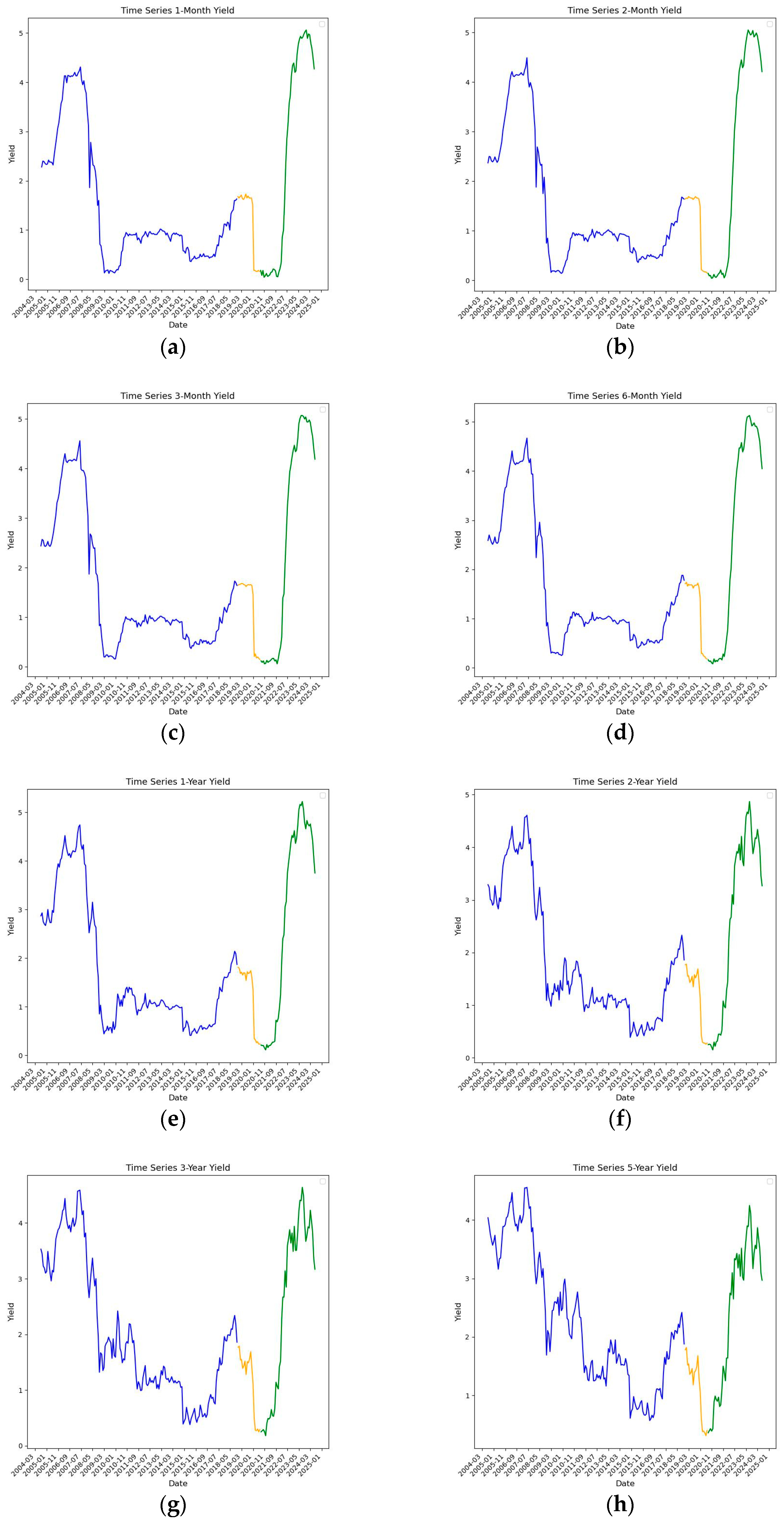
Figure 1. The time series plot for each dependent variable. Each graph shows the time series of changes in yield for bonds with specific maturity. The subgraphs (ak) represent results for bonds with 1-month, 2-month, 3-month, 6-month, 1-year, 2-year, 3-year, 5-year, 7-year, 10-year and long-term maturities respectively. We show training, validation, and test subsamples in blue, yellow, and green, respectively. The y-axis represents the yield values at percentage levels while the x-axis represents monthly intervals. Among bonds with shorter maturities (graphs af), we see that the changes in the yield are mostly dependent on regime shifts, while the yield across bonds with longer maturities (graphs gk) is more noisy and volatile signifying that the longer maturities are more sensitive to economic news.
Ijfs 13 00170 g001aIjfs 13 00170 g001b
Figure 2. Autocorrelation function (ACF) plot for dependent variables. Each graph shows the ACF for a bond with a specific maturity. The subgraphs (ak) represent results for bonds with 1-month, 2-month, 3-month, 6-month, 1-year, 2-year, 3-year, 5-year, 7-year, 10-year and long-term maturities respectively. The y-axis represents the autocorrelation values, while the x-axis represents the number of lags. The blue shaded area indicates values that fall within the 95% confidence interval, representing insignificant autocorrelation.
Ijfs 13 00170 g002aIjfs 13 00170 g002b
Figure 3. Heatmap of RMSE for various algorithms across different yield maturities.
Ijfs 13 00170 g003
Figure 4. Heatmap of MAE for various algorithms across different yield maturities. This heatmap figure above displays the mean absolute error (MAE) of each forecasting algorithm across different Canadian government bond yield maturities. Each cell lists the MAE for a given model–maturity pair. The number in each cell represents the MAE.
Ijfs 13 00170 g004
Figure 5. The performance of Group Lasso during test sample. The graphs show the time series of forecast errors across different bond Maturities along released and forecast yields. The subgraphs (ak) represent results for bonds with 1-month, 2-month, 3-month, 6-month, 1-year, 2-year, 3-year, 5-year, 7-year, 10-year and long-term maturities respectively. The solid amber line represents the model’s forecast while the dashed blue line represents the realized yield. In addition, we plotted the error values in the same graph (dashed red line).
Ijfs 13 00170 g005aIjfs 13 00170 g005b
Figure 6. Feature impact analysis. The normalized impact of the top five explanatory variables with highest impact are plotted in graphs (ak) for each bond maturity. The subgraphs (ak) represent results for bonds with 1-month, 2-month, 3-month, 6-month, 1-year, 2-year, 3-year, 5-year, 7-year, 10-year and long-term maturities respectively.
Ijfs 13 00170 g006aIjfs 13 00170 g006bIjfs 13 00170 g006cIjfs 13 00170 g006dIjfs 13 00170 g006eIjfs 13 00170 g006f
Table 1. Summary Statistics for Bond Yields.
Whole
Sample
Training SampleValidation
Sample
Testing Sample
MeanStdMeanStdMeanStdMeanStd
1-month yield 1.641.51.461.251.270.672.452.15
2-month yield 1.681.511.491.261.260.662.492.16
3-month yield 1.711.521.521.271.260.652.552.16
6-month yield 1.81.521.611.281.290.642.662.12
1-year yield1.911.491.731.281.30.632.752.02
2-year yield1.951.331.851.21.210.572.561.73
3-year yield2.031.281.991.191.190.562.51.59
5-year yield2.211.172.271.131.180.512.41.28
7-year yield2.351.122.471.091.20.512.381.17
10-year yield2.591.092.771.041.260.482.471.06
Long-term yield2.960.993.210.921.550.372.610.8
Table 2. Hyperparameters and the values used in validation step.
AlgorithmHyperparameters Tested ValuesFinal Selected Values
Random WalkNoneNoneN/A
OLSNoneNoneN/A
ARIMAorder of autoregression (p),
order of differentiation (d),
order of moving average (q)
(p, d, q) = (1, 0, 0), (0, 1, 0), (0, 0, 1), (1, 1, 0), (0, 1, 1), (2, 0, 0), (0, 2, 0), (0, 0, 2), (2, 1, 0), (0, 2, 1)(2, 1, 0)
LassoAlphaAlpha = 0.0001, 0.01, 0.005Alpha = 0.005
Group LassoAlphaAlpha = 0.001, 0.005, 0.1Alpha = 0.01
RidgeAlphaAlpha = 0.001, 0.005, 0.01, 0.1Alpha = 0.1
SGDPenalty, AlphaPenalty = L1, L2, Elastic Net
Alpha = 0.001, 0.01, 0.1, 1.0
Elastic Net, Alpha: 1.0
Random ForestsNumber of estimators (n_estimators),
maximum depth (max_depth)
n_estimators = 50, 100, 150
max_depth = 5, 10, 15
(n_estimators = 150, max_depth = 15)
XGBoostNumber of estimators (n_estimators),
maximum depth (max_depth)
n_estimators = 50, 100, 150
max_depth = 5, 10, 15
(n_estimators = 50,
max_depth = 5)
Extra TreesNumber of estimators (n_estimators),
maximum depth (max_depth)
n_estimators = 50, 100, 150
max_depth = 5, 10, 15
(n_estimators = 50,
max_depth = 5)
PLSNumber of components (C)C = 2, 5, 10, 20C = 2
Neural NetworksNumber of neurons in layer 1 (l1),
Number of neurons in layer 2 (l2)
l1 = 128, 64
l2 = 64, 32
(64, 64)
LSTMNumber of neurons in layer 1 (l1),
Number of neurons in layer 2 (l2),
Number of LSTM units (l3)
l1 = 128, 64
l2 = 64, 32
l3 = 32, 16
(128, 64, 16)
Table 3. The performance of each algorithm across validation and test samples.
AlgorithmPerformance in Validation Dataset (SRMSE)Performance in Test Dataset (SRMSE)Ranking Based on Performance on Test Dataset
Random Walk-4.1311
OLS10.2315
ARIMA1.893.369
Lasso2.043.052
Group Lasso2.352.981
Ridge4.374.7512
SGD1.953.127
Random Forest2.163.095
XGBoost2.133.178
Extra Trees2.163.074
PLS2.193.053
Neural Networks2.537.3114
LSTM1.936.8713
Ensemble 11.963.126
Ensemble 21.93.4710
Disclaimer/Publisher’s Note: The statements, opinions and data contained in all publications are solely those of the individual author(s) and contributor(s) and not of MDPI and/or the editor(s). MDPI and/or the editor(s) disclaim responsibility for any injury to people or property resulting from any ideas, methods, instructions or products referred to in the content.