Abstract
This study analyzes daily temperature and precipitation data collected from 44 weather stations throughout New York, New Jersey, and Connecticut to assess and quantify the historical climatic changes within these states. The study conducts a detailed examination of spatial and temporal trends, focusing on specific stations that best represent the climatic diversity of each area. A critical analysis aspect involves comparing temperature trends in urban and suburban areas, mainly focusing on New York City. The findings reveal a significant upward increasing trend in average temperatures across all seasons, with urban areas, especially NYC, exhibiting the most marked increases. This trend is notably sharp in the spring, reflecting climate change’s escalating influence. The study also observes an increase in the annual average temperatures and a concurrent decrease in the variability of temperature ranges, suggesting a stabilization of temperature fluctuations over time. Also, we identified a notable increase in heat wave frequency, more so in urban locales than in their suburban counterparts. Analysis of precipitation patterns, particularly in NYC, reveals a decline in snowfall days, consistent with the general warming trend. The results demonstrate significant trends in seasonal average temperatures, a decrease in the variability of temperatures, and a rise in heat wave occurrences, with urban areas typically experiencing warmer conditions. This comprehensive study highlights the need for a more in-depth analysis of spatial precipitation trends. It underscores the importance of continued research in understanding the multifaceted impacts of climate change, particularly in differentiating urban and rural experiences.
1. Introduction
It has been demonstrated time and time again that the human impact on Earth’s climate is unequivocally apparent and widespread, a fact that has been reflected in countless studies and the experiences of people worldwide [1]. The biggest anthropogenic impact on Earth’s climate is the global warming of the environment; as a result of human interference, certain greenhouse gases’ warming capacity, like methane and nitrous oxide, has increased by a factor of two [2]. Carbon dioxide, another major greenhouse gas, has seen its presence in the atmosphere increase by 47% between the years 1990 and 2008 [3]. The evidence indicates that warming will intensify throughout the 21st century with widespread consequences for Earth’s ecosystems, human health, agriculture, and economic productivity [4]. In addition to concerning global mean temperature increase trends, many studies observed and analyzed an increasing trend in precipitation [5]. The median intensity of extreme precipitation changes in proportion to changes in global mean temperature. For every 1 degree Kelvin (°K) change in global mean temperature, the median intensity of extreme precipitation events changes at a rate of 5.9% to 7.7% [6]. There are increasingly apparent changes in the precipitation pattern on both temporal and spatial scales in proportion to increasing temperatures, especially in the frequency and intensity of precipitation events [7].
Anthropogenic climate change has a noticeable impact on global precipitation patterns, especially in increasing the intensity and number of extreme events. In recent decades, there have been significant variations in these patterns, and studies are now focusing on the spatial and temporal scales of these variations to gain a greater understanding of the impact of climate change on rainfall [5]. The Fourth Assessment Report (AR4) by the Intergovernmental Panel on Climate Change indicates a worldwide increase in extreme precipitation events, concluding that this trend is expected to continue due to global warming [8].
Research on the increasing temperature trends worldwide has been a primary focus in climate change studies. Studies on a global scale have shown that the global extreme maximum and minimum temperatures and the likelihood of a dangerous heat index have increased, which has the potential for detrimental effects on both the economy and human health [4,9]. Further, climate models predict substantial changes in the number of extreme heat days, extreme cold days, heat stress days, and heat waves that are observed to increase in frequency, intensity, and extent [10,11].
Cities are increasingly susceptible to climate change impacts as a result of swift urbanization, a rise in flooding incidents, and the urban heat island (UHI) effect [12]. An urban heat island refers to a more developed location in terms of infrastructure where there is considerably more city space with relatively little green space. The UHI is a heat-related phenomenon directly related to this abundance of city space; specifically, UHI refers to the increased ability of an area to retain excessive amounts of heat due to extensive urban infrastructure, the presence of suitable heat-trapping materials such as asphalt, and regions within the area with low to no grass coverage [13].
Understanding how these trends will affect human living spaces along the urban-rural spectrum is becoming more crucial for societies globally due to their significant impacts on the economy, ecosystems, and human life [14]. As an urban area with considerable population density, New York City is especially vulnerable to the impacts of climate catastrophe [15]. To more efficiently develop a more robust infrastructure that can withstand the increasing number of extreme events, the historical climate and weather data of New York City and its surrounding areas must be closely scrutinized to understand better the future risks the region will face [16].
The association between the heat stress trend and climate change is undeniable and is projected to bring disastrous consequences, such as massive economic productivity and agricultural losses. Human mortality from extreme temperatures is expected to increase and negatively impact the physical and mental health of the general population, especially in vulnerable populations such as the elderly and those with low incomes [17,18]. Changes in temperature and the impact of heat waves are not evenly distributed throughout the study regions. With the horrific impact of heat stress on a population, understanding the temporal and spatial distribution of heat in the NYC region is crucial. Urban areas tend to have specific environmental characteristics such as increased air pollution, higher humidity, winds, and changes in soil composition compared to their rural counterparts; these factors have been shown to boost UHI, which aggravates the effects of heat stress [19,20].
A global study analyzing the annual maximum daily precipitation at over 8000 observation stations revealed statistically significant increases in maximum daily precipitation for about two-thirds of these stations. For instance, in the eastern United States, specifically New York, there has been a noticeable decrease in snowfall accompanied by an increase in rainfall [21].
Investigating the precipitation patterns in New York City and comparing them with those in nearby areas is intriguing given the intricate spatial and temporal nature of these patterns. It is particularly compelling to determine if the urban heat island (UHI) effect is pronounced in New York City and other urban centers within the tri-state area, as this could warrant additional mitigation efforts. This inquiry is grounded in the hypothesis that analyzing climate trends in the tri-state area would uncover trends like those already observed in New York City, as indicated by previous studies and climate observations.
2. Materials and Methods
2.1. Data Collection
This research concentrated on weather data from selected stations in New York, New Jersey, and Connecticut to effectively study the changing climate and weather extremes in New York City and its neighboring regions. Weather data were collected from 44 weather stations via accessible online databases maintained by the National Oceanic and Atmospheric Administration (NOAA). Figure 1 below displays the study area and the variation in data available per station. All available temperature and precipitation data were collected for each weather station, including daily maximum, minimum, and average temperature data and rainfall and snowfall data. It must be noted that each weather station collected data independently from other stations, causing a variation in the time range for each data set. Stations containing data dating back a century or more were chosen as the optimal stations for analysis.
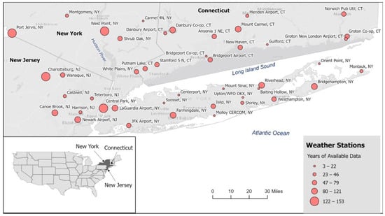
Figure 1.
Geographical placement location and data collection periods of these weather stations are in New York City, New Jersey, and Connecticut states (inset showing a map of United States of America).
2.2. Statistical and Data Analysis
Python and GIS software were used to conduct temporal and spatial analyses. Temporal trends were identified from select stations to understand historical temperature patterns and compare them. Time series analyses were performed using Python for several parameters per location: average annual temperature trends found after calculating the average monthly temperature, annual standard deviation trends, and annual trends in heat waves. For these analyses, New York City was chosen as the central urban location to provide the standard for all further analysis of temperature and precipitation trends. Researchers define extreme heat days differently across studies on changing temperatures and extreme heat. In a study on heat-related vulnerability in NYC, a heat wave is described as when temperatures reach beyond 95 °F (35 °C) for two or more consecutive days [18]. Other studies define heat stress as two or more consecutive days where the maximum temperature exceeds the 95th percentile [22,23]. This study will use the standard of heat stress days defined by those studies. Using data from the Central Park weather station, the 95th percentile was found to be 89 °F (31.6 °C), but for this study, it was rounded up to 90 °F (32.2 °C). Data from the Central Park station were also used to analyze urban temperature trends based on the longevity of data. The Charlotteburg, New Jersey, and Danbury, Connecticut stations were chosen as the suburban temperature trends based on the longevity of data. Linear regressions were plotted to determine trends, and probability tests (p-tests) were performed to determine significance. A spatial temperature analysis was conducted using the empirical Bayesian kriging interpolation method in GIS software, which uses a linear combination of weights at known locations to estimate the values at unknown locations [24]. This method uniquely considers the potential error in calculating the semivariogram by using repeated simulations, enhancing the interpolation results’ accuracy.
The annual mean temperature for a recent year was calculated for each weather station, with each station having a data record ranging from at least 80 to 140 years. These data were then used for interpolation to create a spatial visualization of temperature across most of the tri-state area, particularly in regions between stations.
Several analyses were conducted to understand the changing trends in precipitation patterns for New York City and the surrounding area, including temporal studies of the number of snowfall days, annual precipitation trends, and spatial precipitation trends during certain years. The stations chosen for precipitation analysis were all in New York: the Central Park, John F. Kennedy Airport (JFK), and LaGuardia Airport (LGA) weather stations. The yearly sums of precipitation from these stations were compared to identify three close years between the locations that appeared to contain extreme precipitation events. To visually determine the spatial distribution of precipitation trends for all 44 weather stations, the annual sum of precipitation per location for the three selected years was then mapped using GIS software.
3. Results and Discussions
3.1. Annual Seasonal Temperature Trends
Annual seasonal trends were analyzed by observing the trends in standardized temperature per season. Each set of monthly data was standardized to obtain a better visual representation of the temperature trends. The original temperature data collected were available in daily intervals. To analyze seasonal trends, the data were averaged for each month, and these monthly averages were standardized based on the mean of the monthly average temperature over all years. Equation (1) was used to standardize the data, where the variable month_averagei is the average for the month in the year i, month_average is the average for the month from all years, month_std is the standard deviation of the average temperature of the month from all the years, and s is the standardized value of month_averagei.
To determine whether there was an increasing or decreasing trend in temperature per season, the average of the respective monthly slopes was taken for each season (December, January, and February for winter; March, April, and May for spring; June, July, and August for summer; and September, October, and November for autumn). The trend was analyzed for four weather stations chosen because they contained the most data. The trends between the suburban and urban locations were then compared, as discussed in the results.
The time series for standardized seasonal temperatures for the Central Park weather station contains the oldest weather data for New York City (Figure 2). Each of the seasons’ plots has a positive trend, indicating a rise in the average temperature for each of the four seasons, with the highest trend indicated in spring. Probability tests (p-tests) were performed to identify the significance of these trends, and it was seen that the average p-test result per season was very close to 0, indicating that the positive trends are statistically significant.
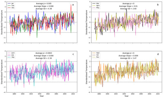
Figure 2.
Seasonal temperature variations in Central Park, NY: notable rising trends in (a) winter (January, February, December), (b) spring (March, April, May), (c) summer (June, July, August), (d) autumn (September, October, November).
The time series for standardized seasonal temperatures in Charlotteburg, New Jersey (Figure 3) had p-test results that indicated that the winter and autumn trends found were not statistically significant. However, the spring and summer trends were significant, and the average slopes indicated an increasing trend in temperature for these seasons.
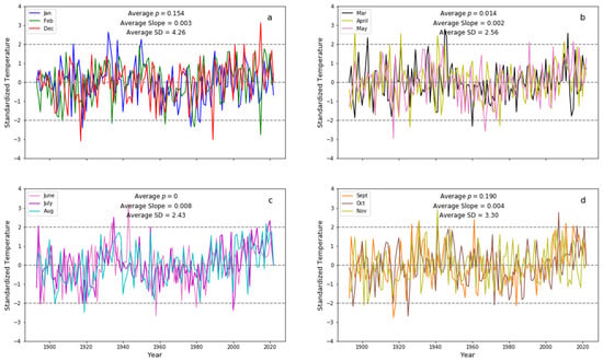
Figure 3.
Seasonal temperature patterns in Charlotteburg, NJ: marked increases in (b) spring (March, April, May) and (c) summer (June, July, August); minor variations in (a) winter (January, February, December) and (d) autumn (September, October, November).
Averaged p-test results for seasonal temperature trends in Danbury, Connecticut (Figure 4) indicate that all seasons’ trends were statistically significant, except for winter. For spring, summer, and autumn, the average slopes indicate an increasing trend in temperature.
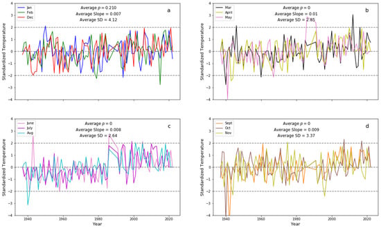
Figure 4.
Seasonal temperature patterns in Danbury, CT: notable rises in (b) spring (March, April, May), (c) summer (June, July, August), and (d) autumn (September, October, November); minimal fluctuations in (a) winter (January, February, December).
3.2. Annual Variation in Temperature
Standard deviation quantifies how spread out data points are from the mean value. To understand the trend in the annual temperature range (the difference between the maximum and minimum average temperature in a year), standard deviation time-series graphs were initially created for the same weather stations analyzed for seasonal temperatures. To reduce the influence that the mean could have on the slope of the standard deviation plots, the coefficient of variation (COV) for the standard deviation of temperature was also plotted.
The annual average temperature graph in Figure 5a indicates a significantly increasing trend of 2.8 °F per century for the Central Park location, indicating that temperatures have historically been rising. A significantly decreasing trend was seen in the COV in the standard deviation plot in Figure 5b, indicating that this location’s annual range of temperatures (difference between the highest and lowest temperatures) decreases over time. To minimize the influence of the mean on standard deviation trends, the COV of standard deviation was plotted in place of the raw standard deviation. Combining these results with the seasonal temperature trends, it can be concluded that the general temperature is rising along with the annual minimum temperature value.
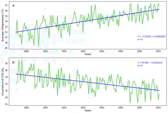
Figure 5.
Long-term temperature fluctuations in Central Park, 1869–2021: (a) trends in annual average temperature and (b) trends in the coefficient of variation of temperature standard deviation.
Figure 6a below shows a significantly increasing trend in temperature of 0.01 °F per century for the annual average temperature of Charlotteburg, New Jersey. The increasing trend matches that of Central Park. However, it is smaller in comparison, which was expected because New York City is classified as an urban location, and Charlotteburg is classified as a suburban. The COV of standard deviation was also plotted in Figure 6b; however, p-test results indicate that these trends may be insignificant and due to chance, and therefore, these trends were not included in the results of this paper.
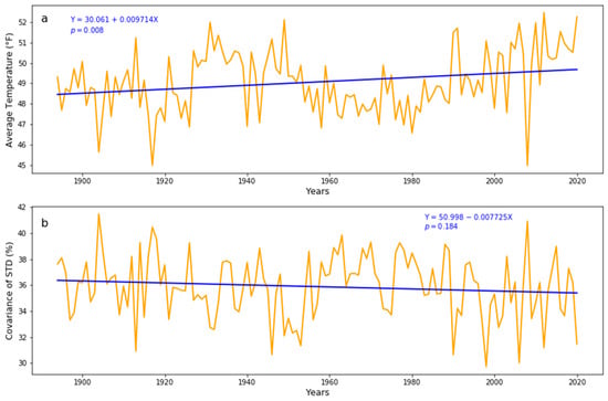
Figure 6.
Long-term temperature fluctuations in Charlotteburg from 1893 to 2021: (a) trends in annual average temperature and (b) trends in the coefficient of variation of temperature standard deviation.
The annual average temperature trend for Danbury, Connecticut, is shown in Figure 7a below. There is a significantly increasing trend for this location of 5.9 °F per century, much larger than that of Charlotteburg and Central Park. This may be because Danbury’s weather station has the shortest data span and represents the trends seen in more recent times compared to the other two locations. Temperature may not increase linearly over time but at a greater rate in recent years. The trend in COV of standard deviation for Danbury is shown in Figure 7b; however, these trends were not included in the results of this paper as the p-test results indicated that the trends might be due to chance and are, therefore, insignificant. It should be noted that the results do not include data from the following years as there were no data available: 1987, 1988, 1989, and 1990.
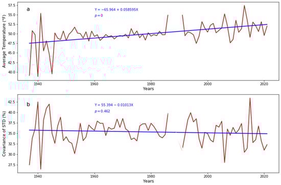
Figure 7.
Long-term temperature fluctuations in Danbury from 1937 to 2021: (a) trends in annual average temperature and (b) trends in the coefficient of variation of temperature standard deviation.
For a more comprehensive comparison, our analysis of annual temperature trends from 1937 to 2021 across three distinct weather stations reveals a substantial and uniform rise in temperatures. It should be noted that for visualization purposes, Figure 5 and Figure 6 presented data beyond this period to illustrate a more extended trend. The annual temperature trends from 1937 to 2021 across three weather stations indicate a significant and consistent temperature increase. At the Central Park weather station, there was a notable linear increase in average temperature of 0.023 °F per year, with a statistically significant p-value of 0. A similar trend was observed at the Charlotteburg weather station, where the average temperature slope was 0.017 °F per year, also significant with a p-value of 0.013. Additionally, the Danbury weather station recorded a more pronounced warming trend, with a linear increase of 0.058 °F per year, underlined by a p-value of 0, further confirming the regional trend of rising temperatures.
3.3. Heat Wave Trends
A time series representing the yearly frequency of heat waves was developed to study the historical patterns of heat wave incidents. According to a study on heat stress and climate change by Oleson et al. [25], heat stress indices tend to combine temperature and humidity factors and may include other assumptions such as radiation and windspeed; however, temperature alone may be used to assess heat stress, as is the case in many climate models [26]. In this study, a heat wave was defined to be an event where the maximum temperature reached 90 °F or higher in a location. The same weather stations were analyzed and later compared for spatial trends. It is essential to recognize that the durations of the heat wave events included in the analysis differed, with some lasting as long as ten days.
Figure 8a above shows a statistically significant increasing trend in the annual number of heat waves at Central Park’s weather station. The slope indicated a historical increase of 1.5 heat wave occurrences per century. A negative heat wave frequency trend was found for the Charlotteburg weather station, as seen in Figure 8b. However, it is not statistically significant as determined by the high p-test results of the trend. For heat wave trends for Danbury, Connecticut, in Figure 8c above, it was found that there has been a historically increasing trend in temperature. The trend was also statistically significant, with a positive slope of 2.8 heat waves per century. This trend was surprisingly more significant than that of Central Park, which may be due to the difference in temporal range since the rate at which temperature increases due to climate change is not linear.
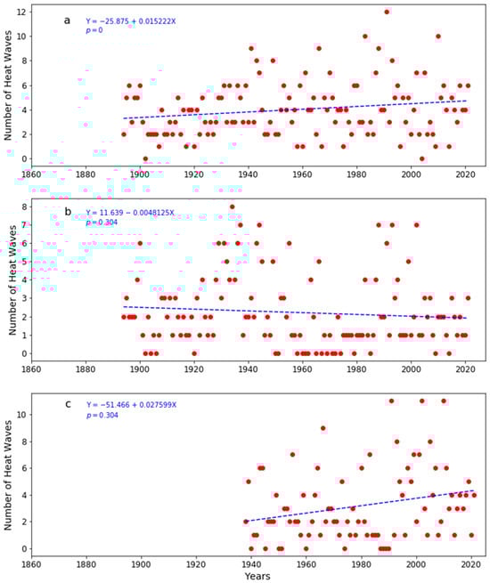
Figure 8.
Analysis of heat wave frequencies in (a) Central Park, NYC, (b) Charlotteburg, NJ, and (c) Danbury, CT.
3.4. Spatial Analysis of Temperature
The spatial analysis of the study site was conducted by selecting a recent year in which most weather stations had sufficient data available. The year 2019 was chosen, and each weather station was analyzed for how many daily average temperature data points they contained. To ensure that each region’s annual average temperature was accurate, any weather station missing more than 40 days out of 365 days of data was removed from the analysis. The remaining 32 weather stations were used to generate the spatial map of the 2019 yearly average of each station’s daily average using ArcGIS’s empirical Bayesian kriging spatial interpolation. Figure 9 shows that the NYC region and parts of New Jersey contain the hottest annual average temperature compared to the more rural areas upstate and further out in Long Island, with a difference of 7 °F between the coldest and hottest regions. The hottest regions appear concentrated in the densest urban regions of New York and New Jersey, potentially an indicator of the UHI effect.
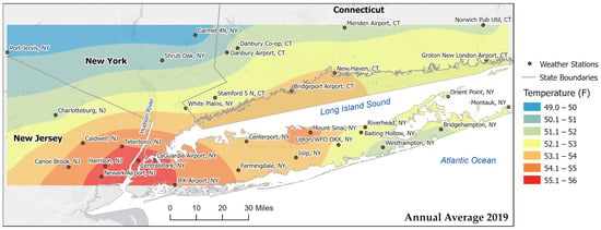
Figure 9.
Mapping 2019’s temperature patterns: annual average temperature spatial analysis.
Yin et al. [13] analyzed 20 years of temperature data for New York State (2001–2020) and revealed a gradual increase in surface temperatures, with July temperatures rising by 3.2 °C and 4.1 °C for maximums and minimums, respectively [13]. This study highlighted the urban heat island effect in New York City, especially from May to October, aligning with broader trends in the area and corroborating Kirkpatrick et al.’ [27] findings on the global increase in heat wave intensity, frequency, and duration, evident in the tri-state area.
3.5. Urban Snowfall Trends
According to Matonse et al., because NYC is experiencing an increase in temperature, the number of snowfall days is expected to drop in response [28]. To confirm this observation, a timelapse was graphed to compare the snowfall trends between the JFK Airport, LGA Airport, and Central Park stations, as shown below in Figure 10. The results for the number of snow days annually at the JFK station, as shown in Figure 10a, were collected from 1960 to 2022. The results for the number of snow days annually at the LGA station, as shown in Figure 10b, were collected from 1940 to 2022. The results for the number of snow days annually at the Central Park station, as shown in Figure 10c, were collected from 1865 to 2022.
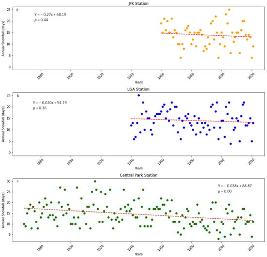
Figure 10.
Trends in annual snowfall days in NYC: comparison between (a) JFK Airport, (b) LGA Airport, and (c) Central Park, showcasing varying trends and statistical significances.
Linear regression revealed slightly decreasing snowfall trends for all three locations (JFK and LGA are in the southern and northern portions, respectively, of Queens County, while Central Park is in New York County). Interestingly, the Central Park station had two significant differences from the JFK and LGA stations. The Central Park station had the highest decreasing trend, and the LGA station had the lowest decreasing trend of the three stations. Using a p-value of less than 0.05 to determine statistical significance, the Central Park station’s findings were statistically significant, as shown by a p-value of 0. The findings of the remaining stations, JFK and LGA, were not statistically significant, as shown by p-values of 0.44 and 0.36. These results indicate that, at minimum, the number of snowfall days in New York County in NYC’s Manhattan is decreasing. While JFK and LGA stations currently do not exhibit the same trend as Central Park, ongoing data collection indicates that they are likely to show similar negative trends. However, it is important to note that the extent of these trends at JFK and LGA may not precisely mirror those observed at the Central Park station.
3.6. Extreme Precipitation Time Series
The standard deviation for extreme rainfall can vary depending on the location and study. Taking the previous research into account, extreme precipitation was defined for this study as any day with rainfall over two inches. The annual number of days with extreme precipitation and the annual sum of precipitation were plotted and graphed for the LGA, JFK, and Central Park stations and later compared. It must be noted that when visualizing the data for the JFK station (Figure 7), a high number of days with extreme precipitation was observed for 1950 (represented by the bar graph), amid other issues, such as extended periods with no data. For instance, a single day was recorded to have 17 inches of rainfall. For this reason, the extreme precipitation trends from the other weather stations in NYC were also determined by plotting in Figure 7a,b. The trends from these plots are further discussed in Section 3.7.
3.7. A Spatial Analysis of Extreme Precipitation Events
The time series in Figure 11 above was used to select three years of interest, notably for having had extreme precipitation events such as hurricanes sometime during the year. The 30-year period before each year chosen for analysis was analyzed with empirical Bayesian kriging interpolation methods similar to the one used for the temperature analysis. The purpose was to understand spatial precipitation trends for the tri-state area visually. The data were cross-referenced between the weather stations to ensure the years with accurate measurements were selected. In this process, it was found that the Central Park weather station had the most significant historic rainfall during 1983 and the greatest count of days in which extreme rain occurred. This high data point was not observed compared with the JFK and LGA weather stations. Further research found that Central Park’s weather station had a faulty weld in the rain gauge that skewed the data recorded for this particular year. The years of interest were 1972, 1991, and 2011.
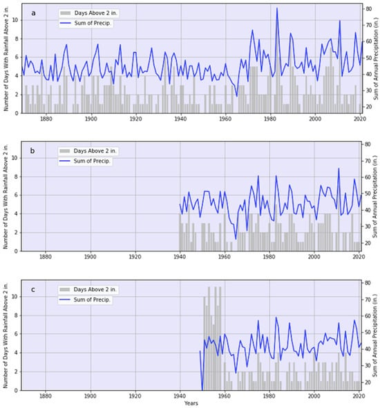
Figure 11.
Overview of annual precipitation in NYC: (a) Central Park, (b) LGA, and (c) JFK stations—comparing the number of days with rainfall higher than 2 inches and total annual precipitation in that year.
A study that examined extreme rainfall frequencies across the United States spanning 115 years using data from 1244 weather stations observed a significant rise in the annual frequency of extreme rainfall events, predominantly in the northeastern United States [29]. The statistical analysis from this study provided compelling evidence of anthropogenic influences driving these meteorological changes. Notably, the tri-state area encompassing New York, New Jersey, and Connecticut was identified as a hotspot for increasing extreme precipitation events. These observations of escalating rainfall extremes in New York City, as presented in Figure 11, are in line with the regional trends observed by Armal et al. [29].
3.7.1. 1972: Hurricane Agnes
In June of 1972, Hurricane Agnes nearly hit the East Coast, ending in New York as a tropical storm. This tropical cyclone caused massive flooding and mass destruction. At the time, Agnes was considered the most destructive hurricane in U.S. history. It is said to have brought very heavy rain after it had combined with an extratropical cyclone, causing what had been considered record-breaking flooding at the time [30]. Figure 12 shows two interpolated maps: the region’s annual sum precipitation data across thirty years from 1943 to 1972 and the year when Hurricane Agnes happened (1972). From these maps, it can be appreciated how this extreme weather event’s precipitation easily surpassed the average precipitation over the last thirty years across the entire study area. It can also be noted that the impact was incredibly widespread, which is coherent with the reports of flooding and damage in multiple locations; not one location’s precipitation levels during the hurricane year was lower than the other years when extreme weather events of Agnes’s magnitude did not occur [30].
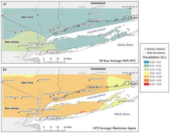
Figure 12.
A spatial analysis of precipitation using (a) a thirty-year average prior to Hurricane Agnes (1943–1972) and (b) the year Hurricane Agnes occurred (1972).
3.7.2. 1991: Hurricane Bob
In August of 1991, Hurricane Bob affected much of the tri-state area and other states such as Massachusetts and Rhode Island [31]. Although it did not make direct landfall in the New York region, it passed by the eastern tip of Long Island and made landfall in Rhode Island as a Category 2 storm. Figure 13 shows two interpolated maps: the region’s annual sum precipitation data across thirty years from 1962 to 1991 and the year when Hurricane Bob happened (1991). These maps actually show a different trend than its counterparts Hurricanes Agnes and Irene; during 1991, some regions of the study location—especially cities like Port Jervis, New Jersey, and Charlottesburg, New Jersey—had lower amounts of precipitation during Hurricane Bob despite the precipitation average before Bob being higher. This can be due to Bob’s path; as described above, this hurricane passed the tip of Long Island, New York. Though there is no difference in rain received for the surrounding cities (Bridgehampton, New York, and Groton Co-op, Connecticut), there is a spatial difference that is biased towards Long Island, New York.
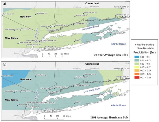
Figure 13.
A spatial analysis of precipitation using (a) a thirty-year average prior to Hurricane Bob (1962–1991) and (b) the year Hurricane Bob occurred (1991).
3.7.3. 2011: Hurricane Irene
Several extreme precipitation events occurred in 2011, making it one of the wettest years on record. Notably, Irene struck New York sometime in August. According to the data, the most significant annual precipitation sum was 80.37 inches in West Point, New York [32]. Figure 14 shows two interpolated maps: the region’s annual sum precipitation data across thirty years from 1982 to 2011 and the year when Hurricane Irene struck in 2011. The second interpolation map displaying Irene’s impact in Figure 14 confirms the unusually large amount of precipitation West Point, NY, received compared to the previous thirty-year average. Most notably, unlike the two previous hurricanes, Agnes and Bob, Irene had the most concentrated impact; during Hurricane Irene, the area with the highest precipitation rate was mainly mainland New York State, as reflected in West Point, New York. And the farther a city is from those areas that were highly affected, the lower the precipitation levels, which drop steadily with distance. The precipitation was also higher in urban areas compared to Hurricanes Agnes and Bob.
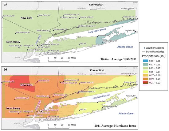
Figure 14.
A spatial analysis of precipitation using (a) a thirty-year average prior to Hurricane Irene (1982–2011) and (b) the year Hurricane Irene occurred (2011).
4. Conclusions
This comprehensive study has shed light on the significant climate trends across New York, New Jersey, and Connecticut, with a special focus on the variations in temperature, the frequency of heat waves, and precipitation patterns. The analysis reveals a consistent and statistically significant rise in average temperatures across all seasons, most notably in urban areas like Central Park, NY, with the most pronounced increase observed during spring. This finding indicates the ongoing impact of climate change in these regions. In terms of annual temperature variability, there is a notable trend of increasing annual average temperatures coupled with a decreasing range in temperature variance. This is particularly evident in Central Park, where we observed a significant increase of 2.8 °F per century, suggesting a narrowing of temperature fluctuations over time.
Additionally, the study highlights a significant increase in the frequency of heat waves, especially evident in areas such as Central Park and Danbury, CT. This trend, however, is not uniform across different locations, indicating a complex interplay of regional climatic factors. The spatial analysis for 2019 revealed a distinct temperature gradient, with urban areas exhibiting higher temperatures, potentially indicative of the urban heat island effect. This aspect underscores the need for further exploration to better understand the dynamics of urban–rural temperature differences.
Our analysis of snowfall trends in New York City, particularly Central Park, shows a decrease in snowfall days, aligning with the overall warming trends observed in urban areas. While showing variability, the study of extreme precipitation events also highlighted the complexities in attributing these changes directly to climate change, especially considering the spatial variability and the impact of extreme weather events like hurricanes.
The findings of this study are crucial for understanding regional climate dynamics in the context of global climate change. The observed trends indicate a clear shift towards warmer climates with altered precipitation patterns, necessitating further research to delve deeper into the spatial variability of these changes. This is particularly important for understanding the impact of extreme weather events and their differential effects on urban versus rural areas. Overall, this study provides valuable insights and a foundation for future research and policy making aimed at mitigating and adapting to the ongoing climatic shifts.
Author Contributions
Each author contributed to the reported research. Conceptualization, T.L., S.M., S.A. and G.G.; methodology, S.A. and T.L.; software, S.A. and G.G.; validation, G.G., S.M. and S.A.; formal analysis, S.M.; investigation, S.A.; resources, G.G.; data curation, G.G.; writing—original draft preparation, S.M.; writing—review and editing, T.L.; visualization, S.A.; supervision, T.L.; project administration, T.L.; funding acquisition, T.L. All authors have read and agreed to the published version of the manuscript.
Funding
This project was partially supported by the National Science Foundation—Research Experiences for Undergraduates (REU) program, grant AGS-2150432, and the National Oceanic and Atmospheric Administration Educational Partnership Program with Minority-Serving Institutions—Cooperative Science Center for Earth System Sciences and Remote Sensing Technologies under the Cooperative Agreement, grant numbers NA16SEC4810008 and NA22SEC4810016. The authors also acknowledge the NSF-REU program for their support of Sameeha Malikah, the NOAA-EPP Program for their support of Stephanie Avila, and the Pinkerton Foundation for their support of Gabriella Garcia. The statements contained in this paper are not the opinions of the funding agency or the U.S. government but rather reflect the authors’ findings and opinions.
Data Availability Statement
The data presented in this study are available on request from the corresponding author.
Acknowledgments
The authors extend their gratitude to Naresh Devineni for his mentorship in conceptualizing the study, enhancing its methodology, and offering technical guidance. Furthermore, they express their appreciation for Shakila Merchant’s support and encouragement of student participation through the Summer Bridge and HIRES programs.
Conflicts of Interest
The authors declare no conflicts of interest.
References
- IPCC. Climate Change 2022. Mitigation of Climate Change. In Working Group III; Cambridge University Press: Cambridge, UK, 2022. [Google Scholar]
- Tian, H.; Lu, C.; Ciais, P.; Michalak, A.M.; Canadell, J.G.; Saikawa, E.; Huntzinger, D.N.; Gurney, K.R.; Sitch, S.; Zhang, B.; et al. The Terrestrial Biosphere as a Net Source of Greenhouse Gases to the Atmosphere. Nature 2016, 531, 225–228. [Google Scholar] [CrossRef] [PubMed]
- Le Quéré, C.; Raupach, M.R.; Canadell, J.G.; Marland, G.; Bopp, L.; Ciais, P.; Conway, T.J.; Doney, S.C.; Feely, R.A.; Foster, P.; et al. Trends in the Sources and Sinks of Carbon Dioxide. Nat. Geosci. 2009, 2, 831–836. [Google Scholar] [CrossRef]
- Lee, D.; Brenner, T. Perceived Temperature in the Course of Climate Change: An Analysis of Global Heat Index from 1979 to 2013. Earth Syst. Sci. Data 2015, 7, 193–202. [Google Scholar] [CrossRef]
- Ban, N.; Schmidli, J.; Schär, C. Heavy Precipitation in a Changing Climate: Does Short-Term Summer Precipitation Increase Faster? Geophys. Res. Lett. 2015, 42, 1165–1172. [Google Scholar] [CrossRef]
- Westra, S.; Alexander, L.V.; Zwiers, F.W. Global Increasing Trends in Annual Maximum Daily Precipitation. J. Clim. 2013, 26, 3904–3918. [Google Scholar] [CrossRef]
- Vu, T.M.; Mishra, A.K. Nonstationary Frequency Analysis of the Recent Extreme Precipitation Events in the United States. J. Hydrol. 2019, 575, 999–1010. [Google Scholar] [CrossRef]
- IPCC. Climate Change 2007. The Fourth Assessment Report (AR4). Intergov. Panel Clim. Chang. 2007, 1, 976. [Google Scholar]
- Brown, S.J.; Caesar, J.; Ferro, C.A.T. Global Changes in Extreme Daily Temperature since 1950. J. Geophys. Res. Atmos. 2008, 113. [Google Scholar] [CrossRef]
- Bathiany, S.; Dakos, V.; Scheffer, M.; Lenton, T.M. Climate Models Predict Increasing Temperature Variability in Poor Countries. Sci. Adv. 2018, 4, eaar5809. [Google Scholar] [CrossRef]
- IPCC. Global Warming of 1.5 °C; IPCC: Geneva, Switzerland, 2022. [Google Scholar]
- Masson, V.; Lemonsu, A.; Hidalgo, J.; Voogt, J. Urban Climates and Climate Change. Annu. Rev. Environ. Resour. 2020, 45, 411–444. [Google Scholar] [CrossRef]
- Yin, Z.; Liu, Z.; Liu, X.; Zheng, W.; Yin, L. Urban Heat Islands and Their Effects on Thermal Comfort in the US: New York and New Jersey. Ecol. Indic. 2023, 154, 110765. [Google Scholar] [CrossRef]
- Cebrián, A.C.; Asín, J.; Gelfand, A.E.; Schliep, E.M.; Castillo-Mateo, J.; Beamonte, M.A.; Abaurrea, J. Spatio-Temporal Analysis of the Extent of an Extreme Heat Event. Stoch. Environ. Res. Risk Assess. 2022, 36, 2737–2751. [Google Scholar] [CrossRef]
- Orton, P.; Lin, N.; Gornitz, V.; Colle, B.; Booth, J.; Feng, K.; Buchanan, M.; Oppenheimer, M.; Patrick, L. New York City Panel on Climate Change 2019 Report Chapter 4: Coastal Flooding. Ann. N. Y. Acad. Sci. 2019, 1439, 95–114. [Google Scholar] [CrossRef]
- Zimmerman, R.; Foster, S.; González, J.E.; Jacob, K.; Kunreuther, H.; Petkova, E.P.; Tollerson, E. New York City Panel on Climate Change 2019 Report Chapter 7: Resilience Strategies for Critical Infrastructures and Their Interdependencies. Ann. N. Y. Acad. Sci. 2019, 1439, 174–229. [Google Scholar] [CrossRef] [PubMed]
- López-Bueno, J.A.; Navas-Martín, M.A.; Linares, C.; Mirón, I.J.; Luna, M.Y.; Sánchez-Martínez, G.; Culqui, D.; Díaz, J. Analysis of the Impact of Heat Waves on Daily Mortality in Urban and Rural Areas in Madrid. Environ. Res. 2021, 195, 110892. [Google Scholar] [CrossRef]
- Madrigano, J.; Ito, K.; Johnson, S.; Kinney, P.L.; Matte, T. A Case-Only Study of Vulnerability to Heat Wave–Related Mortality in New York City (2000–2011). Environ. Health Perspect. 2015, 123, 672–678. [Google Scholar] [CrossRef] [PubMed]
- Bornstein, R.D. Observations of the Urban Heat Island Effect in New York City. J. Appl. Meteorol. 1968, 7, 575–582. [Google Scholar] [CrossRef]
- Parker, D.E. Urban Heat Island Effects on Estimates of Observed Climate Change. Wiley Interdiscip. Rev. Clim. Chang. 2010, 1, 123–133. [Google Scholar] [CrossRef]
- Horton, R.; Rosenzweig, C.; Gornitz, V.; Bader, D.; O’Grady, M. Climate Risk Information: Climate Change Scenarios and Implications for NYC Infrastructure. New York City Panel on Climate Change. Ann. N. Y. Acad. Sci. 2010, 1196, 147–228. [Google Scholar] [CrossRef]
- Heo, S.; Bell, M.L.; Lee, J.T. Comparison of Health Risks by Heat Wave Definition: Applicability of Wet-Bulb Globe Temperature for Heat Wave Criteria. Environ. Res. 2019, 168, 158–170. [Google Scholar] [CrossRef]
- Nairn, J.R.; Fawcett, R.J.B. The Excess Heat Factor: A Metric for Heatwave Intensity and Its Use in Classifying Heatwave Severity. Int. J. Environ. Res. Public Health 2014, 12, 227–253. [Google Scholar] [CrossRef] [PubMed]
- Wu, T.; Li, Y. Spatial Interpolation of Temperature in the United States Using Residual Kriging. Appl. Geogr. 2013, 44, 112–120. [Google Scholar] [CrossRef]
- Oleson, K.W.; Monaghan, A.; Wilhelmi, O.; Barlage, M.; Brunsell, N.; Feddema, J.; Hu, L.; Steinhoff, D.F. Interactions between Urbanization, Heat Stress, and Climate Change. Clim. Chang. 2015, 129, 525–541. [Google Scholar] [CrossRef]
- Ward, K.; Lauf, S.; Kleinschmit, B.; Endlicher, W. Heat Waves and Urban Heat Islands in Europe: A Review of Relevant Drivers. Sci. Total Environ. 2016, 569, 527–539. [Google Scholar] [CrossRef] [PubMed]
- Perkins-Kirkpatrick, S.E.; Lewis, S.C. Increasing Trends in Regional Heatwaves. Nat. Commun. 2020, 11, 3357. [Google Scholar] [CrossRef]
- Matonse, A.H.; Pierson, D.C.; Frei, A.; Zion, M.S.; Schneiderman, E.M.; Anandhi, A.; Mukundan, R.; Pradhanang, S.M. Effects of Changes in Snow Pattern and the Timing of Runoff on NYC Water Supply System. Hydrol. Process. 2011, 25, 3278–3288. [Google Scholar] [CrossRef]
- Armal, S.; Devineni, N.; Khanbilvardi, R. Trends in Extreme Rainfall Frequency in the Contiguous United States: Attribution to Climate Change and Climate Variability Modes. J. Clim. 2018, 31, 369–385. [Google Scholar] [CrossRef]
- Bailey, J.F.; Patterson, J.L.; Paulhus, J.L.H. Hurricane Agnes Rainfall and Floods, June–July 1972; U.S. Government Printing Office: Washington, DC, USA, 1975. [Google Scholar]
- Sun, Y.; Chen, C.; Beardsley, R.C.; Xu, Q.; Qi, J.; Lin, H. Impact of Current-Wave Interaction on Storm Surge Simulation: A Case Study for Hurricane Bob. J. Geophys. Res. Ocean. 2013, 118, 2685–2701. [Google Scholar] [CrossRef]
- Aerts, J.C.J.H.; Botzen, W.J.W. Brief Communication “Hurricane Irene: A Wake-up Call for New York City?”. Nat. Hazards Earth Syst. Sci. 2012, 12, 1837–1840. [Google Scholar] [CrossRef][Green Version]
Disclaimer/Publisher’s Note: The statements, opinions and data contained in all publications are solely those of the individual author(s) and contributor(s) and not of MDPI and/or the editor(s). MDPI and/or the editor(s) disclaim responsibility for any injury to people or property resulting from any ideas, methods, instructions or products referred to in the content. |
© 2024 by the authors. Licensee MDPI, Basel, Switzerland. This article is an open access article distributed under the terms and conditions of the Creative Commons Attribution (CC BY) license (https://creativecommons.org/licenses/by/4.0/).