1. Introduction
The emergence of Volunteered Geographical Information (VGI) offers a new possibility to produce open geographic data [
1]. OpenStreetMap (OSM), as one of the most successful VGI projects, has attracted millions of contributors to produce a global coverage of spatial data, which proves the power of crowdsourcing in geographic data production [
2]. Previous research suggests that OSM data have decent quality in some areas, e.g., Great Britain or Germany, even exceeding proprietary data in some aspects [
3,
4]. More and more projects use OSM data to replace proprietary data in order to take advantage of its openness and speed of evolution [
5].
Who the contributors are and how the data accumulate make the fundamental difference between VGI and traditional geographical data. Plenty of research has been carried out while trying to identify motivations [
6], spatio-temporal contributing patterns [
3], and the social structure of contributor communities [
7]. A frequently reported phenomenon is contribution inequality, which means that a minority of all users make nearly all contributions, resembling many other online communities. For instance, even in earlier years of OSM history, the top 3.5% of all registered users account for 98% of all OSM data [
3], representing very high contribution inequality even when compared to other crowdsourcing projects. According to related theories such as “citizen science” [
1], it is tempting to regard the crowdsourced data as products of the whole “crowd”. However, the phenomenon of contribution inequality alerts one that, although a huge number of contributors take part in the project, the so-called “vocal minority” [
8] account for nearly all data, while most of the community are just a “silent majority”.
The phenomenon of contribution inequality is rooted in the essence of VGI as a crowdsourcing scientific effort [
9]. Knowledge gaps exist between the contributors, ranging from geographic professionals to amateurs [
10]. Experts can be enormously more productive than amateurs, but their population cannot well scale as the project expands. The “vocal minority” and the “silent majority” thus emerge and the contribution inequality takes shape. Contribution inequality has substantial and complicated impacts on data quality and developments of the project. On the one hand, active contributors normally produce data of better quality thanks to their expertise of tools and rich experiences. Unequal contributions mean that more data come from active contributors, which may lead to higher data quality. On the other hand, higher contribution inequality reduces heterogeneity and risks the project, since problems from only a few contributors could have a huge impact on the project.
Plenty of previous work mentions contribution inequality in OSM, and some of them even discuss it deliberately. Heipke discusses the importance of the 90-9-1 rule [
11] in developing geospatial crowdsourcing projects [
12]. Haklay and Weber suggest that OSM exhibits inequality similar to other online communities [
2]. Mooney and Corcoran observe the “long-tail” nature when analyzing collaborative contribution patterns [
7]. Neis and Zipf provide a comprehensive summary on the inequality of contributions of the node, way, and relations, and compare user behaviors between four contributor groups with different activeness [
13]. In later work, Neis
et al. also compare distributions of nonrecurring, junior, and senior mappers between different cities all over the world [
14]. Budhathoki and Haythornthwaite use questionnaires to find motivations behind OSM contributors and report that there exist significant differences in motivations between casual and active contributors [
6]. These explorations improve our understanding on contribution inequality from various aspects, but temporal analysis and in-depth investigations on this topic are still unseen.
In this paper, we will first provide a quantitative measure of contribution inequality, and then answer the general question of “top X% of all contributors make Y% of all contributions”, given any X and Y for an arbitrary period. Trends in contribution inequality will then be discussed. Changes in both the “silent majority” and the “vocal minority” can influence trends in contribution inequality. The silent majority can increase significantly in size so that the minority become even more marginal in population. The vocal minority can become even more productive, which enlarges the gap between the two ends of the community. Both of the cases could result in more unequal contributions. In this paper, we will investigate which is more important, and see whether the results differ in different countries. Special attention is paid to whether there exist huge imports, which may make fundamental differences to the mechanism of OSM contributions [
15]. We perform comparative case studies in Germany, France, the United States, and the Netherlands. These four countries will be divided into two groups based on whether imports are significant among all contributions within the research period. The remaining sections are structured as follows:
Section 2 describes our methods, including how to measure contribution inequality, and the methodology to investigate changes in the vocal majority as well as the silent minority.
Section 3 applies these methods to changeset data in four countries and discusses the results.
Section 4 concludes this paper and suggests possible future work.
2. Methods
In this section, we present our methods to analyze contribution inequality in OSM. To measure inequality, we calculate the Lorenz curve and the Gini coefficient using OSM changesets. The silent majority have a huge population and the amount of individual contributions is less variant. Therefore, we investigate how the structure of the community changes over time. Conversely, the vocal minority have a small population and their individual contributions can be highly irregular. Thus, we discover them and analyze how their productivity changes. We use quantile-based classifications and Mann–Whitney–Wilcoxon two-sample tests as our main tools, respectively. OSM contributions follow heavy-tailed distributions [
16], which may make various statistical methods, e.g., moment-based statistics or the Student’s
t-test, inappropriate. In this paper, we use robust statistical methods only.
2.1. OSM Changesets
We use OSM changeset data as the main data source. A changeset contains a bulk of edits and some metadata to describe these edits. The concept of the changeset is formally introduced in 2009 [
17], but it is possible to generate changeset data before 2009 by extracting diffs from the full OSM editing history. The generated data lack some meta information but still provide useful information such as the date and time of contributions, and user ID. An important advantage of changesets is that they are strictly associated with individual users, which are better for calculating contributions than directly working on the OSM dataset. Changeset data can be obtained from Planet OSM [
18]. Metadata of a changeset include a universal changeset ID, the contributor’s name and ID, opening and closing times, the bounding box of all edits, the number of changes in this changeset, and tags. Tags are flexible metadata provided by contributors or generated by editing tools, which can help to understand the data sources, tools, purpose, and many other aspects about the containing contributions. For example, the tag “source” indicates from where the data come, with values like “knowledge”, “survey” or “NHD” (National Hydrography Dataset). The tag “comment” contains freely composed information, e.g., “Align graveyard and park with Yahoo Aerial Imagery”, which describes what the contributions are and how they are made.
2.2. Inequality
We use the Lorenz curve and the Gini coefficient to depict a quantitative measure of contribution inequality. The Lorenz curve and the Gini coefficient are two closely related methods. They are conventionally used in economics to measure national inequality of income. Furthermore, they have been generalised to describe inequalities in other fields, such as education [
19] and Wikipedia contributions [
20]. In recent literature, they are also used to analyse OSM Wiki editing activities [
21]. In our context, assuming that contributors are sorted by their contributions ascendingly, we choose the cumulative share of contributors as X and the cumulative share of contributions as Y, and get a Lorenz curve for OSM contributions. If contributions from all individuals are strictly equal, the Lorenz curve will become a straight line named the line of equality, as is shown in
Figure 1. The Gini coefficient can then be calculated by dividing area A by area B. The Gini coefficient ranges from 0 (absolutely equal) to 1 (absolutely unequal), and a larger value indicates a higher level of inequality. From the Lorenz curve, we can easily answer the general question: “X% of all contributors make Y% of all contributions.” For example, given
, we get
in
Figure 1, which means that 1–
contributors make
contributions. We can provide any
Y to get the corresponding
X. The Lorenz curves and the Gini coefficient can be compared between sample collections with different sizes. This property is critical for temporal analysis, since the number of contributors each year keeps changing.
One problem with the Gini coefficient is that it does not provide any hint of the underlying demographic structure. Our analysis on the majority and the minority can act as a good complement to it.
2.3. Structure Changes in Community
We classify all contributors into several classes and investigate how the size of each class changes over time. Previous work usually classifies contributors based on manually chosen breaks. For example, Neis and Zipf classify contributors who have created more than 1000 nodes as “Senior Mappers”, who have created more than 10 nodes but fewer than 1000 nodes as “Junior Mappers”, and who have created fewer than 10 nodes as “Nonrecurring Mappers” [
13]. Deciding all breaks in that way quickly becomes impractical if we want an arbitrary number of classes. Moreover, arbitrarily chosen bins on heavy-tailed distributions may result in inaccurate estimations [
22]. In this paper, we determine breaks based on quantiles, which are robust against heavy-tailed distributions. The procedure is as follows: (1) Choose a reference year, and calculate N-quantiles for that year, resulting in N-1 breaks; (2) For every year, use the N-1 breaks to classify contributors active in that year into N classes. The structural changes in the community can be easily seen by comparing corresponding classes between years.
Figure 1.
The concept of the Lorenz curve and the Gini coefficient.
Figure 1.
The concept of the Lorenz curve and the Gini coefficient.
Figure 2.
Various Choice of N when calculating structural changes. (a) N = 3; (b) N = 5; (c) N = 10.
Figure 2.
Various Choice of N when calculating structural changes. (a) N = 3; (b) N = 5; (c) N = 10.
The value of N requires some discussions. More classes may reveal more structural details, but will also introduce noise, which may suppress important information. Ties of quantiles may also introduce extra complexity if we use too many classes. In this paper, we choose N = 5 empirically. To find the most appropriate value of N, we test tertiles (N = 3), quintiles (N = 5), and deciles (N = 10) for data in Germany, and see which one reveals more information. As is shown in
Figure 2, classes based on quintiles (
Figure 2b) provide more information than classes based on tertiles (
Figure 2a) by revealing that contributors who make 75–576 contributions keep a stable proportion in the community. However, information like this becomes unclear again in the case of deciles (
Figure 2c). Similar results apply to the other three countries, so we use quintile-based classifications.
2.4. Productivity Changes in the Minority
In this paper, we define the “vocal minority” as the top contributors who make 95% of all contributions in total. The definition is straightforward, since making 95% of all contributions means that the contributors play major roles in the project. The productivity of the “vocal minority” contributors in each year is compared between neighbouring years using the Mann–Whitney–Wilcoxon (MWW) two-sample test. The MWW test is a nonparametric test aiming to verify whether two sample sets are drawn from different distributions [
23] or whether one sample set is statistically larger/smaller than the other. We take the one-sided version to find whether the contributors become more productive or less. Given the set of selected contributors in the
year as
and that in the next year as
, the null hypothesis
of our test is:
H0:
and make the same amount of contributions.
The alternative hypothesis can be:
H1:
Contributors in tend to be more productive than , i.e., individual contributions of are statistically greater than those of .
Or on the opposite side,
H1:
Contributors in tend to be less productive than , i.e., individual contributions of are statistically smaller than those of .
may be rejected so that the productivity definitely increases or decreases, or the result is inconclusive. The MWW test has some characteristics which are ideal for our study. Unlike some other tests, such as the Student’s
t-test, the MWW test does not assume normality of the data, which makes it a robust method for heavy-tailed distributions of OSM contributions [
24]. Moreover, the MWW test does not require sample sets to be equally sized, which is necessary because selected contributors differ in population between different years.
Apart from knowing whether the productivity increases or decreases, we are also interested in how big the changes are. In addition, for the inconclusive case, we want to check whether is probably true. Estimations of changes are calculated along with confidence intervals at a 90% confidence rate to assess their uncertainty. We use 90% here to limit a type I error on both sides to 5%.
3. Experiments and Results
Four countries (Germany, France, the United States, and the Netherlands) are chosen as study areas. These countries are divided into two groups: countries where imports are insignificant, including Germany and France, and countries where imports are significant, including the United States and the Netherlands. In this section, we will first discuss some choices for the experiments. After that, we focus on measuring contribution inequality and reveal how it changes over time. Changes in the majority and the minority are investigated in subsequent experiments. In the last part, we combine contribution inequality with these two kinds of contributors and answer the following questions: Do OSM contributions become more unequal? Which kind of contributor has more of an impact on the trends in contribution inequality, the silent majority or the vocal minority? What are the differences between countries with and without significant imports?
3.1. Experiment Settings
The research countries are chosen with two concerns. Firstly, the population, number of contributors, and number of contributions should be large enough to be statistically sound; Secondly, OSM in these countries should evolve from scratch to form a mature OSM community, so that the data can cover different stages of the project. The United States is known to have lots of imports into OSM, especially TIGER. The Netherlands has far fewer imports than the United States, but there are still some significant ones, e.g., Automotive Navigation Data (AND). In contrast, Germany and France have no substantial imports within our research time. This knowledge can be confirmed by the official catalogue of OSM imports [
25]. We choose four countries so that we can perform both in-group and between-group comparisons. As for temporal granularity, we choose the year as the basic time unit, instead of the quarter, month or shorter periods, in order to keep an acceptable sample size and avoid seasonal impacts as well [
5]. We only use changesets from 2007 to 2014, since data in 2005 and 2015 are incomplete, and there are only 127 contributors in 2006, which can be too few to be statistically sound.
It is debatable whether to include all registered users or only contributors [
13]. We suggest that for research on OSM contributions, registered users who never contribute have no meaningful difference from unregistered users. In addition, when dealing with a specific area, it is impossible to distinguish in statistics those who never contribute from those who contribute but not in this area. In this paper, we analyze contributors only. The “silent majority” are thus not really “silent”. However, their contributions are very insignificant compared to active contributors.
There are many possible measures for OSM contributions: number of changesets, number of features, node counts, or summation of all kinds of changes. Finding a universal measure is inherently hard, since the concept of “contribution” is quite vague. In this paper, we choose the summation of all kinds of changes because of the following three reasons. Firstly, coarse summaries such as feature counts or the number of changesets are not good measures regarding their highly heterogeneous contents. For example, a river with thousands of nodes should be counted as larger contributions than a simple building with only four nodes; Secondly, homogeneous summaries such as node counts and tag edits cannot cover all contributions. Last but not least, the summations of all changes are already provided in the changeset data from PlanetOSM. This measure suffers from the defect that it does not distinguish different types of contributions. However, it is still the best measure for our purpose to provide an overview of all contributions.
3.2. The Results of Inequality Investigation
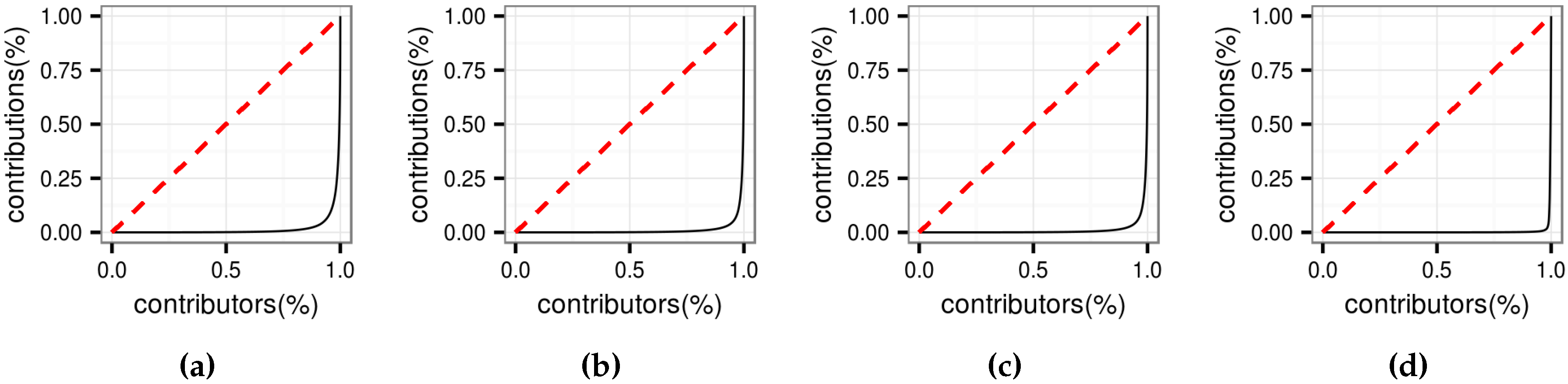
The Lorenz curves of the OSM contributions in the four countries are shown in
Figure 3. The curves are far away from the line of equality, indicating that OSM contributions in all four countries in 2014 are very unequal.
Figure 3.
Lorenz curves in 2014. (a) Germany; (b) France; (c) The United States; (d) The Netherlands.
Figure 3.
Lorenz curves in 2014. (a) Germany; (b) France; (c) The United States; (d) The Netherlands.
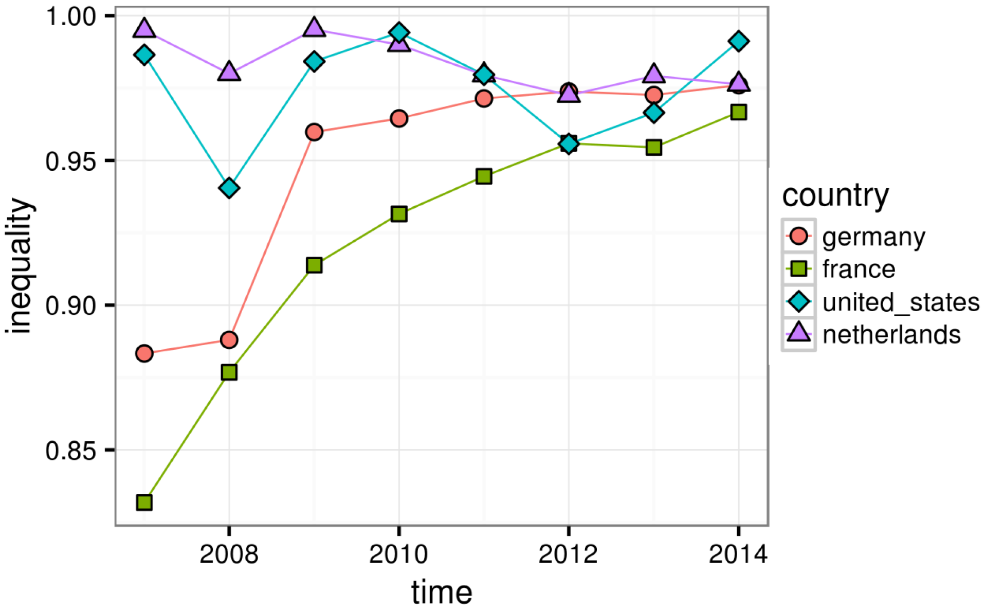
Figure 4 shows that from 2007 to 2014, contribution inequality of all four countries is very high. In 2014, the Gini coefficients of all countries exceed 0.95, which are even significantly higher than that of Wikipedia contributions (0.84) [
20]. The trends, however, are divided. In Germany and France, contribution inequality increases nearly monotonously, from less than 0.90 to nearly 0.95. However, in the United States and the Netherlands, the changes seem random. Note that the Gini coefficient is an ordinal value, so its variations are not very informative. We are only interested in the relative order of these values. Contributions in the United States and the Netherlands are more unequal than those in Germany and France in early years, while in recent years, the four countries reach similar levels of contribution inequality. We also calculate percentages of the top contributions, which make 95%, 90%, 80% and 50% of all contributions.
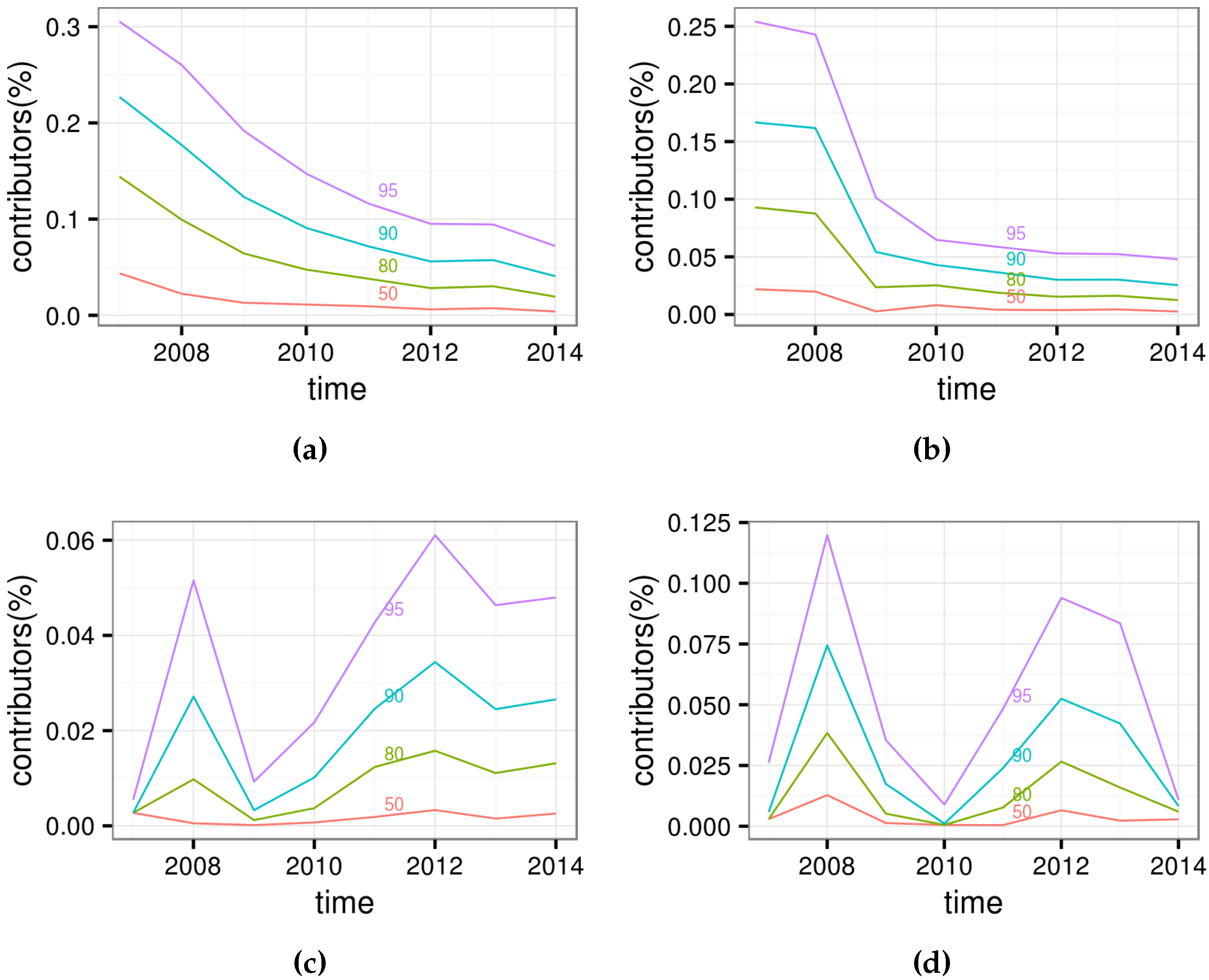
Figure 5 offers more intuitive information as a complement to
Figure 4. Taking Germany as an example, 30% of contributors make 95% of contributions in 2007, while merely 8% of contributors make 95% of contributions in 2014. In France, the percentage of the contributors who make 95% of contributions drops from over 25% to less than 5%. There are again no clear trends for the United States and the Netherlands.
Figure 4.
Gini Coefficients.
Figure 4.
Gini Coefficients.
Figure 5.
The percentage of contributors to make certain percent contributions. (a) Germany; (b) France; (c) The United States; (d) The Netherlands.
Figure 5.
The percentage of contributors to make certain percent contributions. (a) Germany; (b) France; (c) The United States; (d) The Netherlands.
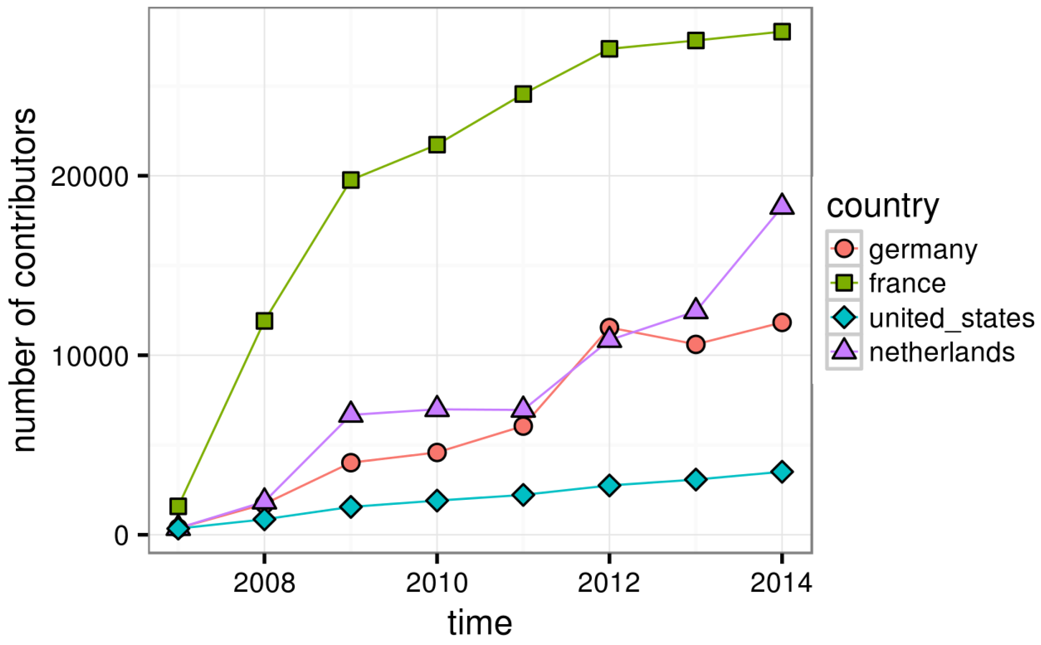
3.3. Changes in the Silent Majority
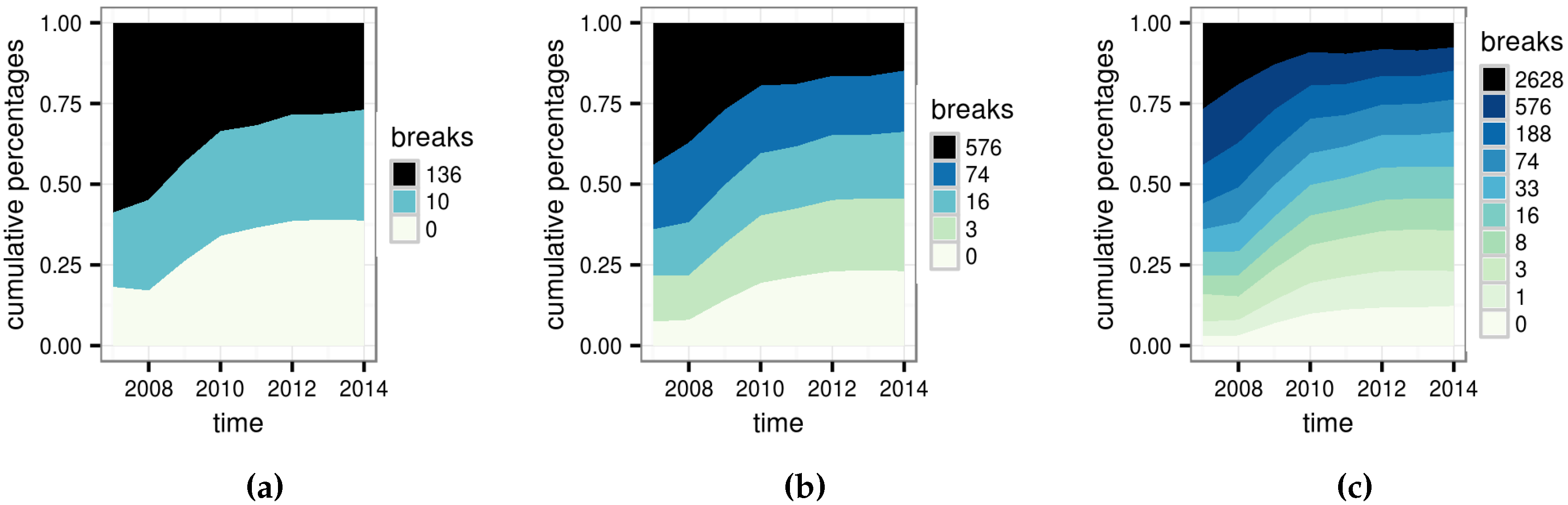
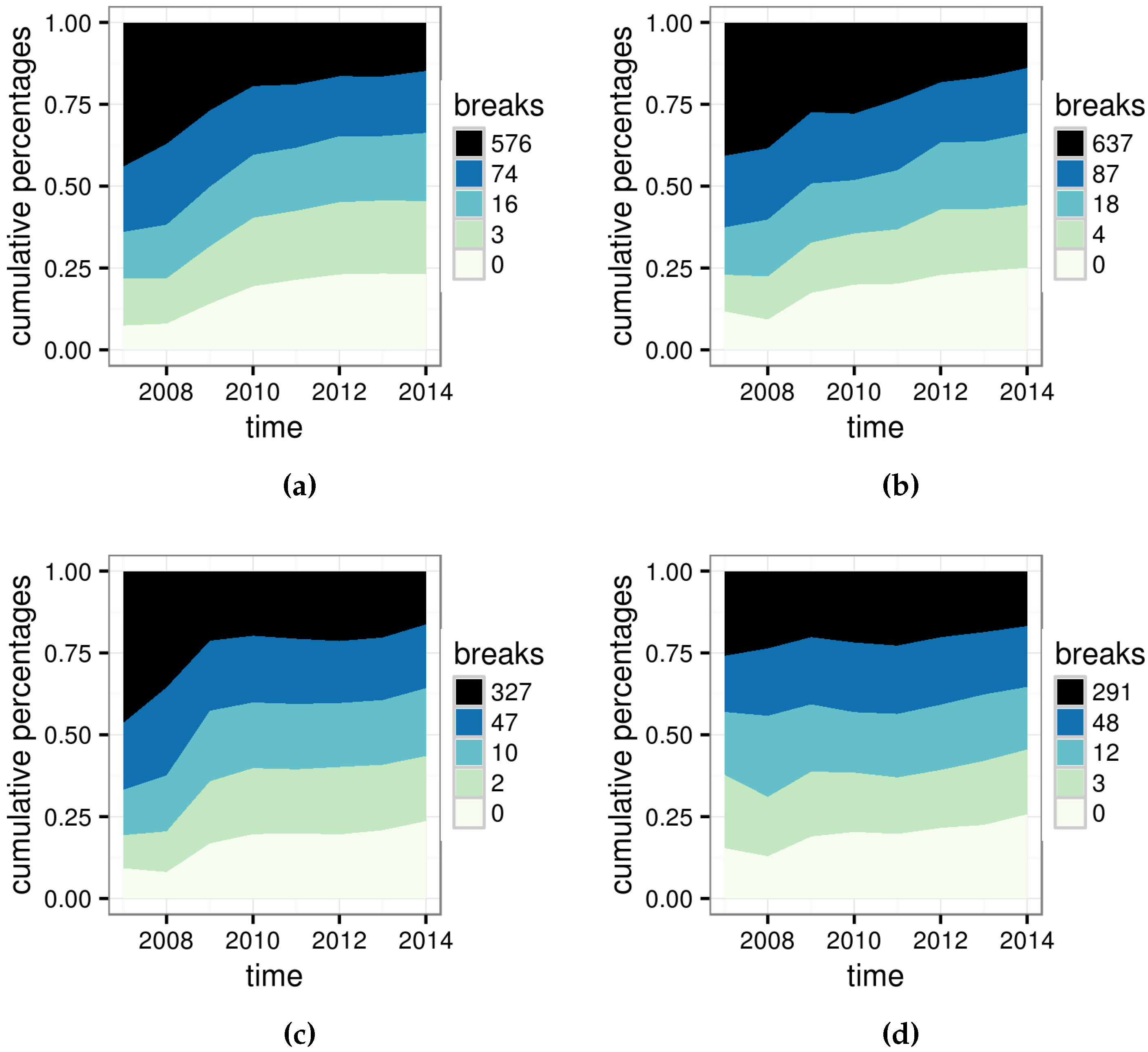
Figure 6 shows the number of contributors. For each year, only users who make a contribution in that year are counted. The results suggest that for all countries, the number of contributors keeps increasing with only very minor exceptions. We calculate quintiles of individual contributions in 2014, and then use them as breaks to classify contributors in each year into five classes. Percentage changes of the five classes are represented in
Figure 7, where the width of each strip represents the size of the corresponding class. It is obvious that lower classes expand quickly and “press” the topmost classes to take smaller proportions. In Germany, there are about 7% of contributors who make only fewer than three changes in 2007, and this number increases to 20% in 2014. On the contrary, the topmost class shrinks from 45% to 20%. In every country, the bottommost class expands at the fastest pace. The second and third classes increase at a lower rate, or do not increase in the Netherlands. The fourth class remains stable over time, and the most active class shrinks.
Figure 6.
Number of contributors per year.
Figure 6.
Number of contributors per year.
Figure 7.
The percentage of contributors to make certain percent contributions. (a) Germany; (b) France; (c) The United States; (d) The Netherlands.
Figure 7.
The percentage of contributors to make certain percent contributions. (a) Germany; (b) France; (c) The United States; (d) The Netherlands.
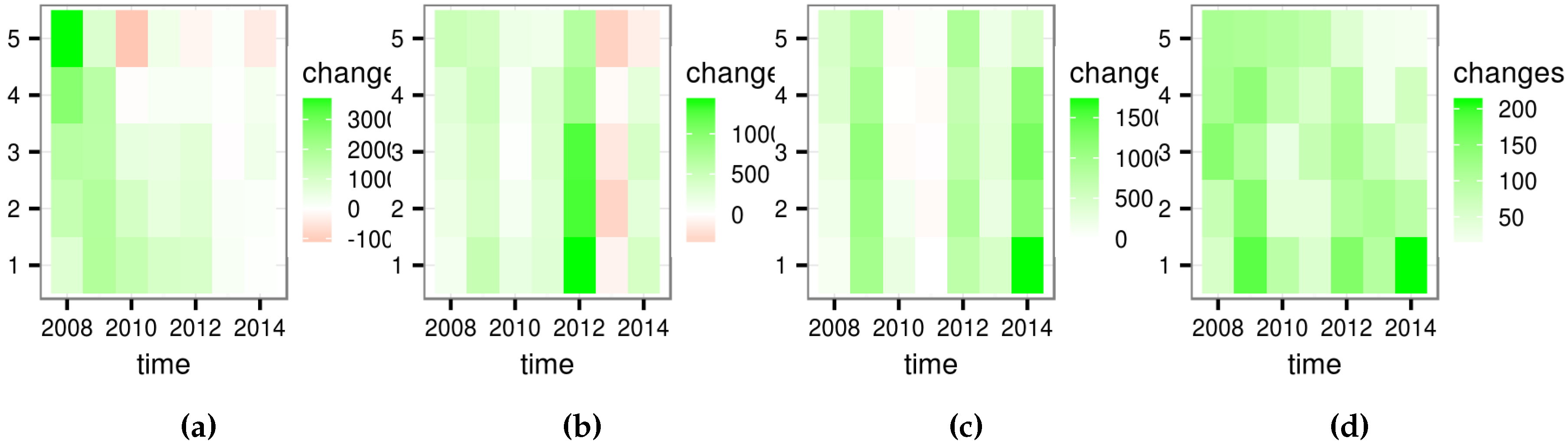
A follow-up question is how each class changes in absolute size. To check it, we calculate changes in absolute size for each class between neighboring years, as is presented in
Figure 8. In this figure, red represents decreases, green represents increases, and darkness represents the degree of changes. We can see that the absolute sizes of all classes increase in the most time with only a few exceptions.
Figure 8.
Differences between absolute class sizes in neighbouring years. (a) Germany; (b) France; (c) The United States; (d) The Netherlands.
Figure 8.
Differences between absolute class sizes in neighbouring years. (a) Germany; (b) France; (c) The United States; (d) The Netherlands.
The above results suggest that contributors with only a few edits expand at a much faster pace. Though the absolute number of the most active contributors does not decline in most cases, they take a smaller percentage of the community. This finding matches conventional understanding about the development of the OSM project. In the beginning, the project offers limited tools and resources, so most contributors may have a background in geography with enough enthusiasm and expertise to contribute from scratch. As the project evolves, it becomes well known to the public and bundles more accessible tools such as iD, which does not affect active contributors much but makes it much easier for amateurs to take part. The consequence is that the “silent majority” become even more major in scale and more insignificant regarding individual contributions. This change pushes contributions to the more unequal end, which is consistent with the trends in contribution inequality in France and Germany, but does not match the random fluctuations in the cases of the United States and the Netherlands.
3.4. Changes in the Vocal Minority
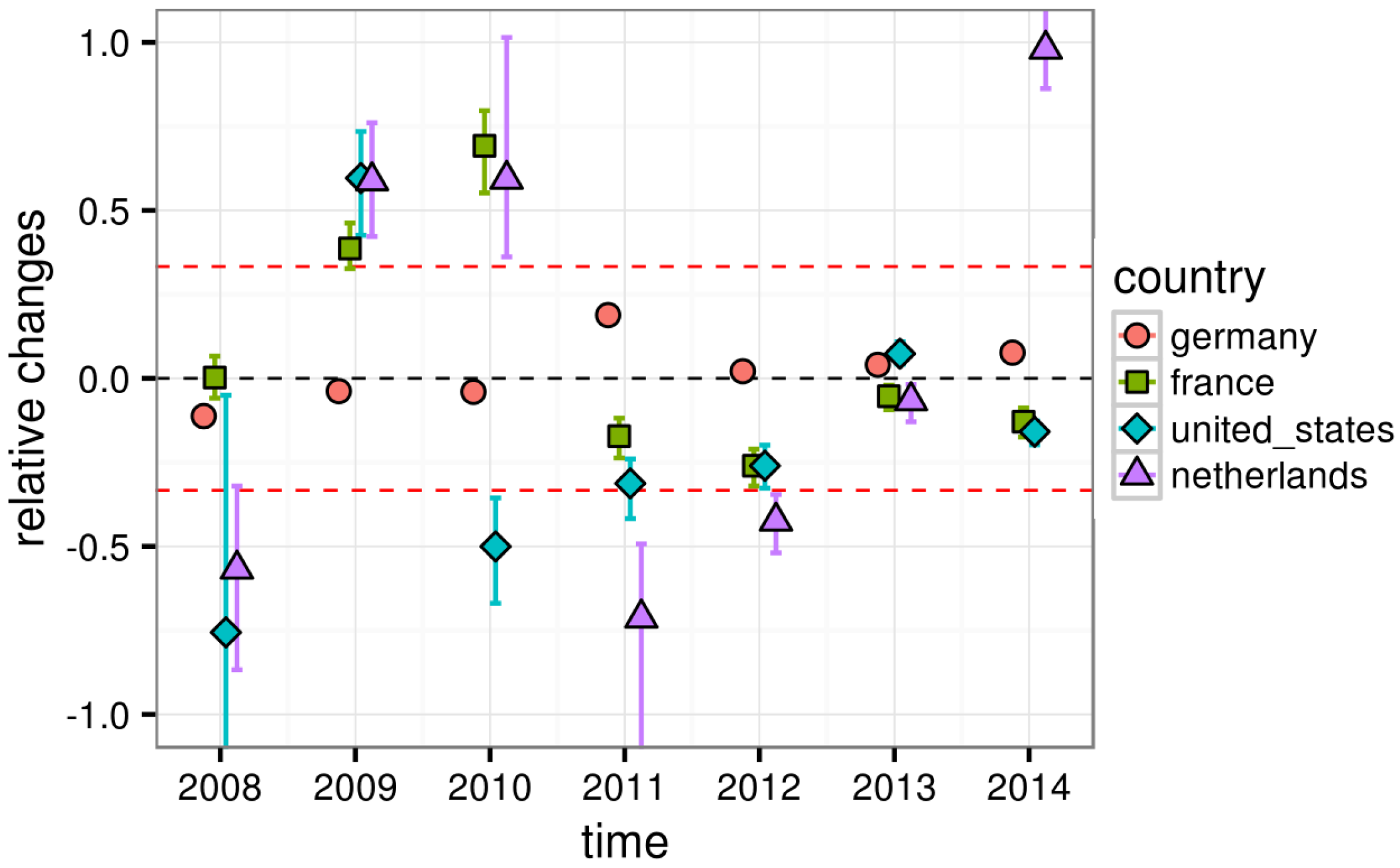
The vocal minority each year are selected for each country. MWW tests suggest that productivity of these contributors changes significantly at a confidence level of 95% for most years, as shown in
Table 1. Estimations of changes, and corresponding confidence intervals at a 90% confidence level, are illustrated in
Figure 9. Given the estimated change at
year as
, we draw
as Y so that the change rate between years and countries can be compared. The top red line represents a 50% increase, and the bottom red line represents a 50% reduction. As is presented in
Figure 9, productivity of the selected contributors in the United States and the Netherlands fluctuates more than that in Germany and France. All changes in Germany and France are within ±50%, with only exceptions in France in 2009 and 2010, when there are several nationwide imports from Corine Land Cover and Geodesic [
25]. In half of the time, the minority in Germany increase or decrease in productivity for less than 10%, while this is never the case in the United States. These results are easy to understand while considering two natures of imports. Firstly, imports are highly influenced by external situations, so they can be very nondeterministic themselves. Secondly, imports can be extremely huge in size. Taking the Netherlands as an example, imports from BAG data in 2014 make the median of the vocal minority in that year 529 times that in 2013. All top 10 contributors are importers for BAG data, and they solely contribute 55,372,740 changes in total, covering 53.4% of total contributions in that year.
Table 1.
p-values of the Mann-Whitney-Wilcoxon (MWW) test. (a) Germany; (b) France; (c) The United States; (d) The Netherlands.
Table 1.
p-values of the Mann-Whitney-Wilcoxon (MWW) test. (a) Germany; (b) France; (c) The United States; (d) The Netherlands.
| 2007–2008 | 2008–2009 | 2009–2010 | 2010–2011 | 2011–2012 | 2012–2013 | 2013–2014 |
| 1.0000 | 1.0000 | 1.0000 | 0.0000 | 0.0052 | 0.0000 | 0.0000 |
| 0.0000 | 0.0000 | 0.0000 | 1.0000 | 0.9948 | 1.0000 | 1.0000 |
| (a) |
| 2007–2008 | 2008–2009 | 2009–2010 | 2010–2011 | 2011–2012 | 2012–2013 | 2013–2014 |
| 0.4744 | 0.0000 | 0.0000 | 1.0000 | 1.0000 | 0.9953 | 1.0000 |
| 0.5256 | 1.0000 | 1.0000 | 0.0000 | 0.0000 | 0.0047 | 0.0000 |
| (b) |
| 2007–2008 | 2008–2009 | 2009–2010 | 2010–2011 | 2011–2012 | 2012–2013 | 2013–2014 |
| 0.9915 | 0.0000 | 1.0000 | 1.0000 | 1.0000 | 0.0000 | 1.0000 |
| 0.0085 | 1.0000 | 0.0000 | 0.0000 | 0.0000 | 1.0000 | 0.0000 |
| (c) |
| 2007–2008 | 2008–2009 | 2009–2010 | 2010–2011 | 2011–2012 | 2012–2013 | 2013–2014 |
| 0.9993 | 0.0000 | 0.0000 | 1.0000 | 1.0000 | 0.9901 | 0.0000 |
| 0.0007 | 1.0000 | 1.0000 | 0.0000 | 0.0000 | 0.0099 | 1.0000 |
| (d) |
Figure 9.
MWW test estimations and confidence intervals.
Figure 9.
MWW test estimations and confidence intervals.
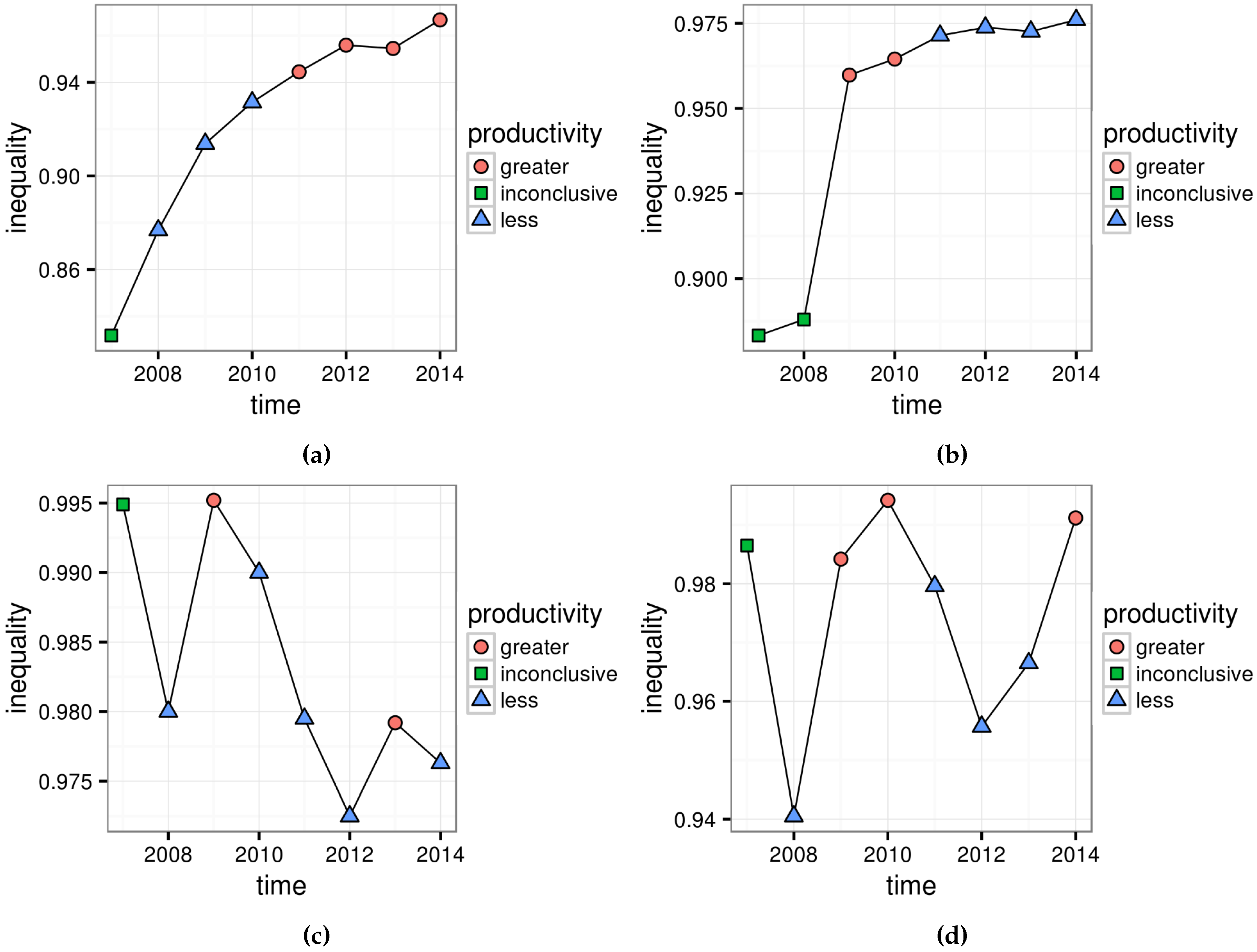
The results on their own are not very interesting, since trends in a single country follow no obvious rules. However,
Figure 10 reveals that in the United States and the Netherlands, the trends of productivity and the trends of contribution inequality are closely related. The tendency to increase or decrease from the two results agrees very well, with only one exception in the year 2013 in the Netherlands. On the contrary, changes in productivity of the vocal minority seem unrelated to the contribution inequality in Germany and France.
3.5. Discussions
We find that OSM contributions in all research areas are very unequal. For countries where imports are not significant, contribution inequality becomes higher over time. Some facts are that in Germany in 2007, 20% of contributors make 95% of contributions, while in 2014, only 5% of contributors make 95% of contributions. On the contrary, contribution inequality in countries with significant imports is higher in general, but heavily fluctuates without clear rules.
Figure 10.
Directions of productivity changes and Gini coefficients. (a) Germany; (b) France; (c) The United States; (d) The Netherlands.
Figure 10.
Directions of productivity changes and Gini coefficients. (a) Germany; (b) France; (c) The United States; (d) The Netherlands.
The mainstream of the community shifts towards the less active end. That is to say, the silent majority occupy even more percentages of the community. This phenomenon can well explain the cases in Germany and France, showing that in countries where imports are less significant, the rapid expansion of the silent majority continuously raises the contribution inequality. Productivity of the vocal minority usually changes significantly across years. Moreover, in countries with huge imports the changes are often more substantial. The tendency of changes agrees well with the trends in contribution inequality in the United States and the Netherlands, which suggests that for countries with significant imports, the productivity changes of the vocal minority greatly influence the trends in contribution inequality. The amount of imports is determined by many unpredictable external factors, which explains the random fluctuations of contribution inequality.
4. Conclusions
In this paper, we use methods including the Lorenz curve and the Gini coefficient, quantile based classifications, and the MWW test to analyze contribution inequality of OSM. Besides discussions on trends in contribution inequality, we also investigate changes of both the “silent majority” and the “vocal minority”, as well as their relationships with the trends in contribution inequality. Our experiments focus on two groups of two countries: countries with significant import behaviors such as the United States and the Netherlands, and countries without significant import behaviors such as Germany and France. Our investigation depicts that the contributions in the four countries are highly unequal. The level of contribution inequality keeps increasing in countries without huge imports, which is consistent with the fact that the silent majority expands rapidly in the community. The trends in contribution inequality in countries with huge imports seem random, but in fact agree well with the productivity changes of the vocal minority, so the randomness may probably come from external factors which influence imports. Our results shed light on where the crowdsourced data actually come from and how the situation changes as OSM evolves continuously. The contrast between countries with and without imports, as well as different roles played by the silent majority and the vocal minority, reveal distinct mechanisms underlying the development of the OSM project in different regions. Knowing which part of contributors are responsible for trends in contribution inequality can help plan a better future of OSM. The methods we use and how they are orchestrated to form conclusions are quite general and can easily apply to other countries. In contrast to the previous research, we conducted quantitative investigations, which can be further integrated into other research as basic indicators. The methods may even be useful for other VGI and and crowdsourcing projects.
The next step of our work is to compare different measures of contributions. The most interesting part will be to investigate whether our conclusions hold for specific types of contributions, like tags, nodes, etc. A further extension is to dive deeper and ask why in the first place the balance between the silent majority and the vocal minority shifts. A possible question is: Which is the main reason to attract more nonrecurring mappers: improvement of tools, fame of the project, or increased usability of the project? We can then aim at more comprehensive understandings about trends in contribution inequality, tension between the majority and the minority in OSM community, and what these phenomenons mean to the future of the OSM project.


