1. Introduction
Cities can be compared to living organisms—constantly changing and consisting of thousands of elements through which millions of particles move [
1]. Understanding such a complex structure has been studied by urbanists for hundreds of years. As a result of technological progress, cities are constantly changing, and therefore, their research must also evolve [
2]. Knowledge of the city’s structure is necessary for spatial planning, infrastructure management, and the development of new technologies that transform an ordinary city into a “smart city” [
2]. At the same time, fine-grained mobility traces raise privacy and security concerns, as repeated location observations may reveal sensitive movement patterns if handled or shared improperly. In this study, we mitigate these risks by working with publicly accessible GBFS snapshots and reporting results only in aggregated forms (e.g., grid-based intensities and corridor summaries), rather than analyzing individual users or personal identifiers. Recent advancements in data availability have enabled new ways of observing urban mobility. Tools such as mobile phone logs, GPS traces from car navigation systems, and people-flow monitoring, collectively referred to as urban computing, have all been used to model movement and spatial relationships in cities [
3]. Another very good source of data on people’s movement around the city was completely unknown until recently: electric scooters (also referred to as e-scooters; we will use both of these terms in the paper). Electric scooters are becoming an increasingly popular means of transportation in the city. They provide a sustainable and cheap alternative to reducing the number of private vehicle trips [
3], and thus pollution, traffic congestion [
4], and land-use [
5]. Electric scooters are one of the fastest-growing electric micro-mobility vehicles [
6]. Since 2017, several e-scooter companies have started their services in many cities in North America and Europe. The number of companies offering e-scooters for rent and the cities where the service is available are constantly growing.
E-scooters interact with existing mobility systems by simultaneously complementing and substituting traditional transport modes. They typically fill gaps in transit networks, solving first-mile/last-mile connectivity issues, especially evident during disruptions like COVID-19, where e-scooters became a preferred transport mode due to health and safety concerns [
7,
8]. Rider behaviors and safety perceptions significantly depend on infrastructure quality. Dedicated lanes improve rider comfort and safety, whereas mixed traffic conditions elevate perceived risks, influencing rider choices and interactions [
9]. Infrastructure safety, cost, and accessibility are factors affecting commuters’ willingness to shift from cars to electric micromobility options such as e-scooters [
10]. User experiences, perceptions, and adoption are influenced by demographic and psychological factors, including attitudes towards sustainability, cost sensitivity, service convenience, and satisfaction with service reliability. Adoption studies revealed that positive user experiences (ease of use, enjoyment) significantly boost e-scooter adoption, whereas technical malfunctions, pricing, limited service areas, and poor infrastructure deter potential users [
11,
12,
13]. Barriers to micromobility implementation primarily encompass infrastructural deficiencies (e.g., poorly maintained paths, inadequate signage), operational issues (high cost, battery limitations, complicated app usage), and personal barriers like safety concerns, weather sensitivity, and perceived health risks. Effective integration into smart city frameworks necessitates addressing these barriers through infrastructure enhancement, operational simplification, policy adjustments, and robust maintenance practices [
14].
Electric scooter users can be grouped into distinct types based on factors such as access to infrastructure, cost sensitivity, and personal background. These groups have different mobility needs, highlighting the importance of tailored policies and infrastructure improvements. Common patterns in e-scooter use include specific times of day and popular locations, and users can generally be categorized as one-time, casual, regular, or non-users. These patterns support the development of more targeted and effective urban mobility strategies [
15,
16].
Despite the growing popularity of e-scooters, their potential to reveal structural characteristics of cities remains underexplored. This study seeks to investigate whether shared e-scooter data can be used to analyze the spatial structure of a city. Given the high volume of movement data they generate, these devices may offer a new perspective on how urban areas function and interact [
17,
18,
19,
20]. While many previous studies rely on long-term, large-scale datasets to produce detailed and comprehensive analyses of micromobility systems, such as multi-month examinations of e-scooter dynamics in Chicago [
21] or extensive spatiotemporal segmentations of shared e-scooter usage patterns across Berlin [
22], our work adopts a different perspective. The aim of this study is not to perform a longitudinal assessment of an entire urban area over extended periods, but rather to demonstrate how much can be learned from visual analysis of a relatively short temporal window of shared e-scooter data.
The goal of the work is thus to investigate the structure of a selected city using various spatial analyses with the use of data from electric scooters and presenting the results visually. Rome has been chosen for the study due to the availability of data from this city and its characteristics: it is a city with a very high tourist potential, also being the European capital composed of typically administrative, residential, and office districts. The aim of the work is also to find a way to obtain data on actual journeys.
We argue that even a limited dataset, when examined through carefully designed visual analytics, can yield meaningful and actionable insights into urban structure, travel behavior, and potential interventions. This emphasis on visual reasoning sets our approach apart from prior research focused primarily on predictive modeling [
23], behavioral determinants [
10], or multi-quarter demand and usage analyses [
15,
16]. Instead, our perspective is pragmatic: we evaluate the practical utility of visually inspecting a compact sample of micromobility data to reveal spatial patterns, functional zones, and mobility flows that are directly interpretable by planners, operators, and other stakeholders.
We position this work within urban computing and mobility visual analytics, where heterogeneous urban sensing data are transformed into representations that support human-centered reasoning and operational decisions. In this framing, our contribution is a descriptive visual-analytics workflow that converts publicly available GBFS snapshots into reconstructed trips and grid-based indicators, which are then communicated through hotspot, corridor, and zoning views. The pipeline emphasizes transparency of assumptions and reproducibility under minimal data access, and is intended for exploratory decision support rather than predictive modeling or causal inference.
Our goal is not to propose a new visualization technique per se, but to present a reproducible visual-analytics workflow for extracting interpretable urban mobility cues from high-frequency GBFS snapshots, which are often the only publicly accessible source of micromobility data. In particular, we demonstrate how a compact observation window (one operator, one week) can still support consistent descriptive analyses of demand, mobility corridors, temporal peaks, and mobility-based functional zoning when the data are reconstructed and summarized transparently.
The main contributions of this paper are as follows:
GBFS-to-trips reconstruction pipeline: we describe how real-time GBFS snapshots sampled every 5 s are transformed into historical rentals and idle episodes using simple continuity rules (≤15 s temporal continuity for rentals; 50 m spatial threshold for idle segmentation), without interpolating missing positions.
A consistent set of map-centered visual products for urban interpretation, including (i) spatial demand/idle-time patterns, (ii) frequently used route structure, and (iii) complementary views of short vs. long trips to separate local mobility from longer cross-city movements.
Mobility-based zoning from reconstructed trips: we show how a 200 m grid and k-means clustering over interpretable descriptors (arrivals, spatial dispersion of starts, average trip distance) yields functional zones that support qualitative reading of city structure.
Transparent, criterion-based location scoring (descriptive, not causal): we provide top-location visualizations under simple criteria (trip-start frequency, average trip distance, dominant time-of-day), explicitly avoiding composite “optimal location” claims.
Decision-support framing for stakeholders: we illustrate how the same descriptive outputs can be mapped to operator and city questions (rebalancing, parking/drop-off zones, and location salience), while explicitly stating the limits of single-operator, single-week generalization.
The rest of the paper is structured as follows. In
Section 2 we discuss related work. In
Section 3 we focus on the data acquisition process. We then conduct initial analyses of electric scooter travel patterns in Rome, categorizing journeys into long and short routes. This section also includes a zoning analysis of the city, identifying distinct areas based on e-scooter usage patterns. A detailed ranking of city locations based on various criteria provides insights into popular spots and potential areas for infrastructure development. In
Section 4, we synthesize our findings to demonstrate their practical applications. In
Section 5, we discuss the scope, limitations, robustness, and transferability of the proposed GBFS-based workflow and interpret the results in light of the data constraints. We conclude the paper in
Section 6.
2. Related Work
Recent work on spatio-temporal data visualization is often framed within the broader paradigm of visual analytics, where interactive visual representations are combined with analytical reasoning to support insight and decision-making [
24,
25]. Foundational work by Andrienko and Andrienko systematizes exploratory analysis for spatial and temporal data and extends these principles to movement data, emphasizing trajectory transformation and multi-scale visual reasoning [
26,
27], (Andrienko & Andrienko, 2006; Andrienko et al., 2013). Building on these principles, we review prior work on visual analysis of micromobility and urban mobility traces, and then position our GBFS-snapshot-driven workflow with respect to these studies.
City structure analysis is a research goal which has been pursued by researchers for quite some time. Depending on available data different analyses can be realized. With the advent of mass data generation and processing (e.g., smartphones, cars, e-scooters, city bikes, etc.) these data become easier and easier to get hold of and be utilized for particular needs. The purpose of such analyses can be, e.g., predicting success of city businesses, ranking business locations, location recommendations, analysis of micro-mobility usage patterns, modeling the demand for POIs or visual analyses of urban data.
Predicting success of city businesses like restaurants or shops, based on various factors using different methods and features are studied in, e.g., [
28,
29,
30]. The authors of these papers use a variety of data sources, including user reviews, check-in data, demographic data, and other online data. The features used in these models include geographical location, human mobility patterns, rating scores, and textual reviews. The models are trained using machine learning techniques, such as logistic regression, gradient boosted decision trees, and support vector machines. The goal is to provide insights that can help businesses improve their performance and survival chances.
Some researchers propose methods for selecting or ranking business locations based on demand or popularity (e.g., [
31,
32,
33]). They aim to identify the most promising locations for businesses (such as stores or outlets) based on factors like demand, popularity, and competition. They use data from map queries, WiFi connections, and social media to identify demand centers and rank potential locations. The methods utilized to achieve the assumed goals include learning-to-rank, regression, and ensemble methods. Ref. [
34] proposes a method for recommending shop types to users based on their preferences and the popularity of shop types. The offered model considers both the popularity of shop types and the preferences of individual users. The method involves collecting data from social media and LBSNs (Location-Based Social Networks), extracting relevant features, training a model (in this case, a matrix factorization approach), and evaluating the model’s performance. The goal is to help users discover new shops and help shop owners attract more customers. Ref. [
35] focuses on modeling the demand for Points of Interest (POIs) in urban regions. It proposes a framework for modelling the demand for POIs across various urban regions. The framework leverages large-scale human mobility data, specifically taxi GPS traces, to analyze and predict the need for services in different neighborhoods. Ref. [
36] develops an approach for real estate appraisal by integrating human mobility patterns with the functional diversity of communities. This approach leverages a geographic functional learning model that captures correlations among estate neighborhoods, urban functions, temporal effects, and user mobility patterns. The study makes use of extensive real-world data, including taxi GPS traces and Point of Interest (POI) data, to model the demand dynamics around properties.
These studies rely heavily on predictive modeling and structured features, whereas our work does not attempt to forecast demand or optimize business performance. Instead, we employ visual exploration of micromobility data to reveal mobility structures and identify potentially interesting locations, without building predictive models or inferring causality.
Analysis of micro-mobility usage patterns is the focus of these papers [
21,
37,
38,
39,
40,
41,
42,
43,
44]. The studies seek to derive insights into user behavior and service usage. Whether through direct data analysis or through surveys, they try to understand the underlying reasons behind micro-mobility choices and how these choices impact urban mobility. The data used in these studies comes either from specific APIs (Application Programming Interfaces) provided by micro-mobility service operators or through comprehensive surveys. The studies employ spatial analysis techniques to overlay trip data onto maps or use statistical methods to explore temporal patterns.
In particular, the authors of [
37] collected real-time data from a vendor’s API, focusing on e-scooter trip origins, destinations, and trajectories. This data was analyzed at 30 s intervals to explore trip dynamics through descriptive statistics, spatial analysis on street maps, and cross-tabulations with street classifications and traffic volumes. The findings revealed spatial and temporal usage patterns, highlighting areas with high traffic and potential risks, which can guide urban planners and policymakers in enhancing urban mobility frameworks, targeting safety measures, and refining regulatory approaches. In [
38] user behaviors and demographic characteristics between e-scooter and bike-sharing systems in the Tricity area of Poland is compared. By utilizing survey data, the study explores how different demographics interact with these micro-mobility services and the implications for urban transport planning, especially in understanding modal complementarity and substitution. Ref. [
39] provides a comparative analysis of usage patterns for e-scooter-share and bike-share systems in Washington, D.C. It uses large datasets to examine how these services are utilized across different times and locations within the city, aiming to determine their functional roles and integration within the urban mobility landscape. Ref. [
40] focuses on Turin, Italy. It analyzes and compares the spatiotemporal usage patterns of dockless bike sharing and e-scooter services. Through data gathered from service operators, the paper identifies key usage trends and geographical hotspots, providing insights into how these services are adopted in different urban contexts and their impact on urban mobility. Ref. [
43] explores how shared micromobility interacts with public transport systems through an in-depth spatiotemporal analysis. Using trip data from Calgary’s shared micromobility program, they identified temporal and spatial hotspots of micromobility use that serve as connectors to bus and rail stations. Their findings revealed that e-scooters and bikes are disproportionately used to bridge transit gaps during peak commuting periods, emphasizing their value in improving multimodal network efficiency. Ref. [
21] conducts a large-scale analysis of shared e-scooter usage in Chicago, integrating trip data with sociodemographic, land-use, and transport-system characteristics. Their findings revealed that e-scooter usage is strongly associated with urban density, transit accessibility, and income levels, with significant differences between neighborhoods. The study concluded that shared e-scooters act as a supplementary mode to transit rather than a direct substitute, especially for short local trips. These results highlight wider socio-spatial inequalities in access and identify policy levers for promoting more equitable micromobility deployment. Ref. [
44] is a survey-based study from Braga, Portugal. The authors identified key social, environmental, and psychological factors influencing e-scooter adoption. They found that perceived convenience, time savings, and environmental concern positively correlated with usage, while safety fears, inadequate infrastructure, and poor road conditions acted as major deterrents. Their analysis emphasized the need for improved cycling infrastructure and targeted regulations to encourage sustainable micromobility use. This work complements broader behavioral research by highlighting how local infrastructure quality and risk perception shape adoption patterns.
These works aim to explain or predict usage behavior, often using statistical inference or econometric modeling. Our study does not model determinants of e-scooter use; instead, it focuses on visualizing the spatial and temporal structure revealed by e-scooter traces. Where behavioral studies seek drivers of mobility, our goal is to reveal patterns and urban structure through visual interpretation.
Other studies go further in examining trip intent and infrastructure design. Ref. [
41] utilizes topic modeling techniques to infer the purposes behind e-scooter trips in urban environments, specifically looking at data from Washington, D.C. By integrating e-scooter trip data with points of interest, the study offers novel insights into the motivations driving e-scooter usage and its implications for urban planning and policy-making. Ref. [
42] analyzes the practical challenges of integrating e-scooters into urban transportation systems, focusing on Dallas, Texas. The study employs unsupervised learning techniques like DBSCAN to identify and manage e-scooter parking areas and employs methods such as shortest path analyses to pinpoint high-use corridors, aiming to enhance infrastructure and reduce vehicle clutter. The findings have the potential to improve parking management and tailor infrastructure to match actual usage patterns, leading to recommendations for policy changes to support the efficient integration of e-scooters in cityscapes. Ref. [
23] uses deep learning and spatio-temporal graph neural networks (STGCapNet) to predict urban e-scooter flows. The proposed GCScoot model utilized real-world data, including GPS trajectories, points-of-interest, street networks, and weather conditions to forecast e-scooter distributions during dynamic reconfiguration scenarios (such as area expansions or reductions). The predictive capability offers valuable guidance for city planners and operators to optimize fleet management, operational decisions, and ultimately enhance micromobility efficiency. These studies analyze mode relationships, substitution effects, and integration with transit. Our study does not evaluate multimodal substitution nor first/last-mile connectivity; instead, it uses e-scooters as a lens to reveal urban form, focusing on routes, hotspots, and functional zones rather than modal interactions.
Another line of research focuses on visual analysis of urban mobility, where spatial data is not only analyzed but also presented in visual form to enhance interpretation. For example, Ref. [
45] uses data from Austin, Texas to analyze electric scooter trips. The data includes rental times, trip durations, distances traveled, and starting and ending locations. The study finds that e-scooter usage varies based on the time of day and day of the week. The study also categorizes routes based on the pickup and drop-off points, revealing a division of the city into two parts. Similarly, in [
46] data from Minneapolis and Louisville is used to determine the optimal number of e-scooters to meet user demand. The study presents charts depicting the popularity of different times of the day and week, and heat maps of e-scooter demand in the city. Ref. [
33] uses data from Foursquare to determine the most popular locations in a city within a specific category. The study uses four methods to determine the level of popularity for a specific area: passenger volume, linear regression, collaborative filtering, and association rules. Each method highlights different characteristics. In [
20] mobile phone data is used to determine the routes of Riyadh residents. The authors conduct an analysis of how the city can be divided based on the characteristics of the trips made to and from each region. The study divides the city based on how users move between different zones and characterizes the features of the city’s regions based on the spatial dispersion of starting locations. The study notes that the choice of analysis type should suit the characteristics of the city under investigation. The authors of [
22] performed an extensive spatiotemporal study of e-scooter trips in Berlin, analyzing millions of rides over several months. The authors classified trip patterns into functional categories such as leisure rides, commuting flows, and multimodal transfers, revealing strong temporal regularities and spatial dependencies across districts. Their visual and statistical analysis underscored the heterogeneity of micromobility demand and its sensitivity to land-use structures. This study serves as an example of long-term, fine-grained mobility characterization based on large datasets. Closest in spirit to our visualization-focused objective are studies that visualize and summarize e-scooter usage for planning or system design. The authors of [
45] estimate e-scooter traffic flow to support micromobility planning, whereas [
46] leverages open data primarily from a system-design perspective.
In summary, existing visual approaches often complement model-driven frameworks or target operational optimization of micromobility systems. In contrast, we center our contribution on visual analytics as the primary analytical instrument, demonstrating that visual reasoning alone can reveal interpretable urban structure, such as mobility corridors, temporal peaks, functional zones, and candidate locations relevant to commercial or operational decisions, without relying on predictive modeling or demand estimation. By prioritizing intuitive, map-based representations, our approach aims to translate micromobility traces into actionable insights that are immediately usable by planners, policymakers, and operators. From a stakeholder perspective, visual analytics is often preferred when decisions must be auditable and quickly communicated (e.g., to justify parking zones, rebalancing priorities, or infrastructure changes). In practice, planners and operators frequently need transparent evidence of where and when demand concentrates, and how patterns change across time, rather than a black-box forecast. Visual summaries also remain useful when ground-truth labels or long historical series are limited, providing a robust descriptive baseline that can later be complemented by predictive models.
3. E-Scooter Data Acquisition and Route Classification
In this section, the process of obtaining data for the needs of this study is described. We discuss data availability, the way of transforming real-time data into historical data, as well as the presentation of the obtained data for the test period. Preliminary visualizations allowed for many conclusions to be drawn. The visualizations were not yet spatial analyses, but rather advanced data presentations. This section presents our analyses that allow for an understanding of the structure and construction of the city.
3.1. Data Acquisition
Despite the INSPIRE Directive (Infrastructure for Spatial Information in Europe) [
47] mandating EU member states to make spatial data widely accessible, many datasets remain inaccessible or are fee-based [
48,
49]. E-scooter data faces similar challenges. Most e-scooters are owned by private companies, which are not obligated to share data unless specific agreements with local governments are established, as seen in Warsaw where five operators agreed to provide anonymized data for research purposes [
19,
50].
Typically, researchers obtain e-scooter data through local government sources. However, in Poland, no open datasets were found, likely due to the relatively recent adoption of this transport mode. Privacy concerns also restrict broader data sharing, especially regarding historical ride data.
While historical data is rarely shared, operators often publish real-time information to attract users, usually through public APIs based on the GBFS (General Bikeshare Feed Specification) standard [
51]. GBFS enables standardized sharing of data on available vehicles, system status, docking stations (if any), and attributes such as availability (is_reserved, is_disabled) and last known location with timestamp, without compromising user privacy.
Due to these limitations, data for this study was collected from the Helbiz operator for the city of Rome, which had an open, test API. Data frames were downloaded every 5 s over a period of 7 days, from 15 to 22 November 2021. This resulted in over 80,000 files, capturing real-time snapshots of the system. While these snapshots allowed identification of general trends in e-scooter availability, further data processing was required to reconstruct actual ride trajectories. The data was cleaned and transformed into historical trip records, forming the basis for analyzing the spatial structure of the city.
Each GBFS snapshot provides time-stamped records per e-scooter ID. We reconstructed trips by first grouping records for each e-scooter chronologically, then segmenting the time series into (i) idle periods and (ii) rental (moving) periods. Consecutive records were treated as belonging to the same rental if the time gap between them did not exceed a temporal continuity threshold (set to 3× the sampling interval, i.e., ≤15 s for 5 s sampling); otherwise, a new segment was started. For idle periods, consecutive records were merged as long as the e-scooter location did not change materially (a spatial threshold of 50 m was used to separate distinct waiting episodes). Each rental segment was converted into a trajectory by connecting successive positions into a polyline, with start/end times taken from the first/last record in the segment; idle segments were stored as a point geometry with the corresponding start/end waiting times. We removed obviously invalid segments produced by missing snapshots (gaps > 15 s) by starting a new segment rather than interpolating positions.
The dataset covers one operator (Helbiz) and a single week, so the results should be interpreted as operator- and period-specific rather than a complete characterization of micromobility in Rome. Patterns may be biased by Helbiz’s fleet size, service-area boundaries, pricing and promotions, vehicle availability/charging practices, and user base, as well as by short-term factors (weather, events, and seasonal tourism). Nevertheless, this scope is appropriate for our study objective: to demonstrate that visual analytics applied to high-frequency GBFS snapshots can yield actionable, stakeholder-oriented insights (e.g., hotspots, corridors, zoning cues) even without long-term, multi-operator coverage. Extending the analysis to multiple operators and longer periods, and cross-validating against external mobility indicators, is left for future work.
3.2. Collected Data Overview
We firstly present the collected data along with basic statistics that serve as an introduction to spatial analysis explaining the structure of the city.
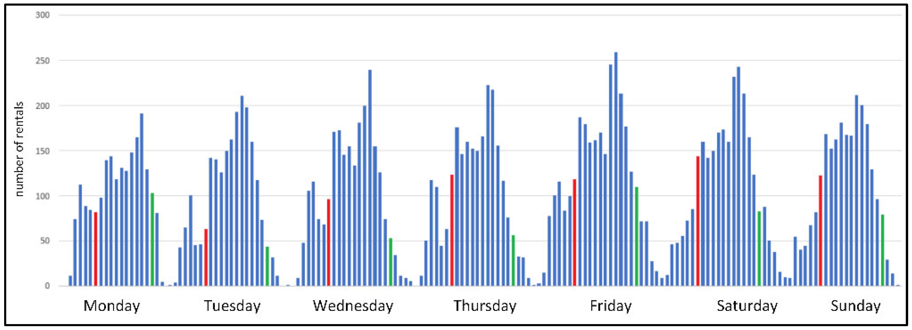
The first statistic is the overall number of rides on specific days of the week (
Figure 1). The days of the week are shown on the bottom axis, and the rides that started at midnight and noon are additionally marked with colors. Importantly, the smallest number of rides during a day occurs around 3:00 a.m. Therefore we do not divide the days equally at midnight, as it would result in losing some valuable information.
On workdays, the first peak occurs around 8–9 a.m., which can be explained by commuting to work and school (there are no such increases in these hours on Saturdays and Sundays). Then, another peak is observed around 1 p.m. In Italy, many people have lunch at this time, so there is greater mobility of residents. Additionally, from 2 p.m., the siesta begins, and some workers (including office workers) return home for a longer break. Further increases are visible in the afternoon, with the maximum during the day almost always reached at 8 p.m. Interestingly, the later the day of the week, the lower the number of rentals at 8 p.m.
In the case of non-working days, the characteristic is slightly different—there is no noticeable morning peak, and slightly more rentals take place during the siesta time, and the number of rentals after midnight is higher than on working days. An interesting day is Friday, which has features of both a working and a non-working day (which is obvious because on Friday evening, many people meet and treat this part of the day as a day off).
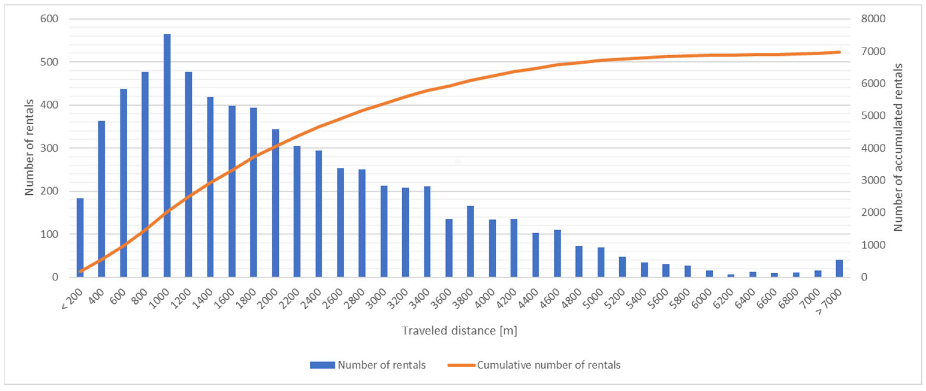
As a second characteristic, we analyzed distances travelled with electric scooters and cumulative number of rentals (
Figure 2). The distances covered by e-scooters are very typical and practically always less than 4 km. Of course, longer rides are also visible (even above 7 km), but the most popular distance was less than a kilometer. Here are some statistical values giving more insight into the distances covered by e-scooters in the considered timeframe: avg = 1155 m, std = 1486 m, median = 1649 m, mode = 850 m. As for the ranges covered, here is a summary: 21% of all trips were shorter than 800 m, 68% of the trips were in the range 800 m–4 km, 10% were in the range 4 km–7 km, and 1% were trips longer than 7 km.
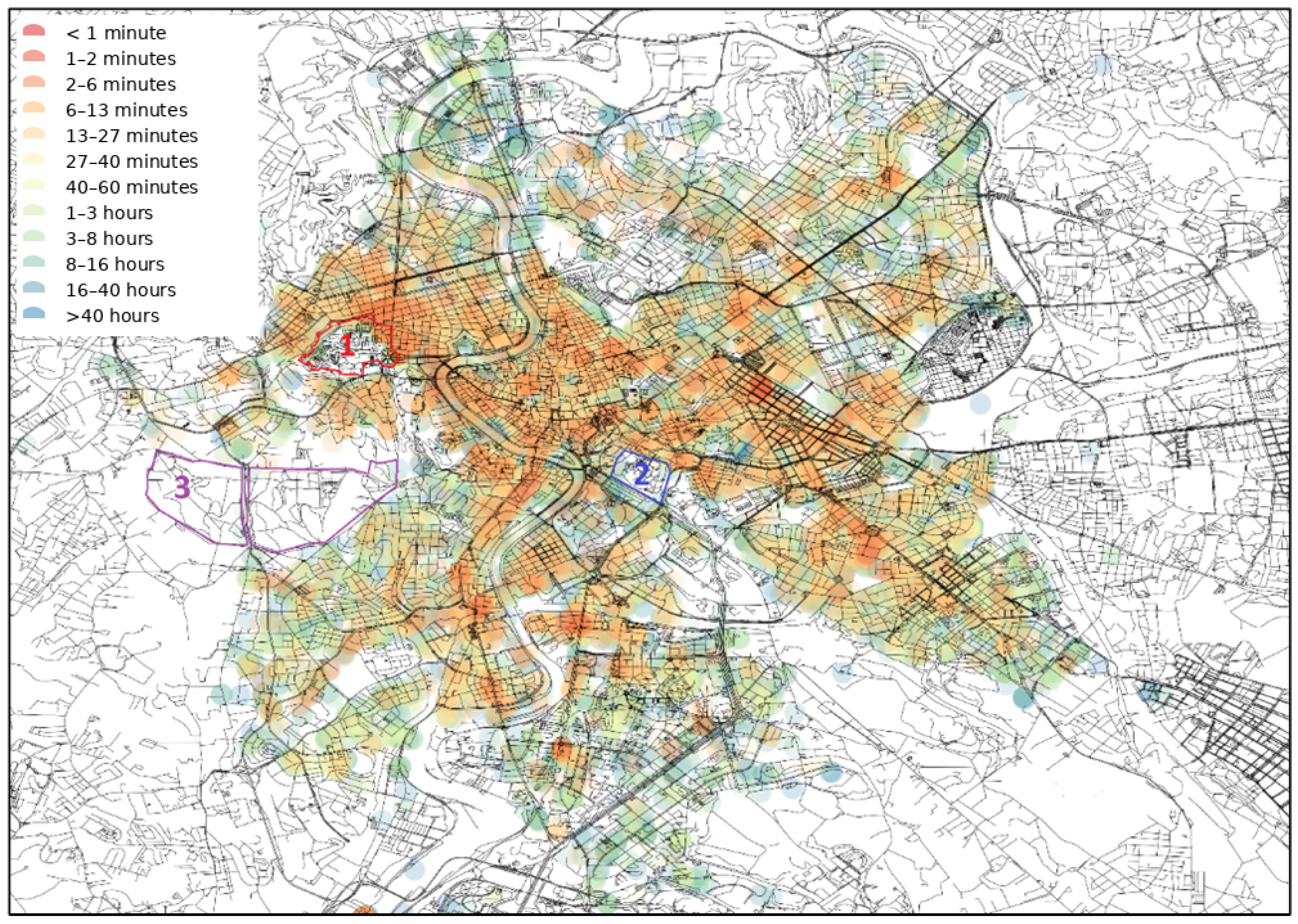
The statistics presented above do not have a spatial character. With the use of a heat map, it is possible to show how the previously designated locations of rented e-scooters look (
Figure 3). A logarithmic scale is used: points that existed for only an hour were better distinguishable than those that existed for many hours. From the analysis, it can be inferred that the “hottest” spot in the city is primarily the area around the main railway station (the largest red dot in the eastern part of the city). Additionally, e-scooters waited very shortly for re-rental in the very center of the city, around the Vatican (northwest part of the city), and at larger intersections in the southern part of the city. The visualization also shows areas where e-scooters cannot be ridden—for example, the closed for visitors part of Vatican, surrounded from west by a wall (area with red border and “1”), the area of the Palatino museum complex (area with blue border and “2”), and the historic Villa Doria Pamphili park (area with violet border and “3”). In this way, areas inaccessible to e-scooters were identified (whether due to an entry ban or a physical inability to pass).
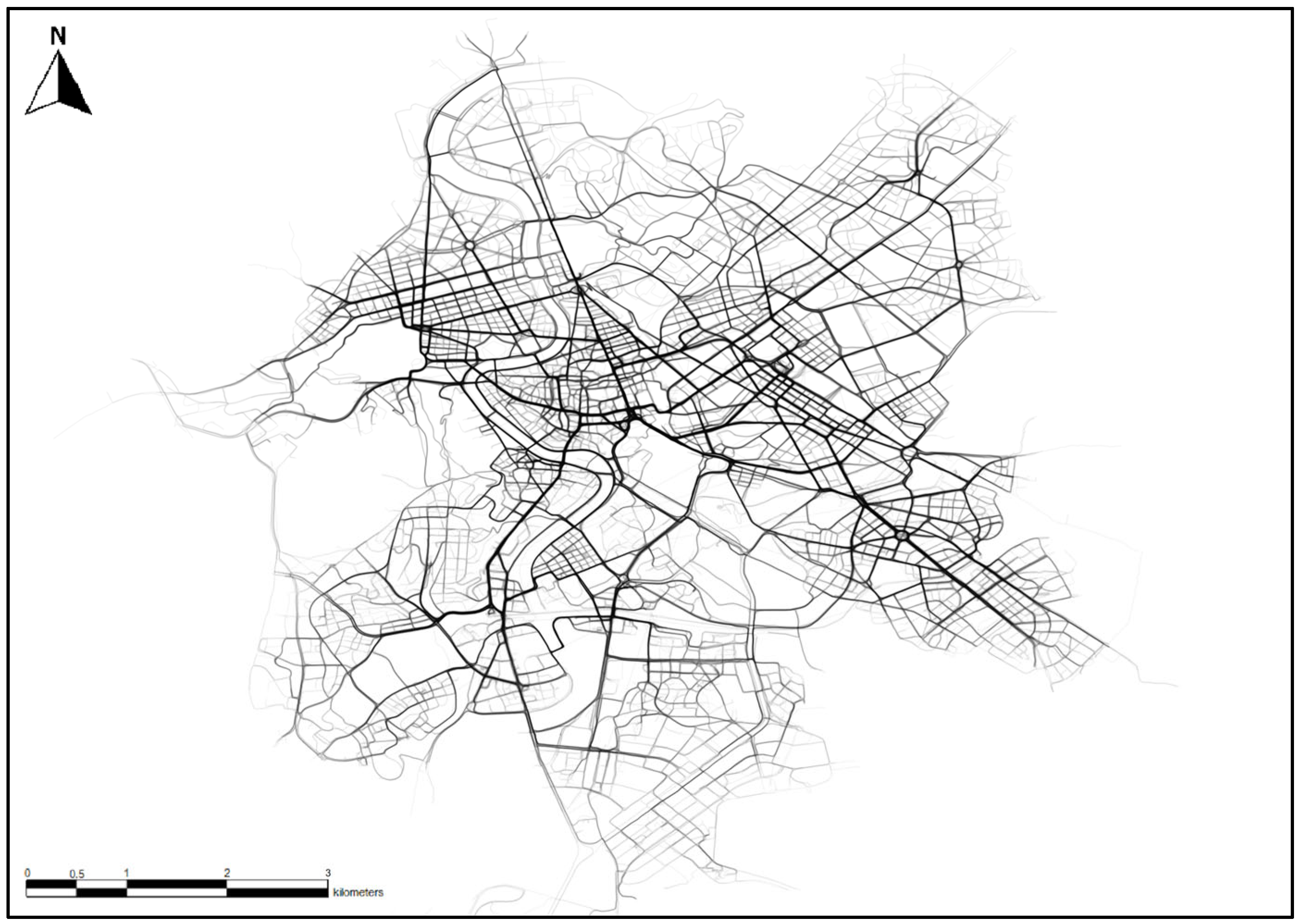
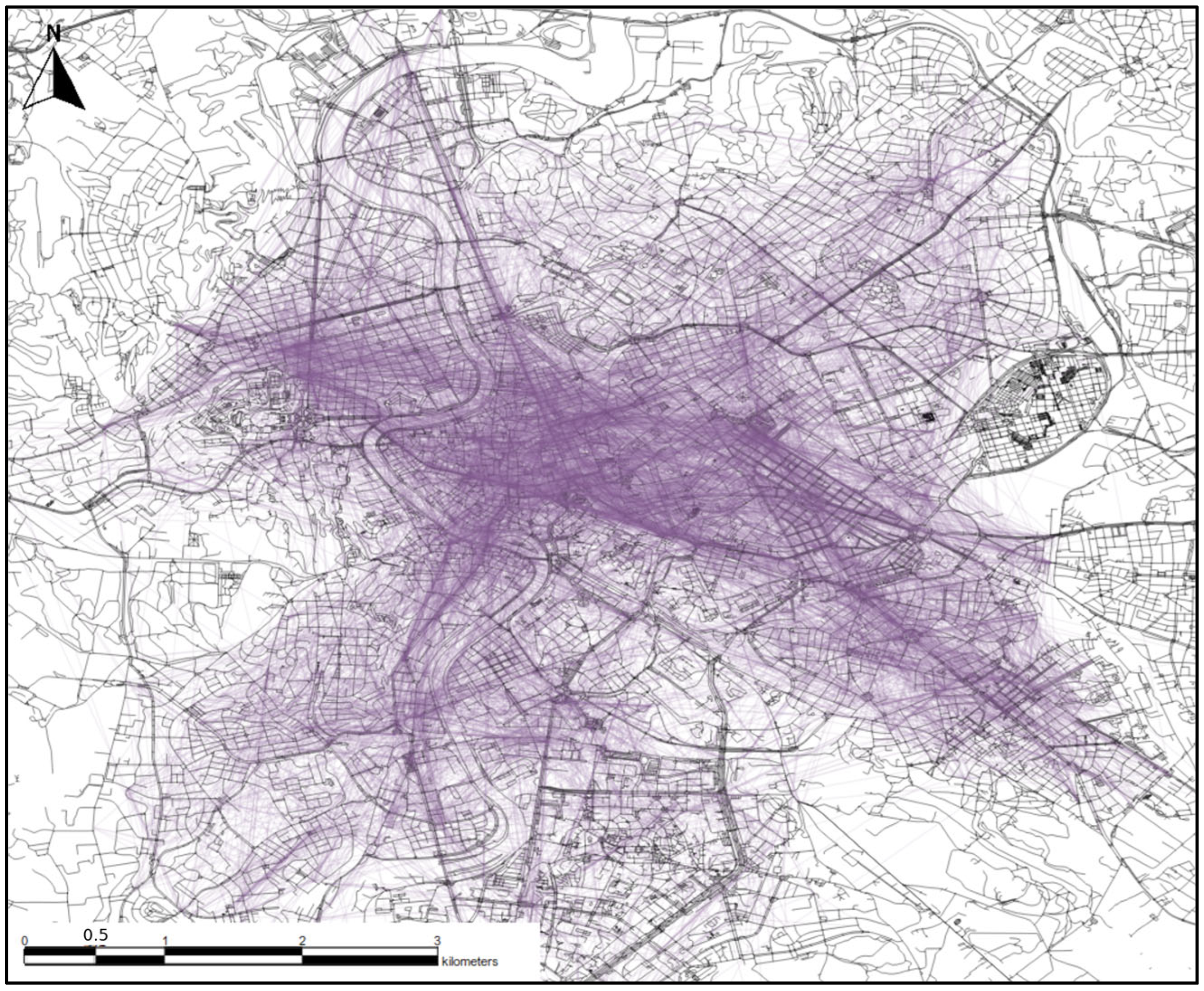
The next visualization shows the actual routes taken by users (
Figure 4). The fading effect is not accidental—in the visualization, each route was drawn using an almost transparent line. The more visible the line, the more routes were taken on that street. Additionally, the thicker the line, the wider the street is in reality—users sometimes ride on one side of the street, sometimes on the other, naturally mapping its width. Thanks to this type of visualization, it is easy to check which streets are most frequently used by residents (which, in the case of other cities, could be used to, e.g., determine the order of snow removal on streets, but in Rome snow falls very rarely).
3.3. Long and Short Routes
All rides were divided into short and long rides. Based on the histogram showing the overall ride length (
Figure 2), it was decided that the distance separating short rides from long rides would be 800 m (the distance close to the peak on the histogram). Short rides were further interpreted as points (according to their starting location), while long rides were represented as lines composed only of two points—the start and end.
Long rides are shown in
Figure 5. Each ride is drawn with a transparent line, in order to better illustrate which areas of the city were most frequently connected in pairs. If users traveled long distances, they were most likely moving along the east–west axis. Despite the fact that the visualization does not show the exact ride routes, only the lines connecting the start and end points, some of them overlap with the street grid. This may suggest that a large number of long rides are made almost in a straight line along one main street. If users were moving at the same rate between all areas of the city, the visualization would show a uniform structure resembling a complete graph. However, this is not the case, which proves that, for example, there are not many trips from the south to the east. It can also be seen that rides between adjacent districts are relatively rare, unless they are rides that pass through the city center or between districts on opposite ends of the city to the east and west.
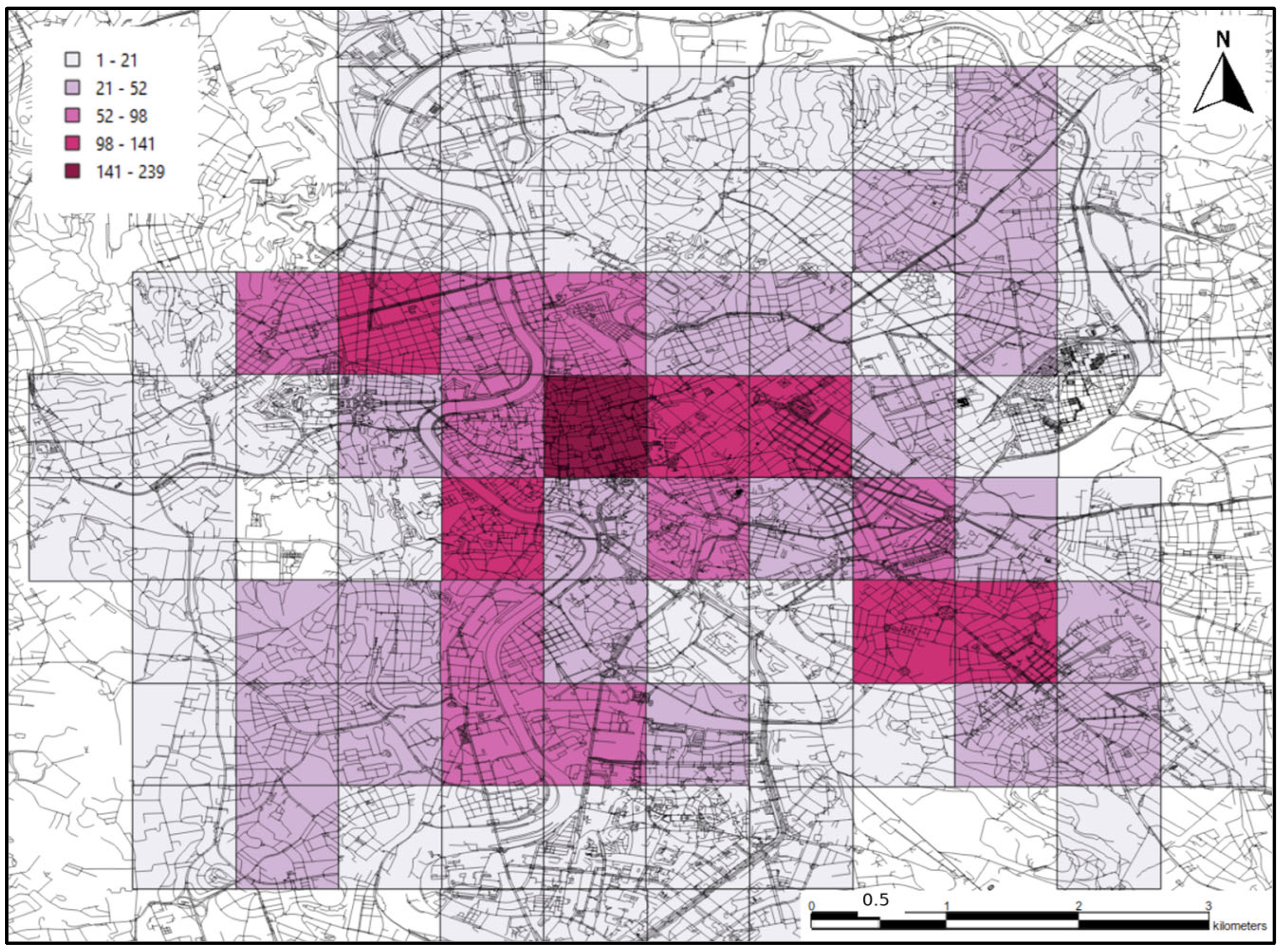
Short rides are shown in
Figure 6. The darker areas on the visualization show that more short trips (less than 800 m) took place in that area. Each square on the visualization has a width of 800 m, so it also shows how such a distance looks compared to the rest of the city. Most trips did not take place in the vicinity of the station or the Vatican, which were previously indicated as generally the most popular regions. Most trips took place in the center of Rome, in the historic part of the city. This may suggest that tourists mainly cover short distances when they want to quickly move between tourist attractions.
4. Zoning and Location Popularity in E-Scooter Analytics
Building upon the foundational data and route classifications discussed in the previous section, we now turn our focus to the more advanced aspects of our spatial analysis: the division of the city into distinct zones based on e-scooter usage and the ranking of locations within these zones. This section presents a view of urban dynamics, exploring how e-scooter data can be utilized to demarcate different urban zones, each characterized by unique usage patterns. We also delve into the methodological approach for ranking locations within the city, providing insights into the most popular and frequented areas as revealed by e-scooter data. Furthermore, we discuss the potential beneficiaries of these analysis results, highlighting the practical implications and applications of our findings in urban planning and mobility management.
4.1. Division into Zones
In [
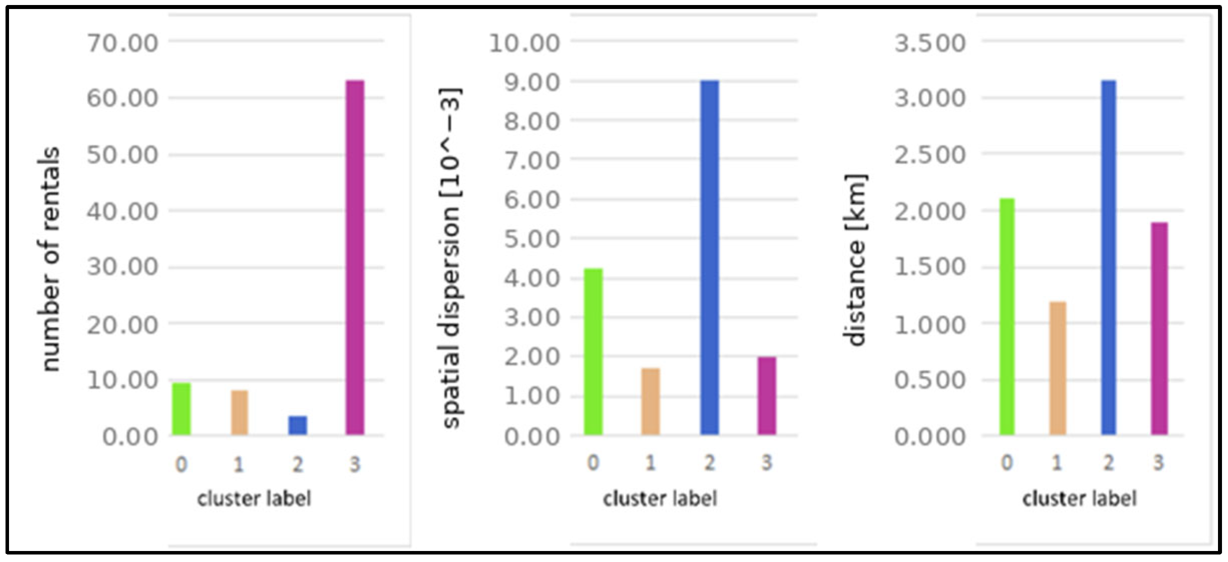
20] the authors divided the city into three types of zones based on mobile phone data. We create zones in our analysis as well. The clustering is applied to square areas with a side length of 200 m. This size was selected as its l (i) is comparable to a short walking distance and aligns with how users reach nearby devices, and (ii) reduces the likelihood that the start and end of the same trip fall into the same cell. To further support this assumption, trips shorter than 200 m were removed from the dataset. Each area is characterized by a different number of trips that end there. In addition, each trip has its unique features. To cluster the areas, it was decided to use three parameters for each area: (i) the number of rentals that end in the area, (ii) spatial dispersion of the starting locations, (iii) average distance traveled. The decision on the number of clusters (the value of k) was made based on a comparison of results for k ranging from 2 to 4. We achieved the best results for k = 4 (based on the values of the centroids of each group) and the results for this value are presented in the paper. Smaller k values produced very coarse partitions that merged functionally distinct areas, while larger k values fragmented the city into smaller clusters that were harder to interpret in a visual-analytics context.
The values of the centroids for each cluster are presented in
Figure 7. Clusters labeled 0 and 1 are similar to each other, with the rides in cluster 0 taking place at longer distances, being more spatially dispersed, and slightly more numerous. Cluster 3 stands out in terms of the number of rentals, having by far the highest number (over 60 compared to just under 10 for cluster 0). However, the rides in this cluster were neither very long nor spatially dispersed. The points in cluster 2 had the highest values in these two categories. For these points, spatial dispersion was twice as high as in cluster 0 and almost four times higher than in cluster 1.
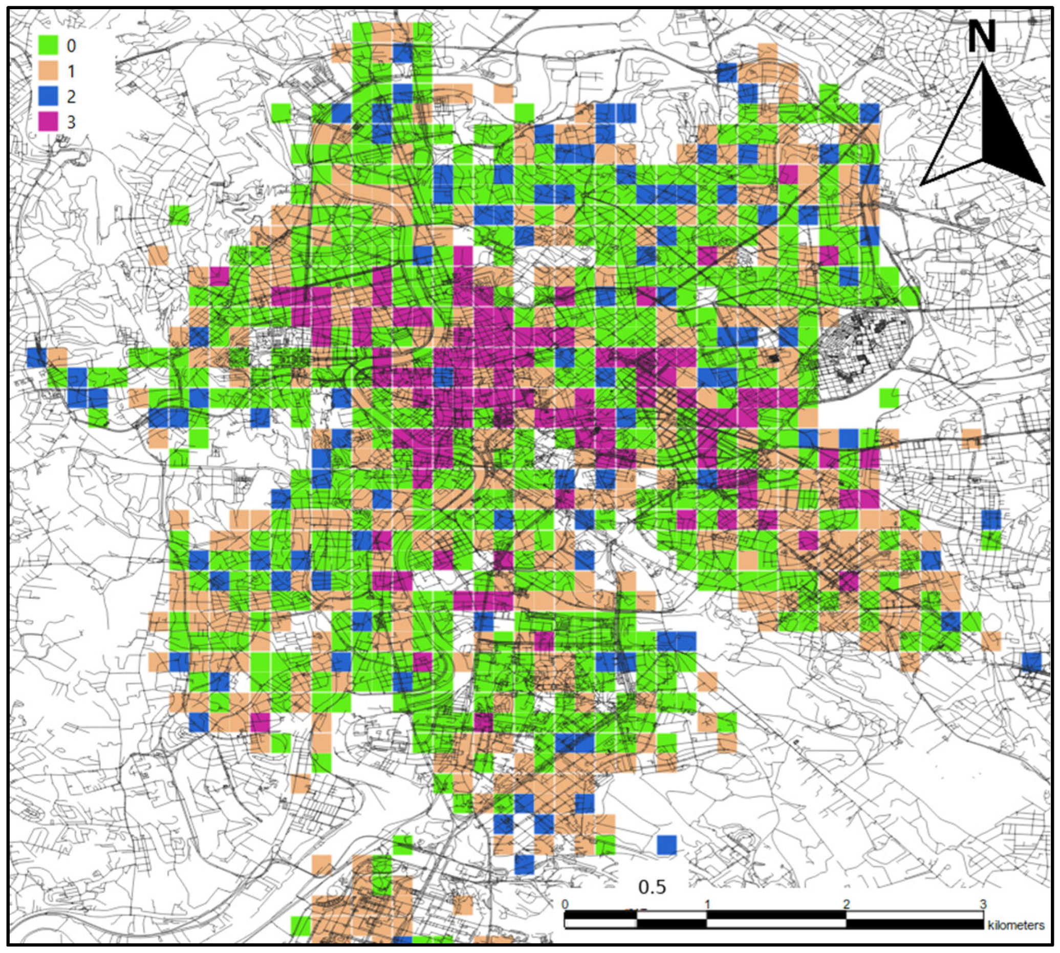
Figure 8 shows the visualization of how locations are distributed in specific clusters within the city. The charts in
Figure 7 show that clusters 0 and 1 are similar to each other and this is also well visible on the cartographic visualization—both clusters cover most of the area and are adjacent to each other. The biggest difference between these two clusters is spatial dispersion of localizations in which users end their rentals. For cluster 1, the spatial dispersion is slightly lower. Taking into account the location of larger clusters of points from this cluster, one can conclude that these are areas where there are quite a few local trips. This is best seen in the example of the EUR district (in the south of the city, somewhat separated from the rest of the city)—the vast majority of it is covered by points from cluster 1. If users mainly traveled to the city center from there, the points would most likely be in cluster 0.
Locations of points from cluster 2 are of interest. They occur rather individually on the map, are less often grouped. Considering that these points are characterized by the smallest number of rentals and the highest dispersion, they can be interpreted as low-activity peripheral destinations. It is worth noting the location of points from this cluster in the city: they are mostly located on the outskirts of the city, and are rarely found in the center. Consistent with the overall temporal pattern of increased activity in the evening (
Figure 1), one plausible interpretation is that a subset of these trips reflects return movements (e.g., toward residential areas).
The last cluster is characterized by the largest number of trips. It is therefore not surprising that the areas previously identified as popular are found in this cluster. Here, too, the vast majority of points belonging to this cluster are located close to each other, and almost all of them are in the city center. Single points occur in other districts. Most likely, these are local activity centers of users related to the proximity of a metro or railway station.
Because ground-truth functional zoning is not uniquely defined, we validate zoning and ranking results via external consistency checks against independent urban structure proxies. First, we compare high-activity clusters and top-ranked cells to transport nodes (e.g., major rail/metro stations) and observe that the highest-demand areas align with known interchange and activity hubs. Second, we compare ranked locations to commercial/POI intensity (e.g., density of amenities and attractions) and find that many top-ranked cells coincide with areas of high POI concentration, consistent with the interpretation that e-scooter demand increases near activity centers.
While the paper focuses on an interpretable, map-centered visual pipeline, we note that the spatial patterns shown in hotspot and corridor maps can also be quantified using standard spatial statistics (e.g., global/local autocorrelation such as Moran’s I on the 200 m grid, or network-based centrality measures after projecting flows onto the street graph). We deliberately prioritize a lightweight workflow that can be reproduced from GBFS snapshots without additional external datasets and without introducing further modeling choices; therefore, we present the link to urban morphology as an interpretive, exploratory perspective, not as a formal validation of land-use patterns.
4.2. Exploratory City Location Scoring
Another analysis that can be carried out based on electric scooters data was exploratory city location scoring. It can be used to identify which places in the city are distinctive and have an advantage over other locations. To conduct such an analysis, one needs to choose the criterion for classifying the locations (what makes one location better than another). For the purposes of this study, three classifications were carried out, each taking into account a different criterion: (i) overall popularity (number of rentals in a given location), (ii) distance traveled from a given location, (iii) popularity at a given time of day. To perform these classifications, we compute three descriptive indicators per 200 m cell: (i) trip-start frequency, (ii) average trip distance for trips starting in the cell, and (iii) the dominant time-of-day category of trip starts. For each indicator we visualize the top locations (top-K) and the corresponding spatial distribution. No composite score is formed. The provided top locations visualized in the figures below are results of exploratory, descriptive summaries of location salience under simple, transparent criteria; they are not intended as a statistically validated or causal ‘optimal location’ model. Because results are derived from a single-operator, one-week sample, the identified hotspots should be interpreted as indicative rather than exhaustive.
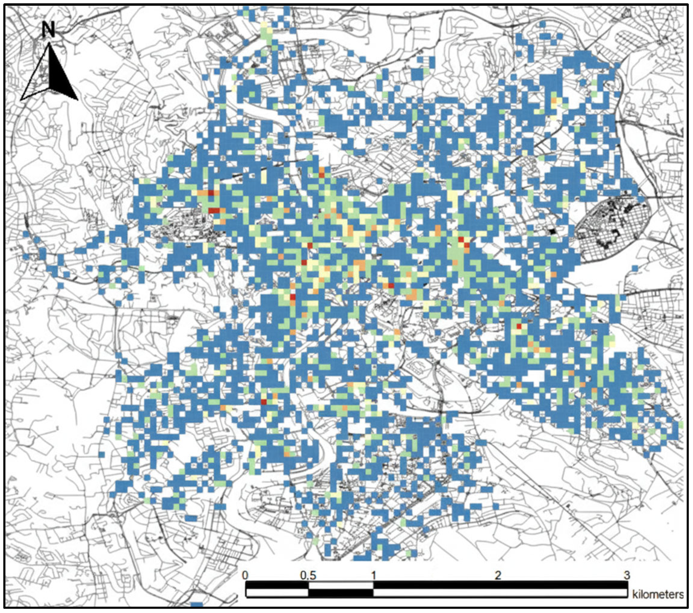
According to the first criterion (overall popularity), the top places in the city are where there is generally the highest number of rentals (
Figure 9). It is not surprising, therefore, that the areas around the main railway station, which was already identified as an area of high potential, are marked in red. In addition, the areas around the Vatican were identified as the best—another place highlighted in the analyses. It is also worth noting the historic center of the city. There are no red dots there, but there are many orange and yellow ones. This should be interpreted as meaning that there is no single characteristic point in that area, but the whole area is frequently visited by e-scooter users. This is also the result of numerous short rides, which usually take place here (please see the analysis of
Figure 6).
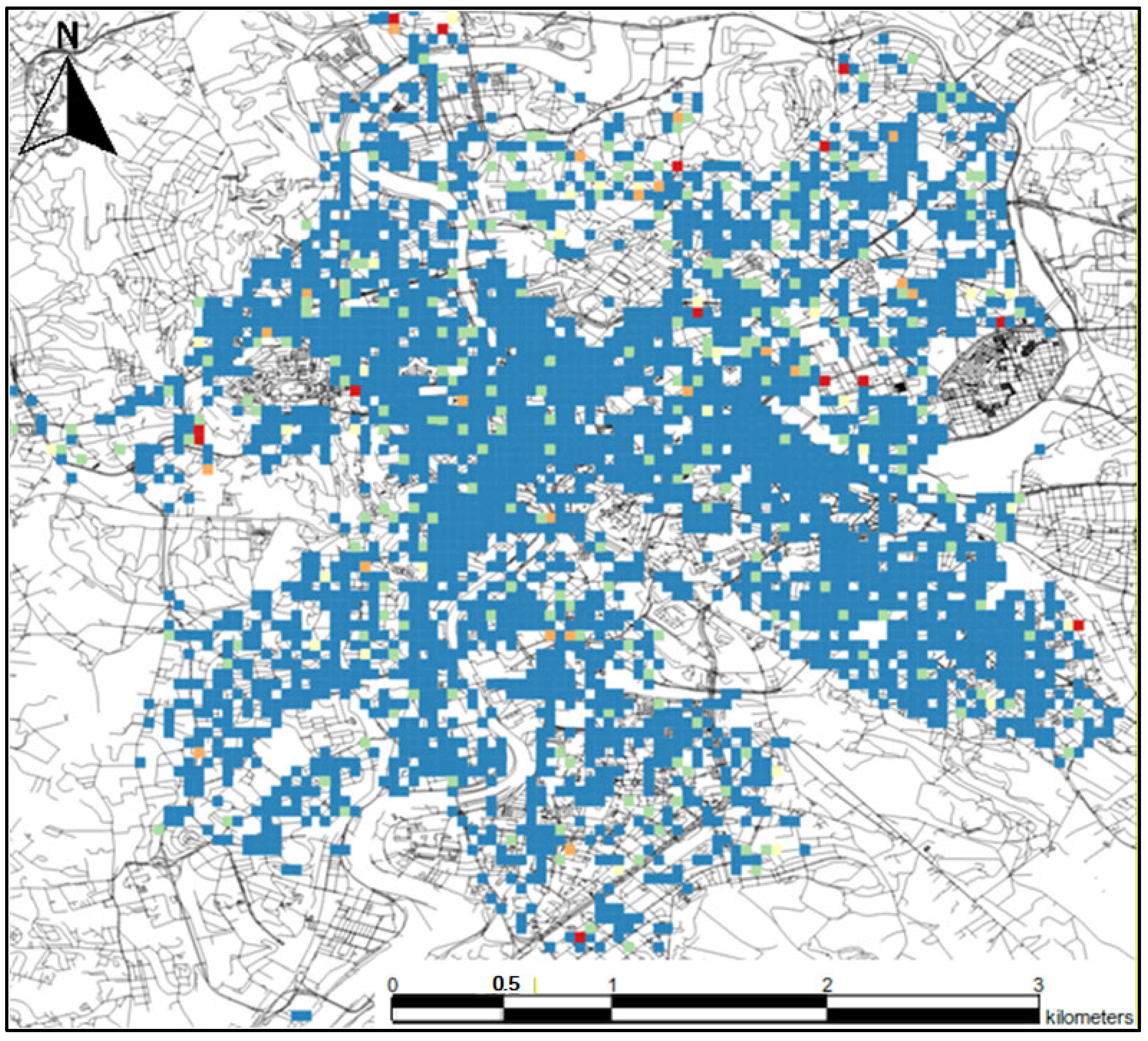
The next visualization (
Figure 10) shows the top locations in the city based on the average distance traveled from them. The top points are primarily located on the outskirts of the city, which is rather obvious—to get anywhere from the edge of the city, one must cover a considerable distance. However, an interesting point is located on St. Peter’s Square in the Vatican. It is among the top 10 best points despite being relatively close to the center. Therefore, it can be inferred that e-scooter users usually travel to a completely different part of the city from around the square. Taking into account the analysis of long rides, it can also be concluded that most users move eastward later on.
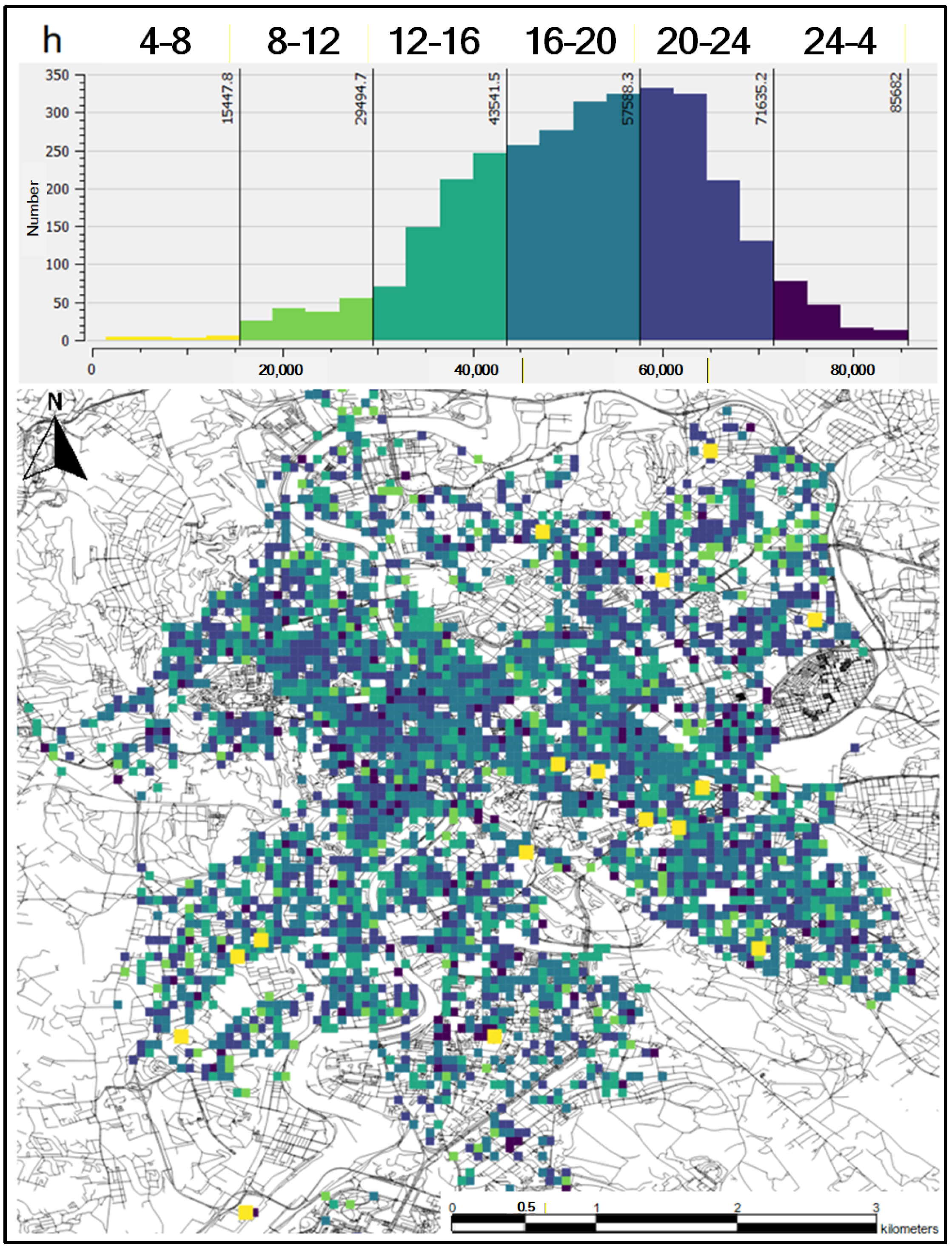
The last analysis concerns the examination of the most popular time of day in different parts of the city (
Figure 11). The histogram indicates colors corresponding to specific time intervals. In addition, yellow dots (most popular in the morning) have been enlarged for better visibility. As the majority of rentals take place in the afternoon and evening hours, most of the points in the city are the most popular during these hours. It is worth paying attention to those points that have been assigned to other times of the day. None of the points popular in the morning are located near the main railway station, the Vatican, or the historic center. These are points that are generally not the most popular but are significant in the morning. On the other hand, points that have peak popularity at night are mainly located in the south of the city. Perhaps in that area, there is no other available means of public transport at night, which is why users most often use e-scooters there.
4.3. Beneficiaries of Analysis Results
All the conclusions arising from the analyses shed light on the structure of Rome, but it would be interesting to see how they can be used by real users. In this subsection, a case study is presented on their use in solving real problems for real groups of interested parties. We selected 3 groups of recipients who we believe can benefit from the results of our analyses: (i) rental operators, (ii) city authorities, (iii) owners of local businesses.
4.3.1. Rental Operators
The operator earns the most when their infrastructure is used around the clock, and the devices remain not rented out for as short a time as possible (while taking into account that each e-scooter needs to be charged at the operator’s service). Additionally, there are usually several operators in a given city competing for customers. Better positioning of their devices in the city (more tailored to the needs of users) allows for outpacing the competition.
Spatial analyses based on electric scooter data can directly answer the question of where the demand for devices is highest (not only in terms of location, but also time of day and week), and thus where the operator should place the devices so that as many customers as possible can use them.
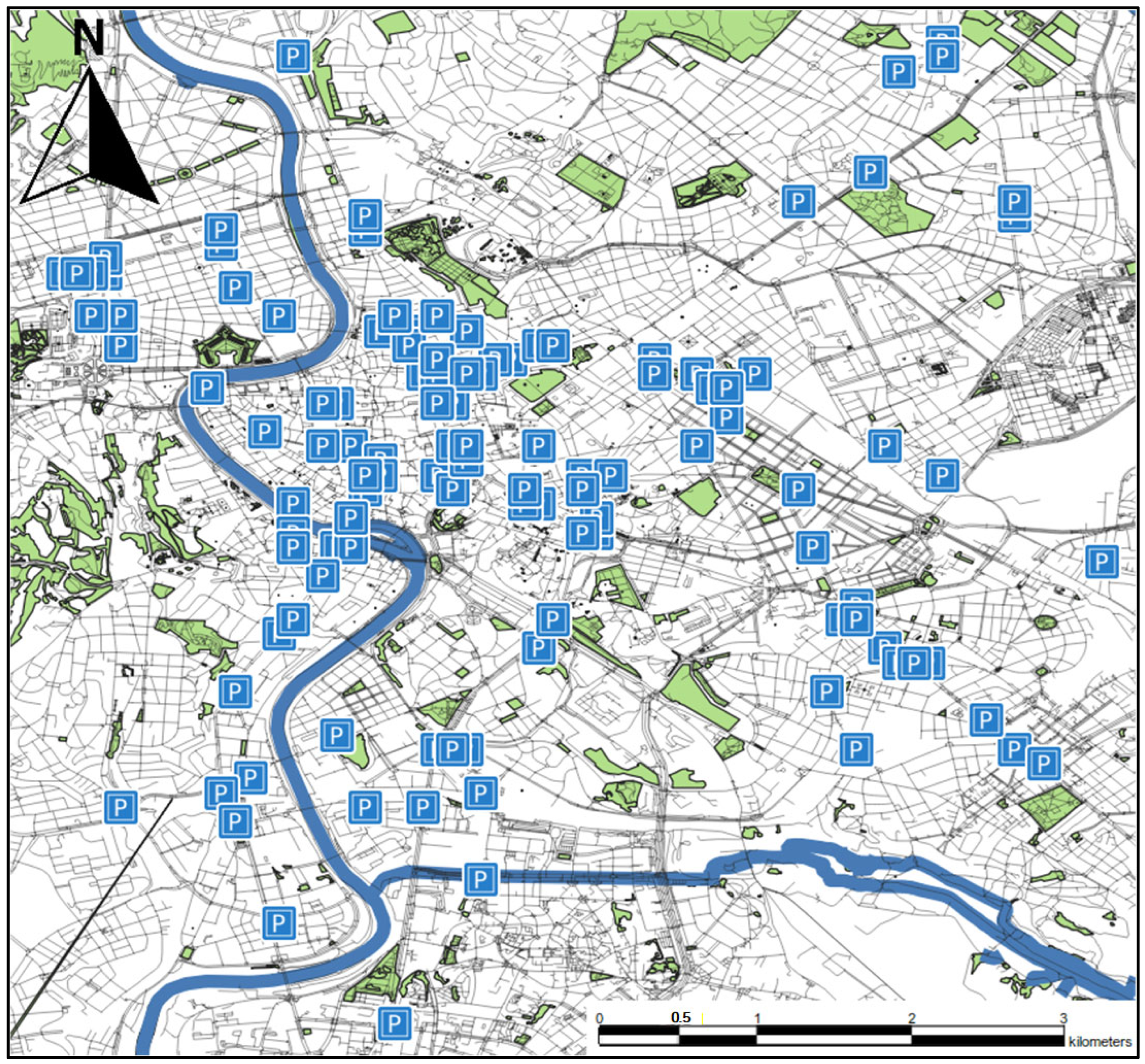
From the operator’s perspective, a key issue is identifying which areas e-scooters should be collected from and where they should be redistributed afterward. Naturally, discharged e-scooters must be retrieved for charging, as they cannot operate without it. However, there may also be locations where it is worth collecting devices before they are fully discharged, for example, in areas with consistently low rental activity. Even more crucial is the question of where to deploy the charged e-scooters, as optimal placement directly impacts usage rates and overall service efficiency.
Based on the available data, it is possible to indicate two types of places: places unfavorable for longer stops and places where e-scooters are sure to be rented again in a short time. The first type of places will be given based on a comparison of the popularity ranking of locations in the city (as discussed in
Section 4.2) and the division of locations in the city into clusters (presented in
Section 4.1). A combination of the two analyses is used because the first one concerned the analysis of locations based on departures from a given location, and the second one based on arrivals. Places where there are many arrivals but very few departures are potential candidates for locations from which it is worth taking e-scooters (there may be a large number of them gathered there or they may remain unrented for a long time). The characterization of the second type of places is the opposite—in places where many people leave but few arrive, it is worth adding a few e-scooters to balance the rental rate.
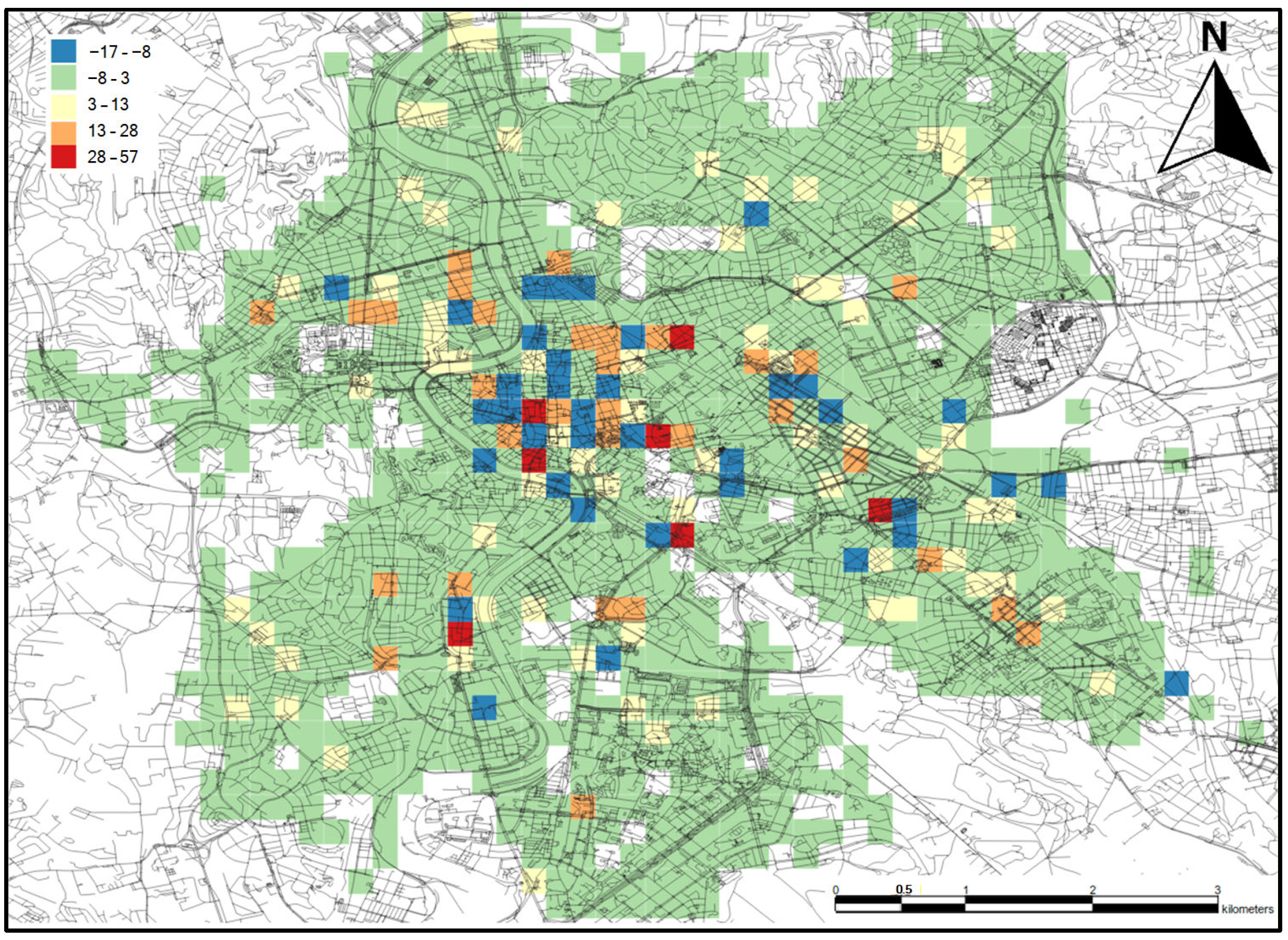
The difference between arrivals and departures from a given location is shown in the legend on the left side of
Figure 12, representing the range of balance values. In locations with a negative balance, there is a predominance of arrivals, while the situation is reversed for locations with a positive balance (
Figure 12). The blue points (with a negative balance) in the center are not a big problem—even if there is an accumulation of e-scooters there, it should be noted that there are red and orange points next to them. Users are willing to walk about 200 m to the nearest e-scooter. E-scooters should be removed primarily from locations marked in blue, around which there are no points with a positive balance, especially important are points outside the city center. These places have many arrivals, but few departures, so e-scooters may unnecessarily stand there. An example of such an area is the vicinity of the Colosseum—this location had the lowest balance. Additionally, the locations around the Colosseum also have a negative balance, so no one will even approach to rent an e-scooter from there. As for the second type of places—it is worth placing e-scooters in places marked in red and orange. There may regularly be a shortage of e-scooters there. It is also worth looking at the locations marked in green. There are definitely the most of them. They represent locations that are not very popular, but users leave e-scooters there. Knowing the cost of e-scooter relocation, it would be profitable to move some of them to better locations, but only if such a cost is low (or lower than the potential profit from rentals).
4.3.2. City Authorities
The next group of stakeholders considered in our study are city authorities. E-scooters have already become a permanent part of the city landscape, and urban planners are beginning to recognize the need to incorporate them into urban infrastructure design. They need to know which places are particularly frequently visited by e-scooter users so that they can create safe rental zones or adjust other means of public transportation for convenient transfers in these locations.
In most e-scooter systems, the e-scooters can be left anywhere, with the only limitation being the operator’s range. However, such a lack of regulations often results in a “mess” in the city. Users leave e-scooters blocking sidewalks or, worse still, sometimes they throw them into the water or even into the trash. The operator can impose penalties on users for damaging equipment, but it is the city’s role to provide space in the common area for e-scooters. Therefore, from the point of view of local authorities, an important question is: where should special points for returning e-scooters be located? When a user leaves one e-scooter, there is no need to designate a special zone for it because one e-scooter does not take up much space. Above all, we need to consider locations where there are many e-scooters. When ten e-scooters are left by users in every free space, even a large square can become cluttered. The cost of creating e-scooter parking zones in the city is not high, and it can bring very good results. Although, for example, painting such zones is relatively cheap, it is not possible to place them at every intersection. It does not make sense because as long as e-scooters appear sporadically in a given location, there is no need to designate a special zone for them. In such cases it is enough for users to leave them safely and without disturbing other residents.
Answering the question of where such zones should be placed will be determined based on the popularity ranking of locations (discussed in
Section 4.2). Parking areas should only be created where there are large numbers of e-scooters. The proposed locations for e-scooter parking in the city are shown in the visualization on
Figure 13. Most of the locations are in the center and surrounding areas; there were too few rentals on the outskirts of the city to create such zones.
4.3.3. Owners of Local Businesses
The last group of potential stakeholders considered in this paper are owners of local businesses. Based on electric scooter data, they can determine with great accuracy where their potential customers are located in the city. It should be noted that electric scooter users are a specific group—primarily young people (very few older people use this type of transportation). Therefore, the use of electric scooter data will be particularly beneficial for businesses aimed at younger residents. In addition, owners of these businesses can investigate where their customers usually depart from in a particular location and adjust their business profile accordingly.
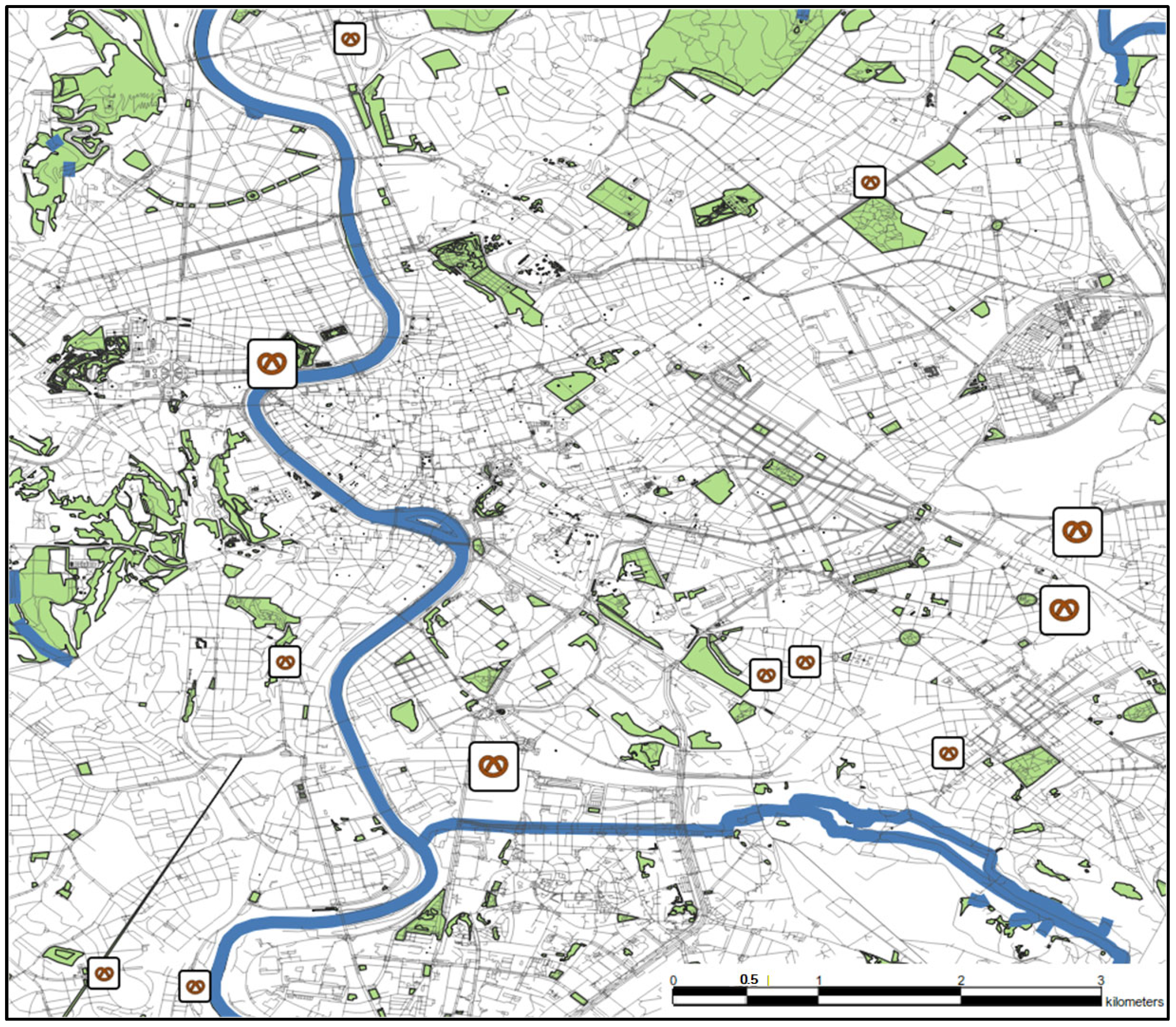
Here we focus on opening a new bakery. An important question for the investor is: where is the best location for a bakery? Bakeries should be opened in a place that is visited by a large number of users. Even better if these users appear in the morning when the demand for bakery goods is the highest. Additionally, the bakery can sell warm products to go, which will also be popular among people who, for example, commute to work and want to buy something for breakfast. The analysis used the ranking of popularity by time of day (discussed in
Section 4.2 Exploratory city location scoring) to determine the most popular locations in the morning.
The analysis yielded a dozen or so locations that would be good places for a bakery according to the presented criteria (
Figure 14). In the next part, the 4 best points are described in more detail (enlarged on the visualization) in the order from best to worst.
First best location for a bakery is at Piazza Pia (the point on the west by the river)—a very attractive tourist place due to its proximity to St. Peter’s Square and Castel Sant’Angelo. In addition, many buses stop here, and it is convenient to transfer to another line. However, this point will have a significant advantage for tourists over the residents of Rome.
The second-best location is a point in a typical residential area (on the east, more southern point). There is Roma Tuscolana railway station in the area, where long-distance and regional trains stop. There is also a school and a theater there. This location, on the other hand, is not attractive for tourists in any way, but many people live there. There are also not many service facilities (especially gastronomy) in the area, so it may be a good place for a new bakery.
The third best location is a point located south of the center of Rome. It is also a less touristy part of the city but is much better connected to the rest of the city. The designated point lies between blocks and a playground, and within a radius of 200 m, there are two railway stations and the Piramide metro station. The area is also characterized by a large number of service facilities and restaurants, so it is an area where people certainly use catering services.
The last point is located north of the second-best point, but it is in a different part of the city. Between the points, there are railway tracks that usually divide the city into distinct parts. This point is located on a fairly busy street, not far from the Pigneto metro station. The surrounding area is similar to that around the third point—mostly blocks of flats and food establishments; however, most of the establishments are located a bit further away from the designated point.
5. Discussion
A recurring concern in visualization-driven urban analytics is that actionable insights may appear anecdotal unless the assumptions, robustness, and scope of validity are stated explicitly. In this work, we therefore position the presented outputs as descriptive decision-support visualizations derived from reconstructed mobility traces, rather than as validated prescriptions or causal claims.
The presented analyses depend on reconstructing rentals from high-frequency GBFS snapshots (sampled every 5 s). Rentals are segmented using a continuity rule (≤15 s temporal continuity), and idle episodes are consolidated based on a spatial change threshold (50 m). These choices are intentionally simple and transparent: when snapshots are missing, we avoid interpolating trajectories and instead start a new segment, prioritizing interpretability over aggressive reconstruction. This design reduces the risk that downstream maps (hotspots, corridors) are dominated by artifacts of gap-filling rather than observed e-scooter movement.
At the same time, the reconstructed trajectories should be understood as an approximation of true rides derived from publicly visible availability states. The approach taken is therefore best suited for extracting aggregate patterns (e.g., persistent high-use areas and major movement directions) rather than for fine-grained claims about exact routes or micro-level travel times.
Several parameter choices reflect a trade-off between granularity and interpretability. The paper intentionally uses a compact set of parameters (e.g., continuity threshold tied to sampling frequency; a fixed grid resolution; a small number of clusters for zoning) to keep the workflow reproducible and easy to communicate.
We emphasize that the key visual conclusions are expected to be robust at the level of macro-structures (dominant hotspots and main corridors), while more detailed patterns can vary with choices such as grid size, the short/long trip split, and zoning configuration. For this reason, the results should be interpreted primarily as a structural reading of urban micromobility under the given observation window and assumptions, and not as an attempt to determine a single optimal parameterization.
The section Beneficiaries of analysis results illustrates how the proposed outputs can support practical questions relevant to both operators and city stakeholders (e.g., identifying locations associated with frequent starts, prolonged idle time, or directional flows that may indicate recurrent demand–supply imbalance). However, these examples are not intended as audited policy recommendations; they demonstrate how a stakeholder could translate descriptive outputs into hypotheses and candidate interventions for further validation.
Consistent with this framing, our location scoring is presented as transparent, criterion-based ranking (e.g., frequent starts, higher average trip distance, or time-of-day dominance), explicitly avoiding a composite score that would imply a universally optimal location. This makes the reasoning auditable and allows stakeholders to adjust criteria to their operational context.
The workflow is designed to be transferable to other cities because it relies on GBFS feeds, which are broadly adopted by micromobility operators and are often the only publicly accessible data source. The core steps (snapshot collection, segmentation into rentals/idle episodes, aggregation to a grid, and production of map-based visuals) do not depend on city-specific annotations and can therefore be replicated in other settings where stable e-scooter identifiers and sufficiently frequent snapshots are available.
Nevertheless, substantive interpretation remains conditioned on factors outside the pipeline: operator coverage and fleet management policies, service-area constraints, pricing, seasonality, and short-term events. Accordingly, generalizing from a single-operator, single-week study should be performed cautiously. The most appropriate use of the workflow is as a lightweight, reproducible first step that (i) reveals candidate patterns and (ii) motivates deeper studies using longer periods, multi-operator datasets, or independent mobility indicators when available.
Finally, we clarify that the contribution of this paper is not the general idea of visual storytelling which has a well-established body of prior work, but the operationalization of a GBFS-snapshot-driven pipeline that reconstructs trips and produces a coherent set of interpretable visual outputs under minimal data access constraints. Many existing micromobility studies either rely on operator-provided trip logs or focus on model-driven objectives; by contrast, we demonstrate what can be achieved using only publicly available GBFS snapshots, emphasizing transparency of assumptions and reproducibility of the resulting descriptive products.
The relationship between e-scooter intensity patterns and urban morphology is discussed as an interpretation of persistent hotspots/corridors rather than as a formal land-use validation. Quantitative confirmation (e.g., statistically significant hotspot detection, autocorrelation strength, or correlation with independent land-use/POI density) is feasible but requires additional data integration choices and, in the case of land-use, external reference datasets. We therefore position our morphology discussion as a reproducible descriptive baseline, intended to motivate targeted, metric-based follow-up analyses when such reference data are available.
6. Conclusions
Our spatial analysis of electric scooter data in Rome demonstrates how micromobility traces can be used to visually explore and interpret urban dynamics and city structure. Rather than proposing new visualization techniques, the core contribution of this work is methodological and practical: we operationalize a reproducible workflow that turns publicly available GBFS API snapshots into interpretable spatial outputs suitable for urban analysis and stakeholder communication.
Specifically, we describe a transparent GBFS-to-trips reconstruction procedure that infers rentals and idle episodes from high-frequency snapshots using simple continuity rules (without interpolation), and then aggregates the reconstructed mobility to produce a coherent set of map-centered views. These include demand and idle-time hotspots, dominant mobility corridors, complementary short-long trip perspectives, mobility-based zoning on a fixed grid, and criterion-based location ranking. Importantly, the ranking is presented as an auditable summary of observed activity under clearly stated criteria, rather than as a universally best location prescription.
The study’s conclusions should be interpreted in light of data representativeness: the dataset covers a single operator and a single week, and the observed patterns may be influenced by operator policies, service-area constraints, fleet management, and short-term conditions. Therefore, the presented outputs are positioned as descriptive decision support and hypothesis generation, most reliable for macro-level structures such as persistent hotspots, main corridors, and broad functional differentiation, rather than as causal inference or externally validated recommendations.
Future work will extend the pipeline to longer observation windows (multi-week and seasonal) and multi-operator/multi-city deployments to assess transferability across different operating policies and urban contexts. We also plan to incorporate external reference layers (e.g., POI/land-use proxies and proximity to transport nodes) to support quantitative validation of selected spatial patterns, and to explore optional predictive components (e.g., short-horizon demand or availability forecasting) built on the same grid-based indicators. In addition, while the present study focuses on descriptive visual analytics, future work may explore integrating the workflow with AI-driven urban mobility components (e.g., short-horizon demand or availability forecasting) and considering security and privacy aspects relevant to IoT-enabled micromobility ecosystems (e.g., data integrity, access control, and privacy-preserving aggregation), which are beyond the scope of this paper.
