Article

Assessing Urban Activity and Accessibility in the 20 min City Concept

1
Computer Science Department, School of Information and Communication Technology, Mongolian University of Science and Technology, Ulaanbaatar 13341, Mongolia
2
Department of Human Intelligence and Robot Engineering, Sangmyung University, Cheonan 31066, Republic of Korea
*
Author to whom correspondence should be addressed.
Electronics 2025, 14(8), 1693; https://doi.org/10.3390/electronics14081693
Submission received: 16 March 2025 / Revised: 14 April 2025 / Accepted: 18 April 2025 / Published: 21 April 2025
(This article belongs to the Special Issue Machine/Deep Learning Applications and Intelligent Systems)

Abstract

:
The 20 min city concept ensures that essential services—such as work, education, healthcare, and recreation—are accessible within a 20 min walk or transit ride. This study evaluates urban accessibility in Ulaanbaatar by analyzing Points of Interest (POIs) and public bus transit networks using spatial analytics and deep learning techniques. Our finding highlights that geographical area characterization is a good proxy for predicting ridership in transit networks. For instance, healthcare and medical areas show a strong correlation with similar ridership behaviors. However, some areas lack nearby bus stations, leading to poorly placed transit stops with low walking scores. To address this, we propose the use of a Quad-Bus approach to identify optimal bus station locations in urban and suburban areas, considering amenity density and deep learning ridership models to diagnose and remedy accessibility gaps. This approach is evaluated using walking and transit scores for distances ranging from 5 to 20 min in the case of Ulaanbaatar city. Results show a moderate overall link between amenity density and ridership (r = 0.44), rising to 0.53 around healthcare clusters. However, >500 high-activity partitions contain no bus stop, and 40% of the city scores below 50 on a 0–100 walking index. Half of urban areas lack a stop within 300 m, leaving 60% of residents beyond a 10 min walk. Quad-Bus reallocations close many of these gaps, boosting walk and transit scores simultaneously. This research offers valuable insights for enhancing mobility, reducing car dependency, and optimizing urban planning to create equitable and sustainable 20 min city models.

1. Introduction

As urban populations continue to grow, ensuring equitable access to essential services such as workplaces, education, healthcare, and recreation has become a critical challenge [1]. Traditional automobile-centric development patterns have led to chronic traffic congestion, high carbon emissions, and socioeconomic disparities in service accessibility [2,3]. In response, urban planners are exploring sustainable [4], proximity-based models to improve livability [5]. One such model is the 20 min city concept, which envisions that residents can reach most daily necessities via a 20 min walk or public transit ride from their homes [1]. This approach emphasizes walkable neighborhoods, mixed land use, and efficient multimodal transportation networks to reduce private car dependency and enhance quality of life [2,5]. However, translating the 20 min city vision into reality presents significant challenges. Urban spatial heterogeneity often leads to uneven accessibility across different neighborhoods [6]. Densely developed city centers tend to exhibit high walkability and robust transit connectivity, whereas suburban and peri-urban areas frequently struggle with limited infrastructure and longer travel times to reach key services [7,8]. Furthermore, fragmented public transportation networks and a lack of data-driven planning have hindered the realization of this concept in practice [9]. Most existing 20 min city assessments have been conducted in well-resourced metropolitan areas using relatively static metrics of walkability and transit access. For example, urban analysts often rely on composite walkability indices (such as Walk Score) that measure proximity to amenities and street connectivity, or on transit service indicators like London’s Public Transport Accessibility Level (PTAL), which grades access based on distance to transit stops and service frequency. Recent studies in cities such as London, Paris, and Rome have developed graph-based accessibility measures—e.g., a “15 min city index”, capturing the share of services reachable within a quarter-hour on foot [10] to compare urban performance in terms of proximity goals. These challenges are pronounced in Ulaanbaatar, Mongolia—a rapidly growing city marked by stark contrasts in mobility and access to amenities across its districts. Ulaanbaatar, the capital city of Mongolia, is experiencing rapid population growth and the city’s population boom (now 1.7+ million) has led to overcrowding and sprawl, with growth outpacing infrastructure. Ulaanbaatar’s population surge—with hundreds of thousands of rural migrants—is a major factor behind its traffic congestion. The government is actively bolstering mass transit to offer an alternative to driving. Private car use has expanded unsustainably. By 2024, Ulaanbaatar exceeded the intended vehicle limit (730 k) set by policymakers. In 2023–2024, the city invested in 810 new buses (600 diesel Euro-5, 160 electric, 50 mid-size) to completely renew the bus fleet. Currently, roughly 40% of trips in the city are made using public transport. The complete overhaul will modernize the entire bus fleet by 2024–2025, enhancing capacity while lowering emissions. The new, expanded fleet is designed to serve Ulaanbaatar’s half-million daily bus passengers and foster a shift away from private car use.
This study addresses the above gap by introducing a dynamic, multi-source methodology for evaluating urban activity and accessibility under the 20 min city paradigm. In contrast to prior studies’ static walkability or transit scores, we leverage rich datasets and advanced spatial analytics to create a more responsive assessment tool. Data from multiple sources are integrated: (i) an extensive set ofPOIs from OpenStreetMap (OSM) and local geographical maps, detailing the locations of key services and amenities [11]; (ii) public transit information from General Transit Feed Specification (GTFS) feeds, providing spatiotemporal samples of bus routes, schedules and ridership over a month [12]; and (iii) a high-resolution pedestrian street network extracted using OSMnx to model walkable paths and travel times. In this research, ridership is defined as the total count of passengers boarding and alighting at each bus stop on public transit vehicles.
This paper provides significant contributions in three key aspects. First, in terms of innovation, we introduce the first integration of Artificial Intelligence-driven spatial analysis—using quadtree decomposition and clustering—via the application of the 20 min urban model to Ulaanbaatar. Our approach combines POI clustering, walking isochrone analysis, and bus GTFS data to construct a comprehensive multimodal accessibility evaluation framework, offering a novel method, termed Quad-Bus for sustainable urban planning. Second, regarding rigor, our analysis employs a robust methodology to validate the spatial match between POI distribution and bus stops. By segmenting the city into 847 quadtree partitions and employing Spectral clustering to identify 30–35% high-density activity centers, we use dual verification with walking and bus scores to reinforce the reliability of our findings. Finally, in terms of influence, the outcomes of our research offer practical guidance for optimizing Ulaanbaatar’s bus network. For instance, our results suggest adjustments in the layout of 60% passenger hubs, thereby providing crucial data support for addressing urban traffic inequality and reducing car dependence amid rapid urbanization. Moreover, the Bidirectional Encoder Representations from Transformers (BERT)-based semantic clustering partition strategy introduced here is adaptable to other urban renewal practices, enhancing its potential impact across diverse metropolitan contexts. This study not only sheds light on Ulaanbaatar’s current mobility challenges but also offers a replicable framework for guiding sustainable urban planning in other rapidly evolving cities.
By fusing the above-mentioned data, we capture both the supply of opportunities (spatial distribution of shops, schools, clinics, etc.) and the mobility infrastructure enabling access (sidewalk and road connectivity, transit routes and usage). We further employ machine learning—in particular, a deep learning model—to link urban activity patterns with transit demand [12,13]. Our analysis reveals a moderate-to-strong positive correlation between public transit ridership and the density of nearby POIs. We used our proposed spatial optimization approach, Quad-Bus, to evaluate 20 min city metrics. We improve public transport station placement in a case study of Ulaanbaatar and compare the accessibility outcomes (e.g., walking distance to transit, coverage of amenities) before and after the proposed bus stop allocations. This approach iteratively hones in on high-need areas: it subdivides the urban space until each sub area [14] reaches a threshold of manageable size or homogeneity, and then recommends new bus stop locations to fill accessibility voids. Such a strategy ensures that densely populated or amenity-rich areas receive appropriately placed transit stops, while avoiding the over-concentration of resources in already well-served zones. The proposed framework directly addresses the limitations of walkability/transit indices by accounting for real-world ridership patterns and the heterogeneous structure of Ulaanbaatar city. The insights gained help shape urban development strategies—ranging from optimizing bus stop placements and improving pedestrian infrastructure to aligning land use planning with transit networks—to guide Ulaanbaatar toward a more accessible, equitable, and sustainable 20 min city model that meets the needs of all its residents.

2. Related Works

The notion of time-constrained proximity in urban design traces back to Gehl’s human-scale city principles [2]. Moreno formalized the 15 min city concept, framing urban life around chrono-urbanism and local living patterns [1], while Axhausen provided a comprehensive policy evaluation framework linking accessibility to urban development outcomes [15]. Southworth underscored the importance of street design for walkability [16], and Ewing and Handy developed quantitative urban design metrics to capture walkable qualities [5]. Collectively, these works establish that compact, mixed-use environments can reduce travel distances and foster active mobility. Composite walkability metrics have been refined and empirically validated across health and behavior studies. Litman evaluated transportation planning accessibility measures [17], and Florida connected creative-class dynamics to urban form [18]. Litman later detailed the public health and environmental benefits of walkable environments [6]. Forsyth et al. demonstrated links between residential density and physical activity [9]. Epidemiological research by Berrigan and Troiano associated built environment features with obesity risk [19], and Frank et al. correlated neighborhood walkability with active transportation and health outcomes [20]. Validation studies by Duncan et al. [21] and Carr et al. [22] confirmed the reliability of Walk Score® in estimating neighborhood walkability across multiple U.S. cities. To overcome the limitations of static buffer zones, researchers have developed isochrone-based models that map true pedestrian reachability. Neis et al. analyzed the evolution of OSMstreet networks to support dynamic accessibility modeling [23]. Luxen and Vetter demonstrated real-time routing based on OSM data [24], and Boeing introduced OSMnx [25], a toolkit for acquiring, constructing, and analyzing complex street networks [24]. These methods enable the generation of walking isochrones that reflect actual pedestrian paths, connectivity, and barriers. Deep learning approaches have further advanced pedestrian infrastructure evaluation. Zhang et al. proposed DeepWalkability, a CNN-based model trained on street-level imagery to assess sidewalk and streetscape quality [26]. Jiang et al. integrated Global Positioning System (GPS) walking trajectories with image data to predict real-time pedestrian accessibility using deep neural networks [27]. These AI-driven techniques capture micro-scale urban features and dynamic conditions beyond traditional indices. Public transit accessibility research has progressed from basic service metrics to AI-enhanced analyses. Pallottino and Scutellà developed shortest-path optimization algorithms to improve transit routing for underserved populations [28]. Wu et al. applied Graph neural networks (GNNs) to model transit connectivity and ridership patterns, enabling deep learning-based accessibility analysis [29]. Allen et al. leveraged GTFS feeds and GPS tracking to measure real-time multimodal accessibility, integrating bus, rail, and pedestrian modes [30]. Banister emphasized that coordinated multimodal systems—linking walking, cycling, and transit—are essential for reducing travel times and increasing ridership in dense urban contexts [4]. Spatial inequities in accessibility persist across urban regions. Holian and McKenzie found that limited transit options strongly influence residential location choices and constraints economic mobility in low-income areas [31]. Lenntorp’s time-geographic framework modeled how temporal and spatial constraints affect individuals’ access to employment, education, and healthcare [32]. Advances in spatial data, big data analytics, and smart city technologies are reshaping accessibility research. More recently, GNNs [33] and Transformer architectures [34] have been applied to predict door-to-door travel times across entire metropolitan networks. Yet, few studies fuse those predictions with land use semantics to explain why demand emerges at specific nodes.

3. Data Collection

This section describes the data sources, preprocessing techniques, and analytical methods used to assess urban activity and accessibility in the context of the 20 min city concept. To assess accessibility within Ulaanbaatar, we utilized a combination of geospatial and transit datasets. We collected data from OSM and other local geographical maps using the Overpass API. We collected data from Google Maps using the Places API and utilized other local map systems. We merged all the different source data into a single file containing names, coordinates, tags, and amenities. The file includes 420,743 raw POIs, representing essential services such as workplaces, schools, healthcare facilities, retail stores, and recreational spaces. Duplicate POIs at identical coordinates were removed, leaving 11,015 unique POIs after data cleaning. (GTFS data were obtained from local transit agencies. Additionally, we obtained bus route data, including one month of bus GPS tracking data, from local transportation agencies to analyze bus stop locations, service frequency, and ridership trends. Ulaanbaatar’s existing public transit network comprises 126 bus routes and 1348 bus stops. We collected the bus route data from local transportation agencies, where we encountered inconsistencies in bus stop names and changes in bus stop IDs due to modifications in the bus routes. We addressed these discrepancies by correcting nearly 1600 mismatched bus stop names. These data were converted into the General Transit Feed Specification (GTFS) to ensure a standardized format [35]. GTFS consists of multiple CSV files defining bus routes, schedules, and stop locations. We validated the converted data using the gtfs-validator tool provided by MobilityData. The dataset contains 15,648 monthly samples, equivalent to 5216 daily ridership records. Street network data were extracted from OSM (March 2025) using OSMnx. These data were related to road connectivity, pedestrian pathways, and traffic flow constraints, which are used for computing walking isochrones and pedestrian accessibility.

4. Methodology Design

This section outlines the methods used to evaluate urban activity, walkability, transit accessibility, and multimodal integration in Ulaanbaatar within the 20 min city framework. Our approach integrates geospatial data [36], classification techniques, large language models (LLMs), and accessibility metrics to assess mobility infrastructure and identify accessibility gaps.

4.1. Quad-Bus Partitioning

To characterize urban activity patterns, we designed a multi-step approach combining spatial partitioning, clustering, and correlation analysis:
1. Quad-Bus partitioning: A Quadtree decomposition method was used to segment Ulaanbaatar’s geographic area into variable-sized subregions based on POI density. We provided a set of POIs and an initial geographic boundary to the Quad-Bus construction algorithm (Algorithm 1). The algorithm returns a Quadtree structure with leaf nodes, constructed by the Recursive Quadtree Construction algorithm (Algorithm 2). Algorithm 2 recursively subdivides a bounding box (defined by longitude: 106.4919° to 107.2829°, latitude: 47.7412° to 48.1881°) into four quadrants until each partition meets a minimum POI threshold (e.g., 10 POIs) and a minimum size constraint (e.g., 300 m). The radius ofeach cellis calculated using the Cell Radius Calculation algorithm (Algorithm 3) which employs the Haversine formula:
d = 2 r   a r c s i n ( s i n 2 ( ϕ 2 ϕ 1 2 ) + c o s ( ϕ 1 ) c o s ( ϕ 2 ) s i n 2 ( λ 2 λ 1 2 ) )
  • r = Earth’s radius ( 6371   km );
  • ϕ 1 , ϕ 2 = latitudes of point 1 and point 2 in radians;
  • λ 1 , λ 2 = longitudes of point 1 and point 2 in radians;
  • d = distance between the two points.
Algorithm 1: Quad-Bus construction
Input:
  • Set of POIs P = { ( l a t i , l o n i ) }
  • Initial geographic boundary Broot encompassing all POIs
Output:
  • Quadtree structure with leaf nodes satisfying splitting constraints
  • Interactive HTML map with POI markers and quadtree cells
Quadtree Node Definition:
Each node N is defined by:
  • Boundary: B = { m i n l a t , m a x l a t , m i n l o n , m a x l o n }
  • POI List: P N P
  • Children: Quadrants [ N W , N E , S W , S E ]
  • Leaf Status: Boolean is_leaf
Algorithm 2: Recursive Quadtree Construction
Procedure BuildQuadtree(N):
    Check Split Conditions:
     If | P N | 10 OR C e l l R a d i u s ( B ) 300   m :
       Terminate recursion (mark N as leaf).
     Else:
       Split N into four quadrants [ N W , N E , S W , S E ] via midpoint subdivision.
       Redistribute P N into child nodes based on geographic coordinates.
       Recursively call BuildQuadtree(child) for each child.
Algorithm 3: Cell Radius Calculation
Function CellRadius(B):
Compute centroid ( c l a t , c l o n ) of B
Calculate maximum Haversine distance (1) d m a x between centroid and all four corners of B:
d m a x = m a x { H a v e r s i n e ( c l a t , c l o n , c o r n e r l a t i , c o r n e r l o n i ) | i 1,2 , 3,4 }  
  • ( c l a t , c l o n ) = the latitude and longitude of the centroid of the boundary.
  • ( c o r n e r l a t i , c o r n e r l o n i ) = the latitude and longitude of the i th corner of the boundary.
  • d m a x = the maximum distance between the centroid and any corner of the boundary.

return d m a x .
2. Clustering: Spectral clustering was selected to group bus stops based on their surrounding POI profiles. POI category names were embedded into high-dimensional vectors using BERT, aggregated per bus stop, and clustered to identify areas with similar activity characteristics. Clustering performance was evaluated using the Silhouette score and Adjusted Rand Index (ARI).
3. Correlation and regression: to assess the relationship between POI density and ridership, we planned to define a buffer (e.g., 300 m) around each bus stop, count POIs within this radius, and compute the Pearson correlation coefficient
r = C o v ( X , Y ) σ X σ Y
  • r is the Pearson correlation coefficient.
  • C o v X , Y is the covariance between variables X (POI density) and Y (ridership).
  • σ X is the standard deviation of X .
  • σ Y is the standard deviation of Y .
Additionally, a stacking regression model was designed to enhance ridership prediction by integrating multiple base learners—Random Forest, Support Vector Regressor, and Gradient Boosting Regressor—with a Ridge regression meta-learner. This model was applied to predict ridership based on POI density and category features within the buffer, with performance evaluated using the R2 score.

4.2. Walking Score Estimation

Walkability was evaluated using a Walking Score metric [22], designed to measure pedestrian accessibility to essential services within a 20 min time frame (approximately 1600 m at 5 km/h). The approach involved the following steps:
  • Network-Based Analysis: shortest-path distances to POIs were calculated using a pedestrian-friendly street network, extracted via OSMnx 2.0.2 (https://osmnx.readthedocs.io/, accessed on 16 February 2025), which was converted into an undirected graph with NetworkX 3.4.2 (https://networkx.org/, accessed on 16 February 2025).
  • Walking isochrones: isochrones were planned at 5, 10, 15, and 20 min intervals to map reachable areas from selected points (e.g., bus stops or partition centroids), with distances computed as follows
d = v · t
where v = 1.39   m / s (average walking speed) and t is time in seconds.
3.
Score Normalization: raw counts of accessible POIs within the buffer were normalized to a 0–100 scale:
W a l k i n g   S c o r e = ( P O I c o u n t c o u n t m i n c o u n t m a x c o u n t m i n ) ·   100
  • P O I c o u n t = the number of POIs in the current partition of quadtree.
  • c o u n t m a x = the maximum number of POIs found in any partition of quadtree.
  • c o u n t m i n = the minimum number of POIs found in any partition of quadtree.

4.3. Transit Score Estimation

Transit scores were computed based on proximity to the nearest bus stop (normalized score), the transit service frequency (GTFS-derived trip count per hour), and the connectivity to other transit modes (multimodal integration factor). When calculating the transit score as a weighted sum of normalized distance and trip count, we can break it down into the following steps:
T r a n s i t   S c o r e = w 1 D n o r m a l i z e d + w 2 T n o r m a l i z e d
  • D n o r m a l i z e d is the normalized distance from the nearest transit station.
  • T n o r m a l i z e d is the normalized trip count (frequency of transit service).
  • w 1 and w 2 are the weights assigned to distance and trip count, respectively.
We assigned weights ( w 1 and w 2 ) to determine the importance of distance to a bus station and trip frequency in the overall T r a n s i t   S c o r e . In many cases, these weights were computed as a weighted sum of these normalized values, with distance to bus stations contributing 70% and trip count 30%. In other words, w 1 = 0.7 and w 2 = 0.3.
Normalized distance ( D n o r m a l i z e d ) is usually normalized by dividing the actual distance to the nearest transit station by the maximum distance found in the dataset (i.e., the farthest possible distance for normalization). The formula for normalization is as follows:
D n o r m a l i z e d = D a c t u a l D m a x
  • D a c t u a l is the actual distance to the nearest transit station;
  • D m a x is the maximum distance across all locations being considered.
Normalized trip count ( T n o r m a l i z e d ) is determined by dividing the actual trip count by the maximum trip count (i.e., the highest frequency of transit in the dataset). The formula for normalization is as follows:
T n o r m a l i z e d = T a c t u a l T m a x
  • T a c t u a l is the actual trip count (frequency of transit service);
  • T m a x is the maximum trip count in the dataset.

5. Experimental Analysis

This section presents the findings of our analysis, including urban activity classification, walkability assessment, and transit accessibility evaluation. The results provide insights into spatial disparities in accessibility, highlighting areas where improvements are needed to enhance urban mobility and connectivity.

5.1. Urban Activity Analysis

To understand the spatial patterns of urban activity, we analyzed how the density of POIs around bus stops in Ulaanbaatar influences passenger flow to optimize transit networks. The dataset contains POIs across Ulaanbaatar, each labeled with diverse textual information. To understand the distribution of top categories, we classify the textual metadata of POIs into 13 high-level categories, as described in [14], using LLM as gpt-4o-mini. The distribution POI categories are shown in Figure 1, where the x-axis represents the POI category, and the y-axis shows its percentage share among all POIs. This indicates that urban activity is heavily service-oriented. The commercial category has the highest representation, accounting for nearly 30% of all POIs. This is followed by other, residence, and food, each making up a significant portion. Categories like health and medicine, education, and service also hold noticeable shares, while bus stations, entertainment, and business contribute smaller percentages. The least represented categories include transportation and traveling, sporting, and outdoor parks. Since we collected all bus stations separately, we excluded the bus stations from POIs.
The bus stops and POIs were converted into geospatial data points. A 300 m buffer around each bus stop was then defined as a standard walking distance [
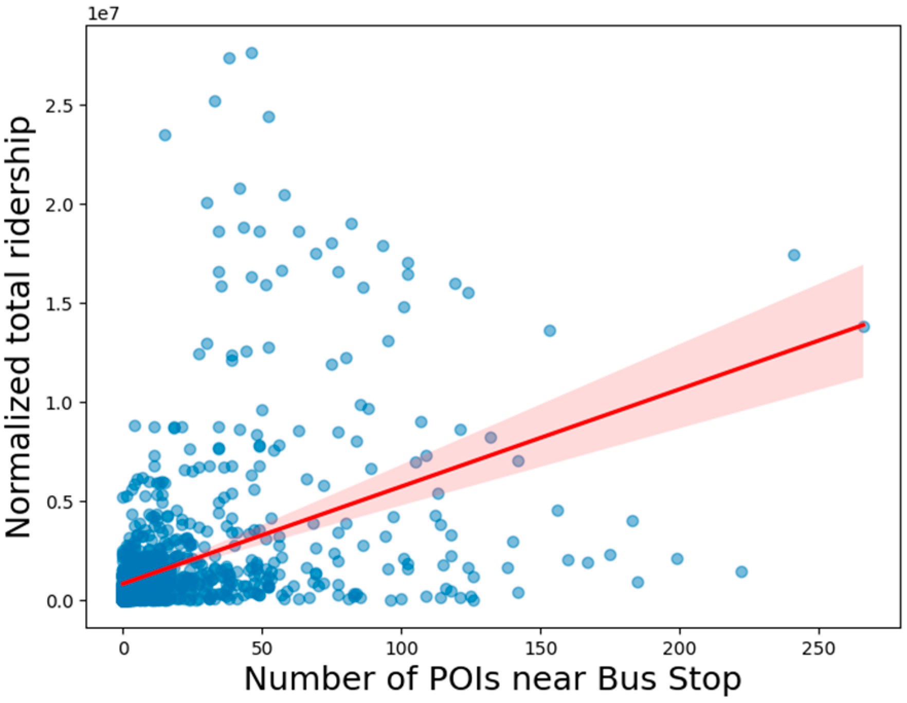
37] to account for the proximity of POIs, as we hypothesized that bus stops surrounded by more POIs might have higher ridership. For each bus stop, the number of POIs within this buffer zone was counted as POI density. To quantify this relationship, we used Pearson correlation analysis, which resulted in a correlation coefficient of 0.4408 with a p-value of 0.0. This indicated a significant correlation among the different buffers of walking distance, as described in Figure 2. This indicates the existence of a moderate positive correlation between POI density and ridership, meaning that bus stops located in areas with more POIs tend to have higher passenger activity. However, while this relationship is statistically significant, it is not the sole factor affecting ridership. Other variables, such as bus frequency, pedestrian accessibility, and population density, may also play a role in determining how many people use public transportation. Further, a linear regression model was applied to measure the direct impact of POI density on ridership. The regression coefficient of 49,087.97 suggests that for every additional POI within 300 m (at the maximum correlation) of a bus stop, the ridership at that stop increases by approximately 49,087 passengers. This strong association implies that transit planners could boost ridership by strategically placing bus stops near malls, universities, office buildings, and other key destinations. However, it is also possible that not all POIs contribute equally to ridership.
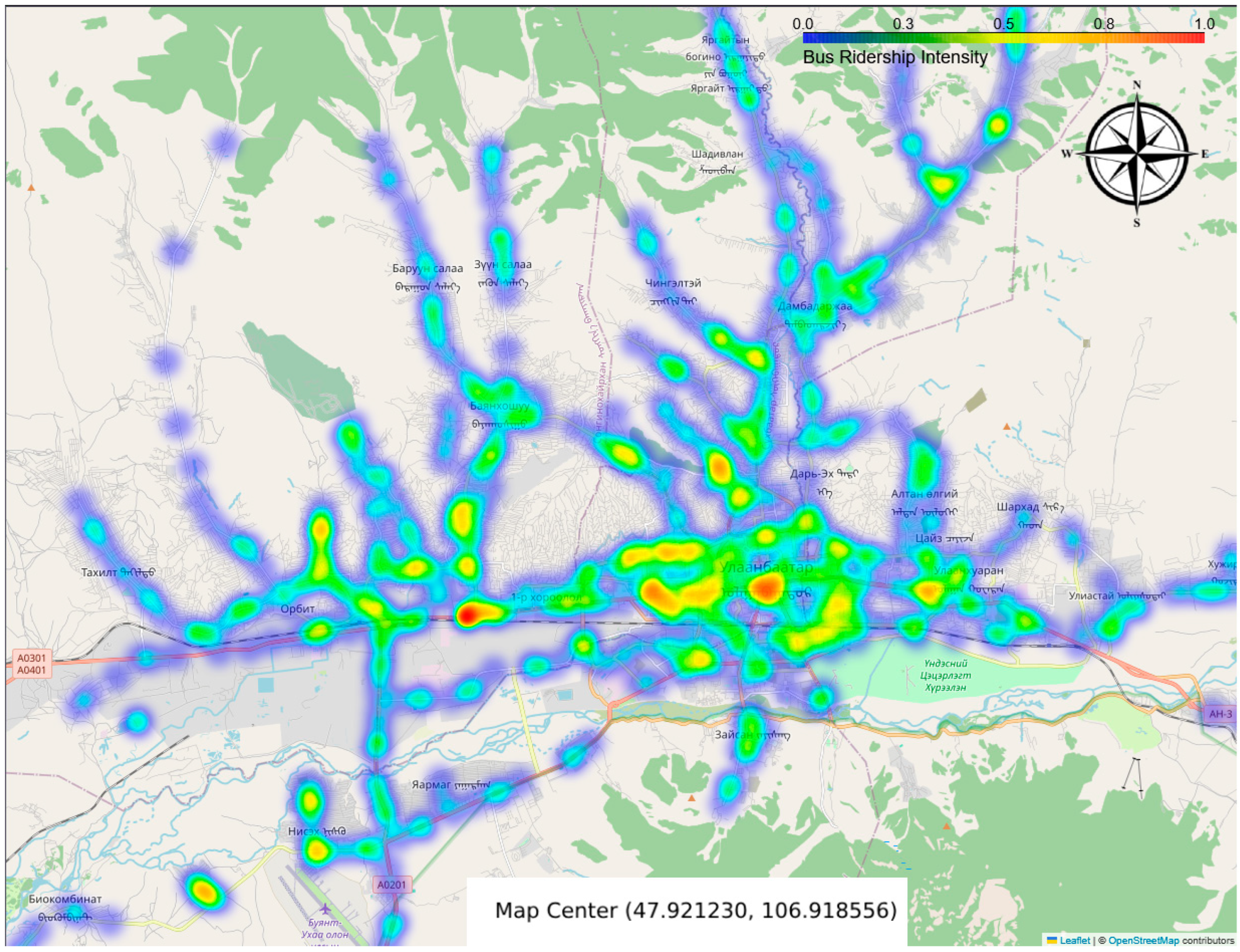
However, POI density is a reliable—but incomplete—proxy for ridership; we further explore whether POIs serve as proxies for ridership within areas that share similar profiles. By analyzing the distribution of POI categories and their spatial correlation with ridership patterns, we aim to determine if certain types of locations—such as commercial hubs, residential zones, or transit-oriented areas—exhibit a strong relationship with public transport usage. To estimate the impact of POIs on ridership, we calculate a 300 m buffer around each bus stop, representing the immediate area that might influence passenger flow. For each bus stop, we count how many POIs of each category fall within its buffer. This creates a profile of the surrounding environment for every bus stop. Simultaneously, we process the ridership dataset to calculate the total number of passengers boarding and alighting at each stop. These totals are merged into the bus stop data, giving us both spatial and usage information. We visualize the ridership patterns in Figure 3, estimating betweenness centrality and total ridership on the map to ensure consistency in feature scales.
The red and yellow regions indicate the highest concentration of activity, while green and blue areas show lower activity levels. We compare the overlap to identify how many high-ridership areas match with high-POI-density locations. To compare the two clusters, we calculate the centroids for each of the clusters. We convert all geographical coordinates from degrees into radians. This step is necessary because the Haversine Formula described in Formula 1, which is used to calculate distances between two points on the Earth’s surface, requires input values in radians. To find the nearest ridership cluster for each POI, we identify the ridership centroid with the minimum distance from each POI centroid. We conduct correlation analysis between the number of nearby POIs (by category) and the total ridership at each stop. Specifically, we use Pearson correlation to assess whether the presence of certain types of POIs is associated with higher or lower bus usage. Finally, we visualize the results, using a bar chart in 
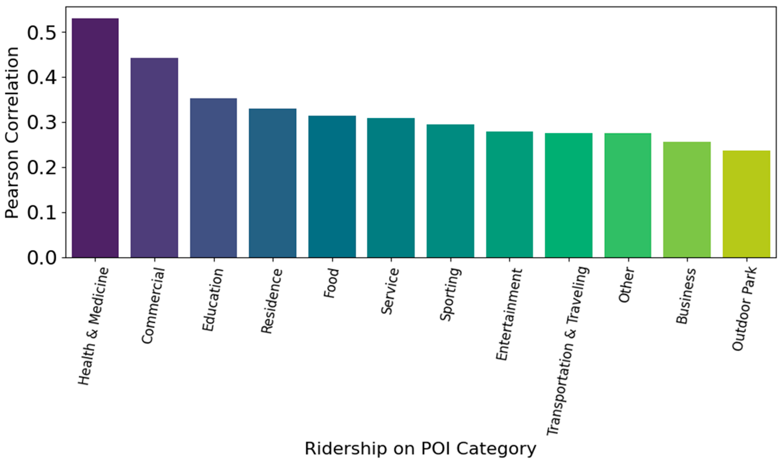
Figure 4 to highlight which POI categories are most strongly correlated with ridership. This allows us to identify areas, such as those with high concentrations of commercial or medical facilities, where POIs may serve as reliable proxies for public transport demand.
The category of health and medicine (r = 0.53) shows the strongest positive correlation with ridership. This suggests that areas near hospitals, clinics, and pharmacies tend to have high public transport usage, possibly due to accessibility needs and regular visits. Commercial (r = 0.44) zones—such as markets, malls, and retail stores—are also highly correlated with ridership. These areas likely act as economic hubs that attract large numbers of passengers. Education (r = 0.35) and residence (r = 0.33) follow closely, indicating that schools and residential areas also influence transit demand, reflecting daily commuting behavior. These results strongly demonstrate that specific types of amenities drive demand. Food, service, sporting, and entertainment categories exhibit moderate correlations (r ≈ 0.28–0.31), suggesting they contribute meaningfully to local transit needs, particularly in mixed-use or leisure-focused zones. The category of transportation and traveling (r = 0.27) is positively correlated with ridership. This is expected, as areas with transport hubs (excluding bus stations) tend to attract more riders. The category of outdoor park (r = 0.24) shows a weaker yet significant correlation, potentially reflecting lower-frequency but still relevant ridership patterns linked to recreational areas. This investigation helps assess whether clusters of specific POI types can reliably predict high or low ridership levels, providing insights for urban planning, transit optimization, and service placement. We constructed a stacked regression model composed of three diverse base learners: a Random Forest Regressor with 200 estimators, a Support Vector Regressor with epsilon = 0.2, C = 10, and a Gradient Boosting Regressor with 100 estimators. These base models were selected to capture different types of patterns and relationships within the data. A Ridge regression model was chosen as the meta-learner to combine the predictions of the base models, providing a robust final prediction. The R2 score was 0.2563, suggesting that the stacking model captures some variability in bus stop ridership. In this case, about 24.63% of the variance in ridership is explained by the neighborhood POIs, while the remaining 75.37% is due to other factors not captured by the model. For instance, certain bus stations may have been placed without adequately considering pedestrian accessibility to nearby POIs within a standard walking distance. Deep learning stacking explains 25.6% of ridership variance, confirming that service frequency, pedestrian quality, and socioeconomics must also be modelled. Bus stations are inconveniently located in residential areas. Such factors may encourage greater dependence on private vehicles for daily commutes, thereby exacerbating traffic congestion. While some areas exhibit very similar ridership patterns within a 0.3 km threshold, a significant portion of areas do not share these patterns. The ridership prediction of 31.58% at the 0.5 km threshold indicates that increasing the threshold allows a larger proportion of areas with POIs to be considered in close proximity to ridership. At a 1 km threshold, the ridership prediction rises to 57.89%, suggesting that over half of the areas are within 1 km of ridership. This is a notable increase compared to the 0.3 km and 0.5 km thresholds, showing that expanding the threshold captures a greater proportion of POIs closely associated with ridership behavior. This approach could be valuable for identifying areas where ridership coverage is insufficient in relation to POIs or for optimizing ridership routes.
We demonstrated that the Spectral clustering approach (k = 10, gamma = 1.0) using Formula 3, when applied to bus stations characterized by POIs and enhanced with ridership data, outperformed other clustering algorithms, as evaluated by the Silhouette score. The optimal parameters were determined by tuning them through grid search, and the neighborhood POI categories were embedded using a LLM—specifically BERT. Each POI category (such as “education”, “health and medicine”, etc.) was converted into a high-dimensional vector. The embeddings were aggregated (summed) for each bus stop based on its associated POI categories. If a bus stop had multiple POI categories, the embeddings for each category were summed together to form a single vector representation. We estimated the performance of the clustering methods by evaluating the ARI, which measures the similarity between two clustering results of the POIs and ridership. The ARI score was 0.3, suggesting a moderate positive agreement between the clustering of bus stops based on POI profiles and clustering based on ridership. This result highlights how similar areas in terms of POI characterization share similar ridership patterns in terms of health and medicine and commercial areas.
We further analyze optimal bus station allocation, which plays a key role in improving accessibility. Well-placed bus stops reduce travel time, enhance convenience, and encourage public transit use. Strategic planning ensures that stops serve high-demand areas while minimizing redundancy. In urban areas, bus stops are typically spaced between 300 and 500 m apart, ensuring easy access for passengers with a walking distance of 5–10 min. This distance is generally considered optimal for high-density areas, balancing coverage and efficiency [28]. In suburban areas, where population density is lower, bus stops are typically spaced 800 m to 2 km apart. This reduces the number of stops, optimizing the system’s efficiency without compromising service [37]. For express or high-speed routes, bus stops are spaced 2 to 5 km apart. These routes are designed to minimize travel time, often running on highways or major corridors with high ridership [28]. In rural areas, where the population is more dispersed, bus stops are generally spaced 5 to 20 km apart, reflecting the longer distances between key locations [38]. To ensure the optimal locations are selected for bus stations, we apply a quadtree partitioning approach, Quad-Bus partitioning using Formula 2 to the outer bounding box of the Ulaanbaatar city with following coordinates:
  • Longitude range—the westernmost boundary is located at 106.4919°, and the easternmost boundary is at 107.2829°;
  • Latitude Range—the southernmost boundary lies at 47.7412°, while the northernmost boundary is at 48.1881°.
The resulting spatial partitions were observed to be 847 based on the POI distribution in the outer bounding box. Each sub area represents a specific spatial partition, representing area characterization in terms of POI densities, and the size of these sub areas varies based on the distribution of POIs. The quadtree partitioning method adapts the size of the subareas, ensuring that each partition contains at least 10 POIs, with the smallest area of 300 m (walking distance). 
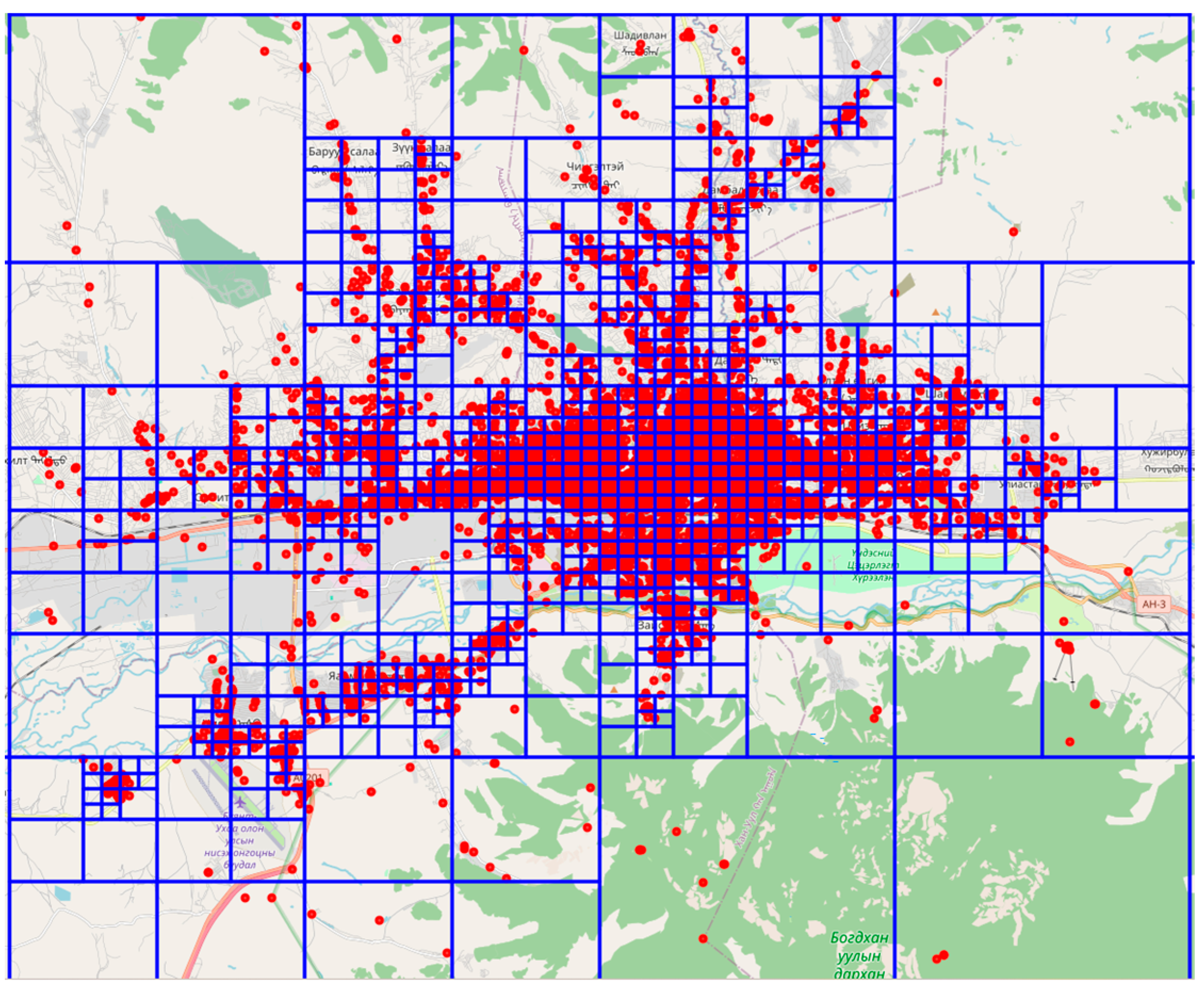
Figure 5 represents the subareas with a POI distribution by quadtree spatial partitioning.
Suburban areas tend to have larger partitions, with a lower density of POIs. In contrast, urban areas that correspond to urban centers typically have smaller partitions with a higher density of POIs, reflecting greater accessibility and mixed land use.
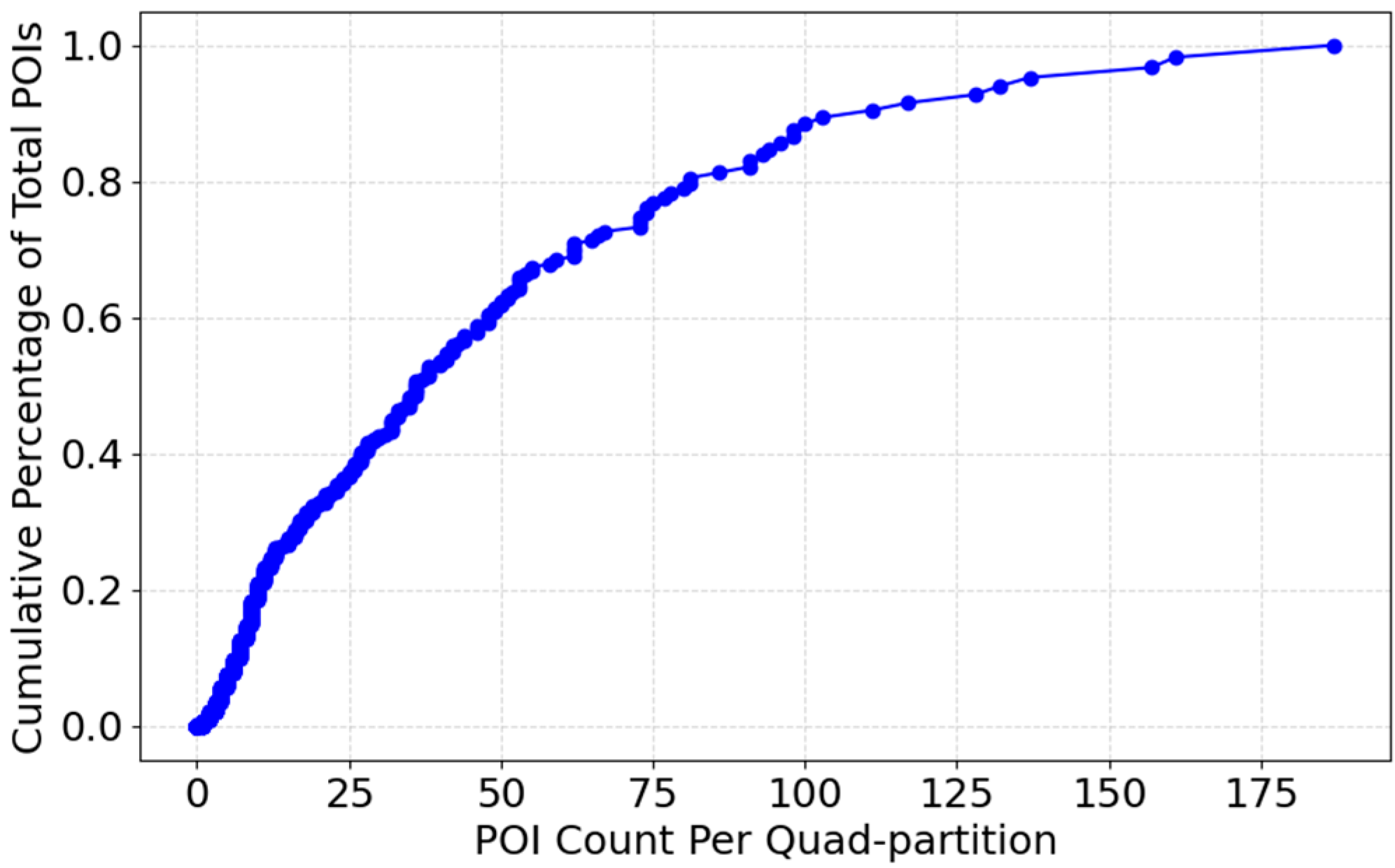
The cumulative distribution plot represented in Figure 6 illustrates how POIs are distributed across various subareas. The x-axis represents the number of POIs per partition, while the y-axis shows the cumulative percentage of total POIs. As the curve progresses, it highlights the density variations in different areas, revealing whether POIs are concentrated in specific locations or evenly spread across the region. A steep initial slope denotes many low-activity partitions, while the flatter tail denotes a few high-activity hubs. At the lower end of the x-axis, the steep incline suggests that a significant number of subregions contain only a small fraction of the total POIs. This indicates that many areas have relatively low activity or sparse development. As we move towards the middle, the curve becomes more gradual, signifying that certain subregions have a moderate and more consistent distribution of POIs. Towards the higher end, the curve flattens, showing that a few high-density areas account for a large portion of the total POIs.
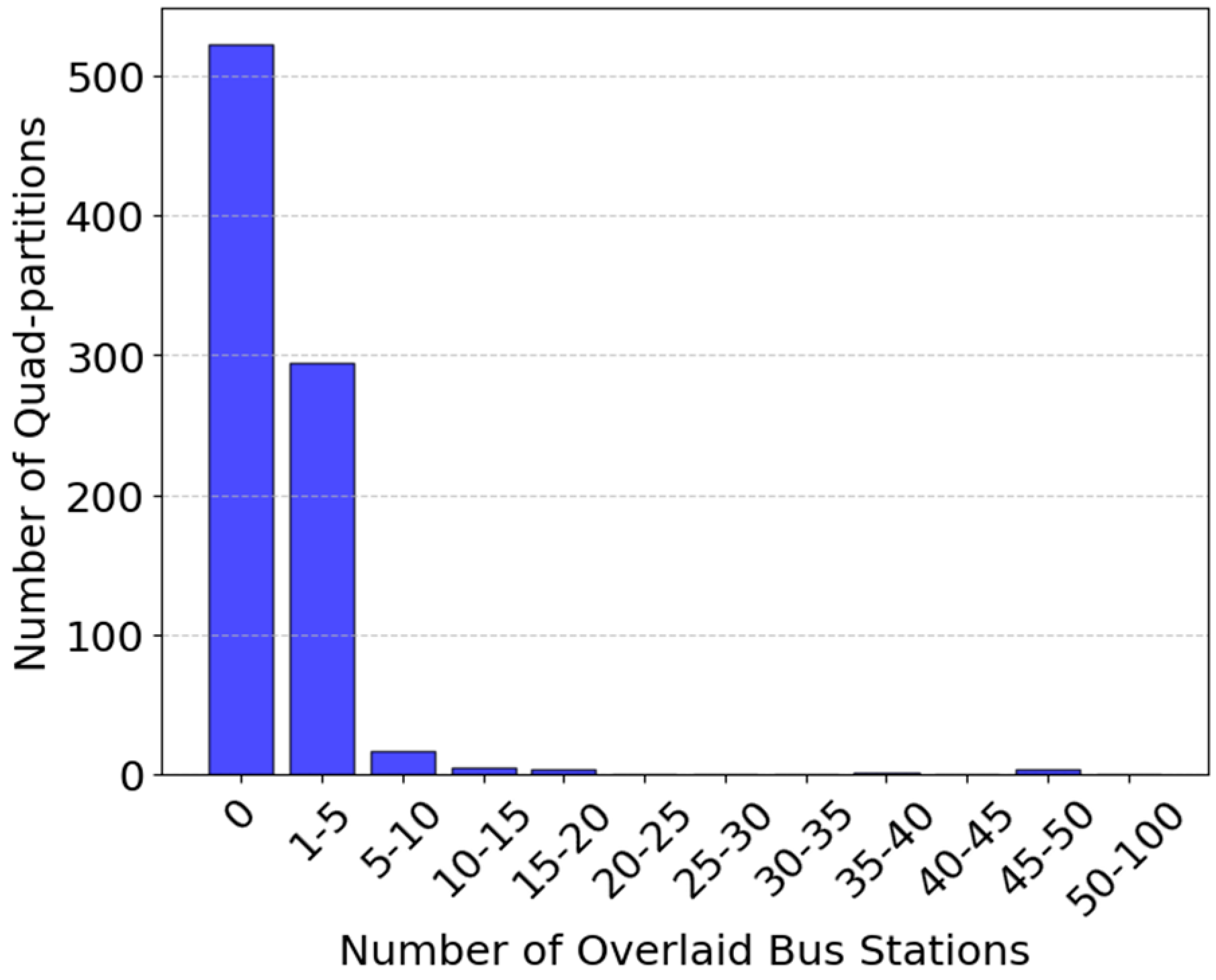
To assess the optimal geographic placement of bus stations based on the distribution density of POIs, we count the number of bus stations located within each subarea (partition) generated by the quadtree. Figure 7 visualizes the spatial distribution of actual bus stations overlaid on the quadtree partitions.
Most partitions (over 500 subareas) have 0 bus stations. This suggests that the high-density activity urban areas have no coverage. A significant number of partitions, approximately 300 subregions, have 1 to 5 bus stations. Very few partitions contain 50+ bus stations. This highlights the uneven distribution of public transport infrastructure between urban and suburban areas, which in turn reduces overall ridership accessibility. 
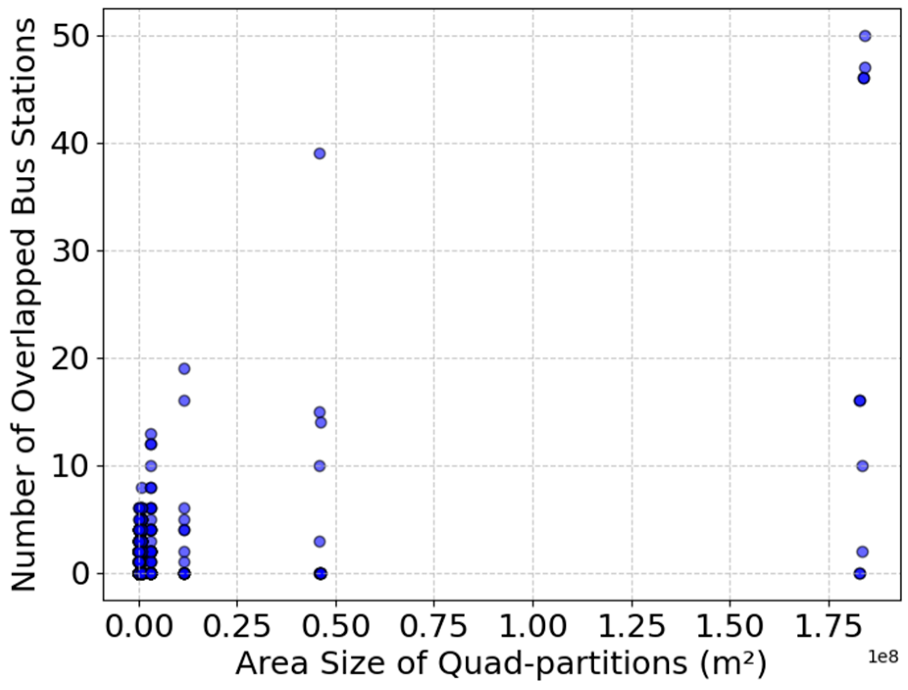
Figure 8 visualizes the relationship between quadtree partition size (in square meters) and the number of bus stations, highlighting how station density varies across different partition scales. Interestingly, smaller quadtree partitions contain between 0 and 10 bus stations per subarea. In contrast, larger quadtree partitions tend to encompass more bus stations per subarea, indicating that rural or suburban regions may have an overabundance of bus stations, or that the use of POI data collected from these areas may be insufficient.
This suggests that bus stations are sparsely distributed, and many of the quadtree subareas do not cover any bus stations. This indicates that bus stations are likely spread out across these low-activity zones, possibly covering larger areas or servicing multiple regions with fewer stations per partition. There are a few outliers where large quadtree sub areas overlap with higher bus station counts. This highlights that bus stations are poorly distributed, with high-density activity areas lacking any stations, while low-density areas have an abundance.
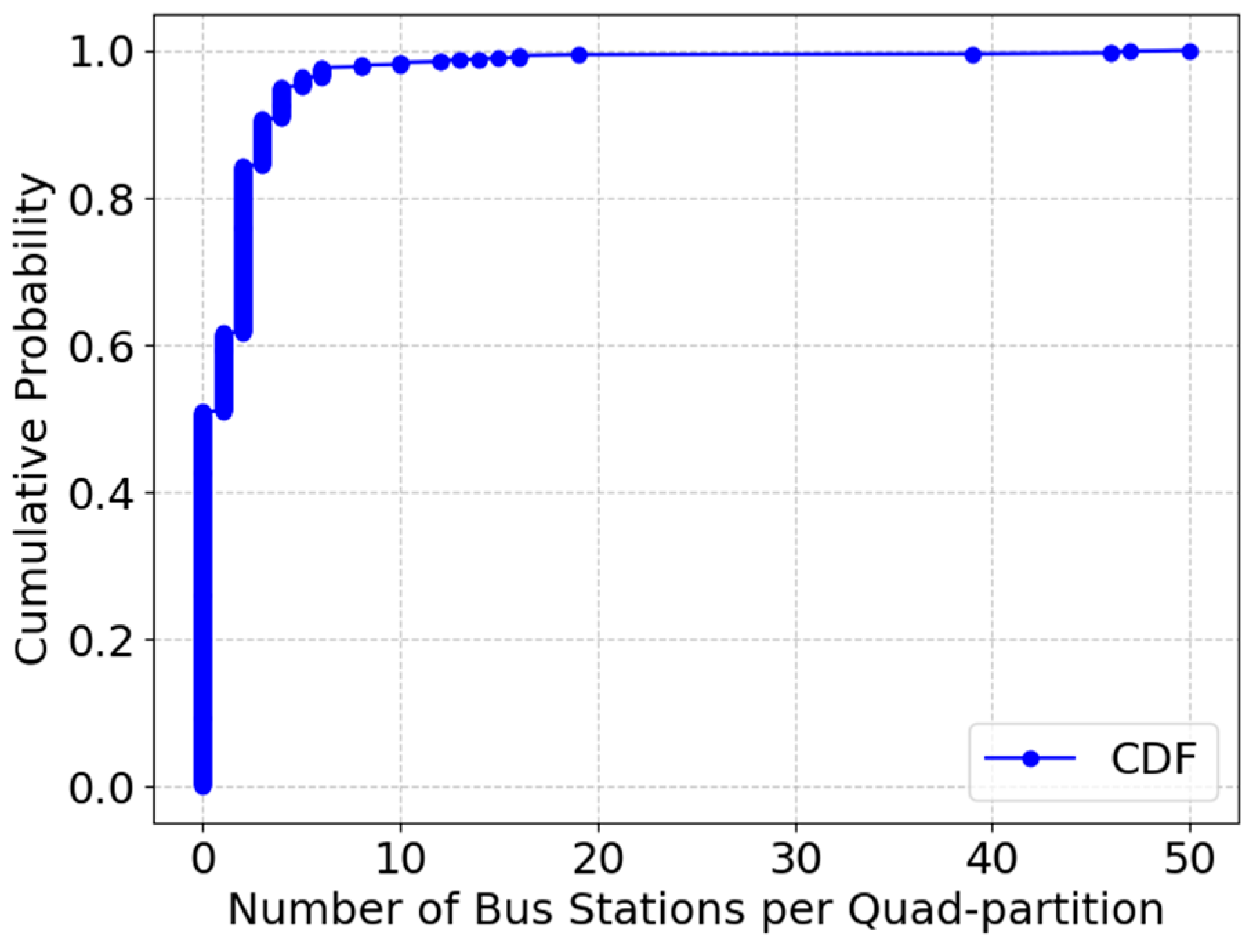
We describe the cumulative distribution of the bus stations per partition in Figure 9, which reveals that over 500 urban partitions lack bus stops, meaning many neighborhoods are underserved by transit networks. The curve climbs steeply at the outset, revealing that half of the partitions contain no bus stations.. A large proportion of partitions (probably over 80%) contain fewer than 5 bus stations. Only a few partitions contain a high number of bus stations. This suggests that bus stations may be unevenly distributed, or that we were unable to identify high-activity areas due to the insufficient collection of POIs. A small number of partitions contain 50+ bus stops, indicating a highly uneven distribution of transit services. These findings suggest that bus stop placement strategies need optimization to serve high-demand areas more effectively.

5.2. Walkability Assessment

Walking Score using Formula 5 is a metric used to evaluate how accessible an area is for pedestrians based on the availability of essential services within a reasonable walking distance. It plays a crucial role in the 20 minute city concept, which envisions urban areas where residents can reach essential amenities—such as grocery stores, schools, healthcare facilities, and workplaces—within a 20 min walk. The maximum walking distance is calculated based on an average walking speed of 1.39 m per second (approximately 5 km/h) and a time limit of 20 min. This results in a maximum reachable distance of around 1668 m. Higher walking scores indicate more pedestrian-friendly environments, while lower scores suggest a reliance on vehicles for daily activities. The walking score was computed based on proximity to amenities (within 1600 m buffer zones), street connectivity and pedestrian infrastructure, and the availability of crosswalks, sidewalks, and pedestrian zones. A higher density of POIs within this distance indicates greater walkability. This normalization ensures comparability across regions. We classify walking scores into five categories [4,31] as presented in Table 1.
A score between 90 and 100 indicates an extremely walkable area, while a score below 30 suggests strong dependence on vehicles. We estimate the walking score for both bus stations and quad partitions based on the number of POIs located within a 1600 m buffer, representing an approximate 20 min walking distance. This distance threshold reflects typical pedestrian accessibility standards in urban studies.
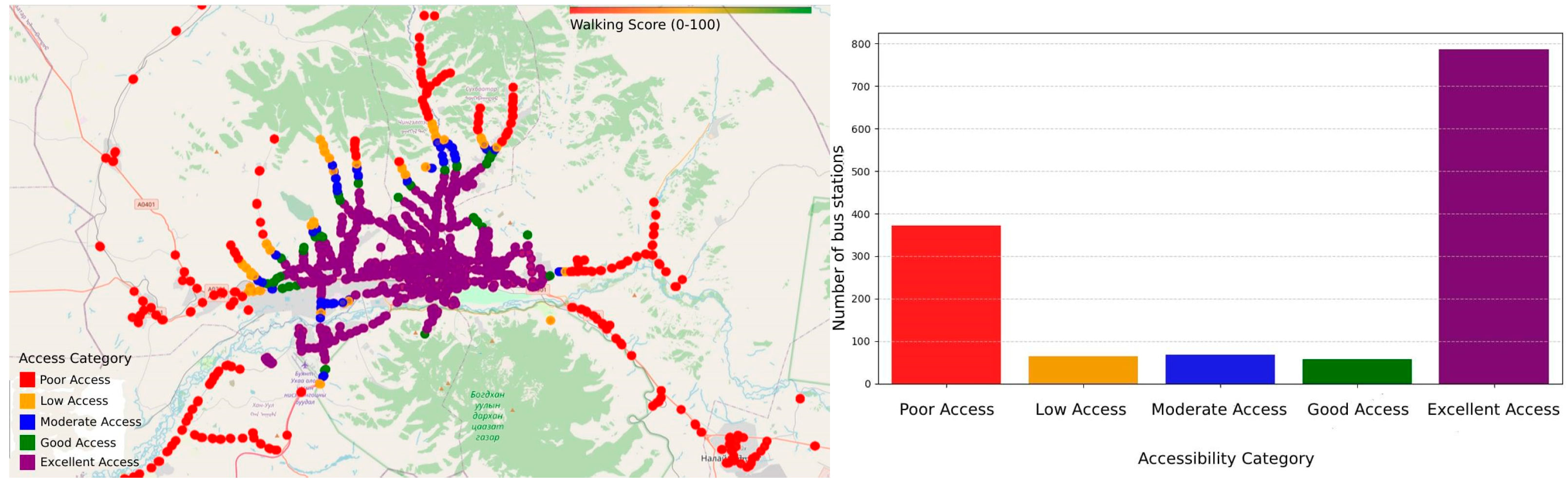
Figure 10 represents the distribution of walking scores for each bus station. The majority of bus stations fall into the “Excellent Access” category. This suggests that many bus stations are well-connected to POIs within a walkable distance. It indicates the need for an efficient urban planning design where public transport hubs are located near essential services (e.g., shopping centers, offices, schools, or healthcare facilities). In contrast, a significant number of bus stations have “Poor Access”. Many bus stations are in areas with limited POIs within walking distance. This could imply poor urban planning, lower density areas, or suburban locations where additional infrastructure is needed. The categories “Low, Moderate, Good” represent transitional areas, meaning some stations provide moderate accessibility but might still need improvements.
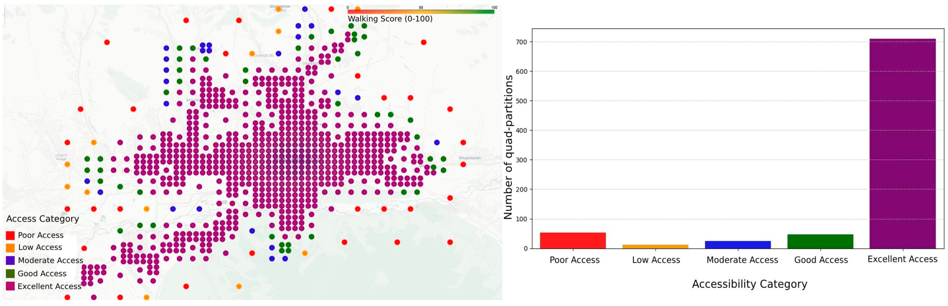
Figure 11 presents the walking score distribution across quad partitions. However, the proportion is much larger in the quad-partition chart, indicating that many geographical areas (quad partitions) have good accessibility or “Excellent Access”. The quad partitions have relatively small “Poor Access”. “Low, Moderate, Good” categories have relatively fewer entries. This consistency indicates that urban planning has created strong contrasts between well-connected and poorly connected areas, with fewer “middle-ground” locations. Quad partitions reflect the overall urban accessibility landscape well. The disparity in terms of poor access suggests that there are many transit hubs in low-accessibility areas, potentially leading to inefficient ridership patterns. The dominance of excellent access in quad partitions suggests that despite a high number of well-connected areas, some bus stations remain underutilized due to poor integration with the POI network.
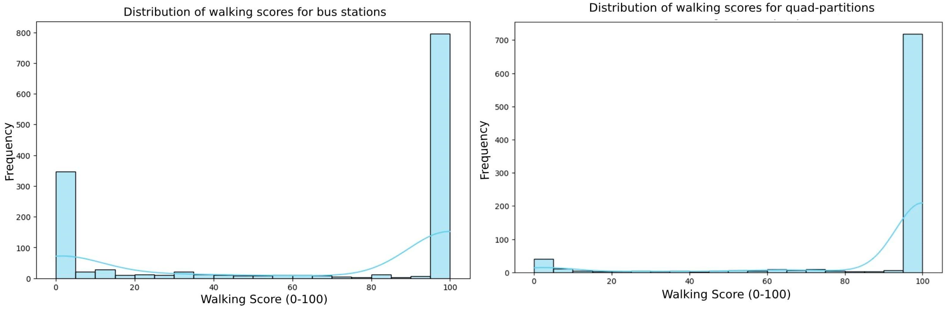
Figure 12 represents the walking score distribution compared to the walking scores for bus stations and quad partitions. POI accessibility within a 20 min walking distance is very limited across most areas. The urban parts of Ulaanbaatar seem highly dependent on transit for access to amenities. Central areas are likely to have better scores; peripheral regions remain underserviced. The histogram indicates that many bus stations have poor access to surrounding POIs within 1600 m. There is a rise at 95–100, showing that certain bus stations are located in highly dense and accessible urban areas. There is a huge spike at 100, indicating that many quad partitions (likely in the city center) have maximum walkability. There is a smaller spike at 0–5, indicating grid cells with almost no reachable POIs. There is a sparse distribution between 5 and 90—very few cells have moderate walking scores. However, the quad partitions in the initial analysis were constrained to have a minimum spatial extent of 300 m and were required to contain at least 10 POIs within their boundaries. While this ensures a baseline level of urban activity and comparability across partitions, these thresholds inevitably shape the resulting distribution of walking scores. To further explore the sensitivity of our findings, we extend the analysis by tuning these thresholds to vary both the minimum partition size and the minimum required number of POIs in order to better understand their impact on walking score patterns and urban spatial structure.
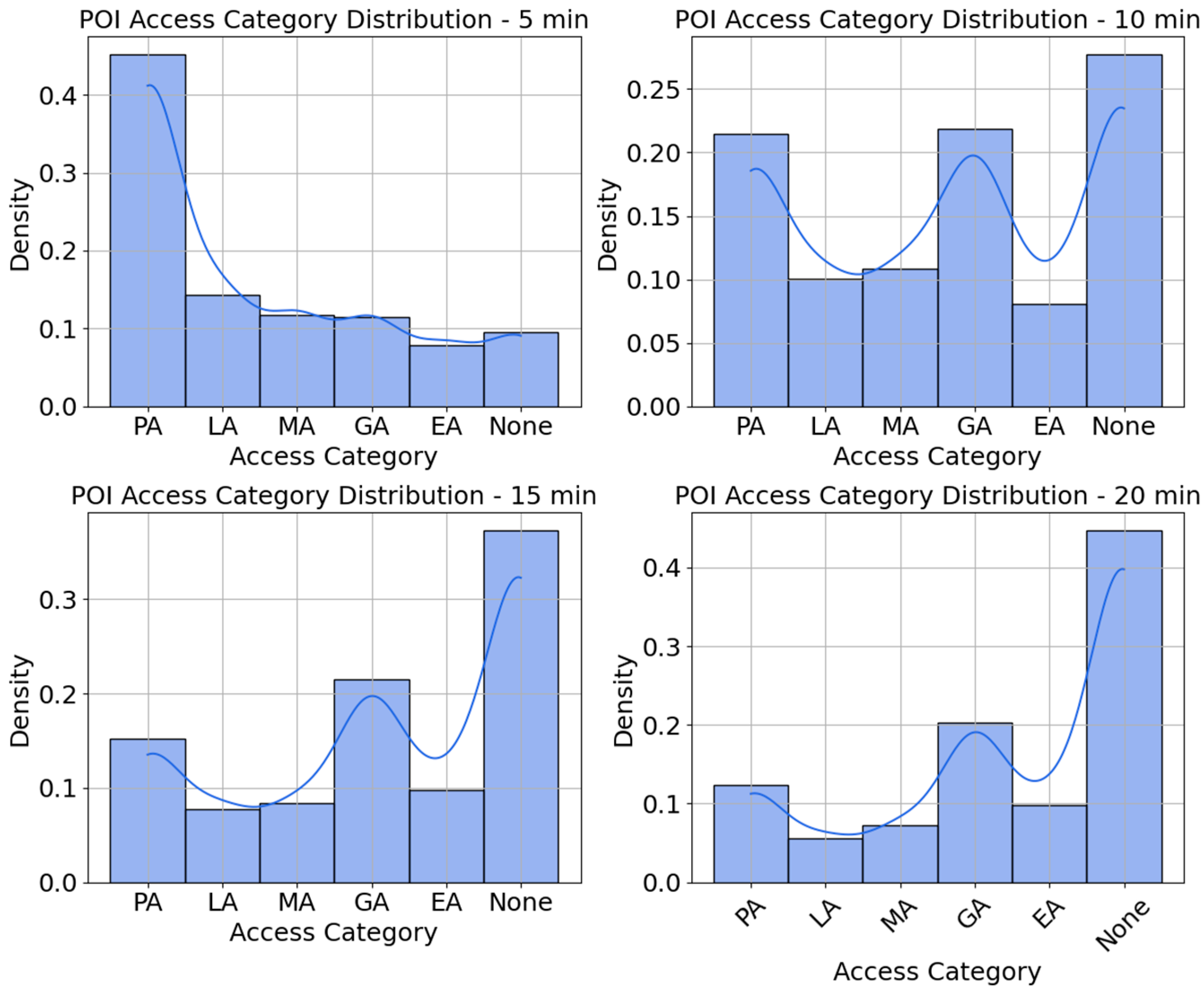
In Figure 13, each panel shows the distribution of walking scores—the raw count of POIs that can be reached from every quad-partition centroid—given a different walking-time threshold (5, 10, 15, and 20 min). The x-axis is the walking score itself; the y-axis is the number of POIs that fall into each score bin. As the walking time increases from 5 min to 20 min, the distribution shifts towards better access categories, with excellent access (EA) becoming the most prominent at the 20 min interval. For shorter intervals (5 and 10 min), the access distribution is skewed toward poor access (PA), meaning that many POIs are not easily accessible in a short walk. However, as the interval increases, the access categories become more balanced, with better access spreading across the dataset. The KDE curve helps in visualizing the smooth distribution of POIs across the categories, indicating areas of higher and lower concentrations of accessible POIs. In the 10 min walking radius, the access distribution becomes more spread out, with poor access (PA) still having a prominent peak, but Low Access (LA) starts to show higher counts compared to the 5 min interval. The 15 min interval sees more balance in the distribution of access categories. Moderate access (MA) starts to show a significant increase, and good access (GA) and excellent access (EA) also begin to appear more prominently. The results highlight the importance of walking distance in determining accessibility to POIs and emphasize the increasing availability of accessible locations as the walking radius expands.
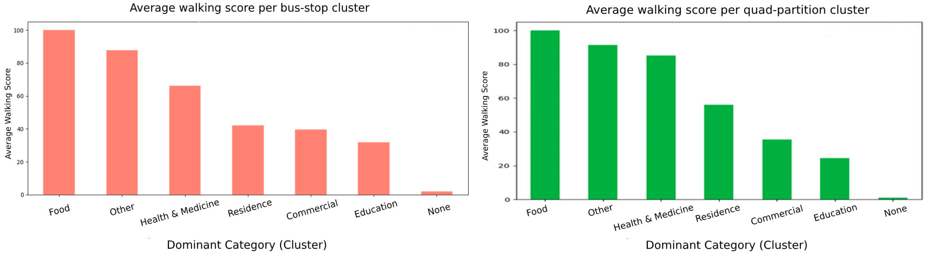
We further explore the walking accessibility for POI-category-specific areas. We use semi-supervised clustering Label Propagation with an Radial Basis Function (RBF) kernel. We feed the clustering with a full category histogram per quad partition as a feature vector. The supervision came from the dominant categories: any category that appeared in at least eight different quad partitions was treated as a seed class, providing a handful of labelled examples for the algorithm to propagate across the feature space. The clusters that emerged were ranked by their average walking score. Figure 14, the x-axis of which is labelled with each cluster’s dominant category, makes it easy to see which kinds of areas offer the richest mix of nearby amenities. In a typical run, the café- and restaurant-dominated clusters rose to the top, with average scores in the mid-eighties, whereas clusters dominated by industrial or sparse residential categories languished near the bottom, with averages barely above ten. Even a coarse measure such as an unweighted POI count, when combined with semi-supervised learning, can already separate highly walkable micro-areas from less attractive ones.
Quad partitions benefit campuses and hospital complexes, whose POIs are spread across several adjacent stops. The none category is a mixed category without a dominant aspect. At the bus stop clusters, the food and other clusters are already strong regarding walkability. In contrast, none, residence, and parts of commercial/education are “doubly disadvantaged” zones that would benefit most from either new local amenities or better last-mile connections. Food- and health-dominated cells average Walk Scores ≈ 100 and 92, respectively, while residence and mixed “none” clusters have scores falling below 30, indicating that they have both few amenities and weak transit. Food (walking score ≈ 100)-specific quad partitions, whose 20 min walking catchment is dominated by restaurants, cafés, and grocery shops, score almost the theoretical maximum. Health and medicine (walking score ≈ 92)-specific quad partitions, anchored by hospitals, clinics, or pharmacies, are also highly walkable. Besides medical facilities, these catchments typically contain convenience stores and eateries, boosting the score. Purely residential districts tend to be mono-functional. Housing blocks are plentiful, but ground-floor retail or services are sparse, and so walkability drops.
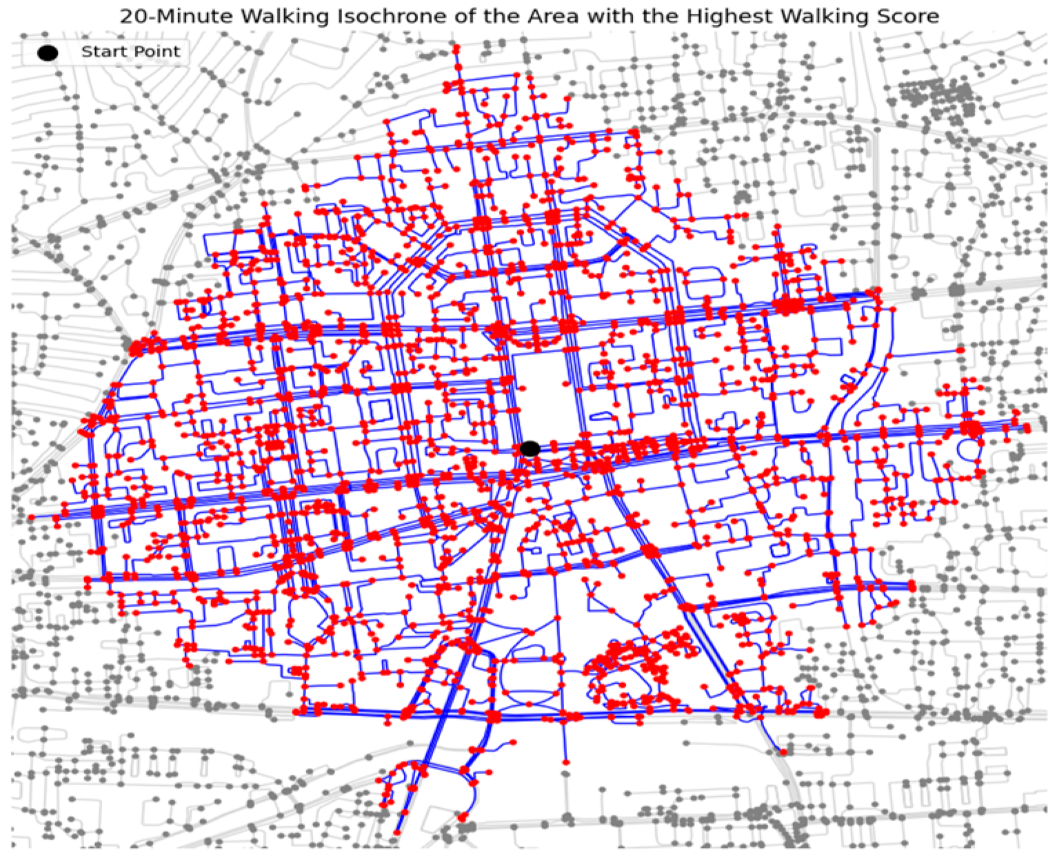
To further explore walkability in pedestrians, we generated walking isochrones using Formula 4, at 20 min walking intervals for a given quad partition (the centroid lat = 47.918, lon = 106.917) with the highest walking score. A walking isochrone represents the area that can be reached within a given time by walking from a specific location. The isochrones illustrate how far pedestrians can travel within a set time, considering road networks and pedestrian barriers.
To generate a 20 min walking isochrone as Figure 15, we extract a pedestrian-friendly road network from OSMusing the OSMnx library. The network is then converted into an undirected graph, ensuring that movement is unrestricted in any direction. We identify the nearest node to a given starting point, which serves as the center of the isochrone analysis. Using NetworkX, we extract all nodes within this distance using an ego graph, which represents the subgraph of all nodes reachable from the center within the specified limit. The figure shows the full road network in gray, overlays the 20 min isochrone in blue, and marks the starting point in red. The blue lines represent the street network that is walkable within the 20 min time frame. The red nodes indicate reachable locations (intersections or important points along the street network) within the isochrone. Gray nodes and streets represent the broader road network beyond the walkable range. The density and connectivity of the blue lines and red nodes suggest that this is a highly walkable area, meaning many locations can be reached within the 20 min window. If the blue network is sparse or disconnected, it may indicate barriers such as wide roads, highways, or missing pedestrian pathways that reduce accessibility.
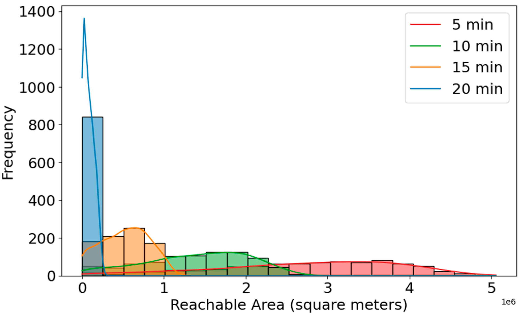
Figure 16 illustrates distribution of reachable areas (walking isochrone) across quad-partition centroids, for different time intervals. We use Universal Transverse Mercator (UTM) projection to obtain accurate isochrone areas in square meters. The X-axis is a reachable area in square meters. The Y-axis is frequency. A large number of centroids have small reachable areas, even when considering 20 min of walking. This suggests that there is limited connectivity in the pedestrian network or physical/urban barriers (e.g., large blocks, rivers, highways, poor infrastructure). A higher bar means more locations are reachable from an area. Blue (20 min): Many locations have a very small area reachable within 20 min. The distribution is heavily skewed to the left, suggesting the existence of obstacles like road design, natural barriers, or disconnected paths. Orange (15 min) and green (10 min): as walking time decreases, fewer locations have very high accessibility, but the area increases gradually. Red (5 min): Expectedly, this color covers smaller areas, but they are more spread out, suggesting that some locations are highly walkable, even in just 5 min. With 10, 15, and 20 min, the accessible area gradually increases, showing that longer walking times provide access to a wider range of areas, but the frequency decreases as areas grow larger. All distributions are right-skewed—meaning most locations have relatively a low reachable walking area, while a few have very high walkable access. These findings emphasize that while central districts support pedestrian mobility, many outer neighborhoods lack adequate pedestrian infrastructure, reinforcing the need for investment in walkways, street crossings, and urban design improvements.

5.3. Transit Accessibility Assessment

We evaluated public transportation accessibility using a transit score metric, which considers proximity to the nearest bus stop and transit frequency (trip count per hour). Transit score measures the availability and quality of public transportation in a central location of each partition of the quadtree, typically on a scale from 0 to 100. It reflects how easy it is to use public transportation in the area. We calculate the trip frequency at each stop by counting the number of trips and merge these data with the stops. Both the distance and trip frequency are normalized: closer stops and higher frequencies receive higher scores. The transit score, using Formula 6-8, for each quad partition is computed as a weighted sum of these normalized values, with distance to bus stations contributing 70% and trip count 30%.
Figure 17 is a histogram showing the distribution of transit scores from the quad partitions within a 300 m radius (a common walking standard) and 1 km radius. Half the city scores < 20 (out of 100) are within a 300 m catchment, while a small core peaks near 60; extending the radius to 1 km lifts many areas into moderate access, highlighting last-mile gaps. Findings show that 50% of urban areas have low transit scores, with many residents needing to walk more than 300 m to reach a bus stop. In contrast, central neighborhoods benefit from high-frequency transit services, ensuring reliable connectivity. Data appear to be right-skewed, meaning most transit scores are low, with a long tail extending to higher values. This could indicate that public transit accessibility is limited in many places, but a few locations have significantly better transit options. A significant portion of locations have transit scores near zero. This suggests that there is limited access to public transportation within a short walking distance (300 m). The transit score distribution was right-skewed (low scores dominant) within 300 m. Within 1 km of radius, more areas have moderate to high transit scores, indicating improved accessibility within a larger radius. The histogram suggests two peaks: one at a low transit score of 0 and another around 60. Findings indicate that nearly 60% of residents lack access to bus stations within a 10 min walk, emphasizing the need for last-mile connectivity improvements. This could indicate disparities in transit access—some areas remain poorly connected, while others benefit from better public transport infrastructure. A 1 km radius captures more transit options, leading to an overall increase in scores. This suggests that while some areas lack nearby transit access, they may still be well-connected within a reasonable walking distance.
Figure 18 shows the top average transit score per POI-category-specific cluster, assessed using the semi-supervised Label Propagation. Overall, 7 of 13 POI categories were estimated with a relatively high transit score and the rest of the POI category observed in most areas (mixed categories) was estimated with a transit score = 0, which reduces the overall transit score largely. The food and other categories have the highest average transit scores, both around 60–70. This suggests that areas with a dominant focus on food services (e.g., restaurants, cafes) and other services (possibly including various mixed-use areas) are well-served by transit, meaning that these areas likely have a higher density of public transportation options. The health and medicine category is also relatively high scoring, which likely indicates that medical facilities or health-related services are generally accessible by public transportation, with an average transit score just below the highest. Residence, commercial, and education categories all have lower but similar transit scores, ranging between 40 and 60. This suggests that residential, commercial, and educational areas have good access to public transport, but that they might not be as well-served as food or health-related services. Categories such as health and medicine, residence, and commercial areas have decent transit scores, but are not as well-connected as food-related or other services. Recommendations include optimizing bus stop locations, increasing service frequency in underserved areas, and integrating real-time data to improve transit planning.

6. Results Discussion

Our integrated analysis of Ulaanbaatar’s urban accessibility under the 20 min city framework yields several key insights. First, the moderate positive correlations between POI density and bus ridership—strongest for Health and Medicine (r = 0.53), followed by Commercial (r = 0.44) and Education (r = 0.35)—confirm that clusters of essential services drive transit demand. This aligns with the broader literature on land use intensity as a predictor of ridership and underscores the value of amenity data in transit planning. Second, the stacking model’s R2 of 0.2563 and the ARI of 0.30 for POI-based versus ridership-based clustering indicate that, while POIs explain a significant share of ridership variability, other factors—service frequency, pedestrian connectivity, and socioeconomic conditions—also substantially influence usage. This finding highlights the need to incorporate additional data streams (e.g., real-time service levels, demographic profiles) into future predictive models. While the clusters are not identical, there are some structures shared between the two, meaning the types of surrounding POIs are to some extent predictive of ridership patterns. This underscores the importance of points of interest as key predictors of ridership. Optimizing bus stop placement and increasing service frequency in transit-deficient zones will improve mobility and reduce travel barriers for residents. Third, our quadtree partitioning exposed stark mismatches between where people and amenities are concentrated and where bus stops are located. Over 500 high-activity subareas lack any transit access, whereas some low-activity zones are overserved. These spatial imbalances exacerbate last-mile challenges, particularly in peripheral districts where walking scores and transit coverage both fall below the 20 min threshold. Fourth, the walkability assessment revealed that 40% of urban partitions score below 50 on the pedestrian accessibility index, reflecting inadequate sidewalks, crossings, and pedestrian infrastructure in many neighborhoods. Transit scores, which are heavily right-skewed, further show that half of the city’s areas have no bus stop within a 300 m walk. Together, these patterns illustrate a dual accessibility gap involving limited walkable access to amenities and poor proximity to transit. These results have clear planning implications. The proposed Quad-Bus method—combining POI-driven clustering, deep learning-informed ridership modeling, and adaptive quadtree decomposition—provides a systematic way to identify and prioritize underserved areas for new or relocated bus stops. By focusing resources on high-demand cells lacking service, Quad-Bus can both shorten travel times and boost potential ridership. Complementary investments in pedestrian infrastructure—sidewalk networks, safe crossings, and barrier-free design—will be essential to maximize the benefits of any transit enhancements. This study’s limitations suggest avenues for further research. Our POI dataset may underrepresented informal services, and GTFS feeds do not capture all local transit variants. Predictive models would benefit from integrating socioeconomic indicators, land use zoning data, and real-time mobility traces. Testing Quad-Bus in other urban contexts—both established and rapidly growing—will help assess its generalizability and refine its parameters for different urban forms. In sum, our findings demonstrate that a data-driven, multi-source approach can illuminate the complex interplay between land use, pedestrian networks, and transit infrastructure. By revealing where the 20 min city ideal falls short in Ulaanbaatar, this work offers actionable guidance for planners seeking to create more equitable, sustainable, and livable urban environments. We extend our analysis to include the informal “ger” districts, where rapid expansion creates distinct challenges in terms of establishing 20 min neighborhoods.

7. Conclusions

This study examined urban activity, walkability, and public transit accessibility within the 20 min city framework using a data-driven approach in Ulaanbaatar, Mongolia. A moderate-to-strong positive correlation was found between public transit ridership and nearby POIs density, and it was particularly high for healthcare facilities, commercial areas, and educational institutions. Health and medicine (correlation coefficient r = 0.53) had the strongest correlation, followed by commercial (r = 0.44) and education (r = 0.35) categories, indicating that these POI types strongly influence ridership. A stacked regression model (Random Forest, Support Vector Regressor, Gradient Boosting) explained approximately 25.63% of ridership variability, suggesting that while POIs significantly influence transit ridership, other unmeasured factors like socioeconomic conditions and pedestrian infrastructure also play roles. Quad-Bus spatial partitioning highlighted a significant mismatch between high-density POI areas and bus stop locations. Over 500 high-activity urban partitions lacked adequate transit access, revealing substantial gaps in transit service placement. This study reveals that Ulaanbaatar’s transit network and pedestrian fabric are misaligned with where people actually live, work and seek services. By integrating LLM-based POI clustering, machine learning demand estimation, and adaptive quadtree partitioning, the proposed Quad-Bus approach pinpoints where additional or relocated stops would yield the greatest accessibility gains. The Quad-Bus method, which adaptively allocates bus stations based on the POI clustering and ridership modeling, demonstrated potential for significantly improving public transportation coverage by identifying optimal locations for new or relocated bus stations. Around 40% of urban areas scored poorly on pedestrian accessibility, indicating inadequate pedestrian infrastructure such as sidewalks, crosswalks, and pedestrian pathways. The walkability analysis revealed stark disparities, with central areas having excellent walkability scores and peripheral regions demonstrating significant dependence on private transportation. Approximately half of the city’s areas lack bus stops within a 300 m radius, highlighting significant deficiencies in transit accessibility. Expanding the assessed radius to 1 km improved overall transit scores, suggesting better accessibility with slightly increased walking distances. However, accessibility remains unevenly distributed across different neighborhoods. This demonstrates that strategically reallocating stops—rather than uniformly spacing them—can substantially enhance multimodal accessibility, align service provision with actual demand, and advance the 20 min city vision in rapidly evolving urban contexts. Future work should enrich the model with socioeconomic indicators, real-time service reliability and informal transport modes, and pilot Quad-Bus in other fast-growing cities to validate its transferability and compare with city benchmarks (Barcelona, Vienna, Paris etc). We will explore a Graph Reinforcement Learning approach and Transformer-based spatial models in bus routes and ridership optimization. Nevertheless, the findings already offer clear guidance: concentrate new stops in health, commercial and educational clusters lacking service, upgrade pedestrian links in residential zones, and adopt data-driven spacing standards city-wide to move decisively toward an equitable, sustainable 20 min Ulaanbaatar.

Author Contributions

Methodology, J.-W.L., T.-K.K. and E.A.; Software, H.-H.C. and J.-W.L.; Validation, H.-H.C.; Investigation, T.M. and J.-W.L.; Resources, T.-K.K.; Data curation, T.M.; Writing—original draft, T.M.; Writing—review & editing, T.M., Z.D., H.-H.C. and E.A.; Visualization, J.-W.L. and E.A.; Supervision, Z.D., T.-K.K. and E.A.; Project administration, T.-K.K. All authors have read and agreed to the published version of the manuscript.

Funding

This research was funded by KOICA (Korea International Cooperation Agency) through “Capacity Building Project for School of Information and Communication Technology at Mongolian University of Science and Technology in Mongolia” (Contract No. P2019-00124), and Mongolian Foundation for Science and Technology (MFST), MES through the project No. SHUTBIHHKZG-2022/163.

Data Availability Statement

Restrictions apply to the availability of these data. Data were obtained from the Public Transport Policy Office of Mongolia and are available from the authors with the permission of the Public Transport Policy Office.

Acknowledgments

The authors gratefully acknowledge the invaluable support of the Mongolian Public Transportation Agency. Their administrative assistance and data resources contributions were instrumental to the success of this study.

Conflicts of Interest

The authors declare no conflicts of interest. The funders had no role in the design of the study; in the collection, analyses, or interpretation of data; in the writing of the manuscript; or in the decision to publish the results.

Abbreviations

The following abbreviations are used in this manuscript:
BERTBidirectional Encoder Representations from Transformers
CNNConvolutional Neural Network
GTFSGeneral Transit Feed Specification
GPSGlobal Positioning System
LLMLarge Language Model
OSMOpenStreetMap
POIPoint of Interests
RBFRadial Basis Function
UTMUniversal Transverse Mercator

References

  1. Moreno, C. The 15-minute city: For a new chrono-urbanism. Smart Cities 2021, 4, 93–110. [Google Scholar] [CrossRef]
  2. Gehl, J. Cities for People; Island Press: Washington, DC, USA, 2010. [Google Scholar]
  3. Dashdorj, Z.; Sobolevsky, S.; Serafini, L.; Ratti, C. Human activity recognition from spatial data sources. In Proceedings of the Third ACM SIGSPATIAL International Workshop on Mobile Geographic Information Systems, New York, NY, USA, 4–7 November 2014; pp. 1–8. [Google Scholar] [CrossRef]
  4. Banister, D. Sustainable urban development and transport: A Eurovision for 2020. Transp. Rev. 2008, 28, 113–130. [Google Scholar] [CrossRef]
  5. Ewing, R.; Handy, S. Measuring the unmeasurable: Urban design qualities related to walkability. J. Urban Des. 2009, 14, 65–84. [Google Scholar] [CrossRef]
  6. Litman, T. The Benefits of Walkability; Victoria Transport Policy Institute: Victoria, BC, Canada, 2013. [Google Scholar]
  7. Kuklina, M.; Savvinova, A.; Filippova, V.; Krasnoshtanova, N.; Bogdanov, V.; Fedorova, A.; Kobylkin, D.; Trufanov, A.; Dashdorj, Z. Sustainability and Resilience of Indigenous Siberian Communities under the Impact of Transportation Infrastructure Transformation. Sustainability 2022, 14, 6253. [Google Scholar] [CrossRef]
  8. Kyttä, K.; Broberg, O.; Tzoulas, T.; Snabb, L. Towards contextually sensitive urban densification: Location-based softGIS knowledge revealing perceived residential environmental quality. Landsc. Urban Plan. 2013, 113, 30–46. [Google Scholar] [CrossRef]
  9. Forsyth, A.; Oakes, J.; Schmitz, K.H.; Hearst, M. Does residential density increase walking and other physical activity? Urban Stud. 2007, 44, 679–697. [Google Scholar] [CrossRef]
  10. Barbieri, L.; D’Autilia, R.; Marrone, P.; Montella, I. Graph Representation of the 15-Minute City: A Comparison between Rome, London, and Paris. Sustainability 2023, 15, 3772. [Google Scholar] [CrossRef]
  11. Dashdorj, Z.; Altangerel, E. High-level event identification in social media. Concurr. Comput. Pr. Exper. 2019, 31, e4668. [Google Scholar] [CrossRef]
  12. Munkhbayar, T.; Dashdorj, Z.; Jargalsaikhan, Z.; Tae-Koo, K.; Altangerel, E. Demand Forecasting in Transportation: A Graph Attention Networks for Predicting Bus Ridership. In Proceedings of the 2025 27th International Conference on Advanced Communications Technology (ICACT), Pyeong Chang, Republic of Korea, 16–19 February 2025; pp. 44–50. [Google Scholar] [CrossRef]
  13. Gärling, T.; Axhausen, K. Travel demand management: A review. Transp. Policy 2003, 10, 35–46. [Google Scholar]
  14. Dashdorj, Z.; Sobolevsky, S.; Lee, S.; Ratti, C. Deriving human activity from geo-located data by ontological and statistical reasoning. Knowl. Based Syst. 2018, 143, 225–235. [Google Scholar] [CrossRef]
  15. Axhausen, K.W. Accessibility and urban development: A framework for policy evaluation. J. Transp. Geogr. 2018, 68, 1–10. [Google Scholar]
  16. Southworth, M. Designing the walkable city. J. Urban Plan. Dev. 2005, 131, 246–257. [Google Scholar] [CrossRef]
  17. Litman, A. Evaluating Accessibility for Transportation Planning; Victoria Transport Policy Institute: Victoria, BC, Canada, 2020. [Google Scholar]
  18. Florida, R. The rise of the creative class. Cities 2012, 29, 153–157. [Google Scholar]
  19. Berrigan, P.; Troiano, T. The built environment and obesity. Epidemiol. Rev. 2002, 24, 137–149. [Google Scholar]
  20. Frank, L.D.; Sallis, J.F.; Conway, T.L.; Chapman, J.E.; Saelens, B.E.; Bachman, W. Many pathways from land use to health: Associations between neighborhood walkability and active transportation, body mass index, and air quality. J. Am. Plann. Assoc. 2010, 72, 75–87. [Google Scholar] [CrossRef]
  21. Duncan, D.T.; Aldstadt, J.; Whalen, J.; Melly, S.J. Validation of Walk Score® for estimating neighborhood walkability. Prev. Med. 2011, 53, 241–243. [Google Scholar]
  22. Carr, L.J.; Dunsiger, S.I.; Marcus, B.H. Validation of Walk Score® for estimating neighborhood walkability: An analysis of four U.S. metropolitan areas. Int. J. Environ. Res. Public Health 2011, 8, 4160–4179. [Google Scholar] [CrossRef]
  23. Neis, P.; Zielstra, D.; Zipf, A. The street network evolution of crowdsourced maps: OpenStreetMap in Germany 2007–2011. Future Internet 2012, 4, 1–21. [Google Scholar] [CrossRef]
  24. Luxen, D.; Vetter, C. Real-time routing with OpenStreetMap data. In Proceedings of the 19th ACM SIGSPATIAL International Symposium on Advances in Geographic Information Systems, Chicago, IL, USA, 1–4 November 2011; pp. 513–516. [Google Scholar]
  25. Boeing, G. OSMnx: New methods for acquiring, constructing, analyzing, and visualizing complex street networks. Comput. Environ. Urban Syst. 2017, 65, 126–139. [Google Scholar] [CrossRef]
  26. Zhang, X.; Li, W.; Wang, H. DeepWalkability: A deep learning approach for pedestrian environment quality assessment. Comput. Environ. Urban Syst. 2021, 87, 101636. [Google Scholar]
  27. Jiang, Y.; Lu, F.; Zhang, Y. Deep learning-based pedestrian accessibility prediction using GPS and image data. Transp. Res. C Emerg. Technol. 2020, 117, 102668. [Google Scholar]
  28. National Association of City Transportation Officials (NACTO). Transit Street Design Guide; Island Press: Washington, DC, USA, 2016. [Google Scholar]
  29. Wu, X.; Zhang, L.; Zhao, J. Deep learning-based transit accessibility analysis. Transp. Res. Part C Emerging Technol. 2020, 121, 102824. [Google Scholar]
  30. Allen, J.; Farber, T.; Bigazzi, M.J. Using GTFS data to measure real-time multimodal accessibility in cities. J. Transp. Geogr. 2021, 90, 102913. [Google Scholar]
  31. Holian, J.; McKenzie, K. The influence of accessibility on residential location choice. Reg. Sci. Urban Econ. 2015, 55, 80–97. [Google Scholar]
  32. Lenntorp, M. Paths in space-time environments: A time-geographic study of movement possibilities of individuals. Environ. Plan. A 1976, 12, 1121–1142. [Google Scholar]
  33. Wu, X.; Zhang, L.; Zhao, J. Graph Neural Network-Based Transit Accessibility Analysis. Transp. Res. Part C 2024, 152, 104081. [Google Scholar]
  34. Fang, Y.; Chen, Z.; Li, M. Transformer Travel-Time Estimation for Multimodal Urban Networks. IEEE Trans. Intell. Transp. Syst. 2024. [Google Scholar]
  35. Handy, S. Critical assessment of the literature on the relationships among transportation, land use, and physical activity. Transp. Res. Board Spec. Rep. 2005, 282, 3–22. [Google Scholar]
  36. Batty, M. The New Science of Cities; MIT Press: Cambridge, MA, USA, 2013. [Google Scholar]
  37. Transit Cooperative Research Program (TCRP). Bus Stop Design; Transit Cooperative Research Program (TCRP): Washington, DC, USA, 2003. [Google Scholar]
  38. World Bank. Urban Transport: A Guide to Good Practice; World Bank: Washington, DC, USA, 2015. [Google Scholar]
Figure 1. Distribution of major categories of POIs.
Electronics 14 01693 g001
Figure 2. Correlation between density of POIs and total ridership at bus stations. Blue dots represent bus stations, and the red line indicates the correlation line between them.
Electronics 14 01693 g002
Figure 3. High-ridership bus stations.
Electronics 14 01693 g003
Figure 4. Correlation between POI category density and ridership at bus stations.
Electronics 14 01693 g004
Figure 5. Spatial partitioning by quadtree. In the figure, red dots represent bus stations and the blue boxes illustrate the quadtree cells.
Electronics 14 01693 g005
Figure 6. Cumulative distribution of POIs over quad partitions.
Electronics 14 01693 g006
Figure 7. Overlaid bus stations within the quad partitions.
Electronics 14 01693 g007
Figure 8. The distribution of bus stations within the quad partitions by area size.
Electronics 14 01693 g008
Figure 9. Cumulative distribution of bus stations within quad partitions.
Electronics 14 01693 g009
Figure 10. Walking score distribution at each bus station.
Electronics 14 01693 g010
Figure 11. Walking score distribution at each centroid of quad partitions.
Electronics 14 01693 g011
Figure 12. Histogram of walking score distribution for bus stations and quad partitions. The blue line represents the density estimation of the histogram.
Electronics 14 01693 g012
Figure 13. Walking score distribution within 5, 10, 15, and 20 min distances in quad partitions. The blue line represents the density estimation of the histogram. Each bar indicates the magnitude of density in different categories.
Electronics 14 01693 g013
Figure 14. Average walking score per cluster of quad partitions.
Electronics 14 01693 g014
Figure 15. Walking isochrone at the location with the highest walking score. The figure displays the full road network in gray, overlays the 20-minute isochrone in blue, and marks the starting point in red. The blue lines represent the portion of the street network that is walkable within the 20-minute timeframe.
Electronics 14 01693 g015
Figure 16. Distribution of reachable areas within walking isochrones across quad partitions at various time intervals. The lines represent the density estimation of the histograms.
Electronics 14 01693 g016
Figure 17. Distribution of transit scores within 300 m and 1 km radii across quad partitions. The blue line represents the density estimation of the histogram.
Electronics 14 01693 g017
Figure 18. The top average transit score per cluster of quad partitions.
Electronics 14 01693 g018
Table 1. Walking score categories.
Walking Score CategoryDescriptionPOI Count
0–10Poor access (PA)0–5
20–29Low access (LA)5–15
30–59Moderate access (MA)15–30
60–99Good access (GA)30–50
100Excellent access (EA)>50
Disclaimer/Publisher’s Note: The statements, opinions and data contained in all publications are solely those of the individual author(s) and contributor(s) and not of MDPI and/or the editor(s). MDPI and/or the editor(s) disclaim responsibility for any injury to people or property resulting from any ideas, methods, instructions or products referred to in the content.

