Article

An Integrated Approach to Real-Time 3D Sensor Data Visualization for Digital Twin Applications

1
Division of Computer Convergence, Chungnam National University, Daejeon 34134, Republic of Korea
2
Department of Industrial and Systems Engineering, Korea Advanced Institute of Science and Technology, Daejeon 34141, Republic of Korea
*
Author to whom correspondence should be addressed.
Electronics 2025, 14(15), 2938; https://doi.org/10.3390/electronics14152938
Submission received: 1 July 2025 / Revised: 14 July 2025 / Accepted: 19 July 2025 / Published: 23 July 2025
(This article belongs to the Section Computer Science & Engineering)

Abstract

Digital twin technology is emerging as a core technology that models physical objects or systems in a digital space and links real-time data to accurately reflect the state and behavior of the real world. For the effective operation of such digital twins, high-performance visualization methods that support an intuitive understanding of the vast amounts of data collected from sensors and enable rapid decision-making are essential. The proposed system is designed as a balanced 3D monitoring solution that prioritizes intuitive, real-time state observation. Conventional 3D-simulation-based systems, while offering high physical fidelity, are often unsuitable for real-time monitoring due to their significant computational cost. Conversely, 2D-based systems are useful for detailed analysis but struggle to provide an intuitive, holistic understanding of multiple assets within a spatial context. This study introduces a visualization approach that bridges this gap. By leveraging sensor data, our method generates a physically plausible representation 3D CAD models, enabling at-a-glance comprehension in a visual format reminiscent of simulation analysis, without claiming equivalent physical accuracy. The proposed method includes GPU-accelerated interpolation, the user-selectable application of geodesic and Euclidean distance calculations, the automatic resolution of CAD model connectivity issues, the integration of Physically Based Rendering (PBR), and enhanced data interpretability through ramp shading. The proposed system was implemented in the Unity3D environment. Through various experiments, it was confirmed that the system maintained high real-time performance, achieving tens to hundreds of Frames Per Second (FPS), even with complex 3D models and numerous sensor data. Moreover, the application of geodesic distance yielded a more intuitive representation of surface-based phenomena, while PBR integration significantly enhanced visual realism, thereby enabling the more effective analysis and utilization of sensor data in digital twin environments.

1. Introduction

Digital twin technology is an innovative approach that replicates physical objects, systems, or processes from the real world into a digital environment. Through real-time synchronization with reality, it enables analysis, simulation, prediction, and optimization [1,2]. The adoption of digital twins is accelerating across a wide range of industries, including manufacturing, construction, energy, healthcare, and aerospace, offering opportunities for productivity enhancement, cost reduction, safety assurance, and the creation of new services [3]. A crucial component of digital twins is sensor data, which accurately detects the state and changes in the physical world and reflects them in the virtual model. With the advancement of Internet of Things (IoT) technology, various types of sensors are being installed on-site, collecting vast amounts of data in real-time. This data plays a decisive role in continuously updating the digital twin model and simulating the dynamic behavior of the real world [4]. The effective utilization of such sensor data forms the basis for enabling real-time monitoring, anomaly detection, predictive maintenance, and optimized decision-making through digital twins [5].
However, as the volume and complexity of data collected from sensors increase, users face challenges in intuitively understanding this data and extracting meaningful information. Traditional methods such as 2D graph plots or text-based data representations, while capable of lossless representation of raw data, have distinct limitations in terms of intuitiveness when it comes to simultaneously comparing multiple sensor values or understanding the status in relation to an object’s complex three-dimensional geometry [6,7]. Particularly, in scenarios requiring the simultaneous monitoring of multiple objects or a comprehensive understanding of how sensor values measured at specific parts of an object affect its overall geometry, the utility of 2D visualization methods sharply decreases.
Against this backdrop, the importance of 3D-based visualization technology, which utilizes 3D Computer-Aided Design (CAD) models identical in shape to physical objects to visualize sensor data, is becoming prominent. Three-dimensional visualization helps users to perceive the state of an object much more intuitively and understand it within a spatial context by directly mapping sensor data values as colors or forms onto the surface of the 3D model [8,9]. However, existing 3D visualization technologies also face several challenges. For instance, while some commercial systems support the 3D visualization of sensor data, they often use simple interpolation methods primarily based on Euclidean distance, which may not accurately reflect actual physical phenomena (e.g., heat conduction along a surface) [10].
Another significant challenge in 3D-based visualization for digital twins arises from the implementation of large-scale, heterogeneous electronic sensor networks. The increasing number of sensors presents a dual problem. First, it significantly increases the cognitive load on domain experts, making the manual interpretation of raw data difficult. Second, the sheer volume of data introduces a substantial technical challenge for real-time processing and rendering. While the offline analysis and simulation of large datasets are well-established fields, the problem of how to effectively visualize such a high volume of sensor data in real-time remains a less-explored area that this research aims to address.
Furthermore, these systems may require complex manual pre-processing of CAD models before visualization, exhibit insufficient real-time processing performance for large-scale models or numerous sensor data, and often do not consider interactions with lighting and shadow effects for natural visual integration with other objects in the scene. Meanwhile, the sophisticated visualization functions provided by Computer-Aided Engineering (CAE) simulation tools are mostly designed for offline analysis, assuming that data for the entire geometry has already been computed, making them difficult to apply directly to real-time sensor data monitoring [11]. As the utility of digital twins increases, there is a growing demand for advanced visualization technologies that go beyond simple data display, enabling users to make reliable and immediate situational judgments. This is a critical interface technology for enhancing the utility of the vast data collection and modeling efforts invested in digital twin construction.
This study aims to overcome the limitations of existing sensor data visualization methods and proposes a novel real-time 3D sensor data visualization system tailored to meet the requirements of digital twin environments. The proposed system seeks to significantly enhance the real-time performance, intuitiveness, and interpretability of sensor data visualization for large-scale and complex 3D CAD models through the following key contributions:
  • Real-Time Sensor Data Interpolation and Full-Geometry Extension based on GPU Parallel Processing: Enables users to instantaneously perceive state changes not only at specific points but also across the entire object by interpolating and extending discretely collected sensor data to the entire surface of the 3D model in real-time, leveraging the parallel computation capabilities of the GPU, thereby allowing for the real-time visualization of hundred-scale sensors and 3D model instances.
  • Improved Physical Plausibility for Surface-Based Phenomena via Geodesic Distance: Provides more intuitive and physically plausible visualization for phenomena that propagate along surfaces (e.g., heat conduction) by allowing users to select a geodesic-distance-based interpolation, which follows the model’s topology, as an alternative to the straight-line Euclidean distance.
  • Robustness to CAD Model Connectivity Issues and Improvement of Interpolation Accuracy: Introduces a point-cloud-sampling-based method to calculate geodesic distances, effectively overcoming the common mesh errors (e.g., gaps, intersections) found in industrial CAD models. This robust approach ensures the applicability of the surface-aware geodesic interpolation even when models are not perfectly manifold.
  • Enhanced Visual Realism and Data Interpretability: Integrates Physically Based Rendering (PBR) techniques to ensure that sensor-visualized objects blend naturally with other elements in the scene. It also offers options such as ramp shading to support users in clearly distinguishing and analyzing data within specific intervals, thereby improving overall visual clarity and interpretability.
The remainder of this paper is organized as follows: Section 2 reviews existing research on sensor data visualization, digital twin monitoring, relevant distance calculation methodologies, and rendering techniques, and discusses the distinctiveness of this study. Section 3 details the architecture, core algorithms, and key functionalities of the proposed real-time 3D sensor data visualization system. Section 4 presents and analyzes the implementation environment, performance evaluation results under various experimental conditions, and qualitative visualization outcomes. Finally, Section 5 summarizes the conclusions of this study and suggests future research directions.

2. Related Works

The effective visualization of sensor data has been a significant research topic in various engineering and industrial application fields, including digital twins. Existing research in this area can be broadly categorized into 2D-based visual analytics, 3D-model-based visualization, and approaches within specific commercial systems.

2.1. Simulation Visualization

First, key differences exist between the visualization of sensor data and that of data from conventional simulation-based systems. Commercial simulation and CAD software provide sophisticated 3D visualization functions, but their purpose and the characteristics of their target data differ from those of this study. CAE (Computer-Aided Engineering) tools such as ANSYS [11] excel at visualizing results from the FEM (Finite Element Method) or CFD (Computational Fluid Dynamics) simulations. They offer advanced techniques for representing vast datasets computed over an entire mesh, such as continuous color variations, contour lines, or colors quantized by intervals (similar to ramp shading). However, these systems are fundamentally designed for offline analysis, targeting static datasets where values have already been computed for all points. In contrast, real-time sensor data exists only at specific discrete locations, presenting a fundamental difference: the data distribution across the entire geometry must be estimated in real-time from these sparse points. Recently, virtual sensing technology [12] has been proposed to bridge this gap; this is a technique that estimates the overall state of a model based solely on information acquired from predetermined sensor locations. While it is evolving to enable reliable state estimation in a short time based on advanced simulation techniques, it faces challenges in adapting to models of diverse geometries, and achieving the real-time performance necessary for monitoring remains difficult. Therefore, new approaches are required to integrate the rich expressive power of CAE visualization into real-time sensor data visualization, and this study represents one such attempt to address this need.

2.2. Sensor Visualization

For traditional sensor data analysis, visual analytics techniques utilizing 2D graphs, charts, and tables have been widely employed. These methods are useful for precisely tracking the time-series changes in individual sensor values or statistically understanding data distributions. However, 2D representations make it difficult to directly reflect the three-dimensional geometric information of the object from which data is measured, and they have limitations in enabling an intuitive understanding of the spatial interrelationships among sensor values which change simultaneously at multiple locations. Particularly, when numerous sensors are distributed across complex machinery or large plant facilities, it is challenging to comprehensively grasp the overall system status using only 2D dashboards [13]. Extending beyond these 2D approaches, research has also focused on constructing digital twin visualization systems that utilize 3D CAD models corresponding to physical objects. For example, Lu et al. [3] developed a monitoring system for a building’s digital twin, employing a 3D CAD model derived from Building Information Modeling (BIM) data. However, in their work, operational data was visualized through 2D graphics, and the 3D CAD model served primarily as a geometric reference for the overall structure rather than for direct data mapping. Similarly, Choi et al. [14] proposed a digital twin architecture and data model using edge devices. They developed an application that visualized detailed states on a 3D model, demonstrating the feasibility of easy status monitoring on Virtual Reality (VR) devices and mobile platforms. Nevertheless, this study also adopted a method of visualizing detailed data primarily through 2D dashboards.

2.3. CAD-Based Sensor Visualization

To overcome such limitations, studies have also been conducted that directly display object states on 3D CAD models. Wang et al. [9] proposed a system that utilizes the Unity3D game engine (Unity3D 2021.3 LTS) to visualize simulation data by mapping it as colors onto existing 3D CAD models. The use of a game engine facilitated the straightforward development of applications operable on various platforms, including VR and mobile devices. However, as this research targeted the results from CFD and FEM, its application to digital twin systems requiring real-time monitoring is challenging. Koo et al. [15] investigated a method of representing collected sensor data as colors on the surface of a predefined virtual 3D pipeline. Nevertheless, since this research is applicable only to specific geometries such as pipes, its utility for digital twins, which necessitate integrated visualization for models of diverse shapes, is limited. Many studies on digital twin monitoring systems tend to focus on system architecture design or data integration. In such research, 3D visualization is often utilized merely as an auxiliary means for spatial information perception, and there is a notable lack of in-depth discussion on methods for precisely representing sensor data itself on 3D models. This gap can be attributed to challenges such as the real-time requirements of sensor data, difficulties in processing large-scale models, and the absence of interpolation techniques that plausibly reflect physical phenomena.

2.4. Commercial Visualization Solutions

Some commercial tools also exist that provide functionalities for directly mapping sensor data onto 3D models. The Sensor Mapping module [10], which operates in the LabView environment from National Instruments (NI), allows users to import a CAD model, specify sensor locations, and then interpolate real-time sensor values to display them as colors on the surface. Autodesk’s Data Visualization Extension [16] offers similar capabilities; however, it is observed to primarily use volume-based interpolation methods suitable for entire spaces, such as representing indoor temperature. This approach diverges somewhat from the objective of this study, which is to precisely represent the state of specific object surfaces. Furthermore, limitations exist in the NI system, including an interpolation method solely reliant on Euclidean distance, vulnerability to potential errors within CAD models, and visual constraints stemming from the absence of Physically Based Rendering (PBR).
Considering these existing research and technological trends comprehensively, this study offers the following distinctive features: First, moving beyond simple color mapping, it proposes a high-performance and intuitive 3D sensor data visualization system specifically tailored for digital twin environments by organically integrating multiple advanced techniques. These include GPU acceleration, the selective application of geodesic distance, robust pre-processing for imperfect CAD models, and Physically Based Rendering (PBR) integration. Second, it overcomes the limitations of existing commercial tools, particularly by enhancing the practicality of geodesic distance calculation and improving visual integration through PBR. This supports users in gaining a more intuitive spatial understanding of sensor data, enabling them to make more informed and timely decisions. Such an approach is posited to contribute to the advancement of digital twin technology by moving beyond mere data presentation towards providing highly interpretable visual insights that can inform actionable outcomes.

3. Proposed Method

Figure 1 presents a conceptual diagram of a digital twin system, illustrating both the data pipeline from a physical asset and the logical architecture of its digital counterpart. To achieve this synchronization, status data from the physical system is acquired by sensors and processed through an electronics pipeline—including signal conditioning and analog-to-digital conversion—before being transmitted to a central server. The advancement of technologies such as the Internet of Things (IoT) has been crucial in enabling this real-time data flow for practical digital twin applications. While specific system designs may vary, they typically consist of several core service layers. Analysis and simulation engines are common components that enable high-value applications like prediction and predictive maintenance. Another critical service is visualization, which provides the human–computer interface for applications such as monitoring and control. For large-scale systems like a process plant, 3D visualization is particularly valuable as it enhances spatial awareness and supports intuitive decision-making. Although the 3D visualization of an object’s external appearance is a mature field, the challenge of effectively visualizing invisible data—such as sensor-derived physical properties—in a real-time 3D context remains less explored. This research, therefore, focuses specifically on addressing this challenge.
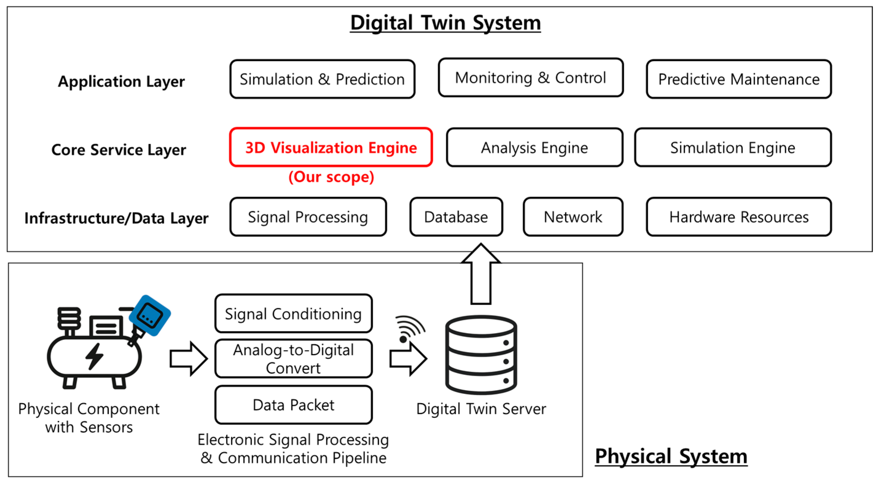
The real-time 3D sensor data visualization system proposed in this study aims to intuitively and reliably represent diverse sensor information collected in digital twin environments. To achieve this, the system was designed based on the Unity3D game engine, actively leveraging the GPU’s parallel processing capabilities to support the real-time processing of large-scale 3D models and numerous sensor data. The system primarily comprises the following: a system architecture and its components; GPU-based real-time sensor data interpolation; enhancement of the physical representation accuracy using geodesic distance; and advanced rendering techniques for improving visual fidelity.

3.1. System Architecture

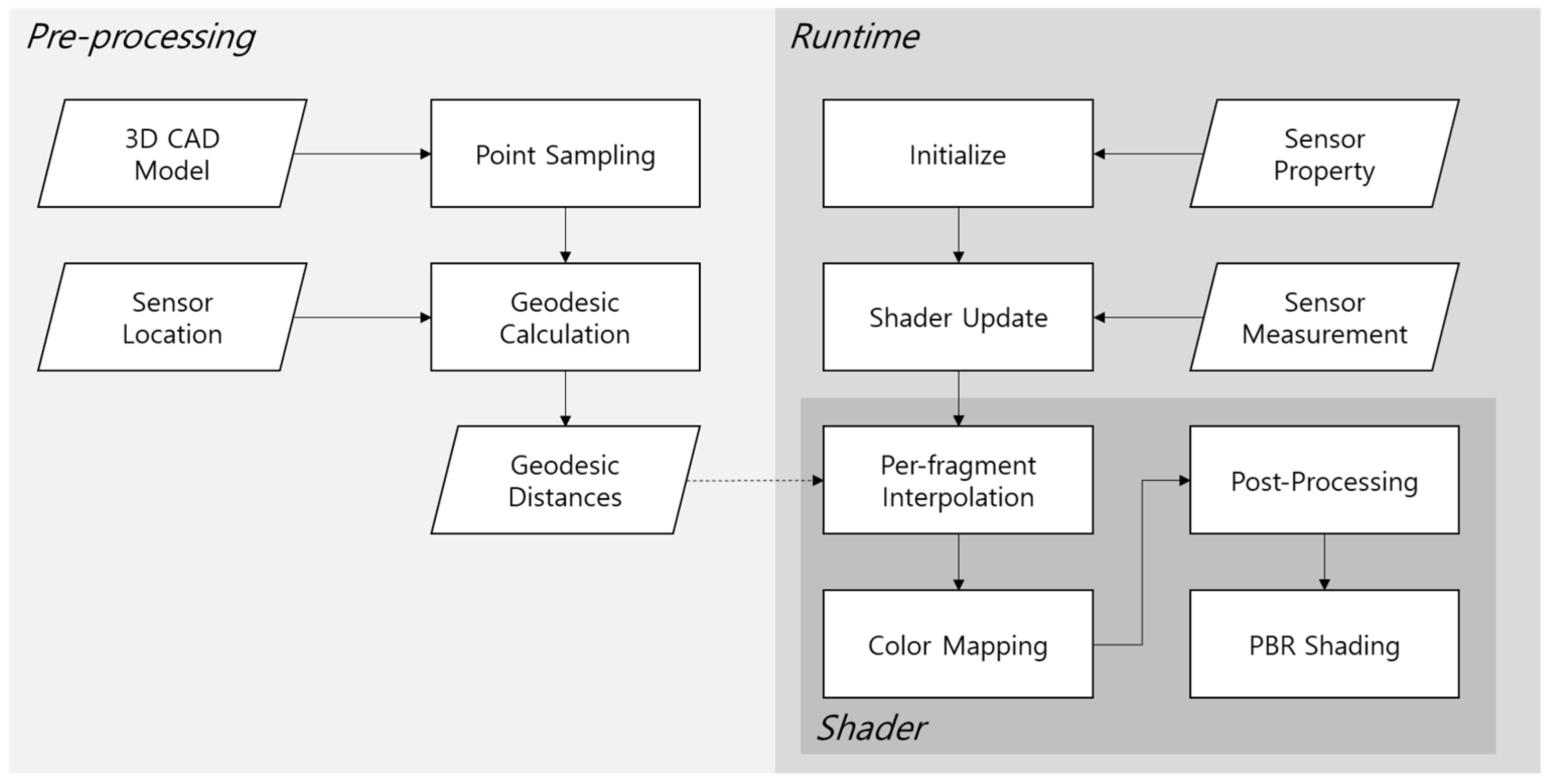
The overall processing flow of the proposed system is illustrated in Figure 2. The system inputs are 3D CAD model information and sensor information (including sensor installation locations, attributes of each sensor, and sensor measurements). The output is an image representing the current state of the actual facility where sensors are installed, mapped as colors onto the 3D CAD model. The proposed system can generate images that reflect real-time changes in sensor measurements. In typical computer graphics applications, such images are generated in real-time by shaders operating on the GPU, and in this study, the core proposed algorithms are also implemented as shader programs.
First, the pre-processing stage involves the pre-calculation of geodesic distances for the geodesic distance interpolation function based on the 3D CAD model and sensor locations. The method proposed in this study utilizes the distance between locations on the 3D CAD model surface and the sensors as key information for interpolation. For distance calculation, a method allowing the selective use of either Euclidean distance or geodesic distance was chosen. Among these, because the real-time calculation of geodesic distance is difficult, an approach of pre-calculating these distances was adopted; further details are provided in Section 3.3.
In the runtime visualization stage, various pieces of information required for program execution are first initialized. During this process, the attributes of each sensor are configured, including the maximum and minimum measurable values for each sensor, and sensor attenuation parameters. These values are used in calculating the interpolation algorithm. Once sensor measurements begin to update from the actual sensors, the sensor information is aggregated in the Shader Update component and then transmitted to the shaders running on the GPU.
Within the shaders, based on this information, sensor measurement values for each visible surface of the 3D CAD model are first calculated via per-fragment interpolation. Subsequently, the color value for that surface is determined through color mapping based on the calculated measurement. Depending on user selection, operations for ramp shading and additional post-processing are performed. The final computed color is then used as the Albedo value for the PBR (Physically Based Rendering) Shader and is displayed on the screen through the remaining PBR pipeline of the Unity3D engine, which was utilized for the experiments in this study. The per-fragment interpolation method, which is central to the proposed approach, is detailed in Section 3.2.

3.2. GPU-Based Real-Time Sensor Data Interpolation

As previously mentioned, this study aims to propose a system for digital twins that enables the real-time observation of an entire object’s state based on discrete data acquired from a few sensors installed at specific locations. In existing digital twin monitoring systems, sensor measurements for such state monitoring are typically displayed as 2D graphs. This approach imposes an additional cognitive load on users attempting to understand the object’s state within a spatial context, leading to difficulties in intuitively perceiving the states of multiple objects. To aid in understanding an object’s state in a spatial context, another common method involves using engineering simulation tools to generate and then visualize the state of the entire 3D CAD model through simulation. However, this method has the disadvantage of being inapplicable to real-time monitoring processes, as simulations can take from several minutes to hours.
To address these issues, this study designs a method to estimate the state of the entire 3D CAD model in real-time through interpolation based on discrete sensor data. The proposed interpolation algorithm is illustrated below in Algorithm 1:
Algorithm 1 Fragment shading algorithm for sensor group visualization
Input: 3D mesh M S H , camera C a m e r a and sensor group G = { l 1 , v 1 , s 1 , o 1 ,   , l N , v N , s N , o N } , where l i denotes world coordinate, v i denotes measured value, s i denotes strength of each sensor, and o i denotes decay control parameter. Sensor group shares its M I N and M A X value to measure.
Output:  C = c 1 ,   , c M , where c j denotes color of each pixel
   S = { s 1 , . s N } , O = o 1 , . o N
   F w = { f 1 w , , f M w } M O D E L_T R A N S F O R M M S H , C a m e r a
    for  i in 1 , , N  do
     v ~ i N O R M A L I Z E v i , M I N , M A X
    end for
    for  j in { 1 , , M }  do                        (Parallel calculation)
     D d j , i     i { 1 , N } , d j , i I N V E R S E_D I S T A N C E f j w , l i }
     ( w 1 , , w N ) C O M P U T E_W E I G H T S D , S
     v j I n t e r p 0
    for  i in 1 , , N  do
       v j I n t e r p v j I n t e r p + C O M P U T E_V A L U E ( v ~ i , w i , d j , i , o i )
    end for
     c j = t e x ( C o l o r m a p , v j I n t e r p )
   end for
We introduce the concept of a “sensor group,” defined as a collection of sensors that measure the same physical quantity and share common specifications. For the purpose of normalization within our algorithm, the shared minimum and maximum values from these specifications are used as an absolute reference to map each sensor’s reading to a [0, 1] range. To ensure a clear and unambiguous visualization, our system is designed to process and display one sensor group at a time.
A 3D mesh model undergoes a transformation process to be rendered on the screen, typically through the model–view–projection transformation in a vertex shader. Subsequently, through the viewport transformation, the screen space coordinates (pixel coordinates) of each triangle constituting the 3D model are calculated. In Algorithm 1, F w signifies the world space coordinates of these pixels that represent a specific model; that is, it is the coordinate value in 3D space of a pixel visible on the screen. The objective of the algorithm is to determine the set of color values, C , for these F w . To achieve this, the algorithm was designed to proceed through a two-stage calculation process.
The first stage is to calculate the influence weight ( w i ) of each sensor for every pixel. The principle behind our weighting scheme is that the state at any point on a surface can be represented based on nearby sensor measurements. This approach assumes that sensors located closer to a given point provide a stronger contribution to its representation than those farther away. While various alternative weighting functions exist, and different choices may yield more physically plausible results for specific phenomena, this research adopts the softmax function (Equation (1)) as a representative method that embodies this core principle. Here, N represents the total number of attached sensors. The term d j , i is the normalized inverse of the distance between the pixel’s world space coordinates and the i-th sensor. Consequently, if the distance between a sensor and a pixel is short, d j , i will have a value close to 1.0, and if the distance is large, its value will be close to 0.0. The strength parameter s i provides control over the influence of each sensor. A higher s i value results in the sensor exerting a stronger influence over a narrower area, whereas a lower strength value leads to a weaker influence spread over a wider area.
C O M P U T E_W E I G H T S ( D , S ) = e d j , i s i / j e d j , i s i ,   for   i 1 N , j   { 1 M }
Once these sensors’ influence weights are calculated, they are used to compute the final interpolated sensor value, v j I n t e r p . Again, various design choices exist for this calculation. In this study, we adopt Equation (2) as a representative method, which provides further controllability over the final representation. This equation defines the contribution of each sensor as follows:
C O M P U T E_V A L U E ( v ~ i , w i , d j , i , o i ) = v ~ i w i d j , i o i ,   for   i 1 N , j { 1 M }
This design ensures that pixel values at sensor locations strongly reflect their respective sensor readings, with values becoming attenuated by d j , i as the distance increases. When multiple sensors are attached to an object, the influence of each sensor on a given pixel is controlled by the w i weights. Furthermore, the decay control parameter o i allows users to adjust the falloff speed of the visualized influence with distance. A larger o i value produces a sharper, more localized falloff, while a smaller value results in a more gradual decay. For instance, if a measured property is known to be relatively uniform across a component, a user can select a small o i value. This creates a visual representation with a very slow decay, making the output more consistent with the expected physical behavior in that specific scenario.
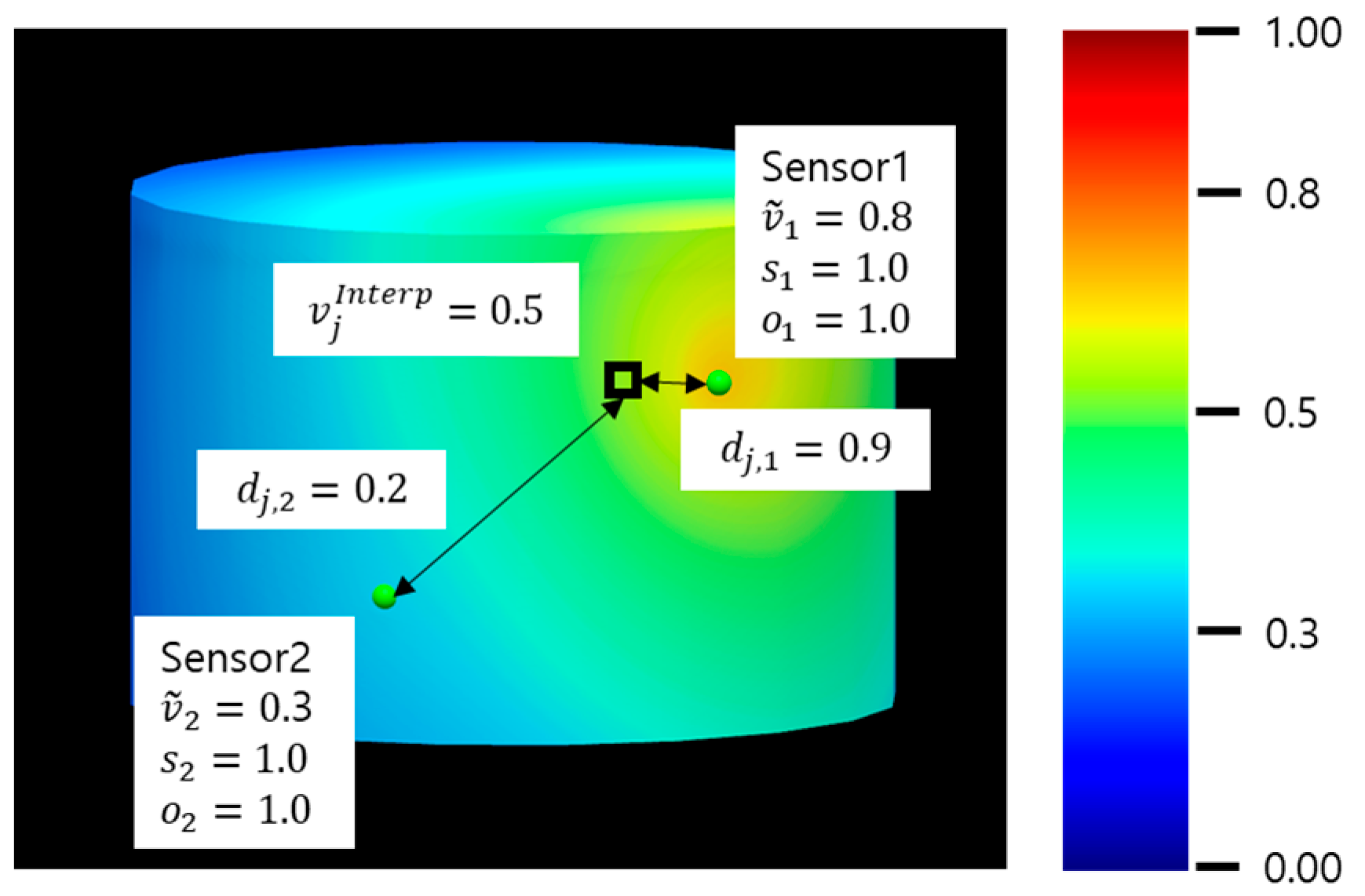
Ultimately, when these interpolated measurements are visualized on screen via color mapping, a result similar to Figure 3 is produced. In the provided example, sensor locations are indicated by green spheres. If we assume the normalized sensor readings are 0.8 and 0.3, and the distances value from a specific pixel (highlighted with a bold border) to these sensors are 0.9 and 0.2, respectively, the proposed method calculates an interpolated value of approximately 0.5 for that pixel. As shown in the figure, this demonstrates the attenuation effect based on sensor proximity.
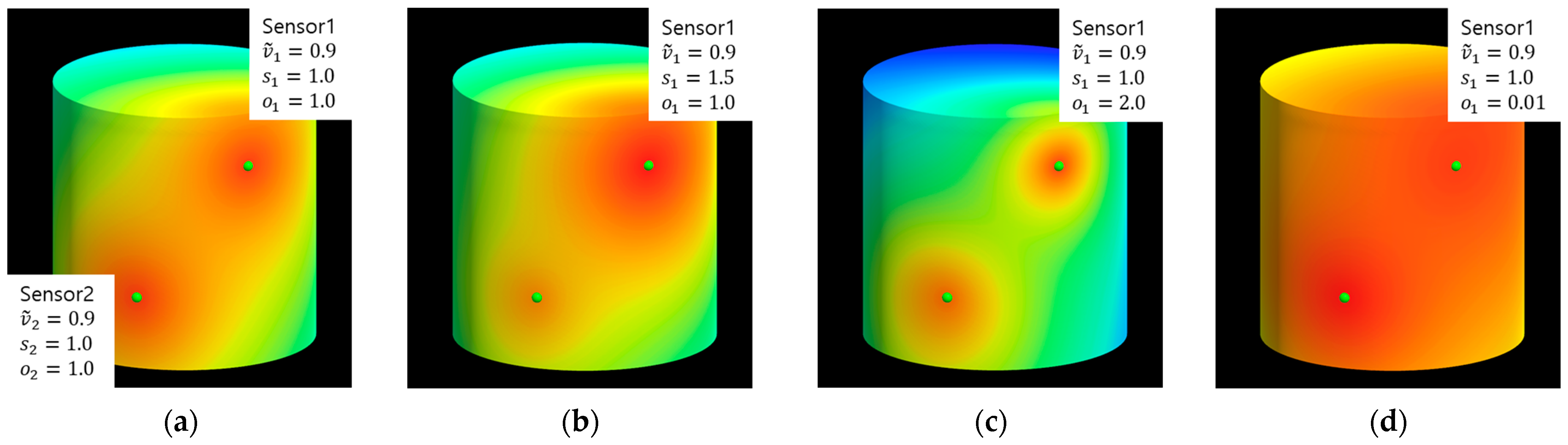
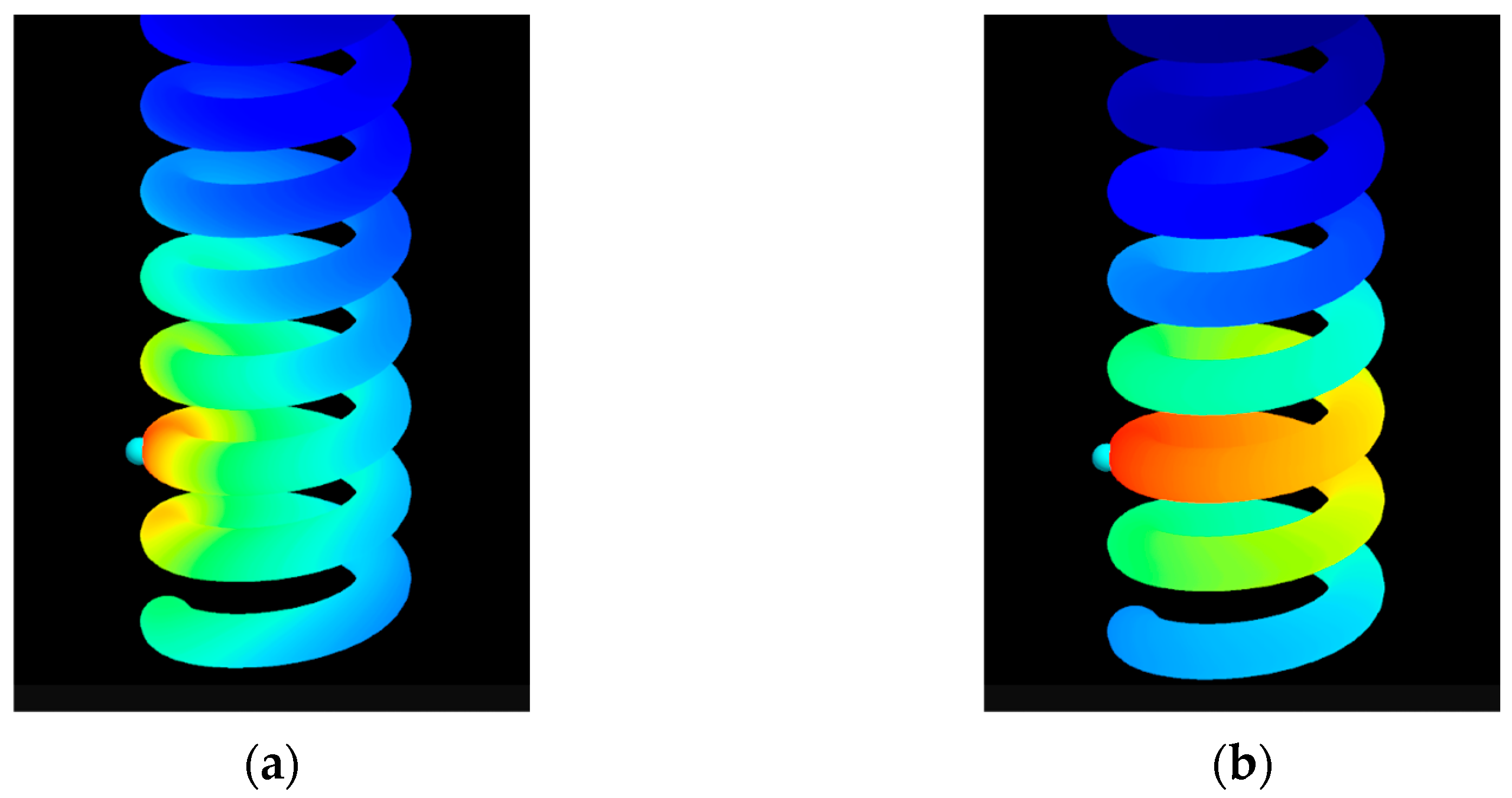
Figure 4 illustrates the effects of the strength ( s i ) and decay control ( o i ) parameters on the visualization for two sensors on the cylinder’s surface. As demonstrated, adjusting these parameters allows a user to generate a wide range of visual representations from the same sensor data. The determination of which representation is most ‘plausible’ is not absolute; it is dependent on the specific physical properties being measured and the characteristics of the component, such as its material. This highlights the primary objective of our system: to provide a controllable, real-time, and intuitive visualization tool, rather than a predictive simulation. Consequently, the selection of appropriate parameter values to best represent a given scenario is intended to be determined by a domain expert.
Since these calculations are implemented on the GPU via shaders, they can be performed in parallel for each pixel. This enables real-time computation for all pixels where the model is displayed. Ultimately, the color corresponding to the sensor’s measurement value is sampled from a Colormap image, and this color is displayed on the screen. In the figure referenced (e.g., Figure 3), it can be observed that this process is executed in parallel not only for any specifically highlighted pixel but for all visible pixels of the model, resulting in their colors being determined and displayed simultaneously. Due to the inherent parallel processing capabilities of the GPU, these computations can be executed at high speed. Consequently, the system is characterized by its ability to immediately reflect dynamically changing sensor measurements in real-time.

3.3. Enhancing Physical Representativeness Using Geodesic Distance

Physical phenomena represented by sensor data, such as temperature distribution on a structure’s surface or stress propagation, often exhibit the characteristic of propagating along the object’s surface. In such cases, interpolating sensor value influences using geodesic distance—which represents the shortest path on the object’s surface—is more physically plausible than using Euclidean distance (a simple straight line between two points). This approach can significantly enhance the reliability of the visualization results. 
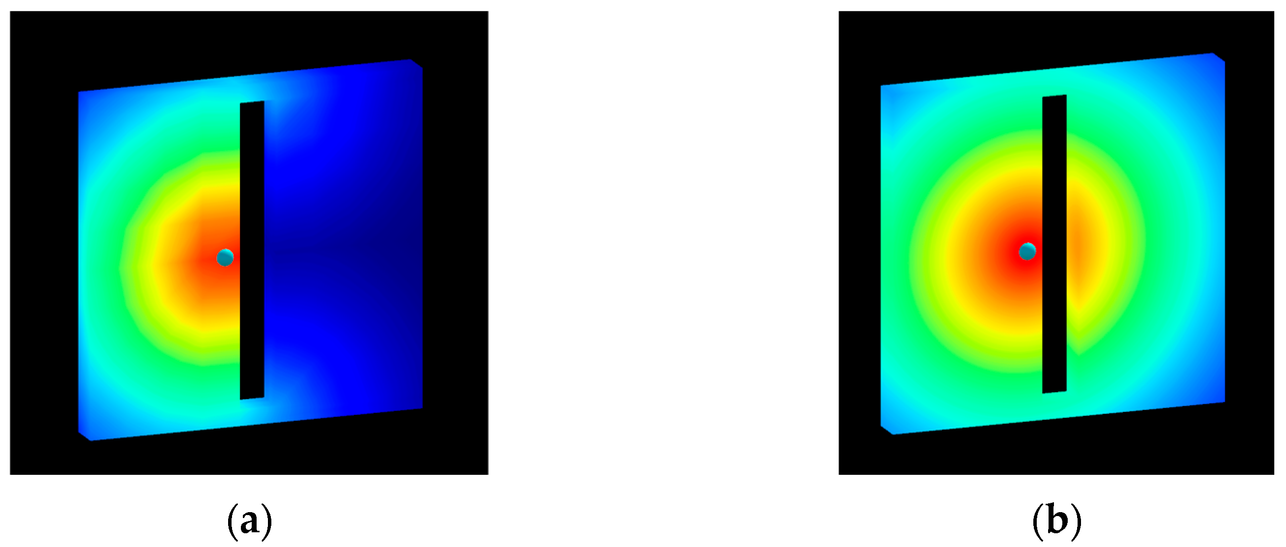
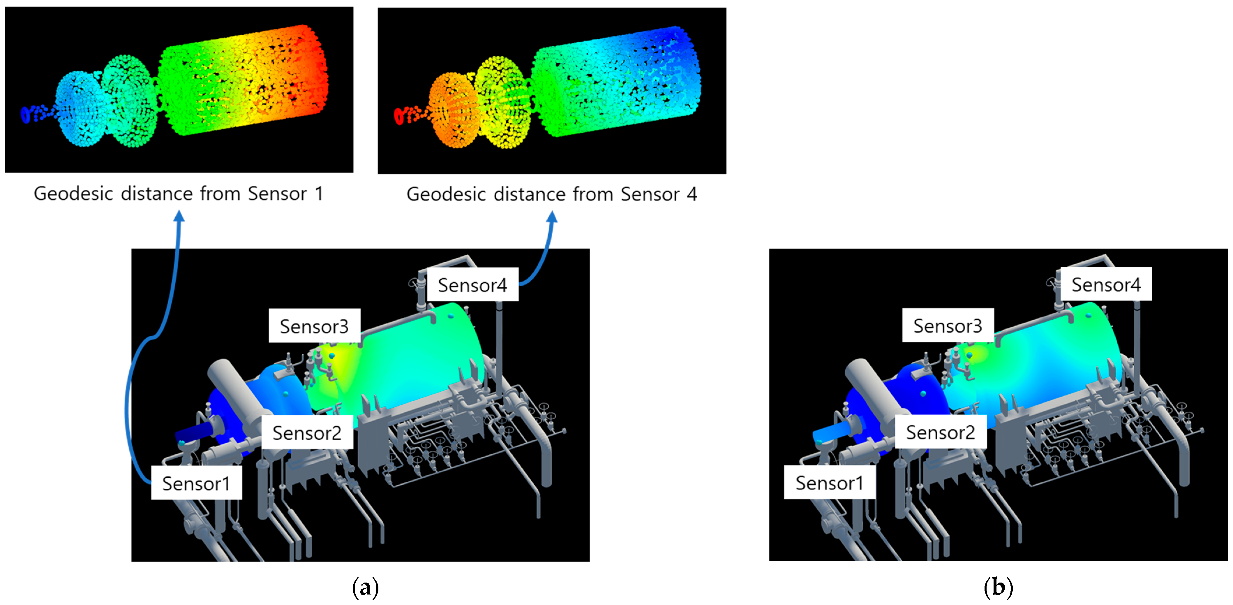
Figure 5 below illustrates a typical limitation demonstrating this issue. Figure 5a shows an example where Euclidean distance is used for the distance ( d j , i ) calculation, as described in Section 3.2. As can be seen in the figure, because weights and attenuation are calculated based on the straight-line distance between the sensor location and points on the 3D CAD model surface, values are interpolated and displayed irrespective of surface connectivity. For instance, if the measured value is temperature and the object possesses heat-conducting properties, the state shown in Figure 5b would represent a more physically reliable result. In this study, to enable visualization that considered such physical connectivity of an object, the system was developed to allow the selection of a distance calculation method utilizing the Heat Method.

3.3.1. Heat-Method-Based Geodesic Distance Calculation

Geodesic distance refers to the length of the shortest path between two points on a curved surface, such as a 3D mesh. Unlike Euclidean distance, which simply represents the straight-line distance in space, geodesic distance is measured along the surface’s topology. Therefore, it is utilized as a key element in various computer graphics and vision fields for analyzing phenomena that occur along an object’s actual surface (e.g., heat conduction, stress propagation), as well as for applications like robot path planning, shape analysis, and segmentation.
A classical algorithm for calculating exact geodesic distances on a 3D polygonal mesh is the Mitchell, Mount, and Papadimitriou (MMP) algorithm [17], which has a time complexity of O ( N 2 l o g N ) , where N is the number of mesh vertices. Subsequently, Surazhsky et al. [18] conducted research that improved computational efficiency by proposing enhanced exact algorithms alongside practical approximation algorithms. These exact computation methods often entail high computational costs, making their real-time application to large-scale meshes challenging. Consequently, various approximation algorithms are being researched to meet the specific requirements (e.g., speed, accuracy) of particular application domains.
The Heat Method proposed by Crane et al. [19] is a geodesic distance calculation technique that effectively approximates distances on curved surfaces based on heat flow simulation. The core idea of this method is to divide the distance calculation into two main stages. First, the heat diffusion equation is solved for a short time to obtain the heat distribution, denoted as u . From this distribution, a normalized gradient field, X = u / u , is computed, which indicates the direction of increasing distance. Subsequently, by taking the divergence of this vector field X , the Poisson equation, ϕ = · X , is solved to finally obtain the geodesic distance function, ϕ .
The Heat Method offers several advantages: it is relatively simple to implement, and because it utilizes standard linear partial differential equation solvers, it is numerically stable and efficient. Notably, after a single pre-factorization step, distance calculations can be performed very rapidly, making it well-suited for applications that require repetitive distance queries. This method possesses the generality to be applied to various types of domains, including not only triangle meshes but also point clouds or grids. It is widely recognized for achieving an excellent balance between accuracy and computational speed in practical applications.
In the system proposed in this study, geodesic distances from each sensor location to all vertices on the 3D model surface are pre-calculated and stored during a pre-processing stage. At runtime, these stored values are retrieved and utilized for interpolation. The system is configured to allow users to select either Euclidean distance or the pre-calculated geodesic distance for the interpolation process, depending on the type of sensor data or the specific analytical objective.

3.3.2. Point Cloud Sampling for CAD Model Connectivity Issues

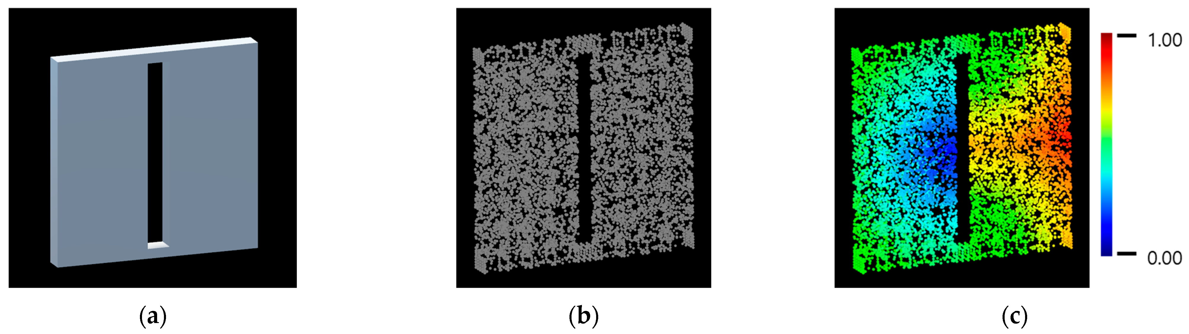
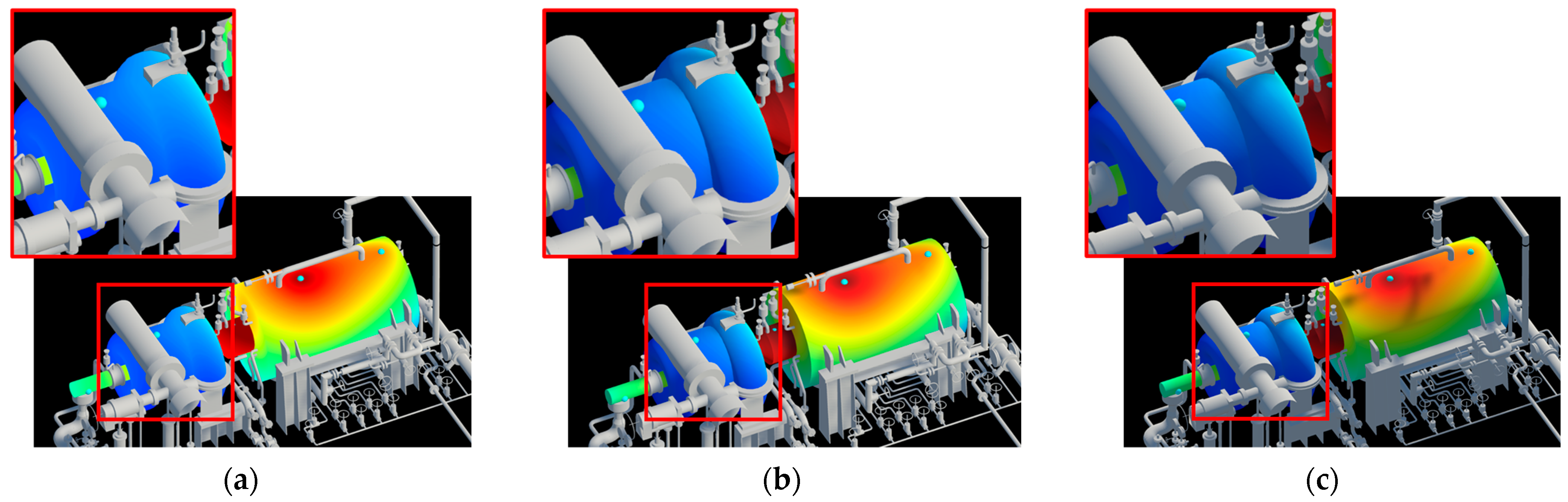
The previously mentioned Heat-Method-based geodesic distance calculation, while feasible for ideal 3D CAD models based on their triangle mesh information, is often not directly applicable in practical scenarios. In actual digital twin construction, 3D CAD models representing objects are typically utilized after being automatically converted from existing 3D design resources. During this conversion process, various issues can arise due to interference between different design components, the limitations of the conversion tools, or suboptimal parameter selections. These problems include the formation of non-manifold geometry resulting from face intersection issues (where triangles improperly overlap or penetrate each other), and face gap problems where parts of a single object lose their intended surface connectivity. An illustration of such phenomena is provided in Figure 6.
While these modeling imperfections can be rectified through manual correction by modeling experts or by carefully tuning conversion parameters, such solutions incur significant time and expenses. This is particularly problematic for digital twin applications, which often involve a multitude of complex objects, making manual intervention or extensive parameter optimization impractical on a large scale.
To address these practical problems, this study introduces a point-cloud-sampling-based geodesic distance calculation method that does not directly rely on the mesh’s topological connectivity. The pre-processing steps for this approach are as follows:
  • A point cloud is generated by uniformly sampling a specific number of points from the surface of the 3D model intended for visualization. The vertices that constitute the original 3D model are also included in this point cloud set.
  • Within the generated point cloud, the k-Nearest Neighbors (kNNs) are identified for each point. Based on this proximity, a virtual connectivity graph is constructed among the points. This process depends solely on geometric proximity, irrespective of the actual connectivity state of the original mesh.
  • The Heat Method is applied to this constructed point cloud graph to calculate the geodesic distances from the points corresponding to sensor locations to all other points in the cloud.
  • From the comprehensive geodesic distance information computed for the entire point cloud, the data corresponding specifically to the vertices of the original 3D model is extracted. This provides the geodesic distance value from each sensor to every vertex of the model.
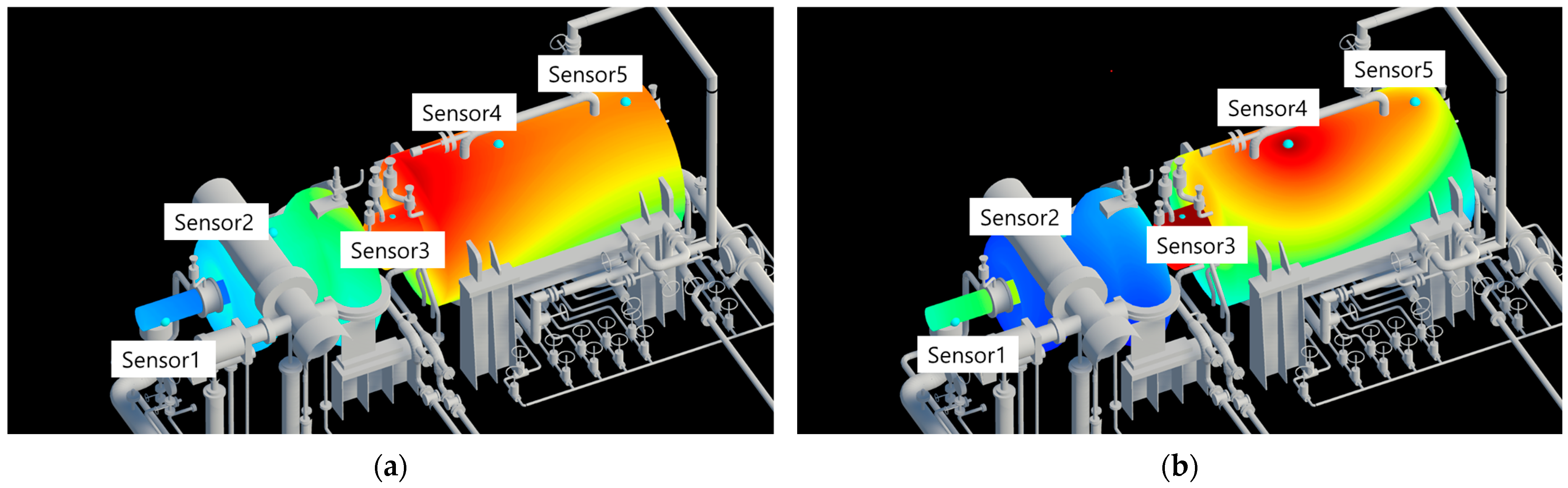
The data generated through steps 1–3 of the process described above is illustrated in Figure 7. The visualization result obtained using this generated data is shown in Figure 8a. A comparison with Figure 8b, which utilizes Euclidean distance, reveals that the visualization achieved using the geodesic distance calculation method (Figure 8a) produces more physically reliable results.

4. Implementation and Experimental Results

To validate the usability and performance of the proposed real-time 3D sensor data visualization system, a visualization program was implemented based on the described methods, and experiments were conducted.

4.1. Development Environment

The development environment was an Intel Core i7-8700K @ 3.70GHz CPU, 32GB RAM (Santa Clara, CA, USA), an NVIDIA GeForce RTX 1080 Ti GPU (Santa Clara, CA, USA), and Windows 11. The overall visualization application was implemented based on Unity3D version 2021.3 LTS. Unity3D was chosen for this study because it is an engine frequently utilized in various digital twin applications due to its diverse extension capabilities and intuitive development environment. The interpolation algorithms were implemented using HLSL (High-Level Shading Language) and Unity3D’s ShaderLab syntax, both available within the Unity3D environment. However, the core proposed methods can be implemented using standard shader syntax in a typical computer graphics rendering pipeline, making them applicable independently of the specific development environment. For the geodesic distance calculation, Geometry Central version 0.1.0 was employed during the pre-processing stage.

4.2. Performance Evaluation

To evaluate the system’s real-time performance, Frames Per Second (FPS) were measured by varying the number of instances of a specific 3D model and sensor configuration. The PC-E18-01 3D CAD model, representing an actual piece of plant equipment, was used as the test model. This model consists of 63,421 triangles and is internally composed of five sub-meshes. Since geodesic interpolation and Euclidean distance interpolation differ primarily in their pre-processing stages and exhibit no significant difference in real-time calculation performance, the following experiments were conducted based on geodesic interpolation:
In the first experiment, instances of the model, each equipped with five sensors, were placed in the scene in quantities of 1, 5, 25, 100, and 400. The FPS was measured for each configuration, and the results are presented in Figure 9. As shown in the figure, a high computational performance exceeding approximately 140 FPS was observed for up to 100 instances. While the finally measured FPS can be influenced by the application’s operational logic and graphics optimization processes, the Unity3D engine used in this study is frequently employed for digital twin construction. Therefore, its internal optimizations are likely applicable in actual digital twin applications. Thus, assuming that 60 FPS is the standard for real-time performance in 3D graphics applications, this implies that real-time sensor visualization is simultaneously possible for more than 100 pieces of equipment.
In the second experiment, FPS was measured for a single model instance while varying the number of sensors, starting from five and progressively doubling this number. The results are presented in Figure 10. As can be seen in the figure, a high computational performance, exceeding 200 FPS, was observed even when data was input from approximately 500 sensors. Unity3D limits the size of the constant buffer used for data input to 1023 elements. Although larger amounts of data can be input using ComputeBuffers, scenarios where a single piece of equipment has thousands of sensors are uncommon in practice. Therefore, in this study, a maximum number of 512 sensors was set for the implementation. By actively leveraging the advantages of GPU parallel computation, it was confirmed that real-time performance can be guaranteed even with a large number of sensors.

4.3. Qualitative Analysis

Visual confirmation and qualitative evaluation were performed for various effects applicable in digital twins, including the proposed sensor visualization method.

4.3.1. Comparison of Distance Methods

As can be seen in Figure 11, Euclidean-distance-based interpolation does not consider the object’s surface geometry, which can sometimes lead to physically unnatural results. In contrast, geodesic-distance-based interpolation represents sensor values as if they diffuse along the object’s surface. This approach can provide much more intuitive and reliable results, especially when visualizing data with surface propagation characteristics, such as heat or stress distributions. Furthermore, as shown in Figure 12, where different sensor values are applied, the geodesic-distance-based results exhibit smoother and more natural color transitions, particularly around edges. This suggests that practical and meaningful results can be obtained through the point-cloud-sampling-based geodesic distance calculation even when the actual CAD model is not perfect, significantly enhancing the system’s practical value. Unless otherwise specified, the strength ( s i ) and decay ( o i ) parameters are set to 1.0 for all subsequent figures.

4.3.2. Results of PBR and Ramp Shading Application

Since the proposed method can be utilized in determining model colors during the visualization process, it can also be integrated with advanced rendering features in rendering engines like Unity3D. As seen in Figure 13, before applying Physically Based Rendering (PBR), the object may appear flat and artificial, potentially looking out of place within the overall visualization system. After applying PBR, the object’s material properties are enhanced, and it interacts naturally with ambient lighting and shadows, providing much more realistic visual results. For example, shadows cast by other objects or shading due to the object’s own curvature are rendered along with the sensor data colors. This greatly improves the visual consistency and immersiveness of the entire digital twin scene and also allows for a clearer perception of the model’s geometry. This signifies that the sensor data visualization object is not merely an information overlay but can be naturally integrated as part of the digital twin environment.
Figure 14 shows the results of applying ramp shading. Without ramp shading, sensor values are represented by continuous color variations. However, when ramp shading is applied and the interval value is adjusted (e.g., to 0.1 or 0.2), areas belonging to specific value ranges are grouped and displayed with the same color. This method, similar to contour maps, clearly delineates specific data thresholds or distribution patterns, making it useful for users to quickly identify particular states (e.g., safe, warning, danger) or to grasp macroscopic trends in value changes. This representation style may also be more familiar to users accustomed to traditional engineering analysis tools.

4.3.3. Application and Deployment Scenarios

The result of integrating the proposed system into a comprehensive digital twin framework is illustrated in Figure 15. This overarching system comprehensively displays attribute information for equipment and details of the attached sensors to the user, while also storing collected sensor data in a database (DB). Sensor data stored in the DB is transferred to the visualization module in real-time. This information is then presented to the user in an integrated manner alongside other equipment 3D models, utilizing the 3D visualization capabilities proposed in this study.
These qualitative results demonstrate that the proposed system is a robust and flexible tool capable of effectively visualizing sensor data under various conditions and according to diverse requirements. In particular, its ability to overcome the imperfections of various CAD data, which are common in real-world usage environments, through point-cloud-sampling-based geodesic distance calculation, and its enhancement of visual realism via PBR integration, further elevates the system’s practical value. Furthermore, features such as ramp shading extend beyond simple visualization to improve data interpretability, thereby supporting users in making more accurate and rapid decisions. Figure 16 demonstrates our visualization technique applied to various process plant CAD models.
Figure 17 demonstrates the deployment of our visualization system on two distinct platforms: a mobile tablet and a web browser. This cross-platform capability is facilitated by the underlying Unity3D engine, allowing the system to be readily deployed to various end-user devices, including PCs, smartphones, tablets, and VR/AR headsets. This flexibility supports two main deployment strategies. For target platforms equipped with sufficient GPU computation power, the entire visualization process can run natively on the device, as shown in the examples. For less powerful devices or for centralized management, a streaming-based approach can be adopted, where a server performs the rendering and streams the visual output to a lightweight client. This ensures broad accessibility and addresses potential hardware limitations in diverse digital twin environments.

4.4. Limitations

The proposed system primarily focuses on visualizing sensor data with scalar values, such as temperature and pressure. The effective 3D visualization of sensor data with vector or tensor values (e.g., flow velocity, strain rate) requires further research. Furthermore, geodesic distance calculation necessitates a pre-processing stage. This presents a limitation in its real-time applicability to scenarios involving highly dynamic model geometries or frequently changing sensor positions, where on-the-fly recalculation might be too slow.
Several limitations are also associated with the geodesic-distance-based visualization approach. First, during the geodesic distance calculation that utilizes the point cloud and kNN algorithm, if the parameter ‘k’ (for k-Nearest Neighbors) is not appropriately selected by the user, the previously mentioned face gap problem in imperfect CAD models might not be adequately resolved. This requires users to determine a suitable ‘k’ value through observation, which can be a drawback. Second, when applying geodesic distance for visualization, if the large surface area of the model is represented by a sparse set of vertices, aliasing artifacts can occur in the vertex-based distance mapping. This can make accurate visualization challenging. In such instances, it becomes necessary to generate additional vertices on the 3D CAD model, for example, by employing triangle subdivision algorithms during model preparation.
Finally, it must be emphasized that the proposed method does not provide physically accurate visualizations comparable to dedicated simulation tools. Real-world physical phenomena are governed by the complex interactions of material properties and environmental conditions, which are not incorporated into our interpolation model. While simulation tools like FEM and CAE are designed to deliver physically reliable results, they sacrifice real-time performance. Our system makes the opposite trade-off: it prioritizes real-time and intuitive visualization at the expense of physical accuracy. Although the system provides parameters for users to adjust sensor weights and make the visualization appear more plausible, there is no direct mapping between these heuristic parameters and real physical properties. Consequently, the proposed system is valuable for applications requiring high-level situational awareness, such as gaining an intuitive understanding of an asset’s overall state or detecting systemic anomalies. However, it is not intended for, nor is it a substitute for, the detailed engineering analysis of specific components.

5. Conclusions

In this study, a comprehensive and enhanced system for effectively visualizing real-time sensor data collected in digital twin environments was successfully developed, and its utility was validated. The proposed system includes an interpolation algorithm that leverages GPU parallel processing for the immediate reflection of real-time data. Key to its design is the selective application of geodesic and Euclidean distance calculations to improve the accuracy of physical phenomena representation, and a point-cloud-sampling-based geodesic distance calculation technique to address imperfections in actual CAD models. The system aims to overcome the limitations of existing systems by integrating various advanced features, including enhanced visual realism through Physically Based Rendering (PBR) integration and improved data interpretability via ramp shading. Implemented in the Unity3D environment, the system demonstrated excellent real-time performance (420 FPS for a single model, approximately 140 FPS in an environment with 100 instances) across various experiments with large-scale 3D models and numerous sensor data. Qualitative evaluations also confirmed improved visual quality and physical reliability.
The primary significance of this research lies in providing a powerful visualization tool that bridges the gap between the vast sensor data generated in digital twins and the user, thereby supporting intuitive understanding and rapid, data-driven decision-making. In particular, by presenting practical solutions to the technical challenges encountered in real-world applications—such as CAD model connectivity issues, real-time geodesic distance approximation, and harmonious integration with PBR—and implementing them as an integrated system, this work not only makes academic contributions but also enhances its potential for practical application in industrial settings. The proposed GPU-accelerated framework demonstrates a viable pathway for overcoming the dual challenges of processing and interpreting data from large-scale sensor networks, paving the way for more scalable and intuitive digital twin monitoring systems.
Future work could involve advancing the current interpolation algorithms to develop more sophisticated models that consider physical properties (e.g., thermal conductivity), fluid dynamics, and other complex phenomena. The physical validity and predictive accuracy of such models could then be rigorously evaluated through comparative validation with CAE (Computer-Aided Engineering) simulation results. Furthermore, research will be necessary to verify the long-term stability and utility of the system by deploying it in operational plants and large-scale facilities with live sensor data feeds over extended periods.

Author Contributions

Conceptualization, H.K. and H.S.; Funding acquisition, H.S.; Methodology, H.K. and H.S.; Project administration, H.S.; Software, H.K.; Supervision, H.S.; Validation, H.K. and H.S.; Visualization, H.K.; Writing—original draft, H.K.; Writing—review and editing, H.K. and H.S. All authors have read and agreed to the published version of the manuscript.

Funding

This research was supported by the “Developmental project of AI-based gas-oil plant management/maintenance core technology (Project No: 21ATOGC161932-01)” project, funded by the Ministry of Land, Infrastructure & Transport (2021–2024).

Data Availability Statement

The datasets generated and/or analyzed during the current study are available from the corresponding author on reasonable request.

Conflicts of Interest

The authors declare no conflicts of interest.

References

  1. Tao, F.; Zhang, H.; Liu, A.; Nee, A.Y. Digital twin in industry: State-of-the-art. IEEE Trans. Ind. Inform. 2018, 15, 2405–2415. [Google Scholar] [CrossRef]
  2. Jones, D.; Snider, C.; Nassehi, A.; Yon, J.; Hicks, B. Characterising the Digital Twin: A systematic literature review. CIRP J. Manuf. Sci. Technol. 2020, 29, 36–52. [Google Scholar] [CrossRef]
  3. Lu, Q.; Xie, X.; Parlikad, A.K.; Schooling, J.M. Digital twin-enabled anomaly detection for built asset monitoring in operation and maintenance. Autom. Constr. 2020, 118, 103277. [Google Scholar] [CrossRef]
  4. Al-Fuqaha, A.; Guizani, M.; Mohammadi, M.; Aledhari, M.; Ayyash, M. Internet of things: A survey on enabling technologies, protocols, and applications. IEEE Commun. Surv. Tutor. 2015, 17, 2347–2376. [Google Scholar] [CrossRef]
  5. Jedermann, R.; Singh, K.; Lang, W.; Mahajan, P. Digital twin concepts for linking live sensor data with real-time models. J. Sens. Sens. Syst. 2023, 12, 111–121. [Google Scholar] [CrossRef]
  6. Keim, D.A. Information visualization and visual data mining. IEEE Trans. Vis. Comput. Graph. 2002, 8, 1–8. [Google Scholar] [CrossRef]
  7. Van Wijk, J.J. The value of visualization. In Proceedings of the VIS 05 IEEE Visualization, Minneapolis, MN, USA, 23–28 October 2005; pp. 79–86. [Google Scholar]
  8. Zhu, Z.; Liu, C.; Xu, X. Visualisation of the digital twin data in manufacturing by using augmented reality. Procedia CIRP 2019, 81, 898–903. [Google Scholar] [CrossRef]
  9. Wang, J.; Phillips, L.; Moreland, J.; Wu, B.; Zhou, C. Simulation and visualization of industrial processes in unity. In Proceedings of the Conference on Summer Computer Simulation, San Diego, CA, USA, 26–29 July 2015; pp. 1–7. [Google Scholar]
  10. National Instruments. LabVIEW Sensor Mapping Reference Manual. Available online: https://www.ni.com/docs/ko-KR/bundle/labview-api-ref/page/vi-lib/express/express-3d-picture/sensorsource-llb/sensor-source-vi.html (accessed on 2 June 2025).
  11. Matsson, J.E. An Introduction to ANSYS Fluent 2022; Sdc Publications: Mission, KS, USA, 2022. [Google Scholar]
  12. Liu, L.; Kuo, S.M.; Zhou, M. Virtual sensing techniques and their applications. In Proceedings of the 2009 International Conference on Networking, Sensing and Control, Okayama, Japan, 26–29 March 2009; pp. 31–36. [Google Scholar]
  13. Ye, C.; Butler, L.; Bartek, C.; Iangurazov, M.; Lu, Q.; Gregory, A.; Girolami, M.; Middleton, C. A digital twin of bridges for structural health monitoring. In Proceedings of the 12th International Workshop on Structural Health Monitoring 2019, Stanford, CA, USA, 10–12 September 2019. [Google Scholar]
  14. Choi, S.; Woo, J.; Kim, J.; Lee, J.Y. Digital twin-based integrated monitoring system: Korean application cases. Sensors 2022, 22, 5450. [Google Scholar] [CrossRef] [PubMed]
  15. Koo, S.O.; Kwon, H.D.; Yoon, C.G.; Seo, W.S.; Jung, S.K. Visualization for a multi-sensor data analysis. In Proceedings of the International Conference on Computer Graphics, Imaging and Visualisation (CGIV’06), Sydney, Australia, 26–28 July 2006; pp. 57–63. [Google Scholar]
  16. Autodesk. Data Visualization and Visual Analytics. Available online: https://www.research.autodesk.com/projects/visualization-visual-analytics/ (accessed on 2 June 2025).
  17. Mitchell, J.S.; Mount, D.M.; Papadimitriou, C.H. The discrete geodesic problem. SIAM J. Comput. 1987, 16, 647–668. [Google Scholar] [CrossRef]
  18. Surazhsky, V.; Surazhsky, T.; Kirsanov, D.; Gortler, S.J.; Hoppe, H. Fast exact and approximate geodesics on meshes. ACM Trans. Graph. TOG 2005, 24, 553–560. [Google Scholar] [CrossRef]
  19. Crane, K.; Weischedel, C.; Wardetzky, M. The heat method for distance computation. Commun. ACM 2017, 60, 90–99. [Google Scholar] [CrossRef]
Figure 1. Conceptual architecture of the integrated digital twin system.
Electronics 14 02938 g001
Figure 2. Architecture of the proposed real-time 3D sensor data visualization system.
Electronics 14 02938 g002
Figure 3. An illustrative example of the proposed sensor data interpolation algorithm on a cylinder model. The figure demonstrates how the final interpolated value is a weighted average of the sensor readings. The influence of each sensor is primarily determined by its proximity to the target point, which is represented by a normalized inverse distance, d j , i . As shown, the closer Sensor 1 ( d j , 1 = 0.9 ) has a greater influence on the final value than the more distant Sensor 2 ( d j , 2 = 0.2 ).
Electronics 14 02938 g003
Figure 4. Visual effects of the strength ( s i ) and decay control ( o i ) parameters on the interpolation result. (a) A baseline visualization with default parameters ( s i = 1.0, o i = 1.0). (b) Compared to the baseline, increasing the strength s i to 1.5 creates a slightly more focused and intense area of influence for Sensor 1. (c) Increasing the decay parameter o i to 2.0 results in a significantly faster and more localized visual falloff around the sensor. (d) Conversely, a near-zero decay parameter ( o i = 0.01 ) causes the sensor’s influence to spread widely across the entire surface, demonstrating how a property with minimal decay can be represented.
Electronics 14 02938 g004
Figure 5. Illustrative comparison of sensor data visualization using (a) Euclidean-distance-based interpolation and (b) geodesic-distance-based interpolation.
Electronics 14 02938 g005
Figure 6. Illustrative examples of common mesh imperfections in 3D CAD models: face gaps and self-intersections affecting surface connectivity.
Electronics 14 02938 g006
Figure 7. Pre-processing stage for point-cloud-based geodesic distance calculation: (a) original 3D model; (b) uniformly sampled point cloud from the model surface; (c) calculated and normalized geodesic distances on the point cloud (red: larger distances, blue: smaller distances from a sensor source).
Electronics 14 02938 g007
Figure 8. Comparison of visualization results on a plate model with a slot: (a) geodesic-distance-based interpolation; (b) Euclidean-distance-based interpolation.
Electronics 14 02938 g008
Figure 9. Real-time performance evaluation: Frames Per Second (FPS) with varying numbers of 3D model instances.
Electronics 14 02938 g009
Figure 10. Real-time performance evaluation: Frames Per Second (FPS) with varying numbers of sensors per model instance. The x-axis is shown on a logarithmic scale.
Electronics 14 02938 g010
Figure 11. Qualitative comparison of visualization results on the PC-E18-01 plant equipment model: (a) Final visualization using geodesic-distance-based interpolation. The inset images at the top illustrate the pre-processing step, showing the calculated geodesic distance fields originating from Sensor 1 (left) and Sensor 4 (right). In these distance fields, blue indicates the smallest distance, while red indicates the largest. (b) For comparison, the visualization result using Euclidean-distance-based interpolation is shown.
Electronics 14 02938 g011
Figure 12. Visualization fidelity on the PC-E18-01 model, contrasting (a) the geodesic distance approach showing smoother transitions, especially around the edges, with (b) the Euclidean distance method under varied sensor inputs.
Electronics 14 02938 g012
Figure 13. Visual enhancement of the sensor-visualized model through Physically Based Rendering (PBR) integration. The inset images provide magnified views to better illustrate the details of lighting and shadow interactions: (a) visualization without PBR, resulting in a flat, unrealistic appearance; (b) visualization with PBR under default lighting, which adds natural shading and enhances the perception of the model’s 3D geometry; (c) the PBR-enabled visualization demonstrating realistic interactions with varied lighting conditions, such as distinct highlights and shadows. This allows the object to be seamlessly integrated into the overall digital twin environment.
Electronics 14 02938 g013
Figure 14. Enhanced data interpretability using ramp shading: sensor values are mapped to discretized color intervals for clear threshold identification.
Electronics 14 02938 g014
Figure 15. The user interface of the integrated digital twin application: (A) Main Toolbar: Provides key controls for sensor data connection, starting/stopping visualization, and panel visibility; (B) 3D Viewport: The central window displaying the entire facility environment, where the proposed real-time sensor visualization is rendered; (C) Asset Panel: Lists all facility components and shows their detailed properties, such as tags and descriptions, upon selection.
Electronics 14 02938 g015
Figure 16. Application examples: sensor data visualization results on various process plant CAD models using the proposed system.
Electronics 14 02938 g016
Figure 17. Demonstration of the system’s platform-independent capabilities. (a) The proposed system running on a tablet device (Samsung Galaxy Tab S8 Ultra, Suwon, Republic of Korea). (b) The same system deployed as a WebGL application running in a standard web browser.
Electronics 14 02938 g017
Disclaimer/Publisher’s Note: The statements, opinions and data contained in all publications are solely those of the individual author(s) and contributor(s) and not of MDPI and/or the editor(s). MDPI and/or the editor(s) disclaim responsibility for any injury to people or property resulting from any ideas, methods, instructions or products referred to in the content.

