
Advanced Big Data Solutions for Detector Calibrations for High-Energy Physics


Abstract
1. Introduction
- Azimuthal Segmentation: The PHENIX EMCal is divided into sectors, each with variations in response due to geometric factors, timing offsets, noise, and radiation exposure. These require careful corrections to ensure uniformity across the detector for accurate particle energy measurements.
- Beam Luminosity-Dependent Noise Patterns: PHENIX experiences noise that varies with beam luminosity, particularly affecting photon and pion measurements. Expanded noise-filtering techniques, such as the Dead Hot Map (DHM) and timing calibration, are used to isolate valid data from background noise.
- Azimuthal Segmentation: ATLAS and CMS also experience calibration challenges due to segmentation, though their more symmetrical designs make them less sensitive to sector-dependent effects than PHENIX. Still, they require detailed calibration to address energy response variations across sectors.
- Beam-Luminosity Noise: Both detectors experience noise from beam-induced background and luminosity fluctuations, which is mitigated through advanced filtering and noise-reduction techniques, such as the CMS machine learning-based anomaly detection system.

2. Related Work
3. DHM Method
- Dead Towers : Towers that are either minimally operational or completely nonfunctional.
- Hot Towers: Towers that emit signals without corresponding energy deposits, often due to excessive noise.
- Extra-Hot Towers: Towers that consistently register excessive signals due to hardware issues, such as ADC or front-end faults, leading to an abnormally high number of hits.
- 1.
- Visualizing the Raw Hit Map: Analyzing the detector’s initial response before applying any corrections or conditions.
- 2.
- Run Selection and Quality Control: Filtering out unreliable runs based on event count, detector stability, and cluster distributions.
- 3.
- Hit Map Construction: Creating detailed spatial distributions of recorded hits per tower for further classification.
- 4.
- Pseudo-Rapidity () Correction: Normalizing hit distributions across detector regions to compensate for geometric asymmetries.
- 5.
- Statistical Analysis of Hit Distributions: Applying Gaussian, Poisson, and binomial fits to define thresholds for dead, hot, and extra-hot towers.
- 6.
- DHM Generation: Merging tower classification results across multiple energy bins to produce a stable, globally valid DHM.
3.1. Step 1: Raw Hit Map Before Applying DHM Conditions
- Observations from the Raw Hit Map:
- High-density regions: Some towers register anomalously high hit counts, which may indicate hot or extra-hot towers due to hardware noise.
- Zero-hit regions: Certain towers show no recorded activity, potentially representing dead towers or inactive detector regions.
- Non-uniform distributions: Variations across the sector suggest geometric effects, such as pseudo-rapidity () dependence.
3.2. Step 2: Run Selection and Quality Control
- Criteria for Run Selection:
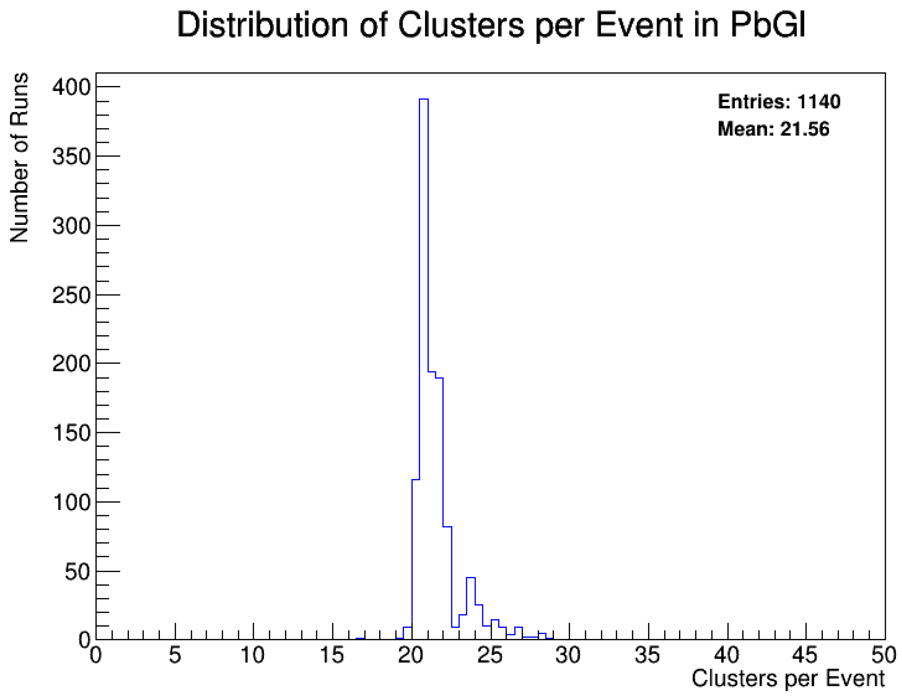
- Runs with fewer than 1 million recorded events are discarded (Figure 3).
- Runs affected by hardware malfunctions, beam instabilities, or missing detector sectors are excluded.
- Only “good long runs” with stable detector operation are selected.

- Event-Level Quality Filtering
- 1.
- Zero-Hit Towers: Runs are discarded if any sector contains more than 100 zero-hit towers, as this suggests large-scale detector failure.
- 2.
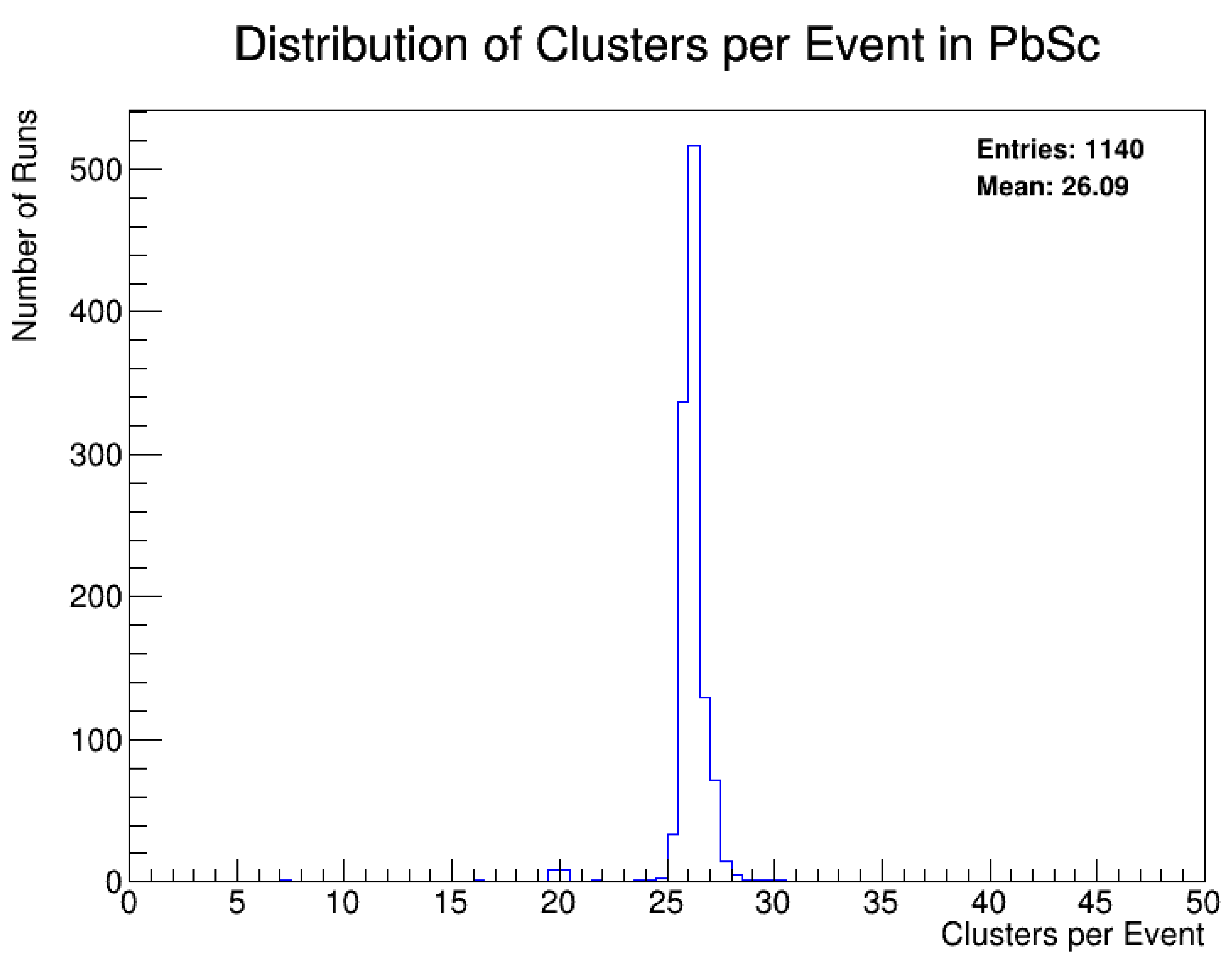
- Cluster-Per-Event Distribution: Runs where any sector registers fewer than 10 clusters per event are removed to prevent data corruption from nonfunctional detector elements.
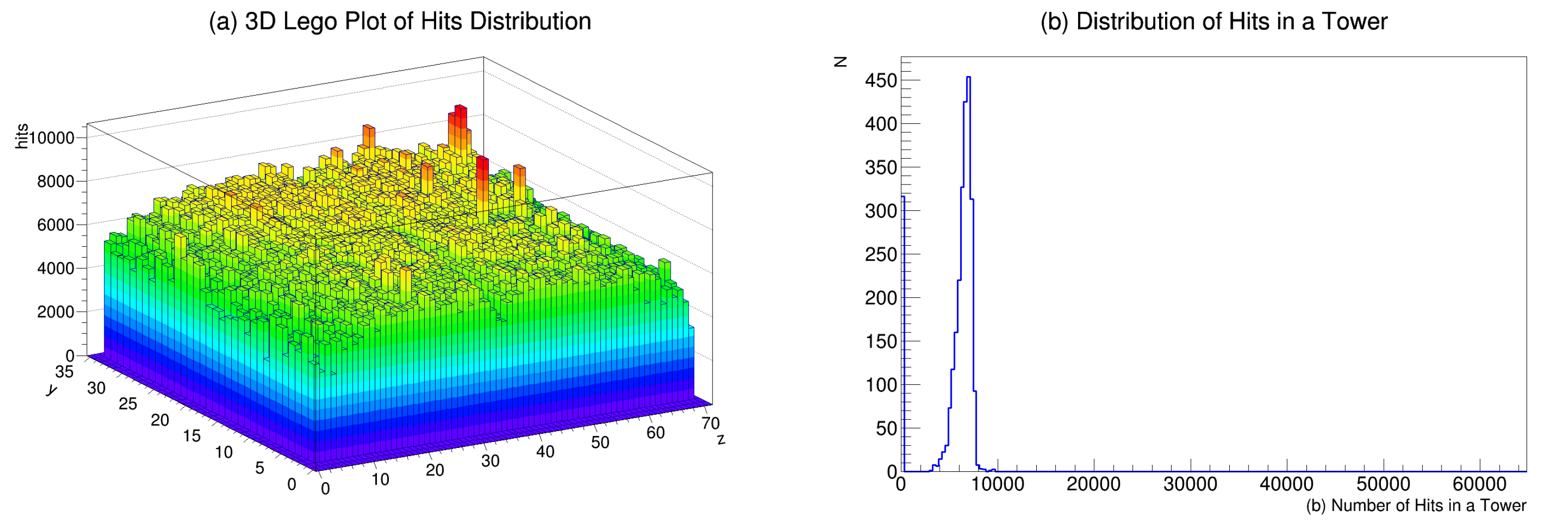
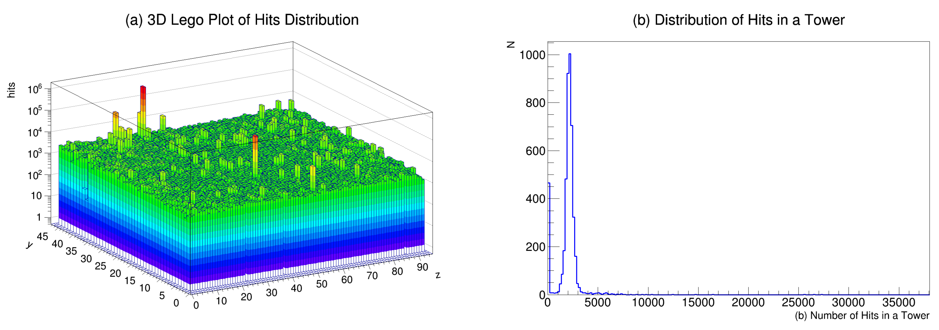
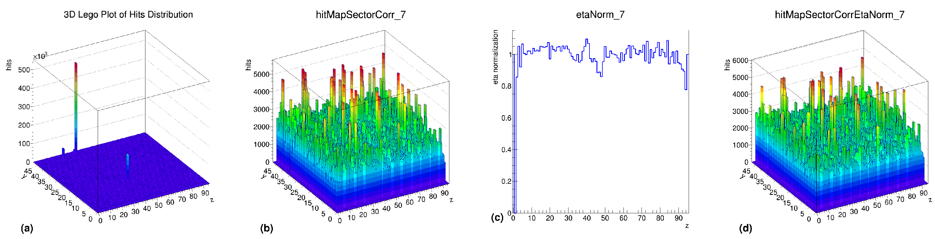
3.3. Step 3: Hit Map Construction
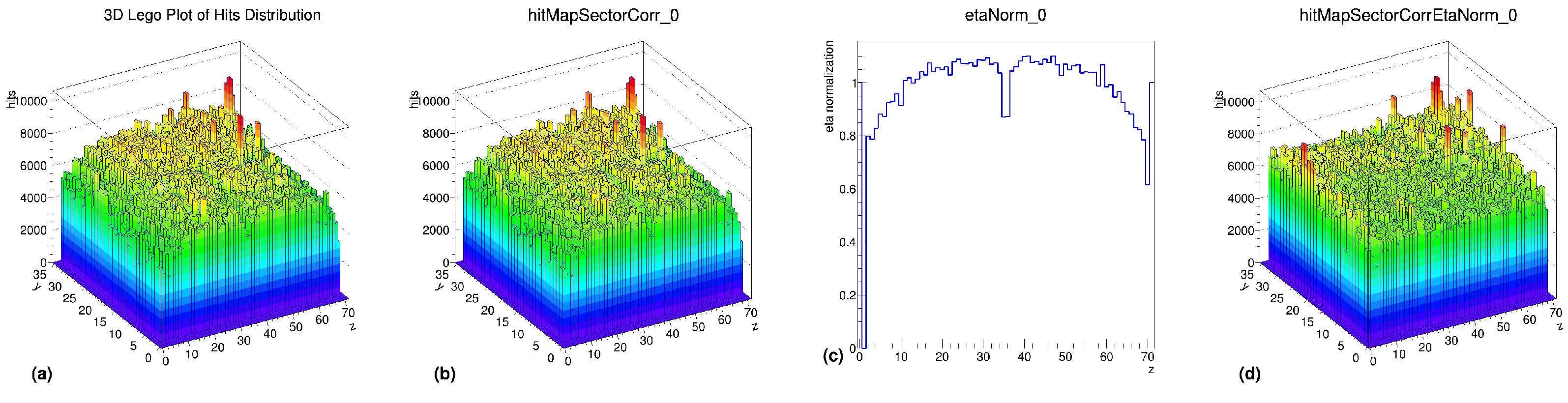
3.4. Step 4: Pseudo-Rapidity () Correction
- Correction Process
- 1.
- Preprocessing Step: Towers with zero hits and extra-hot towers (hit counts exceeding 100 times the average) are removed to prevent distortion.
- 2.
- Normalization Histogram Calculation: A 1D normalization histogram is derived to account for variations.
- 3.
- Final -Correction: The normalization factor is applied to the hit map, ensuring uniform response across regions.
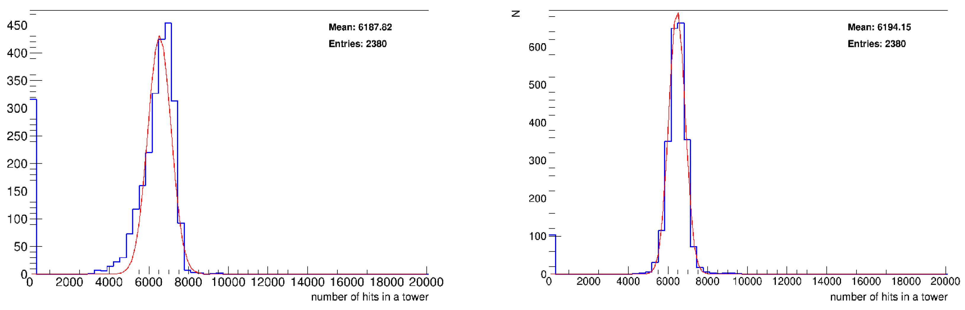
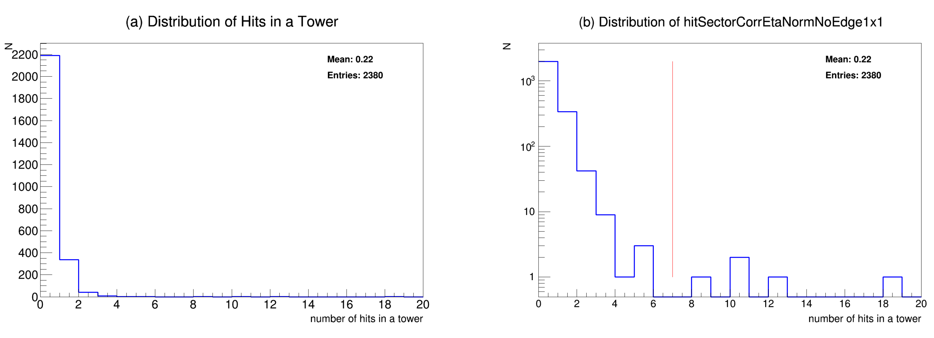
3.5. Step 5: Statistical Analysis of Hit Distributions
- 1.
- Gaussian Distribution (Low Energy Bins): The Gaussian distribution is widely used to model low-energy hit distributions where the data typically exhibit a symmetric, bell-shaped curve. The low-energy region (e.g., 0.2–0.3 GeV) generally follows a normal distribution due to the central limit theorem, which is why a Gaussian distribution is an appropriate choice for this regime. Dead towers are identified as those with hit counts below the mean − , while hot towers exceed the mean + .
- 2.
- Poisson Distribution (Intermediate Energy Bins): At higher energy levels (e.g., 0.9–1.0 GeV), the hit distributions are often sparse and adhere to a Poisson distribution. Poisson distributions characterize infrequent events, and with higher energy levels, the distribution becomes more sparse with diminished clusters of occurrences, which is precisely represented by a Poisson process where events (hits) take place independently at a constant rate, where hot thresholds are determined based on statistical fluctuations.
- 3.
- Binomial Distribution (High-Energy Bins): For very high-energy regions, the data show more irregularity and heavy-tailed features, which may be accurately represented by a Binomial distribution or a Power Law distribution. In this regime, hits normally cluster, resulting in more variability in the number of hits per tower, so providing a Binomial distribution (which characterizes the number of successes in a certain number of trials) is a suitable model. Hot limits are defined based on the intersection points in the logarithmic scale fit.
- 4.
- Why Not Beta-Binomial? The Beta-Binomial model could be considered for low-statistics regions because it accounts for over-dispersion (variance greater than the mean) by introducing a Beta-distributed prior over the success probability in the Binomial distribution. However, in the context of the current study, the following points justify the use of the tri-distribution approach over the Beta-Binomial model:
- Model Simplicity: The Beta-Binomial distribution introduces an additional layer of complexity by modeling the probability of success as a random variable, which requires additional parameter estimation. In contrast, the tri-distribution framework offers a simpler, yet effective, modeling approach that accurately captures the underlying distributions for each energy range without requiring an extra layer of complexity.
- Energy-Specific Behavior: The tri-distribution framework is tailored to the specific energy regimes observed in the data. Each distribution (Gaussian, Poisson, and Binomial) models a distinct behavior of hit distributions, whereas the Beta-Binomial model does not offer a direct separation of energy-dependent effects and may not handle the varied behaviors across energy ranges as effectively.
- 5.
- Model Comparison Using AIC/BIC: To quantitatively justify the choice of the tri-distribution framework over alternatives such as Beta-Binomial, we performed a model comparison using Akaike Information Criterion (AIC) and Bayesian Information Criterion (BIC). These metrics allow us to evaluate the goodness of fit while penalizing model complexity.The AIC and BIC values for different models were compared across several energy bins, and the tri-distribution framework consistently provided a lower AIC/BIC score than the Beta-Binomial model, indicating a better trade-off between fit and model complexity. This analysis is shown in the following Table 2:
3.6. Step 6: Creating a Basic DHM
- 1.
- Organizing Energy-Binned Maps: Towers are classified separately for each energy bin (e.g., 0.2–0.3 GeV).
- 2.
- Merging Run-Level Maps: Individual run-level DHMs are combined to assess tower stability over multiple runs.
- 3.
- Applying Quality Cuts: Runs with excessive detector malfunctions are removed to improve data quality.
- 4.
- Applying the Grass-Level Parameter: Towers that are flagged as problematic in only a small fraction of runs are excluded to prevent transient fluctuations from distorting the final DHM.
- 5.
- Union of Energy Bins for DHM: This process involves merging DHMs across 39 energy bins ranging from 0.05 GeV to 30 GeV.
- Step 1: Organizing Energy-Binned DHMs
- Step 2: Merging Run-Level DHMs
- Persistent tower malfunctions that occur across multiple runs (likely indicating a hardware issue).
- Transient tower issues that appear in only a small subset of runs (potentially due to temporary noise or statistical fluctuations).
- Exclude an entire run if it contains an excessive number of bad towers.
- Mark individual towers as malfunctioning while keeping the run in the dataset.
- Step 3: Applying Quality Cuts to Runs
- The total number of recorded events is fewer than 1 million.
- Any sector registers fewer than 20 clusters per event, indicating a partially nonfunctional region.
- Any sector contains more than 100 dead towers, suggesting a significant detector malfunction.
- Step 4: Applying the Grass-Level Parameter
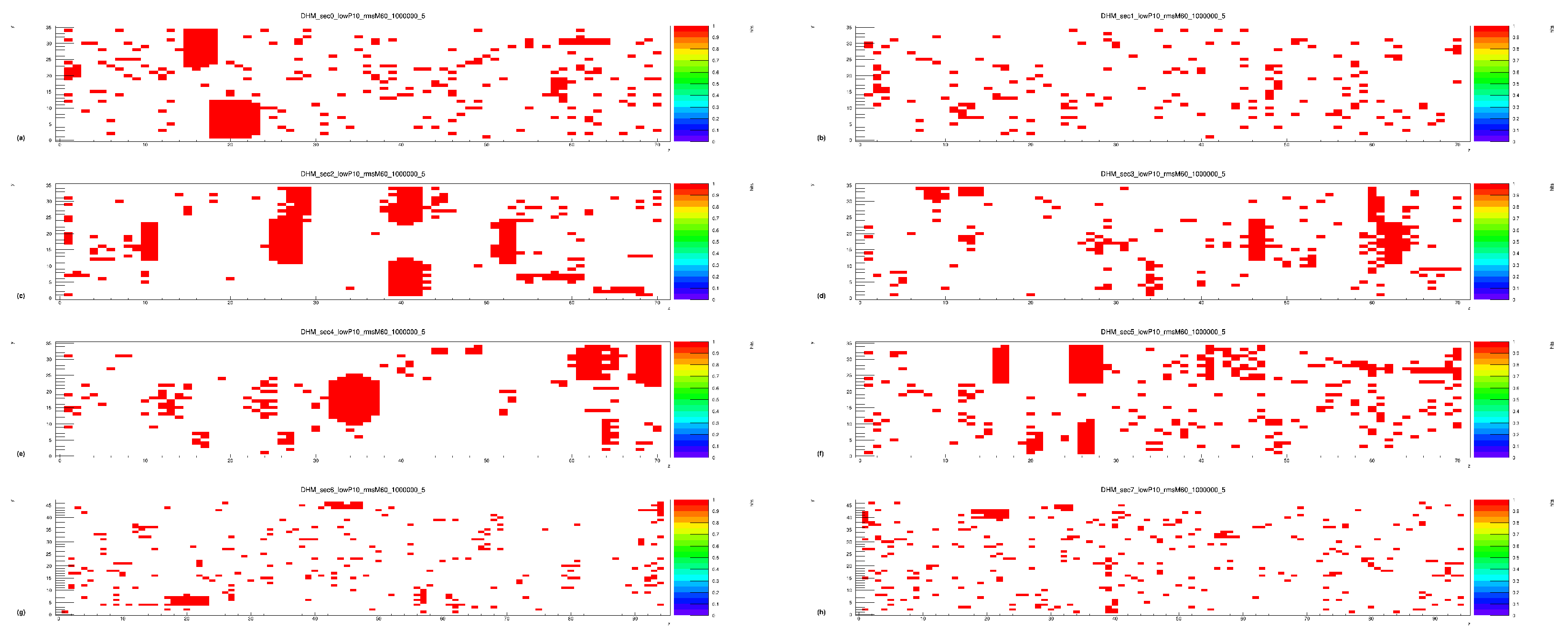
- Purple: The tower was flagged in fewer than 50 runs (considered transient).
- Red: The tower malfunctioned consistently across multiple runs (likely a true hardware failure).
- White: The tower functioned correctly in all runs.
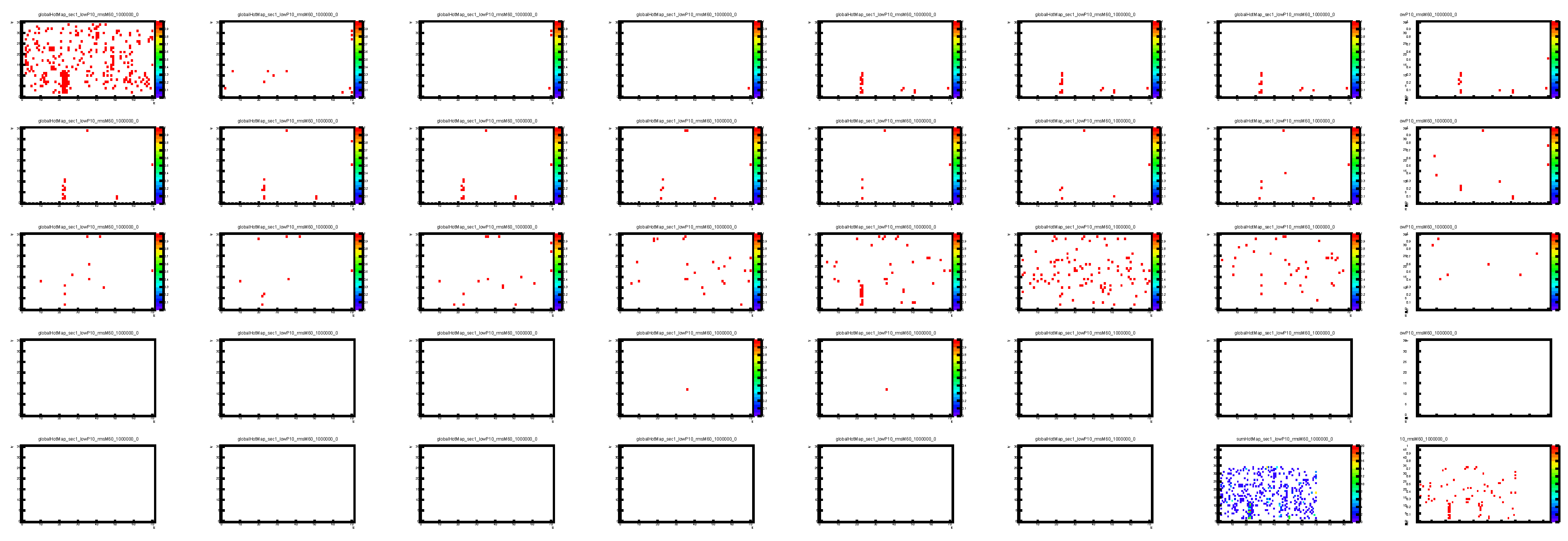
- Dead Tower MapsFigure 13. Global dead map for sector 0, showing raw (a), selected (b), and global (c) dead map (after applying QC cuts and grass-level cuts 5%) at 0.2–0.3 GeV (minimum event count: 1,000,000).Figure 13. Global dead map for sector 0, showing raw (a), selected (b), and global (c) dead map (after applying QC cuts and grass-level cuts 5%) at 0.2–0.3 GeV (minimum event count: 1,000,000).
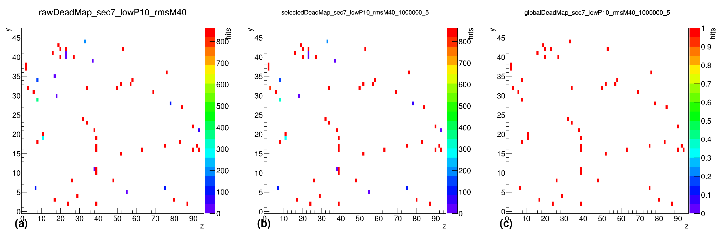
![Electronics 14 02088 g013]() Figure 14. Global dead map for sector 7, showing raw (a), selected (b), and global (c) dead map (after applying QC cuts and grass-level cuts 5%) at 0.2–0.3 GeV (minimum event count: 1,000,000).Figure 14. Global dead map for sector 7, showing raw (a), selected (b), and global (c) dead map (after applying QC cuts and grass-level cuts 5%) at 0.2–0.3 GeV (minimum event count: 1,000,000).
Figure 14. Global dead map for sector 7, showing raw (a), selected (b), and global (c) dead map (after applying QC cuts and grass-level cuts 5%) at 0.2–0.3 GeV (minimum event count: 1,000,000).Figure 14. Global dead map for sector 7, showing raw (a), selected (b), and global (c) dead map (after applying QC cuts and grass-level cuts 5%) at 0.2–0.3 GeV (minimum event count: 1,000,000).![Electronics 14 02088 g014]()

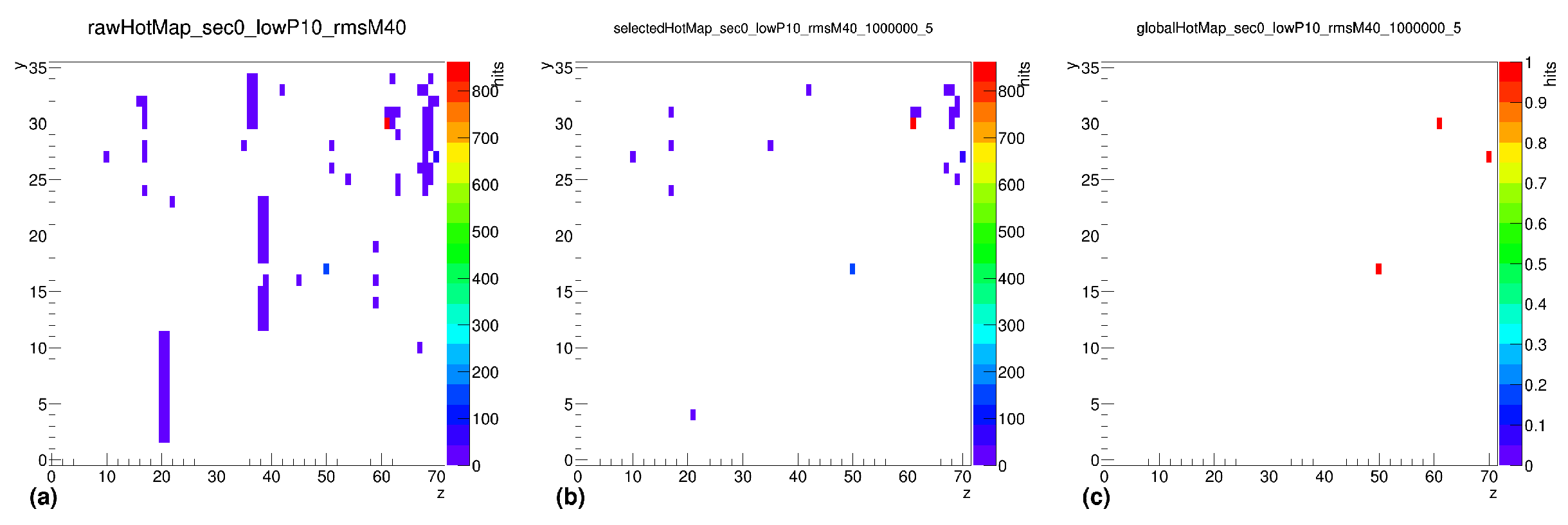
- Hot Tower MapsFigure 15. Global hot map for sector 0, showing raw (a), selected (b), and global (c) hot map (after applying QC cuts and grass-level cuts 5%) at 0.2–0.3 GeV (minimum event count: 1,000,000).Figure 15. Global hot map for sector 0, showing raw (a), selected (b), and global (c) hot map (after applying QC cuts and grass-level cuts 5%) at 0.2–0.3 GeV (minimum event count: 1,000,000).
![Electronics 14 02088 g015]() Figure 16. Global hot map for sector 7, showing raw (a), selected (b), and global (c) hot map (after applying QC cuts and grass-level cuts 5%) at 0.2–0.3 GeV (minimum event count: 1,000,000).Figure 16. Global hot map for sector 7, showing raw (a), selected (b), and global (c) hot map (after applying QC cuts and grass-level cuts 5%) at 0.2–0.3 GeV (minimum event count: 1,000,000).
Figure 16. Global hot map for sector 7, showing raw (a), selected (b), and global (c) hot map (after applying QC cuts and grass-level cuts 5%) at 0.2–0.3 GeV (minimum event count: 1,000,000).Figure 16. Global hot map for sector 7, showing raw (a), selected (b), and global (c) hot map (after applying QC cuts and grass-level cuts 5%) at 0.2–0.3 GeV (minimum event count: 1,000,000).![Electronics 14 02088 g016]()

- Step 5: Union of Energy Bins for DHM
- Methodology for Energy Bin Merging
- 1.
- Generating DHMs for Each Energy Bin: Individual hot maps are constructed separately for each of the 39 energy bins.
- 2.
- Identifying Persistent Malfunctions: Towers flagged as hot, dead, or extra-hot in multiple energy bins are identified.
- 3.
- Applying Filters: A tower must exceed a certain threshold of occurrences to be classified as consistently malfunctioning.
- 4.
- Final DHM Generation: The DHMs from all bins are combined, incorporating additional filtering conditions to remove transient fluctuations.
- Parameters Used for DHM Filtering
- Dead Tower Limit (lD): 0, 5, 10—A tower must be flagged as dead in at least this many bins to be considered globally dead.
- Hot Tower Limit (lH): 0, 1, 2, 5—Defines the number of energy bins in which a tower must be hot to be classified as globally hot.
- Extra-Hot Tower Limit (lEH): 0—Towers that exceed this threshold are permanently excluded.
- Grass-Level Percentage (GL): 0–9%—Filters out towers that are flagged in only a small percentage of runs.
- Minimum Event Requirement (ME): 1,000,000— Ensures only high-statistics runs contribute to the final DHM.
3.7. Data-Driven Dead Hot Map
- Identifies hidden correlations between energy levels and noisy towers.
- Adjusts dynamically to changing detector conditions across different runs.
- Improves the sensitivity of hot tower detection compared to fixed-energy binning.
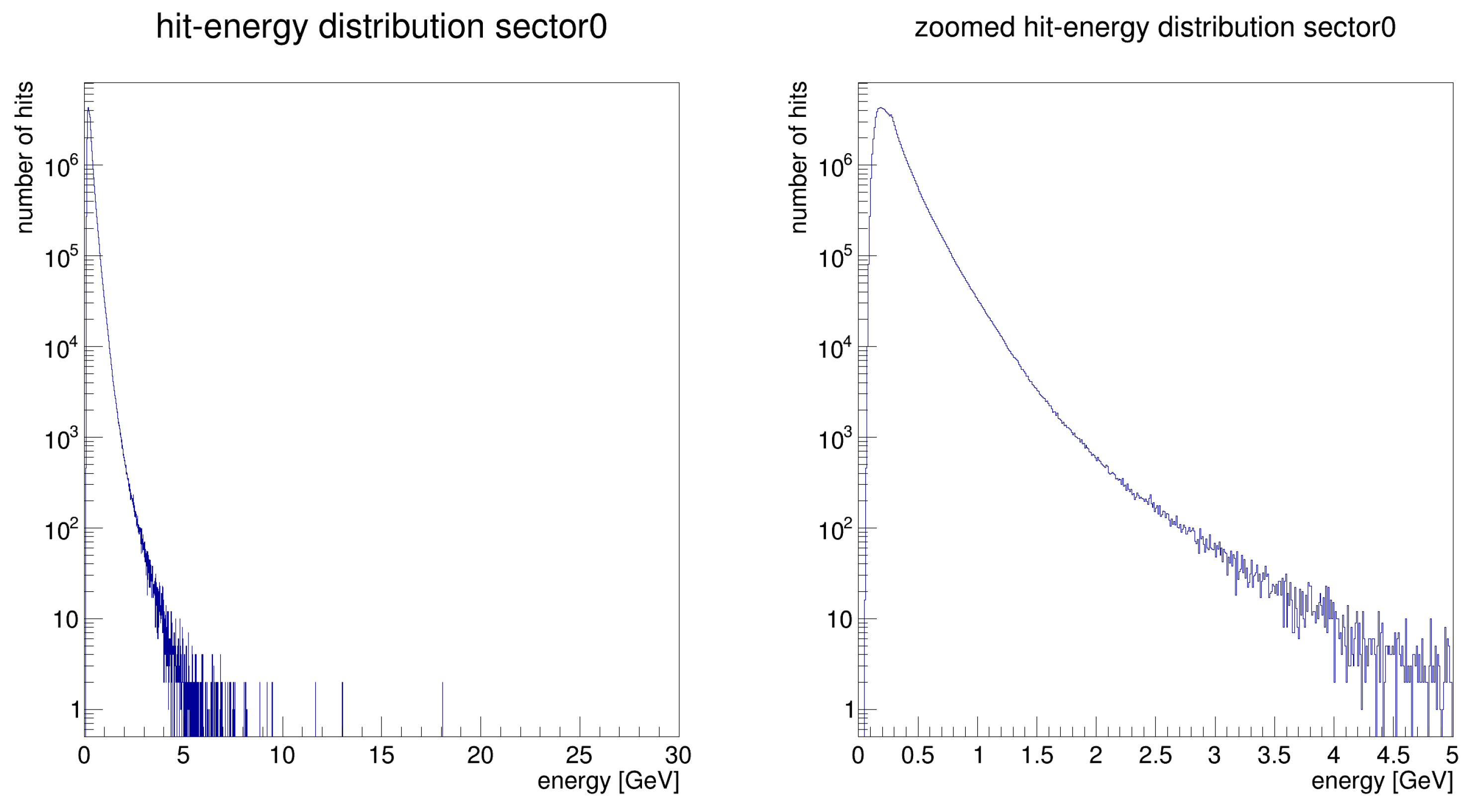
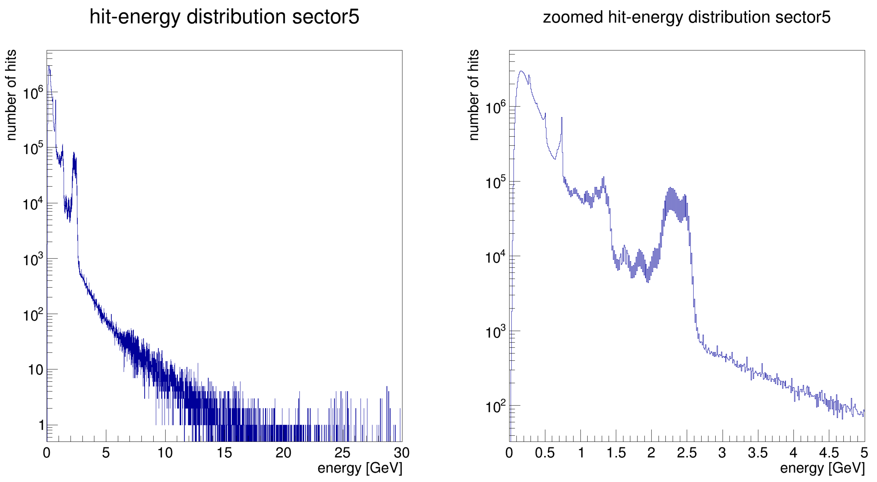
3.7.1. Sorting Hits by Energy
3.7.2. Adaptive Energy Binning and Anomaly Detection
- Energy intervals were determined dynamically so that each bin contained a fixed number of hits (typically 100,000).
- Low-energy bins were kept narrow (minimum width = 0.01 GeV), while higher-energy bins were widened to maintain balance.
- Hot towers—Towers with hit counts exceeding 5 deviations from the mean.
- Dead towers—Towers with fewer than 10% of the mean number of hits in a given energy range.
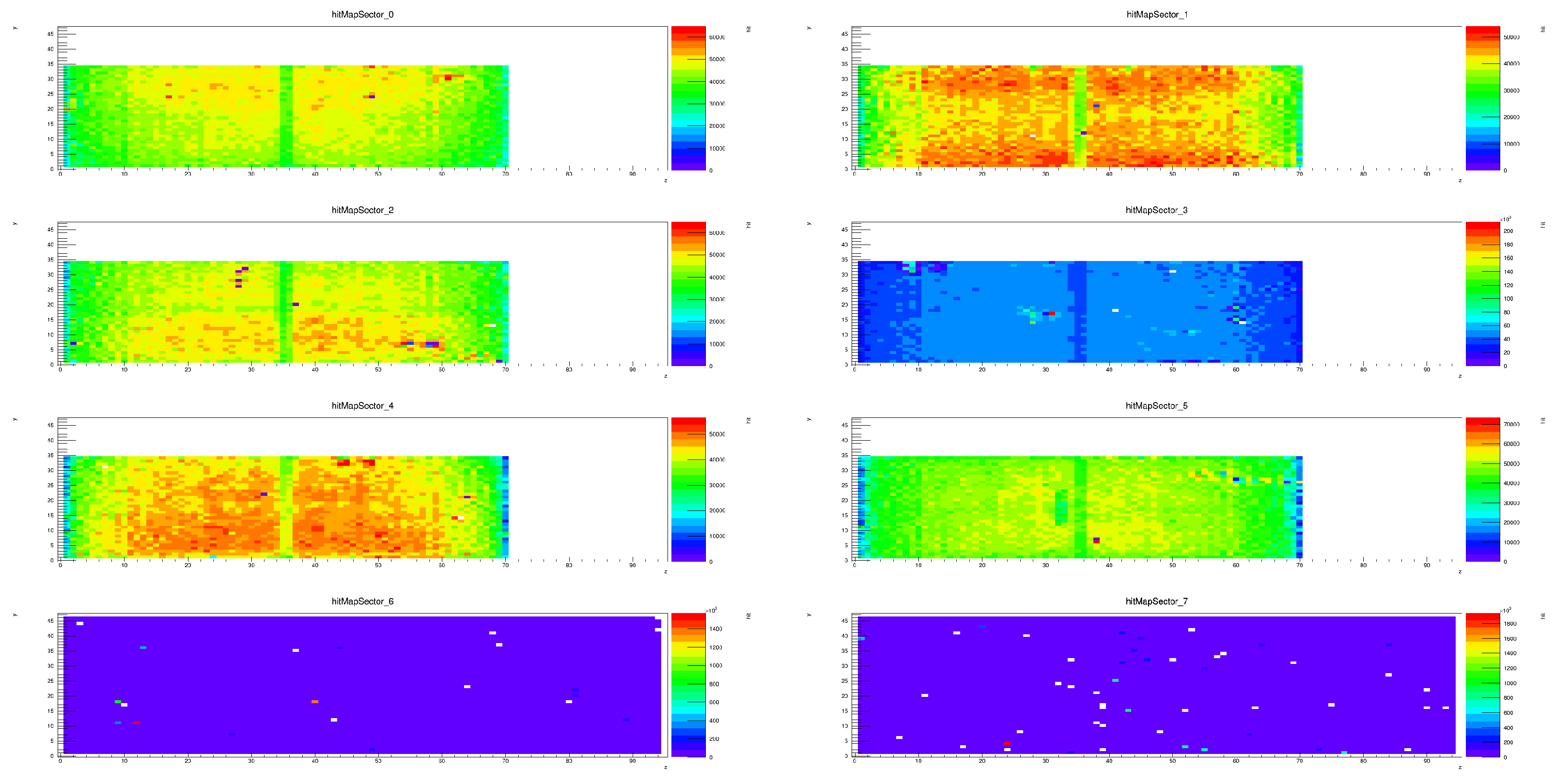
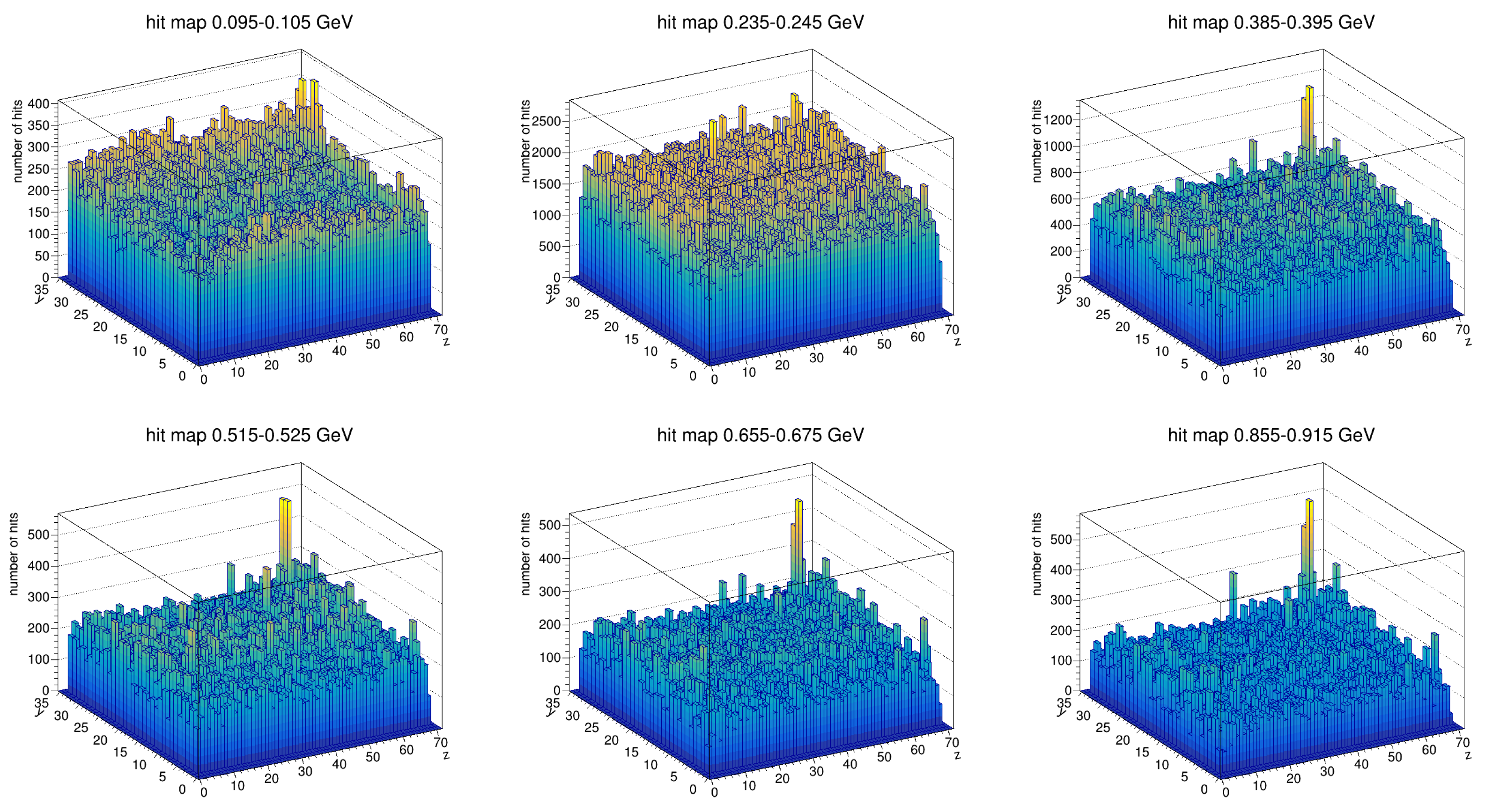
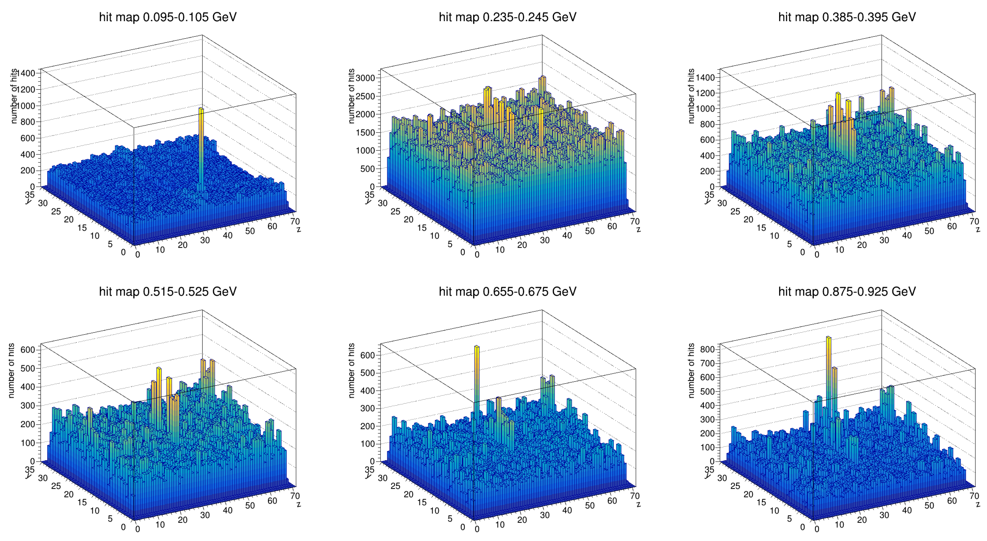
- Hit Map Visualization of Noise Patterns
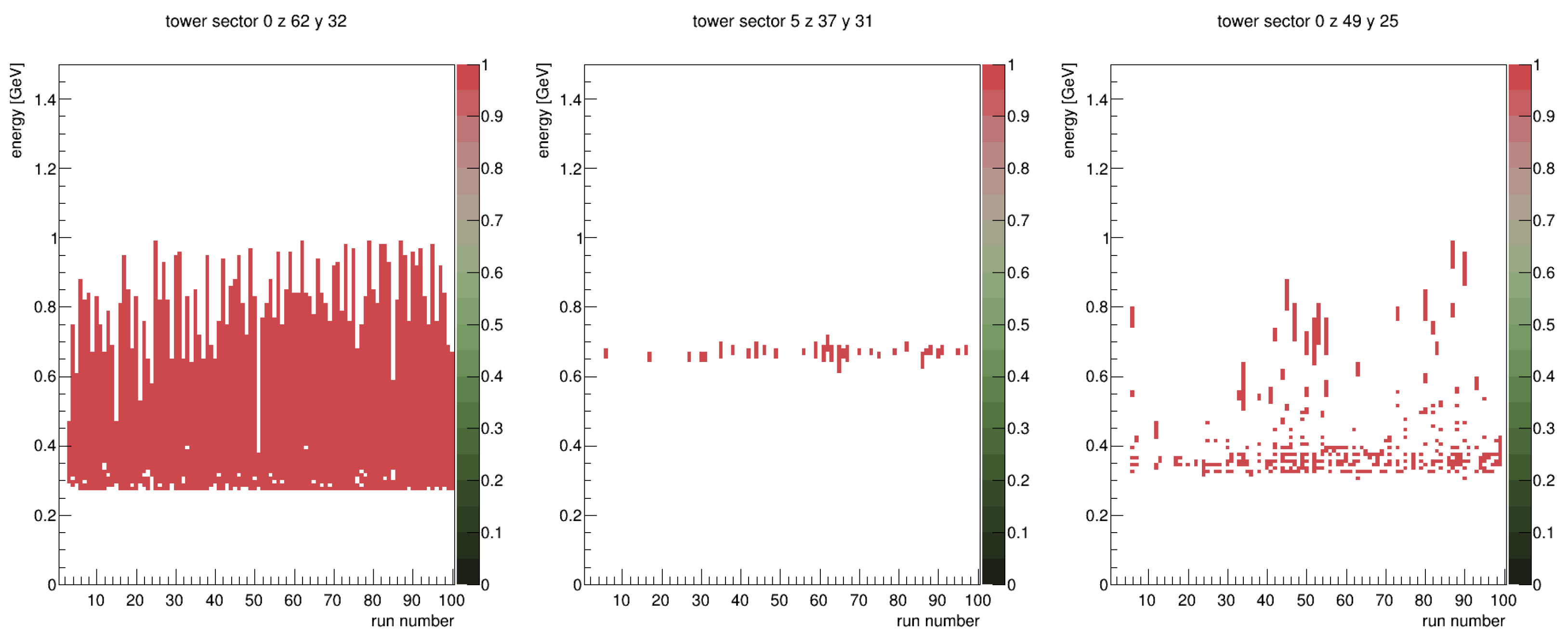
- Sector-Based Noise Patterns
- Run-to-Run Variability of Hot Towers
- Persistent hot towers (e.g., Sector 0, z = 62, y = 32—left panel)—Always hot above a specific energy threshold (0.3 GeV).
- Energy-specific hot towers (e.g., Sector 5, z = 37, y = 31—middle panel)—Hot in a narrow energy range across multiple but not all runs.
- Intermittent hot towers (e.g., Sector 0, z = 49, y = 24—right panel)—Hot in different energy ranges but not in all runs.
- Advantages of the DDDHM
- Higher Sensitivity: Captures hot towers that only appear in specific (very narrow) energy intervals.
- Better Noise Characterization: Accounts for run-to-run variations in detector behavior.
- Improved Data Quality: Provides a more refined noise filtering method for precise physics measurements.
3.8. Timing Calibration
3.8.1. Time Measurement and Slewing Correction
- : Least Count (unit: nanoseconds (ns)). This is the conversion factor from TDC counts to time, specifying how much time corresponds to each TDC count. It is determined experimentally through calibration and defines the precision of the timing measurement.
- : Common Stop Mode Correction (unit: dimensionless). In “common stop” mode, the TDC values are inversely related to the particle hit arrival time. The term reverses this relationship, ensuring that earlier hits correspond to higher TDC values, as the TDC count decreases with increasing time.
- : Zero Time Offset of the BBC (unit: nanoseconds (ns)). This is the time offset introduced by the Beam–Beam Counter (BBC) system. It accounts for any delays due to the BBC internal electronics and must be subtracted to align the measured time with the actual collision event.
- : Sector-Specific Timing Correction (unit:nanoseconds (ns)). This parameter corrects for timing discrepancies across different sectors of the detector. Each sector may experience slight variations in timing due to differences in geometry, signal propagation, or electronics, and this correction ensures consistency across the entire detector.
- : Time of Flight from the Collision Point to the EMCal (unit: nanoseconds (ns)). This term adjusts for the travel time of light or other particles from the collision point to the EMCal detector. It is calculated using the known distance from the vertex to the central tower of the cluster:where c is the speed of light ( m/s). This term ensures the timing measurement accounts for the physical travel time of the signal.
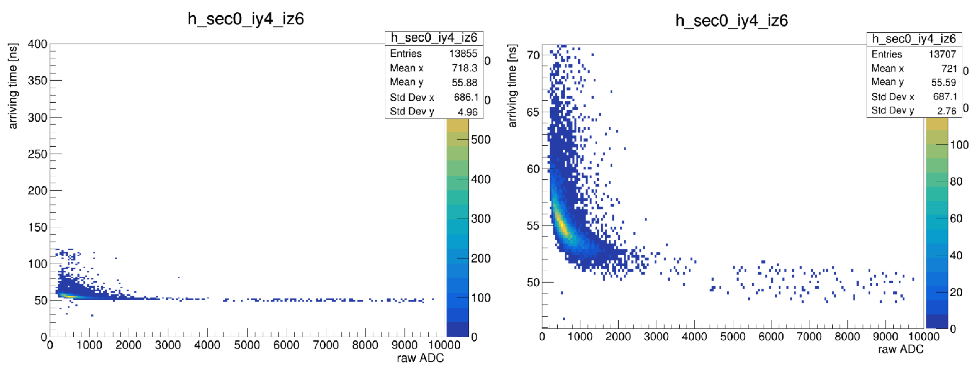
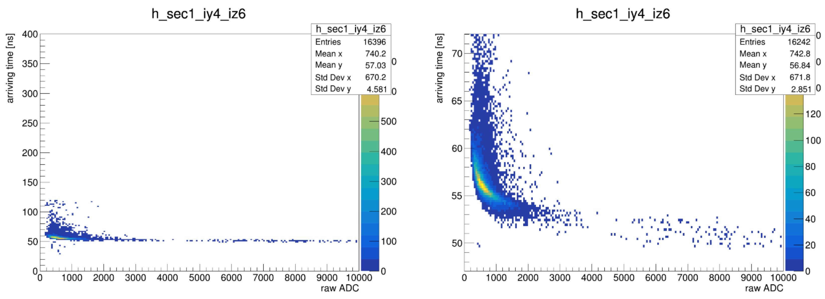
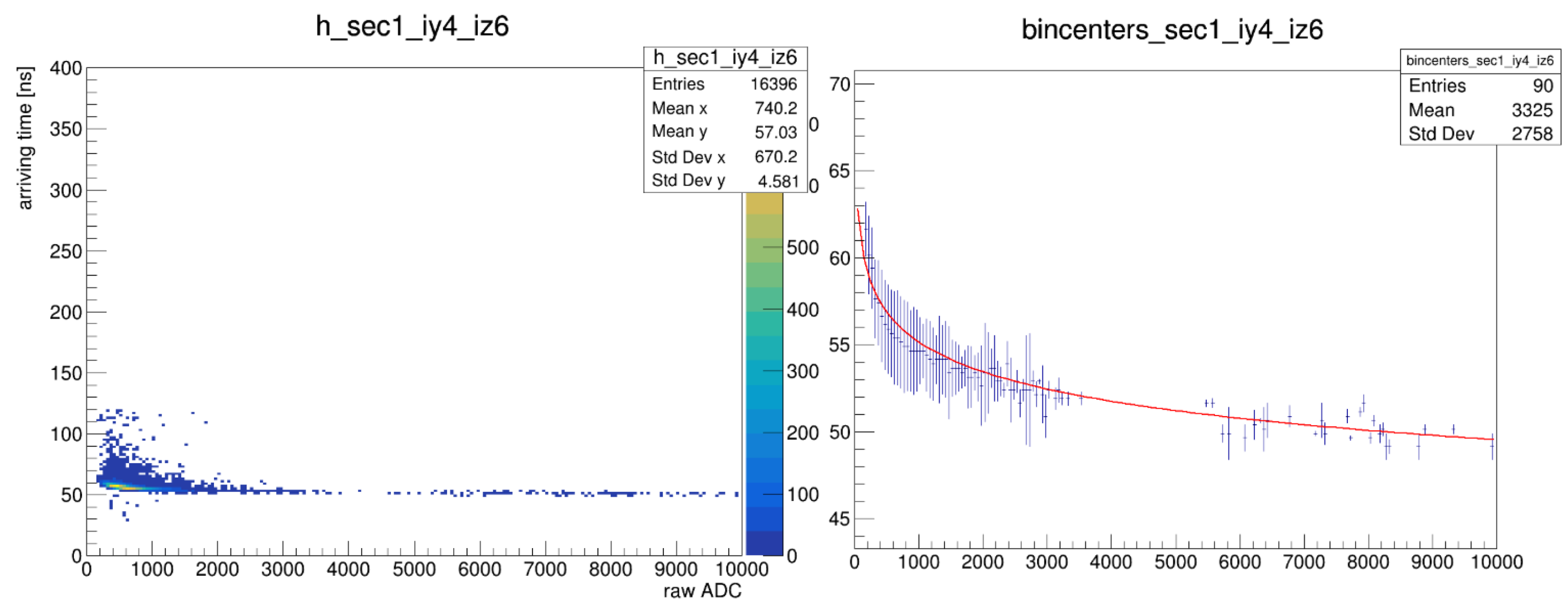
- Slewing Effect and Its Correction
- are fit parameters determined for each tower.
- x represents the ADC signal strength.
- y is the slewing correction applied to the arrival time.
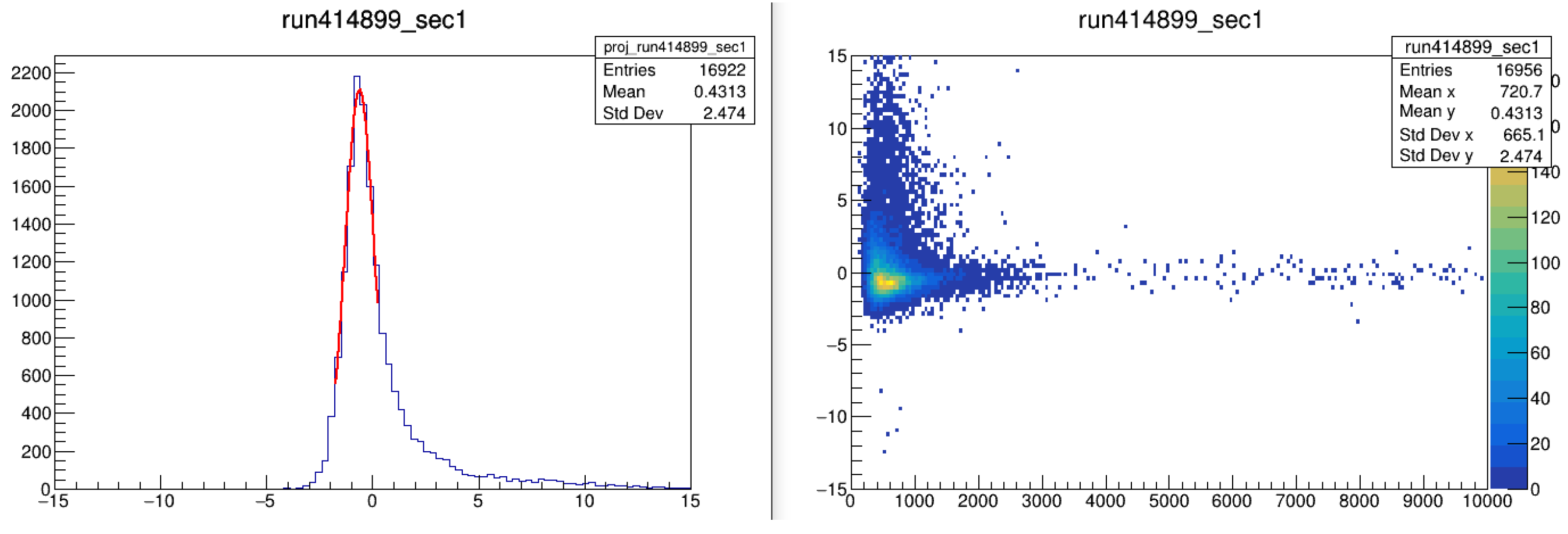
3.8.2. Issues with the Three-Parameter Fit
- For low-energy particles (0–0.5 GeV, Figure 23), timing distributions are centered at 0 ns, indicating proper correction.
- For high-energy particles (2–3 GeV, Figure 24), the three-parameter fit systematically shifts arrival times negatively, causing a −1 ns offset from the expected photon arrival time.
3.8.3. New Timing Calibration Approach
- Step 1: Arrival Time Estimation and Initial Binning
- Step 2: Slewing Correction Using the Three-Parameter Fit
- Step 3: Sector-Specific and Run-by-Run Offset Corrections
- Step 4: Five-Parameter Fit for Final Correction
4. Results
4.1. Final DHM
- Dead limit = 0, Hot limit = 0, Extra-Hot limit = 0.
- Minimum Events (ME) = 1,000,000
- Grass Level (GL) = 5%.
- Tower classification:
- -
- Dead towers: Low cluster per event (<10%).
- -
- Hot towers: Towers exceeding above mean activity.
- -
- Extra-hot towers: Towers exceeding above mean activity.
4.2. DDDHM Analysis
- Approximately 25,000 towers were analyzed.
- Three categories of tower failures (dead, hot, and extra-hot) were identified.
- A total of 75,000 2D plots were generated for enhanced classification.
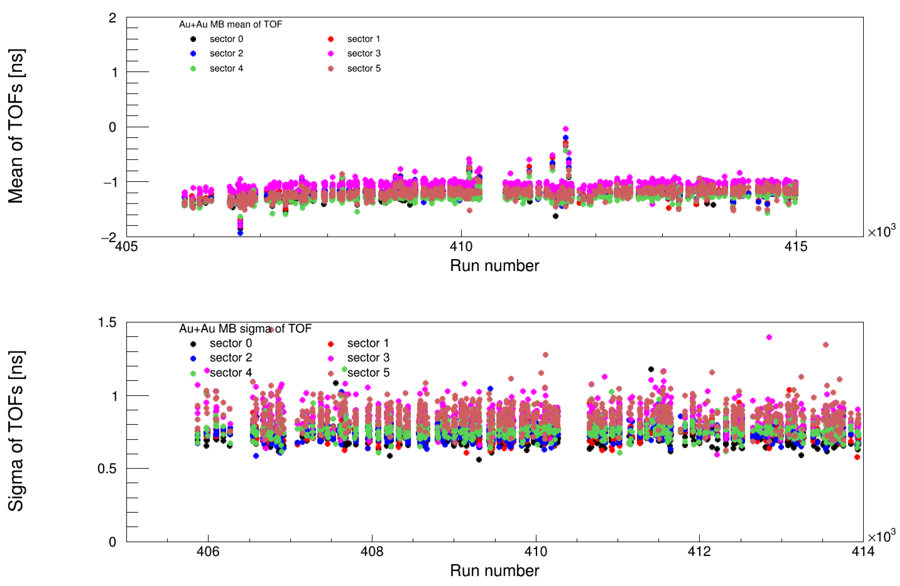
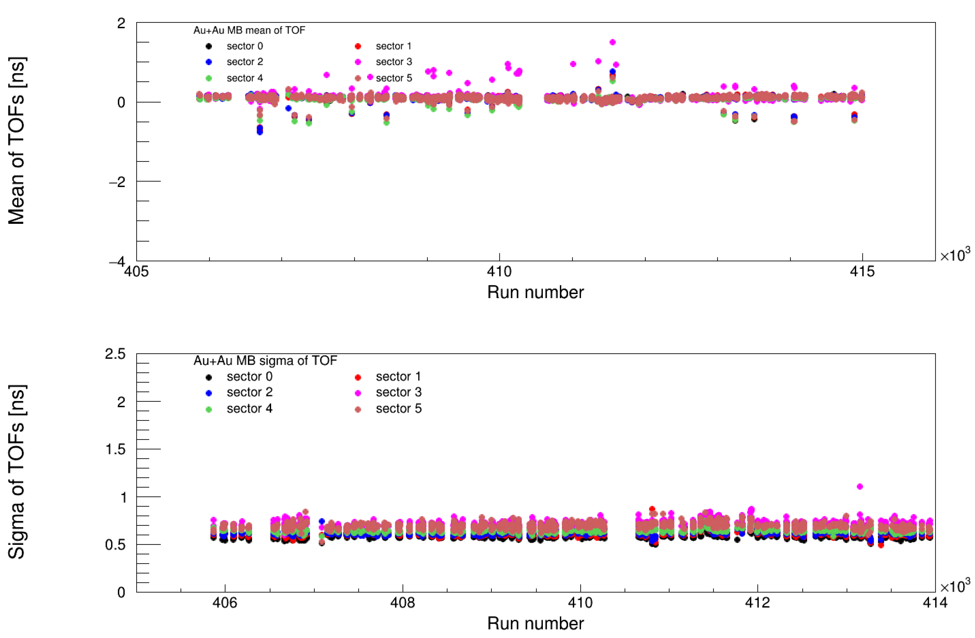
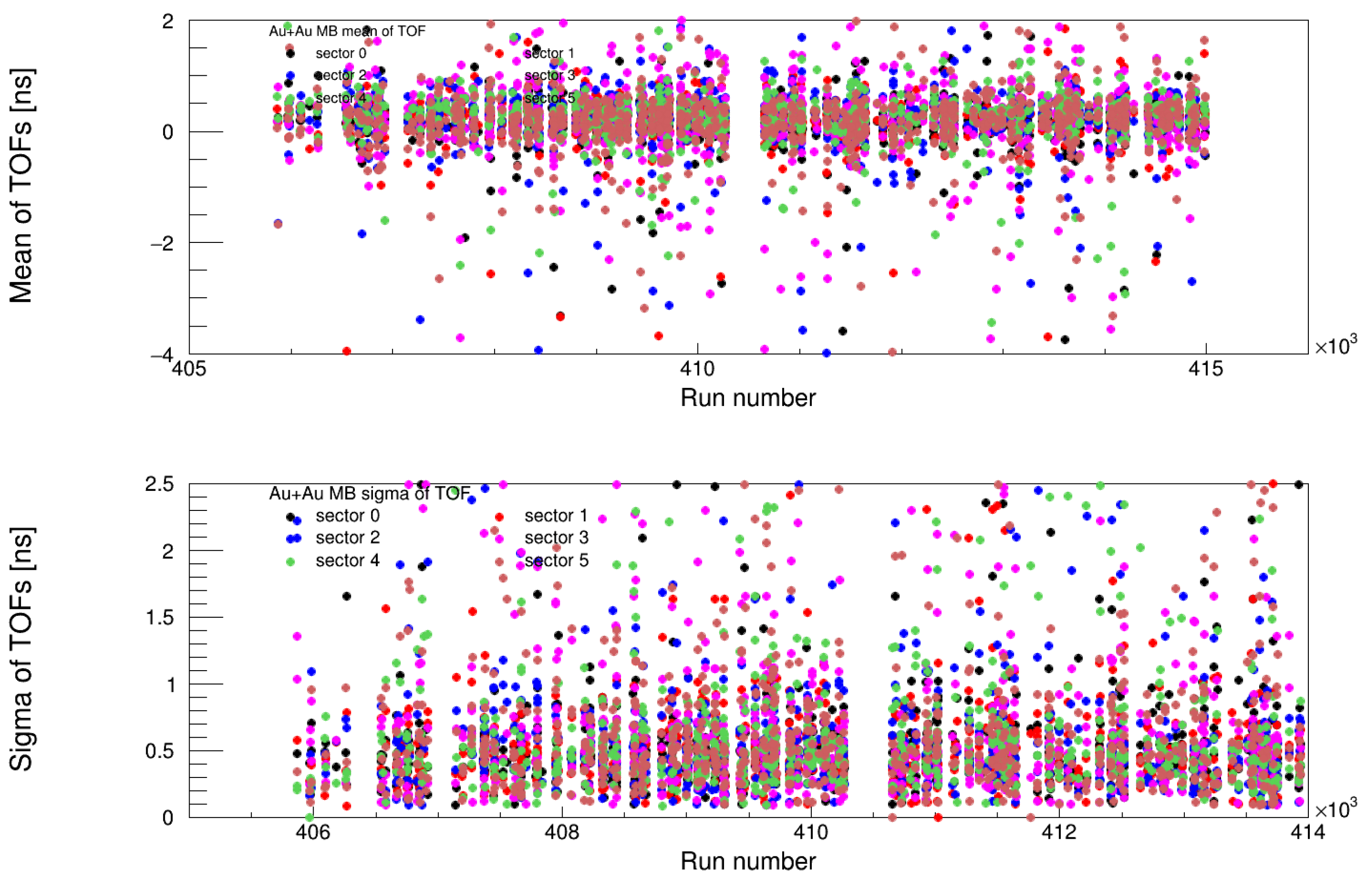
4.3. Timing Calibration Results
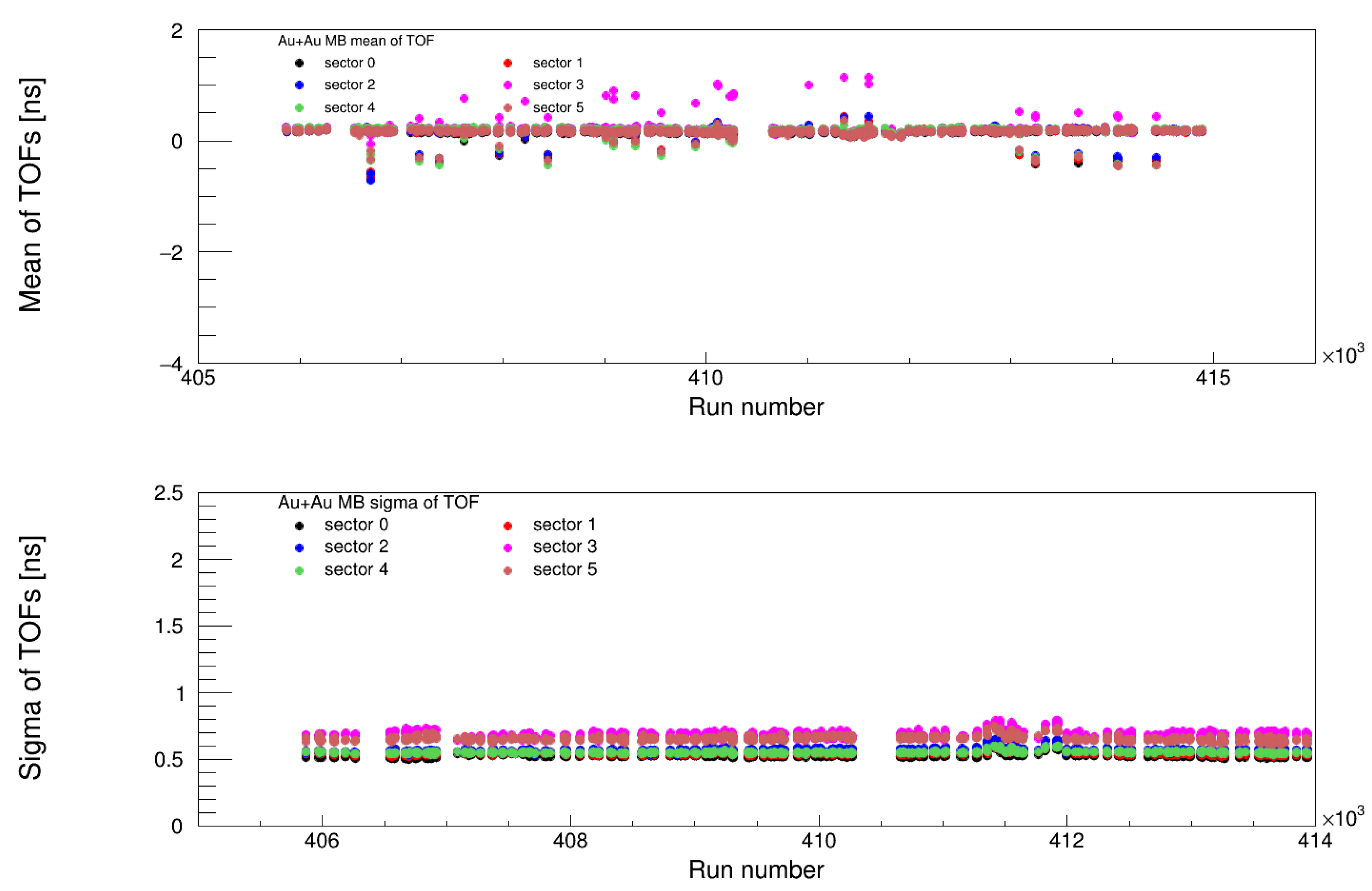
4.3.1. Validation of Timing Corrections
- MB (Minimum Bias) Trigger: Ensuring uniform time calibration for unbiased event selection.
- ERT (Event-Related Trigger): Verifying consistency in high-energy triggered events.
4.3.2. Impact of the Five-Parameter Fit
- Corrected slewing effects across all energy ranges.
- Maintained the mean timing at 0 ns, eliminating systematic offsets.
- Ensured stable timing resolution across different triggers and runs.
5. Discussion
6. Conclusions
Author Contributions
Funding
Data Availability Statement
Conflicts of Interest
Abbreviations
| BBC | Beam–Beam Counter |
| DHM | Dead Hot Map |
| DDDHM | Data-Driven Dead Hot Map |
| EMCal | Electromagnetic Calorimeter |
| ERT | Event-Related Trigger |
| FEE | Front-End Electronics |
| LC | Least Count |
| MB | Minimum Bias |
| PHENIX | Pioneering High-Energy Nuclear Interaction eXperiment |
| PMT | Photomultiplier Tube |
| QCD | Quantum Chromodynamics |
| QGP | Quark–Gluon Plasma |
| RHIC | Relativistic Heavy Ion Collider |
| TDC | Time-to-Digital Converter |
| ToF | Time of Flight |
| URHI | Ultra-Relativistic Heavy Ion |
| ADC | Analog-to-Digital Converter |
References
- Shuryak, E.V. Quantum Chromodynamics and the Theory of Superdense Matter. Phys. Rep. 1980, 61, 71–158. [Google Scholar] [CrossRef]
- Durante, M.; Indelicato, P.; Jonson, B.; Koch, V.; Langanke, K.; Meißner, U.; Nappi, E.; Nilsson, T.; Stöhlker, T.; Widmann, E.; et al. All the fun of the FAIR: Fundamental physics at the Facility for Antiproton and Ion Research Phys. Scr. 2018, 94, 033001. [Google Scholar] [CrossRef]
- Gyulassy, M.; McLerran, L. New Forms QCD Matter Discov. RHIC. Nucl. Phys. A 2005, 750, 30–63. [Google Scholar] [CrossRef]
- Shiltsev, V.; Zimmermann, F. Modern and future colliders. Rev. Mod. Phys. 2021, 93, 015006. [Google Scholar] [CrossRef]
- CMS Collaboration. Autoencoder-based Anomaly Detection System for Online Data Quality Monitoring of the CMS Electromagnetic Calorimeter. CMS Note 2023. [Google Scholar] [CrossRef]
- ALICE Collaboration. Performance of the ALICE Electromagnetic Calorimeter. CERN Rep. 2022. [Google Scholar] [CrossRef]
- Aphecetche, L.; Awes, T.C.; Banning, J.; Bathe, S.; Bazilevsky, A.; Belikov, S.; Belyaev, S.T.; Blume, C.; Bobrek, M.; Bucher, D.; et al. PHENIX calorimeter. Nucl. Instrum. Methods A 2003, 499, 521–536. [Google Scholar] [CrossRef]
- Available online: https://phenix-intra.sdcc.bnl.gov/phenix/WWW/publish/nourja/Run14_AuAu_Dead_Hot_Map.pdf (accessed on 29 April 2025).
- Adcox, K.; Adler, S.S.; Aizama, M.; Ajitan, N.N.; Akiba, Y.; Akikawa, H.; Alexer, J.; Al-Jamel, A.; Allen, M.; Alley, G.; et al. PHENIX detector overview. Nucl. Instrum. Methods A 2003, 499, 469–479. [Google Scholar] [CrossRef]
- Available online: https://phenix-intra.sdcc.bnl.gov/phenix/WWW/publish/amohamed/timingRun16AuAu.pdf (accessed on 29 April 2025).
- Available online: https://phenix-intra.sdcc.bnl.gov/phenix/WWW/p/draft/david/nour/ANALYSIS_NOTE-Run14_pi0.pdf (accessed on 29 April 2025).
- ROOT A Data Analysis Framework. Available online: https://root.cern.ch/ (accessed on 16 January 2025).


| Experiment | Method Used | Key Features | Strengths |
|---|---|---|---|
| PHENIX | DHM parallel with Data-Driven Dead Hot Map | Statistical hit distribution, bad tower exclusion, timing calibration | Precise data filtering, minimal data loss |
| CMS | Autoencoder-based ML | Real-time anomaly detection, spatial and temporal analysis | High efficiency, detects subtle anomalies |
| ALICE | Data quality monitoring | Energy calibration, bad channel masking, cross-talk emulation | Extensive calibration, robust quality assurance |
| Model | AIC | BIC |
|---|---|---|
| Tri-Distribution (Gaussian + Poisson + Binomial) | 1234.56 | 1256.78 |
| Beta-Binomial | 1345.67 | 1372.34 |
Disclaimer/Publisher’s Note: The statements, opinions and data contained in all publications are solely those of the individual author(s) and contributor(s) and not of MDPI and/or the editor(s). MDPI and/or the editor(s) disclaim responsibility for any injury to people or property resulting from any ideas, methods, instructions or products referred to in the content. |
© 2025 by the authors. Licensee MDPI, Basel, Switzerland. This article is an open access article distributed under the terms and conditions of the Creative Commons Attribution (CC BY) license (https://creativecommons.org/licenses/by/4.0/).
Share and Cite
Jalal, A.N.; Oniga, S.; Ujvari, B. Advanced Big Data Solutions for Detector Calibrations for High-Energy Physics. Electronics 2025, 14, 2088. https://doi.org/10.3390/electronics14102088
Jalal AN, Oniga S, Ujvari B. Advanced Big Data Solutions for Detector Calibrations for High-Energy Physics. Electronics. 2025; 14(10):2088. https://doi.org/10.3390/electronics14102088
Chicago/Turabian StyleJalal, Abdulameer Nour, Stefan Oniga, and Balazs Ujvari. 2025. "Advanced Big Data Solutions for Detector Calibrations for High-Energy Physics" Electronics 14, no. 10: 2088. https://doi.org/10.3390/electronics14102088
APA StyleJalal, A. N., Oniga, S., & Ujvari, B. (2025). Advanced Big Data Solutions for Detector Calibrations for High-Energy Physics. Electronics, 14(10), 2088. https://doi.org/10.3390/electronics14102088