Challenges of Developing a Mobile Game for Children with Down Syndrome to Test Gestural Interface


Abstract
1. Introduction
- How can we develop usability and engagement evaluations with a user that can have difficulties in the cognitive area, such as speaking, reading or writing?
- Is there, in the literature, a usability manual that can guarantee their safety during the evaluations?
- How can we engage this audience with mobile games? Is the narrative important? What kind of game can attract them?
2. Materials and Methods
2.1. Game Development: Guidelines
- Use in-game tutorials because they are better than text, videos or image lessons. Through practice, it is possible to learn faster and not forget easily;
- Give the player a possibility to play without rules or negative consequences. Some of them just want to explore, create or interact with others;
- Allow them to change the difficulty level;
- Give the player a chance to practice, build training levels;
- Make an intuitive menu. Show only the options needed each specific time and avoid deeper menus with multiple options and clicks;
- Allow the player to mark enemies. Some people can find it difficult to identify the enemy by his color or any other feature;
- Allow the player to control the game speed settings. For people with motor or cognition issues, slowing down the speed can be very helpful, but it can also help people with no disabilities because some of them like to play the game and not beat it;
- Allow the player to skip one activity or session that he finds difficult. Alternatively, the game can auto-adjust its difficulty to the player’s level through artificial intelligence;
- Permit the player to change the game view perspective. Some people may feel dizzy or sick in first-person cameras, for example;
- Create a reward system balance to manage the player´s achievements and game difficulty. In short, if he chooses to downgrade the difficulty level, the rewards can also be reduced, because, as the authors mention, most disabled people just want to play without barriers and they do not seek big prizes;
- Create “hit areas” large enough to avoid unintentional or mistaken touches;
- Avoid multi-touch, but if you need to use it, bring the buttons closer, because some people find it hard to press two buttons at the same time;
- Allow the player to configure/change the game controls;
- Create interfaces with high contrast or allow the player to change it if needed.
2.2. Heuristic Evaluation
2.2.1. Selecting the Heuristics
- Must be consistent;
- Should prioritize the player’s abilities, not random factors;
- Avoid stagnation (the rules of the game should allow the player to grow);
- Must be natural, have the right weight and pace;
- Must be simple, avoiding trivialities. Clear and objective rules;
- The difficulty should be adjustable when appropriate;
- Enable the relaxation of the game’s rules, avoiding the application of negative reinforcements;
- The game must be fair.
- The game must give rewards;
- Prevent new skill combinations from disrupting the game balance;
- Ensure the attributes for which the player pays meet a pre-defined criterion;
- Rewards should increase player capabilities as well as customization possibilities.
- Allow players to create content;
- There must not be a single winning strategy;
- Include as many elements as the player can interact with;
- Design multiple paths to solve the game;
- Create the world as if your character was there or not. That is, the characters inserted in the game world must be there for a clear reason;
- If the game cannot have modes, this must be noticed by the user;
- Have an appropriate load of cognitive, perceptual, and memory effort;
- Discoveries during play to stimulate the player. Enable new discoveries to motivate the player;
- Player’s first experiences can be painful but should result in positive and immediate responses;
- Challenges should be perceived as capable of being overcome;
- Players should not be distracted by unimportant tasks over tasks they want or need to perform;
- Press the user, but do not frustrate him;
- Encourage competition, cooperation, display and coordination among players;
- Support communication between players;
- The player must feel the control and impact of his actions in the game world;
- Enable game speed setting;
- Allow game view change (e.g., first to third person).
- The narrative must contextualize the game system;
- Have a good story, the player being interested in it;
- Engage the character easily and quickly in the game plot;
- Unexpected end;
- Players must feel emotionally involved in the game and characters;
- Engaging and thought-provoking characters;
- Keep the player’s interest.
- The overall purpose of the game should be clear and presented as soon as possible;
- Gameplay must be balanced so that there is not only one way to win;
- The level’s challenge should increase as the player progresses during the game;
- Player fatigue is minimized by varying activity and pace during play;
- The player must not be able to make mistakes that will block the progress of the game and have no way of restoring normal game progress.
- Controls must be customizable;
- Controls must be intuitive and naturally mapped;
- Minimize controls;
- Follow the control setting patterns of other similar games to shorten the learning curve;
- Controls should be basic enough to learn quickly and yet expandable to advanced options;
- Players must be able to save the game in different statuses;
- Players must feel in control of their characters and units, their movements and interactions in the game world;
- Facilitate the overcoming of obstacles considered difficult.
- The interface should be as non-intrusive as possible;
- Consider hiding the native device interface;
- The player must always be able to identify his status, score, and goal during the game;
- The interface should be consistent in controls, colors, typography and dialog messages;
- Minimize menu depth in the interface;
- The menu should follow the theme and identity of the game;
- Provide means for error prevention and correction through warning messages;
- Art and graphics should express their function well;
- Use stimulating sensory effects.
- Context-sensitive help should be provided during the game to avoid the player from being stopped or even requires him to see the manual;
- The game should give players tips, but not many;
- Provide an engaging tutorial that mimics original gameplay;
- Teach on-demand skills to use when needed;
- Do not wait for the user to read the manual;
- Provide help whenever the player feels the need;
- Provide instructions through audio, image, and text.
- Large enough areas of touch sensitivity, but not large enough to prevent hand rest;
- If there is a multi-touch, it should require the shortest possible movement for a short time;
- Allow the choice for an interface with high contrast;
- Provide visually impaired options;
- Allow volume setting and image and text size configuration.
2.2.2. Applying the Heuristic Evaluation
2.3. Cognitive Walkthrough Evaluation
3. Results
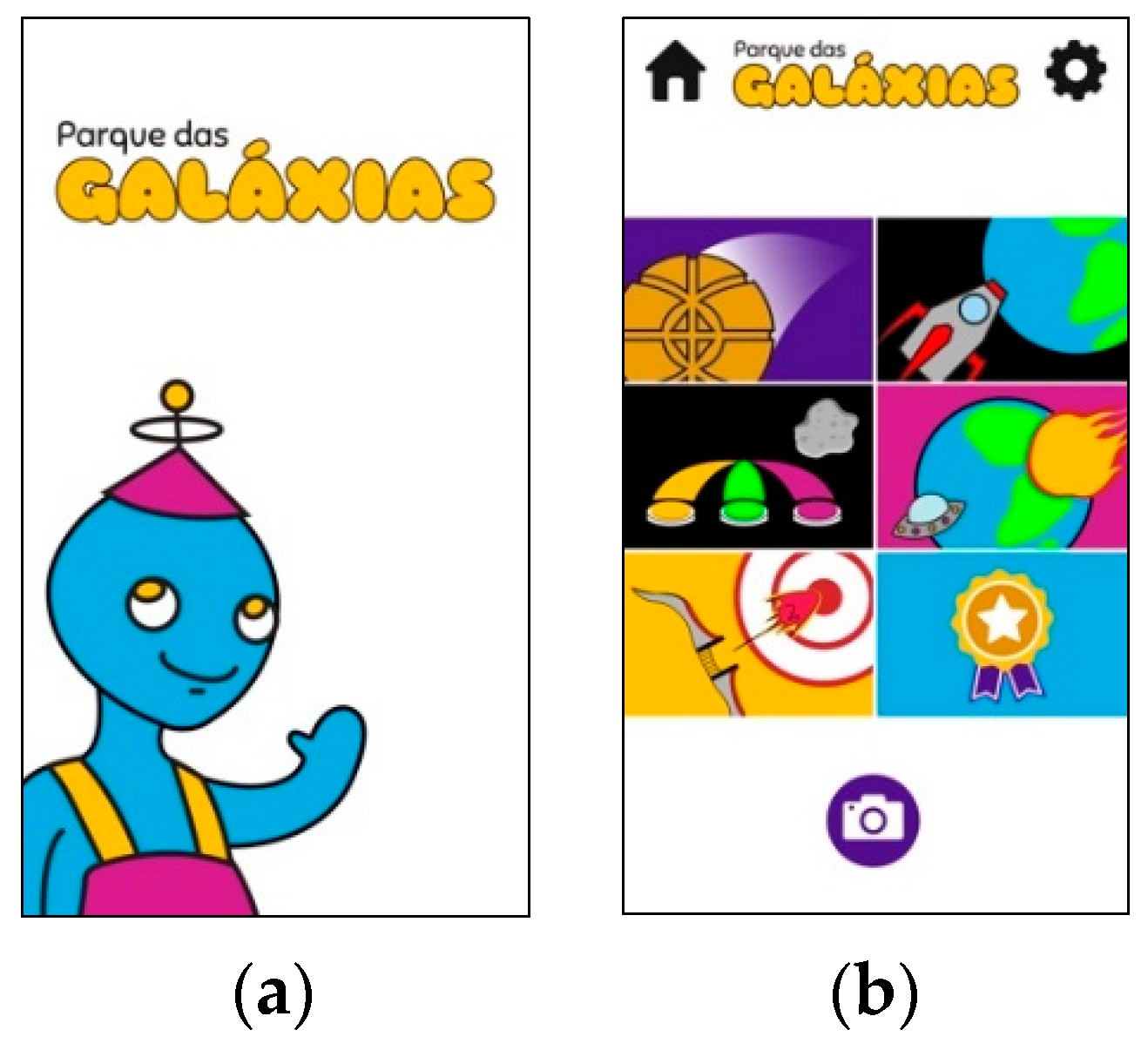
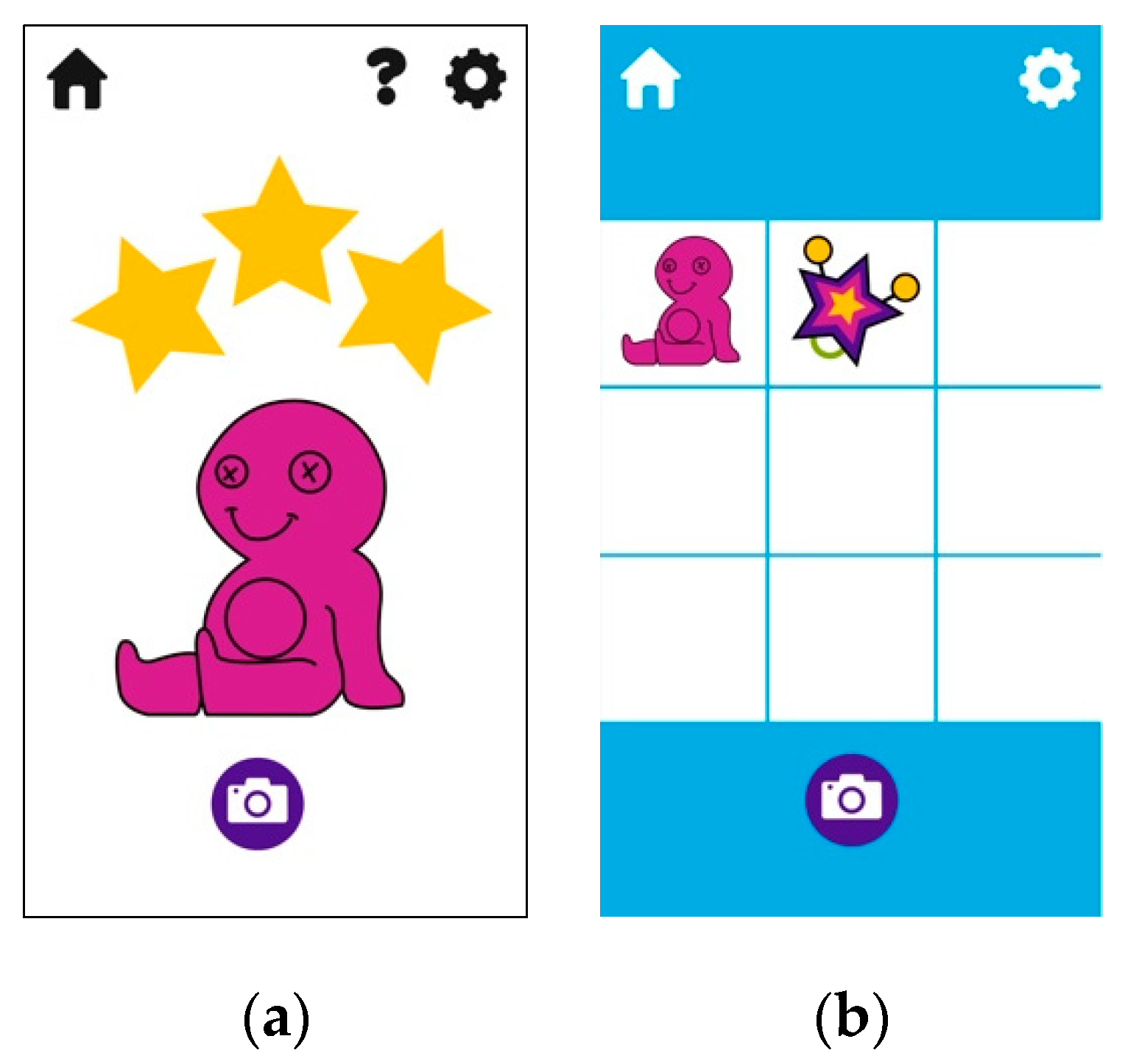
3.1. Game Prototype
3.2. Heuristic Evaluation
3.2.1. Rules
3.2.2. Rewards
3.2.3. Choices
3.2.4. Narrative
3.2.5. Goals
3.2.6. Controls
3.2.7. Feedback
3.2.8. Help
3.2.9. Accessibility
3.3. Cognitive Walkthrough Evaluation
- Will the correct action be sufficiently clear to the user?
- Will the user notice that the correct action is available?
4. Discussion
4.1. Game Development
4.2. Heuristic Evaluation
4.2.1. Rules
4.2.2. Rewards
4.2.3. Choices
4.2.4. Narrative
4.2.5. Goals
4.2.6. Control
4.2.7. Feedback
4.2.8. Help
4.2.9. Accessibility
4.2.10. Recommendations for the Game from the Heuristic Evaluation
- Insert small images or animations at the beginning explaining the objective and narrative of the game. Improve the story and make it clearer;
- Add a score feedback system, make it clear to the player how he gets points or loses;
- Review the reward system. Suggestion from the research team: the gifts should turn into tickets, which can be exchanged at the store in the park;
- Create a meaningful ending, as the player can play without using the rewards;
- Choose a more interesting color palette for the audience in question;
- Use interactive tutorials;
- Improve the main character’s appeal. Generate involvement with the player;
- Insert a time count.
- Hide the home button;
- Remove the camera button from the highlights and place it inside the gift gallery.
- Inform how many balls the player needs to hit to pass the level and show that the shots are unlimited;
- Suggestion: change it to the click-to-drag command, as is done in the Pokemón Go game.
- Improve the lifting of the hammer. The evaluators suggested adding a button;
- Also add feedback on the hammer’s strength, such as a pressure bar.
- Suggestion: change the gesture command from pressing to drag;
- Improve the ship’s feedback by adding a little fire under it when moving.
- One of the evaluators questioned the fact of destroying ships and suggested that they should be replaced by meteors and that the plot should change to save the planet from destruction.
- Change the level goal, because it was difficult to relate the bow with the pinch gesture.
- Insert the close or back button to exit the photo screen;
- The gift screen is not clear, it needs to specify what it is and how it works and allow the selection of one or more items;
- The player should be encouraged to take pictures.
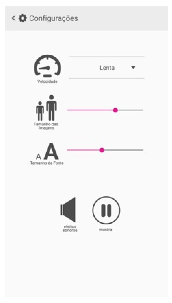
- Readability is difficult and the users will not know how to use it. The suggestion of the research team: when the user logs for the first time, present to him the setup menu. In that case, the player can choose the size of the elements, game speed and volume of the effects and music;
- Think about how the game can be accessible to the visually impaired;
- Choose a new color palette and add a high contrast button.
4.2.11. Considerations about Heuristic Evaluation Method
- It was observed that the player could play without using the rewards, in this way, it did not encourage them;
- The heuristic “there must not be a single winning strategy” was evaluated as improper, because not every game should have more than one strategy;
- The main character had no appeal, he seemed to be in the game just because he is;
- The player should be encouraged to take pictures;
- The main goal should be improved because it was weak;
- Choose another color palette and add the high contrast option for people with moderate or low vision;
- It is hard to activate the slider button in the configuration menu.
4.3. Cognitive Walkthrough Evaluation
4.4. Considerations about the Two Evaluation Methods
5. Conclusions
Author Contributions
Funding
Conflicts of Interest
References
- Maccarini, J.L. Kinect dá a portador de Síndrome de Down a chance de jogar videogame pela primeira vez. 2010. Available online: https://tecnoblog.net/47757/xbox-kinect-sindrome-de-down/ (accessed on 5 March 2020).
- Nascimento, L.; Martins, L.; Munguba, M.C.; Viana, W. Interaction evaluation methods for game controllers of digital games developed for children with Down syndrome: A review of the literature. In Proceedings of the 8th International Conference on Applied Human Factors and Ergonomics, Los Angeles, CA, USA, 17–21 July 2017; Springer: Los Angeles, CA, USA, 2017. [Google Scholar]
- Braddock, D. Aging and developmental disabilities: Demographic and Policy Issues Affecting American Families. Ment. Retard 1999, 37, 155–161. [Google Scholar] [CrossRef]
- Shin, M.; Besser, L.M.; Kucik, J.E.; Lu, C.; Siffel, C.; Correa, A. Prevalence of Down Syndrome Among Children and Adolescents in 10 Regions of United States. Pediatrics 2009, 124, 1565–1571. [Google Scholar] [CrossRef] [PubMed]
- de Lorenzo, S.M.; Braccialli, L.M.P.; Araújo, R.D. Realidade Virtual como Intervenção na Síndrome de Down: Uma Perspectiva de Ação na Interface Saúde e Educação. Rev. Bras. Educ. Espec. 2015, 21, 259–274. [Google Scholar] [CrossRef]
- Wuang, Y.P.; Chiang, C.S.; Su, C.Y.; Wang, C.C. Effectiveness of virtual reality using Wii gaming technology in children with Down syndrome. Res. Dev. Disabil. 2011, 32, 312–321. [Google Scholar] [CrossRef]
- Lopez-Basterretxea, A.; Mendez-Zorrilla, A.; Garcia-Zapirain, B. A Telemonitoring Tool based on Serious Games Addressing Money Management Skills for People with Intellectual Disability. Int. J. Environ. Res. Public Health 2014, 11, 2361–2380. [Google Scholar] [CrossRef]
- Afonseca, C.; Badia, S.B. Supporting Collective Learning Experiences in Special Education: Development and Pilot Evaluation of an Interactive Learning Tool for Down Syndrome. In Proceedings of the IEEE International Conference on Serious Games and Applications for Health, Algarve, Portugal, 2–3 May 2013; pp. 1–7. [Google Scholar]
- Barlet, M.C.; Spohn, S.D. Includification: A Pratical Guide to Game Accessibility. The AbleGamers Foundation. 2012. Available online: http://www.includification.com/ (accessed on 23 October 2015).
- Brandão, A.; Trevisan, D.G.; Brandão, L.; Moreira, B.; Nascimento, G.; Vasconcelos, C.N.; Clua, E.; Mourão, P. Semiotic Inspection of a game for children with Down syndrome. In Proceedings of the 2010 Brazilian Symposium on Games and Digital Entertainment (SBGames), Florianópolis, Santa Catarina, 8–10 November 2010. [Google Scholar] [CrossRef]
- Macedo, I.; Trevisan, D.G. A Method to Evaluate Disabled User Interaction: A Case Study with Down Syndrome Children. In Proceedings of the International Conference on Universal Access in Human-Computer Interaction; Springer: Heidelberg, Germany, 2011. [Google Scholar] [CrossRef]
- Brown, D.J.; McHugh, D.; Standen, P.; Evett, L.; Shopland, N.; Battersby, S. Designing Location-Based Learning Experiences for People with Intellectual Disabilities and Additional Sensory Impairments. Comput. Educ. 2011, 56, 11–20. [Google Scholar] [CrossRef]
- Ramli, R.; Zaman, H.B. Designing Usability Evaluation Methodology Framework of Augmented Reality Basic Reading Courseware (AR BACA SindD) for Down Syndrome Learner. In Proceedings of the 2011 International Conference on Electrical Engineering and Informatics, Bandung, Indonesia, 17–19 July 2011. [Google Scholar] [CrossRef]
- Rocha, T.; Carvalho, D.; Bessa, M.; Reis, S.; Magalhães, L. Usability Evaluation of Navigation Tasks by People with Intellectual Disabilities: A Google and SAPO Comparative Study Regarding Different Interaction Modalities. Univers. Access Inf. Soc. 2017, 16, 581–592. [Google Scholar] [CrossRef]
- Mohd, R.C.; Zaman, H.B. Usability Evaluation of Multimedia Courseware; Springer: Kuala Lumpur, Malaysia, 2011; pp. 337–343. [Google Scholar] [CrossRef]
- White, R.E. The Power of Play: A Research Summary on Play and Learning; Minnesota Children’s Museum: Saint Paul, MN, USA, 2013; pp. 15–25. [Google Scholar]
- Buzzi, M.C.; Buzzi, M.; Perrone, E.; Senette, C. Personalized Technology-Enhanced Training for People with Cognitive Impairment. Univers. Access. Inf. Soc. 2019, 18, 891–907. [Google Scholar] [CrossRef]
- Centro Regional de Estudos Para o Desenvolvimento da Sociedade da Informação. TIC Domicílios. 2017. Available online: https://cetic.br/tics/domicilios/2017/domicilios/A/ (accessed on 24 January 2019).
- Dekelver, J.; Kultsova, M.; Shabalina, O.; Borblik, J.; Pidoprigora, A.; Romanenko, R. Design of Mobile Applications for People with Intellectual Disabilities. In Proceedings of the Creativity in Intelligent Technologies and Data Science; Springer: Cham, Switzerland, 2015. [Google Scholar] [CrossRef]
- Nascimento, L.S.; Martins, L.B.; Villarouco, V.; de Carvalho, W.; Junior, R.L. Recommendations for the Development of Accessible Games for People with Down Syndrome. In Proceedings of the 20th Congress of the International Ergonomics Association, Florence, Italy, 26–30 August 2018; Springer: Florence, Italy, 2019. [Google Scholar] [CrossRef]
- Prena, K. Down Syndrome Video Game Preferences. Michigan State University. 2014. Available online: https://etd.lib.msu.edu/islandora/object/etd%3A3147/datastream/OBJ/download/Down_syndrome_video_game_preferences.pdf (accessed on 10 February 2016).
- GOOGLE. Gestures Patterns—Material Design Guidelines. Available online: https://material.io/guidelines/patterns/gestures.html (accessed on 11 May 2017).
- APPLE. Gestures: iOS Human Interface Guidelines. 2017. Available online: https://developer.apple.com/ios/human-interface-guidelines/interaction/gestures/ (accessed on 10 June 2017).
- Schuytema, P. Design de Games: Uma Abordagem Prática; Cengage Learning: São Paulo, Brazil, 2008. [Google Scholar]
- Fullerton, T. Game Design Workshop: A Playcentric Approach to Creating Innovative Games; CRC Press: Boca Raton, FL, USA, 2019. [Google Scholar]
- Preece, J.; Rogers, Y.; Sharp, H. Design de Interação: Além da interaÇão Homem-Computador; Bookman: Porto Alegre, Brazil, 2007. [Google Scholar]
- Nielsen, J. How to Conduct a Heuristic Evaluation. 1995. Available online: https://www.nngroup.com/articles/how-to-conduct-a-heuristic-evaluation/ (accessed on 10 June 2017).
- Breyer, F.B. Avaliação Heurística para Protótipos de jogos Digitais. Available online: https://repositorio.ufpe.br/bitstream/123456789/3103/1/arquivo2179_1.pdf (accessed on 16 January 2017).
- Federoff, M.A. Heuristics and Usability Guidelines for the Creation and Evaluation of Fun in Video Games; Indiana University: Bloomington, IN, USA, 2002. [Google Scholar]
- Desurvire, H.; Caplan, M.; Toth, J.A. Using Heuristics to Evaluate the Playability of games. In Proceedings of the Conference on Human Factors in Computing Systems; ACM Press: Vienna, Austria, 2004. [Google Scholar]
- Sweetser, P.; Wyeth, P. GameFlow: A model for evaluating player enjoyment in games. Comput. Entertain. 2005, 3, 3. [Google Scholar] [CrossRef]
- Rollings, A.; Addams, E. Andrew Rollings and Ernest Adams on Game Design. Indianapolis. 2003. Available online: https://books.google.ch/books?id=Qc19ChiOUI4C&printsec=frontcover&hl=pt-BR&source=gbs_ge_summary_r&cad=0#v=onepage&q&f=false (accessed on 7 January 2015).
- Korhonen, H.; Koivisto, E.M.I. Playability heuristics for mobile games. In Proceedings of the Conference on Human-Computer Interaction with Mobile Devices and Services; ACM Press: Helsinki, Finland, 2006. [Google Scholar]
- Song, S.; Lee, J. RETRACTED: Key factors of heuristic evaluation for game design: Towards massively multi-player online role-playing game. Int. J. Hum. Comput. Stud. 2007, 65, 709–723. [Google Scholar] [CrossRef]
- Krug, S. Não Me Faça Pensar, 2nd ed.; Alta Books: Rio de Janeiro, Brazil, 2008. [Google Scholar]
- Schell, J. The Art of Game Design: A Book of Lenses, 2nd ed.; CRC Press: Boca Raton, FL, USA, 2015. [Google Scholar]
- Hodent, C. The Gamer’s Brain—How Neuroscience and UX Can Impact Video Game Design; CRC Press: Boca Ratón, FL, USA, 2018. [Google Scholar]
- Nascimento, L. Diretrizes Projetuais e Instrumentos de Avaliação do Mobile Game Parque das Galáxias Criado para Desenvolvimento Psicomotor das Crianças com Síndrome de Down. 2017. Available online: https://repositorio.ufpe.br/handle/123456789/28354 (accessed on 19 November 2017).
- Zagalo, N. Engagement Design: Designing for Interaction Motivations; Springer International Publishing: Berlin, Germany, 2020; Available online: https://www.springer.com/gp/book/9783030370848 (accessed on 9 January 2020).
- Vygotsky. Mind in Society, 2nd ed.; Harvard University Press: London, UK, 1979. [Google Scholar] [CrossRef]
- Web Content Accessibility Guidelines. Understanding Success Criterion 1.4.3: Contrast (Minimum). Available online: https://www.w3.org/WAI/WCAG21/Understanding/contrast-minimum.html (accessed on 18 January 2020).
- Nacher, V.; Cáliz, D.; Jaen, J.; Martínez, L. Examining the Usability of Touch Screen Gestures for Children with Down Syndrome. Interact. Comput. 2018, 30, 258–272. [Google Scholar] [CrossRef]
- Game Developers Conference. State of the Game Industry 2020. GDC. Available online: https://www.gdconf.com/news/game-developers-conference-2020-announces-virtual-awards-and-talk-schedule (accessed on 16 March 2019).
- Feng, J.; Lazar, J. Computer Usage by Children with Down Syndrome: Challenges and Future Research. ACM Trans Access Comput. 2010, 2, 1–44. [Google Scholar] [CrossRef]


| Function | Recommendation |
|---|---|
| Vision | Allow the configuration of objects and letters sizes. |
| Hearing | Allow the configuration of the music and effects volumes. |
| Speak and language | Use images, videos and audios to teach or describe the plot or inform a task that should be performed. |
| Short term and operational memory | Remember and reinforce activities through tutorials within the phase when there is no interaction or if the child is performing a wrong command. It is also interesting to explain just the one needed for the moment. |
| Concentration | Create small tasks, reinforce them through repetition and do not change the action suddenly. |
| Abstract thought | Work with concepts closer to the children. |
| Heuristics | Severity Rating | Resolution Difficulty | ||
|---|---|---|---|---|
| Individual | Group | Individual | Group | |
| Must be consistent | 0.0 | 0.0 | 0.0 | 0.0 |
| Should prioritize the player’s abilities, not random factors | 0.3 | 0.0 | 0.7 | 0.0 |
| Avoid stagnation (the rules of the game should allow the player to grow) | 0.0 | 0.0 | 0.0 | 0.0 |
| Must be natural, have the right weight and pace | 1.3 | 3.0 | 1.0 | 2.0 |
| Must be simple, avoiding trivialities. Clear and objective rules | 0.0 | 3.0 | 0.0 | 3.0 |
| The difficulty should be adjustable when appropriate | 0.3 | 0.0 | 0.0 | 0.0 |
| Enable the relaxation of the game’s rules, avoiding the application of negative reinforcements | 0.0 | 0.0 | 0.0 | 0.0 |
| The game must be fare | 0.0 | 0.0 | 0.0 | 0.0 |
| Average | 0.3 | 0.8 | 0.2 | 0.6 |
| Heuristics | Severity Rating | Resolution Difficulty | ||
|---|---|---|---|---|
| Individual | Group | Individual | Group | |
| The game must give rewards | 1.0 | 0.0 | 1.3 | 0.0 |
| Prevent new skill combinations from disrupting the game balance | 0.0 | 0.0 | 0.0 | 0.0 |
| Ensure the attributes for which the player pays meet a pre-defined criterion | 0.3 | 0.0 | 0.3 | 0.0 |
| Rewards should increase the player’s capabilities as well as customization possibilities | 2.3 | 2.0 | 2.0 | 3.0 |
| Average | 0.9 | 0.5 | 0.9 | 0.8 |
| Heuristics | Severity Rating | Resolution Difficulty | ||
|---|---|---|---|---|
| Individual | Group | Individual | Group | |
| Allow players to create content | 0.0 | 0.0 | 0.0 | 0.0 |
| There must not be a single winning strategy | 0.7 | 0.0 | 0.7 | 0.0 |
| Include as many elements as the player can interact with | 0.3 | 0.0 | 0.7 | 0.0 |
| Design multiple paths to solve the game. | 1.3 | 2.0 | 1.0 | 0.0 |
| Create the world as if your character was there or not. That is, the characters inserted in the game world must be there for a clear reason | 1.3 | 2.0 | 0.7 | 0.0 |
| If the game cannot have modes, this must be noticed by the user | 0.3 | 0.0 | 0.3 | 0.0 |
| Have an appropriate load of cognitive, perceptual, and memory effort | 1.7 | 2.0 | 1.3 | 1.0 |
| Discoveries during play to stimulate the player. Enable new discoveries to motivate the player | 1.7 | 1.0 | 1.3 | 1.0 |
| Player’s first experiences can be painful but should result in positive and immediate responses | 0.7 | 0.0 | 0.0 | 0.0 |
| Challenges should be perceived as capable of being overcome | 0.7 | 0.0 | 0.7 | 0.0 |
| Players should not be distracted by unimportant tasks over tasks they want or need to perform | 0.0 | 0.0 | 0.0 | 0.0 |
| Press the user, but do not frustrate him | 0.7 | 1.0 | 0.7 | 1.0 |
| Encourage competition, cooperation, display and coordination among players | 0.0 | 0.0 | 0.0 | 0.0 |
| Support communication between players | 0.0 | 0.0 | 0.0 | 0.0 |
| The player must feel the control and impact of his actions in the game world | 0.0 | 0.0 | 0.0 | 0.0 |
| Enable game speed setting | 0.0 | 0.0 | 0.0 | 0.0 |
| Allow game view change (e.g., first to third person) | 0.0 | 0.0 | 0.0 | 0.0 |
| Average | 0.5 | 0.5 | 0.4 | 0.3 |
| Heuristics | Severity Rating | Resolution Difficulty | ||
|---|---|---|---|---|
| Individual | Group | Individual | Group | |
| The narrative must contextualize the game system | 2.0 | 3.0 | 2.0 | 3.0 |
| Have a good story, the player being interested in it | 2.3 | 3.0 | 1.7 | 3.0 |
| Engage the character easily and quickly in the game plot | 1.3 | 3.0 | 1.0 | 3.0 |
| Unexpected end | 1.3 | 3.0 | 0.7 | 3.0 |
| Players must feel emotionally involved in the game and characters | 1.3 | 4.0 | 0.7 | 2.0 |
| Engaging and thought-provoking characters | 0.3 | 0.0 | 0.3 | 0.0 |
| Keep the player’s interest | 1.3 | 3.0 | 1.3 | 3.0 |
| Average | 1.4 | 2.7 | 1.1 | 2.4 |
| Heuristics | Severity Rating | Resolution Difficulty | ||
|---|---|---|---|---|
| Individual | Group | Individual | Group | |
| The overall purpose of the game should be clear and presented as early as possible | 1.7 | 3.0 | 1.0 | 1.0 |
| Gameplay must be balanced so that there is not only one way to win | 0.7 | 0.0 | 0.3 | 0.0 |
| The level’s challenge should increase as the player progresses during the game | 1.0 | 1.0 | 1.0 | 1.0 |
| Player fatigue is minimized by varying activity and pace during play | 0.3 | 0.0 | 0.3 | 0.0 |
| The player must not be able to make mistakes that will block the progress of the game and have no way of restoring the normal game progress | 0.7 | 0.0 | 0.7 | 0.0 |
| Average | 0.9 | 0.8 | 0.7 | 0.4 |
| Heuristics | Severity Rating | Resolution Difficulty | ||
|---|---|---|---|---|
| Individual | Group | Individual | Group | |
| Controls must be customizable | 0.3 | 0.0 | 0.3 | 0.0 |
| Controls must be intuitive and naturally mapped | 2.0 | 4.0 | 1.7 | 3.0 |
| Minimize controls | 0.0 | 0.0 | 0.0 | 0.0 |
| Follow the control setting patterns of other similar games to shorten the learning curve | 1.0 | 2.0 | 1.0 | 2.0 |
| Controls should be basic enough to learn quickly and yet expandable to advanced options | 1.0 | 2.0 | 0.7 | 2.0 |
| Players must be able to save the game in different statuses | 0.0 | 0.0 | 0.0 | 0.0 |
| The player must feel in control of their characters and units, their movements and interactions in the game world | 0.0 | 0.0 | 0.0 | 0.0 |
| Facilitate the overcoming of obstacles considered difficult | 1.7 | 2.0 | 1.0 | 3.0 |
| Average | 0.8 | 1.3 | 0.6 | 1.3 |
| Heuristics | Severity Rating | Resolution Difficulty | ||
|---|---|---|---|---|
| Individual | Group | Individual | Group | |
| The interface should be as non-intrusive as possible | 0.0 | 0.0 | 0.0 | 0.0 |
| Consider hiding the native device interface | 0.7 | 1.0 | 0.7 | 1.0 |
| The player must always be able to identify his status, score and goal during the game | 1.7 | 2.0 | 1.3 | 2.0 |
| The interface should be consistent in controls, colors, typography and dialog messages | 1.3 | 0.0 | 1.3 | 1.0 |
| Minimize menu depth in the interface | 0.0 | 0.0 | 0.0 | 0.0 |
| The menu should follow the theme and identity of the game | 0.3 | 1.0 | 0.3 | 1.0 |
| Provide means for error prevention and correction through warning messages | 1.3 | 0.0 | 0.3 | 0.0 |
| Art and graphics should express their function well | 0.7 | 0.0 | 0.7 | 0.0 |
| Use stimulating sensory effects | 0.0 | 0.0 | 0.3 | 0.0 |
| Average | 0.7 | 0.4 | 0.6 | 0.6 |
| Heuristics | Severity Rating | Resolution Difficulty | ||
|---|---|---|---|---|
| Individual | Group | Individual | Group | |
| Context-sensitive help should be provided during the game to avoid the player of being stopped or even requires him to see the manual | 1.0 | 0.0 | 0.7 | 0.0 |
| The game should give players tips, but not many | 0.0 | 0.0 | 0.0 | 0.0 |
| Provide an engaging tutorial that mimics original gameplay | 0.0 | 0.0 | 0.0 | 0.0 |
| Teach on-demand skills to use when needed | 0.0 | 0.0 | 0.0 | 0.0 |
| Do not wait for the user to read manual | 0.0 | 0.0 | 0.0 | 0.0 |
| Provide help whenever the player feels the need | 1.0 | 0.0 | 0.7 | 0.0 |
| Provide instructions through audio, image, and text | 0.0 | 0.0 | 0.0 | 0.0 |
| Average | 0.3 | 0.0 | 0.2 | 0.0 |
| Heuristics | Severity Rating | Resolution Difficulty | ||
|---|---|---|---|---|
| Individual | Group | Individual | Group | |
| Large enough areas of touch sensitivity, but not large enough to prevent hand rest | 0.3 | 0.0 | 0.3 | 0.0 |
| If there is multi-touch, require the shortest possible movement for a short time | 1.0 | 3.0 | 0.7 | 2.0 |
| Allow the choice for an interface with high contrast | 1.0 | 0.0 | 0.3 | 0.0 |
| Provide visually impaired options | 1.7 | 0.0 | 0.3 | 0.0 |
| Allow volume setting and image and text size configuration | 0.7 | 0.0 | 0.0 | 0.0 |
| Average | 0.9 | 0.6 | 0.3 | 0.4 |
| Nickname | Age | Games Usage | Observations |
|---|---|---|---|
| 1st Evaluator | 54 | Does not use games with the children | + 30 years of experience with Down syndrome people |
| 2nd Evaluator | 51 | Only uses analog games | 25 years of experience with impaired people |
| 3rd Evaluator | 32 | Uses digital games |
| Nickname | Evaluation Time |
|---|---|
| 1st Evaluator | 23 min |
| 2nd Evaluator | 20 min |
| 3rd Evaluator | 13 min and 30 s |
| Total | 53 min and 30 s |
| Guidelines | Done | Observations |
|---|---|---|
| In-game tutorials | Yes | The hand showing what to do next is good, but maybe the speed level could be decreased just in the first steps. |
| Play without rules or negative consequences | Yes | The game does not punish the player if he commits mistakes, just the earnings will not be high. |
| Change difficulty level | Yes | Maybe it is interesting to change the labels from the speed levels, making it more pleasant and less pejorative. |
| Training levels | No | Since the player does not lose, the team thought that there was no need for it. |
| Intuitive menu | In part | The game menus are not deep, but some buttons are not intuitive or easy to use, as the slider or effects button. |
| Mark enemies | No | There is no need for it, the player does not battle. |
| Change the game speed | Yes | Same of difficulty level, since the game challenge is related to its speed. |
| The game adjusts its difficulty accordantly to the player or allows to skip the activity | No | The prototype is not there yet and jumping to the next activity would not work for the evaluations. |
| Change perspective | No | It is a 2D game, in this way, allowing change the perspective not only makes the work twice as difficult, but it can also affect the user’s comprehension. |
| Balanced reward system | Yes | If the player does not want a better reward, he can play freely because he is not punished. |
| Large “hit areas” | Yes | Although it is a paper prototype and the hit areas cannot be seen, it is possible to notice the large distance between the interactive objects. |
| Small gesture to multi-touch interfaces | Yes | The only multi-touch gesture is the pinch from the last level, but it needs to be tested by the kids. |
| Option to change the game controls | No | This function is not enabled, because the main objective is to test the gestural interface of the devices. |
| High contrast or allow to change | In part | The chromatic palette has high contrast, but it is possible to enable an option to change it. |
| Guidelines | Done | Observations |
|---|---|---|
| Allow the configuration of objects and letters sizes | Yes | The slider should be revised. |
| Allow changing music and effects volumes | Yes | Not a problem. |
| Use images, videos and audios to teach or describe the plot or inform a task that should be performed | In part | Training or a sandbox level must be addressed. |
| Remember and reinforce activities through tutorials within the phase and when there is no interaction or if the child is performing a wrong command | Yes | It was thought to help the children. |
| Create small tasks, reinforce them through repetition and do not change the action suddenly | Yes | The game was thought to increase gradually but needs some improvement there. |
| Work with concepts closer to the children | In part | Must be submitted to the children. |
© 2020 by the authors. Licensee MDPI, Basel, Switzerland. This article is an open access article distributed under the terms and conditions of the Creative Commons Attribution (CC BY) license (http://creativecommons.org/licenses/by/4.0/).
Share and Cite
Sancho Nascimento, L.; Zagalo, N.; Bezerra Martins, L. Challenges of Developing a Mobile Game for Children with Down Syndrome to Test Gestural Interface. Information 2020, 11, 159. https://doi.org/10.3390/info11030159
Sancho Nascimento L, Zagalo N, Bezerra Martins L. Challenges of Developing a Mobile Game for Children with Down Syndrome to Test Gestural Interface. Information. 2020; 11(3):159. https://doi.org/10.3390/info11030159
Chicago/Turabian StyleSancho Nascimento, Lizie, Nelson Zagalo, and Laura Bezerra Martins. 2020. "Challenges of Developing a Mobile Game for Children with Down Syndrome to Test Gestural Interface" Information 11, no. 3: 159. https://doi.org/10.3390/info11030159
APA StyleSancho Nascimento, L., Zagalo, N., & Bezerra Martins, L. (2020). Challenges of Developing a Mobile Game for Children with Down Syndrome to Test Gestural Interface. Information, 11(3), 159. https://doi.org/10.3390/info11030159