Article

Visual Analysis Scenarios for Understanding Evolutionary Computational Techniques’ Behavior

Computer Science Postgraduate Program, Federal University of Pará, Belém 66075-110, Brazil
*
Authors to whom correspondence should be addressed.
Information 2019, 10(3), 88; https://doi.org/10.3390/info10030088
Submission received: 26 December 2018 / Revised: 20 February 2019 / Accepted: 20 February 2019 / Published: 28 February 2019
(This article belongs to the Special Issue Machine Learning on Scientific Data and Information)

Abstract

:
Machine learning algorithms are used in many applications nowadays. Sometimes, we need to describe how the decision models created output, and this may not be an easy task. Information visualization (InfoVis) techniques (e.g., TreeMap, parallel coordinates, etc.) can be used for creating scenarios that visually describe the behavior of those models. Thus, InfoVis scenarios were used to analyze the evolutionary process of a tool named AutoClustering, which generates density-based clustering algorithms automatically for a given dataset using the EDA (estimation-of-distribution algorithm) evolutionary technique. Some scenarios were about fitness and population evolution (clustering algorithms) over time, algorithm parameters, the occurrence of the individual, and others. The analysis of those scenarios could lead to the development of better parameters for the AutoClustering tool and algorithms and thus have a direct impact on the processing time and quality of the generated algorithms.

1. Introduction

Machine learning algorithms have been successfully applied to several knowledge areas, such as speech recognition [1], image recognition [2], pattern discovery [3], word processing [4], the financial market [5], clustering [6], and automated decision support [7]. In general, people view machine learning models as black boxes in automated decision-making scenarios, since they can be incomprehensible or present an unclear decision-making process [8,9,10].
A better understanding of how these machine learning models work could lead to more accurate models of real-world data. As a consequence, we would improve user confidence and reduce processing time when generating these models. It is therefore a current computer science challenge to develop techniques or tools that are able to produce transparent and explainable models and to provide a description of their internal decision-making process [11,12,13].
In this context, information visualization techniques (InfoVis) create images that can help users better understand the data and their relationships. InfoVis may therefore have an important role in the understanding and analysis of the variety of machine learning models.
In this study, different InfoVis techniques were used to create scenarios that visually describe the evolutionary behavior of a tool named AutoClustering [14]. This tool uses the estimation-of-distribution algorithm as an evolutionary approach to automatically identifying the best density-based clustering algorithm for a given dataset. AutoClustering creates new clustering algorithms using a combination of the main parts of other algorithms. Some scenarios created were about population evolution (clustering algorithms) over time (rounds × generations), fitness evolution, clustering algorithm parameters, and the occurrence of the individual during the generations, among others. The analysis of those scenarios could improve the understanding of the evolutionary model’s behavior and suggest better parameters for AutoClustering. Moreover, this analysis can have a direct impact on the processing time and the quality of the generated algorithms. Datasets from the UCI repository and synthetic datasets were used in the experiments with AutoClustering, and the results were presented in the proposed InfoVis scenarios.
The paper is organized as follows. Section 2 presents the theoretical foundation, including an introduction to evolutionary computation, estimation-of-distribution algorithms, information visualization and visual analytics, and AutoClustering. Section 3 presents the related works that used visualization techniques to explain the behavior of machine learning tools and models. Section 4 presents the datasets and the proposed InfoVis scenarios. Finally, Section 5 presents the final remarks and future work.

2. Theoretical Foundation

This section includes some background on evolutionary computation, estimation-of-distribution algorithms, information visualization, and visual analytics. These concepts are important for the full comprehension of the remainder of the paper.

2.1. Evolutionary Computing

Evolutionary computing is inspired by the natural selection process of Darwin’s Theory of Evolution. Evolutionary algorithms (EAs) seek to select the best individuals (candidate solutions) for each generation using a selection method based on a fitness value, which is a measure of the quality of the candidate solution being represented by an individual. Consequently, the greater the fitness value of an individual, the more often it is selected; thus, more elements of its “genetic material” will be transmitted to the next generations of individuals [15].

2.2. Estimation-of-Distribution Algorithms

Estimation-of-distribution algorithms (EDAs) [16] are a more recent approach to evolutionary computing that is not based on crossover and mutation operators but on the probabilistic distribution of values from a population to the production of a new population. For each EDA generation, a new population is produced from a probabilistic distribution of the evaluation of the fittest individuals. A probabilistic model is formed with each generation on the basis of the evaluation of the previous generation. The execution of an EDA consists of four main steps [17]:
  • Initially, a population of N individuals is produced, generally assuming a uniform distribution of variables;
  • A number m < N of individuals is then selected from the population by any of the selection methods used in evolutionary algorithms, such as tournament or truncation;
  • On the basis of the evaluation of the selected individuals, a better probabilistic model for the variables is set up;
  • On the basis of the distribution obtained in the previous step, a new population of N individuals is produced.
The algorithm repeats these steps until a predefined stop criterion is reached, such as the maximum number of generations.

2.3. Information Visualization and Visual Analytics

In this section, we present basic concepts of information visualization and visual analytics, as well as the correlation between these fields.

2.3.1. Information Visualization

A data chart has the power to communicate a large amount of complex information. However, with an inappropriate representation of the data, it may fail to achieve this goal and become just a decorative chart [18]. Thus, the area of InfoVis seeks to transform abstract data into a visual representation readily understood by the user, who is then able to generate new knowledge about the relationships among data [19]. It can be used for tasks such as identification, multivariate correlation, search, consultation, exploration, and communication.
According to [20], an InfoVis tool should allow users to perform the following tasks, minimally:
  • Overview: provides the user with general context about all the data that will be analyzed;
  • Zoom: allows the user to focus on a certain subset of the data to emphasize the analysis, that is, to analyze a certain context with greater precision;
  • Filter: enables the user to reduce the size of the analyzed dataset, limiting the number of items based on the desired criteria;
  • Details-On-Demand: provides additional non-visible information and details about a particular item;
  • Relate: allows the analysis of the relationship among data items;
  • History: keeps a history of actions to support the undo function;
  • Extract: allows the extraction of sub-collections of detailed data when needed.

2.3.2. Visual Analytics

According to [21], visual analytics combines automated analysis techniques with interactive visualizations for effective comprehension, reasoning, and decision-making for huge and complex datasets. Visual analytics can be seen as an integral approach to decision-making, combining visualization, human factors, and data analysis. In other words, the interactive information visualization is part of the visual analytics process [22].
In visual analytics, the application of automatic analysis is performed before and after the use of information visualization. That is the reason why a new mantra was proposed, “Analyze First, Show the Important, Zoom, Filter and Analyze Further, Details on Demand”, in replacement of the visualization mantra, “overview first, zoom/filter, details on demand” [22]. The challenge in this process is to find an integrated solution that combines the best automatic methods for the given analysis task, then identify its limits, and, finally, choose the best visualization and interaction to explore the data. The user role in this process is fundamental.
In summary, we selected some visualization techniques that are easily understood and support the elaboration of scenarios for
  • data correlations: TreeMap [23] and Alluvial diagram [24];
  • data comparisons: histograms;
  • multidimensional analysis: parallel coordinates [25];
  • highlight outliers: parallel coordinates and histograms;
  • trend analysis: line charts.

2.4. AutoClustering

AutoClustering (https://github.com/LABVIS-UFPA/autoclustering) is a tool that automatically generates density-based clustering algorithms using the EDA technique [14]. The density-based clustering algorithms included in the tool are split into main independent procedures called building blocks. This tool uses a directed acyclic graph (DAG) as an auxiliary data structure for the EDA (Figure 1). Each vertex of the DAG represents one building block, and the edges represent the connections between them, considering their input and output parameters. For instance, the DBSCAN algorithm was decomposed in the building blocks CandidatesByDistance and ClustersByConnectiveness. Furthermore, the combination of building blocks may form traditional algorithms or new ones by creating new combinations of building blocks.
Thus, the EDA generates a population of individuals, where each individual represents a complete density-based clustering algorithm, by combining a sequence of building blocks and the corresponding parameter values. The most recent version of AutoClustering is based on nine density-based algorithms: AMR [26], CLIQUE [27], DBCLASD [28], DBSCAN [29], DENCLUE [30], DESCRY [31], DHC [32], SNN [33], and SUDEPHIC [34]. Some building blocks generate candidate items for each cluster (createCandidatesByDistance, createClusterByConnectiveness, createCandidatesByNPts, createClusterByDistribution); some group these candidate items using a given method (createAttractionTree, createDensityTree, createASH); some organize the items in a data structure (idDenseAreas, createEquallySizedGrid, createAdaptableKDTree, createAMRTree); and other building blocks generate clusters using these data structures (createAMRCluster, createClusterByAttractor, createClusterByPartition, mergeByOverlap, mergeByDistance).
In general, the individuals are formed by a set of connected building blocks (vertices), a path in the DAG from the begin to the end. The selection of a building block depends on the weight of each edge of the graph because the weight represents the probability of two building blocks connecting to each other to generate an algorithm (individual). Thus, the probability associated with each edge is updated in each generation of the EDA according to the evaluation of the individuals that used this edge. According to [14], the following steps describe the execution of AutoClustering:
  • Generate a population of N density-based algorithms. Each individual (or algorithm) represents a possible path in the DAG.
  • Use the Clest method to evaluate each individual.
  • Eliminate the 50% of individuals with the lowest fitness.
  • Update the probabilities of each edge of the DAG according to the frequency of use in the selected population (the 50% of individuals with a higher level of fitness).
  • Generate a new population of N individuals using the updated DAG.
  • Add the best individual from the previous population to the current one (implementing elitism).
  • Repeat steps 2–7.

2.5. Fitness Function

The Clest method [35] was used to evaluate the clustering algorithms generated by the EDA. The Clest method was initially proposed to estimate the number of K groups for a given dataset. Later, a version of the Clest method was used in [14] to objectively measure the quality of the result obtained from a clustering algorithm for a given dataset.
The proposed evaluation method divides the dataset into training and test sets. Then, the clustering algorithm generated by AutoClustering is used to label the training and test sets, leaving the actual label unknown. The next step is to train any classifier with the new labeled training set. In this work, we used the J48 algorithm, which is a Java implementation of the C4.5 decision tree [36]. Finally, the trained model is applied to the test set to classify the data and calculate the accuracy according to that model. Thus, the fitness function of the EDA assigns a measure of performance (accuracy) to a particular individual under analysis on the basis of the result obtained by the Clest method.

3. Related Work

Wu et al. [37] argue that the analysis of evolutionary algorithms is based on a large amount of data and is therefore not an easy task. Thus, visual analysis tools of evolutionary algorithms would be of great help. The authors suggest that these tools may have some of the following features:
  • Examining individuals and their codifications in detail;
  • Tracing the origin and survival of building blocks or partial solutions;
  • Tracking ancestral trees;
  • Examining the effects of genetic operators;
  • Examining the population considering convergence, specialization, etc.;
  • Obtaining statistics and trends of the gross population;
  • Examining freely in time (generations and rounds) and across populations.
Liu et al. [38] presented a brief systematic review of visualizations proposals for describing machine learning models in three categories: understanding, diagnosis, and refinement. Understanding helps researchers to comprehend classification models better. Diagnosis is the step that uses visualization techniques to allow researchers to better appreciate, for instance, why a training process did not reach the desired performance. It would be then possible to select better features to improve model performance. Refinement uses interactive visualization techniques to facilitate the inclusion of knowledge learned in the diagnostic phase.
Cruz et al. [39] presented the ELICIT tool: Evolutionary Computation Visualization; this is an interactive tool for visualizing the process of evolutionary algorithms. This tool provides two levels of views. The first one is named General View to cover the whole population. The second one is named Individual View to cover a particular individual. In this way, the tool has different types of representations. Some visualization scenarios are:
  • Visualization of the fitness distribution—scatterplot;
  • Visualization of genetic operators—matrix of points;
  • Visualization of the genetic lineage of an individual—parallel coordinates, histograms.
Mcphee et al. [40] proposed a graph visualization approach to represent the individuals and their ancestries as the result of a genetic algorithm (GA) processing. This proposal focuses on presenting the successful and unsuccessful attempts for a node to evolve during the generation and rounds. Some analysis scenarios are population evolution and individual evolution. The tool highlights essential moments in the evolutionary process, such as the creation of a new individual. Furthermore, the visualization uses rectangles to represent the nodes; width and height represent the number of times a node was selected and the number of children of a node, respectively; and color represents the successful level of a node.
Daneshpajouh and Zakaria [41] proposed a visualization technique based on histograms, where each column represents a cluster. The columns are divided into small squares or blocks, and each block represents a subcluster. Blocks that are in the same horizontal line are in the same generation. Moreover, the authors used symbols to represent cluster results and how they changed from one generation to another. The main focus is to perform local searches during the global exploration from one generation to another. In this way, the primary purpose of visualization is more to support the analysis of the dynamics of cluster formations in the GA than to analyze the visualization of high-dimensional individuals in the GA. Finally, the authors highlighted that the proposed tool enables the study of search space and analysis of GA behavior, thereby obtaining useful information to manipulate the search space interactively.

4. Visualization Scenarios

We propose some analytic scenarios that are based on good practices in information visualization [42] and were introduced in prior works on evolutionary computing techniques or tools such as [37,38,39,43]. Most of the prior works have some common scenarios, such as average fitness, population overview, and individual tracking, among others.
In this way, the contribution of this paper is the proposal of new visualizations for these most common scenarios and new scenarios to enhance the overall understanding of the behavior of evolutionary computational methods. The logs of AutoClustering, the tool which automatically generates density-based clustering algorithms using the evolutionary EDA technique, was used in the proposal scenarios.
Considering the visual analytics mantra, this paper focuses on steps based on information visualization techniques. The hypothesis is that the quality of the initial view of the data would allow for more productive interactions or tasks, such as zoom, filter, analyze further, and details on demand, and result in useful insights. The proposal scenarios are:
  • Data overview: these visualizations present the complete dataset and guide the user in further analysis.
    -
    Types of individuals;
    -
    Occurrence of individual types per generation;
    -
    Individuals with the best fitness.
  • Tracking: these visualizations present the occurrence of individuals in the population and in each generation.
    -
    Tracking individuals.
  • Individual features: these visualizations present the correlation between the individual parameters and allow for the analysis of outliers, trends, and patterns.
    -
    Correlation between fitness and parameters of the individuals per generation and rounds.
  • Fitness: these visualizations aim to analyze the fitness in the population per generation and round to understand the evolution and diversity of the population.
    -
    Fitness evolution;
    -
    Average of fitness;
    -
    Variance of fitness.
  • Compare different datasets: these visualizations aim to compare the results of evolutionary techniques or tools for different datasets in order to find similarities or differences between individuals.
    -
    Comparison of individual classes in different datasets.

4.1. Test Setup and Datasets

For the experiments on AutoClustering, we performed 30 rounds of simulations with 500 generations for each dataset. Each round included 50 individuals (clustering algorithms and their respective parameters). Tests were based on public domain datasets from the well-known UCI dataset repository, often used for benchmarking in machine learning research [44]: Cleveland Heart Diseases (13 attributes, 294 instances), Glass Identification (8 attributes, 214 instances). and BUPA (7 attributes, 345 instances). In addition, we used a high-dimensional synthetic dataset (20 attributes, 2000 instances) created by the tool proposed in [45].

4.2. Data Overview

The following scenarios provide an overview of the AutoClustering results.

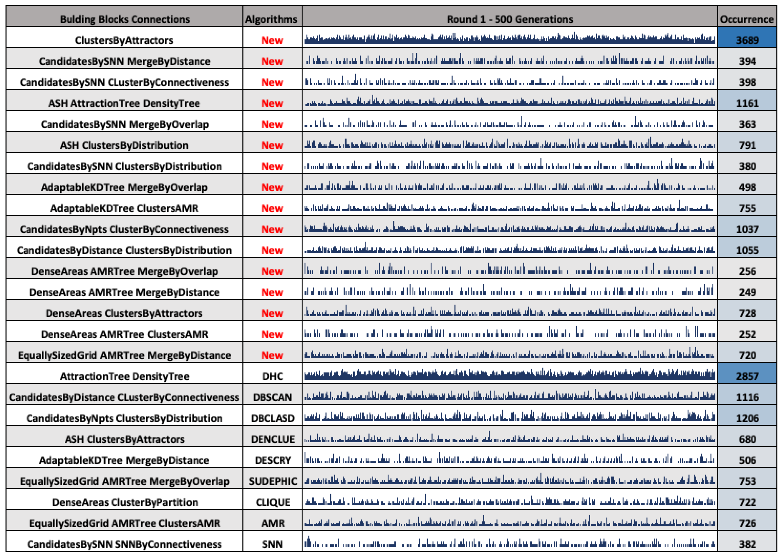
4.2.1. Type of Individuals

This scenario presents an overview of the connections among the existing building blocks in the AutoClustering DAG that form the types of clustering algorithms. In other words, the types of algorithms mean the possible combinations of the building blocks. For the Cleveland dataset, 25 types of different clustering algorithms were generated (Figure 2) considering 30 rounds with 500 generations each.
The alluvial diagram is used to illustrate the connections between building blocks that compose the types of generated clustering algorithms. These building blocks are arranged on axes (levels) ordered by the number of occurrences of the blocks. Thus, the building blocks CandidatesBySNN and ClustersByDistribution, highlighted in red, form a type of clustering algorithm, and the width of this connection represents how often this type of algorithm occurred. Therefore, alluvial organization levels can help us to understand how the connections between blocks are made and the types of algorithms generated.
Axes are divided proportionally into small bars, where each bar represents the number of occurrences of a particular building block during the formation of an algorithm. For instance, the DenseAreas building block occurred more often than the AttractionTree, highlighted in green, as the first block chosen for the creation of algorithms. This kind of information can help us to understand how the weights of the AutoClustering probability model were adjusted.

4.2.2. Occurrence of Individual Types Per Generation

Figure 3 shows the histograms about occurrences of algorithm types from the first round for the Cleveland dataset. A total of 16 new clustering algorithms were generated by combining the building blocks illustrated in Figure 1. This behavior reinforces the evolutionary feature of the tool for creating new types of clustering algorithms.
Figure 3 helps to illustrate the distribution of the algorithm types over the generations. From this, it is possible to observe a high number of occurrences of the ClustersByAttractors and DHC algorithms. In addition, the visualization illustrated in Figure 3 shows that these algorithms may have generated good results. In this way, the results of these two types of algorithms can be analyzed separately, and this can help to identify the characteristics that they may have in common.
Another point to emphasize is the occurrence analysis of the algorithm types per generations and rounds. For instance, ASH->AttractionTree->DensityTree also presented a high occurrence rate. However, DenseAreas->AMRTree->MergeByDistance is an example of an algorithm type that did not occur for several generations.
These analyses provide some indicators about the evolution of the AutoClustering probability model over generations. Other similar chart suggestions are the occurrence of blocks per generation, occurrence of one or more types of algorithms, or the individual occurrence (algorithm plus parameters) per generation or round. Thus, this visualization can help the user identify the algorithms that are created the most over the generations.

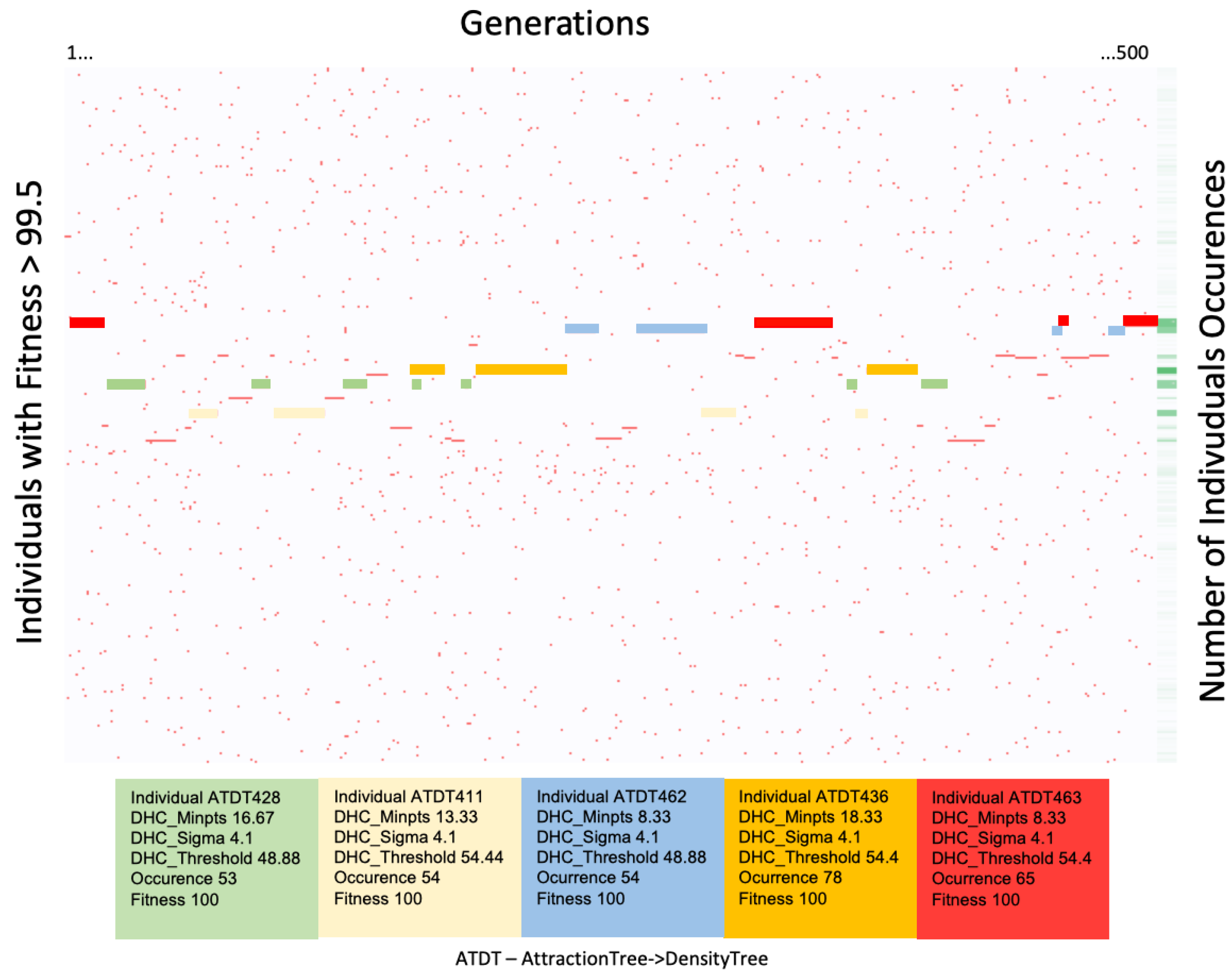
4.2.3. The Best Fitness
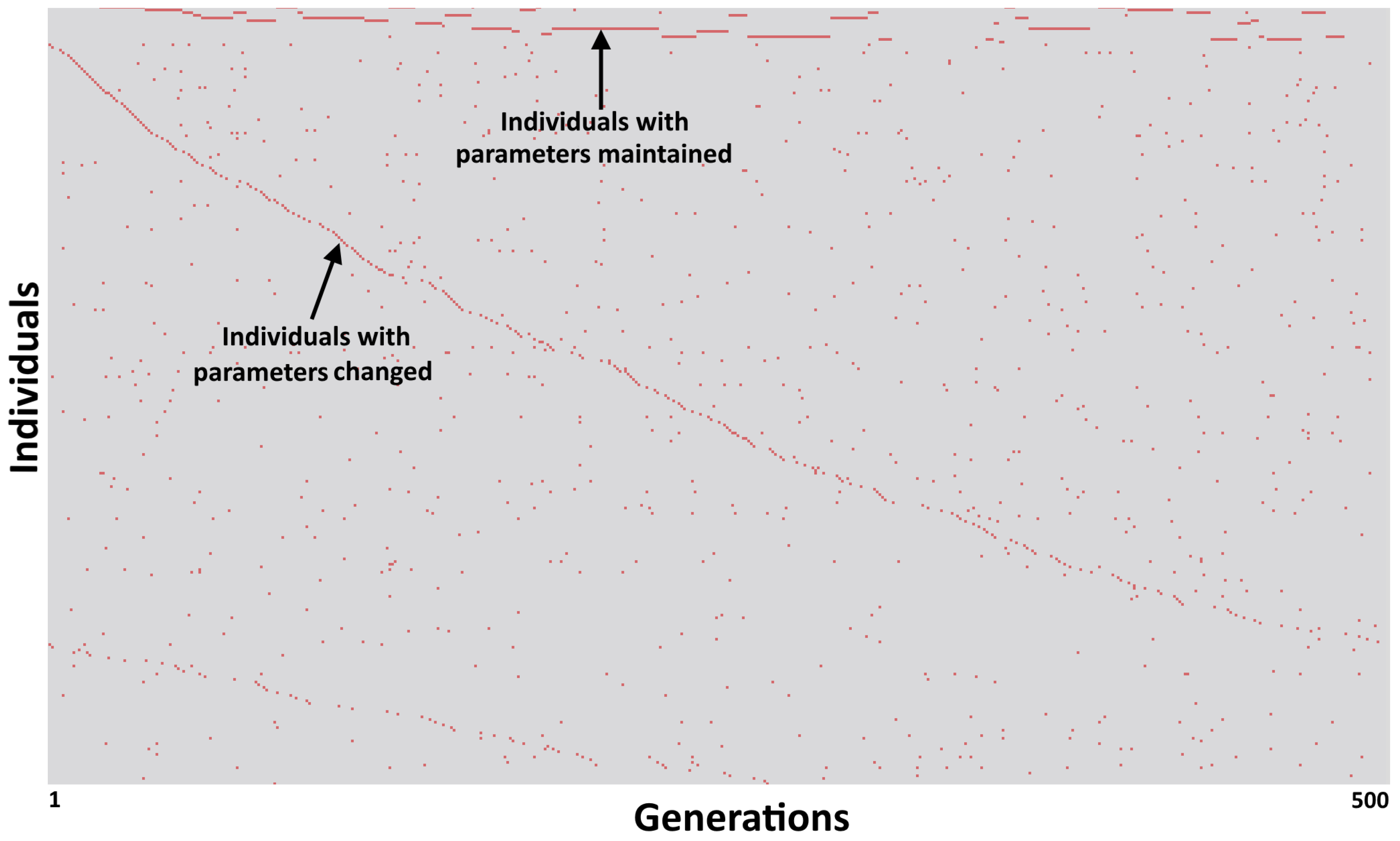
For the visualization and comparison of the best fitness values among the types of algorithms generated by AutoClustering, we used the TreeMap technique (Figure 4) on the Cleveland Heart Diseases dataset with 30 rounds and 500 generations.
The TreeMap technique creates visual data groups and maps data values according to area size and color. The presented configuration forms two groups: one for new algorithms (highlighted in red) and another for algorithms already known in the literature. The area size represents the average number of occurrences of each algorithm for all rounds, and the visual items are ordered from the top left corner to the bottom right corner. The color represents the fitness value, where a darker color means a greater fitness value.
In the group of new algorithms, the ASH->AttractionTree->DensityTree obtained the best fitness with 96.48% (highlighted in yellow). Among the known algorithms, the DHC algorithm achieved the best fitness of 99.99% (highlighted in green). For this dataset, few new algorithms obtained good results. However, the best fitness of this group was among the overall best fitness values. Thus, the possibility to create individuals more adapted to different dataset profiles could be the critical point between good and bad results in the clustering task.

4.3. Tracking

This section presents a scenario to track individuals.

Tracking Individuals

On the basis of the initial setup of AutoClustering, the tool generates 25,000 individuals, and around 10,000 of these individuals are unique (algorithm + parameters). Figure 5 shows a scatterplot organized by individuals and generations from the first round of the BUPA dataset. Only individuals with a fitness value greater than 99.5% are presented.
In the chart, the best five individuals, with respect to the results of fitness and occurrences, are highlighted by colors. All five individuals are related to the AttractionTree->DensityTree algorithm with a fitness value equal to 100%. The final algorithm indicated by AutoClustering as the result is highlighted in red; it is the algorithm with the highest fitness in generation 500.
This kind of chart allows the user to visually track the generated individuals and to analyze the behavior of the tool. The algorithm highlighted in red show ups in the early generations, but it is later replaced by the algorithm highlighted in green, which has the same fitness value. This raises a question: Why does this algorithm disappear after a few generations and reappear later with such an excellent fitness value?
The first explanation is that the tool uses elitism, which is an evolutionary computing technique that aims to select the best individuals generated for the next generation. AutoClustering selects only one individual for the next generation on the basis of two main points: the highest fitness value and the more recent individual. Another explanation is related to the updates to the probability model over the generations with the best individuals. Since the algorithm highlighted in red is an excellent individual, it has a good chance of appearing among individuals in the next generations.

4.4. Individuals Feature

This section presents a scenario to analyze individuals’ features.

Correlation between Fitness and Parameters

The first round of the synthetic dataset was used to analyze the parameters of the individuals. The tool generated 25,000 individuals (50 individuals per generation), and 17,024 of these individuals had a fitness equal to zero. Also, there were 10,943 unique individuals (algorithm plus parameters), and 3039 of these individuals presented a fitness different from zero. Although the AdaptableKDTree->MergeByOverlap had the highest occurrence number (803) among the generated algorithms, the algorithm AttractionTree->DensityTree (650) was the winner in most of the generations, and it had the best fitness: 99.9999999974321%.
For this scenario, parallel coordinate visualization (Figure 6) was chosen because of its multidimensional characteristic and capacity for correlating between data. The technique uses parallel axes to represent the data dimensions. The values of each attribute are mapped along one of the axes. The attribute values of the same data record connect lines crossing all the axes. Thus, it is possible to analyze the visualization by looking for patterns, trends, and outliers.
Analyzing only the AttractionTree->DensityTree individuals, whose parameters are DHC_SIGMA, DHC_MINPTS, and DHC_THRESHOLD, it is possible to see in Figure 6 that the values of the respective parameters are in the ranges [2.5; 15], [6.6; 20], and [24; 60]. Furthermore, Figure 6 shows that the SIGMA and THRESHOLD parameters are the most influential parameters for achieving a good fitness value (99.9%), with ranges between the values [4.1; 10.3] and [37.7; 60.0], respectively. For a fitness equal to 0%, the parameters also are SIGMA and THRESHOLD, with ranges between [11.8; 15] and [54.4; 60.0], respectively. In other words, if you had high values of SIGMA and very high values of THRESHOLD parameters, then the fitness result would be 0%. Finally, a more extensive analysis of these parameters in different dataset profiles could optimize the parameter values related to each building block for generating good individuals.
Regarding the evolution of individuals with fitness values higher than 99.5%, it is possible to identify two patterns in Figure 7. The first one concerns the individuals created at the beginning of the rounds and maintained over the next generations; the second one is about individuals with good fitness that had some parameters changed (such as MINPTS, which does not directly influence fitness values), which helped to generate other excellent individuals.

4.5. Fitness

This section presents a scenario to analyze the fitness over the generations and rounds.

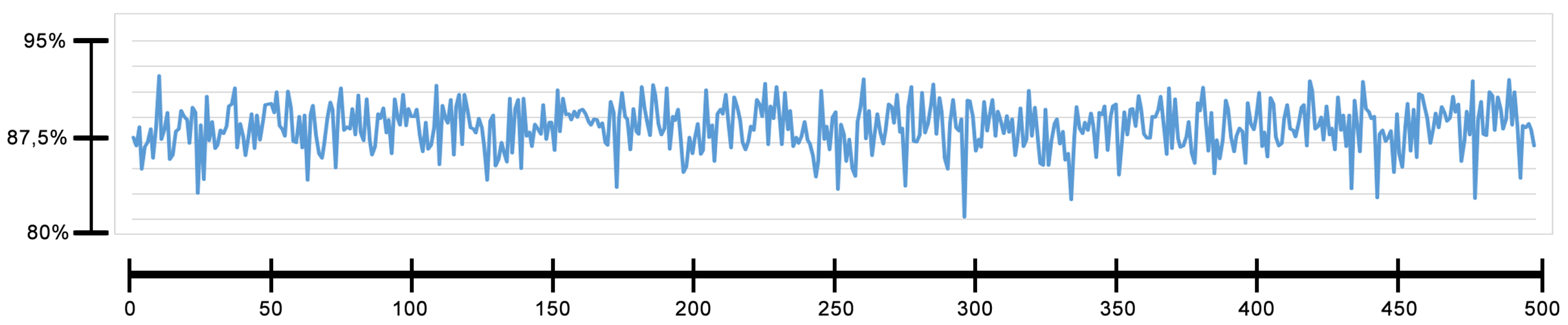
4.5.1. Fitness Evolution

The line graph matrix illustrated in Figure 8 shows the fitness evolution of the algorithms created over the generations for the Cleveland dataset. The test with this dataset generated five different algorithms: CLIQUE, DBSCAN, DENCLUE, DHC, and New. This new algorithm is formed by the building blocks ASH→AttractionTree→DensityTree. Thus, Figure 8 shows the changes in the fitness values for each generation during the rounds.
In the chart in Figure 8, 90% of the rounds reached the maximum fitness value between 100 and 150 generations, and the latest fitness growth occurred in generations 282 and 407. This may indicate the possibility that the initial parameters for the tool could be better defined. It is possible to analyze reducing the number of generations or the number of rounds.
Lines R3 and R6 represent the two rounds that had a change in fitness after 200 generations. The black circle on the line highlights the generation in which the fitness changed for these two cases—generation 282 and 407, respectively. Furthermore, this change in fitness after a “stabilization” can be analyzed to gather more details about it. However, it was observed that the change in fitness represented a minimal gain that is below 1%. Also, the green squares highlight the rounds with the best result. In these rounds, the solution that obtained the best result was the DHC algorithm with an average fitness above 99%. Additionally, analyzing the logs, for both examples, showed that the individual before the best one is the same algorithm type with different parameters. Thus, the stability analysis may depend on the problem under analysis, since such a small change can be considered irrelevant.

4.5.2. Average of the Fitness

The line chart in Figure 9 shows the average fitness values for individuals with a fitness different from 0% in each generation. The variability represented in the chart reinforces the diversity of the generated population, as individuals have a range of fitness values, considering their various parameters.

4.6. Compare Different Datasets

This section presents a scenario to analyze the tool’s result for different datasets.

Comparison of Algorithm Types in Different Datasets

Figure 10 presents the comparison of AutoClustering results for the Cleveland (highlighted in blue) and Glass Identification (highlighted in orange) datasets. TreeMap was set to group hierarchically by dataset name and algorithm name. The area size represents the occurrence of each algorithm type. The colors represent the fitness values. The green color highlights individuals with fitness equal to 100%, the yellow color highlights individuals with fitness values between 99.5% and 99.99%, and the red color highlights individuals with fitness values equal to 0%. Furthermore, a filter was performed to include only individuals with fitness values greater than 75% and fitness equal to 0%.
Figure 10 shows that the best algorithm consisted of the AttractionTree->DensityTree (DHC) building blocks for both datasets. Moreover, the Glass Identification dataset presented more individuals with fitness values equal to 100%. Furthermore, the results for algorithms that presented fitness equal to 0% were similar for both datasets. Finally, AutoClustering generated the best algorithm types (yellow and green items) more frequently for the Glass Identification dataset than for the Cleveland dataset.
Figure 11 illustrates another comparison scenario using a histogram matrix. This visualization shows the occurrences for each type of algorithm. The algorithms DenseAreas->ClustersByPartition, ASH->ClustersByAttractors, and CandidatesByDistance->ClusterByConnectiveness are highlighted in green because they had different occurrence patterns for the two datasets. Furthermore, the AttractionTree->DensityTree algorithm (highlighted in purple) presented the best fitness values for the Cleveland dataset, but there was quite a different occurrence pattern for the Glass Identification dataset. Moreover, the initial part of the histogram, highlighted in yellow, shows an increasing number of occurrences for the ClustersByAttractors algorithm. This growth means that as the probability model evolved over generations, this algorithm was more likely to be created by AutoClustering. Thus, it provides information about how the probability model evolved for each of the datasets.

5. Final Remarks and Future Works

The demand for understanding and replicating models that are automatically generated by machine learning techniques is high, since such models not only affect scientific works but also have a direct impact on regular tasks, for example, personal loan analysis or medical benefits authorization. Sometimes, it is necessary to explain how the systems and tools made their decisions or how the rules were created on the basis of real data, and this is not an easy task.
Among the different research areas dedicated to facilitating the understanding of machine learning methods, it is worth highlighting visual analytics. It combines automated analysis techniques with interactive visualizations for understanding, reasoning, and decision-making. It is particularly useful when analyzing large datasets, which is usually the case for results and logs of these types of algorithms.
Of all the steps in the visual analytics process, the visualization step is essential because data visualization techniques can create visual representations to facilitate the perception of data relationships, patterns, trends, and outliers. The visualization scenarios proposed in this work support the analysis and understanding of the evolutionary techniques’ behavior.
For the analysis task, we propose some visualization scenario classes: data overview of a population, individual tracking, quality of generated individuals and their parameters, and comparison of the tool’s results when applied to different datasets.
The AutoClustering tool was used as a case study for different datasets. AutoClustering uses an estimation-of-distribution algorithm to automatically create density-based clustering algorithms by combining building blocks of classic existing algorithms. We analyzed the results and looked for behavioral patterns during the evolutionary process.
Applying the visualization scenarios to AutoClustering results, it was possible to understand the construction of the algorithms through the connections of building blocks. The occurrences and fitness of the generated algorithms helped to understand how the probability model evolved throughout the rounds. Moreover, the visualization scenarios allowed for the visual tracking of individuals throughout the generations, as well as the analysis of their parameters, ultimately indicating the best clustering algorithms for a given dataset. Finally, the comparison scenarios visually presented the behavior of AutoClustering for different datasets. Thus, the set of proposed visualization scenarios could improve the decision-making process and the specific strategies for each dataset and their initial parameters.
Some of the analysis scenarios are valid for other evolutionary techniques, such as population overview, best individual in the population, individual tracking, and parameter analysis. Therefore, the techniques used for the proposed visualization scenarios may be applied to other evolutionary approaches with little adaptation. However, each evolutionary technique has its particular features and challenges, so they may require new visualization scenarios. For instance, not all evolutionary techniques use the probability model for the generation of candidate solutions.
As future work, we suggest the creation of an interactive dashboard with proposed visualization scenarios to better support the analysis task. Another suggestion is the use of interactive visualization scenarios during the training and testing steps with recommended adjustments to the model configuration. We also plan to use the proposed visualization scenarios to analyze the behavior of other evolutionary approaches. Another proposal is to perform usability studies for the visualization scenarios. Finally, there is potential for the elaboration of new visualization scenarios, for example, analyzing the updates of the probability model weights used by the EDA.

Author Contributions

Conceptualization, A.M., B.M. and J.M.; Data curation, Y.S., A.M., D.S., B.M. and J.M.; Formal analysis, Y.S., A.M., D.S., B.M. and J.M.; Investigation, A.M., D.S., B.M. and J.M.; Methodology, A.M., B.M. and J.M.; Project administration, B.M. and J.M.; Supervision, B.M. and J.M.; Validation, Y.S., B.M. and J.M.; Visualization, Y.S., D.S., B.M. and J.M.; Writing—Original Draft, Y.S., A.M., B.M. and J.M.; Writing—Review & Editing, B.M., A.M. and J.M.; All authors read and approved the final manuscript.

Funding

This study was financed in part by the Coordenação de Aperfeiçoamento de Pessoal de Nível Superior—Brazil (CAPES)—Finance Code 001 and the APC was funded by authors.

Conflicts of Interest

The authors declare no conflict of interest.

References

  1. Hinton, G.; Deng, L.; Yu, D.; Dahl, G.E.; Mohamed, A.R.; Jaitly, N.; Senior, A.; Vanhoucke, V.; Nguyen, P.; Sainath, T.N.; et al. Deep neural networks for acoustic modeling in speech recognition: The shared views of four research groups. IEEE Signal Process. Mag. 2012, 29, 82–97. [Google Scholar] [CrossRef]
  2. LeCun, Y.; Bengio, Y.; Hinton, G. Deep learning. Nature 2015, 521, 436. [Google Scholar] [CrossRef] [PubMed]
  3. Huang, D.; Lai, J.; Wang, C.D. Ensemble clustering using factor graph. Pattern Recognit. 2016, 50, 131–142. [Google Scholar] [CrossRef]
  4. Attorre, B.F.M.; Silva, L.A. Open Source Tools Applied to Text Data Recovery in Big Data Environments. In Proceedings of the Annual Conference on Brazilian Symposium on Information Systems: Information Systems: A Computer Socio-Technical Perspective, Goiania, Brazil, 26–29 May 2015; Brazilian Computer Society: Cuiabá, Brazil, 2015; Volume 1, p. 65. [Google Scholar]
  5. Nametala, C.A.; Pimenta, A.; Pereira, A.C.; Carrano, E.G. An Automated Investment Strategy Using Artificial Neural Networks and Econometric Predictors. In Proceedings of the XII Brazilian Symposium on Information Systems on Brazilian Symposium on Information Systems: Information Systems in the Cloud Computing Era, Santa Catarina, Brazil, 17–22 May 2016; Brazilian Computer Society: Cuiabá, Brazil, 2016; Volume 1, p. 21. [Google Scholar]
  6. Hinneburg, A.; Keim, D.A. An efficient approach to clustering in large multimedia databases with noise. In Proceedings of the Fourth International Conference on Knowledge Discovery and Data Mining, New York, NY, USA, 27–31 August 1998; Volume 98, pp. 58–65. [Google Scholar]
  7. Do Nascimento, T.C.S.; de Miranda, L.C. Chronos Acoes: Tool to Support Decision Making for Investor of the Stock Exchange. In Proceedings of the Annual Conference on Brazilian Symposium on Information Systems: Information Systems: A Computer Socio-Technical Perspective, Goiania, Brazil, 26–29 May 2015; Brazilian Computer Society: Cuiabá, Brazil, 2015; Volume 1, p. 71. [Google Scholar]
  8. Fekete, J.D. Visual analytics infrastructures: From data management to exploration. Computer 2013, 46, 22–29. [Google Scholar] [CrossRef]
  9. Liu, M.; Shi, J.; Li, Z.; Li, C.; Zhu, J.; Liu, S. Towards better analysis of deep convolutional neural networks. IEEE Trans. Vis. Comput. Graph. 2017, 23, 91–100. [Google Scholar] [CrossRef] [PubMed]
  10. Mühlbacher, T.; Piringer, H.; Gratzl, S.; Sedlmair, M.; Streit, M. Opening the black box: Strategies for increased user involvement in existing algorithm implementations. IEEE Trans. Vis. Comput. Graph. 2014, 20, 1643–1652. [Google Scholar] [CrossRef] [PubMed]
  11. Portugal, I.; Alencar, P.; Cowan, D. A Preliminary Survey on Domain-Specific Languages for Machine Learning in Big Data. In Proceedings of the 2016 IEEE International Conference on Software Science, Technology and Engineering (SWSTE), Beer-Sheva, Israel, 23–24 June 2016; pp. 108–110. [Google Scholar] [CrossRef]
  12. Shi, Y.; Sagduyu, Y.; Grushin, A. How to steal a machine learning classifier with deep learning. In Proceedings of the 2017 IEEE International Symposium on Technologies for Homeland, Waltham, MA, USA, 25–26 April 2017; pp. 1–5. [Google Scholar] [CrossRef]
  13. Heghedus, C.; Chakravorty, A.; Rong, C. Energy Informatics Applicability; Machine Learning and Deep Learning. In Proceedings of the 2018 IEEE International Conference on Big Data, Cloud Computing, Data Science Engineering (BCD), Yonago, Japan, 12–13 July 2018; pp. 97–101. [Google Scholar] [CrossRef]
  14. Meiguins, A.S.G.; Limão, R.C.; Meiguins, B.S.; Junior, S.F.S.; Freitas, A.A. AutoClustering: An estimation of distribution algorithm for the automatic generation of clustering algorithms. In Proceedings of the 2012 IEEE Congress on Evolutionary Computation, Brisbane, Australia, 10–15 June 2012; pp. 1–7. [Google Scholar]
  15. Freitas, A.A. Data mining and Knowledge Discovery with Evolutionary Algorithms; Springer Science & Business Media: Berlin/Heidelberg, Germany, 2013. [Google Scholar]
  16. Cagnini, H.E.L. Estimation of Distribution Algorithms for Clustering And Classification. Master’s Thesis, Pontifícia Universidade Católica do Rio Grande do Sul, Porto Alegre, Brazil, 2017. [Google Scholar]
  17. Larrañaga, P.; Lozano, J.A. Estimation of Distribution Algorithms: A New Tool for Evolutionary Computation; Kluwer Academic Publishers: Norwell, MA, USA, 2002. [Google Scholar]
  18. Tufte, E.R.; Goeler, N.H.; Benson, R. Envisioning Information; Graphics Press: Cheshire, CT, USA, 1990; Volume 126. [Google Scholar]
  19. Spence, R. Information Visualization; Springer: Berlin, Germany, 2001; Volume 1. [Google Scholar]
  20. Shneiderman, B. The eyes have it: A task by data type taxonomy for information visualizations. In Proceedings of the IEEE Symposium on Visual Languages, BouIder, CO, USA, 3–6 September 1996; pp. 336–343. [Google Scholar]
  21. Keim, D.; Andrienko, G.; Fekete, J.D.; Görg, C.; Kohlhammer, J.; Melançon, G. Visual analytics: Definition, process, and challenges. In Information Visualization; Springer: Berlin, Germany, 2008; pp. 154–175. [Google Scholar]
  22. Keim, D.A.; Mansmann, F.; Schneidewind, J.; Ziegler, H. Challenges in visual data analysis. In Proceedings of the Tenth International Conference on Information Visualisation, London, UK, 5–7 July 2006; pp. 9–16. [Google Scholar]
  23. Shneiderman, B. Tree visualization with tree-maps: 2-d space-filling approach. ACM Trans. Graph. (TOG) 1992, 11, 92–99. [Google Scholar] [CrossRef] [Green Version]
  24. Sinar, E.F. Data visualization. In Big Data at Work: The Data Science Revolution and Organizational Psychology; Routledge: Abingdon-on-Thames, UK, 2015; pp. 129–171. [Google Scholar]
  25. Inselberg, A.; Dimsdale, B. Parallel coordinates for visualizing multi-dimensional geometry. In Computer Graphics 1987; Springer: Berlin, Germany, 1987; pp. 25–44. [Google Scholar]
  26. Liao, W.k.; Liu, Y.; Choudhary, A. A Grid-Based Clustering Algorithm Using Adaptive Mesh Refinement. Available online: http://users.eecs.northwestern.edu/~choudhar/Publications/LiaLiu04A.pdf (accessed on 26 February 2019).
  27. Agrawal, R.; Gehrke, J.; Gunopulos, D.; Raghavan, P. Automatic Subspace Clustering of High Dimensional Data for Data Mining Applications; ACM: New York, NY, USA, 1998; Volume 27. [Google Scholar]
  28. Xu, X.; Ester, M.; Kriegel, H.P.; Sander, J. A distribution-based clustering algorithm for mining in large spatial databases. In Proceedings of the 14th International Conference on Data Engineering, Orlando, FL, USA, 23–27 February 1998; pp. 324–331. [Google Scholar]
  29. Ester, M.; Kriegel, H.P.; Sander, J.; Xu, X. A density-based algorithm for discovering clusters in large spatial databases with noise. In Proceedings of the IEEE Symposium on Visual Languages, BouIder, CO, USA, 3–6 September 1996; Volume 96, pp. 226–231. [Google Scholar]
  30. Hinneburg, A.; Keim, D.A. A general approach to clustering in large databases with noise. Knowl. Inf. Syst. 2003, 5, 387–415. [Google Scholar] [CrossRef]
  31. Angiulli, F.; Pizzuti, C.; Ruffolo, M. DESCRY: A density based clustering algorithm for very large data sets. In Proceedings of the International Conference on Intelligent Data Engineering and Automated Learning, Exeter, UK, 25–27 August 2004; pp. 203–210. [Google Scholar]
  32. Jiang, D.; Pei, J.; Zhang, A. DHC: A density-based hierarchical clustering method for time series gene expression data. In Proceedings of the Third IEEE Symposium on Bioinformatics and Bioengineering, Bethesda, MD, USA, 12 March 2003; pp. 393–400. [Google Scholar]
  33. Ye, H.; Lv, H.; Sun, Q. An improved clustering algorithm based on density and shared nearest neighbor. In Proceedings of the 2016 IEEE Information Technology, Networking, Electronic and Automation Control Conference, Chongqing, China, 20–22 May 2016; pp. 37–40. [Google Scholar]
  34. Zhou, D.; Cheng, Z.; Wang, C.; Zhou, H.; Wang, W.; Shi, B. SUDEPHIC: Self-tuning density-based partitioning and hierarchical clustering. In Proceedings of the International Conference on Database Systems for Advanced Applications, Bali, Indonesia, 21–24 April 2014; pp. 554–567. [Google Scholar]
  35. Breckenridge, J.N. Replicating cluster analysis: Method, consistency, and validity. Multivar. Behav. Res. 1989, 24, 147–161. [Google Scholar] [CrossRef] [PubMed]
  36. Bashir, U.; Chachoo, M. Performance evaluation of j48 and bayes algorithms for intrusion detection system. Int. J. Netw. Secur. Its Appl. 2017. [Google Scholar] [CrossRef]
  37. Wu, A.S.; De Jong, K.A.; Burke, D.S.; Grefenstette, J.J.; Ramsey, C.L. Visual analysis of evolutionary algorithms. In Proceedings of the 1999 Congress on Evolutionary Computation, Washington, DC, USA, 6–9 July 1999; Volume 2, pp. 1419–1425. [Google Scholar]
  38. Liu, S.; Wang, X.; Liu, M.; Zhu, J. Towards better analysis of machine learning models: A visual analytics perspective. Vis. Inform. 2017, 1, 48–56. [Google Scholar] [CrossRef]
  39. Cruz, A.; Machado, P.; Assunção, F.; Leitão, A. Elicit: Evolutionary computation visualization. In Proceedings of the Companion Publication of the 2015 Annual Conference on Genetic and Evolutionary Computation, Madrid, Spain, 11–15 July 2015; pp. 949–956. [Google Scholar]
  40. McPhee, N.F.; Casale, M.M.; Finzel, M.; Helmuth, T.; Spector, L. Visualizing Genetic Programming Ancestries. In Proceedings of the 2016 on Genetic and Evolutionary Computation Conference Companion, Denver, CO, USA, 20–24 July 2016; pp. 1419–1426. [Google Scholar]
  41. Daneshpajouh, H.; Zakaria, N. A Clustering-based Visual Analysis Tool for Genetic Algorithm. In Proceedings of the International Conference on Information Visualization Theory and Applications, Porto, Portugal, 27 February–1 March 2017; pp. 233–240. [Google Scholar]
  42. Munzner, T. Visualization Analysis and Design; AK Peters/CRC Press: Boca Raton, FL, USA, 2014. [Google Scholar]
  43. Santana, R.; Bielza, C.; Larranaga, P.; Lozano, J.A.; Echegoyen, C.; Mendiburu, A.; Armananzas, R.; Shakya, S. Mateda-2.0: Estimation of distribution algorithms in MATLAB. J. Stat. Softw. 2010, 35, 1–30. [Google Scholar] [CrossRef]
  44. Lichman, M. UCI Machine Learning Repository; University of California: Oakland, CA, USA, 2013. [Google Scholar]
  45. Brito, Y.; Santos, C.; Mendonca, S.; Arújo, T.D.; Freitas, A.; Meiguins, B. A Prototype Application to Generate Synthetic Datasets for Information Visualization Evaluations. In Proceedings of the 2018 22nd International Conference Information Visualisation (IV), Fisciano, Italy, 10–13 July 2018; pp. 153–158. [Google Scholar]
Figure 1. The building blocks’ directed acyclic graph (DAG) as the auxiliary data structure to the estimation-of-distribution algorithm (EDA).
Information 10 00088 g001
Figure 2. Alluvial visualization organized by occurrence order of each block considering all the rounds.
Information 10 00088 g002
Figure 3. Histograms of total occurrences of blocks in each of the 500 generations considering a single round.
Information 10 00088 g003
Figure 4. Overview of algorithms using the Treemap visualization technique considering the highest fitness value and the mean occurrence rates of the clustering algorithms after all rounds.
Information 10 00088 g004
Figure 5. Visualization to track the best individuals in a population.
Information 10 00088 g005
Figure 6. Correlation between fitness and parameters for the AttractionTree->DensityTree algorithm.
Information 10 00088 g006
Figure 7. The occurrences of individuals with fitness of more than 99.5% created along the generations.
Information 10 00088 g007
Figure 8. Line chart that shows the fitness values of the best algorithm generated over the generations.
Information 10 00088 g008
Figure 9. Line chart that shows the average fitness over the generations for individuals with fitness different from 0%.
Information 10 00088 g009
Figure 10. Treemap with the organization of fitness throughout the generations for the Cleveland Heart Diseases and Glass Identification datasets.
Information 10 00088 g010
Figure 11. Histogram matrix of the algorithm occurrences for the Cleveland Heart Diseases and the Glass Identification datasets.
Information 10 00088 g011

