
Effectiveness of COVID-19 Vaccines: Evidence from the First-Year Rollout of Vaccination Programs


Abstract
:1. Introduction
2. Materials and Methods
2.1. Data Understanding
- Except for iso_code, continent, location, and date, all other variables had missing values. The range of missing values varied from 5.7% in total_cases to 96.3% in excess_mortality. Variables that could be important in measuring the vaccination impact, such as weekly_icu_admissions and others, had a high proportion of missing values.
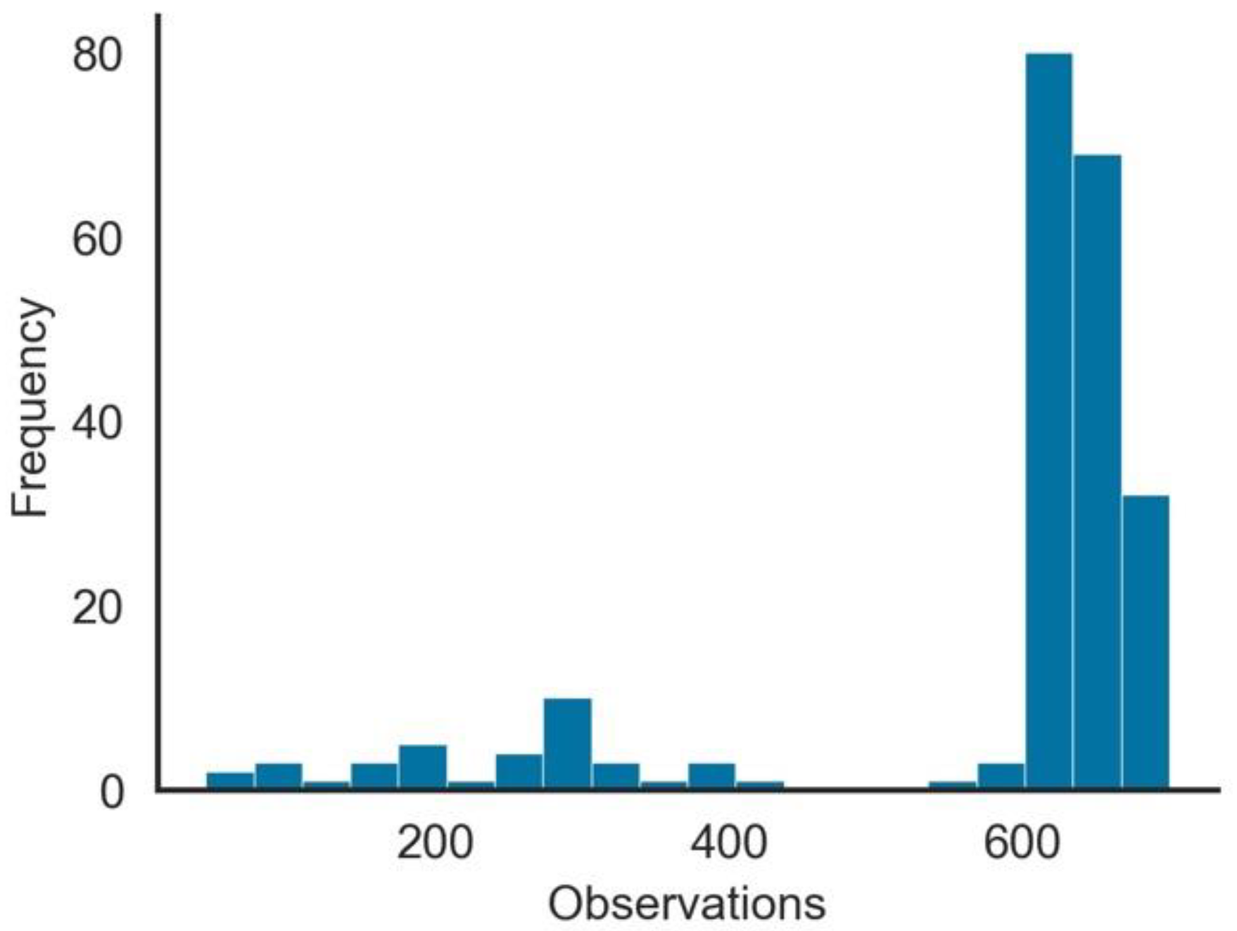
- The number of observations per Geo-Political Entity (GPE), as seen in Figure 1, was highly skewed. From the 222 GPEs in the dataset, over 100 had more than 500 days of observations, while for other GPEs, the number was substantially low.
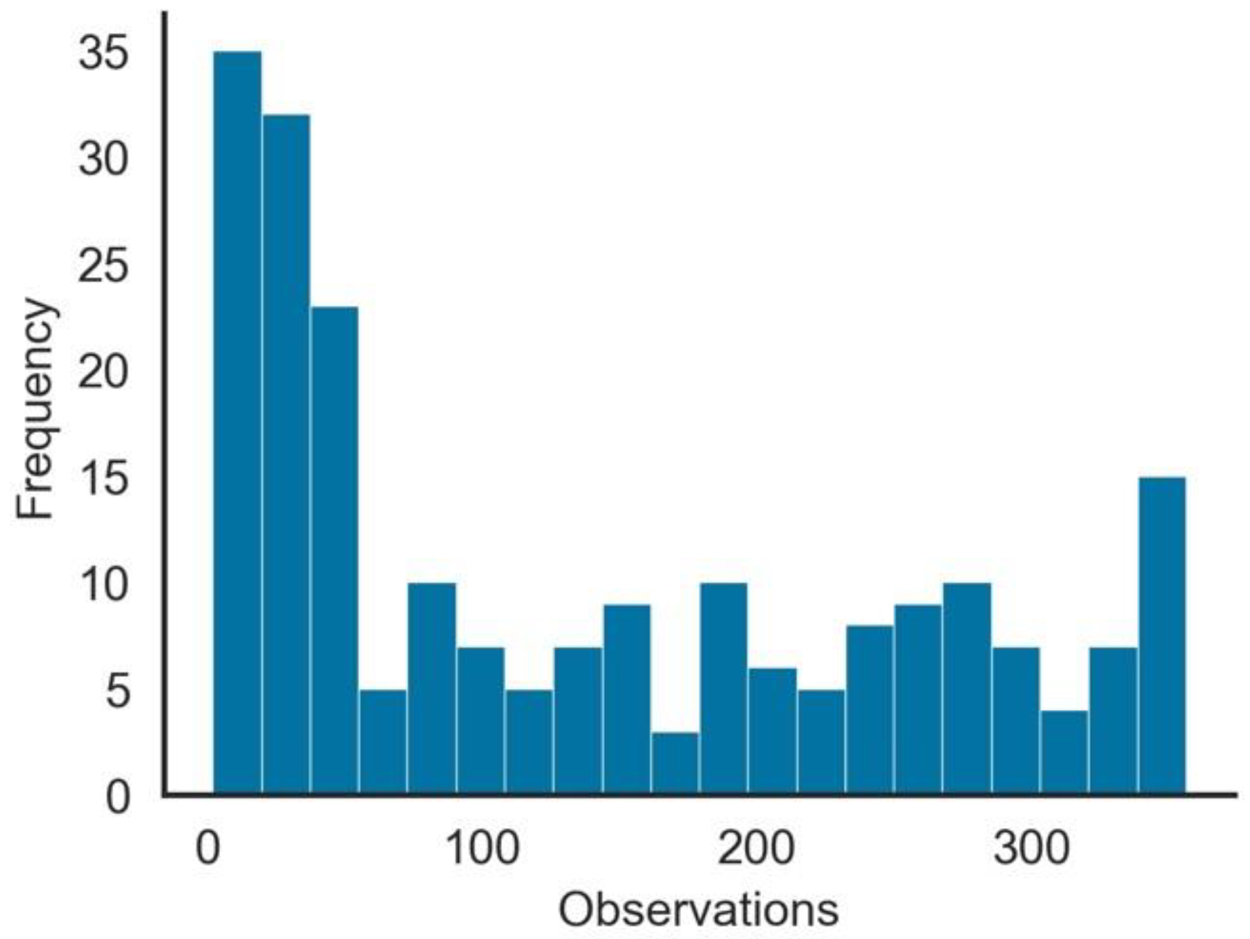
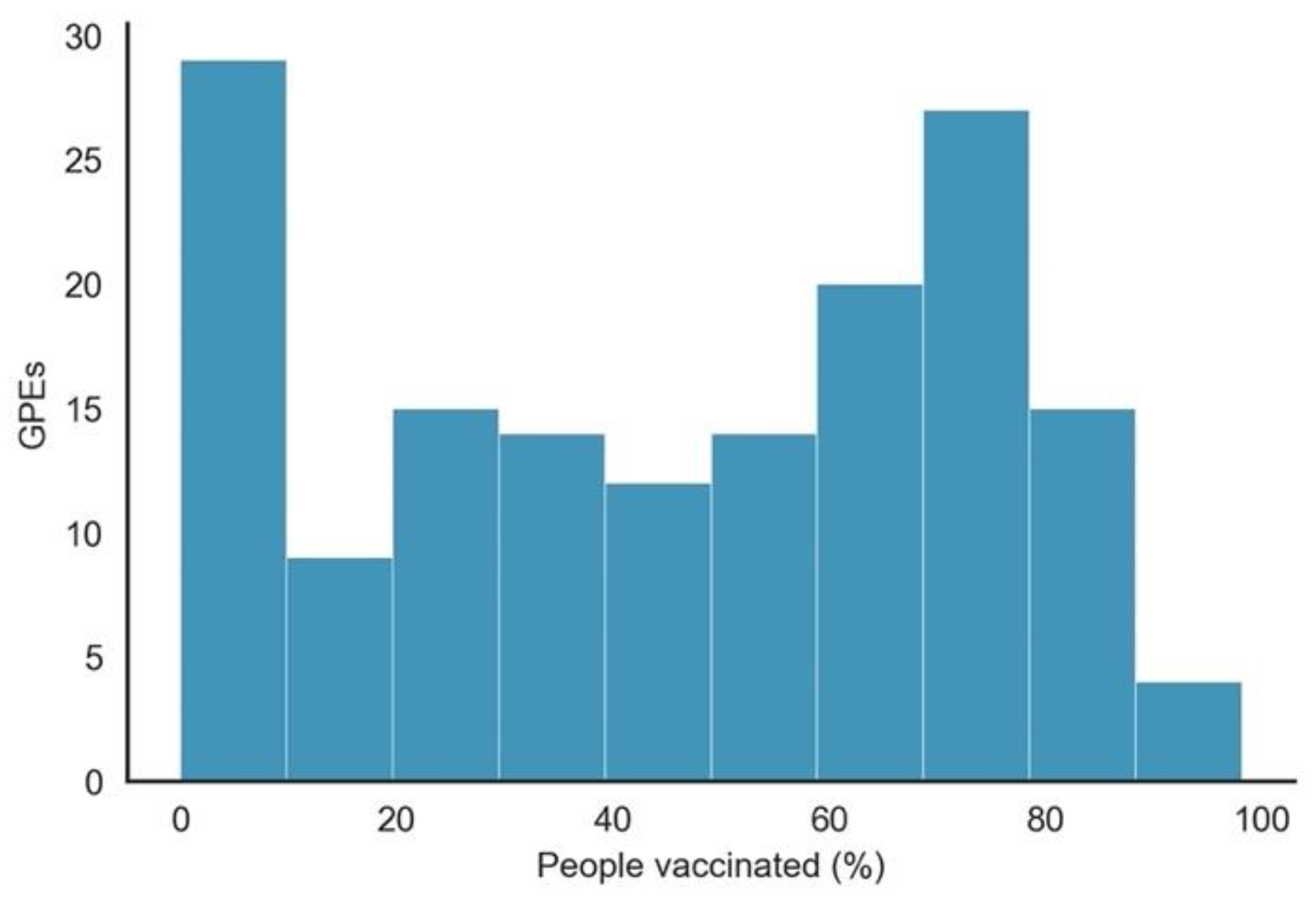
- As expected, since vaccination did not start simultaneously in all GPEs, the number of observations per GPE with people_vaccinated > 0 was not uniform. As shown in Figure 2, although many GPEs had more than 100 days of vaccination, in more than 50 GPEs, the number of days since it started was less than 50 days. From the 222 GPEs, five did not even present any vaccination numbers. Contrastingly, 25% of the GPEs had vaccination data for more than 243 days.
- Some GPEs did not consistently provide reports, i.e., reporting later after the beginning of the pandemic or even not reporting during some days.
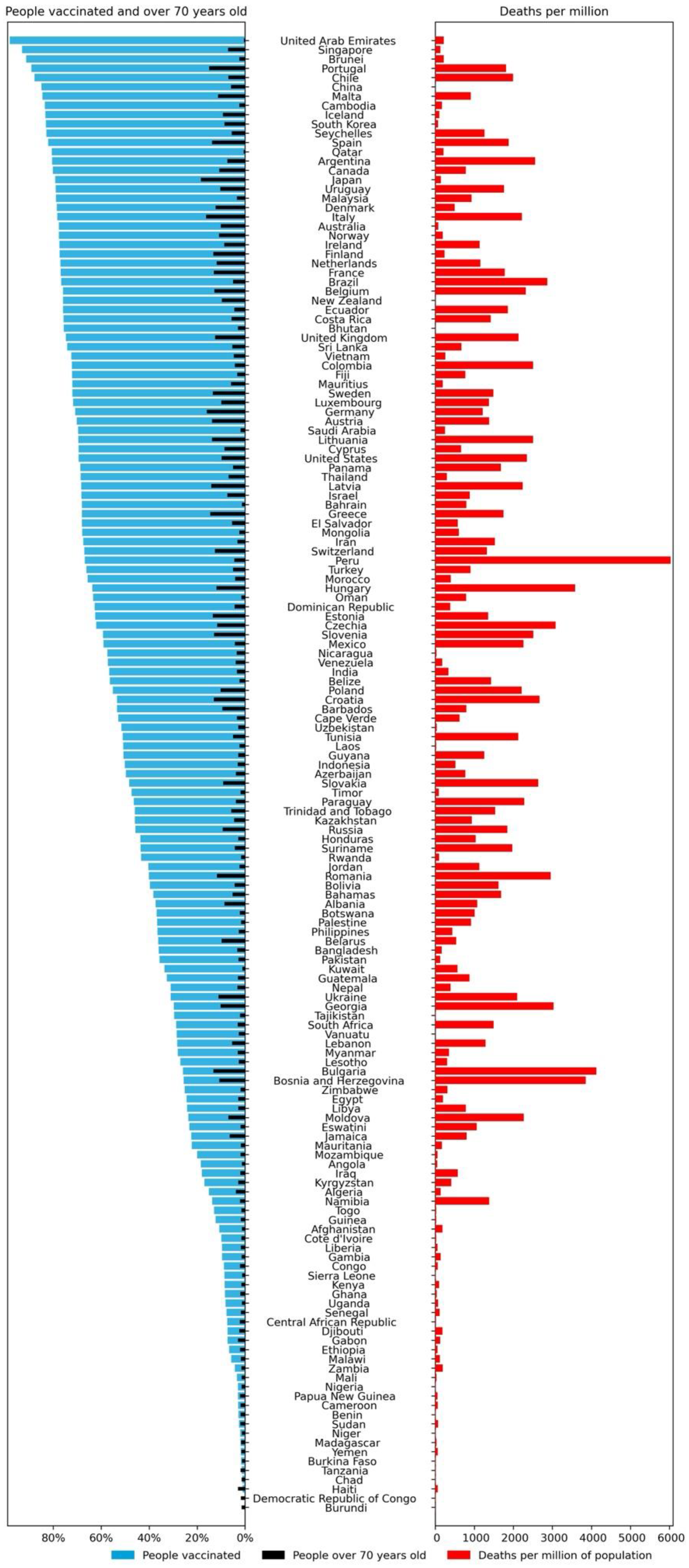
- Gibraltar presented values of people_vaccinated_per_hundred above 100% (121.43%), which may indicate that the population value was incorrect or that there were vaccinated persons that were not part of its population.
2.2. Data Preparation
2.3. Clustering Model
2.4. Regression Model
3. Results and Discussion
3.1. Descriptive Analysis
3.2. Regression Model
4. Strengths and Limitations
5. Conclusions
Author Contributions
Funding
Data Availability Statement
Conflicts of Interest
Appendix A

| Variable | Type | Description |
|---|---|---|
| total_cases | Confirmed cases | Total confirmed cases of COVID-19 |
| new_cases | Confirmed cases | New confirmed cases of COVID-19 |
| new_cases_smoothed | Confirmed cases | New confirmed cases of COVID-19 (7-day smoothed) |
| total_cases_per_million | Confirmed cases | Total confirmed cases of COVID-19 per 1,000,000 people |
| new_cases_per_million | Confirmed cases | New confirmed cases of COVID-19 per 1,000,000 people |
| new_cases_smoothed_per_million | Confirmed cases | New confirmed cases of COVID-19 (7-day smoothed) per 1,000,000 people |
| total_deaths | Confirmed deaths | Total deaths attributed to COVID-19 |
| new_deaths | Confirmed deaths | New deaths attributed to COVID-19 |
| new_deaths_smoothed | Confirmed deaths | New deaths attributed to COVID-19 (7-day smoothed) |
| total_deaths_per_million | Confirmed deaths | Total deaths attributed to COVID-19 per 1,000,000 people |
| new_detaths_per_million | Confirmed deaths | New deaths attributed to COVID-19 per 1,000,000 people |
| new_deaths_smoothed_per_million | Confirmed deaths | New deaths attributed to COVID-19 (7-day smoothed) per 1,000,000 people |
| excess_mortality | Excess mortality | Percentage difference between the reported number of weekly or monthly deaths in 2020–2021 and the projected number of deaths for the same period based on previous years |
| excess_mortality_cumulative | Excess mortality | Percentage difference between the cumulative number of deaths since 1 January 2020 and the cumulative projected deaths for the same period based on previous years |
| excess_mortality_cumulative_absolute | Excess mortality | Cumulative difference between the reported number of deaths since 1 January 2020 and the projected number of deaths for the same period based on previous years |
| excess_mortality_cumulative_per_million | Excess mortality | Cumulative difference between the reported number of deaths since 1 January 2020 and the projected number of deaths for the same period based on previous years, per million people |
| icu_patients | Hospital and ICU | Number of COVID-19 patients in intensive care units (ICUs) |
| icu_patients_per_million | Hospital and ICU | Number of COVID-19 patients in intensive care units (ICUs) per 1,000,000 people |
| hosp_patients | Hospital and ICU | Number of COVID-19 patients in hospital |
| hosp_patients_per_million | Hospital and ICU | Number of COVID-19 patients in hospital per 1,000,000 people |
| weekly_icu_admissions | Hospital and ICU | Number of COVID-19 patients newly admitted to intensive care units (ICUs) in a given week |
| weekly_icu_admissions_per_million | Hospital and ICU | Number of COVID-19 patients newly admitted to intensive care units (ICUs) in a given week per 1,000,000 people |
| weekly_hosp_admissions | Hospital and ICU | Number of COVID-19 patients newly admitted to hospitals in a given week |
| weekly_hosp_admissions_per_million | Hospital and ICU | Number of COVID-19 patients newly admitted to hospitals in a given week per 1,000,000 people |
| stringency_index | Policy responses | Government Response Stringency Index: composite measure based on 9 response indicators including school closures, workplace closures, and travel bans, rescaled to a value from 0 to 100 (100 = strictest response) |
| reproduction_rate | Reproduction rate | Real-time estimate of the effective reproduction rate (R) of COVID-19 |
| total_tests | Test & positivity | Total tests for COVID-19 |
| new_tests | Test & positivity | New tests for COVID-19 (only calculated for consecutive days) |
| total_tests_per_thousand | Test & positivity | Total tests for COVID-19 per 1000 people |
| new_tests_per_thousand | Test & positivity | New tests for COVID-19 per 1000 people |
| new_tests_smoothed | Test & positivity | New tests for COVID-19 (7-day smoothed) |
| new_tests_smoothed_per_thousand | Test & positivity | New tests for COVID-19 (7-day smoothed) per 1000 people |
| positive_rate | Test & positivity | The share of COVID-19 tests that are positive, given as a rolling 7-day average (this is the inverse of tests_per_case) |
| tests_per_case | Test & positivity | Tests conducted per new confirmed case of COVID-19, given as a rolling 7-day average (this is the inverse of positive_rate) |
| tests_units | Test & positivity | Units used by the location to report its testing data |
| total_vaccinations | Vaccinations | Total number of COVID-19 vaccination doses administered |
| people_vaccinated | Vaccinations | Total number of people who received at least one vaccine dose |
| people_fully_vaccinated | Vaccinations | Total number of people who received all doses prescribed by the vaccination protocol |
| total_boosters | Vaccinations | Total number of COVID-19 vaccination booster doses administered (doses administered beyond the number prescribed by the vaccination protocol) |
| new_vaccinations | Vaccinations | New COVID-19 vaccination doses administered (only calculated for consecutive days) |
| new_vaccionations_smoothed | Vaccinations | New COVID-19 vaccination doses administered (7-day smoothed) |
| total_vaccinations_per_hundred | Vaccinations | Total number of COVID-19 vaccination doses administered per 100 people in the total population |
| people_vaccinated_per_hundred | Vaccinations | Total number of people who received at least one vaccine dose per 100 people in the total population |
| people_fully_vaccinated_per_hundred | Vaccinations | Total number of people who received all doses prescribed by the vaccination protocol per 100 people in the total population |
| total_boosters_per_hundred | Vaccinations | Total number of COVID-19 vaccination booster doses administered per 100 people in the total population |
| new_vaccinations_smoothed_per_million | Vaccinations | New COVID-19 vaccination doses administered (7-day smoothed) per 1,000,000 people in the total population |
| iso_code | Others | ISO 3166-1 alpha-3–three-letter country/GPE codes |
| Continent | Others | Continent of the geographical location |
| Location | Others | Geographical location |
| Date | Others | Date of observation |
| Population | Others | Population in 2020 |
| population_density | Others | Number of people divided by land area, measured in square kilometers, most recent year available |
| median_age | Others | Median age of the population, UN projection for 2020 |
| aged_65_older | Others | Share of the population that is 65 years and older, most recent year available |
| aged_70_older | Others | Share of the population that is 70 years and older in 2015 |
| gdp_per_capita | Others | Gross domestic product at purchasing power parity (constant 2011 international dollars), most recent year available |
| extreme_poverty | Others | Share of the population living in extreme poverty, most recent year available since 2010 |
| cardiovasc_death_rate | Others | Death rate from cardiovascular disease in 2017 (annual number of deaths per 100,000 people) |
| diabetes_prevalence | Others | Diabetes prevalence (% of population aged 20 to 79) in 2017 |
| female_smokers | Others | Share of women who smoke, most recent year available |
| male_smokers | Others | Share of men who smoke, most recent year available |
| handwashing_facilities | Others | Share of the population with basic handwashing facilities on premises, most recent year available |
| hospital_beds_per_thounsand | Others | Hospital beds per 1000 people, most recent year available since 2010 |
| life_expectancy | Others | Life expectancy at birth in 2019 |
| human_development_index | Others | A composite index measuring average achievement in three basic dimensions of human development—a long and healthy life, knowledge, and a decent standard of living |
| Variable | Type | Description |
|---|---|---|
| Location | Others | Geographical location |
| Date | Others | Date of observation |
| Vaccine | Vaccinations | Manufacturer of the vaccine |
| total_vaccinations | Vaccinations | Total doses administered. For vaccines that require multiple doses, each individual dose is counted |
References
- World Health Organization. WHO Director-General’s Opening Remarks at the Media Briefing on COVID-19—11 March 2020. Available online: https://www.who.int/dg/speeches/detail/who-director-general-s-opening-remarks-at-the-media-briefing-on-COVID-19---11-march-2020 (accessed on 14 July 2020).
- António, N.; Rita, P.; Saraiva, P. COVID-19: Worldwide Profiles during the First 250 Days. Appl. Sci. 2021, 11, 3400. [Google Scholar] [CrossRef]
- World Health Organization. Weekly Operational Update on COVID-19—30 November 2020; World Health Organization: Geneva, Switzerland, 2020; p. 13. [Google Scholar]
- Henry, D.A.; Jones, M.A.; Stehlik, P.; Glasziou, P.P. Effectiveness of COVID-19 Vaccines: Findings from Real World Studies. Med. J. Aust. 2021, 215, 149. [Google Scholar] [CrossRef]
- Kim, J.H.; Marks, F.; Clemens, J.D. Looking beyond COVID-19 Vaccine Phase 3 Trials. Nat. Med. 2021, 27, 205–211. [Google Scholar] [CrossRef]
- Walkowiak, M.P.; Walkowiak, D. Predictors of COVID-19 Vaccination Campaign Success: Lessons Learnt from the Pandemic So Far. A Case Study from Poland. Vaccines 2021, 9, 1153. [Google Scholar] [CrossRef] [PubMed]
- Mo, P.K.; Luo, S.; Wang, S.; Zhao, J.; Zhang, G.; Li, L.; Li, L.; Xie, L.; Lau, J.T.F. Intention to Receive the COVID-19 Vaccination in China: Application of the Diffusion of Innovations Theory and the Moderating Role of Openness to Experience. Vaccines 2021, 9, 129. [Google Scholar] [CrossRef] [PubMed]
- Karami, A.; Zhu, M.; Goldschmidt, B.; Boyajieff, H.R.; Najafabadi, M.M. COVID-19 Vaccine and Social Media in the U.S.: Exploring Emotions and Discussions on Twitter. Vaccines 2021, 9, 1059. [Google Scholar] [CrossRef] [PubMed]
- Our World in Data Data. On COVID-19 (Coronavirus) by Our World in Data. Available online: https://github.com/owid/COVID-19-data (accessed on 1 November 2021).
- Chapman, P.; Clinton, J.; Kerber, R.; Khabaza, T.; Reinartz, T.; Shearer, C.; Wirth, R. CRISP-DM 1.0: Step-by-Step Data Mining Guide. Available online: https://the-modeling-agency.com/crisp-dm.pdf (accessed on 10 September 2015).
- Harris, C.R.; Millman, K.J.; van der Walt, S.J.; Gommers, R.; Virtanen, P.; Cournapeau, D.; Wieser, E.; Taylor, J.; Berg, S.; Smith, N.J.; et al. Array Programming with NumPy. Nature 2020, 585, 357–362. [Google Scholar] [CrossRef] [PubMed]
- McKinney, W. Data Structures for Statistical Computing in Python. In Proceedings of the 9th Python in Science Conference, Austin, TX, USA, 28 June–3 July 2010; pp. 56–61. [Google Scholar]
- Hunter, J.D. Matplotlib: A 2D Graphics Environment. Comput. Sci. Eng. 2007, 9, 90–95. [Google Scholar] [CrossRef]
- Waskom, M.; The Seaborn Development Team. Mwaskom/Seaborn. Zenodo. 2020. Available online: https://seaborn.pydata.org/citing.html (accessed on 1 December 2021).
- Seabold, S.; Perktold, J. Statsmodels: Econometric and Statistical Modeling with Python. In Proceedings of the 9th Python in Science Conference, Austin, TX, USA, 28 June–3 July 2010. [Google Scholar]
- United Nations. Human Development Reports. Available online: http://hdr.undp.org/en/composite/HDI (accessed on 27 December 2020).


| Variable | Count | Min. | Max |
|---|---|---|---|
| iso_code | 127,297 | - | - |
| date | 127,297 | 1 January 2020 | 30 November 2021 |
| A | B | C | |
|---|---|---|---|
| people_vaccinated_per_hundred | 9.637 | 73.227 | 35.795 |
| human_development_index | 0.516 | 0.853 | 0.705 |
| stringency_index_med | 39.465 | 58.468 | 63.640 |
| death_ratio | 3.117 | 1.645 | 2.176 |
| A | B | C | ||
|---|---|---|---|---|
| Before vaccination (30 November 2020) | Probability of dying | 0.0204 | 0.0272 | 0.0174 |
| Odds of dying | 0.0209 | 0.0280 | 0.0178 | |
| After vaccination (30 November 2021) | Probability of dying | 0.0172 | 0.0136 | 0.0156 |
| Odds of dying | 0.0175 | 0.0138 | 0.0158 | |
| Odds ratio of dying (between the two periods) | 0.8373 | 0.4931 | 0.8895 | |
| p-value of the odds ratio of dying (between the two periods) | <0.01 | <0.01 | <0.01 | |
| Difference in the odds ratio of dying (between the two periods) | 0.16237 | 0.5069 | 0.1105 | |
| Cluster B | ||
|---|---|---|
| Week 28 November 2021 | Deaths | 3,533,115 |
| Cases | 176,273,398 | |
| Death ratio (%) | 1.649 | |
| Vacc. (%) | 73.092 | |
| Estimation Additional 5% increase in vaccination | Death ratio (%) | 1.709 |
| Deaths | 3,012,163 | |
| Vacc. (%) | 78.092 | |
| Saved people | 520,952 |
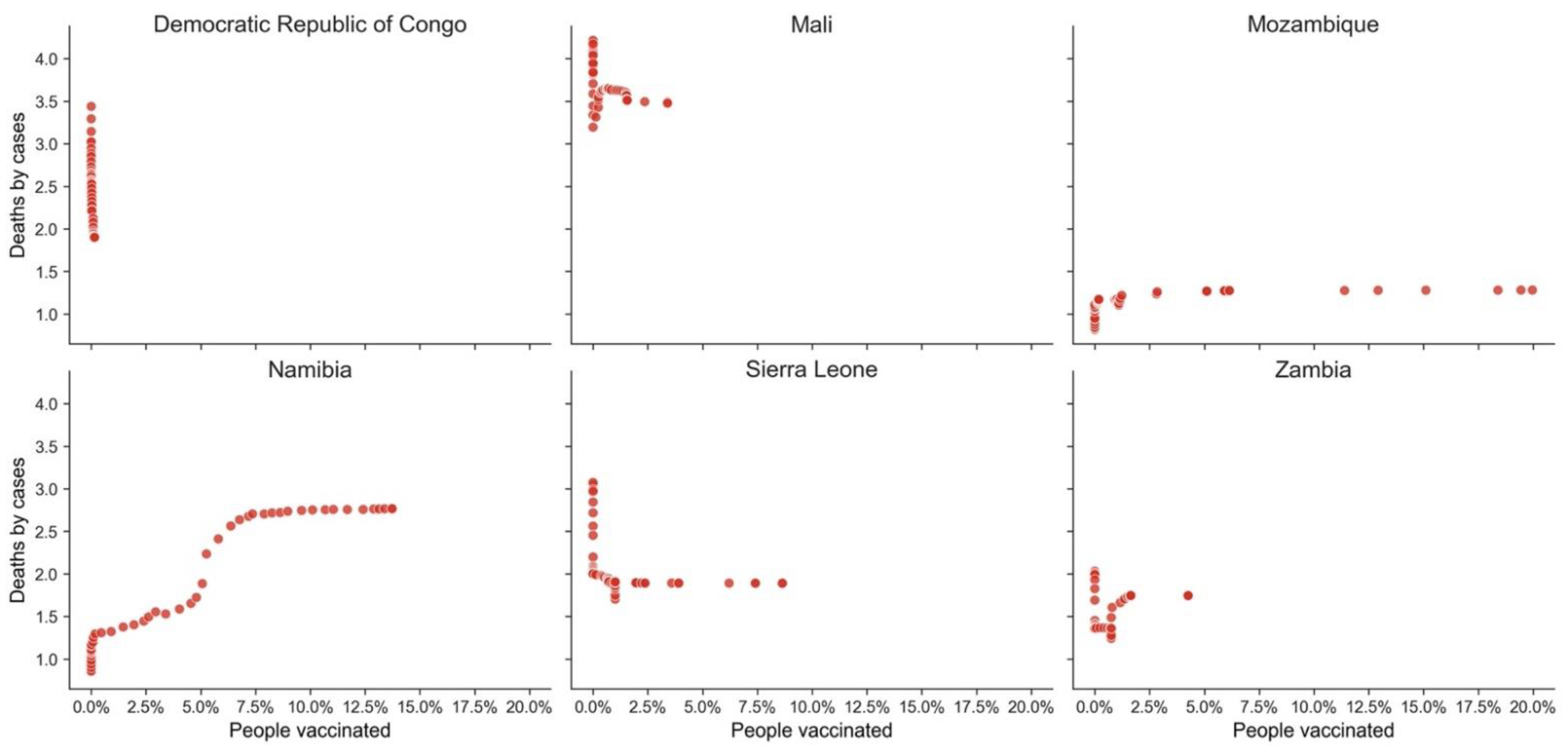
| GPE | HDI | Death Ratio | People Vaccinated % |
|---|---|---|---|
| Democratic Republic of Congo | 0.480 | 1.901 | 0.15 |
| Mali | 0.434 | 3.476 | 3.40 |
| Mozambique | 0.456 | 1.281 | 19.97 |
| Namibia | 0.646 | 2.766 | 13.73 |
| Sierra Leone | 0.452 | 1.890 | 8.64 |
| Zambia | 0.584 | 1.745 | 4.26 |
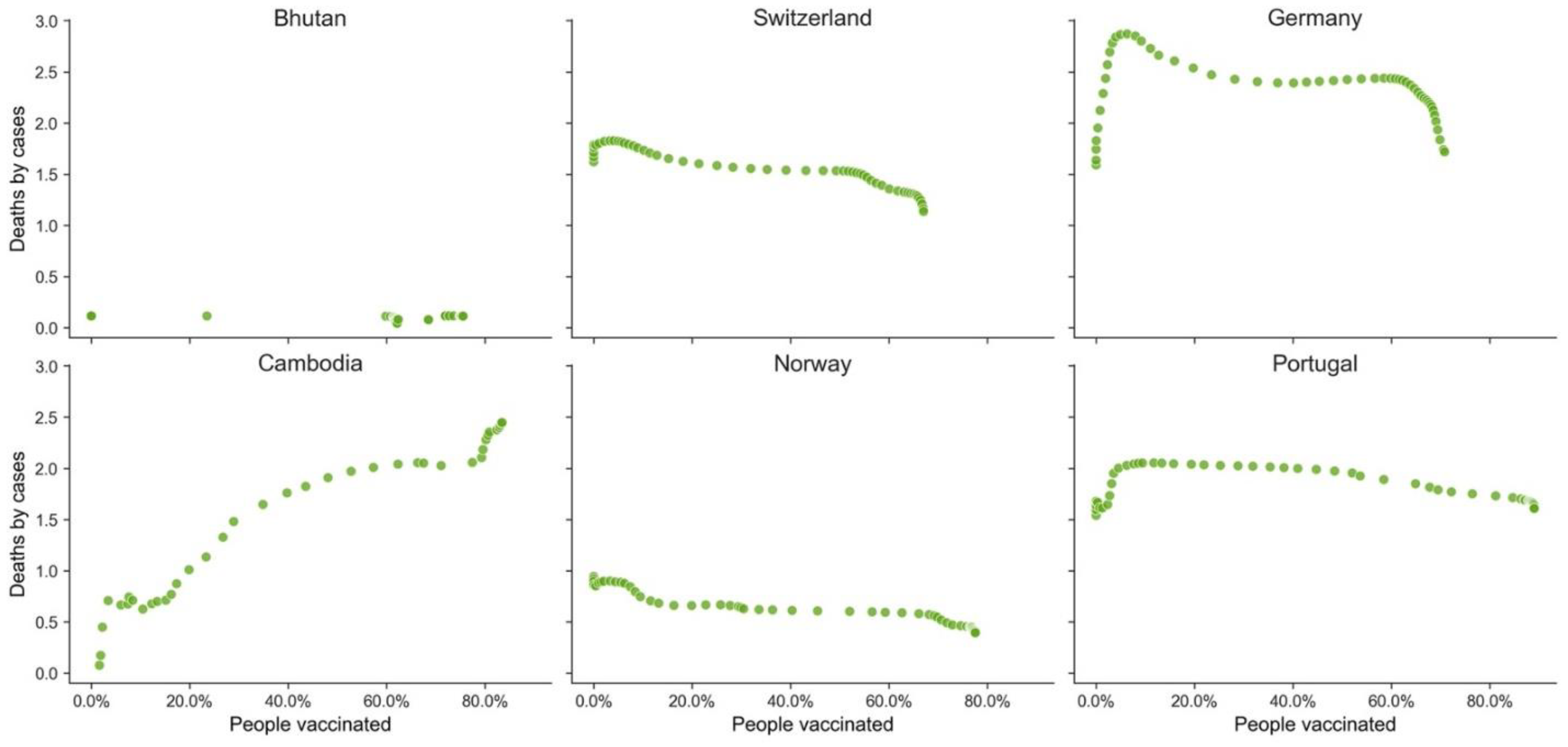
| GPE | HDI | Death Ratio | People Vaccinated % |
|---|---|---|---|
| Bhutan | 0.654 | 0.114 | 75.54 |
| Switzerland | 0.955 | 1.136 | 67.04 |
| Germany | 0.947 | 1.718 | 70.81 |
| Cambodia | 0.594 | 2.447 | 83.47 |
| Norway | 0.957 | 0.394 | 77.56 |
| Portugal | 0.864 | 1.607 | 89.04 |
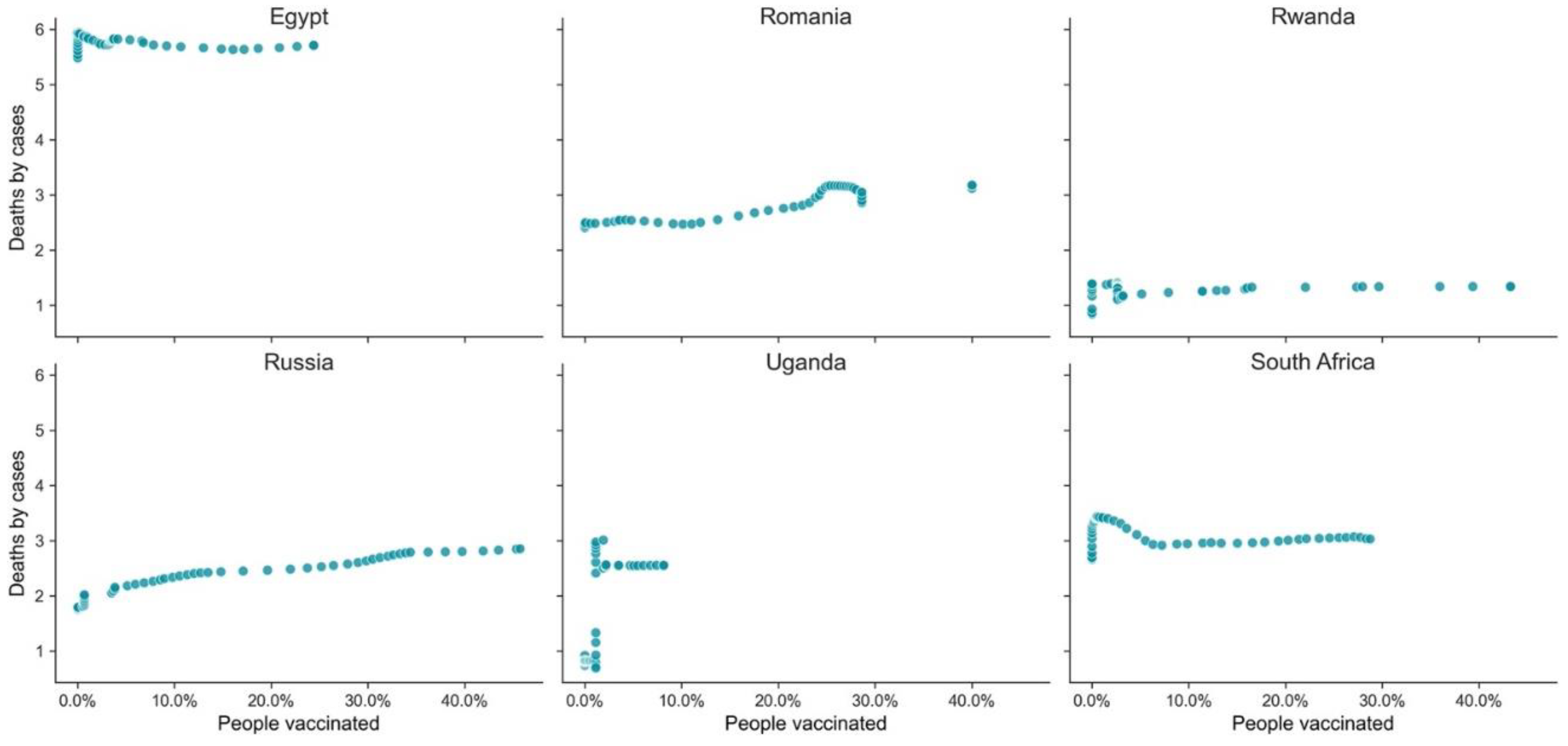
| GPE | HDI | Death Ratio | People Vaccinated % |
|---|---|---|---|
| Egypt | 0.707 | 5.710 | 24.40 |
| Romania | 0.828 | 3.176 | 40.03 |
| Rwanda | 0.824 | 1.337 | 43.27 |
| Russia | 0.543 | 2.850 | 45.74 |
| Uganda | 0.544 | 2.550 | 8.15 |
| South Africa | 0.709 | 3.027 | 28.75 |
Publisher’s Note: MDPI stays neutral with regard to jurisdictional claims in published maps and institutional affiliations. |
© 2022 by the authors. Licensee MDPI, Basel, Switzerland. This article is an open access article distributed under the terms and conditions of the Creative Commons Attribution (CC BY) license (https://creativecommons.org/licenses/by/4.0/).
Share and Cite
Antonio, N.; Rita, P.; Saraiva, P. Effectiveness of COVID-19 Vaccines: Evidence from the First-Year Rollout of Vaccination Programs. Vaccines 2022, 10, 409. https://doi.org/10.3390/vaccines10030409
Antonio N, Rita P, Saraiva P. Effectiveness of COVID-19 Vaccines: Evidence from the First-Year Rollout of Vaccination Programs. Vaccines. 2022; 10(3):409. https://doi.org/10.3390/vaccines10030409
Chicago/Turabian StyleAntonio, Nuno, Paulo Rita, and Pedro Saraiva. 2022. "Effectiveness of COVID-19 Vaccines: Evidence from the First-Year Rollout of Vaccination Programs" Vaccines 10, no. 3: 409. https://doi.org/10.3390/vaccines10030409
APA StyleAntonio, N., Rita, P., & Saraiva, P. (2022). Effectiveness of COVID-19 Vaccines: Evidence from the First-Year Rollout of Vaccination Programs. Vaccines, 10(3), 409. https://doi.org/10.3390/vaccines10030409