Article

A Study of Colormaps in Network Visualization

1
Life Media Interdisciplinary Program, Ajou University, Suwon 16499, Korea
2
Department of Computer Science, University of California, Davis, CA 95616, USA
3
Department of Digital Media, Ajou University, Suwon 16499, Korea
*
Author to whom correspondence should be addressed.
Appl. Sci. 2019, 9(20), 4228; https://doi.org/10.3390/app9204228
Submission received: 26 August 2019 / Revised: 23 September 2019 / Accepted: 3 October 2019 / Published: 10 October 2019

Abstract

:
Color is a widely used visual channel for encoding data in visualization design. It is important to select the appropriate type of color mapping to better understand the data. While several studies have investigated the effects of colormaps in various types of information visualization, there have been no studies on their effects on network visualization. Thus, in this paper, we investigate the effects of several colormaps in network visualization using node-link diagrams. Specifically, we compare four different single- and multi-hue colormaps for node attributes, and evaluate their effectiveness in terms of task completion time and correctness rate. Our results show that participants complete their tasks significantly faster with blue (single-hue, sequential) as compared to viridis (multi-hue, sequential), RdYlBu (divergent, red-yellow-blue), and jet (rainbow) colormaps. Additionally, the overall correctness rate shows significant differences between colormaps, with viridis being the least error-prone among the colormaps studied.

1. Introduction

Color is commonly used for the visual encoding of data in many visualization designs. A colormap specifically refers to a mapping from data values to colors. It is crucial to use the appropriate colormap for the data under study, as a good colormap helps viewers to understand and communicate with the data, while a bad colormap can mislead the viewers in terms of understanding the data. Researchers have used several types of colormaps for data visualization such as blue (single-hue, sequential), RdYlBu (diverging, red-yellow-blue), viridis (multi-hue, sequential), and jet (rainbow), as shown in Figure 1.
Visualization designers select a colormap either based on their intuition and experience or based on recommendations from color science [1]. The effectiveness of a colormap depends on various factors [2]. For example, an effective colormap for encoding ordered data often uses luminance and saturation to encode the values, since hue does not have an intuitive ordering [3]. In addition, the effect of a colormap for a given dataset can differ depending on the task [4]. Furthermore, different mark types can affect the perception of color differences [1].
While several studies have investigated the effects of colormaps in various types of data visualization, no study has examined their use in network visualization. Network visualization is widely used in a variety of domains, such as social [5] and biological sciences [6,7,8]. There are multiple approaches available for visualizing networks, such as the visual matrix, node-link diagram, and space layout [9]. Of these, the node-link diagram, which depicts a set of entities (nodes) as points and the relationship among them (links) as lines, is the most popular technique.
The goal of this study is to investigate the effects of four different colormaps for encoding quantitative node attributes in a node-link diagram. The colormaps (Figure 1) considered for the evaluation are blue (single-hue, sequential), RdYlBu (divergent), viridis (multi-hue, sequential, perceptually uniform), and jet (rainbow). Additionally, we use structural and non-structural node attributes to see how the effectiveness of colormaps differs depending on the type of node attribute assessed. We analyze the task completion time and correctness rate of participants with each colormap in a node-link diagram.
The results of the user study show that the blue (single-hue, sequential) colormap performs faster than the other three multi-hue colormaps with respect to task completion time. However, in terms of correctness rate, blue is the most error-prone, while viridis (multi-hue, sequential, perceptually uniform) shows the most accurate results. We find that colormaps can perform differently when used in real visualizations as compared with their evaluation in an isolated setting without any given context or visualization. Thus, this study establishes a more in-depth understanding of colormaps in network visualization and also gives several guidelines that can be used by visualization designers to achieve effective color encoding for visualizing networks.

2. Related Work

2.1. Color Models in Visualization

Over the last five decades, researchers in the field of color science have defined a range of perceptually-uniform color spaces/models, including CIELAB [10], Δ E94 [11], DE2000 [12], and CAM02-UCS [13]. In particular, CIELAB is a popular choice in the field of data visualization due to its simple color distance calculation equation [1,14,15]. Although these models provide a useful approximation of the perceived color difference, they perform weakly in terms of identifying the factors which can influence color perception. Several factors, such as the size of color stimuli [16,17] and the spatial distance between two colors, can influence color perception [18]. For a comprehensive review of color models, please see [10,11,12].

2.2. Colormaps and Evaluation Studies

Mapping data to visual channels (e.g., position, size, and color) can reveal unseen patterns and insights in the data. In many existing studies (e.g., [17,19,20,21]), it is well documented that among the different visual channels, color is more powerful than size, shape, and orientation [22]. These studies also characterize the properties of a color scale that result in useful and effective colormaps [1].
There are three important properties of colormaps: discriminative power, uniformity, and order [23]. Discriminative power depicts the number of specific colors that viewers can identify on a color scale. Uniformity pertains to the consistency in perceived variations between pairs of equidistant areas sampled from various parts of a color scale. Order relates to the appearance that colors in the color scale follow in a natural progression.
Color encoding is a fundamental way of representing scalar values in visualizations, and therefore, it is used in a wide range of application scenarios [4]. Currently, designers develop colormaps based on their experience, cognitive heuristics, and empirical data from several experiments [24]. Cynthia Brewer’s ColorBrewer [25], a pioneering work in color encoding, explains the binary, qualitative, sequential, and diverging color scales used for visualization on cartographic maps [4]. In addition, survey studies have focused on the design of various colormaps and provided guidance on effective color encoding [2,26]. Zhou and Hansen [2] reviewed the systems used to generate colormaps based on perception and cognitive heuristics. For example, PRAVDAColor considers heuristics for color encoding based on perception, task, and data type [27]. In addition to using perceptual color space for encoding, algorithms have also been used to generate colormaps [28]. For example, Colorgorical [29] uses scores of perceptual distances, color names, and aesthetics models to generate categorical palettes, and ColorBrewer [30] schemes are modeled based on color theory and are then hand-tuned for aesthetics and performance.
The effectiveness of a colormap depends on the data and task at hand [2,26,31]; thus, one must consider the type of data in use before encoding to a certain colormap. Studies show that sequential colormaps best represent sequential data, whereas diverging data with a neutral or average midpoint is best suited for diverging colormaps [22]. Tominski et al. [4] designed a color mapping function to support tasks like comparison, localization, or identification of data values. ColorCAT [32] expanded the scope of this work by adding localization and identification tasks as well as colorblindness assessment.
Several tools have been developed to help users design colormaps. For example, Bergman et al. [27] developed a rule-based approach that takes spatial frequency into account, Cleveland and McGill [33] showed that different color channels communicate individual values less precisely than position or size, and MacEachren et al. [34] compared the effectiveness of color and other channels for investigating uncertainty.
Other aspects of colormap design that can affect their efficacy have also been studied, such as color naming and semantics [35,36], categorical similarity, and cognitive bias [1]. Using Choropleth maps, Brewer et al. [37] evaluated eight color schemes that support different visualization tasks. Liu et al. [24] performed a comparative analysis of different colormap types, with a focus on comparing the ability of single- and multi-hue color schemes to support similarity judgments. However, while numerous studies have investigated the effects of different colormaps in the context of visualization (Table 1), no studies have focused on the use of colormaps for network visualization. Thus, the current study presents a comparative evaluation of single- and multi-hue colormaps in network visualization.

3. User Study

The main purpose of our study is to evaluate the use of colormaps in network visualization using a node-link diagram. Specifically, we compare structural and non-structural attributes of four different colormaps.

3.1. Experimental Design

We design a within-subject experiment involving Four colormaps × three datasets × two node attributes × two span values. The dependent variables in this study are the task completion time and correctness rate. Task completion time was recorded after the participant clicked the “Start” button, which took the user to the next window showing a task to perform in a node-link diagram with the help of a colormap legend.
We performed a preliminary pilot study before the actual user study to uncover any issues with our experimental design. Several factors were identified as affecting participants’ behaviors towards the study and potentially having negative impacts on the study results. These issues were taken into account and are explained in detail in each category below.

3.1.1. Node Attributes

We considered two node attributes for our study: one structural and one non-structural.
  • PageRank: This is a ranking of the nodes in the node-link diagram based on the structure of incoming links. It is determined by counting the number of links to a node to get a rough estimate of how important that node is a network. It is assumed that more important nodes are more likely to receive a greater numbers of links;
  • Random: As a non-structural node attribute, we assigned random values in [ 0 , 1 ] for each node with a uniform distribution.
We could have used more node attributes in our study, but this would have increased the total number of tasks, and our pilot study indicated that having a large number of tasks could negatively affect our results. Thus, we selected two node attributes. Specifically, PageRank was selected due to its wide usage in finding important nodes.

3.1.2. Task

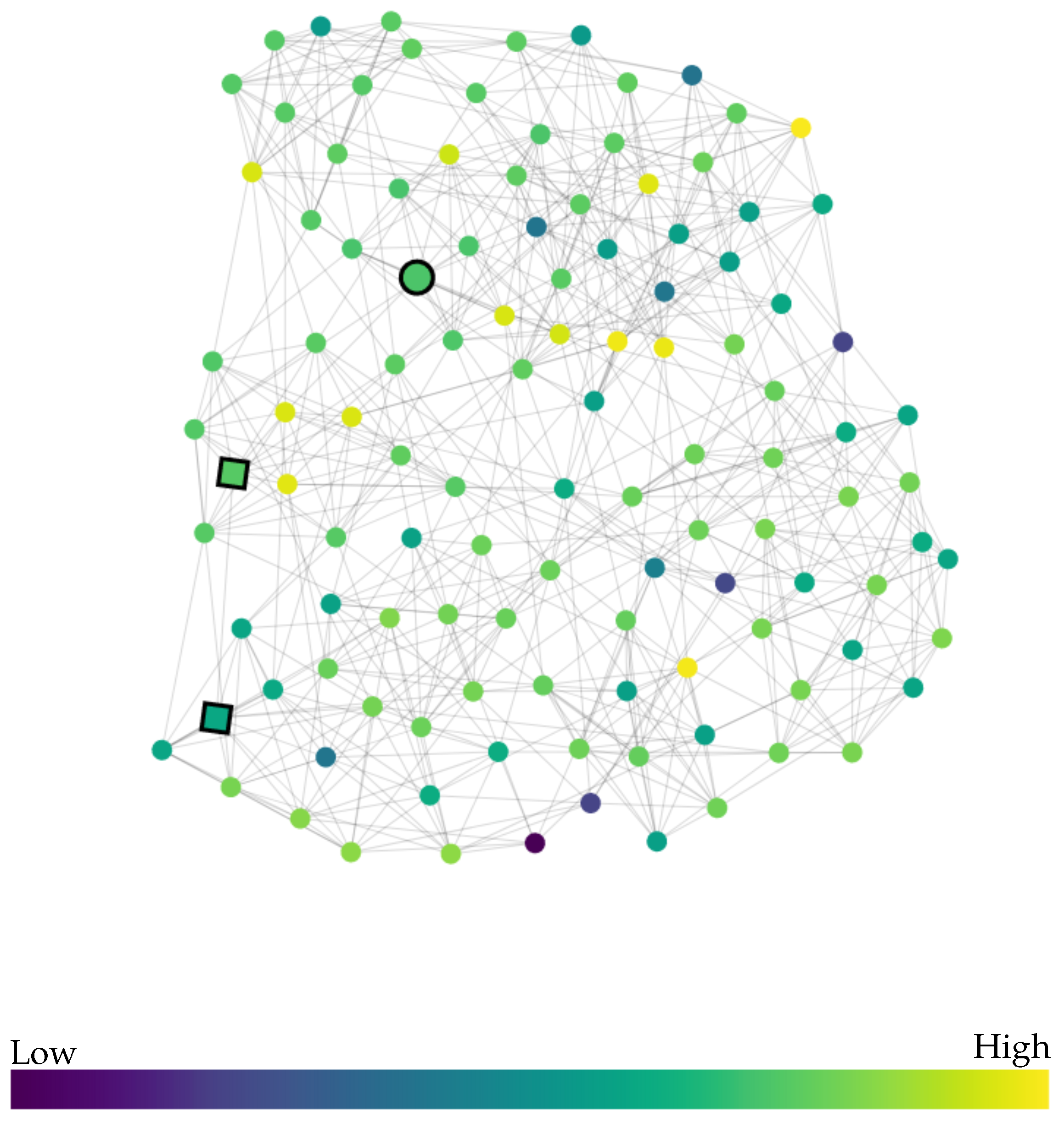
Participants were shown a node-link diagram with three highlighted nodes as stimuli, as shown in Figure 2. The three highlighted nodes represent the reference node (circle-shaped) and the other two are comparison nodes (square-shaped). We selected comparison and reference nodes based on span values. Assuming a data domain of [ 0 , 100 ] , two comparison nodes were generated with span values, the distance between two comparison nodes in uniform data value steps along the given colormap, of 15 and 40. The reference node was randomly generated inside a given span value. Participants were asked to select the comparison node that appeared closer in distance to the reference node based on a given colormap.

3.1.3. Datasets

Four different networks were used for the study: one for the training session and the other three for the actual user study. All the networks have different numbers of nodes and edges.
  • Karate: this dataset, which has 34 nodes and 78 links, is the well-known and popularly used Zachary karate club network [38]. It was used for training;
  • Lesmis: this network, which has 77 nodes and 254 links, is constructed based on co-occurrences of characters in Les Misérables [39];
  • Football: this is a network of an American football game from 2000 [40] with 115 nodes and 613 links;
  • Jazz: this is a collaboration network between jazz musicians [41] with 198 nodes and 2742 links.
All networks were laid out with the sfdp layout algorithm [42]. There are numerous layout algorithms for network visualization [43]. An experiment with multiple layouts and colormaps can reveal interesting interactions between layouts and colormaps. However, adding one more factor (layout) in our experiment design, with possibly two to four levels, significantly increases the number of tasks for the participants which will lead to fatigue in the user study. As the main focus of this study is the effect of different colormaps in the context of network visualization, we did not use other layout methods in our experiment.

3.1.4. Colormaps

There are many categories of colormaps, such as sequential, categorical, diverging, and cyclic, where each category includes multiple colormaps. Due to their volume, it is impractical to evaluate all colormaps. For this study, we selected four representative colormaps from the sequential, diverging, and miscellaneous categories, as defined in Matplotlib [44]. Our selection process was based on a recent colormap evaluation study [24]. We selected two sequential colormaps (blue, viridis), one diverging colormap (RdYlBu), and one rainbow colormap (jet).
For quantitative data, sequential colormaps are often used ahead of other types. Single-hue sequential colormaps (e.g., blue in Figure 1a) are arranged from high to low to encode increasing numeric values. These primarily represent the values with a linear ramping in the luminance [25] and are used to represent information that has an order. High data values are represented by dark colors and low values by light colors [22]. Light-to-dark progression dominates the scheme, as studies have shown that dark colors contain more bias. People inferred that the dark color represents higher or larger values and light color represents low values respectively.
Studies show that the human visual system supports the discrimination of higher spatial frequencies in the luminance channel [45]. Similarly, multi-hue sequential colormaps are used to encode increasing numeric values, additional ramping in hues and luminance is used together for better color discrimination. A new perceptually uniform color model, the viridis colormap (Figure 1c), and its variants [46] is frequently used in visualization tools. These colormaps are perceptually graded by both hue and luminance ramping so that the amount of color change in each color step appears consistent.
In contrast to sequential colormaps, diverging colormaps (e.g., RdYlBu in Figure 1b) are used to encode quantitative values between two contrasting colors at either end with a neutral mid-point, such as zero or the average value. Divergent colormaps are best suited when there is a well-defined reference (midpoint) in the data. They are used to compare data values to a reference (midpoint) value in a manner that visually highlights whether values are above or below the reference. Color ramps with different hues diverge with increasing saturation to highlight the values below and above the mid-point [47].
Rainbow colormaps (e.g., jet in Figure 1d) have been used frequently in many visualization designs. However, recent studies show that rainbow colormaps have several limitations, especially for mapping ordinal data, as they lack perceptual ordering [48,49,50]. Furthermore, they are not suitable for colorblind users [49]. A lack of perceptual ordering and uncontrolled luminance variation can be misleading for data interpretation [48].
Most existing studies used colormaps in an isolated setting, not in a real visualization. In addition, the evaluation of colormaps has not been applied in any kind of network visualization technique.
In the pilot study, we used eight colormaps: sequential (grey, blue, and YlGnBu), perceptually uniform (viridis, inferno, and magma) with diverging (RdYlBu) and rainbow (jet) colormaps for comparison. Having eight colormaps along with the other factors (i.e., datasets, node attributes, and spans) was a lot to ask from the participants. With eight colormaps, participants felt fatigued and lost their interest during the study.
A previous study [24] regarding the comparative study of different colormaps showed that viridis (multi-hue, sequential) and blue (single-hue, sequential) outperformed other colormaps in terms of reaction time and error rate. Thus, we selected the two sequential colormaps to compare with a diverging and a rainbow colormap. We used blue (single-hue, sequential), viridis (multi-hue, sequential), RdYlBu (diverging), and jet (rainbow) for our user study. These four colormaps can be considered representatives of each category of colormaps.

3.1.5. Participants

For the user study, we recruited 36 participants (24 males and 12 females). One participant was excluded because of color blindness. Out of the remaining 35 participants, 18 were graduate students and 17 were undergraduate students. The age of the participants ranged from 22 to 38, with a mean age of 28.29 years ( S D = 4.29 ). Students were compensated with a gift card (worth a cup of coffee) after finishing the user study.

3.2. Procedure

First, participants were asked to record their age and gender to start the user study. An instruction page was shown to the participant explaining what network visualization (node-link diagram) and colormaps are and what the purpose of this study was.
The introduction page included the following task instructions: “Based on the given colormap, you will be asked to select one of the two comparison nodes which you think is closer to the reference node. To perform the task, you have to click on one of the two comparison nodes as your answer to that task. For each task, your reaction time and correctness (true/false) to that task will be recorded. Please perform the task as quickly and accurately as possible by utilizing the graph and colormap given”.
After reading the instructions, participants were navigated to the next page to perform a screening test for color-vision deficiencies using six Ishihara plates. Before the experimental task, a training session consisting of three practice tasks using different graphs with random colormaps (different from those used in the actual user study) was administered. After selecting any node as an answer, participants were able to see the task completion time and the correctness of their answer. This allowed them to understand the variables recorded for each task. Participants were asked to respond to the task as quickly and accurately as possible while prioritizing the accuracy of the task.
After the training session, participants began the experimental tasks by pressing the “start” button. When participants completed a task by clicking a comparison node, they were navigated to the next task without any delay. To remove the learning effect, the order of colormaps, tasks, and datasets were randomized.

4. Results

4.1. Task Completion Time

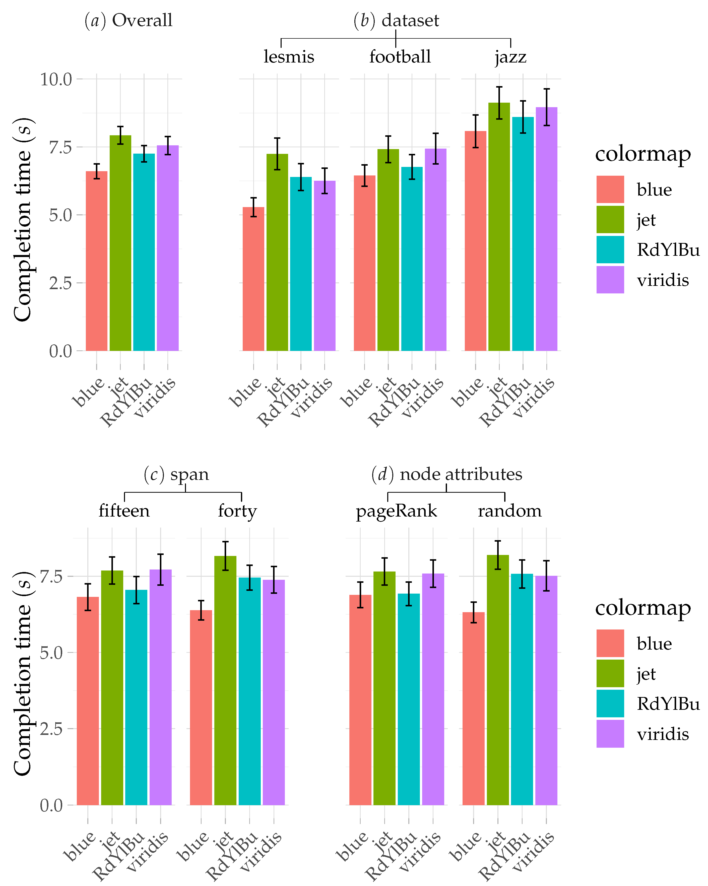
On average, each task took 7.33 s ( S D = 6.34 s) to complete. A repeated measures ANOVA showed that the colormaps had a significant effect on the task completion time ( F 3 , 102 = 9.4, p < 1.38 × 10 5 ). The average task completion time (see Figure 3) was 7.92 s for jet ( S D = 6.61 s), 7.55 s for viridis ( S D = 6.83 s), 7.25 s for RdYlBu ( S D = 6.16 s), and 6.60 s for blue ( S D = 5.54 s). In terms of task completion time, blue outperformed the other colormaps.
The post-hoc test using the Bonferroni correction showed that the task completion time for blue was faster than viridis ( p < 0.02 ) and jet (p < 8.7 × 10 7 ), respectively. RdYlBu was significantly faster than jet ( p < 0.02 ). Furthermore, viridis was significantly different and faster than jet ( p < 0.04 ). However, the difference between viridis and diverging RdYlBu was not significant.
The dataset used had a significant effect on task completion time ( F 2 , 68 = 53.6 , p < 1.04 × 10 14 ). However, as expected, the largest network took more time than the smaller graphs. The average task completion time (see Figure 3) was 6.29 s for lesmis ( S D = 5.70 s), 7.01 s for football ( S D = 5.65 s), and 8.69 s for jazz ( S D = 7.25 s).
The span values of 15 and 40 had no significant effect on the task completion time. Similarly, the node structural (PageRank) and non-structural (Random) attributes had no significant effect on the task completion time.

4.2. Correctness Rate

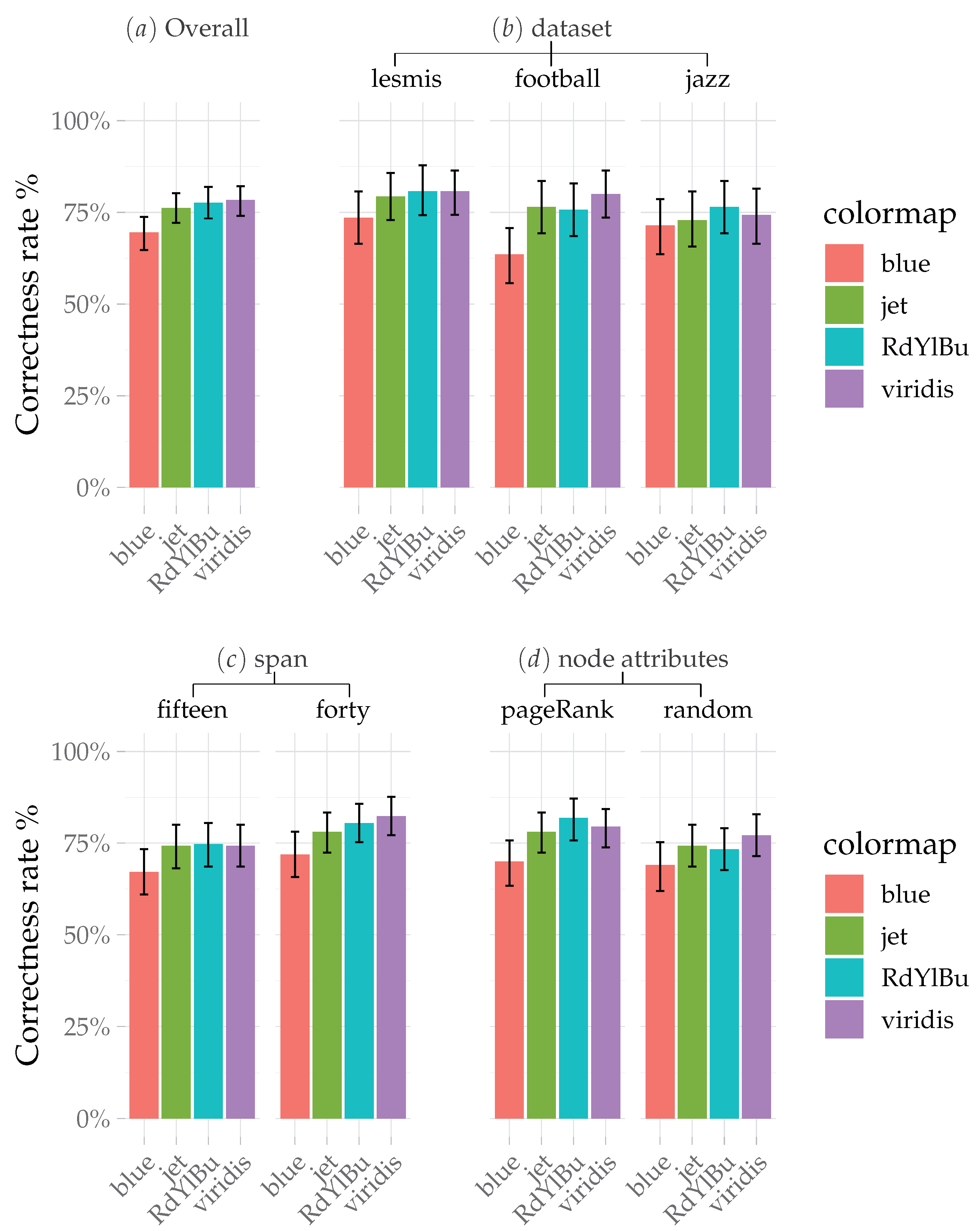
Overall, 75.4% of the tasks were completed correctly. A repeated measures ANOVA showed a significant effect of colormaps ( F 3 , 102 = 4.56 , p < 0.004 ) and span ( F 1 , 34 = 6.62 , p < 0.01 ) on the correctness rate.
The post-hoc test using showed that viridis outperformed all other colormaps (see Figure 4) with the highest number of correctly answered tasks (329 out of 420). Blue was the most error-prone out of all of the colormaps with the least number of correctly answered tasks (292 out of 420) and was significantly different from the viridis ( p < 0.01 ) and diverging RdYlBu ( p < 0.03 ) colormaps. Jet had no significant effect on the correctness rate compared with the other colormaps.
The post-hoc test for correctness rate revealed significant effects of span ( p < 0.004 ) and node attributes ( p < 0.04 ). With respect to span, participants performed more accurately on colormaps with a span value of 40 than those with the smaller value of 15. In terms of node attributes, the use of PageRank (structural attribute) led to a higher correctness rate than random (non-structural attribute).
Additionally, the smallest size dataset lesmis had a higher correctness rate than the other datasets and was significantly different from football ( p < 0.03 ) and jazz ( p < 0.04 ).

5. Discussion

In this study, we evaluated the task completion time and correctness rate of four colormaps through a quantitative analysis. The results of the user study indicate that blue (single-hue, sequential) has the shortest task completion time followed by RdYlBu (diverging), viridis (multi-hue, sequential), and jet (rainbow), respectively. In a previous study [24], blue and viridis had the shortest task completion times and also showed significantly different results from the diverging and rainbow colormaps. This shows that participants completed their tasks faster when using colormaps with fewer hues. This may be because the perceptual distances across different hues are less apparent as compared to those of a colormap with only a few hues (1–3) throughout the whole colormap. Further, this discordance may occur as a result of the increased effort involved in consulting the given colormap, which eventually increased the task completion time. That is why participants require more time for task completion when configuring distances with colormaps other than blue.
On the other hand, viridis (multi-hue, sequential) demonstrated a higher correctness rate than the other colormaps. A previous study [24] also found viridis to be superior to other colormaps for correctness rate. In addition, with a small span value, the performance of the blue colormap is degraded. Although blue colormaps performed well with respect to task completion time, they were found to be the most error-prone, below all of the other colormaps. Overall, participants performed the tasks more accurately when using the higher span value of 40. As the span value decreased and the comparison nodes became closer to each other, the accuracy dropped. As a result of the single hue in the blue colormap, when the span value was small and the comparison nodes were closer to each other, it was very difficult for participants to achieve a good level of accuracy. On the other hand, regarding the other colormaps, even when the comparison nodes were close to each other, participants were still able to differentiate between them, as they contained more than one hue.
Another important reason for blue performing badly as compared to the other colormaps could be the high luminance of the colormap. With a white background, the comparison/reference node with a high luminance value makes it more difficult for the participants to accomplish the task accurately, which was not the case for the other colormaps.
Structural and non-structural node attributes did not show a significant difference in terms of task completion time. However, there was a significant difference in the correctness rate. Thus, the effect of a given colormap can differ depending on the node attribute in network visualization. We suspect that this difference is caused by the spatial proximity between nodes. The positions of nodes were computed with a layout algorithm [42], where structurally similar nodes were close to each other. Thus, it is possible that the spatial node position plays an effective role in the difference between the correctness rates of structural and non-structural node attributes.
A previous study [24] evaluated colormaps in isolation and found that viridis and blue outperformed the other colormaps. However, this was not the case in our study, which focused on the evaluation of network visualization. This shows that colormaps do not always perform the same way for different kinds of visualization techniques.
Thus, visualization designers should consider the importance of colormaps in network visualization as well as their performance when encoding data. For instance, multi-hue colormaps may be preferred to single-hue ones when visualizing continuous scalar node attributes, given their superior characteristics in terms of discrimination whilst preserving perception order.
Participants performed the user study in different viewing environments, as we designed it to comprise a variety of situational factors (surrounding, light, visual angles). By doing so, we obtained samples from a wide range of display conditions, because, in the real-world, visualizations are generally viewed in imperfect environments [1]. Recent research works [15,20] have shown that sampling across this variation can generate accurate models of color perception in practice.
This study is the first investigation of the effects of colormaps in network visualization. Our scope was limited to a few colormaps and node attributes. Ideally, we would have liked to consider more than four colormaps and more than two node attributes. Moreover, adding other factors (e.g., layouts and different tasks) along with colormaps can reveal interesting findings. The effect of the same colormap can vary depending on the interaction of different factors and colormaps. However, to prevent fatigue of the participants, we had to limit our scope.
In future work, we would like to address these limitations and extend our research to obtain further insights. We will consider the interaction between colormaps and other visual channels especially considering different layouts methods and the use of low-, high-, and mid-luminance points in several different colormaps in our future work.

6. Conclusions

In this paper, we have presented a thorough evaluation of four quantitative colormaps using a similarity judgment analysis considering time completion and the correctness rate. The single-hue colormap performed well in terms of the task completion time as compared with multi-hue colormaps. Further, viridis excelled in terms of error rate as compared to the other colormaps. With increased luminance, multi-hue colormaps appeared to be superior to single-hue colormaps with respect to the error rate. Thus, the results show significant differences among the given colormaps, providing insights into their effectiveness regarding different metrics of network visualization. Considering the importance of network visualization, especially in social network data, it is important to study various aspects of network visualization further. While it is highly unlikely that one single evaluation user study could cover all the major issues, we believe that our work has extended the knowledge of color encoding in network visualization. It can be taken as a good starting point and guide for color encoding design as well as providing a quantitative understanding of color perception for network visualization.

Author Contributions

Conceptualization, R.M.K. and O.-H.K.; methodology, R.M.K. and O.-H.K.; software, C.P.; validation, R.M.K.; formal analysis, R.M.K.; investigation, R.M.K.; data curation, R.M.K.; writing—original draft preparation, R.M.K.; writing—review and editing, R.M.K. and O.-H.K.; supervision, K.L.

Funding

This research was funded by [the Ministry of Education of the Republic of Korea and the National Research Foundation of Korea] grant number [NRF-2018S1A5B6075104] and [Brain Korea 21 Plus Digital Therapy Research Team] grant number [NRF31Z20130012946].

Conflicts of Interest

The authors declare no conflict of interest.

References

  1. Szafir, D.A. Modeling Color Difference for Visualization Design. IEEE Trans. Vis. Comput. Graph. 2018, 24, 392–401. [Google Scholar] [CrossRef] [PubMed]
  2. Zhou, L.; Hansen, C.D. A Survey of Colormaps in Visualization. IEEE Trans. Vis. Comput. Graph. 2016. [Google Scholar] [CrossRef] [PubMed]
  3. Munzner, T. Visualization Analysis and Design. In AK Peters Visualization Series; CRC Press: Boca Raton, FL, USA, 2014. [Google Scholar]
  4. Tominski, C.; Fuchs, G.; Schumann, H. Task-driven color coding. In Proceedings of the 2008 12th International Conference Information Visualisation, London, UK, 9–11 July 2008; pp. 373–380. [Google Scholar]
  5. Viégas, F.B.; Donath, J. Social network visualization: Can we go beyond the graph. In Proceedings of the Workshop on Social Networks (CSCW), Chicago, IL, USA, 6–10 November 2004; Volume 4, pp. 6–10. [Google Scholar]
  6. Alper, B.; Bach, B.; Henry Riche, N.; Isenberg, T.; Fekete, J.D. Weighted graph comparison techniques for brain connectivity analysis. In Proceedings of the SIGCHI Conference on Human Factors in Computing Systems, Paris, France, 27 April–2 May 2013; ACM: New York, NY, USA, 2013; pp. 483–492. [Google Scholar] [Green Version]
  7. Jourdan, F.; Melançon, G. Tool for metabolic and regulatory pathways visual analysis. In Proceedings of the Visualization and Data Analysis 2003, International Society for Optics and Photonics, Santa Clara, CA, USA, 21–23 January 2003; Volume 5009, pp. 46–56. [Google Scholar]
  8. Barsky, A.; Gardy, J.L.; Hancock, R.E.; Munzner, T. Cerebral: A Cytoscape plugin for layout of and interaction with biological networks using subcellular localization annotation. Bioinformatics 2007, 23, 1040–1042. [Google Scholar] [CrossRef] [PubMed]
  9. Cui, W.; Qu, H. A Survey on Graph Visualization. Ph.D. Thesis, Clear Water Bay, Hong Kong, China, 2007. [Google Scholar]
  10. L’Eclairage, C.I.D. CIE Recommendations on Uniform Color Spaces, Color-Difference Equations, and Metric Color Terms. Color Res. Appl. 1977, 2, 5–6. [Google Scholar] [CrossRef]
  11. McDonald, R.; Smith, K.J. CIE94-a new colour-difference formula. J. Soc. Dyers Colour. 1995, 111, 376–379. [Google Scholar] [CrossRef]
  12. Luo, M.R.; Cui, G.; Rigg, B. The development of the CIE 2000 colour-difference formula: CIEDE2000. Color Res. Appl. 2001. [Google Scholar] [CrossRef]
  13. Lou, R.M.; Cui, G.; Li, C. Uniform colour spaces based on CIECAM02 colour apperance model. Color Res. Appl. 2006. [Google Scholar] [CrossRef]
  14. Fechner, G.; Howes, D.; Boring, E. Elements of Psychophysics; Holt, Rinehart and Winston: New York, NY, USA, 1966. [Google Scholar]
  15. Reinecke, K.; Flatla, D.R.; Brooks, C. Enabling designers to foresee which colors users cannot see. In Proceedings of the 2016 CHI Conference on Human Factors in Computing Systems, San Jose, CA, USA, 7–12 May 2016; ACM: New York, NY, USA, 2016; pp. 2693–2704. [Google Scholar]
  16. Carter, R.C.; Silverstein, L.D. Size matters: Improved color-difference estimation for small visual targets. J. Soc. Inf. Disp. 2010, 18, 17. [Google Scholar] [CrossRef]
  17. Stone, M.; Szafir, D.A.; Setlur, V. An engineering model for color difference as a function of size. In Proceedings of the Color and Imaging Conference, Boston, MA, USA, 3–7 November 2014; Volume 2014, pp. 253–258. [Google Scholar]
  18. Brychtová, A.; Çöltekin, A. The effect of spatial distance on the discriminability of colors in maps. Cartogr. Geogr. Inf. Sci. 2017, 44, 229–245. [Google Scholar] [CrossRef]
  19. Schott, G.D. Colored Illustrations of the Brain: Some Conceptual and Contextual Issues. Neuroscientist 2010, 16, 508–518. [Google Scholar] [CrossRef]
  20. Szafir, D.A.; Stone, M.; Gleicher, M. Adapting color difference for design. In Proceedings of the Color and Imaging Conference, Boston, MA, USA, 3–7 November 2014; Volume 2014, pp. 228–233. [Google Scholar]
  21. Schloss, K.B.; Lessard, L.; Walmsley, C.S.; Foley, K. Color inference in visual communication: The meaning of colors in recycling. Cogn. Res. Princ. Implic. 2018, 3, 5. [Google Scholar] [CrossRef] [PubMed]
  22. Schloss, K.B.; Gramazio, C.C.; Silverman, A.T.; Parker, M.L.; Wang, A.S. Mapping Color to Meaning in Colormap Data Visualizations. IEEE Trans. Vis. Comput. Graph. 2018, 25, 810–819. [Google Scholar] [CrossRef] [PubMed]
  23. Bujack, R.; Turton, T.L.; Samsel, F.; Ware, C.; Rogers, D.H.; Ahrens, J. The Good, the Bad, and the Ugly: A Theoretical Framework for the Assessment of Continuous Colormaps. IEEE Trans. Vis. Comput. Graph. 2017, 24, 923–933. [Google Scholar] [CrossRef] [PubMed]
  24. Liu, Y.; Heer, J. Somewhere Over the Rainbow: An Empirical Assessment of Quantitative Colormaps. In Proceedings of the 2018 CHI Conference on Human Factors in Computing Systems—CHI’18, Montreal, QC, Canada, 21–26 April 2018. [Google Scholar]
  25. Brewer, C.A. Color use guidelines for mapping. Vis. Mod. Cartogr. 1994, 2, 123–148. [Google Scholar]
  26. Silva, S.; Santos, B.S.; Madeira, J. Using color in visualization: A survey. Comput. Graph. 2011, 35, 320–333. [Google Scholar] [CrossRef]
  27. Bergman, L.D.; Rogowitz, B.E.; Treinish, L.A. A rule-based tool for assisting colormap selection. In Proceedings of the IEEE Visualization’95, Atlanta, GA, USA, 28 October 1995; pp. 118–125. [Google Scholar]
  28. Jacomy, M. I Want Hue. 2015. Available online: http://tools.medialab.sciences-po.fr/iwanthue/ (accessed on 18 July 2019).
  29. Gramazio, C.C.; Laidlaw, D.H.; Schloss, K.B. Colorgorical: Creating discriminable and preferable color palettes for information visualization. IEEE Trans. Vis. Comput. Graph. 2016, 23, 521–530. [Google Scholar] [CrossRef] [PubMed]
  30. Harrower, M.; Brewer, C.A. ColorBrewer.org: An Online Tool for Selecting Colour Schemes for Maps. Cartogr. J. 2003, 40, 27–37. [Google Scholar] [CrossRef]
  31. Rheingans, P.L. Task-based color scale design. In Proceedings of the 28th AIPR Workshop: 3D Visualization for Data Exploration and Decision Making, Washington, DC, USA, 5 May 2000; Volume 3905, pp. 35–43. [Google Scholar]
  32. Mittelstädt, S.; Jäckle, D.; Stoffel, F.; Keim, D.A. Colorcat: Guided design of colormaps for combined analysis tasks. In Proceedings of the Eurographics Conference on Visualization (EuroVis)-Short Papers, Zurich, Switzerland, 4–8 May 2015. [Google Scholar]
  33. Cleveland, W.S.; McGill, R. Graphical Perception: Theory, Experimentation, and Application to the Development of Graphical Methods. J. Am. Stat. Assoc. 1984, 79, 531–554. [Google Scholar] [CrossRef]
  34. MacEachren, A.M.; Roth, R.E.; O’Brien, J.; Li, B.; Swingley, D.; Gahegan, M. Visual semiotics & uncertainty visualization: An empirical study. IEEE Trans. Vis. Comput. Graph. 2012, 18, 2496–2505. [Google Scholar]
  35. Zacks, J.; Tversky, B. Bars and lines: A study of graphic communication. Mem. Cogn. 1999, 27, 1073–1079. [Google Scholar] [CrossRef]
  36. Lin, S.; Fortuna, J.; Kulkarni, C.; Stone, M.; Heer, J. Selecting Semantically-Resonant Colors for Data Visualization. Comput. Graph. Forum 2013, 32, 401–410. [Google Scholar] [CrossRef] [Green Version]
  37. Brewer, C.A.; MacEachren, A.M.; Pickle, L.W.; Herrmann, D. Mapping Mortality: Evaluating Color Schemes for Choropleth Maps. Ann. Assoc. Am. Geogr. 1997, 87, 411–438. [Google Scholar] [CrossRef]
  38. Zachary, W.W. An Information Flow Model for Conflict and Fission in Small Groups. J. Anthropol. Res. 1977, 33, 452–473. [Google Scholar] [CrossRef] [Green Version]
  39. Knuth, D. The Stanford GraphBase: A Platform for Combinatorial Computing; ACM Press: New York, NY, USA, 1994. [Google Scholar]
  40. Girvan, M.; Newman, M.E. Community structure in social and biological networks. Proc. Natl. Acad. Sci. USA 2002, 99, 7821–7826. [Google Scholar] [CrossRef] [PubMed] [Green Version]
  41. Gleiser, P.M.; Danon, L. Community structure in jazz. Adv. Complex Syst. 2003, 6, 565–573. [Google Scholar] [CrossRef]
  42. Hu, Y. Efficient and High Quality Force-Directed Graph Drawing. Math. J. 2005, 10, 37–71. [Google Scholar]
  43. Gibson, H.; Faith, J.; Vickers, P. A Survey of Two-dimensional Graph Layout Techniques for Information Visualization. Inf. Vis. 2013, 12, 324–357. [Google Scholar] [CrossRef]
  44. Hunter, J.D. Matplotlib: A 2D graphics environment. Comput. Sci. Eng. 2007, 9, 90. [Google Scholar] [CrossRef]
  45. Creel, D.J. Visual and Auditory Anomalies Associated with Albinism; University of Utah Health Sciences Center: Salt Lake City, UT, USA, 1995. [Google Scholar]
  46. Van der Walt, S.; Smith, N. A Better Default Colormap for Matplotlib. In Proceedings of the Python in Science (SciPy) Conference, Austin, TX, USA, 6–12 July 2015. [Google Scholar]
  47. Satyanarayan, A.; Moritz, D.; Wongsuphasawat, K.; Heer, J. Vega-Lite: A Grammar of Interactive Graphics. IEEE Trans. Vis. Comput. Graph. 2017, 23, 341–350. [Google Scholar] [CrossRef]
  48. Borland, D.; Taylor, R., II. Rainbow Color Map (Still) Considered Harmful. IEEE Comput. Graph. Appl. 2007, 27, 14–17. [Google Scholar] [CrossRef]
  49. Light, A.; Bartlein, P.J. The end of the rainbow? Color schemes for improved data graphics. Eos Trans. Am. Geophys. Union 2004, 85, 385. [Google Scholar] [CrossRef]
  50. Bethel, E.W.; Childs, H.; Hansen, C. High Performance Visualization: Enabling Extreme-Scale Scientific Insight, 1st ed.; Chapman & Hall/CRC: London, UK, 2012. [Google Scholar]
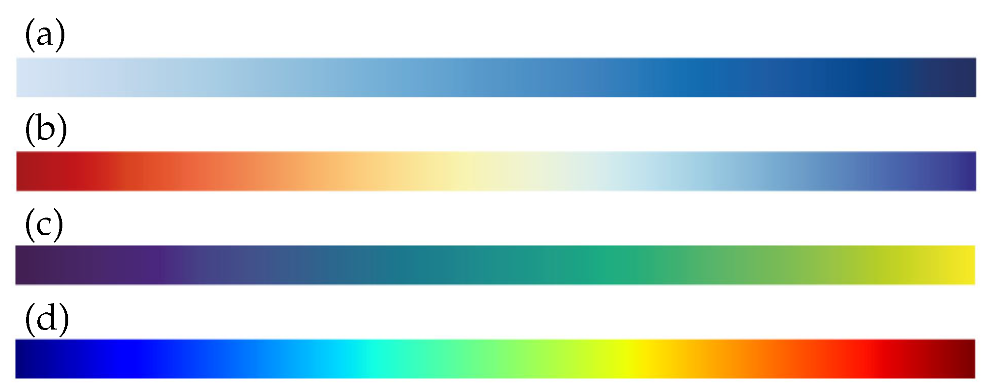
Figure 1. The colormaps used in this study: (a) blue (single-hue, sequential); (b) RdYlBu (diverging); (c) viridis (multi-hue, sequential, perceptually uniform); and (d) jet (rainbow).
Applsci 09 04228 g001
Figure 2. This figure shows one of the tasks from a user study in which participants were shown a node-link diagram along with a colormap legend. Dataset: football; colormap: viridis; node attribute: PageRank. Link to the user study: https://chanhee13p.github.io/colormapInNetworkMode2/.
Applsci 09 04228 g002
Figure 3. Results of the experiment for task completion time. (a) Shows the overall task completion time for each colormap which is then broken down further into datasets (b), and span (c), and node attributes (d).
Applsci 09 04228 g003
Figure 4. Results of the experiment for the correctness rate. (a) shows the overall correctness rate for each colormap, which is then broken down further into datasets (b), span (c), and node attributes (d).
Applsci 09 04228 g004
Table 1. Summary of related work.
CategoryAuthorSummary
EvaluationSzafir, D.A. [1]Modeling color difference perceptions for three common mark types: points, bars, and lines.
Brychtová, A. and Çöltekin, A. [18]Examine the effect of the spatial gap in discriminability of color hue and value between map symbols.
Schloss, K.B. et al. [22]Investigated how inferred color-quantity mappings for colormap data visualizations were influenced by the background color.
Liu, Y. and Heer, J. [24]A comparative analysis of different colormap types, with a focus on comparing single- and multi-hue schemes.
Brewer, C.A et al. [37]Evaluating specific combinations of colors on maps, for selecting colors for choropleth maps of mortality data.
Recommendations and colormap generating toolsTominski, C. et al. [4]Describe a color coding approach that accounts for the different tasks users might pursue when analyzing data.
Bergman, L.D. et al. [27]An interactive approach for guiding the user’s selection of colormaps in visualization.
Gramazio, C.C. et al. [29]A web-based tool for creating discriminable and aesthetically preferable categorical color palettes.
Mittelstädt, S. et al. [32]Proposed a methodology and tool to design colormaps for combined analysis tasks.
Rheingans, P.L. [31]General guideline for different types of colormaps and their characteristics.
Borland, D. and Taylor Ii, R. [48]Explains the characteristics that make the rainbow color map a poor choice.
Light, A. and Bartlein, P.J. [49]Explains the drawbacks of rainbow colormap and guidelines to use other colormaps.
Brewer, C.A. [25]Guidelines to the use of color to directly represent data that occur at locations in the graphic.