
Eye-Tracking Study on Reading Fluency in Relation to Typeface Pleasantness Influenced by Cross-Modal Correspondence Between Taste and Shape


Abstract
1. Introduction
2. Materials and Methods
2.1. Participants
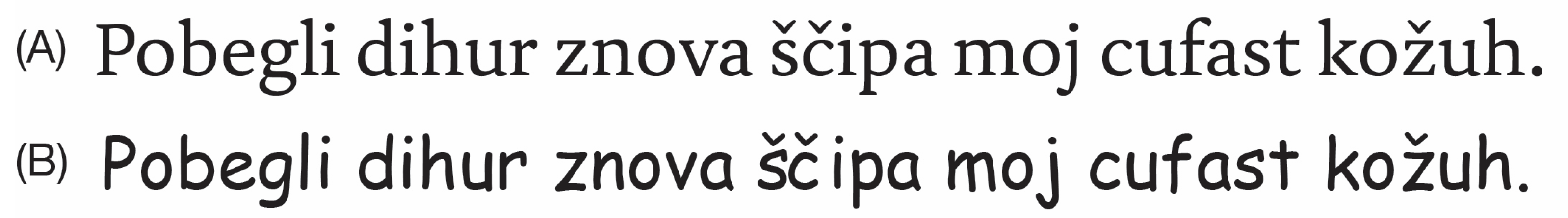
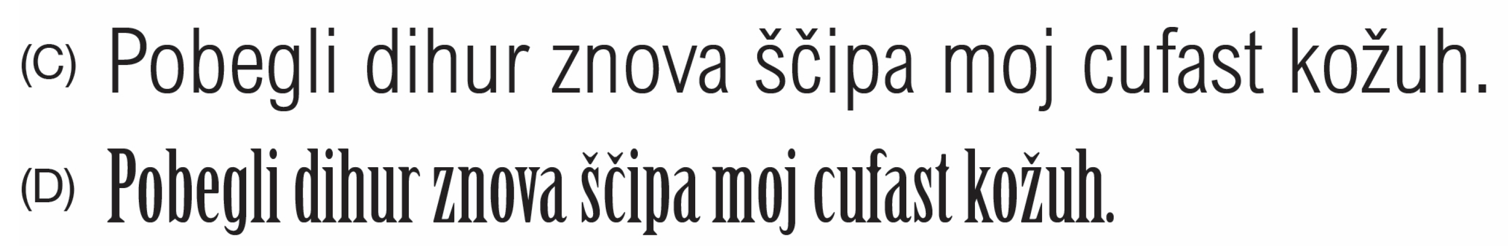
2.2. Stimuli
2.3. Apparatus and Instruments
2.4. Procedure
2.5. Data Analysis
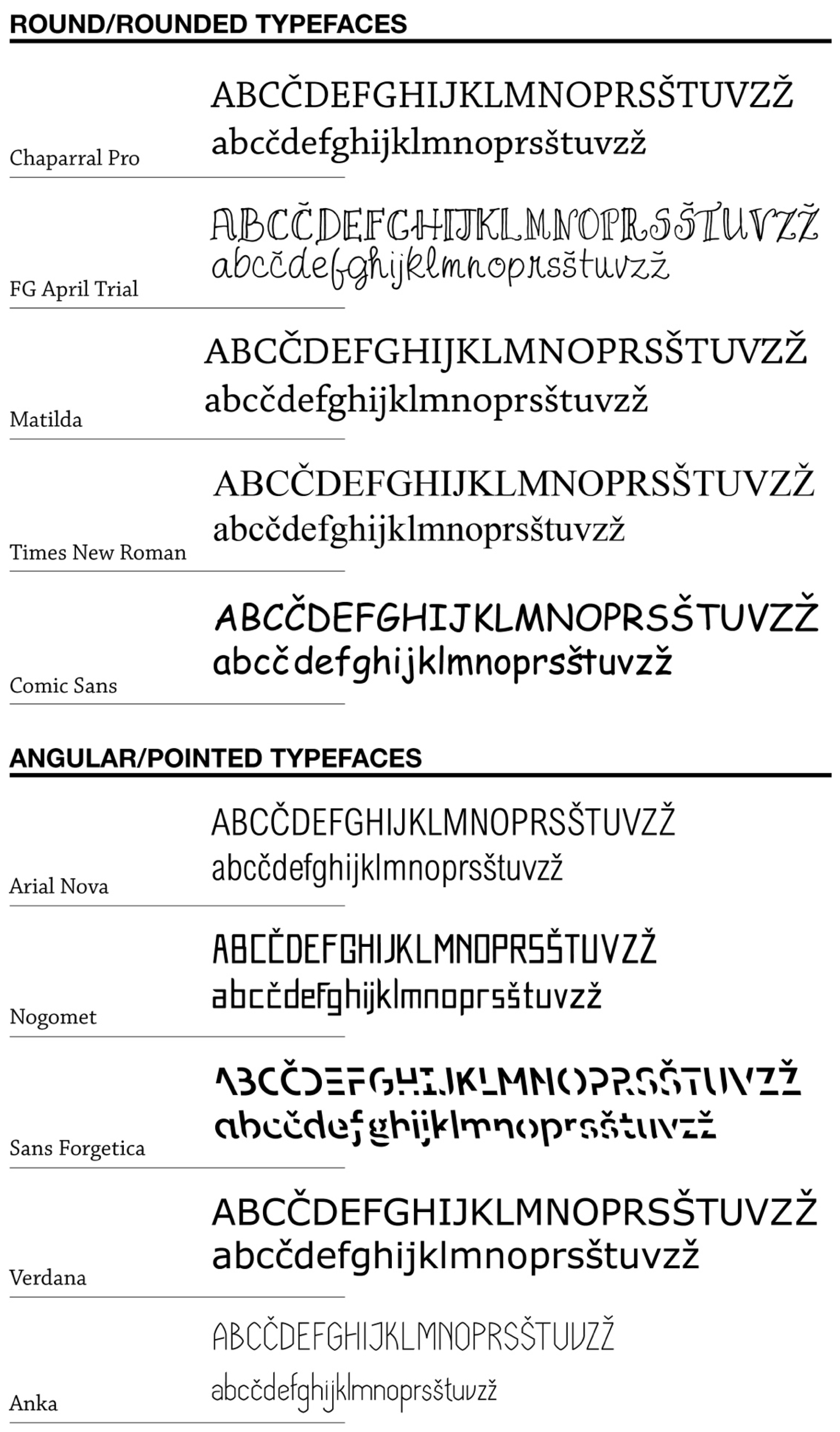
3. Results
4. Discussion
4.1. Cross-Modal Correspondence Between Typeface Shape and Taste (Sweetness)
4.2. Relationship Between Typeface Perceived Sweetness and Reading Fluency
4.3. Limitations
4.4. Conclusions
Author Contributions
Funding
Institutional Review Board Statement
Informed Consent Statement
Data Availability Statement
Acknowledgments
Conflicts of Interest
References
- Beier, S.; Sand, K.; Starrfelt, R. Legibility Implications of Embellished Display Typefaces. Visible Lang. 2017, 51, 107. [Google Scholar]
- Medved, T.; Podlesek, A.; Možina, K. Influence of Letter Shape on Readers’ Emotional Experience, Reading Fluency, and Text Comprehension and Memorisation. Front. Psychol. 2023, 14, 1107839. [Google Scholar] [CrossRef] [PubMed]
- Oderkerk, C.; Beier, S. Fonts of Wider Letter Shapes Improve Recognition in Peripheral Vision. Ergonomics 2020, 65, 753–761. [Google Scholar] [CrossRef]
- Brath, R.; Banissi, E. Using Typography to Expand the Design Space of Data Visualization. She Ji J. Des. Econ. Innov. 2016, 2, 59–87. [Google Scholar] [CrossRef]
- Brath, R. Text in Visualization: Extending the Visualization Design Space. Ph.D. Thesis, London South Bank University, London, UK, 2018. [Google Scholar]
- Bessemans, A. Matilda: A Typeface for Children with Low Vision. In Digital Fonts and Reading; World Scientific: Singapore, 2016; pp. 19–36. [Google Scholar]
- Bessemans, A. Typefaces for Children’s Reading. TMG 2016, 19, 1–9. [Google Scholar] [CrossRef]
- Beier, S.; Larson, K. How Does Typeface Familiarity Affect Reading Performance and Reader Preference? IDJ 2013, 20, 16–31. [Google Scholar] [CrossRef]
- Cacali, E. The Effects of Font on Vocabulary Memorization. Humanit. Rev. 2016, 21, 63–72. [Google Scholar]
- Gasser, M.; Boeke, J.; Haffeman, M.; Tan, R. The Influence of Font Type on Information Recall. N. Am. J. Psychol. 2005, 7, 181–188. [Google Scholar]
- Day, S.L.; Atilgan, N.; Giroux, A.E.; Sawyer, B.D. The Influence of Format Readability on Children’s Reading Speed and Comprehension. Educ. Sci. 2024, 14, 854. [Google Scholar] [CrossRef]
- Choi, S.; Jang, K.E.; Lee, Y.; Song, H.; Cha, H.; Lee, H.J.; Oh, A.-G.; Kang, H.; Kim, Y.-T.; Chang, Y. Neural Processing of Lower- and Upper-Case Text in Second Language Learners of English: An fMRI Study. Lang. Cogn. Neurosci. 2018, 33, 165–174. [Google Scholar] [CrossRef]
- Cadime, I.; Rodrigues, B.; Santos, S.; Viana, F.L.; Chaves-Sousa, S.; Do Céu Cosme, M.; Ribeiro, I. The Role of Word Recognition, Oral Reading Fluency and Listening Comprehension in the Simple View of Reading: A Study in an Intermediate Depth Orthography. Read. Writ. 2017, 30, 591–611. [Google Scholar] [CrossRef]
- Pikulski, J.J.; Chard, D.J. Fluency: Bridge Between Decoding and Reading Comprehension. Read. Teach. 2005, 58, 510–519. [Google Scholar] [CrossRef]
- Cruz, J.; Mendes, S.A.; Marques, S.; Alves, D.; Cadime, I. Face-to-Face Versus Remote: Effects of an Intervention in Reading Fluency During COVID-19 Pandemic. Front. Educ. 2022, 6, 817711. [Google Scholar] [CrossRef]
- Meyer, M.S.; Felton, R.H. Repeated Reading to Enhance Fluency: Old Approaches and New Directions. Ann. Dyslexia 1999, 49, 283–306. [Google Scholar] [CrossRef]
- Duranovic, M.; Senka, S.; Babic-Gavric, B. Influence of Increased Letter Spacing and Font Type on the Reading Ability of Dyslexic Children. Ann. Dyslexia 2018, 68, 218–228. [Google Scholar] [CrossRef] [PubMed]
- Mueller, M.L.; Dunlosky, J.; Tauber, S.K.; Rhodes, M.G. The Font-Size Effect on Judgments of Learning: Does It Exemplify Fluency Effects or Reflect People’s Beliefs about Memory? J. Mem. Lang. 2014, 70, 1–12. [Google Scholar] [CrossRef]
- Ali, A.Z.M.; Wahid, R.; Samsudin, K.; Idris, M.Z. Reading on the Computer Screen: Does Font Type Has Effects on Web Text Readability? IES 2013, 6, 26–35. [Google Scholar] [CrossRef]
- Su, N.; Li, T.; Zheng, J.; Hu, X.; Fan, T.; Luo, L. How Font Size Affects Judgments of Learning: Simultaneous Mediating Effect of Item-Specific Beliefs about Fluency and Moderating Effect of Beliefs about Font Size and Memory. PLoS ONE 2018, 13, e0200888. [Google Scholar] [CrossRef]
- Koch, B.E. Emotions in Typographic Design: An Empirical Examination. Visible Lang. 2012, 46, 206–227. [Google Scholar]
- Bigelow, C. Typeface Features and Legibility Research. Vis. Res. 2019, 165, 162–172. [Google Scholar] [CrossRef]
- Hsieh, Y.-C.; Kuo, C.-T.; Lin, H. The Effect of Screen Size of Mobile Devices on Reading Efficiency. In Human Aspects of IT for the Aged Population. Design for Aging; Zhou, J., Salvendy, G., Eds.; Springer International Publishing: Cham, Switzerland, 2016; Volume 9754, pp. 435–445. [Google Scholar]
- Bjork, R.A.; Yue, C.L. Commentary: Is Disfluency Desirable? Metacognition Learn. 2016, 11, 133–137. [Google Scholar] [CrossRef]
- Dressler, E. Understanding the Effect of Font Type on Reading Comprehension/Memory under Time-Constraints” (2019). Theses/Capstones/Creative Projects. 70. Available online: https://digitalcommons.unomaha.edu/university_honors_program/70 (accessed on 29 June 2024).
- Meyer, A.; Frederick, S.; Burnham, T.C.; Guevara Pinto, J.D.; Boyer, T.W.; Ball, L.J.; Pennycook, G.; Ackerman, R.; Thompson, V.A.; Schuldt, J.P. Disfluent Fonts Don’t Help People Solve Math Problems. J. Exp. Psychol. Gen. 2015, 144, e16–e30. [Google Scholar] [CrossRef]
- Novemsky, N.; Dhar, R.; Schwarz, N.; Simonson, I. Preference Fluency in Choice. JMR 2007, 44, 347–356. [Google Scholar] [CrossRef]
- Oppenheimer, D.M.; Frank, M.C. A Rose in Any Other Font Would Not Smell as Sweet: Effects of Perceptual Fluency on Categorization. Cognition 2008, 106, 1178–1194. [Google Scholar] [CrossRef]
- Pieger, E.; Mengelkamp, C.; Bannert, M. Metacognitive Judgments and Disfluency—Does Disfluency Lead to More Accurate Judgments, Better Control, and Better Performance? Learn. Instr. 2016, 44, 31–40. [Google Scholar] [CrossRef]
- Rummer, R.; Schweppe, J.; Schwede, A. Fortune Is Fickle: Null-Effects of Disfluency on Learning Outcomes. Metacognition Learn. 2016, 11, 57–70. [Google Scholar] [CrossRef]
- Sanchez, C.A.; Naylor, J.S. Disfluent Presentations Lead to the Creation of More False Memories. PLoS ONE 2018, 13, e0191735. [Google Scholar] [CrossRef]
- Wu, R.; Shah, E.D.; Kardes, F.R. “The Struggle Isn’t Real”: How Need for Cognitive Closure Moderates Inferences from Disfluency. J. Bus. Res. 2020, 109, 585–594. [Google Scholar] [CrossRef]
- Weissgerber, S.C.; Reinhard, M.-A. Is Disfluency Desirable for Learning? Learn. Instruc. 2017, 49, 199–217. [Google Scholar] [CrossRef]
- İlic, U.; Akbulut, Y. Effect of Disfluency on Learning Outcomes, Metacognitive Judgments and Cognitive Load in Computer Assisted Learning Environments. Comput. Hum. Behav. 2019, 99, 310–321. [Google Scholar] [CrossRef]
- Yue, C.L.; Castel, A.D.; Bjork, R.A. When Disfluency Is—And Is Not—A Desirable Difficulty: The Influence of Typeface Clarity on Metacognitive Judgments and Memory. Mem. Cogn. 2013, 41, 229–241. [Google Scholar] [CrossRef] [PubMed]
- Cushing, C.; Bodner, G.E. Reading Aloud Improves Proofreading (but Using Sans Forgetica Font Does Not). J. App. Res. Mem. Cogn. 2022, 11, 427–436. [Google Scholar] [CrossRef]
- Geller, J.; Davis, S.D.; Peterson, D.J. Sans Forgetica Is Not Desirable for Learning. Memory 2020, 28, 957–967. [Google Scholar] [CrossRef] [PubMed]
- Maxwell, N.P.; Perry, T.; Huff, M.J. Perceptually Fluent Features of Study Words Do Not Inflate Judgements of Learning: Evidence from Font Size, Highlights, and Sans Forgetica Font Type. Metacognition Learn. 2022, 17, 293–319. [Google Scholar] [CrossRef]
- Taylor, A.; Sanson, M.; Burnell, R.; Wade, K.A.; Garry, M. Disfluent Difficulties Are Not Desirable Difficulties: The (Lack of) Effect of Sans Forgetica on Memory. Memory 2020, 28, 850–857. [Google Scholar] [CrossRef] [PubMed]
- Wetzler, E.L.; Pyke, A.A.; Werner, A. Sans Forgetica Is Not the “Font” of Knowledge: Disfluent Fonts Are Not Always Desirable Difficulties. Sage Open 2021, 11, 21582440211056624. [Google Scholar] [CrossRef]
- Bjork, R.A.; Dunlosky, J.; Kornell, N. Self-Regulated Learning: Beliefs, Techniques, and Illusions. Annu. Rev. Psychol. 2013, 64, 417–444. [Google Scholar] [CrossRef] [PubMed]
- Diemand-Yauman, C.; Oppenheimer, D.M.; Vaughan, E.B. Fortune Favors the (Bold and the Italicized): Effects of Disfluency on Educational Outcomes. Cognition 2011, 118, 111–115. [Google Scholar] [CrossRef] [PubMed]
- Halin, N. Distracted While Reading? Changing to a Hard-to-Read Font Shields against the Effects of Environmental Noise and Speech on Text Memory. Front. Psychol. 2016, 7, 1096. [Google Scholar] [CrossRef] [PubMed]
- Macdonald, J.S.P.; Lavie, N. Visual Perceptual Load Induces Inattentional Deafness. Atten. Percept. Psychophys. 2011, 73, 1780–1789. [Google Scholar] [CrossRef] [PubMed]
- Celhay, F.; Boysselle, J.; Cohen, J. Food Packages and Communication through Typeface Design: The Exoticism of Exotypes. Food Qual. Prefer. 2015, 39, 167–175. [Google Scholar] [CrossRef]
- Davis, S.W.; Horváth, C.; Gretry, A.; Belei, N. Say What? How the Interplay of Tweet Readability and Brand Hedonism Affects Consumer Engagement. J. Bus. Res. 2019, 100, 150–164. [Google Scholar] [CrossRef]
- Lupton, E. Rhetorical Handbook. Design Papers 5; Nova Scotia College of Art and Design: Halifax, NS, Canada, 1987. [Google Scholar]
- Lewis, C.; Walker, P. Typographic Influences on Reading. Br. J. Psychol. 1989, 80, 241–257. [Google Scholar] [CrossRef]
- Raden, A.Z.M.; Qeis, M.I. Song And Typography: Expressing The Lyrics Visually Through Lyrical Typography. Int. J. Sci. Technol. Res. 2019, 3, 61–64. [Google Scholar]
- Wilkins, A.; Smith, K.; Penacchio, O. The Influence of Typography on Algorithms That Predict the Speed and Comfort of Reading. Vision 2020, 4, 18. [Google Scholar] [CrossRef] [PubMed]
- Price, J.; McElroy, K.; Martin, N.J. The Role of Font Size and Font Style in Younger and Older Adults’ Predicted and Actual Recall Performance. Aging Neuropsychol. Cogn. 2016, 23, 366–388. [Google Scholar] [CrossRef] [PubMed]
- Bigozzi, L.; Tarchi, C.; Vagnoli, L.; Valente, E.; Pinto, G. Reading Fluency as a Predictor of School Outcomes across Grades 4–9. Front. Psychol. 2017, 8, 200. [Google Scholar] [CrossRef]
- Labroo, A.A.; Pocheptsova, A. Metacognition and Consumer Judgment: Fluency is Pleasant but Disfluency Ignites Interest. Curr. Opin. Psychol. 2016, 10, 154–159. [Google Scholar] [CrossRef]
- Mead, J.A.; Hardesty, D.M. Price Font Disfluency: Anchoring Effects on Future Price Expectations. J. Retail. 2018, 94, 102–112. [Google Scholar] [CrossRef]
- Mueller, M.L.; Tauber, S.K.; Dunlosky, J. Contributions of Beliefs and Processing Fluency to the Effect of Relatedness on Judgments of Learning. Psychon. Bull. Rev. 2013, 20, 378–384. [Google Scholar] [CrossRef] [PubMed]
- Song, H.; Schwarz, N. If It’s Hard to Read, It’s Hard to Do: Processing Fluency Affects Effort Prediction and Motivation. Psychol. Sci. 2008, 19, 986–988. [Google Scholar] [CrossRef] [PubMed]
- Woods, R.J.; Davis, K.; Scharff, L.; Austin, S. Effects of Typeface and Font Size on Legibility for Children. Am. J. Psychol. Res. 2005, 1, 86–102. [Google Scholar]
- Wilkins, A.; Cleave, R.; Grayson, N.; Wilson, L. Typography for Children May Be Inappropriately Designed. J. Res. Read. 2009, 32, 402–412. [Google Scholar] [CrossRef]
- Abubaker, A.A.; Lu, J. The Optimum Font Size and Type for Students Aged 9–12 Reading Arabic Characters on Screen: A Case Study. J. Phys. Conf. Ser. 2012, 364, 012115. [Google Scholar] [CrossRef]
- Katzir, T.; Hershko, S.; Halamish, V. The Effect of Font Size on Reading Comprehension on Second and Fifth Grade Children: Bigger Is Not Always Better. PLoS ONE 2013, 8, e74061. [Google Scholar] [CrossRef]
- Amare, N.; Manning, A. Seeing Typeface Personality: Emotional Responses to Form as Tone. In Proceedings of the 2012 IEEE International Professional Communication Conference, Orlando, FL, USA, 8–10 October 2012; pp. 1–9. [Google Scholar] [CrossRef]
- Haenschen, K.; Tamul, D.J. What’s in a Font?: Ideological Perceptions of Typography. Commun. Stud. 2020, 71, 244–261. [Google Scholar] [CrossRef]
- Tsonos, D.; Kouroupetroglou, G. Modeling Reader’s Emotional State Response on Document’s Typographic Elements. Adv. Hum.-Comput. Interact. 2011, 2011, 1–18. [Google Scholar] [CrossRef]
- Brumberger, E. The Rhetoric of Typography: The Persona of Typeface and Text. Tech. Commun. 2003, 50, 206–223. [Google Scholar]
- Childers, T.L.; Jass, J. All Dressed Up with Something to Say: Effects of Typeface Semantic Associations on Brand Perceptions and Consumer Memory. J. Consum. Psychol. 2002, 12, 93–106. [Google Scholar] [CrossRef]
- Crisinel, A.-S.; Jones, S.; Spence, C. ‘The Sweet Taste of Maluma’: Crossmodal Associations Between Tastes and Words. Chem. Percept. 2012, 5, 266–273. [Google Scholar] [CrossRef]
- Jordan, T.R.; AlShamsi, A.S.; Yekani, H.A.K.; AlJassmi, M.; Al Dosari, N.; Hermena, E.W.; Sheen, M. What’s in a Typeface? Evidence of the Existence of Print Personalities in Arabic. Front. Psychol. 2017, 8, 1229. [Google Scholar] [CrossRef]
- MacKiewicz, J. How to Use Five Letterforms to Gauge a Typeface’s Personality: A Research-Driven Method. J. Tech. Writ. Commun. 2005, 35, 291–315. [Google Scholar] [CrossRef]
- Shaikh, A.D.; Chaparro, B.; Fox, D. Perception of Fonts: Perceived Personality Traits and Uses. Usability News 2006, 8, 1–6. [Google Scholar]
- Manippa, V.; Tommasi, L. The Shape of You: Do Individuals Associate Particular Geometric Shapes with Identity? Curr. Psychol. 2023, 42, 10042–10052. [Google Scholar] [CrossRef]
- Turoman, N.; Velasco, C.; Chen, Y.-C.; Huang, P.-C.; Spence, C. Symmetry and Its Role in the Crossmodal Correspondence between Shape and Taste. Atten. Percept. Psychophys. 2018, 80, 738–751. [Google Scholar] [CrossRef] [PubMed]
- Bremner, A.J.; Caparos, S.; Davidoff, J.; De Fockert, J.; Linnell, K.J.; Spence, C. “Bouba” and “Kiki” in Namibia? A Remote Culture Make Similar Shape–Sound Matches, but Different Shape–Taste Matches to Westerners. Cognition 2013, 126, 165–172. [Google Scholar] [CrossRef]
- Shukla, A. The Kiki-Bouba Paradigm: Where Senses Meet And Greet. IJMH 2016, 3, 240–252. [Google Scholar] [CrossRef]
- Spence, C.; Deroy, O. Crossmodal Correspondences: Innate or Learned? i-Perception 2012, 3, 316–318. [Google Scholar] [CrossRef]
- Wan, X.; Woods, A.T.; Van Den Bosch, J.J.F.; McKenzie, K.J.; Velasco, C.; Spence, C. Cross-Cultural Differences in Crossmodal Correspondences between Basic Tastes and Visual Features. Front. Psychol. 2014, 5, 1365. [Google Scholar] [CrossRef]
- Walker, P. Cross-Sensory Correspondences and Symbolism in Spoken and Written Language. J. Exper. Psychol. Learn. Mem. Cogn. 2016, 42, 1339–1361. [Google Scholar] [CrossRef]
- Velasco, C.; Woods, A.T.; Wan, X.; Salgado-Montejo, A.; Bernal-Torres, C.; Cheok, A.D.; Spence, C. The Taste of Typefaces in Different Countries and Languages. Psychol. Aesthet. Crea. 2018, 12, 236–248. [Google Scholar] [CrossRef]
- Salgado-Montejo, A.; Alvarado, J.A.; Velasco, C.; Salgado, C.J.; Hasse, K.; Spence, C. The Sweetest Thing: The Influence of Angularity, Symmetry, and the Number of Elements on Shape-Valence and Shape-Taste Matches. Front. Psychol. 2015, 6, 1382. [Google Scholar] [CrossRef]
- Velasco, C.; Salgado-Montejo, A.; Marmolejo-Ramos, F.; Spence, C. Predictive Packaging Design: Tasting Shapes, Typefaces, Names, and Sounds. Food Qual. Prefer. 2014, 34, 88–95. [Google Scholar] [CrossRef]
- Velasco, C.; Woods, A.T.; Deroy, O.; Spence, C. Hedonic Mediation of the Crossmodal Correspondence between Taste and Shape. Food Qual. Prefer. 2015, 41, 151–158. [Google Scholar] [CrossRef]
- Velasco, C.; Woods, A.T.; Hyndman, S.; Spence, C. The Taste of Typeface. i-Perception 2015, 6, 1–10. [Google Scholar] [CrossRef]
- Velasco, C.; Hyndman, S.; Spence, C. The Role of Typeface Curvilinearity on Taste Expectations and Perception. Internat. J. Gastron. Food Sci. 2018, 11, 63–74. [Google Scholar] [CrossRef]
- Bar, M.; Neta, M. Visual Elements of Subjective Preference Modulate Amygdala Activation. Neuropsychologia 2007, 45, 2191–2200. [Google Scholar] [CrossRef] [PubMed]
- Ngo, M.K.; Velasco, C.; Salgado, A.; Boehm, E.; O’Neill, D.; Spence, C. Assessing Crossmodal Correspondences in Exotic Fruit Juices: The Case of Shape and Sound Symbolism. Food Qual. Prefer. 2013, 28, 361–369. [Google Scholar] [CrossRef]
- Velasco, C.; Beh, E.J.; Le, T.; Marmolejo-Ramos, F. The Shapes Associated with the Concept of ‘Sweet and Sour’ Foods. Food Qual. Prefer. 2018, 68, 250–257. [Google Scholar] [CrossRef]
- Matthews, P.; Simmonds, G.; Spence, C. Establishing Boundary Conditions for Multiple Design Elements Congruent with Taste Expectations. Food Qual. Prefer. 2019, 78, 103742. [Google Scholar] [CrossRef]
- Wang, Q.J.; Reinoso Carvalho, F.; Persoone, D.; Spence, C. Assessing the Effect of Shape on the Evaluation of Expected and Actual Chocolate Flavour. Flavour 2017, 6, 2. [Google Scholar] [CrossRef]
- Hyndman, S. Why Fonts Matter: A Multisensory Analysis of Typography and Its Influence from Graphic Designer and Academic Sarah Hyndman; Ebury Publishing: London, UK, 2016. [Google Scholar]
- Mano, H. Affect and Persuasion: The Influence of Pleasantness and Arousal on Attitude Formation and Message Elaboration. Psychol. Mark. 1997, 14, 315–335. [Google Scholar] [CrossRef]
- Gollety, M.; Guichard, N. The Dilemma of Flavor and Color in the Choice of Packaging by Children. Young Consum. 2011, 12, 82–90. [Google Scholar] [CrossRef]
- Piqueras-Fiszman, B.; Ares, G.; Varela, P. Semiotics and perception: Do labels convey the same messages to older and younger consumers? J. Sens. Stud. 2011, 26, 197–208. [Google Scholar] [CrossRef]
- Chall, J.S. Stages of Reading Development; McGraw-Hill: New York, NY, USA, 1983. [Google Scholar]
- McLean, R. The Thames and Hudson Manual of Typography; Thames and Hudson: London, UK, 2000. [Google Scholar]
- Možina, K. Knjižna Tipografija; BiblioThecaria Filozofska fakulteta: Ljubljana, Slovenia, 2003. [Google Scholar]
- Larson, K.; Hazlett, R.L.; Chaparro, B.S.; Picard, R.W. Measuring the Aesthetics of Reading. In People and Computers XX—Engage; Bryan-Kinns, N., Blanford, A., Curzon, P., Nigay, L., Eds.; Springer: London, UK, 2007; pp. 41–56. [Google Scholar]
- Petit, O.; Velasco, C.; Cheok, A.D.; Spence, C. Consumer Sensory Neuroscience in the Context of Food Marketing. In Proceedings of the 12th International Conference on Advances in Computer Entertainment Technology, Iskandar, Malaysia, 16 November 2015; pp. 1–4. [Google Scholar]
- Picard, R.W. The Aesthetics of Reading. Available online: https://www.media.mit.edu/publications/the-aesthetics-of-reading-2/ (accessed on 29 June 2024).
- Tobii Pro Tobii Studio. User’s Manual, Version 3.4.8; Tobii AB: Stockholm, Sweden, 2017. [Google Scholar]
- ISO 3664; Graphic Technology and Photography—Viewing Conditions. ISO: Geneva, Switzerland, 2009.
- ISO 12646; Graphic Technology—Displays for Colour Proofing—Characteristics. ISO: Geneva, Switzerland, 2015.
- ISO 9241-303; Ergonomics of Human-System Interaction—Part 303: Requirements for Electronic Visual Displays. ISO: Geneva, Switzerland, 2011.

| Source of Variability | b | SEb | 95% CI for b | t | df | p |
|---|---|---|---|---|---|---|
| Intercept | 3.28 | 0.04 | [3.20, 3.36] | 79.17 | 87.9 | <0.001 |
| Typeface sweetness | 0.40 | 0.03 | [0.34, 0.46] | 13.37 | 805.0 | <0.001 |
| Age group | −0.18 | 0.08 | [−0.34, −0.02] | −2.15 | 87.9 | 0.034 |
| Typeface sweetness × Age group | −0.20 | 0.06 | [−0.31, −0.08] | −3.28 | 805.0 | <0.001 |
| Source of Variability | b | SEb | 95% CI for b | t | df | p |
|---|---|---|---|---|---|---|
| Intercept | 2.79 | 0.06 | [2.68, 2.91] | 45.73 | 83.8 | <0.001 |
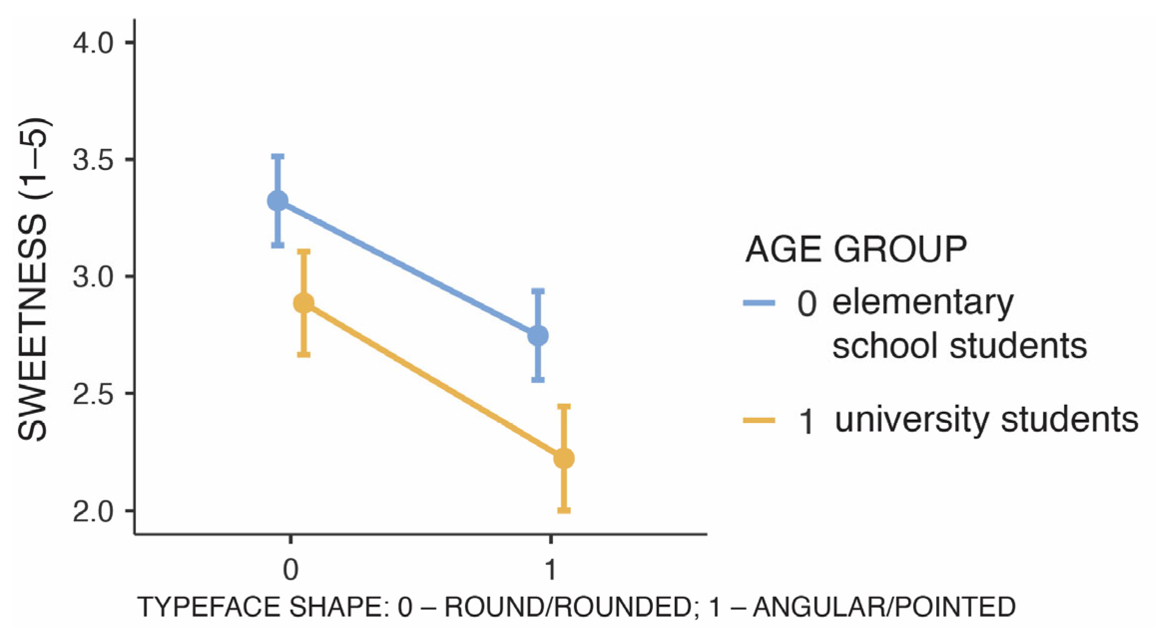
| Typeface shape | −0.62 | 0.08 | [−0.78, −0.46] | −7.51 | 763.5 | <0.001 |
| Age group | −0.48 | 0.12 | [−0.72, −0.24] | −3.93 | 83.8 | <0.001 |
| Typeface shape × Age group | −0.09 | 0.17 | [−0.41, 0.24] | −0.53 | 763.5 | 0.596 |
| Source of Variability | b | SEb | 95% CI for b | t | df | p |
|---|---|---|---|---|---|---|
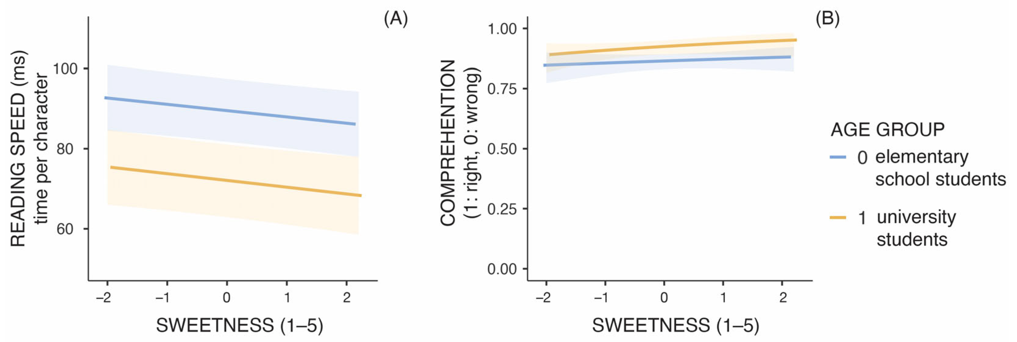
| Intercept | 80.76 | 3.01 | [74.86, 86.67] | 26.81 | 84.6 | <0.001 |
| Typeface sweetness | −1.63 | 0.46 | [−2.54, −0.73] | −3.54 | 773.1 | <0.001 |
| Age group | −17.59 | 6.03 | [−29.40, −5.78] | −2.92 | 84.6 | 0.005 |
| Typeface sweetness × Age group | −0.12 | 0.93 | [−1.93, 1.70] | −0.13 | 773.1 | 0.900 |
| Source of Variability | b | SEb | OR | 95% CI for OR | z | p |
|---|---|---|---|---|---|---|
| Intercept | 2.19 | 0.13 | 8.90 | [6.95, 11.37] | 17.39 | <0.001 |
| Typeface sweetness | 0.14 | 0.10 | 1.15 | [0.95, 1.39] | 1.46 | 0.14 |
| Age group | 0.67 | 0.25 | 1.96 | [1.20, 3.21] | 2.67 | 0.008 |
| Typeface sweetness × Age group | 0.14 | 0.19 | 1.15 | [0.79, 1.68] | 0.73 | 0.47 |
Disclaimer/Publisher’s Note: The statements, opinions and data contained in all publications are solely those of the individual author(s) and contributor(s) and not of MDPI and/or the editor(s). MDPI and/or the editor(s) disclaim responsibility for any injury to people or property resulting from any ideas, methods, instructions or products referred to in the content. |
© 2024 by the authors. Licensee MDPI, Basel, Switzerland. This article is an open access article distributed under the terms and conditions of the Creative Commons Attribution (CC BY) license (https://creativecommons.org/licenses/by/4.0/).
Share and Cite
Medved, T.; Podlesek, A.; Možina, K. Eye-Tracking Study on Reading Fluency in Relation to Typeface Pleasantness Influenced by Cross-Modal Correspondence Between Taste and Shape. Appl. Sci. 2025, 15, 326. https://doi.org/10.3390/app15010326
Medved T, Podlesek A, Možina K. Eye-Tracking Study on Reading Fluency in Relation to Typeface Pleasantness Influenced by Cross-Modal Correspondence Between Taste and Shape. Applied Sciences. 2025; 15(1):326. https://doi.org/10.3390/app15010326
Chicago/Turabian StyleMedved, Tanja, Anja Podlesek, and Klementina Možina. 2025. "Eye-Tracking Study on Reading Fluency in Relation to Typeface Pleasantness Influenced by Cross-Modal Correspondence Between Taste and Shape" Applied Sciences 15, no. 1: 326. https://doi.org/10.3390/app15010326
APA StyleMedved, T., Podlesek, A., & Možina, K. (2025). Eye-Tracking Study on Reading Fluency in Relation to Typeface Pleasantness Influenced by Cross-Modal Correspondence Between Taste and Shape. Applied Sciences, 15(1), 326. https://doi.org/10.3390/app15010326