1. Introduction
Traditionally, data have been visualized through digital data visualizations, but current advances in materials science and digital fabrication are enabling new ways to represent and interact with data physically [
1]. The greater affordability of 3D printing technology for a broader profile of users and applications can be attributed to the combination of material innovation, open-source collaboration, market competition, standardization, efficiency improvements, and community support. In this context, Data Physicalization is the area that investigates how physical objects can encode data through their physical (geometry and materials) and visual characteristics [
2,
3].
Part of the challenge of designing a physicalization of data is choosing the materials that will compose it and how these materials (physical and visual variables) will map and communicate the data appropriately [
4]. There are many ways of encoding data in data physicalizations, some similar to digital data visualizations, making use of the visual channel to visually identify varieties of color, size, shape, etc., and other encodings make use of different perception channels such as touch, hearing, smell, and taste, which can provide the user with a multisensory experience of exploring data [
5].
According to [
6], there are still many open questions for designing and creating good data physicalization that is enjoyable, promotes user engagement, and represents and communicates data efficiently. Some of these open questions are about what coding variables are available to compose the design of data physicalization, how they can map and encode data efficiently, what criteria could be helpful to evaluate them, what methods could be used to assess the data physicalization, etc.
Well-established studies in the information visualization area, such as visual variables, lead us to believe these fundamentals can be fully applied to data physicalization without any adaptations or refinements. However, the physical context of physicalizations presents challenges beyond the digital environment, which can contribute to an erroneous perception of visual variables and, therefore, lead to low efficiency in data communication [
5].
The works of [
2,
6] pointed out several challenges and opportunities for the development of data physicalizations, including the need to develop empirical guidelines similar to those for digital data visualizations, considering the use of physical and digital variables, to answer questions about the precision in the representation of values by these variables, including which of them can best represent quantitative, ordinal, or nominal data, and questions related to the pre-attention of these variables, as well as their combined use, among others.
Color is one of the most used visual variables in information visualization and data physicalization to encode and communicate data [
1,
6]. Although the use of color is based on well-established theories in information visualization, these fundamentals are still being consolidated in data physicalization, and evaluations are necessary [
6]. It is noteworthy that color perception can be influenced by the type of material that composes the physical artifact, the characteristics of the light-emitting device, and ambient light. If these issues are not addressed, information communication in data physicalization can fail. At first, an easy way to overcome these issues could be to use digital color palettes [
7,
8,
9,
10], or define them manually, to be applied directly to data physicalization, leading to the low efficiency of the color to communicate data [
6].
Therefore, this article proposes and presents a method for evaluating and selecting colors for active data physicalization which includes the choice of colors for forming categorical, sequential, and divergent color palettes. The approach also includes the evaluation of the proposed colors concerning the material that makes up the data physicalization and the light-emitting device. Data physicalizations may contain different materials and components that alter the perception of colors, which makes this analysis necessary.
The methodology can be summarized in the following steps: identify potential colors to compose the color palettes for data physicalization, evaluate the proposed color palettes while considering the material and the light-emitting device of the data physicalization, and carry out the evaluation with users based on the most common information visualization tasks. A physical 3D bar chart using dynamic colors was developed to support the proposed evaluation. Each bar is embedded with an LED strip and is controlled by an Arduino board (
Figure 1).
Even though it is an exploratory study, the pre-evaluation and effectiveness evaluation results indicate the same pattern: color scales from the literature created for digital screens cannot be used in physicalizations without adequate preparations. In the pre-evaluation, the difference in error between the physical and digital versions of the Farnsworth–Munsell test shows that using colors can confuse ordering, which impacts various InfoVis tasks, such as comparison and identification.
This article is organized as follows: first, there is a brief presentation of information visualization, data physicalization, and color theory concepts. Some related works about data physicalizations with dynamic colors are presented. The following section shows the evaluation method used to choose the best color palettes for data physicalization; after that, the results are presented and discussed. Finally, the final remarks and future works of this research are presented.
2. Theoretical Background
In this section, we describe the main concepts of the topics involved in this article: information visualization, data physicalization, color systems, color perceptual distance, and the Farnsworth–Munsell test.
2.1. Information Visualization and Data Physicalization
The theory of Information Visualization (InfoVis) is well established in many subareas, including, for example, encoding abstract data through visual variables such as color, shape, size, etc. [
5]; there are dozens or hundreds of data visualization techniques available to visually organize visual data items, such as scatter plots, bar charts, hierarchical techniques such as tree maps, multidimensional techniques such as parallel coordinates, etc. [
11]; interactive aspects allow for relating data views and manipulating the set of visual items, including goal reduction or exploring relationships between them [
3]. These features in data visualization tools enable users to explore a dataset to understand relationships, patterns, outliers, etc., to generate knowledge, and ultimately to confirm or answer initial questions for making future decisions [
12,
13]. A summary view of these characteristics can be seen in the pipeline shown in
Figure 2, where the main steps are selecting data, proposing a visual coding for the data, and choosing a visualization technique to present it [
14].
Data physicalization is a field that studies the data encoding in a tangible, physical form. Unlike traditional data visualization, which typically relies on graphical or digital representations on screens, data physicalization transforms abstract information into physical objects that can be touched, manipulated, or interacted with in the real world. These features come with their own challenges, like interaction, materials used for data encoding, and 3D arrangement of objects [
2,
3].
Currently, it is common to find static or passive physicalizations (they do not change the initial data mapping) due to the evolution, availability, and ease of digital manufacturing technologies such as 3D printing [
15,
16]. Rearrangeable physicalizations use a similar approach; they are composed of several static parts but may undergo some changes (position of the parts) through a manual process [
17,
18]. There are also active or dynamic data physicalizations, composed of static parts, but which can undergo changes via electromechanical components. This allows for different sets of data to be mapped in the physicalization [
10]. Finally, there are hybrid approaches which mix other technologies; for example, augmented physicalizations combine data physicalizations with augmented reality techniques through projections [
10].
In general, it can be said that information visualization mainly focuses on proposing interactive digital data visualizations that can be seen and manipulated on desktops, tablets, smartphones, etc. For some scenarios, it could be interesting to make it possible to view data or data charts without these devices, and still with some advantages. For example, with data charts on larger scales and with a three-dimensional perspective, the use of data charts in public places can communicating data relating to general interests, such as increasing the use of renewable energy, reducing forest fires, or improving adherence to health campaigns by the population, among others [
2,
19,
20].
In this context, the data physicalization area proposes ways of representing data physically, as if it were a counterpart to the visualization of information aimed at the physical world instead of the digital one. Considering the pipeline in
Figure 2, having many steps between information visualization and data physicalization is common. However, we no longer want to encode data through only visual variables but also through physical, haptic, auditory, olfactory, and gustatory variables, and we can provide a multisensory experience in data exploration [
21]. As a final result of applying the pipeline of
Figure 2, a physical artifact that represents and communicates data is obtained and can also be interactive.
Data physicalizations can have different designs, idioms, materials, and purposes, and these characteristics have provided opportunities and challenges for the Information Visualization and Data Physicalization community [
2,
10]. The purpose of data physicalization can range from physicalizations with an artistic bias to those that only encode abstract data. They must have a dataset adapting to the limitations of physicalization and following the target audience’s expectations [
6]. Concerning the idiom, it is possible to use techniques and concepts already consolidated in the information visualization area or propose new methods or hybrid ways of organizing data items in 3D space. There are many ways to interact with the physicalization of data [
22]. It is intuitive that we can only focus on tangible interaction, such as touching, picking up, squeezing, etc., but the other senses can provide a variety of new forms of interaction. Materials directly influence the way data is encoded and interact with physicalization. Many materials can be applied, and each kind has limitations, characteristics, and restrictions for encoding data and composing data physicalization. However, these studies are still in the initial phase in the data physicalization area [
6]. Finally, one or more evaluation stages must be proposed to indicate whether the objectives of data physicalization have been achieved.
2.2. Color Systems, Color Perceptual Distance, and Farnsworth–Munsell Test
This article used some color spaces, among which the following stand out: RGB, HSV or HSL, CIELAB, and Munsell. RGB is widely used in the display of electronic devices. In this article, it is used in the LED strip configuration embedded in the data physicalization and in estimating the RGB color visible in the data physicalization via a webcam. The HSV and HSL color systems are an alternative to RGB as they come closer to how humans describe the perception of color [
23]. In this article, they are used to present the results of color choice and the color palettes proposed. Another system used is CIELAB, a color space widely used to evaluate colors, and it correlates color values with visual perception very well [
24]. This article uses the color parameters in CIELAB to calculate the perceptual distance between two colors and estimate their similarity [
25]. Finally, the Munsell color space specifies a color in hue (basic color), value (lightness), and chroma (color intensity) and presents a wide chromatic and tonal variety of colors. In this article, the Munsell color system is used to apply the Farnsworth–Munsell test [
26], both in digital and physical environments, pointing out potential colors to compose the data physicalization color palettes.
In 1976, the International Commission on Illumination (ICI), aiming to have a metric to measure the difference between two colors, introduced the concept of Delta E [
27]. Thus,
(DeltaE or dE) is the measure of change in visual perception between two colors. In the same year, the ICI also proposed the CIELAB color system and the first version for calculating Delta E (DeltaE 76) using CIELAB color parameters. New versions of Delta E were proposed to correct some inconsistencies in previous versions, and the most recent is DeltaE 2000 [
28]. Although DeltaE 2000 presents a more complex calculation, it is also more accurate, mainly due to more precise lighting calculations. It also considers the issue of perceptual non-uniformity of the human visual system; that is, the human eye is more sensitive to certain colors than others.
Color tolerance is the metric that describes the limit of the difference between two colors: a reference color and the target color we want to measure its similarity to. Generally speaking, there is no standard for the Color Tolerance Range, which varies depending on the industry or purpose [
25]. Therefore, it is possible to imagine that these values for colors in data physicalization will also be different, as it will depend on the material and how the color is proposed in physicalization, among other factors. However, a table of generic values commonly used in the absence of more specific standards can be seen in
Table 1. Thus, this article considers that colors are similar if they have perceptual distances between them less than or equal to 5.
Farnsworth–Munsell (FM) 100-hue Test
Proposed by Dean Farnsworth, the Farnsworth–Munsell 100 test is a vision test whose objective is to evaluate the test participant’s ability to identify and order colors with minimal differences in hue, considering value and chroma constants [
30]. The Munsell color system describes the color hue values used in the test and is often used to test for color blindness [
31].
The most common initial configuration is to use 100 hue values grouped into four blocks of 25 colors distributed horizontally, but other values are possible. Each block has two reference colors at the ends, and they are fixed (
Figure 3a). These colors should guide the test participant in ordering the other colors of the set, and each block is presented individually [
24,
32]. Currently, the test can be found in both physical and digital versions.
After applying the test, the error counting stage begins, identifying colors positioned incorrectly in each color block (
Figure 3b). The greater the distance of the color from its original position, the greater the error value. Lower error scores point to greater accuracy in color ordering; high scores indicate low accuracy and may point out a type of color blindness. The precision of the test is related to the display [
30].
3. Related Works
A literature review was conducted to identify how colors are applied in data physicalizations, what type of data these colors encode, whether there are related evaluations, and the number of color values used, among other issues.
Articles published in the repositories of ACM, IEEE, Wiley Online, and Springer were selected, in the period between 01/2005 and 01/2023, with the following keywords: “data physicalization”, “data visualization”, “data materialization”, “tangible data”, “tangible data”, and “active”. The repository query returned 1016 results.
Both the inclusion and exclusion processes were conducted by two evaluators with experience in information visualization and data physicalization. The main rule for including an article in the final review selection is that the color applied in the data physicalization should encode abstract data, regardless of the number of color values applied. Another criterion used was that the physicalization of data, which must be aimed at coding and communicating data, be a complete article, and be written in English. The article exclusion criteria considered non-complete articles, articles outside the scope of this research, duplicate articles, and articles that did not contain any of the research keywords in their title, abstract, or keywords.
Thus, 25 articles were selected, with a time interval between 2014 and 2023: 22 from ACM, 2 from the WILEY, and 1 from IEEE.
Table 2 contains the final selection of the articles.
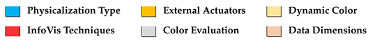
The articles selected for analysis were read in full to extract information and categorize the following data: Data Physicalization Type; External Actuators; Dynamic Color (Hue, Saturation, Brightness); Color Palete; InfoVis Techniques; Color Evaluation; DataDimensions; Color Values.
The analysis of the articles showed that 36% of physicalizations are dynamic, 40% are rearrangeable, 16% are passive, and 8% use more than one type. Furthermore, 52% of physicalizations do not use any external actuator, compared with 40% that use some type, and 8% use it in a hybrid way. Regarding color, 64% of inspections use dynamic colors, 36% use static colors, and only 20% of the total allow you to configure hue, saturation, or brightness. The types of color palette uses characterized in these articles were 64% categorical, 12% sequential, and 28% using both palettes. There are no references to the use of a divergent color palette.
Regarding InfoVis techniques, 87% present a single technique, 44% use a bar chart, 12% use scatter plots, 4% use pie charts, and 24% use other types. It is worth mentioning that the vast majority of the articles, around 88%, did not present a color evaluation for data physicalizations. Regarding the data dimensions mapped in data physicalization, 36% map one dimension, 28% map two dimensions, 32% map three dimensions, and 4% map more than three data dimensions. The color values used to encode the data are 1D— 16%–1D, 2D—12%, 4D—12%, 5D—32%, 6D—12%, and +6D—6%.
The analysis also presented other relationships, such as a trend toward using active physicalizations compared with passive ones in more recent years, which use external actuators in their design (67%). In this context, the colors can then allow for the configuration of hue, saturation, and brightness and use more than one type of color palette.
Considering only active data physicalization, just 11% conducted a color evaluation, 44.5% mapped three data dimensions, 66.6% used six or more color values, 66.6% used more than one color palette, and 33.3% allowed hue, saturation, and brightness to be configured to the map data. No automated evaluation procedures for the colors in data physicalization were found.
4. Color Evaluation for Data Physicalization
In this section, we describe the development of the method for evaluating and selecting dynamic colors in the context of physicalizing active data. This process includes choosing colors to form color palettes that represent qualitative and quantitative data, evaluating the proposed colors in comparison with the colors commonly used in the literature, and proposing methods for selecting color palettes.
Normally, the characteristics of the material are uniform, as is the gloss applied to the material. If the colors were identical, it would not be possible to carry out a study on the influences of colors and luminance; it would be enough to adjust the brightness. However, in the study carried out, the color scales have different colors, so it is necessary to carry out a study on the influence of neighboring colors on color perception.
Figure 4 shows the development of the method for evaluating and selecting dynamic colors in the context of physicalizing active data. This starts with the application of the FM test (physical and digital environment), collecting the data and comparing the errors obtained in the digital and physical environment, analyzing and comparing the results obtained, selecting the best colors for the physical environment, calculating the perceptual distance between the colors in order to manually or automatically define the color palettes, defining the color palettes, defining the best configuration for the data physicalization light-emitting device, and applying the user test.
This method was subdivided into two stages: the first to suggest a set of color scales that is suitable for the proposed physicalization environment, and the second to apply user testing to common data visualization tasks in order to validate the proposed color scales, as described below.
4.1. Applying the Farnsworth–Munsell Test (FM)
The pre-evaluation is a modified version of the FM color perception test for a physical and digital environment; i.e., the user must order a set of colors according to their perception from a starting color to a final color. In the original test, this is done with four sets (scenarios) of 25 colors. In this paper, the test will use four color sets with 8, 10 and 12 colors each. These color scenarios are selected at random and each scenario is shown separately. The main objective of the pre-evaluation is to compare the results of the tests carried out in the physical and digital environment, with the same sets of colors, in order to identify potential colors that can make up the physicalization of data.
To this end, a physical artifact (bar chart) is built containing 12 bars, made using a modeling process (Autodesk Fusion 360 [
59]) and 3D printing (3D Creality Ender-3 V2 [
60]), and each bar is 10 cm high × 1.5 wide × 1.5 deep. These bars have an LED strip with 6 LEDs connected to an Arduino Mega board controlling the operation. The physical artifact is completed with interaction buttons for the bars (2 to 11), where the wiring diagram for the electronic components for dynamic color changes and button interactions are connected to a 5 (five) volt, 5 (five) amp power supply. The complete diagram is seen in
Figure 5.
The colors for the tests are generated using fixed color limits, then interpolated to generate each set in each condition. These limits are linearly interpolated on the HSV color space, and the codes below are given in RGB hexadecimal code.
Set 1—#B2766f, #9D8E48
Set 2—#97914B, #529687
Set 3—#4E9689, #7B84A3
Set 4—#8484A3, #B37673
The limits are used to generate 24, 32, and 40 colors for the 8, 10, and 12 bars conditions, respectively. The colors of the limits themselves are not taken in this sum, as they repeat in each sequence. A total of 96 colors are generated. In each scenario for each condition, the colors are randomized using the Fisher–Yates shuffle.
The color perception test was carried out with a group of 12 people who accepted the invitation and completed the FM test in the physical and digital environment. To select this group of users, the following requirements were established: to be over 18 (eighteen) years old, to have basic knowledge of reading data charts, specifically bar charts, and not to have problems differentiating colors (no form of color blindness).
The digital scenario of the pre-evaluation test was performed on a desktop where participants viewed and interacted with the FM test on a digital display with the following characteristics: screen size 21.5, full HD, refresh rate 60 Hz, resolution 1920 × 1080, LED. The digital interface presents each of the four sets of colors selected for testing and interaction with each pair of virtual buttons allowing two colors to be swapped positions. The scenarios are created randomly (
Figure 6) and thus proceed with the task of reordering the set of colors. Each color set has a maximum of 12 colors, interpolated using the same method as the FM test, for a total of 48 colors. While the original test has more colors for each line, the objective is also broader. The evaluation presented will use the FM test technique in a quantity appropriate for visualizing the information (a maximum of 12 distinct discrete steps), not to confirm a form of color blindness.
Meanwhile, the physical color perception test was carried out using the proposed data inspection, using 12 3D-printed bars, with LED strips embedded in each physicalization bar. Each bar has a 10 cm height, 17 cm width, and 2 mm thickness front face. These strips encode the colors of each scenario, and each scenario is generated and presented in a random order. These colors of the scenarios are randomized to ensure that there is no bias in the selected order, and to ensure that a unique sample for all participants could not hinder the results in both scenarios, the physical and digital.
Figure 7 shows the physicalization created with the color scenarios adapted from the FM test. As in the digital version, the buttons are used to support the task of sorting the colors; with each interaction with each pair of buttons, two colors swaps positions.
4.2. Data Collected and Error Analysis
The FM pre-evaluation generates data to compare the digital and physical conditions. The collected data are processed into metrics to compare error and select colors to generate a palette.
4.2.1. Data Collected
Data for the adapted FM test were collected using automatic logs, connecting the answers to the sorting tasks carried out in both the digital and physical environments, as shown in
Table 3.
4.2.2. Compare Errors
At this stage, the color scales were based on the areas with the smallest errors, given that these errors indicate many restrictions with the neighborhood of colors in the perceptual sense.
Figure 8 left shows the representation of the position errors obtained from the color sorting tests, with eight bars, carried out in the digital and physical environments. It should also be noted that the color maps the average of the sorting errors, and the x and y axes indicate the positions that the colors should be in and the position that was found. The circles and squares indicate the positions in the physical and digital condition, respectively.
Figure 8 right shows the average number of errors in color sorting, where orange indicates errors in the physical condition and blue indicates errors in the digital color.
In
Figure 9, we can see the representation of the errors obtained in each set of bars, and the totality of the charts may be an overwhelming overview, but the main focus is on where the error is greatest in the set of bars, where the orange line is greater than the blue line. This presents a set of colors with many errors, which we can prune to select an appropriate palette.
4.3. Analysis and Results
Evaluating the errors from all the tests, we selected 70 colors, while 26 colors were considered unsuitable for creating the color scales. In regard to the colors selected, there is significant emphasis on warm colors, and the entire line 3 (of blue hues) was not considered suitable for use on a continuous scale. This confirms the findings of many resources in the literature that human vision favors warm colors [
61,
62].
Figure 10a shows the total sets of colors on the CIELAB color space (a and b axes), with the set of all the colors used on the left and the set of colors with the highest hit rate on the right.
Figure 10b shows the total sets of colors on the HSV scale (axes h and v), with the set of all the colors on the left and the set of colors with the highest hit rate on the right. The brightness and luminance axes have not been shown for visual clarity.
4.4. Color Palette Selection for the Data Physicalization
After applying the FM (adapted) pre-evaluation, a color sorting task, we selected the set of 70 colors with the fewest errors. In this way, this set of colors with good perception results has the potential to make up color scales to be applied in data physicalization. The strategy for forming the color scales is to select one or two representatives from each hue group to make up the scales. For qualitative (categorical) color palettes, it is especially useful to separate hues that are close, such as red and orange.
Figure 11 shows the potential colors available to make up the color scales.
Right now, color selection is an entirely manual process. It is supported by the literature on color perception, where one chooses a set of colors over another, but it is mainly based on the results of the evaluations. For each scale, the process is more straightforward. The selection of colors for the continuous, divergent, and categorical scales varies based on the differences chosen between the colors and the perceptual errors acquired in the evaluation. These scales are selected based on the CIELAB and HSV color models. These color spaces are perceptually uniform, making them essential to the study. Nevertheless, some restrictions are necessary, since physical bars have restrictions in various uses:
There are no named colors. A named color is a standardized color that shares the same name in natural language and can be referred to by that name instead of the code within the color space. Users are familiar with these colors, so they can undergo changes in lighting and brightness and alter the perception of the scales.
The perceptual differences between shades should guide the selection of colors for the scales, with prime attention being paid to avoiding areas with perceptual errors. Error areas indicate that colors that are close together should not be used to create scales.
An area with colors that are close together (5% perceptual distance, measured by ) should have only one color selected to avoid confusion.
For each type of color scale, there is a set of desired features:
Continuous Scale: In a continuous scale, the values can change in a simple (often linear) distribution from a to b and are encoded in a visual channel that can change in the same proportion. In the case of colors, they move gradually between two hues from one extreme to the other. Between two colors in a given color model, the scale usually moves from one color to another in a straight line, continuously or by sampling values.
- −
In continuous digital color scales, colors have a constant brightness level and varying hue or saturation values (or a and b for the CIELAB color space). Using these general guidelines, it is possible to create color scales that are suitable for digital screens. Our approach to physicalizations cannot rely on these definitions alone, since brightness has an unknown impact on the material used in the physicalization.
- −
The approach for the continuous scale is to choose the most successful hue and interpolate it in itself in the case of single hue, or between two hues in the case of multihue scales.
Diverging Scale: Divergent color scales consist of two distinct colors with a midpoint color used to indicate a break or neutral point (usually 0). The interpolation of the values between the colors and the neutral point is usually a continuous scale. On digital screens, colors are based on changing the hue value while keeping the brightness and saturation constant (digital).
- −
The colors for the physicalized version should follow the selection of two shades (hues) that are less prone to errors.
- −
The approach for the divergent scale is to choose the most successful hues and interpolate between the two hues.
Categorical Scale: For categorical scales, each category is associated with an indexed value, and each value encodes to a distinct segment of the visual channel. In the case of colors, these are chosen by varying the hue, keeping the brightness and saturation at a constant level for digital screens. The hue is also manipulated to obtain different colors, while the saturation and value are kept the same.
- −
The physicalized version follows the same principles, but respects the perceptual evaluation previously carried out.
- −
The approach for the categorical scale is to choose one color from each group of colors that is prone to fewer errors based on the evaluation.
4.5. Perceptual Color Distance and Color Selection
Figure 12 presents the sets of colors and selected clusters in scatter plots. These clusters were selected based on the rules of
Section 4.4.
The centroids were chosen manually to visually separate the different perceptual groups. Categorical colors scales should use only one (with a maximum of 2, if there are more than 7 categories) color for each category. The clusters without any points indicate the blue color group, which, despite the high error rate, can be considered for the categorical scale. The scales of numerical values (divergent and continuous) select clusters to interpolate from one to another in the case of multihue scales, or inside the cluster for the single hue scales.
4.6. Color Scales Selected
Based on the analysis in the previous sections, it was possible to select the color scales of common types for information visualization: a categorical scale; two continuous scales, one with a single hue varying in saturation and the other being multihue, varying from one hue to the other; and a divergent scale.
Figure 13 shows the selected color set containing the discretized color scales. A total of nine colors per scale were selected, taking into account some sensible limits of human vision [
63,
64], such as the maximum number of categories and the space limits of the prototype. There are nine colors in each scale to comply with the divergent scale, as it usually features a middle point, making it better to use an odd number of discretization sampling. It could be 7 or 11 for this matter, but we simply settled on 9.
4.7. Setting the Light-Emitting Device
Commonly, addressable LED strips have two basic settings: RGB color and the brightness of each LED. Considering that the RGB color of the LED will be configured, it remains to define the intensity of its brightness. Brightness intensity is critical as it can alter the perception of color and influence the perception of neighboring colors in the physicalization of data.
Considering this context, a study was carried out on the perceptual difference between the reference colors (used to configure the LED strip) and the RGB colors estimated directly from the data physicalization for various levels of brightness intensity, seeking to discover the level of LED brightness intensity that minimally affects color perception.
4.7.1. Brightness Intensity of the LED Strip
For a set of brightness values (128, 64, and 32), the RGB colors for all colors of the categorical palette were estimated, individually and without neighboring colors that could cause any influence on color perception. As a result, the brightness intensity value 32 for LED strips was the one that showed the lowest overall variation in the perceptual difference of colors, using the
calculation.
Figure 14 presents an example of estimating the RGB color from a bar of data physicalization via a computer vision algorithm in Python using OpenCV and Numpy. The blue frame is just a visual reference for the test conductor to position the camera in front of the bar. From the area delimited by the blue rectangle, the average red color, average blue color, and average green color of all pixels in this area are calculated to present the estimated final color.
4.7.2. Assessing the Influence of Neighboring Colors
Considering the brightness intensity value of 32 for LED strips, a study was carried out on the influence of neighboring colors on color perception for this brightness level. Ten random color scenarios were generated from the categorical color palette so a given color could receive influences from different colors (
Figure 15).
For each color in all scenarios, the perceptual distance (
) was calculated in relation to the isolated color estimated, since it already considers the material used in physicalization. The results can be seen in
Figure 16, where the Y axis represents the median values of the perceptual distance between a color reference and estimated color, and the X axis represents the RGB colors. It is noteworthy that most of the medians presented values below 5. As the colors were initially selected without similar hues being close, even with some difference values with
> 5, it was still possible to identify these colors within the same group as the isolated original color. The highest median value among all the distances was 5.3 (green), mainly due to an outlier value in this group.
For measurements, a C920 Logitech webcam was used, positioned approximately 2 cm from the bar, with the illuminance measurement of the environment with artificial light being 136 lux. It should also be noted that the improvement of the webcam image was disabled to maintain the conditions for capturing images.
4.8. User Tests
The main goal of the user test is to compare the efficiency of using color palettes commonly used in the literature and industry with the color palettes proposed for data physicalization in common InfoVis tasks. Some Tableau
https://www.tableau.com/ (accessed on 11 November 2023) and ColorBrewer [
65] color palettes will be used.
4.8.1. Research Hypotheses
At this stage, a set of hypotheses was developed with the purpose of confirming the feasibility of using the proposed color palettes for data physicalization to perform InfoVis tasks:
Hypothesis 1. Using the proposed color palettes for data physicalization presents good efficiency results in performing common information visualization tasks compared with using other color palettes from the literature or industry.
Hypothesis 2. Within an information visualization task group (e.g., selection, comparison), irrespective of the color palette employed, the results will present a similar level of error.
These two hypotheses complement each other in expecting better results from the proposed palette (Hypothesis 1) but not in a staggering manner. The advantages will be small and incremental with each type of task, favoring the proposed palette over the digital ones.
4.8.2. Initial Procedures
Forty-five users were invited and received a brief test description. After that, an Informed Consent Form was presented to each one, signed by all, and all agreed to participate in the test. These participants received the following guidance through instructional videos: a brief introduction to the test; an explanation of qualitative, sequential, and divergent color palettes; a description of how to interact with the data physicalization; a presentation of all the color palettes in the data physicalization presented; examples of similar InfoVis tasks to the test; and instructions on how participants should provide answers using the data physicalization. After these guidelines, some similar InfoVis tasks to the test could be practiced using data physicalization but with another synthetic dataset, to practice and alleviate doubts. The test only started after positive feedback that the participant was ready to take the test. Participants were organized into three groups: proposed color palettes, ColorBrewer color palettes, and Tableau color palettes. Participants were assigned to a group in a random and balanced manner and performed all tasks only with color palettes from the same group.
4.8.3. InfoVis Tasks
The InfoVis tasks defined to evaluate and compare color palettes include identifying individual colors, grouping colors, reading color coding, finding maximum and minimum color codes, and ordering a set of colors. All tasks end with a button press, indicating the bar that was the target of the task or the number of elements for the task. Tasks are described below:
- 1.
Identify unique color coding:
Identify the unique color (
Figure 17a). In more detail,
Figure 17a presents a random scenario generated by an algorithm that specifies the occurrence of a unique color (just one). In this example, the unique color is shown in bar number 4.
Consider bar number 12 as a target color. Identify the number of occurrences of it (
Figure 17b).
- 2.
Identify the number of different color groups:
Identify the number of different color groups in the physicalization (
Figure 18).
- 3.
Identify color-coded values:
Identify which bar represents the categorical color value indicated at bar number 12 (
Figure 19a).
In a sequential color scale, identify which bar corresponds to the color indicated at bar number 12 (
Figure 19b).
In a divergent color scale, identify which bar number corresponds to the color indicated at bar number 12 (
Figure 19c).
The scenario presented in
Figure 19 is to locate a target color. The target color is displayed in bar number 12. The difference between scenarios (a), (b), and (c) is that the first one uses a categorical color palette, the second one uses a sequential color palette, and the third uses a divergent color palette.
- 4.
Find maximum and minimum color-coded values:
Consider a sequential color scale, and identify which bar is the maximum value (
Figure 20a).
Consider a sequential color scale, and identify which bar is the minimum value (
Figure 20b).
Consider a divergent color scale composed of two primary colors (yellow and blue). Identify which bar is the maximum value (darker blue) (
Figure 20c).
Consider a divergent color scale composed of two primary colors (yellow and blue). Identify which bar is the minimum value (darker yellow) (
Figure 20d).
- 5.
Compare color-coded quantitative values:
For the first two tasks in this section, lighter colors represent lower values, and darker colors represent higher values, and the last two are reversed.
Consider a disordered sequential color scale. Identify which bar has the highest value (
Figure 21a).
Consider a disordered sequential color scale. Identify which bar has the lowest value (
Figure 21b).
Consider a divergent color scale composed of two primary colors (yellow and blue). Identify which bar has the highest value (
Figure 21c).
Consider a divergent color scale composed of two primary colors (yellow and blue). Identify which bar has the lowest value (
Figure 21d).
The scenarios presented in
Figure 21 enable a user to compare two colors that represent values of a scale to identify which represents the highest or lowest value. These target colors are located in bar number 1 and bar number 12 and are generated randomly. The bars numbered 2 to 10 represent the color palettes proposed, which can be sequential, like (a) and (b), or divergent, like (c) and (d). In this case, the number 11 bar does not display any color.
- 6.
Sort color-coded values:
Considering a sequential color scale, identify the colors that are not ordered. (
Figure 22a).
Considering a divergent color scale, identify the colors that are not ordered. (
Figure 22b).
5. Results
Now, we present the results of our color scale evaluation for the physicalization.
5.1. Data Analysis
This analysis focuses on understanding the visual impact of each palette in the InfoVis tasks and the hypothesis confirmation.
Figure 23 shows the best efficiency in terms of statistical groupings. Although the median of the proposal is better in the case of hits, it does not indicate in which situation it is better.
Figure 24 has the chart with the color palettes in relation to each task. The total count of errors and hits indicates that the color palette has almost no errors in five of the six tasks. This confirms Hypothesis 1, which implies the effectiveness of the color palette in InfoVis tasks.
We follow the focus of this analysis in each task. Some tasks are of the same group, such as tasks one through three, which are identification tasks.
Figure 25 shows the hits and misses of the types of tasks in more detail, where it groups these tasks with the same type, and the correctness of the proposal in relation to the other palettes can be seen better. Hypothesis 2 is confirmed, which shows the feasibility of using generic colors in generic visualization tasks.
5.2. Discussion
Even though this is an exploratory study, the results of the pre-assessment and the effectiveness assessment indicate the same pattern: scales from the literature that were created for digital screens cannot be used in physicalizations without proper preparations. In the pre-assessment, the difference in error between the physical and digital versions of the FM test shows that the use of colors can confuse sorting, which impacts different InfoVis tasks, such as comparison and identification.
In the accuracy assessment, the proposed palette proved to be more effective than the others when it came to comparison. Adaptations to the color palette can be made to create more efficient dynamic scales for other tasks as well as to evaluate a wider range of tasks and create composite tasks.
The main hypothesis for the next step in this work is to evaluate the automated generation of color palettes for InfoVis tasks and different data physicalization scenarios.
5.3. Proposal of Automatic Analysis
The generation and evaluation of color scales in data physicalizations was dealt with for a single case in this manuscript. But in the case of other data physicalizations, with the use of other materials and different ambient lighting conditions, repeating this process in the same way as it has been performed so far is very costly in terms of time and effort. Following the step-by-step process, we have the FM test run, followed by the analysis of the brightness and luminance of the environment and evaluation of InfoVis tasks. A process like this is unfeasible in many scenarios, so we propose the implementation of an automated method to carry out the most costly stages of this process.
The following proposal applies automatic methods for creating color scales in physicalizations as well as automating the evaluation. By eliminating these more manual parts, the process of selecting and adapting colors is optimized.
Figure 26 presents the diagram of the automated method, explained below.
The process starts with the user taking photos and measuring luminance. These are the only inputs to the method. These images must contain a set of colors generated by physicalization to compare with the base colors. Together with these images, the luminance present in the location is estimated.
The automated method then proceeds to analyze the distribution of light and colors. It is important to establish the relationship between the captured colors and visual expectations, measuring the perceptual distance between them. The method interpolates pairs of estimated colors and the expected colors, generating intermediate color tones. These colors are used to compare with the expected distance errors and select more suitable color groups, comparably to the effectiveness evaluation. This stage is essential for creating a more accurate digital representation of the environment.
This is followed by color clustering, identifying similar colors and adjusting them according to the images that have been made of the physicalization. Next, the user checks and, if necessary, adapts the colors identified to ensure suitability for physicalization. At the end, the scales adapted for data physicalization are created.
These steps are an automated version of the method used in this work. The implementation of the automatic method will guarantee the use of the method for other data physicalizations without the need for the manual effort required for color scale evaluation using the methods used in this manuscript.
In many scenarios, there may be a need to input parameters, such as the number of colors in the palette, or even some colors, if the user wishes, or have standardized parameters. However, the article mainly aims to specify color palettes for a given data physicalization. Hence, the necessity of the input parameters depends on the task involved and the solution implementation. In this direction, we offer some scenarios to configure color palettes. In one possible scenario, an algorithm analyzes the dataset and chooses how many and which colors to use for encoding data goals to create a data analysis scenario for a task. In another scenario, the user decides the number of colors to use and chooses a single mandatory color to compose the color palette. No color is required as an input parameter, but if the user specifies a color, the rest of the color palette will be calculated considering that chosen color. In another scenario, everything is automated; a data physicalization image with a standard color configuration is required. Based on the computer vision algorithms, it is possible to estimate the luminance of the environment and all colors in physicalization.
6. Conclusions and Future Works
This paper presents an evaluation of color scales applied to 3D bar charts in which the colors are encoded onto the bars by LED strips. The application of the FM method followed by evaluation of the brightness and luminance of the environment confirms a color palette for creating scales. An evaluation with users in InfoVis tasks confirms the effectiveness of the scales created.
The results of this work show an important aspect of data visualization: it is not always possible to convert the techniques used in the digital domain to other fields. The variations in luminance and material that are possible in a physicalization show that using color scales requires a more detailed study that takes these particularities into account. This work presents it in a singular physicalization.
The aim of the final stage of this work is to generate suitable color scales for data physicalizations in an automated way. Using the manual process as a basis, the automatic process has the same steps, but without the more costly and human part of selecting color groups and gauging the lighting model of the world. The evaluation of the automatic method will be carried out on a set of different physicalizations, varying the type of material used, with different lighting and environmental conditions.
Author Contributions
Conceptualization, C.B., T.A. and B.M.; methodology, C.B., T.A. and B.M.; software, C.B., T.S., T.A. and B.M.; validation, T.S., T.A. and B.M.; formal analysis, W.M., T.A. and B.M.; investigation, C.B., W.M. and B.M.; resources, B.M.; data curation, T.S., W.M. and B.M.; writing—original draft preparation, C.B., T.S., W.M., T.A. and B.M.; visualization, C.B., T.A. and B.M.; supervision, T.A. and B.M.; project administration, B.M. All authors have read and agreed to the published version of the manuscript.
Funding
This research was funded by the Higher Education Personnel Improvement Coordination (CAPES), the APC was funded by the Federal University of Pará (UFPA) supported by the PROPESP/UFPA (PAPQ), and also supported by IEETA funded through the Foundation for Science and Technology (FCT) and National Advanced Computing Network (RNCA).
Institutional Review Board Statement
The study was approved by the Institutional Review Board (or Ethics Committee) of 18-UFPA-Institute of Health Sciences of the Federal University of Pará (15522319.2.0000.0018 and 03/10/2019).
Informed Consent Statement
Informed consent was obtained from all subjects involved in the study.
Data Availability Statement
Data available on request due to ethical restrictions.
Conflicts of Interest
The authors declare no conflict of interest.
Abbreviations
The following abbreviations are used in this manuscript:
| RGB | Red, Green, Blue |
| HSV | Hue, Saturation, and Value |
| HSL | Hue, Saturation, and Lightness |
| LED | Light-Emitting Diode |
| ICI | International Commission on Illumination |
| ACM | Association for Computing Machinery |
| IEEE | Institute of Electrical and Electronics Engineers |
| InfoVis | Information Visualization |
| FM | Farnsworth–Munsell |
References
- Bae, S.S.; Szafir, D.A.; Do, E.Y.L. Exploring the Benefits and Challenges of Data Physicalization. 2022. Available online: https://ceur-ws.org/ (accessed on 11 November 2023).
- Jansen, Y.; Dragicevic, P.; Isenberg, P.; Alexander, J.; Karnik, A.; Kildal, J.; Subramanian, S.; Hornbæk, K. Opportunities and challenges for data physicalization. In Proceedings of the 33rd Annual ACM Conference on Human Factors in Computing Systems, Seoul, Republic of Korea, 18–23 April 2015; pp. 3227–3236. [Google Scholar]
- Sauvé, K.; Houben, S. From Data to Physical Artifact: Challenges and Opportunities in Designing Physical Data Artifacts for Everyday Life. Interactions 2022, 29, 40–45. [Google Scholar] [CrossRef]
- Dumičić, Ž.; Thoring, K.; Klöckner, H.W.; Joost, G. Design Elements in Data Physicalization: A Systematic Literature Review. In Proceedings of the DRS2022, Bilbao, Spain, 25 June–3 July 2022. [Google Scholar] [CrossRef]
- McCormack, J.; Roberts, J.C.; Bach, B.; Freitas, C.D.S.; Itoh, T.; Hurter, C.; Marriott, K. Multisensory Immersive Analytics. In Immersive Analytics; Marriott, K., Schreiber, F., Dwyer, T., Klein, K., Riche, N.H., Itoh, T., Stuerzlinger, W., Thomas, B.H., Eds.; Springer International Publishing: Cham, Switzerland, 2018; Volume 11190, pp. 57–94. [Google Scholar] [CrossRef]
- Ranasinghe, C.; Degbelo, A. Encoding Variables, Evaluation Criteria and Evaluation Methods for Data Physicalizations: A Review. arXiv 2023, arXiv:2305.03476. [Google Scholar]
- Bertin, J. Semiology of Graphics; University of Wisconsin Press: Madison, WI, USA, 1983. [Google Scholar]
- Sauvé, K.; Sturdee, M.; Houben, S. Physecology: A Conceptual Framework to Describe Data Physicalizations in their Real-World Context. ACM Trans. Comput. Hum. Interact. 2022, 29, 1–33. [Google Scholar] [CrossRef]
- Hogan, T. Data Sensification: Beyond representation modality, toward encoding data in experience. In Proceedings of the DRS International Conference, Limerick, Ireland, 25–28 June 2018. [Google Scholar]
- Dragicevic, P.; Jansen, Y.; Vande Moere, A. Data physicalization. In Handbook of Human Computer Interaction; Springer: Cham, Switzerland, 2020; pp. 1–51. [Google Scholar]
- Fisher, D.; Meyer, M. Making Data Visual: A Practical Guide to Using Visualization for Insight; O’Reilly Media, Inc.: Sebastopol, CA, USA, 2017. [Google Scholar]
- Chiang, R.H.; Grover, V.; Liang, T.P.; Zhang, D. Strategic value of big data and business analytics. J. Manag. Inf. Syst. 2018, 35, 383–387. [Google Scholar] [CrossRef]
- Card, S.K.; Mackinlay, J.; Shneiderman, B. Readings in Information Visualization: Using Vision to Think; Morgan Kaufmann: Burlington, MA, USA, 1999. [Google Scholar]
- Jansen, Y.; Dragicevic, P. An interaction model for visualizations beyond the desktop. IEEE Trans. Vis. Comput. Graph. 2013, 19, 2396–2405. [Google Scholar] [CrossRef] [PubMed]
- Le Goc, M.; Perin, C.; Follmer, S.; Fekete, J.D.; Dragicevic, P. Dynamic composite data physicalization using wheeled micro-robots. IEEE Trans. Vis. Comput. Graph. 2018, 25, 737–747. [Google Scholar] [CrossRef] [PubMed]
- Taher, F.; Hardy, J.; Karnik, A.; Weichel, C.; Jansen, Y.; Hornbæk, K.; Alexander, J. Exploring interactions with physically dynamic bar charts. In Proceedings of the 33rd Annual Acm Conference on Human Factors in Computing Systems, Seoul, Republic of Korea, 18–23 April 2015; pp. 3237–3246. [Google Scholar]
- Willett, W.; Jansen, Y.; Dragicevic, P. Embedded data representations. IEEE Trans. Vis. Comput. Graph. 2016, 23, 461–470. [Google Scholar] [CrossRef]
- Lindley, S.E.; Thieme, A.; Taylor, A.S.; Vlachokyriakos, V.; Regan, T.; Sweeney, D. Surfacing small worlds through data-in-place. Comput. Support. Coop. Work. (CSCW) 2017, 26, 135–163. [Google Scholar] [CrossRef]
- Djavaherpour, H.; Samavati, F.; Mahdavi-Amiri, A.; Yazdanbakhsh, F.; Huron, S.; Levy, R.; Jansen, Y.; Oehlberg, L. Data to physicalization: A survey of the physical rendering process. In Proceedings of the Computer Graphics Forum; Wiley Online Library: Hoboken, NJ, USA, 2021; Volume 40, pp. 569–598. [Google Scholar]
- Ware, C. Information Visualization: Perception for Design; Morgan Kaufmann: Burlington, MA, USA, 2019. [Google Scholar]
- Jansen, Y. Physical and Tangible Information Visualization. Ph.D. Thesis, Université Paris Sud-Paris XI, Bures-sur-Yvette, France, 2014. [Google Scholar]
- Ullmer, B.; Ishii, H. Emerging frameworks for tangible user interfaces. IBM Syst. J. 2000, 39, 915–931. [Google Scholar] [CrossRef]
- Corporation, M. Precise Color Communication: Color Control from Feeling to Instrumentation; Minolta: Osaka, Japan, 1994. [Google Scholar]
- Birch, J.; Birch, J. Diagnosis of Defective Colour Vision. 2001. Available online: aojournal.com.au (accessed on 11 November 2023).
- Moreland, K. Diverging color maps for scientific visualization (expanded). In Proceedings of the ISVC, Las Vegas, NV, USA, 30 November–2 December 2009; Volume 9, pp. 1–20. [Google Scholar]
- Ghose, S.; Parmar, T.; Dada, T.; Vanathi, M.; Sharma, S. A new computer-based Farnsworth Munsell 100-hue test for evaluation of color vision. Int. Ophthalmol. 2014, 34, 747–751. [Google Scholar] [CrossRef]
- CIE. Improvement to Industrial Colour-Difference Evaluation; Technical Report; CIE: Vienna, Austria, 2001; ISBN 978-3-901906-08-4. [Google Scholar]
- Luo, M.R.; Cui, G.; Rigg, B. The development of the CIE 2000 colour-difference formula: CIEDE2000. Color Res. Appl. Endorsed Inter-Soc. Color Counc. Colour Group (Great Br.) Can. Soc. Color Color Sci. Assoc. Jpn. Dutch Soc. Study Color Swed. Colour Cent. Found. Colour Soc. Aust. Cent. Français De La Coul. 2001, 26, 340–350. [Google Scholar] [CrossRef]
- Wojciech, M.; Maciej, T. Color difference Delta E—A survey. Mach. Graph. Vis. 2011, 20, 383–411. [Google Scholar]
- Farnsworth, D. The Farnsworth-Munsell 100-hue Test for the Examination of Color Discrimination; Munsell Color Company: Baltimore, MD, USA, 1957. [Google Scholar]
- Birch, J. Use of the Farnsworth—Munsell 100-Hue test in the examination of congenital colour vision defects. Ophthalmic Physiol. Opt. 1989, 9, 156–162. [Google Scholar] [CrossRef] [PubMed]
- Bayer, A.; Thiel, H.J.; Zrenner, E.; Dichgans, J.; Kuehn, M.; Paulus, W.; Ried, S.; Schmidt, D. Color vision tests for early detection of antiepileptic drug toxicity. Neurology 1997, 48, 1394–1397. [Google Scholar] [CrossRef] [PubMed]
- Cwierz, H.; Díaz-Barrancas, F.; Llinás, J.G.; Pardo, P.J. On the validity of virtual reality applications for professional use: A case study on color vision research and diagnosis. IEEE Access 2021, 9, 138215–138224. [Google Scholar] [CrossRef]
- Sturdee, M.; Kara, H.; Alexander, J. Exploring Co-Located Interactions with a Shape-Changing Bar Chart. In Proceedings of the 2023 CHI Conference on Human Factors in Computing Systems, New York, NY, USA, 23–28 April 2023. [Google Scholar] [CrossRef]
- Engert, S.; Klamka, K.; Peetz, A.; Dachselt, R. STRAIDE: A Research Platform for Shape-Changing Spatial Displays Based on Actuated Strings. In Proceedings of the 2022 CHI Conference on Human Factors in Computing Systems, New York, NY, USA, 29 April–5 May 2022. [Google Scholar] [CrossRef]
- Hinze, A.; Vanderschantz, N.; Sijnja, N.; Rogers, B.; Cunningham, S.J. Physical Metadata Visualisation: The Knitted Personal Library. In Proceedings of the Sixteenth International Conference on Tangible, Embedded, and Embodied Interaction, New York, NY, USA, 13–16 February 2022. [Google Scholar] [CrossRef]
- Panagiotidou, G.; Görücü, S.; Nofal, E.; Akkar Ercan, M.; Vande Moere, A. Co-Gnito: A Participatory Physicalization Game for Urban Mental Mapping. In Proceedings of the 14th Conference on Creativity and Cognition, New York, NY, USA, 19–23 June 2022; pp. 284–297. [Google Scholar] [CrossRef]
- Rijnders, F.; Wallner, G.; Bernhaupt, R. Live Feedback for Training through Real-Time Data Visualizations: A Study with League of Legends. Proc. ACM Hum.-Comput. Interact. 2022, 6, 1–23. [Google Scholar] [CrossRef]
- Sauvé, K.; Ramirez Gomez, A.; Houben, S. Put a Label on It! Approaches for Constructing and Contextualizing Bar Chart Physicalizations. In Proceedings of the 2022 CHI Conference on Human Factors in Computing Systems, New York, NY, USA, 29 April–5 May 2022. [Google Scholar] [CrossRef]
- Soares de Sousa, T.A.; Monteiro, W.C.; Oliveira de Araújo, T.D.; Resque dos Santos, C.G.; Meiguins, B.S. An Overview of the Design and Development for Dynamic and Physical Bar Charts. In Proceedings of the 2022 26th International Conference Information Visualisation (IV), Vienna, Austria, 19–22 July 2022; pp. 67–72. [Google Scholar] [CrossRef]
- Bae, S.; Yang, R.; Gyory, P.; Uhr, J.; Szafir, D.A.; Do, E.Y.L. Touching Information with DIY Paper Charts & AR Markers. In Proceedings of the 20th Annual ACM Interaction Design and Children Conference, New York, NY, USA, 24–30 June 2021; pp. 433–438. [Google Scholar] [CrossRef]
- Daniel, M.; Rivière, G. Exploring Axisymmetric Shape-Change’s Purposes and Allure for Ambient Display: 16 Potential Use Cases and a Two-Month Preliminary Study on Daily Notifications. In Proceedings of the Fifteenth International Conference on Tangible, Embedded, and Embodied Interaction, New York, NY, USA, 14–19 February 2021. [Google Scholar] [CrossRef]
- Herman, B.; Omdal, M.; Zeller, S.; Richter, C.A.; Samsel, F.; Abram, G.; Keefe, D.F. Multi-Touch Querying on Data Physicalizations in Immersive AR. Proc. ACM Hum.-Comput. Interact. 2021, 5, 1–20. [Google Scholar] [CrossRef]
- Menheere, D.; van Hartingsveldt, E.; Birkebæk, M.; Vos, S.; Lallemand, C. Laina: Dynamic Data Physicalization for Slow Exercising Feedback. In Proceedings of the Designing Interactive Systems Conference 2021, New York, NY, USA, 28 June–2 July 2021; pp. 1015–1030. [Google Scholar] [CrossRef]
- Morais, L.; Sampaio, L.; Yásser, G.; Brito, A. Lumiphys: Designing a Long-Term Energy Physicalization to Democratize Smart Campus Data. In Proceedings of the Twelfth ACM International Conference on Future Energy Systems, New York, NY, USA, 28 June–2 July 2021; pp. 362–366. [Google Scholar] [CrossRef]
- Ren, H.; Hornecker, E. Comparing Understanding and Memorization in Physicalization and VR Visualization. In Proceedings of the Fifteenth International Conference on Tangible, Embedded, and Embodied Interaction, New York, NY, USA, 14–19 February 2021. [Google Scholar] [CrossRef]
- Sauvé, K.; Verweij, D.; Alexander, J.; Houben, S. Reconfiguration Strategies with Composite Data Physicalizations. In Proceedings of the 2021 CHI Conference on Human Factors in Computing Systems, Yokohama, Japan, 8–13 May 2021. [Google Scholar] [CrossRef]
- Pepping, J.; Scholte, S.; van Wijland, M.; de Meij, M.; Wallner, G.; Bernhaupt, R. Motiis: Fostering Parents’ Awareness of Their Adolescents Emotional Experiences during Gaming. In Proceedings of the NordiCHI ’20: Twelve Nordic Conference on Human-Computer Interaction: Shaping Experiences, Shaping Society, Tallinn, Estonia, 25–29 October 2020. [Google Scholar] [CrossRef]
- Sauvé, K.; Bakker, S.; Houben, S. Econundrum: Visualizing the Climate Impact of Dietary Choice through a Shared Data Sculpture. In Proceedings of the DIS ’20: Designing Interactive Systems Conference, Eindhoven, The Netherlands, 6–10 July 2020; pp. 1287–1300. [Google Scholar] [CrossRef]
- Veldhuis, A.; Liang, R.H.; Bekker, T. CoDa: Collaborative Data Interpretation through an Interactive Tangible Scatterplot. In Proceedings of the TEI ’20: Fourteenth International Conference on Tangible, Embedded, and Embodied Interaction, Sydney, NSW, Australia, 9–12 February 2020; pp. 323–336. [Google Scholar] [CrossRef]
- Daniel, M.; Rivière, G.; Couture, N. CairnFORM: A Shape-Changing Ring Chart Notifying Renewable Energy Availability in Peripheral Locations. In Proceedings of the TEI ’19: Thirteenth International Conference on Tangible, Embedded, and Embodied Interaction, Tempe, AZ, USA, 17–20 March 2019; pp. 275–286. [Google Scholar] [CrossRef]
- Wun, T.; Oehlberg, L.; Sturdee, M.; Carpendale, S. You Say Potato, I Say Po-Data: Physical Template Tools for Authoring Visualizations. In Proceedings of the TEI ’19: Thirteenth International Conference on Tangible, Embedded, and Embodied Interaction, Tempe, AZ, USA, 17–20 March 2019; pp. 297–306. [Google Scholar] [CrossRef]
- Buur, J.; Mosleh, S.S.; Fyhn, C. Physicalizations of Big Data in Ethnographic Context. Ethnogr. Prax. Ind. Conf. Proc. 2018, 2018, 86–103. [Google Scholar] [CrossRef]
- Khot, R.A.; Aggarwal, D.; Pennings, R.; Hjorth, L.; Mueller, F.F. EdiPulse: Investigating a Playful Approach to Self-Monitoring through 3D Printed Chocolate Treats. In Proceedings of the 2017 CHI Conference on Human Factors in Computing Systems, Denver, CO, USA, 6–11 May 2017; pp. 6593–6607. [Google Scholar] [CrossRef]
- Khot, R.A.; Andres, J.; Lai, J.; von Kaenel, J.; Mueller, F.F. Fantibles: Capturing Cricket Fan’s Story in 3D. In Proceedings of the 2016 ACM Conference on Designing Interactive Systems, Brisbane, QLD, Australia, 4–8 June 2016; pp. 883–894. [Google Scholar] [CrossRef]
- Stusak, S.; Hobe, M.; Butz, A. If Your Mind Can Grasp It, Your Hands Will Help. In Proceedings of the TEI ’16: Tenth International Conference on Tangible, Embedded, and Embodied Interaction, Eindhoven, The Netherlands, 14–17 February 2016; pp. 92–99. [Google Scholar] [CrossRef]
- Wun, T.; Payne, J.; Huron, S.; Carpendale, S. Comparing Bar Chart Authoring with Microsoft Excel and Tangible Tiles. Comput. Graph. Forum 2016, 35, 111–120. [Google Scholar] [CrossRef]
- Szigeti, S.J.; Stevens, A.; Tu, R.; Jofre, A.; Gebhardt, A.; Chevalier, F.; Lee, J.; Diamond, S.L. Output to Input: Concepts for Physical Data Representations and Tactile User Interfaces. In Proceedings of the CHI ’14 Extended Abstracts on Human Factors in Computing Systems, Toronto, ON, Canada, 26 April–1 May 2014; Association for Computing Machinery: New York, NY, USA, 2014; pp. 1813–1818. [Google Scholar] [CrossRef]
- Fusion 360|3D CAD, CAM, CAE, & PCB Cloud-Based Software| Autodesk. Available online: https://www.autodesk.com/products/fusion-360/overview (accessed on 11 November 2023).
- Ender-3 V2 3D Printer. Available online: https://www.creality.com/products/ender-3-v2-3d-printer-csco (accessed on 11 November 2023).
- Malik-Moraleda, S.; Mahowald, K.; Conway, B.R.; Gibson, E. Concepts Are Restructured During Language Contact: The Birth of Blue and Other Color Concepts in Tsimane’-Spanish Bilinguals. Psychol. Sci. 2023, 40. [Google Scholar] [CrossRef]
- Eysenck, M.W.; Keane, M.T. Cognitive Psychology: A Student’s Handbook, 5th ed.; Psychology Press: New York, NY, USA, 2005. [Google Scholar]
- Szafir, D.A.; Sarikaya, A.; Gleicher, M. Lightness constancy in surface visualization. IEEE Trans. Vis. Comput. Graph. 2015, 22, 2107–2121. [Google Scholar] [CrossRef] [PubMed]
- Healey, C.G. Effective Visualization of Large Multidimensional Datasets. Ph.D. Thesis, University of British Columbia, Vancouver, BC, Canada, 1996. [Google Scholar]
- Harrower, M.; Brewer, C.A. ColorBrewer.org: An online tool for selecting colour schemes for maps. Cartogr. J. 2003, 40, 27–37. [Google Scholar] [CrossRef]
Figure 1.
Application of the Farnsworth–Munsell test adapted for digital (a) and physical (b) environments.
Figure 1.
Application of the Farnsworth–Munsell test adapted for digital (a) and physical (b) environments.
Figure 2.
Extended InfoVis pipeline that captures data physicalizations. Reprinted allowed under CC BY-SA 3.0 Deed, 2013 [
14].
Figure 2.
Extended InfoVis pipeline that captures data physicalizations. Reprinted allowed under CC BY-SA 3.0 Deed, 2013 [
14].
Figure 3.
Application of the Farnsworth-Munsell test (
a); Polar Chart showing the total number of errors in the ordering test (
b). Section (
a) is allowed under CC BY-SA 4.0 Deed, 2019,
Image and License, Section (
b) is adapted, allowed under CC BY-SA 4.0 Deed, 2021 [
33]. We focused on the chart.
Figure 4.
Pipeline for proposing and evaluating color scales for data physicalization. It has three main modules: application of an adapted vision test, generation of color scales, and equipment setup. It ends with user evaluation using InfoVis tasks.
Figure 4.
Pipeline for proposing and evaluating color scales for data physicalization. It has three main modules: application of an adapted vision test, generation of color scales, and equipment setup. It ends with user evaluation using InfoVis tasks.
Figure 5.
Physical artifact with interaction buttons (a); electronic components connected to an Arduino Mega board (b); 10 cm height bar and 2 mm thickness front face of the bar (c).
Figure 5.
Physical artifact with interaction buttons (a); electronic components connected to an Arduino Mega board (b); 10 cm height bar and 2 mm thickness front face of the bar (c).
Figure 6.
Color palette scenarios used in the digital environment. Scenarios (a–d) present the four sets of colors used on the FM test.
Figure 6.
Color palette scenarios used in the digital environment. Scenarios (a–d) present the four sets of colors used on the FM test.
Figure 7.
Color palette scenarios used in the physical environment. Scenarios (a–d) present the four sets of colors used on the FM test.
Figure 7.
Color palette scenarios used in the physical environment. Scenarios (a–d) present the four sets of colors used on the FM test.
Figure 8.
Chart showing the wrong positions in the color order. The image shows the color set of row 1 with 8 colors. In the left chart, the blue shade encodes the sum of the sorting errors, and the x and y axes indicate the positions that the colors should be in and which position was found. The circles and squares indicate the positions in the physical and digital condition. In the right chart, the line chart presents the mean of perceptual errors at each position and condition.
Figure 9.
Complete charts of the errors obtained in the pre-evaluation, in all conditions. These charts present all the 96 colors; no color has been removed from these charts. The totality of the charts looks daunting, but we call attention to the orange lines.
Figure 9.
Complete charts of the errors obtained in the pre-evaluation, in all conditions. These charts present all the 96 colors; no color has been removed from these charts. The totality of the charts looks daunting, but we call attention to the orange lines.
Figure 10.
Colors in two color spaces, CIELAB and HSV, in two stages: Complete and Final. On the left side, the chart shows all 96 colors in the evaluation; in the right set are the 64 colors with the lowest error rate. The axes are a and b for CIELAB (a) and h and v for HSV (b). Brightness and luminance axes are not shown for visual clarity.
Figure 11.
Potential colors to compose color scales for data physicalization.
Figure 11.
Potential colors to compose color scales for data physicalization.
Figure 12.
Set of colors and selected clusters. These clusters are manually selected from the ruleset of the colors selection, and each type of scale uses them in a different way. The empty circle indicates the group of blue colors, which, despite the high number of errors, can be considered for the categorical scale.
Figure 13.
Color scales obtained analyzing the the pre-evaluation data.
Figure 13.
Color scales obtained analyzing the the pre-evaluation data.
Figure 14.
Color estimation isolated in a bar in the physicalization. The blue rectangle indicates the area of the bar that the iamge processing algorithms are applied.
Figure 14.
Color estimation isolated in a bar in the physicalization. The blue rectangle indicates the area of the bar that the iamge processing algorithms are applied.
Figure 15.
Setting the LED strip brightness setting. (a) Configuration by the facilitor of the colors in the physical bars (b) Image of the bar to measure luminance and color. The blue rectangle indicates the area of the bar that the image processing algorithms are applied.
Figure 15.
Setting the LED strip brightness setting. (a) Configuration by the facilitor of the colors in the physical bars (b) Image of the bar to measure luminance and color. The blue rectangle indicates the area of the bar that the image processing algorithms are applied.
Figure 16.
Assessing the influence of neighboring bar colors. Almost all hues present themselves with a median below five, indicating that no great influences were observed on the luminance of neighboring bars.
Figure 16.
Assessing the influence of neighboring bar colors. Almost all hues present themselves with a median below five, indicating that no great influences were observed on the luminance of neighboring bars.
Figure 17.
Examples of scenarios with a categorical color palette: (a) identify the unique color; (b) identify the number of times the target color occurs.
Figure 17.
Examples of scenarios with a categorical color palette: (a) identify the unique color; (b) identify the number of times the target color occurs.
Figure 18.
InfoVis task of identifying the number of color groups.
Figure 18.
InfoVis task of identifying the number of color groups.
Figure 19.
The InfoVis task of identifying color-coded values: (a) identify the categorical value indicated in bar 12; (b) identify on a sequential scale the color indicated in bar 12; (c) identify on a divergent scale the color indicated in bar 12.
Figure 19.
The InfoVis task of identifying color-coded values: (a) identify the categorical value indicated in bar 12; (b) identify on a sequential scale the color indicated in bar 12; (c) identify on a divergent scale the color indicated in bar 12.
Figure 20.
The InfoVis task of finding coded maxima and minima: (a) identify in a sequential scale the maximum value (darker colors); (b) identify on a sequential scale the minimum value (lighter colors); (c) identify the maximum value on a divergent scale (blue plus dark); (d) identify the minimum value on a divergent scale (dark yellow).
Figure 21.
InfoVis task of comparing quantitative values by color: (a) identify on a sequential scale, through the reference bars, the maximum value; (b) identify on a sequential scale, through the reference bars, the minimum value; (c) identify on a divergent scale, through the reference bars, the maximum value; (d) identify on a divergent scale, through the reference bars, the minimum value.
Figure 22.
The InfoVis task of ordering sets of colors: (a) identify on a sequential scale the color bars that are disordered; (b) identify the color bars on a divergent scale that are disordered.
Figure 22.
The InfoVis task of ordering sets of colors: (a) identify on a sequential scale the color bars that are disordered; (b) identify the color bars on a divergent scale that are disordered.
Figure 23.
Distribution of errors and successes by color palette. The proposed palette shows a similar distribution to the others, but with an emphasis on more hits by a small margin for the proposed palette.
Figure 23.
Distribution of errors and successes by color palette. The proposed palette shows a similar distribution to the others, but with an emphasis on more hits by a small margin for the proposed palette.
Figure 24.
Aggregation of errors and successes in relation to tasks and palettes. There are many hits in all conditions, with the exception of task 5, which has smaller errors for the proposed color palette.
Figure 24.
Aggregation of errors and successes in relation to tasks and palettes. There are many hits in all conditions, with the exception of task 5, which has smaller errors for the proposed color palette.
Figure 25.
Aggregation of hits and misses for the type of task. The comparison task highlights the effectiveness of the proposed palette in relation to the others.
Figure 25.
Aggregation of hits and misses for the type of task. The comparison task highlights the effectiveness of the proposed palette in relation to the others.
Figure 26.
Diagram of the automated process for creating color scales. The automatic method only asks the user for images of the environment with the colors and processes the images with estimation and interpolation, applying clustering to separate the appropriate colors. After confirmation from the user, the scales are created.
Table 1.
The difference in color perception according to the values of
[
29].
Table 1.
The difference in color perception according to the values of
[
29].
| Parameters | Description |
|---|
| 0 < < 1 | The difference is unnoticeable |
| 1 < < 2 | The difference is only noticed by an experienced observer |
| 2 < < 3.5 | The difference is also noticed by an inexperienced observer |
| 3.5 < < 5 | The difference is clearly noticeable |
| > 5 | Gives the impression that these are two different colors |
Table 2.
Articles selected from the literature review.
Table 2.
Articles selected from the literature review.
| Year | Author | Dynamic | Rearrangeable(Lego) | Passive | Both | Electronic | Static | Both | Yes | No | Yes | No | Categorical | Divergent | Sequential | Multiple | BarChart | PieChart | BubbleChart, ScatterPlot | Others | Multiple Techniques | Yes | No | One | Two | Three | More than Three | One | Two | Three | Four | Five | Six | More than Six |
|---|
| 2023 | [34] | 1 | | | | 1 | | | 1 | | | 1 | | | | 1 | 1 | | | | | | 1 | 1 | | | | | 1 | | | | | |
| 2022 | [35] | 1 | | | | 1 | | | 1 | | 1 | | | | | 1 | | | 1 | | | | 1 | | 1 | | | | | | | 1 | | |
| 2022 | [36] | | | 1 | | | 1 | | | 1 | | 1 | | | | 1 | 1 | | | | | | 1 | | | 1 | | | | | | | | 1 |
| 2022 | [37] | | 1 | | | | 1 | | 1 | | | 1 | 1 | | | | | | | 1 | | | 1 | | | 1 | | | | | 1 | | | |
| 2022 | [38] | 1 | | | | 1 | | | 1 | | | 1 | | | 1 | | 1 | | | | | | 1 | | | 1 | | 1 | | | | | | |
| 2022 | [39] | | 1 | | | | 1 | | 1 | | | 1 | 1 | | | | | | | 1 | | | 1 | | | 1 | | | | | | 1 | | |
| 2022 | [40] | | | | 1 | 1 | | | 1 | | | 1 | | | | 1 | 1 | | | | | | 1 | | | 1 | | | | | | 1 | | |
| 2021 | [41] | | | | 1 | | 1 | | 1 | | | 1 | 1 | | | | 1 | | | | | | 1 | | 1 | | | | | | | | 1 | |
| 2021 | [42] | 1 | | | | 1 | | | 1 | | 1 | | 1 | | | | | | | 1 | | | 1 | 1 | | | | | | | | 1 | | |
| 2021 | [43] | | | 1 | | | 1 | | 1 | | | 1 | | | 1 | | | | | 1 | | | 1 | 1 | | | | | | | | 1 | | |
| 2021 | [44] | | 1 | | | | | 1 | | 1 | | 1 | 1 | | | | 1 | | | | | | 1 | | | 1 | | 1 | | | | | | |
| 2021 | [45] | 1 | | | | 1 | | | 1 | | 1 | | | | | 1 | 1 | | | | | | 1 | 1 | | | | | | | | 1 | | |
| 2021 | [46] | | 1 | | | | | 1 | | 1 | | 1 | | | 1 | | 1 | | | | | | 1 | | | 1 | | 1 | | | | | | |
| 2021 | [47] | | 1 | | | | 1 | | | 1 | | 1 | 1 | | | | 1 | 1 | | 1 | 1 | 1 | | | 1 | | | | | | 1 | | | |
| 2020 | [48] | 1 | | | | 1 | | | | 1 | | 1 | 1 | | | | | | 1 | | | | 1 | | 1 | | | | | | | | 1 | |
| 2020 | [49] | 1 | | | | 1 | | | | 1 | | 1 | 1 | | | | | | 1 | | | | 1 | | 1 | | | | | | | | | 1 |
| 2020 | [50] | 1 | | | | 1 | | | | 1 | | 1 | 1 | | | | | 1 | | | | | 1 | 1 | | | | | 1 | | | | | |
| 2019 | [51] | 1 | | | | 1 | | | 1 | | 1 | | | | | 1 | | | | 1 | | 1 | | | | 1 | | | | | | | | 1 |
| 2019 | [52] | | 1 | | | | 1 | | 1 | | | 1 | 1 | | | | 1 | | 1 | 1 | 1 | | 1 | | 1 | | | | | | | 1 | | |
| 2018 | [53] | | 1 | | | | 1 | | | 1 | | 1 | 1 | | | | 1 | | | 1 | 1 | | 1 | 1 | | | | | | | | | | 1 |
| 2017 | [54] | | | 1 | | | 1 | | | 1 | | 1 | 1 | | | | | | | 1 | 1 | | 1 | 1 | | | | 1 | | | | | | |
| 2016 | [55] | | | 1 | | | 1 | | 1 | | | 1 | 1 | | | | 1 | | | | | | 1 | | | | 1 | | 1 | | | | | |
| 2016 | [56] | | 1 | | | | 1 | | 1 | | | 1 | 1 | | | | | | | 1 | | | 1 | 1 | | | | | | | | 1 | | |
| 2016 | [57] | | 1 | | | | 1 | | 1 | | | 1 | 1 | | | | 1 | | | | | | 1 | 1 | | | | | | | 1 | | | |
| 2014 | [58] | | 1 | | | | 1 | | 1 | | | 1 | | | | 1 | 1 | | | | | 1 | | | 1 | | | | | | | | 1 | |
| | TOTAL | 9 | 10 | 4 | 2 | 10 | 13 | 2 | 16 | 9 | 4 | 21 | 15 | 0 | 3 | 7 | 14 | 2 | 4 | 10 | 4 | 3 | 22 | 9 | 7 | 8 | 1 | 4 | 3 | 0 | 3 | 8 | 3 | 4 |
![Applsci 14 00166 i001]() | ![Applsci 14 00166 i002]() |
Table 3.
Summary of data collected from the FM test.
Table 3.
Summary of data collected from the FM test.
| Collected Data | Calculated Data |
|---|
| Colors | |
| Time | |
| Swaps | – |
| Digital/Physical | – |
| Disclaimer/Publisher’s Note: The statements, opinions and data contained in all publications are solely those of the individual author(s) and contributor(s) and not of MDPI and/or the editor(s). MDPI and/or the editor(s) disclaim responsibility for any injury to people or property resulting from any ideas, methods, instructions or products referred to in the content. |
© 2023 by the authors. Licensee MDPI, Basel, Switzerland. This article is an open access article distributed under the terms and conditions of the Creative Commons Attribution (CC BY) license (https://creativecommons.org/licenses/by/4.0/).


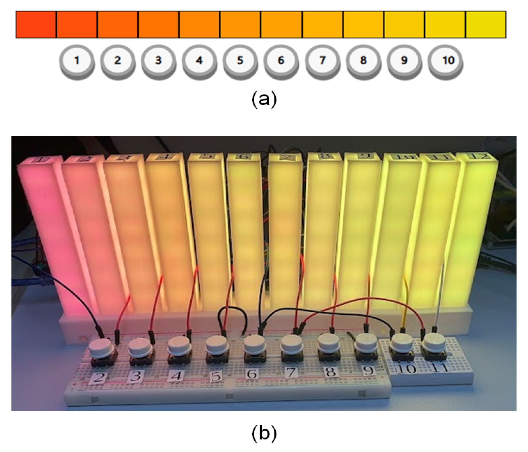
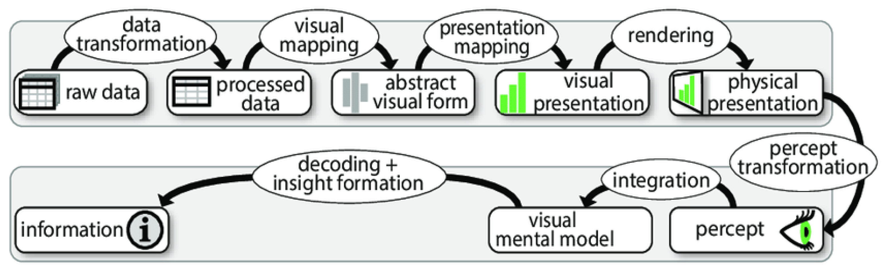
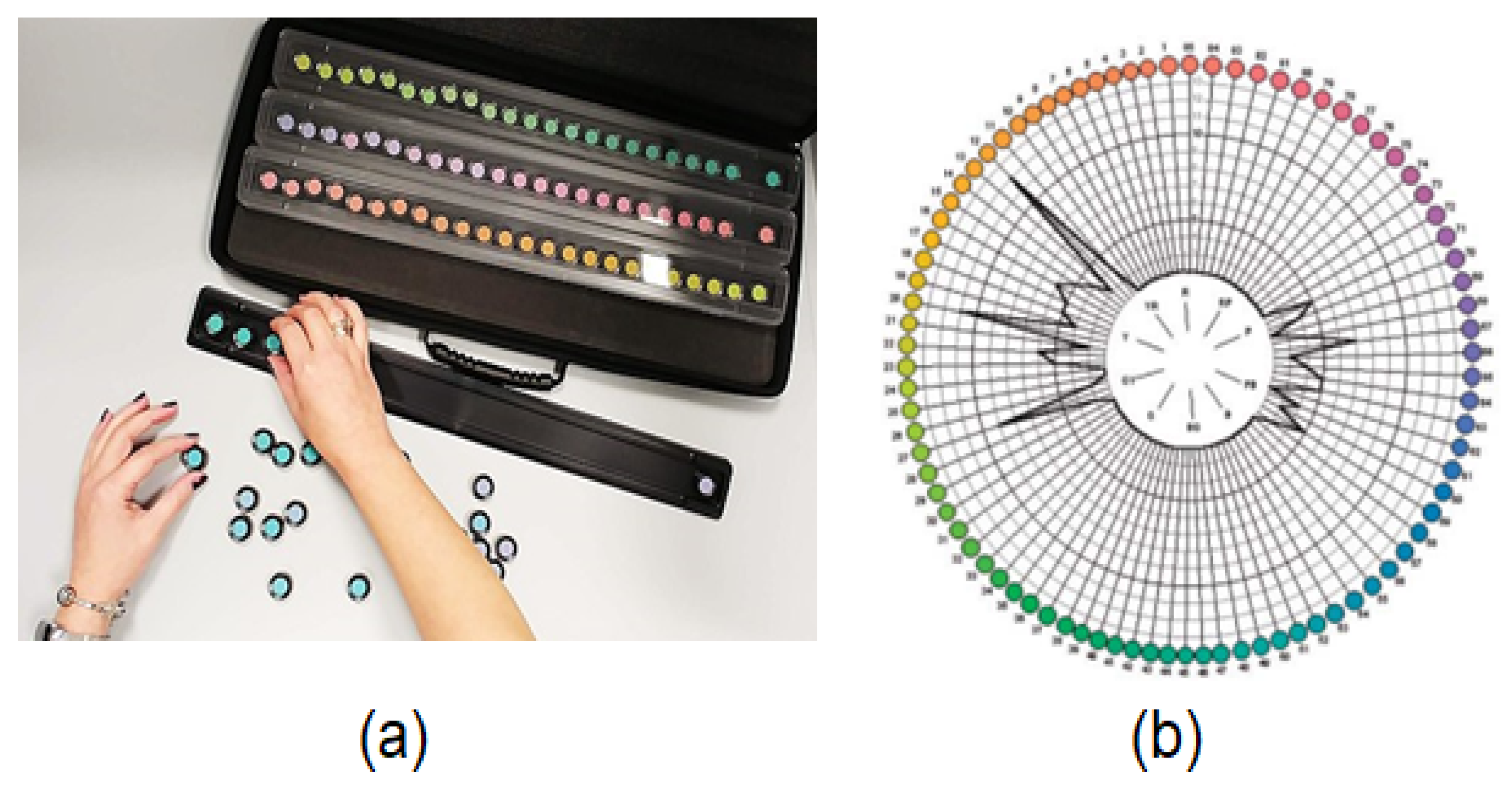
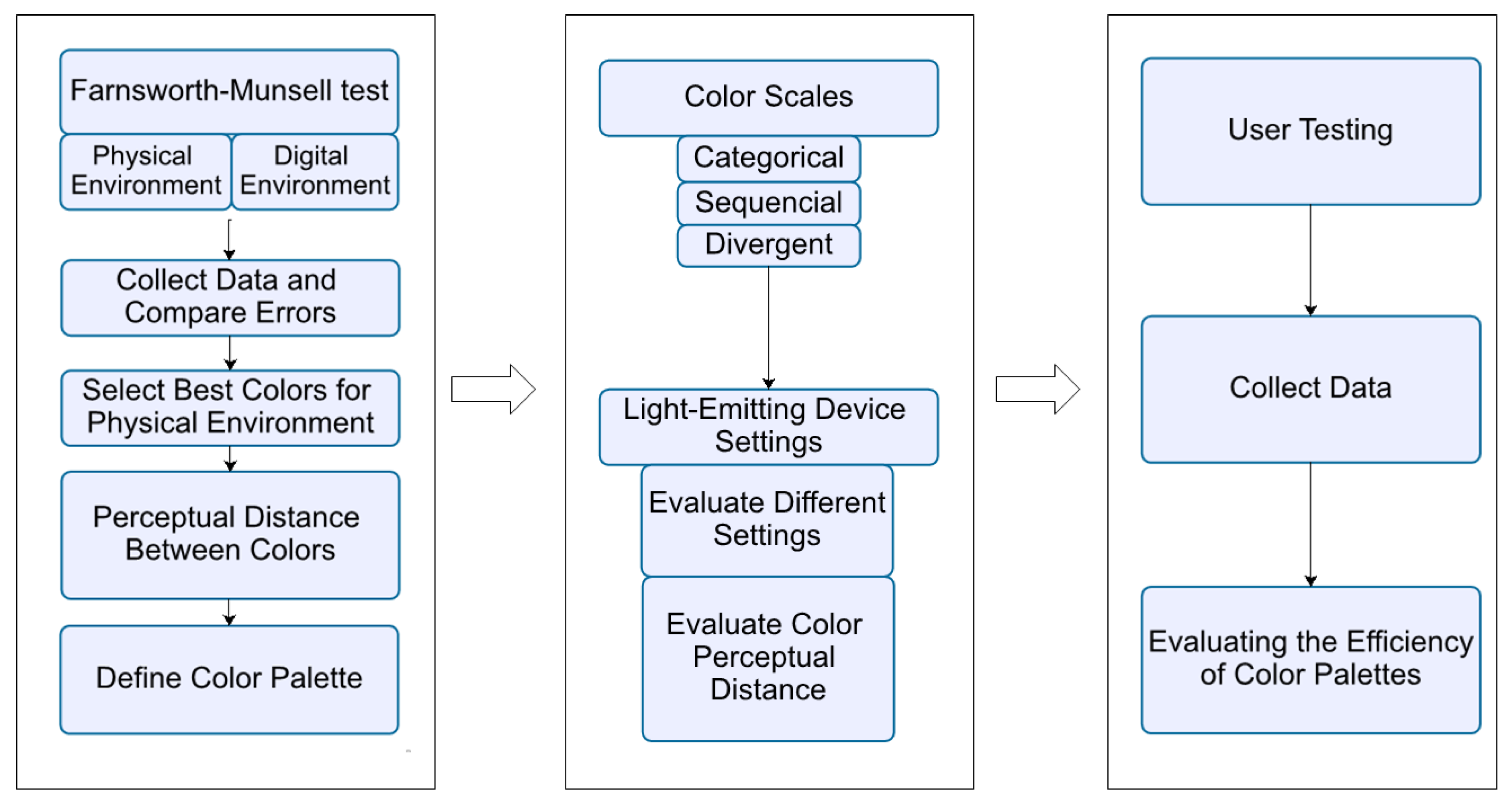
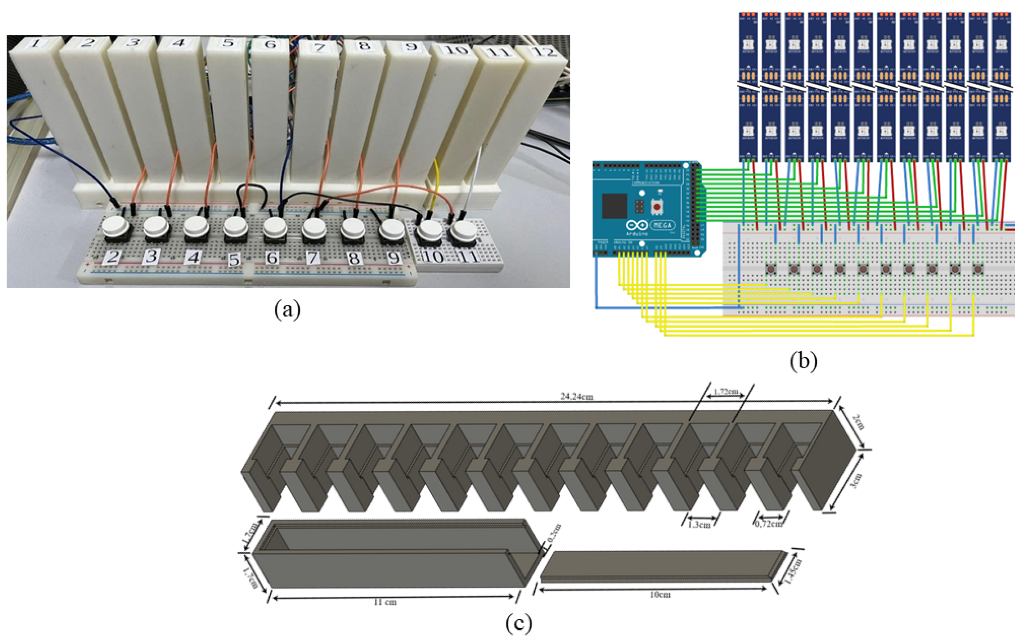
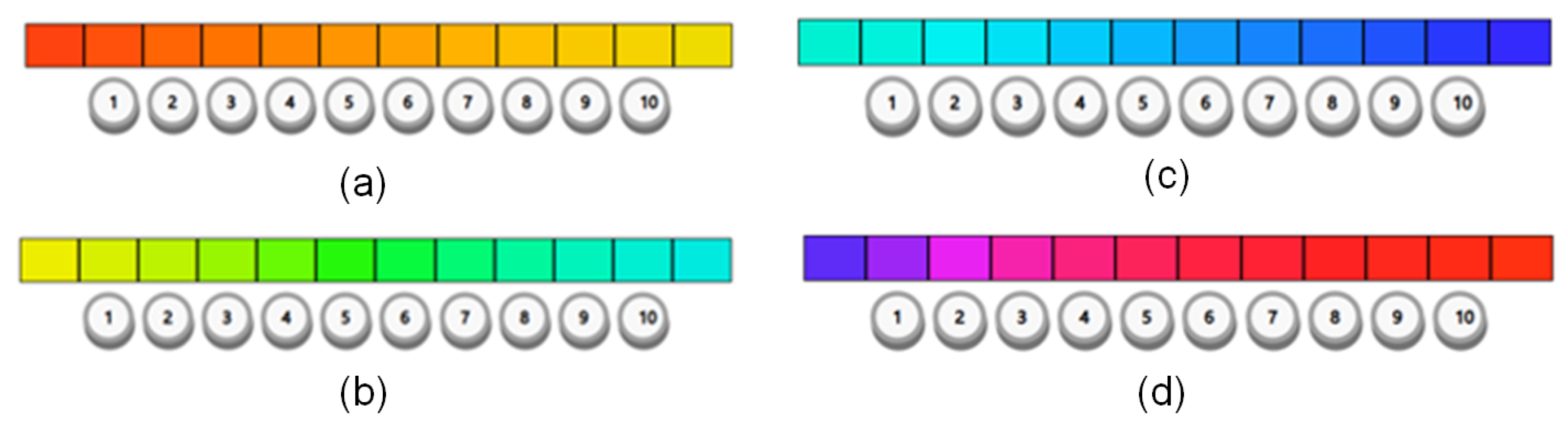
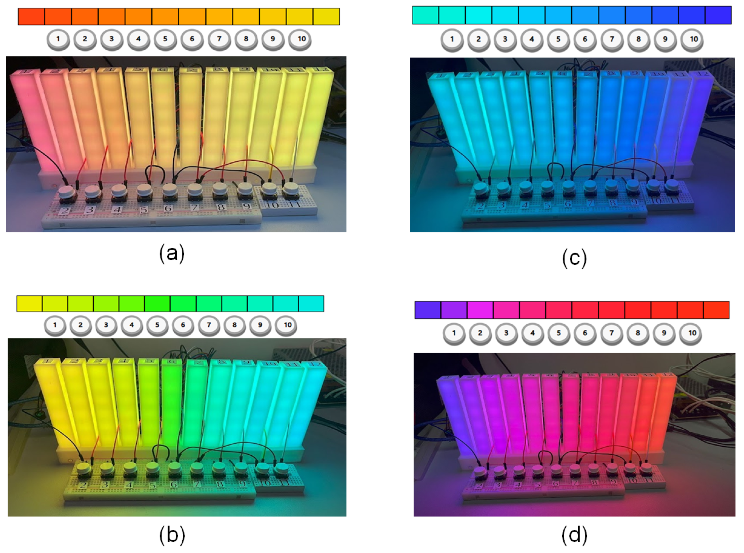
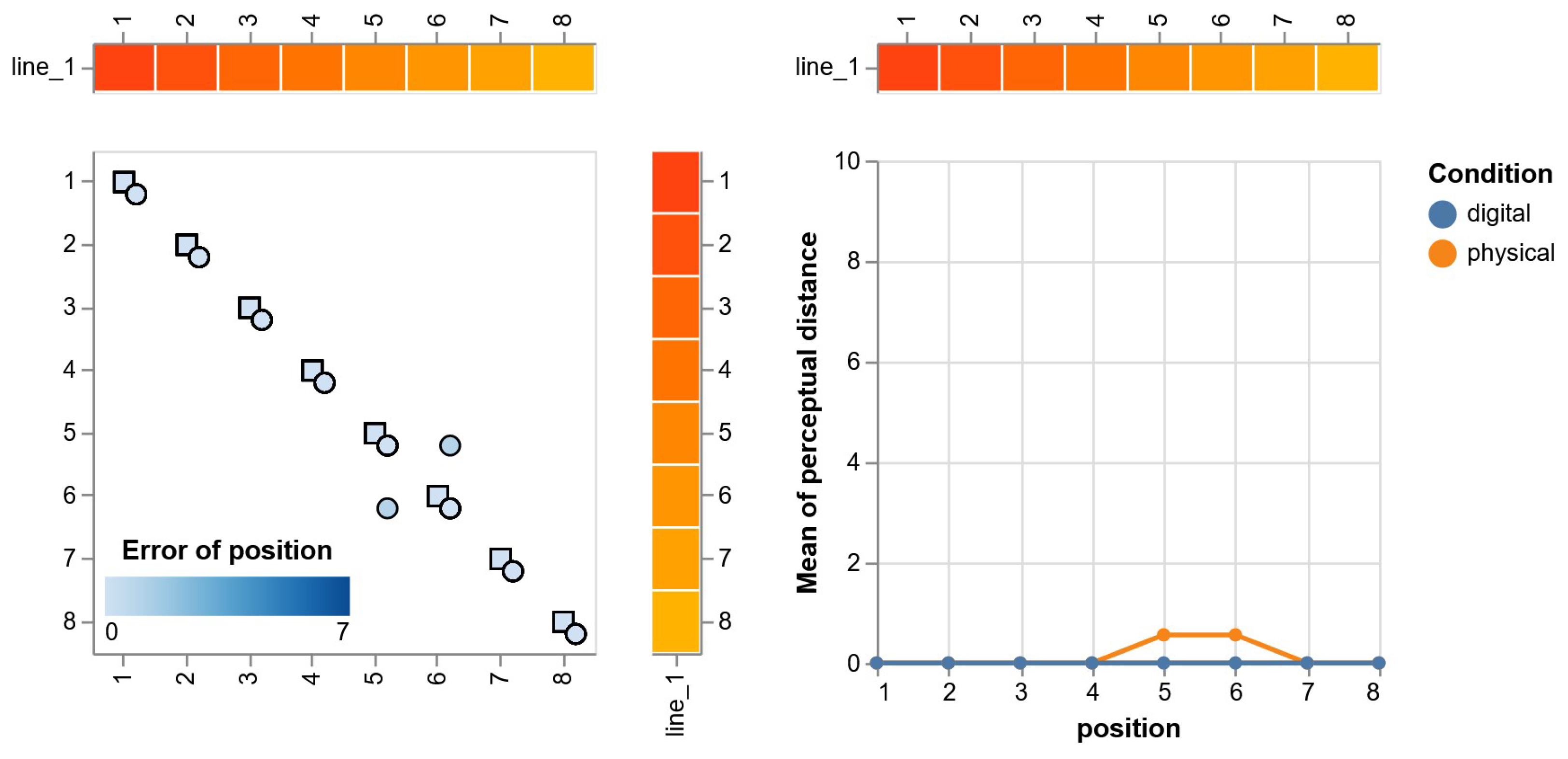
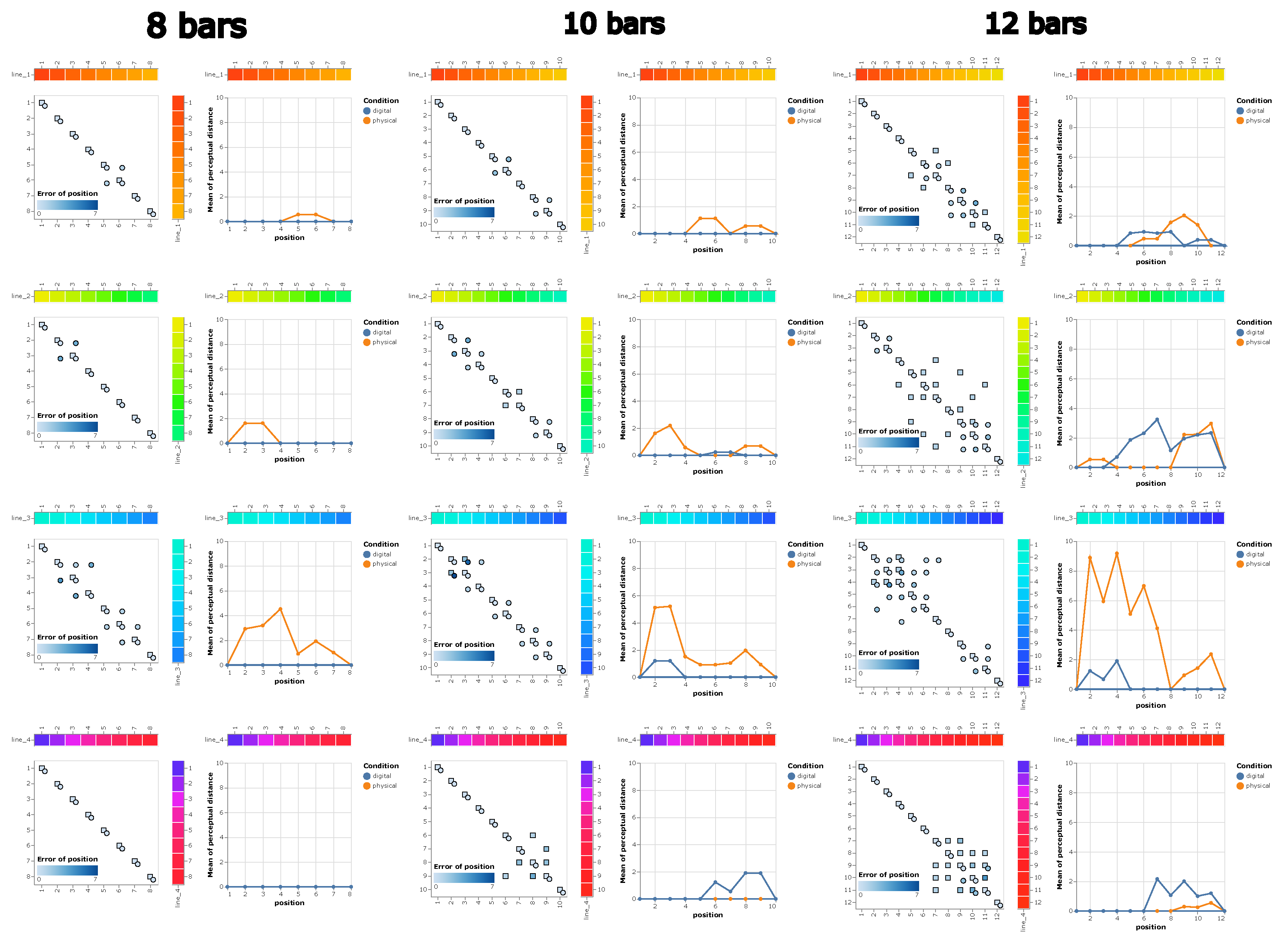
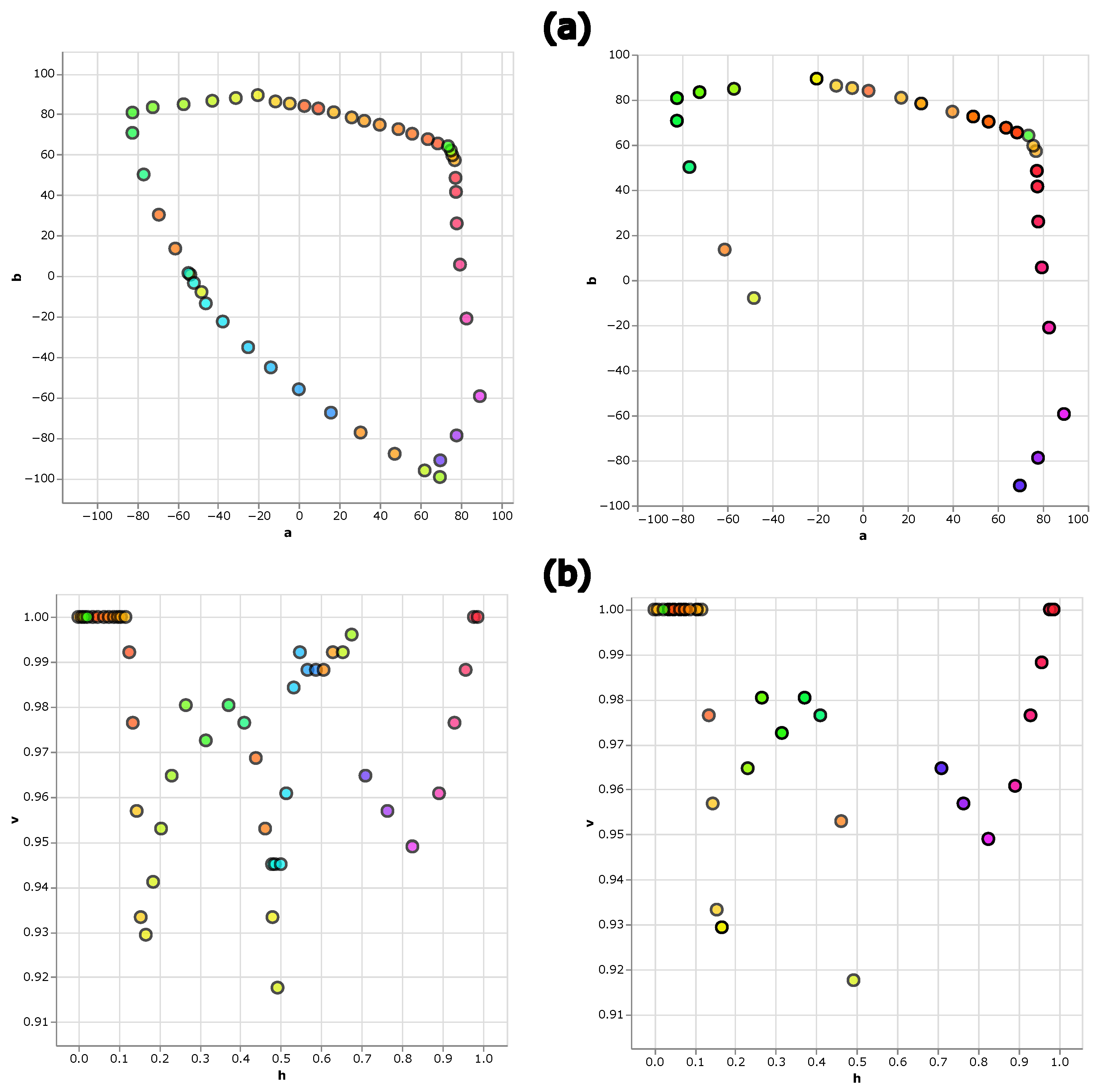
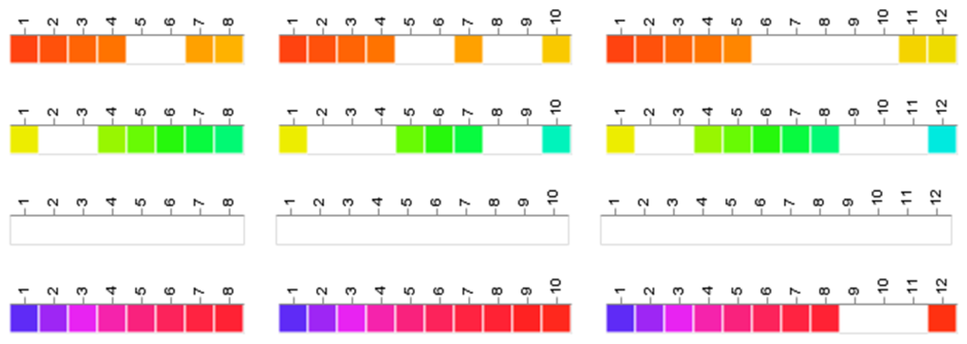
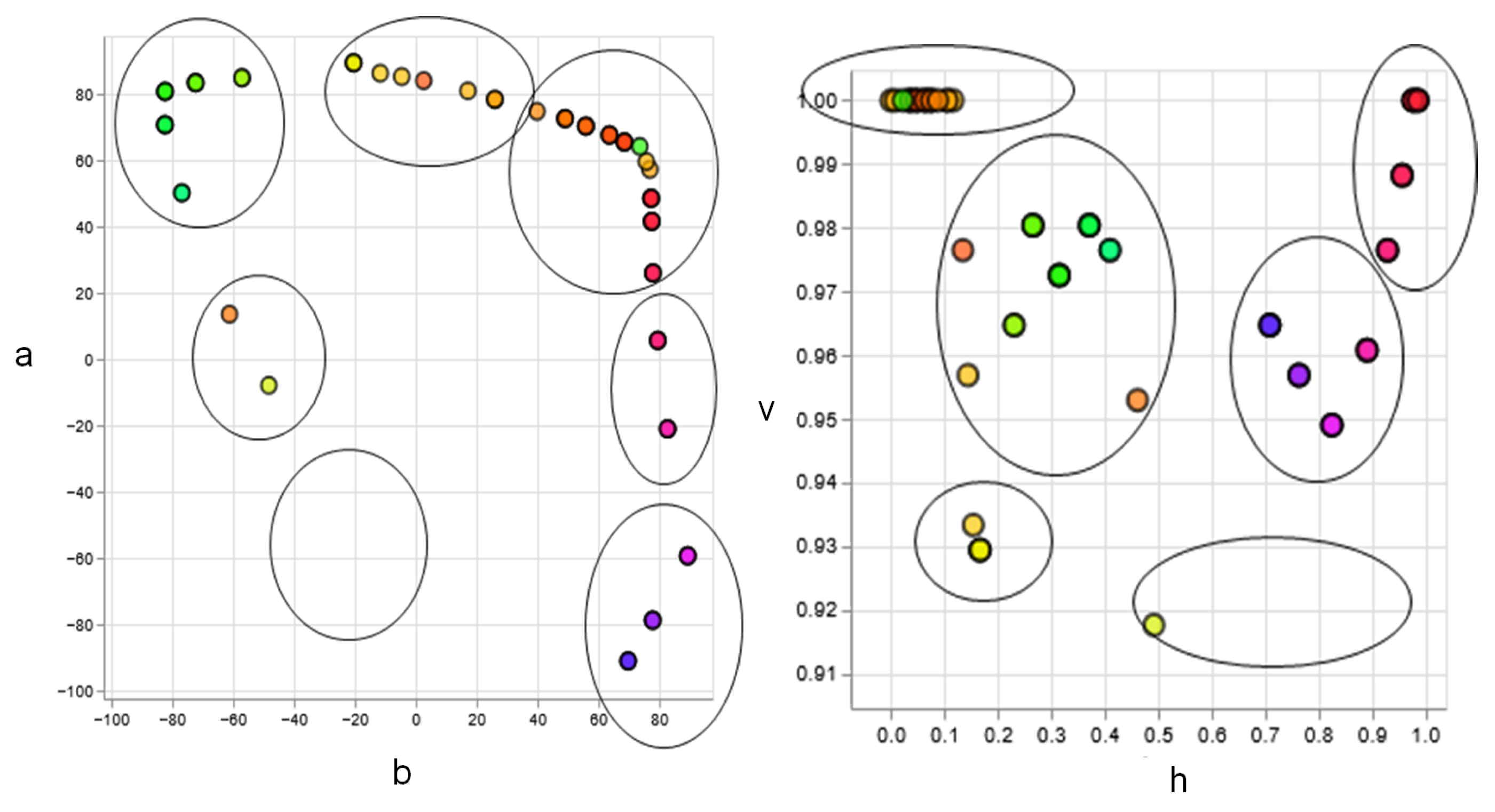

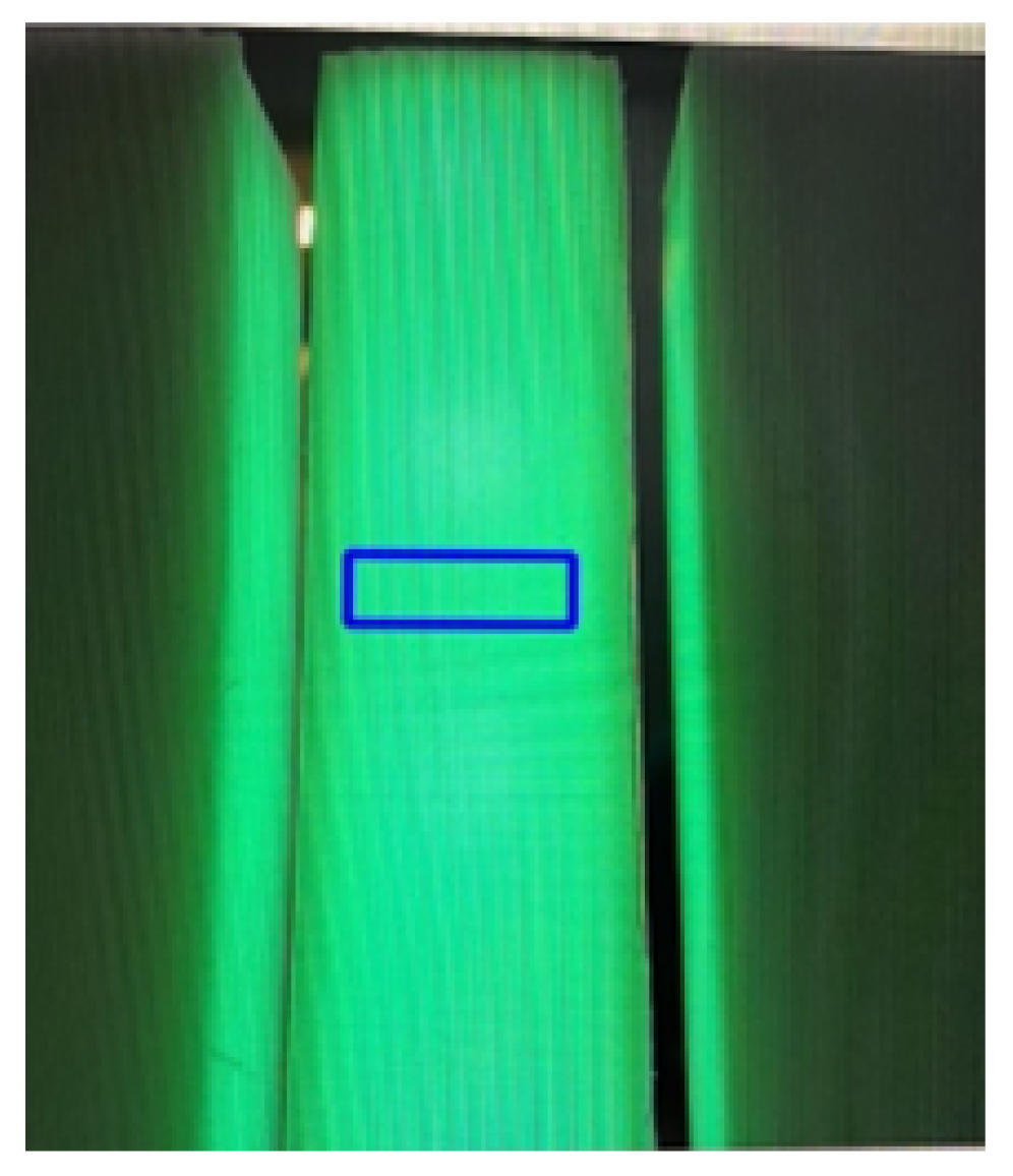
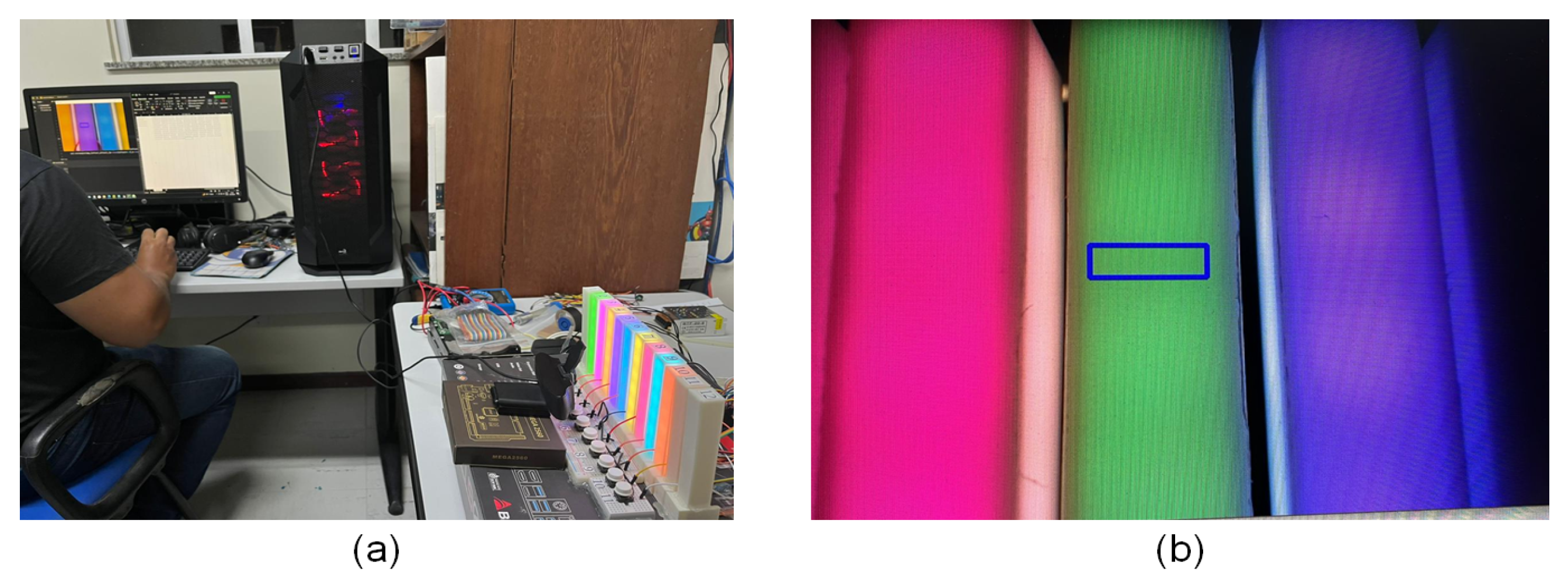
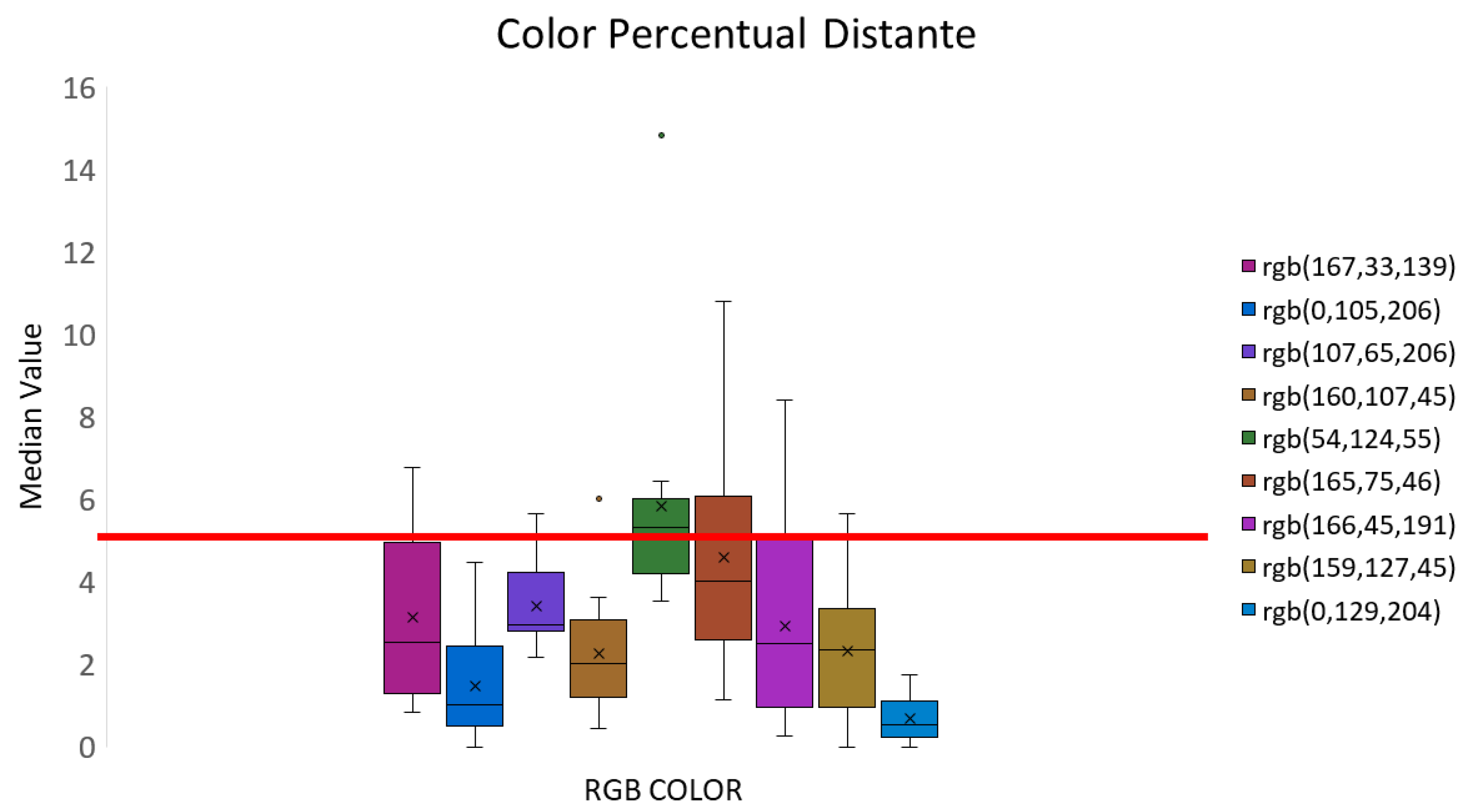
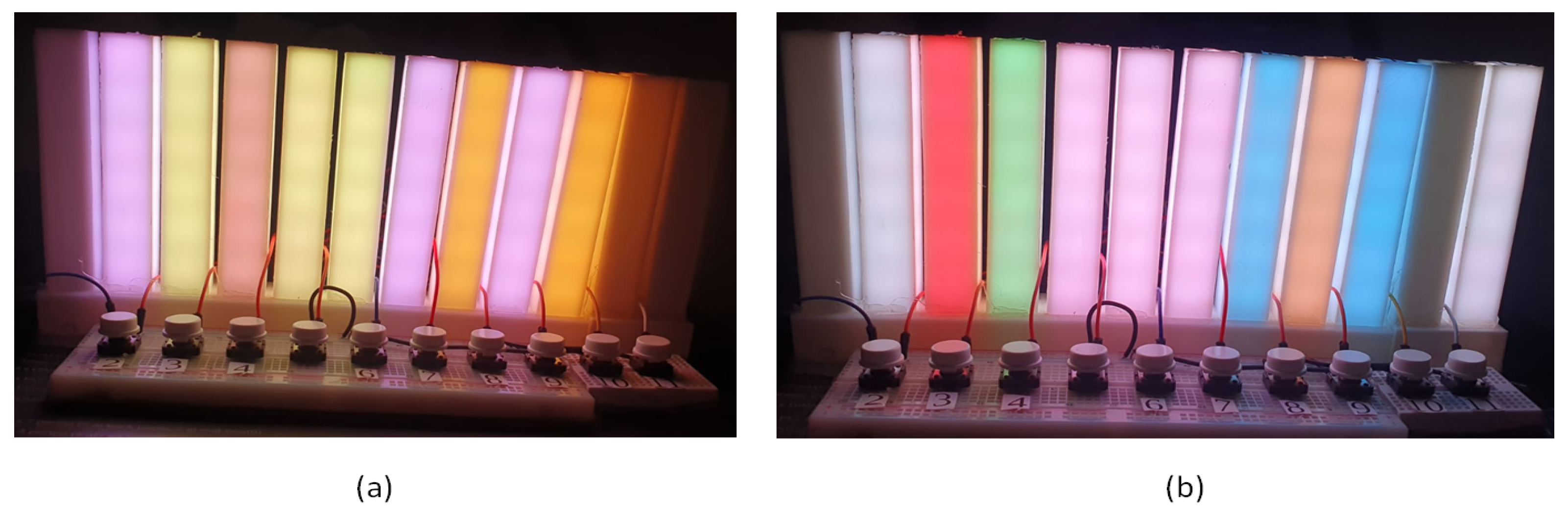
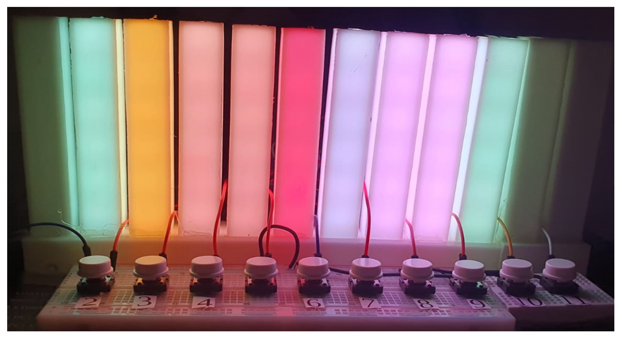
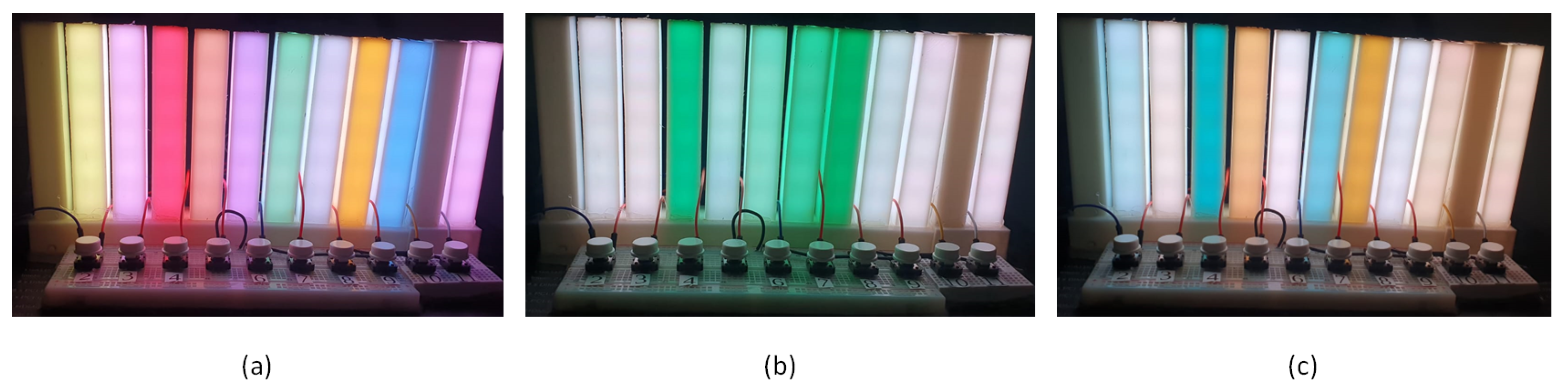

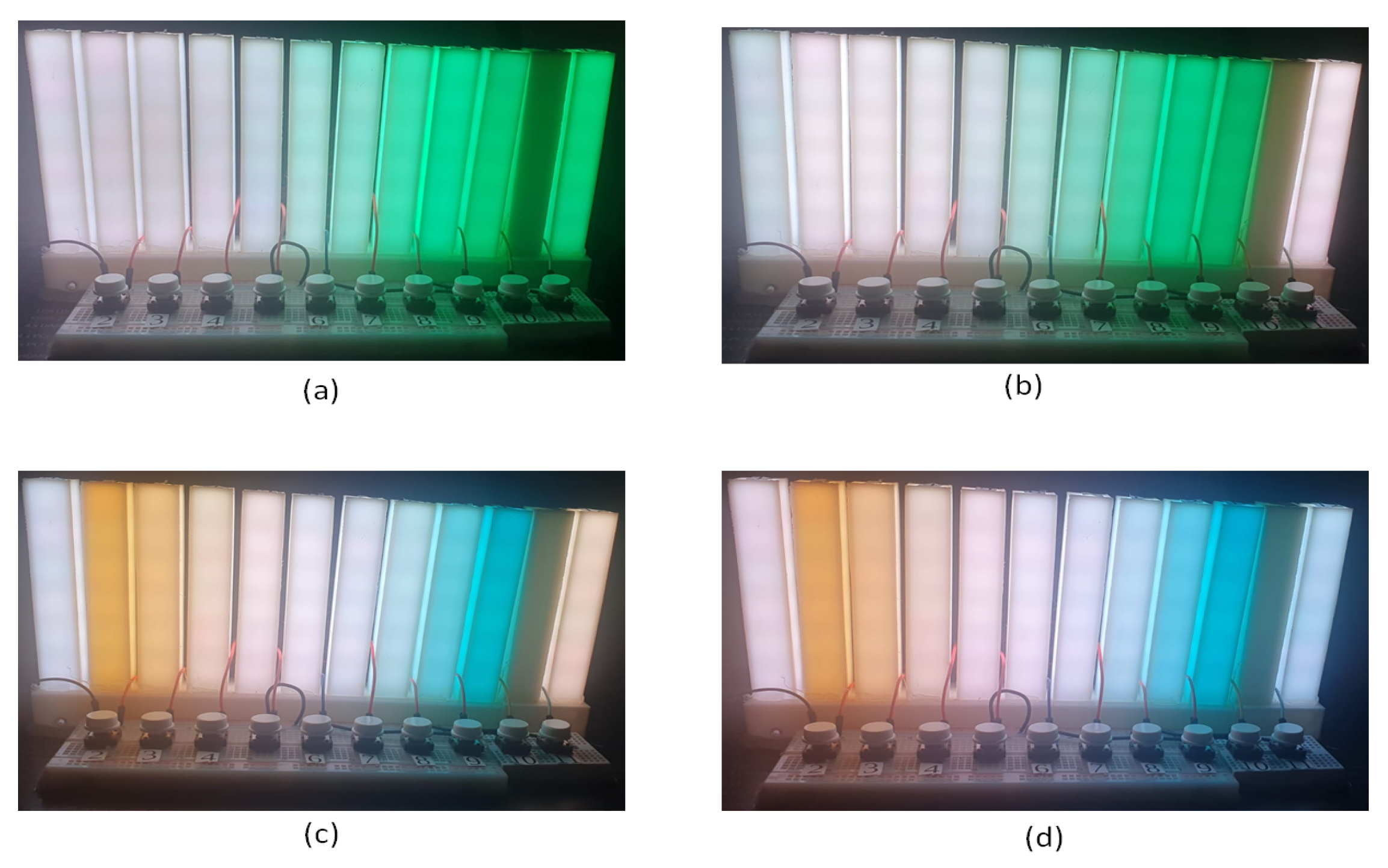
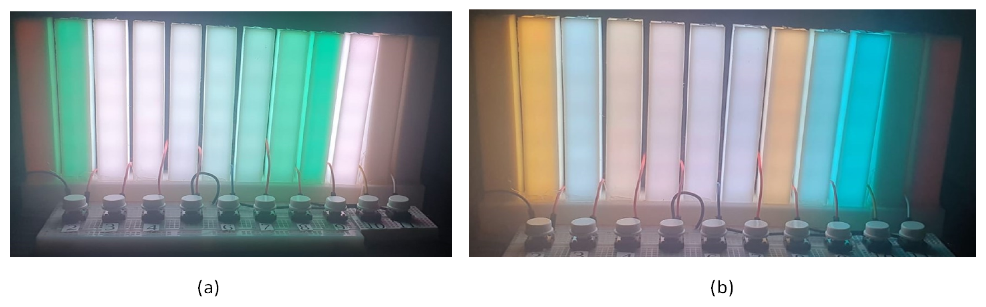

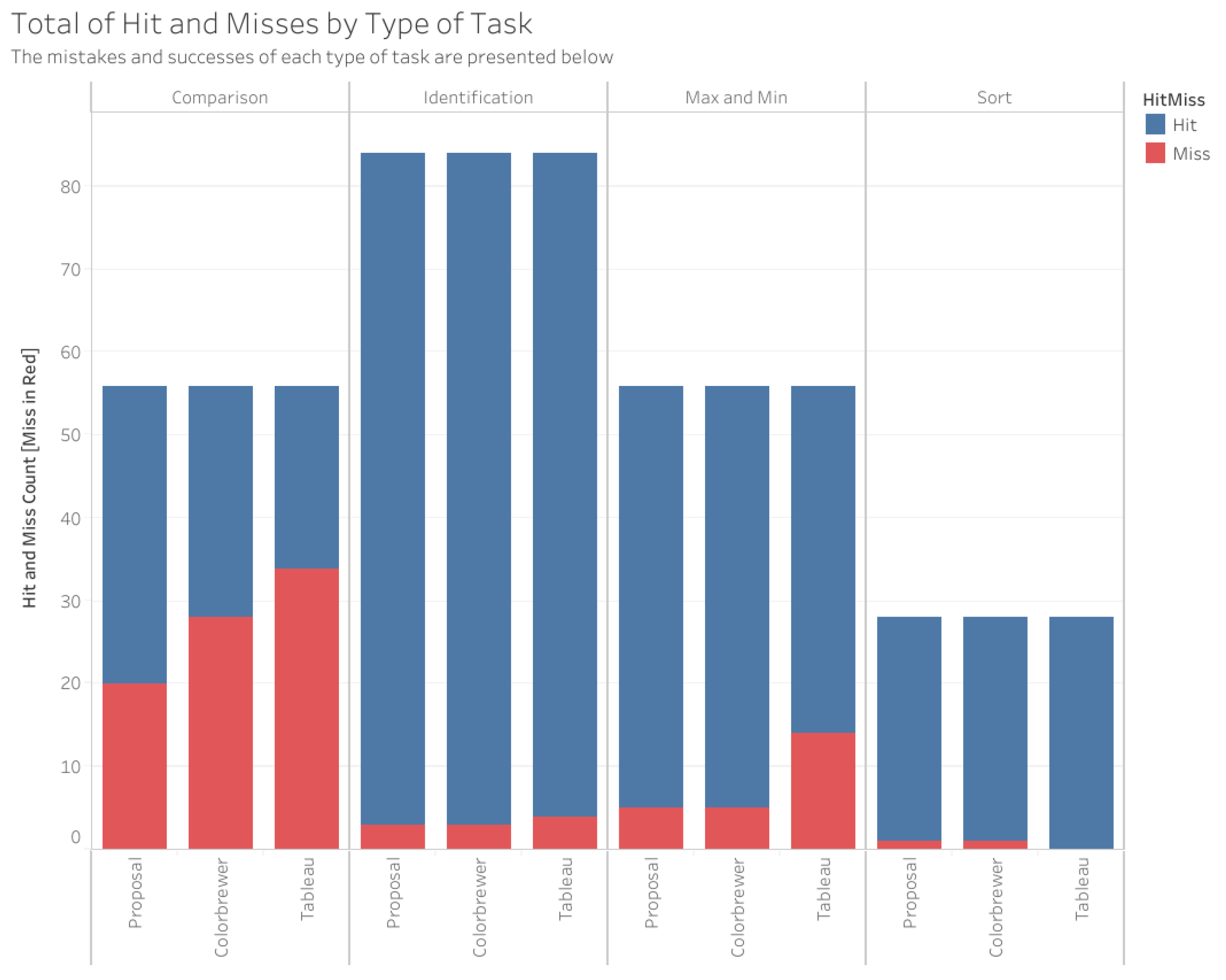
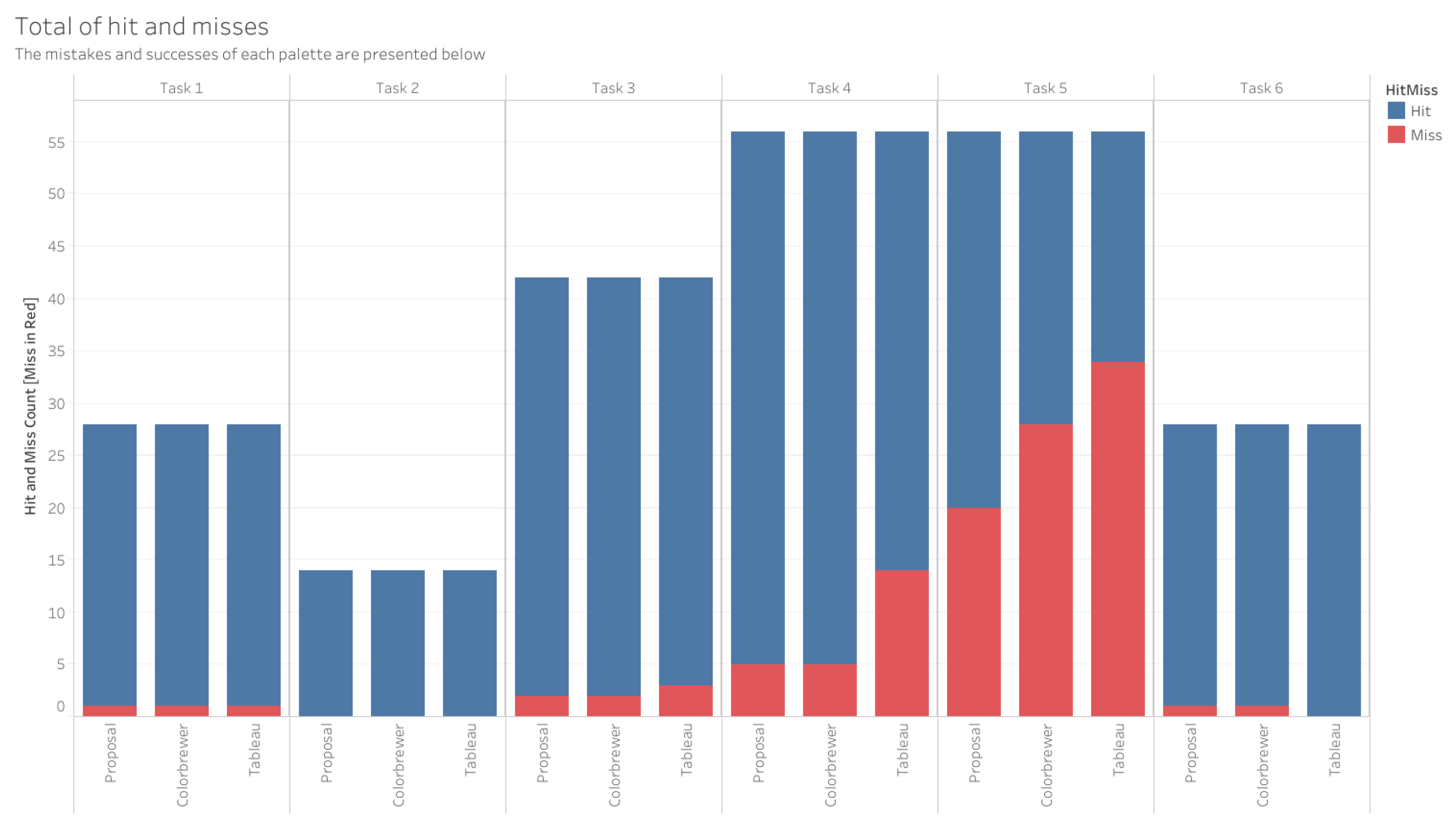
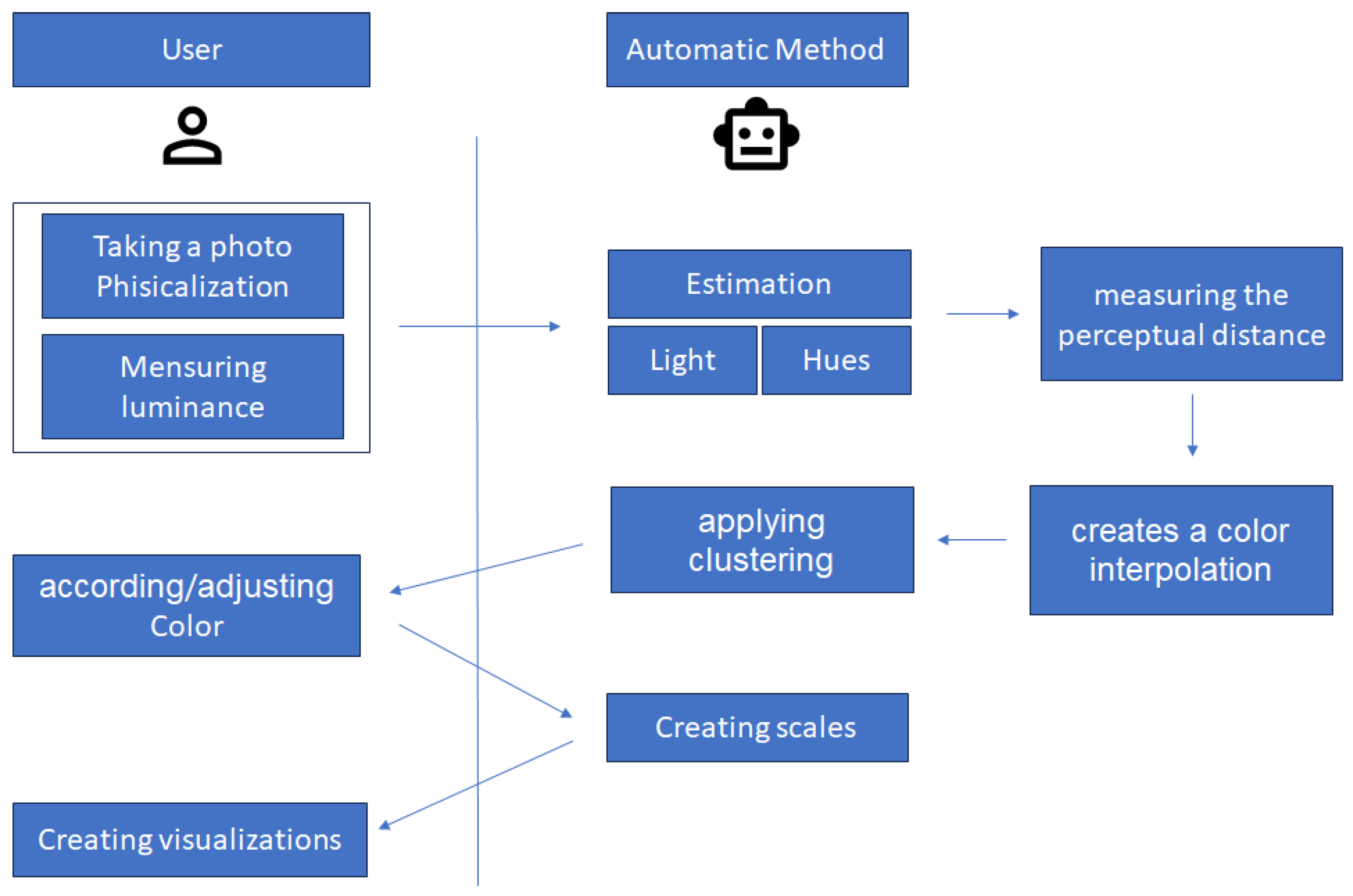
