Aesthetics and Clarity in Information Visualization: The Designer’s Perspective


Abstract
:1. Designing Information Visualizations for a General Audience
- 1.
- How do designers look upon the relative importance of clarity and attractiveness in information design?
- 2.
- What position do designers take in objective representation of data vs. providing subjective interpretation in visualizing information?
- 3.
- What do designers consider the defining characteristics of attractiveness in information design?
2. Interviews and Literature Review
2.1. Method
2.2. Analyses
2.2.1. Step 1: Selecting Relevant Statements
Interviews
Handbooks
2.2.2. Step 2: Explorative Survey
2.2.3. Qualitative Analysis
Clarity vs. attractiveness
- (1)
- “Relevance. […] Meaning the infographic has to contribute to conveying information. It must be clear. That means you have to make choices with which you guide your reader through the infographic. Accessibility. The reader must not give up because of complexity or because he doesn’t know where to begin. And attractiveness. [,…] It must surprise, excite, make curious.” (I; clarity: 96.4 %)
- (2)
- “I think you must be able to see what the subject is. Quickly see where you have to search. Not simplify by leaving out, but clarify by layering. Attractiveness tops. But I am not an artist. Form follows content. If the image is pretty but non-informative, than that is not sufficient for me. Not more image than content.” (I; clarity: 100%)
- (3)
- “The purpose of visualization is insight, not pictures. A visualization’s function is to facilitate understanding. Form has to follow this function. This does not mean that aesthetics are not important—they are. […] However, it is not only aesthetics that help to increase the information flow.” (H: Scheiderman, in Klanten 2010, p. 8; clarity: 82.1%)
- (4)
- “Information design as a discipline has the efficient communication of information as its primary task.” (H: Wildbur and Burke 1998, p. 6; clarity: 96.4%)
- (5)
- “Clarity and aesthetics. Where the emphasis is put, depends on the target group and the assignment. If it is for a newspaper for a broad non-expert audience, you have to tell a story that is engaging; then it is not all about efficiency.” (I; clarity: 21.4%)
- (6)
- “The only conclusion possible is that design always involves three inextricably related elements, however much their relative proportions may differ from one application to the next, namely: durability, usefulness, and beauty.” (H: Mijksenaar 1997, p. 18; clarity: 46.4%)
- (7)
- “The optimum synthesis of aesthetics and information value remains the essential objective in every type of diagrammatic presentation.” (H: Herdeg 1981, p. 6; clarity: 64.4%)
Objectivity vs. subjectivity
- (8)
- “Complete objectivity doesn’t exist, you always make choices. But it is not our aim to give our personal opinion.” (I; objectivity: 60.7%)
- (9)
- “I do not give my own judgment. You have to interpret. But people have to make their own judgment.” (I; objectivity: 57.1%)
- (10)
- “You have to interpret; simply providing data is pointless. But people have to make their own judgment.” (I; objectivity: 28.6%)
- (11)
- “Show the data; […] avoid distorting what the data have to say.” (H: Tufte 2001, p. 13; objectivity: 92.9%)
- (12)
- “Then you must be able to experience the story. Make the story manifest. Engage people. [The question is:] how to translate a feeling, an atmosphere, into something visual?” (I; objectivity: 10.7%)
- (13)
- “I try to make things visual as soon as possible, and then discuss with the client what exactly it is they want to tell. It is not about my own message.” (I; objectivity: 64.3%)
- (14)
- “Sometimes the message is clear, but not always. These days I am increasingly employed by businesses, and then the assignment is often very vague. I take an active role then to find out: what is the message? They often don’t know. (…) Or governments have made analyses and want to show something about them to managers or to the public. Then they come to us with piles of reports full of important information: can you make a graphic of this? (…) Then we have to extract the essence ourselves.”
- (15)
- “It only happened once, with a big international non-profit organization (…). When the data did not fit the story, they would just make another selection from the data. I will never work for them again.”
- (16)
- “When something is not right in a graphic, people notice that quicker than in a text. (…) You cannot visualize what is not there. [Referring to the example:] We reached a compromise: the organization on top instead of at the bottom, the process reversed. If I had given them what they wanted and had put them literally in the center, it would have become a very bad visualization with a weird twist in it, and people notice that.”
Attractiveness features
- (17)
- “That is in the design. I think in metaphors, which I try to use as an illustrative element. […] I use associations between subject and form […]. It is mainly about information density.”
- (18)
- “That follows from the process. It designs itself. Beauty that you see in it is a bit of intuition that you are doing alright. I don’t think we have a visual language of our own.”
- (19)
- “We start from what we consider good ourselves. That is hard to define. Data visualization is usually clear in terms of archetype. Then look at contrast, define archetype, and then the subject, and then you come in an atmosphere, and aesthetics. Aesthetics is important. We do what we like.”
- (20)
- “In interactive visualizations: playful movement, something surprising… Use of color… More feeling. Just as much information, but beautifully designed.”
- (21)
- “(…) something that is unique and tells a story, that attracts attention and is remembered.”
- (22)
- “Graphical elegance is often found in simplicity of design and complexity of data.” (Tufte 2001, p. 177)
- (23)
- “Elegance is a measure of the grace and simplicity of the designed product relative to the complexity of its functions.” (Herdeg 1981, p. 8)
- (24)
- “(…) Not simplify by leaving out, but clarify by layering. (…)”
- (25)
- “(…) many data that show patterns. (…)”
3. Discussion and Conclusions
Author Contributions
Funding
Conflicts of Interest
Appendix A
- Can you briefly describe your educational background and professional career/experience?
- What kind of clients do you usually work for and prefer to work for? (e.g., editorial, government, business)
- Can you describe a typical work process? How are you provided with the data, who is responsible for the analysis, who constructs the message, and how do you communicate with the client about the design?
- What are the main criteria for a good data visualization for a general audience?
- What makes a data visualization attractive?
- Do you show opinions in your data visualization designs?
- What is your opinion about misleading with graphs? Do clients ever ask you to lie with graphs, and have you ever done that? Do you check the data you are supplied with?
- Do you test your designs before they get published?
- Do you consult design handbooks, and if so, which?
Appendix B
- LL = library loan
- IW = interviewees’ literature
- IIID = recommended by IIID
Appendix C. Statements and Their Scores (Percentages of Choices for Clarity and Objectivity)
- I = statement from interview
- H = statement from design handbook
| Statements on clarity vs. attractiveness | ||
| Statements judged to express clarity as main criterion (>66.66%) | % clarity | |
| I | “I think you must be able to see what the subject is. Quickly see where you have to search. Not simplify by leaving out, but clarify by layering. Attractiveness tops. But I am not an artist. Form follows content. If the image is pretty but non-informative, then that is not sufficient for me. Not more image than content.” | 100.0 |
| H | “To communicate quantitative information effectively first requires an understanding of the numbers, then the ability to display their message for accurate and efficient interpretation by the reader.” (Few 2004, p. 10) | 100.0 |
| H | “Our goal is to enable the user to understand and find his way […]. Accuracy always takes priority over esthetics.” (Brückner 2004, p. 11) | 100.0 |
| I | “Relevance. […] Meaning the infographic has to contribute to conveying information. It must be clear. That means you have to make choices with which you guide the reader through the infographic. Accessibility. The reader must not give up because of complexity or because he doesn’t know where to begin. And attractiveness. […] It must surprise, excite, make curious.” | 96.4 |
| I | “It must be legible. And the reader must be able to read his own story: can you compare things, zoom in on details, etc. You often see beautiful images with a lot of data without the story being clear. That is not good.” | 96.4 |
| H | “A graphic designer is expected to convey a message as clear as possible by creating order in text and image. Information design is a spectrum of design that is mainly occupied with giving consumers information in the clearest and most direct manner.” (Wildbur 1989, inside cover) | 96.4 |
| H | “The challenge is to develop ways of arranging the most relevant data in the clearest manner and the smallest amount of space.” (Woolman 2002, p. 11) | 96.4 |
| H | “Information design as a discipline has the efficient communication of information as its primary task.” (Wildbur and Burke 1998, p. 6) | 96.4 |
| H | “Excellence in statistical graphics consists of complex ideas communicated with clarity, precision, and efficiency.” (Tufte 2001, p. 13) | 92.9 |
| H | “Its [information design] purpose is the systematic arrangement and use of communication carriers, channels, and tokens to increase the understanding of those participating in a specific conversation or discourse.” (Jacobson 1999, p. 4) | 89.3 |
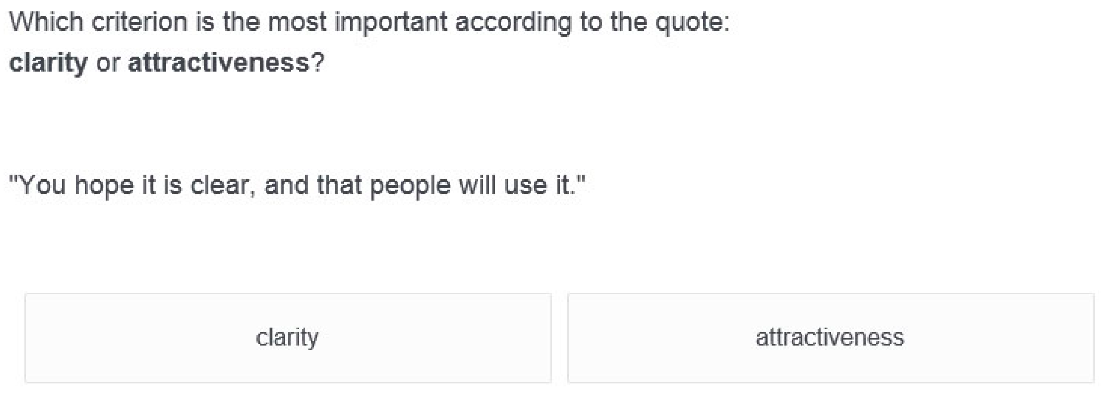
| I | “You hope it is clear, and that people will use it.” | 85.7 |
| H | “The first goal of an infographic is not to be beautiful just for the sake of eye appeal, but, above all, to be understandable first, and beautiful after that, or to be beautiful thanks to its exquisite functionality. A good graphic realizes two basic goals: it presents information, and it allows users to explore that information.” (Cairo 2013, p. xx) | 85.7 |
| H | “Although aesthetics are taking on an increasingly important role, we must always ensure that visualizations make things easier to understand.” (Richli in Klanten 2008, p. 185) | 85.7 |
| H | “The goal of information design must be to design displays so that visual queries are processed both rapidly and correctly for every important cognitive task the display is intended to support.” (Ware 2008, p. 14) | 85.7 |
| H | “The purpose of visualization is insight, not pictures. A visualization’s function is to facilitate understanding. Form has to follow this function. This does not mean that aesthetics are not important—they are. […] However, it is not only aesthetics that help to increase the information flow. Narrative is a very powerful tool as well.” (Schneidermann in Klanten 2010, p. 8) | 82.1 |
| H | “The idea is to make designs that enhance the richness, complexity, resolution, dimensionality, and clarity of the content.” (Tufte 1997, pp. 9–10) | 82.1 |
| I | “It must tell a story. Provide insight into something. No info no graphic. Aesthetics is also important, if it does not distract.” | 75.0 |
| I | “The data set is important. It must tell something, provide a different insight than with Excel. It starts with the analysis of what you could give insight in.” | 71.4 |
| H | “Certain [design] choices become compelling because of their greater efficiency.” (Bertin 2011, p. 9) | 71.4 |
| H | “It is an essential element […] that the design of symbols in themselves, as well as their arrangement, should be attractive. Yet, line, color and shade are not to be employed merely for the pleasure we take in them, but for informative purposes.” (Neurath 2010, p. 106) | 67.9 |
| Statements undecided (66.66–33.33%) | % clarity | |
| H | “When consistent with the substance and in harmony with the content, information displays should be documentary, comparative, causal and explanatory, quantified, multivariate, exploratory, skeptical.” (Tufte 1997, p. 53) | 64.3 |
| H | “The optimum synthesis of aesthetics and information value remains the essential objective in every type of diagrammatic presentation.” (Herdeg 1981, p. 6) | 64.3 |
| H | “Too many data presentations, alas, seek to attract and divert attention by means of display apparatus and ornament.” (Tufte 1990, p. 33) | 60.7 |
| H | “The only conclusion possible is that design always involves three inextricably related elements, however much their relative proportions may differ from one application to the next, namely: durability, usefulness, and beauty.” (Mijksenaar 1997, p. 18) | 46.4 |
| H | “Combining beauty and truth, they [data visualizations] are, at their best, inspiring, fascinating, visually interesting and easy to read, while conveying complex levels of information in an impactful way.” (Losowsky in Klanten 2011, p. 6) | 39.3 |
| Statements judged to express dominance of attractiveness as main criterion (<33.33%) | % clarity | |
| I | “It starts with the data. A design cannot transcend the content. […] Then you must be able to experience the story. Make the story manifest. Engage people. It must contain something intriguing that attracts.” | 25.0 |
| I | “Clarity and aesthetics. Where the emphasis is put, depends on the target group and the assignment. If it is for a newspaper for a broad non-expert audience, you have to tell a story that is engaging; then it is not all about efficiency.” | 21.4 |
| I | “Data must be correct, fit the story, and it must provide an extra or different insight into the story that accompanies it. You don’t have to be able to see immediately what it is about—that is too difficult with some financial constructions. But I do try to make something stand out, as a sort of hook.” | 10.7 |
| Statements on objectivity vs. subjectivity | ||
| Statements judged to express dominance of objectivity as main goal (>66.66%) | % objectivity | |
| H | “Show the data; […] avoid distorting what the data have to say.” (Tufte 2001, p. 13) | 92.9 |
| H | “The first priority of information design is the correct communication of serious subject matter.” (Brückner 2004, p. 7) | 89.3 |
| H | “A good graphic realizes two basic goals: it presents information, and it allows users to explore that information.” (Cairo 2013, p. 73) | 85.7 |
| H | “Show comparisons, contrasts, differences. Show causality, mechanism, explanation, systematic structure.” (Tufte 2006, p. 127) | 75.0 |
| I | “I think the essence is that you confine yourself to facts and figures and let the reader draw his own conclusions. I don’t feel the need to give my own viewpoints, I rather do it the other way around.” | 71.4 |
| I | “We don’t need to bring our own truth, we rather map everything, so that people can form their own opinion.” | 67.9 |
| Statements undecided (66.66–33.33%) | ||
| I | “I try to make things visual as soon as possible, and then discuss with the client what exactly it is they want to tell. It is not about my own message.” | 64.3 |
| H | “Evidence presentations [=data visualizations] should be created in accord with the common analytical tasks at hand, which usually involve understanding causality, making multivariate comparisons, examining relevant evidence, and assessing the credibility of evidence and conclusions.” (Tufte 2006, p. 9) | 64.3 |
| I | “Complete objectivity doesn’t exist, you always make choices. But it is not our aim to give our personal opinion.” | 60.7 |
| H | “Contemporary information designers seek to edify more than persuade, to exchange ideas rather than foist them on us.” (Jacobson 1999, pp. 1–2) | 60.7 |
| I | “I do not give my own judgment. You have to interpret. But people have to make their own judgment.” | 57.1 |
| I | “I need to agree with the message and the visualization. But I do not show political messages.” | 46.4 |
| I | “Telling the story is the starting point. You make something with a goal. In the visualization you have to help people in the interpretation. Not simply show something. But I do not judge.” | 42.9 |
| H | “A successful visualization […]: it informs, it makes the reader think about the world around them, and about our own lives. It stirs emotions, it encourages action, it equips us, it inspires us.” (Losowsky in Klanten 2011, p. 7) | 39.3 |
| Statements judged to express dominance of subjectivity as main goal (<33.33%) | % objectivity | |
| I | “You have to interpret; simply provide data is pointless. But people have to make their own judgment.” | 28.6 |
| I | “Then you must be able to experience the story. Make the story manifest. Engage people. [The question is:] how to translate a feeling, an atmosphere, into something visual?” | 10.7 |
| Statements on the characteristics of attractiveness | ||
| I | “In interactive visualizations: playful movement, something surprising… Use of color… More feeling. Just as much information, but beautifully designed.” | |
| I | “Quantity matters; many data that show patterns. And then find a good form. You must be able to see information, but also an interesting form. […]. But something that is unique and tells a story, that attracts attention and is remembered.” | |
| I | “For me that is in quiet, balance between text and image, about 80/20. It must contain air. It must surprise, tickle, make curious. […] The main image must make curious. There is information everywhere, so it must have a hook in the image to which the eye lingers. […] Quiet ordering, hierarchy in typography. Colors in a limited palette, so that you can put accents for attention.” | |
| I | “Exciting design, whatever that is, surprising forms.” | |
| I | “That is in the design. I think in metaphors, which I try to use as an illustrative element. […] I use associations between subject and form […]. It is mainly about information density.” | |
| I | “That follows from the process. It designs itself. Beauty that you see in it is a bit of intuition that you are doing alright. I don’t think we have a visual language of our own.” | |
| I | “We start from what we consider good ourselves. That is hard to define. Data visualization is usually clear in terms of archetype. Then look at contrast, define archetype, and then the subject, and then you come in an atmosphere, and aesthetics. Aesthetics is important. We do what we like. Newspapers have guidelines, of course. Within those we search for freedom. We try to use limited colors. And silhouette: […] try to lift the form out of the page. […].” | |
| H | “Graphical elegance is often found in simplicity of design and complexity of data.” (Tufte 2001, p. 177) | |
| H | “Elegance is a measure of the grace and simplicity of the designed product relative to the complexity of its functions.” (Herdeg 1981, p. 8) |
References
- Berlyne, Daniel E. 1971. Aesthetics and Psychobiology. New York: Appleton-Century-Crofts. [Google Scholar]
- Bertin, Jacques. 2011. Semiology of Graphics: Diagrams, Networks, Maps. Redlands: ESRI. [Google Scholar]
- Bourdieu, Pierre. 1987. Distinction: A Social Critique of the Judgment of Taste. Cambridge: Harvard University Press. First published 1979. [Google Scholar]
- Brückner, Hartmut. 2004. Informationen Gestalten. Bremen: Hauschild. [Google Scholar]
- Cairo, Alberto. 2013. The Functional Art: An Introduction to Information Graphics and Visualization. Berkeley: New Riders. [Google Scholar]
- Card, Stuart K., Jock MacKinlay, and Ben Shneiderman, eds. 1999. Readings in Information Visualization: Using Vision to Think. Burlington: Morgan Kaufmann Publishers. [Google Scholar]
- Cawthon, Nick, and Andrew Vande Moere. 2007. The Effect of Aesthetic on the Usability of Data Visualization. Paper presented at 11th International Conference Information Visualization (IV’07), Zürich, Switzerland, July 4–6; pp. 631–36. [Google Scholar]
- Chater, Nick. 1999. The search for simplicity: A fundamental cognitive principle? The Quarterly Journal of Experimental Psychology 52A: 273–302. [Google Scholar] [CrossRef]
- Cross, Nigel. 1982. Designerly Ways of Knowing. Design Studies 3: 221–27. [Google Scholar] [CrossRef]
- Fabrikant, Sara Irina, Sidonie Christophe, Georgios Papastefanou, and Sara Maggi. 2012. Emotional response to map design aesthetics. Paper presented at GIScience Conference 2012, Columbus, OH, USA, September 18–21; Berlin: Springer. [Google Scholar]
- Few, Stephen. 2004. Show Me the Numbers: Designing Tables and Graphs to Enlighten. Oakland: Analytics Press. [Google Scholar]
- Gaver, William W., Jacob Beaver, and Steve Benford. 2003. Ambiguity as a resource for design. In Human Factors in Computing Systems (CHI). Ft. Lauderdale: ACM Press, pp. 233–40. [Google Scholar]
- Gombrich, Ernst H. 1995. The Story of Art. London: Phaidon. [Google Scholar]
- Hegarty, Mary. 2011. The Cognitive Science of Visual-Spatial Displays: Implications for Design. Topics in Cognitive Science 3: 446–74. [Google Scholar] [CrossRef] [PubMed]
- Hekkert, Paul. 2006. Design aesthetics: Principles of pleasure in design. Psychological Science 48: 157–72. [Google Scholar]
- Herdeg, Walter, ed. 1981. Diagrams: The Graphic Visualization of Abstract Data. Zürich: Graphis Press. [Google Scholar]
- Jacobson, Robert E., ed. 1999. Information Design. Cambridge: MIT Press. [Google Scholar]
- Judelman, Greg. 2004. Aesthetics and Inspiration for Visualization Design: Bridging the Gap between Art and Science. Paper presented at Eighth International Conference on Information Visualisation (IV’04), London, UK, July 14–16; pp. 245–50. [Google Scholar]
- Klanten, Robert, ed. 2008. Data Flow—Visualising Information in Graphic Design. Berlin: Gestalten. [Google Scholar]
- Klanten, Robert, ed. 2010. Data Flow 2: Visualizing Information in Graphic Design. Berlin: Gestalten. [Google Scholar]
- Klanten, Robert, ed. 2011. Visual Storytelling: Inspiring a New Visual Language. Berlin: Gestalten. [Google Scholar]
- Kosara, Robert. 2007. Visualization Criticism—The Missing Link Between Information Visualization and Art. Paper presented at 11th International Conference on Information Visualisation (IV’07), Zürich, Switzerland, July 4–6; pp. 631–36. [Google Scholar]
- Lau, Andrea, and Andrew Vande Moere. 2007. Towards a Model of Information Aesthetic Visualization. Paper presented at 11th International Conference on Information Visualization (IV’07), Zürich, Switzerland, July 4–6; pp. 87–92. [Google Scholar]
- Lavie, Talia, and Noam Tractinsky. 2004. Assessing dimensions of perceived visual aesthetics of Web sites. International Journal of Human Computer Studies 60: 269–98. [Google Scholar] [CrossRef]
- Levy, Ellen, Jeff Zacks, Barbara Tversky, and Diane Schiano. 1996. Gratuitous graphics? Putting Preferences in Perspective. Paper presented at SIGCHI Conference on Human Factors in Computing Systems (CHI’96), Vancouver, BC, Canada, April 13–18; pp. 42–49. [Google Scholar]
- McCandless, David. 2009. Information Is Beautiful. London: Collins. [Google Scholar]
- McWhinnie, Harold J. 1968. A review of research on aesthetic measure. Acta Psychologica 28: 363–75. [Google Scholar] [CrossRef]
- Mijksenaar, Paul. 1997. Visual Function: An Introduction to Information Design. Rotterdam: 1010 Publishers. [Google Scholar]
- Neurath, Otto. 2010. From Hieroglyphics to Isotype: A Visual Autobiography. London: Hyphen. [Google Scholar]
- Ngo, David, Lian Teo, and John Byrne. 2003. Modelling interface aesthetics. Information Science 152: 25–46. [Google Scholar] [CrossRef]
- Quispel, Annemarie, Alfons Maes, and Joost Schilperoord. 2016. Graph and chart aesthetics for experts and laymen in design: The role of familiarity and perceived ease of use. Information Visualization 15. [Google Scholar] [CrossRef]
- Reber, Rolf, Norbert Schwartz, and Piotr Winkielman. 2004. Processing Fluency and Aesthetic Pleasure: Is Beauty in the Perceiver’s Processing Experience? Personality and Social Psychological Review 8: 364–82. [Google Scholar] [CrossRef] [PubMed]
- Schön, Donald A. 1983. The Reflective Practitioner. How Professionals Think in Action. London: Templer-Smith. [Google Scholar]
- Storkerson, Peter K. 2006. Communication Research: Theory, Empirical Studies, and Results. In Design Studies—Theory and Research in Graphic Design. Edited by Audrey Bennet. New York: Princeton Architectural Press. [Google Scholar]
- Tufte, Edward R. 1983. The Visual Display of Quantitative Information. Cheshire: Graphics Press. [Google Scholar]
- Tufte, Edward R. 1990. Envisioning Information. Cheshire: Graphics Press. [Google Scholar]
- Tufte, Edward R. 1997. Visual Explanations. Cheshire: Graphics Press. [Google Scholar]
- Tufte, Edward R. 2001. The Visual Display of Quantitive Information. Cheshire: Graphics Press. [Google Scholar]
- Tufte, Edward R. 2006. Beautiful Evidence. Cheshire: Graphics Press. [Google Scholar]
- Vande Moere, Andrew, and Helen Purchase. 2011. On the role of design in information visualization. Information Visualization 10: 356–71. [Google Scholar] [CrossRef]
- Ware, Colin. 2008. Visual Thinking for Design. Amsterdam: Elsevier/Morgan Kaufmann. [Google Scholar]
- Wildbur, Peter. 1989. Information Graphics. Houten: Gaade. [Google Scholar]
- Wildbur, Peter, and Michael Burke. 1998. Information Graphics—Innovative Solutions in Contemporary Design. London: Thames and Hudson. [Google Scholar]
- Woolman, Matt. 2002. Digital Information Graphics. London: Thames & Hudson. [Google Scholar]
- Yau, Nathan. 2011. Visualize This. The Flowing Data Guide to Design, Visualization, and Statistics. Indianapolis: Wiley. [Google Scholar]
- Zajonc, Robert B. 1968. Attitudinal effects of mere exposure. Journal of Personality and Social Psychology Monograph Supplements 9 Pt 2: 1–27. [Google Scholar] [CrossRef]
- Zajonc, Robert B. 1984. On the primacy of affect. American Journal of Psychology 39: 117–23. [Google Scholar] [CrossRef]
| 1 | In the scientific field of information visualization, the term information visualization refers to the computer-aided interactive visualization of big data with the aim of amplifying cognition (Card et al. 1999). In graphic design, the term refers to a broader category of visualizations meant to inform or instruct people, including data visualization. In this article, the term information visualization refers to the visualization of quantitative data, be it limited or big, static or interactive. |
| 2 |


| No. of Statements | No. of Statements in Which Each Criterion Is Judged as Most Important | ||
|---|---|---|---|
| Clarity | Attractiveness | Undecided | |
| Interviews: N = 9 | 6 | 3 | 0 |
| Handbooks: N = 19 | 14 | 0 | 5 |
| Objective | Subjective | Undecided | |
| Interviews: N = 9 | 2 | 2 | 5 |
| Handbooks: N = 7 | 4 | 0 | 3 |
© 2018 by the authors. Licensee MDPI, Basel, Switzerland. This article is an open access article distributed under the terms and conditions of the Creative Commons Attribution (CC BY) license (http://creativecommons.org/licenses/by/4.0/).
Share and Cite
Quispel, A.; Maes, A.; Schilperoord, J. Aesthetics and Clarity in Information Visualization: The Designer’s Perspective. Arts 2018, 7, 72. https://doi.org/10.3390/arts7040072
Quispel A, Maes A, Schilperoord J. Aesthetics and Clarity in Information Visualization: The Designer’s Perspective. Arts. 2018; 7(4):72. https://doi.org/10.3390/arts7040072
Chicago/Turabian StyleQuispel, Annemarie, Alfons Maes, and Joost Schilperoord. 2018. "Aesthetics and Clarity in Information Visualization: The Designer’s Perspective" Arts 7, no. 4: 72. https://doi.org/10.3390/arts7040072
APA StyleQuispel, A., Maes, A., & Schilperoord, J. (2018). Aesthetics and Clarity in Information Visualization: The Designer’s Perspective. Arts, 7(4), 72. https://doi.org/10.3390/arts7040072