Article

Psychology or Physiology? Choosing the Right Color for Interior Spaces to Support Occupants’ Healthy Circadian Rhythm at Night

by
Mansoureh Sadat Jalali
1,*,
Ronald B. Gibbons
2,3 and
James R. Jones
2
1
Department of Civil and Environmental Engineering, Amirkabir University of Technology, Tehran 1591634311, Iran
2
College of Architecture and Urban Studies, Virginia Tech, Blacksburg, VA 24060, USA
3
Transportation Institute, Virginia Tech, Blacksburg, VA 24061, USA
*
Author to whom correspondence should be addressed.
Buildings 2025, 15(15), 2665; https://doi.org/10.3390/buildings15152665
Submission received: 8 July 2025 / Revised: 21 July 2025 / Accepted: 23 July 2025 / Published: 28 July 2025
(This article belongs to the Section Building Energy, Physics, Environment, and Systems)

Abstract

The human circadian rhythm is connected to the body’s endogenous clock and can influence people’s natural sleeping habits as well as a variety of other biological functions. According to research, various electric light sources in interior locations can disrupt the human circadian rhythm. Many psychological studies, on the other hand, reveal that different colors can have varied connections with and a variety of effects on people’s emotions. In this study, the effects of light source attributes and interior space paint color on human circadian rhythm were studied using 24 distinct computer simulations. Simulations were performed using the ALFA plugin for Rhinoceros 6 on an unfurnished bedroom 3D model at night. Results suggest that cooler hues, such as blue, appear to have an unfavorable effect on human circadian rhythm at night, especially when utilized in spaces that are used in the evening, which contradicts what psychologists and interior designers advocate in terms of the soothing mood and nature of the color. Furthermore, the effects of Correlated Color Temperature (CCT) and the intensity of a light source might be significant in minimizing melanopic lux to prevent melatonin suppression at night. These insights are significant for interior designers, architects, and lighting professionals aiming to create healthier living environments by carefully selecting lighting and color schemes that support circadian health. Incorporating these considerations into design practices can help mitigate adverse effects on sleep and overall well-being, ultimately contributing to improved occupant comfort and health.

1. Introduction

Humans are becoming increasingly detached from the natural world, particularly the day–night cycle of light. People no longer require natural light because they spend approximately 90% of their time indoors [1], and electric light sources can offer adequate lighting for interior spaces. Most buildings employ a combination of daylight (natural light from the sun and the sky) allowed through various sorts of apertures and electric light sources. Each of these light sources can have various effects on residents [2,3,4,5,6]. Even the light emitted from television or tablet screens can induce sleep difficulties and disrupt human circadian rhythm when these devices are utilized in the evening [7,8,9].
Another aspect of human health is that of mood and comfort. Different colors and light sources in interior spaces can have an impact on people’s psychological health [10]. Furthermore, people have varied connections and preferences when it comes to interior color [11]. As a result of the influence of blue light on the circadian clock, additional elements of the human experience must be examined. These features are discussed in further depth in the following article.

1.1. Impacts of Light and Color on Human Physiology

The light that reaches the retina is projected to the suprachiasmatic nucleus, and entrains human circadian rhythms. There are three different types of cells in the human retina. Rods and cones are photoreceptors responsible for vision (rods for night vision and cones for colored day vision). Intrinsically photosensitive retinal ganglion cells (ipRGCs) provide light-sensitive control of melatonin secretion. Light stimulates these cells, and they affect human physiological behavior, such as circadian rhythm [12]. Studies on different mammals show that the peak sensitivity of these cells is in the blue part of the visible light spectrum (459 to 484 nm) [13,14]. Light received by human retinal cells affects melatonin secretion and impacts levels of alertness or fatigue. In the absence of adequate daylight or electric light during the day, natural melatonin suppression may not occur properly and this creates a sense of drowsiness and possibly depression [15]. In contrast, being exposed to high-intensity light (especially in the blue range) at night will create a sense of alertness [15,16].
Buildings can include a variety of spaces, and occupants’ circadian rhythm will be affected if sufficient intensity and spectral quality are not met in those zones [15]. Zones that do not receive enough light to stimulate occupants’ circadian rhythm put people at risk of disrupting their circadian rhythm [17]. This disruption can cause serious harm or worsen symptoms in people suffering from sleep disorders [18], learning problems [19], Alzheimer’s disease [20,21], and seasonal affective disorder (SAD) [20,22]. As a result, maintaining a healthy circadian rhythm can contribute to human health.
In addition, studies have shown impacts of color on human physiology. Experimental studies using biometric data have shown that warm and cool color tones in natural landscapes can modulate physiological stress indicators such as heart rate variability and galvanic skin response, with location-specific effects on wellbeing [23]. The role of color in physiology has also been highlighted in biomedical and neuroscience research, where color is used to study neural circuits and influence emotional and behavioral responses [24]. However, there remains a limited understanding of how interior surface colors in architectural environments influence circadian physiology, particularly through their interaction with electric light sources.

1.2. Impacts of Light and Color on Human Psychology

In order to meet the needs of occupants in interior spaces, color, light, texture, etc., are designed to shape the visual comfort and perception of forms in built environments. Interior designers consider different factors when choosing an appropriate color palette for interior spaces. Most of the time, aesthetically pleasing colors correspond to the meaning and feeling they create in building occupants [11]. Many psychological studies indicate that people have comparable sentiments about different hues. For example, studies about the association of colors with human mood show that red is stimulating and exciting for most people, orange is disturbing, and yellow is cheerful and joyful. On the other hand, blue is tender, soothing, calm, peaceful, and serene, and violet is dignified and stately [25,26,27].
People also have preferences for colors in interior environments. In a cross-cultural study, the interior color meaning and preferences of people from four different cultural backgrounds (the US, English, Korean, and Japanese) were tested. The authors presented participants with color palettes of building interior spaces to assess the reactions of people with different cultural backgrounds. They employed an integrated color palette comprised of horizontal and vertical lines comparable to those encountered in interior settings. Within those lines, the palette was made up of big and tiny planes. Surfaces such as walls and floors were represented by larger planes, while accessories were represented by smaller ones. The findings revealed that people from different cultures had varied color preferences. Palettes with neutral tones and sharp contrast were chosen by the Japanese. The palette with low contrast and warm tones was chosen by Americans, while Koreans preferred the palette with neutral colors more than other ones. Finally, the English participants preferred the palette with warm tones [28]. Sociocultural forces influence the meaning given to different color palettes used in designed environments. People’s reactions to colors depend heavily on their anthropological stance [29]. A previous study revealed the differences between the color preferences of eastern, western, and individual cultures. For example, the palette with neutral hues and obvious red and blue preferred by Koreans reflects their Yin–Yang principles of harmony [28].
In another study in Turkey, participants were shown 41 color samples from the Polisan (Polisan Home Cosmetics, Dilovası, Turkey) interior space color catalog under a fixed 200 lux illumination level using an incandescent light source, to discover their color preferences for interior spaces [30]. The conditions, such as the location of the observer, glare avoidance, and color samples, were controlled during the study. The results showed that people associated the color blue in interior spaces with peace, relief, calm, and modernity. On the other hand, the color red was associated with tiring, striking, and depressive moods [30]. In a different study, blue was used as the main hue in bedrooms to emphasize their comfortable and calming properties [31]. Blue was also the preferred paint color among hotel guests, and it was perceived as a pleasant color [32]. According to interior designers, cold colors such as blue and green promote sleep and relaxation, but warm colors such as red, orange, and yellow are considered to be more distracting [33].
The preceding studies indicated the significance of occupants’ emotions associated with colors. People spend the majority of their time indoors, and this underlines the importance of interior color palette selection even more. Colors’ influence on occupants’ circadian rhythm, on the other hand, has been generally overlooked in studies. There is a huge research gap when it comes to the effect of interior color, in addition to the light source color and intensity, on maintaining occupants’ healthy circadian rhythm. Studies suggest that cold colors such as blue have soothing effects and thus can be the best choice for bedrooms to help people go to sleep more easily [33,34]. However, the effects of these colors on the human circadian rhythm have not yet received due attention.
This study aims to investigate the effects of the interior color palette along with the light source properties on human melanopic lux as an indicator of occupants’ circadian rhythm [35,36,37]. However, melanopic lux is not a SI conforming metric. Instead, based on expert consensus, melanopic equivalent daylight illuminance (MEDI) should be used [15,38]. Although melanopic equivalent daylight illuminance is a more precise measure of the biological impact of light on the circadian rhythm, melanopic lux provides a more convenient and practical measure for describing light sources and their effect on human health and well-being because it is measured by the software used in this study and recommended by the WELL Building Standard [39]. Thus, this metric is used in this study.
This study serves as proof of the concept that color should be an inseparable component of any study of the circadian rhythm in buildings. Although prior studies have addressed the psychological effects of color and the physiological effects of light on the circadian rhythm independently, few have examined how room surface color influences melanopic lighting levels, especially in combination with different light source types and intensities. Most design recommendations treat light and color as separate factors, and the circadian consequences of color reflectivity are rarely quantified in simulation or measured studies.
This study addresses that gap by systematically analyzing how interior paint colors, when combined with different light sources (LED vs. incandescent) and intensity levels, influence melanopic lux—a key indicator of circadian stimulation. Through 24 simulations using a validated circadian lighting plugin (ALFA), we quantify how warm vs. cool color tones affect melanopic lighting. The findings contribute new insights to architectural lighting design, suggesting that cool colors, while psychologically soothing, may actually reflect more melanopically active light and pose a greater risk for circadian disruption at night. This study provides a performance-based approach to help architects and designers align visual comfort with circadian health in bedrooms and other evening-use spaces.
This simulation research uses Rhinoceros 6 for the 3D modeling of a bedroom and the Solemma ALFA (https://www.solemma.com/alfa, accessed on 30 May 2020) [40] plugin for its associated circadian lighting calculations in the evening. In this study, six different colors were chosen for room walls and ceiling. The colors were selected from the ALFA plugin [40] database and were found in the BEHR color collection based on their CIELAB color space. CIELAB color space defines colors based on three values: “L” value for the lightness from black to white, “a” value from green to red, and “b” value from blue to yellow.
The whole paper is organized as follows: Section 2 describes the study methodology, simulation environment setup, and study phases. Section 3 presents the results of the study phases. The study findings are discussed in Section 4. Finally, Section 5 and Section 6 are the conclusion and suggestions for future studies.

2. Method

This study consisted of two phases in which the effect of different interior colors on human equivalent melanopic lux at night was evaluated using the simulation tools detailed above. In each phase, the light intensity was fixed in the simulations, and the light source spectral power distribution (SPD), as well as the room color, were variable. The spectral power distribution (SPD) of a light source indicates the intensity of each wavelength of the visible light spectrum a light source emits and suggests how a light source will interact with different colored objects [41]. In the second phase, the light source intensity was reduced by half to determine if the change of intensity could help with the process of interior paint color selection.

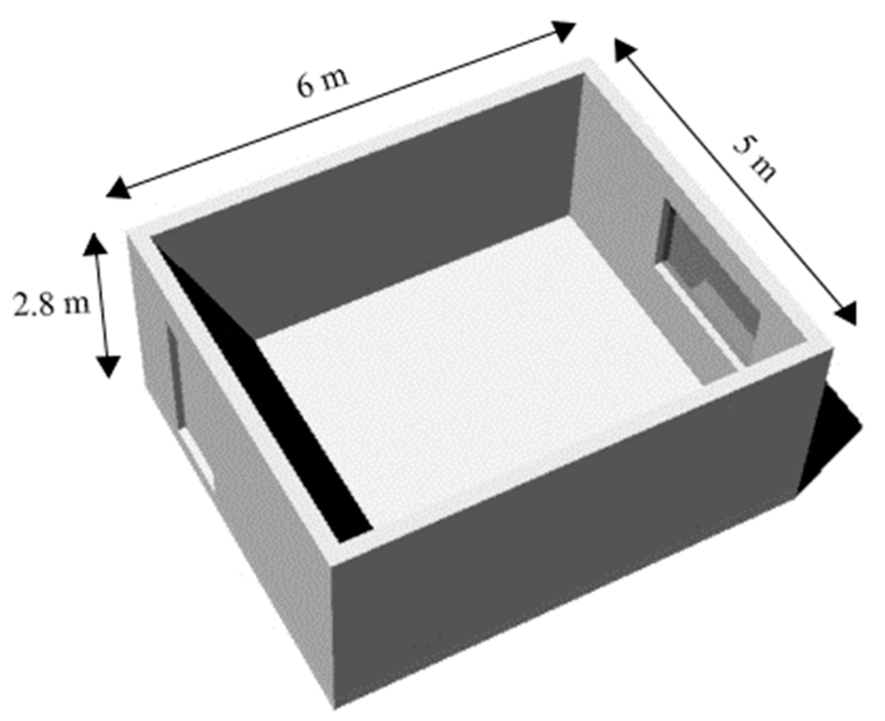
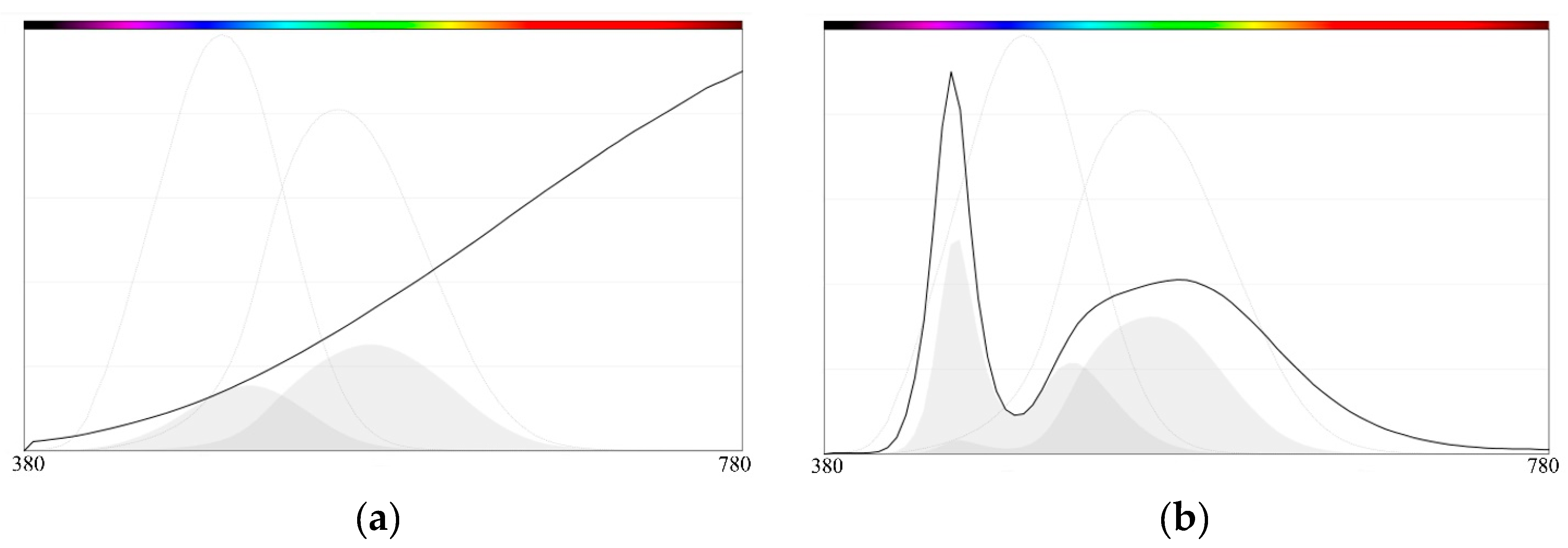
2.1. Simulation Environment Setup

In this study, Rhinoceros 6 was used to model a rectangular unfurnished bedroom (length: 6 m, width: 5 m, height: 2.8 m) with a door and one window (Figure 1). The room has no furniture since this study aims to produce a preliminary assessment of the effect of paint color on melanopic lux. The ALFA plugin for Rhinoceros 6 was also employed to calculate melanopic lux based on the room paint color, and light source SPD and intensity [40]. The plugin was set to end the analysis after 50 passes with ambient bounces of 10 and a limit weight of 0.01. ALFA uses spectral raytracing to predict the amount of light received by occupants’ ipRGCs and calculates melanopic lux [42,43,44]. In this paper, the WELL Building Standard is used as a basis for evaluating light source impact. WELL was selected as it is a performance-based standard that certifies interior spaces that support occupants’ health and well-being through different means, with the light being one of them. It suggests that melanopic lux be maintained at less than 50 for bedrooms at night [39]. Equivalent melanopic lux (EML, units of m-lux) or melanopic lux is a metric used to measure the biological effect of different light sources on human circadian rhythm [37]. On the other hand, photopic lux refers to the response of color vision receptors or cones to a light source.
To assess the psychological and physiological effects of colors, interior colors similar to those studied in the papers cited in the literature review were chosen. The colors were selected from the ALFA database (Figure 2). Floor, windows, and door materials were fixed, and wall and ceiling paint colors were variable. Fixed materials have a melanopic to photopic lux ratio (m/p) of close to 1, and therefore act as neutral materials in the study. All selected materials are shown in Table 1, with their CIELAB color space values. CIELAB is used to make it easier to find the colors in the BEHR color collection.
Materials were selected from the ALFA database, which contains over 500 measured spectral materials. Based on the colors’ CIELAB color space values, paint colors associated with spectral color were found in BEHR Color Collection (in daylight D65). Two different hypothetical light sources were selected from the ALFA light source database, incandescent with a melanopic to photopic (m/p) ratio of 0.48, Correlated Color Temperature (CCT) of 2595K, and Color Rendering Index (CRI) of 99.5; and LED with a m/p ratio of 0.87, CCT of 6126K, and CRI of 79.8, both with 5800 lumens output. The CCT is a calculated metric based on the SPD and defines the appearance of a light source with high CCT appearing as cooler, where lower CCT values are judged to be warmer and are more toward orange and red. As buildings typically consist of different wall and furniture colors and materials, the experienced SPD in space is affected by the light reflected from those surfaces. As colored walls absorb some portions of the SPD and reflect others, the reflected spectrum is further modified. The result of this combination of light emission and reflection is that the spectrum incident in the eye is a combination of emitted and reflected spectrum through various spatial positions.
Light sources were placed on the room model ceiling with the same photometric distribution. The light sources SPD chart is shown in Figure 3. The grayed areas show each light source’s photopic and melanopic action spectra.
This study consisted of two phases to evaluate light source properties and interior paint color selection effects on human melanopic lux. In each phase, 14 different simulations were conducted in the same light intensities. Since all the simulations were performed at night; room location, direction, time of day, and month are not needed.

2.2. Phase One

The study’s first phase consisted of 14 different simulations with different interior colors and light sources. In each simulation, one of the colors was chosen for the ceiling and walls, and the simulation was repeated twice: once with the LED 0.87 light source and once with the incandescent 0.48. In each simulation, two 5800-lumens light sources were installed on the model ceiling, and the horizontal workplane illuminance (0.76 m/2.5 ft above ground) was between 243–273 lux. In this phase, simulations were performed to study the effects of high-intensity lighting mode on melanopic lux under different room color conditions.

2.3. Phase Two

The impacts of light source intensity, source type, and room color were all assessed in the low-intensity configuration during the study’s second phase. The only difference between this phase and phase one is that the number of light sources was reduced to one 5800-lumens luminaire. The average horizontal workplane illumination ranged from 130 to 145 lux at a height of 0.76 m (2.5 feet).

3. Results

3.1. Results of the First Phase

The results obtained from the first phase revealed that room color has a great potential to influence human melanopic lux. The comparison basis in this study was the calculated melanopic lux. Whether using LED or incandescent as the room light source, the highest melanopic lux belonged to light blue (Munsell 10P 8/4) and Dupont Aquamarine 24 room colors, and the lowest melanopic lux belonged to Dupont Red 2 and Dupont Orange 6. The Macbeth White wall was only used as a point of comparison in the study. Since the melanopic to photopic lux ratio in that paint color is close to 1, it only reflects the effects of light source CCT and intensity. The phase one results are presented in Table 2.

3.2. Results of the Second Phase

The IES lighting handbook suggests a maintained illuminance target of 15–60 lux on the horizontal (Eh) target plane in bedrooms [45]. For reading and writing, it suggests using bedside lamps to provide horizontal illuminance between 100 to 400 lux. In this phase, for each simulation, one 5800-lumen light source was used for the room general lighting and the average horizontal workplane illuminance in the room was between 130 to 145 lux. The average melanopic lux in all simulations (except on the white wall) was 50 or lower (between 19–50) which is accepted by the WELL Building Standard for bedrooms at night. The results suggest that, even in low-intensity mode, room color, and light source properties can affect melanopic lux. Based on the results presented in Table 2, even cold paint colors when used with a light source with lower CCT and intensity could maintain melanopic lux of less than 50, which is acceptable according to the WELL Building Standard. As a result, reducing the light intensity can help interior designers choose cold colors and still maintain a healthy circadian rhythm for the occupants. The results also suggest that warmer room colors such as red and orange result in lower melanopic lux compared to cold colors such as green and blue. The results of the second phase are presented in Table 2.

3.3. Statistical Analysis

To evaluate whether the color tone of interior surfaces influences melanopic lux, the six room colors (excluding white) were grouped into warm-toned (red, orange, and dark yellow) and cool-toned (yellow–green, aquamarine, and blue) categories. Under high-intensity lighting (Phase 1), a t-test comparing warm-toned vs. cool-toned rooms showed a statistically significant difference in melanopic lux: t(4) = −5.67, p = 0.0048, with cool colors producing higher melanopic lux (mean = 81.0) than warm colors (mean = 60.3).
Similarly, under low-intensity lighting (Phase 2), cool-toned rooms still resulted in significantly higher melanopic lux: t(4) = −5.96, p = 0.0042, with cool colors averaging 44.7 melanopic lux compared to 28.7 for warm colors.
These results confirm that cool hues such as blue and aquamarine reflect more melanopically weighted light than warm colors, which may lead to greater circadian disruption at night. This pattern was consistent across both LED and incandescent light sources and at both intensity levels, underscoring the importance of wall and ceiling color tone in addition to lighting characteristics when designing circadian-supportive environments.

4. Discussions

The findings of both studies suggest that interior space color, as well as light SPD and intensity, influence the amount of melanopic lux. The room color is clearly a crucial component of the experienced SPD in the space. The results also suggest that, unlike the suggestions of interior designers and psychologists (use of cold colors, such as blue, for bedrooms due to their soothing effect), warm colors like red or orange could support a healthier circadian rhythm and help occupants sleep more easily by preventing their melatonin suppression at night. Additionally, due to their high reflectivity, white walls yield a higher photopic and melanopic lux, and designers should be more careful when using this color.
In addition to the qualitative trends observed in the simulation data, statistical analysis reinforced the importance of color tone. Specifically, cool-toned colors (blue, aquamarine, yellow–green) were found to result in significantly higher melanopic lux compared to warm-toned colors (red, orange, dark yellow) under both high- and low-intensity lighting. These differences were statistically significant (p < 0.01), confirming that cool colors, despite being perceived as psychologically calming, can intensify circadian disruption by reflecting more melanopically weighted light at night. This suggests that color temperature of surfaces should be treated with the same level of importance as light source CCT and intensity in circadian lighting design.

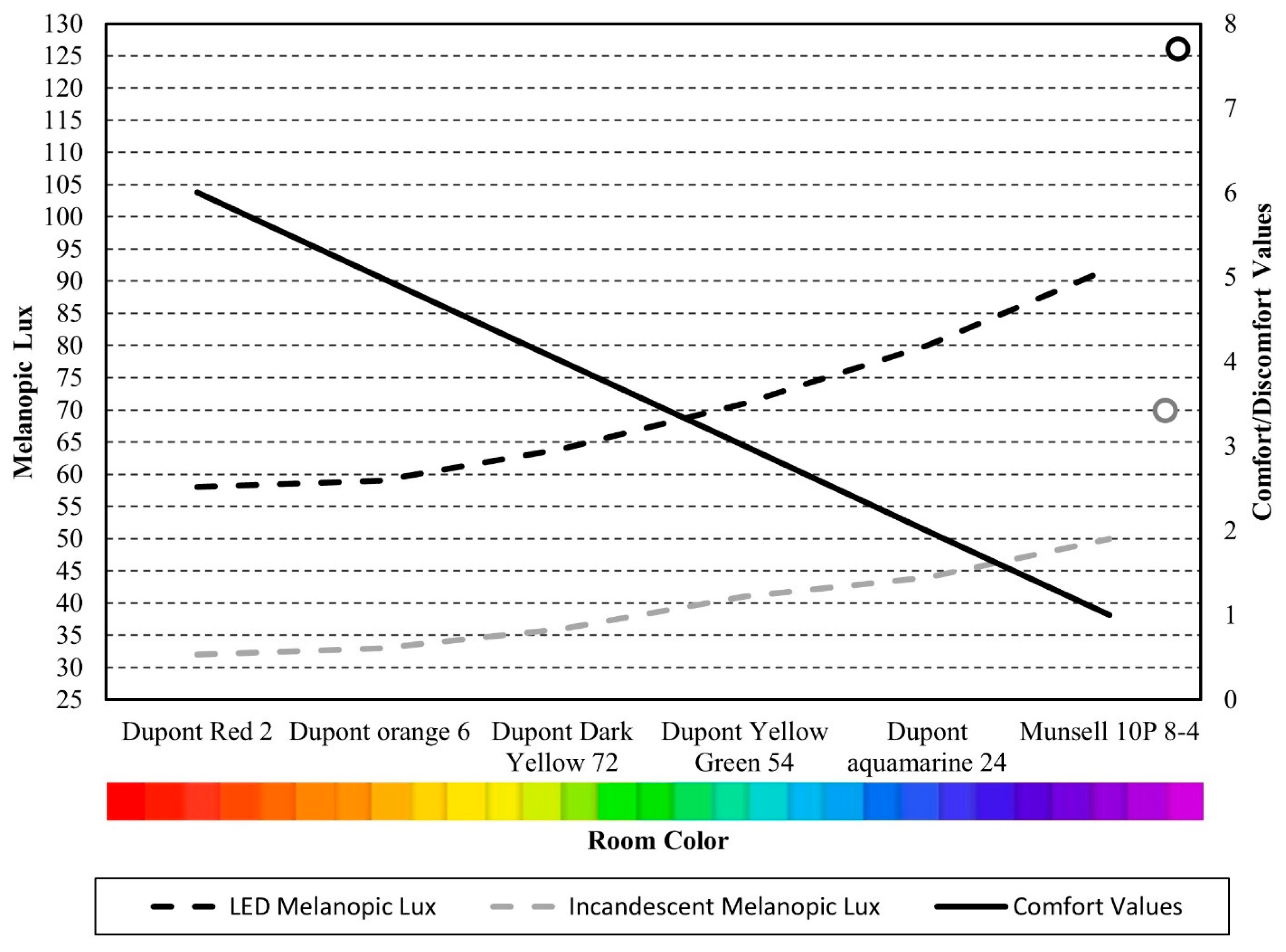
4.1. Comparison to Comfort Measures

Studies suggest that colors can affect our mood and comfort in buildings [28,30]. In this study, six different hues were chosen to represent the interior space’s colors (Table 2). Colors were graded based on the comfort feeling they would create for occupants, according to psychological research cited. On a scale of one to six, violet and blue were the most comforting colors (ranked 1 and 2), and orange and red were ranked as the most discomforting colors for interior spaces (ranked 5 and 6).
Figure 4 and Figure 5 provide a visual comparison between psychological comfort rankings and the corresponding melanopic lux values obtained from simulations (Table 3). The x-axis reflects each color’s psychological ranking based on prior research [25,26,27,30,46], with lower ranks indicating higher perceived comfort (e.g., blue and violet) and higher ranks indicating more stimulating or discomforting colors (e.g., orange and red). The y-axis shows the average melanopic lux under either high-intensity (Figure 4) or low-intensity (Figure 5) lighting conditions. Each point represents one color–light source combination. The Macbeth White surface is included as a control material and shown separately, as it is not part of the psychological ranking. This visualization emphasizes that psychologically soothing colors often result in higher melanopic stimulation, which may be detrimental to circadian health at night.
This also suggests that, when psychological comfort increases (violet and light blue with the rank of 1 and 2), the melanopic lux also increases, and this can negatively affect the human circadian rhythm at night. The same results are also evident with the incandescent light source.
In the second phase (Figure 5), reducing the light source intensity did not eliminate the effect of room paint color. Similar to what was shown in high-intensity mode, in this phase, the effect of room colors with their associated comfort/discomfort rankings are shown in the following figures for both LED 0.87 and incandescent 0.48. However, reducing the intensity will help to keep melanopic lux within the safe range (below 50) at night.
Similar to the consideration of the light source and the recommendations typically made about room colors, this comparison also shows that the most comforting colors are those that negatively impact the value of melanopic lux.

4.2. Intensity Comparison

When the room color is a constant hue, the intensity and SPD of the light source will be the most critical factors in determining the quantity of melanopic lux. Based on the simulation results, melanopic lux in the Dupont Aquamarine 24 room with a high-intensity incandescent light source was equal to the melanopic lux in the same room with low-intensity LED 0.87 (both were 44). This shows that reducing the light intensity can neutralize the effect of paint color and light source CCT. Additionally, Figure 4 and Figure 5 show that, at higher intensities, the difference between LED and incandescent sources becomes greater. The results for the Macbeth White color are also included in the graphs as a controlling factor. However, because the white wall was not included in the psychological studies, it is represented by small circles. It also has a greater value for melanopic and photopic lux when compared to other colors, which might be due to its high reflectivity.

5. Conclusions

In this study, 24 different simulations were conducted to evaluate the effect of bedroom color on melanopic lux, which serves as an indicator of occupants’ circadian rhythm. Half of the simulations were performed under low-intensity lighting, while the other half used high-intensity lighting in an unfurnished bedroom model at night. Although these simulation results primarily demonstrate the core concept—the importance of paint color in supporting a healthy human circadian rhythm—they reveal several key findings. Contrary to common interior design recommendations, colors perceived as cooler (such as blue and violet) lead to higher melanopic lux levels, which are undesirable at night and may contribute to circadian disruption. Additionally, reducing light intensity at night can mitigate the negative effects of both paint color and light source Correlated Color Temperature (CCT) on melanopic lux. This suggests that interior designers could safely use cooler hues by adjusting lighting intensity to maintain melanopic lux within a safe range. Finally, choosing different paint colors allows designers to better control the combined effects of light source spectral power distribution (SPD) and intensity on occupants’ circadian responses.
The results of this study highlight a critical academic insight: the reflective properties of interior color palettes significantly influence melanopic lighting, especially in the context of different light sources. This challenges the conventional separation between visual comfort (psychology) and circadian regulation (physiology) in lighting research. By integrating both aspects through a simulation-based workflow, the study offers a methodological contribution that future academic work can build upon to further investigate non-visual lighting effects in built environments.
It is important to note that, although color psychology is discussed in the literature review, the simulation results presented here focus exclusively on physiological responses, specifically melanopic lux as an indicator of potential melatonin suppression. The psychological color rankings were referenced only to show that common design preferences (e.g., cool tones for calmness) may conflict with biological needs at night. Future studies could incorporate occupant perception surveys or emotional response testing to evaluate the interplay of psychology and physiology in a more comprehensive way.

6. Future Study

As this topic is relatively new, there are many opportunities to expand upon these findings. Future research could include repeating the simulations during daytime conditions to assess how room color and lighting properties affect melatonin suppression throughout the day. Incorporating a broader color palette instead of single hues would enhance the realism of the models. Moreover, exploring variations in brightness and saturation could provide insight into how factors beyond hue influence circadian impacts. Ultimately, validating the simulation results through experimental studies involving actual participants would be valuable to confirm the real-world influence of interior color on occupants’ circadian rhythms.

Author Contributions

Conceptual, M.S.J., J.R.J. and R.B.G.; methodology, M.S.J. and R.B.G.; software, M.S.J.; validation, R.B.G. and J.R.J.; formal analysis, M.S.J.; writing—original draft preparation, M.S.J.; writing—review and editing, J.R.J. and R.B.G.; supervision, J.R.J. and R.B.G. All authors have read and agreed to the published version of the manuscript.

Funding

This research did not receive any specific grant from funding agencies in the public, commercial, or not-for-profit sectors.

Data Availability Statement

The original contributions presented in this study are included in the article. Further inquiries can be directed to the corresponding author.

Conflicts of Interest

The authors declare no conflicts of interest.

References

  1. Klepeis, N.E.; Nelson, W.C.; Ott, W.R.; Robinson, J.P.; Tsang, A.M.; Switzer, P.; Behar, J.V.; Hern, S.C.; Engelmann, W.H. The National Human Activity Pattern Survey (NHAPS): A resource for assessing exposure to environmental pollutants. J. Expo. Sci. Environ. Epidemiol. 2001, 11, 231–252. [Google Scholar] [CrossRef]
  2. Zolfaghari, Z.; Jones, J. Study of the Effect of Light Emitting Diode (LED) on the Optimum Window-to-Wall Ratio and Whole-Building Energy Consumption in Open Offices. Ph.D. Thesis, Virginia Tech, Blacksburg, VA, USA, 2022. [Google Scholar]
  3. Fisk, A.S.; Tam, S.K.E.; Brown, L.A.; Vyazovskiy, V.V.; Bannerman, D.M.; Peirson, S.N. Light and Cognition: Roles for Circadian Rhythms, Sleep, and Arousal. Front. Neurol. 2018, 9, 56. Available online: https://www.frontiersin.org/articles/10.3389/fneur.2018.00056 (accessed on 12 April 2023). [CrossRef]
  4. Santhi, N.; Ball, D.M. Chapter 2—Applications in sleep: How light affects sleep. In Progress in Brain Research; Parkin, B.L., Ed.; Real-World Applications in Cognitive Neuroscience; Elsevier: Amsterdam, The Netherlands, 2020; Volume 253, pp. 17–24. [Google Scholar] [CrossRef]
  5. Souman, J.L.; Tinga, A.M.; Pas, S.F.T.; van Ee, R.; Vlaskamp, B.N.S. Acute alerting effects of light: A systematic literature review. Behav. Brain Res. 2018, 337, 228–239. [Google Scholar] [CrossRef]
  6. Münch, M.; Wirz-Justice, A.; Brown, S.A.; Kantermann, T.; Martiny, K.; Stefani, O.; Vetter, C.; Wright, K.P., Jr.; Wulff, K.; Skene, D.J. The Role of Daylight for Humans: Gaps in Current Knowledge. Clocks Sleep 2020, 2, 61–85. [Google Scholar] [CrossRef]
  7. Schöllhorn, I.; Stefani, O.; Lucas, R.J.; Spitschan, M.; Slawik, H.C.; Cajochen, C. Melanopic irradiance defines the impact of evening display light on sleep latency, melatonin and alertness. Commun. Biol. 2023, 6, 228. [Google Scholar] [CrossRef]
  8. Davis, B. The Netflix Effect and Defining Binge-Watching. Undergraduate Research Posters. Available online: https://scholarscompass.vcu.edu/uresposters/190 (accessed on 1 January 2016).
  9. Wood, B.; Rea, M.S.; Plitnick, B.; Figueiro, M.G. Light level and duration of exposure determine the impact of self-luminous tablets on melatonin suppression. Appl. Ergon. 2013, 44, 237–240. [Google Scholar] [CrossRef] [PubMed]
  10. Tomassoni, R.; Galetta, G.; Treglia, E. Psychology of light: How light influences the health and psyche. Psychology 2015, 6, 1216. [Google Scholar] [CrossRef]
  11. Mahnke, F.H. Color, Environment, and Human Response: An Interdisciplinary Understanding of Color and Its Use as a Beneficial Element in the Design of the Architectural Environment; John Wiley & Sons: Hoboken, NJ, USA, 1996; 272p. [Google Scholar]
  12. Joyce, D.S.; Houser, K.W.; Peirson, S.N.; Zeitzer, J.M.; Zele, A.J. Melanopsin Vision: Sensation and Perception Through Intrinsically Photosensitive Retinal Ganglion Cells. Elements in Perception. December 2022. Available online: https://www.cambridge.org/core/elements/melanopsin-vision/25D01A0152E76F068B54E0CE351C62B8 (accessed on 12 April 2023).
  13. Brainard, G.C.; Sliney, D.; Hanifin, J.P.; Glickman, G.; Byrne, B.; Greeson, J.M.; Jasser, S.; Gerner, E.; Rollag, M.D. Sensitivity of the human circadian system to short-wavelength (420-nm) light. J. Biol. Rhythm. 2008, 23, 379–386. [Google Scholar] [CrossRef]
  14. Bailes, H.J.; Lucas, R.J. Human melanopsin forms a pigment maximally sensitive to blue light (λmax ≈ 479 nm) supporting activation of Gq/11 and Gi/o signalling cascades. Proc. R. Soc. B Biol. Sci. 2013, 280, 20122987. [Google Scholar]
  15. Brown, T.M.; Brainard, G.C.; Cajochen, C.; Czeisler, C.A.; Hanifin, J.P.; Lockley, S.W.; Lucas, R.J.; Münch, M.; O’Hagan, J.B.; Peirson, S.N.; et al. Recommendations for daytime, evening, and nighttime indoor light exposure to best support physiology, sleep, and wakefulness in healthy adults. PLOS Biol. 2022, 20, e3001571. [Google Scholar] [CrossRef] [PubMed]
  16. Meek, C.; Wymelenberg, K.V.D. Daylighting and Integrated Lighting Design; Routledge: London, UK, 2014; 116p. [Google Scholar]
  17. Konis, K. A novel circadian daylight metric for building design and evaluation. Build. Environ. 2017, 113, 22–38. [Google Scholar] [CrossRef]
  18. Serra-Negra, J.M.; Paiva, S.M.; Fulgêncio, L.B.; Chavez, B.A.; Lage, C.F.; Pordeus, I.A. Environmental factors, sleep duration, and sleep bruxism in Brazilian schoolchildren: A case-control study. Sleep Med. 2014, 15, 236–239. [Google Scholar] [CrossRef]
  19. Rautkylä, E.; Puolakka, M.; Tetri, E.; Halonen, L. Effects of correlated colour temperature and timing of light exposure on daytime alertness in lecture environments. J. Light Vis. Environ. 2010, 34, 59–68. [Google Scholar] [CrossRef]
  20. Rossi, M. Circadian Lighting Design in the LED Era; Springer: Berlin/Heidelberg, Germany, 2019; 277p. [Google Scholar]
  21. Sloane, P.D.; Williams, C.S.; Mitchell, C.M.; Preisser, J.S.; Wood, W.; Barrick, A.L.; Hickman, S.E.; Gill, K.S.; Connell, B.R.; Edinger, J.; et al. High-intensity environmental light in dementia: Effect on sleep and activity. J. Am. Geriatr. Soc. 2007, 55, 1524–1533. [Google Scholar] [CrossRef]
  22. Meesters, Y.; Winthorst, W.H.; Duijzer, W.B.; Hommes, V. The effects of low-intensity narrow-band blue-light treatment compared to bright white-light treatment in sub-syndromal seasonal affective disorder. BMC Psychiatry 2016, 16, 27. [Google Scholar] [CrossRef]
  23. Neale, C.; Griffiths, A.; Chalmin-Pui, L.S.; Mendu, S.; Boukhechba, M.; Roe, J. Color aesthetics: A transatlantic comparison of psychological and physiological impacts of warm and cool colors in garden landscapes. Wellbeing Space Soc. 2021, 2, 100038. [Google Scholar] [CrossRef]
  24. Persson, P.; Bondke Persson, A. Color in physiology. Acta Physiol. 2024, 240, e14182. [Google Scholar] [CrossRef]
  25. Fugate, J.M.B.; Franco, C.L. What color is your anger? Assessing color-emotion pairings in English speakers. Front. Psychol. 2019, 10, 206. [Google Scholar]
  26. Schaie, K.W. Scaling the association between colors and mood-tones. Am. J. Psychol. 1961, 74, 266–273. [Google Scholar] [CrossRef]
  27. Wexner, L.B. The degree to which colors (hues) are associated with mood-tones. J. Appl. Psychol. 1954, 38, 432. [Google Scholar] [CrossRef]
  28. Park, Y.; Guerin, D.A. Meaning and preference of interior color palettes among four cultures. J. Inter. Des. 2008, 28, 27–39. [Google Scholar] [CrossRef]
  29. Rapoport, A. Sacred Places, Sacred Occasions and Sacred Environments+ Design and Culture. Archit. Des. 1982, 52, 75–82. [Google Scholar]
  30. Manav, B. Color-emotion associations and color preferences: A case study for residences. Color Res. Appl. 2007, 32, 144–150. [Google Scholar] [CrossRef]
  31. Marani, F. Conquering SAD. 2019. Available online: https://aaltodoc.aalto.fi:443/handle/123456789/41413 (accessed on 24 December 2022).
  32. Siamionava, K.; Slevitch, L.; Tomas, S.R. Effects of spatial colors on guests’ perceptions of a hotel room. Int. J. Hosp. Manag. 2018, 70, 85–94. [Google Scholar] [CrossRef]
  33. Gulak, M.B. Gulak: Architectural Guidelines for State Psychiatric...—Google Scholar. 2006. Available online: https://scholar.google.com/scholar_lookup?title=Architectural%20guidelines%20for%20state%20psychiatric%20hospitals&publication_year=1991&author=M.B.%20Gulak (accessed on 24 December 2022).
  34. Küller, R.; Mikellides, B.; Janssens, J. Color, arousal, and performance—A comparison of three experiments. Color Res. Appl. 2009, 34, 141–152. [Google Scholar] [CrossRef]
  35. Brown, T.M. Melanopic illuminance defines the magnitude of human circadian light responses under a wide range of conditions. J. Pineal Res. 2020, 69, e12655. [Google Scholar] [CrossRef]
  36. Nowozin, C.; Wahnschaffe, A.; Rodenbeck, A.; de Zeeuw, J.; Hädel, S.; Kozakov, R.; Schöpp, H.; Münch, M.; Kunz, D. Applying Melanopic Lux to Measure Biological Light Effects on Melatonin Suppression and Subjective Sleepiness. Curr. Alzheimer Res. 2017, 14, 1042–1052. [Google Scholar] [CrossRef]
  37. Lucas, R.J.; Peirson, S.N.; Berson, D.M.; Brown, T.M.; Cooper, H.M.; Czeisler, C.A.; Figueiro, M.G.; Gamlin, P.D.; Lockley, S.W.; O’hAgan, J.B.; et al. Measuring and using light in the melanopsin age. Trends Neurosci. 2014, 37, 1–9. [Google Scholar] [CrossRef]
  38. CIE, S. 026/E: 2018; CIE System for Metrology of Optical Radiation for ipRGC-Influenced Responses to Light. CIE Central Bureau: Vienna, Austria, 2018.
  39. IWBI. WELL. International WELL Building Institute. Available online: https://www.wellcertified.com/ (accessed on 22 July 2023).
  40. Solemma. Adaptive Lighting for Alertness (ALFA). Available online: https://www.solemma.com/alfa (accessed on 31 May 2023).
  41. Boubekri, M. Daylighting, Architecture and Health: Building Design Strategies; Routledge: London, UK, 2008; 156p. [Google Scholar]
  42. Balakrishnan, P.; Jakubiec, J.A. Spectral Rendering with Daylight: A Comparison of Two Spectral Daylight Simulation Platforms. In Proceedings of the BS2019, Rome, Italy, 2–4 September 2019. [Google Scholar]
  43. Elsayedand, N.; Rakha, T. A framework to simulate the non-visual effects of daylight on the cognitive health of mild cognitive impairment (mci) people. In Proceedings of the ASHRAE Topical Conference Proceedings, Virtual, 29 September–1 October 2020; American Society of Heating, Refrigeration and Air Conditioning Engineers, Inc.: Peachtree Corners, GA, USA, 2020; pp. 119–129. [Google Scholar]
  44. Saiedlue, S.; Amirazar, A.; Hu, J.; Place, W. Assessing circadian stimulus potential of lighting systems in office buildings by simulations. In Proceedings of the ARCC Conference Repository, Toronto, Canada, 29 May–1 June 2019. [Google Scholar]
  45. DiLaura, D.L. The Lighting Handbook: Reference and Application; Illuminating Engineering Society of North America: New York, NY, USA, 2011; 1068p. [Google Scholar]
  46. Valdez, P.; Mehrabian, A. Effects of color on emotions. J. Exp. Psychol. Gen. 1994, 123, 394. [Google Scholar] [CrossRef]
  47. Sutton, T.; Whelan, B.M. The Complete Color Harmony: Expert Color Information for Professional Color Results; Rockport Publishers: Gloucester, MA, USA, 2004; 218p. [Google Scholar]
  48. Hupka, R.B.; Zaleski, Z.; Otto, J.; Reidl, L.; Tarabrina, N.V. The colors of anger, envy, fear, and jealousy: A cross-cultural study. J. Cross-Cult. Psychol. 1997, 28, 156–171. [Google Scholar] [CrossRef]
Figure 1. Room 3D model with a hidden ceiling from Rhinoceros 6 (length: 6 m/20 ft, width: 5 m/16 ft, height of floor to ceiling: 2.8 m/9.2 ft).
Buildings 15 02665 g001
Figure 2. Colors chosen for building interior in BEHR collection shades. From top left to bottom right: Dupont Red 2, Munsell 10P 8/4, Dupont Orange 6, Dupont Aquamarine 24, Dupont Dark Yellow 72, Dupont Yellow Green 54, Macbeth White, light gray stone tiles, wood for both door and window frame.
Buildings 15 02665 g002
Figure 3. (a). Incandescent source with CCT of 2595K and CRI of 99.5 (known as incandescent 0.48 in the ALFA). (b). LED source with CCT of 6126K and CRI of 79.8 (known as LED 0.87 in the ALFA). Light sources SPD comes from the ALFA database (gray areas show melanopic and photopic action of the source).
Buildings 15 02665 g003
Figure 4. Comparison between LED and incandescent in high-intensity mode regarding comfort values. The black circle at the top right of the graph shows the result for Macbeth White wall simulation with LED light source and the gray circle is with the incandescent light source. The lines are continuous since the hues are organized based on the m/p (melanopic to photopic ratio) and any color in between will yield a result somewhere on the line. This figure illustrates a clear inverse relationship between perceived comfort and physiological suitability for evening use: colors ranked as more comforting (e.g., blue, violet) are associated with higher melanopic lux values, suggesting a greater risk of melatonin suppression.
Buildings 15 02665 g004
Figure 5. Comparison between LED and incandescent in low-intensity mode regarding comfort values. The black circle at the top right of the graph shows the result for Macbeth White wall simulation with LED light source and the gray circle is with the incandescent light source. The lines are continuous since the hues are organized based on the m/p (melanopic to photopic ratio) and any color in between will yield a result somewhere on the line. The trend persists under reduced lighting intensity, though the overall melanopic lux values decrease. This reinforces the idea that surface color tone significantly influences melanopic stimulation, even when illuminance is within recommended nighttime levels.
Buildings 15 02665 g005
Table 1. Colors chosen for ALFA simulation for the proposed room with their CIELAB color space values.
Color NameFixed or VariableTypeRadianceLabm/p
Light Gray Stone Tiles (Floor)FixedOpaquePlastic59.81−0.511.970.98
Door and Window FrameFixedOpaquePlastic26.265.033.150.86
Window Glass: Double IGU Green Tvis 32%FixedTransparent 1.09
Dupont Red 2VariableOpaquePlastic34.072757.925348.08450.09
Dupont Orange 6VariableOpaquePlastic48.647155.190958.52060.14
Dupont Aquamarine 24VariableOpaquePlastic56.6106−16.7631−31.70292.06
Dupont Dark Yellow 72VariableOpaquePlastic75.824215.111978.99020.20
Dupont Yellow Green 54VariableOpaquePlastic73.103−23.735849.3110.68
Munsell 10P 8/4 (Light Blue)VariableOpaquePlastic80.8256.0705−15.2381.04
Macbeth WhiteVariableOpaquePlastic96.682−0.61381.75250.99
Table 2. Phase one (P1) and phase two (P2) simulation results for different room colors under two different light sources, LED 0.87 and Incandescent 0.48. The results are showing average melanopic lux, photopic lux, and workplane illuminance in the room.
Room ColorLight SourcePhotopic Lux (P1)Melanopic Lux (P1)Photopic Lux (P2)Melanopic Lux (P2)Horizontal Workplane Illuminance (P1)Horizontal Workplane Illuminance (P2)
Dupont Red 2LED 0.8771584033240130
Dupont Red 2Incandescent 0.4875324319243131
Dupont Orange 6LED 0.8778594434245132
Dupont Orange 6Incandescent 0.4884334719250134
Dupont Dark Yellow 72LED 0.87103645636268143
Dupont Dark Yellow 72Incandescent 0.48109365921273145
Dupont Yellow Green 54LED 0.8793715240256137
Dupont Yellow Green 54Incandescent 0.4891415123255137
Dupont Aquamarine 24LED 0.8777804444244132
Dupont Aquamarine 24Incandescent 0.4877444325243131
Munsell 10P 8/4 LED 0.87103925650266142
Munsell 10P 8/4 Incandescent 0.48105505727268143
Macbeth WhiteLED 0.871491267866314154
Macbeth WhiteIncandescent 0.48148707837313165
Table 3. Rankings of colors based on their effect on human mood. From top to bottom, violet is the most comforting color and red is the least comforting.
RankingColorAssociated Emotions
1VioletDignified and stately [27]
2BlueTender, soothing, calm, peaceful, and serene [27]
Peaceful, comfortable, and soothing [26]
Peaceful and releasing [30]
Calmness [25]
High pleasure [46]
3GreenEnvy and disgust [25]
High pleasure [46]
Connected to nature and rebirth [47]
4YellowCheerful and joyful [27]
Happiness [25]
5OrangeDisturbing [27]
Stimulating and cheerful [26]
Low pleasure [46]
6RedStimulating and exciting [27]
Anger and fear [25,48]
Striking and depressive [30]
Low pleasure [46]
Disclaimer/Publisher’s Note: The statements, opinions and data contained in all publications are solely those of the individual author(s) and contributor(s) and not of MDPI and/or the editor(s). MDPI and/or the editor(s) disclaim responsibility for any injury to people or property resulting from any ideas, methods, instructions or products referred to in the content.

