Article

Air Quality Analysis in Lima, Peru Using the NO2 Levels during the COVID-19 Pandemic Lockdown

1
Department of Electrical Engineering, Universidad de Ingenieria y Tecnologia, Barranco 15063, Peru
2
Department of Environmental Engineering, Universidad de Ingenieria y Tecnologia, Barranco 15063, Peru
3
John A. Paulson School of Engineering and Applied Sciences, Harvard University, Cambridge, MA 02134, USA
4
Department of Electrical and Computer Engineering, University of New Mexico, Albuquerque, NM 87131, USA
5
Department of Medical Physics, Memorial Sloan Kettering Cancer Center, New York, NY 10065, USA
*
Author to whom correspondence should be addressed.
Atmosphere 2022, 13(3), 373; https://doi.org/10.3390/atmos13030373
Submission received: 27 December 2021 / Revised: 16 February 2022 / Accepted: 20 February 2022 / Published: 23 February 2022
(This article belongs to the Section Air Quality)

Abstract

:
The emergence of the new COVID-19 virus in Peru forced the Peruvian government to take swift measures to stop its proliferation. Consequently, a state of emergency was declared, which included mandatory social isolation and quarantine. This action meant that people would transit only in emergency cases. In this context, this study’s objective is to analyze the air quality changes in terms of the capital city’s NO 2 levels due to these government decisions using satellite imagery data obtained from the Sentinel-5P satellite. One critical problem is the lack of spatially distributed air quality data. The Peruvian Meteorological Service only monitors air quality in Lima, the capital city. In addition, the air quality ground stations are not always functioning. Thus, there is a need to find new reliable methods to complement the official data obtained. One method of doing so is the use of remote sensing products, although the accuracy and applicability are yet to be determined; therefore, this is the article’s focus. A temporal and spatial analysis was developed quantitatively and qualitatively to measure the levels of NO 2 in eighteen regions of Lima to contrast the quarantine’s effect on polluting gas emission levels. The measurements are also compared with the official Peruvian data from ground sensors using Pearson correlation coefficients, thus, showing that Sentinel-5P data can be used for changes in the mean daily concentration of NO 2 . We also developed the first version of an open platform that converts the satellite data into a friendly format for visualization. The results show NO 2 ambient concentration reductions compared to 2019 of between 60% and 40% in the first two weeks and between 50% and 25% in the following two weeks of the COVID-19 lockdown. However, this effect could not be observed two months after the start of the lockdown.

1. Introduction

Peru is a developing country with a 20.5% index of poverty and a 71% informality index in its active population [1]. That means more than half the people work day to day to survive, do not have any life insurance, and perform their activities informally [2]. Even before the current pandemic, it was challenging to control sanitation, labor exploitation, and business environmental politics. In addition, almost one-third of the country’s total population lives in the capital city and, thus, there are automobiles, principal businesses, and industries [3]. Thus, all those factors make Lima one of the 30 most polluted cities in South America [4].
The first official case of the new coronavirus in Peru was confirmed on 6 March 2020. Ten days later, the country’s president announced an obligatory quarantine for 15 days as a drastic action to refrain from spreading the virus [5]. This historical event paralyzed almost all the businesses except for those required to survive, such as the ones related to food provision, the health sector, and banks. The usual traffic levels decreased to a minimum; most industries stopped working, including the entire tourism sector. The financial sector had an unexpected recession; meanwhile, the environment had an opportunity to recover. In that way, this manuscript shows the environmental impact that quarantine time had on Lima’s air pollution.
The gas analyzed in this study is nitrogen dioxide (NO 2 ), a toxic and irritating yellowish-brown gaseous chemical compound formed by combining one nitrogen and two oxygen atoms. NO 2 together with nitrous oxide (NO) are known as NOx and are some of the air pollutants in cities [6]. NO 2 is mainly added to the air from fuel burning, usually from vehicles, power plants, and off-road equipment [6].
Continuous exposure to NO 2 is associated with various respiratory tract diseases, such as decreased lung capacity, acute bronchitis, pulmonary emphysema, asthma, and it is a culprit behind allergic processes, particularly in children [7,8]. There has been an ongoing motivation to monitor the levels of NO 2 ; with this purpose, several cities have an air quality monitoring system, which includes the deployment of ground-based sensors [9].
Different studies have been conducted in different cities around the globe that relate the concentration of air pollutants and COVID-19 lockdown. For instance, 44 cities in China were analyzed, and it was found that NO 2 levels dropped by 25%, whereas PM10 showed the second-largest decrease, on the order of 14% [10]. Other examples can be found in Europe, where NO 2 was the contaminant with the most reduction, with 58% and 51% in Milan, Italy and Barcelona, Spain, respectively [11,12].
Another approach that has revolutionized the way air quality is sensed is via satellite imagery. This approach is the case of the Sentinel-5 Precursor (Sentinel-5P) satellite mission, in which one of its data products focuses on analyzing the NO 2 levels of the troposphere. The Copernicus Sentinel-5P mission’s main objective is to perform high spatio-temporal resolution atmospheric measurements for air quality, ozone and UV radiation, and climate monitoring and prediction [13].
Since the end of 2020, different approaches have been applied using satellite information to analyze the effect of lockdowns on the environment as well as on the spreading of the virus. In the case of Peru, in [14], the authors used remote sensing data from the Copernicus Data Hub of the European Space Agency, specifically, the Sentinel-5 Precursor satellite, to analyze the variation of aerosol pollution in Peru until April 2020. In [15], the authors proposed a Reduced-Space Gaussian Process Regression classification model for air pollution and infection evaluated in Lima. In [16], the authors performed an environmental and social analysis as risk factors for spreading the novel coronavirus in Peru.
Global similar studies are found mainly in the cases of China [4,17], India [18,19], Thailand [20], an urban-industrial area near Lisbon in Portugal [21], a time scale case study in Wrocław, Poland [22], a spatio-temporal analysis of air pollutants before and during the first wave COVID-19 outbreak in Turkey [23], and South America [24,25,26]. In these cases, the discussion included analyzing the nitrogen dioxide levels, for example, in Thailand [27], Italy [28,29], and Greece [30] and also as a contributing factor to coronavirus (COVID-19) fatality [31,32].
In all of these cases, we can see a reduction of NO 2 levels during the pandemic lockdown, implying a breather or the environment. However, the big question is related to what will happen to air quality after all of this. Unfortunately, the answer in many cities and countries, at least in a short time frame, is that everything could be back as it was before, or it could be worse due to the need for economic recovery.
In this work, we present an analysis of the NO 2 during the COVID-19 pandemic lockdown in Lima, Peru. Considering that Peru was the country with the highest number of coronavirus deaths per capita [33], using technology to track natural conditions is a must. We need to consider that, according to [34], Lima is the city with the worst air quality in South America, with the leading cause being vehicle emissions.
Our contributions are an air quality analysis in Peru, where there has not been sufficient research performed, and, with this analysis, we show how our behavior influences air quality. This research is significant because there are many countries like Peru where there is no data analysis on national and international relevance topics, such as the care of the environment that involves all people.
Considering that the number of ground-based sensors is deficient in the country, analyzing the information using available satellite information could highly impact decisions to improve the environment in countries in similar or worse conditions than in Peru. We describe the process followed and state the reasons for selecting specific areas to analyze. We are convinced that this analysis could help us become aware of our current habits regarding the environment, specifically in Lima, Peru.

2. Materials and Methods

In this section, we first describe the process for data acquisition, including details about the satellite images used from the server. Next, we describe the process’s primary main tasks, including the selected areas’ descriptions to be analyzed. Finally, we describe the process for the visual representation of the obtained data.

2.1. Data Acquisition

This research’s images were acquired using Google Earth Engine (GEE), a cloud-based tool specialized in analyzing satellite images [35]. The algorithms and scripts were designed with the specific products of NO 2 level 3 to display the Copernicus Sentinel-5P satellite images. We selected eighteen specific places in the metropolitan city Lima, Peru (described in Section 2.1.2). Each image was segmented only to obtain information from the geographically specified point.
A specific study area of an approximate diameter of 500 m for each point was loaded (see Figure 1); on this circumference, image data sets were taken from June 2018 to March 2021. Lastly, the circumference’s mean values were used as a statistical reducer for the NO 2 levels to represent the information. Finally, the data set was exported in CSV format to perform the statistical analysis, graphical representation, and data comparison across time and regions.

2.1.1. Copernicus Sentinel-5 Precursor

The Copernicus Sentinel-5 Precursor (Sentinel-5P) mission is the first dedicated Copernicus mission to monitor our atmosphere [13]. The Copernicus Sentinel-5P mission’s main aim is to conduct atmospheric measurements with a high spatio-temporal resolution for air quality, ozone, UV radiation, and climate monitoring and prediction [13]. Onboard the Sentinel-5P, an instrument called TROPOMI (TROPOspheric Monitoring Instrument) is an imaging spectrometer that ranges within ultraviolet and shortwave infrared.
The instrument uses passive remote-sensing techniques to achieve its target by measuring the solar radiation reflected and radiated from the earth at the top of the atmosphere (TOA) [36]. The single payload retrieves operationally tropospheric and stratospheric NO 2 column products, which has an unprecedented improved spatial resolution from previous data sets of 7 × 3.5 km 2  [36]. In this work, we use the total vertical column of NO 2 (see Section 2.2 for more details). The main characteristics of the Copernicus Sentinel-5P data products are [37]:
  • Temporal coverage: since 30 April 2018.
  • Spatial coverage: about a 2600 km swath. Full daily surface coverage of radiance and reflectance measurements for latitudes over 7° and under −7°, and better than 95% coverage for latitudes in the interval [−7°, 7°].
  • Spatial resolution: 3.5 × 7.0 km (across by along-track), at the beginning of the mission and 3.5 × 5.5 km (across by along-track), since 6 August 2019.
  • Orbit: near-polar, sun-synchronous orbit with an ascending node equatorial crossing at 13:30 h Mean Local Solar time. The surface is always illuminated at the same sun angle in a sun-synchronous orbit [38].

2.1.2. Google Earth Engine

With satellite imagery availability in near real-time and offline, it is possible to produce extensive data analysis of the NO 2 levels. The Google Earth Engine (GEE) is an online cloud server tool that provides satellite imagery from Copernicus Sentinel-5P. The interface allows for quick algorithm design, testing, and application for the images run under a Python and JAVA environment.
For this research, offline level 3 NO 2 data set products, with the characteristics and resolution indicated in the previous subsection, were used to obtain the NO 2 levels to produce the plots and compare and analyze the NO 2 levels within a specific region across time [35]. GEE integrates a database of petabytes of satellite images and geospatial data sets with computational capabilities on a planetary scale, making it accessible to scientists, researchers, and developers to identify shifts, chart patterns, and measure earth surface differences [39].
The data provided from these images were downloaded in CSV format to compare NO 2 pollution variations along the time. Table 1 presents the eighteen areas from Lima selected to analyze pollution patrons in the capital (including coordinates).
The first twelve were selected due to the daily activities impact: metro stations, the international airport, essential markets, and industrial parks. The last six were chosen to compare the results with data from the National Meteorology and Hydrology Service of Peru (SENAMHI) available [40]. Additionally, five cities from the other side of the hemisphere were used to compare Lima levels: New Delhi (India), Lanzhou (China), Auckland (New Zealand), Sydney (Australia), and Cape Town (South Africa).

2.2. Process

The process can be divided into seven main tasks:
1.
Location of geographic coordinates for a specific point in Lima. The function ’Geometry point’ of GEE was used to import each point’s longitude and latitude described in Section 2.1.2 [41].
2.
Assign 500 m diametrical buffer around the specific point. Around each coordinate previously set, a buffer of 500 m diameter was added to extract the NO 2 data only around that area to later export data and apply a statistical reducer [42].
3.
Load the Copernicus Sentinel-5P satellite image collection product L3/NO 2 . GEE has various satellite data collections; for this specific research, the Sentinel-5P OFFL NO 2 : Offline Nitrogen Dioxide dataset was used to obtain the density values of NO 2 . This is described in a particular band of a total vertical column of NO 2 (ratio of the slant column density of NO 2 and the total air mass factor; see [43] for more details about the bands in the Sentinel-5P satellite):
var collection = ee.ImageCollection
(’COPERNICUS/S5P/OFFL/L3_NO2’).
 selec
(’tropospheric_NO2_column_number_density’).
filterDate(’2020-01-01’, ’2020-06-30’)
4.
Clipping of satellite images to only show NO 2 data in the region of interest. Satellite data are clipped to the buffer area delimited in step 2 around each coordinate in order to compile the statistical analysis [42]:
var geom=geometry.buffer(500);
var timeSeries2019 = collection2019.map(function (image) {
   var date = image.date().format(’yyyy-MM-dd’)
   var value = image
     .clip(geom)
   .reduceRegion({
     reducer: ee.Reducer.mean(),
     scale: 30
    }).get(’tropospheric_NO2_column_number_density’)
   return ee.Feature(null, {value: value, date: date})
})
//Show rectangle around ROI
var Parada2020=collection.median().clip(geometry2)
5.
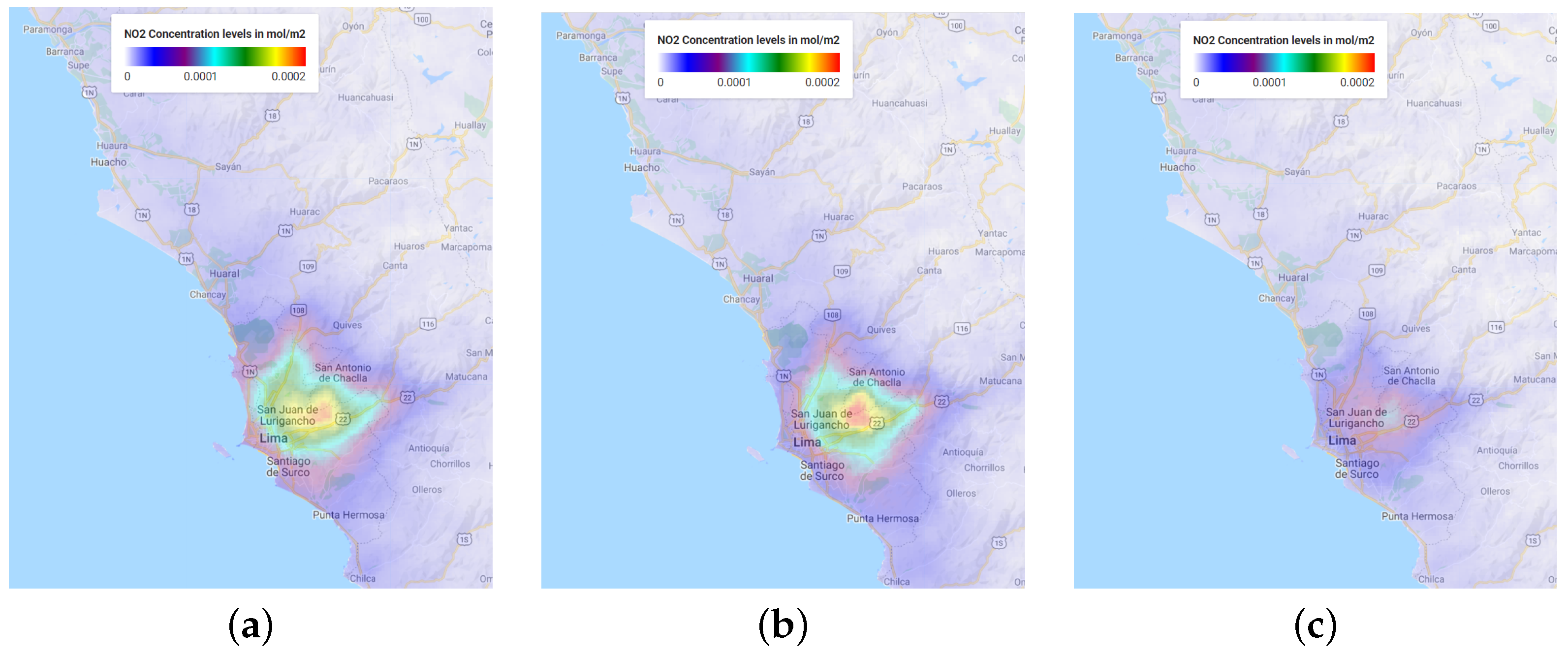
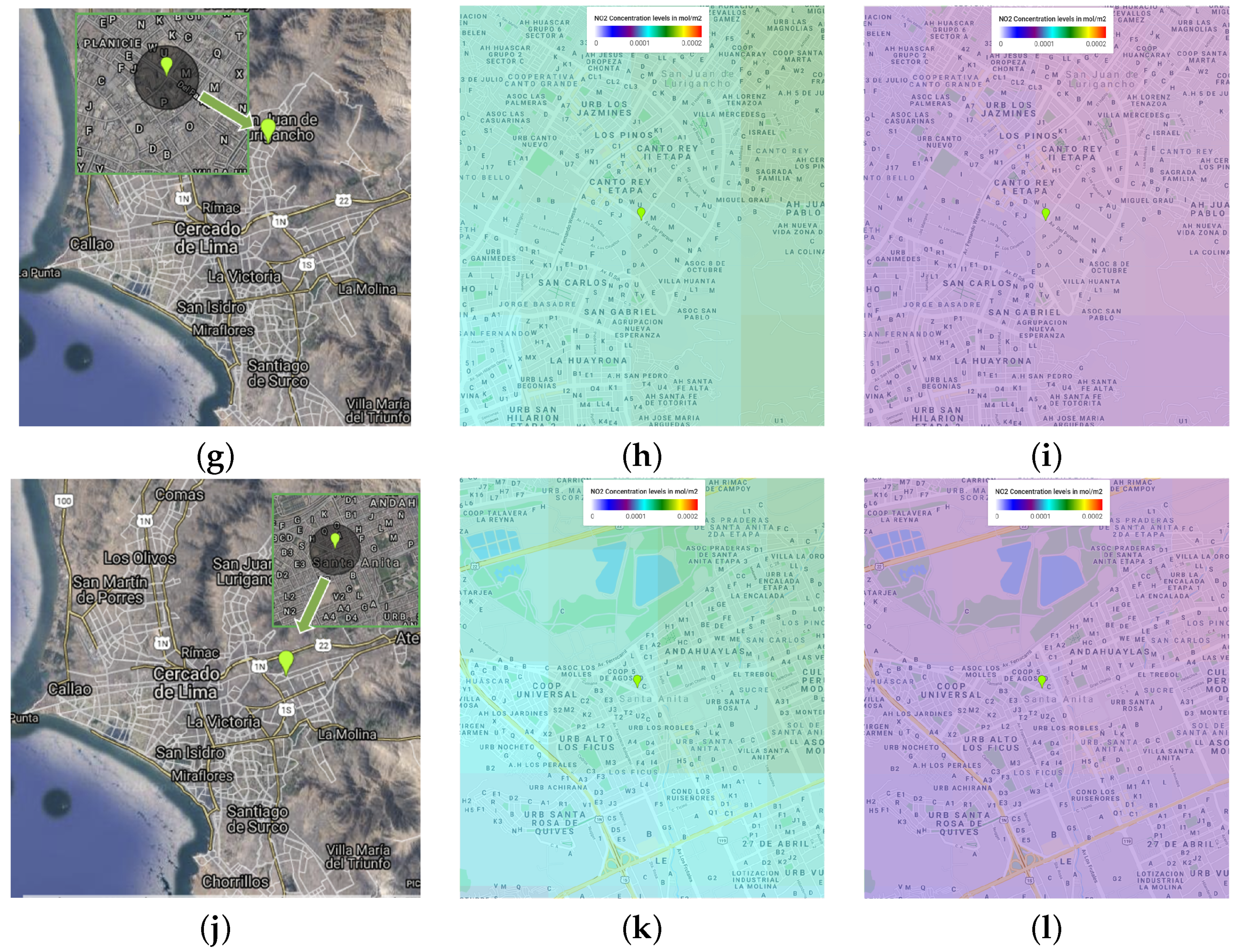
Color palette application to graphically differentiate NO 2 concentrations on a scale of a minimum value of 0 and a maximum value of 0.0002 mol/m 2 with a total of seven levels colored from white to red [42]:
var band_viz = {
  min: 0,
  max: 0.0002,
  palette: [’white’, ’blue’, ’purple’, ’cyan’, ’green’, ’yellow’, ’red’],
   opacity: 0.3
}
6.
Application of statistical reducer of the mean to obtain a single value of NO 2 per established date. A reducer is a way to aggregate GEE data within the buffer area to obtain a single value of the NO 2 density level [44]:
var timeSeries = collection.map(function (image) {
   var date = image.date().format(’yyyy-MM-dd’)
   var value = image
     .clip(geom)
   .reduceRegion({
     reducer: ee.Reducer.mean(),
     scale: 30
    }).get(’tropospheric_NO2_column_number_density’)
   return ee.Feature(null, {value: value, date: date})
})
7.
Export data in CSV format for future statistical analysis. When the reducer is applied, now we can export the data in CSV format to further enhance the statistical analysis and comparison within zones and time [45]:
Export.table.toDrive({
  collection: timeSeries,
  description: ’NO2Levels2020MercadoFrutas’,
  selectors: ’date, value’,
   fileFormat: ’CSV’
});

2.3. Visual Representation of the Data

For each section, a graphical analysis was performed to understand the evolution of NO 2 levels. The areas of interest, with the previous addition of a color palette, were primarily used to better understand the concentration levels for a specific rectangle around the region of interest to a spatial georeference.
For this purpose, the time series were classified into three periods: (i) from January to June in 2020, (ii) from January to June in 2019, and (iii) from June to December in 2018. Recalling that the satellite data are available from April 2018 and that all the selected points in Peru have coverage starting in June 2018, these three periods allow us to compare two cycles: from July 2018 to June 2019 and from July 2019 to June 2020. We consider the quarantine months only (from March to June) for 2019 and 2020, which were not available for 2018, since it is important to compare the lockdown periods and the periods before it.
This will allow us to visualize possible differences in the lockdown’s air quality starting conditions. For example, the comparison of the NO 2 levels in the Lima metropolitan area is shown in Figure 2 (see tasks 4–6 in Section 2.2). Note how, in 2020, there is a noticeable difference in NO 2 levels compared to 2018 and 2019. A similar analysis was performed for all the zones described in Section 2.2.
In Figure 3, we can see the location and progress for zones around four sensors of SENAMHI in Lima. Thus, in Figure 3a, we show a zoom on the sensor’s location in Carabayllo, while we can see the year comparison in Figure 3b,c. In Figure 3d–f, we can see a similar visual representation of the US embassy’s sensor data in Lima. In Figure 3g–i, we present the data for the zone around the sensor ‘San Juan de Lurigancho’ (SJL), while in Figure 3j–l, for the sensor around ‘Santa Anita’.

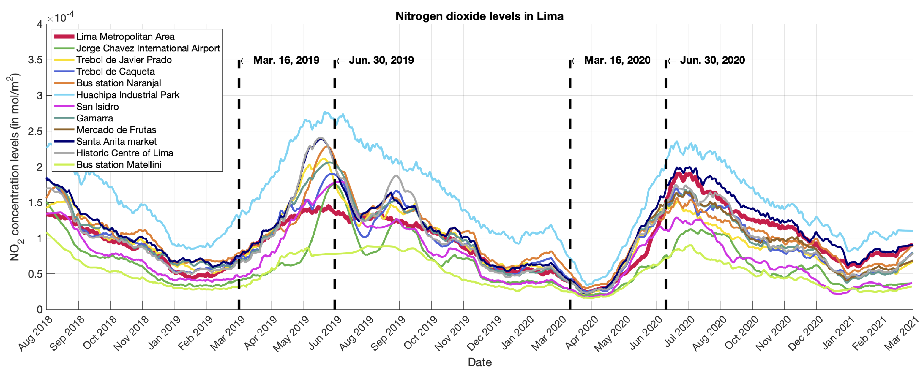
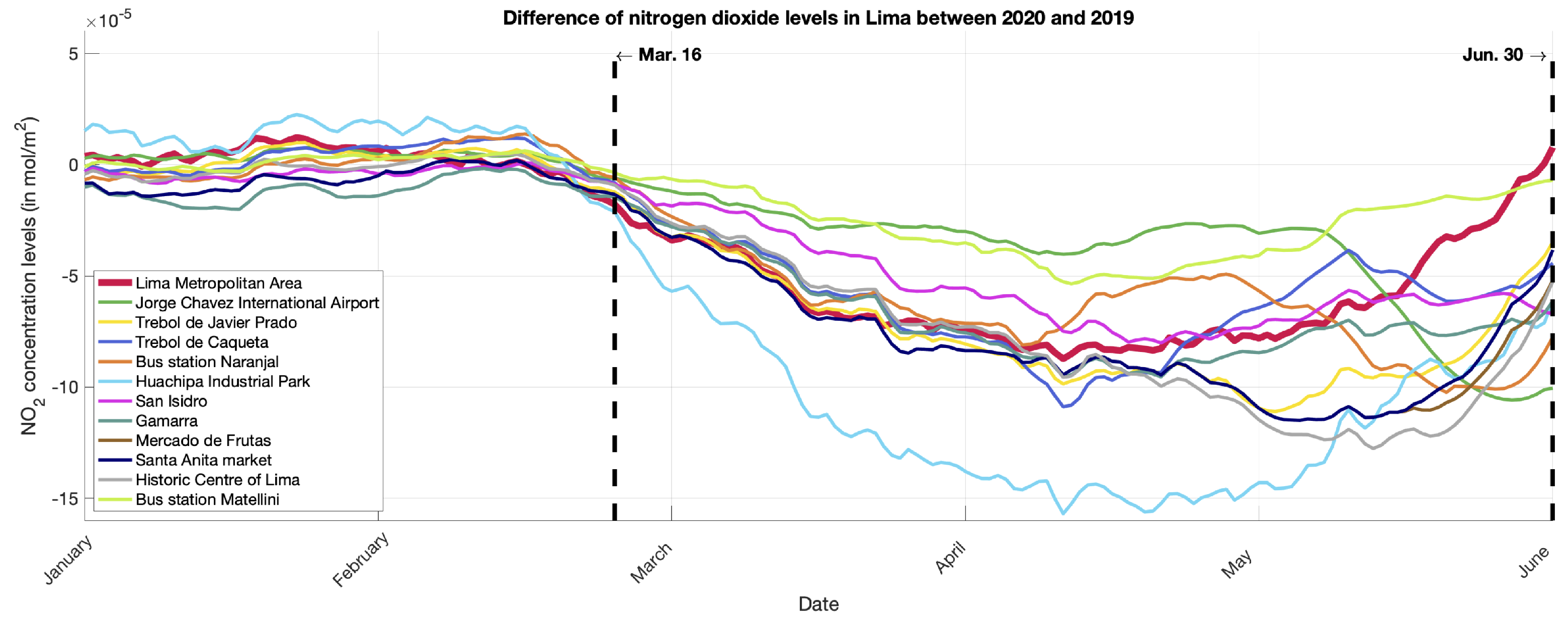
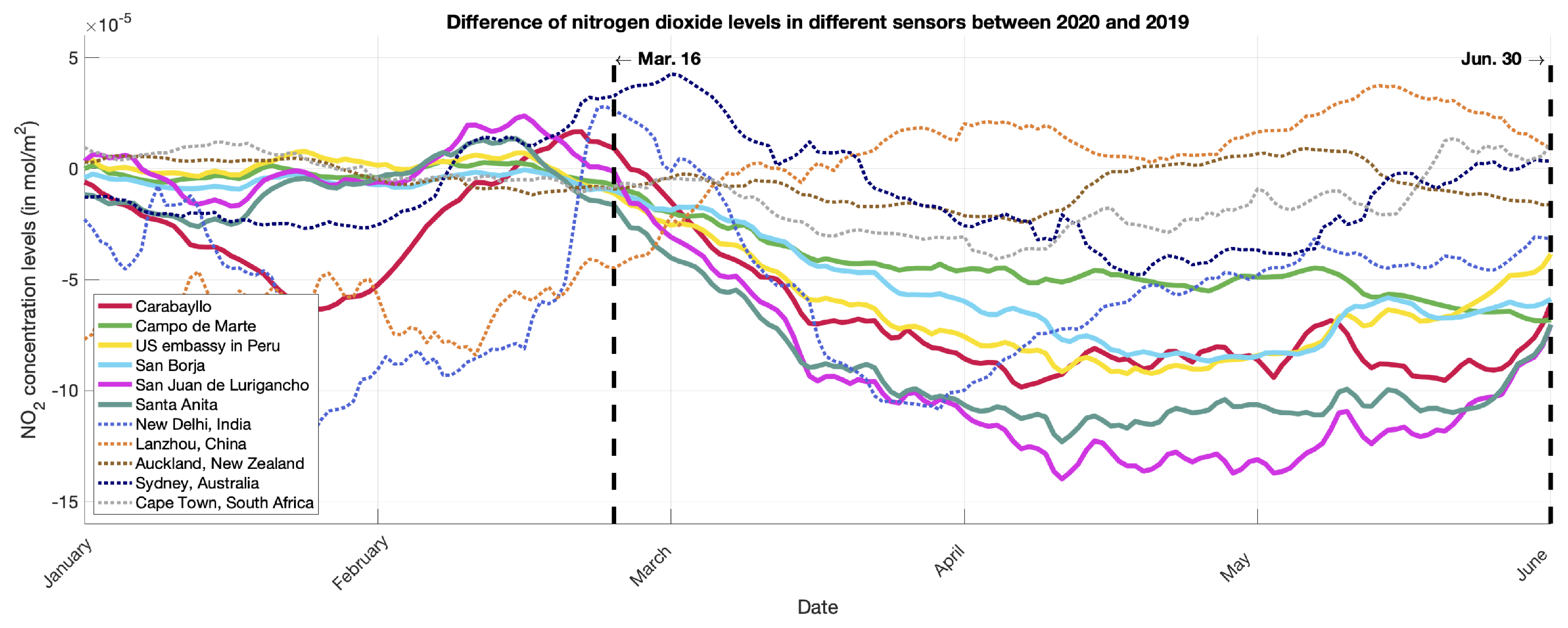
3. Results and Discussion

After exporting the data in CSV format from the GEE tool, data analysis was conducted to display the dataset in the form of graphs and statistical comparisons. The data processing and analysis were done using Matlab 2019a on a computer with an i7 processor and 16 GB RAM. Since the data obtained from the Copernicus Sentinel-5 Precursor is not uniformly sampled, meaning that non-continuous information is obtained, i.e., different dates and times, first, a 1D interpolation was applied to the date.
The method selected was a shape-preserving piecewise cubic interpolation because of the nonuniform spacing presented in the data while looking to keep the sample behavior. Once we had a continuous vector for all the points analyzed, we applied a digital Savitzky–Golay filter [46] of order one and frame length of 35 to the set of digital points to smooth the data [47].
In the following subsections, we first present a validation of the satellite results compared with Peru’s official data. Later, we focus on the results in terms of the satellite values.

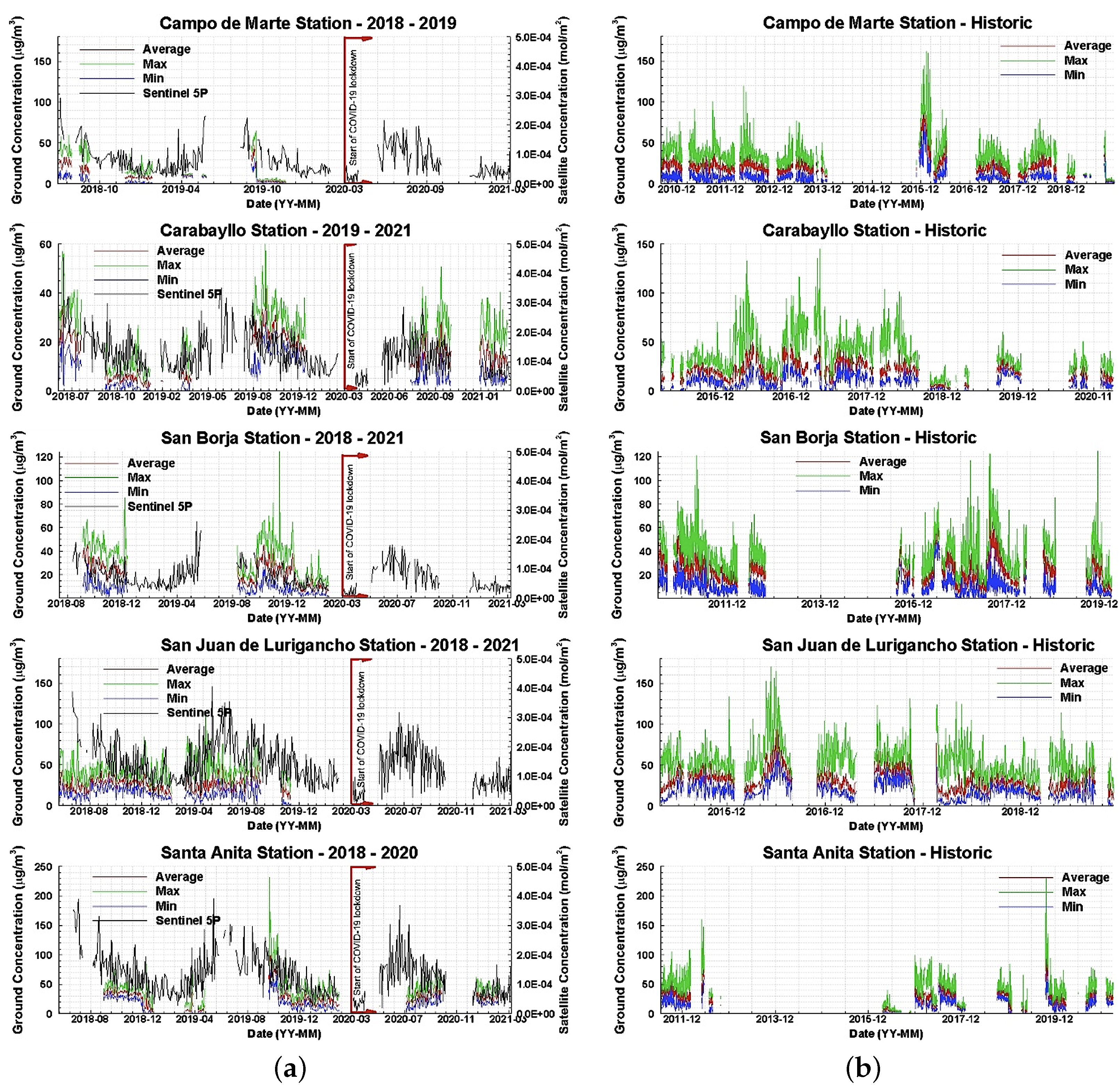
3.1. Comparison with Official Ground Air Quality Monitoring Stations

The results were first compared with data obtained by five air quality stations of SENAMHI, spatially distributed within the limits of the Metropolitan area of Lima. The air quality stations of SENAMHI measure particulate matter with a diameter size less than 2.5 and 10 micrometers, sulfur dioxide, carbon monoxide, ozone, hydrogen sulfide, and nitrogen dioxide in units of a microgram per cubic meter. Concerning NO 2 , this variable is measured using the automatic chemiluminescence method; these data are reported with an hourly frequency.
First, the ground air quality NO 2 data was processed to obtain the daily average, maximum, and minimum concentrations for all days where at least 16 hourly values were available. The official dataset provides data structured with an hourly resolution. Sentinel-5P data are obtained in mol per meter square units, and thus it is not directly comparable to ground air quality station data. The comparison is made in terms of Pearson correlation coefficients (PCC) as well as a percentage increase or decrease in specific periods [48]. No shape-preserving piecewise cubic interpolation was applied to the data for this particular comparison.
The SENAMHI official air quality sensor stations analyzed in this section are: ‘Campo de Marte’ station, ‘Carabayllo’ station, ‘San Borja’ station, ‘San Juan de Lurigancho’ station, and ‘Santa Anita’ station. The range of dates with available data for all stations and the PCC are shown in Table 2. PCCs were calculated between Sentinel-5P measurements and the ground station daily mean, ground station daily maximum, and ground station daily minimum to identify which statistical trends can be best represented using the satellite data in question.
The PCC between ground station daily average and Sentinel-5P ranged from 0.251 to 0.547. In contrast, PCC between ground station daily maximum and Sentinel-5P ranged between 0.173 and 0.487, with ‘Santa Anita’ station having the lowest value and ‘San Borja’ station having the highest value for both cases. However, the PCC between the daily minimum and Sentinel-5P ranged between 0.209 and 0.345, with ‘Carabayllo’ station having the lowest value and ‘San Borja’ station having the highest.
It can be observed that all PCCs ranged between 0.173 and 0.547, which means that the level of correlation ranged from weak to moderate positive correlation [49]. In addition, it can also be observed that the Sentinel-5P data showed, on average, the highest PCCs compared to the ground station daily mean data. This indicates that Sentinel-5P data are more representative of changes in the mean daily concentration of NO 2 rather than changes in the maximum and minimum daily concentrations.
Figure 4 shows the comparison between ground air quality data and Sentinel-5P data for the range of dates where Sentinel-5P was active (see Figure 4a), as well as the comparison between the mean daily concentration, maximum daily concentration, and minimum daily concentration measured at ground air quality data for the range of dates where each station was active. It can be observed that none of the air quality monitoring stations were active to collect data when the COVID-19 lockdown started (16 March 2020). Sentinel-5P, then, provides a valid alternative to monitor the effects of the lockdown on the air quality (NO 2 concentrations) during this period.
The Sentinel-5P concentration in the days prior to the lockdown ranged approximately from 0.5 × 10 4 to 1 × 10 4 mol/m 2 , and they lowered to approximately 0.2 × 10 4 mol/m 2 . This represents a decrease of 20% to 40%. Moreover, historical data show that there is no significant upward or downward trend on NO 2 concentrations on all five stations analyzed. Although seasonality is observed, the sudden decrease of NO 2 concentrations, especially when compared to data two weeks before the lockdown, is significantly explained by the regulations imposed rather than seasonal changes.
Finally, the ‘Carabayllo’ and ‘Santa Anita’ stations show that, two months after the restrictions were lifted, the NO 2 concentrations registered by air quality stations returned to values compared to the seasonal values shown in previous years. The Sentinel-5P data can also observe this pattern, thus, confirming that the changes in NO 2 concentration measured with Sentinel-5P are consistent with the patterns observed at ground stations.

3.2. Satellite Results and Discussion

First, in Figure 5, we show the historic NO 2 concentration levels in mol/m 2 for the twelve selected zones in Lima, where there is no sensor from SENAMHI (see Section 2.2), from August 2018 to March 2021. Note that the last value was from a previous date in some cases since there was no most recent information from the Sentinel-5P satellite for the specified coordinates. Next, in Figure 6, we show the same historic NO 2 concentration levels information for the six locations of the sensors of SENAMHI selected.
This graph also includes the values of cities from New Delhi (India), Lanzhou (China), Auckland (New Zealand), Sydney (Australia), and Cape Town (South Africa) since there is information from both the Sentinel-5P satellite and [40]. We selected the last three cities for reference since they are in the same south hemisphere as Lima, Peru, with similar time seasons. Later, in Figure 7, we show the difference between 2019 and 2020, from the range from 1 January to 4 July, when available, for the zones indicated in Figure 5. Finally, in Figure 8, we show the same difference analysis for the zones indicated in Figure 6.
By recalling Figure 2, we can see that the NO 2 concentration levels of the Lima metropolitan area present differences between 2020 versus 2019 and 2018, with similar results for small regions of interest, as shown in Figure 3. For a better analysis, in Table 3, we present the numerical values for four locations for the ranges (i) between 16 March and 29 March in 2019, 2020, and 2021 and (ii) between 30 March and 15 April in 2019 and 2020. We selected the first-time range to compare that could include 2021 during the same days of the month of the forced lockdown.
We selected the second-time range considering that Peru’s citizens followed the government indications with more emphasis; unfortunately, as of the writing of this article, we did not have complete data from the Sentinel-5P for the year 2021 for that range. We can see, in Table 3, how the percentage of the NO 2 levels was decreased considering the dates between 16 March and 15 April. For example, for the location of the bus station Matellini, the average NO 2 levels on 16–29 March 2020, represented 61.8% and 67.7% compared to 2019 and 2021. Furthermore, the average NO 2 levels between 30 March and 15 April 2020 were 37.8% of the values in 2019.
In Peru, the 2020 summer went from 21 December 2019 to 19 March 2020. During that time, most schools and universities were on vacation, and many people also took vacations from work while some of them spent time out of the central city, e.g., on the beach. A reduction in NO 2 levels around Lima can be observed during that time, as seen in Figure 5. This reduction can be explained by changes in the atmospheric conditions and changes in the emission spatial and temporal patterns, though it is beyond the scope of the current research to address these questions.
In the year 2020, with the announcement on 16 March from the former President Martín Vizcarra regarding the countrywide lockdown, closing borders, restricting domestic travel, and forbidding nonessential business operations, beginning on 16 March, many schools and universities did not start the academic year, while others were in the first week of classes. This cancellation of activities directly impacted the levels of NO 2 as can be seen in Figure 5 and Figure 7. This result agrees with that described in [50], where the author described how the limitation of logistical activities strongly influenced the rapid improvement in air quality due to the significant reduction of polluting substances.
In Huachipa Industrial Park, a primary and important industrial zone for commerce in Lima, the differences were very substantial. Even if we would have expected to keep the NO 2 values low due to the quarantine, people started to take risks with the president’s extensions and began to not fulfill the indications as described in Section 1. This effect can be seen in Figure 5 and Figure 7, around the middle of May, where the NO 2 levels started to increase again. Since not the entire Peruvian population began going back to business, the NO 2 levels did not reach the high values of previous years, and we can observe the difference. These results are more related to the Peruvian president’s announcement on 22 May, when he ordered mandatory social isolation, meaning quarantine due to the severe circumstances that affected the nation due to COVID-19 until 30 June [51].
It is essential to mention that the lowest reduction of the NO 2 levels was in the international airport area and around the metro stations. In the case of the airport, Peru was admitting in and out solidarity flights. In the case of the metro stations, since workers from essential business operations, e.g., nurses, medical doctors, and police officers, were still working (and more than usual), the buses were still running. For the locations where the sensors of SENAMHI were located, see Figure 6, this pattern reduction is similar. For comparison purposes, New Delhi (India) and Lanzhou (China), where there has been a more in-depth investigation regarding air quality [4,17,18,19], are also plotted in this graph, among other cities.
The cities of Auckland (New Zealand), Sydney (Australia), and Cape Town (South Africa) follow the same trend as in Lima due to the similarity of the summer months, including the academic periods. From Figure 8, in China, the values start to increase by March, since they were the first to get the virus but the first to start to overcome it. In these two countries, the difference curve shows that the lower levels of NO 2 were also when the countries started strict actions and the mandatory quarantine, which happened around January–March for China and March–April for India.
To analyze and explain the resultant graphics, we take two intrinsic characteristics of the capital city and the event. After the official announcement on 16 March 2020, the other five quarantine time extensions were taken as less and less relevant with each new communication. This can be explained with the information given at the start of the introduction; people could not wait more time in their homes without income and, as only 21.9% of homes have a refrigerator, they would not be able to store their food either [52]. This fact drove people to disobey the quarantine state and return to their work informally.
Unfortunately, idiosyncrasy and low education levels played an important role, making authorities work hard and achieve little. Second, pollution curves had a patron themselves in the way of the year because of important dates and the weather. This is related to the increase in demand for some products that increase production and thus pollution levels, and the variation of temperatures make the gas density vary in the atmosphere. It is also essential to consider that Lima is near the sea and has a high vegetation index in the districts along the green coast; this helps process pollution via plants and algae and reduce its levels.
This work clearly shows the zones with major pollution troubles, and, with the information taken from quarantine, people in Peru also had the time required to let the environment rest and heal. Thus, the authorities and everyone interested in environmental care can use this data to set targets and perform projects in order to help nature. Some improvements to this research could study other Peruvian cities to compare their pollution levels with their geography and vegetation or other Latin-American cities with their poverty and technology advancement index.
We are currently working on an open and free platform that can use all the global information from the Sentinel-5P satellite and convert it to the format presented in this work. The draft version of the platform is available at (visited on 21 February 2022) https://app-no2monitor.herokuapp.com. We expect to continue improving this platform to add more features to provide the global NO 2 data available from the Sentinel-5P satellite in a friendly, simple, and easy-to-understand way. Another improvement can be comparing terrestrial sensors with satellite data to make it easy to recognize non-healthy levels of NO 2 in moles per square centimeter as the World Health Organization (WHO) levels are in micrograms per cube centimeter and there is no simple way to convert one dimension to another.

4. Conclusions

We presented a study of the air quality during the COVID-19 pandemic lockdown in Lima, Peru, in terms of the NO 2 levels. The data was obtained from the Sentinel-5P satellite dataset in over eighteen different places in Lima, Peru. The data spans from June 2018 through March 2021, and we emphasized the mandatory lockdown dates in Peru to study the impact of the quarantine. The pollution caused by NO 2 emissions presented a notable decrease due to the mandatory quarantine in Peru between March–June 2020: between 65% and almost 25% of the 2019 values.
However, the NO 2 concentration levels in Lima were not harmful to health. It is a great success to reduce NO 2 levels and avoid complications or diseases caused by a pollutant. On the other hand, these levels increased again when the quarantine ended. It is still a matter of research to continue monitoring air quality with satellite tools, such as those presented in this research, since, in this way, there will be complementary and extensive analyses of the data, which will help the health organizations in charge of monitoring air quality in Peru and help report more data to international organizations, such as the WHO.
The comparisons between the data from the Sentinel-5P and the official ground-based sensors that are constantly monitoring air quality levels in Lima indicated that Sentinel-5P data are more representative of changes in the mean daily concentration of NO 2 rather than changes in the maximum and minimum daily concentrations.
This study using satellite imagery will expand the Peruvian government’s tools and resources to monitor the contamination levels and support ongoing projects to reduce NO 2 emissions in the city. Finally, an important finding is that such low levels have not been reported in the last two years. Therefore, these data will also help compare health levels and reinforce future research on the Lima region’s wellness and health.
As future work, we are currently developing an open and accessible platform that can use all the global information from the Sentinel-5P satellite and convert it to a visual and user-friendly format. We expect to continue improving this platform to add more features to provide the global NO 2 data from the satellite in a friendly, simple, and easy-to-understand way.

Author Contributions

Conceptualization, D.V., Q.B. and V.M.; methodology, D.H. and V.M.; software, R.C. and N.S.; validation, D.V.; formal analysis, D.H. and V.M.; investigation, D.V., Q.B., M.P.G. and C.T.; resources, D.V. and Q.B; data curation, D.V. and Q.B; writing—original draft preparation, D.V., Q.B. and V.M.; writing—review and editing, D.H. and V.M.; visualization, D.V. and V.M.; supervision, V.M.; funding acquisition, D.H. and V.M. All authors have read and agreed to the published version of the manuscript.

Funding

This research was supported by the Universidad de Ingenieria y Tecnologia (UTEC), Peru, seed funds under the grant research Seed Fund 2021-01.

Institutional Review Board Statement

Not applicable.

Informed Consent Statement

Not applicable.

Data Availability Statement

All the data used in this work was obtained from the Copernicus Sentinel-5 Precursor (Sentinel-5P) satellite.

Conflicts of Interest

The authors declare no conflict of interest.

References

  1. The World Bank. Poverty Headcount Ratio at National Poverty Lines (% of Population). Peru. 2020. Available online: https://data.worldbank.org/indicator/SI.POV.NAHC?locations=PE (accessed on 21 February 2022).
  2. Finn, K. The Informal Economy in Peru: A Blueprint for Systemic Reform. Lehigh Preserv. 2017, 35, 56–57. [Google Scholar]
  3. French, A.; Mechler, R.; Arestegui, M.; MacClune, K.; Cisneros, A. Root causes of recurrent catastrophe: The political ecology of El Niño-related disasters in Peru. Int. J. Disaster Risk Reduct. 2020, 47, 101539. [Google Scholar] [CrossRef]
  4. Rodríguez-Urrego, D.; Rodríguez-Urrego, L. Air quality during the COVID-19: PM2.5 analysis in the 50 most polluted capital cities in the world. Environ. Pollut. 2020, 266, 115042. [Google Scholar] [CrossRef]
  5. Horton, J. COVID: Why Has Peru Been So Badly Hit? 2020. Available online: https://www.bbc.com/news/world-latin-america-53150808 (accessed on 21 February 2022).
  6. World Health Organization. Air Quality Guidelines: Global Update 2005: Particulate Matter, Ozone, Nitrogen Dioxide, and Sulfur Dioxide; Technical Report; World Health Organization: Copenhagen, Denmark, 2006. [Google Scholar]
  7. Carvalho, P.C.; Nakazato, L.F.; Nascimento, L.F.C. Exposure to NO2 and children hospitalization due to respiratory diseases in Ribeirão Preto, SP, Brazil. Cienc. Saude Coletiva 2018, 23, 2515–2522. [Google Scholar] [CrossRef]
  8. Esposito, S.; Galeone, C.; Lelii, M.; Longhi, B.; Ascolese, B.; Senatore, L.; Prada, E.; Montinaro, V.; Malerba, S.; Patria, M.F.; et al. Impact of air pollution on respiratory diseases in children with recurrent wheezing or asthma. BMC Pulm. Med. 2014, 14, 130. [Google Scholar] [CrossRef] [Green Version]
  9. Song, Y.; Chen, F.; Zhang, Y.; Zhang, S.; Liu, F.; Sun, P.; Yan, X.; Lu, G. Fabrication of highly sensitive and selective room-temperature nitrogen dioxide sensors based on the ZnO nanoflowers. Sens. Actuators B Chem. 2019, 287, 191–198. [Google Scholar] [CrossRef]
  10. Bao, R.; Zhang, A. Does lockdown reduce air pollution? Evidence from 44 cities in northern China. Sci. Total Environ. 2020, 731, 139052. [Google Scholar] [CrossRef]
  11. Collivignarelli, M.C.; Abbà, A.; Bertanza, G.; Pedrazzani, R.; Ricciardi, P.; Carnevale Miino, M. Lockdown for CoViD-2019 in Milan: What are the effects on air quality? Sci. Total Environ. 2020, 732, 139280. [Google Scholar] [CrossRef] [PubMed]
  12. Tobías, A.; Carnerero, C.; Reche, C.; Massagué, J.; Via, M.; Minguillón, M.C.; Alastuey, A.; Querol, X. Changes in air quality during the lockdown in Barcelona (Spain) one month into the SARS-CoV-2 epidemic. Sci. Total Environ. 2020, 726, 138540. [Google Scholar] [CrossRef]
  13. ESA Copernicus Sentinel. Sentinel-5P. 2020. Available online: https://sentinels.copernicus.eu/web/sentinel/missions/sentinel-5p (accessed on 21 February 2022).
  14. Roman-Gonzalez, A.; Navarro-Raymundo, A.F.; Vargas-Cuentas, N.I. Air Pollution Monitoring in Peru Using Satellite Data During the Quarantine Due to COVID-19. IEEE Aerosp. Electron. Syst. Mag. 2020, 35, 73–79. [Google Scholar] [CrossRef]
  15. Arias Velásquez, R.M.; Mejía Lara, J.V. Gaussian approach for probability and correlation between the number of COVID-19 cases and the air pollution in Lima. Urban Clim. 2020, 33, 100664. [Google Scholar] [CrossRef] [PubMed]
  16. Badillo-Rivera, E.; Fow-Esteves, A.; Alata-López, F.; Virú-Vásquez, P.; Medina-Acuña, M. Environmental and social analysis as risk factors for the spread of the novel coronavirus (SARS-CoV-2) using remote sensing, GIS and analytical hierarchy process (AHP): Case of Peru. medRxiv 2020. [Google Scholar] [CrossRef]
  17. Fan, C.; Li, Y.; Guang, J.; Li, Z.; Elnashar, A.; Allam, M.; de Leeuw, G. The Impact of the Control Measures during the COVID-19 Outbreak on Air Pollution in China. Remote Sens. 2020, 12, 1613. [Google Scholar] [CrossRef]
  18. Kumari, P.; Toshniwal, D. Impact of lockdown measures during COVID-19 on air quality—A case study of India. Int. J. Environ. Health Res. 2020, 32, 503–510. [Google Scholar] [CrossRef] [PubMed]
  19. Venter, Z.S.; Aunan, K.; Chowdhury, S.; Lelieveld, J. COVID-19 lockdowns cause global air pollution declines. Proc. Natl. Acad. Sci. USA 2020, 117, 18984–18990. [Google Scholar] [CrossRef]
  20. Stratoulias, D.; Nuthammachot, N. Air quality development during the COVID-19 pandemic over a medium-sized urban area in Thailand. Sci. Total Environ. 2020, 746, 141320. [Google Scholar] [CrossRef]
  21. Gamelas, C.; Abecasis, L.; Canha, N.; Almeida, S.M. The Impact of COVID-19 Confinement Measures on the Air Quality in an Urban-Industrial Area of Portugal. Atmosphere 2021, 12, 1097. [Google Scholar] [CrossRef]
  22. Turek, T.; Diakowska, E.; Kamińska, J.A. Has COVID-19 Lockdown Affected on Air Quality?—Different Time Scale Case Study in Wrocław, Poland. Atmosphere 2021, 12, 1549. [Google Scholar] [CrossRef]
  23. Ghasempour, F.; Sekertekin, A.; Kutoglu, S.H. Google Earth Engine based spatio-temporal analysis of air pollutants before and during the first wave COVID-19 outbreak over Turkey via remote sensing. J. Clean. Prod. 2021, 319, 128599. [Google Scholar] [CrossRef]
  24. Mendez-Espinosa, J.F.; Rojas, N.Y.; Vargas, J.; Pachón, J.E.; Belalcazar, L.C.; Ramírez, O. Air quality variations in Northern South America during the COVID-19 lockdown. Sci. Total Environ. 2020, 749, 141621. [Google Scholar] [CrossRef]
  25. Shrestha, A.M.; Shrestha, U.B.; Sharma, R.; Bhattarai, S.; Tran, H.N.T.; Rupakheti, M. Lockdown caused by COVID-19 pandemic reduces air pollution in cities worldwide. EarthArXiv 2020. [Google Scholar] [CrossRef]
  26. Pacheco, H.; Díaz-López, S.; Jarre, E.; Pacheco, H.; Méndez, W.; Zamora-Ledezma, E. NO2 levels after the COVID-19 lockdown in Ecuador: A trade-off between environment and human health. Urban Clim. 2020, 34, 100674. [Google Scholar] [CrossRef] [PubMed]
  27. Oo, T.K.; Arunrat, N.; Kongsurakan, P.; Sereenonchai, S.; Wang, C. Nitrogen Dioxide (NO2) Level Changes during the Control of COVID-19 Pandemic in Thailand. Aerosol Air Quality Res. 2021, 21, 200440. [Google Scholar] [CrossRef]
  28. Skiriene, A.F.; Stasiskiene, Z. COVID-19 and Air Pollution: Measuring Pandemic Impact to Air Quality in Five European Countries. Atmosphere 2021, 12, 290. [Google Scholar] [CrossRef]
  29. Bassani, C.; Vichi, F.; Esposito, G.; Montagnoli, M.; Giusto, M.; Ianniello, A. Nitrogen dioxide reductions from satellite and surface observations during COVID-19 mitigation in Rome (Italy). Environ. Sci. Pollut. Res. 2021, 28, 22981–23004. [Google Scholar] [CrossRef]
  30. Akritidis, D.; Zanis, P.; Georgoulias, A.K.; Papakosta, E.; Tzoumaka, P.; Kelessis, A. Implications of COVID-19 Restriction Measures in Urban Air Quality of Thessaloniki, Greece: A Machine Learning Approach. Atmosphere 2021, 12, 1500. [Google Scholar] [CrossRef]
  31. Ogen, Y. Assessing nitrogen dioxide (NO2) levels as a contributing factor to coronavirus (COVID-19) fatality. Sci. Total Environ. 2020, 726, 138605. [Google Scholar] [CrossRef]
  32. Chudnovsky, A.A. Letter to editor regarding Ogen Y 2020 paper: “Assessing nitrogen dioxide (NO2) levels as a contributing factor to coronavirus (COVID-19) fatality”. Sci. Total Environ. 2020, 740, 139236. [Google Scholar] [CrossRef]
  33. Worldometers.info. COVID-19 CORONAVIRUS PANDEMIC. 2021. Available online: https://www.worldometers.info/coronavirus/ (accessed on 21 February 2022).
  34. Lee, K.; Greenstone, M. Air Quality Life Index: Annual Update; Air Quality Life Index: Chicago, IL, USA, 2021. [Google Scholar]
  35. Google Earth Engine. A Planetary-Scale Platform for Earth Science Data & Analysis. 2021. Available online: https://earthengine.google.com (accessed on 21 February 2022).
  36. ESA Copernicus Sentinel. Sentinel-5P TROPOMI User Guide. 2020. Available online: https://sentinel.esa.int/web/sentinel/user-guides/sentinel-5p-tropomi (accessed on 21 February 2022).
  37. ESA Copernicus Sentinel. Copernicus Sentinel-5P Data Products. 2021. Available online: https://sentinels.copernicus.eu/web/sentinel/missions/sentinel-5p/data-products (accessed on 21 February 2022).
  38. Agency, E.S. Sentinel-5P: Orbit. 2021. Available online: https://sentinels.copernicus.eu/web/sentinel/missions/sentinel-5p/orbit (accessed on 21 February 2022).
  39. Google Earth Engine. Google Earth Engine Developer’s Guide. 2021. Available online: https://developers.google.com/earth-engine (accessed on 21 February 2022).
  40. The World Air Quality Project. Lima Air Pollution: Real-time Air Quality Index (AQI). 2021. Available online: https://aqicn.org/city/lima/ (accessed on 21 February 2022).
  41. Google Earth Engine. Geometry Overview. 2021. Available online: https://developers.google.com/earth-engine/guides/geometries (accessed on 21 February 2022).
  42. Google Earth Engine. Image Visualization. 2021. Available online: https://developers.google.com/earth-engine/guides/image_visualization (accessed on 21 February 2022).
  43. Google Earth Engine. Sentinel-5P OFFL NO2: Offline Nitrogen Dioxide. 2021. Available online: https://developers.google.com/earthengine/datasets/catalog/COPERNICUSS5POFFLL3NO2 (accessed on 21 February 2022).
  44. Google Earth Engine. Reducer Overview. 2021. Available online: https://developers.google.com/earth-engine/guides/reducers_intro (accessed on 21 February 2022).
  45. Google Earth Engine. Exporting Data. 2021. Available online: https://developers.google.com/earth-engine/guides/exporting (accessed on 21 February 2022).
  46. Schafer, R.W. What Is a Savitzky-Golay Filter? [Lecture Notes]. IEEE Signal Process. Mag. 2011, 28, 111–117. [Google Scholar] [CrossRef]
  47. Betta, G.; Capriglione, D.; Cerro, G.; Ferrigno, L.; Miele, G. The effectiveness of Savitzky-Golay smoothing method for spectrum sensing in cognitive radios. In Proceedings of the 2015 XVIII AISEM Annual Conference, Trento, Italy, 3–5 February 2015; pp. 1–4. [Google Scholar] [CrossRef]
  48. Schober, P.; Boer, C.; Schwarte, L.A. Correlation Coefficients: Appropriate Use and Interpretation. Anesth. Analg. 2018, 126, 1763–1768. [Google Scholar] [CrossRef]
  49. Ratner, B. The correlation coefficient: Its values range between+ 1/−1, or do they? J. Target. Meas. Analy. Market. 2009, 17, 139–142. [Google Scholar] [CrossRef] [Green Version]
  50. Marinello, S.; Butturi, M.A.; Gamberini, R. How changes in human activities during the lockdown impacted air quality parameters: A review. Environ. Prog. Sustain. Energy 2021, 40, e13672. [Google Scholar] [CrossRef] [PubMed]
  51. Peru News Agency. Peru: Government Extends State of Emergency against Covid-19 Thru June 30; Technical Report; Andina Agencia Peruana de Noticias: Lima, Peru, 2020. [Google Scholar]
  52. Jabiel, S.; Life Helmets. Technical Report; United Nations Development Programme. 2020. Available online: https://www.pe.undp.org/content/peru/es/home/presscenter/articles/2020/life-helmets.html (accessed on 21 February 2022).
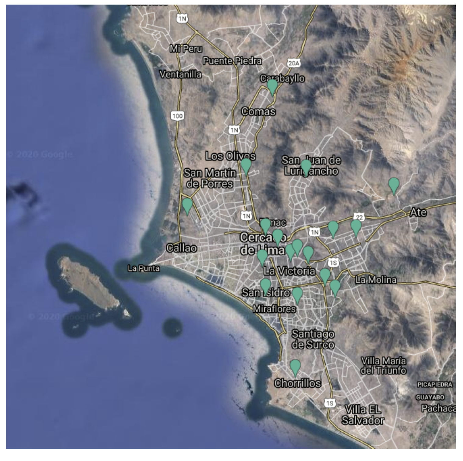
Figure 1. Map from Lima, Peru, showing the location of the 18 areas selected as described in Section 2.1.2. The image shown corresponds to approximately 49 km by 49.5 km.
Atmosphere 13 00373 g001
Figure 2. Satellite data information, in terms of the NO 2 concentration levels in mol/m 2 for the Lima metropolitan area. (a) 2018 June–December. (b) 2019 January–June. (c) 2020 January–June. The image shown corresponds to approximately 175 by 210 km. In all cases, the color bars indicate the NO 2 concentration levels on a scale of a minimum value of 0 and a maximum value of 0.0002 mol/m 2 as described in task five in Section 2.2.
Atmosphere 13 00373 g002
Figure 3. Example of spatial georeference for four areas of interest used to better understand the concentration levels of NO 2 around the region of interest. (a) Location of the sensor in Carabayllo and the visual comparison for (b) January–June 2019 and (c) January–June 2020. (d) Location of the sensor in the US embassy in Peru, and the visual comparison for (e) January–June 2019 and (f) January–June 2020. (g) Location of the sensor in ‘San Juan de Lurigancho’, and the visual comparison for (h) January–June 2019 and (i) January–June 2020. (j) Location of the sensor in ‘Santa Anita’ and the visual comparison for (k) January–June 2019 and (l) January–June 2020. In the second and third columns, the color bars indicate the NO 2 concentration levels on a scale of a minimum value of 0 and a maximum value of 0.0002 mol/m 2 as described in task five in Section 2.2. The locations of all the sensors are described in Table 1 and shown in Figure 1.
Atmosphere 13 00373 g003aAtmosphere 13 00373 g003b
Figure 4. Comparison of the results, in terms of NO 2 levels using the data from the Sentinel-5 satellite (mol/m 2 ) and the official data of Peru from SENAMHI air quality stations (micrograms/m 3 ), located at ‘Campo de Marte’ station, ‘Carabayllo’ station, ‘San Borja’ station, ‘San Juan de Lurigancho’ station, and ‘Santa Anita’ station: (a) 2018–2021, and (b) historical data.
Atmosphere 13 00373 g004
Figure 5. Historic nitrogen dioxide pollution levels in Lima for the twelve selected zones in Lima, where there is no sensor from SENAMHI (see Section 2.2) from August 2018 to March 2021.
Atmosphere 13 00373 g005
Figure 6. Historic nitrogen dioxide pollution levels for the six locations of the sensors of SENAMHI selected (see Section 2.2), from August 2018 to March 2021. We also include New Delhi (India), Lanzhou (China), Auckland (New Zealand), Sydney (Australia), and Cape Town (South Africa) as references.
Atmosphere 13 00373 g006
Figure 7. Nitrogen dioxide pollution differences between 2019 and 2020, from the range of 1 January to 4 July, when available, for the zones indicated in Figure 5.
Atmosphere 13 00373 g007
Figure 8. Nitrogen dioxide pollution difference between 2019 and 2020, from the range of 1 January to 4 July, when available, for the sensor locations indicated in Figure 6.
Atmosphere 13 00373 g008
Table 1. Eighteen places in Lima selected to analyze pollution patrons in the capital of Peru.
PlaceCommentsLatitude and Longitude Coordinates
1Lima metropolitan areaDowntown Lima−77.04, −12.04
2Jorge Chavez International AirportPeru’s main international and domestic airport−77.12, −12.02
3Gamarra Commercial EmporiumPopularly known as Gamarra, place of great commercial movement mainly related to the fashion industry and the manufacture of clothing−77.01, −12.06
4Bus station ‘Matellini’One of Lima’s main metro stations−77.01, −12.18
5‘El mercado de frutas’Main fruit market in Lima−76.99, −12.06
6‘Santa Anita’ marketOne big wholesale market in Lima−76.94, −12.04
7Bus station ‘Naranjal’One of Lima’s busiest bus stations−77.06, −11.98
8‘San Isidro’District is one of Lima’s wealthiest neighborhoods−77.04, −12.1
9‘Trebol de Caqueta’One of the busiest road interchanges in Lima−77.04, −12.04
10‘Trebol de Javier Prado’Well-known road interchanges in Lima−76.98, −12.09
11Historic Centre of LimaDistrict with the main public entities−77.02, −12.05
12Huachipa Industrial ParkIndustrial district in the province of Lima−76.91, −12.00
13‘Campo de Marte’Location of a National Meteorology and Hydrology Service of Peru (SENAMHI) official air quality sensor−77.04, −12.07
14‘Carabayllo’Location of a SENAMHI official air quality sensor−77.03, −11.90
15US embassy in PeruLocation of a SENAMHI official air quality sensor−76.96, −12.10
16        ‘San Juan de Lurigancho’ (SJL)        Location of a SENAMHI official air quality sensor−76.99, −11.98
17‘San Borja’Location of a SENAMHI official air quality sensor−77.00, −12.10
18‘Santa Anita’Location of a SENAMHI official air quality sensor−76.97, −12.04
Table 2. Summary of available data for ground air quality monitoring stations and Pearson correlation coefficients with the Sentinel-5P satellite.
Ground StationSentinel-5PPearson Correlation Coefficient: Sentinel-5P with
Station NameRange of DatesNumber of Data PointsRange of DatesNumber of Data PointsNumber of Common Data PointsDaily AverageDaily MaximumDaily Minimum
Campo de MarteAug. 2010–Nov. 20191830Jul. 2018–Mar. 2021360820.4820.3930.345
CarabaylloMar. 2015–Mar. 20211273Jun. 2018–Mar. 20214582080.3010.3270.209
San BorjaJun. 2010–Feb. 20201758Aug. 2018–Mar. 20213791230.5470.4870.313
San Juan de LuriganchoMar. 2015–Nov. 20191272Jun. 2018–Mar. 20215092150.4130.2890.298
Santa AnitaJun. 2011–Mar. 20211234Jun. 2018–Mar. 20214912850.2510.1730.241
Table 3. Numerical results of the NO 2 concentrations levels (in mol/m 2 ) for the locations of Lima Metropolitan Area, Jorge Chavez International Airport, Santa Anita market, and the bus station Matellini for the time ranges of (i) between 16 March and 29 March in 2019, 2020, and 2021 and (ii) between 30 March and 15 April in 2019 and 2020. The results are presented in terms of the minimum (min.) and the average ( μ ), both in the range of 10–5. We also show the ratio between the average values between 2020 versus 2019 and 2021.
16 March–29 March30 March–15 April
Location2019202020212020:20192020:2021201920202020:2019
min. μ min. μ min. μ % ( μ )% ( μ )min. μ min. μ % ( μ )
Lima Metropolitan Area7.27.92.73.68.38.745.641.49.09.52.42.627.4
Jorge Chavez Int. Airport4.14.32.12.43.63.655.866.74.64.82.02.143.8
Santa Anita market7.48.02.53.46.16.542.552.39.09.92.32.525.3
Bus station Matellini3.13.41.72.12.93.161.867.73.94.51.61.737.8
Publisher’s Note: MDPI stays neutral with regard to jurisdictional claims in published maps and institutional affiliations.

