1. Introduction
In recent years, the increasing adoption of digital technologies in industrial environments has transformed the way organizations manage and optimize their operations. The integration of Internet of Things (IoT) devices, smart sensors, and advanced manufacturing systems has led to the generation of vast amounts of real-time data [
1]. These sensor-integrated devices continuously generate significant amounts of data structured as time series, with each record associated with a specific timestamp [
2]. This continuous flow of structured data plays a central role in enabling data-driven decision making, supporting key industrial applications such as predictive maintenance, quality control, and optimizing operational efficiency [
3]. However, the value of this data depends on its quality. Decisions based on inaccurate, incomplete, inconsistent, or outdated data can have significant negative consequences, from minor process inefficiencies to severe production downtime or safety risks [
4]. This reality makes data quality the top industrial data management challenge. Unlike traditional data systems, industrial data is often generated in high volume and high frequency, with significant heterogeneity in format, structure, and semantics [
5]. In addition, its real-time nature and dependence on physical devices introduce variability, noise, and a higher risk of data degradation over time [
1].
Data quality is an inherently multifaceted concept, and its interpretation and assessment require careful analysis to align with each organization’s unique objectives and operational needs [
6,
7]. Rather than being defined at the point of data creation alone, data quality must be assessed in the specific context of its use. Identifying instances of poor data quality is critical, as it can directly impact business performance and prevent informed decision making [
3]. Data quality is typically assessed using a set of dimensions, each of which represents a specific attribute or characteristic that contributes to the overall quality of the data [
7,
8]. These dimensions serve as a structured framework for evaluating, quantifying, and systematically managing data quality [
9]. Identifying and understanding these dimensions is essential for organizations seeking to improve the reliability and usability of their data. They form the basis for effective quality assessments and support continuous improvement efforts across data-driven processes [
10]. According to Liu et al. [
4], who analyzed data-related challenges in smart manufacturing, the most critical issues are directly related to four key dimensions:
accuracy, completeness, consistency, and timeliness. Moreover, the operationalization of these dimensions is often supported by quantitative metrics. As noted by Goknil et al. [
1], such metrics can take various forms, including normalized scores within the [0, 1] interval, binary indicators, percentages, frequencies, or probabilities, depending on the nature of the dimension and the evaluation context. It is also important to note that a single data quality dimension can be assessed using multiple metrics, and these can be applied at different levels of analysis to produce more granular and accurate evaluations [
9].
Without appropriate mechanisms to assess and ensure data quality, decisions based on this data can be unreliable or even potentially dangerous to industrial processes. As a result, there is a growing need for robust solutions that can systematically assess and monitor the quality of data in real-time industrial contexts. This paper addresses this challenge by proposing a data quality pipeline specifically designed for industrial environments, architected and implemented with the specific characteristics and constraints of manufacturing systems in mind. The architecture supports data ingestion, profiling, validation, and continuous monitoring, and is structured around key data quality dimensions such as accuracy, completeness, consistency, and timeliness. By implementing targeted metrics, the pipeline enables early detection of data issues, contributing to more trusted insights and improved responsiveness across industrial operations.
To validate the practical applicability of this pipeline, a case study was conducted in a real-world manufacturing environment. The case study demonstrates how the pipeline can be deployed in a live production environment, providing not only visibility into data quality trends over time, but also actionable feedback to support continuous improvement efforts. In this way, this work contributes to the expanding field of research and practice focused on improving data quality in industrial systems, filling the gap between theoretical frameworks and operational needs. Compared to existing data quality assessment approaches in industrial and big data contexts, the proposed pipeline provides a unified and lightweight architecture that integrates ingestion, profiling, validation, and visualization in real time. While many solutions [
1] rely on rule-based frameworks or static configurations, our architecture introduces dynamic metric computation and adaptive profiling mechanisms, allowing the system to react autonomously to changes in data patterns. This reduces manual intervention and increases adaptability in volatile environments. Additionally, the introduction of quality scores (
,
, and
) enables continuous, time-aware monitoring, a limitation in many prior works that only provide snapshot evaluations. By addressing issues such as dynamic thresholding, modularity, and real-time responsiveness, our pipeline directly overcomes key challenges identified in the recent literature, such as the rigidity of validation frameworks [
1,
11] and the lack of operational feedback in industrial systems [
4].
The main contributions of this work are as follows:
The design of a lightweight, modular data quality pipeline adapted to industrial environments with real-time constraints.
The implementation of a metric-based profiling mechanism that supports the continuous evaluation of key data quality dimensions over streaming data.
The integration of data quality metrics and score results into dashboards enables operators to effectively monitor, analyze, and respond to data quality issues.
The validation of the approach through a real-world case study demonstrates its applicability and practical impact.
The remainder of this article is organized as follows:
Section 2 reviews previous studies that address challenges and strategies related to data quality and ingestion. It begins with data quality metrics (
Section 2.1), followed by quality scores used to assess and summarize data quality (
Section 2.2). After these two topics, the section discusses data ingestion architectures designed to handle industrial data streams (
Section 2.3). The case study in which the data quality assessment metrics are applied is presented in
Section 3.
Section 4 outlines the architecture developed in this work, detailing its main components and the mechanisms employed.
Section 5 analyzes the results obtained through a case study, highlighting the effectiveness and impact of the proposed approach. Finally,
Section 6 summarizes the conclusions and suggests future directions for research in this area.
2. Related Work
In recent years, there has been a growing focus on data-driven architectures across various domains, highlighting the universal need for reliable, high-quality data streams. In the educational sector, Abideen et al. [
12] explored the application of machine learning and data mining techniques to analyze student enrollment criteria, demonstrating the significant impact of structured data pipelines and feature selection on the quality and accuracy of educational decision-making. Similarly, Ullah et al. [
13] addressed the importance of selecting appropriate features for detecting and preventing cyberattacks in IoT systems. The authors emphasized that selecting and prioritizing significant security-related features is critical for enhancing decision-making and improving security effectiveness in IoT devices. While these studies do not focus directly on industrial manufacturing, they share core challenges with Industry 4.0: the need for scalable, real-time pipelines, adaptive quality mechanisms, and integrated monitoring. These parallels emphasize the importance of creating domain-specific data quality pipelines that can handle the complexities of industrial environments.
Data quality has long been recognized as a foundational requirement in analytical systems, particularly in industrial and enterprise contexts. The integration of IoT devices and smart sensors in Industry 4.0 environments has amplified the challenges of managing data quality due to the high volume, velocity, and heterogeneity of the data generated. Data degradation in such environments is common, resulting from issues such as sensor malfunction, transmission noise, and semantic inconsistencies [
1]. In this context, ensuring high-quality data is essential to enable accurate predictive maintenance, real-time monitoring, and efficient process control.
Goknil et al. [
1] offers a comprehensive taxonomy of data quality techniques, including data monitoring, data cleaning, and data repair. These techniques are essential to mitigate common issues such as outliers, noise, and incomplete records. The study also outlines the levels of automation and standardization available for each quality technique and highlights a gap in the practical application of these concepts in smart manufacturing settings. Additionally, the authors emphasize the importance of understanding data quality through its various dimensions and present 17 distinct ones. These dimensions are critical for identifying and characterizing data problems in CPS and IoT environments. The study associates various metrics with these dimensions but notes limited adoption of these metrics in real industrial applications. While the literature often addresses issues such as missing values, noise, and outliers, using dimensions as a systematic basis for evaluating and improving data quality is still in its early stages. This gap underscores the necessity for further research on not only techniques but also how to evaluate and guide these techniques through well-established data quality dimensions.
Liu et al. [
4] studied the effect of data quality on big data analytics in smart factory environments. Their study reveals that smart factory settings face several data quality challenges, such as inaccurate, incomplete, inconsistent, and outdated data. These issues significantly impact the effectiveness of analytics and the efficiency of production processes, affecting critical activities such as process control and predictive maintenance. To address these challenges, the authors identified four dimensions for assessing data quality in this context: accuracy, completeness, consistency, and timeliness. The selection of these dimensions is directly related to the operational problems observed. Inaccurate data can result in erroneous decision-making, while incomplete data can compromise the integrity of analyses. Inconsistencies can result in conflicting interpretations, and outdated data can reduce the relevance and utility of information in dynamic environments. The choice of these four dimensions reflects the primary challenges in smart manufacturing and guides practical interventions to improve data quality and the efficiency of analytical systems.
The authors conducted a systematic review and identified six predominant data quality issues affecting big data analytics in smart factories: anomalies, missing data, noise, inconsistencies, and old data. Anomalies are associated with the accuracy dimension and may arise from system malfunctions, sensor errors, or human mistakes. While anomalies are often indicative of errors, they can also represent significant events. Noise, also related to accuracy, originates from environmental interferences in industrial settings or sensor reading errors. Unlike anomalies, noise is generally considered incorrect data. Missing data is related to the completeness dimension. Technical causes include sensor failures, transmission errors, energy limitations, lack of updates, and saving errors. Non-technical causes include inadequate understanding of data management and sampling inspections that fail to capture all output data. Inconsistencies concern contradictions between data elements and are linked to the consistency dimension. Causes include signal interference, timestamp discrepancies, and a lack of data governance, such as inaccurate naming conventions and divergent structures across departments. Finally, outdated data are related to the timeliness dimension and are mainly caused by the use of static data or slow communication between devices, leading to low update rates.
2.1. Data Quality Metrics
Data quality metrics are typically tied to specific dimensions [
7], and can be based on direct observations during a period [
14] or mathematical formulations [
15]. Our approach utilizes concrete metrics [
16], adapted from industrial data concerning the dimensions outlined above.
The
accuracy dimension is a measure of the precision with which data values reflect real-world events. It is typically determined by comparing the data values to a trusted reference source [
7,
17]. In practical terms, it measures how close a given data point is to its true value [
7]. This dimension is of particular importance in IoT environments, where decisions depend heavily on the precision of sensor data.
To quantify accuracy, we use a normalized metric, as shown in Equation (
1):
In this equation, X represents the full set of observed values. The equation scales each value x to a range between 0 and 1, with values near 0 indicating closeness to the minimum observed value, and values near 1 indicating proximity to the maximum. This normalization facilitates the detection of anomalies, particularly those values that fall outside of the expected range.
The
completeness dimension assesses whether all required data elements are present, ensuring that no values are missing [
7]. It reflects the extent to which the data is sufficiently comprehensive to support the intended analytical tasks [
10]. In the context of IoT systems, this dimension is particularly critical, as missing data can compromise the accuracy of analyses and undermine decision-making processes.
In [
16], two complementary metrics are proposed to evaluate completeness. The first metric is shown in Equation (
2).
In this equation, represents the number of missing values (such as nulls, blanks, or other undefined entries), and corresponds to the total number of values that should be present.
The second metric, defined in Equation (
3), offers a temporal perspective on completeness. It evaluates the regularity of data collection by comparing the number of actual data records to the number of expected records within a predefined time window:
Here, represents the number of observed events in a given interval, while indicates how many events were expected in that same interval. This metric is especially useful for identifying time-based gaps in data streams, helping to assess the temporal integrity and reliability of sensor-generated data.
Together, these metrics provide a comprehensive view of completeness by addressing both structural absence and temporal irregularity.
The
consistency dimension ensures that data is consistently formatted and compatible across different sources and systems [
10]. It involves aligning data definitions, structures, meanings, and representations across different business areas [
17], and ensuring equivalence between tables, sources, or systems [
7]. Inconsistencies can arise from different formats or variations in how data is entered. In the IoT context, consistency is critical because data from different sources must be harmonized to prevent misinterpretation and incorrect use [
7].
The consistency metric is calculated by comparing the number of rules found in the data (
) to the total number of rules that were previously established and expected to exist (
). The metric is expressed as:
The
timeliness dimension refers to how current the data is when it is needed [
10]. It is typically defined as the time lag between a real-world event and its reflection in the information system [
6]. In the context of IoT, timeliness is particularly important for real-time applications that depend on fresh, up-to-date information to respond effectively to changes in the environment.
This metric is used to assess whether data is still valid and relevant at the time of analysis. It is determined by two key factors: , which measures the time since the data was generated, and , which indicates how long the data remains meaningful or useful. Timeliness is expressed on a scale of 0 to 1, where 1 means the data is still valid and suitable for timely decision making, and 0 means the data is outdated and no longer within the ideal window for analysis.
The equation for timeliness is
This equation ensures that highly volatile data (which quickly loses relevance) is treated more strictly, while data with low volatility can tolerate longer delays without compromising its timeliness.
Calculating these metrics relies on continuous data analysis. In this context, data profiling plays a crucial role by providing the necessary insights and supporting the calculation of the presented metrics. Data profiling is an essential, continuous process in any robust data quality strategy. It supports anomaly detection, facilitates rule generation, and enables dynamic validation [
18]. Profiling results feed directly into metric calculations [
16]: null detection for completeness, outlier handling for accuracy, type checking for timeliness, and correlation analysis for consistency, among others. This integration allows for a proactive approach, reducing manual intervention and supporting automated, real-time responses to quality deviations in manufacturing data streams.
2.2. Data Quality Scores
Costa e Silva et al. [
19] introduced the Quality Score Delta (
; see Equation (
6)) as a proposal for assessing data quality in industrial environments. The
captures dynamic variations in data quality over time, providing both a current snapshot and a historical perspective. This makes it particularly valuable in dynamic contexts such as IoT systems, where data reliability and operating conditions evolve rapidly.
The
is calculated in time blocks and measures the difference between two indicators: the Weighted Quality Score (
; see Equation (
7)), which evaluates quality in the current block, and the Longitudinal Weighted Quality Score (
; see Equation (
8)), which aggregates quality in previous blocks and provides a historical perspective by giving more weight to recent observations. In this way, the
of block
j reflects the evolution of quality in relation to the recent past.
The quality scores rely on two fundamental dimensions of data quality: accuracy and completeness. For each sensor in the system, the number of rows in block j is denoted as , the number of accurate values is , and is the number of rows with no missing values.
The global sensor weights and are constrained such that and .
One distinctive feature of the present work, compared to [
19], is how data from different sensors is incorporated in the quality scores. Namely, sensor-specific dimension weights are introduced:
for accuracy and
for completeness, satisfying
and
with
. This separation allows for the quality scores to penalize missing data (completeness) independently of sensor precision (accuracy), which is especially relevant for heterogeneous IoT systems where reporting frequencies vary across sensors.
Furthermore, the completeness calculation has also been adjusted. Instead of using Equation (
2) to compute the completeness metric, Equation (
3) was used. As a consequence,
(Equation (
7)) and
(Equation (
8)) metrics, were updated to:
Specifically, the ratio was replaced with , where denotes the expected number of records of sensor s in block j, which more intuitively represents the proportion of received records versus expected records in block j.
For the historical component , the set contains the indices of the last m data blocks, before block j. The weighting function , where , controls the exponential decay of influence from past blocks, assigning greater importance to more recent observations. This formulation ensures that the score captures not only the instantaneous quality of the data but also its temporal evolution with sensor-specific and dimension-specific granularity.
The calculation for a block j considers the proportion of valid data in each dimension and sensor, which is weighted by its respective parameter. In contrast, the is calculated using an exponential decay-based weighted average of previous blocks. This strategy allows the system to react more quickly to recent changes in data quality and respects the volatile and often unpredictable nature of industrial environments monitored by IoT. These scores are both conceptually robust and practically applicable. They enable continuous monitoring of data quality, facilitate dynamic decision-making, and allow prioritization based on sensor criticality or operational requirements.
2.3. Data Ingestion Architectures
Achieving effective data quality management in this environment not only requires accurate metrics and continuous profiling but also relies heavily on robust data ingestion architectures capable of handling the volume, variety, and velocity of industrial data streams. Ensuring that this data is collected, filtered, and integrated efficiently into centralized repositories is essential for enabling actionable insights and optimizing operations. However, the inherent diversity and volume of industrial data present unique ingestion challenges, prompting the development of specialized architectures and frameworks.
Several studies have proposed ingestion models that specifically address the complexity of heterogeneous data collection in industrial settings. Ji et al. [
20] introduced a system tailored for ingesting device data in industrial big data frameworks, employing strategies such as synchronization, slicing, splitting, and indexing to manage heterogeneous sources. This model is implemented in the Industrial Big Data Platform and uses device templates to define expected sensor structures. It also applies coordinated strategies, such as data synchronization, temporal segmentation, parameter division, and hierarchical indexing. Although it is effective for structured and scalable data ingestion, the architecture was not designed for real-time applications. This limits its suitability for low-latency industrial environments. In parallel, broader frameworks like Gobblin [
21] and the ingestion patterns surveyed by Sawant and Shah [
22] offer flexible approaches for general-purpose big data environments. Sawant and Shah identified five key ingestion patterns: multi-source extraction, protocol conversion, multiple destination routing, just-in-time transformation, and real-time transmission. These patterns serve as foundational building blocks for scalable ingestion in environments with large volumes of semi or unstructured data. Gobblin operationalizes these patterns through a configurable, extensible framework that supports both batch and streaming ingestion. However, it lacks native support for real-time data quality assessment and industrial-specific requirements, so its usage remains mostly generic.
Goknil et al. [
1] present a comprehensive classification of data quality support systems. They distinguish between four types: rule-based mechanisms, anomaly detection pipelines, visual monitoring platforms, and extensible architectures with formal control mechanisms. Rule-based systems offer transparency and ease of implementation, but their inflexibility hinders adaptability in dynamic industrial environments. Conversely, machine learning-based approaches, including both supervised and unsupervised methods, are becoming more relevant for identifying abnormal quality patterns, such as outliers and unexpected correlations. However, these approaches require rigorous training phases and high-quality historical data.
The authors have developed more targeted solutions for smart manufacturing in [
11,
23]. The framework proposed in [
11] introduces a modular ingestion system based on Apache Kafka, using a plugin-based mechanism for flexible quality rule enforcement across heterogeneous data sources.
Building upon these foundations, [
23] proposed a full ingestion and monitoring system specifically designed for Industry 4.0 environments. The system integrates AVRO schema validation to maintain data integrity and uses Great Expectations, a well-established solution with a consistent syntax for articulating data quality rules. It also utilizes databases such as MongoDB to store correctly formatted messages as raw data, Cassandra to perform data cleansing and store transformed data, and an InfluxDB-based monitoring service coupled with Grafana to monitor time series data and provide visualizations.
These architectures exemplify a significant trend observed in the literature: a migration from generic big data ingestion frameworks to domain-specific solutions that are tailored to the quality assurance requirements of Industry 4.0. Despite progress, many existing systems lack native mechanisms for real-time quality assessment or automated detection of semantic inconsistencies.
Our proposed pipeline builds on these foundational principles by integrating the ingestion, profiling, and validation stages into a unified architecture. In addition to providing the flexibility required for heterogeneous sources, it extends analytical capabilities by introducing real-time metric computation appropriate for volatile industrial data streams. This integrated approach bridges the gap between flexibility and interpretability, supporting proactive and automated quality management in complex manufacturing environments.
3. Case Study
The case study describes a real-time monitoring scenario in an industrial production environment focusing on electric motors integrated into conveyor systems. A conveyor system is a common piece of mechanical handling equipment that transports materials from one location to another [
24]. They are especially useful in applications involving the transportation of heavy or bulky materials. These motors are part of automated production lines and play a critical role in the continuous operation of conveyor machines. Conveyor technology is used in various applications, including moving sidewalks and escalators, as well as on many manufacturing assembly lines [
24]. Additionally, conveyors are widely used in automated distribution and warehousing systems [
24].
Accurate capture and evaluation of sensor data is essential in this context to ensure machine reliability, operational efficiency, and timely fault detection. Each conveyor system is driven by an individual motor designated as SE01, SE02, or SE03. Each motor is equipped with vibration and external temperature sensors. While vibration data is also available, this study focuses exclusively on the motors’ external temperature readings. These sensors are essential for detecting potential overheating issues, identifying abnormal thermal patterns, and supporting predictive maintenance strategies.
The temperature sensors, referred to as
,
, and
, are configured to collect one data point per second, generating a continuous, high-frequency stream of readings. The data is transmitted in a standardized JSON format and ingested by a real-time processing architecture. Each message contains metadata including a sensor identifier, variable name, measured value, and exact timestamp of the reading, as illustrated in
Table 1.
An example of a real-time message received:
{
"code": "Temp1",
"name": "Temp1",
"value": 42.5,
"date": "2025-05-23T09:07:36.627000"
}
Three conveyors are instrumented with these sensors, allowing for consistent and scalable data acquisition. This setup enables the monitoring of equipment performance in real-time, capturing dynamic behaviors that could be missed in traditional periodic inspections.
As data volume increases, it enables deeper analysis of data quality characteristics, including the identification of missing values, temporal gaps, out-of-range measurements, and anomalies. These challenges are commonly encountered in industrial environments due to the complexity of sensor networks and harsh operating conditions.
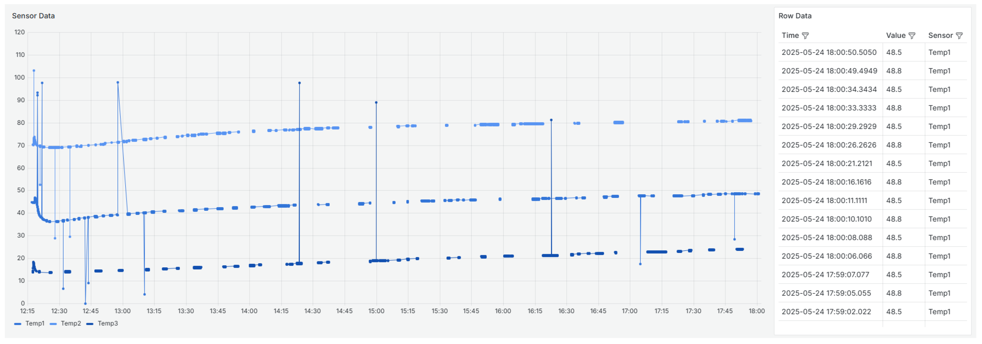
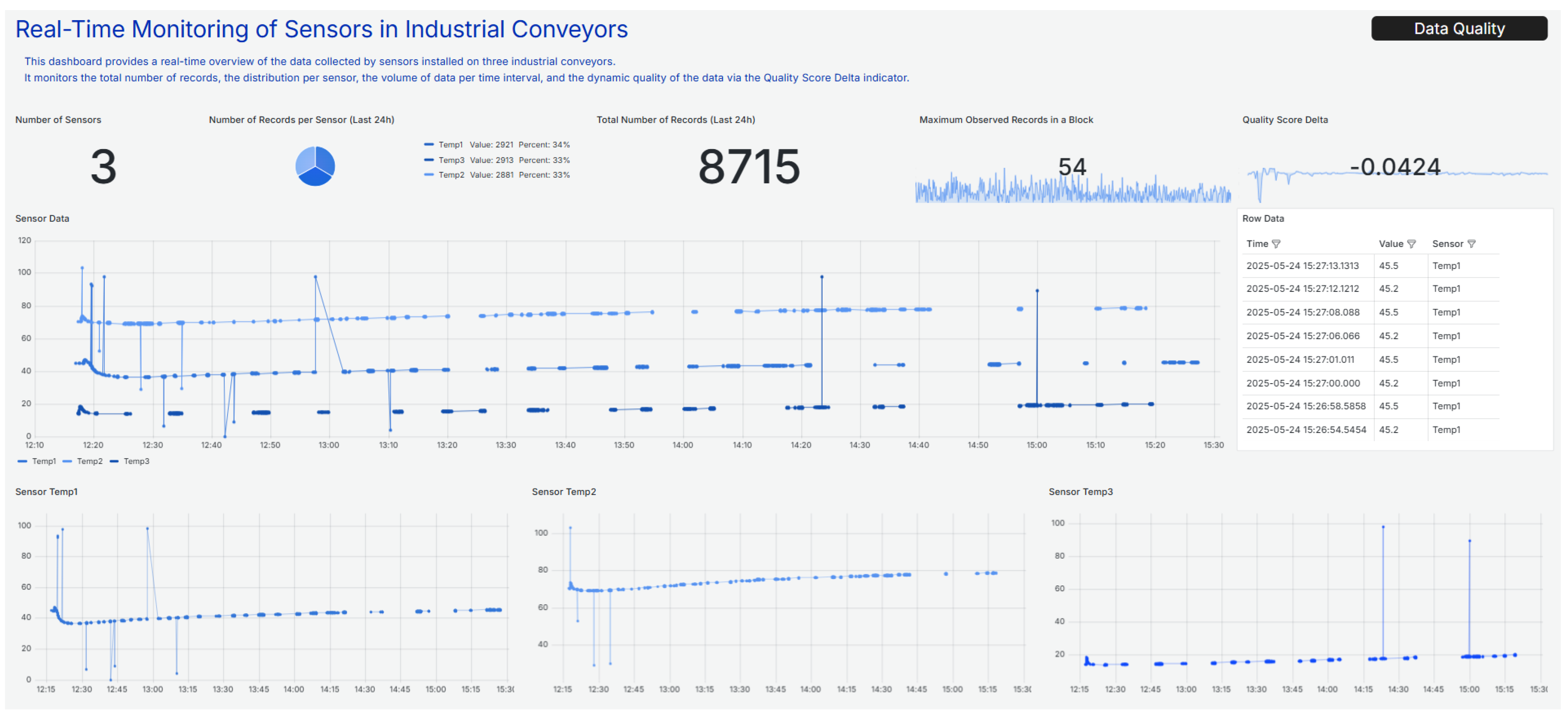
Figure 1 provides a visual representation of the data collected from three temperature sensors (
,
, and
). The left side of the figure contains a line graph showing the time evolution of the values recorded by each sensor. The right side contains a table with the raw data, including the timestamp, the recorded value, and the corresponding sensor. This combined view allows for a more comprehensive analysis, facilitating the visual inspection of trends and anomalies, as well as the detailed verification of individual data points. The graph reveals significant anomalous behavior, including peaks, abrupt drops in values, and temporal gaps. Such irregularities could indicate sensor failures, loss of communication, calibration problems, or other issues. These patterns highlight the importance of analyzing data quality in depth before using it for monitoring or decision-making processes.
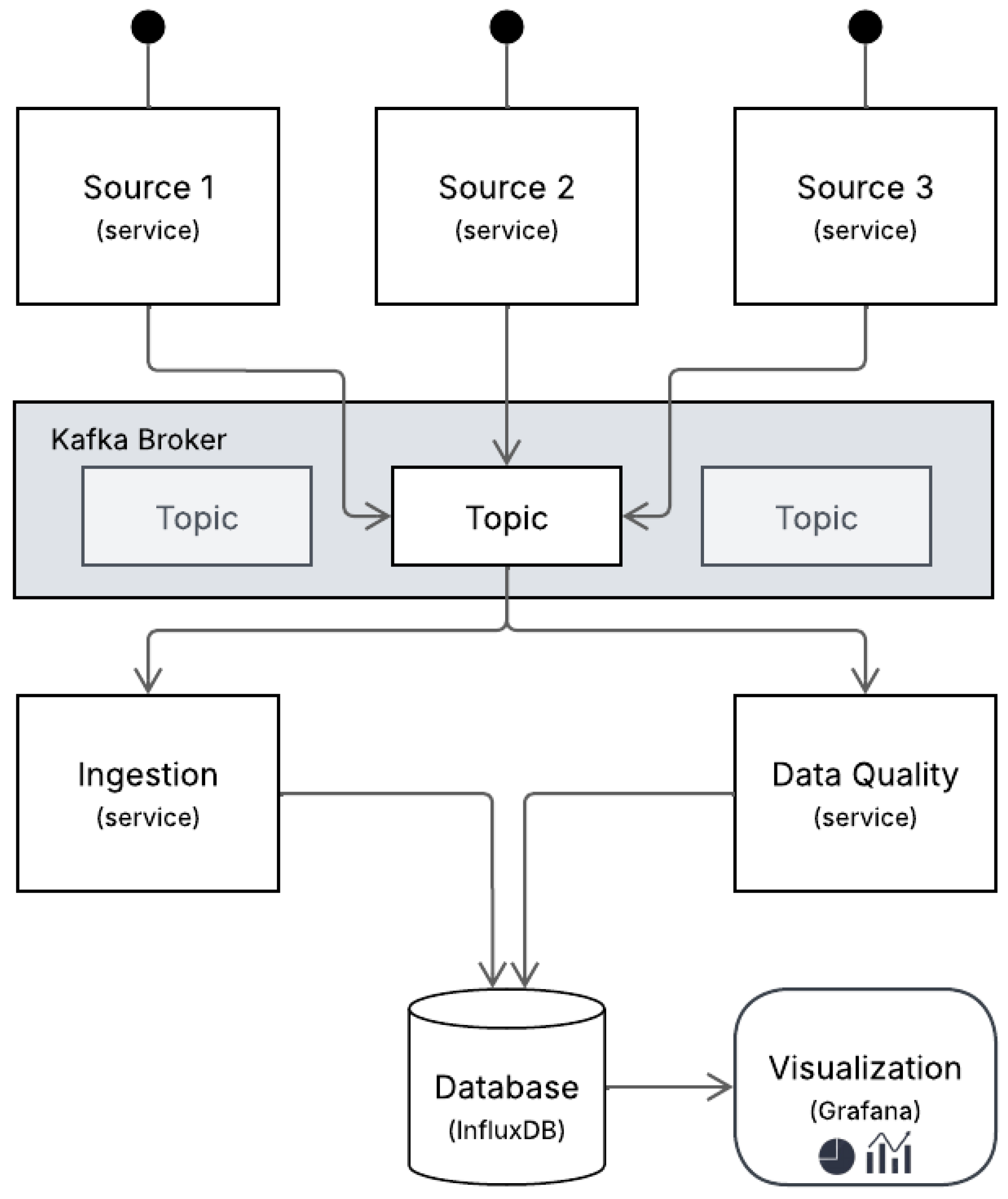
4. Architecture
In the domain of industrial data processing, the definition of a robust and extensible architecture is fundamental to ensure the seamless acquisition, processing, and monitoring of high-frequency data streams. The architecture proposed in this work builds upon the foundational principles presented in [
11,
23], particularly regarding modular ingestion, streaming validation, and data profiling in smart manufacturing environments. Inspired by these contributions, the system was designed to ensure interoperability, traceability, and adaptability in the face of heterogeneous industrial data sources and volatile data streams.
Figure 2 presents the implemented architecture, which integrates three core services, namely ingestion, quality assessment, and visualization, operating in parallel over an event-driven infrastructure powered by Apache Kafka (
https://kafka.apache.org/, accessed on 25 May 2025), InfluxDB (
https://www.influxdata.com/, accessed on 25 May 2025), and Grafana (
https://grafana.com/, accessed on 25 May 2025). This configuration is designed to facilitate low-latency data management and to process high-frequency sensor data in real time, while ensuring continuous monitoring of data quality.
At the beginning of the system, industrial sensors publish real-time measurements directly to a centralized Kafka broker, eliminating the need for intermediate preprocessing layers. Each sensor functions as an autonomous source, contributing to a Kafka topic that aggregates data across the production environment. This source-to-broker model reduces latency, promotes scalability, and ensures traceability from the point of origin.
The ingestion service is designed to consume messages from the Kafka topic continuously, parse them, and then transmit the data to InfluxDB, a time-series database optimized for high-throughput workloads and real-time analytics. Unlike previous approaches that used AVRO schema validation [
23], the current pipeline operates without schema enforcement at this stage. It focuses on real-time acquisition and storage instead, prioritizing speed and the separation of validation into a parallel process. Although the ingestion process does not validate the schema, data integrity is indirectly assessed during the profiling stage through the detection of anomalies, missing values, and formatting inconsistencies.
Operating in parallel to the ingestion process, a dedicated data quality service performs continuous profiling of incoming data. This service processes the same Kafka stream and evaluates each batch of records over one-minute windows. For each temporal block, a comprehensive set of data quality metrics (shown in
Section 2) is computed. These metrics are calculated incrementally and aggregated to produce a composite data quality score, which enables high-level monitoring of system performance. In contrast to conventional rule-based validation frameworks, such as Great Expectations, the validation logic in this case is integrated within a customized profiling mechanism. The system’s capacity for dynamic adaptation is supported by the incorporation of rolling historical windows, which facilitate the inference of expected behaviors. This strategy enables the system to function effectively in scenarios where predefined thresholds or schemas are unavailable.
The raw data and the computed quality metrics are stored in InfluxDB and exhibited through Grafana dashboards, which function as the primary interface for monitoring the system. Grafana facilitates the real-time and historical visualization of data readings and the corresponding data quality indicators. This dual perspective empowers technical professionals to cross-reference raw values with their evaluated integrity, facilitating rapid issue diagnosis and operational decision-making.
This architectural choice reflects the key priorities of industrial environments: robustness, modularity, and responsiveness. Decoupling ingestion from validation and monitoring enables each component to scale independently, recover from failures, and avoid compromising the entire pipeline. Additionally, event-driven streaming with Kafka enables near real-time data propagation with minimal delay, and InfluxDB facilitates efficient querying of time-series sensor data. Unlike monolithic or rule-heavy architectures, this design supports the flexible integration of heterogeneous data sources and can adapt to evolving validation needs through profiling.
5. Results and Discussion
This study proposed and implemented a data quality pipeline architecture designed for industrial environments. The focus was on capturing and monitoring sensor data in real time. The system was tested in a real production scenario involving electric motors on conveyor belts, where temperature sensors transmitted data every second. The main objective was to validate the effectiveness of a pipeline capable of ensuring data quality from origin to evaluation and visualization.
The developed architecture consists of three main services: data ingestion, continuous data quality evaluation by calculating metrics in one-minute windows through data profiling, and storage and visualization of these metrics. The complete data flow begins with sensor readings. This data is sent to a specific Apache Kafka topic. In this case, only one topic is used because only temperature sensors were utilized (). A service consumes this data, stores the raw readings in InfluxDB ( ), directs the data to one-minute time buffers, activates quality calculation routines based on these time blocks, stores the calculated metrics in InfluxDB ( ), and displays the results in real time via Grafana dashboards.
The quality assessment was based on four key dimensions: accuracy, completeness, consistency, and timeliness, each with specific metrics. For historical data, this corresponds to the last day of records stored in InfluxDB. All reported results refer to data collected between 12:10 and 15:30 on 24 May 2025. This time window was selected because it has higher data variability, which provides a more comprehensive basis for quality evaluation.
Accuracy (Equation (
1)) was calculated by normalizing current values in relation to each sensor’s history. The minimum and maximum values used in the normalization Equation (
1) were dynamically defined using the Hampel filter. Unlike the approach adopted by [
16], which establishes normalization bounds based on fixed percentiles (specifically the 10th and 90th), the method proposed in the present work utilizes a distinct statistical filtering approach to dynamically define these limits. The Hampel filter identifies and mitigates the influence of outliers to ensure that extreme values do not distort the normalization process [
25]. Recognized for its robustness and effectiveness in outlier removal [
26], the Hampel filter relies on the median and the median absolute deviation (MAD), making it particularly suitable for IoT and sensor data, which are often affected by noise and sporadic anomalies [
25]. In this approach, outliers are defined as values that lie outside the interval
, where MAD is the median absolute deviation from the median of the historical dataset. The threshold of three MADs is commonly used due to its balance between sensitivity and robustness [
25]. This approach allows for the real-time detection of outliers, since any normalized value outside the interval [0, 1] is considered anomalous.
As illustrated in
Figure 3, the Hampel-based normalization method results in a clearer distinction between valid and anomalous values compared to the percentile-based approach. The Hampel filter, in particular, demonstrates improved sensitivity to outliers while maintaining robustness in fluctuating environments. This visual comparison underscores the rationale behind adopting a dynamic, median-based strategy instead of static percentile thresholds for more accurate computation of the accuracy metric.
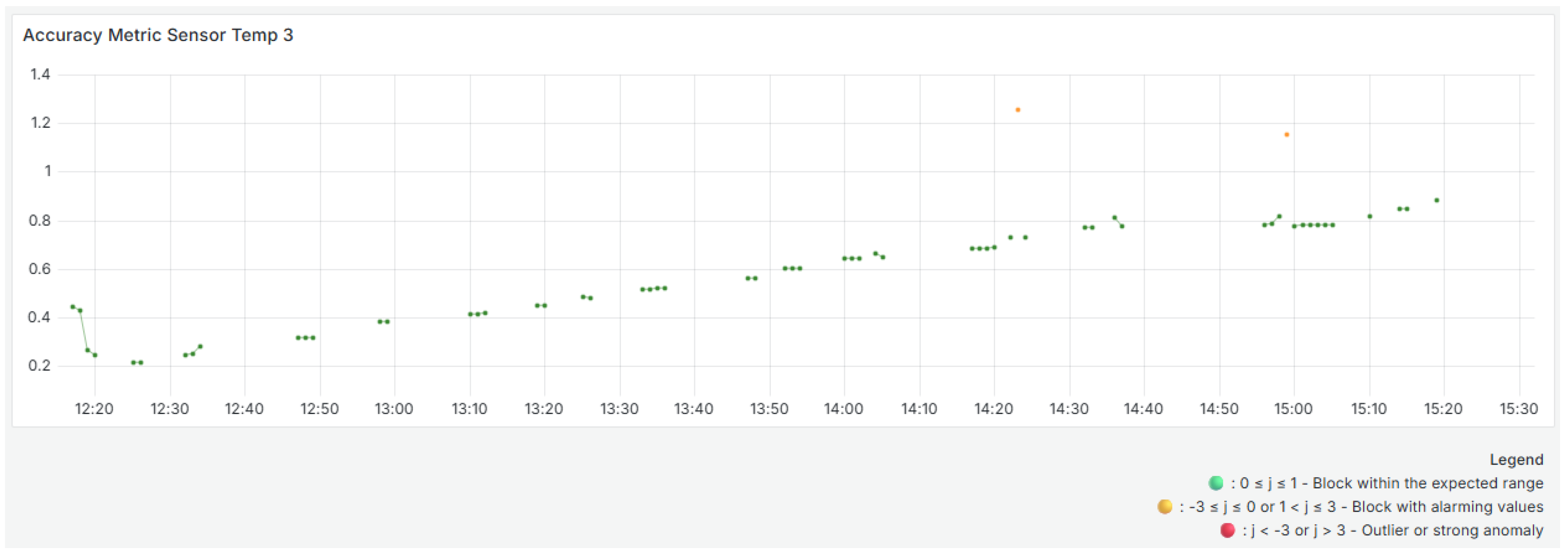
Figure 4,
Figure 5 and
Figure 6 show the evolution of the accuracy metrics over time for the three temperature sensors during the selected analysis window. The variability in these metrics is due to the dynamic normalization process, which is based on each sensor’s most recent history and the limits defined by the Hampel filter. These visualizations use colored dots to indicate the evaluation result of each time block. Green dots correspond to values within the expected range, yellow dots indicate small deviations, and red dots highlight blocks with significant anomalies or outliers that may require investigation.
The Sensor
shows significant initial fluctuations, with several blocks outside the expected range of [0, 1], which are represented in yellow, indicating outliers and atypical behavior compared to the sensor’s historical trend. This aligns with
Figure 1 of the received data, which shows significant oscillations above and below typical values at the beginning of the period. As time progresses, the values stabilize within the expected range, indicating a more consistent temperature profile.
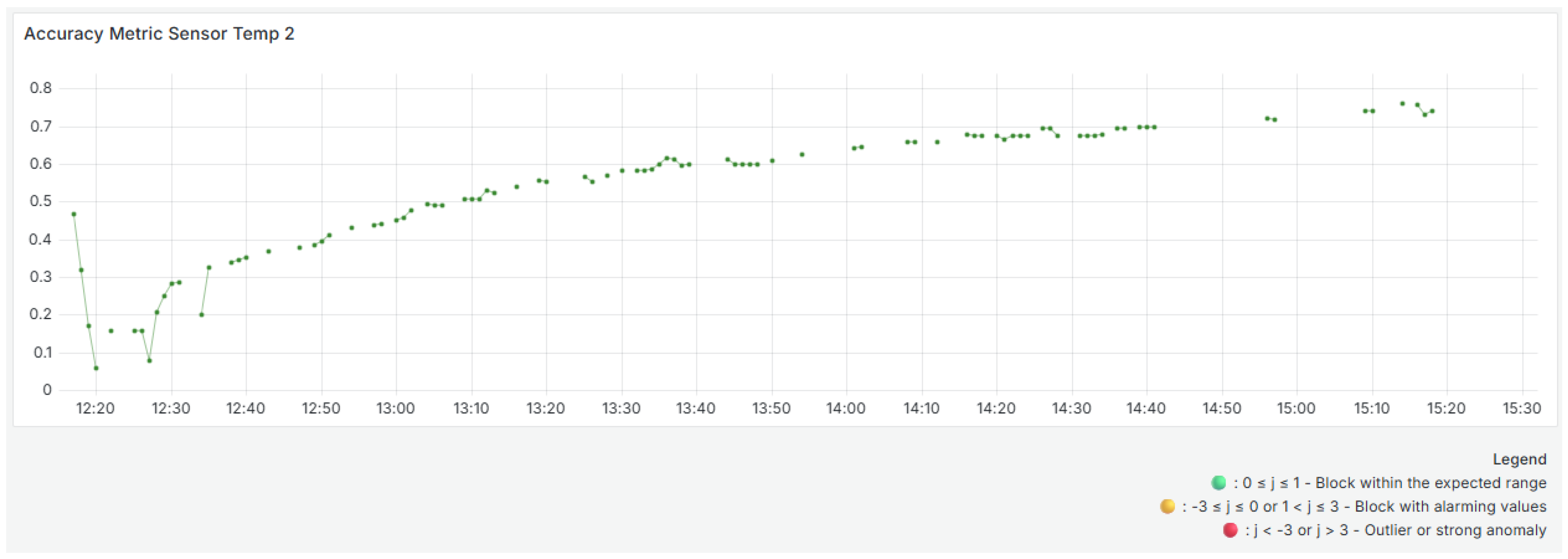
For Sensor
(middle panel,
Figure 5), the accuracy results start at lower levels, suggesting below-normal readings. However, on average, the block analyzed did not have enough poor quality values to be considered a poor quality block. Accuracy gradually increases and stabilizes after 1:00 p.m. The absence of yellow dots suggests that most readings remained within the expected range, indicating reliable and consistent sensor performance over time.
The Sensor
(bottom panel,
Figure 6) also shows initial instability with small oscillations and anomalous values around 2:20 p.m. and 3:00 p.m. These values are visible in
Figure 1, which shows two high peaks around the same time. However, accuracy improves and becomes more consistent after that point.
It should be noted that no red dots were identified throughout the analyzed window, indicating that, despite variations and some values outside the [0, 1] range, none of the blocks were classified as severely inaccurate or compromised.
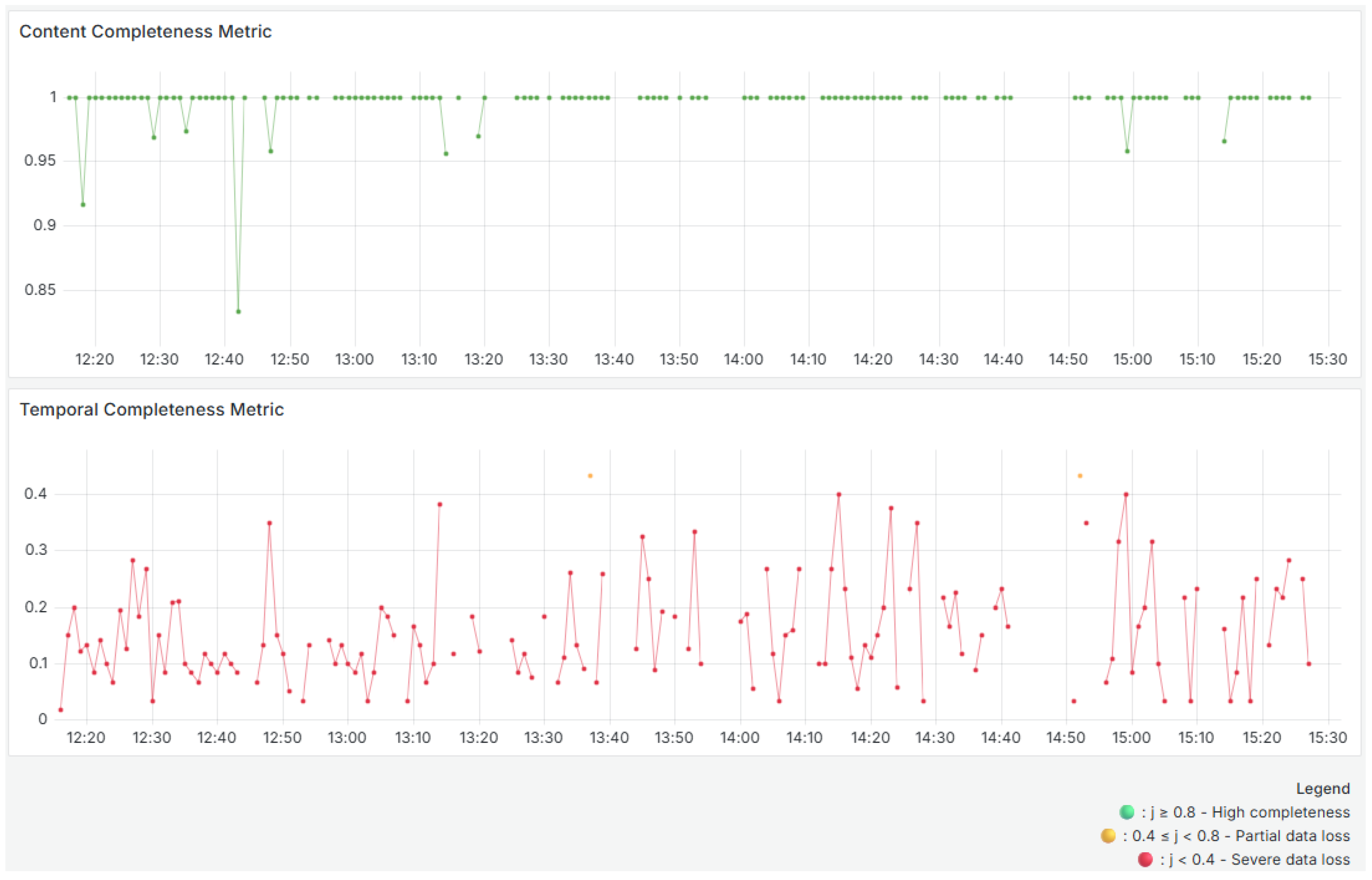
There are two metrics for completeness: Equations (
2) and (
3). The first metric is completeness at the content level. It ensures that all required fields (code, name, value, and date) are present and that there are no null or empty values. The second metric calculates temporal completeness by comparing the number of observed records with the expected number (60 records per minute per sensor).
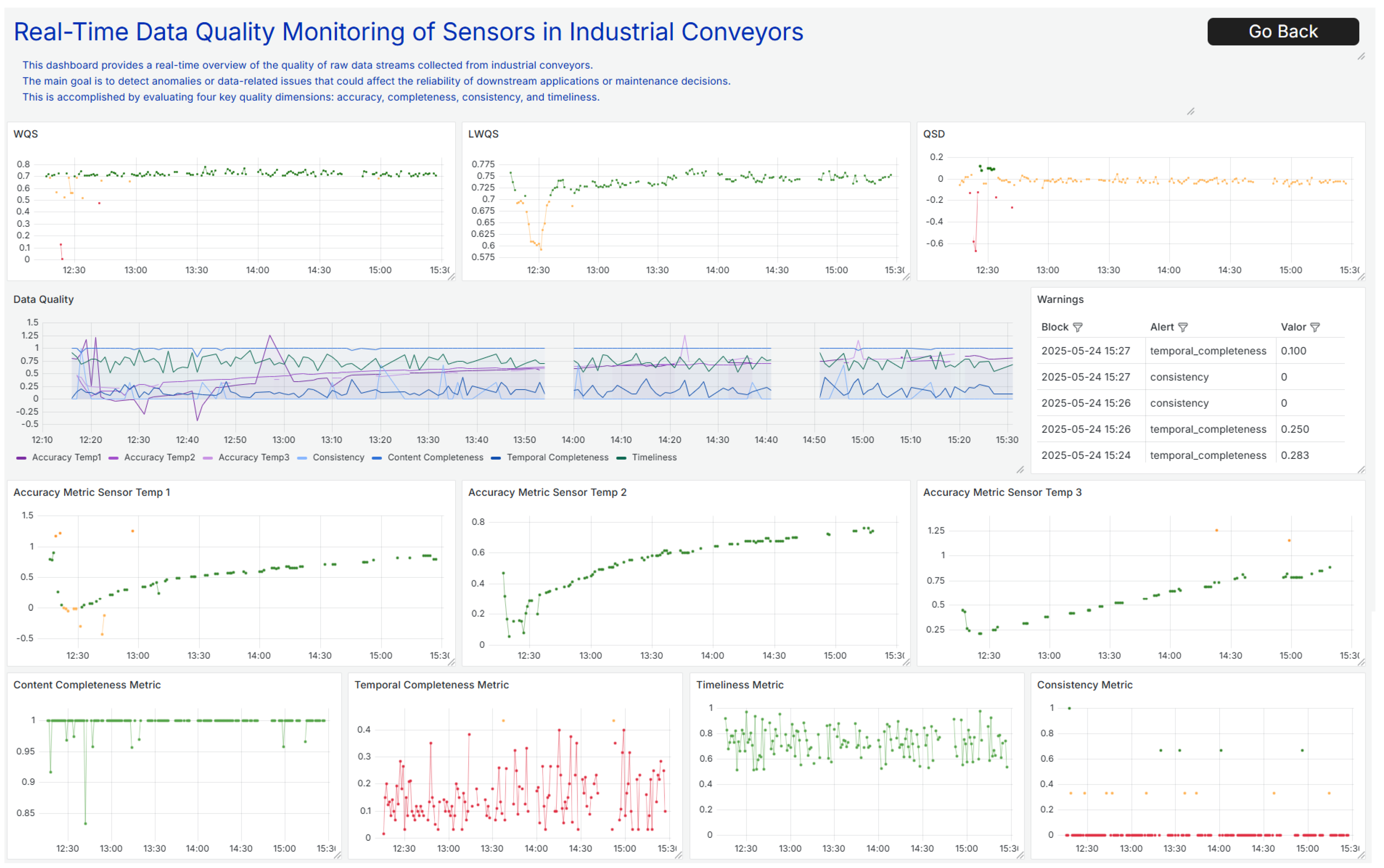
Figure 7 shows two completeness metrics. The use of color encoding facilitates visual inspection: green denotes high completeness, yellow indicates partial data loss or irregularity, and red highlights severe loss.
As can be seen in the top panel, the content completeness remains close to 1 throughout the analyzed period, with rare exceptions of small drops (e.g., around 12:20 and 12:40), which may indicate incomplete records. Overall, the quality of the data content is very high, and the results consistently remain above 0.8, indicating a green result.
The temporal completeness metric compares observed records to the expected 60 per minute per sensor, and the bottom panel in
Figure 7 shows significant fluctuations, with values below 0.2. This suggests regular data loss in terms of temporal frequency or a problem with the sensors not sending data frequently enough, resulting in periods of absence. As can be seen in
Figure 1, there are multiple data gaps and large blank spaces. This indicates that no data was received during those intervals. These gaps explain the consistently low values in the temporal completeness metric. Though two yellow points stand out, they appear to be isolated incidents. The variability of this metric suggests that, although data is present, it is not transmitted at the expected frequency.
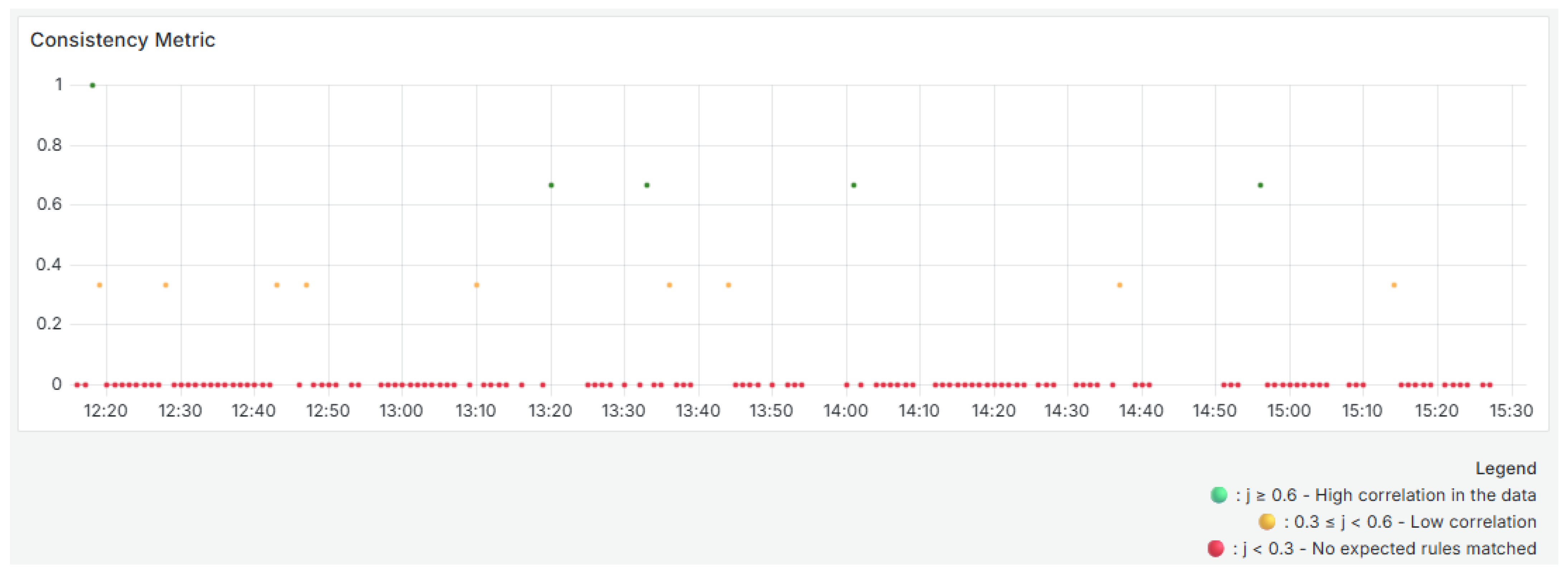
To calculate consistency (Equation (
4)), rules are automatically identified based on strong correlations with a coefficient greater than 0.8 between sensors, as determined by historical data using the Pearson correlation coefficient. These rules are stored and continuously compared with the correlations observed in each time block. If a new consistent rule appears during the analysis process, it is added to this file. This allows the rule set to evolve dynamically over time.
Figure 8 illustrates the evolution of the consistency metric. Each time block is color-coded: green for high consistency, yellow for low consistency, and red for an absence of expected relationships. This coding helps you quickly identify changes in system behavior or data correlation.
As shown in the
Figure 8, most of the time, the analyzed blocks have a value of 0, indicating an absence of the expected rules between the sensors. This may indicate atypical behavior, sensor faults, or changes in the monitored phenomenon affecting the historical relationships. A few blocks had values of 0.333 and 0.666, and one block had a value of 1. This indicates that the data only maintained complete consistency with the historical correlations at very specific times. The green points with values of 0.666 and 1 (e.g., around 12:15, 13:20, and 14:00) are positive exceptions. The low frequency of blocks with complete consistency reinforces the need to investigate possible causes of the loss of correlation, such as operational anomalies, environmental changes, or inadequate updating of the dynamic rules.
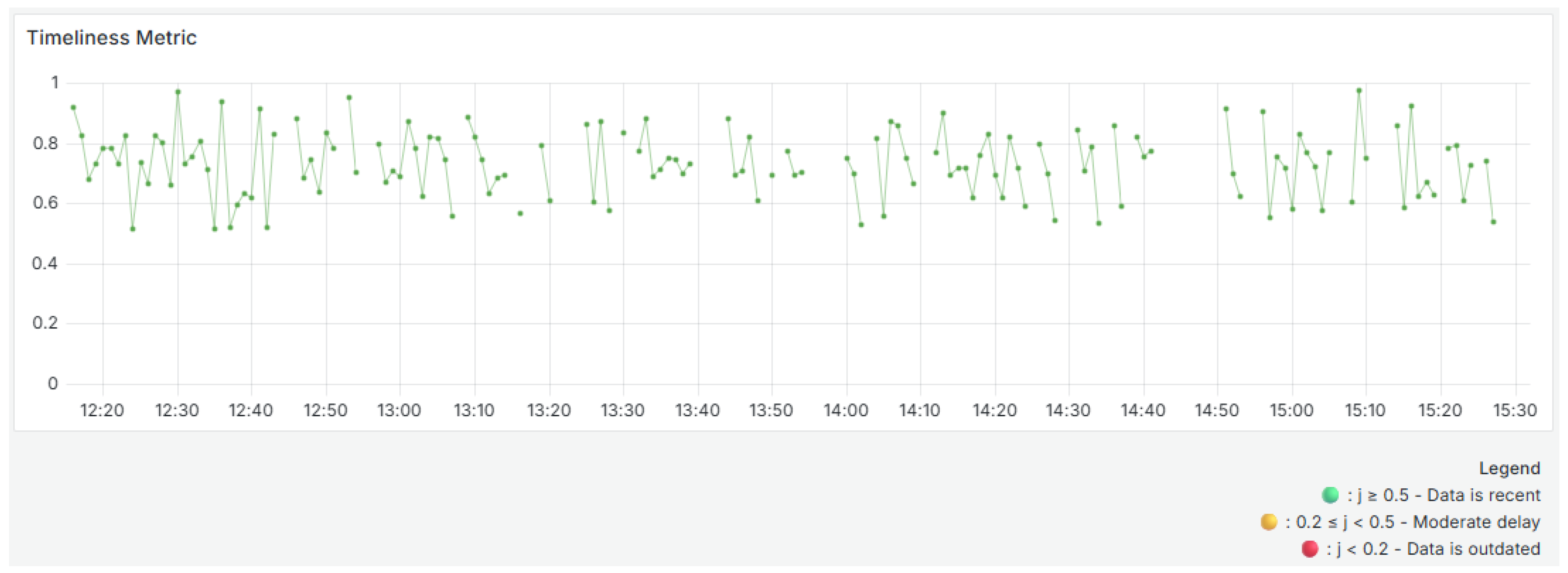
Timeliness (Equation (
5)) is calculated based on the age of the record in relation to its volatility. In this study, volatility was defined as a two-minute window, meaning data is considered timely if it arrives within two minutes of generation. This parameter can be adjusted according to the application scenario’s specific requirements (e.g., real-time monitoring systems or critical control processes). A shorter threshold may be more appropriate for time-sensitive environments, while a longer threshold might be acceptable for less time-sensitive ones. Adjusting the volatility threshold ensures that the timeliness metric remains meaningful and aligned with operational expectations.
Figure 9 shows the evolution of the timeliness metric. The timeliness values are also color-coded across the time window. Blocks above 0.5 are green, indicating timely data. Intermediate values are yellow. Blocks below 0.2 are red, which indicates the possibility of latency or delivery issues.
The graph shows oscillations between values close to 0.5 and 0.95. Most blocks are above 0.7, indicating that data is generally received within the acceptable period. However, frequent drops reflect occasional delays in receiving data. These variations may be due to network latency, intermediate processing or queues, or system overload. Despite these variations, there are no long periods of extremely low punctuality, showing that the system generally maintains adequate performance in terms of data arrival time with room for occasional improvement.
For the Data Quality Indices, the weights assigned to the accuracy and completeness dimensions, as well as to each sensor, are based on their importance. The weights used are for accuracy and for completeness. This emphasizes the greater impact of accuracy on data quality. These weights were manually defined based on the expected relevance of each metric and sensor in the evaluated scenario. This approach reflects domain specifics rather than automated adjustments. This approach aligns with the operational context and objective of real-time monitoring interpretability. The is calculated using the previous 10 blocks (10 min, ), and sensor weights for completeness are set to for sensors . This setup ensures balanced contributions from all sensors, while allowing for some to be prioritized based on their criticality. Sensor weights for accuracy are set to for sensors , but the number of sensors is not the total number in the system, it is only the number of sensors that sent data in block j.
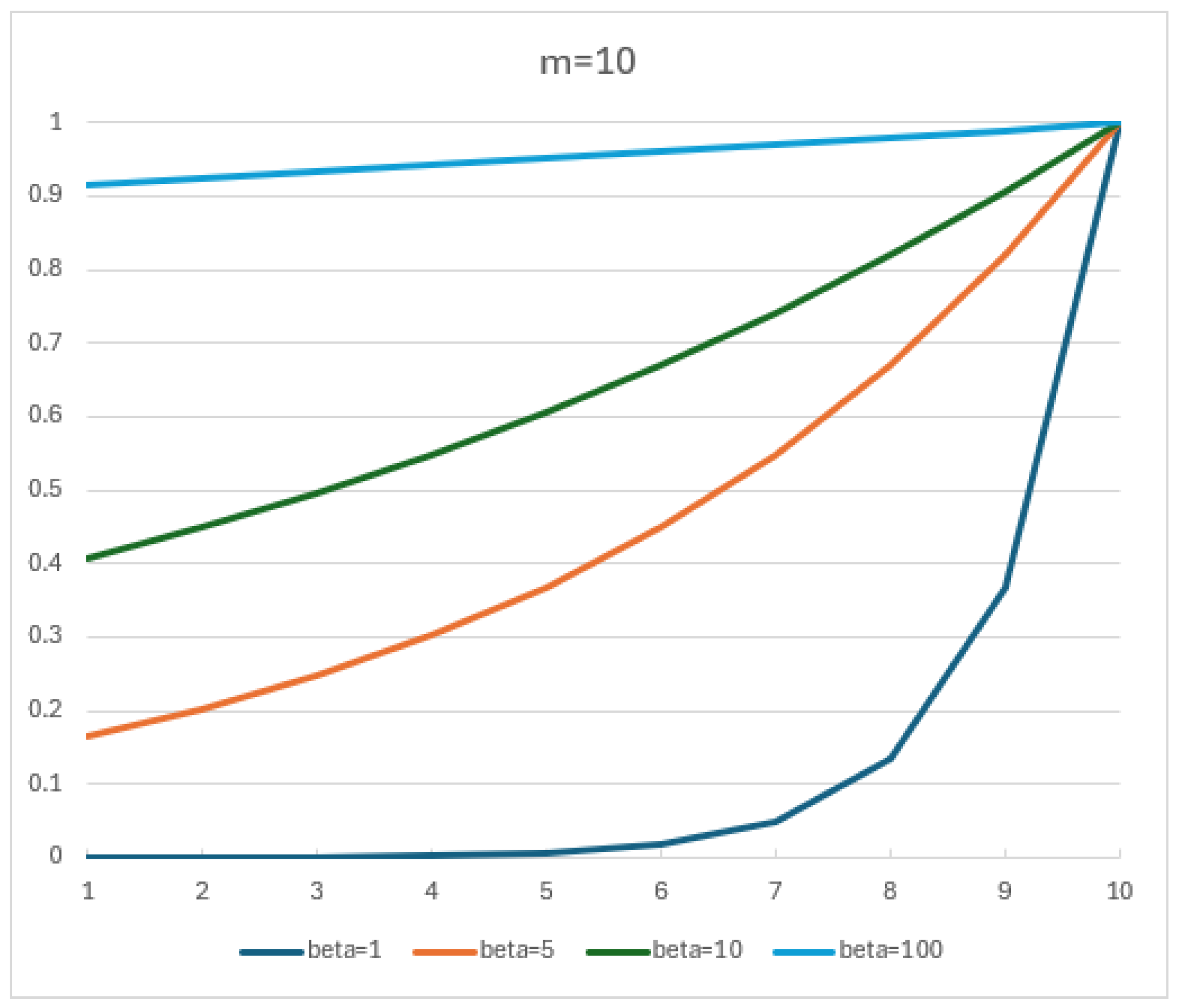
The choice of
was not the result of formal parameter tuning, but rather based on the visual inspection of the exponential decay curves, as shown in
Figure 10. Among the values considered,
offers a visually balanced trade-off between sensitivity to recent data and retention of historical influence. This value provides a weighting curve in which the most recent blocks retain significant influence, while still incorporating meaningful historical context. This balance ensures that the
responds to recent changes in data quality without overreacting to short-term fluctuations, and remains consistent with the intended behavior of the score in industrial time-series contexts.
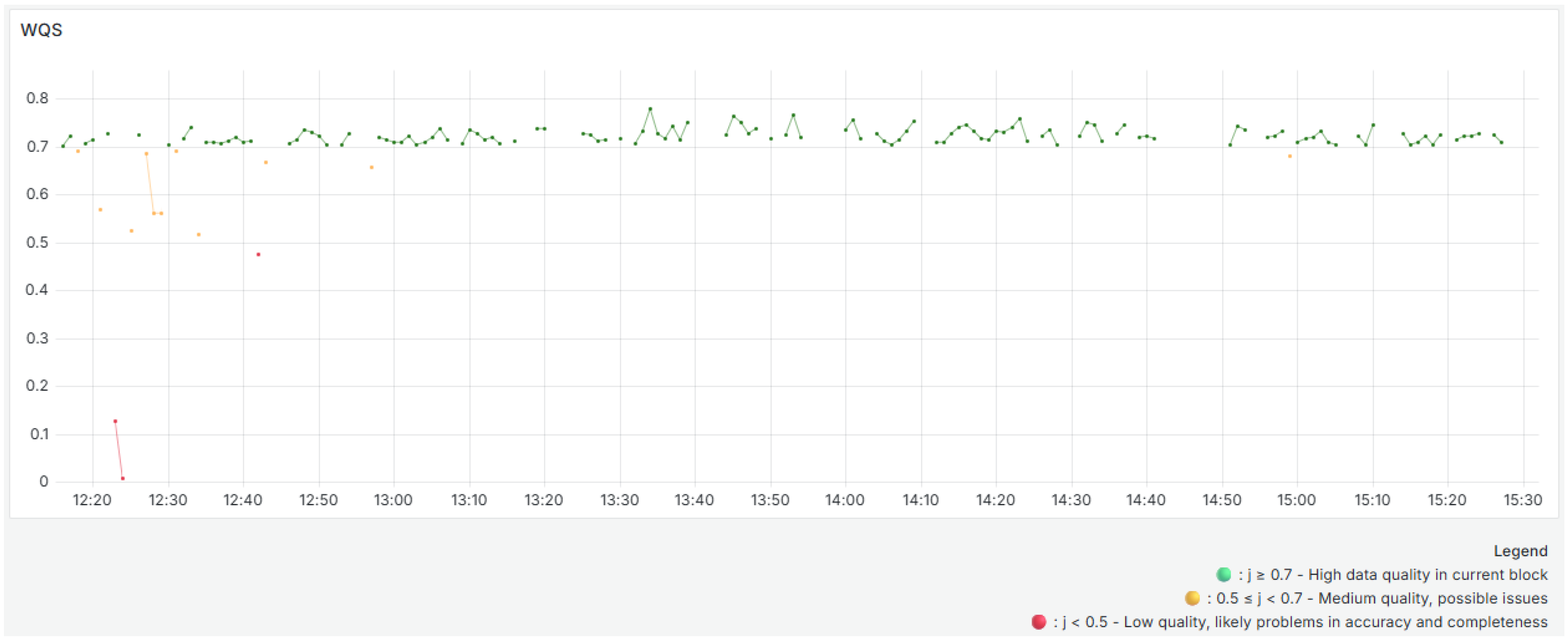
The
(
Figure 11) reveals short-term fluctuations in data quality, reflecting sensor performance in one-minute intervals. These variations are particularly evident in the early segments of the timeline, where drops in accuracy and completeness caused by anomalies and sporadic sensor delays or failures lead to lower
values. The
results use colored dots to show the evaluation of each time block. Green dots correspond to high-quality data in the current block. Yellow dots indicate medium-quality data, and red dots highlight blocks with low-quality data. The metric reaches its lowest values between 12:20 and 12:40. As illustrated in
Figure 4,
Figure 5 and
Figure 6, this corresponds to the time interval with the highest occurrence of anomalies. The
never exceeds 0.8, mainly due to the consistently low completeness metric Equation (
3) results.
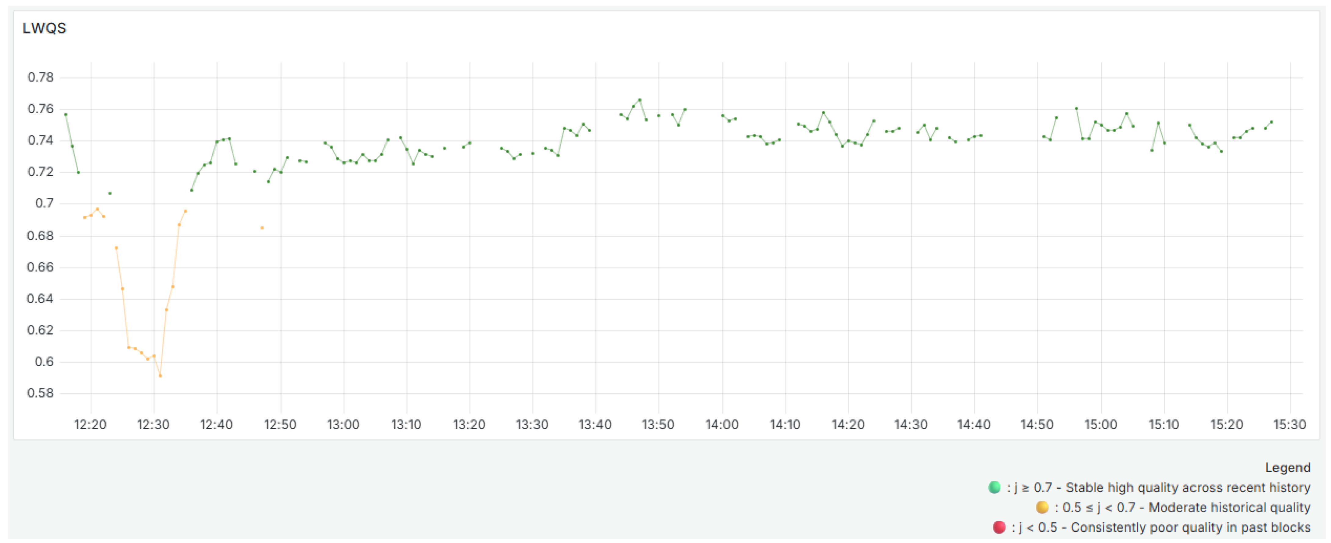
In contrast, the
(
Figure 12) has a smoother curve because of its historical aggregation process. As expected, it responds more gradually to sharp drops in quality because it incorporates the influence of past blocks with exponentially decreasing weights. For instance, while the
S shows a significant decline around 12:25, the
exhibits a less pronounced drop, reflecting the influence of higher-quality previous blocks while still demonstrating a notable decline due to the greater impact of more recent blocks. The
results use colored dots to show how previous blocks were evaluated. Green dots indicate a stable high quality across these blocks. Yellow dots indicate moderate historical quality. Red dots highlight consistently poor quality in past blocks.
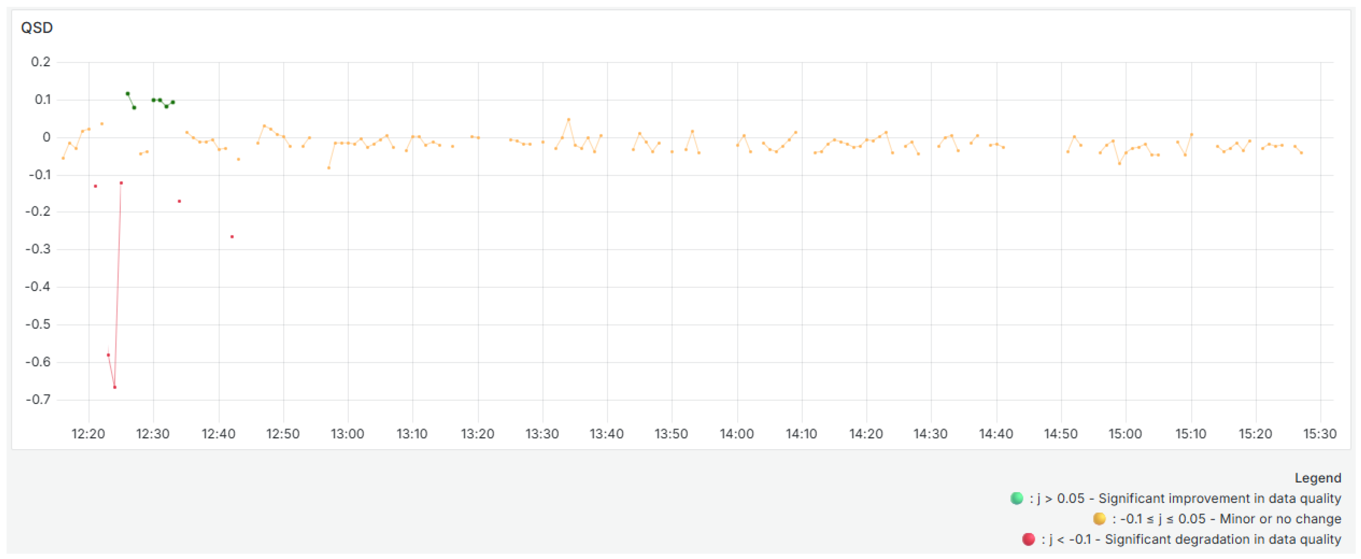
The
(
Figure 13), which is defined as the difference between the
and the
, explicitly captures these variations. Positive
values indicate an improvement in quality compared to recent history, and negative values indicate a deterioration. The yellow dots on the graph do not indicate warnings, only situations in which quality has varied minimally, remaining close to zero. Green dots indicate a substantial improvement in quality compared to previous blocks, and red dots indicate a drop in quality. For instance, when the
decreases significantly, the
decreases as well, taking on negative values. In contrast, when the
increases significantly, the
increases, and green dots appear. The predominance of yellow dots along the graph indicates general stability in data quality with no significant variations compared to previous data.
This validates the role of as a sensitive indicator for detecting real-time changes in data quality. The works as an advanced indicator of degradation or improvement, making it suitable for proactive monitoring in industrial IoT-based systems. It should be noted that incorporating specific weights for each sensor and quality dimension allows the system to reflect the operational relevance and relative importance of each sensor. This enables more precise prioritization in scenarios with heterogeneous data sources and variable reliability.
Two interactive Grafana dashboards were developed for real-time analysis, as illustrated in
Figure 14 and
Figure 15.
Figure 14 displays the raw data received from the
, including high-level information such as the total number of records received in the last day, the number of records sent by each sensor, a table with the raw entries, an overall records graphic, and individual graphics per sensor.
In contrast,
Figure 15 focuses entirely on data quality. The top three panels display the main data quality indices and then present a graphic that consolidates all quality metrics over time. The table highlights warnings and instances where a metric falls below expected thresholds. Finally, individual plots are provided for each metric. Separating raw data visualization from quality monitoring allows for clearer, more efficient system oversight and rapid issue identification.
These dashboards are designed to support operational decision-making by allowing users to interact with data in real time. Operators can apply time filters, isolate specific sensors, and monitor critical quality indicators over time. Alert thresholds and visual indicators facilitate the rapid detection of anomalies, incomplete data streams, and sensor malfunctions. This interactive setup ensures that data quality issues are promptly identified and addressed, reducing diagnostic time and supporting proactive system maintenance.
When tested, the architecture was able to handle continuous data ingestion with minimal latency. Metrics showed visible fluctuations, such as drops in temporal completeness when sensors stopped sending data, reductions in consistency when expected correlations between sensors were not maintained, and detection of outliers in specific sensors, which could signal possible failures or inaccurate readings. This level of granularity enables detailed diagnosis of data quality in an industrial environment. Separating ingestion and quality services and running them in parallel guarantees robustness and scalability. Additionally, using extreme percentiles increases sensitivity to deviations, and automatically identifying new consistency rules makes the system self-adjusting to new behavior patterns.
The architecture’s flexibility and lightweight design make it suitable for industrial environments with limited computing resources. The system does not depend on external declarative frameworks because it incorporates validation and analysis directly into the data quality service through profiling integration. This approach has the potential to be extended to other types of sensors and industrial variables, such as vibration or pressure, without requiring significant structural changes. Specific adaptations may be required depending on the industrial sector. For example, vibration and torque sensors might be prioritized in automotive environments, while completeness and conformity of batch parameters may be more relevant in food production. The pipeline’s modular structure facilitates these adjustments with minimal effort.
Despite its practical advantages, the proposed architecture has certain limitations. First, reliance on temporal processing windows may introduce slight delays in metric calculation, limiting its suitability for applications requiring ultra-low latency. While the system is designed to scale efficiently and has reliably handled continuous ingestion and processing during evaluations, it may require further adjustments to perform optimally under extreme load conditions, such as processing thousands of concurrent sensor streams. Optimizing Kafka partitioning, adjusting consumer group configurations, and refining InfluxDB indexing strategies may be necessary to avoid ingestion or storage bottlenecks. Additionally, the pipeline has not yet been tested in scenarios involving machine state transitions or multimodal operational contexts, where sensor behavior can vary significantly depending on the phase of the equipment or the operational mode. Finally, while the metric computation logic is solid, it is tailored to a specific set of quality dimensions and may need to be reconfigured for alternative use cases or data models.


 ,
, 


