Global Correlates of Cardiovascular Risk: A Comparison of 158 Countries


Abstract
1. Introduction
2. Methods
2.1. Statistics of Food Consumption
2.2. Health Statistics
2.3. Socioeconomic Statistics
2.4. Statistical Analyses
3. Results
3.1. Pearson Linear Correlations
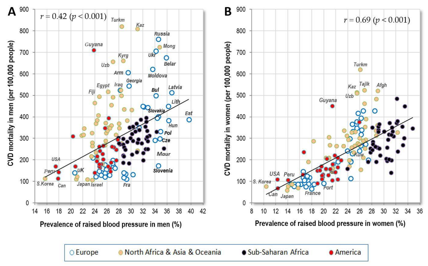
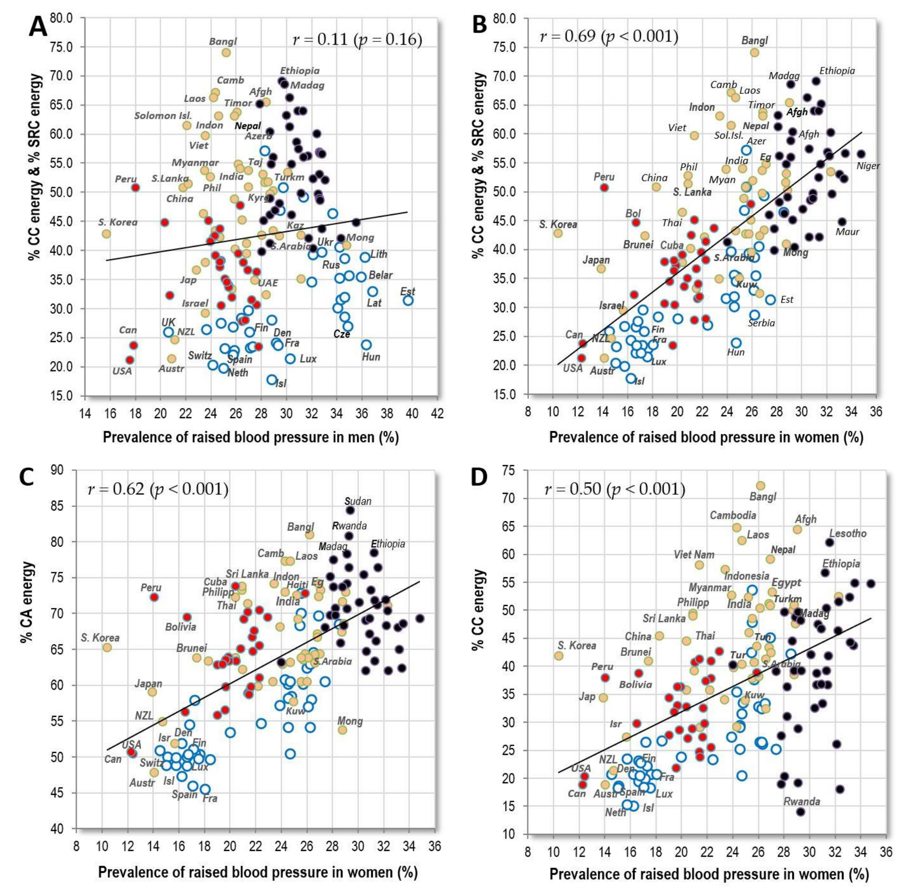
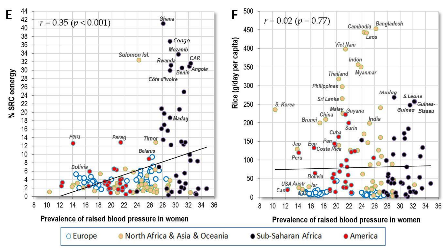
3.1.1. Raised Blood Pressure
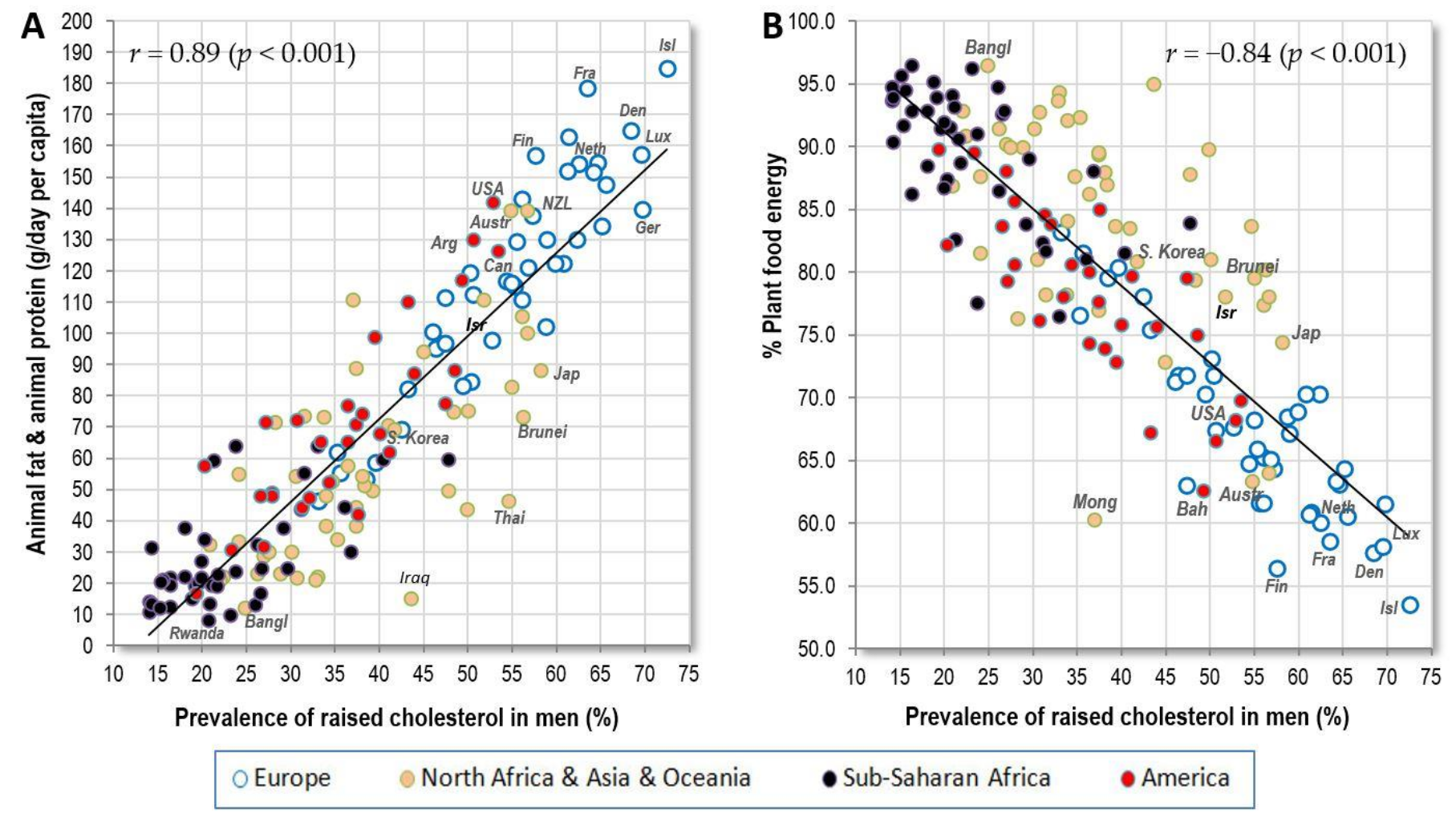
3.1.2. Raised Cholesterol
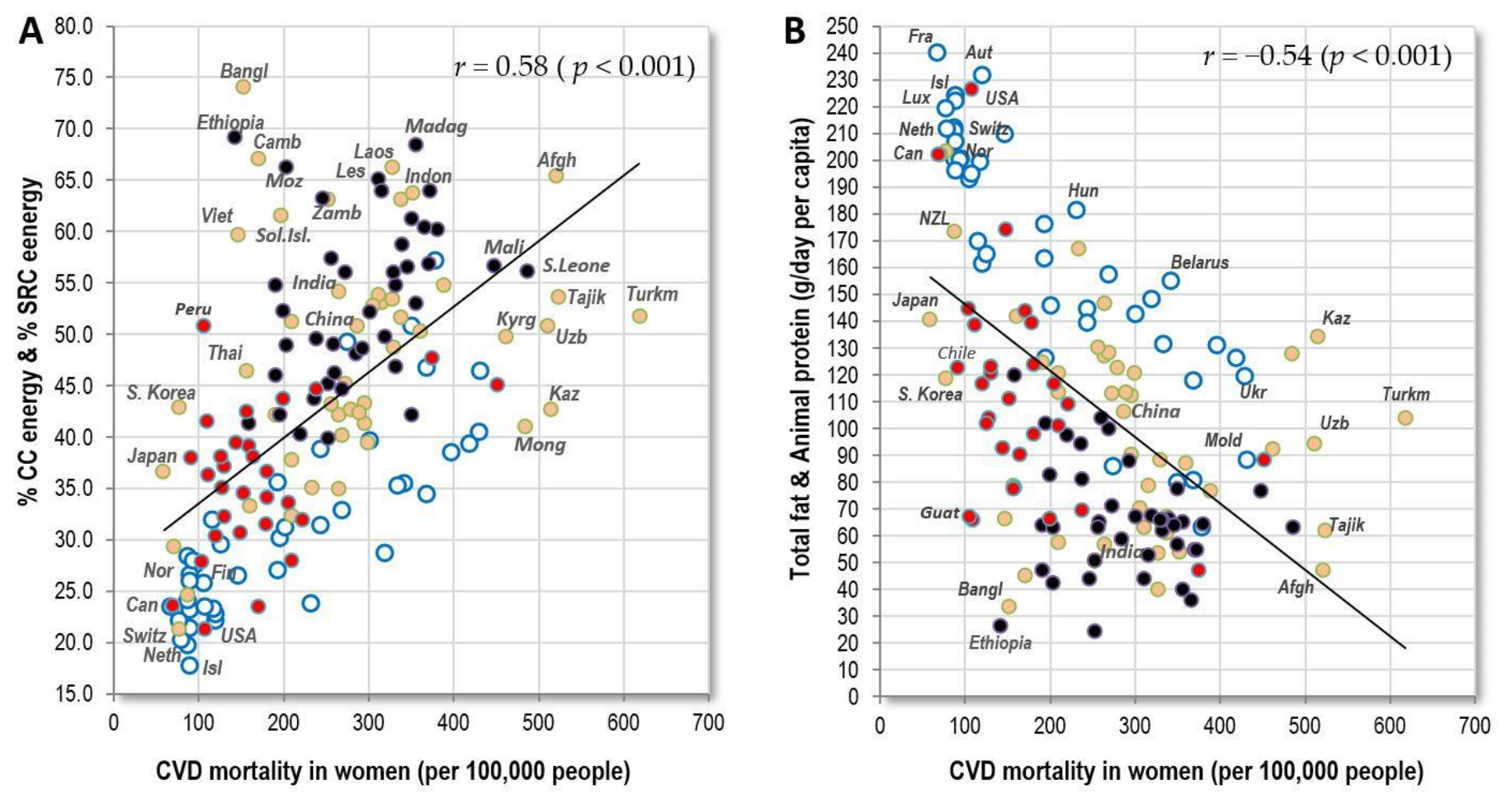
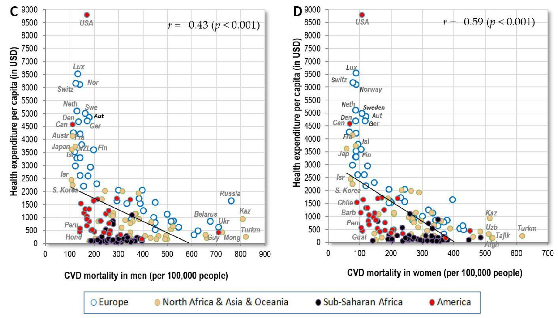
3.1.3. Cardiovascular Mortality
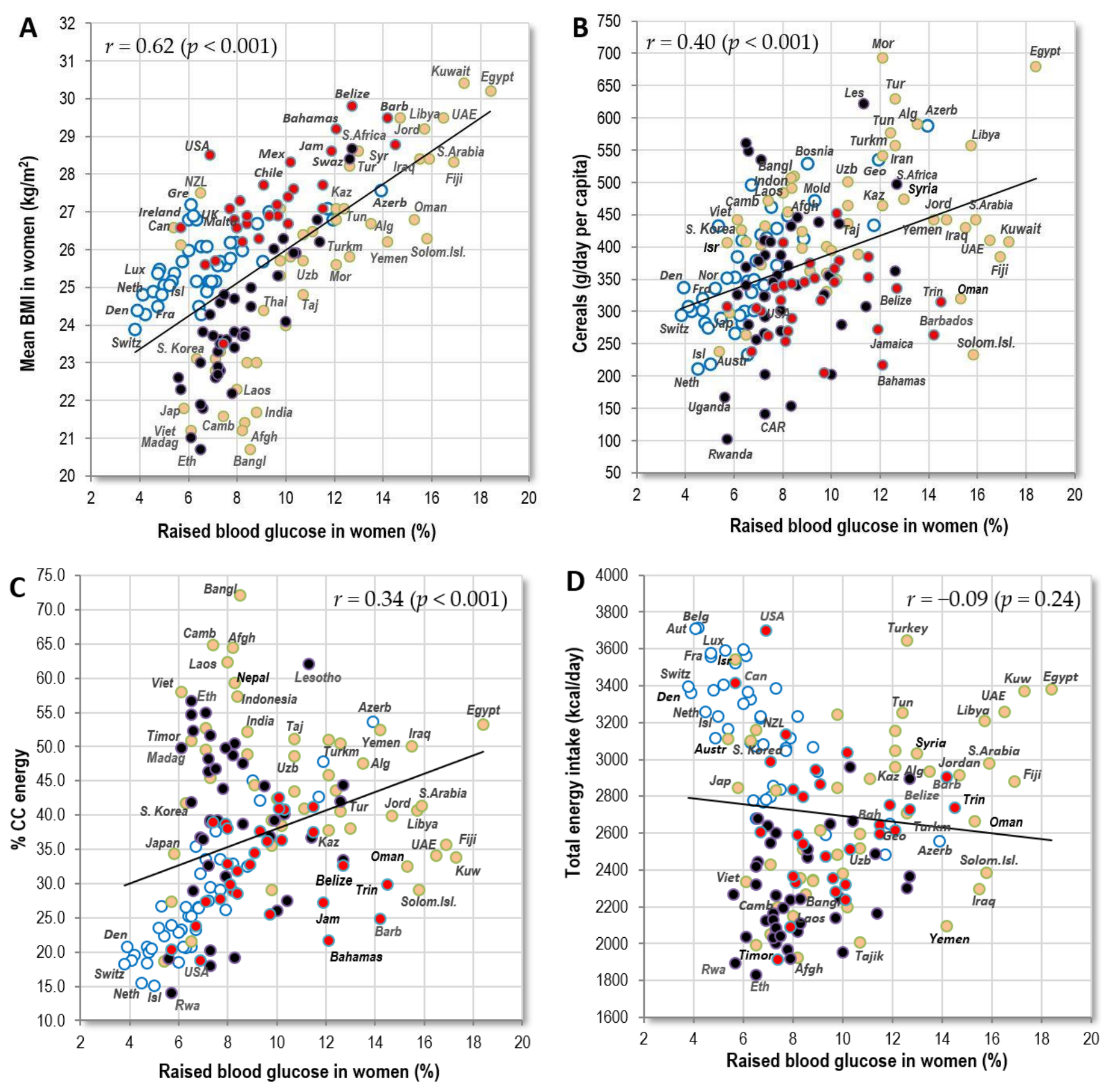
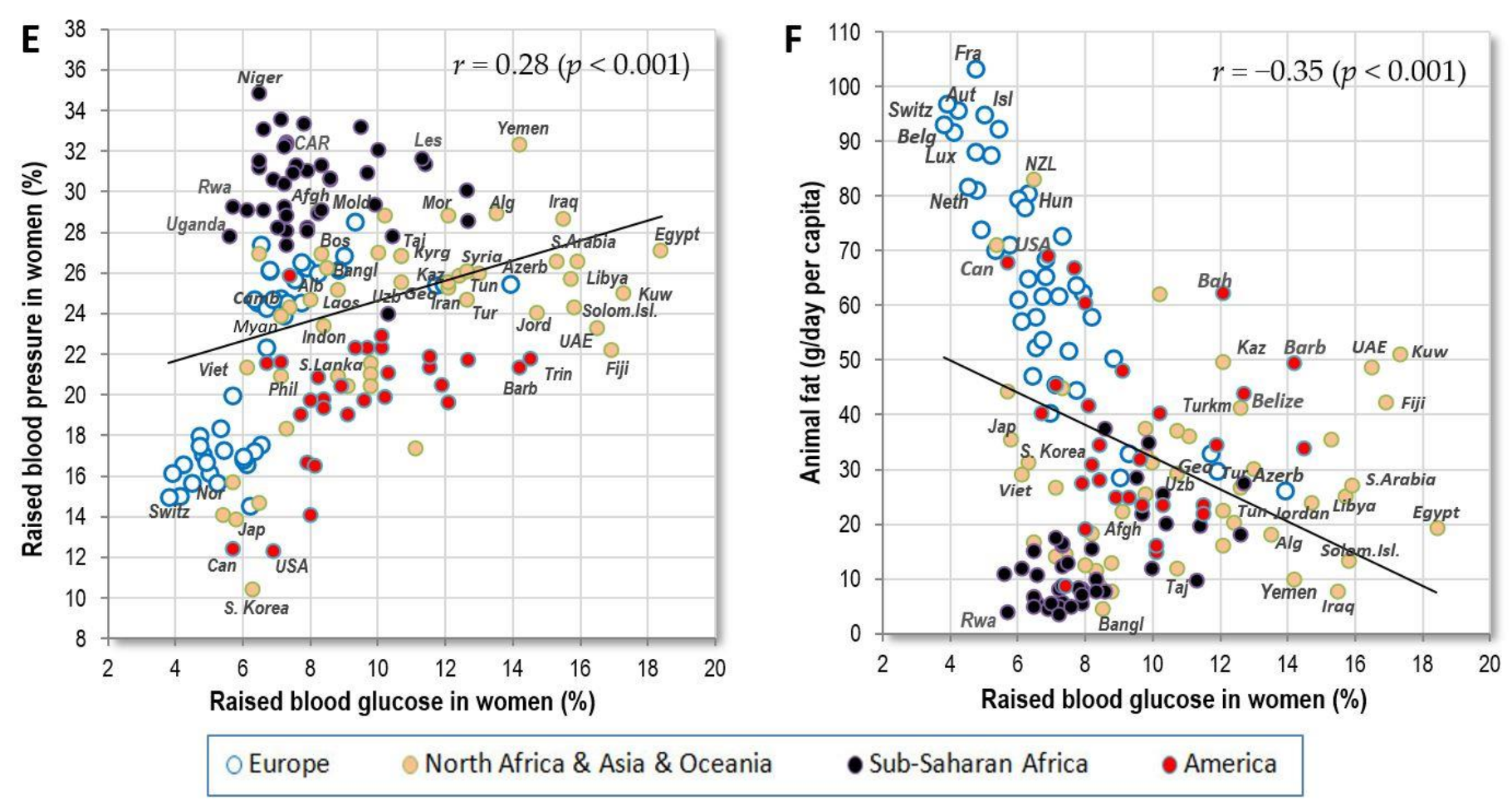
3.1.4. Raised Blood Glucose
3.2. Pearson Linear Correlations in Items with Insufficient Data
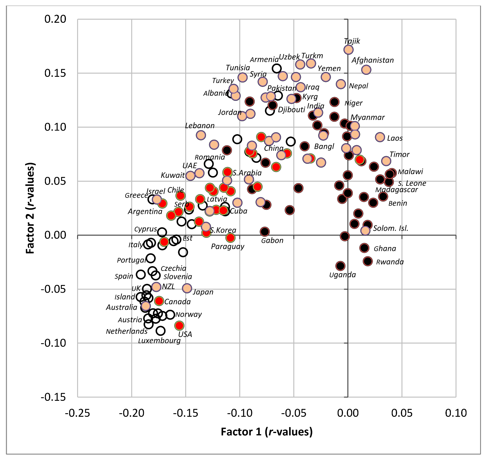
3.3. Consistency of Findings across Regions, Sex and Health Expenditure Level
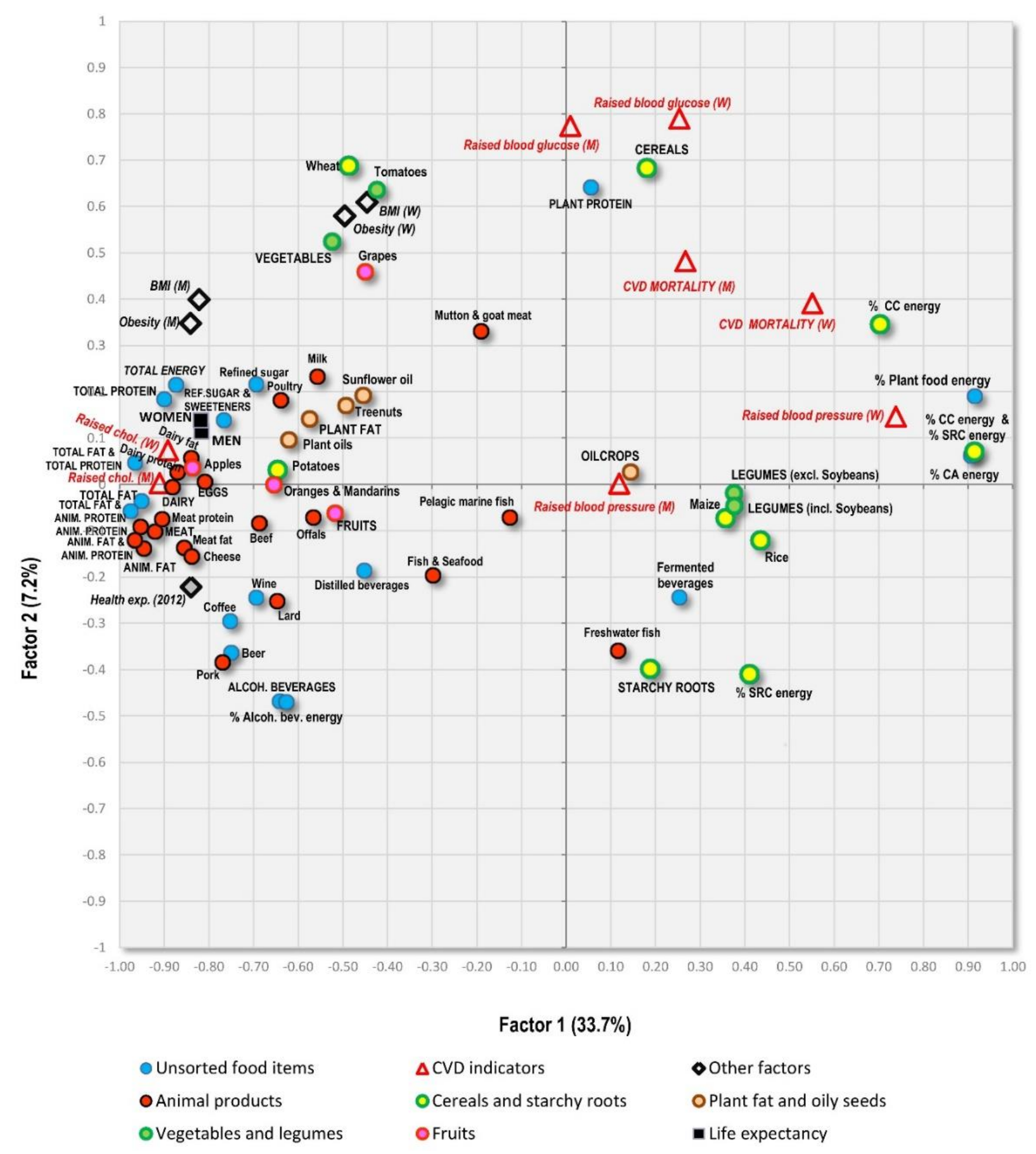
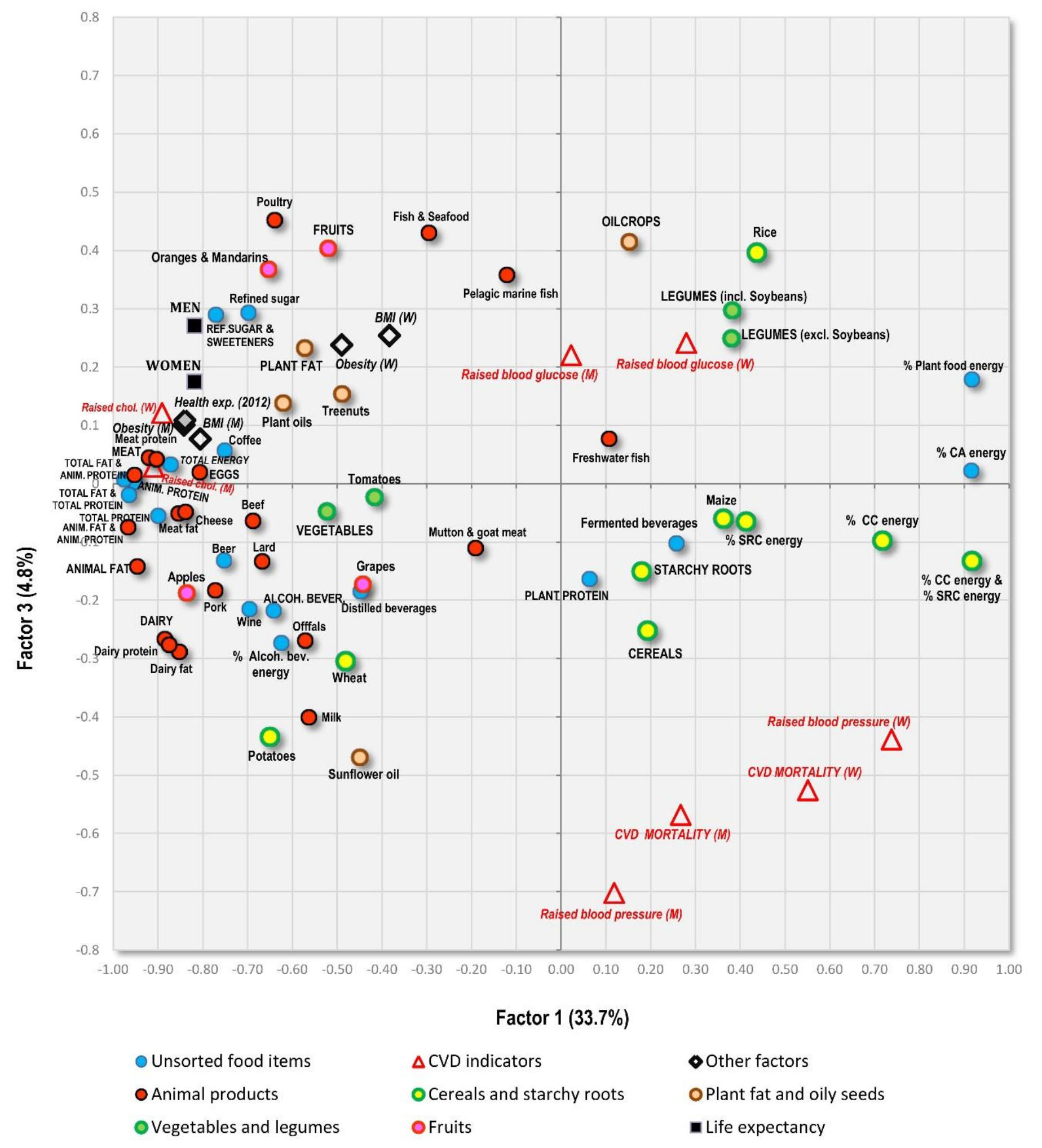
3.4. Factor Analysis
3.5. Penalized Regression Analyses
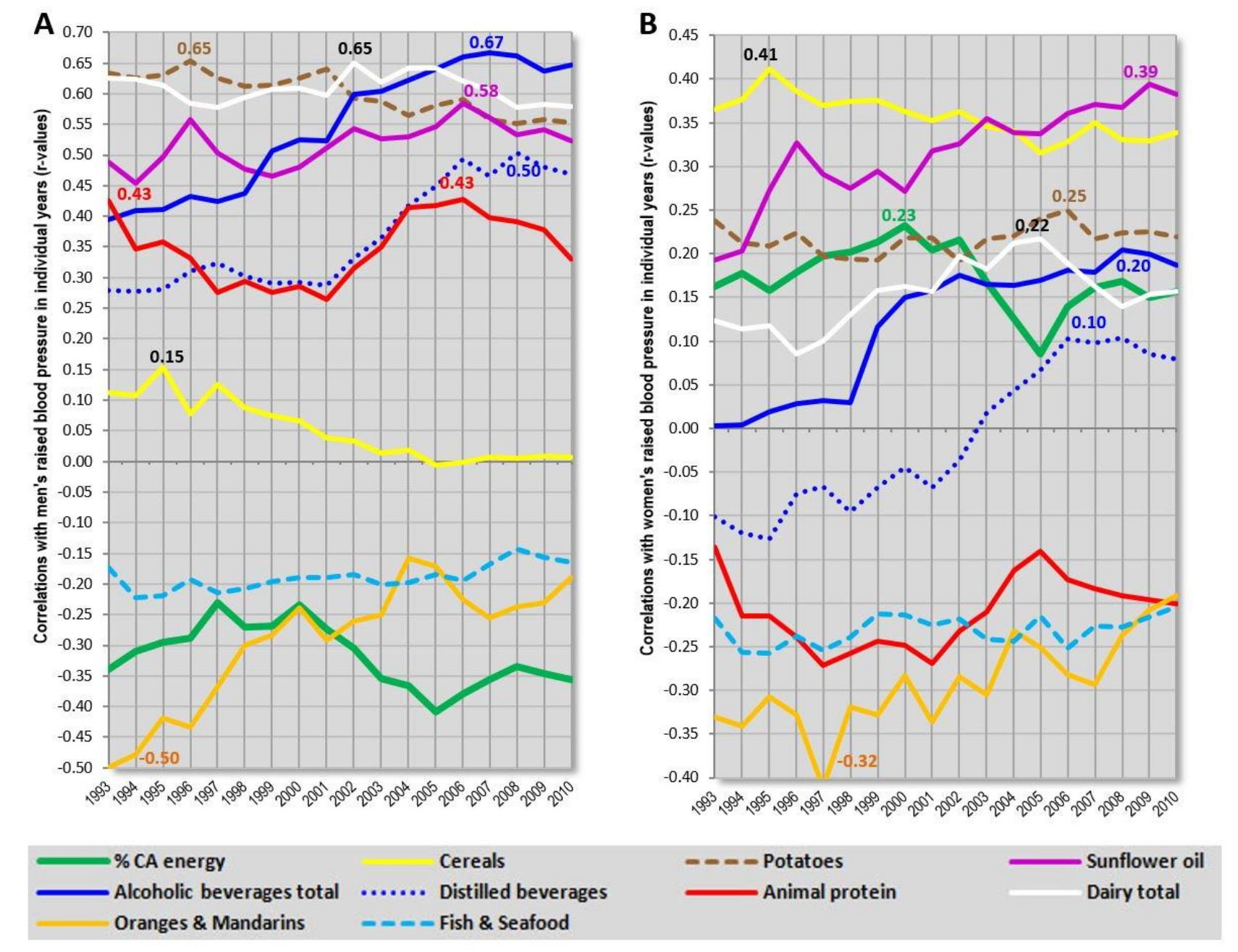
3.6. Temporal Changes of Correlation Coefficients
4. Discussion
5. Conclusions
Supplementary Materials
Author Contributions
Conflicts of Interest
References
- Mente, A.; de Koning, L.; Shannon, H.S.; Anand, S.S. A systematic review of the evidence supporting a causal link between dietary factors and coronary heart disease. Arch. Intern. Med. 2009, 169, 659–669. [Google Scholar] [CrossRef] [PubMed]
- Di Nicolantonio, J.J.; Lucan, S.C.; O’Keefe, J.H. The evidence for saturated fat and for sugar related to coronary heart disease. Prog. Cardiovasc. Dis. 2016, 58, 464–472. [Google Scholar] [CrossRef] [PubMed]
- Skeaff, C.M.; Miller, J. Dietary fat and coronary heart disease: Summary of evidence from prospective cohort and randomised controlled trials. Ann. Nutr. Metab. 2009, 55, 173–201. [Google Scholar] [CrossRef] [PubMed]
- Siri-Tarino, P.W.; Sun, Q.; Hu, F.B.; Krauss, R.M. Meta–analysis of prospective cohort studies evaluating the association of saturated fat with cardiovascular disease. Am. J. Clin. Nutr. 2010, 91, 535–546. [Google Scholar] [CrossRef] [PubMed]
- Di Angelantonio, E.; Chowdhury, R.; Forouhi, N.G.; Danesh, J. Association of dietary, circulating, and supplement fatty acids with coronary risk. Ann. Intern. Med. 2014, 161, 458–459. [Google Scholar] [CrossRef] [PubMed]
- De Souza, R.J.; Mente, A.; Maroleanu, A.; Cozma, A.I.; Ha, V.; Kishibe, T.; Uleryk, E.; Budylowski, P.; Schünemann, H.; Beyene, J.; et al. Intake of saturated and trans unsaturated fatty acids and risk of all cause mortality, cardiovascular disease, and type 2 diabetes: Systematic review and meta-analysis of observational studies. BMJ 2015, 351. [Google Scholar] [CrossRef] [PubMed]
- Schwab, U.; Lauritzen, L.; Tholstrup, T.; Haldorssoni, T.; Riserus, U.; Uusitupa, M.; Becker, W. Effect of the amount and type of dietary fat on cardiometabolic risk factors and risk of developing type 2 diabetes, cardiovascular diseases, and cancer: A systematic review. Food Nutr. Res. 2014, 58. [Google Scholar] [CrossRef] [PubMed]
- Hamley, S. The effect of replacing saturated fat with mostly n-6 polyunsaturated fat on coronary heart disease: A meta-analysis of randomised controlled trials. Nutr. J. 2017, 16, 30. [Google Scholar] [CrossRef] [PubMed]
- Dong, J.Y.; Zhang, Y.H.; Wang, P.; Qin, L.Q. Meta-analysis of dietary glycemic load and glycemic index in relation to risk of coronary heart disease. Am. J. Cardiol. 2012, 109, 1608–1613. [Google Scholar] [CrossRef] [PubMed]
- Fan, J.; Song, Y.; Wang, Y.; Hui, R.; Zhang, W. Dietary glycemic index, glycemic load, and risk of coronary heart disease, stroke, and stroke mortality: A systematic review with meta–analysis. PLoS ONE 2012, 7, e52182. [Google Scholar] [CrossRef] [PubMed]
- Ma, X.Y.; Liu, J.P.; Song, Z.Y. Glycemic load, glycemic index and risk of cardiovascular diseases: Meta–analyses of prospective studies. Atherosclerosis 2012, 223, 491–496. [Google Scholar] [CrossRef] [PubMed]
- Mirrahimi, A.; de Souza, R.J.; Chiavaroli, L.; Sievenpiper, J.L.; Beyene, J.; Hanley, A.J.; Augustin, L.S.; Kendall, C.W.; Jenkins, D.J. Associations of glycemic index and load with coronary heart disease events: A systematic review and meta-analysis of prospective cohorts. J. Am. Heart Assoc. 2012, 1, e000752. [Google Scholar] [CrossRef] [PubMed]
- Harcombe, Z.; Baker, J.S.; Cooper, S.M.; Davies, B.; Sculthorpe, N.; DiNicolantonio, J.J.; Grace, F. Evidence from randomised controlled trials did not support the introduction of dietary fat guidelines in 1977 and 1983: A systematic review and meta-analysis. Open Heart 2015, 2, e000196. [Google Scholar] [CrossRef] [PubMed]
- Grasgruber, P.; Sebera, M.; Hrazdira, E.; Hrebickova, S.; Cacek, J. Food consumption and the actual statistics of cardiovascular diseases: An epidemiological comparison of 42 European countries. Food Nutr. Res. 2016, 60, 31694. [Google Scholar] [CrossRef] [PubMed]
- Menotti, A.; Keys, A.; Aravanis, C.; Blackburn, H.; Dontas, A.; Fidanza, F.; Karvonen, M.J.; Kromhout, D.; Nedeljkovic, S.; Nissinen, A.; et al. Seven Countries Study. First 20-year mortality data in 12 cohorts of six countries. Ann. Med. 1989, 21, 175–179. [Google Scholar] [CrossRef] [PubMed]
- Menotti, A.; Keys, A.; Blackburn, H.; Aravanis, C.; Dontas, A.; Fidanza, F.; Giampaoli, S.; Karvonen, M.; Kromhout, D.; Nedeljkovic, S.; Nissinen, A. Twenty-year stroke mortality and prediction in twelve cohorts of the Seven Countries Study. Int. J. Epidemiol. 1990, 19, 309–315. [Google Scholar] [CrossRef] [PubMed]
- Food Balance Sheets. Available online: http://www.fao.org/faostat/en/#data/FBS (accessed on 1 June 2016).
- Grasgruber, P.; Sebera, M.; Hrazdíra, E.; Cacek, J.; Kalina, T. Major correlates of male height: A study of 105 countries. Econ. Hum. Biol. 2016, 21, 172–195. [Google Scholar] [CrossRef] [PubMed]
- Noncommunicable Diseases. Available online: http://apps.who.int/gho/data/node.main.A858?lang=en (accessed on 1 June 2016).
- Nichols, M.; Townsend, N.; Scarborough, P.; Rayner, M.; Leal, J.; Luengo-Fernandez, R.; Gray, A. European Cardiovascular Disease Statistics 2012; European Heart Network: Brussels, Belgium, 2012. [Google Scholar]
- Nichols, M.; Townsend, N.; Scarborough, P.; Rayner, M. Cardiovascular disease in Europe: Epidemiological update. Eur. Heart J. 2013, 34, 3028–3034. [Google Scholar] [CrossRef] [PubMed]
- NCD Risk Factor Collaboration. Worldwide trends in blood pressure from 1975 to 2015: A pooled analysis of 1479 population-based measurement studies with 19·1 million participants. Lancet 2017, 389, 37–55. [Google Scholar]
- The World Bank. Data Catalog. Available online: http://datacatalog.worldbank.org/ (accessed on 1 June 2016).
- Zou, H.; Hastie, T. Regularization and variable selection via the elastic net. J. R. Stat. Soc. Ser. B Stat. Methodol. 2005, 67, 301–320. [Google Scholar] [CrossRef]
- Armitage, P. Statistical Methods in Medical Research; Blackwell Scientific Publications: Oxford, UK, 1980. [Google Scholar]
- The World Health Organization: Media Centre. The Top 10 Causes of Death. 2017. Available online: http://www.who.int/mediacentre/factsheets/fs310/en/ (accessed on 10 September 2017).
- Mensink, R.P.; World Health Organization. Effects of Saturated Fatty Acids on Serum Lipids and Lipoproteins: A Systematic Review and Regression Analysis; World Health Organization: Geneva, Switzerland, 2016; Available online: http://apps.who.int/iris/bitstream/10665/246104/1/9789241565349-eng.pdf (accessed on 4 September 2017).
- Mozaffarian, D.; Fahimi, S.; Singh, G.M.; Micha, R.; Khatibzadeh, S.; Engell, R.E.; Lim, S.; Danaei, G.; Ezzati, M.; Powles, J. Global sodium consumption and death from cardiovascular causes. N. Engl. J. Med. 2014, 371, 624–634. [Google Scholar] [CrossRef] [PubMed]
- Després, J.P.; Lemieux, I.; Alméras, N. Abdominal obesity and the metabolic syndrome. In Overweight and the Metabolic Syndrome; Springer: New York, NY, USA, 2006; pp. 137–152. Available online: https://pdfs.semanticscholar.org/1290/3a24428f6c6024aed0c7b8de08306f8b15ff.pdf (accessed on 7 September 2017).
- Chiolero, A.; Faeh, D.; Paccaud, F.; Cornuz, J. Consequences of smoking for body weight, body fat distribution, and insulin resistance. Am. J. Clin. Nutr. 2008, 87, 801–809. [Google Scholar] [CrossRef] [PubMed]
- Nissinen, A.; Berrios, X.; Puska, P. Community-based noncommunicable disease interventions: Lessons from developed countries for developing ones. Bull. World Health Organ. 2001, 79, 963–970. [Google Scholar] [PubMed]
- Dehghan, M.; Mente, A.; Zhang, X.; Swaminathan, S.; Li, W.; Mohan, V.; Iqbal, R.; Kumar, R.; Wentzel-Viljoen, E.; Rosengren, A.; et al. Associations of fats and carbohydrate intake with cardiovascular disease and mortality in 18 countries from five continents (PURE): A prospective cohort study. Lancet 2017, 390, 2050–2062. [Google Scholar] [CrossRef]
- Mente, A.; Dehghan, M.; Rangarajan, S.; McQueen, M.; Dagenais, G.; Wielgosz, A.; Lear, S.; Li, W.; Chen, H.; Yi, S.; et al. Association of dietary nutrients with blood lipids and blood pressure in 18 countries: A cross-sectional analysis from the PURE study. Lancet Diabetes Endocrinol. 2017, 5, 774–787. [Google Scholar] [CrossRef]
- The Altmetric Top 100. Available online: https://www.altmetric.com/top100/2017/#list (accessed on 30 January 2018).
- Rehm, J.; Mathers, C.; Popova, S.; Thavorncharoensap, M.; Teerawattananon, Y.; Patra, J. Global burden of disease and injury and economic cost attributable to alcohol use and alcohol-use disorders. Lancet 2009, 373, 2223–2233. [Google Scholar] [CrossRef]
- Ramsden, C.E.; Zamora, D.; Leelarthaepin, B.; Majchrzak-Hong, S.F.; Faurot, K.R.; Suchindran, C.M.; Ringel, A.; Davis, J.M.; Hibbeln, J.R. Use of dietary linoleic acid for secondary prevention of coronary heart disease and death: Evaluation of recovered data from the Sydney Diet Heart Study and updated meta-analysis. BMJ 2013, 346, e8707. [Google Scholar] [CrossRef] [PubMed]
- Farvid, M.S.; Ding, M.; Pan, A.; Sun, Q.; Chiuve, S.E.; Steffen, L.M.; Willett, W.C.; Hu, F.B. Dietary linoleic acid and risk of coronary heart disease: A systematic review and meta-analysis of prospective cohort studies. Circulation 2014, 130, 1568–1578. [Google Scholar] [CrossRef] [PubMed]
- Mills, K.T.; Bundy, J.D.; Kelly, T.N.; Reed, J.E.; Kearney, P.M.; Reynolds, K.; Chen, J.; He, J. Global disparities of hypertension prevalence and control. Circulation 2016, 134, 441–450. [Google Scholar] [CrossRef] [PubMed]
- Kestin, M.; Moss, R.; Clifton, P.M.; Nestel, P.J. Comparative effects of three cereal brans on plasma lipids, blood pressure, and glucose metabolism in mildly hypercholesterolemic men. Am. J. Clin. Nutr. 1990, 52, 661–666. [Google Scholar] [CrossRef] [PubMed]
- Gates, J.R.; Parpia, B.; Campbell, T.C.; Junshi, C. Association of dietary factors and selected plasma variables with sex hormone-binding globulin in rural Chinese women. Am. J. Clin. Nutr. 1996, 63, 22–31. [Google Scholar] [CrossRef] [PubMed]
- Ishii, K.; Takizawa, K.; Okabe, T.; Yamaguchi, T.; Sakuma, I. A rice diet is associated with less fat synthesis/accumulation than a bread diet before exercise therapy. J. Nutr. Sci. Vitaminol. 2005, 51, 349–354. [Google Scholar] [CrossRef] [PubMed]
- Atkinson, F.S.; Foster-Powell, K.; Brand-Miller, J.C. International tables of glycemic index and glycemic load values: 2008. Diabetes Care 2008, 31, 2281–2283. [Google Scholar] [CrossRef] [PubMed]
- Archer, E.; Pavela, G.; Lavie, C.J. The inadmissibility of what we eat in America and NHANES dietary data in nutrition and obesity research and the scientific formulation of national dietary guidelines. Mayo Clin. Proc. 2015, 90, 911–926. [Google Scholar] [CrossRef] [PubMed]


| Variables Used in the Main Analysis | Description | Countries (n) | Source |
|---|---|---|---|
| Food supply (FAOSTAT, 1993–2011) | 60 food items | 175 | FAO [17] |
| Raised blood pressure (2010) | >18 years, age-standardized; systolic ≥ 140 or diastolic ≥ 90 (mmHg) | 192 | WHO [19] |
| Raised cholesterol (2008) | >25 years, age-standardized; ≥5.0 mmol/L | 189 | WHO [19] |
| CVD mortality (2012) | Age-standardized, per 100,000 population | 172 | WHO [19] |
| Raised blood glucose (2010) | >18 years, age-standardized; ≥126 mg/dL (7.0 mmol/L) history of diabetes, or on medication | 192 | WHO [19] |
| Obesity (BMI > 30 kg/m2) (2010) | >18 years, age-standardized | 192 | WHO [19] |
| Mean BMI (kg/m2) (2010) | >18 years, age-standardized | 192 | WHO [19] |
| Health expenditure per capita (2012) | PPP, constant 2011 international USD | 188 | World Bank [23] |
| Life expectancy (2012) | Life expectancy at birth | 200 | World Bank [23] |
| All variables used | 158 | ||
| Variables Used in the Supplementary Analysis | Description | Countries (n) | Source |
| Insufficiently active adults (2010) | >18 years, age-standardized | 123 | WHO [19] |
| Smoking of any tobacco product (2013) | >15 years, age-standardized | 115 (both sexes) | WHO [19] |
| Daily smoking of any tobacco product (2013) | >15 years, age-standardized | 115 (both sexes) | WHO [19] |
| Smoking of cigarettes (2013) | >15 years, age-standardized | 115 (both sexes) | WHO [19] |
| Daily smoking of cigarettes (2013) | >15 years, age-standardized | 115 (both sexes) | WHO [19] |
| Variable | Raised Blood Pressure (Men) | CVD Mortality (Men) | Raised Blood Glucose (Men) | ||||||||||||
|---|---|---|---|---|---|---|---|---|---|---|---|---|---|---|---|
| Region | Europe | World Outside Europe | North Africa & Asia & Oceania | America | Sub-Saharan Africa | Europe | World Outside Europe | North Africa & Asia & Oceania | America | Sub-Saharan Africa | Europe | World Outside Europe | North Africa & Asia & Oceania | America | Sub-Saharan Africa |
| n (countries) | 42 | 116 | 47 | 29 | 40 | 42 | 116 | 47 | 29 | 40 | 42 | 116 | 47 | 29 | 40 |
| Fruits (Total) | −0.60 | −0.35 | −0.18 | −0.01 | −0.34 | −0.78 | −0.29 | −0.38 | −0.19 | −0.02 | −0.44 | 0.08 | 0.20 | 0.06 | −0.15 |
| Apples | −0.18 | −0.37 | −0.13 | −0.18 | −0.09 | −0.39 | −0.07 | −0.19 | −0.25 | 0.04 | −0.43 | 0.33 | 0.13 | 0.28 | 0.58 |
| Grapes | −0.12 | −0.24 | 0.05 | −0.33 | −0.15 | −0.05 | 0.25 | 0.20 | −0.29 | 0.10 | 0.05 | 0.40 | 0.25 | 0.22 | 0.51 |
| Oranges and Mandarins | −0.58 | −0.37 | −0.13 | 0.12 | −0.03 | −0.74 | −0.26 | −0.42 | −0.12 | 0.04 | −0.34 | 0.21 | 0.29 | 0.20 | 0.31 |
| Alcoholic Beverages (Total) | −0.19 | −0.13 | −0.55 | −0.22 | −0.15 | −0.59 | −0.29 | −0.37 | −0.31 | 0.24 | −0.47 | −0.25 | −0.31 | 0.00 | 0.05 |
| Beer | −0.14 | −0.39 | −0.51 | −0.32 | 0.01 | −0.48 | −0.38 | −0.38 | −0.31 | 0.07 | −0.38 | −0.09 | −0.29 | −0.01 | 0.67 |
| Distilled Beverages | 0.47 | −0.33 | −0.33 | 0.27 | −0.11 | 0.32 | −0.12 | −0.12 | 0.28 | −0.09 | 0.16 | −0.11 | −0.40 | 0.25 | 0.21 |
| Fermented Beverages | 0.16 | 0.20 | −0.51 | −0.42 | −0.17 | −0.13 | −0.02 | −0.28 | −0.20 | 0.20 | −0.05 | −0.23 | −0.13 | −0.16 | −0.25 |
| Wine | −0.33 | −0.08 | −0.25 | 0.21 | 0.29 | −0.58 | −0.16 | −0.14 | −0.13 | 0.24 | −0.44 | −0.02 | −0.16 | −0.01 | 0.64 |
| Coffee | −0.36 | −0.45 | −0.25 | −0.35 | 0.05 | −0.69 | −0.36 | −0.46 | −0.21 | 0.13 | −0.52 | 0.03 | −0.02 | −0.15 | 0.06 |
| Refind Sugar and Sweeteners (Total) | −0.15 | −0.44 | −0.13 | 0.05 | 0.12 | −0.34 | −0.30 | −0.36 | −0.18 | −0.17 | −0.58 | 0.33 | 0.31 | 0.52 | 0.54 |
| Refined Sugar | −0.23 | −0.34 | 0.01 | 0.32 | 0.13 | −0.25 | −0.24 | −0.24 | −0.12 | −0.16 | −0.55 | 0.37 | 0.39 | 0.58 | 0.53 |
| Vegetables (Total) | −0.17 | −0.33 | −0.11 | −0.21 | −0.02 | 0.07 | 0.11 | −0.08 | −0.15 | 0.08 | 0.07 | 0.44 | 0.29 | 0.10 | 0.24 |
| Tomatoes | −0.33 | −0.13 | 0.21 | −0.23 | 0.10 | 0.01 | 0.19 | 0.15 | −0.32 | 0.11 | 0.06 | 0.52 | 0.50 | −0.14 | 0.34 |
| Legumes (Excluding Soybeans) | −0.08 | 0.10 | 0.00 | 0.08 | −0.25 | −0.19 | −0.22 | −0.23 | 0.00 | −0.15 | −0.04 | −0.16 | 0.31 | −0.08 | −0.44 |
| Legumes (Including Soybeans) | −0.08 | 0.02 | −0.23 | 0.08 | −0.28 | −0.21 | −0.27 | −0.43 | −0.02 | −0.16 | −0.05 | −0.18 | 0.21 | −0.10 | −0.46 |
| Cereals (Total) | 0.29 | 0.02 | 0.29 | −0.08 | 0.14 | 0.61 | 0.37 | 0.37 | 0.02 | 0.09 | 0.59 | 0.32 | 0.20 | 0.12 | 0.15 |
| Maize | 0.15 | 0.08 | −0.04 | 0.00 | −0.50 | 0.24 | −0.19 | −0.06 | −0.20 | −0.08 | 0.19 | −0.24 | −0.13 | −0.02 | −0.13 |
| Rice | −0.36 | −0.24 | −0.43 | 0.00 | 0.26 | −0.36 | −0.04 | −0.35 | 0.40 | 0.31 | −0.22 | −0.16 | −0.45 | −0.13 | 0.03 |
| Wheat | 0.01 | −0.08 | 0.49 | −0.05 | 0.19 | 0.38 | 0.44 | 0.50 | −0.07 | −0.16 | 0.51 | 0.59 | 0.47 | 0.20 | 0.59 |
| Starchy Roots (Total) | 0.28 | 0.21 | −0.17 | −0.19 | −0.26 | 0.31 | −0.01 | 0.05 | 0.05 | 0.13 | −0.04 | −0.23 | 0.08 | −0.52 | −0.20 |
| Potatoes | 0.28 | −0.31 | 0.19 | −0.57 | −0.44 | 0.31 | 0.09 | 0.25 | −0.33 | −0.04 | −0.04 | 0.11 | 0.09 | −0.14 | −0.14 |
| Oilcrops | −0.44 | −0.24 | −0.36 | 0.04 | 0.19 | −0.33 | 0.06 | −0.11 | 0.65 | 0.18 | −0.24 | 0.15 | 0.08 | 0.12 | 0.04 |
| Plant Oils | −0.48 | −0.14 | 0.04 | −0.32 | 0.27 | −0.58 | −0.17 | −0.18 | −0.35 | 0.05 | −0.53 | 0.26 | 0.35 | −0.13 | 0.25 |
| Sunflower Oil | 0.28 | 0.04 | 0.31 | 0.28 | −0.17 | 0.40 | 0.17 | 0.33 | −0.09 | 0.00 | −0.06 | 0.27 | 0.30 | −0.03 | 0.40 |
| Tree Nuts | −0.62 | −0.26 | −0.14 | −0.48 | −0.17 | −0.55 | −0.06 | −0.27 | −0.08 | 0.07 | −0.42 | 0.20 | 0.08 | −0.04 | −0.11 |
| Plant Protein | 0.07 | 0.02 | 0.09 | −0.23 | −0.12 | 0.37 | 0.22 | 0.11 | −0.05 | 0.09 | 0.46 | 0.33 | 0.38 | 0.00 | −0.03 |
| Plant fat | −0.53 | −0.12 | −0.06 | −0.31 | 0.32 | −0.66 | −0.16 | −0.24 | −0.30 | 0.14 | −0.51 | 0.32 | 0.39 | 0.00 | 0.29 |
| % CC Energy | 0.34 | 0.12 | 0.11 | 0.03 | 0.11 | 0.71 | 0.31 | 0.22 | 0.27 | 0.02 | 0.73 | −0.02 | −0.29 | −0.06 | −0.01 |
| % SRC Energy | 0.41 | 0.28 | −0.18 | −0.15 | −0.22 | 0.49 | −0.02 | 0.03 | 0.13 | 0.12 | 0.10 | −0.27 | 0.03 | −0.56 | −0.21 |
| % CC Energy and % SRC Energy | 0.40 | 0.33 | 0.03 | −0.04 | −0.16 | 0.77 | 0.29 | 0.22 | 0.31 | 0.20 | 0.72 | −0.24 | −0.27 | −0.31 | −0.32 |
| % CA energy | 0.47 | 0.21 | −0.08 | 0.09 | −0.48 | 0.80 | 0.10 | 0.05 | 0.30 | −0.05 | 0.68 | −0.28 | −0.22 | −0.08 | −0.42 |
| % Alcoholic Beverages Energy | 0.11 | −0.17 | −0.50 | 0.16 | −0.26 | −0.35 | −0.27 | −0.27 | −0.01 | 0.13 | −0.31 | −0.30 | −0.40 | 0.09 | 0.02 |
| % Plant Food Energy | 0.21 | 0.30 | −0.02 | −0.06 | −0.31 | 0.67 | 0.10 | −0.01 | 0.17 | 0.10 | 0.65 | −0.13 | 0.06 | −0.15 | −0.49 |
| Fish and Seafood | −0.33 | −0.32 | −0.47 | −0.15 | 0.23 | −0.51 | −0.15 | −0.39 | 0.33 | 0.13 | −0.24 | 0.09 | −0.13 | 0.43 | 0.44 |
| Pelagic Marine Fish | −0.08 | −0.15 | −0.27 | 0.00 | 0.26 | −0.21 | −0.09 | −0.18 | −0.20 | 0.11 | −0.12 | 0.14 | 0.01 | 0.52 | 0.40 |
| Freshwater Fish | −0.30 | −0.09 | −0.33 | −0.38 | 0.00 | −0.34 | −0.11 | −0.27 | −0.16 | −0.03 | −0.32 | −0.29 | −0.45 | −0.39 | −0.14 |
| Meat (Total) | −0.37 | −0.34 | −0.02 | −0.05 | 0.31 | −0.74 | −0.20 | −0.20 | −0.18 | 0.01 | −0.56 | 0.22 | 0.11 | 0.15 | 0.72 |
| Beef | −0.40 | −0.24 | −0.01 | 0.02 | 0.10 | −0.47 | −0.14 | 0.06 | −0.22 | −0.13 | −0.46 | −0.02 | −0.07 | −0.18 | 0.36 |
| Pork | −0.15 | −0.51 | −0.63 | −0.22 | 0.26 | −0.57 | −0.30 | −0.35 | −0.25 | 0.19 | −0.52 | −0.20 | −0.49 | −0.10 | 0.29 |
| Poultry | −0.26 | −0.38 | −0.05 | −0.01 | 0.00 | −0.54 | −0.29 | −0.44 | 0.01 | 0.14 | −0.29 | 0.39 | 0.33 | 0.55 | 0.70 |
| Mutton and Goat Meat | −0.38 | 0.23 | 0.47 | 0.26 | 0.45 | −0.29 | 0.34 | 0.31 | 0.04 | −0.14 | 0.02 | 0.36 | 0.29 | 0.26 | 0.26 |
| Meat Fat | −0.41 | −0.28 | 0.00 | 0.20 | 0.30 | −0.67 | −0.05 | −0.01 | −0.12 | 0.07 | −0.51 | 0.18 | −0.02 | 0.15 | 0.58 |
| Meat Protein | −0.42 | −0.29 | 0.04 | −0.02 | 0.30 | −0.75 | −0.18 | −0.16 | −0.18 | −0.01 | −0.56 | 0.23 | 0.13 | 0.13 | 0.71 |
| Dairy (Total, Excluding Butter) | −0.42 | −0.19 | 0.36 | −0.24 | 0.32 | −0.61 | 0.01 | 0.21 | −0.19 | −0.22 | −0.63 | 0.25 | 0.22 | −0.01 | 0.34 |
| Cheese | −0.51 | −0.34 | −0.08 | −0.31 | 0.20 | −0.73 | −0.27 | −0.30 | −0.24 | −0.17 | −0.60 | 0.17 | 0.09 | 0.20 | 0.26 |
| Milk | 0.10 | −0.02 | 0.44 | −0.02 | 0.35 | 0.26 | 0.20 | 0.50 | −0.13 | −0.20 | 0.05 | 0.20 | 0.19 | −0.18 | 0.29 |
| Dairy Fat | −0.46 | −0.12 | 0.39 | −0.20 | 0.36 | −0.55 | 0.05 | 0.28 | −0.22 | −0.20 | −0.52 | 0.26 | 0.26 | 0.04 | 0.27 |
| Dairy Protein | −0.35 | −0.16 | 0.38 | −0.17 | 0.35 | −0.58 | 0.03 | 0.21 | −0.17 | −0.21 | −0.61 | 0.27 | 0.24 | 0.04 | 0.33 |
| Eggs (Total) | 0.08 | −0.52 | −0.28 | −0.18 | −0.07 | −0.19 | −0.29 | −0.40 | −0.51 | 0.09 | −0.55 | 0.24 | 0.14 | −0.15 | 0.45 |
| Lard | 0.02 | −0.36 | −0.25 | −0.13 | 0.27 | −0.26 | −0.25 | −0.11 | −0.21 | −0.09 | −0.35 | −0.06 | −0.23 | 0.14 | 0.11 |
| Offal | 0.08 | 0.03 | 0.17 | 0.07 | 0.45 | −0.16 | −0.01 | 0.01 | −0.08 | −0.08 | −0.19 | 0.09 | 0.00 | −0.24 | 0.50 |
| Animal Fat | −0.38 | −0.36 | 0.01 | −0.05 | 0.40 | −0.71 | −0.10 | −0.04 | −0.24 | −0.09 | −0.71 | 0.24 | 0.07 | 0.14 | 0.51 |
| Animal Protein | −0.42 | −0.37 | −0.09 | −0.10 | 0.41 | −0.75 | −0.17 | −0.23 | −0.15 | −0.06 | −0.61 | 0.28 | 0.10 | 0.17 | 0.71 |
| Animal Fat and Animal Protein | −0.41 | −0.37 | −0.04 | −0.07 | 0.42 | −0.75 | −0.14 | −0.14 | −0.20 | −0.08 | −0.69 | 0.26 | 0.09 | 0.16 | 0.64 |
| Total Fat | −0.52 | −0.31 | −0.04 | −0.20 | 0.49 | −0.80 | −0.16 | −0.18 | −0.31 | 0.06 | −0.72 | 0.35 | 0.30 | 0.09 | 0.53 |
| Total Protein | −0.44 | −0.32 | −0.03 | −0.18 | 0.23 | −0.67 | −0.03 | −0.14 | −0.16 | 0.02 | −0.48 | 0.43 | 0.31 | 0.16 | 0.51 |
| Total Fat and Animal Protein | −0.50 | −0.34 | −0.06 | −0.16 | 0.51 | −0.81 | −0.17 | −0.21 | −0.26 | 0.02 | −0.71 | 0.33 | 0.24 | 0.12 | 0.66 |
| Total Fat and Total Protein | −0.52 | −0.33 | −0.04 | −0.20 | 0.44 | −0.81 | −0.11 | −0.17 | −0.26 | 0.05 | −0.69 | 0.40 | 0.32 | 0.12 | 0.61 |
| Total Energy | −0.43 | −0.37 | −0.10 | −0.17 | 0.12 | −0.65 | −0.07 | −0.20 | −0.23 | 0.23 | −0.63 | 0.47 | 0.42 | 0.18 | 0.44 |
| Raised Cholesterol (Men) | −0.40 | −0.47 | −0.14 | −0.16 | −0.04 | −0.79 | −0.16 | −0.32 | −0.45 | −0.16 | −0.61 | 0.45 | 0.29 | 0.10 | 0.62 |
| Raised Blood Pressure (Men) | 0.66 | 0.30 | 0.63 | 0.17 | 0.29 | 0.29 | 0.10 | 0.51 | 0.41 | 0.45 | |||||
| CVD Mortality (Men) | 0.66 | 0.30 | 0.63 | 0.17 | 0.29 | 0.47 | 0.31 | 0.25 | 0.02 | 0.25 | |||||
| Raised Blood Glucose (Men) | 0.29 | 0.10 | 0.51 | 0.41 | 0.45 | 0.47 | 0.31 | 0.25 | 0.02 | 0.25 | |||||
| Mean BMI (Men) | −0.11 | −0.36 | 0.27 | −0.05 | 0.18 | −0.38 | 0.00 | 0.14 | −0.41 | 0.17 | 0.17 | 0.63 | 0.72 | 0.55 | 0.77 |
| Obesity (Men) | −0.22 | −0.31 | 0.26 | −0.11 | 0.21 | −0.64 | −0.03 | 0.05 | −0.33 | 0.13 | −0.26 | 0.65 | 0.74 | 0.43 | 0.83 |
| Life Expectancy (Men) | −0.72 | −0.65 | −0.45 | −0.22 | 0.15 | −0.96 | −0.26 | −0.67 | −0.61 | −0.19 | −0.48 | 0.30 | 0.05 | −0.03 | 0.18 |
| Health Expenditure (2012) | −0.62 | −0.50 | −0.33 | −0.50 | −0.06 | −0.80 | −0.32 | −0.52 | −0.24 | 0.05 | −0.60 | 0.14 | 0.07 | 0.00 | 0.65 |
 | |||||||||||||||
| Variable | Raised Blood Pressure (Women) | CVD Mortality (Women) | Raised Blood Glucose (Women) | ||||||||||||
|---|---|---|---|---|---|---|---|---|---|---|---|---|---|---|---|
| Region | Europe | World Outside Europe | North Africa & Asia & Oceania | America | Sub–Saharan Africa | Europe | World Outside Europe | North Africa & Asia & Oceania | America | Sub–Saharan Africa | Europe | World Outside Europe | North Africa & Asia & Oceania | America | Sub–Saharan Africa |
| n (countries) | 42 | 116 | 47 | 29 | 40 | 42 | 116 | 47 | 29 | 40 | 42 | 116 | 47 | 29 | 40 |
| Fruits (Total) | −0.72 | −0.47 | −0.31 | −0.17 | −0.45 | −0.72 | −0.38 | −0.44 | −0.14 | −0.01 | −0.59 | 0.09 | 0.15 | 0.14 | −0.19 |
| Apples | −0.36 | −0.50 | −0.35 | −0.55 | −0.31 | −0.44 | −0.26 | −0.25 | −0.42 | −0.19 | −0.44 | 0.21 | 0.03 | −0.06 | 0.72 |
| Grapes | 0.06 | −0.22 | 0.05 | −0.61 | −0.37 | 0.13 | 0.11 | 0.19 | −0.43 | −0.21 | 0.14 | 0.35 | 0.24 | −0.09 | 0.60 |
| Oranges and Mandarins | −0.75 | −0.52 | −0.27 | −0.16 | −0.20 | −0.74 | −0.41 | −0.43 | −0.18 | 0.03 | −0.57 | 0.23 | 0.23 | 0.17 | 0.47 |
| Alcoholic Beverages (Total) | −0.49 | −0.24 | −0.73 | −0.59 | −0.15 | −0.66 | −0.29 | −0.46 | −0.43 | 0.06 | −0.64 | −0.31 | −0.45 | −0.37 | 0.05 |
| Beer | −0.42 | −0.57 | −0.69 | −0.55 | −0.37 | −0.54 | −0.50 | −0.47 | −0.39 | −0.14 | −0.52 | −0.17 | −0.41 | −0.31 | 0.62 |
| Distilled Beverages | 0.38 | −0.48 | −0.50 | 0.19 | −0.18 | 0.20 | −0.29 | −0.22 | 0.29 | −0.21 | 0.12 | −0.09 | −0.46 | 0.21 | 0.36 |
| Fermented Beverages | −0.01 | 0.25 | −0.52 | −0.47 | 0.01 | −0.22 | 0.10 | −0.30 | −0.24 | 0.12 | −0.14 | −0.24 | −0.25 | −0.32 | −0.23 |
| Wine | −0.48 | −0.31 | −0.41 | −0.24 | −0.14 | −0.57 | −0.27 | −0.18 | −0.28 | −0.11 | −0.55 | −0.12 | −0.26 | −0.27 | 0.53 |
| Coffee | −0.67 | −0.59 | −0.54 | −0.28 | −0.08 | −0.72 | −0.47 | −0.51 | −0.15 | 0.05 | −0.69 | −0.07 | −0.18 | −0.30 | −0.03 |
| Ref. Sugar and Sweeteners (Total) | −0.50 | −0.64 | −0.43 | −0.10 | −0.25 | −0.46 | −0.52 | −0.46 | −0.29 | −0.25 | −0.65 | 0.33 | 0.21 | 0.32 | 0.73 |
| Refined Sugar | −0.49 | −0.54 | −0.27 | 0.22 | −0.26 | −0.39 | −0.46 | −0.35 | −0.19 | −0.26 | −0.55 | 0.40 | 0.31 | 0.51 | 0.70 |
| Vegetables (Total) | 0.07 | −0.38 | −0.25 | −0.51 | −0.36 | 0.18 | −0.05 | −0.11 | −0.29 | 0.00 | 0.17 | 0.33 | 0.20 | −0.09 | 0.06 |
| Tomatoes | −0.10 | −0.17 | 0.12 | −0.47 | −0.33 | 0.09 | 0.04 | 0.10 | −0.38 | −0.07 | 0.15 | 0.47 | 0.49 | −0.40 | 0.28 |
| Legumes (Excluding Soybeans) | −0.01 | 0.22 | 0.16 | 0.40 | 0.09 | −0.06 | −0.12 | −0.24 | 0.10 | −0.09 | −0.14 | −0.11 | 0.32 | −0.02 | −0.36 |
| Legumes (Including Soybeans) | −0.02 | 0.13 | −0.10 | 0.37 | 0.06 | −0.07 | −0.18 | −0.44 | 0.08 | −0.10 | −0.15 | −0.15 | 0.17 | −0.04 | −0.36 |
| Cereals (Total) | 0.62 | 0.17 | 0.50 | −0.03 | 0.31 | 0.67 | 0.33 | 0.43 | −0.08 | 0.10 | 0.77 | 0.34 | 0.30 | 0.04 | 0.26 |
| Maize | 0.39 | 0.19 | 0.11 | 0.20 | −0.11 | 0.35 | −0.07 | 0.05 | −0.16 | −0.10 | 0.32 | −0.13 | −0.10 | −0.09 | 0.26 |
| Rice | −0.37 | −0.13 | −0.21 | 0.21 | 0.07 | −0.35 | −0.04 | −0.34 | 0.45 | 0.32 | −0.27 | −0.16 | −0.39 | 0.15 | −0.20 |
| Wheat | 0.30 | −0.15 | 0.39 | −0.42 | −0.31 | 0.47 | 0.23 | 0.49 | −0.24 | −0.36 | 0.62 | 0.55 | 0.49 | 0.00 | 0.62 |
| Starchy Roots (Total) | 0.19 | 0.25 | −0.02 | −0.28 | −0.26 | 0.09 | 0.12 | −0.04 | 0.03 | 0.14 | 0.03 | −0.24 | 0.12 | −0.45 | −0.31 |
| Potatoes | 0.19 | −0.35 | −0.01 | −0.81 | −0.23 | 0.09 | −0.08 | 0.14 | −0.46 | −0.07 | 0.03 | 0.09 | 0.04 | −0.31 | 0.06 |
| Oilcrops | −0.38 | −0.14 | −0.21 | 0.20 | 0.10 | −0.22 | −0.09 | −0.26 | 0.60 | 0.07 | −0.27 | 0.20 | 0.16 | 0.33 | −0.27 |
| Plant Oils | −0.61 | −0.29 | −0.20 | −0.48 | −0.11 | −0.60 | −0.25 | −0.24 | −0.37 | −0.04 | −0.63 | 0.10 | 0.23 | −0.45 | 0.07 |
| Sunflower Oil | 0.36 | −0.07 | 0.20 | −0.07 | −0.27 | 0.44 | 0.03 | 0.24 | −0.16 | −0.12 | 0.06 | 0.27 | 0.32 | −0.22 | 0.61 |
| Tree Nuts | −0.59 | −0.26 | −0.27 | −0.45 | −0.06 | −0.50 | −0.13 | −0.32 | −0.09 | 0.20 | −0.43 | 0.12 | −0.01 | −0.03 | −0.11 |
| Plant Protein | 0.38 | 0.17 | 0.21 | −0.10 | 0.18 | 0.44 | 0.22 | 0.12 | −0.10 | 0.10 | 0.56 | 0.32 | 0.40 | −0.03 | 0.06 |
| Plant fat | −0.67 | −0.23 | −0.25 | −0.42 | 0.02 | −0.67 | −0.23 | −0.32 | −0.33 | 0.06 | −0.66 | 0.18 | 0.30 | −0.30 | 0.06 |
| % CC Energy | 0.73 | 0.36 | 0.48 | 0.40 | 0.36 | 0.79 | 0.39 | 0.36 | 0.35 | 0.10 | 0.91 | 0.04 | −0.16 | 0.15 | 0.10 |
| % SRC Energy | 0.38 | 0.34 | 0.02 | −0.10 | −0.18 | 0.28 | 0.14 | −0.03 | 0.19 | 0.11 | 0.22 | −0.28 | 0.09 | −0.38 | −0.34 |
| % CC Energy and % SRC Energy | 0.77 | 0.62 | 0.48 | 0.33 | 0.24 | 0.82 | 0.50 | 0.34 | 0.41 | 0.31 | 0.92 | −0.18 | −0.12 | −0.03 | −0.35 |
| % CA Energy | 0.80 | 0.50 | 0.41 | 0.51 | −0.22 | 0.83 | 0.29 | 0.16 | 0.44 | 0.06 | 0.88 | −0.13 | −0.06 | 0.25 | −0.23 |
| % Alcoholic Beverages Energy | −0.19 | −0.31 | −0.70 | −0.20 | −0.21 | −0.44 | −0.31 | −0.38 | −0.04 | −0.03 | −0.46 | −0.31 | −0.52 | −0.19 | 0.12 |
| % Plant Food Energy | 0.63 | 0.62 | 0.47 | 0.48 | 0.12 | 0.74 | 0.35 | 0.10 | 0.37 | 0.27 | 0.83 | −0.06 | 0.20 | 0.12 | −0.56 |
| Fish and Seafood | −0.54 | −0.38 | −0.53 | −0.29 | −0.29 | −0.58 | −0.24 | −0.44 | 0.15 | 0.05 | −0.45 | 0.01 | −0.19 | 0.41 | 0.13 |
| Pelagic Marine Fish | −0.28 | −0.19 | −0.29 | −0.15 | −0.19 | −0.30 | −0.15 | −0.25 | −0.26 | 0.04 | −0.25 | 0.10 | −0.01 | 0.50 | 0.15 |
| Freshwater Fish | −0.46 | 0.00 | −0.19 | −0.46 | −0.11 | −0.44 | −0.03 | −0.24 | −0.22 | 0.08 | −0.40 | −0.30 | −0.40 | −0.49 | −0.24 |
| Meat (Total) | −0.71 | −0.65 | −0.51 | −0.54 | −0.18 | −0.81 | −0.41 | −0.28 | −0.36 | −0.19 | −0.76 | 0.10 | −0.07 | −0.18 | 0.68 |
| Beef | −0.58 | −0.49 | −0.38 | −0.45 | 0.07 | −0.56 | −0.30 | −0.04 | −0.37 | −0.10 | −0.50 | −0.11 | −0.16 | −0.53 | 0.50 |
| Pork | −0.47 | −0.64 | −0.72 | −0.53 | −0.05 | −0.63 | −0.45 | −0.41 | −0.34 | −0.16 | −0.66 | −0.30 | −0.58 | −0.35 | 0.14 |
| Poultry | −0.48 | −0.62 | −0.42 | −0.31 | −0.46 | −0.61 | −0.47 | −0.45 | −0.14 | −0.19 | −0.50 | 0.31 | 0.16 | 0.40 | 0.61 |
| Mutton and Goat Meat | −0.36 | 0.06 | 0.11 | −0.05 | 0.25 | −0.21 | 0.23 | 0.23 | −0.10 | −0.05 | −0.11 | 0.29 | 0.22 | 0.20 | 0.34 |
| Meat Fat | −0.69 | −0.58 | −0.44 | −0.35 | −0.11 | −0.74 | −0.29 | −0.11 | −0.30 | −0.26 | −0.71 | 0.08 | −0.15 | −0.12 | 0.58 |
| Meat Protein | −0.73 | −0.61 | −0.46 | −0.53 | −0.17 | −0.82 | −0.38 | −0.24 | −0.37 | −0.17 | −0.75 | 0.10 | −0.04 | −0.21 | 0.68 |
| Dairy (Total, Excluding Butter) | −0.63 | −0.44 | −0.06 | −0.57 | −0.06 | −0.64 | −0.20 | 0.14 | −0.38 | −0.26 | −0.69 | 0.18 | 0.14 | −0.32 | 0.44 |
| Cheese | −0.76 | −0.51 | −0.33 | −0.62 | 0.04 | −0.77 | −0.40 | −0.34 | −0.40 | −0.11 | −0.70 | 0.08 | 0.01 | −0.16 | 0.39 |
| Milk | 0.23 | −0.25 | 0.09 | −0.26 | −0.02 | 0.32 | 0.00 | 0.39 | −0.27 | −0.23 | 0.13 | 0.19 | 0.17 | −0.31 | 0.39 |
| Dairy Fat | −0.60 | −0.36 | 0.01 | −0.55 | 0.01 | −0.51 | −0.15 | 0.20 | −0.41 | −0.21 | −0.58 | 0.21 | 0.19 | −0.27 | 0.37 |
| Dairy Protein | −0.60 | −0.41 | −0.03 | −0.51 | −0.02 | −0.59 | −0.18 | 0.15 | −0.37 | −0.24 | −0.67 | 0.22 | 0.16 | −0.23 | 0.42 |
| Eggs (Total) | −0.29 | −0.70 | −0.63 | −0.36 | −0.43 | −0.35 | −0.48 | −0.43 | −0.58 | −0.26 | −0.55 | 0.10 | −0.04 | −0.46 | 0.46 |
| Lard | −0.21 | −0.51 | −0.45 | −0.32 | 0.16 | −0.32 | −0.41 | −0.21 | −0.26 | −0.23 | −0.40 | −0.06 | −0.32 | 0.06 | 0.16 |
| Offal | −0.12 | −0.25 | −0.27 | −0.21 | 0.07 | −0.20 | −0.13 | −0.08 | −0.15 | −0.11 | −0.23 | 0.00 | −0.12 | −0.25 | 0.50 |
| Animal Fat | −0.74 | −0.65 | −0.47 | −0.55 | −0.06 | −0.78 | −0.36 | −0.16 | −0.44 | −0.30 | −0.84 | 0.14 | −0.07 | −0.16 | 0.56 |
| Animal Protein | −0.77 | −0.68 | −0.59 | −0.59 | −0.21 | −0.83 | −0.41 | −0.34 | −0.38 | −0.20 | −0.80 | 0.14 | −0.08 | −0.16 | 0.64 |
| Animal Fat and Animal Protein | −0.78 | −0.68 | −0.55 | −0.58 | −0.14 | −0.83 | −0.39 | −0.26 | −0.42 | −0.26 | −0.85 | 0.14 | −0.08 | −0.17 | 0.62 |
| Total Fat | −0.82 | −0.57 | −0.46 | −0.57 | −0.02 | −0.85 | −0.37 | −0.31 | −0.45 | −0.13 | −0.88 | 0.20 | 0.15 | −0.26 | 0.38 |
| Total Protein | −0.69 | −0.53 | −0.40 | −0.59 | −0.03 | −0.73 | −0.25 | −0.23 | −0.39 | −0.08 | −0.64 | 0.30 | 0.17 | −0.17 | 0.52 |
| Total Fat and Animal Protein | −0.83 | −0.64 | −0.54 | −0.59 | −0.10 | −0.87 | −0.40 | −0.34 | −0.44 | −0.17 | −0.88 | 0.18 | 0.07 | −0.23 | 0.52 |
| Total Fat and Total Protein | −0.83 | −0.58 | −0.45 | −0.60 | −0.03 | −0.86 | −0.34 | −0.29 | −0.45 | −0.12 | −0.86 | 0.25 | 0.17 | −0.23 | 0.51 |
| Total Energy | −0.69 | −0.53 | −0.35 | −0.51 | −0.23 | −0.74 | −0.29 | −0.31 | −0.42 | 0.07 | −0.74 | 0.36 | 0.32 | −0.12 | 0.37 |
| Raised Cholesterol (Women) | −0.67 | −0.72 | −0.52 | −0.60 | −0.56 | −0.79 | −0.45 | −0.47 | −0.66 | −0.32 | −0.78 | 0.38 | 0.19 | −0.17 | 0.68 |
| Raised Blood Pressure (Women) | 0.86 | 0.61 | 0.68 | 0.48 | 0.45 | 0.71 | 0.06 | 0.53 | 0.43 | −0.11 | |||||
| CVD Mortality (Women) | 0.86 | 0.61 | 0.68 | 0.48 | 0.45 | 0.75 | 0.19 | 0.31 | 0.19 | −0.05 | |||||
| Raised Blood Glucose (Women) | 0.71 | 0.06 | 0.53 | 0.43 | −0.11 | 0.75 | 0.19 | 0.31 | 0.19 | −0.05 | |||||
| Mean BMI (Women) | 0.23 | −0.36 | 0.12 | −0.17 | −0.26 | 0.36 | −0.20 | 0.09 | −0.27 | −0.10 | 0.70 | 0.72 | 0.78 | 0.72 | 0.89 |
| Obesity (Women) | 0.31 | −0.32 | 0.16 | −0.19 | −0.24 | 0.16 | −0.21 | 0.01 | −0.21 | −0.01 | 0.38 | 0.72 | 0.80 | 0.62 | 0.85 |
| Life Expectancy (Women) | −0.83 | −0.80 | −0.72 | −0.52 | −0.36 | −0.93 | −0.51 | −0.62 | −0.82 | −0.43 | −0.76 | 0.20 | −0.15 | −0.25 | 0.02 |
| Health Expenditure (2012) | −0.86 | −0.64 | −0.69 | −0.66 | −0.36 | −0.83 | −0.45 | −0.57 | −0.34 | −0.09 | −0.75 | −0.02 | −0.16 | −0.30 | 0.78 |
| |||||||||||||||
| Variable | Raised Blood Pressure (Men) | CVD Mortality (Men) | Raised Blood Glucose (Men) | ||||||||||||
|---|---|---|---|---|---|---|---|---|---|---|---|---|---|---|---|
| Category | Total Sample | >500 USD | 1000 USD | 500–2000 USD | 2000 USD | Total Sample | >500 USD | 1000 USD | 500–2000 USD | 2000 USD | Total Sample | >500 USD | 1000 USD | 500–2000 USD | 2000 USD |
| n (countries) | 158 | 92 | 60 | 61 | 31 | 158 | 92 | 60 | 61 | 31 | 158 | 92 | 60 | 61 | 31 |
| Fruits (Total) | −0.32 | −0.35 | −0.32 | −0.39 | −0.06 | −0.38 | −0.51 | −0.38 | −0.46 | −0.34 | −0.02 | −0.12 | −0.02 | 0.07 | −0.29 |
| Apples | 0.00 | 0.10 | 0.07 | 0.47 | 0.08 | −0.13 | −0.12 | −0.19 | 0.42 | −0.22 | −0.04 | −0.34 | −0.41 | −0.04 | −0.40 |
| Grapes | −0.04 | 0.02 | −0.04 | 0.12 | 0.01 | 0.13 | 0.04 | −0.14 | 0.24 | −0.04 | 0.17 | −0.03 | −0.10 | 0.11 | −0.07 |
| Oranges and Mandarins | −0.33 | −0.34 | −0.33 | −0.31 | −0.11 | −0.41 | −0.48 | −0.44 | −0.34 | −0.28 | 0.05 | −0.14 | −0.11 | 0.14 | −0.14 |
| Alcoholic Beverages (Total) | 0.08 | 0.12 | 0.13 | 0.59 | 0.16 | −0.31 | −0.34 | −0.23 | −0.01 | 0.07 | −0.35 | −0.62 | −0.66 | −0.58 | −0.45 |
| Beer | 0.00 | 0.09 | 0.11 | 0.51 | 0.13 | −0.31 | −0.31 | −0.17 | −0.04 | 0.21 | −0.26 | −0.56 | −0.57 | −0.54 | −0.34 |
| Distilled Beverages | 0.12 | 0.30 | 0.34 | 0.40 | 0.15 | 0.06 | 0.16 | 0.24 | 0.22 | 0.19 | −0.16 | −0.33 | −0.28 | −0.40 | −0.14 |
| Fermented Beverages | 0.11 | −0.06 | −0.30 | 0.11 | −0.45 | −0.02 | −0.11 | −0.21 | −0.08 | −0.26 | −0.18 | −0.07 | −0.13 | −0.08 | 0.00 |
| Wine | 0.06 | 0.11 | 0.12 | 0.41 | 0.25 | −0.28 | −0.30 | −0.30 | 0.07 | −0.26 | −0.24 | −0.46 | −0.50 | −0.33 | −0.36 |
| Coffee | −0.10 | −0.03 | −0.02 | 0.24 | 0.26 | −0.40 | −0.45 | −0.41 | −0.14 | −0.16 | −0.23 | −0.45 | −0.48 | −0.19 | −0.40 |
| Ref. Sugar and Sweeteners (Total) | −0.22 | −0.15 | −0.27 | 0.02 | −0.26 | −0.26 | −0.32 | −0.24 | −0.21 | −0.05 | 0.13 | −0.21 | −0.18 | −0.06 | −0.20 |
| Refined Sugar | −0.18 | −0.09 | −0.14 | −0.05 | −0.04 | −0.21 | −0.22 | −0.11 | −0.19 | 0.01 | 0.18 | −0.11 | −0.08 | 0.02 | −0.21 |
| Vegetables (Total) | −0.14 | −0.09 | −0.17 | 0.09 | −0.31 | 0.10 | 0.13 | −0.03 | 0.37 | −0.09 | 0.27 | 0.18 | 0.16 | 0.30 | 0.24 |
| Tomatoes | −0.09 | −0.09 | −0.14 | −0.05 | −0.11 | 0.13 | 0.15 | 0.00 | 0.30 | 0.03 | 0.35 | 0.27 | 0.19 | 0.42 | 0.17 |
| Legumes (Excluding Soybeans) | −0.06 | −0.22 | −0.16 | −0.37 | −0.21 | −0.19 | −0.13 | 0.03 | −0.39 | 0.00 | −0.05 | 0.22 | 0.29 | 0.07 | 0.41 |
| Legumes (Including Soybeans) | −0.12 | −0.31 | −0.26 | −0.42 | −0.44 | −0.22 | −0.18 | −0.04 | −0.42 | −0.15 | −0.06 | 0.19 | 0.27 | 0.04 | 0.39 |
| Cereals (Total) | 0.06 | 0.16 | 0.20 | 0.05 | 0.10 | 0.42 | 0.55 | 0.45 | 0.48 | 0.21 | 0.35 | 0.47 | 0.35 | 0.41 | 0.30 |
| Maize | 0.02 | 0.02 | −0.02 | −0.07 | −0.14 | −0.08 | 0.06 | 0.01 | −0.12 | −0.29 | −0.14 | 0.04 | 0.08 | −0.10 | −0.03 |
| Rice | −0.31 | −0.41 | −0.36 | −0.61 | −0.31 | −0.05 | −0.17 | −0.05 | −0.43 | −0.08 | −0.04 | 0.28 | 0.45 | 0.11 | 0.50 |
| Wheat | 0.07 | 0.22 | 0.29 | 0.24 | 0.27 | 0.37 | 0.43 | 0.36 | 0.55 | 0.27 | 0.43 | 0.24 | 0.00 | 0.34 | −0.04 |
| Starchy Roots (Total) | 0.20 | 0.34 | 0.28 | 0.50 | 0.06 | 0.04 | 0.20 | 0.12 | 0.33 | 0.06 | −0.22 | −0.40 | −0.50 | −0.42 | −0.37 |
| Potatoes | 0.16 | 0.36 | 0.32 | 0.61 | 0.10 | 0.15 | 0.28 | 0.13 | 0.60 | 0.08 | −0.12 | −0.37 | −0.45 | −0.28 | −0.36 |
| Oilcrops | −0.28 | −0.45 | −0.49 | −0.45 | −0.52 | 0.01 | −0.27 | −0.19 | −0.36 | −0.12 | 0.17 | 0.13 | 0.20 | 0.15 | 0.10 |
| Plant Oils | −0.14 | −0.28 | −0.32 | −0.04 | −0.32 | −0.29 | −0.32 | −0.33 | −0.01 | −0.16 | 0.05 | −0.15 | −0.22 | 0.18 | −0.10 |
| Sunflower Oil | 0.29 | 0.47 | 0.43 | 0.56 | 0.25 | 0.24 | 0.46 | 0.40 | 0.56 | −0.03 | −0.01 | −0.17 | −0.22 | −0.26 | −0.11 |
| Tree Nuts | −0.24 | −0.22 | −0.30 | −0.11 | −0.17 | −0.20 | −0.21 | −0.22 | 0.05 | −0.17 | 0.02 | −0.07 | −0.05 | 0.27 | −0.32 |
| Plant Protein | 0.02 | 0.02 | 0.01 | 0.03 | −0.19 | 0.25 | 0.36 | 0.25 | 0.38 | −0.01 | 0.34 | 0.40 | 0.29 | 0.41 | 0.28 |
| Plant fat | −0.16 | −0.31 | −0.36 | −0.12 | −0.29 | −0.32 | −0.35 | −0.38 | −0.06 | −0.18 | 0.11 | −0.07 | −0.13 | 0.33 | −0.05 |
| % CC Energy | 0.00 | 0.03 | 0.08 | −0.28 | −0.03 | 0.35 | 0.49 | 0.45 | 0.22 | 0.18 | 0.17 | 0.57 | 0.56 | 0.43 | 0.49 |
| % SRC Energy | 0.18 | 0.23 | 0.34 | 0.23 | 0.17 | 0.01 | 0.14 | 0.22 | 0.07 | 0.17 | −0.20 | −0.27 | −0.45 | −0.40 | −0.36 |
| % CC Energy and % SRC Energy | 0.11 | 0.10 | 0.15 | −0.20 | −0.01 | 0.34 | 0.53 | 0.51 | 0.25 | 0.23 | 0.03 | 0.48 | 0.49 | 0.27 | 0.47 |
| % CA Energy | 0.04 | 0.07 | 0.10 | −0.33 | −0.05 | 0.26 | 0.43 | 0.48 | −0.04 | 0.30 | 0.04 | 0.47 | 0.49 | 0.21 | 0.42 |
| % Alcoholic Beverages Energy | 0.15 | 0.28 | 0.31 | 0.60 | 0.29 | −0.21 | −0.18 | −0.06 | 0.10 | 0.17 | −0.36 | −0.62 | −0.62 | −0.60 | −0.41 |
| % Plant Food Energy | −0.03 | −0.16 | −0.17 | −0.53 | −0.33 | 0.18 | 0.30 | 0.30 | −0.12 | 0.09 | 0.15 | 0.61 | 0.60 | 0.51 | 0.45 |
| Fish & Seafood | −0.27 | −0.25 | −0.27 | −0.19 | −0.19 | −0.26 | −0.30 | −0.25 | −0.14 | −0.44 | 0.01 | −0.08 | −0.04 | 0.08 | −0.05 |
| Pelagic Marine Fish | −0.12 | −0.12 | −0.13 | −0.13 | −0.08 | −0.11 | −0.10 | −0.04 | −0.09 | −0.28 | 0.11 | 0.02 | 0.07 | 0.06 | −0.05 |
| Freshwater Fish | −0.13 | −0.16 | −0.12 | −0.09 | −0.07 | −0.15 | −0.15 | −0.21 | 0.03 | −0.13 | −0.28 | −0.23 | −0.37 | −0.11 | −0.18 |
| Meat (Total) | −0.12 | −0.10 | −0.15 | 0.25 | −0.09 | −0.30 | −0.46 | −0.44 | −0.12 | −0.16 | −0.03 | −0.35 | −0.31 | −0.14 | −0.04 |
| Beef | −0.16 | −0.20 | −0.31 | 0.04 | −0.41 | −0.20 | −0.33 | −0.36 | −0.12 | −0.38 | −0.12 | −0.39 | −0.37 | −0.28 | −0.30 |
| Pork | 0.03 | 0.15 | 0.21 | 0.55 | 0.28 | −0.26 | −0.24 | −0.18 | 0.20 | 0.16 | −0.33 | −0.60 | −0.63 | −0.52 | −0.45 |
| Poultry | −0.28 | −0.24 | −0.25 | −0.19 | −0.20 | −0.30 | −0.35 | −0.15 | −0.35 | −0.08 | 0.30 | 0.25 | 0.47 | 0.34 | 0.46 |
| Mutton and Goat Meat | 0.06 | −0.10 | −0.13 | −0.03 | −0.06 | 0.17 | −0.09 | −0.12 | 0.10 | −0.08 | 0.32 | 0.33 | 0.38 | 0.60 | 0.42 |
| Meat Fat | −0.10 | −0.04 | −0.04 | 0.22 | 0.04 | −0.21 | −0.37 | −0.38 | −0.04 | −0.24 | −0.07 | −0.38 | −0.34 | −0.23 | −0.13 |
| Meat Protein | −0.12 | −0.11 | −0.18 | 0.21 | −0.13 | −0.29 | −0.46 | −0.44 | −0.13 | −0.27 | −0.01 | −0.31 | −0.26 | −0.09 | −0.04 |
| Dairy (Total, Excluding Butter) | 0.05 | 0.15 | 0.08 | 0.61 | 0.16 | −0.12 | −0.17 | −0.29 | 0.38 | −0.08 | −0.11 | −0.49 | −0.55 | −0.32 | −0.39 |
| Cheese | −0.08 | −0.04 | −0.03 | 0.42 | 0.18 | −0.35 | −0.39 | −0.38 | 0.09 | −0.03 | −0.19 | −0.45 | −0.52 | −0.05 | −0.50 |
| Milk | 0.15 | 0.25 | 0.17 | 0.42 | −0.12 | 0.21 | 0.24 | 0.09 | 0.37 | −0.18 | 0.04 | −0.24 | −0.26 | −0.32 | −0.07 |
| Dairy Fat | 0.07 | 0.13 | 0.07 | 0.53 | 0.09 | −0.09 | −0.14 | −0.25 | 0.36 | −0.13 | −0.08 | −0.44 | −0.50 | −0.27 | −0.34 |
| Dairy Protein | 0.08 | 0.19 | 0.14 | 0.60 | 0.26 | −0.10 | −0.15 | −0.27 | 0.38 | −0.07 | −0.08 | −0.46 | −0.53 | −0.29 | −0.36 |
| Eggs (Total) | −0.11 | 0.03 | 0.09 | 0.21 | 0.15 | −0.19 | −0.14 | −0.10 | 0.17 | 0.15 | −0.02 | −0.41 | −0.35 | −0.35 | −0.04 |
| Lard | 0.05 | 0.15 | 0.16 | 0.39 | 0.20 | −0.19 | −0.17 | −0.10 | 0.06 | 0.19 | −0.23 | −0.47 | −0.42 | −0.36 | −0.38 |
| Offal | 0.16 | 0.20 | 0.18 | 0.43 | 0.25 | −0.05 | −0.12 | −0.12 | 0.24 | −0.22 | −0.06 | −0.27 | −0.16 | −0.33 | 0.05 |
| Animal Fat | −0.03 | 0.07 | 0.06 | 0.52 | 0.20 | −0.21 | −0.32 | −0.36 | 0.20 | −0.15 | −0.12 | −0.53 | −0.56 | −0.36 | −0.44 |
| Animal Protein | −0.10 | −0.05 | −0.13 | 0.35 | 0.04 | −0.27 | −0.42 | −0.49 | 0.06 | −0.45 | −0.04 | −0.44 | −0.45 | −0.21 | −0.29 |
| Animal Fat and Animal Protein | −0.06 | 0.02 | −0.02 | 0.47 | 0.16 | −0.24 | −0.37 | −0.44 | 0.15 | −0.29 | −0.09 | −0.51 | −0.55 | −0.31 | −0.43 |
| Total Fat | −0.09 | −0.10 | −0.15 | 0.36 | −0.04 | −0.30 | −0.41 | −0.48 | 0.13 | −0.27 | −0.04 | −0.43 | −0.49 | −0.09 | −0.42 |
| Total Protein | −0.08 | −0.04 | −0.13 | 0.35 | −0.07 | −0.15 | −0.23 | −0.38 | 0.36 | −0.45 | 0.10 | −0.22 | −0.32 | 0.14 | −0.13 |
| Total Fat and Animal Protein | −0.10 | −0.09 | −0.15 | 0.40 | −0.02 | −0.30 | −0.43 | −0.51 | 0.12 | −0.36 | −0.04 | −0.45 | −0.50 | −0.15 | −0.41 |
| Total Fat and Total Protein | −0.09 | −0.08 | −0.15 | 0.40 | −0.06 | −0.26 | −0.37 | −0.47 | 0.25 | −0.37 | 0.01 | −0.38 | −0.46 | 0.00 | −0.36 |
| Total Energy | −0.13 | −0.07 | −0.15 | 0.26 | −0.14 | −0.17 | −0.19 | −0.32 | 0.32 | −0.23 | 0.14 | −0.18 | −0.31 | 0.21 | −0.20 |
| Raised Cholesterol (Men) | −0.12 | 0.05 | 0.05 | 0.42 | 0.32 | −0.24 | −0.34 | −0.39 | 0.18 | −0.24 | 0.07 | −0.35 | −0.41 | −0.05 | −0.23 |
| Raised Blood Pressure (Men) | 0.42 | 0.60 | 0.65 | 0.60 | 0.57 | 0.04 | 0.08 | 0.10 | −0.16 | 0.21 | |||||
| CVD Mortality (Men) | 0.42 | 0.60 | 0.65 | 0.60 | 0.57 | 0.30 | 0.32 | 0.31 | 0.10 | 0.35 | |||||
| Raised Blood Glucose (Men) | 0.04 | 0.08 | 0.10 | −0.16 | 0.21 | 0.30 | 0.32 | 0.31 | 0.10 | 0.35 | |||||
| Mean BMI (Men) | −0.10 | 0.06 | 0.11 | 0.14 | 0.20 | −0.02 | 0.00 | −0.04 | 0.19 | 0.37 | 0.40 | 0.22 | 0.32 | 0.36 | 0.44 |
| Obesity (Men) | −0.09 | 0.09 | 0.15 | 0.21 | 0.23 | −0.08 | −0.11 | 0.00 | 0.10 | 0.26 | 0.39 | 0.18 | 0.31 | 0.40 | 0.31 |
| Life Expectancy (Men) | −0.39 | −0.40 | −0.49 | −0.29 | −0.43 | −0.33 | −0.58 | −0.75 | −0.29 | −0.84 | 0.08 | −0.31 | −0.37 | 0.01 | −0.55 |
| Health Expenditure (2012) | −0.27 | −0.30 | −0.38 | 0.17 | −0.30 | −0.43 | −0.51 | −0.53 | −0.10 | −0.33 | −0.14 | −0.39 | −0.43 | 0.17 | −0.35 |
| |||||||||||||||
| Variable | Raised Blood Pressure (Women) | CVD Mortality (Women) | Raised Blood Glucose (Women) | ||||||||||||
|---|---|---|---|---|---|---|---|---|---|---|---|---|---|---|---|
| Category | Total Sample | >500 USD | 1000 USD | 500–2000 USD | 2000 USD | Total Sample | >500 USD | 1000 USD | 500–2000 USD | 2000 USD | Total Sample | >500 USD | 1000 USD | 500–2000 USD | 2000 USD |
| n (countries) | 158 | 92 | 60 | 61 | 31 | 158 | 92 | 60 | 61 | 31 | 158 | 92 | 60 | 61 | 31 |
| Fruits (Total) | −0.53 | −0.41 | −0.26 | −0.38 | −0.09 | −0.46 | −0.49 | −0.31 | −0.44 | −0.29 | −0.08 | −0.15 | −0.01 | 0.09 | −0.25 |
| Apples | −0.52 | −0.30 | −0.25 | 0.18 | −0.04 | −0.37 | −0.26 | −0.27 | 0.23 | −0.25 | −0.25 | −0.47 | −0.49 | −0.16 | −0.37 |
| Grapes | −0.24 | 0.00 | −0.05 | 0.21 | 0.14 | 0.02 | 0.08 | −0.07 | 0.33 | 0.00 | 0.06 | −0.07 | −0.14 | 0.08 | 0.03 |
| Oranges and Mandarins | −0.60 | −0.49 | −0.42 | −0.33 | −0.20 | −0.53 | −0.52 | −0.44 | −0.38 | −0.27 | −0.05 | −0.22 | −0.15 | 0.17 | −0.19 |
| Alcoholic Beverages (Total) | −0.41 | −0.37 | −0.31 | 0.13 | 0.00 | −0.44 | −0.46 | −0.38 | −0.14 | −0.10 | −0.53 | −0.72 | −0.73 | −0.64 | −0.46 |
| Beer | −0.55 | −0.37 | −0.26 | 0.04 | 0.01 | −0.50 | −0.43 | −0.30 | −0.21 | 0.05 | −0.44 | −0.65 | −0.63 | −0.63 | −0.32 |
| Distilled Beverages | −0.32 | −0.02 | 0.09 | −0.01 | 0.04 | −0.20 | −0.04 | 0.06 | −0.04 | 0.06 | −0.22 | −0.33 | −0.26 | −0.43 | −0.22 |
| Fermented Beverages | 0.25 | 0.08 | −0.34 | 0.34 | −0.42 | 0.11 | 0.04 | −0.25 | 0.15 | −0.28 | −0.14 | 0.01 | −0.19 | 0.07 | −0.04 |
| Wine | −0.43 | −0.31 | −0.22 | 0.01 | 0.12 | −0.41 | −0.39 | −0.37 | −0.05 | −0.30 | −0.44 | −0.57 | −0.57 | −0.43 | −0.41 |
| Coffee | −0.60 | −0.50 | −0.43 | −0.13 | −0.04 | −0.55 | −0.54 | −0.48 | −0.26 | −0.24 | −0.44 | −0.61 | −0.60 | −0.35 | −0.46 |
| Ref. Sugar and Sweeteners (Total) | −0.65 | −0.43 | −0.37 | −0.27 | −0.39 | −0.53 | −0.45 | −0.31 | −0.41 | −0.04 | 0.02 | −0.26 | −0.14 | −0.07 | −0.18 |
| Refined Sugar | −0.57 | −0.27 | −0.14 | −0.25 | −0.13 | −0.47 | −0.34 | −0.16 | −0.38 | 0.04 | 0.10 | −0.12 | 0.01 | 0.02 | −0.15 |
| Vegetables (Total) | −0.37 | −0.06 | −0.08 | 0.17 | −0.10 | −0.07 | 0.12 | 0.05 | 0.37 | 0.05 | 0.11 | 0.07 | 0.08 | 0.20 | 0.31 |
| Tomatoes | −0.22 | 0.06 | 0.02 | 0.21 | 0.07 | 0.00 | 0.17 | 0.10 | 0.34 | 0.14 | 0.25 | 0.24 | 0.15 | 0.41 | 0.24 |
| Legumes (Excluding Soybeans) | 0.28 | 0.11 | 0.16 | −0.14 | 0.08 | −0.02 | −0.01 | 0.14 | −0.28 | 0.12 | 0.07 | 0.30 | 0.36 | 0.12 | 0.49 |
| Legumes (Including Soybeans) | 0.22 | 0.02 | 0.07 | −0.19 | −0.20 | −0.06 | −0.06 | 0.07 | −0.30 | −0.06 | 0.05 | 0.26 | 0.33 | 0.10 | 0.40 |
| Cereals (Total) | 0.26 | 0.48 | 0.47 | 0.37 | 0.26 | 0.41 | 0.59 | 0.53 | 0.52 | 0.26 | 0.40 | 0.52 | 0.41 | 0.42 | 0.36 |
| Maize | 0.27 | 0.27 | 0.18 | 0.14 | −0.06 | 0.06 | 0.17 | 0.07 | 0.01 | −0.29 | 0.03 | 0.19 | 0.19 | 0.03 | 0.01 |
| Rice | 0.02 | −0.12 | −0.02 | −0.48 | −0.16 | 0.05 | −0.07 | 0.09 | −0.36 | 0.06 | 0.05 | 0.31 | 0.48 | 0.14 | 0.46 |
| Wheat | −0.19 | 0.24 | 0.26 | 0.35 | 0.34 | 0.16 | 0.38 | 0.35 | 0.52 | 0.26 | 0.31 | 0.18 | −0.02 | 0.27 | 0.05 |
| Starchy Roots (Total) | 0.21 | 0.07 | −0.03 | 0.23 | −0.02 | 0.10 | 0.05 | −0.09 | 0.15 | −0.08 | −0.21 | −0.40 | −0.50 | −0.46 | −0.33 |
| Potatoes | −0.34 | −0.06 | −0.02 | 0.22 | 0.02 | −0.16 | 0.01 | −0.07 | 0.28 | −0.05 | −0.25 | −0.43 | −0.50 | −0.36 | −0.31 |
| Oilcrops | −0.08 | −0.25 | −0.23 | −0.33 | −0.35 | −0.04 | −0.19 | −0.11 | −0.27 | −0.05 | 0.23 | 0.12 | 0.22 | 0.16 | 0.15 |
| Plant Oils | −0.42 | −0.41 | −0.38 | −0.03 | −0.19 | −0.39 | −0.39 | −0.33 | −0.11 | −0.15 | −0.17 | −0.29 | −0.31 | 0.06 | −0.04 |
| Sunflower Oil | −0.11 | 0.31 | 0.31 | 0.35 | 0.28 | 0.05 | 0.39 | 0.36 | 0.50 | −0.05 | −0.10 | −0.17 | −0.20 | −0.31 | −0.13 |
| Tree Nuts | −0.40 | −0.28 | −0.24 | 0.02 | −0.12 | −0.28 | −0.21 | −0.15 | 0.08 | −0.13 | −0.12 | −0.17 | −0.11 | 0.18 | −0.24 |
| Plant Protein | 0.20 | 0.31 | 0.24 | 0.36 | 0.02 | 0.25 | 0.40 | 0.34 | 0.45 | 0.07 | 0.33 | 0.39 | 0.28 | 0.40 | 0.35 |
| Plant fat | −0.38 | −0.40 | −0.39 | −0.01 | −0.15 | −0.39 | −0.40 | −0.34 | −0.10 | −0.13 | −0.10 | −0.22 | −0.23 | 0.22 | 0.01 |
| % CC Energy | 0.50 | 0.56 | 0.51 | 0.25 | 0.16 | 0.51 | 0.63 | 0.57 | 0.42 | 0.24 | 0.34 | 0.70 | 0.66 | 0.54 | 0.50 |
| % SRC Energy | 0.35 | 0.19 | 0.11 | 0.13 | 0.07 | 0.16 | 0.12 | 0.02 | 0.04 | 0.00 | −0.15 | −0.20 | −0.41 | −0.38 | −0.33 |
| % CC Energy and % SRC Energy | 0.69 | 0.61 | 0.55 | 0.32 | 0.19 | 0.58 | 0.66 | 0.60 | 0.45 | 0.26 | 0.22 | 0.64 | 0.60 | 0.39 | 0.48 |
| % CA Energy | 0.62 | 0.59 | 0.53 | 0.19 | 0.10 | 0.47 | 0.57 | 0.56 | 0.16 | 0.34 | 0.30 | 0.67 | 0.65 | 0.41 | 0.43 |
| % Alcoholic Beverages Energy | −0.40 | −0.23 | −0.15 | 0.12 | 0.11 | −0.39 | −0.33 | −0.23 | −0.07 | −0.03 | −0.51 | −0.69 | −0.68 | −0.64 | −0.45 |
| % Plant Food Energy | 0.64 | 0.48 | 0.37 | 0.14 | −0.04 | 0.45 | 0.47 | 0.44 | 0.12 | 0.21 | 0.36 | 0.75 | 0.71 | 0.64 | 0.50 |
| Fish and Seafood | −0.43 | −0.38 | −0.32 | −0.23 | −0.34 | −0.35 | −0.34 | −0.26 | −0.17 | −0.44 | −0.12 | −0.19 | −0.10 | 0.02 | −0.19 |
| Pelagic Marine Fish | −0.20 | −0.13 | −0.07 | −0.14 | −0.25 | −0.18 | −0.13 | −0.03 | −0.13 | −0.29 | 0.04 | −0.02 | 0.07 | 0.03 | −0.15 |
| Freshwater Fish | −0.07 | −0.30 | −0.38 | −0.12 | −0.22 | −0.10 | −0.19 | −0.31 | 0.03 | −0.26 | −0.28 | −0.29 | −0.44 | −0.13 | −0.24 |
| Meat (Total) | −0.70 | −0.58 | −0.48 | −0.31 | −0.02 | −0.53 | −0.59 | −0.50 | −0.34 | −0.09 | −0.26 | −0.54 | −0.43 | −0.31 | 0.01 |
| Beef | −0.54 | −0.46 | −0.46 | −0.27 | −0.40 | −0.38 | −0.44 | −0.46 | −0.27 | −0.41 | −0.26 | −0.43 | −0.37 | −0.30 | −0.24 |
| Pork | −0.56 | −0.40 | −0.26 | −0.03 | 0.13 | −0.48 | −0.40 | −0.29 | −0.02 | 0.01 | −0.54 | −0.73 | −0.71 | −0.65 | −0.47 |
| Poultry | −0.59 | −0.33 | −0.09 | −0.41 | 0.05 | −0.48 | −0.38 | −0.08 | −0.45 | 0.09 | 0.15 | 0.12 | 0.44 | 0.23 | 0.55 |
| Mutton & Goat Meat | 0.00 | −0.05 | −0.03 | 0.23 | 0.05 | 0.14 | −0.02 | 0.00 | 0.23 | 0.12 | 0.23 | 0.21 | 0.28 | 0.55 | 0.39 |
| Meat Fat | −0.65 | −0.53 | −0.39 | −0.31 | −0.04 | −0.46 | −0.51 | −0.46 | −0.23 | −0.23 | −0.28 | −0.56 | −0.45 | −0.37 | −0.18 |
| Meat Protein | −0.67 | −0.56 | −0.47 | −0.29 | −0.06 | −0.51 | −0.58 | −0.49 | −0.33 | −0.17 | −0.24 | −0.49 | −0.36 | −0.25 | 0.02 |
| Dairy (Total, Excluding Butter) | −0.54 | −0.36 | −0.34 | 0.14 | 0.02 | −0.37 | −0.33 | −0.40 | 0.17 | −0.15 | −0.31 | −0.62 | −0.64 | −0.45 | −0.36 |
| Cheese | −0.59 | −0.50 | −0.43 | 0.00 | 0.00 | −0.53 | −0.51 | −0.48 | −0.13 | −0.09 | −0.40 | −0.58 | −0.61 | −0.18 | −0.43 |
| Milk | −0.26 | 0.04 | 0.02 | 0.13 | −0.14 | −0.02 | 0.15 | 0.03 | 0.27 | −0.19 | −0.05 | −0.26 | −0.28 | −0.38 | −0.10 |
| Dairy Fat | −0.49 | −0.33 | −0.33 | 0.12 | −0.06 | −0.32 | −0.27 | −0.35 | 0.20 | −0.17 | −0.26 | −0.56 | −0.60 | −0.38 | −0.34 |
| Dairy Protein | −0.52 | −0.32 | −0.31 | 0.14 | 0.06 | −0.35 | −0.30 | −0.37 | 0.18 | −0.11 | −0.28 | −0.59 | −0.62 | −0.41 | −0.34 |
| Eggs Total | −0.66 | −0.43 | −0.26 | −0.26 | 0.03 | −0.47 | −0.33 | −0.18 | −0.08 | 0.09 | −0.25 | −0.55 | −0.46 | −0.49 | −0.04 |
| Lard | −0.44 | −0.28 | −0.16 | −0.08 | 0.12 | −0.39 | −0.31 | −0.21 | −0.13 | 0.07 | −0.36 | −0.54 | −0.46 | −0.46 | −0.33 |
| Offal | −0.30 | −0.15 | −0.06 | 0.07 | 0.17 | −0.22 | −0.19 | −0.15 | 0.12 | −0.14 | −0.21 | −0.36 | −0.23 | −0.40 | 0.03 |
| Animal Fat | −0.67 | −0.52 | −0.43 | −0.14 | −0.04 | −0.48 | −0.49 | −0.48 | −0.06 | −0.23 | −0.35 | −0.70 | −0.68 | −0.53 | −0.46 |
| Animal Protein | −0.71 | −0.61 | −0.57 | −0.24 | −0.17 | −0.53 | −0.58 | −0.58 | −0.20 | −0.43 | −0.29 | −0.64 | −0.60 | −0.40 | −0.33 |
| Animal Fat & Animal Protein | −0.70 | −0.58 | −0.51 | −0.19 | −0.09 | −0.51 | −0.55 | −0.55 | −0.13 | −0.33 | −0.33 | −0.70 | −0.68 | −0.50 | −0.46 |
| Total Fat | −0.66 | −0.59 | −0.53 | −0.12 | −0.15 | −0.53 | −0.56 | −0.54 | −0.12 | −0.29 | −0.30 | −0.63 | −0.63 | −0.31 | −0.39 |
| Total Protein | −0.61 | −0.44 | −0.46 | 0.07 | −0.15 | −0.41 | −0.37 | −0.43 | 0.17 | −0.38 | −0.14 | −0.44 | −0.48 | −0.05 | −0.13 |
| Total Fat & Animal Protein | −0.70 | −0.62 | −0.58 | −0.18 | −0.17 | −0.54 | −0.59 | −0.59 | −0.16 | −0.37 | −0.31 | −0.66 | −0.66 | −0.38 | −0.41 |
| Total Fat & Total Protein | −0.66 | −0.57 | −0.54 | −0.05 | −0.17 | −0.50 | −0.52 | −0.54 | 0.00 | −0.36 | −0.25 | −0.59 | −0.62 | −0.23 | −0.34 |
| Total Energy | −0.61 | −0.41 | −0.40 | 0.07 | −0.16 | −0.43 | −0.35 | −0.36 | 0.11 | −0.19 | −0.09 | −0.36 | −0.43 | 0.05 | −0.15 |
| Raised Cholesterol (Women) | −0.73 | −0.47 | −0.35 | −0.11 | 0.07 | −0.52 | −0.48 | −0.35 | −0.10 | −0.23 | −0.09 | −0.48 | −0.47 | −0.14 | −0.21 |
| Raised Blood Press. (Women) | 0.69 | 0.82 | 0.83 | 0.71 | 0.73 | 0.28 | 0.60 | 0.57 | 0.27 | 0.52 | |||||
| CVD Mortality (Women) | 0.69 | 0.82 | 0.83 | 0.71 | 0.73 | 0.36 | 0.54 | 0.55 | 0.21 | 0.65 | |||||
| Raised Blood Glucose (Women) | 0.28 | 0.60 | 0.57 | 0.27 | 0.52 | 0.36 | 0.54 | 0.55 | 0.21 | 0.65 | |||||
| Mean BMI (Women) | −0.29 | 0.28 | 0.30 | 0.01 | 0.32 | −0.13 | 0.24 | 0.28 | −0.04 | 0.48 | 0.62 | 0.76 | 0.77 | 0.80 | 0.67 |
| Obesity (Women) | −0.28 | 0.33 | 0.47 | 0.13 | 0.41 | −0.17 | 0.16 | 0.37 | −0.12 | 0.50 | 0.57 | 0.65 | 0.76 | 0.64 | 0.65 |
| Life Expectancy (Women) | −0.79 | −0.69 | −0.68 | −0.52 | −0.54 | −0.54 | −0.60 | −0.70 | −0.34 | −0.82 | −0.12 | −0.58 | −0.67 | −0.33 | −0.78 |
| Health Expenditure (2012) | −0.71 | −0.67 | −0.68 | −0.18 | −0.46 | −0.59 | −0.60 | −0.58 | −0.30 | −0.38 | −0.38 | −0.56 | −0.56 | 0.00 | −0.38 |
| |||||||||||||||
| Variable | Raised Blood Pressure (Men) | CVD Mortality (Men) | Raised Blood Pressure (Women) | CVD Mortality (Women) | ||||
|---|---|---|---|---|---|---|---|---|
| Category | Total Sample | Health Exp. > 500 USD | Total Sample | Health Exp. > 500 USD | Total Sample | Health Exp. > 500 USD | Total Sample | Health Exp. > 500 USD |
| Adjustment | Health Expenditure per Capita, Current Smoking of any Tobacco Product | Health Expenditure per Capita | ||||||
| n (countries) | 115 | 74 | 115 | 74 | 158 | 92 | 158 | 92 |
| Fruits (Total) | −0.25 | −0.31 | −0.19 | −0.35 | −0.35 | −0.28 | −0.28 | −0.39 |
| Apples | 0.35 | 0.38 | 0.26 | 0.22 | 0.00 | 0.18 | 0.12 | 0.17 |
| Grapes | 0.02 | −0.04 | 0.10 | −0.06 | −0.05 | 0.09 | 0.25 | 0.18 |
| Oranges and Mandarins | −0.21 | −0.22 | −0.23 | −0.28 | −0.32 | −0.23 | −0.28 | −0.30 |
| Alcoholic Beverages (Total) | 0.39 | 0.48 | 0.04 | 0.03 | 0.08 | 0.07 | −0.10 | −0.14 |
| Beer | 0.36 | 0.42 | 0.07 | 0.08 | −0.08 | 0.03 | −0.15 | −0.14 |
| Distilled Beverages | 0.31 | 0.37 | 0.24 | 0.18 | −0.15 | 0.05 | −0.02 | 0.02 |
| Fermented Beverages | 0.05 | −0.10 | −0.02 | −0.11 | 0.22 | 0.09 | 0.03 | 0.04 |
| Wine | 0.32 | 0.33 | −0.06 | −0.11 | 0.05 | 0.07 | −0.06 | −0.11 |
| Coffee | 0.29 | 0.40 | −0.07 | −0.09 | −0.07 | 0.02 | −0.15 | −0.16 |
| Ref. Sugar and Sweeteners (Total) | 0.02 | 0.05 | 0.02 | −0.03 | −0.38 | −0.13 | −0.25 | −0.20 |
| Refined Sugar | 0.03 | 0.04 | 0.01 | −0.07 | −0.36 | −0.12 | −0.25 | −0.22 |
| Vegetables (Total) | −0.16 | −0.33 | 0.06 | −0.18 | −0.20 | −0.03 | 0.16 | 0.18 |
| Tomatoes | −0.09 | −0.27 | 0.13 | −0.07 | −0.07 | 0.08 | 0.19 | 0.20 |
| Legumes (Excluding Soybeans) | −0.13 | −0.33 | −0.29 | −0.35 | 0.10 | −0.09 | −0.26 | −0.22 |
| Legumes (Including Soybeans) | −0.22 | −0.46 | −0.36 | −0.45 | 0.03 | −0.20 | −0.29 | −0.28 |
| Cereals (Total) | −0.06 | −0.10 | 0.14 | 0.25 | 0.12 | 0.32 | 0.33 | 0.47 |
| Maize | −0.01 | −0.03 | −0.10 | 0.01 | 0.12 | 0.11 | −0.13 | 0.00 |
| Rice | −0.54 | −0.59 | −0.39 | −0.39 | −0.29 | −0.43 | −0.17 | −0.31 |
| Wheat | 0.20 | 0.15 | 0.43 | 0.31 | −0.01 | 0.31 | 0.39 | 0.46 |
| Starchy Roots (Total) | 0.26 | 0.41 | 0.18 | 0.34 | 0.20 | 0.18 | 0.05 | 0.12 |
| Potatoes | 0.44 | 0.51 | 0.44 | 0.47 | −0.01 | 0.18 | 0.16 | 0.24 |
| Oilcrops | −0.36 | −0.59 | −0.09 | −0.50 | −0.24 | −0.41 | −0.15 | −0.30 |
| Plant Oils | −0.07 | −0.24 | −0.15 | −0.23 | −0.02 | −0.11 | −0.08 | −0.14 |
| Sunflower Oil | 0.40 | 0.41 | 0.34 | 0.37 | 0.05 | 0.31 | 0.20 | 0.40 |
| Tree Nuts | −0.13 | −0.20 | −0.15 | −0.23 | −0.14 | −0.07 | −0.03 | 0.00 |
| Plant Protein | −0.08 | −0.23 | 0.06 | 0.05 | 0.16 | 0.23 | 0.23 | 0.35 |
| Plant fat | −0.12 | −0.29 | −0.19 | −0.30 | −0.01 | −0.12 | −0.11 | −0.16 |
| % CC Energy | −0.33 | −0.35 | −0.12 | 0.08 | 0.12 | 0.20 | 0.23 | 0.38 |
| % SRC Energy | 0.16 | 0.28 | 0.06 | 0.21 | 0.24 | 0.11 | 0.01 | 0.03 |
| % CC Energy and % SRC Energy | −0.22 | −0.28 | −0.08 | 0.16 | 0.34 | 0.25 | 0.27 | 0.42 |
| % CA Energy | −0.30 | −0.26 | −0.12 | 0.08 | 0.16 | 0.19 | 0.04 | 0.23 |
| % Alcoholic Beverages Energy | 0.47 | 0.56 | 0.13 | 0.09 | 0.01 | 0.11 | −0.08 | −0.08 |
| % Plant Food Energy | −0.46 | −0.61 | −0.29 | −0.17 | 0.23 | 0.06 | 0.03 | 0.12 |
| Fish and Seafood | −0.21 | −0.18 | −0.27 | −0.30 | −0.29 | −0.30 | −0.20 | −0.24 |
| Pelagic Marine Fish | −0.02 | 0.00 | −0.05 | −0.12 | −0.18 | −0.18 | −0.14 | −0.16 |
| Freshwater Fish | −0.23 | −0.18 | −0.25 | −0.05 | −0.04 | −0.13 | −0.09 | −0.01 |
| Meat (Total) | 0.18 | 0.18 | 0.10 | −0.08 | −0.32 | −0.21 | −0.15 | −0.30 |
| Beef | −0.02 | −0.07 | 0.16 | 0.03 | −0.19 | −0.20 | −0.04 | −0.20 |
| Pork | 0.40 | 0.47 | 0.03 | 0.01 | −0.11 | −0.01 | −0.11 | −0.06 |
| Poultry | −0.18 | −0.23 | −0.12 | −0.20 | −0.40 | −0.23 | −0.26 | −0.30 |
| Mutton and Goat Meat | 0.05 | −0.12 | 0.20 | 0.00 | 0.08 | 0.02 | 0.23 | 0.05 |
| Meat Fat | 0.15 | 0.18 | 0.12 | −0.06 | −0.29 | −0.18 | −0.06 | −0.20 |
| Meat Protein | 0.16 | 0.12 | 0.10 | −0.09 | −0.29 | −0.21 | −0.13 | −0.30 |
| Dairy (Total, Excluding Butter) | 0.46 | 0.50 | 0.31 | 0.25 | −0.01 | 0.17 | 0.14 | 0.13 |
| Cheese | 0.28 | 0.27 | −0.07 | −0.12 | −0.04 | −0.01 | −0.10 | −0.13 |
| Milk | 0.31 | 0.29 | 0.43 | 0.39 | −0.04 | 0.15 | 0.23 | 0.27 |
| Dairy Fat | 0.41 | 0.42 | 0.30 | 0.25 | −0.02 | 0.12 | 0.14 | 0.15 |
| Dairy Protein | 0.47 | 0.52 | 0.30 | 0.25 | −0.01 | 0.18 | 0.14 | 0.14 |
| Eggs (Total) | 0.16 | 0.15 | 0.08 | 0.00 | −0.36 | −0.19 | −0.13 | −0.07 |
| Lard | 0.33 | 0.38 | 0.12 | 0.11 | −0.10 | 0.01 | −0.10 | −0.08 |
| Offal | 0.31 | 0.30 | 0.21 | 0.08 | −0.06 | −0.01 | 0.01 | −0.07 |
| Animal Fat | 0.41 | 0.51 | 0.25 | 0.15 | −0.21 | −0.04 | −0.01 | −0.07 |
| Animal Protein | 0.30 | 0.33 | 0.14 | −0.03 | −0.33 | −0.21 | −0.11 | −0.25 |
| Animal Fat and Animal Protein | 0.38 | 0.47 | 0.21 | 0.08 | −0.28 | −0.12 | −0.06 | −0.16 |
| Total Fat | 0.25 | 0.19 | 0.06 | −0.11 | −0.17 | −0.12 | −0.09 | −0.17 |
| Total Protein | 0.22 | 0.14 | 0.16 | 0.00 | −0.17 | −0.03 | 0.06 | 0.03 |
| Total Fat and Animal Protein | 0.28 | 0.26 | 0.10 | −0.08 | −0.25 | −0.17 | −0.10 | −0.22 |
| Total Fat and Total Protein | 0.25 | 0.19 | 0.11 | −0.07 | −0.19 | −0.09 | −0.10 | −0.10 |
| Total Energy | 0.11 | 0.03 | 0.10 | −0.02 | −0.18 | 0.03 | 0.01 | 0.06 |
| Raised Cholesterol | 0.18 | 0.38 | 0.08 | −0.03 | −0.43 | −0.06 | −0.17 | −0.14 |
| ||||||||
| Raised Blood Pressure (Men) | CVD Mortality (Men) | ||||
|---|---|---|---|---|---|
| Positive Correlates | Mean | Correlation (p-Values) | Positive Correlates | Mean | Correlation (p-Values) |
| CVD Mortality | 301.3 | 0.50 (p < 0.001) | Current smoking of any tobacco product (%) | 34.1 | 0.53 (p < 0.001) |
| Sunflower oil | 5.9 | 0.34 (p < 0.001) | Daily smoking of any tobacco product (%) | 27.3 | 0.52 (p < 0.001) |
| Potatoes | 116.3 | 0.26 (p = 0.005) | Current smoking of cigarettes (%) | 28.3 | 0.52 (p < 0.001) |
| Starchy roots | 199.5 | 0.25 (p = 0.008) | Raised blood pressure (%) | 28.1 | 0.50 (p < 0.001) |
| Distilled beverages | 8.7 | 0.22 (p = 0.020) | Daily smoking of cigarettes (%) | 23.1 | 0.49 (p < 0.001) |
| % Alcoholic beverages energy | 3.0 | 0.21 (p = 0.024) | Cereals (total) | 378.1 | 0.42 (p < 0.001) |
| Milk | 185.7 | 0.21 (p = 0.026) | Wheat | 201.9 | 0.33 (p < 0.001) |
| % SRC energy | 5.6 | 0.20 (p = 0.036) | Raised blood glucose (%) | 8.7 | 0.33 (p < 0.001) |
| Daily smoking of any tobacco product (%) | 27.3 | 0.18 (p = 0.054) | % CC energy and % SRC energy | 41.3 | 0.33 (p < 0.001) |
| Offals | 8.4 | 0.17 (p = 0.07) | % CC energy | 35.7 | 0.32 (p < 0.001) |
| Negative Correlates | Mean | Correlation (p-Values) | Negative Correlates | Mean | Correlation (p-Values) |
| Rice | 78.6 | −0.37 (p < 0.001) | Oranges and Mandarins | 41.0 | −0.48 (p < 0.001) |
| Fruits total | 208.2 | −0.36 (p < 0.001) | Health Expenditure | 1472.3 | −0.47 (p < 0.001) |
| Life Expectancy | 69.6 | −0.36 (p < 0.001) | Fruits (total) | 208.2 | −0.44 (p < 0.001) |
| Oranges and Mandarins | 41.0 | −0.35 (p < 0.001) | Coffee | 6.3 | −0.41 (p < 0.001) |
| Fish and Seafood | 44.8 | −0.30 (p < 0.001) | Plant Fat | 43.5 | −0.39 (p < 0.001) |
| Poultry | 39.7 | −0.30 (p = 0.001) | Life Expectancy | 69.6 | −0.39 (p < 0.001) |
| Oilcrops | 15.3 | −0.30 (p = 0.001) | Cheese | 13.7 | −0.38 (p < 0.001) |
| Health Expenditure | 1472.3 | −0.30 (p = 0.001) | Fish and Seafood | 44.8 | −0.38 (p < 0.001) |
| Plant fat | 43.5 | −0.26 (p = 0.005) | Plant Oils | 30.5 | −0.37 (p < 0.001) |
| Plant oils | 30.5 | −0.23 (p = 0.013) | Poultry | 39.7 | −0.35 (p < 0.001) |
 | |||||
| Positive Correlates | |||||
|---|---|---|---|---|---|
| Frequency | Raised Blood Pressure | Frequency | CVD Mortality | Frequency | Raised Blood Glucose |
| 8 | CVD mortality | 8 | Raised blood pressure | 9 | Mean BMI; Obesity |
| 6 | % CA energy; % CC energy; | 6 | Cereals (total); | 8 | Refined sugar; Wheat |
| Raised blood glucose | % CC energy and % SRC energy; | 6 | Plant protein; Poultry; | ||
| 5 | % CC energy & % SRC energy; | Wheat | Raised blood pressure; | ||
| % Plant food energy | 5 | % CC energy; | Ref. sugar and Sweeteners (total); | ||
| 4 | % SRC energy | Raised blood glucose | Total energy | ||
| 3 | Mutton and Goat meat; Wheat | 4 | Plant protein; % CA energy; Milk | 5 | Cereals (total); CVD mortality; Tomatoes; Total fat and Total protein; Total protein; Sunflower oil |
| Negative Correlates | |||||
| Frequency | Raised Blood Pressure | Frequency | CVD Mortality | Frequency | Raised Blood Glucose |
| 9 | Health expenditure | 9 | Life expectancy | 7 | Freshwater fish |
| 8 | Life expectancy | 7 | Alcoholic beverages (total); Beer; Cheese; | 6 | Alcoholic beverages (total); |
| 7 | Beer; Fruits (total); | Eggs (total); Raised cholesterol | % Alcoholic beverages energy; Pork | ||
| Raised cholesterol | 6 | Coffee; Fruits (total); Health expenditure; Oranges and Mandarins; Pork; Poultry; Ref. sugar and Sweeteners total | 5 | Starchy roots (total) | |
| 6 | Animal fat; Animal protein; Animal fat and Animal protein; Apples; Beef meat; Cheese; Fish and seafood; Meat (total); Meat protein; Pork; Total fat; Total fat and Animal protein; Total fat and Total protein; Total protein; Total energy; Tree nuts | 4 | % SRC energy | ||
| 3 | Beef meat; Beer; % CA energy; Eggs (total); Lard; Legumes (including Soybeans); Plant oils | ||||
| 5 | % Alcoholic beverages energy; Animal protein; Fish and Seafood; Total fat; Total fat and Animal protein Total fat and Total protein; Total energy | ||||
| CVD Mortality (Men) | CVD Mortality (Women) | ||||
|---|---|---|---|---|---|
| Positive Correlates | Mean | Correlation (p-Values) | Positive Correlates | Mean | Correlation (p-Values) |
| Raised blood pressure | 25.8 | 0.57 (p < 0.001) | Raised blood pressure | 16.9 | 0.73 (p < 0.001) |
| Raised blood glucose | 8.0 | 0.35 (p = 0.056) | Raised blood glucose | 6.0 | 0.65 (p < 0.001) |
| % CA energy | 52.0 | 0.30 (p = 0.10) | % CA energy | 52.0 | 0.34 (p = 0.06) |
| Wheat | 249.2 | 0.27 (p = 0.14) | Cereals (total) | 320.0 | 0.26 (p = 0.16) |
| % CC energy & % SRC energy | 26.1 | 0.23 (p = 0.22) | Wheat | 249.2 | 0.26 (p = 0.16) |
| Negative Correlates | Mean | Correlation (p-Values) | Negative Correlates | Mean | Correlation (p-Values) |
| Life expectancy | 78.3 | −0.84 (p < 0.001) | Life expectancy | 83.2 | −0.82 (p < 0.001) |
| Animal protein | 62.2 | −0.45 (p = 0.011) | Fish and Seafood | 77.3 | −0.44 (p = 0.013) |
| Total protein | 103.7 | −0.45 (p = 0.011) | Animal protein | 62.2 | −0.43 (p = 0.016) |
| Fish and Seafood | 77.3 | −0.44 (p = 0.014) | Beef meat | 55.7 | −0.41 (p = 0.022) |
| Beef meat | 55.7 | −0.38 (p = 0.036) | Health expenditure | 3895.4 | −0.38 (p = 0.036) |
| Total fat and Total protein | 236.8 | −0.37 (p = 0.043) | Total protein | 103.7 | −0.38 (p = 0.036) |
| Total fat and Animal protein | 195.3 | −0.36 (p = 0.048) | Total fat and Animal protein | 195.3 | −0.37 (p = 0.042) |
| Fruits (total) | 290.4 | −0.34 (p = 0.062) | Total fat and Total protein | 236.8 | −0.36 (p = 0.048) |
| Health expenditure | 3895.4 | −0.33 (p = 0.071) | Animal fat and Animal protein | 134.9 | −0.33 (p = 0.068) |
| Maize | 19.1 | −0.29 (p = 0.11) | Wine | 53.1 | −0.30 (p = 0.11) |
| |||||
| Direction of beta Coefficients | Total Sample (158 Countries) | Countries with Health Expenditure above 500 USD per Capita (92 Countries) |
|---|---|---|
| Women’s Raised Blood Pressure | ||
| Positive | Cereals (total) (2) | Mean BMI; Sunflower oil (3) |
| Negative | Poultry; Eggs total; Fish and Seafood; Fruits (total); Oranges and Mandarins; Oilcrops (3) Health expenditure; Meat fat; Raised cholesterol (2) | Health expenditure; Fish and Seafood; Oranges and Mandarins; Plant oils (3) Beef; Eggs; Lard (2) |
| Women’s CVD Mortality | ||
| Positive | % SRC energy; Sunflower oil; Wheat (3) | Sunflower oil (3) |
| % CC energy and % SRC energy (2) | Cereals (total) (2) | |
| Negative | Beef; Health Expenditure (3) Refined sugar; Legumes (including Soybeans) (2) | Fish and Seafood; Oranges and Mandarins; Pelagic marine fish; Refined sugar; Wine (3) Plant oils (2) |
| Women’s Raised Blood Glucose | ||
| Positive | Mean BMI; Pelagic marine fish (3) % CC energy; Obesity (2) | Mean BMI; % CA energy (3) |
| Negative | Pork (3) | Beer; Coffee; Lard (3) |
| Alcoholic beverages (total), % Alcoholic beverages energy; Coffee; Total fat and Animal protein (2) | Animal fat and Animal protein; Beef; Distilled beverages; Eggs; Total protein (2) | |
© 2018 by the authors. Licensee MDPI, Basel, Switzerland. This article is an open access article distributed under the terms and conditions of the Creative Commons Attribution (CC BY) license (http://creativecommons.org/licenses/by/4.0/).
Share and Cite
Grasgruber, P.; Cacek, J.; Hrazdíra, E.; Hřebíčková, S.; Sebera, M. Global Correlates of Cardiovascular Risk: A Comparison of 158 Countries. Nutrients 2018, 10, 411. https://doi.org/10.3390/nu10040411
Grasgruber P, Cacek J, Hrazdíra E, Hřebíčková S, Sebera M. Global Correlates of Cardiovascular Risk: A Comparison of 158 Countries. Nutrients. 2018; 10(4):411. https://doi.org/10.3390/nu10040411
Chicago/Turabian StyleGrasgruber, Pavel, Jan Cacek, Eduard Hrazdíra, Sylva Hřebíčková, and Martin Sebera. 2018. "Global Correlates of Cardiovascular Risk: A Comparison of 158 Countries" Nutrients 10, no. 4: 411. https://doi.org/10.3390/nu10040411
APA StyleGrasgruber, P., Cacek, J., Hrazdíra, E., Hřebíčková, S., & Sebera, M. (2018). Global Correlates of Cardiovascular Risk: A Comparison of 158 Countries. Nutrients, 10(4), 411. https://doi.org/10.3390/nu10040411