
A Novel Classification Technique of Landsat-8 OLI Image-Based Data Visualization: The Application of Andrews’ Plots and Fuzzy Evidential Reasoning


Abstract
:
1. Introduction
2. Background
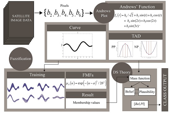
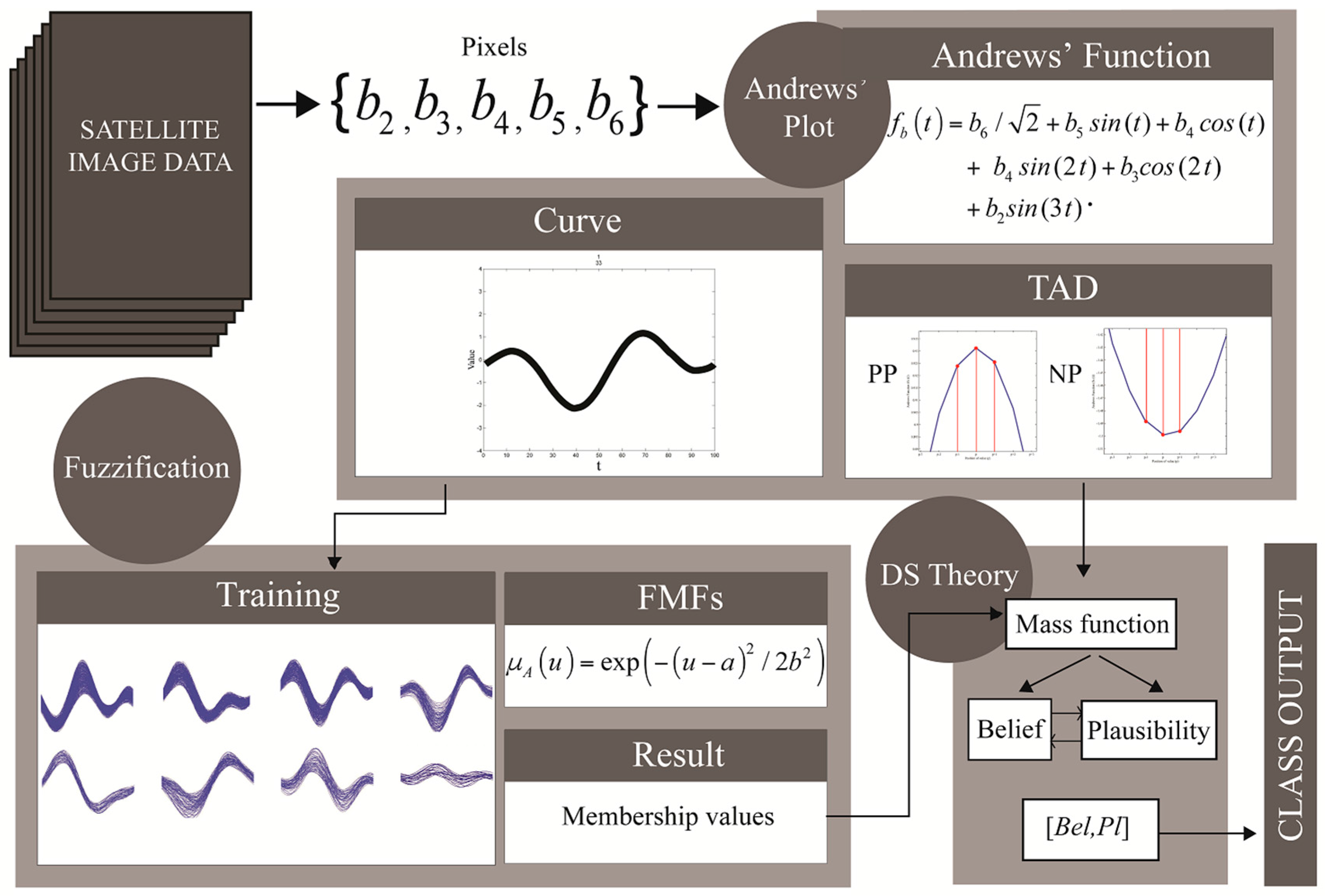
2.1. Andrews’ Curve of Satellite Image Pixels
2.2. Fuzzification Approach
2.3. Principles of Dempster-Shafer (DS) Theory
3. Materials and Methods
3.1. Data
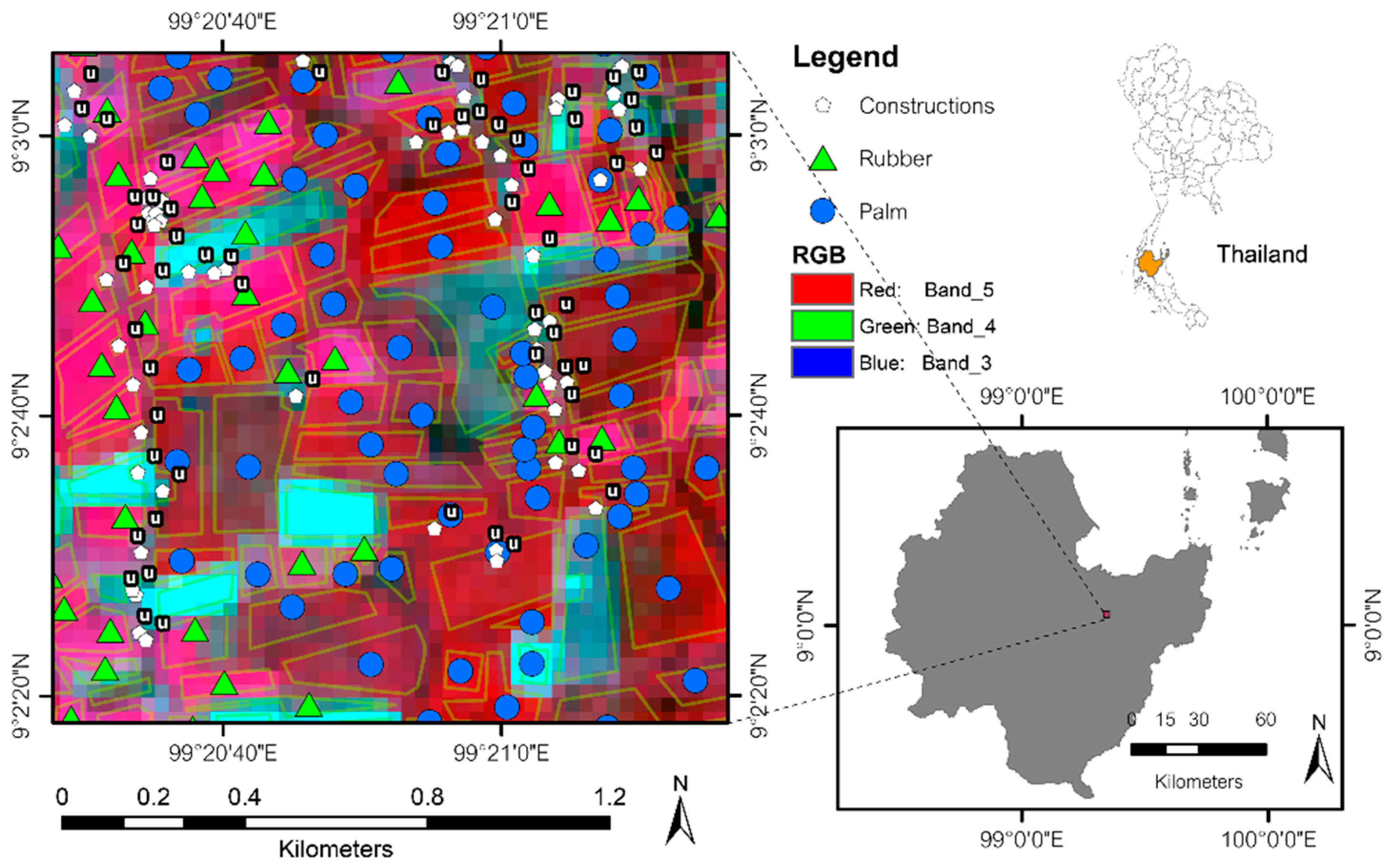
3.1.1. Rubber and Palm Data (RP)
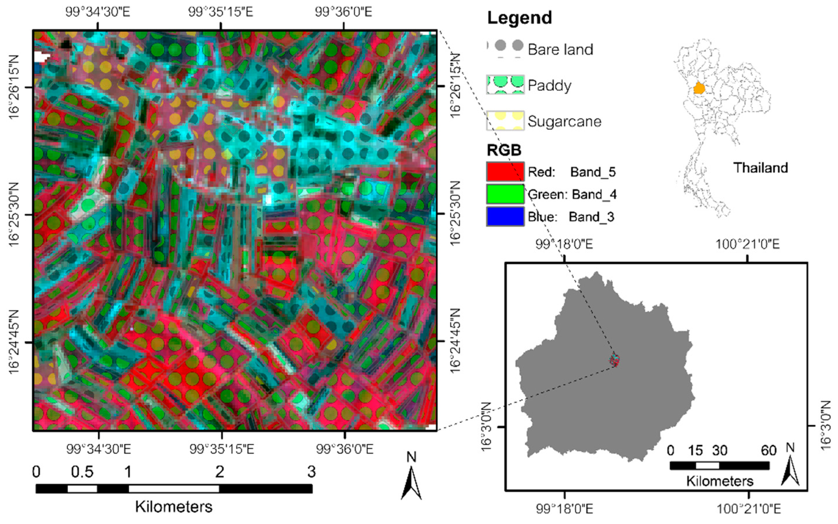
3.1.2. Paddy and Sugarcane Data (PS)
3.2. Proposed Method
3.2.1. Training and Testing Data Selection
3.2.2. Membership Grade Acquisition
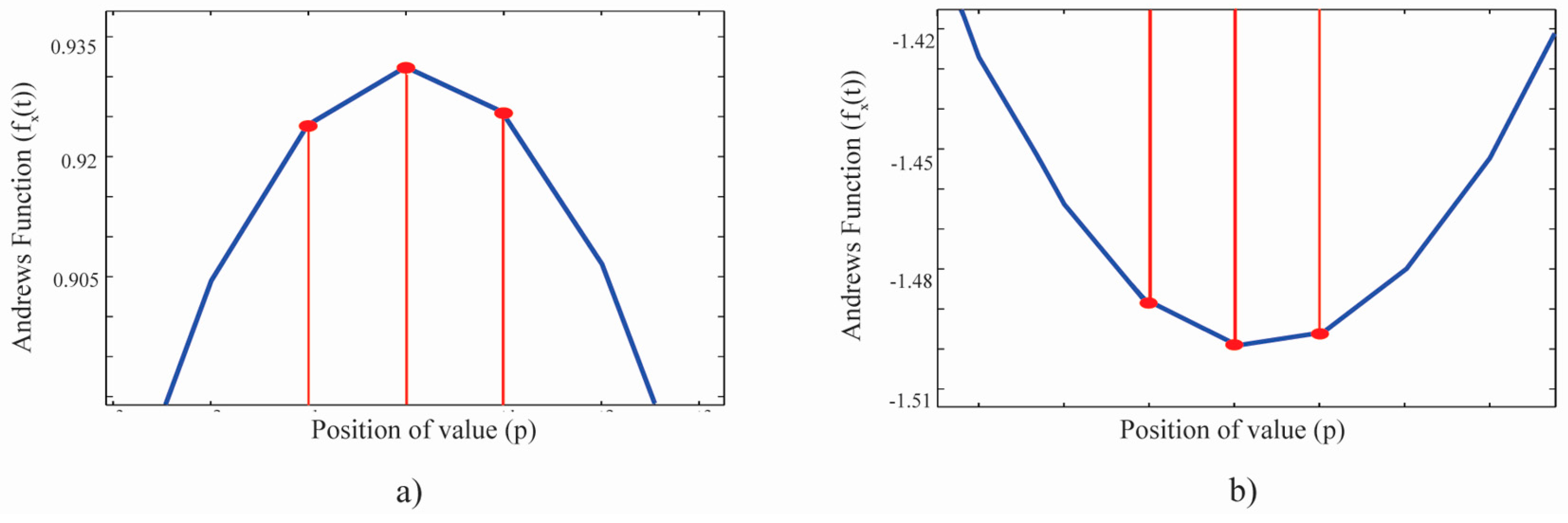
3.2.3. Type of Andrews’ Curve Dynamic (TAD)
3.2.4. Calculation of Belief and Plausibility
4. Results
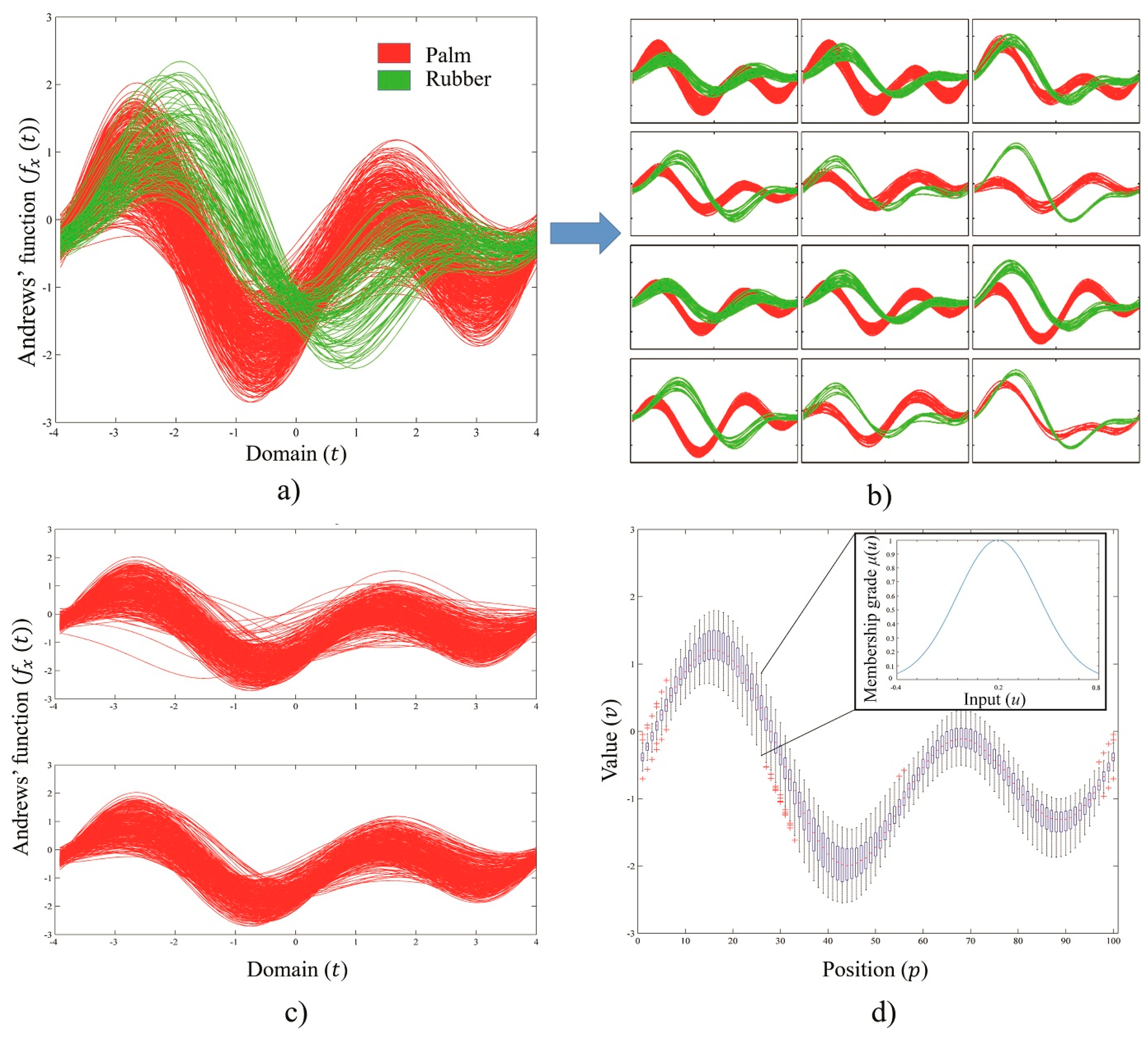
4.1. Andrews’ Curve of Training Sets
4.2. Example Fuzzification, Belief and Plausibility Calculation Results
5. Discussion
5.1. Accuracy and Data Uncertainties
5.2. Representative of Training Data
5.3. Robustness
5.4. Limitations and Suggestions
5.5. Future Work
6. Conclusions
Acknowledgments
Author Contributions
Conflicts of Interest
References
- Andrews, D.F. Plots of high-dimensional data. Biomatrics 1972, 28, 125–136. [Google Scholar] [CrossRef]
- David, A.P.; Robert, P.G.; Andrew, R.M.; Stephanie, L.M. Abiotic and Biotic soil characteristics in old growth forests and thinned or unthinned mature stands in three regions of Oregon. Diversity 2012, 4, 334–362. [Google Scholar]
- Spencer, N.H. Investigating data with Andrews plots. Soc. Sci. Comput. Rev. 2003, 21, 244–249. [Google Scholar] [CrossRef]
- Norliza, M.N.; Omar, M.R.; Chang, Y.F. A feature detection method for pulmonary Mycobacterium Tuberculosis using conventional chest radiographs. In Proceedings of the XII. European Signal Processing Conference (EUSIPCO 2004), Vienna, Austria, 6–10 September 2004. [Google Scholar]
- Rietman, E.A.; Layadi, N. A study on Rm→R1 maps: Application to a 0.16-μm via etch process endpoint. IEEE Trans. Semicond. Manuf. 2000, 13, 457–468. [Google Scholar] [CrossRef]
- Koutsonikola, V.A.; Vakali, A.I. A fuzzy bi-clustering approach to correlate web users and pages. Int. J. Knowl. Web Intell. 2009, 1, 3–23. [Google Scholar] [CrossRef]
- Moustafa, R.E.; Hadi, A.S.; Symanzik, J. Multi-class data exploration using space transformed visualization plots. J. Comput. Graph. Stat. 2011, 20, 298–315. [Google Scholar] [CrossRef]
- Zadeh, L.A. Fuzzy sets. Inform. Control 1965, 8, 338–353. [Google Scholar] [CrossRef]
- Zadeh, L.A. Fuzzy Algorithms. Inform. Control 1968, 12, 94–102. [Google Scholar] [CrossRef]
- Bustince, H.; Barrenechea, E.; Pagola, M.; Fernandez, J.; Xu, Z.; Bedregal, B.; Montero, J.; Hagras, H.; Herrera, F.; Baets, B.D. A historical account of types of fuzzy sets and their relationships. IEEE Trans. Fuzzy Syst. 2016, 24, 179–194. [Google Scholar] [CrossRef]
- Chen, Y.-N.; Hsieh, C.-T.; Wen, M.-G.; Han, C.-C.; Fan, K.-C. A Dimension Reduction Framework for HIS Classification Using Fuzzy and Kernel NFLE Transformation. Remote Sens. 2015, 7, 14292–14326. [Google Scholar] [CrossRef]
- Park, S.-E.; Moon, W.M. Unsupervised classification of scattering mechanisms in Polarimetric SAR data using fuzzy logic in entropy and Alpha Plane. IEEE Trans. Geosci. Remote Sens. 2007, 45, 2652–2664. [Google Scholar] [CrossRef]
- Xu, S.; Wang, T.; Hu, S. Dynamic Assessment of Water Quality Based on a Variable Fuzzy Pattern Recognition Model. Int. J. Environ. Public Health 2015, 12, 2230–2248. [Google Scholar] [CrossRef] [PubMed]
- Dempster, A.P. Upper and lower probabilities induced by a Multivalued mapping. Ann. Math. Stat. 1967, 38, 325–339. [Google Scholar] [CrossRef]
- Shafer, G. A Mathematical Theory of Evidence; Princeton University Press: Princeton, NJ, USA, 1976. [Google Scholar]
- Sentz, K.; Ferson, S. Combination of Evidence in Dempster-Shafer Theory; U.S. Department of Energy’s (DOE): Washington, DC, USA, 2002.
- Deng, Y.; Su, X.Y.; Jiang, W. A Fuzzy Dempster Shafer Method and its Application in Plant Location Selection. Adv. Mater. Res. 2010, 102–104, 831–835. [Google Scholar] [CrossRef]
- Mönks, U.; Dorksen, H.; Lohweg, V.; Hubner, M. Information Fusion of Conflicting Input Data. Sensors 2016, 16, 1798. [Google Scholar] [CrossRef] [PubMed]
- Lu, F.; Jiang, C.; Huang, J.; Wang, Y.; You, C. A Novel Data Hierarchical Fusion Method for Gas Turbine Engine Performance Fault Diasnosis. Energies 2016, 9, 828. [Google Scholar] [CrossRef]
- Laha, A.; Pal, N.R.; Das, J. Land cover classification using fuzzy rules and aggregation of contextual information through evidence theory. IEEE Trans. Geosci. Remote 2006, 44, 1633–1641. [Google Scholar] [CrossRef]
- Yang, Y.-T.; Wang, Y.; Wu, K.; Yu, X. Classification of Complex Urban Fringe Land Cover Using Evidential Reasoning Based on Fuzzy Rough Set: A Case Study of Wuhan City. Remote Sens. 2016, 8, 304. [Google Scholar] [CrossRef]
- Hsieh, P.-F.; Lee, L.C.; Chen, N.-Y. Effect of spatial resolution on classification errors of pure and mixed pixels in remote sensing. IEEE Trans. Geosci. Remote 2001, 39, 2657–2663. [Google Scholar] [CrossRef]
- Cesar, G.-O.; Fyfe, C. Visualization of high-dimensinal data via orthogonal curves. J. Univers. Comput. Sci. 2005, 11, 1806–1819. [Google Scholar]
- Raol, J.R. Multi-Sensor Data Fusion with MATLAB: Theory and Practice; Taylor & Francis: Boca Raton, FL, USA, 2009. [Google Scholar]
- Klir, G.J.; Wierman, M.J. Uncertainty Based Information: Elements of Generalized Information Theory; Physica-Verlag GmbH & Co.: Heidelberg, NY, USA, 1998. [Google Scholar]
- Petrou, Z.I.; Kosmidou, V.; Manakos, I.; Stathaki, T.; Adamo, M.; Tarantino, C.; Tomaselli, V.; Blonda, P.; Petrou, M. A rule-based classification methodology to handle uncertainty in habitat mapping employing evidential reasoning and fuzzy logic. Pattern Recognit. Lett. 2014, 48, 24–33. [Google Scholar] [CrossRef]
- How to Convert Landsat DNs to Top of Atmosphere (ToA) Reflectance. Center for Earth Observation, 2016. Available online: http://yceo.yale.edu/how-convert-landsat-dns-top-atmosphere-toa-reflectance. (accessed on 12 December 2016).
- Martinez, W.L.; Martinez, A.R.; Solka, J.L. Exploratory Data Analysis with MATLAB, 2nd ed.; CRC Press: Boca Raton, FL, USA, 2010. [Google Scholar]
- Raciti, S.M.; Hutyra, L.R.; Newell, J.D. Mapping carbon storage in urban trees with multi-source remote sensing data: Relationships between biomass, land use, and demographics in Boston neighborhoods. Sci. Total Environ. 2014, 500–501, 72–83. [Google Scholar] [CrossRef] [PubMed]
- Gray, J.; Song, C. Mapping leaf area index using spatial, spectral, and temporal information from multiple sensors. Remote Sens. Environ. 2012, 119, 173–183. [Google Scholar] [CrossRef]
- Olofsson, P.; Foody, G.M.; Herold, M.; Stehman, S.V.; Woodcock, C.E.; Wulder, M.A. Good practices for estimating area and assessing accuracy of land change. Remote Sens. Environ. 2014, 148, 42–57. [Google Scholar] [CrossRef]
- Defays, D. An efficient algorithm for a complete link method. Comput. J. 1977, 20, 364–366. [Google Scholar] [CrossRef]
- Loyd, C. Landsat 8 Bands. Landsat Science, 6 January 2014. Available online: http://landsat.gsfc.nasa.gov/landsat-8/landsat-8-bands (accessed on 20 December 2016).


| Classes | Descriptions | Training (Pixels) | Testing (Pixels) | ||
|---|---|---|---|---|---|
| RP data | 34% | 22% | 11% | 66% | |
| BLRP | Bare land/harvested area in RP data | 80 | 53 | 27 | 1524 |
| RB | Rubber field | 329 | 219 | 109 | |
| PM | Palm field | 384 | 255 | 127 | |
| PS data | 15% | 10% | 7% | 83% | |
| BLPS | Bare land/harvested area in PS data | 894 | 616 | 431 | 15,065 |
| PD | Paddy field | 1503 | 1035 | 724 | |
| SC | Sugarcane field | 227 | 156 | 110 | |
| Classes | T1 (1010) | T2 (0101) | T3 (10) | T4 (01) | T5 (101) | T6 (010) |
|---|---|---|---|---|---|---|
| PM | 0.5 | 0.1 | 0.3 | 0.2 | 0.3 | 0.33 |
| RB | 0.5 | 0.3 | 0.6 | 0.4 | 0.6 | 0.33 |
| BLRP | 0 | 0.6 | 0.1 | 0.4 | 0.1 | 0.34 |
| PD | 0.6 | 0.1 | 0.45 | 0.4 | 0.45 | 0.33 |
| SC | 0.4 | 0.4 | 0.45 | 0.2 | 0.45 | 0.33 |
| BLPS | 0 | 0.5 | 0.1 | 0.4 | 0.1 | 0.34 |
| Input 1 | ||||||
|---|---|---|---|---|---|---|
| 0.1924 | 0.5300 | 0.1565 | 0.1211 | |||
| 0.1000 | ||||||
| 0.0192 | 0.0530 | 0.0157 | 0.0121 | |||
| 0.6000 | ||||||
| 0.1155 | 0.3180 | 0.0939 | 0.0727 | |||
| {} | 0.3000 | |||||
| 0.0577 | 0.1590 | 0.0469 | 0.0363 | |||
| Training Size | Reference Data (Pixels) | |||||
|---|---|---|---|---|---|---|
| BLRP | RB | PM | Total | UA (%) | ||
| 35% | BLRP | 148 | 4 | 0 | 152 | 97.37 |
| RB | 14 | 566 | 32 | 612 | 92.48 | |
| PM | 1 | 70 | 689 | 760 | 90.66 | |
| Total | 163 | 640 | 721 | 1524 | ||
| PA (%) | 90.80 | 88.44 | 95.56 | OA (%) = 92.06 | ||
| 24% | BLRP | 148 | 4 | 0 | 152 | 97.37 |
| RB | 15 | 562 | 35 | 612 | 91.83 | |
| PM | 1 | 70 | 689 | 760 | 90.66 | |
| Total | 164 | 636 | 724 | 1524 | ||
| PA (%) | 90.24 | 88.36 | 95.17 | OA (%) = 91.80 | ||
| 11% | BLRP | 146 | 5 | 1 | 152 | 96.05 |
| RB | 12 | 564 | 36 | 612 | 92.16 | |
| PM | 1 | 95 | 664 | 760 | 87.37 | |
| Total | 159 | 664 | 701 | 1524 | ||
| PA (%) | 91.82 | 84.94 | 94.72 | OA (%) = 90.16 | ||
| Training Size | Reference Data (Curves) | |||||
|---|---|---|---|---|---|---|
| BLPS | PD | SC | Total | UA (%) | ||
| 15% | BLPS | 4809 | 12 | 1 | 4822 | 99.73 |
| PD | 52 | 8612 | 72 | 8736 | 98.58 | |
| SC | 51 | 60 | 1396 | 1507 | 92.63 | |
| Total | 4912 | 8684 | 1469 | 15065 | ||
| PA (%) | 97.90 | 99.17 | 95.03 | OA (%) = 98.35 | ||
| 10% | BLPS | 4791 | 27 | 4 | 4822 | 99.36 |
| PD | 57 | 8608 | 71 | 8736 | 98.53 | |
| SC | 48 | 63 | 1395 | 1507 | 92.63 | |
| Total | 4895 | 8698 | 1471 | 15065 | ||
| PA (%) | 97.86 | 98.97 | 94.90 | OA (%) = 98.21 | ||
| 7% | BLPS | 4798 | 19 | 5 | 4822 | 99.50 |
| PD | 100 | 8571 | 65 | 8736 | 98.11 | |
| SC | 43 | 63 | 1383 | 1507 | 91.77 | |
| Total | 4941 | 8671 | 1453 | 15065 | ||
| PA (%) | 97.11 | 98.85 | 95.18 | OA(%) = 97.92 | ||
| Methods | Reference Data (Pixels) | |||||
|---|---|---|---|---|---|---|
| BLRP | RB | PM | Total | UA (%) | ||
| Minimum Distance | BLRP | 129 | 12 | 11 | 152 | 84.87 |
| RB | 1 | 411 | 200 | 612 | 67.16 | |
| PM | 0 | 37 | 723 | 760 | 95.13 | |
| Total | 130 | 460 | 934 | 1524 | ||
| PA (%) | 99.23 | 89.35 | 77.41 | OA (%) = 82.48 | ||
| Maximum Likelihood | BLRP | 148 | 3 | 1 | 152 | 97.37 |
| RB | 42 | 555 | 15 | 612 | 90.67 | |
| PM | 10 | 86 | 664 | 760 | 87.37 | |
| Total | 200 | 644 | 680 | 1524 | ||
| PA (%) | 74.00 | 86.18 | 97.65 | OA (%) = 89.70 | ||
| The proposed method | BLRP | 146 | 5 | 1 | 152 | 96.05 |
| RB | 12 | 564 | 36 | 612 | 92.16 | |
| PM | 1 | 95 | 664 | 760 | 87.37 | |
| Total | 159 | 664 | 701 | 1524 | ||
| PA (%) | 91.82 | 84.94 | 94.72 | OA (%) = 90.16 | ||
© 2017 by the authors. Licensee MDPI, Basel, Switzerland. This article is an open access article distributed under the terms and conditions of the Creative Commons Attribution (CC BY) license (http://creativecommons.org/licenses/by/4.0/).
Share and Cite
Boonprong, S.; Cao, C.; Torteeka, P.; Chen, W. A Novel Classification Technique of Landsat-8 OLI Image-Based Data Visualization: The Application of Andrews’ Plots and Fuzzy Evidential Reasoning. Remote Sens. 2017, 9, 427. https://doi.org/10.3390/rs9050427
Boonprong S, Cao C, Torteeka P, Chen W. A Novel Classification Technique of Landsat-8 OLI Image-Based Data Visualization: The Application of Andrews’ Plots and Fuzzy Evidential Reasoning. Remote Sensing. 2017; 9(5):427. https://doi.org/10.3390/rs9050427
Chicago/Turabian StyleBoonprong, Sornkitja, Chunxiang Cao, Peerapong Torteeka, and Wei Chen. 2017. "A Novel Classification Technique of Landsat-8 OLI Image-Based Data Visualization: The Application of Andrews’ Plots and Fuzzy Evidential Reasoning" Remote Sensing 9, no. 5: 427. https://doi.org/10.3390/rs9050427
APA StyleBoonprong, S., Cao, C., Torteeka, P., & Chen, W. (2017). A Novel Classification Technique of Landsat-8 OLI Image-Based Data Visualization: The Application of Andrews’ Plots and Fuzzy Evidential Reasoning. Remote Sensing, 9(5), 427. https://doi.org/10.3390/rs9050427