Abstract
The COVID-19 pandemic has infected almost 73 million people and is responsible for over 1.63 million fatalities worldwide since early December 2019, when it was first reported in Wuhan, China. In the early stages of the pandemic, social distancing measures, such as lockdown restrictions, were applied in a non-uniform way across the world to reduce the spread of the virus. While such restrictions contributed to flattening the curve in places like Italy, Germany, and South Korea, it plunged the economy in the United States to a level of recession not seen since WWII, while also improving air quality due to the reduced mobility. Using daily Earth observation data (Day/Night Band (DNB) from the National Oceanic and Atmospheric Administration Suomi-NPP and NO2 measurements from the TROPOspheric Monitoring Instrument TROPOMI) along with monthly averaged cell phone derived mobility data, we examined the economic and environmental impacts of lockdowns in Los Angeles, California; Chicago, Illinois; Washington DC from February to April 2020—encompassing the most profound shutdown measures taken in the U.S. The preliminary analysis revealed that the reduction in mobility involved two major observable impacts: (i) improved air quality (a reduction in NO2 and PM2.5 concentration), but (ii) reduced economic activity (a decrease in energy consumption as measured by the radiance from the DNB data) that impacted on gross domestic product, poverty levels, and the unemployment rate. With the continuing rise of COVID-19 cases and declining economic conditions, such knowledge can be combined with unemployment and demographic data to develop policies and strategies for the safe reopening of the economy while preserving our environment and protecting vulnerable populations susceptible to COVID-19 infection.
1. Introduction
The spread of severe acute respiratory syndrome coronavirus 2 (SARS-CoV-2, COVID-19) was first reported in Wuhan, China, in early 2020 by human-to-human transmission [1,2,3,4], which became a global pandemic by early March 2020 and affected more than 150 countries within weeks. The World Health Organization declared a global health emergency related to COVID-19 on 30 January 2020 and a worldwide pandemic on 11 March 2020 [5]. As of November 2020, COVID-19 has infected over 73 million people worldwide and over 16 million people in the US, causing more than 1.63 million and almost 301,000 mortalities worldwide and in the US, respectively, as of 15 December 2020 [6].
Because the health effects of COVID-19 are unknown and the virus has a high mortality rate, precautionary measures like wearing face coverings, social distancing, and handwashing have been suggested, while clinical studies are underway to develop vaccines and potential cures. Social distancing, which includes full lock down (stay at home), partial lock down (travel if there is a need), quarantine (isolation for certain duration), and maintaining a minimum separation distance while in public, is considered an effective measure to curb the spread of a pandemic, as was seen during the 1918 flu pandemic [7]. Lockdown restrictions (full to partial) within the US were first implemented in early March and were lifted by end of May. During this time frame, only essential businesses (e.g., hospitals, gas stations, grocery stores) were operational.
An immediate impact of lockdown restrictions was on mobility and its reduction, which not only curtailed the infection rate of COVID-19 but also reduced pollution level [8] and resulted in a 4.8% drop in GDP [9]. Since the beginning of the lockdown, several studies have examined the economic effects of the lockdown measures. Bonaccorsi et al. [10], in their study of the economic impacts of the lockdown in Italy, reported that the lockdown not only reduced national and state level fiscal revenues but also caused a segregation effect in municipalities with high inequality and high concentration of low-income population due to the mobility reduction, such that the municipalities were at a higher risk of experiencing poverty and slower recovery. Chen et al. [11] also reported that mobility restrictions in areas experiencing high COVID-19 deaths had an increase in unemployment insurance claims and reduction in economic activity both in the US and Europe; a similar trend was also reported in China [12]. Although the extent of the economic disruption due to the COVID-19 pandemic is still unknown, it is evident that GDP growth is declining because of the pandemic.
Not surprisingly, the most polluted regions of the globe saw improved air quality during the lockdown. Several studies have reported that lockdown measures contributed to emission reduction as measured by the concentration of nitrogen dioxide (NO2), carbon monoxide (CO), sulphur dioxide (SO2), PM10, and PM2.5 (particulate matter in ug/m3 for particles smaller than 10 and 2.5 μm in median diameter, respectively). It is important to note that there is a direct relationship between NO2 and population density [13], as it is an indication of economic activity. This can be a byproduct of industrial activity (e.g., power plants, industrial plants) as well as from combustion due to the operation of vehicles (cars, trucks, buses, trains, etc.).
During and following the lockdown in China, many cities experienced a drop in NO2 concentration by 40–60%, an increase in mean ozone concentration by a factor of 1.5–2, and a 35% drop in PM2.5 [14,15,16]. Similar trends regarding concentrations of NO2, CO, PM10, and PM2.5 were reported for Delhi and Mumbai in India and several cities in Europe [17,18,19]. Even NASA and the European Space Agency (ESA) have been using satellite imagery to monitor the environmental conditions resulting from COVID-19 response measures due to the reduced fuel emission (https://eodashboard.org/). Evidently, lockdown measures have contributed to a reduction in different gasses which contribute to the creation of photochemical smog along with other pollutants hazardous to human health. Long-term exposure to NO2 and PM2.5 have been linked to respiratory diseases that have been identified as a contributing factor to fatality from COVID-19 [20]. The linkages between prior exposure to PM2.5 and mortality due to infection caused by COVID-19 were presented by a Harvard study (Wu et al., 2020 [21]).
The purpose of this study was to determine if the locations of NO2 as well as the decrease in power consumption, as measured by the radiance from the Visible Infrared Imaging Radiometer Suite (VIIRS) Day/Night Band, aligned with economic activity centers and to understand how the underlying population density related to these locations. Using three case study locations (Los Angeles, CA; Chicago, IL; Washington, DC), we examined how NO2 concentration and economic activity (VIIRS Day/Night Band imagery was used as a proxy) changed due to change the reduction in mobility patterns during February, March, and April of 2020. This preliminary study demonstrates how satellite-derived information (e.g., NO2 concentration and light intensity—a proxy for energy consumption) can be used to explore variation in economic activities in near real-time resulting from a global pandemic or an isolated, local incident (weather or attack on infrastructure) that causes a reduction or shutdown of the power grid, etc.
2. Data and Methodology
This study focused on three major metropolitan areas in the United States: Chicago, IL; Los Angeles (LA) County, CA; Washington DC, where similar “stay at home” measures were implemented on 12th, 19th, and 20th of March 2020, respectively. The lockdown measures ensured that only essential businesses and services were open in the three cities. The other reason for choosing these cities was the availability of mobility data at a high confidence level.
Each metropolis has a unique economy. LA County is the third largest metropolitan area in the United States with an estimated GDP of $1.05 trillion in 2018 [9], and an estimated population of about 10 million as of July 2019 (US Census Bureau 2020) (Figure 1a). Its economy includes a variety of industries ranging from entertainment to shipping to software, which require long commutes over the vast highway system. The Chicago metropolitan area has an estimated 2018 GDP of $689 billion [9] and an estimated population of 2.7 million in 2019 (US Census Bureau 2020) (Figure 1b). While the majority of Chicago’s economy includes financial and professional service sectors concentrated in the downtown part of the city requiring lengthy commutes, there is a heavy manufacturing presence in the Chicago metropolitan area. The Washington DC metropolis is primarily focused on businesses and the support of the federal government and had an estimated 2018 GDP of over $540 billion [9] and an estimated population of 9.81 million in 2019 (US Census Bureau 2020) (Figure 1c).
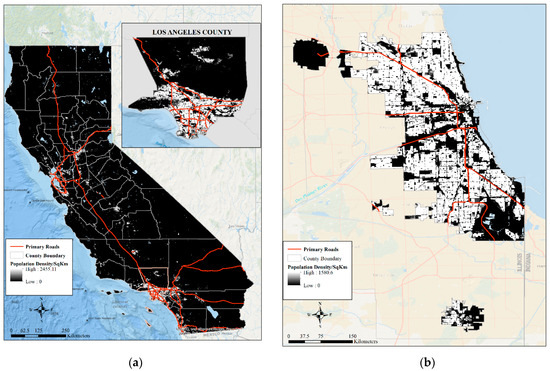
Figure 1.
Population density distribution in 2020 for California and LA County (a), Chicago, IL (b), and Washington, District of Columbia (c).
In the three metropolises, there is a heavy reliance on long home-to-work commutes, which is a factor for heavy pollution. According to the American Lung Association’s 2020 “State of the Air” report, LA, Chicago, and Washington DC (are ranked 1, 16th, and 20th among the 25 most ozone-polluted cities in the US [22]. While each of these regions contain numerous small-to-medium coal/gas power-generating facilities, the largest power-generating facilities in Chicago and Washington DC are nuclear power plants, which do not emit any NO2 or greenhouse gases. The city of LA has four natural gas-fired generating stations within city boundaries, which are medium in size. The city primarily receives power from Utah, Arizona, and Nevada.
In the three metropolises, there is heavy commercial traffic (trucks), particularly in the port and heavy industry regions of the city as well as a wide range of age and type of vehicles. In addition, all three cities have large mass transportation infrastructure (buses, subways, trains) which are relied upon by the population, particularly in the downtown areas. The largest difference between the three study cities is that the type of fuel utilized in the Los Angeles area. For many decades, California has had a unique blend of gasoline which was developed to help reduce the amount of smog, particularly in the LA basin.
In terms of climatology, as observed from the National Oceanic and Atmospheric Administration’s (NOAA) National Climatic Data Center (NCDC), the three sites do have varying climatology. Being in the northcentral part of the United States, Chicago is by far the coldest and snowiest location of each of the study regions. It has an average monthly snowfall of 9.1” in February to an average of 1” of snow in April, with an average temperature ranging from −1.6 °C to roughly 5 °C over the three months of study. In general, this would translate to an increase in activity. Similarly, in the Washington, DC metropolitan area, the average temperature is roughly from 4 °C to 15 °C over the three months of study. As one would expect, the LA basin is much warmer than both Chicago and Washington, DC. However, all of the areas generally have precipitation including both rain and snow during the study period. While the temperature and primary precipitation are different, all three study locations observe an increase temperatures and increased precipitation, typically in the form of rain, during the three-month study period. This would generally lead to an overall increase in movement.
Materials and Methods
For the study, we used tropospheric column NO2 data from Sentinel 5P TROPOspheric Monitoring Instrument (TROPOMI) from the ESA datahub (https://scihub.copernicus.eu/) to examine the environmental effects of the lockdowns, VIIRS Day/Night Band (DNB) data to capture changes in energy consumption using light intensity (a proxy for economic activity), surface PM2.5 data from the AirNow monitoring network (airnow.gov), cell phone derived mobility data from BlueDot software company under academic agreement to use the data for research purposes, and 2020 population distribution data from WorldPop (https://www.worldpop.org/). To maintain consistency among datasets, monthly averaged data were used for the time period studied. A discussion of the datasets and analytics used to examine the impact of the lockdowns on economic activities and environmental conditions is presented below.
Sentinel-5P TROPOMI
The Sentinel-5 Precursor (Sentinel-5P) satellite is a low-earth orbiting satellite developed by the ESA as part of the Copernicus Programme. It flies in a sun-synchronous ascending node orbit at roughly 824 km in altitude. The primary instrument onboard the satellite is TROPOspheric Monitoring Instrument (TROPOMI), a spectrometer designed to sense ultraviolet (UV, 270–320 nm), visible (VIS, 310–500 nm), near (NIR, 675–775 nm). and short-wavelength infrared (SWIR, 2305–2385 nm) radiation [23], and monitor trace gases (O3, CH4, CO, NO2, SO2) as well as aerosol index and layer height. The S5P TROPOMI is an air quality mission that observes air quality related to trace gases and aerosols at high spatial resolution. The NO2 product used in this study was available at a 3.5 km × 5 km spatial resolution. For our analysis, we remapped the pixel level TROPOMI data to 0.25° × 0.25° resolution.
Suomi NPP VIIRS
The Suomi National Polar-Orbiting Partnership (S-NPP) and NOAA-20 satellites are polar orbiting environmental satellites launched in a sun-synchronous 1330 local time ascending node orbit. The S-NPP and NOAA-20 are spaced one-half orbit apart (~50 min) from each other. Each satellite orbits the Earth at a roughly 834 km altitude and completes a single orbit in ~101 min. Both satellites carry the VIIRS instrument, which collects both visible and infrared imagery spanning from 0.4–12 μm, combining key capabilities of several legacy instruments. The VIIRS includes a DNB capable of sensing visible/near-infrared (500–900 nm) during both day- and nighttime (low-light) conditions. At night, it is sensitive to small amounts (~7 orders of magnitude fainter than daylight) of light present in its band pass and is capable of detecting from its orbital altitude the light emitted from a single isolated streetlamp [24,25,26,27]. The DNB data have been used for a wide range of applications such as fire detection, meteorological phenomena, observations of anthropogenic light sources, like ship tracking and fishery monitoring [28,29], as well as to estimate electrical usage and power outage, industrial output, and economic activities [30,31,32,33].
VIIRS DNB Radiance Data Creation
To discern trends in human activity and mobility, monthly composites of city light intensity from S-NPP were created. The measured DNB radiances from the nights where there was little to no moonlight (roughly the day after last quarter to the day after the first quarter phase of the moon, or approximately 14 consecutive nights of each lunar cycle) were cloud-cleared using the NOAA’s Interface Data Processing Segment (IDPS) VIIRS Cloud Mask to create a nightly screened image [34]. These images were then remapped to a common 15 arc second grid and combined into a single monthly composite of the brightest radiance for each pixel in the grid.
A key point to note is the need to account for the stray light which occurs in the DNB. Stray light arises from flaws in the light shielding of the satellite, where non-earth-scene light enters from either the VIIRS scan cavity or through the nadir door and solar diffuser openings. This results in a “gray” haze in the data, which can extend as far south as the southern United States in the summer months due to the tilt of the earth and exists in the DNB for both S-NPP and NOAA-20. A post-processing correction is applied to the data to remove this stray light [35], allowing for a more consistent radiance across as the stray light region is traversed.
Mobility Data
Human mobility was approximated using anonymized, population-aggregated, near real-time, mobile device GPS location data provided by Veraset (Veraset, San Francisco, CA, USA, 2020), a data-as-a-service vendor. The location data were used to calculate median maximum distance, i.e., the distance between farthest check-in and home location in km (mean daily median by census tract). “Home” was defined as the location (~0.6 square km grid cell) where a device was primarily located between 12 AM and 5 AM local time. Maximum distances from home were calculated daily for each device, and a daily median value was assigned at the census tract level. This data were averaged over the course of a given month to correlate with the analysis of the DNB as well as to filter the day-to-day noise in mobility patterns and discern over all trends in human activity. Census tracts with less than 5 daily devices were excluded from the analysis. This type of data has been utilized to study the effectiveness of “stay-at-home” orders during COVID-19 [36] as well as by emergency management agencies to help determine the likely areas for COVID-19 to spread. Due to the fact of privacy laws in other countries, this study used the data available for cities in the United States.
Population Distribution Data
Population data sets were obtained from WorldPop [37], which provides high-resolution, open, and contemporary data about human population distribution across the world. We obtained the 2020 population data for the three study sites as GeoTiff files at a spatial resolution of 100 m × 100 m (3 arc seconds). The gridded population data were created using a top-down approach [37], which was adjusted to match the United Nations Population estimate. Using the census tract boundaries (the spatial scale at which mobility data were generated) and the gridded population data, we determined the population density at the tract level for the implementation of the spatial data mining approaches.
Spatial Data Mining
The following spatial statistics methods were used to examine the spatial variation of mobility, energy usage, the NO2 concentration over the three months, and also to understand the relationship among the variables, while the underlying population density did not change during February–April.
Hotspot Analysis, also known as the Getis–Ord (Gi*) spatial statistic, was used to identify the spatial clusters of hotspots (i.e., features of high values) and coldspots (i.e., features of low values). The Gi* spatial statistic estimates the spatial dependency effect of an attribute based on a specified spatial relationship among the features. The spatial relationship can be based on identifying features within a certain distance from a feature or assigning a weight to features based on their distance from a feature. This statistic identifies statistically significant clusters of high and low values represented by a z-score and p-values (more details about the statistical method can be found in References [38,39]).
To identify the variation in mobility and energy consumption (using DNB radiance values), an optimized hotspot analysis was implemented. The Optimized Hot Spot Analysis tool in ArcGIS Pro [40] implements incremental spatial autocorrelation that performs Global Moran’s I for a series of distances to measure the intensity of clustering at each distance. The intensity of clustering represented by a z-score identifies the optimal distance that allows for pronounced clustering. This peak optimal distance was used as the threshold distance for identifying clusters in the hotspot analysis. This tool automatically aggregates data and identifies the significant distance threshold to aid with cluster identification.
Spatial Autocorrelation: Evidently, mobility and energy consumption dropped as a result of lockdown across the study sites. Because of the spatial variation of high and low population density clusters in the study site, Moran’s I was used to identify the spatial autocorrelation in the parameters (mobility, DNB intensity and NO2 concentration) using Moran’s I. While Global Moran’s I describes the spatial dependency and association across the study site, Local Moran’s I (Local Indicator Spatial Association (LISA)) identifies the degree of association between a census tract and its neighbors (more details about these statistics can be found in References [41,42,43]).
Visualization: The visualization of GIS data throughout this paper were created using ArcGIS® software by Esri. ArcGIS® and ArcMap™ are the intellectual property of Esri and are used herein under license. Copyright Esri©. All rights reserved. For more information about Esri® software, please visit www.esri.com.
3. Results—Effects of Lockdown
3.1. Population Density
Before exploring the effects of the lockdowns in our three case study cities, we explored the population density distribution at the census tract level (the administrative boundary that was used to generate mobility data). The main purpose was to identify the high–low density clusters to understand the effects of lockdown on subsequent changes in mobility patterns, nitrogen dioxide concentrations as well as power usage due to the change (i.e., drop) in economic activities. Figure 2a,b depict the population density distribution for LA County at the census tract level. These data show that the highest density tracts were clustered in the south-central part of LA County (specifically, surrounding LA city, highlighted by the square in Figure 2a), and this area was surrounded by high to moderate density tracts (hotspots in Figure 2b). The northern half, southwestern part, and southern-most part of the county were occupied by very low-density census tracts (coldspots in Figure 2b). Essentially, the southern half of the county is densely populated with high spatial variability, while the northern half of the county is sparsely populated.
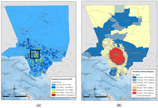
Figure 2.
Population density distribution at the census tract in LA County (population/square KM) (a) and high- and low-density census tract clusters in LA County (b).
In the city of Chicago, moderate to heavily populated tracts are clustered in the northern and northeastern part of the city (Figure 3a). While the sparsely populated tracts were clusters in the southern and northwestern part of the city; the low population density tracts were spread out across the city. From the hotspot analysis output, it was clear that the heavy density tracts were clustered along the north-eastern part of the city (hotspots with high significance in Figure 3b), along the lake shore, while the low population density clusters were located in the southern and northwestern parts of the city (coldspots in Figure 3b). There was a random distribution of moderate to low density tracts across the entire city (Figure 3b).
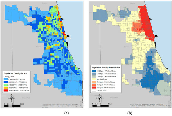
Figure 3.
Population density distribution at census tract in Chicago (population/square KM) (a) and high- and low-density census tract clusters in Chicago (b).
The majority of Washington, DC population is concentrated in the central part of the city, with a few clusters of low and very low-density tracts are spread out across the entire city (Figure 4a,b). It was clear from the hotspot analysis that the densely population tracts were clustered in the center of Washington, DC with few clusters of low-density population. The remainders of the tracts were less densely populated.
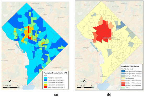
Figure 4.
Population density distribution at census tract in DC (population/square KM) (a) and high- and low-density census tract clusters in Washington, DC. (b).
3.2. Variations in Mobility Patterns
The immediate impact of lockdown measures in the cities was a reduction in mobility due to the tele-working and shutdown of all businesses except essential businesses and services. Because stay-at-home measures were in place by March 2020 in all three cities, we explored the change in mobility (distance and pattern) at the census tract level. Figure 5 and Figure 6 show the mobility distribution in LA County during February through April. The data indicate that mean travel distance dropped from 268 km in February to 50 km in March and 42.6 km in April. In February, the high mobility areas were concentrated in the downtown area of LA City as well as in the northeast and northwest part of LA County, which has a very sparse population (Figure 5a, Figure 2a).
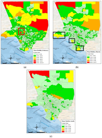
Figure 5.
Mean mobility distribution in LA in February (a), March (b), and April (c).
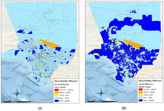
Figure 6.
Mean mobility percentage difference in LA between February and March (a) and between March and April (b).
Evidently, the highest distance traveled dropped by more than 75% in the entire county. While more than 50 km distance on average was traveled in the northwestern part of the county, mobility was no more than 20 km in the downtown area of the county (central part of the county closer to LA City (red box in Figure 5a)). Essentially, the lock-down-induced telecommuting appears to have impacted on the reduction of mobility in LA city by more than 90%. Moderate mobility was still observed in March near Malibu, Long Beach, and Santa Monica (southwestern part of the county represented by black boxes in Figure 5b). Although there were some pockets of high mobility in the high-density areas of LA County, mobility appeared to have dropped in areas surrounding the downtown LA (central part of the County) but was still higher in sparsely populated counties of LA along the northeast and northwestern part of the county. The maximum distanced traveled in LA County by April was approximately 42 km (Figure 5c). Nevertheless, the areas experiencing moderate mobility remained the same as they were in March, and these areas included the low-density tracts of the county as well as Santa Monica, Long Beach, and Malibu. Preliminary analysis of the income data from the US Census (2018 American Community Survey) revealed that the mobility reduced significantly in the impoverished part of LA County.
Although mobility was reduced by 50–100% by March in many parts of LA County, including closer to LA City (Figure 6a), majority of LA experienced a drop in mobility by 50–100% by April (Figure 6b). During February–April, mobility increased significantly only in few census tracts of LA. A future analysis of the tracts experiencing mobility increase will be conducted to explore the effects of the underlying socio-economic characteristics as well as businesses that might have contributed to the mobility increase.
Before the lockdown, travel in Chicago in February appears to have been concentrated near the downtown area (black box in Figure 7a), near the Chicago Midway International Airport (northwestern part of the City), Whiting (southern part), and near the Chicago Midway International Airport (red box in Figure 7a). It also appears that travel in Chicago was not concentrated in the high-density tracts that are located in the northeastern part of the metropolis (Figure 3a).
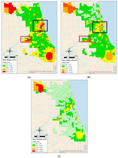
Figure 7.
Mean mobility distribution in Chicago in February (a), in March (b), and April (c).
Following the lockdown, by March, the maximum distance traveled dropped by 50% (81 km to 44.6 km) (Figure 7b). However, the moderate to very high mobility clusters were still located near the downtown area of Chicago, near the airports, and Whiting (Figure 7b, red and black boxes). Mobility dropped by another 50% in April in Chicago (Figure 7c), but like February and March, high to moderate mobility areas were present in the central Southern and Southwestern part of Chicago (Figure 7c). Evidently, mobility was still higher near O’Hare International Airport (northwestern part of Chicago. Figure 7a–c).
Figure 8a,b depict the percent change in mobility in Chicago during February through April. Immediately after the lockdown, mobility dropped by more than 50% in many tracts across Chicago, while it also increased by more than 100% in the northeastern part of the City (black box in Figure 8a) near Uptown—a residential neighborhood. By April, mobility reduced by more than 75% (Figure 8b) across the entire city. The mobility reduction was evident in the central, northeastern, northwestern (near O’Hare International Airport), and southern (near Whiting) part of the City. Although the mobility reduction near the airports was approximately 25%, the reduction in residential neighborhoods of the city (high density tracts, Figure 3a) appeared to be due to the fact of tele-commuting.
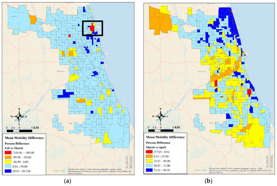
Figure 8.
Mean mobility percent difference in Chicago between February and March (a) and between March and April (b).
The densely populated tracts in Washington DC were clustered near the central and southeastern part (Figure 4a). The central part of DC was also where White House is located. Therefore, it is no surprise that mobility was higher in February in the central part of DC (near the White House and the downtown area) (Figure 9a). In March, after the beginning of the lockdown, mobility dropped in Washington DC by almost 50% from about 73 km to 38 km (Figure 9a,b), but the highest mobility was reported to be near the White House, Capital Hills, and the Washington, DC downtown. Residential neighborhoods surrounding the central part of DC exhibited low mobility. In comparison to March, mobility dropped by almost 50% from in April. However, the clusters of high to moderate mobility were still concentrated near White House, downtown DC, and Capital Hills (central part of DC, Figure 9c) where most of the policy makers were meeting regularly to address the spread of the pandemic. Mobility appeared to have dropped significantly in the residential areas of DC (surrounding areas of White House and downtown), which could be attributed to tele-working.
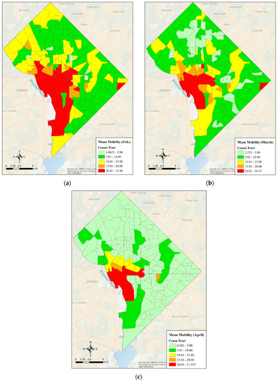
Figure 9.
Mean mobility distribution in Washington, DC in February (a), in March (b), and April (c).
Between February and March, mobility dropped by more than 50% in few places across DC, but mobility was higher near the White House in March (Figure 10a). By April, however, mobility dropped by at least 16% percent across DC, and it was higher than 90% in a few locations (Figure 10b). Even the central part of DC (near White House and downtown areas) experienced a 25–50% reduction in mobility by April. While mobility reduced in high-density tracts (nearer to downtown area) immediately after the lockdown in March, by April, all across DC significant reductions in mobility were observed. However, unlike LA and Chicago, DC did not experience an increase in mobility in March or April. This could be attributed to the fact that LA County has sparsely populated census tracts as opposed to DC and Chicago, which are mainly occupied urban tracts.
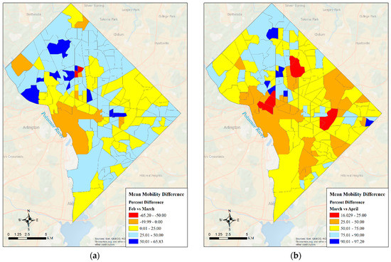
Figure 10.
Mean mobility percentage difference in Washington DC between February and March (a) and between March and April (b).
3.3. Analysis of NO2
NO2 is one of many byproducts of industrial processes that are considered hazardous to the health of humans and the environment (EPA, 2015). From the NO2 trends observed by TROPOMI over Los Angeles (Figure 11), it can be seen that there was a large reduction in the monthly average total tropospheric column NO2 from February to March, and the reduction continued through April.
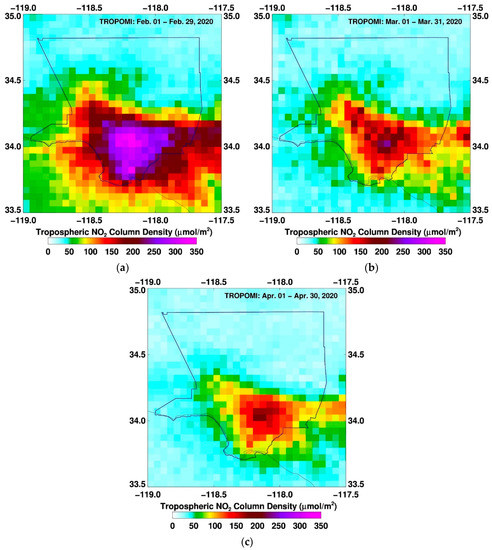
Figure 11.
Distribution of NO2 concentrations in Los Angeles, CA during February (a), March (b), and April (c).
More than half of the signal was due to the lockdown, with only the highest concentrations of NO2 (due to industrial activity) remaining near the LA Port region, where most of the refinery and industrial capability in Los Angeles is located, as well as the Inland Empire (San Bernardino Valley), which is a major shipping hub. A recent study [44] showed that while total NO2 reduction in Los Angeles during 15 March 15 to 30 April 2020 compared to the same time period in 2019 (Business as Usual, BAU) was about 66%, NO2 reduction due to the lockdown measures was 35% and with the remaining 31% being due to the fact of seasonality. Even during the lockdown, it would be expected that there would be some industrial activity to support essential services. The trend in NO2 is correlated to the mobility pattern observed during the lockdown. In Figure 12, the left image (a) is a histogram of the total column NO2 for February, March, and April 2020, and the right image (b) is the distribution of distance a given cellphone travelled during the daytime period (i.e., when most movement occurs) for each corresponding month. As can be seen from Figure 12, February and March exhibited a wider range of mobility compared to April. The curve shifted to the left with high concentrations (tails of the curves), nearly 50% lower than the values observed in February and May.
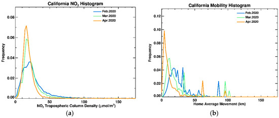
Figure 12.
Histogram of NO2 concentration in California (a) and mobility distribution (b).
Chicago, Illinois had an earlier lockdown than Los Angeles. As discussed previously, the economy is focused around the downtown region by Lake Michigan in the financial and professional services sectors. However, there is a heavy manufacturing presence in the Chicago metropolitan area, particularly close to the southeastern part of Lake Michigan and into the western part of Indiana.
As one might expect, the areas where people commute to on a regular basis showed a dramatic decrease in NO2 in the downtown region, while the areas of heavy industry, such as powerplants and refineries, remained at elevated (though reduced) NO2 levels (Figure 13). A recent study [44] reported that reductions in NO2 as observed by TROPOMI due to the lockdown were ~14% for 15 March to 30 April 2020 compared to the same time in 2019.
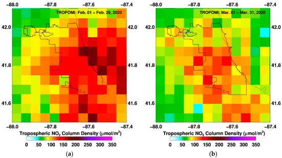
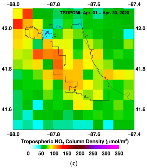
Figure 13.
Distribution of NO2 concentration in Chicago in February (a), March (b) and April (c).
While there was a similar trend in decreased mobility with Los Angeles, the spread of the total column of NO2 was much narrower in Chicago (Figure 14). This is partially due to the fact that the area observed was much smaller than the Los Angeles basin. The other notable difference was that that the average distance for commuting was much shorter for Chicago than Los Angeles.
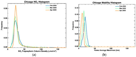
Figure 14.
Histogram of NO2 concentration in Chicago (a) and mobility distribution (b).
The Washington, DC metropolitan area is heavily driven by businesses and federal agencies. However, unlike Los Angeles and Chicago, there is no heavy industry. Maryland and the DC area implemented their lockdown on 17 March. The primarily I-95 travel corridor in Maryland, Delaware, and southern New Jersey can easily be seen in Figure 15, which is the total tropospheric NO2 column density for February.
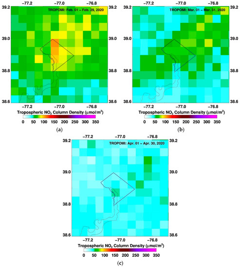
Figure 15.
Distribution of NO2 concentration in Washington DC in February (a), March (b) and April (c).
Again, as seen in the histogram shown below (Figure 16), which is for Washington, DC, as the amount of mobility (i.e., the amount of movement from a given device) decreases, as does the peak in the NO2 column density. In the mobility data, April 2020 peak distance was the lowest but in the NO2 histogram, March NO2 concentrations were slightly lower than those in April or nearly the same.
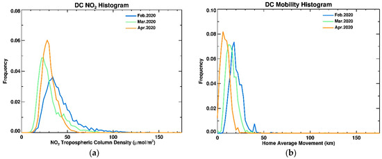
Figure 16.
Histogram of NO2 concentration in Washington, DC (a) and mobility distribution (b).
Table 1 shows the comparison between the monthly averaged NO2 concentrations and mobility information distance over the entire region of each study site. As can be seen, the average mobility distance was at its lowest in the April 2020 peak distance, which corresponds with the lowest average NO2 concentrations in all three sites.

Table 1.
Monthly average distribution of NO2 (µmoles/m2) concentration and mobility (km).
There were some variations between each of the sites that can be seen in Table 1. Los Angeles, for example, had a significant drop in movement between February and March, which was accompanied by a significant drop in NO2 density. The leveling off in mobility did not directly correlate to the steady decrease in the rate of NO2 density. There are a number of factors which could be a reason for this, including the time it takes to turn off various industrial processes or the number of cars on the highway.
In the case of Chicago, their lockdown was not as abrupt (only 17% drop in NO2 for 26% drop in mobility between February and March), but even so, the decrease in movement resulted in a decrease in NO2 density. The Washington DC metropolitan area is notable in that the shutdown did not occur until late March, meaning that the largest drop in mobility would have occurred in late-March. Even then, the NO2 density decreased by 30% between February and March while the drop in NO2 between March and April is quite significant, at 42%. The mandatory telework is continuing in the Washington, DC area and the trend in NO2 for the whole year (2020) will shed light on how policy makers can introduce work schedules to the federal employees in the area to minimize air pollution.
The photochemical smog that leads to poor air quality is a chemical soup of noxious gases (NOx = NO+ NO2) among other volatile organic compounds (VOCs) that lead to ozone and PM2.5 formation. Ozone is harmful to humans as well as plants, whereas PM2.5 is harmful to humans. Both are pollutants that were declared as criteria pollutants by the United States Environmental Protection Agency (EPA). While NO2 and VOCs are precursors for ozone and secondary aerosol formation, PM2.5 can also be directly emitted (soot from cars) or photochemically formed from NO2, SO2, and VOCs which are precursors. Because of the extreme reductions in the SO2 emissions beginning in the 1970s to curb acid rain, SO2 is no longer a main source for secondary aerosol formation. NO2 and VOCs remain the main precursors leading to the formation of secondary nitrate and organic aerosols. Figure 17 shows PM2.5 concentrations in February, March, and April of 2020 decreased compared to the same months in 2019 with the exception of February 2020 in Los Angeles which was higher than the values observed in February 2019. Note that the lockdowns did not start until March and the differences could be due to the unique seasonal differences between the two years. Of the three cities, Chicago saw the largest reduction in PM2.5.
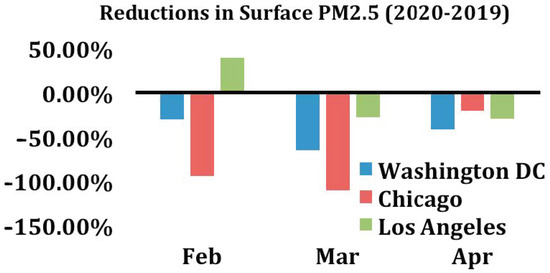
Figure 17.
Distribution of surface PM2.5 in Washington, DC, Chicago, and LA during February–March.
3.4. Distribution of Nighttime Lights (NTL)
The Day/Night Band (DNB) on S-NPP (and NOAA-20) has the ability to detect visible/near-infrared (500–900 nm spectral response) imagery for both day and nighttime conditions. The instrument is sensitive enough to detect not just the light emitted from a single isolated streetlamp but also emitted light from the mesosphere reflected off cloud features as well as density perturbations within the mesosphere itself. While it has a wide range of applications, the DNB was used here as a proxy of power usage (economic activities). Because the DNB is only able to observe electrical light at night, generally around 1–2 a.m. local time, this means that it is only a measurement of nighttime/early morning activity. Despite this limitation, there is significant activity at night like traffic movement that is captured by the DNB imagery.
Immediately after the lockdown measures were in place, businesses were shut down and the majority of the economic activities stopped in LA as is evident from Figure 18b, except for some activities that were still ongoing near downtown LA and the Long Beach area. The reduction in activities in March aligns with the reduction in mobility seen in LA County, except for the downtown area and near Long Beach where probably the port activities were still underway to some extent (Figure 5). The limited traffic movement in March (Figure 18b) could be due to the travel to essential businesses, such as grocery stores and hospitals. Although the lockdown measures were still active in April, economic activities appear to have resumed in LA in April (Figure 18c). The highest NTL intensity values (nWatts·cm−2·sr−1) in February, March and April were 7610, 5730, and 3569 respectively. Evidently, the April NTL intensity was 53% lower than February radiance and ~38% lower than March radiance. However, it is clear that the economic activities and associated mobilities in April were concentrated in the downtown LA area, near the port in Long Beach, and along the LA-San Bernardino and LA–San Fernando corridors as evident from Figure 18d,e, where the blue indicates a measured increase in light intensity, while red indicates a measured decrease in intensity (radiance). This color scheme has been used in other studies regarding DNB radiance differences [29,30,31,32,45].
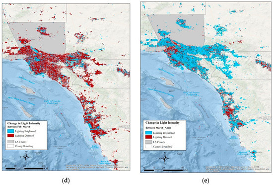
Figure 18.
Nighttime light (NTL) intensity distribution from VIIRS for Los Angeles in February (a), March (b), April (c); change in NTL intensity in LA between February and March (d) and between March and April (e).
Not surprisingly a similar pattern was observed in Chicago in March after the lockdown measures were in place in Illinois, particularly in the Chicago Metropolitan area. Economic activities dropped in Chicago region except for the downtown Chicago area near Millennium Park (Figure 19). Some activities are also observed near Rosemont area (O’Hare International Airport) and Clearing (Chicago Midway International Airport). Comparison of the light intensity between February and March (892 and 839 nWatts·cm−2·sr−1, respectively) indicates that the reduction in economic activities was not that drastic as was the case in LA (Figure 19d). By April, economic activities and traffic movement started in the Chicago region (Figure 19c), but the comparison of light intensity between March and April (839 and 1207 nWatts·cm−2·sr−1, respectively) (Figure 19e) indicates that economic activities and mobility increased way more than what was observed in February in certain parts of Chicago rather than the broader region. In fact, the radiance dropped by 6% in March, but increased by ~44% in April. This is corroborated by PM2.5 observations in April, which showed very limited reduction in April 2020 as compared to April 2019, whereas March 2020 showed substantial reductions in PM2.5 compared to March 2019 (Figure 17). The activities are concentrated in the Chicago metropolis rather than beyond the metropolis in the suburbs as was the case in February.
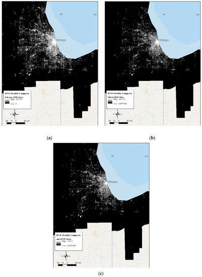
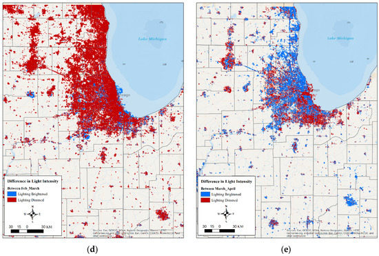
Figure 19.
Nighttime light (NTL) intensity distribution from VIIRS for Chicago in February (a), March (b), April (c); change in NTL intensity in Chicago between February and March (d) and between March and April (e).
The pattern of reduced economic activities and mobility in March followed by an increase in activities in April was observed in DC and its surrounding urban areas of Pittsburgh, Maryland, etc. Although the radiance values dropped by 22% in DC (Figure 20d, from 490 to 383 nWatts·cm−2·sr−1), there was an increase in activity (lighting was bright) in the neighboring areas of DC in Arlington and Bethesda. An obvious decline in activity in College Park was also observed due to the closure of the university campus and federal buildings near the campus. The drop in central DC in March was concentrated in the downtown area where businesses closed down immediately following the lockdown orders. By April, though economic activities increased to some extent (radiance increased by 7% than what was observed in March, Figure 20e), economic activities in the DC area beyond the downtown and White house area reduced in April as most employees started working remotely. This drop in radiance aligns with what was observed with regard to mobility change during March and April in the broader DC region. By contrast to DC metro area, economic activities and traffic movement appear to have resumed by April in the Baltimore, Columbia, MD areas.
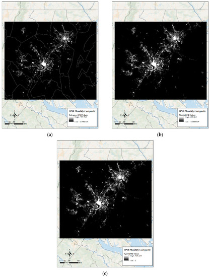
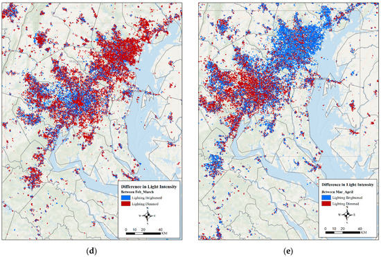
Figure 20.
Nighttime light (NTL) intensity distribution from VIIRS for Washington DC in February (a), March (b), April (c); change in NTL intensity in DC between February and March (d) and between March and April (e).
4. Discussion and Conclusions
This paper presented an initial study of the impacts of lockdown measures in response to the novel coronavirus disease 2019 (i.e., COVID-19) on economic activities and environmental conditions in three cities across the US. The study revealed that the lockdown measures have two conflicting effects: (i) first, a reduction in mobility contributed to a decrease in economic activity that subsequently impacts rise of poverty, and (ii) second, a mobility reduction also reduced pollution, specifically, the concentration of NO2, which is a key precursor for photochemical smog production. Long-term exposure to NO2 and PM2.5 have been linked to respiratory diseases that have been identified as a contributing factor in fatality from COVID-19 (Ogen 2020, [20]). The linkages between prior exposure to PM2.5 and mortality due to infection from COVID-19 was presented by a Harvard study (Wu et al. [21]). A recent study [46] observed the effects of lockdown measures as a result from COVID-19 in four major metropolis areas, including Los Angeles. Connerton et al. [46] stated that they utilized air quality data from local air monitoring agencies for the study areas. For LA, Connerton et al. [45] NO2 concentration was taken from the South Coast Air Quality Monitoring District dataset for a single month of data (March) from 2 locations: Central Los Angeles and North Orange County. While this provides a high temporal dataset, it is not necessarily representative of the entire LA basin. This study utilized satellite-based observation from the TROPOMI instrument on Sentinel-5P, which covers the entire LA basin at the expense of finer scale temporal changes. Both Connerton et al. [46] and this study showed a net decrease in NO2 concentration over both Los Angeles and New York city areas. However, the rate of decrease was different for LA, which was 38% (Table 2 in [46]) verses 25% for Wu et al. [21], which utilized satellite-based observations. Furthermore, while Connerton et al. [46] only looked at the change in a single month (i.e., March), as previously noted, while Wu et al. [21] explored the changing trend for three months. There is a natural variability of NO2 that occurs with the changing of temperatures through the various months. However, the rate of change shown in this study as well as others [21,46] is larger than what naturally would occur.
Following the lockdown in February, mobility, economic activities, and NO2 concentration dropped in LA, Chicago, and DC. While the reduction in economic activities (as seen from DNB data) in LA in March appears to be a result of the complete shutdown of all businesses; this was not the case in Chicago and DC. In fact, unlike LA, where some activities were underway in the LA downtown area and Long Beach, in Chicago and DC, economic activities and mobility were continuing in March in the broader metro areas surrounding the downtown as well as seaports and airport facilities. This supports the findings by Elvidge et al. (2020) [45], namely, that the reduction in nighttime lights was not due to normal variability. Rather they were the result of the “stay at home” orders implemented by the various cities in this study.
By April, economic activities and travel to essential businesses had resumed in LA, Chicago, and DC. It appears that economic activities resumed in downtown areas with high population densities, and mobility (observed from mobility data and VIIRS data) resumed along corridors connecting to high-density areas in LA and broader DC region as well. Preliminary analyses of median household incomes in the study sites from the US Bureau of Economic Analysis dataset appears to reveal that the mobility reduction was more pronounced in low-income and poor neighborhoods of LA and Chicago rather than in the affluent areas, which probably were occupied by service sector employees. Given that businesses, specifically, those catering to the service sector were not fully functional and employees started tele-commuting, it is not surprising that despite an increase in mobility and economic activity (related to travel to points of interest like grocery stores, hospitals etc.) in April, both NO2 and PM2.5 concentration were reduced in LA, Chicago, and DC during March–April. A major takeaway from this study is that while the lockdown measures helped reduce the transmission of the disease, they also reduced mobility, thereby disrupting economic activities and improving air quality. This study demonstrates how satellite imagery can be used to examine the change in economic activities and resulting air quality in near real-time as well as to examine the change in energy usage (a proxy for economic activities). It is also obvious that reduction in NO2 concentration is a result of reduction in overall mobility irrespective of the economic activity centers and underlying population density distribution. The study also revealed that lockdown measures ensured limited mobility and economic activity in the business districts as well as in high density neighborhoods with essential businesses and corridors connecting major activity centers and high-density areas. This study also revealed that low-income neighborhoods experienced the brunt of the lockdown where mobility was lower as opposed to affluent areas. This information could be combined with demographic data, COVID-19 cases and energy consumption information to identify potential areas for disease spread and test site locations and explore the varying patterns of energy consumption such that strategies can be developed to address energy supply–demand relationships as well as reduce disease spread and NO2 concentration while resuming economic activity. Research is currently underway to further explore the correlation between information provided by the Day\Night Band, as shown in this study, and various economic indicators, such as unemployment numbers, GDP statistics, and mobility patterns. Future research will also explore the relationships from different cities with varying population densities and across time.
Author Contributions
W.S.III developed the concept and methodology of this analysis; mobility data were provided by A.W.; Day\Night Band data analysis and background was provided by S.D.M. and W.S.III The analyses of the NO2 and PM2.5 data were performed by Z.W., H.Z. and S.K. Analysis and visualization were performed by Z.W., H.Z. and S.K. The writing and reviewing was performed by W.S.III and S.K. All authors have read and agreed to the published version of the manuscript.
Funding
This research received no external funding.
Data Availability Statement
No new data were created or analyzed in this study. Data sharing is not applicable to this article.
Acknowledgments
NOAA’s JPSS Proving Ground and Risk Reduction (PGRR) Program helped provide funding for this effort. The authors sincerely appreciate the NASA/NOAA Joint Polar Satellite System (JPSS) Program for providing the VIIRS data used in this study. The authors wish to acknowledge Chris Elvidge and Earth Observation Group, Payne Institute for Public Policy, Colorado School of Mines for the development for the production of the cloud-free DNB composites utilized in this analysis. The authors also wish to acknowledge the extraordinary effort of Bandana Kar from Oak Ridge National Laboratory in helping with conceptualization, methodology development, and analysis, and we also wish to acknowledge Jaimie Johns and Jack Forsythe from BlueDot Inc. for their contribution in cleaning and filtering the anonymized mobile decide location data. The manuscript contents are solely the opinions of the authors and do not constitute a statement of policy, decision, or position on behalf of NOAA or the US Government.
Conflicts of Interest
The authors declare no conflict of interest.
References
- Hui, D.S.; Azhar, E.I.; Madani, T.A.; Ntoumi, F.; Kock, R.; Dar, O.; Ippolito, G.; Mchugh, T.D.; Memish, Z.A.; Drosten, C.; et al. The continuing 2019-nCoV epidemic threat of novel coronaviruses to global health—The latest 2019 novel coronavirus outbreak in Wuhan, China. Int. J. Infect. Dis. 2020, 91, 264–652. [Google Scholar] [CrossRef] [PubMed]
- Paules, C.I.; Marston, H.D.; Fauci, A.S. Coronavirus Infections—More Than Just the Common Cold. JAMA 2020, 323, 707. [Google Scholar] [CrossRef]
- Li, Q.; Guan, X.; Wu, P.; Wang, X.; Zhou, L.; Tong, Y.; Ren, R.; Leung, K.S.M.; Lau, E.H.Y.; Wong, J.Y.; et al. Early Transmission Dynamics in Wuhan, China, of Novel Coronavirus–Infected Pneumonia. N. Engl. J. Med. 2020, 382, 1199–1207. [Google Scholar] [CrossRef] [PubMed]
- Wong, J.; Goh, Q.Y.; Tan, Z.; Lie, S.A.; Tay, Y.C.; Ng, S.Y.; Soh, C.R. Preparing for a COVID-19 pandemic: A review of operating room outbreak response measures in a large tertiary hospital in Singapore. Can. J. Anesth. 2020, 67, 732–745. [Google Scholar] [CrossRef] [PubMed]
- World Health Organization (WHO). WHO Announces COVID-19 Outbreak a Pandemic. Available online: https://www.euro.who.int/en/health-topics/health-emergencies/coronavirus-CoVID-19/news/news/2020/3662/who-announces-CoVID-19-outbreak-a-pandemic (accessed on 19 September 2020).
- Johns Hopkins University of Medicine (JHU), COVID-19 Data in Motion. Available online: https://coronavirus.jhu.edu/ (accessed on 19 September 2020).
- Strochlic, N.; Champine, R.D. How Some Cities ‘Flattened the Curve’ during the 1918 Flu Pandemic. National Geographic. Available online: https://www.nationalgeographic.com/history/2020/03/how-cities-flattened-curve-1918-spanish-flu-pande668mic-coronavirus/ (accessed on 19 September 2020).
- Sharma, S.; Zhang, M.; Anshika; Gao, J.; Zhang, H.; Kota, S.H. Effect of restricted emissions during COVID-19 on air quality in India. Sci. Total Environ. 2020, 728, 138878. [Google Scholar] [CrossRef]
- U.S. Bureau of Economic Analysis. CAGDP2 Gross Domestic Product (GDP) by County and Metropolitan Area. Available online: https://apps.bea.gov/itable/iTable.cfm?ReqID=70&step=1 (accessed on 19 September 2020).
- Bonaccorsi, G.; Pierri, F.; Cinelli, M.; Flori, A.; Galeazzi, A.; Porcelli, F.; Schmidt, A.L.; Valensise, C.M.; Scala, A.; Quattrociocchi, W.; et al. Economic and social consequences of human mobility restrictions under COVID-19. Proc. Natl. Acad. Sci. USA 2020, 117, 15530–15535. [Google Scholar] [CrossRef]
- Chen, S.; Igan, D.; Pierri, N.; Presbitero, A. The Economic Impact of COVID-19 in Europe and the US: Outbreaks and Individual Behaviour Matter a Great Deal, Non-Pharmaceutical Interventions Matter Less. VOXEU-CEPR. Available online: https://voxeu.org/article/economic-impact-CoVID-19-europe-and-us (accessed on 19 September 2020).
- Huang, J.; Wang, H.; Xiong, H.; Fan, M.; Zhou, A.; Li, Y.; Dou, D. Quantifying the Economic Impact of 681 COVID-19 in Mainland China Using Human Mobility Data. Available online: https://arxiv.org/abs/2005.03010 (accessed on 19 September 2020).
- Lamsal, L.N.; Martin, R.V.; Parrish, D.D.; Krotkov, N.A. Scaling Relationship for NO2 Pollution and Urban Population Size: A Satellite Perspective. Environ. Sci. Technol. 2013, 47, 7855–7861. [Google Scholar] [CrossRef]
- Bauwens, M.; Compernolle, S.; StavrakouiD, T.; Müllerid, J.-F.; Van Gent, J.; Eskes, H.; Levelt, P.F.; Van Der, A.R.; Veefkind, J.P.; Vlietinck, J.; et al. Impact of Coronavirus Outbreak on NO 2 Pollution Assessed Using TROPOMI and OMI Observations. Geophys. Res. Lett. 2020, 47, 688. [Google Scholar] [CrossRef]
- Shi, X.; BrasseuriD, G.P. The Response in Air Quality to the Reduction of Chinese Economic Activities during the COVID-19 Outbreak. Geophys. Res. Lett. 2020, 47, 691. [Google Scholar] [CrossRef]
- He, G.; Pan, Y.; Tanaka, T. The short-term impacts of COVID-19 lockdown on urban air pollution in China. Nat. Sustain. 2020, 3, 1005–1011. [Google Scholar] [CrossRef]
- Mahato, S.; Pal, S.; Ghosh, K.G. Effect of lockdown amid COVID-19 pandemic on air quality of the megacity Delhi, India. Sci. Total Environ. 2020, 730, 139086. [Google Scholar] [CrossRef] [PubMed]
- Kumari, P.; Toshniwal, D. Impact of lockdown measures during COVID-19 on air quality– A case study of India. Int. J. Environ. Health Res. 2020, 1–8. [Google Scholar] [CrossRef] [PubMed]
- UNECE. Declines in air Pollution Due to COVID-19 Lockdown Show Need for Comprehensive Emission Reduction Strategies. UNECE Sustainable Development GOALS. Available online: https://www.unece.org/info/media/news/environment/2020/declines-in-air-pollution-due-to-CoVID-19-lolockdown-show-need-for-comprehensive-emission-reduction-strategies/doc.html (accessed on 19 September 2020).
- Ogen, Y. Assessing nitrogen dioxide (NO2) levels as a contributing factor to coronavirus (COVID-19) fatality. Sci. Total Environ. 2020, 726, 138605. [Google Scholar] [CrossRef] [PubMed]
- Wu, X.; Nethery, R.C.; Sabath, M.B.; Braun, D.; Dominici, F. Air pollution and COVID-19 mortality in the United States: Strengths and limitations of an ecological regression analysis. Sci. Adv. 2020, 6, eabd4049. [Google Scholar] [CrossRef]
- American Lung Association. State of the Air 2020. American Lung Association. Available online: https://wtop.com/wp-content/uploads/2020/04/SOTA-2020-Proof-8-Embargoed.pdf (accessed on 19 September 2020).
- Veefkind, J.; Aben, E.; McMullan, K.; Förster, H.; De Vries, J.; Otter, G.; Claas, J.; Eskes, H.; De Haan, J.; Kleipool, Q.; et al. TROPOMI on the ESA Sentinel-5 Precursor: A GMES mission for global observations of the atmospheric composition for climate, air quality and ozone layer applications. Remote Sens. Environ. 2012, 120, 70–83. [Google Scholar] [CrossRef]
- Lee, T.E.; Miller, S.D.; Turk, F.J.; Schueler, C.; Julian, R.; Deyo, S.; Dills, P.; Wang, S. The NPOESS VIIRS Day/Night Visible Sensor. Bull. Am. Meteorol. Soc. 2006, 87, 191–200. [Google Scholar] [CrossRef]
- Liao, L.B.; Weiss, S.; Mills, S.; Hauss, B. Suomi NPP VIIRS Day and Night Band (DNB) on-orbit performance. J. Geophys. Res. Atmos. 2013, 118, 12705–12718. [Google Scholar] [CrossRef]
- Mills, S.; Jacobson, E.; Jaron, J.; McCarthy, J.; Ohnuki, T.; Plonski, M.; Searcy, D.; Weiss, S. Calibration of the VIIRS Day/Night Band (DNB). Remote Sens. 2015, 7, 718–988. [Google Scholar]
- Jacobson, E.; Ibara, A.; Lucas, M.; Menzel, R.; Murphey, H.; Yin, F.; Yokoyama, K. Operation and characterization of the Day/Night Band (DNB) for the NPP Visible/Infrared Imager Radiometer Suite (VIIRS). In Proceedings of the 6th Annual Symposium on Future National Operational Environmental Satellite Systems-NPOESS and GOES-R, Boston, MA, USA, 20 January 2010; p. 349. [Google Scholar]
- Straka, W.; Seaman, C.J.; Baugh, K.E.; Cole, K.; Stevens, E.; Miller, S.D. Utilization of the Suomi National Polar-Orbiting Partnership (NPP) Visible Infrared Imaging Radiometer Suite (VIIRS) Day/Night Band for Arctic Ship Tracking and Fisheries Management. Remote Sens. 2015, 7, 971–989. [Google Scholar] [CrossRef]
- Miller, S.D.; Straka, W.; Mills, S.P.; Elvidge, C.D.; Lee, T.F.; Solbrig, J.; Walther, A.; Heidinger, A.K.; Weiss, S.C. Illuminating the Capabilities of the Suomi National Polar-Orbiting Partnership (NPP) Visible Infrared Imaging Radiometer Suite (VIIRS) Day/Night Band. Remote Sens. 2013, 5, 6717–6766. [Google Scholar] [CrossRef]
- Bennett, M.M.; Smith, L.C. Advances in using multitemporal night-time lights satellite imagery to detect, estimate, and monitor socioeconomic dynamics. Remote Sens. Environ. 2017, 192, 176–197. [Google Scholar] [CrossRef]
- Elvidge, C.D.; Baugh, K.E.; Kihn, E.A.; Kroehl, H.W.; Davis, E.R.; Davis, C.W. Relation between satellite observed visible-near infrared emissions, population, economic activity and electric power consumption. Int. J. Remote Sens. 1997, 18, 1373–1379. [Google Scholar] [CrossRef]
- Jing, X.; Shao, X.; Cao, C.; Fu, X.; Yan, L. Comparison between the Suomi-NPP Day-Night Band and DMSP-OLS for Correlating Socio-Economic Variables at the Provincial Level in China. Remote Sens. 2016, 8, 17. [Google Scholar] [CrossRef]
- Yeh, C.; Perez, A.; Driscoll, A.; Azzari, G.; Tang, Z.; Lobell, D.; Ermon, S.; Burke, M. Using publicly available satellite imagery and deep learning to understand economic well-being in Africa. Nat. Commun. 2020, 11, 1–11. [Google Scholar] [CrossRef] [PubMed]
- Kopp, T.J.; Thomas, W.; Heidinger, A.K.; Botambekov, D.; Frey, R.A.; Hutchison, K.D.; Iisager, B.D.; Brueske, K.; Reed, B. The VIIRS Cloud Mask: Progress in the first year of S-NPP toward a common 741 cloud detection scheme. J. Geophys. Res. Atmos. 2014, 119, 2441–2456. [Google Scholar] [CrossRef]
- Mills, S.; Weiss, S.; Liang, C. VIIRS day/night band (DNB) stray light characterization and correction. In Proceedings of the Earth Observing Systems XVIII. SPIE Intl. Soc. Opt. Eng. 2013, 8866, 88661P. [Google Scholar]
- Lasry, A.; Kidder, D.; Hast, M.; Poovey, J.; Sunshine, G.; Zviedrite, N.; Ahmed, F.; Ethier, K.A. Timing of Community Mitigation and Changes in Reported COVID-19 and Community Mobility—Four US 746 Metropolitan Areas. MMWR Morb. Mortal. Wkly. Rep. 2020, 69, 451–457. [Google Scholar] [CrossRef]
- WorldPop. Mapping Populations—WorldPop Gridded Population Estimate Datasets and Tools. 2020. Available online: https://www.worldpop.org/methods/populations (accessed on 20 September 2020).
- Getis, A.; Ord, J.K. The Analysis of Spatial Association by Use of Distance Statistics. Geogr. Anal. 2010, 24, 189–206. [Google Scholar] [CrossRef]
- Ord, J.K.; Getis, A. Local Spatial Autocorrelation Statistics: Distributional Issues and an Application. Geogr. Anal. 1995, 27, 286–306. [Google Scholar] [CrossRef]
- ESRI. How Optimized Hot Spot Analysis Works. ESRI. 2020. Available online: https://pro.arcgis.com/en/pro-app/tool-reference/spatial-statistics/how-optimized-hot-spot-analysis-works.htm#:~:text=The%20Optimized%20Hot%20Spot%20Analysis%20tool%20identifies%20peak%20distances%20using,becomes%20the%20scale%20of%20analysis.&text=This%20distance%20corresponds%20to%20758the,Getis%2DOrd%20Gi*)%20tool (accessed on 20 September 2020).
- Anselin, L. Local Indicators of Spatial Association-LISA. Geogr. Anal. 1995, 27, 93–115. [Google Scholar] [CrossRef]
- Anselin, L.; Syabri, I.; Kho, Y. GeoDa: An Introduction to Spatial Data Analysis. Handb. Appl. Spat. Anal. 2010, 38, 73–89. [Google Scholar] [CrossRef]
- Anselin, L. The Moran Scatterplot as an ESDA Tool to Assess Local Instability in Spatial Association. In Spatial Analytical Perspectives on GIS; Informa UK Limited: London, UK, 2019; pp. 111–126. [Google Scholar]
- Goldberg, D.L.; Anenberg, S.C.; Griffin, D.; McLinden, C.A.; Lu, Z.; Streets, D.G. Disentangling the impact of the COVID-19 lockdowns on urban NO 2 from natural variability. Geophys. Res. Lett. 2020, 47, e2020GL089269. [Google Scholar] [CrossRef] [PubMed]
- Elvidge, C.D.; Ghosh, T.; Hsu, F.-C.; Zhizhin, M.; Bazilian, M. The Dimming of Lights in China during the COVID-19 Pandemic. Remote Sens. 2020, 12, 2851. [Google Scholar] [CrossRef]
- Connerton, P.; Vicente de Assunção, J.; Maura de Miranda, R.; Dorothée Slovic, A.; José Pérez-Martínez, P.; Ribeiro, H. Air quality during COVID-19 in four megacities: Lessons and challenges for public health. Int. J. Environ. Res. Public Health 2020, 17, 775. [Google Scholar] [CrossRef] [PubMed]


Publisher’s Note: MDPI stays neutral with regard to jurisdictional claims in published maps and institutional affiliations. |
© 2020 by the authors. Licensee MDPI, Basel, Switzerland. This article is an open access article distributed under the terms and conditions of the Creative Commons Attribution (CC BY) license (http://creativecommons.org/licenses/by/4.0/).