Article

Multisensory Coding of Red and Blue in Interior Design for Older Adults and Visually Impaired Users: An Inclusive Design Perspective

by
Agnieszka Rek-Lipczyńska
* and
Aleksandra Kowalska
Department of Interior Design, Faculty of Architecture, West Pomeranian University of Technology in Szczecin, Al. Piastów 17, 71-300 Szczecin, Poland
*
Author to whom correspondence should be addressed.
Sustainability 2025, 17(21), 9381; https://doi.org/10.3390/su17219381
Submission received: 27 August 2025 / Revised: 22 September 2025 / Accepted: 3 October 2025 / Published: 22 October 2025

Abstract

This article analyses the design aspects of multisensory colour experience in interior architecture. It presents the results of comparative studies on the perception of red and blue spatial environments through various senses (vision, hearing, smell, touch, and thermal sensation). The phenomenon of synaesthesia and its potential application in design are discussed, demonstrating how colors can be encoded and perceived through senses other than sight. Spatial solutions are proposed to enable blind individuals to experience color through touch (e.g., differentiated surface textures), sound (appropriate tones or rhythms), temperature (warm vs. cool lighting), and other environmental properties. The text includes references to the cultural and symbolic meanings of red and blue—covering cross-cultural differences and spatial characteristics attributed to these colors—based on an analysis of Stanisław Lem’s novel Solaris. Furthermore, the article formulates design recommendations from the perspective of sustainable development and inclusivity, taking into account European accessibility guidelines and universal design principles. The aim is to present an integrated approach to interior design, in which color becomes an experience accessible to all users, in line with the concept of “Design for All” and the principles of sustainable design.

1. Introduction

Color is one of the most powerful factors shaping the perception of space in interior architecture. Traditionally, colors have been considered mainly in terms of visual composition and aesthetics. Today, however, there is growing interest in multisensory design, which engages not only vision but also other senses, enabling the built environment to provide holistic experiences for its users. Research in environmental psychology suggests that the color scheme of an interior influences tactile sensations, thermal comfort, and even the perception of sounds and smells [1,2]. For designers, this implies a need for a broader perspective: surface color not only defines the aesthetic character of a space but can also modulate mood, behaviour, and thermal and acoustic comfort for its occupants.
At the same time, the inclusivity of color design—ensuring that people with sensory impairments (e.g., blind or visually impaired individuals) can also “experience” the colors used in an interior—has become an increasingly important challenge.
In an era of ageing populations and legal regulations such as the European Accessibility Act, there is growing emphasis on universal design, according to which spaces should be usable by all, regardless of limitations.
This article addresses these issues by focusing on two contrasting colors—red and blue—as examples for analysing multisensory color perception. It compares how red and blue are perceived through different senses, discusses the phenomenon of synaesthesia and its potential applications in design, and proposes strategies for enabling blind and partially sighted individuals to perceive color information through other sensory channels. Section 5 offers recommendations for sustainable and inclusive color design in interior spaces, drawing on best practices and European accessibility guidelines.

2. Materials and Methods

2.1. Identifying the Impact of Color on Emotions

In the first stage, a review was conducted of studies from the last decade (2015–2025) concerning emotional branding and sensory design.
The most recent systematic review by Jonauskaite & Mohr covering 132 studies conducted between 1895 and 2022 (more than 42,000 participants from 64 countries) on the associations between colors and emotions, confirms that people across the globe consistently link certain colors with particular emotions [3]. In earlier cross-cultural research, involving 4598 participants from 30 countries, demonstrated the existence of robust, universal color–emotion associations while also highlighting the role of culture in modulating these associations. Significant local differences were observed: machine-learning analysis revealed that the profile of color–emotion associations additionally depends on the country and language of the respondents [4].
Subsequent research by Takei & Imaizumi demonstrated that certain colors can perceptually enhance the recognition of corresponding emotions (e.g., yellow facilitates the detection of happiness). This was shown in a perceptual experiment on the influence of background color on the speed of recognising facial expressions associated with culturally linked emotions (yellow for happiness, blue/grey for sadness) [5].
Equally important are the findings of Alvarado, showing that specific combinations of color properties (hue, lightness, saturation) convey emotional content more effectively than single colors. This innovative study, at the intersection of perception psychology and artificial intelligence, used generative text-to-image models to analyse color–emotion associations. Neural networks generated images based on descriptions of emotions defined by valence, arousal, and dominance, and the resulting images were analysed for color features (e.g., brightness, saturation, tonality) to determine which combinations the model “learned” for specific emotions [6].
In a psychophysiological study examining the effect of color range in virtual reality on a mobile device, Bower and colleagues exposed eighteen participants to different color conditions within an immersive VR environment: a room with neutral white walls (control), a room with intensely blue walls, and a baseline condition (total darkness–black surroundings). Compared to the white (and black) conditions, the blue environment caused a significant increase in breathing variability and skin conductance responses, as well as noticeable changes in brain activity—including increased frontal alpha power (particularly the frontal-midline rhythm), greater interhemispheric asymmetry, and elevated theta, alpha, and beta power in multiple regions while in the blue room. In other words, an environment with a cool, saturated color induced stronger physiological arousal and a distinct neural response compared to an achromatic environment [7].
As Wang, Ku, and Lin, who studied changes in color preferences and emotional responses among young people during the COVID-19 pandemic in 2024, showed, color perception preferences at the population level are not constant [8]. Overall, the pandemic reduced the preference for vivid, warm colors and increased interest in muted, cool tones, reflecting a greater need for emotional calm during uncertain times. The study illustrates how a global stressor can reprogram our color associations [8].
Rui and Firzan’s latest study, 2025, examines the emotional dimension of interior design, focusing on the integration of cultural and emotional elements in Chinese living spaces [9]. Using qualitative methods—interviews with five interior designers and a focus group with six experts—the authors found that culturally inspired decorative motifs strongly influence the emotional reception of a space. Interiors rooted in tradition (in this case, the “new Chinese style”) can evoke a sense of identity and belonging, which positively affects users’ emotions [9].

2.2. Interior Design and Multisensory Design in Research

In his latest review article, Spence, a leading experimental psychologist, highlights how, amidst growing interest in neuroscience and sensory psychology, a trend toward synesthetic design—engaging multiple senses simultaneously—has emerged. The author discusses sensory interactions in the environment, for example, how the color of lighting can influence the perceived temperature. A key concept examined in his work is crossmodal correspondences–natural associations between stimuli from different modalities (e.g., cool colors are associated with cool temperatures, high-pitched sounds with bright colors). Spence argues that architects should consciously use these relationships to create coherent experiences. He concludes that a multisensory approach in design can enhance user well-being–positively influencing social, emotional, and cognitive development–in contrast to monofunctional, dehumanized spaces that often impair such outcomes [10].

2.2.1. Links Between Color and Sound Perception

Recent studies have shown that in deaf individuals fitted with a cochlear implant (CI), auditory stimulation can activate areas of the visual cortex. This is the result of a reorganization of sensory pathways—signals from the cochlear implant, rather than being processed solely in the auditory cortex, partially engage regions originally dedicated to processing visual input (crossmodal plasticity). In practice, this means that the brain can recruit previously unused resources to enhance auditory perception, improve sound localization, and increase discrimination of acoustic features [11].
In a series of three Stroop-type experiments, Miyamoto et al. in 2023 investigated how correlations between colors and sounds influence automatic perceptual processes in non-synesthetic individuals [12]. They confirmed the existence of bidirectional associations: the presentation of a given color could either facilitate or interfere with recognition of a simultaneously presented sound, and vice versa, provided that the stimuli matched known associations. For example, combinations of blue with the sound of a “falling water droplet” and yellow with a “bright, sparkling” sound produced the strongest interference or facilitation effects. Importantly, in the third experiment it was shown that the effect depended on semantic categorization—when an intermediate color was presented, the Stroop effect only occurred after participants consciously classified it as, for example, “yellow”, and then heard a congruent/incongruent sound. This finding indicates that verbal labels and the semantic meaning of colors play a role in perceptual crossmodal interactions [12].
In 2025, Bartulienė et al. described a unique case of sound → color synesthesia in a visually impaired individual [13]. Using machine learning, they analyzed the acoustic features of sounds that triggered specific color perceptions. After confirming the synaesthesia (the participant “saw” colors when hearing voices), recordings of speech were collected and labelled according to the color perceived (e.g., blue, pink). A deep neural network was then trained to predict the synaesthetic color evoked by a given voice based on its acoustic parameters (including MFCC coefficients, timbre, and signal energy). The model achieved high classification accuracy (~84%), and feature analysis revealed that pitch, spectral characteristics, and loudness/energy were the most influential factors shaping color perception in this synaesthete [13].

2.2.2. Links Between Color and Aroma Perception

Human senses do not operate in isolation—visual, olfactory, tactile, and auditory information is integrated by the brain to create a unified perceptual experience. In this context, color plays not only an aesthetic role but can also modulate the perception of stimuli from other modalities, including scent. Numerous studies in perception psychology, neurogastronomy, and multisensory design demonstrate that color can influence expectations and the perceived intensity of scents—sometimes even before the odour reaches the olfactory receptors [14].
This is evidenced by a psychophysical study conducted by Ward et al. in 2023, which showed that color perception can be subtly altered by olfactory signals [15]. During experiments, participants were presented with various scents and asked to adjust a visual stimulus to match an achromatic (neutral grey) reference. A systematic shift in the neutral point toward warmer tones was observed in the presence of certain odours. For example, the scent of cherries caused the neutral stimulus to be perceived as slightly reddish-brown—consistent with the expected association between cherry aroma and the color red. Four of the five tested scents induced such color biases aligned with their “color” connotations, demonstrating a crossmodal effect: olfactory information influences visual color perception [15].

2.2.3. Links Between Color and Taste/Flavour Perception

Taste and aroma perception is a multisensory process in which visual cues play a key role alongside the chemical stimuli detected by taste and smell receptors. The color of food, tableware, packaging, and lighting can significantly shape consumer expectations and subjective assessments of taste and aroma. This phenomenon is explained by crossmodal correspondences—natural, though largely culturally mediated, associations between sensory modalities.
In their 2021 study, Spence and Levitan examined how food color, tableware, and lighting affect taste perception. They found that red and orange increased perceived sweetness, while blue and green reduced taste intensity. Packaging color also modulates flavour expectations [16]. Similarly, Reinoso Carvalho et al. found that beer color (light vs. dark), as well as bottle and label color, influenced both taste expectations and actual perception. Darker beers were perceived as stronger and more bitter, regardless of their actual flavour profile [17].
Environmental cues may also play a role: Tu et al. in 2020 showed that red lighting increased the perceived sweetness and pleasure of drinking a beverage, while blue lighting re-evoked the perceived flavor intensity and elicited cooler emotional responses [18].
Wang & Spence demonstrated that a “sensory language” develops from early childhood—both children and adults associate specific colors with tastes (e.g., red = sweet, green = sour, brown = umami) [19]. In 2023, Chen and Spence confirmed strong associations between colors and basic tastes: yellow with sourness, brown with bitterness, and red with sweetness [20]. Their study also used three-dimensional stimuli (beverages, food) [20]. Warm hues such as red, orange, and yellow frequently enhance the perception of sweetness and fruity notes, whereas cool shades of blue and green tend to evoke impressions of freshness, lightness, or acidity.

2.2.4. Links Between Color and Touch Perception

Touch, like other senses, does not function in isolation—haptic sensations are often influenced by stimuli from other modalities, including visual signals. One of the best-documented examples of such interaction is the influence of color on how we interpret the tactile properties of objects.
In a series of experiments in 2024, Ho et al. asked participants to touch objects of different colors and temperatures [21]. Paradoxically, blue objects of a given temperature were more likely to be rated as warmer than red ones—an effect that contradicts common cultural associations [21].
Ludden et al.’s 2020 study examined how the consistency or inconsistency of a product’s color and texture affects tactile perception [22]. Products with congruent combinations (e.g., red + rough texture) were rated as more natural and pleasant to touch. Reanalysis of these findings confirmed the existence of the crossmodal congruence effect—alignment between visual and tactile cues increases perceptual comfort [22].
Similarly, Wastiels et al. investigated how color and surface gloss influence tactile expectations. Light, matte colors were associated with softness, while dark, glossy colors were linked to hardness and coolness [23]. These findings confirm that color shapes expectations about texture before the object is even touched, which is significant for interior and product design.
In a 2022 marketing study, Hagtvedt and Brasel showed that color can strengthen or weaken textural associations—for example, brown and beige enhance the perception of fabric softness, while gray and black are associated with smoothness or coolness [24].
Neurological evidence comes from a study by Ward and Simner in 2013, who described a case of tactile-visual synesthesia: a study participant consistently experienced specific colors when touching specific textures (e.g., soft = yellow, rough = dark green) [25].
These examples illustrate that crossmodal correspondences—natural or culturally reinforced associations between different sensory modalities—can shape our tactile expectations regarding an object’s texture, temperature, weight, or hardness. Warm colors such as red and orange often evoke associations with rough, heavy, or warm surfaces, whereas cool shades of blue or green tend to suggest smoothness, lightness, or coolness. Understanding these links is crucial for multisensory design—both in architecture and product design—where the coherence between color and tactile characteristics can enhance comfort, intuitiveness, and emotional resonance.

2.3. Multisensory Color Coding for Blind, Visually Impaired, and Elderly Users

A review was conducted of studies from the last decade (2015–2025) addressing multisensory color-coding strategies for individuals with various forms of color perception impairment.
Color is one of the most important elements of visual communication. However, for blind or partially sighted individuals, as well as for many older adults—whose ability to distinguish colors naturally deteriorates with age—color perception is significantly limited. This phenomenon affects not only comfort in navigating spaces but also orientation, safety, and the ability to fully participate in social and cultural life.
Contemporary research in psychophysics, neuroscience, and inclusive design suggests that the loss or weakening of color perception can be partially compensated for by implementing multisensory color coding. This involves using auditory, tactile, thermal, olfactory, or acoustic cues as alternative carriers of color information. Such systems and environments allow color information to be perceived and interpreted through other sensory modalities, often in ways that are intuitive and emotionally engaging.
These solutions have practical applications in interior design, public spaces, educational aids, and digital interfaces. They are particularly important in the context of ageing populations and growing requirements for universal design, which aims to ensure environmental accessibility and clarity for all users, regardless of sensory abilities.
Cavazos Quero, Lee & Cho developed a color-coding system using sound and scent to represent colors, aimed at helping blind individuals access information about colors in works of art. Melodies were mapped to specific hues (melodic tonality reflecting hue), while scent intensity corresponded to brightness and saturation. In an experiment involving 18 blind or partially sighted participants, the new system was compared with an audio-only approach. Color identification accuracy improved for 39% of participants, remained similar for 28%, and decreased for 33%. Despite mixed results, the prototype using multisensory coding was rated higher in terms of usability (mean 78.6 points vs. 61.5 on the SUS scale, compared to traditional tactile graphics). Participants reported that the multisensory color code increased comfort and confidence when exploring artworks.
A different multisensory approach was proposed by Iranzo Bartolomé, Cho & Cho combining sound and thermal cues to convey color information to blind users. The authors developed a mapping in which musical sounds and warm/cool sensations corresponded to specific colors and their attributes (e.g., warm colors such as red represented by higher temperatures, cool colors such as blue by lower ones). In experiments with 18 participants, the system enabled identification of 24 colors with significantly better-than-chance accuracy. Detailed semantic surveys were also conducted to determine the most intuitive associations—e.g., certain sounds were naturally associated with “warm” or “cool” colors. The final algorithm was validated on a group of 12 new participants, confirming its usability and effectiveness [26]. Recent studies emphasize that multisensory spatial design can significantly enhance accessibility and emotional engagement for users with visual or sensory limitations. Xu et al. (2025) demonstrated that the integration of visual, auditory, tactile, and olfactory cues within an interior environment can effectively guide perception and improve spatial orientation [27]. Their case study of the Suzhou Coffee Roasting Factory exemplifies how coordinated sensory stimuli—such as lighting, soundscapes, material textures, and ambient aromas—can transform interior spaces into inclusive and emotionally resonant environments, aligning with the principles of multisensory color coding proposed in this paper [27].

2.4. Color Perception in Older Adults: Seeing Red and Blue in the Built Environment

Literature Review: 2015–2025

Ageing significantly alters color perception due to changes in the visual system. Natural processes such as lens yellowing, reduced transmission of blue light, decreased contrast sensitivity, and slower adaptation to lighting changes influence color discrimination. Older adults often distinguish warm colors (red, orange, yellow) more easily, whereas cool tones (blue, green) may appear less saturated or be harder to differentiate. These changes affect visual comfort, spatial orientation, safety, and overall well-being. Understanding these shifts is essential for designing legible, friendly, and inclusive environments that support functionality and quality of life for older adults.
Wang & Cho analyzed how colors in residential interiors attract the attention of older adults using eye-tracking technology. In an experiment, seniors were shown visualizations of interiors with different door and wall colors, including combinations of so-called “safety colors” (e.g., red) with black or white. Red doors, particularly with a black frame (high red–black contrast), attracted the strongest and fastest visual attention and sustained gaze for longer periods compared to white doors in the same position. In contrast, combinations with blue or green did not elicit as strong a response. Even in participants with lower cognitive scores (MMSE), the preference for red persisted despite more dispersed and less focused scanning patterns. The findings suggest that appropriate color selection for environmental elements critical to safety can improve their visibility and enhance safety in the home [19].
In 2024, Jaglarz also raised the issue of the importance of interior colors for the well-being of older people [28]. The author reviewed research on age-related changes in color perception and conducted a survey among seniors. Results indicated that older adults strongly rejected monochromatic interiors devoid of color accents, perceiving them as sad and depressing. Preferred schemes drew from nature-inspired palettes—earth tones, greens, blues, muted browns—creating a harmonious, welcoming atmosphere. Interestingly, despite reduced sensitivity to cool colors with age, respondents most often cited blue and green as their favourite environmental colors. These findings inform design recommendations to use color strategically (nature inspiration, avoiding monotony) to improve comfort, orientation, and mood in senior living environments [28].

2.5. Symbolism and Perception of Red and Blue

Red and blue have long been associated with rich cultural symbolism, evoking distinct emotional reactions and associations. Red is widely linked with energy, dominance, passion, but also danger. It is often perceived ambivalently—symbolizing courage, struggle, and blood on one hand, and love and sensuality on the other. In many cultures, red holds special status: in China and Japan it is a color of luck and prosperity, while in Buddhist tradition red ink is used to write the name of the deceased, lending it funerary associations.
Blue carries associations with calmness, harmony, and spirituality. In Western culture, blue is connected with wisdom, trust (e.g., widely used in business and healthcare as a professional color), and relaxation. However, cultural variations exist: in Iran, blue may be associated with mourning, while in Hinduism it can symbolize war. Generally, warm red is perceived as stimulating and energizing, whereas cool blue is calming and contemplative.
Color psychology confirms that warm tones (reds, oranges, yellows) tend to increase activity and emotional arousal, while cool tones (blues, greens, purples) promote relaxation and reflection.

3. Results

The results presented in this section highlight the multidimensional nature of color perception in the context of multisensory design, with particular emphasis on individuals who are blind, visually impaired, and elderly. The analysis is based both on empirical research findings and on a review of scientific literature from the past decade (2015–2025), encompassing psychophysics, neuroscience, environmental psychology, and inclusive design practices.
In particular, data concerning the perception of two contrasting colors—red and blue—were examined in relation to various sensory modalities: vision, touch, smell, taste/aroma, hearing, and thermal sensations. The results reveal characteristic patterns of how these colors are perceived, their associations with emotional and physiological responses, and their cultural symbolism. Mechanisms of crossmodal correspondences and the phenomenon of synesthesia were also analyzed, as they may serve as an inspiration for the development of color codes accessible beyond the visual modality.
The findings not only document existing interrelations between color and multisensory perception but also point to practical opportunities for their application in interior design—so that color may become a universal spatial language, “readable” by all users, regardless of their perceptual abilities.

3.1. General Emotional Patterns Associated with Color

An analysis of a systematic review conducted by Jonauskaite and Mohr in 2025 found consistent cross-cultural patterns linking color with emotional responses [3]. A key factor determining emotional appraisal is not the color name itself but rather its brightness, saturation, and color temperature. Light colors are globally associated with positive emotions, while dark colors are linked to negative ones. Moreover, saturated warm colors elicit emotions characterized by higher levels of arousal compared to cool and muted tones. Below, we present a summary of emotions associated with specific colors, based on the analysis by Jonauskaite and Mohr [3] [Table 1].
Across all studied cultures, red was typically associated with high-arousal emotions, yellow with joy, and black with sadness; however, the strength and nuances of these associations varied depending on the geographical and linguistic proximity of nations. Jonauskaite et al. (2020) [4]. Such knowledge can be applied in the design of spaces and products tailored to different cultural contexts, as well as in well-being–oriented practices (e.g., chromotherapy, cross-cultural marketing), where accounting for local variations in color perception may increase the effectiveness of interventions.
Takei and Imaizumi demonstrated that specific background colors can modulate the speed and accuracy of recognizing emotions from facial expressions. A yellow background significantly facilitated the identification of happy facial expressions, whereas the traditionally assumed association “sadness = blue” was not confirmed in this study. In practice, this suggests that background colors may be strategically used in interfaces, visual signals, or therapeutic settings to enhance positive emotions. At the same time, it emphasizes that not all colloquial color–emotion metaphors correspond to real perceptual mechanisms [5].
Other analyses confirm that specific combinations of color properties—hue, brightness, saturation—convey emotional meaning more effectively than single parameters [6]. Environmental studies further demonstrate that color embedded in architectural surroundings can modulate emotional and physiological responses. For example, blue environments increase autonomic arousal and affect brain activity patterns linked to emotional processing. This has direct implications for the design of public spaces (e.g., hospitals, offices, schools) in terms of psychological well-being: a conscious selection of interior colors may support desired states (e.g., calming vs. stimulating), which translates into measurable health and social benefits at the population level [7].
Research conducted during the COVID-19 pandemic also showed that global stressors can recalibrate color associations. Under conditions of elevated stress, preference for cool colors (blue, green)—associated with safety and calm—increased, while preference for warm colors declined [8].
Spence’s review (2020) provides a theoretical foundation for the concept of sensory design and, indirectly, emotional branding [10]. It demonstrates that human perception of space is holistic—for example, visually impaired individuals compensate for the lack of visual information through hearing, touch, and smell. Multisensory interior design for seniors or visually impaired people is therefore not only a matter of accessibility but also of shaping mood and emotion. In this context, red and blue do not need to operate exclusively through the visual channel—their perception may be reinforced by correlated stimuli: red may “warm” a space through higher temperature and soft textures, while blue may be conveyed through gentle sounds and airy materials.
Such synergy of stimuli creates atmospheres more easily perceivable by older adults and visually impaired users, even if they cannot directly see the color. Emotional branding, in this sense, means building an emotional bond between the user and the place through multisensory impressions—for example, evoking memories through scent, a sense of safety through sound, or energy through colored light [9].

3.2. Interior Design and Multisensory Design

The study by Xu, H., Zhao, J., Jin, C., Zhu, N., & Chai, Y. proposed a set of multisensory strategies for interior design, including:
The selection of colors and illumination to create the desired emotional climate;
The design of soundscapes that enhance users’ immersion in space;
Tactile elements providing physical comfort and textural diversity;
Scents that evoke associations and memories, supporting a coherent sensory narrative [27].
These strategies were implemented in a conceptual design of a coffee-smoking lounge, where coordinated stimuli—colors, lighting, coffee aroma, and ambient sounds—created the impression of a coherent “scenography” of space. This approach illustrates that the conscious interplay of color with other sensory modalities can significantly enhance user experience and generate a unique emotional climate within interiors.
Scope of application: commercial and public interiors where a high level of immersion and sensory engagement is expected—e.g., cafés, restaurants, boutique hotels, exhibition spaces.
In Spence’s analysis, three levels of emotional design were identified:
(1)
Visual–aesthetic—including novelty, appropriateness of color schemes, order, and richness of form;
(2)
Functional—referring to usability, comfort, and privacy;
(3)
Individual—related to personalization, fashion, and the incorporation of cultural elements.
Importantly, color appears here both as a key factor at the aesthetic level (e.g., color coherence with cultural expectations) and as an element influencing comfort (e.g., a suitable color can calm or stimulate). The authors argue that the integration of emotion and culture can help overcome many design challenges—for example, making interiors more creative and user-friendly [10].

3.3. Multisensory Color Coding for the Blind, Visually Impaired, and Elderly

The study by Cavazos Quero, Lee, & Cho directly pursued the idea of “colors beyond vision,” proposing alternative sensory channels—auditory and olfactory—for conveying color information to individuals who are blind or have severe visual impairments. In the context of interior design, their findings suggest that essential colors such as red and blue may be communicated through sounds or aromas associated with these hues, enabling their experience through non-visual modalities, in line with inclusive design principles [14].
A similar approach is found in the work of Iranzo Bartolomé et al. who combined thermal sensations with color perception. Interior elements may emit subtle warmth or coolness, allowing older adults and visually impaired individuals to differentiate colors: a heated surface may signal red (warm), while a cooler one may indicate blue (cold). Combining temperature with sound adds an emotional dimension and improves memorability, confirming that multisensory experiences are more engaging and durable than single-channel ones [26].
The findings of Wang & Cho highlight the specific role of red in the visual perception of seniors. Red—a long-wavelength color—is most visible and attracts attention fastest, whereas cool colors (e.g., blue) are perceived less effectively. This phenomenon results from age-related ocular changes, such as lens yellowing and reduced transmission of blue light. For interior design, this implies that warm colors (red, orange, yellow) should be prioritized in marking functionally important elements, such as doors, handrails, or emergency buttons [19].
Jaglarz provides a theoretical basis for inclusive and sustainable color design. The study confirms that red and other warm colors are more legible to seniors than blues, while also stressing that design should not be limited to function—colors affect emotions and well-being. Overly monotonous, colorless interiors may exacerbate apathy, whereas carefully designed color accents stimulate activity and improve mood. In the spirit of emotional branding, colors may be “felt” not only visually but also through the mood they bring into a space [28].
The issue of multisensory color coding also includes associations between color and sound perception. Studies on crossmodal correspondences show that colors have consistent acoustic associations: for example, red is linked to full and low-pitched sounds, while blue is associated with bright and high-pitched tones [17]. In multisensory interface design, this may allow the adaptation of auditory signals to color codes, also in the context of spatial orientation for blind users.
Research on synesthesia and the use of artificial intelligence to simulate synesthetic experiences provides further contributions to this issue [13]. Findings show that it is possible to predict which sound properties correspond to a given color, which may, in the future, support the development of tools translating speech sounds or acoustic signals into color information.
Evidence of the brain’s adaptive capacity in the context of multisensory coding comes from studies of crossmodal plasticity observed in individuals with cochlear implants. Research shows that auditory stimuli can activate visual cortex areas, demonstrating that the brain can reorganize its pathways and transfer information from one modality to another. In terms of interior design, this means there is a real possibility of creating systems that translate color into auditory, tactile, or thermal stimuli, which users—thanks to neural plasticity—can learn to interpret as naturally as visually perceived colors.

3.4. Links Between Color and Aroma Perception

Research has shown that the integration of olfactory and visual stimuli can influence color perception, although the effect is small yet consistent. The findings suggest that the brain integrates olfactory information with visual input at an early stage of color perception, confirming the existence of multisensory integration mechanisms. While the study was fundamental (laboratory-based), its implications may be applied in areas such as VR/AR experience design, museum and exhibition installations, and sensory marketing, where scent is used to modulate visual perception. This points to the potential of employing fragrance as a subtle tool for enhancing or modifying color perception in the context of shaping mood and user experience.

3.5. Links Between Color and Tactile Perception

One of the first well-documented studies on tactile-visual synesthesia was conducted by Ward and Simner in 2013 [25]. It demonstrated that connections between color and touch may have a neurological basis, even if for most people they remain nonverbal and unconscious. This may explain why, in interior design, certain colors are “intuitively” associated with specific materials—for example, white with softness, black with smoothness, and red with roughness. The authors suggest that crossmodal correspondences (natural associations between senses) may originate from neurological, cultural, or learned factors. Such research provides valuable insights into how sensory integration operates even in neurotypical individuals, which may inspire more coherent multisensory design [Table 2].
For a person who is completely blind, the colors of the external world do not exist in direct perception but can be indirectly experienced through other sensory impressions. Therefore, interior designers aiming to create truly inclusive spaces should consider solutions that enable information encoded in color to be conveyed through other senses. The idea of “design for the blind” assumes that every element available visually (e.g., a wall color, a zone marking, or an on-screen message) should have a tactile, auditory, or olfactory equivalent understandable to people with visual impairments.
The simplest carrier of information for the blind is touch. Interiors can employ diverse textures and shapes corresponding to specific colors. For example, a wall or handrail marked in red might have a distinct tactile pattern (e.g., raised stripes, rough texture), while blue surfaces might have a contrasting pattern (e.g., smooth, cooler-to-the-touch panels). Existing systems of tactile color codes—such as the Scripor Alphabet—assign each color a unique, easily recognizable tactile symbol. Originally developed for clothing and color identification of garments by the blind, this system can be successfully adapted to architecture, e.g., by marking furniture edges or picture frames in museums with the appropriate tactile color symbols. The Scripor standard effectively translates the concept of color into the language of embossed signs, transforming color from a purely visual category into a tactile experience. Similar approaches have been tested with tactile maps and building plans, where different embossed patterns represent colors on printed maps, enabling blind individuals to “read” the color-coded legend with their fingers.
Another important channel is sound. Although sound has traditionally been rarely used for color coding in space, new technologies open wide possibilities. Blind people often use smartphone applications that recognize the color of an object via the camera and deliver the information verbally (“red shirt,” “blue door”). Embedding auditory cues directly into the environment, however, may create a more seamless experience. For instance, one can imagine sound installations reacting to proximity to a color-marked zone—upon approaching a red-coded room, a high-pitched or fast sound sequence is heard, while a blue-coded room may be accompanied by lower or slower tones. These would act as sonification of color, i.e., translating color information into acoustic signals. In practice, such systems would require discreet sensors and directional speakers to avoid excessive noise—a technical challenge, but feasible in specific applications (e.g., educational spaces, multimedia exhibitions).
A particularly inspiring example is Neil Harbisson, an artist recognized as the world’s first cyborg, who perceives colors through a permanently mounted camera-antenna that converts surrounding colors into sound vibrations transmitted via bone conduction. Harbisson, who has complete achromatopsia, learned to distinguish colors through different sound frequencies generated by his device—each color became a note or chord. While an individualized high-tech solution, it demonstrates the potential of translating visual signals into auditory ones for blind users. In architecture, instead of implants, color sensors and sound emitters could be used: for instance, a cane equipped with an RGB sensor could detect the color of a room and emit a corresponding tone (such prototypes already exist). However, universal design principles recommend that solutions be embedded in the environment itself rather than requiring special devices from users. Consequently, architects increasingly envision intelligent, speaking environments that autonomously provide voice or sound cues (e.g., elevators announcing floors, acoustic traffic signals). Extending this concept, auditory cues could be directly coded to the color of the environment.
The thermal sense can also be engaged. Although less intuitive, in certain contexts ambient temperature can be modulated according to color, allowing blind individuals to perceive differences physically. For example, in an art gallery presenting “red” and “blue” installations, heating or cooling could be independently controlled: the “red” room slightly warmer (e.g., halogen lights emitting heat), and the “blue” room cooler (e.g., LED lighting and air conditioning). The difference need not be large—just a few degrees—but perceivable on the skin, providing an additional clue to the “climate” of the space. Another approach involves heated or cooled tactile surfaces—for instance, a handrail at the entrance to a red-coded zone could be warm, while one leading to a blue-coded zone could be cool (or made from naturally cooler materials). Although such measures are rarely used due to cost and complexity, they may be valuable in specific settings, such as multisensory experience rooms, therapeutic centers, or special exhibitions.
Scent may also assist blind individuals in identifying the character of a color-coded space. If a given room has a distinctive fragrance, users learn to associate it with that place or function (a process that occurs naturally, as every building has its own “smell”). Designers can amplify this by introducing subtle olfactory indicators—for example, a floral fragrance for a red room and a forest scent for a blue one. Importantly, these scents must be subtle and non-intrusive to maintain their informational function. Increasingly, signature scents—unique brand fragrances—are used in modern offices and hotels, which can also aid orientation for blind individuals (recognizing a building by its smell). In this context, scent may serve as a complementary layer in conveying the “color atmosphere” of a space: for instance, a red, energetic sales zone could be emphasized with a stimulating citrus aroma, while a blue relaxation lounge with a calming lavender fragrance.
In summary, enabling blind individuals to experience color involves applying redundancy of information—each color-coded message should be accompanied by an alternative cue in tactile, auditory, olfactory, or textual form. For example, if offices are color-coded, each room should also have Braille inscriptions with the color name or embossed symbols, or an automatic voice message at the entrance (“This is the Blue Room”). Such practices are increasingly becoming standard within universal design. European accessibility guidelines emphasize that information should not rely on color alone—any color-coded information (e.g., evacuation plans, door markings) must have an alternative in the form of text, shape, or texture, accessible to individuals with visual impairments. This ensures that color functions as an additional layer of information rather than the sole carrier of meaning.
For the visually impaired (low vision), the key principle is to provide strong color contrasts between elements (floor–wall, door–wall, text–background), facilitating form recognition. For color-blind individuals, color-blind-friendly schemes are recommended, avoiding the most frequently confused pairs (e.g., red and green) and supplementing colors with descriptions or pictograms. This, too, belongs to multisensory design, as it engages the sense of shape (visual or tactile) rather than relying exclusively on color information.

3.6. Survey on Multisensory Associations of Red and Blue

To complement the theoretical analysis, an exploratory survey was conducted by the co-author of this article, Aleksandra Kowalska, a fifth-year architecture student at the West Pomeranian University of Technology in Szczecin. The study involved 33 student participants (aged 21–26), recruited from the Faculty of Architecture and Design. The purpose of the survey was to investigate how individuals intuitively associate two contrasting colors—red and blue—with different sensory modalities.
Participants were asked to freely assign their first associations with the colors red and blue across four categories: (1) emotions, (2) sensory impressions (sound, touch, temperature), (3) scents, and (4) spatial forms. The study was conducted in a controlled classroom environment with neutral lighting to avoid external color bias. Responses were collected through an open-ended questionnaire and subsequently categorized into thematic groups for analysis.
Red was most frequently associated with high-arousal emotions such as energy, passion, and aggression (Figure 1).
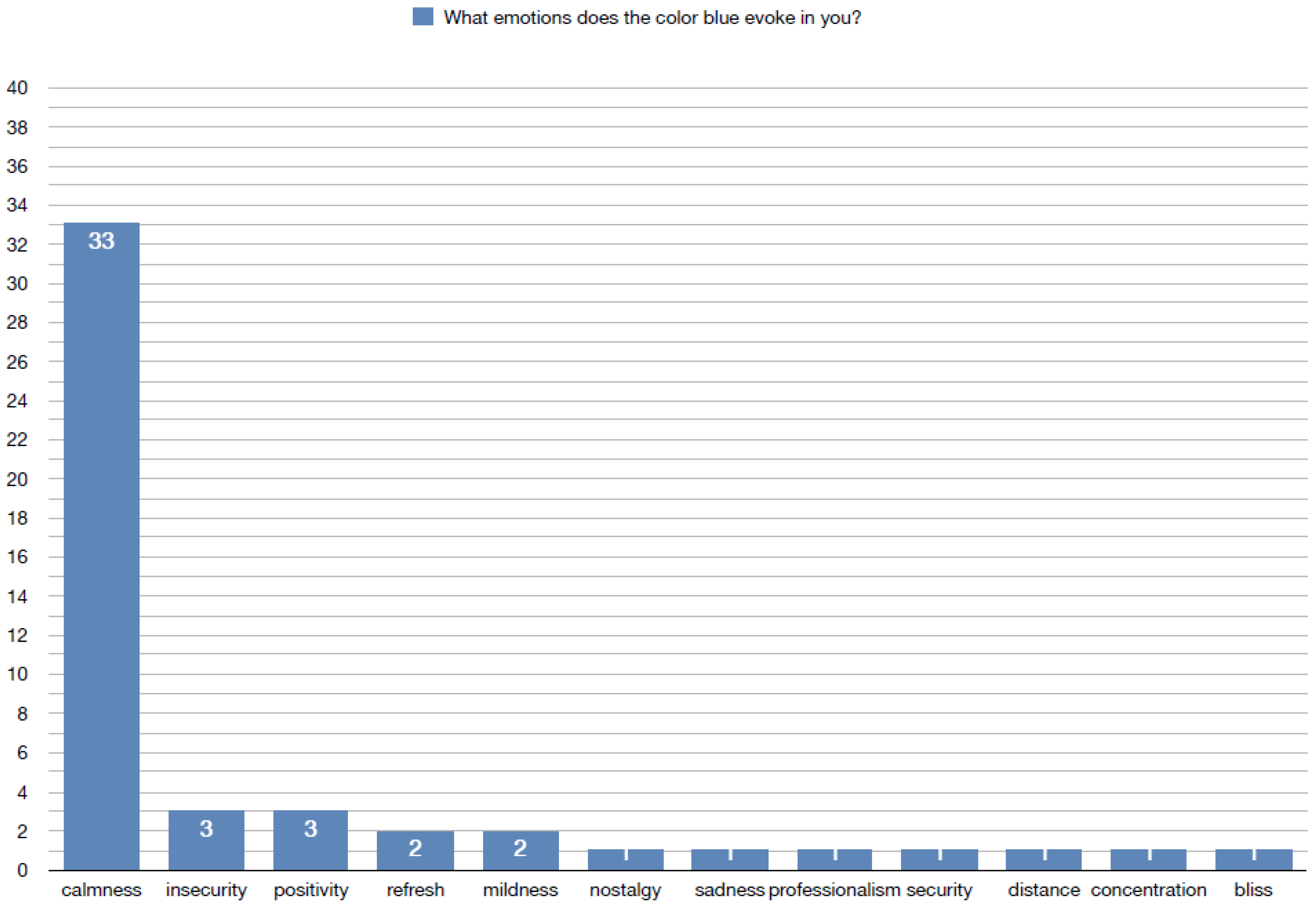
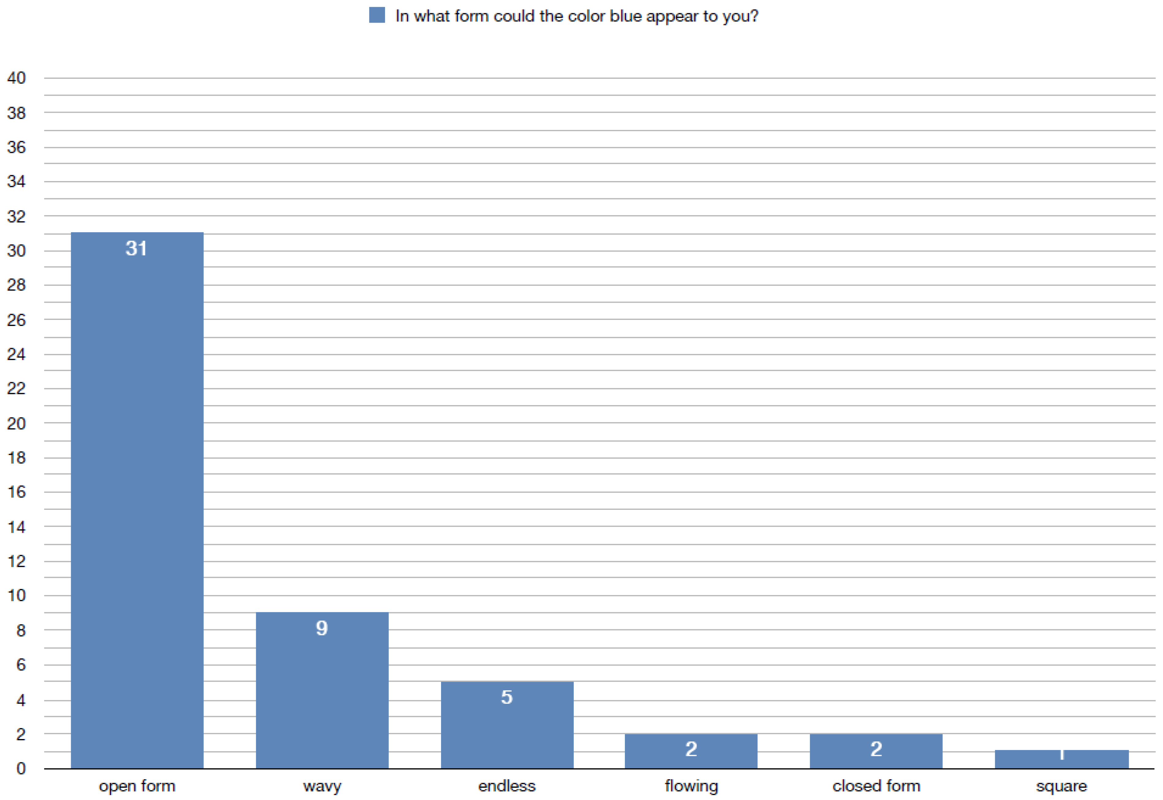
Blue, in contrast, was associated with calmness, relaxation, and melancholy (Figure 2). Sensory links included coolness, smooth textures, and soft or muted sounds. Respondents rarely indicated a strong scent association, though freshness (e.g., water, air) appeared in several answers. In spatial terms, blue was linked with open, flowing, and light forms, perceived as ordered and expansive [Figure 2].
In sensory terms, respondents linked red with warmth, sharp or rough textures, and loud or dynamic sounds. Olfactory associations included sweet and intense fragrances (e.g., flowers, spices). Spatially, red was connected with angular, dense, and enclosing forms, often perceived as heavy or overwhelming.
The most frequent spontaneous association with red was blood, followed by love, anger, fruit, and danger. Other responses included warmth, fire, and rose and less common associations such as lust, strength, heart, and warning. These results indicate that red is strongly linked to biological and emotional activation, often connected with life, passion, danger, and intensity. The semantic field of red thus emphasizes energy, alertness, and affective arousal, in line with previous studies in color psychology [Figure 3].
By contrast, the color blue was most commonly associated with sky (27 indications), followed by water (8) and peace (6). Less frequent were coldness (3), rest (2), and individual responses such as ice, car, flowers, and blueberry. These findings demonstrate that blue evokes a strong sense of calmness, spaciousness, and stability, associated with nature (sky, water) and tranquil affective states [Figure 4].
The clear opposition between the associative domains of red and blue—activation versus relaxation, heat versus coolness, closeness versus distance—supports the theoretical framework of cross-modal emotional coding of color discussed in the article. These associative patterns also align with established perceptual theories, confirming that even in free-association tasks, color stimuli activate multisensory and emotional representations rather than purely visual ones.
The survey results align with crossmodal correspondence literature, which shows systematic links between warm colors (such as red) and high-arousal sensory associations, versus cool colors (such as blue) and low-arousal, expansive impressions. Importantly, the findings confirm that participants tend to perceive colors not only visually but as part of a multisensory experience, linking hue with emotion, materiality, soundscape, and spatial form. These associations provide a practical basis for applying color strategies in interior design, particularly in contexts where multisensory cues are needed for inclusivity. To enhance the reproducibility and credibility of the study, it is essential to provide more detailed information about the applied methodology. In particular, the following aspects should be specified: sample selection criteria (e.g., number of participants, age, student status, presence or absence of sensory impairments), experimental environment settings (e.g., type of lighting, ambient temperature, background noise during the test), and data collection tools (e.g., survey questionnaires, rating scales, sensory testing devices). Presenting these details allows for greater comparability of results across studies and strengthens the empirical validity of the findings.
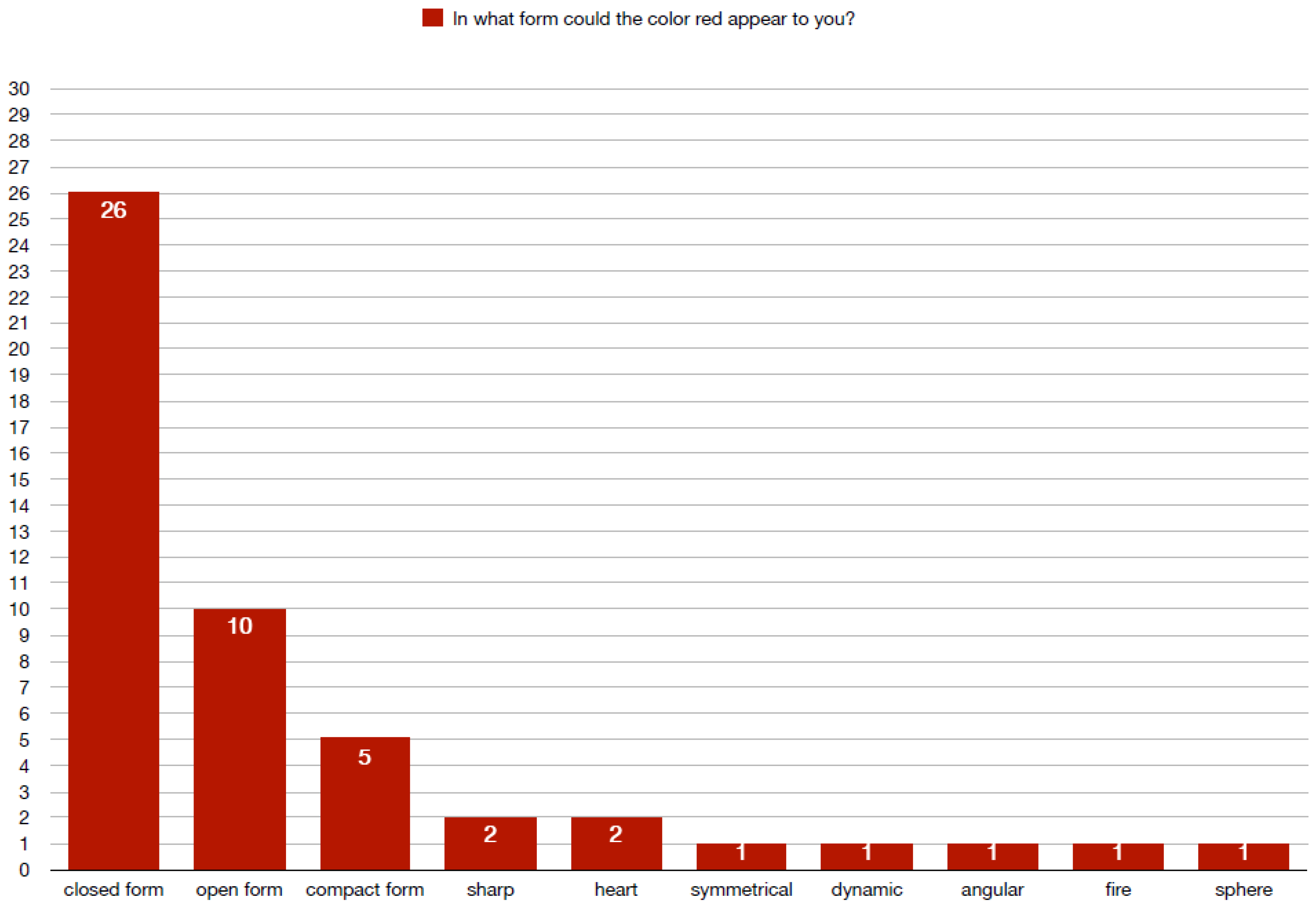
The spatial-form associations revealed clear contrasts between red and blue. Participants most frequently linked red with closed, compact, and sharply defined forms, often describing it as intense, energetic, or contained [Figure 5]. By contrast, blue was associated with open, wavy, and flowing shapes, evoking impressions of spaciousness and continuity. These findings support the notion that warm and cool colors elicit distinct perceptual and spatial schemas—red being perceived as dense and confined, while blue conveys openness and fluidity [Figure 6].

3.7. The Contrast Between Red and Blue as a Literary Paraphrase of Narrative Tension in Solaris

The authors of this article conducted an analysis of the literary vision of the colors red and blue in Stanisław Lem’s novel Solaris. The purpose of this literary analysis was to demonstrate how language and the symbolism of color can be interpreted in the context of multisensory perception of space. In the novel, colors do not function merely as descriptive attributes of the fictional world; rather, they serve as active carriers of meaning, emotion, and narrative tension. The ocean and the sky—the central elements of the setting—change color in ways that reflect the dynamics of the plot and the psychological states of the characters, becoming a metaphorical “screen” for existential experiences and confrontations.
Red and blue in Solaris create a form of dualism: the former symbolizes life, energy, and emotional intensity, but also chaos, dread, and unease; the latter conveys cold distance, otherness, and apparent tranquility, concealing silence and lack of response. This contrast, embedded in Lem’s literary descriptions, resonates with the psychology of color and may be interpreted within the framework of multisensory design—as a model example of how colors can be used to construct atmosphere, mood, and meaning in space.
The ocean is often described as shifting in color—from blue to blood-red, sometimes gray, silvery, or almost lifeless. Symbolically, these two hues may be associated with:
Red—life, pulsating matter, threatening force, anxiety.
Blue—cold intelligence, otherness, inscrutable mystery, cosmic chill.
The juxtaposition of these colors expresses the dual nature of the ocean: something organic and alive, yet simultaneously inhuman, alien, and impersonal. It seems to react to humans, but in ways that remain beyond human comprehension.
In Solaris, the sky does not serve as a source of hope or transcendence, as it often does in classical literature. On the contrary, it appears as:
empty, cold, and silent,
devoid of spiritual presence,
stripped of divine meaning—humanity has not found God but an alien, incomprehensible ocean.
The sky thus becomes a metaphor for the psychological states of the novel’s characters.
Blue sky—symbolizes the cold, alien calm of the planet; it may be read as an illusion of normality to which the characters cling; it conveys cosmic indifference that provides no answers.
Red sky—appears during moments of emotional intensity (e.g., when Rheya manifests); it symbolizes human interference with what is natural, as well as unease or the overwhelming force of the ocean. It is a “wounded” sky, marked by human emotion, fear, shame, and guilt.
The sky in Solaris is not merely a backdrop—it reacts to the presence of humans, much like the ocean itself. It forms part of what may be described as the “planet’s consciousness.” Just as the ocean creates “visitors,” the sky reflects psychological moods and existential tension.
Red sky = moments when emotions dominate, when the protagonist confronts his past.
When the ocean was calm or “silent,” the sky appeared in cool tones—often blue, pearly, or whitish. When the ocean was active—pulsating, generating structures (symmetriads, mimoids)—the sky shifted to red, orange, or even luminous, as though internally illuminated. The planet’s atmosphere was dependent on the ocean, which functions as a living, conscious organism.
This is further underscored by Solaris’s orbit around two suns—one red and one blue. Depending on which sun dominated the horizon, the sky acquired corresponding hues:
Under the blue sun—the sky appeared cold, gray, and distant.
Under the red sun—the sky became warm, intense, and almost unnatural in its coloration.
These were not ordinary day-night cycles; transitions between “days” carried symbolic and emotional weight. One may also interpret the changing sky as reflecting the inner states of the protagonist, especially Kelvin:
In moments of calm, detached observation, he described the sky as clear, ashen, or emotionless.
In moments of fear, memories or confrontation with the past, the sky glowed crimson, suffused with oppressive, suffocating colors. The sky thus acts as an expression of emotion—not literal, but embedded in the poetics of the fictional world: “The sky was orange-gray, and the ocean gleamed faintly under the fading light of the red sun. Soon the blue one would rise—and everything would once again become cold, dead.”
The juxtaposition of red and blue in Solaris demonstrates how literary symbolism of color can mirror psychological states and existential tension. As shown in Table 3, the dualism between red (life, chaos, emotional intensity) and blue (distance, calmness, cosmic indifference) provides a model for understanding how colors may shape atmosphere and meaning in multisensory design. This highlights the potential of narrative-inspired color strategies to enrich architectural spaces with layered emotional and symbolic depth.
The spatial associations of red and blue emphasize the multisensory dimension of color perception, extending beyond the visual domain to include tactile, acoustic, and olfactory cues. As illustrated in Table 4, red tends to evoke intensity, density, and stimulation, while blue is linked to calmness, openness, and restraint. These findings underscore the importance of integrating color with other sensory modalities in interior design to achieve coherent and immersive user experiences.
The analysis of the meaning of red and blue in the authors’ study is consistent with international research in psychophysics, environmental psychology, and neuroscience. Red emerges as a symbol of passion, strength, and emotional intensity, but also of chaos, claustrophobia, and confrontation with the past. It is a high-arousal color: it increases heart rate and blood pressure, activates the nervous system, and stimulates emotions (both positive and negative). This dualism corresponds closely to the findings of Jonauskaite and Mohr. In contrast, blue appears as a symbol of distance, cold intelligence, and cosmic indifference. The spatial dimension associated with blue is ordered, bright, and light [3].
The analyzed contrast between red and blue confirms the classical dualism in color psychology: emotion ↔ rationality, energy ↔ calmness, closeness ↔ distance. In the authors’ study, both colors create a complementary emotional code—their juxtaposition in design can guide the user’s mood and shape the rhythm of spatial experience.
The author made a preliminary attempt to determine how an architectural interior could be designed to be dedicated specifically to the multisensory perception of a single color. The comparison includes fundamental spatial factors. The data are presented in the table below (Table 5).
In the context of interior architecture, red and blue carry a number of predictable perceptual effects. It has long been recognized that color schemes influence the subjective perception of a room’s dimensions and atmosphere. Walls painted in intense red may create the impression that the space is “closing in” on the observer—red, as a warm color, visually reduces the interior, adding a sense of coziness but also of confinement when used in excess. The opposite effect is produced by cool blue: hues from the blue–green palette visually enlarge and “push back” the boundaries of a room, creating a sense of spaciousness [Table 5].
This impression is strongly linked to the psychological perception of color temperature—blue tones are experienced as cold, whereas reds are perceived as warm and advancing, both of which affect the way we judge depth and scale in space. Studies confirm that people generally experience light blue as “cold” in perception, while red or orange are felt as “warm.” Moreover, color selection may influence the subjective sense of thermal comfort—for instance, interiors dominated by red appear warmer, while those characterized by blue tones are perceived as cooler, even at the same ambient air temperature. As a result, color schemes may directly impact user decisions: in a “cool” blue-toned room, occupants may feel a need to increase heating, whereas in a warm red environment, the temperature may feel higher than it actually is.
In addition to influencing the visual appraisal of space, colors also affect other sensory experiences in an indirect manner. For example, color schemes can modulate gustatory–olfactory impressions and appetite. Red is known to have a stimulating effect—in gastronomy and dining-room design, red accents (such as tablecloths, walls, or restaurant logos) are often used, as warm colors tend to increase appetite and encourage social interaction at the table [Table 4 and Table 5]. Conversely, cool blue is often considered an appetite-suppressing color—it is rarely used in dining environments, and studies suggest that meals served on blue plates appear less appetizing and are consumed in smaller quantities. Blue, associated with cleanliness and freshness, is instead well suited to bathrooms and kitchens, where it enhances the impression of hygiene. Red, on the other hand, is often avoided in bedrooms, as its energetic character may hinder relaxation before sleep.
Colors also influence sound perception—an effect that is less intuitive. Experimental studies have shown that the visual environment can alter the perceived loudness of noise. For example, the noise of a household appliance was subjectively rated as louder and more unpleasant when accompanied by a red visual stimulus, compared to the identical sound presented with green–blue stimuli. In other words, red can “amplify” the perception of sound (similarly to white and other bright colors), while cool greens and blues exert a calming effect, making noise seem somewhat more tolerable.
Below is a summary of the key features and effects attributed to red and blue in the context of the multi-sensory experience of interior spaces. [Table 6.]
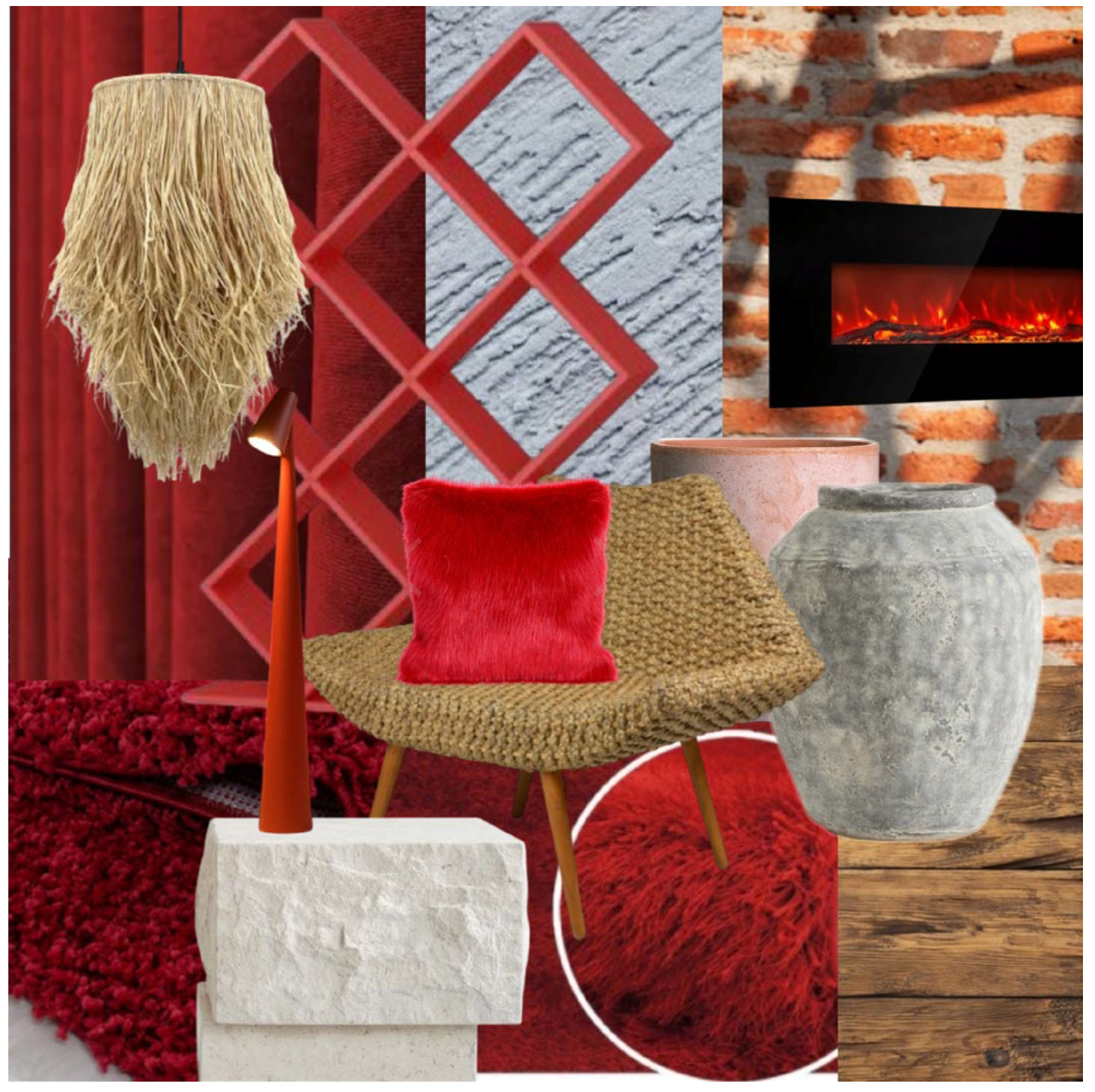
Moodboard—Red
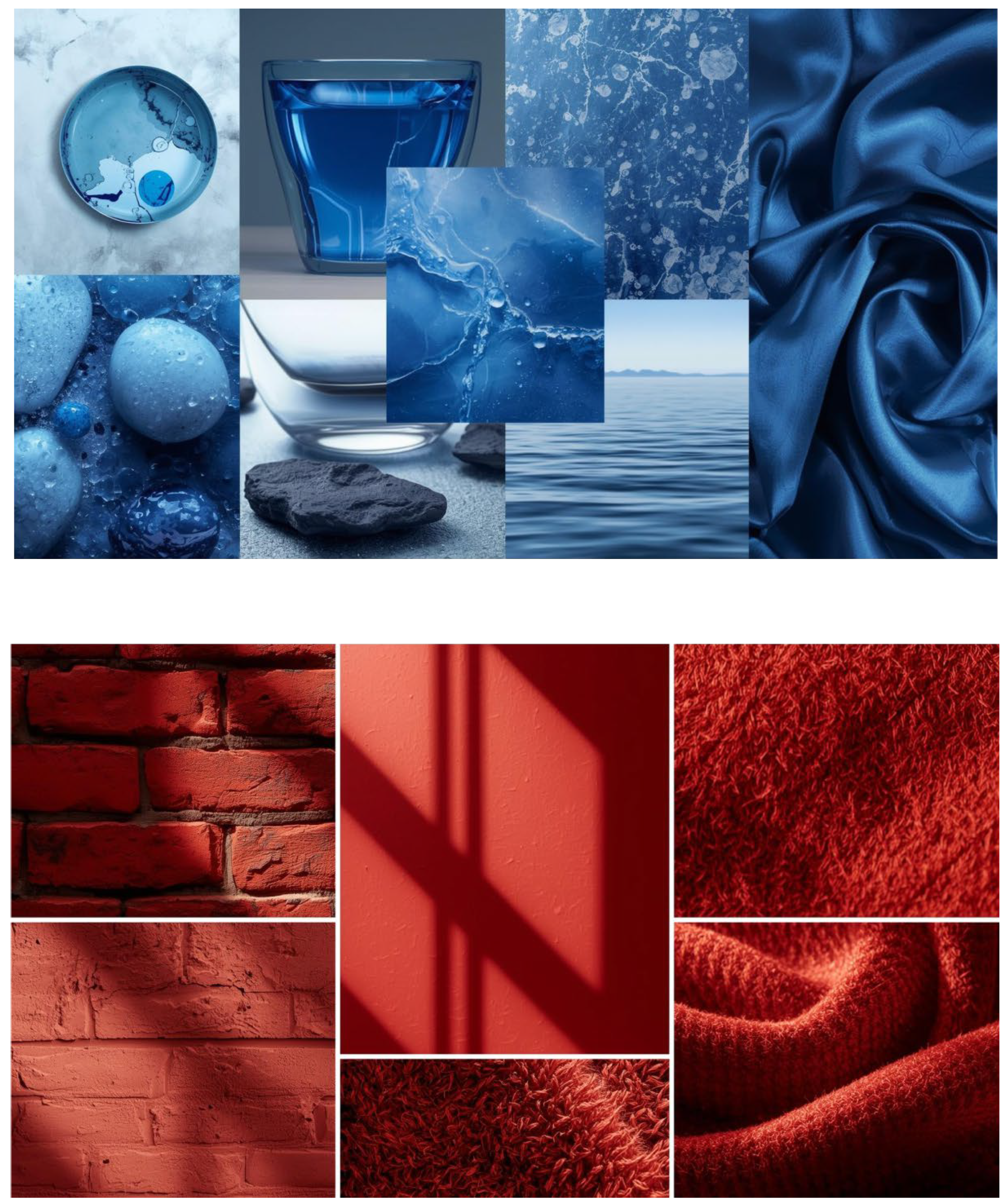
The red moodboard illustrates the multisensory associations of red as a high-arousal, “warm” color. Coarse brick textures, matte painted walls, and fibrous fabrics evoke tactility linked with warmth, density, and a sense of enclosure. These material and chromatic choices confirm the findings of psychophysical studies in which red is consistently associated with stimulation, heightened attention, and increased perceived temperature. In spatial perception, such surfaces may foster feelings of coziness, but also claustrophobia when applied excessively. This aligns with experimental evidence demonstrating that red environments enhance arousal and can amplify the perception of noise, thereby intensifying the sensory climate of interiors [Figure 7].
Moodboard—Blue
The blue moodboard conveys blue as a “cold,” low-arousal color associated with calmness, expansion, and harmony. Smooth, glossy, and water-inspired textures (e.g., satin, polished stone) generate tactile sensations of coolness and lightness, reinforcing the perception of depth and spaciousness. In alignment with environmental psychology research, blue-dominant environments are reported to reduce stress levels and attenuate the subjective perception of noise, thereby supporting restorative experiences. From a design perspective, these qualities position blue as an optimal color strategy for interiors intended to promote relaxation, contemplation, and a sense of openness [Figure 7].
Below is a conceptual, original mood board illustrating the multisensory impact of red on interior design. Raw textures, warm lighting accents, and dynamic forms emphasize energy, warmth, and stimulation. The arrangement demonstrates how red, as an “unfolding” color, creates intimacy and intensity while simultaneously enhancing sensory activation through tactile and thermal associations [Figure 8].
Below is a conceptual mood board illustrating the multisensory impact of blue in interior design. Smooth, reflective surfaces, metallic and satin finishes, and fluid forms emphasize coolness, spaciousness, and tranquility. The composition highlights how blue, as a “receding” color, enhances the perception of openness and relaxation through visual, tactile, and acoustic stimuli [Figure 9].

4. Discussion

4.1. Multisensory Perception of Color: Vision, Sound, Smell, Touch, and Temperature

The experience of color in space usually takes place through the dominant sense of vision, yet other senses also participate in perceiving indirect stimuli associated with color. In a well-designed multisensory interior, visual impressions harmonize with acoustic, thermal, tactile, and even olfactory sensations, creating a coherent atmosphere. As discussed in the previous section, red and blue can trigger predictable reactions beyond the visual modality—for instance, influencing the perceived loudness of noise or modulating sensory arousal levels related to thermal comfort or appetite. The mechanisms underlying these phenomena often involve cross-sensory associations (crossmodal correspondences), shaped both biologically and culturally. For example, the brain integrates inputs from multiple senses into a single interpretation of the environment: higher temperatures are associated with “warm” colors, while lower temperatures are linked with “cool” colors, even if the wall paint does not alter the actual air temperature. Similarly, lower-pitched sounds (bass) are intuitively matched with darker or visually “lower” colors, while brighter colors correspond with higher tones.
Taste and aroma. Strong associations exist between color and the taste or aroma of food—for instance, the taste of an orange is tightly bound to its color, so a green-colored beverage with orange flavor may be perceived as less authentically “orange.” Studies have shown that the presence of specific scents in the environment can distort color perception—for example, the smell of lemon or mint may make a hue appear more yellowish or greenish than it actually is. This occurs because the mind generates unconscious associations (lemon = yellow, mint = green) that influence the perception of background color. Conversely, color can also modify flavor and aroma perception. In one experiment, the same wine was judged as sweeter and more aromatic when served under red lighting compared to blue or neutral light [21]. Such phenomena are known as crossmodal effects, in which stimuli from one sense influence perceptions in another. Experimental models of multisensory color perception often manipulate the hue of a room and measure changes in taste or smell, confirming that visual cues can systematically bias gustatory experiences.
Auditory perception of color. Colors also affect the acoustic mood of interiors. In rooms dominated by red tones, users may unconsciously speak louder and faster, and background sounds (e.g., street noise or air conditioning) may be judged as more disturbing. In blue-toned interiors, people tend to speak more quietly, and background noise is perceived as less intrusive. In rare cases of synesthesia, sounds trigger color sensations or vice versa—listeners “see” colors while hearing music. Composers such as Scriabin experimented with assigning musical keys to specific colors [29]. In general, high-pitched sounds are more frequently associated with bright, cool colors (yellow, light blue), while low-pitched tones are linked with dark, warm hues (burgundy, brown).
Olfactory and gustatory perception of color. Olfactory descriptions often employ “color terms” (e.g., “green” scent of grass, “warm” spicy aroma). When using aroma marketing in interiors, designers should ensure that scents are consistent with the color palette. For example, the intense fragrance of cinnamon or vanilla is more congruent with warm-colored environments (oranges, reds) than with cool blue ones, where it may appear incongruent or unpleasant. Research shows that sensory congruence between color and aroma enhances overall evaluations of spaces by users. In practice, this may be applied by thematically matching scents to interior zones: a “red” energy zone in a spa might be reinforced with clove or citrus notes, while a “blue” relaxation area could be complemented with eucalyptus or marine aromas. The influence of color on taste is also documented: in experiments, beverages of identical composition tasted different depending on the color of packaging or lighting—red cues enhanced perceptions of measure changes in taste or smell, confirming that visual cues can systematically bias gustatory experiences. Tactile perception of color. Color is also perceived through materials and textures, which people intuitively associate with particular hues. Even sighted individuals, when closing their eyes, can “imagine” that a warm, coarse textile (e.g., wool) corresponds with red or orange, whereas smooth, cool silk aligns with blue or silver. In some cases of synesthesia, tactile stimuli can directly evoke color sensations (e.g., a given texture “feels green” even without visual input). In design practice, warm, soft, and textured materials (wood, velvet) amplify the warm character of red interiors, while glass, metal, or polished stone emphasize the visual coolness of blue spaces. Interestingly, architectural theorists also speak of the “weight of colors”—subjectively, colors differ in perceived heaviness: black and red appear “heavy,” while blue and white are perceived as “light.” This has implications for how interiors are experienced—for example, a dark red floor may be perceived as more solid (although visually lighter) than a pale blue one [30].
These complex phenomena illustrate that a designer consciously employing color can simultaneously influence multiple senses—even if the user remains unaware of such effects.

4.2. Challenging Assumptions: Color, Temperature, and Synesthesia

Interestingly, recent experiments have questioned some of the traditional assumptions. For instance, Ho et al. found that when participants touched colored objects, the effect was opposite to expectations: a blue object at a given temperature was more often perceived as warm than a red object at the same temperature. This suggests that the brain integrates direct thermal sensations with prior associations of color and warmth in a contrasting manner—possibly as a corrective mechanism to the anticipated “color effect.”

4.2.1. Synesthesia and Applications in Design

The study also refers to synesthesia, a special case of multisensory perception. The findings are scientifically significant—revealing which properties of sound correspond to color experiences—and practically relevant, as they point to opportunities for using AI to predict or simulate synesthetic sensations. In the future, such knowledge may support the design of tools for blind individuals (e.g., translating speech into color cues) or inspire multisensory art and interfaces that connect sound and color based on actual cross-sensory correlations [13].
Synesthesia occurs when stimulation of one sense simultaneously triggers sensations characteristic of another. Individuals with synesthesia may, for example, “hear” colors (each hue evoking a specific sound), “taste” words, or “see” colors in response to numbers or music. Although synesthesia is rare as a congenital neurological trait, it has long inspired artists and designers to create multisensory experiences accessible to all. In architecture, one speaks of “synesthetic architecture”, in which spaces are designed so that stimuli from different senses converge into a unified perceptual whole. A well-known example is the Jewish Museum in Berlin by Daniel Libeskind, where slanted floors, sharp angles, and cold lighting deliberately disrupt conventional stimuli, producing not only visual disorientation but also bodily sensations of imbalance and confusion—thus evoking deeper emotions aligned with the museum’s theme.
In synesthetic design, a stimulus intended for one sense is deliberately crafted to suggest another. For instance, a specific texture may evoke a thermal impression, or a building material may suggest a sound association: rough brick may “feel” warm and dry, while smooth chrome-plated metal may appear cold and “resonant” (as we imagine the sound it might produce). Designers can harness these associations: to make a space feel cozy and warm, one may use not only warm colors but also soft, matte textures that absorb sound; to create a clinical, laboratory-like atmosphere, one may combine cool hues with smooth, glossy materials that reflect both light and sound, producing an echoing sense of “sterility”.
Synesthesia also has direct applications in multisensory information design. Since in some individuals the senses are “cross-wired,” this principle can be adapted as a universal design language—for example, assigning specific sounds, shapes, or scents to particular colors, so that color-coded information is accessible across multiple modalities. Historically, attempts at “color instruments” such as the color organ sought to match sounds with light hues. Today, designers experiment with multimedia installations that combine color, sound, image, and touch (e.g., vibrations) into a single immersive experience. One example is an interactive bridge illumination project, where a pedestrian’s sound (e.g., a clap) triggers a wave of light in a corresponding color. Another example involves therapeutic sensory rooms for children with disabilities, where wall colors respond to sound or touch, allowing children to “see music” or “hear touch.” Although these ideas once seemed futuristic, LED, sensor, and synthesizer technology has advanced such that these multisensory concepts are increasingly feasible. Thus, in multisensory navigation systems for buildings, these principles can be applied: a red path could be marked not only by visual color but also by a high-pitched, fast rhythm sound, while a blue path could be accompanied by a lower tone and slower pulse, ensuring that both visual and auditory cues are congruent and intuitive. Similarly, functional zones may be paired with olfactory motifs—for instance, lavender in a blue relaxation area, and citrus notes in a red activity zone. In this sense, synesthetic design aims at the harmonious integration of stimuli, enabling them to reinforce each other and convey meaning even when one sensory channel is limited.
Sustainable and Inclusive Color Design
Multisensory and inclusive design are closely aligned with the principles of sustainable development—particularly in the social dimension (ensuring equal access) and in promoting user well-being. According to the UN 2030 Agenda, the Sustainable Development Goals include building inclusive, safe urban spaces (SDG 11) and promoting health and well-being (SDG 3). Considering the needs of people with different disabilities when designing interior color schemes directly supports these goals. European legislation and standards—such as the European Accessibility Act of 2019—emphasize the application of universal design principles in all new projects.
This means that multisensory perception of space should be planned already at the conceptual stage of architectural design: from providing adequate lighting (for the visually impaired), to acoustics (important for those using hearing aids in noisy interiors), to clear tactile and contrast-based markings. Publicly funded projects in the EU increasingly require accessibility audits, which also assess elements such as the use of colors that meet contrast criteria (e.g., EN 17161 standards on visual accessibility and color perception in the built environment).
It is important to stress that inclusive design does not mean eliminating intense colors but rather using them consciously. For example, UK Design Council guidelines on design for dementia recommend avoiding patterned, distracting surfaces but at the same time employing strong color accents to mark key elements (e.g., toilet doors in contrasting hues, handrails in bright yellow). In design for individuals with autism, by contrast, muted, cool palettes are preferred to prevent sensory overload—here blues and greens are more suitable than vivid reds. The context of the user and the function of the space thus determine color choices from a sustainable design perspective: the aim is to create environments that support health and well-being for all.
Interestingly, despite the decline in sensitivity to cool colors with age, surveys show that elderly respondents most often choose blue and green as their favorite environmental colors. This apparent paradox (reduced perception of blues vs. preference for blues) continues to puzzle researchers. Age-related visual changes include:
Yellowing of the lens, acting as a “warm filter” that reduces blue light transmission;
Decline in cone sensitivity, particularly S-cones responsible for blue perception;
Increased need for lighting—older adults require more light to recognize colors;
Greater reliance on mesopic adaptation, i.e., transitional conditions between day and twilight [28].
How then should we interpret the dominant color preferences of older adults in light of the Purkinje phenomenon?

4.3. Conceptual Prototypes of Multisensory Light Switches

To further illustrate how multisensory coding of color can be translated into practical design applications, two conceptual prototypes of light switches were developed. These design studies are based on the analyses presented earlier in this article, which highlighted how red and blue evoke contrasting yet predictable sensory associations across vision, touch, hearing, thermal perception, and even olfactory imagination. By integrating these findings into product-scale design, the prototypes demonstrate how inclusive design strategies may extend beyond spatial environments to everyday interfaces (Table 7).
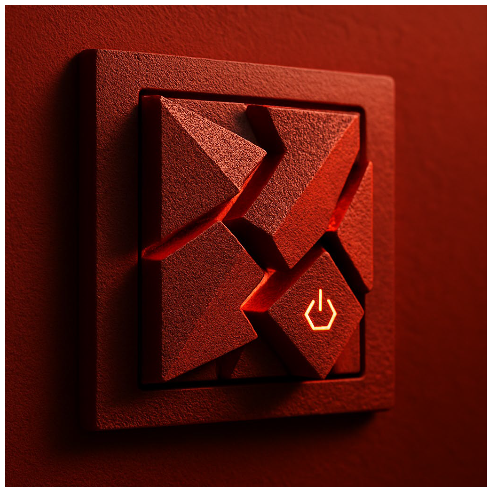
The design emphasizes sharp, geometric button shapes with rough, textured surfaces and warm tactile qualities, reflecting the stimulating and dynamic sensory profile of red [Figure 10].
Concept Proposal—Multisensory Light Switch “Red Code”
Form and Layout:
The panel consists of several sharp, geometric buttons (e.g., triangles, rhombuses, jagged edges).
The buttons are arranged in a multi-element, layered composition, visually and tactilely resembling a dynamic structure (e.g., a crystal or a fragment of a wall).
Surface:
A rough texture—for example, cast from sandblasted aluminum, ceramic, or imprinted architectural concrete.
Small grooves and protrusions are clearly perceptible to the touch.
Thermal Impression:
The buttons are made of a “warm-touch” material—e.g., impregnated wood, ceramic with light surface heating (a low-energy micro-heater).
Alternatively, a polymer composite can be used, which naturally warms quickly to the hand’s temperature compared to metal.
Color and Lighting:
A dark red casing with subtle warm LED backlighting (2700 K) glowing from the gaps between the buttons, highlighting the dynamism of the form and signaling activation.
Multisensory Qualities:
Touch: a distinctly rough surface and a warm tactile impression.
Sight: sharp shapes, contrasts of light and shadow.
Sound: each click produces a clear, “sharp” mechanical sound that matches the geometric form.
This concept was developed on the basis of the earlier analyses presented in this article, which explored how the color red can be encoded and experienced across multiple sensory modalities in interior design.
The design features smooth, wavy button forms with glossy, cool-to-touch surfaces and subtle cool backlighting, reflecting the calming and spacious sensory profile of blue [Figure 11].
Concept Proposal—Multisensory Light Switch “Blue Flow”
Form and Layout:
The panel is composed of smooth, flowing, and wavy-shaped buttons, arranged in a minimalistic and harmonious composition.
The design visually and tactilely evokes the impression of water ripples or fluid architectural forms, reinforcing associations of openness and calmness.
Surface:
A glossy, sleek texture—for example, polished glass, glazed ceramic, or lacquered composite materials.
The buttons are intentionally smooth to the touch, emphasizing a cool and refined tactile quality.
Thermal Impression:
The material selection ensures a “cool-touch” sensation—e.g., glass, stone, or polished ceramic.
The surfaces retain a slightly lower temperature than the surrounding air, providing a refreshing tactile experience.
Color and Lighting:
A light-to-medium blue casing with subtle cool LED backlighting (5000–6500 K) shining gently around the edges of the buttons.
This lighting effect highlights the fluid contours and underscores the calming atmosphere of the design.
Multisensory Qualities:
Touch: smoothness, gloss, and cool tactile sensations.
Sight: soft, flowing shapes with gentle contrasts and reflections.
Sound: each click produces a muted, low-pitched sound consistent with the tranquil character of the form.
This concept was developed on the basis of the earlier analyses presented in this article, which demonstrated how the color blue can be experienced multisensorially in interior design—as a symbol of spaciousness, serenity, and sensory balance.
The two concepts—Red Code and Blue Flow—represent contrasting sensory strategies. The red prototype emphasizes stimulation and intensity: sharp geometries, rough textures, warmth to the touch, and a sharp mechanical sound upon activation, all of which reflect red’s energetic and activating qualities. By contrast, the blue prototype highlights calmness and balance: smooth, flowing forms, glossy cool-touch surfaces, and a muted, low-pitched click that resonates with blue’s associations of serenity and spaciousness. Together, these designs showcase how theoretical insights into multisensory perception of color can be materialized into tangible objects. They also provide a practical framework for inclusive design, where everyday elements such as light switches can be enriched with multisensory cues, ensuring accessibility and enhancing the user experience for both sighted and visually impaired individuals.

4.4. Color, Perception, and the Purkinje Effect

Considering the lower lighting conditions that often prevail in the homes of older adults (diffused lighting, local lamps, lack of strong daylight), the Purkinje effect naturally enhances the perception of blue–green tones relative to red. Although objective visual sensitivity declines, in subjective perceptual experience (i.e., how one feels in a given space), blues and greens appear brighter, calmer, and more present. It can therefore be assumed that seniors subconsciously prefer colors that harmonize with their perceptual lighting conditions—for instance, hues that remain “visible” under dim, natural, or evening light—consistent with the Purkinje mechanism. In summary, under reduced lighting conditions typical of domestic environments for the elderly, the visual system becomes more sensitive to wavelengths corresponding to blues and greens, which may unconsciously influence the sense of their brightness and presence [31].
Sustainable and inclusive design benefits from a multisensory approach to color. Biophilic design, recognized as a component of sustainable architecture, emphasizes the need to engage multiple senses through natural elements—not only the green of plants, but also their scent, the sound of wind, or the texture of wood. The introduction of natural materials and colors into interiors simultaneously fulfills several goals: it is ecological (local materials, fewer synthetics), health-promoting (improved air quality, humidity regulation by wood), and provides rich multisensory stimuli. For example, wooden finishes not only add a warm, honey-like hue to a space but also produce a subtle resin scent, are pleasant to the touch, and improve room acoustics (wood reduces echo). Plants enrich interiors with soothing greenery for the eyes, filter the air while providing fresh fragrance, and introduce natural sounds (the rustling of leaves). Multisensory design thus draws upon the principles of sustainable design to create spaces that are both welcoming and health-promoting.
Based on the studies reviewed, a set of key design recommendations can be formulated:
Ensure multisensory coherence. When designing for all senses, stimuli should be aligned—for example, if a particular color palette is applied, it should be accompanied by a congruent soundscape and fragrance, avoiding dissonance (e.g., bright red décor paired with a cold, acoustically harsh space). Non-material elements such as acoustics, background music, scents (derived from natural materials or tailored to the room’s function), and tactile features (textures, surface temperatures) should complement visual design.
Use redundant multisensory coding. Color-coded information can be supported by other modalities. For instance, a specific sound or scent can signal the presence of red or blue in the environment. Inclusive designers should consider hybrid sensory strategies—combining stimuli (e.g., sound with scent)—to increase accessibility for visually impaired users. Such systems must remain intuitive, easy to learn, and simple to perceive.
Leverage natural crossmodal correspondences. For example, to encode red in space, designers might employ warm materials or heated elements paired with energetic sound cues; conversely, blue may be conveyed through cooler tactile materials and calmer sounds. Balanced, correlated stimuli (aligned with psychological crossmodal correspondences) enhance perception, provided no single sense overwhelms the others.
Design senior-friendly interiors. Residential environments for older adults should emphasize high-contrast warm colors. Key elements (doors, handrails, stair edges) should be marked with colors such as red against a dark background (e.g., black) to maximize visibility. Blue and other cool hues may be included decoratively but should not be the sole identifiers of functionally critical features, as they may be overlooked by users with weakened vision. For seniors with cognitive decline, color cues should be even simpler and more distinct—for example, universal color codes (red = caution/danger, green = safe) applied consistently throughout the interior.
Apply practical guidelines. Warm, highly saturated colors (reds, oranges, yellows) should highlight important features, while problematic color combinations for seniors (e.g., blue text on green background, dark navy details on black surfaces) should be avoided. High brightness contrasts are essential (e.g., light-colored doors on dark walls). Excessive use of dark hues in small rooms should be avoided, as they can increase feelings of confinement and reduce visibility in low light. Instead, bright, light-reflecting backgrounds complemented with strong color accents are recommended. Functionality should be balanced with aesthetics—for instance, yellow can serve as a warning color in communal spaces, while in living areas it should be used more sparingly to prevent visual fatigue.
Ensure redundancy in information design. Where color is used to convey functional meaning (e.g., zones of a building, evacuation routes, wayfinding systems), it should always be accompanied by redundant cues such as text, pictograms, or tactile markers, ensuring accessibility for people with low vision or color blindness.
Test with users and follow standards. Participatory approaches should be applied—consulting with blind users to evaluate tactile signage, or with seniors to ensure color schemes are not visually tiring. Designers should also reference established standards and guidelines (e.g., Guide to Universal Design, BS 8300 in the UK, DIN 32975 in Germany on visual contrast, or Polish Universal Design Guidelines).
All of these measures reflect the principles of human-centered design, where the ultimate goal is user well-being and a complete sensory experience of space. The result is interiors that are more inclusive, comfortable, and safe—an inherent part of sustainable social development. Moreover, such spaces are often aesthetically richer, as multisensory design adds depth to the experience. In today’s competitive environments (retail, museums, hotels), design that appeals to multiple senses creates memorable, distinctive impressions—supporting both marketing value and health-promoting benefits by fostering stronger emotional bonds with place and a deeper sense of place.

5. Conclusions

The conducted study demonstrates the potential of developing theoretical interior models as a methodological tool for architectural and design research. By systematically translating sets of perceptual and sensory features into spatial, material, and atmospheric characteristics, such models enable a deeper understanding of how interiors can be shaped to evoke specific experiences. They provide an experimental framework that links design parameters (light, geometry, materiality, acoustic and olfactory qualities) with multisensory responses, thereby enriching traditional approaches to architectural analysis.
Equally significant is the role of conceptual visualizations, which allow abstract qualities—such as warmth, spaciousness, tension, or ethereality—to be expressed in a tangible form. These visual representations facilitate not only the communication of design intentions but also the validation of theoretical assumptions through experiential simulation. In this way, visualizations act as a bridge between theoretical constructs and practical design applications.
The results indicate that creating theoretical models and their visualizations offers valuable opportunities for further interdisciplinary research, particularly in the fields of sensory studies, environmental psychology, and sustainable design. By combining conceptual rigor with perceptual exploration, this approach supports the development of more human-centered and experientially rich architectural environments [Table 8].
Operational guidelines for design practice can be summarized as follows:
Material selection: warm colors (e.g., red) should be paired with tactilely warm materials (wood, textured ceramics, textiles), while cool colors (e.g., blue) align better with smooth, glossy, and cold-to-touch materials (glass, metal, stone).
Lighting parameters: red-coded spaces benefit from warm light (2700–3000 K) and strong light–shadow contrasts, whereas blue-coded spaces should employ cool light (5000–6500 K) and diffuse illumination.
Acoustic design: multisensory coding can be reinforced by acoustic cues—red environments with sharper, more dynamic sounds; blue with low-pitched, muted, and calming soundscapes.
Olfactory integration: scents may be used to complement color associations (sweet or spicy notes for red, fresh or herbal notes for blue).
Study limitations include the relatively small sample size of the exploratory survey, as well as individual differences in sensory interaction (e.g., personal or cultural variability in crossmodal associations). These constraints highlight the need for further empirical validation, particularly across diverse cultural and age groups, and with larger participant samples.
Contemporary interior architecture design is increasingly moving away from treating color solely as a visual attribute of space, shifting instead toward a multisensory and inclusive approach. A comparative analysis of two contrasting hues—red and blue—illustrates how diverse effects they can evoke through sight, hearing, smell, touch, and thermal perception. Red, an energetic and “warm” color, stimulates and attracts attention but can also overwhelm and amplify noise; blue, on the other hand, soothes the senses, creates an impression of spaciousness and coolness, yet in excess may be perceived as detached or suppressing certain stimuli (e.g., appetite). Understanding these mechanisms allows designers to consciously shape the user experience—through an appropriate composition of colors and accompanying stimuli, mood, behavior, and comfort within interior spaces can be effectively modeled. The phenomenon of synesthesia serves as an inspiration to pursue sensory coherence in spatial design. Stimuli for different senses should not conflict but rather complement each other, creating a rich yet harmonious landscape of impressions. This translates into practical guidelines: when designing with color, one should simultaneously consider texture, sound.
At the same time, inclusivity in color design is indispensable for sustainable development. The right to fully experience space—including its aesthetic and sensory qualities—should belong to everyone, regardless of perceptual limitations. Solutions enabling blind, visually impaired, or otherwise disabled individuals to perceive color-related cues (through tactile markers, auditory or olfactory signals, etc.) are becoming a new standard of accessibility. Guided by the principle of “Nothing about us without us,” designers should collaborate with users with special needs, testing and refining multi-channel information systems in space. Such initiatives are reinforced by international guidelines and standards, which means that inclusive color design is no longer a matter of goodwill, but a quality requirement in many contemporary projects.
In this context, it is worth including research that demonstrates the extraordinary plasticity of the human brain—the nervous system’s ability to reorganize synaptic connections in response to environmental changes, damage, or functional loss—forming the basis of sensory compensation processes. One of the most fascinating examples is the adaptation observed in blind or deaf-blind individuals, where the visual cortex—deprived of typical visual stimuli—can be recruited for processing information from other modalities. This phenomenon may hold particular significance for the design of multisensory coding systems of information—including color—for blind and visually impaired individuals. Since the brain is capable of adaptation and can transfer functions from one modality to another, there is a real possibility of developing tools that translate visual stimuli into auditory, tactile, or thermal ones, which users could eventually learn to interpret as intuitively as sighted people perceive colors. In this sense, for blind and visually impaired individuals, this property of the brain paves the way for multisensory color coding. If the brain can “learn” to hear or feel by touch information that was originally processed visually, it is possible to create systems in which colors—such as red or blue—are encoded through sounds, tactile cues, temperature, or scents. Thanks to neural plasticity, users of such solutions could naturally “read” colors, much like implant users learn to perceive speech and sound. This means that appropriately designed multisensory technologies can become practical tools for restoring access to color-related information for people who have lost their sight, with effectiveness increasing over time as neural adaptation progresses.
For blind and visually impaired individuals, this property of the brain paves the way for multisensory color coding. If the brain can “learn” to hear or feel by touch information that was originally processed visually, it is possible to create systems in which colors—such as red or blue—are encoded through sounds, tactile cues, temperature, or scents. Thanks to neural plasticity, users of such solutions could naturally “read” colors, much like implant users learn to perceive speech and sound. This means that appropriately designed multisensory technologies can become practical tools for restoring access to color-related information for people who have lost their sight, with effectiveness increasing over time as neural adaptation progresses.
In conclusion, multisensory color experience represents an intersection of science, art, and technology in interior architecture. It deepens perception, making spaces more expressive and emotionally impactful. At the same time, it places responsibility on designers to shape environments that are socially sustainable—accessible and welcoming to all. An interdisciplinary approach—combining knowledge of perception with design practice and principles of universal design—enables the creation of interiors that engage the full spectrum of human senses, fostering stronger bonds between people and their surroundings. In such spaces, color ceases to be merely a background element and becomes a vivid experience, shared by both sighted and blind individuals, the young and the elderly, the able-bodied and those with disabilities—in other words, by the entire diverse community of users. In this way, interior architecture can fully realize its social role, creating environments that are simultaneously beautiful, functional and inclusive.

Author Contributions

Conceptualization, A.R.-L.; Software, A.K.; Validation, A.R.-L.; Formal analysis, A.R.-L. and A.K.; Investigation, A.R.-L.; Data curation, A.R.-L.; Writing—original draft, A.R.-L.; Supervision, A.R.-L. All authors have read and agreed to the published version of the manuscript.

Funding

This research received no external funding.

Institutional Review Board Statement

Not applicable.

Informed Consent Statement

Not applicable.

Data Availability Statement

The original work presented in this study can be found in the article. If you have any further questions, please contact the corresponding author.

Acknowledgments

While preparing this manuscript, the author used the Chat GPT 5 tool for data collection, generating a diagram and language translation. The author reviewed and edited the results and takes full responsibility for the content of this publication.

Conflicts of Interest

The author declares no conflicts of interest.

References

  1. Xie, C.; Zhang, Z.; Guo, Y. Multisensory Experience and Emotional Response in Architectural Space: A Comparative Analysis of a Coffee Roasting Factory. Buildings 2023, 15, 1393. [Google Scholar]
  2. Ziat, M.; Balcer, C.A.; Shirtz, A.; Rolison, T. A Century Later, the Hue-Heat Hypothesis: Does Color Truly Affect Temperature Perception? In Haptics: Perception, Devices, Control, and Applications; Springer: Berlin/Heidelberg, Germany, 2016; pp. 273–280. [Google Scholar] [CrossRef]
  3. Jonauskaite, D.; Mohr, C. Do we feel colours? A systematic review of 128 years of psychological research linking colours and emotions. Psychon. Bull. Rev. 2025, 32, 1457–1486. [Google Scholar] [CrossRef]
  4. Jonauskaite, D.; Abu-Akel, A.; Dael, N.; Oberfeld, D.; Abdel-Khalek, A.M.; Al-Rasheed, A.S.; Antonietti, J.-P.; Bogushevskaya, V.; Chamseddine, A.; Chkonia, E.; et al. Universal patterns in color–emotion associations are further shaped by linguistic and geographic proximity. Psychol. Sci. 2020, 31, 1245–1260. [Google Scholar] [CrossRef]
  5. Takei, S.; Imaizumi, S. Effect of background color on facial emotion recognition: Influence of color–emotion associations. i-Perception 2022, 13, 1–16. [Google Scholar]
  6. Alvarado, J. Text-to-image models reveal specific color-emotion associations. Front. Psychol. 2025, 16, 1593928. [Google Scholar] [CrossRef] [PubMed]
  7. Bower, T.; Kim, J.; Kim, H. Influence of immersive room color on physiological and psychological responses in virtual reality. Front. Psychol. 2022, 13, 879325. [Google Scholar]
  8. Wang, M.-Y.; Ku, Y.-C.; Lin, Y.-H. Changes in color preference and emotional associations during the COVID-19 pandemic. Front. Psychol. 2024, 15, 1365332. [Google Scholar]
  9. Rui, L.; Firzan, M. Emotional Design of Interior Spaces: Exploring Challenges and Opportunities. Buildings 2025, 15, 153. [Google Scholar] [CrossRef]
  10. Spence, C. Senses of place: Architectural design for the multisensory mind. Cogn. Res. Princ. Implic. 2020, 5, 46. [Google Scholar] [CrossRef]
  11. Sandmann, P.; Dillier, N.; Eichele, T.; Meyer, M.; Kegel, A.; Pascual-Marqui, R.D.; Marcar, V.L.; Jäncke, L.; Debener, S. Visual activation of auditory cortex reflects maladaptive plasticity in cochlear implant users. Brain 2012, 135, 555–568. [Google Scholar] [CrossRef]
  12. Miyamoto, K.; Taniyama, Y.; Hine, K.; Nakauchi, S. Congruency of color–sound crossmodal correspondence interacts with color and sound discrimination depending on color category. i-Perception 2023, 14, 1–18. [Google Scholar] [CrossRef]
  13. Bartulienė, R.; Saudargienė, A.; Reinytė, K.; Davidavičius, G.; Davidavičienė, R.; Ašmantas, Š.; Raškinis, G.; Šatkauskas, S. Voice-Evoked Color Prediction Using Deep Neural Networks in Sound–Color Synesthesia. Brain Sci. 2025, 15, 520. [Google Scholar] [CrossRef] [PubMed]
  14. Cho, J.Y.; Suh, J. Spatial Color Efficacy in Perceived Luxury and Preference to Stay: An Eye-Tracking Study of Retail Interior Environment. Front. Psychol. 2020, 11, 296. [Google Scholar] [CrossRef] [PubMed]
  15. Ward, R.J.; Ashraf, M.; Wuerger, S.; Marshall, A. Odors modulate color appearance. Front. Psychol. 2023, 14, 1175703. [Google Scholar] [CrossRef]
  16. Spence, C.; Levitan, C.A. Exploring the Role of Color in Flavor Perception: Recent Advances and Future Directions. Food Qual. Prefer. 2021, 92, 104124. [Google Scholar]
  17. Reinoso Carvalho, F.; Wang, Q.J.; Spence, C. Assessing the Influence of Beer Color, Bottle Color, and Label Design on Consumer Expectations and Perceptions. Food Res. Int. 2021, 141, 110074. [Google Scholar]
  18. Tu, Y.; Yang, Y.; Ma, M. Effect of Ambient Color on Taste Perception and Emotional Response. Appetite 2020, 149, 104630. [Google Scholar]
  19. Wang, Z.-Y.; Cho, J.-Y. Older Adults’ Response to Color Visibility in Indoor Residential Environment Using Eye-Tracking Technology. Sensors 2022, 22, 8766. [Google Scholar] [CrossRef]
  20. Chen, Y.C.; Spence, C. Crossmodal Correspondences between Basic Tastes and Colors: A Replication and Extension Study. Multisens. Res. 2023, 36, 1–20. [Google Scholar]
  21. Ho, H.-N.; Iwai, D.; Yoshikawa, Y.; Watanabe, J.; Nishida, S. Combining colour and temperature: A blue object is more likely to be judged as warm than a red object. Sci. Rep. 2014, 4, 5527. [Google Scholar] [CrossRef]
  22. Ludden, G.D.; Schifferstein, H.N.; Hekkert, P. The multisensory perception of products: The influence of color–texture congruence. Des. Stud. 2020, 68, 100943. [Google Scholar]
  23. Wastiels, L.; Schifferstein, H.N.J.; Wouters, I. Materiality matters: The influence of color and gloss on perceived material properties and touch expectations. Front. Psychol. 2021, 12, 624303. [Google Scholar]
  24. Hagtvedt, H.; Brasel, S.A. Crossmodal correspondences between visual and tactile textures: The role of color. J. Consum. Psychol. 2022, 32, 482–495. [Google Scholar]
  25. Ward, J.; Simner, J. The color of touch: A case of tactile–visual synaesthesia. Neurocase 2012, 18, 167–180. [Google Scholar] [CrossRef] [PubMed]
  26. Iranzo Bartolomé, J.; Cho, G.; Cho, J.-D. Multi-Sensory Color Expression with Sound and Temperature in Visual Arts Appreciation for People with Visual Impairment. Electronics 2021, 10, 1336. [Google Scholar] [CrossRef]
  27. Xu, H.; Zhao, J.; Jin, C.; Zhu, N.; Chai, Y. Research on the Multi-Sensory Experience. Design of Interior Spaces from the Perspective of Spatial Perception: A Case Study of Suzhou Coffee Roasting Factory. Buildings 2025, 15, 1393. [Google Scholar] [CrossRef]
  28. Jaglarz, A. Color as a Key Factor in Creating Sustainable Living Spaces for Seniors. Sustainability 2024, 16, 10251. [Google Scholar] [CrossRef]
  29. Jiang, A.; Fang, W.; Liu, J.; Foing, B.; Yao, X.; Westland, S.; Hemingray, C. The effect of colour environments on visual tracking and visual strain during short-term simulation of three gravity states. Appl. Ergon. 2023, 110, 103994. [Google Scholar] [CrossRef]
  30. Wang, Q.J.; Spence, C. “That’s What I Call Umami!” Color–Taste Associations in Children and Adults. J. Sens. Stud. 2022, 37, e12736. [Google Scholar]
  31. Anstis, S.M. The Purkinje rod–cone shift as a function of luminance and retinal eccentricity. Vis. Res. 2002, 42, 2485–2491. [Google Scholar] [CrossRef]
Figure 1. Diagram showing the results of a survey on the “first association” of the color red with an emotion. Author: Aleksandra Kowalska.
Sustainability 17 09381 g001
Figure 2. Diagram showing the results of a survey on the “first association” of the color blue with an emotion. Author: Aleksandra Kowalska.
Sustainability 17 09381 g002
Figure 3. Diagram showing the results of the “first association” red survey. Author: Aleksandra Kowalska.
Sustainability 17 09381 g003
Figure 4. Diagram showing the results of the “first association” blue survey. Author: Aleksandra Kowalska.
Sustainability 17 09381 g004
Figure 5. Diagram showing the survey results of the “first association” of red with spatial form. Author: Aleksandra Kowalska.
Sustainability 17 09381 g005
Figure 6. Diagram showing the survey results of the “first association” of blue with spatial form. Author: Aleksandra Kowalska.
Sustainability 17 09381 g006
Figure 7. Sensory mood board illustrating the multisensory associations of red and blue in interior design (author’s concept).
Sustainability 17 09381 g007
Figure 8. Moodboard—Red Interior Concept. Author: Agnieszka Rek-Lipczyńska.
Sustainability 17 09381 g008
Figure 9. Moodboard—Blue Interior Concept. Author: Agnieszka Rek-Lipczyńska.
Sustainability 17 09381 g009
Figure 10. Conceptual rendering of a multisensory light switch inspired by the color red. Generated by ChatGPT-5 based on the developed design assumptions.
Sustainability 17 09381 g010
Figure 11. Conceptual rendering of a multisensory light switch inspired by the color blue. Generated by ChatGPT-5 based on the developed design assumptions.
Sustainability 17 09381 g011
Table 1. Summary of color emotions based on the research of Jonauskaite, D. and Mohr, C. from 2025 [3]. Author: Agnieszka Rek-Lipczyńska.
ColorsEmotions
Positive
Emotions
Negative
Level of ArousalComments
1.redX
love
X
anger
TALLStrong emotional reaction, ambiguous
2.yellowX
joy
TALLAssociated with optimism and light
3.orangeX
enthusiasm
TALLEnergizing, but not as aggressive as red
4.blueX
composure
SHORTIt creates a feeling of security
5.greenX
relaxation
SHORTIt is associated with nature and harmony
6.whiteX
cleanliness,
openness
SHORTNeutral, clean, soothing
7.pinkX
sensitivity
SHORTDelicate, gentle, feminine
8purple X
strength,
spirituality
TALLIt represents dignity, prestige, spirituality
9gray X
sadness
SHORTMost often associated with melancholia
10black X
fear, sadness
TALLThe color of strong negative emotions
Table 2. Experiencing Color without Vision: Design for the Visually Impaired and Blind. Author: Agnieszka Rek-Lipczyńska.
ColorsCorrelated Tactile PropertyExamples of Materials/SurfacesNotes/Source
yellowSoft, fluffy, delicateBlanket, wool, velvet, MW foamfelt yellow when touched by a soft blanket/Ward & Simner, 2013 [25]
redRough, grainy, slightly roughSandpaper, raw wood, stringStrong color reaction of MW to rough cardboards/Ward & Simner, 2013 [25]
dark greenRough, fibrousCarded fabrics, jute, natural fabricsSubjectively perceived as a “grainy” color of touch
blueSmooth, cool, wet or slipperyGlazed ceramics, metal, glassColor often associated with smoothness and coolness/Wastiels et al., 2021 [23]
whiteLoose, dry, lightFlour, powder, chalkFine-grained feeling, “neutral” touch/Ward & Simner, 2013 [25]
brownHard, stiff, massiveWood, leather, corkAssociated with weight and stability
blackHard, slippery, cold or unfriendlyMarble, polished stone, metalOften correlated with hardness and cold/Ludden et al., 2020 [22]
pinkSmooth, soft, warmVelvet, latex, siliconeAssociated with pleasure and tactile comfort
Table 3. Analysis of Colors in the Context of Solaris. Author: Agnieszka Rek-Lipczyńska.
Narrative AspectRedBlue
Meaning in the description of the ocean—Lifepulsating matter, threatening force, emotional tensionCold intelligence, otherness, mystery, cosmic chill
Emotional context of the charactersMoments of confrontation with the past, surges of emotion, fear, guiltPseudo-calm, superficial order, cold distance
Connection with the day cycle on SolarisRed sun—warm, intense, dramatic lightBlue sun—cold, pale, indifferent sky
Symbolic space—Chaosclaustrophobia, dominance, heavinessOrder, openness, submission, lightness
Blue sky = pseudo-calm, surface order masking emptiness or existential dread.
Table 4. Spatial Impressions and Multisensory Perception of Colors. Author: Agnieszka Rek-Lipczyńska.
Spatial FeatureRedBlue
LightingWarm light, strong shadow contrastsCold light, hidden sources
Form Sharp angles, chaotic arrangement, crowdingFluid forms, rounded shapes, few elements
MaterialRough, coarse surfaces Smooth, light-reflecting surfaces
AcousticsNoise, echo, loud effectsSilence, muffled sounds
Olfactory perceptionSweet fragranceNo distinct scent, freshness
Tactile perceptionOppressiveness, warmth, narrownessLightness, spaciousness, coolness
Table 5. Summary of core factors for multisensory perception and model interior in “red” and “blue”. Author: Agnieszka Rek-Lipczyńska.
Red ColorBlue Color
Warm lightCold light
Chaotic, disorderly arrangementOrderly layout
Geometric, sharp forms, anglesLiquid forms, waves, curves
Dense arrangement of elements, tightening spaceOpen space, few elements
The layering of elements makes the space tightenSmooth, light-reflecting materials. Use of airy materials
Overwhelm effect, Shadow play—strong chiaroscuro contrastsHigh room. Hidden light sources
Feeling warmFeeling cold
Dynamic sound effectsSilence
Rough, rough surfacesCleanliness
Sweet scentThe smell of freshness
Table 6. Summary of the key features and effects attributed to red and blue in the context of the multi-sensory experience of interior spaces. Author: Agnieszka Rek-Lipczyńska.
AspektRed ColorBlue Color
Cultural
symbolism
Energy, power, passion, insecurity; happiness (China, Japan); also mourning (e.g., name of the deceased in Buddhism)Peace, wisdom, harmony, spirituality; mourning (Iran); professionalism (business, medicine in Western culture)
Effect
emotional
Stimulation, excitement, increased dynamics. Increases energy and activity levels. May cause anxiety if consumed in excess.Calming, relaxation, contemplation. Reduces the level of stress and tension. It may contribute to a slight depression of mood (symbolism of sadness).
Perception of spaceIt optically reduces and zooms in on the walls (“pressing” color). It gives coziness, but too much of a feeling of claustrophobiaOptically, it enlarges and recedes the borders (“receding” color). It gives the impression of spaciousness and depth. It eliminates claustrophobia in small interiors.
Thermal comfort-feeling“Warm”—subjectively increases the feeling of ambient temperature. The interior feels hotter; a color associated with fire and the sun“Cold”—subjectively reduces the feeling of temperature. The interior feels cooler; a color associated with water and ice
Acoustics-noiseIt enhances the perception of loudness—sounds seem louder and more insistent in a red environmentSoftens the perception of loudness—noise is perceived as slightly quieter and less bothersome in a blue-green environment
Taste-smellSweet, intense—associated with ripe fruit, spices, flowers (rose). Red in the environment can stimulate appetiteFresh, clean—associated with mint, air, water (sea breeze). Blue in the environment often suppresses appetite
Touch, texture-associationsWarm, rough—in synesthetic sensations, it may be associated with the impression of warmth, roughness or greater weight.Cool, smooth—combined with the impression of coolness, smoothness and lightness. Often described as “lighter” and softer than red.
Table 7. Comparative multisensory features of the conceptual light switches “Red Code” and “Blue Flow.” Author: Agnieszka Rek-Lipczyńska.
Sensory ModalityRed Code (Stimulation and Intensity)Blue Flow (Calmness and Balance)
Form and layoutSharp, geometric, layered buttons (triangles, rhombuses, jagged edges)Smooth, flowing, wavy shapes reminiscent of water ripples
Surface textureRough, tactile, sandblasted or ceramic with groovesGlossy, sleek, polished glass/ceramic with seamless finish
Thermal
perception
Warm to the touch (wood, ceramic with micro-heating, warm polymers)Cool to the touch (glass, stone, polished ceramic)
Color and lightingDark red casing, warm LED backlight (2700 K) highlighting contrastsLight-to-medium blue casing, cool LED backlight (5000–6500 K) accentuating softness
TouchDistinct roughness and warmthSmoothness, gloss, coolness
SightStrong light–shadow contrasts, intense presenceGentle reflections, soft contours, calming openness
SoundSharp, mechanical click soundMuted, low-pitched click sound
Table 8. Conceptual interior model; “Chaotic and overwhelming” and “Cold and Ethereal” Variant. AI-generated models. Author: Agnieszka Rek-Lipczyńska.
AspektInterior Model—“Cold and Ethereal” VariantConceptual Interior Model—“Chaotic and Overwhelming” Variant
1. LightingCold light (color temperature 5000–6500 K, white with a bluish tint).
Concealed light sources (linear fixtures integrated into suspended ceilings, wall recesses, and floor-embedded strips).
Light reflections enhanced by smooth, reflective surfaces.
Warm light (2700–3000 K, yellowish tones).
The play of chiaroscuro-strong contrasts of light and dark zones.
Spot lighting, local lighting, bringing out sharp forms.
2. Form and GeometryFluid lines, waves, and curves expressed in ceilings, furniture, and details.
A minimalist layout characterized by a small number of elements, emphasizing emptiness and airiness.
Open space—absence of divisions and unnecessary partition walls.
Chaotic, disorderly arrangement-lack of alignment and compositional order.
Geometric, sharp forms and angles-aggressive, irregular shapes.
Density of elements-a feeling of limited, stuffy space.
Layering-overlapping of forms, multiplication of shapes, impaired legibility of space.
3. Materials and TexturesSmooth surfaces (lacquered finishes, glass, polished stone, metal).
Light, airy materials—semi-transparent textiles (voile, organza, mesh fabrics).
Reflectivity—glass and polished surfaces reinforcing the sense of coolness.
Rough, rough surfaces (concrete, raw wood, brick, unpolished stone).
No gloss, light absorbing materials.
Variety of textures creating anxiety and tactile contrasts, textures soft, warm to the touch
4. Spatial ScaleA high ceiling conveying monumentality and spaciousness.
Selected elements emphasizing verticality and lightness.
The space is getting tighter-walls, furniture and details are densely arranged, the feeling of being overwhelmed.
A feeling of weight and confinement.
5. Sensory ImpressionsTouch: cold, smooth, and hard surfaces (glass, stone).
Acoustics: silence, with reverberation moderated by discreet acoustic treatments, absence of disturbances.
Smell: freshness—e.g., ozonic, marine, or citrus notes.
Thermal sensation: low temperature and a perception of coolness enhanced by light color, chromatic palette (white, blues, silver).
The space is getting tighter-walls, furniture and details are densely arranged, the feeling of being overwhelmed.
A feeling of weight and confinement.
Touch: roughness, unevenness.
Hearing: dynamic sound effects-echo, reverberation, sudden acoustic contrasts (e.g., sounds reflected from hard surfaces).
Smell: sweet smell (association of intensity, heaviness of the atmosphere).
Thermal perception: feeling of warmth enhanced by the color of light and materials.
Disclaimer/Publisher’s Note: The statements, opinions and data contained in all publications are solely those of the individual author(s) and contributor(s) and not of MDPI and/or the editor(s). MDPI and/or the editor(s) disclaim responsibility for any injury to people or property resulting from any ideas, methods, instructions or products referred to in the content.