2.1. Corpus
The number of projects aimed at communicating complex, socially relevant phenomena to a wider public has grown in recent years. We initially screened 495 climate- and environment-related projects, with future work likely to begin with an extensive keyword-matching search on the World Wide Web. As inclusion criteria, we considered projects published within the last 5 years that demonstrate (in some way or form) an important component of data sonification related to climate action (e.g., climate change, climate crisis, climate mitigation, etc.). Additionally, the projects may use visualisations to represent the data. The projects encompass a variety of artistic genres such as video, images, installations, sculptures, interactive design, and social practice activities. For an overview of the 36 projects, see
Figure 1 for more information about the corpus, including web links to media and other information, see the
Supplementary Material at the end of the paper.
To reduce from 495 to 36 projects, we applied the following four-step screening, summarized in
Figure 1 (and illustrated in
Figure 1, a PRISMA-style flowchart):
Keyword filtering: Automated search of “climate,” “environment,” “sonification,” etc., yielding 2340 hits;
Date filter: Restricted to 2019–2024 publications (n = 861);
Relevance check: Two independent coders scored abstracts on a 3-point scale (0 = irrelevant; 1 = visualisation only; 2 = sonification/interactive component), retaining scores ≥ 1 (n = 152; Cohen’s κ = 0.82);
Full-text eligibility: Removed duplicates, non-English, commercial-only demos, leaving 36 final projects.
To narrow the initial pool of 495 projects down to the final 36, we applied a four-step screening procedure. First, an automated keyword search for “climate,” “environment,” or “sonification” yielded 2340 hits, which were then limited to publications from 2019–2024, reducing the set to 861 projects. Next, two independent coders rated each abstract on a three-point relevance scale (0 = irrelevant; 1 = visualisation only; 2 = sonification or interactivity), retaining 152 projects with scores of 1 or higher (Cohen’s κ = 0.82). Finally, we excluded duplicates, non-English entries, commercial demonstrations, and projects lacking interactive or sonification components, resulting in 36 eligible projects. A PRISMA-style flowchart summarizing these steps appears in
Figure 1.
2.2. Diversity of Forms
We conducted a systematic content analysis of the corpus. The first author prepared information for each item, which included the following: (1) web links to media (audio-only or film, i.e., audio and video), (2) unformatted text (e.g., programme notes or summaries), and (3) web links to other descriptions (e.g., web sites, podcasts, newspapers, and journal articles). The types of project descriptions are varied and contain varying amounts of text, images, film clips, speeches, references, and other information provided by the original author or others [
23]. Some descriptions are long, such as pages of published papers or informative web blogs, while others are very short, such as programme notes or artist statements [
24,
25].
The corpus was analysed in detail in order to explore what art forms could be more effective in transforming difficult climate science knowledge and data into an effective means of raising awareness, understanding and promoting action, and adjusting personal behaviour in relation to the climate crisis. These projects use data visualisation and interactive art to present complex climate data to the public, stimulating audience interest and action through innovative art forms.
Figure 2 shows a hierarchical overview of the 36 projects by theme and sub-theme, with each box representing a specific sub-theme and its size reflecting how many projects fall into that category (from one to five, as indicated by the colour gradient). At the broadest level, the 36 projects fall into five overarching themes—Climate Change, Future Scenarios, Earth Science, Art and Science, and Human Impact—each of which then subdivides into more specific areas. Under Climate Change, the work ranges from data visualisation and interactive installations to artistic expression, data measurement, sonification, machine learning, and video art. Future Scenarios encompasses simulation, interactive installations, citizen-science experiments and further data visualisation. Here, the projects under the theme “Earth Science” are divided into Data Visualisation, Algorithmic Art, Data Analysis, and Interactive Installations. The Art and Science category brings together purely artistic explorations alongside rigorous data-analysis pieces. And finally, Human Impact focuses on data visualisation and data analysis that highlight how people contribute to—and are affected by—environmental change. The sub-themes under each theme are represented by rectangles of different colours and sizes, with the colours ranging from purple to yellow to indicate the number of projects from small to large. This visualisation effectively shows the distribution of the number of projects within each theme and its sub-themes, facilitating a quick understanding of the distribution of projects in different research areas.
The projects cover five themes—climate change, human impacts, future scenarios, earth science, and art and science—that explore sub-themes under the different themes We explored the following sub-themes through various forms of data visualisation, simulation, interactive installation, artistic expression, and scientific measurement, presenting a rich and diverse range of research and creative outputs. Through the diagrams, we clearly observe that these projects discuss more about data visualisation and aspects involving artificial intelligence, machine learning, and interactive installations (see
Figure 2). Therefore, these three genres will be specifically analysed as sub-headings in the next section.
2.2.1. Questionnaire Design and Psychometrics
In order to quantify both aesthetic perception and behavioural intent, we designed a two-part survey comprising a 12-item Aesthetic Perceptual Scale (APS) and an 8-item Behavioural Intent Inventory (BII), each item rated on a five-point Likert scale. We piloted this instrument with 120 participants—40 each from the UK, Italy, and China—recruited via Prolific.co and balanced for age and gender. Analysis in R (v4.2.1) using the psych package showed high internal consistency (Cronbach’s α = 0.89 for the APS and α = 0.86 for the BII), while confirmatory factor analysis in lavaan yielded excellent model fit (CFI = 0.95, RMSEA = 0.04). These results confirm that our survey reliably captures the targeted constructs and supports subsequent predictive analyses. Cronbach’s α = 0.89 for the APS and α = 0.86 for the BII. To further enrich the dimensionality and improve cross-context applicability of our APS, we also drew on Novak et al. [
26] and on Ortega and Zhao [
27] by incorporating tactile feedback and spatial immersion items and by combining crowd-sourced ratings with expert review to bolster reliability and external validity.
2.2.2. Behavioural Intent Inventory Evaluation
When designing our Behavioural Intent Inventory, we incorporated methodologies from Gomez et al. [
28] whose large-scale survey of post-VR intervention behaviour change employs a robust pre- and post-test control design and multi-group comparative analyses. We also adopted the “culture-adaptation index” recommended by Sánchez and Rossi [
2,
29] for measuring low-carbon lifestyle intentions across different cultural contexts, ensuring that our instrument remains both comparable and meaningful in varied international settings.
2.3. Project Observation and Analysis
In this section, we examine three complementary approaches—dynamic data visualisation (
Section 2.3.1), AI-driven extended reality (
Section 2.3.2), and interactive art (
Section 2.3.3)—in sequence. We begin with dynamic visualisation, which transforms raw climate data into clear graphical narratives and establishes a shared factual foundation. Next, AI-powered XR builds on those visualisations to create immersive, data-rich environments that adapt in real time. Finally, interactive art leverages physical and digital interfaces to place audiences at the heart of the experience, converting awareness into emotional engagement and, ultimately, action [
3,
18]. Together, these three stages form a continuum from “seeing” to “experiencing” to “acting”.
With the growing problem of climate change, a key challenge is how to effectively communicate this complex and urgent message. In this context, dynamic data visualisation and interactive art are playing an increasingly important role as innovative means of communication. By combining scientific data with artistic expression, these projects have been able to address different topics by focusing on earth sciences, future scenarios, human impacts, etc. [
6,
8,
30].
Not only does this form of communication capture the public’s attention, but it also enhances their understanding and awareness of climate change and its impacts. Here we explore a number of art projects related to climate change and environmental issues that use scientific data visualisation, interactive art, and AI-expanded reality art to transform scientific data into engaging artworks.
The focus of this paper is to investigate which art forms are better able to make the public receptive to the complex and difficult science of climate data and how to raise public environmental awareness to promote individual behavioural change, so the rationale, similarities, and differences of the principles and characteristics of all forms of artistic and technological means should be explained.
It is particularly important to note that the following section distinguishes between Machine Learning Artificial Intelligence Art and Interactive Art due to differences in technology and expression, but it is important to note that both have an important place in modern art-making and that there are some intersections and similarities between them. Both emphasise audience participation and interaction, enhancing the experience and understanding of the work through the audience’s actions and reactions. They both rely on modern technology, with machine learning and artificial intelligence providing artists with new tools and methods for processing and generating complex data and images, while interactive art uses sensors, computers, and other electronic devices to enable interaction between viewers and works [
8,
31]. In addition, both represent innovative forms of contemporary art that break through the limitations of traditional art to offer new perspectives and experiences through new technologies and methods [
5,
7,
12].
However, there are significant differences between the two in terms of their technological core and creative process. The core of machine learning AI art lies in algorithms and data, where artists use machine learning algorithms to train models and create artworks through data analysis and generation [
18,
19]. While the core of interactive art lies in the interactive mechanism, in which artists design and build interactive systems to allow viewers to interact with the artwork through body movements, sound, touch, etc. [
31,
32]. In the creation process, machine learning AI art involves more programming and algorithm design, which requires processing large amounts of data and generating artworks through model training; interactive art focuses on the design of physical devices and interactive interfaces, involving the development of sensors, electronic circuits, and interactive software [
7,
26].
In terms of viewer experience, the viewer experience of machine learning AI art is usually passive; although the AI can adjust to the viewer’s inputs, such adjustments are made through predetermined algorithms, and the viewer is more interested in observing and experiencing the AI-generated artwork [
24,
25]. In contrast, the viewer experience of interactive art is active, with the viewer directly influencing and altering the performance of the artwork through their own actions, creating a dynamic, real-time interactive relationship [
27]. Thus, despite the differences between machine learning AI art and interactive art in some respects, together they bring new possibilities for art creation through technological means and provide viewers with a rich interactive experience [
28].
2.3.1. Data Visualisation Projects
To further enrich the dimensionality and improve cross-context applicability of our APS, we also drew on Novak et al.’s [
29]. Multi-Dimensional Dynamic Perception Scale (MDDPS), which introduces two additional axes—tactile feedback and spatial immersion—and on the latest crowd-sourced rating platform described by Ortega and Zhao [
30]. By combining large-scale crowd ratings with expert review, these approaches bolster both the reliability and external validity of our scale when deployed across diverse participant pools.
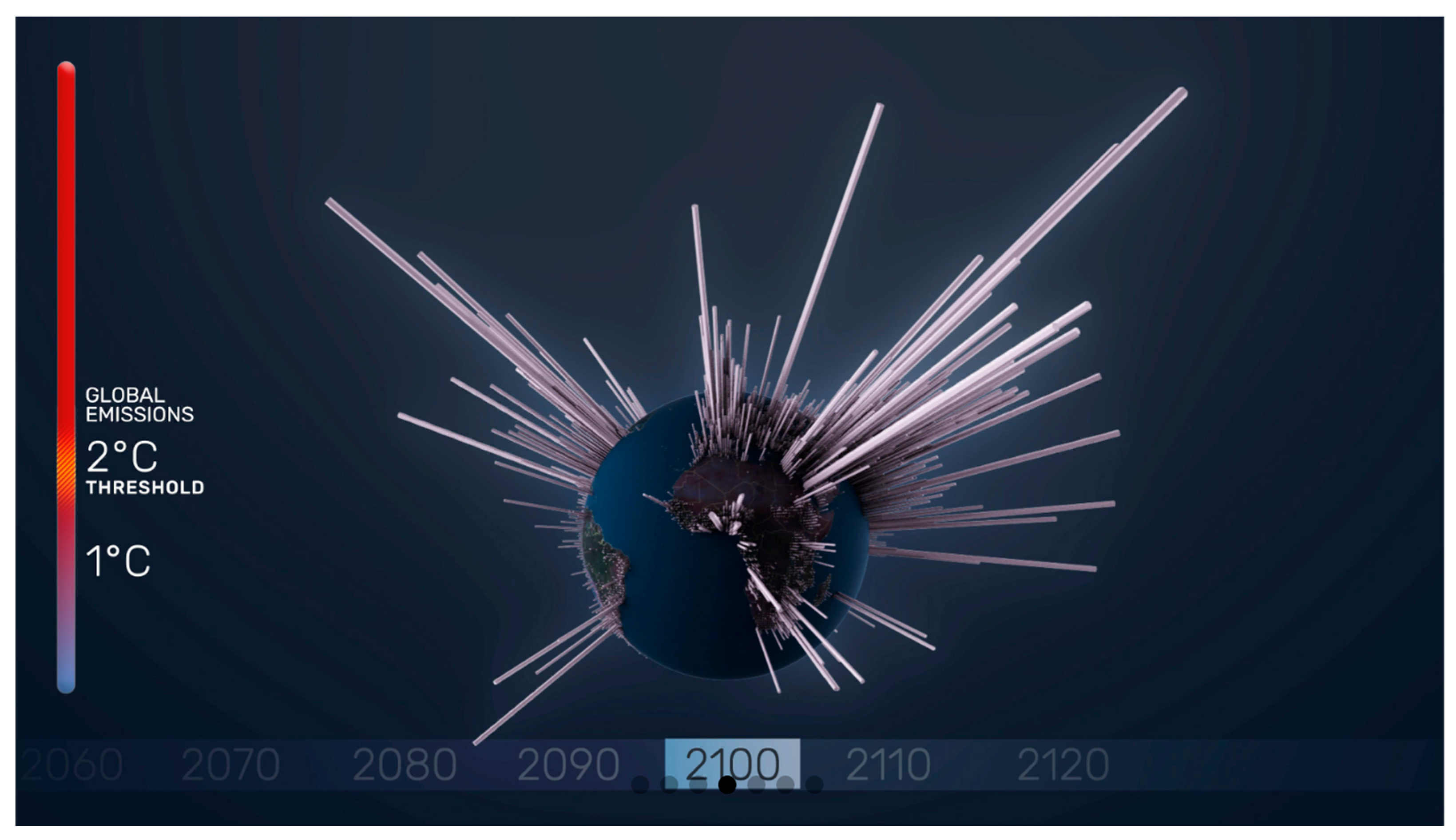
By harnessing advanced visualisation methods, these works render complex climate datasets into clear, engaging graphics that map historical trends and present-day conditions—making the evolution of climate change both visible and immediately comprehensible. For example, “A Brief History of Carbon Dioxide Emissions” demonstrates the historical trend of carbon dioxide emissions since 1751 through time-series graphs to help viewers understand its long-term impact on climate change. “MRI of the Earth” uses GAN (Generative Adversarial Network) to generate climate change visuals, showing the natural beauty of the planet and the promise of climate change through a data-driven approach. In addition, “Coastline Paradox” combines street view and 3D rendering to visualise the impacts of sea level rise and migration, while “Plastic Air” uses data and visualisation to reveal the environmental and health impacts of micro-plastic particles in the air. Through accurate data and innovative visualisation techniques, these projects enable audiences to better understand the complexity and urgency of climate change.
In terms of scientific data visualisation, “Asunder” simulates an “environmental manager” looking at technological solutions to environmental challenges through three-channel video projection, satellite imagery, and CESM (Community Earth System Model) climate models; “A Brief History of Carbon Dioxide Emissions” shows the distribution and scale of carbon dioxide emissions since 1751; “The Human Reach” reminds people of the impact of greenhouse gas emissions on global warming. A Brief History of Carbon Dioxide Emissions” shows the distribution and scale of carbon dioxide emissions since 1751, reminding people of the impact of greenhouse gas emissions on global warming [
33,
34]; “The Human Reach” is a story map that shows how humans are contributing to global warming. “The Human Reach” uses story maps to demonstrate the impact of humans on the Earth’s environment and calls for the protection of ecosystems; “Earth from Space” uses satellite imagery and interactive display technology to allow viewers to observe Earth’s changes from space and deepen their understanding of climate change; the “Interactive Science Posters” project deepens public understanding of Earth sciences by using dynamic, touch-responsive posters to trace changes in the planet’s interior and surface. Meanwhile, “MRI of the Earth” visualizes climate-related weather events from 1970 to today, generating over 200 million images of the Earth’s landscapes to reveal long-term morphological shifts [
35,
36,
37,
38]. “Timelines” demonstrates the retreat of glaciers through a collaboration with the ETH Institute of Glaciology in Zurich, using drones to capture long-exposure images at night; “Plastic Air” explores the micro-organisms in the air and the impacts they have on the environment. “A Century of Surface Temperature Anomalies” uses NASA GISTEMP v4 data and webgl Earth to visualise the impacts of microplastics on the environment. webgl Earth to visualise changes in Earth’s surface temperature.
Using climate data to galvanise climate action has proved to be a formidable challenge. Visualisations and interactive immersive means offer the latest techniques for representing climate data, often with innovative and exciting results. With a growing number of data visualisation projects [
39], we review the most representative climate projects currently available, focusing on data visualisation and interaction of climate change science data to explore what art forms are more effective at transforming difficult climate science knowledge and data into an effective means of raising awareness, understanding, and catalysing action and adjusting individual behaviours in relation to the climate crisis.
2.3.2. Machine Learning Models and Artificial Intelligence
These projects transform scientific data into intuitive and emotive visual experiences through artistic endeavours, making complex climate issues easier to understand and perceive. The prospect of sophisticated machine learning models and artificial intelligence is seen as a way out of these moments of crisis [
40,
41]. They can respond to a wide range of inputs in thought-provoking ways. AI technology is now in the hands of millions of people, creating a storm of imagination among the public.
In the realm of AI-driven expanded reality, artists are harnessing real-time data and advanced algorithms to immerse audiences in the unfolding story of our changing planet. “In My Mother Tongue Time and Weather Are the Same” marries automated digital cinema with machine learning forecasts: as predictive models recalculate tomorrow’s conditions, the installation’s visuals and ambient soundscapes shift seamlessly, inviting viewers to experience the fluid boundary between past, present, and future [
42].
Meanwhile, “Airsense” brings air-quality monitoring into the public’s pocket. Lightweight enough to clip to a jacket or bag strap, the wearable microdevice continuously samples particulate and gas concentrations across Dubai’s streets [
31,
43]; its companion app then maps these readings onto a dynamic city-wide pollution atlas, highlighting hotspots in heat-map colours and alerting users when levels cross health thresholds.
Satellite telemetry takes centre stage in both “Observer” and “Tulpenberg,” two XR installations that stream live feeds from four orbiting platforms. Through a head-mounted display, participants track satellites as they arc overhead, their real celestial trajectories rendered as glowing trails, while contextual overlays explain each satellite’s mission and the environmental parameters it records. Drawing on the same data feed, “Tulpenmania/Domum” transforms the gallery floor into a shifting coastal tableau: synthesized mist rolls in to simulate sea-level rise, and LED-lit water lines creep ever higher, turning abstract numbers into a visceral, embodied experience [
44].
Nature and technology converge in “PigeonBlog,” where homing pigeons—equipped with miniaturized CO
2 sensors, GPS modules, and microcontrollers—become mobile monitoring stations [
9,
10]. As the birds fly familiar city routes, their devices log pollution levels that are later visualized in interactive maps and sonified so that users can literally hear the ebb and flow of urban emissions. In a similar spirit, “Clams” translates real-time water-quality metrics—pH, turbidity, dissolved oxygen—into an evolving soundscape: rising acidity makes the installation emit sharp, staccato notes, while clearer water yields soft, flowing chords.
Air-pollution data also finds its voice in “Aerosonar,” a spatial audio device that captures particulate levels above Belgrade and converts them into immersive sound fields: denser smog registers as low drones while cleaner air rings with crystalline chimes, allowing listeners to “hear” the city’s breath [
45,
46]. Building on climate-driven visuals, “Mother Fluctuation” layers projection mapping with environmental data to create choreographed light sculptures that ebb and swell in response to temperature anomalies [
8,
20]. “Seeing the Invisible” expands this approach, combining mixed-media panels, VR headsets and interactive sensors to expose the hidden threats of noise, microplastics, and permafrost melt—each hazard rendered as both image and sound.
Finally, several pieces employ AI to push the boundaries of data-driven art. “Climate Change Impact Filter” uses trained neural networks to predict how rising temperatures will reshape animal migration patterns and then algebraically distorts live webcam feeds of urban parks to reflect those future shifts [
47]. “Cold Flux: Visualising the Antarctic Melt” harnesses generative adversarial networks trained on satellite imagery to produce real-time melting simulations, projecting them onto sculptural ice blocks that drip as algorithms dictate. And with “Voices for Change,” community-sourced testimonies about local climate impacts are woven into a 3D spatial-audio installation; as participants move through the space, voices rise and fall around them, creating an intimate chorus that underscores the human stakes behind the data. While we may be excited, amazed, frightened and even fascinated by AI, we should remember that while AI is an intelligent, autonomous, auto-matching, immaterial, and abstract technology, it is heavily dependent on and built from Earth’s resources and requires human labour. We need to look at the biases and ethical issues behind these systems and question their role and impact on our environment, but can we, as an aware and creative community, take advantage of this emerging and rapidly evolving field and make it work?
2.3.3. Interactive and Immersive Experience Programmes
In contrast to virtual reality (VR), fully fabricated worlds, extended reality (XR) offers a blended space of boundless possibility, enabling users to move beyond physical constraints and engage in highly focused, immersive exchanges of ideas, expertise, and knowledge.
Many works also unfold in public spaces, inviting visitors not only to observe but to participate directly in the creative process. By engaging passersby in hands-on activities—workshops, impromptu performances, or collaborative installations—these projects broaden our perspective, spark fresh ideas for tackling ecological crises, and foster inclusive dialogue. In doing so, they help build pluralistic frameworks that articulate shared concerns, collective interests, and transformative pathways for a more sustainable planet.
In the area of interactive art, “Welcome to Planet B” is an interactive game that simulates a futuristic world where participants face climate change challenges and decisions; The Glacier Retreat” is also an interactive game that simulates the challenges of climate change in a future world; “Climate Change as an Immersive Hell Painting” combines scientific data with artistic expression to demonstrate the impacts of climate change; “ Glockner. Luft. Raum” visualises climate data through art that demonstrates the connection between climate change and weather in the Glockner area; “Where Do I Come From?” shows three artists building datasets from their own waste, challenging viewers to recognise the real-life consequences of everyday actions; “Wood Wide Web” gives life to endangered tree ecosystems in India and the UK, sharing the stories of their erasure through datasets; “Diving into an Acidifying Ocean” uses interactive data visualisation exploring the impact of rising temperatures on marine life; “Medusae” uses interactive storytelling exploring the impact of rising temperatures, overfishing, acidic water, and low oxygen on different jellyfish hotspots in the Mediterranean; “Pollinator Pathmaker” uses algorithmic tools to create garden artefacts and generate unique garden designs; “The Lagoon” shows a fictional coastal city being transformed into an ocean by an eight-minute video collage; “Calling in Our Corals” crowdsources data to help scientists monitor ecosystems, detect illegal fishing and assess restoration efforts; “Passage of Water” showcases global freshwater resources and their impact on the environment [
2,
9,
14].
Many of the virtual technology-related projects raise hypotheses about how we can have cities of the future and how we can co-create our future lives in this global context of climate change. These projects promote circular creativity projects that bring together individuals from different fields with the aim of starting a discussion on the changes needed for a sustainable future society and co-creating new actions.
2.3.4. Reflection
In the subset of installations featuring adaptive behaviour, we employed a random-forest regression model to predict participants’ Behavioural Intent Inventory (BII) scores from their real-time Aesthetic Perceptual Scale (APS) ratings. The dataset was divided into a 70% training set and a 30% test set, stratified by geographic region to ensure balanced representation. We configured the model with 200 trees, a maximum depth of 10, and a minimum of five samples per leaf, then trained and evaluated it using Python 3.9 and scikit-learn v1.1.2. On the held-out test set, the regressor achieved an RMSE of 0.42 and an R2 of 0.68, demonstrating a strong predictive relationship between dynamic aesthetic features and pro-environmental intent.
There is also reason to wonder whether the vision of technology will allow all people to access and use the great achievements of science and technology. It is not enough to think about how to prevent AI systems from harming others; AI is a tool based on the global collective “raw material” of knowledge, creativity, etc., which must be utilised. In recent years, we have been thinking a lot about digital humanism, and now it is time to think about a form of “digital socialism”, a “commonwealth”, a “social contract”, with which we can overcome the profound and widespread changes of the digital age, and even more, the collective global consequences of climate change [
1,
31].
Admittedly, this is an almost insurmountable challenge. However, it is certain that it is precisely because of this vision that, for more than four decades, under the heading “art, technology, and society”, people have been thinking not only about how technology is changing our society, but also about how art and society themselves are shaping technology. The measurements of the global scientific community can only lead to the conclusion that we need a radical change of course, and that the window of opportunity to make such a change is rapidly closing, a fact that is difficult to accept because the consequences will be daunting, uncomfortable and expensive.
In our case review process we trace how Planet Fuzzy Truth (a name for the meta-narrative that embraces complexity in how society responds to climate change) became our society’s stance on environmental degradation and climate change. Throughout the many interactive hours of work and activities, we see a variety of established sustainable, resilient narrative structures that promote a future where we take ownership of the bounty of nature around us, rather than possessing it. The Hyper Planet Lab (the interactive hub where satellite imagery, CO2 sensors, sea-level gauges, and GPS data converge), is where technology from satellite imagery, CO2 verses, sea level measurements, and GPS data help us deepen our knowledge of the planet to raise collective awareness of the planet’s pressing issues.


