1. Introduction
According to the Intergovernmental Panel on Climate Change (IPCC), human activity has caused 1.0 °C of global warming above pre-industrial estimates, considering an increase of 1.5 °C between 2030 and 2052 [
1]. Global warming has been one of the causes of sudden climate change [
2]. There are several studies on global warming [
3], it being one of the main problems since the end of the 20th century [
4], which has been worsening with the evolution of industry [
5]. One of the ways to reduce the consequences of atmospheric phenomena from global warming is to analyze and understand data from previous phenomena that help predict and understand natural disasters [
6,
7]. Scientific visualization has evolved in all scientific areas [
8,
9,
10], and meteorology is the case of one of them. It has a vast amount of data to be processed [
11], presented, and analyzed to understand natural phenomena [
12,
13].
A four-dimensional presentation will improve the understanding of the phenomenon and its interpretation, allowing the population that is curious about the subject to visualize and understand the phenomena [
14,
15,
16].
An initial study was needed to understand the science of meteorology and a state-of-the-art survey, thus evaluating the existing systems and the techniques to be used to realize meteorology and its phenomena. Visualization allows for presenting something abstract or an idea and understanding complex data clearly and consistently [
17]. Since its integration in education, visualization has been considered a key technology as it allows presenting information more clearly, thus captivating students’ interest. In addition, it contributes to improvements in computer skills [
18]. Since 1958, attempts have been made to understand data through visualization [
19]. Over the years, in addition to understanding, we aimed to predict future events based on data simulation visualizations [
20,
21]. With the increasing complexity of analyzed data [
22], it became necessary to develop equipment capable of processing them. Thus, scientific visualization arises from information processing and data understanding [
23].
The scientific visualization application has had significant success due to processing data through the computer. This has made the presentation of images or geometric representations possible in order to obtain information and understand data, thus providing discoveries in various areas [
24,
25]. In other words, visualization has allowed for the exploration of information visually and the understanding of the data. Scientific visualization promotes a new approach to learning and investigating data at the deepest level, using the power of human vision [
26]. It uses aspects from various fields such as computer graphics, user interface methodology, image processing, systems design, and signal processing. The main application of the scientific visualization technique is concentrated on the analysis and visualization of large volumes of data, such as meteorological data. Thanks to the performance of the new workstations, it has become possible to carry out 3D simulations and dynamic presentations of large volumes of data in real time. Thus, visualizations have become advantageous in simulations, animations, and modeling. They are often the only efficient way to analyze performance, validate models, and discover unknown patterns using visual observation.
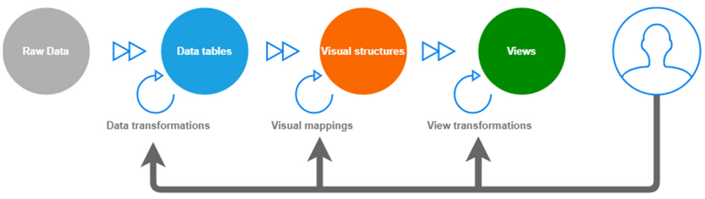
According to the model presented by [
27], untreated data are initially processed, grouped into tables, and transformed into visual structures to perform the rendering process, as shown in
Figure 1. According to this model, various data types can be positioned according to their graphical properties, such as color, structure, size, etc. In the last phase, the data are rendered for the final presentation to the user, who can interact at any stage of the process, applying desired changes.
Meteorology studies the atmosphere and its phenomena to forecast the weather, which is fundamental at the present time. This science studies our atmosphere’s chemical, physical, and dynamic processes in their interactions with various systems such as the lithosphere and the biosphere. It aims to develop instruments capable of visualizing, transmitting, predicting, and analyzing meteorological data [
28]. Weather forecasting is the application of science and technology to the study of an atmospheric condition in a specific period and place. It allows for the prediction of various elements, such as air temperature, atmospheric pressure, humidity, clouds, precipitation, visibility, and wind [
29]. The forecast is based on different atmospheric data from a given place, and allows for the simulation of atmospheric changes in this same place using meteorology. These forecasts are fundamental in agriculture, fishing, and even tourism [
30,
31,
32].
Visualization is a technology used to present and simulate meteorology and atmospheric science. Data from various institutes and remote centers are currently used and visualized in large quantities to understand atmospheric and meteorological phenomena [
15,
33].
Visualization in meteorology has gone through several stages of evolution until reaching the point where we know it. Initially, 2D drawings created by hand were used until 1960, and the first computer-based visualization system was developed by the authors of [
34]. In the late 1980s, there was an evolution, moving from 2D to 4D illustrations [
35]. This was due to the appearance of computers with more excellent processing capabilities and systems that improved their performance [
15]. Thus, designs appeared capable of processing large amounts of data, allowing for its visualization in various formats from 2D to 4D, with the possibility of introducing different filters and new features. With the evolution of the processing power of computers and the use of satellites to extract more accurate data, it is possible to generate broader simulations with large time series and several variables [
33].
This review aimed to identify existing studies on meteorological visualization in 4D. The central part of this review is based on the discovery of existing technologies in the area and their application and results. Thus, it is intended to develop an innovative tool capable of processing large amounts of atmospheric data through its visualization in various perspectives with variations in space and time.
The following research questions were defined to research this area, for which an answer was sought:
- Q1.
What is the best way to process weather data?
- Q2.
What is the best way to view weather phenomena in 4D?
As a result, the selected studies validated its systems related to a known phenomenon and related to tests with scientists with knowledge in the meteorological field.
This paragraph ends the introductory section. Next,
Section 2 presents the methodology of this review. Then, the results and discussion are presented in
Section 3, giving the conclusions in
Section 4.
2. Methods
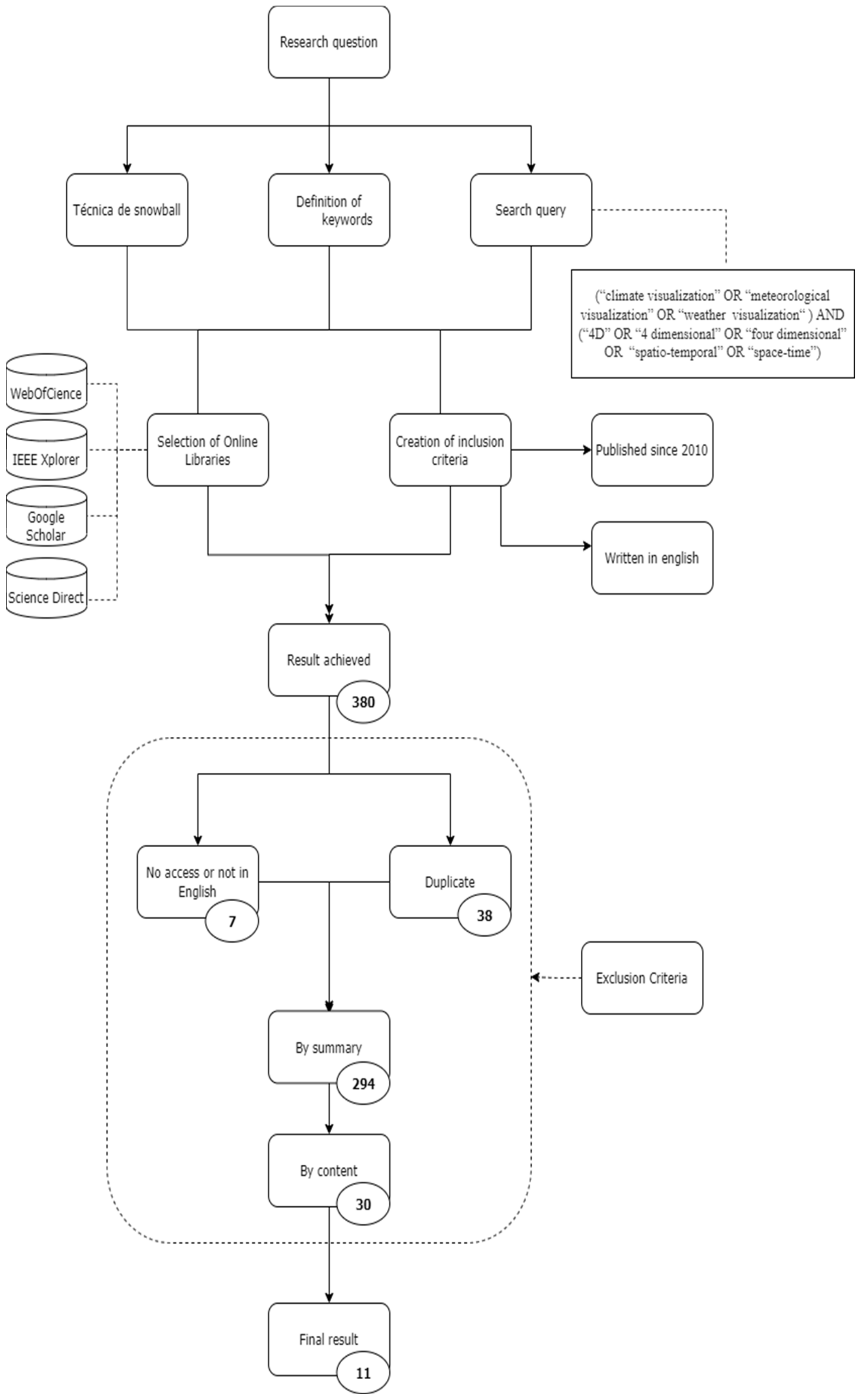
In this scientific review, a systematic methodology was chosen consisting in creating an abstract based on the research topic that highlights the most critical points of the selected articles. In this systematic review, the research theme was effective systems for visualizing atmospheric phenomena and meteorological data in space and time or 4D. A critical phase of a systematic review is choosing the research question, since the research will attempt to answer these same questions.
Knowing the research topic, we began by carrying out exploratory research using the snowball technique, a non-probabilistic chain sampling technique which consists in selecting base articles focused on the research theme and the continuous investigation of the reports cited. When determining a base of 3 research papers, the keywords were read and extracted, and they were later used to create a search query consisting of commands that allow for extracting the most relevant information. This search query underwent several conjugations until reaching the desired result to obtain a final question, with the following query being received: (“climate visualization” OR “meteorological visualization” OR “weather visualization”) AND (“4D” OR “4-dimensional” OR “four-dimensional” OR “Spatio-temporal” OR “space-time”). Four online databases were used in the review, namely, Google Scholar, Web of Science, IEEE Xplore, and ScienceDirect.
The third review step created selection, exclusion, and inclusion criteria. As for the inclusion criteria, all articles and works presented with the query developed, written in English, and published from 2010 to 2022 were selected to obtain more updated information, as there is talk of a theme connected with new technologies. After applying the exclusion criteria, a list with the research results was obtained, which returned a total of 380 publications:
38 duplicate posts were removed;
Seven publications to which it was not possible to obtain access or which were not in English were excluded;
After analyzing the title, abstract, or, if necessary, the full article, 294 publications were excluded;
Thirty publications were excluded due to their content (less relevant or non-scientific articles).
Therefore, after applying the methodology, we obtained 11 scientific articles that aim to develop a meteorological data visualization system that includes visualization in space and time (4D).
All projects, articles, and publications were analyzed to select the most relevant to the topic in question. In
Figure 2, it is possible to observe the entire flow performed in this review, showing the results in graphical form as recommended by PRISMA [
36].
3. Results
All articles obtained from this systematic review regarding meteorological data visualization systems are summarized in
Table 1. They resulted in a total of 11 papers. The main objective was the development of valuable tools for meteorological and meteorological phenomena visualization and their evaluation in four-dimensional space.
Most of the authors used data in the NetCDF format; it is thus possible to observe that 8 of the 11 articles had the option of the NetCDF data format [
37,
38,
39,
40,
41,
42,
43,
44]. This is because this format encompasses a set of self-explanatory and independent software libraries and data formats that support object-oriented scientific data creation, access, and sharing. One of the main reasons for using this data format is that it stores meteorological and climatic data. However, despite this format being standard, for most articles, techniques/technologies needed to be applied for processing the data to be visualized.
Table 1.
Studies summary.
Table 1.
Studies summary.
| Study | Data Type | Data Format | Data Processing | Data Visualization |
|---|
| [45] | Spatio-temporal data (Weather data and phenomena) | SI | Aggregation of time series of data | Amatsubu (System developed), and “Time juxtaposing” |
| [37] | Hydrometeorological data | NetCDF | System for transforming data into metadata | GPGPU, DirectCompute, DirectX, and Google/Yandex/Bing Maps |
| [40] | Weather data | NetCDF, HDF5 | Coordinate transformation, Octree | Level of Detail and GPU-based volume rendering technology |
| [41] | Weather data | NetCDF | RapidMiner/RapidAnalytics, Amazon EC2, S3, and Eucalyptus | Ncview, and Protovis |
| [46] | Weather data | SI | VisTrails, CDAT, and DV3D | CDAT, DV3D, VisIt, ParaView, R, and MatLab |
| [42] | Weather data | HDF, HDF-EOS, NetCDF | OPeNDAP, GDS, and WMS | PHP application that converts database data into KLM format files |
| [47] | Meteorological phenomenon data | SI | Python application | JavaScript and D3 for spatial visualization and PCP, and Cesium platform |
| [43] | North Pole meteorological phenomena data | NCEP, NCAR | Cesium | WebGL and GPU |
| [44] | Hydrometeorological data | NetCDF, HDF, and GRIB | Voxel Data Model | 4DSVS |
| [38] | Data relating to meteorological phenomena | NetCDF, NCL | CDO and ArcGIS | ParaView, OpenGeoSys, and VRED |
| [39] | Weather data | NetCDF | 3-phase processing, reduction, transformation, and encoding | Cesium and WebGL-based rendering technology |
Of the 11 articles analyzed, 4 did not describe the techniques used, while the remaining 7 presented different methods. Each author chooses the form that best suits their point of view and best applies to the developed system.
Chiba et al. [
45] developed a new method for geo-visualization in space and time. The authors considered that the typical visualization method takes a long time to process data. Their proposal was to develop a scientific visualization technique, called “Amatsubu”, which statically represents several instantaneous values on a single map, superimposing them without requiring interactivity controls. The main objective is to evaluate the usefulness of “Amatsubu” as a spatio-temporal representation using an existing method. The main difficulties were based on the model of the spatial distributions of apprehension at a given moment and according to its changes; to solve this, the authors used circles to represent values and times of time series data by areas and colors rather than positions. The authors assessed the perceptibility of information for spatial alteration systems of spatio-temporal data. Next, the authors determined how “Amatsubu” compensates for weaknesses in statistical methods. Both studies were carried out around rainfall intensity data with two clouds presented with temporal juxtaposition and “Amatsubu” to understand the accuracy and speed of the readings of the 40 participants (20 from each study). The results obtained with the “Amatsubu” demonstrate spatial changes with greater precision and in shorter periods. As two clouds overlap in a certain period, the authors introduced an animation applied to current time series data organization as a single stimulus.
Golubev et al. [
37] developed and designed a system for the visual analysis of meteorological data, more specifically hydro-meteorological, which was given the name of FloodVision. The system aims to allow for analyzing different meteorological phenomena and scenarios in real time and dynamically visualizing data fields simultaneously in a virtual globe; it was developed in various types of devices with an intuitive interface to be used by specialists and non-specialists in phenomena. The user can define a dataset to visualize visualization scenarios by defining speed and dynamics. The authors used a virtual globe that appears as a layer that can design sets with different tilesets, such as Google, Yandex, or Bing, and map tilesets from OpenStreetMap or Mapbox, with other layers for visualization with minimal distortion. It allows for the observation of several layers combined, such as weather and wind, allowing for addition and removal. It was optimized with metadata obtained in the NetCDF (network common data form) format, a set of software libraries that will enable array-oriented access and sharing of scientific data, comparing different variables, and joining similar variables. Loading only the part of the information shown in the animation at a given moment, the old one is to be deleted from the RAM when the new one is loaded. In addition, remote servers were used. The system must be well designed to smooth the real-time display and allow for loading at three time slots per second. In addition to pre-processing the data to visualize them, DirectCompute was used, a special API included in DirectX that allows for calculating flow lines, as all velocity layers are rendered in separate textures. The system was constructed with two configuration panels for a friendly user interface: one for users and one for scientific users. These panels allow the user to configure the panel with the necessary combined options to improve the desired climate visualization. In addition to visualization, it will enable the introduction of graphics for a better evaluation of the phenomenon.
Helbig et al. [
38] developed a way to visualize various meteorological phenomena in a specific planet region. For this purpose, a system capable of integrating untreated heterogeneous data was created. Visualizations are displayed on a PC (or in virtual reality) for a clear, easy-to-understand presentation with the ability to interact and animate. The authors presented two simulations for two defined zones for an explicit simulation with the application of ParaView, based on the VTK visualization toolkit, providing a variety of filters and options to implement new functionality. For the visualization of data, pre-processing was necessary.
For data in the NetCDF format, CDO (climate data operators) and NCL (National Center for Atmospheric Research (NCAR) Command Language) were used to analyze and visualize the meteorological data. Next, ArcGIS was used for vector data, which, combined with another tool, GIS (geographic information system), allowed it to be converted into a coordinate system. For the data to be visualized with ParaView, OpenGeoSys was used.
DataExplorer was used for a more perceptible data visualization and a color scheme, brightness, saturation, opacity, shape, and size. VRED was used to export ParaView scenes in the OpenSG format, together with a script developed in Python. In future work, it was considered essential to transport the system to another VR (virtual reality) software called Unity3D (a game engine) to allow for more dynamics in the system. The system was presented to specialists in meteorology for evaluation in order to obtain constructive feedback. The experts mentioned that the proposed method has potential compared to those currently used in PCs. The virtual reality capability was a positive surprise, and the animation capability with variable definition and speed control.
Wang et al. [
43] developed a dynamic 4D visualization system to simulate and analyze atmospheric phenomena at the North Pole. One of the main focuses is on the development of an algorithm capable of identifying a cyclone at the North Pole. The algorithm extracts the minimum pressure using GRASS GIS (geographical resources analysis support system, geographic information system), free software, and open-source GIS developed in Python to compare pressure values and identification of the cyclone eye. The visualization methodology used in this article consists of 4D wind field data (NetCDF) compressed into a video in the VP9 format in a web environment. The authors used WebGL (virtual globe) and GPU (graphics processing unit) for faster visualization. The wind data were pooled and unified using Cesium, an open-source JavaScript library for world-class 3D globes based on WebGL. For one-frame rendering, the data went through the following three steps: particle initialization, which consists in redistributing the particles and storing RGB colors, particle advection (particle positioning update), and, in the final phase, rendering these so as to allow for 4D visualization of the atmospheric data. Finally, the authors performed several analyses, according to which the proposed system was able to identify cyclones in the North Pole with an accuracy of 95%, a result that validates the developed system.
Li et al. [
39] follow as a continuation of the Polar Cyclone project developed by the same authors in 2016 to simulate atmospheric phenomena in 4D at the North Pole [
44]. The authors aimed to create a system for the real-time visualization of large volumes of meteorological data on a virtual globe in a web environment capable of visualizing meteorological data presented and organized in a multidimensional way with the transmission of large time series of data, based on a client format. For better performance, the data pre-processing consisted of three phases, namely, dimension reduction and reorganization of multidimensional data that are in a NetCDF hierarchical format, as well as linear transformation of individual pixels into the RGB format, which will then be transformed into a YUV system (color-coding system), which displays images and videos more efficiently, and encodes the visualization in a video form, reducing the 4D data to time series in 2D images by encoding multiple pictures in the video when requested. To visualize the 3D maps, Cesium was used, a free library for globes and 3D maps that was adapted to the PolarGlobe system; for the video visualization, libx264 was used, a free software that is capable of encoding video streams in a compact format, H.264. In order to obtain a standard for video compression to evaluate the performance and accuracy of video compression, three experiments were performed consisting in encoding speed and decoding speed, in which H.264 was considered the best option for providing comparable data accuracy, but the rate of encoding and decoding being used by the system was a video codec developed by the ITU-T Video Coding Experts Group (Joint Video Team 2002) and ISO/IEC Moving Picture Experts Group (MPEG; Gall 1991). For the demonstration of the data, it is requested from the server and sent to the browser, and, as new data comes in, it is unpacked, restored, and encapsulated in the WebGL texture (a JavaScript API available from the new canvas element of the HTML5, which supports the rendering of 2D graphics and 3D graphics) that pushes them into graphics card memory for the data to be rendered. The client can view the data from various perspectives, have control of the visualization in time and speed, select a particular type of data, and visualize in a specific location.
Liu et al. [
40] aim to visualize and analyze meteorological data using virtual globes, proposing a systematic structure of meteorological data visualization (MDV—meteorological data volume) in World Wind (WW), an open-source virtual globe. For this purpose, an innovative structure was proposed to visualize volumetric data for the analysis and visualization of meteorological data, consisting of an MDV server and an MDV WW-Client. The meteorological data are organized in the NetCDF and HDF5 (hierarchical data format) formats, usually large data files, so that they must be pre-processed and transformed for rendering. The way chosen was to create an octree tree, which effectively improves rendering. The data are easily accessible using the HTTP protocol. A graphical user interface on the server side allows for filtering and defining the weather variable to be displayed. The core of the proposed system is the MDV WW-Client, with the graphical color implemented in WW(SDK) based on its C# version. To increase system efficiency and reduce response time, caching and LOD (level of detail, a technique that allows for multiple representations for a graphical object) were used, which are also the way to increase rendering efficiency and reduce system response time. One more point is to speed up bulk texture rendering based on GPU (graphic processing unit) by implementing a spherical coordinate system that allows for viewing from multiple angles. Finally, to evaluate the performance of the system with a case study on a tropical cyclone, since it showed positive results from the application of virtual globes of meteorological phenomena, the authors considered that there are improvements to be made, one of which is to replace WW version C# for a newer version of java and take GPU processing not only for bulk textures but also for streamlines.
Lu et al. [
41] developed a cloud framework for the spatiotemporal processing of a weather dataset and a tool capable of providing a cloud platform with flexible and fast computing with resource, scheduling, and data management services with fault tolerance and distributed storage, data analysis, and visualization. The developed software was described as independent, thus allowing for integrating a set of tools without depending on any specific software. For an illustration phase, the framework incorporates data analysis tools such as RapidMiner (a data science software platform that provides an integrated environment for data preparation, machine learning, deep learning, text mining, and predictive analytics), Rapid Analytics (the server version of RapidMiner enhanced with a secure remote analysis web service), Amazon EC2 Private Cloud (Elastic Compute Cloud, a core part of Amazon’s cloud computing platform, Amazon Web Services), S3 (a service offered by Amazon Web Services that provides object storage through a web service interface), and Eucalyptus (a paid and open-source computer software for creating private and hybrid cloud computing environments). RapidMiner/Rapid Analytics is an open-source tool with a friendly java-based environment with limited machine memory and processor performance. To overcome these limitations, it is necessary to integrate distributed computing frameworks for machine learning using Radoop (an extension for executing RapidMiner) with the MapReduce algorithm (a programming model designed to process large volumes of data in parallel) in Hadoop (a platform for the Java software for cluster computing and processing large volumes of data). For data analysis, custom tools were added to convert NetCDF binary files into American Standard Code for Information Interchange (an ASCII binary code that encodes 128 signals) or java objects, a tool for extracting spatiotemporal data from the original data. Data filtering and tools for visualizing data in space and time for RapidMiner include the weather operators view (visual browser for files in the NetCDF format) and Protovis (a free open-source software, provided under the BSD license, using JavaScript and SVG for native web view). Data visualization is based on the virtual machine created with Amazon EC2 using other tools and custom settings such as the Analytics web service. Based on these extra tools added to RapidMiner, it is possible to visualize episodic data, as well as regional or local spatio-temporal visualization trajectories depending on the dataset. In the results phase, an analysis and visualization of climatic data was presented, as they can interact within space and time and according to the visualization of trajectories and high-pressure cells and the seasonal change of the low-pressure center.
According to the Maxwell et al. [
46], the complexity of data and the broad spectrum of data, such as climate data, require new tools for discovering, accessing, manipulating, and visualizing them, the biggest challenge being integrating advanced visualization tools and supporting the workflows and a high performance. The authors described a system developed by NASA that connects the DV3D (an interface for the visualization and analysis of climate data) and a package UV-CDAT interface for the exploratory analysis of climate simulations, with the capacity to visualize interactive data in 4D, hyper wall, and visualization stereo. They provide a wide range of climate analysis functions with other climate analysis tools. Different data sources were used for data collection, including the Earth System Grid (ESG) and interactive visualization systems. VisTrails is a scientific workflow management system developed at the University of Utah’s Institute for Scientific Computing and Imaging for broad integration; it is a workflow builder that integrates CDAT modules (front end for resource exploration and analysis), visual data, and DV3D (friendly interfaces for the visualization and analysis of climate data at an appropriate level for scientists) in the VisTrails infrastructure, allowing for the integration of other modules. UV-CDAT also provides the ability to interface with tools such as VisIt, ParaView, R, and MatLab for data analysis and visualization. These tools make it possible to visualize data in 4D, simulate graphs, customize visualizations and data analysis, and select, edit, and analyze variables using a command line.
Sun et al. [
42] created a web-based visual platform that displays information for visualizing various geophysical variables in different sources, using Google Earth (GE) as a standard graphical interface. The platform allows for the processing and visualization of meteorological data from local or remote sources, selects the period and place of visualization, and simultaneously accesses several users. The authors established a platform architecture based on the following three layers of implementation:
The data layer consists in bringing data from multiple sources of different formats in a heterogeneous data system, with most of the data being in the ASCII format; the NASA Satellite data are in various formats, such as HDF (hierarchical data format), HDF-EOS (hierarchical data format—earth observing system), and NetCDF (network common data form), with the latter available online. Metadata thus were created for these data, while the others were downloaded to a local server in the system.
The logic layer includes data service access, analysis, and data integration. A large part of the data is provided through the Uniform Resource Locator (Argyle, Gourley, Ling, Shehab, etc.), such as HTTP, FTP (file transfer protocol), simple object access protocol (SOAP), or HTTP-based, such as OPeNDAP (Open Source Project for a Network Data Access Protocol), GDS (global distribution system), WCS, and WMS. In the developed prototype, the system accesses the data available in DISC NASA GES (archives of data sets applicable to the atmospheric composition) through services such as OPeNDAP, GDS, and WMS, thus giving remote access to images through web services. The remaining data were stored in a MySQL database and managed using a PHP application developed in NADSC (The Atmospheric Data and Services Center of the Nanjing University of Information Science & Technology) with SQL commands, thus allowing for dynamic images to be generated on the local server and for pre-generation.
The presentation layer that consists in dynamic creation through a PHP application that converts database data into the KLM (keyhole markup language) format files used to represent, organize, store, manage, serve, and visualize two-dimensional (2D) and three-dimensional (3D) geospatial data in geographic browsers that are available in the database. Thus, the KLM file is easily accessible in GE (Google Earth), virtual earth tools, or even Google Maps, allowing for meteorological data processing and visualization.
Wang et al. [
47] developed three techniques for a better understanding of complex meteorological and space-time phenomena: the visualization of climatic and spatio-temporal data on the web, multi-view and varied analysis of scientific data, and, finally, data exploration for analysis and visualization on a virtual globe. The authors developed an effective visual analysis tool to explore and know complex meteorological data. In this study, Arctic System Reanalysis (ASR) was used to validate the system’s effectiveness in meteorological analysis in the arctic region. To visualize the data, the authors used two techniques: one of animated dynamic lines based on the streamline algorithm, and another of rendering the volume of the data with an algorithm based on GPU (graphics processing unit) for converting large volumes of data for better visualization in 4D. A widget was also implemented that schematizes the data presented. For a localized visualization, the authors defined a spatial filter that allows for selecting the area to be visualized in the virtual globe and excluding unnecessary data for a better understanding and analysis. The authors used another multidimensional filter that allows a zone selection to be visualized in a parallel coordinate graph (PCP). Behind the visualization, the authors implemented a classic algorithm that discovers the hidden associations between the variables in a meteorological database, allowing for visualization of how the different elements of the earth interact with each other, their categorization, and the application of different rules and data representation strategies. In the technical component, the system was made available on two distributed servers, a web responsible for responding to requests for resources created by the user and the application server implemented in Python that accesses the weather data and filters and categorizes them. The authors considered this architecture simple to maintain, upgrade, and expand. On the client side, the browser visualizes the weather data in real time using JavaScript and D3 for spatial visualization and PCP, as well as the Cesium platform for visualization of the virtual globe.
Zhang et al. [
44] created an interactive 4D space-time visualization system for hydrometeorological data in natural disasters based on a virtual globe. This universal system allows for the visualization of several forms of hydrometeorological data and several models. The system was developed based on three layers: data server, processing server, and a user component. Hydrometeorological data are represented in the NetCDF, HDF (hierarchical data format), and GRIB (general regularly distributed information in binary form) formats, incompatible data for fast rendering. These data have to be separated and indexed in multiple tiers for better performance based on the voxel data model (a value in a regular grid in a three-dimensional space.). This data is stored in keyframes used for dynamic presentations over a given period. For rendering the data, two models were introduced, including volume rendering, which demonstrates a large amount of data, and adaptive flowline rendering, which consists of three points: the definition of initial velocity points, the tracking of particle movement, and the generating of flowlines by adaptive sampling that allows for improving the rendering efficiency. Considering the search for the specific moments of natural disasters, the authors added two types of data analysis: profile analysis, which enables the visualization of data through a plane cut, and eddy tracking, which allows for determining the location of the whirlpool in real time. The system was called 4DSVS. It was developed using the C++/C# programming languages, with the processing part on the server as well as the client part. The user interface contains four parts: a ribbon menu, a World Wind virtual globe (.NET version) template, an XML-saved model, and a data analysis. Finally, the system was applied to different cases. The authors drew the following conclusions: the model is applicable to various meteorological phenomena, has flexible and smooth visual effects that generate other graphics, and is varied in functionality.
4. Discussion
The analyzed studies identified different tools that can be used for processing and visualizing data.
Table 2 summarizes the characteristics of each tool used in the various studies. We can observe that a vast number of tools were primarily open-source. In a total of 12 tools, only 4 had no free license. In their entirety, most of the tools support several platforms, but ArcGis and VRED only support windows.
In the same way, 11 tools support various data formats concerning data types, and only Ncview supports a single format, netCDF. Regarding the purpose of the tools, ArcGis, CDAT, Cesium, DV3D, MatLab, Paraview, Protovis, VisTrails, and VRED allow for data processing and visualization. On the other hand, the Ncview, OpenGeoSys, and WebGL only enable the visualization of pre-processed data.
Visualization technologies are based on the engine that generates the data to be visualized. In all the articles reviewed, these were distinct. Most of them were developed by authors who used different libraries and programming languages. The authors of [
45] did not present any information about the technologies used. In general, virtual globes were used for data projection. Three authors used the same system to visualize meteorological data using the Cesium platform to imagine the virtual world [
39,
47]. Of the remaining articles, seven used different virtual globes. Finally, the authors of [
41] used a flat map to demonstrate the data.
It should be noted that Helbig et al. [
38] implemented VRED reality technology. The articles reviewed by [
37,
42,
46] did not present any user tests or tests with data already analyzed and validated in other existing systems. Only one of the articles provided tests with 40 users [
45]. One of the remaining articles [
38], conducted tests with a group of scientists who validated the system; the remaining six studies presented independent tests that applied the method to different existing phenomena to validate their viability.
Therefore, the primary consideration identified is that we face a system with several options. There is not a wide variety of techniques. In this case, we observe that each of the authors chose their technology and developed their system, whose only similarity is visible in the result. One of the critical points that the research group would like to emphasize is the presentation variables such as color, structure, density, and opacity. Only one study tried to describe such an important point that helps us interpret a representation of the phenomenon.
However, we believe that obtaining a concrete answer to our research question was somewhat hampered because the investigations presented their methodologies and technologies differently. Despite this, the information set was essential for obtaining knowledge.
Finally, the research group would like to recommend Unity3d, which was quite interesting for its description of the technologies used and, especially, for the future work in which they intend to migrate their system to Unity3d, which we consider relevant. Future implementation work for a 4D meteorological visualization system and virtual reality should consider this tool as a viable option for the project.
More specifically, the collection was carried out regarding the types of data to be presented, as well as their presentation format, the technologies used in the processing/reduction of complexity and their weight, and the rendering/visualization technologies of these data that were used in the papers submitted for review.
5. Conclusions
In this review, systems capable of performing the simulation of meteorological phenomena from unprocessed meteorological data were addressed for their use in meteorology. The theme of meteorology and the sensations caused by it was approached to understand the problem in question. The climate is a critical topic and its phenomena, changes, and effects, such as hurricanes, affect many people’s lives. The visualization subject was also addressed in general terms, as well as, more specifically, the scientific visualization related to meteorological phenomena. The application of scientific visualization technologies aims to process and visualize large data sets, thus promoting a new way of visualizing information that would otherwise be difficult to understand. Meteorological data (mainly composed of large data sets) as well as scientific visualization, allow for interpreting an atmospheric event and capturing new perspectives in meteorology.
After analyzing the eleven studies presented in this systematic review, we can find answers to our main questions. Regarding Q1, “What is the best way to process weather data?”, we verified that the analyzed articles generally used tools that already allowed for data processing together with visualization, which facilitates and reduces the volume of work. Only pre-processing technologies were used to convert and reduce the data.
Regarding Q2, “What is the best way to view weather phenomena in 4D?”, the analyzed studies show that there are several tools that allow for the visualization of meteorological data in 4D, with Paraview being the most relevant in our opinion; it is a tool that enables the processing and visualization of various types of meteorological data in three and four dimensions, in addition to being multiplatform and having an open-source license.
In
Table 1, it is possible to observe a list of articles with their most important characteristics regarding weather data visualization systems. The collection was carried out regarding the types of data to be presented and their presentation format, the technologies used in data processing, and the rendering/visualization technologies of this data, which allowed us to answer our research questions. It was also possible to observe that 7 of 11 studies preferred NetCDF, 3 of 11 studies chose SI, and 3 of 11 studies selected the use of HDF and its variants to represent the data.
The advancement of scientific visualization in meteorology has led to the appearance of several tools capable of processing raw meteorological data, providing an easy-to-understand visualization of atmospheric data for an end-user. Several websites and online applications provide a real-time view of the weather status. Even some of them allow for visualization in 3D and 4D, providing the data of various atmospheric variables for their use in multiple areas, such as in the practice of paragliding.
Thus, the state of the art on this topic was obtained through a literature review conducted through a defined methodology. Of the articles initially considered related to the case, eleven papers were chosen to guide our work. All these articles demonstrated the types of data and formats to be used and their processing. Additionally, the papers indicated the technologies related to the visualization/presentation of these data in various dimensions, including some in virtual reality. Finally, most of the articles obtained in the final list validated their systems—some through a case study relating to a known phenomenon and others through tests with scientists in the meteorological field.


 ,
, 


