Article

Multi-Channel LED Luminaires: An Object-Oriented Approach for Retail Lighting Based on the SOR Framework

by
Kaveh Ahmadian Tazehmahaleh
1,*,
Hamideh Godazgar
2,
Kevin AG Smet
1 and
Peter Hanselaer
1
1
ESAT-WaveCore/Light&Lighting Laboratory, KU Leuven, 9000 Gent, Belgium
2
R&D Department, Noorsaform Lighting Engineering, Co., Tehran 1587776418, Iran
*
Author to whom correspondence should be addressed.
Sustainability 2022, 14(10), 5994; https://doi.org/10.3390/su14105994
Submission received: 31 March 2022 / Revised: 6 May 2022 / Accepted: 10 May 2022 / Published: 15 May 2022

Abstract

:
In this paper, a method to find the optimum spectrum for the illumination of objects in a retail environment is presented. A variety of familiar objects are illuminated with a number of illuminants of a predefined Correlated Color Temperature (CCT) of 3000 K, strategically selected from the entire range of metamers, which can be generated by the multi-channel luminaire under test. The solution space has been derived by solving basic colorimetric equations using a brute force method. In a paired comparison experiment, observers had to select the most “attractive” appearance for the presented objects. The results illustrate that objects may indeed appear more attractive for a statistically meaningful number of observers under a particular lighting condition. Assuming attractiveness of an object as a stimulus in the SOR framework, this approach facilitates the generation and the selection of the “optimum” spectrum based on the goals of the stakeholders in retail lighting applications.

1. Introduction

The evolution of architecture and interior design in a retail environment demonstrates a shift towards a greater engagement with consumers and environments and the creation of more distinctive and memorable places [1]. This means that a retail store today needs to fulfill functional requirements (i.e., allowing for and stimulating efficient commercial transactions) but also aims to be a pleasurable place for visitors and to fit within the distinct image or brand philosophy of the company [2]. Retail spaces have evolved from a three-dimensional place to a multi-dimensional space, including the five senses (smell, sound, touch, taste and sight) and an emotional connection [3]. Within the last decade, several studies have investigated the emotional and cognitive influence of light in a retail environment. Schifferstein et al. [4] suggested that vision was the most important factor at the buying stage during the selection of a product on a supermarket shelf, and, after opening the package and eating the food, taste seemed to be the second factor. According to Quartier et al. [2], the effects of lighting in a retail setting could, in principle, occur at multiple levels, such as the following: (1) The perceptual/cognitive level, (2) the emotional level and (3) the behavioral level. A space illuminated with warm white is found to be more “high class”, “bright” and “expensive” than spaces illuminated with cool/neutral and bluish light [5], while using a higher CCT leads to a more modern image and a higher perception of competence [6] (Perceptual/Cognitive). High chroma lighting induces an increase in the liveliness of the atmosphere, while low chroma lighting can increase coziness [7] (emotional); the willingness to eat red apples under yellow-like light was much higher than under white, green, blue or red light [8] (behavioral).
Due to the availability of narrow band Light Emitting Diodes (LEDs) with peak wavelengths distributed over the visible spectrum, and combined with the advances in control technology, it is expected that an increasing number of multichannel LED luminaires will be installed in retail lighting [9], enabling the lighting designer, brand designer, owner of the store or any other stakeholders to select a dedicated and object-dependent illumination spectrum.
Given this opportunity, it would be interesting to find an “optimum” spectrum for illuminating an object to achieve the desired goal(s) on any of the cognitive, emotional or behavioral levels. According to Wei et al. [10], the design of a saturation-enhancing light source that induces specific hue-dependent color shifts could be an interesting strategy. According to Royer et al. [11], using local chroma shift values helps specific object-based illumination, and new guidelines and recommendations need to be generated.
In recent years, a number of methods with respect to the software and hardware of multichannel light sources have been proposed and registered as patents. They are focused on how to emphasize the object color [12], to increase the object chroma when the light source is dimmed [13] or how to adjust the spectrum based on the user’s preference [14]. Although these publications are an indication of the future perspective for an object-oriented approach in lighting, however, none of them do report on a strategy to facilitate the end user in selecting the optimal spectrum.
This research aims to pave the way towards answering the question of finding the “right” illumination for an object or object category while having a particular goal in mind. The hypothesis of this research is that for each object there is a spectrum that makes objects more attractive for observers.
After giving a brief review of the existing literature on the S-O-R (Stimulus-Organism-Response) framework and the key findings, the methodology to calculate and generate a target spectrum is discussed. Next, a section dedicated to a visual experiment that was conducted to find the most attractive appearance for a range of familiar objects under different metamers of 3000 K is presented. The results of the experiment and statistical analysis are presented in the Results section, followed by the Discussion section. Finally, some recommendations for future research are discussed.

2. Theory

2.1. SOR Framework

The shopping experience includes consumer processes (e.g., product evaluation, attitude formation) and responses (e.g., satisfaction, purchase behavior), which are affected by aspects of the shopping environment, the context and the consumer characteristics [15]. Fiore and Kim proposed a new framework by integrating both a hedonic experience model and a utilitarian experience related model, named Stimulus-Organism-Response (SOR) [15]. This conceptual framework links the environmental aspects (Stimulus) to behavioral responses (Response) via the internal state of a person, such as perception, cognition and emotion (Organism).
The primary goals in a store include the attraction of consumers to enter the store and encouraging them to stay relatively long. In addition, increasing the sales revenue or creating and boosting the brand identity are among the main targets of a retail store. Understanding the influence of light on any of the levels defined in SOR is an interesting research topic that could lead to finding the right light to achieve the expected targets. These targets might be related to the customer’s purchase behavior or to the product/brand perception, such as naturalness and freshness. Although there has been a quite large amount of research activities regarding the impact of lighting on costumers in a brick-and-mortar retail store, as far as we are aware, only a limited number of studies have specifically investigated the influence of the illumination spectrum. The key outcomes of a number of these studies are summarized in Table 1.

2.2. Generating the Target Spectrum

For a retail designer, the selection of the illumination chromaticity ( x n ,   y n ) and corresponding CCT, as well as the corresponding absolute level Y n , are the primary concerns. It has been shown that the chromaticity of the illumination contributes to the color preference assessment of the colored objects [33]. Consequently, the selection of a particular target white point (on a perfect white diffuser at the product location), characterized by its absolute CIE (International Commission on Illumination) tristimulus values ( X n ,   Y n ,   Z n ), is the first step.
Consider a multichannel LED light source made up of k channels. Based on the additivity rule, one can write:
i = 1 k w i · X n , i = x n y n Y n i = 1 k w i · Y n , i = Y n i = 1 k w i · Z n , i = z n y n · Y n
where X n , i , Y n , i and Z n , i are the CIE tristimulus values of each channel i at the maximum drive current, w i is the optical weight of each individual channel, with values between zero and one and ( x n ,   y n ,   z n ) are the target chromaticity coordinates of the illuminant. Equation (1) represents a system of three linear equations with the weights as variables. If the number of channels, k, exceeds 3, the system is underdetermined. To calculate w i , at first, 3 channels (1, 2 and 3) are selected such that the target white can certainly be reached. For a six channel light source, Equation (1) can be rewritten as:
i = 1 3 w i · X n , i = x n y n · Y n w 4 · X n , 4 w 5 · X n , 5 w 6 · X n , 6 i = 1 3 w i · Y n , i = Y n w 4 · Y n , 4 w 5 · Y n , 5 w 6 · Y n , 6 i = 1 3 w i · Z n , i = z n y n · Y n w 4 · Z n , 4 w 5 · Z n , 5 w 6 · Z n , 6
If,
A = [ X n , 1 X n , 2 X n , 3 Y n , 1 Y n , 2 Y n , 3 Z n , 1 Z n , 2 Z n , 3 ]
then one can write:
[ w 1 w 2 w 3 ] = A 1 [ x n y n Y n Y n z n y n Y n ] w 4   A 1 [ X n , 4 Y n , 4 Z n , 4 ] w 5   A 1 [ X n , 5 Y n , 5 Z n , 5 ] w 6   A 1 [ X n , 6 Y n , 6 Z n , 6 ]
Since the six entries of the solution vector w should contain only positive numbers in order to be physically meaningful (and lower than 1 for practical reasons), a system of 6 inequalities emerges. By implementing a brute force method, as presented in a previous paper [34], it is possible to calculate the output of each LED channel that fulfils the conditions regarding the CCT and illuminance level. Any selection of w from the solution space would give rise to a metamer at the predefined target white point and represents an illumination spectrum.

2.3. Object Gamut

The apparent color of an object is based on the interaction of the spectral irradiance distribution of the illumination and the object’s spectral reflectance. The CAM02-UCS [35] color system is a comprehensive and widely accepted colorimetric system, taking into account, amongst others, chromatic adaptation. The perceptual correlates of any object, such as hue-angle, lightness and chroma, as well as redness-greenness ( a ) and yellowness-blueness ( b ) coordinates, can be calculated for each metameric illuminant spectrum. The gamut of a green apple in the CAM02-UCS ( a , b ) plane for 3000 K metameric illumination spectra is illustrated in Figure 1. It is calculated by making use of the spectral reflectance factor of a typical green apple taken from [36].

3. Experiment

A visual experiment was designed to find the illumination spectrum that makes the objects appear more “Attractive”. According to Schifferstein et al. [4], attractiveness was the most influential emotion in the buying stage during the selection of a product in the supermarket. Finding the illumination spectrum generating the most attractive object appearance may lead to a higher customer attraction to the objects, which is the first and most important stage in shopping behavior.
The experiment was conducted at the Light & Lighting Laboratory’s research facilities. Prior to the start of the experiment, the subjects were screened for color vision deficiencies by participating in a Munsell-Farnworth 100-hue test and were asked about their age and gender. A written instruction as well as a consent form was given to each observer. The experiment was approved by the social and societal ethics committee of KU Leuven (SMEC).

3.1. The Multichannel Luminaire

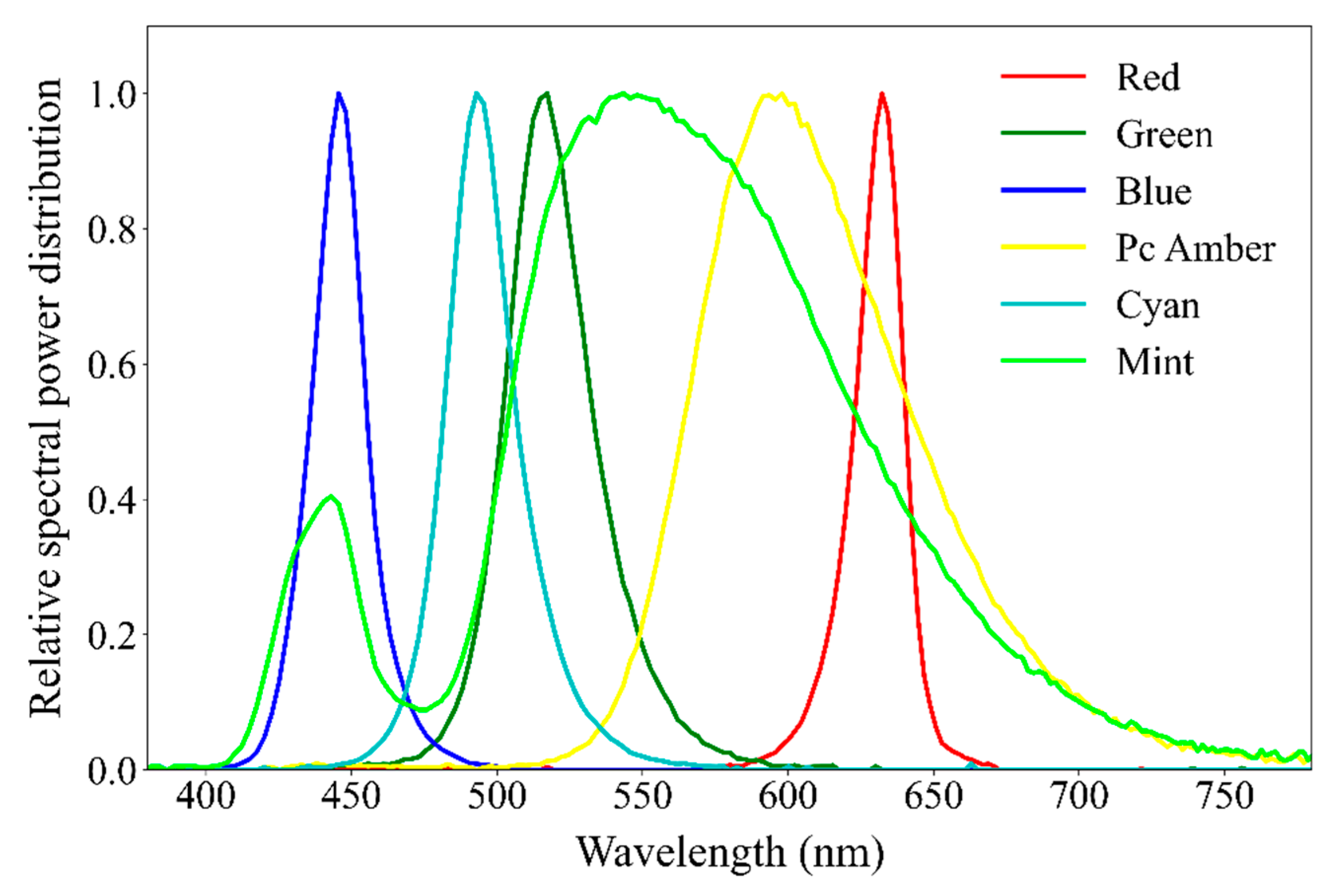
A custom developed 6-channel LED luminaire is used to generate the different spectra. Among commercially available LEDs, the Red (R), Green (G), Blue (B), Cyan (C), Phosphor converted Amber (Pc-A) and Mint (Mi) LEDs from the Luxeon C series of Lumileds® (Amsterdam, The Netherlands) are selected. The relative Spectral Power Distribution (SPD) of the six channels is presented in Figure 2, and their CIE 1964 ( x 10 , y 10 ) chromaticity coordinates and peak wavelength are given in Table 2. The luminaire is controlled via a serial port of a laptop.

3.2. Selection of the Objects

An object set of 12 typical objects widely available in supermarkets in Belgium were selected, 8 of them representing fresh food and 4 of them packaged food. The selection criteria were as follows: (1) the objects are familiar to the participants and (2) objects are distributed over the entire hue circle as much as possible. Fresh food items were replaced regularly to avoid the influence of color degradation due to aging.
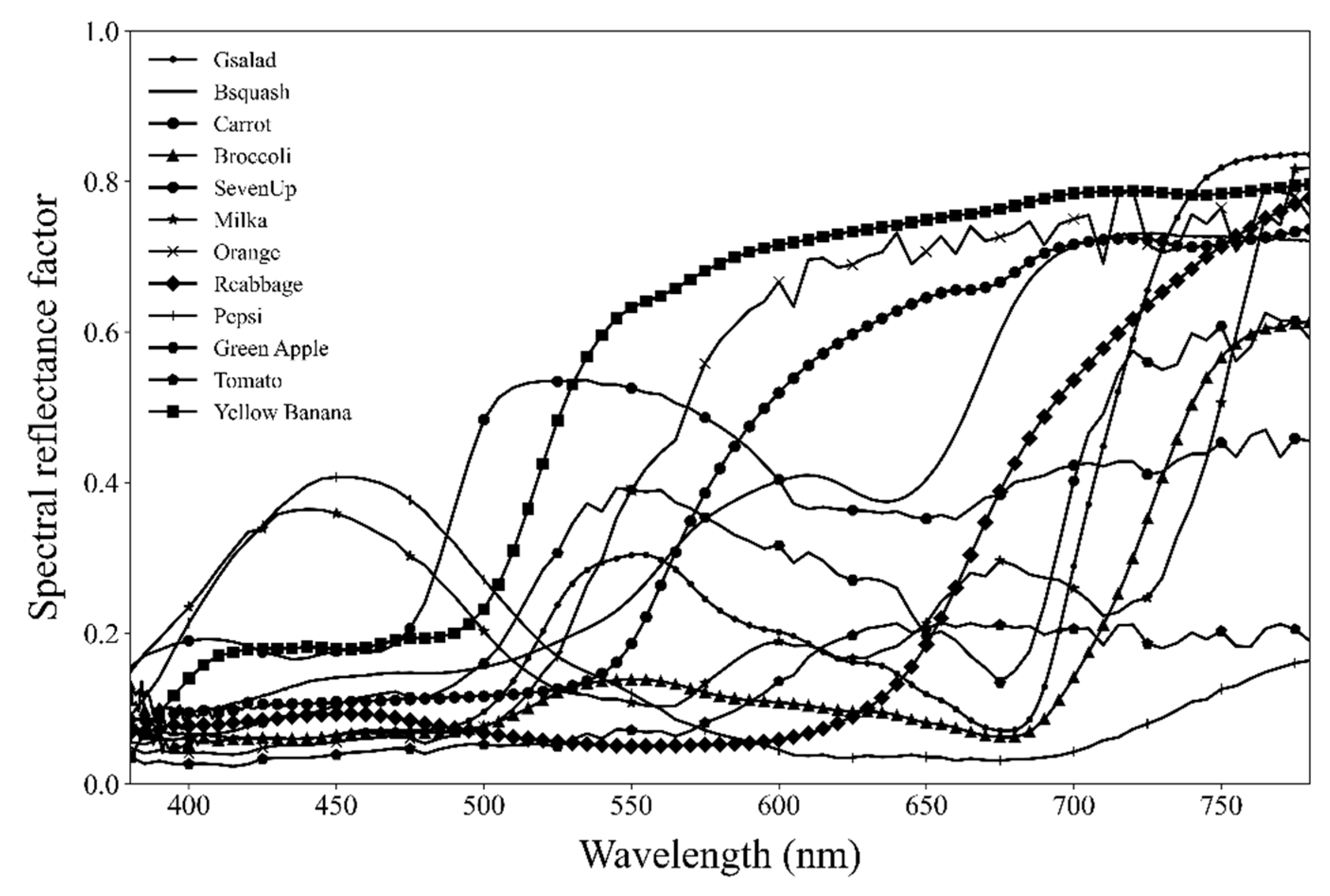
These objects include (1) Green Salad (2) Butternut Squash (3) Carrot (4) Broccoli (5) Seven Up Can (6) Milka chocolate pack (7) Orange (8) Red Cabbage (9) Pepsi Can (10) Green Apple (11) Red Tomato and (12) Yellow Banana. The spectral reflectance factors of the objects were measured using a Hunterlab spectral reflectance meter and are presented in Figure 3.
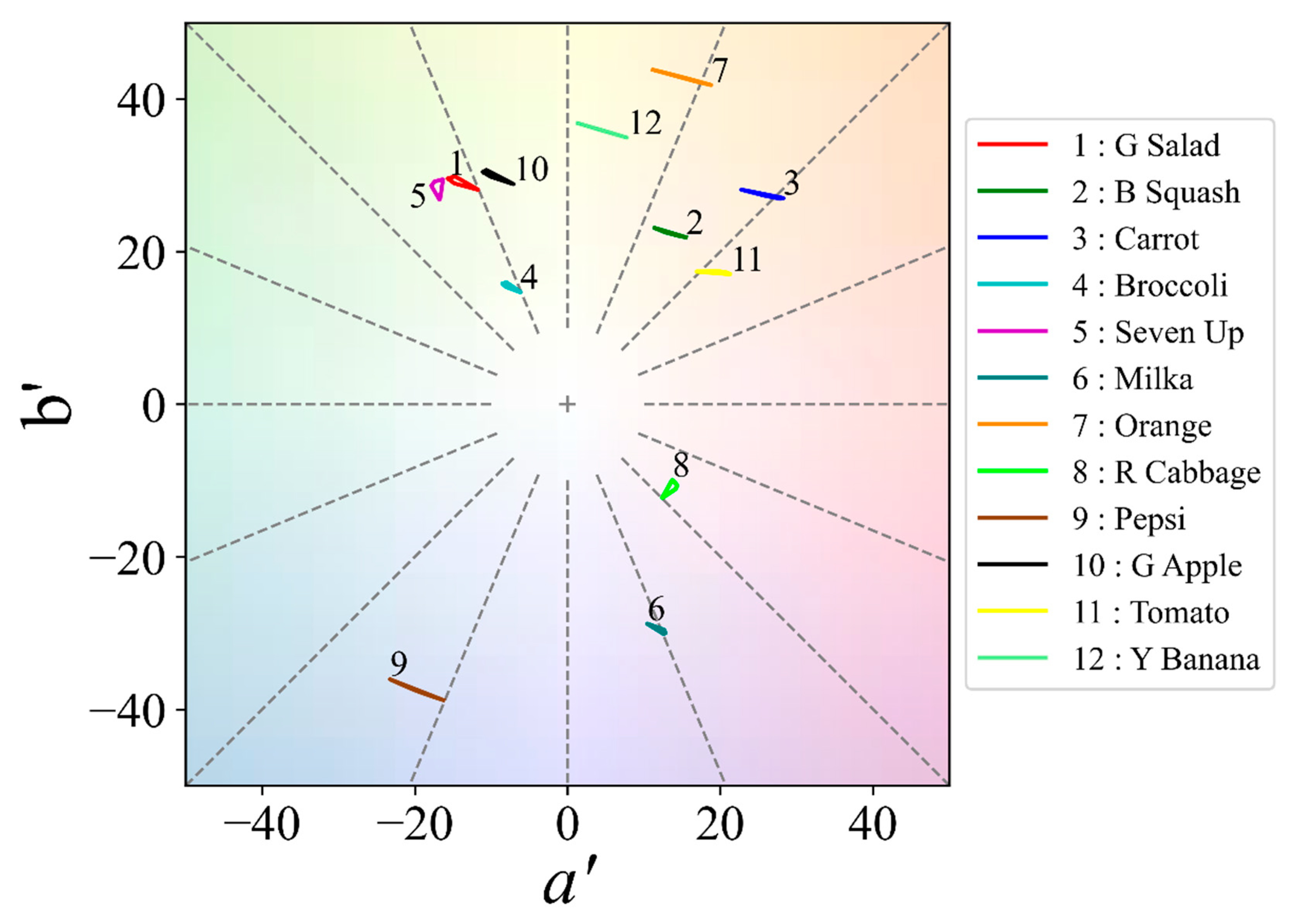
Figure 4 demonstrates the CAM02-UCS ( a , b ) gamut of the objects illuminated by all 3000 K metamers. For quite some objects, the hue variation dominates the variation in chroma.

3.3. Selection of the Spectra Used in the Experiment

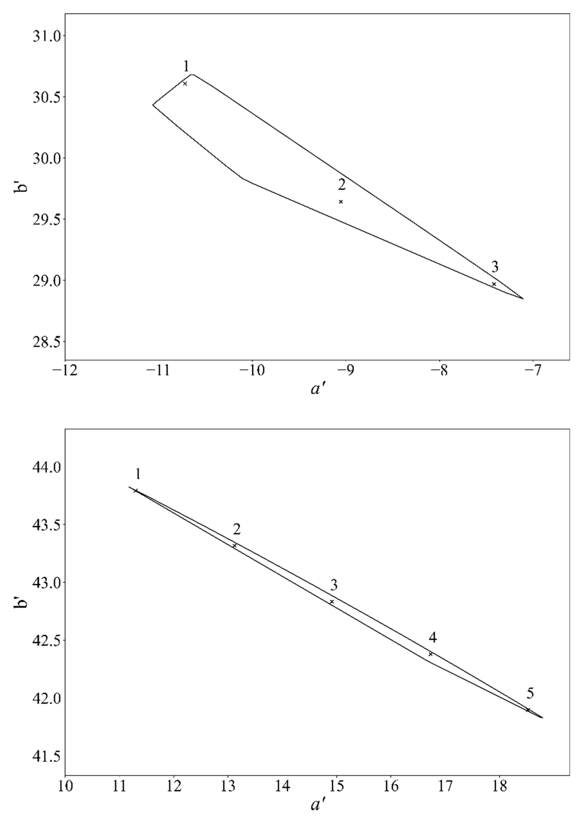
In order to find the optimum illumination spectrum for an object, a number of object chromaticities within the gamut of that object needs to be selected for evaluation by a panel of test subjects. According to Mukai [37], a Euclidian distance of 3 in the CAM02-UCS space is for most objects presented in a light booth with a gray background as the threshold to notice slight color differences. Depending on the spectral reflectance factor of the object, the selected CCT and the illuminance level, the gamut size and shape may vary for each object, and so does the number of possible target points with a mutual distance greater than 3. In Figure 5, the final selected points for a green apple (top) and an orange (bottom) for 3000 K metamers illuminated at 500 lux are presented in the CAM02-UCS ( a , b ) plane. Due to the small gamut of the green apple with respect to the limiting distance of 3 units, only three points are selected.

3.4. Experiment

3.4.1. Experiment Setup

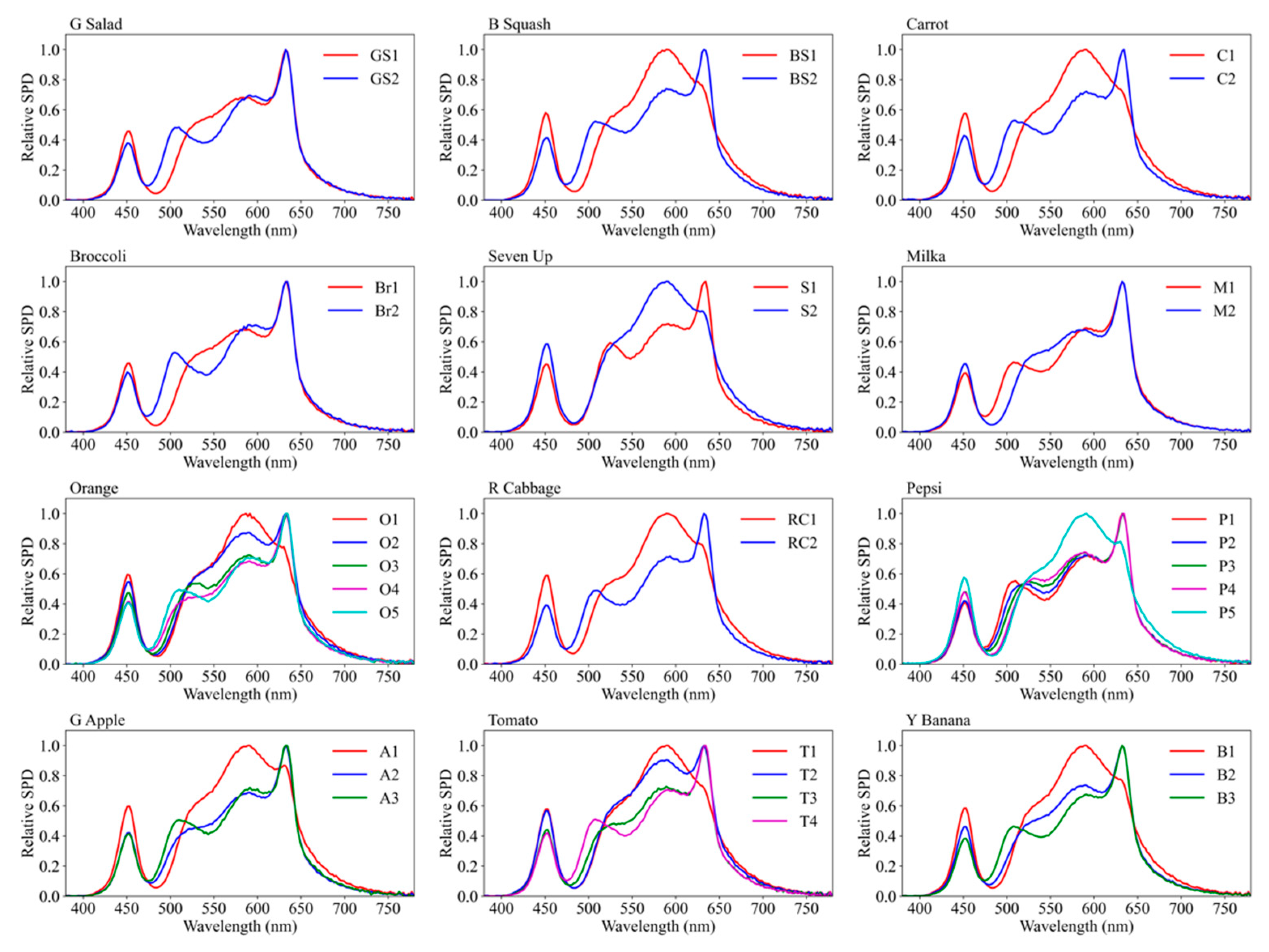
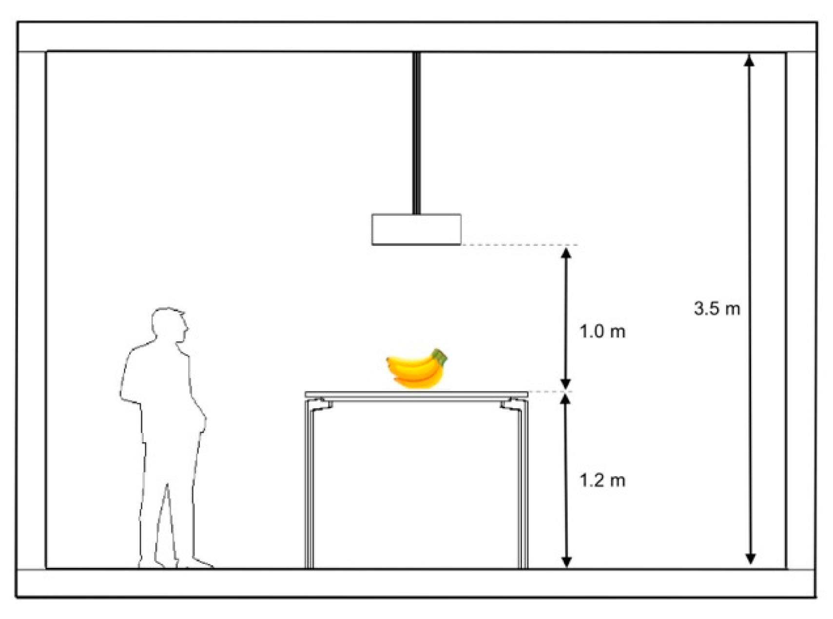
Objects were individually positioned on a white table inside a 2.2 m × 2.2 m room with spectrally neutral gray painted walls, solely illuminated by the above-mentioned custom developed with metamers of 3000 K, all with the same chromaticity coordinates (0.3135, 0.3234) and all providing an illuminance of 500 lux on the table. The spectrum was measured using a Gigahertz Optik BTS-45 calibrated spectral irradiance meter at a distance of 1.00 m below the light source. The particular spectra used for each object are presented in Figure 6. A link to download the illumination spectra is provided at Supplementary Material Table S1.
A 3000 K CCT was selected for the target white point, which is a commonly used for illumination of food in supermarkets in Belgium. According to Jost-Boissard et al. [38], variations of the CCT between 3000 K and 4000 K are not strongly correlated with the perception of attractiveness and naturalness, although in some cases, 3000 K was slightly preferred. In another study by Park et al. [39], participants perceived a 3000 K illumination as being “more pleasurable” than a 5000 K illumination. When asked about their illumination preference, participants preferred a CCT of 3000 K to the CCT of 5000 K, regardless of the color rendering index of the light sources.
A closed loop feedback system was developed to compensate for spectral changes due to the temperature rise and aging of the LEDs and to ensure that the Euclidian distance between the chromaticity coordinates of the target and the generated spectrum expressed in the CIE 1976 UCS system was below 0.003 ( Δ u v < 0.003 ). Figure 7 illustrates the schematic setup of the experiment room.

3.4.2. Experiment Procedure

Observers could participate individually or in small groups, however they were not allowed to communicate with each other during the experiment. Observers were allowed to walk around the table and to observe the objects from different perspectives. Since the experiments were conducted over several days, it was not possible to keep the number of observers the same for each object. An overview is given in Appendix A.
Following a 3 min adaptation time, objects were positioned consecutively in a randomized order to minimize potential bias. Because about 90% of an observer’s final chromatic adaptation state is reached within 1 min [40] and steady-state chromatic adaptation occurs within about 2 min [41], the observers in this study reached stable adaptation states before the experiment began.
A set of illuminants were selected for each object as formerly discussed. All possible pairs of stimuli for each set were presented to the participants. In order to counterbalance a possible interval bias (or order bias), the pairs of stimuli were presented in two orders (for example AB and BA). For each object, a null condition was considered where the two illuminants of a pair were identical (AA, BB, …). This null condition pair was also selected randomly for each object. Consequently, the total number of pairs for each object is calculated as
N p = P ( N s , 2 ) + 1 ( b i a s   o r d e r ) + 1 ( n u l l   c o n d i t i o n )
where N p is the total number of the spectrum pairs, N s is the number of elements in the set for each object and P ( N s , 2 ) is the number of permutations of a pair from N s .
The experimenter presented the pairs of illumination settings consecutively and in a randomized order. The first illumination setting was presented for 6 s, called ‘illumination A’, during which the observer(s) had enough time to observe and evaluate the object; afterwards, the second illumination in the pair, called ‘illumination B’, was immediately presented for another 6 s. With the illuminations alternating, the experimenter made clear which setting the observer was looking at, and the observers were instructed to fill in the questionnaire form and indicate for which of the illuminations the object appears more attractive (A or B). Subjects were allowed to declare that they had no preference about the attractiveness (entree X). They were free to ask the experimenter to repeat the pair as much as needed to make their final judgement. Between the presentation of each illumination pair, the light source was turned off for 0.5 s, and the room was dark to minimize bias from the short-term memory of the previous judgement as well as to let the observer know that a new pair was being presented. After completing all pairs for one object, the same procedure was repeated for the other objects. Note that the chromaticity and the illuminance were identical for all settings and all objects, and re-adaptation is not expected to be necessary when switching from one to another illuminant.

4. Results

4.1. Null Condition Test

Null condition pairs were included to test for any possible bias between the first and second illumination in each pair. The null condition pair was selected randomly for each object. Table 3 presents the percentage of times where the first or the second illuminant is chosen as giving rise to the most attractive object appearance; additionally, the percentage of X-entrees (no difference) is indicated. If there were no bias, a score of 100% for the category “X; no difference” or an equal percentage for the first and the second illuminant would be expected. In order to test the null bias quantitively, a binomial test has been applied. At a significance level of α = 0.05 , there was no significant null bias.

4.2. Interval Bias

Since the two illuminants in each pair were presented in both orders (AB and BA), it is expected that the distribution of the observer’s selection for the first and the second element of all these couples of illuminants pooled together is not significantly different from 50%. In Table 3, the results of the chi-square goodness-of-fit test are presented for each object. Since all values are greater than 0.05, there is no evidence to reject the hypothesis of a 50–50% distribution of the first and second illuminant and none of the orders (AB or BA) shows a significant difference at the significance level of α = 0.05 , except with the Pepsi can. This object will be discussed in more detail below.

4.3. Observer’s Choice of Attractiveness

In order to evaluate the observers’ attractiveness assessment, a preference probability matrix ( P o b j e c t ) was calculated for each object; the data are presented in Table 4. Because the chi-square goodness-of-fit test shows no significant difference between the presentation orders, the results of both orders are pooled. Each element P i j in the P o b j e c t presents the percentage of the times where illumination condition i has been selected as more attractive than the illumination condition j . To calculate these numbers, the evaluations are converted to 0 and 1 (1 for the most attractive and 0 for the other). In case the answer was “no difference”, both illuminants are considered to be chosen an equal number of times, and the results are added to both illuminants. To investigate whether two stimuli in one pair are significantly different or not, a Dixon and Mood sign test was used [42]. If the number of times that an illuminant is judged as most attractive is lower than a critical value, that illuminant is considered to be the less attractive one. This critical value depends on the selected level of significance.
Due to the varying number of participants per object and the randomized null condition pairs, the critical value varies for each object. Since the results of the two presentation orders are pooled, two critical values can be defined. This means that if P i j is lower than the minimum of the two critical values (CVmin), the stimulus i is less preferred than j , and if the P i j is higher than the maximum of the two critical values (CVmax), then the stimulus i is the more preferred one. If the result lies between the two critical values, no significant difference can be concluded. In Table 5, the minimum and maximum values for the critical values of the sign test for each object are presented, and the elements that have a significant difference are highlighted in gray. If all elements of a row/column are lower than the CVmin or higher than the CVmax, that illuminant is considered the preferred one. For example, illuminant 1 is the most preferred illuminant for the Green Apple, but illuminant 2 is not significantly more attractive than illuminant 3. For Orange, both illuminants 4 and 5 are preferred to the other three illuminants; however, there is no significant difference between the two, and both can be considered as the most preferred one. The results show that, except for Pepsi and Red Cabbage, there is always at least one illuminant for each object that makes the object significantly more attractive. The names of the preferred illuminants are mentioned in Table 6. Object name abbreviations are added before the illuminant number to avoid confusion; e.g., BS2 means the illuminant 2 for Butternut Squash.

5. Discussion

In Table 7, with the color rendering properties of each of the metameric spectra used in the experiment, the most attractive ones are highlighted in gray. In this table, Rf and Rg are the Illumination Engineering Society IES TM30-18 fidelity and gamut area metrics [43], respectively, and Rm and Rmi are the memory color rendering and specific memory color rendering indices, respectively [36]. Rmi is mentioned only for those objects which were very similar to the objects listed in the data set of Smet [36]. Qp is the color preference scale introduced by Davis and Ohno [44]. Rcschj is the local chroma shift, and Rfi is the fidelity index for a color evaluation sample (CES) with a similar hue to the object [43]. For a better representation, cell colors for Rcshj are set based on the recommendations of IES TM30-18 as being the representative color for that hue bin. The local chroma shift of red (Rcsh1) was included for all objects, since, according to Royer et al. [45], the chroma shift in the red hue bin has a significant influence on objects. If the gamut of the object is located in more than one hue bin, Rcshj for both hue bins are presented.
It can be seen that Rf and Rfi are not always good predictors for attractiveness: in the cases of Green Apple, Broccoli, Green Salad and Milka, the spectrum with the lower values for Rf and Rfi was the spectrum that gave rise to the most attractive appearance. The predictive power of Qp for visual attractiveness is also flawed. For Green Salad, Broccoli, Milka and Green Apple, the spectrum with a lower Qp was the most visually attractive one.
Where available, Rmi is a very good predictor. This is in line with the previous studies on memory color [46].
A higher value for Rcshj indicates a shift in chroma towards more saturation. The results show that for all objects, except Yellow Banana, a higher Rcshj always points to a higher attractiveness. This means that increasing chroma in the color group of the object tend to be selected as most attractive. In the case of Yellow Banana, one explanation for the different result is that the object color has a direct link to its ripeness. Some observers declared that the bananas with a more saturated yellow color appeared to be riper, and the duration they could be stored at home would therefore be shorter, so it became a less attractive banana for them. This means that when asking about attractiveness instead of visual attractiveness, another level in SOR, i.e., cognition and judgment on the Organism level, is also involved. Perhaps this interaction can be avoided by giving more information to the observers before the experiment, by distinguishing between attractiveness and visual attractiveness.
No significant optimal spectrum could be defined for Red Cabbage, although all color rendering indicators were higher for illumination RC2.This could, perhaps, be due to the object’s very low reflectance factor and the resultant very small gamut.
According to Schiffersetin et al. [4], customers usually link the appearance of the package of a product to its content. In the case of Pepsi, some observers reported that they could not make any link between the color of the content inside the package and its color, and therefore they could not make any judgments
For some objects with a relatively larger gamut (such as the Yellow Banana, Orange or Tomato), there is more than one preferred illumination. In the case of Orange, its gamut is very narrow in the chroma direction, and illuminations generating a chroma shift (for the same hue) with a distance greater than 3 in the CAM02-UCS chromaticity plane were not realizable. However, there is a very significant hue shift (>12 CAM02-UCS units) between points 1 and 5 and the gamut located in two hue bins. However, in all cases, both preferred illuminations were related to the two adjacent points inside the gamut. This means that if the color difference is smaller than 3 CAM02-UCS units, for some objects, both illuminations have the same attractiveness. According to Mukai [37], for most observers, a minimum of 3 CAM02-UCS units is required to distinguish color differences.

6. Conclusions

The analysis of the results demonstrates that our research hypothesis—the existence of an optimal spectrum that makes objects appear more attractive using the spectrally tunable 6 channel source— has not been rejected. For all of the objects in this experiment—except the Pepsi Can and the Red Cabbage—an optimum spectrum was recognized, which confirms the potential for an object-oriented illumination strategy. While none of the general color rendering metrics such as CIE Ra, CIE/IES Rf or IES Rg are a good predictor, object/hue-oriented metrics such as local chroma shift or specific memory color rendering indices perform better in terms of the prediction of attractiveness. Based on these preliminary results, the following strategy can be formulated: given a particular multi-channel lamp and a particular object, one can calculate all metamers according to the guidelines from this paper; for each metamer, the Rschj (or Rmi if available) value corresponding to the hue bin of the object under test is calculated. According to our experiment, the metamer with the highest Rschj is considered to be the most attractive one. However, when considering other CCTs and different sets of objects, a moderate chroma shift might be more preferred [10]. Further experiments are required to find the optimum level of local chroma shift for a broad range of illumination conditions
As these results are obtained for one particular chromaticity corresponding with a CCT of 3000 K and at an illuminance of 500 lux, to find the overall most attractive illuminant, further experiments are required under different illuminant chromaticity coordinates and illuminance levels.
In addition, the conclusions have to be checked when using another set of familiar objects, as well as nonfamiliar objects. A larger variety of illuminant chromaticity settings, illuminance values and objects are also required to be able to build a predictive model for the correlation of specific hue dependent color rendering metrics and the subjective descriptors of the objects. Additional experiments are also required to investigate the influence of the illumination spectrum on the other aspects of the SOR model, such as naturalness, freshness or ripeness (cognitive evaluations or Organism) and the customer’s willingness to buy (Response). This could be very relevant. For example, there are several studies that suggest that naturalness does not necessarily corelate with attractiveness. A retailer could choose to illuminate fresh food such that it appears more natural (as a brand concept) or such that it appears more attractive to boost sales.
The ultimate goal of this research is to provide the retail designer with a tool to develop a personal strategy and to create a brand image that is based on the use of an optimal object-dependent illumination.

Supplementary Materials

The following supporting information can be downloaded at: https://www.mdpi.com/article/10.3390/su14105994/s1, Table S1: The illumination spectra that were used in this experiment.

Author Contributions

Conceptualization, P.H. and K.A.T.; methodology, P.H., K.A.T. and K.A.S.; software, K.A.T. and H.G.; validation, P.H., K.A.T. and K.A.S.; formal analysis, K.A.T. and H.G.; investigation, K.A.T., P.H. and K.A.S.; resources, K.A.T. and H.G.; data curation, K.A.T. and H.G.; writing—original draft preparation, K.A.T.; writing—review and editing, P.H. and K.A.S.; visualization, K.A.T. and H.G.; supervision, P.H.; project administration, K.A.T. All authors have read and agreed to the published version of the manuscript.

Funding

Author K.G.S is supported by KU Leuven internal funds.

Institutional Review Board Statement

The study was conducted in accordance with the Declaration of Helsinki, and approved by the social and societal ethics committee of KU Leven (SMEC) registered with reference number G-2021-4114 approved on 21 December 2021.

Informed Consent Statement

Informed consent was obtained from all subjects involved in the study.

Conflicts of Interest

The authors declare no conflict of interest.

Appendix A

Table A1. Number of observers per object.
ObjectsNumber of ParticipantsAge
TotalFemaleMaleMinMaxMeanSD
Green Salad716253728.73.9
Butternut Squash716253728.73.9
Carrot716253728.73.9
Broccoli716253728.73.9
Seven Up716253728.73.9
Milka716253728.73.9
Orange18513203725.34.4
Red Cabbage615253728.34
Pepsi716253728.73.9
Green Apple18513203725.34.4
Tomato18513203725.34.4
Yellow Banana401921106438.616.4

References

  1. Petermans, A.; Kent, A. (Eds.) Retail Design A contextual lens. In Retail Design Theoretical Perspectives; Routledge: Abingdon, VA, USA, 2017; pp. 14–29. [Google Scholar]
  2. Quartier, K.; Vanrie, J.; van Cleempoel, K. As real as it gets: What role does lighting have on consumer’s perception of atmosphere, emotions and behaviour? J. Environ. Psychol. 2014, 39, 32–39. [Google Scholar] [CrossRef]
  3. Quartier, K. Retail Design What’s in the name? In Quartier, Katlijn; Petermans, A., Kent, A., Eds.; Routledge: London, UK, 2017; pp. 31–48. [Google Scholar]
  4. Schifferstein, H.; Fenko, A.; Desmet, P.; Labbe, D.; Martin, N. Influence of package design on the dynamics of multisensory and emotional food experience. Food Qual. Prefer. 2013, 27, 18–25. [Google Scholar] [CrossRef]
  5. Tantanatewin, W.; Inkarojrit, V. Effects of color and lighting on retail impression and identity. J. Environ. Psychol. 2016, 46, 197–205. [Google Scholar] [CrossRef]
  6. Schielke, T. Influence of Lighting Design on Marketing Communication. LEUKOS 2015, 11, 109–124. [Google Scholar] [CrossRef]
  7. Li, B.; Zhai, Q.; Hutchings, J.; Luo; Ying, F. Atmosphere perception of dynamic LED lighting over different hue ranges. Lighting Res. Technol. 2019, 51, 682–703. [Google Scholar] [CrossRef]
  8. Yang, F.L.; Cho, S.; Seo, H.-S. Effects of Light Color on Consumers’ Acceptability and Willingness to Eat Apples and Bell Peppers. J. Sens. Stud. 2016, 31, 3–11. [Google Scholar] [CrossRef]
  9. Royer, M. Show Me the Data: Characterizing the Performance of Color Tunable Light Sources–Illuminating Engineering Society. In Proceedings of the IES to Host Webinar on Color Tuning, Online, 4 June 2020. [Google Scholar]
  10. Wei, M.; Houser, K.; David, A.; Krames, M. Colour gamut size and shape influence colour preference. Lighting Res. Technol. 2017, 49, 992–1014. [Google Scholar] [CrossRef]
  11. Royer, M.P.; Houser, K.W.; David, A. Chroma Shift and Gamut Shape: Going beyond Average Color Fidelity and Gamut Area. LEUKOS 2018, 14, 149–165. [Google Scholar] [CrossRef]
  12. Garufo, G.; Lomberg, M. Objektbeleuchtung. German Patent DE102018130596A1, 4 June 2020. [Google Scholar]
  13. Houser, K. Light Sources That Increase Object Chroma When Dimmed. U.S. Patent US20210345461A1, 4 November 2021. [Google Scholar]
  14. Vick, K.J.; Allen, G.R.; Beers, W.W.; Vick, V.R. Enhanced Color-Preference Light Sources. EU Patent EP3044504B1, 20 July 2016. [Google Scholar]
  15. Fiore, A.M.; Kim, J. An integrative framework capturing experiential and utilitarian shopping experience. Int. J. Retail. Distrib. Manag. 2007, 35, 421–442. [Google Scholar] [CrossRef] [Green Version]
  16. Schielke, T.; Leudesdorff, M. Impact of lighting design on brand image for fashion retail stores. Lighting Res. Technol. 2014, 47, 672–692. [Google Scholar] [CrossRef]
  17. Sina, A.S.; Wu, J. The effects of retail environmental design elements in virtual reality (VR) fashion stores. Int. Rev. Retail. Distrib. Consum. Res. 2022. [Google Scholar] [CrossRef]
  18. Schüpbach, R.L.; Reisinger, M.; Schrader, B. Influence of lighting conditions on the appearance of typical interior materials. Color Res. Appl. 2015, 40, 50–61. [Google Scholar] [CrossRef]
  19. Szabó, F.; Kéri, R.; Schanda, J.; Csuti, P.; Wilm, A.; Baur, E. A study of preferred colour rendering of light sources: Shop lighting. Lighting Res. Technol. 2016, 48, 286–306. [Google Scholar] [CrossRef]
  20. Chakrabarti, M.; Thorseth, A.; Corell, D.D.; Dam-Hansen, C. A white–cyan-red LED system for low correlated colour temperature lighting. Lighting Res. Technol. 2017, 49, 343–356. [Google Scholar] [CrossRef]
  21. Smet, K.; Hanselaer, P. Memory and preferred colours and the colour rendition of white light sources. Lighting Res. Technol. 2016, 48, 393–411. [Google Scholar] [CrossRef]
  22. Teunissen, C.; Van Der Heijden, F.; Poort, S.; De Beer, E. Characterising user preference for white LED light sources with CIE colour rendering index combined with a relative gamut area index. Lighting Res. Technol. 2017, 49, 461–480. [Google Scholar] [CrossRef] [Green Version]
  23. Oberfeld, D.; Hecht, H.; Allendorf, U.; Wickelmaier, F. Ambient lighting modifies the flavor of wine. J. Sens. Stud. 2009, 24, 797–832. [Google Scholar] [CrossRef]
  24. Briand Decré, G.; Pras, B. Lighting and Perceived Temperature: Energy-Saving Levers to Improve Store Evaluations? Adv. Consum. Res. 2010, 37, 312–318. [Google Scholar]
  25. Kuijsters, A.A.; Redi, J.; De Ruyter, B.B.; Seuntiëns, P.P.; Heynderickx, I.I. Affective ambiences created with lighting for older people. Light. Res. Technol. 2015, 47, 859–875. [Google Scholar] [CrossRef] [Green Version]
  26. Masuda, O.; Nascimento, S.M.C. Best lighting for naturalness and preference. J. Vis. 2013, 13, 4. [Google Scholar] [CrossRef] [Green Version]
  27. Otterbring, T.; Löfgren, M.; Lestelius, M. Let There be Light! An Initial Exploratory Study of Whether Lighting Influences Consumer Evaluations of Packaged Food Products. J. Sens. Stud. 2014, 29, 294–300. [Google Scholar] [CrossRef]
  28. Wang, C. The enhancement of appetite through the use of colored light in case of a cake: Preliminary evidence from event-related potentials. Color Res. Appl. 2021, 46, 456–466. [Google Scholar] [CrossRef]
  29. Kang, S.Y.; Youni, N.; Yoon, H.C. The self-regulatory power of environmental lighting: The effect of illuminance and correlated color temperature. J. Environ. Psychol. 2019, 62, 30–41. [Google Scholar] [CrossRef]
  30. Areni, C.S.; Kim, D. The influence of in-store lighting on consumers’ examination of merchandise in a wine store. Int. J. Res. Mark. 1994, 11, 117–125. [Google Scholar] [CrossRef]
  31. Biswas, D.; Szocs, C.; Chacko, R.; Wansink, B. Shining Light on Atmospherics: How Ambient Light Influences Food Choices. J. Mark. Res. 2017, 54, 111–123. [Google Scholar] [CrossRef]
  32. Summers, T.A.; Hebert, P.R. Shedding some light on store atmospherics: Influence of illumination on consumer behavior. J. Bus. Res. 2001, 54, 145–150. [Google Scholar] [CrossRef]
  33. Khanh, T.; Bodrogi, P.; Vinh, Q.; Stojanovic, D. Colour preference, naturalness, vividness and colour quality metrics, Part 1: Experiments in a room. Lighting Res. Technol. 2017, 49, 697–713. [Google Scholar] [CrossRef]
  34. Tazehmahaleh, K.A.; Smet, K.; Hanselaer, P. Visualization of Lighting Quality and Object Appearance When Using Multichannel Light Sources. LEUKOS 2021, 18, 232–245. [Google Scholar] [CrossRef]
  35. Luo, M.R.; Cui, G.; Li, C. Uniform colour spaces based on CIECAM02 colour appearance model. Color Res. Appl. 2006, 31, 320–330. [Google Scholar] [CrossRef]
  36. Smet, K.; Ryckaert, W.; Pointer, M.; Deconinck, G.; Hanselaer, P. A memory colour quality metric for white light sources. Energy Build. 2012, 49, 216–225. [Google Scholar] [CrossRef]
  37. Mukai, K. Relationship between Colour Rendering Indices and Subjective Colour Differences. In Proceedings of the 29th CIE SESSION, Washington, DC, USA, 14–22 June 2019; pp. 980–989. [Google Scholar] [CrossRef]
  38. Jost-Boissard, S.; Fontoynont, M.; Blanc-Gonnet, J. Perceived lighting quality of LED sources for the presentation of fruit and vegetables. J. Mod. Opt. 2009, 56, 1420–1432. [Google Scholar] [CrossRef]
  39. Park, N.-K.; Farr, C.A. The Effects of Lighting on Consumers’ Emotions and Behavioral Intentions in a Retail Environment: A Cross-Cultural Comparison. J. Inter. Des. 2007, 33, 17–32. [Google Scholar] [CrossRef]
  40. Rinner, O.; Gegenfurtner, K.R. Time course of chromatic adaptation for color appearance and discrimination. Vis. Res. 2000, 40, 1813–1826. [Google Scholar] [CrossRef] [Green Version]
  41. Shevell, S.K. The time course of chromatic adaptation. Color Res. Appl. 1999, 26, S170–S173. [Google Scholar] [CrossRef]
  42. Chen, L.; Dou, W.W.; Qiao, Z. Correction: Ensemble Subsampling for Imbalanced Multivariate Two-Sample Tests. J. Am. Stat. Assoc. 2014, 109, 871. [Google Scholar] [CrossRef] [Green Version]
  43. IES Color Committee. IES Method for Evaluating Light Source Color Rendition (ANSI/IES TM-30-18); Lighting Design + Application; Illuminating Engineering Society: New York, NY, USA, 2019; Volume 49, p. 11. Available online: https://www.proquest.com/magazines/ies-method-evaluating-light-source-color/docview/2264107658/se-2?accountid=17215 (accessed on 12 April 2022).
  44. Davis, W.; Ohno, Y. Color quality scale. Opt. Eng. 2010, 49, 33602. [Google Scholar] [CrossRef] [Green Version]
  45. Royer, M.; Wilkerson, A.; Wei, M. Human perceptions of colour rendition at different chromaticities. Light. Res. Technol. 2017, 50, 965–994. [Google Scholar] [CrossRef]
  46. Babilon, S.; Khanh, T.Q. Color appearance rating of familiar real objects under immersive viewing conditions. Color Res. Appl. 2018, 43, 551–568. [Google Scholar] [CrossRef]
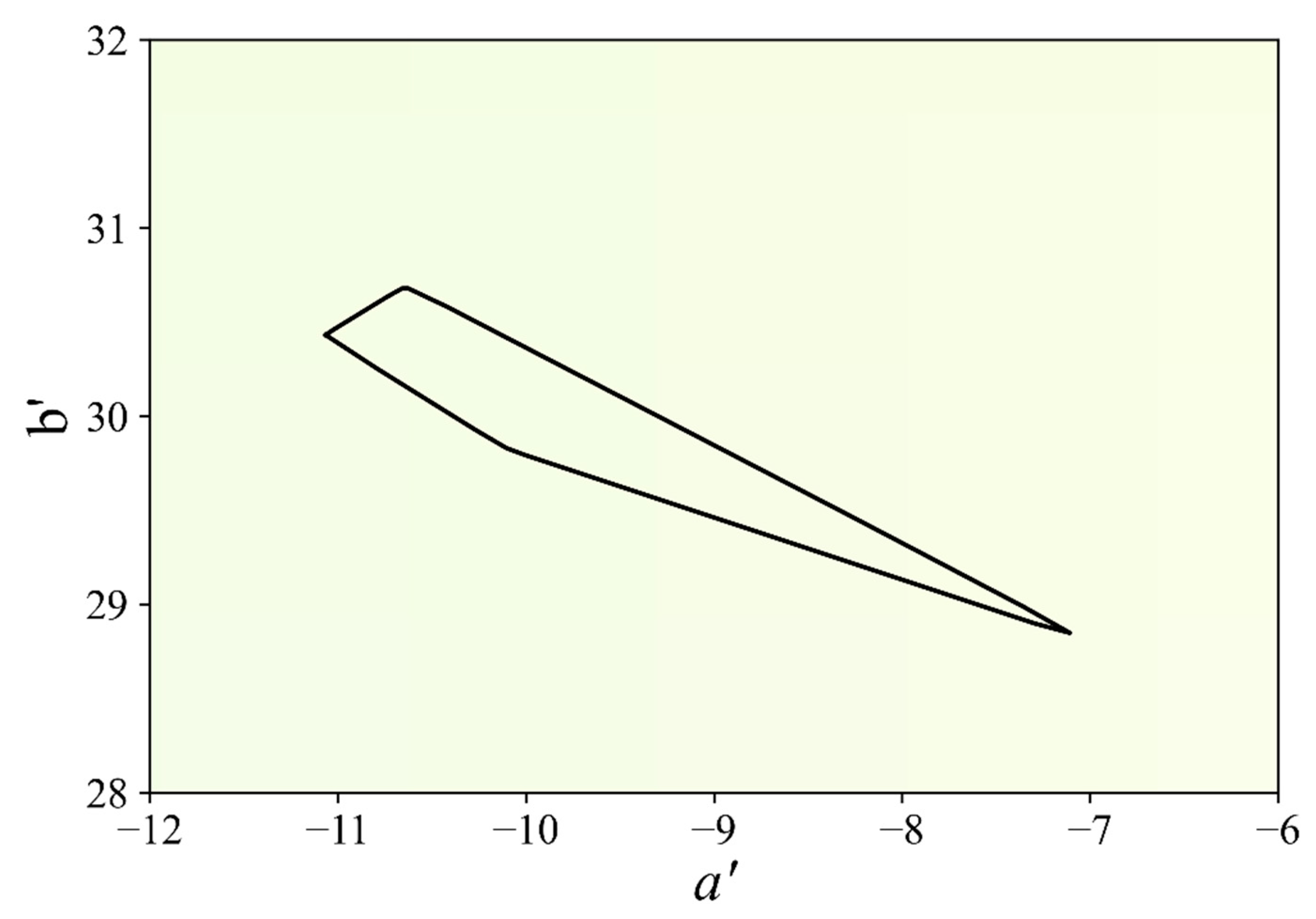
Figure 1. Color gamut in the CAM02-UCS ( a , b ) plane of a green apple under metamers of the 6 channel test luminaire (CCT = 3000 K). The a axis represents the red (positive)-green (negative) axis; the b axis represents the yellow (positive)-blue (negative) axis.
Sustainability 14 05994 g001
Figure 2. Relative spectral power distribution of the 6 channels of the luminaire under consideration.
Sustainability 14 05994 g002
Figure 3. Spectral reflectance factors of the selected objects.
Sustainability 14 05994 g003
Figure 4. Gamuts of the selected objects in the CAM02-UCS ( a , b ) plane at 3000 K.
Sustainability 14 05994 g004
Figure 5. Selected points within the gamut of a green apple (top) and an orange (bottom) in the CAM02-UCS ( a , b ) plane and generated by metamers of 3000 K.
Sustainability 14 05994 g005
Figure 6. Illumination spectra for each object.
Sustainability 14 05994 g006
Figure 7. Schematic illustration of the experiment room.
Sustainability 14 05994 g007
Table 1. Overview of the literature regarding the influence of light on customers.
SOR LevelKey Outcomes of the Research
StimulusSchielke [16]: Only by changing the lighting, brand image can be changed. Non-uniform lighting looks more modern.
Tantanatewin & Inkarojrit [5]: A space illuminated with warmer white light creates a higher impression and identity score.
Li et al. [7]: High chroma increases liveliness.
Sina & Wu [17]: Cool lighting creates more arousal than warm lighting and creates higher pleasure
OrganismSchupbach et al. [18]: Visual perception of objects is strongly influenced by lighting condition.
Fszabó et al. [19]: A certain type of meat can have a wide variety in chromaticity when considering different stores due to lighting condition.
Chakrabarti et al. [20]: Under certain lighting conditions, gold may appear as silver.
Smet & Hanselaer [21]: Memory color has an influence on preferred colors of familiar objects.
Teunissen et al. [22]: Light sources with higher gamut area are preferred due to an increase in saturation, which leads to a higher color vividness.
Oberfeld et al. [23]: Wine can taste better under blue and red light (cross model sensory).
Briand and Pars [24]: Warm white light has a strong influence on store upmarket positioning.
Kuijsters et al. [25]: Warm white light is perceived as cozier and less tense.
Masuda & Nascimento [26]: Objects illuminated with a CCT of 6200 K off the Planckian locus in the purplish direction light would appear more natural.
Otterbring et al. [27]: Food products are evaluated more negatively under cold white light.
Wang [28]: Warm light (4000 K) significantly increased appetite. Red lighting could enhance appetite, while green lighting results in people losing their appetite
Kang et al. [29]: Both warm-bright lighting and cool-dim lighting intensify the ease of processing of information
ResponseQuartier [3]: Lighting has an influence on people’s behavior in retail environments.
Lue Yang et al. [8]: Apples are more eaten under yellow light.
Areni & Kim [30]: Higher brightness leads to an increased examination and tasting of wine bottles.
Biswas et al. [31]: In brighter restaurants, customers select more healthy food.
Summers & Hebert [32]: Increasing the lighting level will produce arousal, pleasure and approach.
Table 2. Peak wavelength and CIE 1964 color coordinates ( x 10 , y 10 ) of the LED channels.
Ch#Channel NamePeak Wavelength (nm)
x 10
y 10
1Red (R)6320.68610.3135
2Green (G)5170.17720.7112
3Blue (B)4460.15200.0381
4PC-Amber (PcA)5980.58010.4144
5Cyan (C)4930.07110.4909
6Mint (Mi)5430.39710.4571
Table 3. Null Condition and Interval bias test results for each object. The number pairs, 1/1, 2/2, etc. in the Null pairs column refer to the illumination spectrum.
ObjectsNull Condition TestInterval Bias Test
Null Pairs (A/A)1st 2nd No DifferenceChi-Square Goodness-of-Fit Test
Statisticp-Value
Green Salad1/100100%0.050.83
2/225%075%
Butternut Squash1/10100%00.050.83
2/217%17%66%
Carrot1/125%075%1.190.28
2/2033%67%
Broccoli1/1067%33%0.430.51
2/200100%
Seven Up1/100100%1.190.28
2/217%17%66%
Milka1/133%067%01
2/2050%50%
Orange1/1050%50%0.070.79
2/2050%50%
3/3025%75%
5/5012%88%
Red Cabbage1/150%050%01
2/225%075%
Pepsi1/100100%4.040.04
3/300100%
4/400100%
5/50100%0
Green Apple1/19%36%55%0.140.71
2/200100%
3/3017%83%
Tomato1/100100%0.020.89
2/200100%
3/3033%67%
5/500100%
Yellow Banana1/114%14%72%2.90.09
2/211%32%57%
3/321%14%65%
Table 4. Preference probability matrix (P) of the presented illuminations; the ones fulfilling the sign test are highlighted in gray. Note that the illumination numbers are specific to each object and do not necessarily refer to the same illumination spectra.
PGreen SaladPButternut SquashPCarrotPBroccoliPSeven UpPMilkaPRed cabbage
Illumination 12121212121212
1-100%-0%-14%-100%-95%-25%-50%
2--------------
PYellow BananaPGreen Apple
Illumination 123123
1-32%28%-79%81%
2--48%--45%
3------
PTomato
Illumination 1234
1-10%2%12%
2--36%24%
3---49%
4----
POrangePPepsi
Illumination 1234512345
1-10%9%5%15%-38%25%14%13%
2--39%3%14%58%-22%38%0%
3---11%10%75%86%-14%57%
4----56%86%71%56%-71%
5-----63%38%29%13%-
Table 5. Minimum (CVmin) and maximum (CVmax) critical values at the 5% significance level for each object.
Green SaladButternut SquashCarrotBroccoliSeven upMilkaOrangeRed CabbagePepsiGreen AppleTomatoYellow Banana
CVmin24%24%24%24%24%25%30%22%0%30%30%37%
CVmax76%76%76%76%76%75%70%78%100%70%70%63%
Table 6. Preferred illumination(s) for each object.
Green SaladButternut SquashCarrotBroccoliSeven upMilkaOrangeRed
Cabbage
PepsiGreen AppleTomatoYellow Banana
Preferred
Illumination(s)
GS1BS2C1Br1S1M2O4O5--A1T3
T4
B2
B3
Table 7. Color rendering properties of the used spectra for each object.
ObjectsIlluminationRfRgRmRmiQpRcshjRfi
Green Salad Rcsh1Rcsh6 Rf42Rf43Rf45
GS181.999.985.0 83.3−8%9% 79.979.386.2
GS292.298.688.691.1−6%1%97.697.199.5
Butternut Squash Rcsh1Rcsh3 Rf20Rf21Rf22
BS175.093.478.6 72.4−17%−6% 46.160.360.4
BS292.198.988.691.0−6%−2%80.195.493.3
Carrot Rcsh1Rcsh2Rcsh3Rf20Rf21Rf22
C175.193.578.8 72.6−17%−14%−5%46.260.660.0
C292.198.988.690.6−6%−4%−2%80.295.793.6
Broccoli Rcsh1Rcsh6 Rf42Rf49Rf52
Br181.899.984.9 82.9−8%9% 79.882.190.6
Br292.498.588.791.6−6%1%96.697.194.6
Seven Up Rcsh1Rcsh6 Rf49Rf52Rf53
S186.4101.987.6 91.1−6%8% 84.290.885.0
S275.994.279.573.8−15%7%80.187.477.7
Milka Rcsh1Rcsh13Rcsh14Rf80Rf81Rf83
M192.298.788.6 92.3−6%2%2%89.968.892.8
M282.399.885.183.9−8%8%10%84.579.591.4
Orange Rcsh1Rcsh3Rcsh4Rf21Rf22Rf26
O174.793.478.3Rm3 67.877.2−17%−6%3%59.759.765.7
O279.997.483.187.179.9−11%−4%3%68.669.071.7
O384.4100.286.395.282.2−8%−3%2%77.677.778.0
O489.399.387.998.188.4−7%−2%1%87.486.388.1
O592.498.988.799.390.3−6%−2%0%96.994.697.1
Red Cabbage Rcsh1Rcsh15 Rf90Rf97Rf99
RC175.593.579.0 72.8−16%0%79.483.664.1
RC292.298.888.691.7−6%−2%94.594.388.8
Pepsi Rcsh1Rcsh11 Rf76Rf77Rf78
P192.398.688.6 92.4−6%2%94.783.890.3
P289.999.388.190.4−7%0%86.087.383.2
P386.599.887.187.5−8%−2%75.486.075.0
P482.599.685.283.9−9%−4%64.980.867.0
P575.793.979.373.5−16%−5%57.175.760.7
Green Apple Rcsh1Rcsh5 Rf42Rf43Rf45
A176.494.980.1Rm197.975.0−15%7% 83.879.686.4
A288.599.487.794.389.1−7%3%91.389.793.6
A392.298.788.687.792.3−6%−1%97.797.099.3
Tomato Rcsh1Rcsh2Rcsh3Rf5Rf7Rf11
T174.593.378.2 72.117%−14%−6%50.058.461.4
T278.797.182.378.812%−10%−4%62.671.871.4
T384.499.886.284.28%−7%−3%73.782.981.0
T492.498.688.790.9−6%−4%−2%79.687.288.7
Yellow Banana Rcsh1Rcsh4 Rf26Rf29Rf31
B174.993.678.5Rm273.772.6−17%3% 65.869.172.4
B286.8100.087.296.884.7−7%2%82.682.583.9
B392.398.688.699.892.4−6%0%97.697.297.4
Publisher’s Note: MDPI stays neutral with regard to jurisdictional claims in published maps and institutional affiliations.