1. Introduction
Commercial aviation has been a large and growing source of emissions globally. The IEA estimates that in 2019, carbon dioxide emissions from aviation reached nearly 1 gigatonne, or about 2.8% of global carbon dioxide emissions (hereafter “CO
2 emissions”) from fossil fuel combustion [
1]. Before the COVID-19 pandemic in 2020, global CO
2 emissions from aviation had been predicted to grow to 22% of global emissions by 2050 if efforts to fulfil climate change targets within the sector were further postponed [
2]. While the 2020 COVID-19 pandemic has slashed air travel across the board, it is harder to imagine that these changes represent a permanent state of heavily reduced flying rather than a temporary, suppressed state that either partially or fully will bounce back once the pandemic has run its course. Still, the 2020 and 2021 COVID-19 restrictions have forced many changes upon us, including substituting physical meetings for meetings and conferences online. COVID-19 has also made us reconsider the purpose, or indeed even the need for many of the meetings that previously presumed flying and physical co-presence [
3]. In terms of reducing CO
2 emissions from flying, the COVID-19 hiatus thus represents a window of opportunity to reconsider our flying patterns. We might find that we can fly significantly less and aim for a trajectory that will fulfil the emission reduction targets set by international treaties such as the Paris Agreement [
4].
The Paris Agreement [
4] states that we should aim for an increase of average global temperature “well below 2C”, e.g., aiming for an average 1.5 C temperature increase above pre-industrial levels. In order to reach that goal, we need to decrease our CO
2 emissions by 50% every decade from now on in order to transition to a carbon neutral society by 2050 [
5]. These emission reductions need to happen in all countries, in all organisations and all sectors of society, e.g., all the way from the global to the local and the individual level. Our own university, KTH Royal Institute of Technology (Stockholm, Sweden),is a research-intensive university with high CO
2 emissions from flying, and many of the largest CO
2 emitters in the Swedish public sector are in fact universities. According to a report by the Swedish Environmental Protection Agency [
6], out of the 10 governmental agencies that reported the largest carbon emissions from long-haul air trips in 2019, no less than seven were universities. Reducing CO
2 emissions from business air travel at universities is, however, a difficult issue, since (aero)mobility has become a norm in the academic world [
7].
In this paper, we report on work that comes out of a research project aimed at supporting CO2 emission reductions from business air travel at KTH Royal Institute of Technology. We have used a variety of methods to probe a problem space in the intersection of interactive visualizations using air travel data for the purpose of reducing CO2 emissions from business air travel at our own university. By probing this problem space, we have unearthed needs, challenges and opportunities for the creation of visualization tools aimed at raising awareness and potentially facilitating change toward more sustainable travel practices at KTH, at other universities and in other knowledge-intensive organisations.
Below, we will first present the area of academic flying as well as the ongoing research project that aims to support the reduction of CO2 emissions from flying at KTH Royal Institute of Technology. Additionally, we introduce design-oriented research and the double-diamond design process, which has been used as a research approach in this paper. Following this, we present the various methods we have used to probe the problem space and the results that came out of this work, which consists of a scoping review, several design experiments and a formative evaluation of five visualization tools. In the findings, we highlight several additional insights and hidden complexities that emerged throughout this work. It is not an uncomplicated endeavour to design interactive visualization tools that use air travel data to support CO2 emission reductions from business air travel in knowledge intensive organisations. Several complicating factors surrounding such visualization tools provide limitations for working within this domain, such as quality and availability of data, and issues related to employees’ travel patterns. Our deliberations will show that the problem space of CO2 emission reductions from academic flying is very large and that it is possible to move between issues at a very detailed level, e.g., minute issues pertaining to data, to overarching perspectives, e.g., organisational change and the internal dynamics at a large research-intensive university. We conclude by discussing these insights and complexities and by highlighting the importance of fitting possible interactive visualization tools into the larger ecosystems of people and structures that make up a knowledge-intensive organisation so as to achieve concrete change towards sustainability.
3. Methods
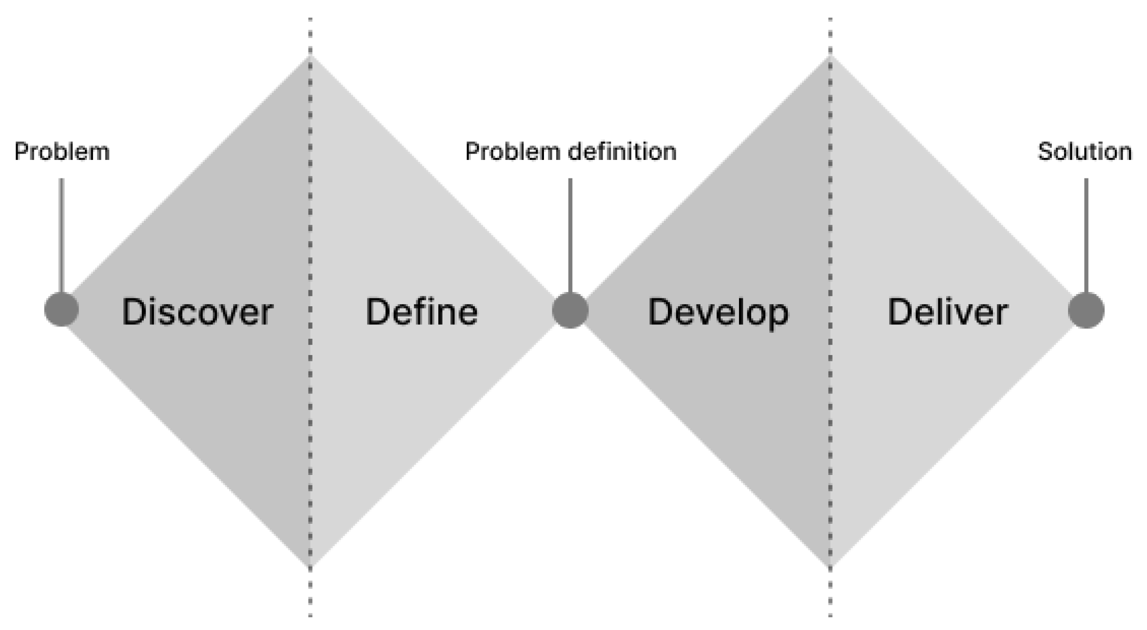
In this paper, we probe a problem space in the intersection of interactive visualization using air travel data for the purpose of reducing CO2 emissions from business air travel at our own university, KTH Royal Institute of Technology. Our investigations have been conducted through two parallel and interlinked processes. The first encompasses work that has been done as part of a research project (see “Context of the study” above) and the second covers a string of smaller, often design-oriented projects that have been conducted in collaboration with bachelor’s and master’s students at our institution. These two processes have been interlinked; student projects have used data from the research project as input towards specific designs and output from student projects have in turn been used as input to the research project. Relating back to the design process, we have in this work found ourselves in the first diamond, i.e., discovering and defining the problem(s) at hand, with the student projects conducting smaller design experiments within this process, in order to probe and draw out various dimensions of the problem space.
During winter 2019–spring 2020, we collaborated with 10 bachelor and 26 master level students in a series of design experiments and evaluations that explored various ways of visualizing data about business air travel at KTH Royal Institute of Technology. These activities were conducted through a number of design projects in three different master-level courses: “Information Visualization”, “Advanced Project Course in Interactive Media Technology” and “Individual Course in Media Technology” as well as in five bachelor theses (each performed by a pair of students). Students received access to an anonymised data set of all employees’ flights during a three-year period (2017–2019) and different groups of students chose to work with different questions that the data set could answer, for example “who flew where?”, “when during the year do KTH researchers fly?” or “what is the carbon footprint of different divisions?”. Furthermore, the design experiments have also explored different aspects of visualizing this data set (informative, critical and explorative) as well as more passive visualizations and more interactive interfaces. During these projects, our role as researchers were to provide data, give feedback as well as supervise the projects. All design choices made throughout the projects were students’ choices. Students have employed a varied set of methods including Research Through Design methodology [
45], qualitative research methods such as interviews as well as project-based learning [
49] and expo-based learning [
50]. In total, the students earned 117 ECT credits (formally equivalent to more than 3000 hours of work).
In parallel with the students’ design experiments, we conducted a systematic scoping review to survey the state of the art of flight visualizations that examined emissions from organisations’ business air travel. The review followed the initial framework stages for conducting scoping reviews as outlined by Colquhoun et al. [
51]. A set of eligibility criteria was defined which included peer-reviewed papers and grey literature, but that excluded books or book chapters, visualizations of private air travel or non-digital visualizations. The search criteria were chosen in order to find works in the intersection of (1) digital/HCI-related solutions that (2) cover visualizations of flight data of (3) business air travel from (4) an sustainability point of view. The search terms were framed around five key terms: visualization, flight, business, sustainability, and ICT. Considering the interdisciplinary character of our work spanning the intersection of technology and sustainability, we chose to search in three different databases: Scopus, Google Scholar and the extended ACM Digital Library (which has a focus on computing). Complementary searches were also made on Google to find grey literature and existing tools outside of academic databases. These database searches were performed during May 2020.
During the autumn of 2020, we conducted a formative evaluation of several visualization tools targeting academic flying. The evaluation was conducted in the form of a workshop together with experts in the field of information visualization. The aim of the evaluation was to uncover lessons to be learned for designing and building systems to visualize business air travel (i.e., forming ideas). In the workshop, three experts in information visualization (this set of experts included one of the paper authors ) and four persons in the research project evaluated five different visualization tools. Four of the visualization tools had been developed by KTH students as part of the design experiments described above, while the fifth was an external tool created by the University of Edinburgh that we had found during the scoping review. The underlying data set (that was used in the research project and in the student projects) was also examined in detail and discussed during the workshop. The format of the workshop was based on a focus group method developed by Kinnaird and Romero [
52] with a core group of participants examining the different visualization tools with two workshop attendees acting as facilitators; one guiding the conversation and another operating the various visualization tools that were projected on a large wall-sized 4-m 4-K display. Both audio and video from the workshop was recorded and the material was later analysed by identifying and clustering meaningful observations in an affinity diagram [
53].
We have additionally kept a collaborative, longitudinal research diary [
54], documenting the process, decisions, experiences and insights gathered from work conducted over a period of 2 years (including the work described above). Results presented below have also been informed by us organising a two-hour workshop on reducing CO
2 emissions from academic business air travel with eight international experts on “academic flying”. While the workshop was very informative and enriched many of the ideas and issues presented in the discussion, it did not yield a concrete set of “findings” and it will thus not be presented separately in the results section.
4. Results
In this section, we will present the results from the activities conducted as part of our exploration of the problem space as laid out in this paper.
4.1. Scoping Review
We conducted an exhaustive search for related work through a scoping review. Unexpectedly, we uncovered only scattered examples of relevant work. In fact, there do not exist related, peer-reviewed articles or conference papers on this topic. For example, there is no single peer-reviewed publication on the topic of visualizations of employees’ CO
2 emissions from business air travel. Instead, we found some works that were related but not very relevant, for example many publications aiming at visualizing flight trajectories and patterns of throughput and congestion, e.g., [
55,
56]. In the work reported in this paper, we are not focused on this body of work concerning various physical phenomena regarding commercial flights, such as noise and emission levels at departure and arrival at airports. Rather, we are focused on the overall flight behaviours of institutions, departments and individuals across temporal, regional and global dimensions. The aim is to understand how flight-intensive institutions currently make use of flying as a mode of transportation, e.g., “who flies where and why”, and to understand opportunities for such institutions to decrease CO
2 emissions from flying in the near future.
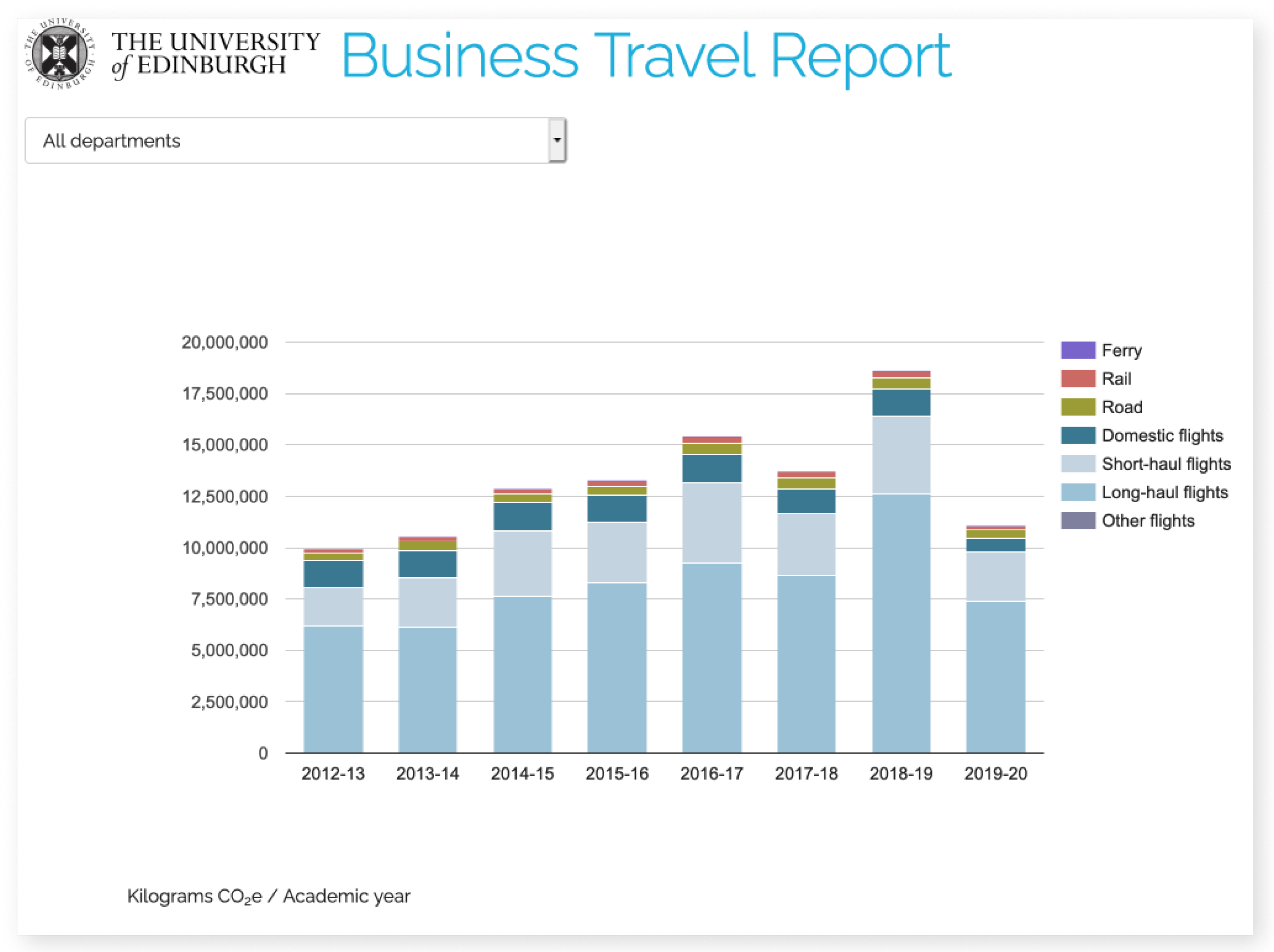
That said, we discovered a non-peer reviewed publication about one highly relevant example: a web-based “Business Travel Report” from the University of Edinburgh [
57]. The web-based Edinburgh system visualizes the various journeys made by employees at the university (planes, trains, cars and other means of transportation), and provides both an overview as well as the possibility to drill-down into the data with respect to various metrics such as CO
2 emissions, cost and distance. Moreover, users can filter and analyse these categories of data across departments (see
Figure 2). The system also offers different ways to inspect the data. First, the data may be represented over the world’s geography using a heat map as the main visual structure. Users may also investigate lists of top destinations, lists of suppliers and travel agencies, as well as the details of how the carbon footprints of different journeys were calculated.
A complementary search on Google also revealed another set of tools, since a number of commercial actors such as travel agencies have created their own Business Intelligence Systems. These systems process and visualize data about travel in an organisation, often times targeting travel managers and providing aggregated views of travel patterns in an organisation. The primary focus of such tools seem to be on cost savings and on how to manage travel bookings. Yet, several tools also include dedicated features to track CO2 emissions from travel.
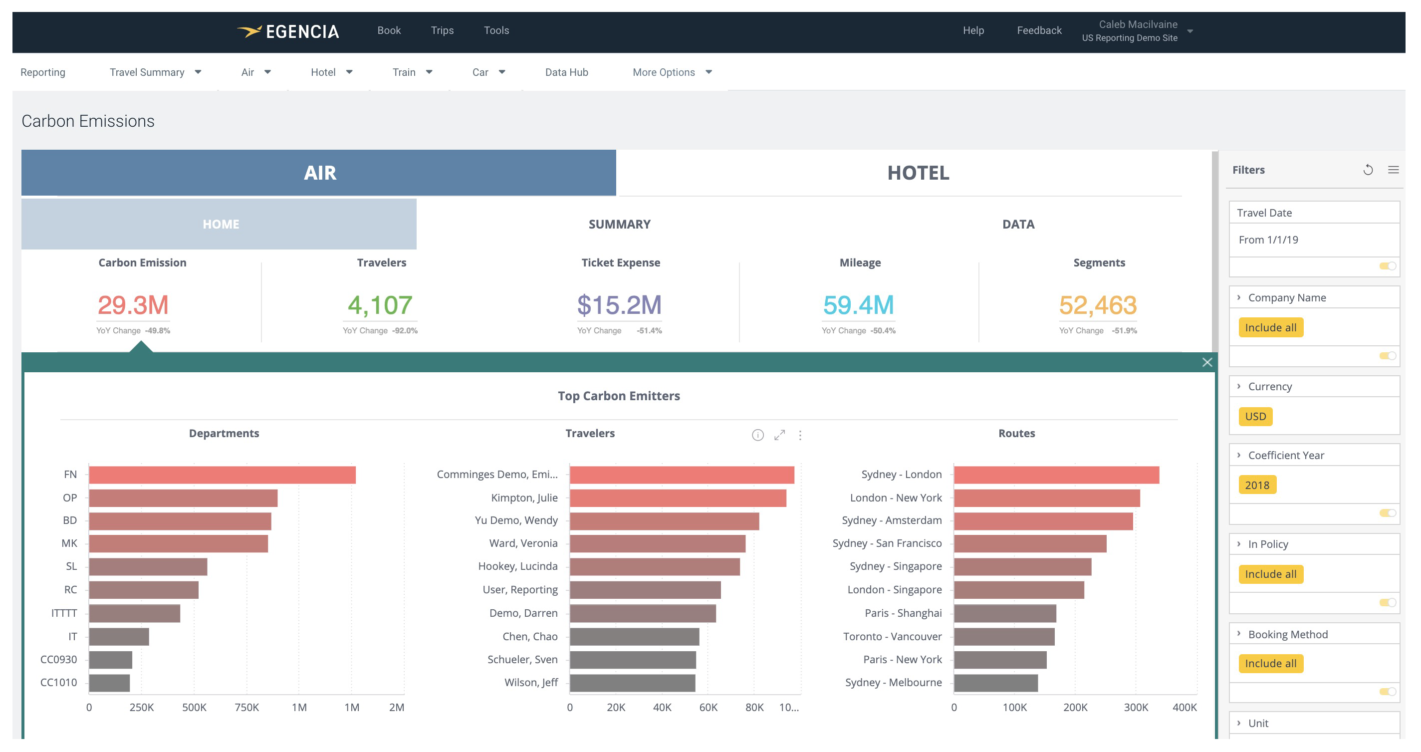
One example of such a commercial Business Intelligence System is the Egencia Analytics Studio by the American online travel company Expedia’s corporate travel agency Egencia (e.g., the same travel agency that KTH uses). This system tracks and aggregates information about an organisation’s travel and it includes a feature for visualising the climate impact of business air travel and hotel bookings in terms of CO
2 emissions (see
Figure 3). The Egencia Analytics Studio offers “multi-dimensional dashboards about travel-related greenhouse gas emissions” as stated on their webpage [
58]. The aim is to provide insights that empower travel managers to support their organisation’s and employees’ environmental goals through, e.g., the introduction of more environmentally friendly travel policies. What characterises these tools is their focus on providing interactive visualizations to examine and dissect air travel in an organisation from a top-down perspective. The focus seems to be business purposes, for instance compiling reports or enforcing travel policies.
4.2. Design Experiments
The design experiments that were conducted in collaboration with students resulted in a number of different design concepts and prototypes. Additionally, three evaluations in the form of three bachelor’s theses were conducted on one of the prototypes. In this section, we will present these design experiments in terms of “top-down”, “middle” and “bottom-up” perspectives, which pertains to where in the organisation these experiments find themselves. “Top-down” means looking at the data from an organisational perspective, i.e., looking at the university as a whole and all organisational units within it. “Bottom-up” describes a level of analysis focusing on the individual employees in an organisation. “Middle” refers to a level of analysis that is situated in-between a top-down and a bottom-up perspective, i.e., focusing on the distribution of trips and CO
2 emissions within a smaller organisational group such as a division. These three perspectives are related to and inspired by an analytical lens for studying and analysing how transition to sustainable futures (can) happen through top-down, middle-out and bottom-up actors in society [
59].
4.2.1. Top-Down Design Experiments
Four different “top-down” visualization prototypes that look at different aspects of the dataset have been developed. By design, the tools follow
Shneiderman’s Mantra: “Overview first, zoom and filter, details on demand” [
60]. These are tools that aim at giving an overview of the whole data set (all air travel at KTH) and that also support filtering, zooming, and highlighting elements and regions of interest, starting from the overview and progressing to deeper levels of data representations. The different tools contained features that visualized, e.g., the distribution of CO
2 emissions and trips amongst different organisational units, trends and changes in CO
2 emissions over time across organisational units, as well as destinations on a world map. To give a concrete example, one of these projects explored three different questions: where, who and how much do different organisational units and employees at KTH fly in terms of number of trips and in terms of CO
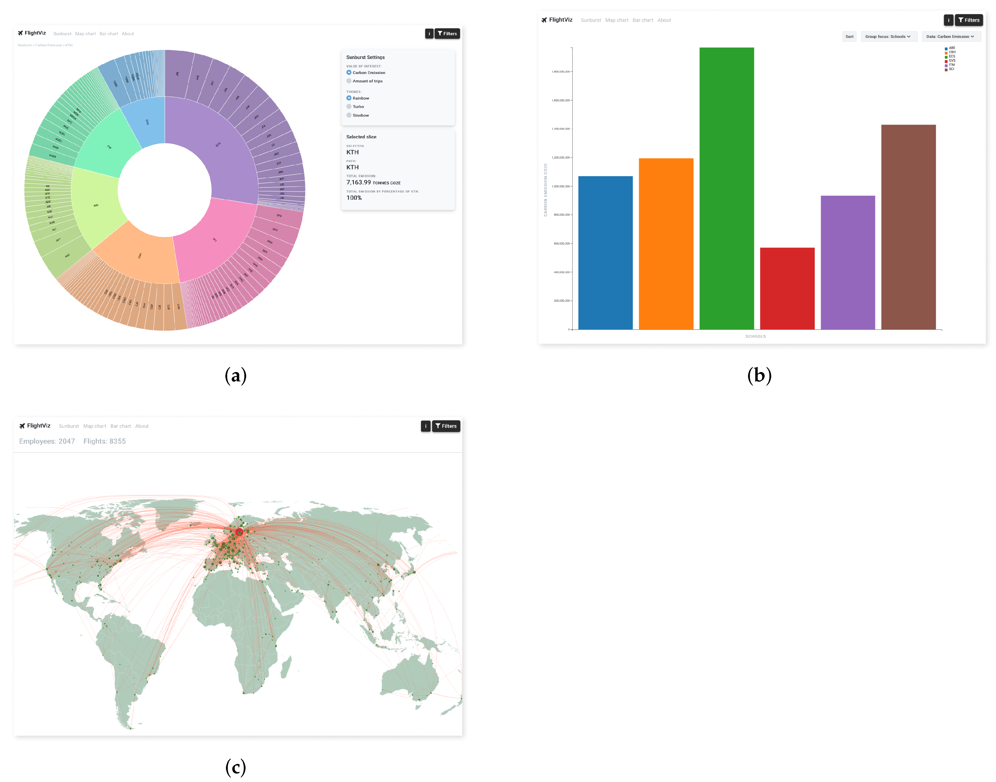
2 emissions. To answer these questions, the project developed a web-based tool, FlightViz, with three interactive visualizations of the dataset:
Figure 4a a sunburst diagram that reflected the organisational structure of KTH, with each of the five school plus central administration is represented by different colours;
Figure 4b) a map of the world with flights mapped onto it; and
Figure 4c) a traditional bar chart with the organisational units as a framework for more detailed analysis. In all three visualizations, it was possible to drill down into and explore the data as well as to inspect and filter it according to various metrics (CO
2 emissions, number of trips, salary, professional titles, destinations, flight class, organisational unit).
The FlightViz prototype was later evaluated in three different bachelor theses. The evaluations were conducted together with different stakeholders working with sustainability-related questions at KTH [
61], with sustainability managers at nine other Swedish universities [
62], and with people working with sustainability-related questions in two different organisations [
63]. All three evaluations demoed the prototype and then followed up with semi-structured interviews focusing on available information in the prototype, functionality and fit with the organisation’s needs (less emphasis was put on issues relating to design and usability). Despite the fact that these meetings resulted in long wish lists with additional longed-for features, the reactions of sustainability managers at other Swedish universities in particular were overwhelming; several of them wanted to have access to a tool such as FlightViz immediately.
4.2.2. Middle Design Experiments
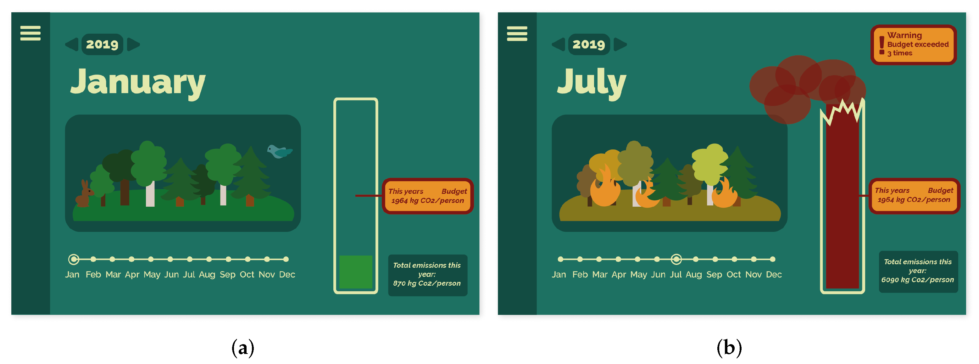
Three projects took a “middle” perspective as the starting point for conducting design experiments, e.g., investigating how data about flying patterns in an organisation could be visualized in order to create awareness and reflection about the topic within a smaller organisational group such as a division. For example, one bachelor thesis project used a Research Through Design approach to explore how an installation in the physical office spaces of a division could be used to achieve this. The project created a mockup of a digital interface which aimed to trigger discomfort and negative emotions concerning flying in order to communicate and increase awareness of the connection between data, habits and behaviours [
64]. The digital interface visualized an annual CO
2 emission budget for a division in real time and illustrated how cumulative increases of the division’s emissions from flying over the course of the year influenced the wellbeing of a (digital) forest (see
Figure 5).
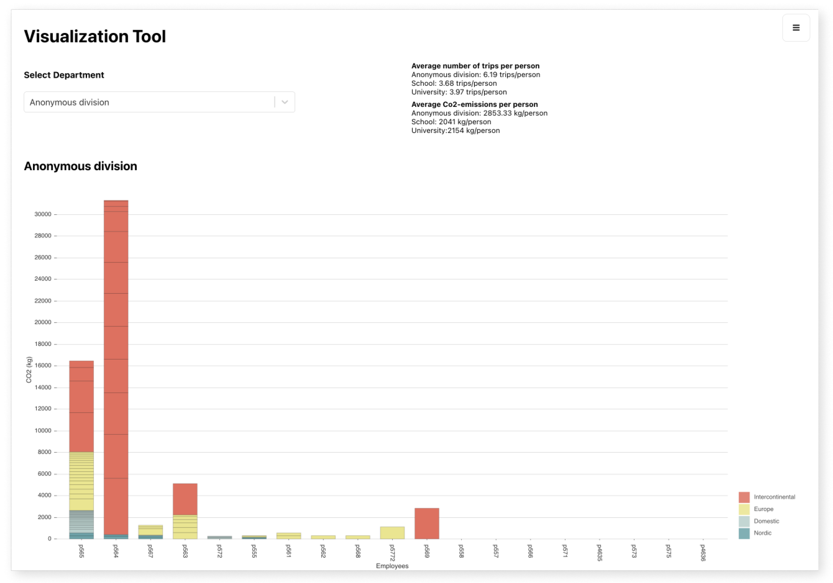
Another project investigated the “middle” perspective by creating a digital tool for analysing the flying amongst employees at a division. The tool was inspired by a physical representation of a division’s flying habits that we had developed in the research project and that involved post-it notes and poker chips. Each post-it note represented an employee at a division and each chip represented one flight/trip (with different colours for short-haul, medium-haul and long-haul trips). The end result of this visualization project followed the same principles using a bar chart (see
Figure 6). Each bar represents one employee and is further segmented into all individual trips made by respective employees during a year. These trips are divided into short-haul (domestic, nordic), medium-haul (European) or long-haul (intercontinental) trips.
4.2.3. Bottom-Up Design Experiments
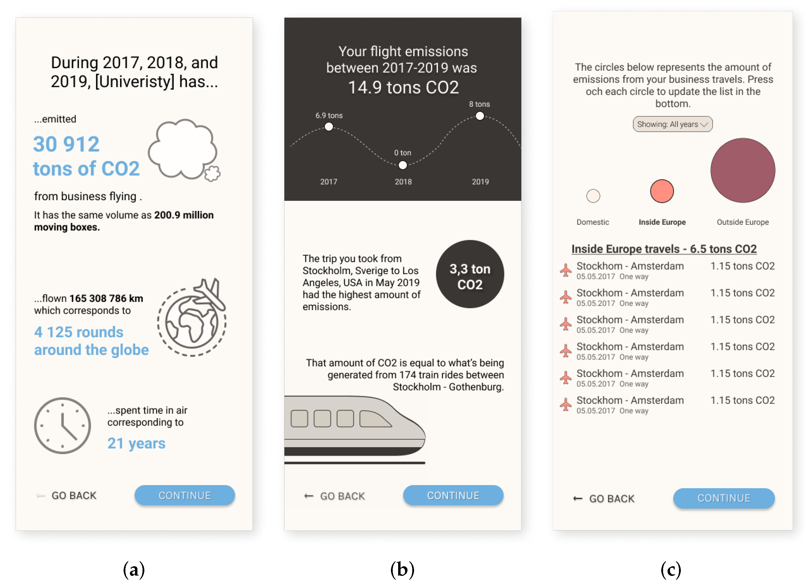
One project looked at the dataset from a “bottom-up” perspective, developing an app for supporting behaviour change on an individual level amongst employees at KTH (see
Figure 7). The aim was to trigger reflection around travel habits at work through the provision of a tool to explore personal data on business air travel. In the app, you follow a stepwise process in which you first are introduced to your own CO
2 emissions from flying in (tons of CO
2), followed by a presentation of alternatives that can reduce emissions from business travel (based on your own data). Lastly, your carbon footprint is compared with the average of the organisation as a whole, of people with the same role in the organisation, and with the average for employees at the division where you work.
4.3. Workshop with Visualization Experts
The workshop with experts in information visualization generated a variety of insights about issues concerning the data set and the five visualization tools that were examined during the workshop.
The workshop started with a detailed inspection of the data set. Different inconsistencies and missing values were noted, including wished-for information that we don’t have access to such as why a specific trip was made and who funded/paid for the trip. One participant pointed out that if the aim is to develop a visualization tool that could be used in other organisations, adding additional requirements on the data would make it harder to implement it elsewhere.
A relatively large share of the trips in the data set were made by “anonymous” travelers, i.e., there was no information about who had booked or made the trip nor about their affiliation (see “Findings” below). Workshop participants agreed that it is essential to know who (in terms of individuals, divisions, departments) travels in order to decrease emission in the organisation. One suggestion was that it should not be possible to book business trips without stating who it concerns (name, affliation) and why they travel, thereby avoiding this problem.
The issue of “anonymous trips” was also mentioned when the five visualization tools were compared. Some tools included this data, while others did not. One participant highlighted that ambiguity should be visualized in order to “show what we know, and also what we do not know about the data”. Beyond discussions about data and ambiguity, the workshop participants noted a range of features from different tools that should be included in a system that affords exploration and identification of opportunities for emission reductions. Suggested features included visualizing the distribution between different organisational units, displaying where people fly on a world map as well as when flying happens in terms of “flight intensity” in a calendar view (e.g., during what periods of the year do researchers fly a lot?).
5. Findings
In the introduction, we stated that we have used a variety of methods to probe a problem space in the intersection of interactive visualizations using air travel data for the purpose of reducing CO2 emissions from business air travel at KTH Royal Institute of Technology. We further stated that by probing this problem space, we have unearthed needs, challenges and opportunities for the creation of visualization tools aimed at raising awareness and facilitating change toward more sustainable travel practices at KTH, at other universities and in other knowledge-intensive organisations.
Up to this point, we have discussed hands-on, practical tasks that have been undertaken as we have probed this problem space. We will now complicate matters by having another take at unearthing “needs, challenges and opportunities for the creation of visualization tools aimed at raising awareness and potentially facilitating change toward more sustainable travel practices”. Since this paper is the result both of employing specific, concrete methods to explore a problem space (see “Methods” and “Results” above) as well as insights gathered from ongoing work in a research project over a period of 2 years, we have over time uncovered hidden complexities that we were not initially aware of. Additional questions and issues have thus been uncovered that go beyond, or possibly come before, the issue of how to design suitable visualizations. We thus take a step back and point at factors that have simultaneously structured and limited us in our endeavour to design interactive visualizations using air travel data for the purpose of reducing CO2 emissions from business air travel. We will highlight and discuss some of these factors below with a focus on “data” and “people”.
5.1. Data
When it comes to creating interactive visualizations, data is sometimes treated as an “entity” that has an objective existence. This is particularly true in a world that swims in data (e.g., quantified self, sensors, big data etc.). It is easy to imagine that getting hold of relevant data is simple and that it’s easy to clean up the data before turning to the work of designing suitable representations and visualizations. We ourselves initially thought that it would be a relatively simple process to (1) get hold of data that (2) would allow us to create interactive visualizations that (3) would allow us to draw conclusions that (4) would feed into policy and action. Getting hold of useful data has however turned out to be significantly more complicated than what we initially imagined. We will here describe some of these challenges as well as other challenges related to data (use, quality etc.).
5.1.1. Aquiring Data
An unexpected hurdle for getting hold of data about KTH’s air travel was office politics. Data about KTH’s air travel is collected by KTH’s designated travel agency, Egencia, and the only person at KTH who has the authority to ask for that data is KTH’s travel manager. While Egencia has been forthcoming in handing over data to KTH, our request to get hold of that data ran into red tape and was, for partially unclear reasons, delayed for the better part of 6 months. Had it not been for the fact that the research project was supported by a national funding agency, that the project required the data in question and that the researchers in the project reached out to the highest levels of university management for support, we can easily imagine that the data would have continued to be unavailable or inaccessible. It is to this day unclear exactly why it was exceedingly hard to get hold of data (which in principle is public and could be requested by any citizen), but it could be that these difficulties point at the perceived sensitivity of the issues in question.
A separate problem is that while it is mandated that all KTH employees should use KTH’s designated travel agency for booking their business trips, it is apparently possible (at times and for reasons unknown to us) to book trips in ways that do not comply with this policy. While compliance has increased over the last few years, it is surely not 100% and it is currently impossible to gauge the level of compliance and to draw any conclusions about how much data is “missing” about KTH’s flying (e.g., not available through Egencia). One particularly hard problem is exemplified by a ph.d. student who wanted to attend a research conference in Dublin, Ireland. He chose to pay for a dirt-cheap round trip with a low-cost air carrier between Stockholm and Dublin out of their own pocket rather than to burden their research project with buying an expensive ticket through KTH’s travel agency. While the research project paid for their hotel room in Dublin, the trip itself “does not exist” for the university (personal communication, May 2021).
Yet another problem is that it was only possible to get data for 2017, 2018 and 2019 from the travel agency. KTH used another travel agency before 2017, but since that travel agency was acquired by a larger travel agency, all travel records from before 2017 are gone.
5.1.2. Frequency of Data
Another related and complicating factor was the frequency at which we could get new data delivered, since this frequency has implications for the kind of computer systems and visualizations it is possible to create. While the research project would have wanted to regularly get new, up-to-date data (for example every month or every quarter), we have had to settle for annual instalments of data. It is possible to do much with annual instalments of data, e.g., [
30], and it is also sufficient for following up annual targets at an aggregated level. However, a more regular data feed would make it possible to create systems that keep track of changes in a more timely and dynamic manner. With a more regular data feed it would for instance be possible to compare emissions with annual targets and sound the alarm if KTH, a specific school at KTH, or a specific division at KTH is not on track to meet this year’s targets. It would also be possible to compare emissions between divisions over time in order to benchmark, spur or compete against other divisions. More timely delivery of data could thus encourage visualizations that support reflections and discussions in ways that data that is updated more seldom does not.
5.1.3. Travel Agency Data Limitations
As mentioned, data about KTH’s air travel is collected by a travel agency and forwarded on an annual basis. The data of interest to us is not so much actively “collected” by the travel agency as representing a residual or a “sediment” of the ongoing activity of booking business trips for KTH employees. The data in question is collected for reasons having to do with accountability in terms of bookings and billings, and it just so happens that the same data can be useful also for other purposes, e.g., for contributing to an understanding of air travel at KTH and by extension for supporting CO2 emission reductions. The fact that the data is useful for such purposes could be seen as a fortunate coincidence or a serendipitous side effect of the business of booking business trips. The data collected by the travel agency is however collected for purposes and organised in ways that make sense for a travel agency, but that might not be optimal for our purposes. We will here give a few examples of challenges we have encountered in respect to this.
What is most important for a travel agency are functions having to do with being a intermediary between customers (KTH and KTH employees) and suppliers (airlines and hotels). Core tasks are to book trips, to handle and track money and to communicate important information to different stakeholders. It is thus very important for a travel agency to keep track of money and this becomes complicated when trips are rebooked or cancelled. This also means that the travel agency’s computer systems are organised around bookings or transactions, where our research project is primarily interested in the trips made by KTH employees (and where one trip can be the result of several transactions).
Since Egencia’s system saves each transaction, we get information about all bookings, including bookings that were later rebooked or cancelled, but our research project is interested only in trips made (no matter how many times the booking was changed). Furthermore, the travel agency’s data is organised according to when each booking was made, where we instead are exclusively interested in when the trip was made. For instance, trips booked at the end of 2018 but made during 2019 are delivered in the travel agency’s 2018 data set and had to be moved over to our 2019 data set. These discrepancies sometimes make it problematic to discern or “unveil” the trip itself among several bookings. Complicated bookings might not be possible to fully understand even with additional human detective work.
To better understand business travel at KTH, including thinking about what trips are more or less “necessary”, it would be useful for us to have information about the stated purpose of each trip. This is information that Egencia does not have at all. Brief information about the purpose of a trip does in fact exist in another (internal) KTH system, but this information is not saved at a central level after a proposed trip by an employee has been approved.
Yet another challenge is that KTH also pays for a substantial number of flights made by people who are not employed by KTH.This might sound counterintuitive, but there are various examples. One example is that KTH pays for trips made by international researchers who are part of a grading committee for a PhD dissertation, and another example is that some KTH PhD students are formally not employed by KTH, but are rather supported by a scholarship or a stipend from their home country (see further [
42]). While it is easy to account for each trip made by a bona fide KTH employee in Egencia’s system, it is not possible to know who travelled (nor for what purpose such a trip was made) when it comes to trips made by a non-KTH employee.
Trips made by non-KTH employees are thus difficult to account for, and while these trips also need to be reduced, they currently, so to speak, “fly under the radar”. This would not have been a big problem but for the fact that earlier research of ours shows that “a significant proportion of KTH’s air travel is made by unknown and anonymous travellers rather than by identifiable KTH employees” [
42]. In 2019, air travel by non-KTH employees accounted for no less than 32% of KTH’s total CO
2 emissions from air travel. It is clear that it will be all but impossible for KTH to reach its CO
2 reduction targets unless travel by KTH employees as well as travel by KTH non-employees decreases. The latter will, however, be hard as long as everything about unknown travellers’ travels is unknown.
Our conclusion in this section about “data” is that while travel agency data is very useful, there is a gap between the needs of the university and the data that the travel agency currently collects. To collect necessary data, we see two different alternatives ahead. The first is to formulate new requirements for data that is collected by the travel agency. The second is to “intercept” data that is exchanged between KTH and the travel agency, e.g., for KTH to collect and manage travel data that is necessary to have access to in order to reach the university’s climate targets for aviation. An added benefit of KTH owning and managing records of travel data is that no data will be lost if the university switches to another travel agency (as happened in 2017). Yet another benefit is that it would be possible to also integrate information about the purpose of each trip (these data are recorded in another system that is managed by KTH and thus not currently integrated with the travel agency data set).
5.2. People
Behind the data are people. People with behaviours. People who are part of practices that involve travel. The data we analyse and visualize is what remains after people have done whatever it is people do (e.g., travel to conferences, travel to project meetings, travel to collect research material, etc.). Currently, KTH only summarises and presents aggregated data about the whole university and the five Schools once per year, as required by Swedish law. The primary use of such high-level data pertains to accounting, i.e., to retrospectively ascertain whether high-level goals have been reached or not. To actually decrease CO
2 emissions from travel, it is necessary to better understand why people travel and to effect behaviour changes that make people travel less or choose other modes of transportation. Visualizing travel data is a good start, but having access to relevant information is often times not enough to effectuate behaviour change, as is well known from studies of the so-called attitude-behaviour gap [
65]. The conclusion is thus that no substantial reductions in CO
2 emissions from flying can happen unless people change, and this is not likely to happen just because they have access to relevant information or well-crafted visualizations.
Through the various design experiments described in the results, we have explored how to approach the visualization of flight data from other perspectives beyond top-down accounting, e.g., targeting the individual or the collective middle level. These visualizations provide quite different qualities compared to top-down approaches, and preliminary results [
42] indicate that they can encourage reflection and discussions that have a higher chance of affecting actual flying behaviours. As stated in the background, we are in particular interested in the collective or “middle” level, e.g., looking at specific divisions (that are situated in-between university management and the individual employees). This level offers opportunities to trigger and mediate difficult conversations in the context of the workplace around the need to re-evaluate needs, behaviours, habits, practices, obstacles and ways to move forward in order to decrease “unnecessary flying” so as to be in line with the university’s climate targets. Here, the role of presenting data is not so much about getting an overview as about creating spaces and opportunities to think and discuss, and through doing so hopefully inspire concrete action.
Displaying a division’s data about trips and CO
2 emission to all employees can however be regarded as sensitive and it can raise possibly uncomfortable questions that have never been asked before. It is almost always the case that trips and CO
2 emissions are very unequally distributed within a division, and it is not at all unusual for a small minority of the employees (<10%) to be responsible for half or more of both the division’s trips and emissions see
Figure 6 above). Air travel data from 2019 (the last year before Covid) indicate that 41% of all KTH employees made one or more trips, but that 20% of all employees are responsible for 89% of total emissions and that “the top 5% are responsible for almost half (47%) of all emissions from flying at KTH” [
42]. Displaying “neutral” data for all colleagues to see can thus be construed as sensitive and possibly as uncomfortable to some employees.
This introduces a dilemma between, on the one hand, the individual employee’s wish for privacy, and on the other hand, the legitimate needs of the organization to act in those ways that hold the most promise of attaining the university’s climate goals. Does an employee have the right to demand that travel data should be protected if divulging such information could lead to embarrassment or even to some degree of public shaming? Or is the act of transparently displaying correct data about how employees fly, a prerequisite to frank and constructive discussions about how behaviours that have been re-framed as “problematic” should be handled?
Apart from the issues raised in the previous section (see “Data” above), this is an issue and a trade-off that cannot easily be solved, for example by gaining access to more data. This is instead a trade-off that opens up difficult ethical questions about the relationship between the employer and the employee, between the employee and their colleagues and between public and private data. While all the data we present is anonymised, it is not very difficult for people who work at a division to figure out “who is who” among the people who fly the most (usually a subset of the persons holding the most senior academic positions at the division). On the other hand, if it is the case that a small minority of employees (<10%) are responsible for more than half of the division’s emissions, it will be hard for the division to attain CO
2 emissions reduction goals unless the people who fly the most reduce their emissions at the same or at a higher pace than other employees at the division. For this to happen, it clearly helps if “top fliers” (or rather “top emitters” or “superspreaders”) as well as their colleagues transparently get access to hard, irrefutable data about the division’s flying so they can assess the situation and together discuss viable options to move forward (as seen in
Figure 6). If data instead was masked or aggregated in order to hide the fact that some employees are “top emitters”, their personal responsibility to act would become blurred or erased.
These issues also occur “recursively” at other levels. Should visualization tools such as those presented in this paper be available outside of the division? Should the KTH administration, KTH senior management or all KTH employees be able to inspect anonymised data from the more than 200 divisions at KTH? The general rule of thumb is that personal data should preferably be masked if there are less than three individuals in a specific category (Personal communication with KTH’s Data Protection Officer and KTH’s Research Data Coordinator, autumn 2019). In a division with more than three female ph.d. students, it would thus be ok to display individual travel patterns for each female ph.d. students, but it would not be ok to display individual travel patterns for full professors at a division with only one or two full professors. However, is data about business travel at a public authority “personal”, does ownership of said data reside with the organisation or should that data be regarded as public (not the least since most of the funding for research and education ultimately comes from the taxpayers’ purses)? Sweden adheres to far-reaching principles of openness, e.g., “the principle of public access to official records” states that everyone has the right to take part of non-classified public record (comparable to the UK Freedom of Information Act where “members of the public are entitled to request information from public authorities” see further [
66].
It is clear to us that if the overarching goal is personal and organisational change, then any restrictions in terms of data transparency and accountability could easily become hindrances to accomplishing desired goals. To ascertain that this is the case does however not resolve the matter, since it’s a trade off between different considerations. There is a qualitative difference between requesting specific or limited data and making large amounts of data about employees’ travels instantly accessible and explorable through an interactive interface. Perhaps detailed non-anonymised data should only be available to those who work at the same division, but not to others, so that co-workers at a division can work together towards fulfilling the sustainability goals of that division? Or should perhaps such data only be available to the head of the division?
6. Discussion and Conclusions
It is not an uncomplicated endeavour to design interactive visualization tools that use air travel data to support CO2 emission reductions from business travel in knowledge-intensive organisations. At the interface level the task involves decisions about, e.g., what kind of visualizations should be developed given the data at hand, as well as the specific purposes of the visualizations. However, as we have described above, there are also several complicating factors surrounding such visualization tools that provide limitations for working within this domain, such as quality and availability of data, and issues related to employees’ travel patterns. In this paper, we have tried to unpack this complexity by applying a design-oriented research approach. Our deliberations have shown that the problem space of CO2 emission reductions from academic flying is very large and that it is possible to move between issues at a very detailed level, e.g., minute issues pertaining to data, to overarching perspectives, e.g., organisational change and the internal dynamics at a large research-intensive university.
Beginning at the interface level, the different design experiments that we conducted together with our students explored various ways to examine, visualize and understand how employees in an organisation such as KTH flies. These design experiments have targeted either the individual, the collective or an organisational level at KTH using different visual representations ranging from traditional bar charts and sunburst diagrams (see
Figure 4) to stylized burning forests (see
Figure 5). The cognitive goals of these visualizations include understanding individual, divisional and organisational patterns of aggregated flight distances and CO
2 emissions (including the role of seasonal variation, destinations, purposes of trips, professional roles, distribution of trips and CO
2 emissions within and between divisions etc.) in order to discover and elucidate opportunities as well as challenges to substantially lower these emissions. The question here is what kind of visualizations and tools would provide most value when working towards changed travel practices in knowledge-intensive organisations (such as universities). Impressive interactive visualizations such as sunburst diagrams (see
Figure 4a) might help management and policy makers better understand and explore where CO
2 emissions in the organisation emanate and highlight opportunities for policy interventions. While such visualizations could support the development of better policies that target business air travel, the large autonomy academics currently enjoy in making decisions about how to spend research funds makes it hard to imagine that top-down approaches to visualizing flight data can bridge the knowledge-action gap by themselves. Additionally, there are many goal conflicts in the academic system that create incentives and perceived rewards as well as implicit pressure to fly around the world.
In contrast, visualization tools aimed at the the collective or “middle” level, focusing on groups of employees at a division (see
Figure 5 and
Figure 6), offer certain qualities that we argue come closer to the actual work practices of academics, and offer opportunities to trigger and mediate interesting, but possibly also difficult discussions in the context of the workplace. Foremost, this level of analysis bridges the divide between the management (top-down approaches) and individual employees, and exposes current practices at the level where the individual and the organisation meet. We think working on this level has the potential to open up new spaces to discuss CO
2 emissions reductions in relation to climate goals amongst colleagues and provide insights to individuals as well as to management that can have an impact on work practices and travel policies in the organisation. In particular, as with the visualization that can be seen in
Figure 6, it is possible to explore how CO
2 emissions are distributed amongst (anonymised) employees at a specific division, and this distribution can be exceedingly unequal [
42]. Shedding light on this issue in the context of the workplace can be difficult and provoke tough conversations amongst colleagues related to work practices, norms, and values, and they could raise questions about who (individual employees or a division as a whole) is responsible to change their behaviour in order to live up to agreed-upon emission reduction goals.
As discussed in the findings, a set of issues encapsulate and complicate the process of drawing out and visualizing flight data at this and other levels in the organisation. For instance, the travel agency data used in the design experiments only partially meets KTH’s current needs. The data is oriented towards the booking of business trips, and does not provide the necessary clarity and support needed to follow up the reduction targets set out by the organisation. As our approach has shown, the curation, preprocessing and validation of data in order to “find the right kind of data” for the job therefore becomes important as an intermediate step between our work and a final visualization for end users. As pointed out by Williams [
67], there is a rich body of work around visualizing high-dimensional data, but without suitable paired data, the value of many of these techniques is diminished. The bottom line is that there needs to be structural changes made in order to timely capture and follow up flying at KTH and similar institutions in a manner that fits the needs of the organisation. Better data is one possibility, though this raises a new set of questions such as “What data is relevant?” and “How much data do you really need in order to take action?”. Even with more and/or better data, tools that visualize data on how employees fly also need to fit into a larger puzzle of organisational change. If an organisation takes on the challenge of reducing its CO
2 emissions and “keep tabs” on business air travel, CO
2 emissions become a limited resource in a way that it has not been before, e.g., a “currency” of sorts. This has implications for how the organisation would work with these issues and could entail, e.g., the introduction of CO
2 emission budgets in order to regulate travel as well as managing and following up the results of such interventions. Timely information would become important, for example in terms of providing information to employees about the climate impact of a planned trip
before booking the trip in question, or by delivering real-time information about how employees at a division fly, including follow-ups if (certain) employees fly “too much” (emit more CO
2 emissions than budgeted/allowed).
The different needs, challenges and opportunities that have been raised in this paper mirror the complexity of the challenge of reducing CO2 emissions from flying in knowledge-intensive organisations such as KTH. It is not enough to create exciting tools that allow for exploration and understanding of a dataset if the goal is actual real behavioural and organisational change and more sustainable work practices. Good data must be in place, but also clear ideas about where and how interactive visual technologies can provide support and intervene in the ecosystem of people and structures that an organisation consists of—in order to create the change that is needed to create a more sustainable and just future.


 ,
, 