1. Introduction
Nowadays, identity has become an important matter for individuals as well as for organizations. Organizations are seen as specific types of institutions wherein processes of recruitment take place and members are divided according to their specialization, and they “combine and work together in order to achieve clear objectives” [
1] (p. 167).
In the academic field, due to the increased competition between higher-education institutions, universities must find ways to effectively differentiate themselves [
2], and thus strengthen their identity. In this context, universities understand that a strong, powerful, and successful identity can determine a student’s desire to associate with that university [
3], and implicitly to study within it.
Constructing and building the identity of a university implies the creation of visual elements that can be easily recognized by the academic community but also by people outside the university [
3]. However, the identity of a university does not only relate to its visual elements such as logos, colours, and slogan, but it can also be represented by its buildings, ceremonies, traditions, members, or even its admission process [
1].
Due to its complexity, “identity can refer to diverse objects and domains, in different meanings,” [
4] (p. 7) and there are many approaches to identity.
Two of these perspectives are the essentialist perspective, that claims that identity is remains the same regardless of change and time, and the nominalist perspective, which is in opposition to the essentialist one, that is based on the conceptions of Heraclitus, who argued that everything flows and is subject to change, and so identity depends on the period and the point of view adopted [
4]. Conceptions similar to those presented in the nominalist perspective can be found in the post-modernist perspective [
5], which states that identity is not fixed or permanent, but is rather is formed over time, is not defined by biological aspects, and is assumed to be different at different times.
Taking into account these various ways of approaching identity, this article drew on the perspectives that state that identity is not fixed, and that it changes over time, due to the fact that Transilvania University of Brasov made a change in its visual identity without maintaining a connection with its old visual elements. In other words, the university rebranded itself and performed a brand-identity change, which means modifying its visual-identity elements: the logo, slogan, and colours [
6]. Thus, while branding can be defined as a “manifestation of the unique characteristics of a university” [
7] (p. 85), a memorable identity of a university can be obtained through the strategy of branding [
8]. However, while through the process of branding identity can be improved and updated, the fact that some aspects that were linked to the original identity may be replaced or left out can have a negative impact on the institution [
9].
When changing the identity of an institution, efficient internal communication and the ability of the members of the academic community to recognize the advantages and benefits of such change are essential for the success of the rebranding process [
10].
Usually, the aspects that are replaced are represented by the visual identity elements, the logo, slogan, and colours, and each of these elements has an important role in the life of a university. Slogans or mottos can help the university establish a unique and distinct place in the field of higher education [
11] and logos are symbols through which the main concept of the identity of the institution is expressed visually, with impact and clarity [
12]. Thus, in the academic context, in order to differentiate themselves and to be easy to recognize, many universities integrate their name into their visual-identity symbols [
13]. Even more, in the process of changing the visual identity of an institution, stories or rituals can be created around its new symbols, and these stories can produce change in the organizational culture and cause the members of the academic community to become more attached to the new symbols and better identify themselves with the organization [
14].
In this regard, because Transilvania University of Brasov has completely replaced its visual symbols, this article focused on the visual identity of the university and took into account the idea that such a change may have not been understood by the members of the academic community as the initiators wanted. This article also explored the reasons of the change, as well as its outcomes. Thus, firstly, we discuss the literature on the concepts of identity, organizational identity, and the identity of a university; then, we briefly present the old and current visual identities of the university and the research questions and hypotheses. Then, we present the materials and methods, participants, the procedure, and measures. After we display the results, we present the discussion and conclusions based on the findings.
3. Material and Methods
3.1. Purpose, Research Questions and Hypotheses
Our research focused on the change of visual identity of Transilvania University of Brasov, situated in Romania. The purpose of the research was to assess if the change in the visual identity of the university produced the expected effects. Specifically, we focused on investigating the reasons for the change, how the new concept was developed, who was involved, and what the meanings of the new symbols were. Taking into account the fact that the change of visual identity may not be understood by the academic community in the way that initiators of the change wanted, we were interested in determining the motives that stood at the basis of the change and also its outcomes. In this regard, at the basis of our research stood two research questions:
Even more, in regards to the change made by Transilvania University of Brasov, we started from the premises that:
- (1)
the university changed its identity in order to keep up with current trends;
- (2)
students were not involved in the process of change;
- (3)
there is a connection between the university’s symbols and its geographical position;
- (4)
professors and students clearly understood the meaning of the logo.
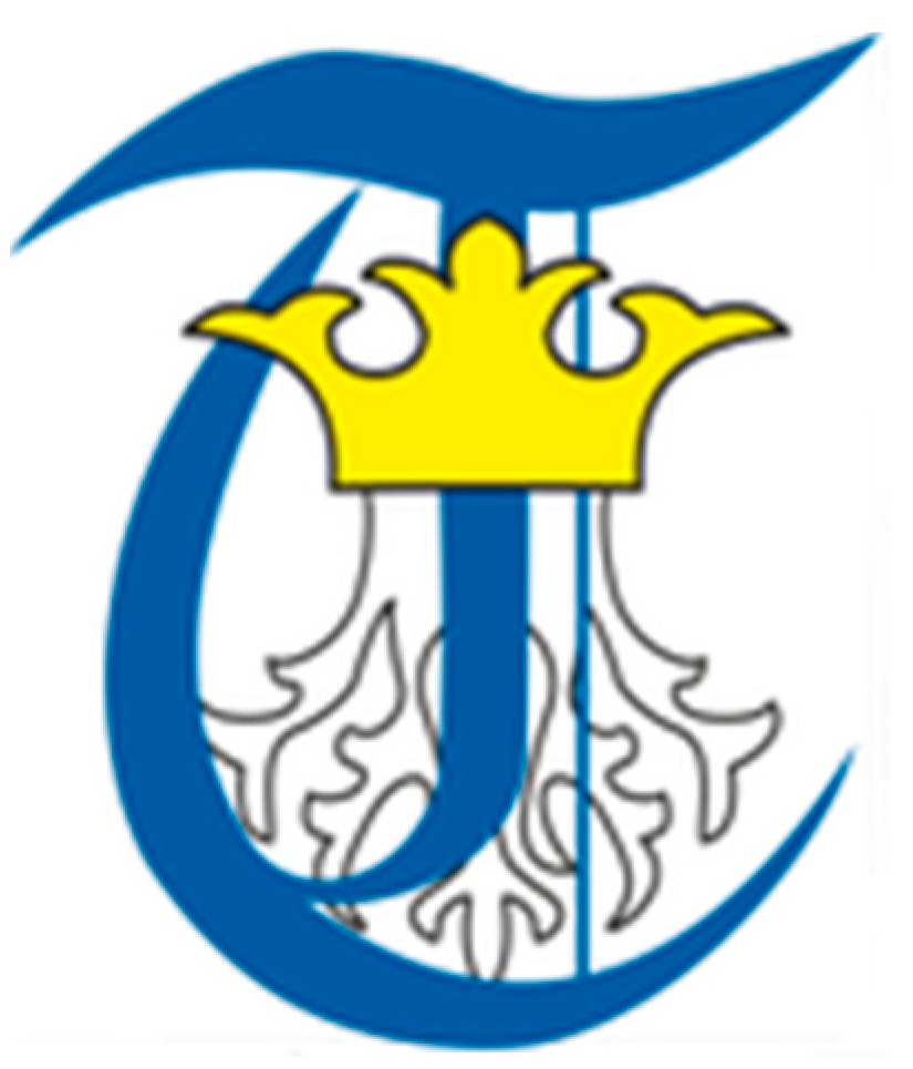
Thus, due to the change of its visual identity, data regarding its old symbols are scarce, but in an old newsletter of the university the old slogan “Fides et excellentia-Trust and Excellence” is mentioned, as well as its old logo that contained historical elements that were related to the city and history of Brasov, such as its crown and tree roots, and its colours were blue and yellow [
50]. The old logo is presented in
Figure 7.
Transilvania University of Brasov considers itself the largest university in the center of Romania, and its current visual identity no longer includes historical elements. It is built on the idea of a university situated in the center of the country: its slogan is “Learn to be central”. The logo can be displayed both in black or white; it symbolizes books on a shelf, and it also shapes the letters T and U which are related to the name of the University [
51]. The current logo is presented in
Figure 8.
3.2. Participants
Considering that our interest was in finding out the reasons of the change as well as the results it produced, participants of the study were represented both by people that were directly involved in the process of the visual identity change and beneficiaries: professors and students. People involved in the process had the role of expert informants, and professors and students were asked to state their opinion. Thus, we discussed with ten people among which were two pro-rectors, BC and GM, the creator of the concept MM, three teachers CC, BV, and NF, and four students LA, AD, GA, and BS. The participants were chosen depending of their level on implication in the process of change. However, we decided to present the results of our research according to only 10 interviews due to the fact that these interviews provided us with the necessary information, thus reaching saturation, but, in fact, a total of 40 interviews were conducted for this research.
After conducting and analyzing the 10 interviews mentioned in the paper, we reached saturation, and the other interviews we conducted did not provide new information but only confirmed the information we had already gathered through the initial 10 interviews. Firstly, interviews were conducted with persons with management functions (dean, or vice-dean), from each of the 18 faculties of the university (we talked with one person from each faculty). Next, we conducted 18 interviews with students from each of the 18 faculties of the university, then we talked with three members of the university’s Communication department, and lastly we interviewed the external collaborator, i.e., the person who designed and created the concept of the new visual identity.
Therefore, we consolidated and validated our decision of presenting the results while taking into consideration only 10 of the interviews we conducted by highlighting the results of a previous study in which researchers used qualitative methods, the study revealing that data saturation was achieved after the researchers analyzed only twelve of the interviews they conducted [
52] (p. 74). Another interesting result emphasized by researchers shows that “the more similar participants in a sample are in their experiences with respect to the research domain, the sooner the researcher can expect to reach saturation” [
52] (p. 76). Thus, in a broad way, saturation can refer to the way categories or themes that are pre-determined are represented appropriately in the data obtained [
53]. In this regard, by taking into account the aforementioned aspects, the fact that people in our sample represented a homogenous group, being people that shared similar experiences, while being members of the academic community and also the fact that in our research we established some a-priori themes and categories, we argue that, through the ten interviews according to which we presented the findings of our research, we have reached saturation and, thus, the results of our study, too, can be considered valid and relevant.
3.3. Procedure
Due to the fact that the nature of the research required that the information should be obtained from people rather than any written materials that exist, such as a visual identity manual, in order to conduct the research, we used a qualitative approach. In this regard, interviews that were semi-structured were conducted. Participants of the study were required to answer questions regarding the old identity, its messages, reason for the change, and the new identity and its symbols. The interviews were conducted by phone, or with the help of certain online platforms due to the availability of the participants and due to the situation generated by the COVID-19 pandemic. Participants included in the study were represented by people involved directly in the process of change, and also students and teachers. Thus, even though the interviews were conducted by phone and people did not have in front of them pictures with the symbols of the university’s visual identity, because they were involved in the process, or because they worked or studied within the university, the participants in our study were familiar with the elements through which Transilvania University of Brasov expresses its visual identity.
Moreover, in the context of the pandemic, the issue of the validity and quality of the data obtained by conducting qualitative research online or over the phone rises. In this regard, previous studies emphasized that even though, initially, it seems more difficult to provide and gather valid data through telephone, e-mail, or other online methods than by conducting face-to-face interviews, [
54] (p. 9), in certain situations, face-to-face interviews that are conducted offline “can produce less effective and less rich data collection than the ones conducted by using Skype or the telephone” [
54] (pp. 10–11). Similarly, another study in which interviews were conducted online revealed that during online conversations respondents were more comfortable, that the online conversations lasted longer than offline conversations, that participants were not rushed to end the calls, and that the online interviews were able to generate more information than interviews previously conducted by the researcher in person [
55] (pp. 7–8). Taking into account these aspects, and the fact that, during the interviews we conducted over the phone, participants offered us many details about the change of the visual identity of the university, it can be inferred that by talking with the participants on the phone, we, too, obtained relevant and valid data regarding the subject we addressed.
3.4. Measures
In order to obtain the necessary information, two semi-structured interview guides were created, one for the people directly involved in the process, and one for the beneficiaries. The questions included in the semi—structured interview guides are represented in
Appendix A. Each of the interview guides contains the main aspects and dimensions discussed within the interviews, as well as their related questions. Thus, we focused on measuring the following aspects: reasons for changing the visual identity, people involved, the process of creating the new concept, old visual identity (its logo, slogan, and messages sent), the current visual identity (the concept, the message, font, slogan, university logo, university logo colors, connection with the idea of modernity).
4. Results
4.1. Reasons for Changing the Visual Identity
People involved in the process stated that there were two main reasons why the change took place. Firstly, the university did not have a unified concept: its visual identity was not coherent in design, nor in the messages sent, and the logos for the eighteen faculties of the university “were promoting diversity but their identity was not well consolidated”. The second reason was represented by the fact that the symbols of the university were old, they were related to an “ancient, gothic history”, and were no longer in line with the values that the university stands by, or with the faculties, most of them being recently established. Thus, our first hypothesis was confirmed, because one of the motives of the change was that the previous visual identity was old and the university wanted to be modern and in line with current times. Even more, beneficiaries noted that the university “was no longer in the attention of the public”, and that “it had to move towards a modern identity”.
4.2. People Involved
The process exclusively involved people in management positions: the rector of the university, pro-rectors, deans, vice-deans, and an external collaborator, a specialized graphic designer. Students were not involved in the process, and thus this confirmed our second hypothesis. Even the student representative stated that he was not involved in the process of establishing the new identity, and was only asked to provide his opinion after all the symbols were already created.
4.3. The Process of Creating the New Concept
The decision to create a new visual identity came from the rector; there was an auction, and the expert who was chosen “proposed several variants for the concept”. They no longer went “through the filter of students and teachers” in establishing the new concept because the process would have been endless. Thus, it can be inferred that the change took place from top to bottom. Teachers understand why it was done this way, but students believe that they should have been involved too.
4.4. The Old Visual Identity
The old visual identity contained symbols related to the tradition and history of the city of Brasov. Regarding the old slogan, apart from one person involved in the process, the rest of the people we talked to no longer remembered the slogan, “Trust and excellence”.
Regarding the logo, all participants were of the belief that it was “old, gothic”, the creator of the new concept even stating that the old logo was “designed in a strange way.” However, the logo was making a connection between the university and the city of Brasov because it had the same elements that can be found on the flag of the city: tree roots and a crown, which symbolizes power. The old visual identity was sending the message that “the university is part of the city of Brasov”.
4.5. The Current Visual Identity
4.5.1. The Concept
The current visual identity no longer promotes a connection to the city or its history, and its visual symbols are designed in a modern, digital way. The concept is built on the idea of a university being in the center of Romania, and it is related to the university’s geographical position in the country. Thus, our third hypothesis is confirmed. Teachers and students have positive attitudes towards the concept, considering it “bold”, “memorable”, and “fresh”.
4.5.2. The Message
The message that the university wants to send through its current visual identity is that teachers and students are the main preoccupation of the university. People involved in the process revealed that “the emphasis was on the idea that the student and the teacher have a central role within the university”, and that “a real university is the one that puts the students at the center.” Both teachers and students understand this message.
4.5.3. Font and Slogan
While the old visual identity din not contain a distinct font, the current visual identity has a much more consolidated one. The font is UTsans, and it was specially created for the university, who adopted it in order to strengthen its visual identity and to differentiate itself: “having a font of your own gives you more the idea of a university that wants to present itself distinctly.” However, teachers and students have some issues regarding the font. Since it is specially created, it must be installed on computers and problems with the text occur during presentations. Therefore, the conditions under which the font can and should be used have to be communicated more clearly.
The current slogan of the university, “Learn to be central!” directly addresses students and makes them feel that they are in direct connection with the university. Thus, the slogan the university manages to get closer to students and teachers and urges students not only to be at the center of the university, but also to study in the center of the country.
4.5.4. University Logo and Logo Colors
There are two meanings that the current logo holds, but teachers and students understand and acknowledge only one. Its design is simple and it is constituted out of vertical and horizontal lines that, in the middle, form a square. It symbolizes books on a shelf, which are related to studies and knowledge, but its line also form the letters T and U, which come from the name of the university, Transilvania University of Brasov.
However, students are upset that the logo was not explained to them and that they had to look for information about it themselves, and they believe its meaning is difficult to understand: “you need additional explanations to be able to truly understand it.” Moreover, between the people involved in the process of creating the new concept are people that do not know both meanings of the logo, which shows the lack of effective communication. Thus, our fourth hypothesis is not confirmed, because students and teachers only knew about one meaning of the logo and they had problems understanding it.
The logo is malleable: it can be black and placed on a white background, or it can be white and placed on a black background. The colors of the logo, black and white, were picked because they are non-colors, they express neutrality, and they complement the logos of the faculties that are brightly colored. Students and teachers believe that the colors also express simplicity and clarity, and that the university “chose the simplest color option”.
4.5.5. Connection with the Idea of Modernity
Given the fact that one of the core values of Transilvania University of Brasov is modernity, its current visual identity is closely linked to it. The connection with the idea of modernity is mainly made through the design of the logo that is simple, abstract, it expresses symmetry, people associate it with something digital, with a bar code, and thus, the university is modern and no longer has symbols associated with history.
5. Discussion
Transilvania University of Brasov changed its visual identity because the old symbols no longer matched its values, they were outdated, and did not convey a coherent message about the university.
The current visual identity does not maintain a connection with the old symbols, are abstract, and have multiple meanings and a modern design. This shows that the identity of the university did not remain the same, but it changed over time and adapted to current trends. In this regard, our study supports the approaches of identity that claim identity is dynamic, fluid and adaptive [
4,
5,
36]. Thus, the process of creating the current visual identity took place from top to bottom, without involving students or teachers. This way of establishing a new visual identity was effective because it took a shorter time to decide on the visual symbols than it would have taken if both students and teachers expressed their opinion. However, there are also downsides in building a visual identity without taking into account the beliefs of students and teachers, as they may not agree to the new symbols or they may not understand them. One downside was also shown by our research: because they were not aware of the direction in which the new identity would be oriented, when seeing the logo, students and teachers did not understand its meaning very well, and they still require explanations in order to understand it.
The change produced the desired outcomes: beneficiaries understand that the change was necessary, and the message that was sent to them: that they have a central role within the university, and also acknowledge that the symbols are related to the university’s geographical position in the country. However, the way its font should be used and the meanings of the logo have not been clearly communicated to beneficiaries, which is why there are still ambiguities as to what the logo represents and how the font should be used.
Thus, similar to [
37], which showed that corporate identity is of utmost importance for a university and that the new visual identity adopted by the universities analyzed had beneficial impact on members and stakeholders, our study also revealed how important it is to effectively manage identity and showed that, while there are still aspects of the new visual identity that the academic community does not understand very well, they acknowledged their importance, they were open to the new symbols, and they tried to appropriate them. Another study that focused on the visual identity of higher education institutions revealed that there was a link between the visual identity of a university and its reputation, and the way people perceived it. Thus, compared with individuals who acknowledge the distinct attributes of the visual identity of a higher education institution, individuals who are not able to perceive and identify distinctive characteristics of the visual identity “reported a less favorable reputation” [
56] (p. 268). In this regard, it can be inferred that it is of great importance in the process of establishing the identity of a university to promote and visually emphasize the elements that differentiate the university and provide authenticity to it.
Even more, with regard to the idea that identity does change and does not remain the same over time, our research was in line with a previous study which also showed that universities located in the United Kingdom produced changes in their visual identity, improving their existing logo or even changing it completely, this being the case of London Metropolitan University [
57], as well as the case of the university that we analyzed in this paper, Transilvania University of Brasov. In addition, while considering the reasons for conducting the change of the visual identity, our research was in line with another study which highlighted the fact that Cranfield University, in the United Kingdom, also changed its visual identity, especially its logo, because its symbols were outdated and old [
58].
6. Conclusions
Visual identity plays an important role in the life of any organization, institution or company. However, although it is an essential element, the identity of an institution can be fluid and subject to change. In this regard, taking into account that Transilvania University of Brasov changed its visual identity, the aim of the research was to assess if the change produced the effects expected by the initiators of the change. In this regard, we focused on analyzing the reasons why the change was took place, the people involved, how the visual identity elements were changed, what the meanings of the old identity were, and what the meanings of the current identity are.
The findings of our research revealed that the process was complex: the university performed the change in order to consolidate its connection with the city and keep up with modern times. The process involved only people in management positions, and no connection with the old visual identity elements was maintained.
However, considering the fact that the research was focused on the change of the visual identity of only one university, and that even though saturation was reached through the interviews conducted with the people directly involved in the process as well as with the beneficiaries: professors and students, the results of our research cannot be generalized.
Taking into account the results of the research and the way the university decided to unfold the process of establishing its new visual identity, some recommendations regarding the way higher education institutions could construct or rebrand their identity can be highlighted. Thus, when the identity of a university is designed, when its members decide upon the symbols that will represent and differentiate the university, they should make sure that the new symbols are in line with the values and principles of the university. Next, the people who are in charge with creating the visual identity should make sure that the symbols have clear meanings, and they should present and explain those symbols to the academic community, and also to the public. Another recommendation concerns the concept of the visual identity, which should revolve around something specific to the university, meaning that the concept, together with the logo and slogan, should emphasize those characteristics that differentiate and give authenticity to the university. For example, in the case of Transilvania University of Brasov, an element used in the process of building its visual identity, in order to highlight some of the distinctive characteristics of the university, is its geographical position. Because the university is located in the center of the country, the concept of its visual identity revolves around the idea of centrality, an idea that is also present in the design of the logo and in its slogan, which encourages students to “Learn to be central!”
Furthermore, with respect to the establishment of the visual identity elements of the university, while a unique font that is representative for the university can contribute to the consolidation of its identity, it is important to offer special attention to the way the font is created, to make sure the font will be easy to use, and that members of the academic community will not encounter issues while using it. In addition, while the members of the academic community are the people who know best how the university should be represented through its visual identity, to ensure that the symbols are designed properly, it is recommended for the university to collaborate with a person who is specialized in design.
Thus, taking into account the aspects mentioned above, some managerial implications of our paper can be highlighted. Throughout this paper we attempted not only to describe the process of changing the visual identity of the university, but also to extract guidelines that universities and members of the academic community could take into account while rebranding their universities. In other words, our paper can serve as a frame of reference in terms of rules of good practice that should be considered in the process of changing the visual identity of a university. For example, with regards to its practical implications, from our study one can observe that in the process of rebranding the visual identity of a university, it is very important consider the opinion of students, too, to involve them in the process, but that it is also important to clarify the meanings of the symbols and to collaborate with specialists when designing the symbols. Hence, our paper revealed certain key steps that institutions should consider in their rebranding process.
Therefore, while the findings contributed to the understanding and awareness of the essential role that the visual identity has in shaping the identity of a university, the research also had some limitations that should be taken into account for future research. Because there is still ambiguity among teachers and students in regard to the meanings of the logo, a semiotic analysis should be done in order to better understand why the logo is not perceived as it should be and in order to clarify its meaning in the minds of the members of the academic community. Another limitation of the paper was represented by the fact that, in our research, we focused on the rebranding process of only one university, and that we focused only on its visual identity elements such as the logo, slogan, and font, and did not take into account other visual elements such as its buildings. Other limitations of our study relate to the fact we did not focus on the opinion of the general public, represented by citizens of Brasov or by prospective students, and to the fact that, even if we reached saturation, we had a relatively small number of respondents. Thus, further research should also focus on the logos of the faculties and on the relationships between them, and could include inhabitants of the city of Brasov, in order to see how the identity of the university is perceived at the city level. In other words, future research should take into account the opinion of the general public regarding the visual identity of the university, but it should also measure, with the help of quantitative methods and instruments such as the questionnaire, the impact of the process of changing the visual identity of the university and the impact of the current symbols of the university on prospective students.


