Article

A User-Based Look at Visualization Tools for Environmental Data and Suggestions for Improvement—An Inventory among City Planners in Gothenburg

by
Beata Stahre Wästberg
1,*,
Monica Billger
2 and
Marco Adelfio
2
1
Department of Computer Science and Engineering, Chalmers University of Technology/University of Gothenburg, S-412 96 Gothenburg, Sweden
2
Department of Architecture and Civil Engineering, Chalmers University of Technology, S-412 96 Gothenburg, Sweden
*
Author to whom correspondence should be addressed.
Sustainability 2020, 12(7), 2882; https://doi.org/10.3390/su12072882
Submission received: 17 February 2020 / Revised: 22 March 2020 / Accepted: 1 April 2020 / Published: 4 April 2020
(This article belongs to the Special Issue Sustainable Urban Planning Techniques)

Abstract

:
With a growing interest in environmental data and the need to consider various environmental factors earlier in the planning processes, it becomes more important to disseminate this type of information to different target groups in a comprehensible way. To support easier decision making, many cities and municipalities are increasingly using digital city models where it is possible to integrate different types of information based on simulation and visualization of future scenarios. Such tools have high potential, but the visual representation of data still needs to be developed. In this paper, we investigate how professionals within urban planning currently use visualization to communicate environmental data, and what their needs are regarding tools and visual representation. We discuss challenges for representing environmental data in urban development processes, with the aim of contributing to a better understanding of these issues. We base our investigation on a literature study, an inventorying survey and a focus group discussion with professionals within urban planning. This study provides an end-user perspective among urban planners and valuable insights on tool usage and visualization. Results show that applications used for environmental visualization still can be improved regarding, e.g., user friendliness and information handling, which may increase their efficiency.

1. Introduction

Current urbanization pace urges cities to face the environmental impacts of urban demographics and activities. As current research and policy predominantly advocate for denser and more compact cities [1,2], the urbanization pressure will augment. Hence, it will become increasingly essential to focus on sustainable solutions for urban development, something that makes environmental data a more and more important component in urban planning processes.
In order to build more environmentally friendly cities, a variety of stakeholders needs to be included in urban planning processes [3,4,5], enhancing their environmental awareness and commitment. Already early in the planning process, planners need to have this dialogue [3] with city actors, such as residents, politicians, property owners and businesses. Such dialogue is sometimes undermined as stakeholders struggle to reach a common and shared understanding of planning material. This is mainly due to their different approaches and knowledge bases, but also to the amount, accessibility and interpretation of environmental data, especially when abstract numbers are used to visually represent real world phenomena [6]. For different professionals, visualization techniques can ease legibility, communication and interpretation of environmental data, favoring the achievement of agreed and informed decisions through communication and dialogue [7,8,9,10].
Traditionally, information based on quantitative environmental data has been disseminated using two-dimensional maps. Current stakeholders’ communication needs pose the question of whether 2D representations are still the most adequate to use or not—e.g., for non-specialized actors. Local authorities today are increasingly using digital 3D city models for decision making, especially for the simulation and visualization of future scenarios [11,12,13]. Still, such models are not fully integrated in urban planning processes [6].
This paper focuses on results from an inventory study on how professionals within urban planning currently use and communicate environmental data, and their visualization needs for analysis and representation. The study described was carried out in the research project A Dialogue Tool for Visualization of Environmental Data in 3D City Models, which investigates how to visualize environmental data in urban planning processes through conceptual visualizations. In this transdisciplinary project, researchers collaborated with urban planners, environmental experts and tool developers in order to develop methods for representing environmental parameters in a 3D-city model. Our aims with this paper are to (1) understand and provide insights from end-user perspectives among urban planners on tools and interfaces for visual representation of environmental data, and (2) present needs for development in order to facilitate knowledgeable design choices in urban planning tool development.
The paper is structured in the following way. Section 2 accounts for the relevant state of the art. In Section 3, the methodology and our research approach are described, and in Section 4 we account for the results and analysis. Results are then discussed and put in context in Section 5. Section 6 concludes the paper.

2. State of the Art

The literature study has revealed the emergence of several interconnected issues, examined in the following subsections. The need for using environmental data in urban planning is key to tackling contemporary issues such as urbanization pressure and climate change. Three knowledge gaps (KGs) have been identified. In order to increase the use of environmental data, enhanced environmental awareness among urban planning stakeholders is needed (KG 1). As environmental data need to be well represented for improved communicative value, the potential and challenges of data visualization in urban planning ought to be explored (KG 2). More specifically, an investigation into different aspects of visualization of environmental data is needed (KG 3).

2.1. The Need for Increased Environmental Awareness and Systematic Use of Environmental Data in Urban Planning

The first knowledge gap (KG 1) to address is the need for enhanced and conscious use of environmental data in urban planning, which has emerged as a response to the ongoing processes of urban densification and climate change. Contemporary cities are affected by an impinging urbanization pressure accompanied by a simultaneous increase in urban population, which will account for 70% of global demographics by 2050 [14]. Such pressure, combined with current global concerns about climate change and the trespassing of “planetary boundaries” [15], exacerbates the simultaneous need for more resource-efficient and socially equitable cities [16]. An increased understanding of the environmental consequences of densification is thus needed [17,18]. For instance, in many Swedish compact city centers, EU permitted levels of sound pollution are exceeded [19], and in order to densify the city, new limit values are needed for sound. Alongside densification policies, it is therefore important to create a certain degree of environmental awareness [20] and commitment from a wide range of stakeholders involved in environmental assessment and urban planning. With this objective, there is a growing general need for communication and dialogue [3,4,5] early in the planning process. Both environmental awareness and communication/dialogue of environmental data in planning are still underexplored issues.
The need for increased environmental awareness in urban planners is connected to a more systematic use of environmental data in planning. So far, the existing academic literature dealing with environmental data used in/for urban planning seems focused more on narrow or specific topics [13,21] rather than on a systematic or comprehensive reflection on the use of environmental data in urban planning. Notwithstanding, some authors have had a more systematic focus related to the creation of common databases or platforms. Within this group, Brook et al. [22] developed a protocol for creating a national data platform for Canada related to environmental exposure, bringing together urban form analysis and health. Ibarra-Espinosa et al. [23] developed an open-source Vehicular Emissions Inventory (VEIN) which is directed not only to sectoral studies on weather, climate and environmental health but is expected to be useful more generally for urban planning. Yeo and Lee [24] describe and assess the creation of a planning database focused on environment and energy, using urban planning and urban space data. The US Environmental Protection Agency [25] created a systematic process of collecting environmental data through data quality objectives. Taking into account the remarkable amount of environmental data which are nowadays collected from different sources, Pullin [26] highlights the need for a “stocktaking of data that establishes the current evidence base with a view to predicting outcomes of alternative actions” [26] (p. 1).

2.2. The Potential and Challenges of Data Visualization in Urban Planning

Along with systematization of data, leading to an increased understanding and awareness, another key issue to be explored is the aforementioned dialogue and communication of environmental data in urban planning. Knowledge gap number two (KG 2) concerns the importance of focusing on the representation and visualization of environmental data in urban planning. The value and still underexplored potential of visualization for supporting dialogue processes in urban planning has been recognized by previous research [6,11,12]. Other studies touched on the role of visualization in promoting participation in planning [27,28,29] or delivering empowerment through design [30]. The most comprehensive works on this topic highlight the importance of ICT (Information and Communication Technology) in the use of environmental data for representation and visualization of urban-related issues. For instance, Cheshmehzangi et al. [7] propose an integrated approach to environmental performance of urban design using computational tools. A similar technological focus with a more pronounced visualization output is shared by Esposito De Vita et al. [8] who explore the use of GIS (Geographic Information System) data to promote resilience goals in planning.
Visualization is also strongly present in the work of Saran et al. [10], who examine the use of virtual 3D city models for environmental simulations at the urban scale. They point out that the same form of geo-information can be used in different ways in 3D city modelling. However, there are challenges related to the compatibility of 3D datasets, concerning, for example, accuracy and texture. [10] Molines et al. [9] propose a similar critical view on the GIS contribution to deal with heterogeneity of environmental data for sustainable urban design and development. They point out limitations of GIS such as weak functionality in 3D spatial analysis and poor compatibility with CAD (Computer-Aided Design) and simulation software and conclude that new methods are needed for more effective 3D information analysis [9]. Visualization in urban planning has also been subject to certain criticisms, for its rhetorical connotations as a “persuasive system” [31] (p. 586). This occurs when the visualized material is created from the privileged power position of a map (or design) maker generating a biased vision of reality [32]. By doing so, visualizations “can aggravate and exacerbate problems when they are misused” [33] (p. 311) or they can generate issues of manipulation or misinterpretation [6].

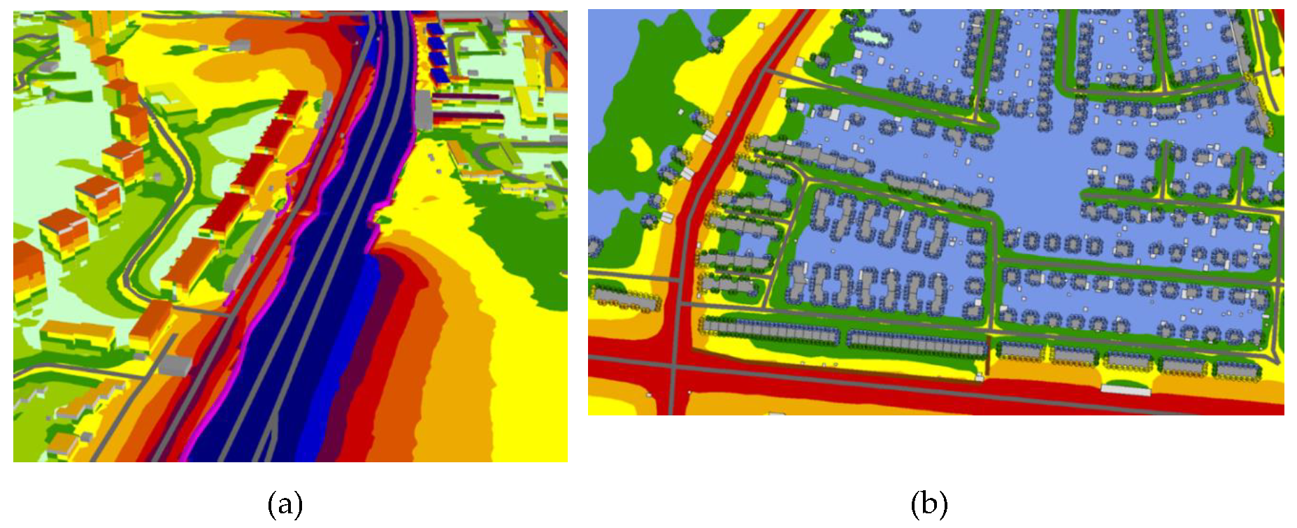
2.3. Design Challenges When Visualizing Environmental Data

One of the major challenges for urban planning today is how to communicate large amounts of environmental data, forming knowledge gap three (KG 3). Visualization tools are pointed out to have high potential for increased stakeholder involvement in urban planning; however, due to technical and economical demands, the implementation is challenging [6,34,35]. Planning problems are complex; one major challenge to deal with is how to best visualize and interact with all parameters involved [36]. The visualization possibilities for being able to view different kinds of data are constantly getting better. Increasingly, cognitive aspects are included in digital modeling and visualization, instead of, as previously, only focusing on the object’s representative physical correctness [37,38,39]. In the broad field of environmental data visualization, representation techniques are advancing. Grainger et al. [11] states that to allow science to have a real influence on political environmental decisions, an iterative and collaborative design approach is required to be able to make customized visualizations [11]. In order to create a tool that is actually going to be used, it is important to know the needs of different target groups and to invite these groups to evaluations of the design throughout the design process [13]. Who a user is affects their involvement in the visualization. Factors such as sociocultural differences and the contexts in which they work with visualizations are important in terms of users’ involvement in a data visualization [4,40]. Further research is needed on how different target groups work with data visualizations, which is a relatively under-researched focus in visualization research to date [40,41].
The increasing development of digital tools to support dialogue processes also requires that expertise from different research areas such as environmental research and HCI (Human–Computer Interaction) can be linked [11,12,13]. Different types and levels of information should be conveyed in a visually comprehensible manner in both 2D and 3D, depending on what is most relevant to show. Knowledge on how to represent environmental data in 3D media needs to be developed [6]. One step towards this is to translate traditional knowledge from visualizing environmental data in 2D maps to interactive 3D visualizations. In street view, the spatial context can be shown in more detail, while planar view provides an overview [13]. The level of abstraction and information in a visualization should be connected to factors such as who the target audience is, their previous knowledge of the project, and how much information it is suitable to convey in order to maximize understanding [11,42].
Moreover, an important design challenge is the aesthetic considerations of the visualization in themselves, such as visual style and the use of colors. Aesthetic considerations have, according to Hullman et al. [43], been under-explored in many efficiency-motivated studies. If the visualization is appealing, the likelihood is that we will be positively attuned to the content, even though the aspects of visual appearance and information are unrelated [44]. Aesthetic considerations are also important for improving the readability of a visualization. One challenge lies in how to combine map material and abstract coloring of environmental data. Traditionally, colors play an important role in cartographic visualization. Bláha and Štěrba [45] point out color as possibly “the most important graphic variable or means of cartographic expression” [45]. Borland and Taylor [46] also point out the importance of appropriate choices of color, and exemplify with the misuse of the commonly used rainbow color scale (for an example of the rainbow scale, see Figure 1a,b) [46]. The common use of the rainbow scale to highlight environmental data is referred to by several authors [11,46,47]. Instead of using this scale, Grainger et al. [11] proposes the use of form attributes such as shapes, or the use of a single color ranging from low to high intensity. Cultural or natural connotations of specific colors are also important to take into consideration, based on the target audience [11]. When using different visual styles, such as symbolic objects or images in an otherwise visually photorealistic setting, it is important to work with a design language that distinguishes between visual realism and visual non-realism, e.g., by a knowledgeable use of colors [13,38].

3. Methodology

3.1. Research Approach

The empirical research of this paper takes a user-centered, mixed-method approach, combining results from a questionnaire and a focus group discussion [49]. The user group we focus on in our study is professionals within urban planning, however, with different roles and competences (e.g., environmental experts, city planners, architects and project developers). Data gathering was conducted in two phases. First, a questionnaire study was distributed to urban planning professionals, to comprehend how they currently (1) work with environmental data, (2) use visualization tools in their work with environmental data, and (3) would like to improve current representation possibilities. Second, a focus group discussion focused on the question of using and visualizing environmental data. It involved key stakeholders from the Gothenburg municipality and other interested organizations related to urban planning processes. (see Figure 2 and Table 1)

3.2. Phase I: Questionnaire Study

A questionnaire study with mostly open-ended questions was carried out in the first quarter of 2017, following Velotta’s [50] process for the design and implementation of questionnaires (see Figure 3). The following issues were addressed: use of environmental data in urban planning, perceptions of how and to what extent environmental data affects urban planning, desired improvements for tools used to handle environmental data, desired improvements for visualization, and representation of data. In this study, 24 urban planning professionals with different specializations within urban planning participated. They were aged between 25 and 60 and included seventeen women and seven men. The participants were primarily reached through the partner organizations in our research project and were selected based on their professional roles.

3.3. Phase II: Focus Group Discussion

The focus group [51,52] met on 21st April 2017 to discuss environmental data, tool usage and visualization. It involved 19 urban planning professionals from the project partner organizations and other relevant organizations (the consultant industry, the municipality and academia). A funnel approach [53] was adopted (see Figure 4), starting with a broader discussion on the topic and then narrowing it down to the specific subject the participants should focus on. Participants in the workshop were divided into four groups of four or five persons. The group discussions were centered on four main questions: (1) Why? Identify needs for environmental data from your professional perspective; (2) For whom? Identify target groups with whom to communicate environmental data; (3) What is relevant to show for whom? Identify relevant content and levels of information in relation to target group (e.g., annual average value, limit values, maximum values, etc.), (4) How? In what way would it be suitable to visualize environmental data in a 3D-model (e.g., perspective, use of colors and symbols, graphs, etc.).
Finally, the groups were asked to create a list of criteria for what constitutes a successful visualization according to different target groups (the latter were also defined in the same session). The day ended with a summary made by each group of what they had discussed, and any conclusions drawn.
In this study, 17 urban planning professionals (seven women and ten men) participated, with different specializations such as architects and planners, environmental experts, researchers, developers, and visualization experts. They worked at the Gothenburg municipality (9), community development consultancies (5), the Swedish Road Administration (1), Johanneberg science park (1) and Gothenburg University (1).

4. Results and Analysis

4.1. Results from Phase I: Questionnaire Study

This section is structured according to the issues tackled by the questionnaire study and mentioned in Section 3.2.

4.1.1. Use of Environmental Data in Urban Planning

A total of 19 out of 24 participants used environmental data in their work, primarily data regarding sound, air quality, water, land, geology, sun and wind. The data was used for a variety of purposes, such as development and implementation of detailed plans and infrastructure plans, climate and sustainability reports, applications for building permits, preliminary assessments, and quality surveys and service statements. An indirect use of the data regarded issues on how it can be applied in order to test and develop new solutions. Participants’ work with quantitative environmental data included calculations, simulations (e.g., for wind), mappings (e.g., for traffic noise, air quality and flooding) dispersion modeling (e.g., meteorological data and air quality data), sun and shadow studies, studies on soil contamination, precipitation floods, rainfall, and air pollutants (see Figure 5).
The participants use different tools in their workplace, for the analysis of environmental data in urban planning and/or for communicating with citizens and other stakeholders. Commonly used tools included various types of GIS software, such as ArcGIS and MapInfo, often in combination with 3D modeling software, such as SketchUp, Revit, or inhouse tools built on existing software. The web-based tool Infovisaren (https://metria.se/produkter-tjanster/geodatatjanster/infovisaren/) (Metria AB, Gävle, Sweden) with interactive maps and other location-based information was used by planners at the City of Gothenburg. Other tools named were SoundPlan (https://www.soundplan.eu/english/) (Backnang, Germany), used for sound calculations, Artportalen (https://www.artportalen.se/) (Sweden), a portal for observations of Sweden’s plants, animals and fungi, dispersion models such as MISKAM, ADMS, TAPM, as well as Microsoft Excel for statistical calculations, and Adobe Acrobat for reports in PDF format.

4.1.2. Perception of How and to What Extent Environmental Data Affects Urban Planning

The 18 participants who answered this question were divided in their opinions on how much, and in what way, environmental data affects city planning today. A majority agreed that it is an important part of urban planning processes, and about half of the answers considered all environmental data, or data concerning specific environmental factors, such as sound or air quality, to be either very or quite influential. However, many participants (planners and engineers) considered environmental data, though important in urban planning processes, not to have much impact and not to always be fully considered. According to some participants, this is connected to accessibility and usage of data. Data concerning sound and air quality were considered to be the most relevant of all environmental data in today’s urban planning processes, while data concerning wind and sun was considered to have the smallest impact. Comments showed, however, that the interest in, and use of, environmental data is increasing (see Figure 6).

4.1.3. Desired Improvements for Tools Used to Handle Environmental Data

Participants’ answers on how they would like to use environmental data management tools touched on the following topics: improved handling of information, improved user friendliness and increased interactivity and 3D.
First, in terms of improved handling of information, a major issue emerging from the questionnaire was related to the need for obtaining a full overview of a project on the same platform, i.e., the ability to see the overall conditions for a specific location, instead of just a limited number of parameters. Furthermore, possibilities to combine different data and types of information were also called for—for example, to see analyses of solar studies in combination with wind in the same model. The respondents also highlighted the need for improving the analytical capabilities and performance of the tools.
Second, in relation to achieving improved user friendliness, questionnaire respondents wanted tools to be easy to use, with good search and delimitation features, including the ability to switch between showing a limited number of aspects to be displayed and a full picture of the project in the same tool. They also declared that tools today often are quite difficult to handle.
Third, concerning the question of increased interactivity and 3D, the responses of participants showed a demand for additional help in interpreting the information. This was particularly evident, for example, in relation to specific topics such as height information or sound conditions at different heights in the planning of high-rise buildings (see Figure 7).

4.1.4. Desired Improvements for Visualization and Representation of Data

A total of 16 out of the 24 participants considered that the visual representation of environmental data in planning processes ought to be improved. These respondents pointed out that the representation of data needs to be both graphically and visually enhanced. Suggested improvements included: more easy-to-read information, possibility to influence and manage appearance, possibility to combine visualizations with other graphic material, and more use of 3D visualizations and VR environments (see Figure 8).
The issue of obtaining more easy-to-read information was what most comments concerned. Participants highlighted the need to communicate information through visualizations that different target groups can understand. Participants underlined the challenge of visualizing environmental data without obscuring the underlying map and called, for example, for a more holistic approach to visualization. One participant, who had defective color vision, called for clearer coloring of, for example, gradients, due to difficulty in seeing differences between different classes. (see Figure 1a,b).
Concerning how to influence and manage appearance and combine it with other graphical material, a general expressed need was to have the possibility to gather and combine all material developed in a project. A variety of needs and wishes emerged in relation to visualizations, graphical user interfaces and interactivity. Specific suggestions were made, such as using clickable ‘i-dots’ in order to switch between different levels of information and include features that clearly show delimitations. Some participants highlighted the need for combining visualizations with other graphical material created for a specific project, such as an Illustrator or CAD files, or statistics shown as bar charts.
In relation to obtaining more 3D visualizations and VR environments, some participants focused on the increasing need for 3D and VR already in the planning phase of a new building or area, in order to get an overview of a project and be able to easily see that all requirements are met. Suggestions included, e.g., to present detailed plans in VR, and to use 3D simulations for factors such as wind and particles.

4.2. Results from Phase II: Focus Group Discussion

In the focus group discussion, the participants were divided into four groups of four or five persons, in order to discuss the issues relating to their use of environmental data, explained in Section 3.3. These issues will be explored separately in the following subsections.

4.2.1. Why? Identification of Needs for Environmental Data from Your Professional Perspective

In the discussion, all groups saw growing needs for environmental data in the future considering increasing urban densification. These needs could be divided into three categories regarding: type of environmental data, use of environmental data and visualization of environmental data (see Figure 9).
Identified needs regarding type of data included, for example, air quality (e.g., PM/NOx), sun studies in densification projects, cycling and pedestrian activities in urban areas, as well as sound. Identified needs regarding use of environmental data included suggestions such as a common geodatabase, where all the information is accessible in the same place, openness and accessibility of data (input data/ analysis results), and low-resolution national data for local use. Identified needs regarding visualization of environmental data included added auralization for sound visualization, how to show what different dB-numbers mean for the urban environment and for our health, and how to show differences in how we are affected in indoor and outdoor environments.

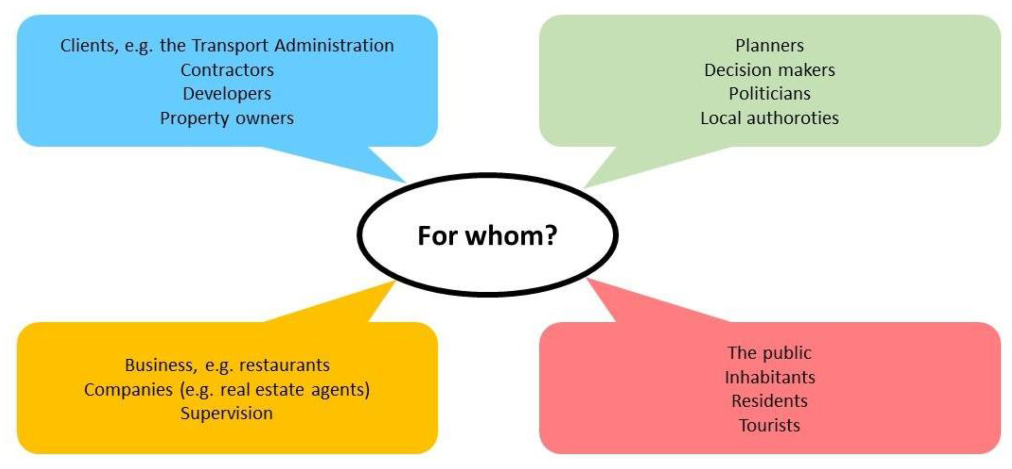
4.2.2. For Whom? Identification of Target Groups with Whom to Communicate Environmental Data

Secondly, the participants were asked to identify target groups with whom to communicate environmental data. Many target groups were identified. Several of the discussion groups mentioned the same or similar audiences, which can be divided as shown in Figure 10.

4.2.3. What to Show to Whom? Identification of Relevant Content and Levels of Information in Relation to Target Groups

Thirdly, the participants were asked to discuss what they considered to be relevant to show to whom, regarding, for example, levels of information and detail. Their answers on this can be summarized as follows (see Figure 11):
Open format and availability: To have an open format and be easily accessible was considered important for data concerning, for example, temperature, electromagnetic fields (EMF), healthy environments (“from a democratic perspective”), health, habitat index and space syntax.
Relevant limits and levels of detail (LOD) in relation to target group: To be able to visualize relevant aspects of, for example, sound; to, e.g., be able to show when sound levels become harmful (“here the limit values are surpassed”); to show time-dependent sound, effects of new constructions on sound, sound in relation to environmental quality standards; and to be able to visualize sound combined with other environmental data such as air quality, in real time.
To be able to put information in the right perspective/adapt to different audiences: For example, to manage to create simple images for non-experts to use as base material to proceed from. Different administrations, with different background skills, need different types of visualizations.
More information layers, to combine different data, to combine population statistics with environmental data, and flexibility: Proposals connected to this concerned more information layers, to be able to combine visualizations with information shown as bar charts, to be able to combine population statistics with environmental data, as well as to more easily transfer data between different software. Additionally, more flexibility was called for, such as the possibility to change the content of the visualizations.

4.2.4. How? Identification of Suitable Ways of Representing Environmental Data in a 3D Model

In the group discussions on suitable ways of visualizing environmental data in a 3D-model, simplicity was considered important, both regarding the tool itself and the visualizations generated from it. Other important factors when visualizing environmental data included scale and perspective, and the ability to move from micro to macro perspective—to, for example, be able to combine an overview perspective in 2D with a pedestrian perspective in 3D for details in areas of particular interest (including recognizable features such as facades to facilitate the experience). The importance of standardizing visualization approaches was discussed, for example regarding colors and symbols. Other suggestions concerned displaying more than one parameter simultaneously, as well as (for sound) color coding of facades and ground surfaces. Issues that came up included, among other things, how visualizations can influence those concerned to act and behave differently, what levels and cuts in data to use in visualizations, and how data is to be communicated. Suggestions on how to communicate environmental data to citizens included, e.g., apps (such as Pokemon games), maps, movies and VR simulations on the web (see Figure 12).

4.2.5. Formulation of Criteria for What Is Required for a Visualization to Work for Different Target Groups

In the focus group discussion, different types of criteria were discussed and presented, and there were several interpretations and responses to this task in the smaller groups. For a visualization to be usable in different contexts, the groups considered one important factor to be aesthetics, i.e., a knowledgeable use of color and symbols for illustrating the impact of environmental values. Another important factor was considered to be the use of a suitable level and relevance of information for different target groups’ needs. Other aspects included using activity-dependent parameters to show, for example, real time measurements, and to include other senses than just vision. An important question was raised as to whether 2D or 3D, or a combination of the two, is best suited for demonstrating environmental data.

5. Discussion

5.1. Reflections on Results

In this section, research findings are discussed against the existing literature and previous research. By doing so, this paper will address and tackle the formerly identified challenges for representing and communicating environmental data in urban development processes. The reflections are directly linked with the knowledge gaps (KGs) identified in the state of the art.
KG 1. The Need for Increased Environmental Awareness and Systematic Use of Environmental Data in Urban Planning
Earlier studies point out that environmental data has too little influence in urban planning and urban design, something that our results correlate with [54,55]. A reason for this can be that “urban planning is viewed as being unable to support environmental sustainability in the broader sense” and that “environmental sustainability in its broader definition is seen as too complex for urban planners to influence alone” [54] (p. 6623). Our participants considered environmental data to be an important part of urban planning processes, above all, data on sound and air quality. Even so, environmental data still do not seem to have much impact on the outcome of these processes and are not always considered as much as they should be, as comments in our study clearly showed. Earlier research points out the need for communication and dialogue already early in the planning process, and that increased awareness and systematic use of environmental data is needed [3,4,6,13,20,21]. From our own research, suggestions on how to use environmental data highlighted the need for openness and accessibility, such as a common geodatabase, and low-resolution national data for local use.
KG 2. The Potential and Challenges of Data visualization in Urban Planning
The use of data visualization in urban planning to support better communication with different stakeholders entails both potential and challenges, as has been described in detail in the state of the art [6]. To solve these challenges, there is a need for different research disciplines to collaborate [11,12] as well as to bridge the gap between research and practice [4]. Among the most significant challenges, detected in previous research, related to the visualization of environmental data in urban planning, the lack of comprehensiveness in tackling all relevant urban development issues [36] and the diversity of data sources and formats [6] stand out. This correlates with the experiences of the participants in our study, who primarily used their data for analytical purposes and communication, and expressed specific needs and aspirations including the existence of a common geodatabase and better possibilities to combine different sorts of data and more easily convert different data formats in different software.
Despite all problems, the potential of environmental data in urban planning processes is considered high, as previous research [6] shows. This can also be observed in our study, where most of the participants saw a growing need for environmental data in urban planning. Data they would have liked to see integrated into tools for urban planning processes was of different kinds, such as environmental data combined with data on different kinds of flows in the city that are created by human activities.
Our findings have shown that stakeholders express a clear need for better tools for understanding and communicating environmental data. According to Dodman et al. [56], environmental aspects need to be included in already existing tools in order to better integrate environmental issues in urban planning, instead of which, new stand-alone solutions are developed. The participants in our study used an array of different tools and platforms for handling environmental data, in different contexts and for different purposes. Most of the participants considered that the tools they used could be improved in different ways, primarily regarding information handling, user friendliness, interactivity and the possibility to use 3D.
KG 3. Design Challenges when Visualizing Environmental Data
Our study has pointed out two design challenges which are considered as under-researched areas in previous research [40,43], namely aesthetic considerations [43] and research on how different target groups work with data visualizations [40,41].
With regard to aesthetic considerations, the results from our study complement previous research [4,40,41] by highlighting the need for 3D visualization as a means for communication, and the importance of aesthetic design choices for representation and communication of environmental data. Our study provides many examples from practice, where aspects are discussed such as the use of 3D and VR in urban planning, interaction with data, and examples of data integration. Participants were asked about improvements for visualizing environmental data. The answers included, e.g., a higher level of visual detail and to be able to see more than one parameter at the time for comparing different data sets. Another issue concerned how to communicate information that is comprehensible and easy to read. One challenge here lies in how to combine map material and abstract coloring of environmental data. Underlying map information can be obscured by colors and thus hard to interpret. Participants pointed out, for example, that noise maps, often used in combination with a rainbow color scale, are difficult to read (see Figure 1a,b). This agrees with previous research which has criticized the rainbow scale for not being as effective as other color scales in communicating, e.g., weather information [46,48]. Participants furthermore came up with different suggestions regarding how to influence and manage appearance, such as to facilitate the possibility to move between different proposals, to include more information layers, to include features that highlight different limit values, and to be able to combine information with other graphic material. The answers showed that the representation of environmental data is a challenge; i.e., visualizations often lack the capacity to convey information in a clear and consistent way. Visualizations in 3D and in VR could be looked upon as an answer to this in terms of more easily giving an overview of a project, in order to see that all requirements are met. The participants gave different suggestions on such applications.
The issue of considering design and aesthetics in the visualization of environmental data is also connected to the question of enhancing engagement among relevant stakeholders in different target groups [40,41]. A large number of different target groups with whom to communicate environmental data were identified in the focus group study. There is an evident diversity and complexity of stakeholder groups within urban planning, clearly demonstrated among the variety of participants in the study, concerning, e.g., multiple roles and different agendas, generating a variety of relations and networks. Many stakeholders can thus be part of several target groups. What the results from our study showed is that one kind of representation is not suitable for everyone. It is clear that different users have different needs and different background skills, and that the same data therefore needs to be presented in different ways depending on the target audience.

5.2. Reflections on Study Approach

The completed study deals with examining and analyzing opinions, whether through the questionnaire or the focus group discussion, and thus cannot be looked upon as the basis for statistically quantitative, measurable results. Although both methods aim at producing qualitative results, the combination of questionnaire and focus group discussion proved to be fruitful. This has to do with the fact that the different contexts in which responses were collected generated different types of results, which together provided a broader picture than if one had concentrated on just one of the methods. To conduct a study of this kind is to some extent an organic development; through the questionnaire study, we learned, for example, which questions were relevant to ask and how the questions should be phrased in order to avoid misinterpretation. Through the results, it became clearer which issues to proceed with, and how to plan a strategy for the focus group discussion. Since the questionnaire study was conducted first, it could be used as background material and a basis in the focus group discussion. However, it was important that it not influence the discussion, and different questions and focus were therefore used in the two studies. For both the questionnaire study and the focus group discussion, we chose to focus on descriptive, open questions that enabled the participants to talk about their own experiences, thereby adopting Krueger’s view on how to plan questions [52,57].
Since the questionnaire study gave participants an equal opportunity to express their opinions in an anonymous context, they could feel free in their formulations. In the focus group, discussion opinions had to be voiced in front of smaller groups as well as in the plenary session, which could have an inhibitory effect on some participants. We were aware of this and therefore planned the smaller groups according to gender balance and mixing participants with people they did not previously know. Literature on focus groups [51,57] suggests that it is important that the group is small enough to encourage all participants to contribute, something that we felt was important in our study. Audio recordings from the small group sessions were used for the analysis, since comments from the plenary discussion could be dominated by those most comfortable speaking in front of a larger audience, potentially influencing views and standpoints.
A pro in performing the focus group discussion was that the results were backed up and explained by participants’ reasoning, thus providing a broader context than the questionnaire study (which was performed via email).
The participants in the study represented a broad spectrum of actors and positions in urban planning processes, with large variations in their use of environmental data, regarding both types of data, methods, and purpose of use. This gives indications of the process as a whole, even though the number of participants was too few to form a valid base for statistical analysis. In order to further understand what is required for a visualization to work in the dialogue between specific parties, it would have been interesting to focus on participants’ views in relation to their role in the planning process. These roles include, for example, local authorities, planners, property owners, developers, commercial actors, contractors and residents.

6. Conclusions

In order to tackle the challenges connected to the use of data visualization in urban planning and facilitate communication with stakeholders, there is a need for different research disciplines to collaborate and to bridge the gap between research and practice [4,11,12]. This study can be looked upon as a step in this direction. It can thus contribute to the development of analytical frameworks and research methods for creating more adaptable and more easily comprehensible visualizations of environmental data in urban planning, based on factors such as user needs, information context and purpose. Results from this study show that applications used for environmental visualization can still be improved regarding, e.g., user friendliness and information handling, which may increase their efficiency. In environmental visualization science, the perspective of the target audience is still an under-researched area, and instead of integrating this and focusing on the problem of solving an urban issue, the focus instead often lies on the tool itself and technical improvements [4,41].
The study has given us an end-user perspective among urban planners and valuable insights on tools and interfaces. It has shown that there is a need to renew the media channels used for communication with citizens and other stakeholders. The survey participants asked for improved handling of information, improved user friendliness and increased interactivity and 3D. The majority expressed that the representation of data needs to be both graphically and visually enhanced. As results from both the questionnaire study and the focus group discussion have shown, it is clear that different users have different needs, and that the same data therefore needs to be presented in different ways depending on the target audience. It is important to present more parameters at the same time to see relationships, consequences and the overall picture. Presenting several parameters simultaneously requires new ways of thinking about how data can be represented—we are not restricted to only using color gradients! Instead, we need to consider how we can use qualitative visualizations for supporting quantitative data in order to present data in a manner that is relevant and useful.
As interest in environmental data increases and the need to consider various environmental factors earlier in the planning processes grows, the necessity to disseminate this type of information to different target groups in a comprehensible way is increasing. Aesthetic considerations influence how effectively the information is conveyed and perceived. The more complex models become and the more information they need to display, the better we must be at making knowledgeable design choices regarding color and shape, in order to convey the intended information in the best possible way.

Author Contributions

Conceptualization: B.S.W., M.B. and M.A.; Data curation: B.S.W. and M.B.; Formal analysis: B.S.W., M.B. and M.A.; Funding acquisition: B.S.W. and M.B.; Investigation: B.S.W., M.B. and M.A.; Methodology: B.S.W., M.B. and M.A.; Project administration: B.S.W.; Resources: B.S.W. and M.B.; Validation: B.S.W., M.B. and M.A.; Visualization: B.S.W.; Writing—original draft: B.S.W.; Writing—review and editing: B.S.W., M.B. and M.A. All authors have read and agreed to the published version of the manuscript.

Funding

This work was made possible by grants from the Swedish Research Council Formas, Adlerbert Research Foundation (Adlerbertska forskningsstiftelsen) and Chalmers Library. The research project MiljöVis—A dialogue tool for visualization of environmental data in 3D city models, upon which this article builds, was supported by the Swedish Research Council Formas (Sustainable Building and Planning—Future Research Leaders and Grant Dnr 2016-20107). The production of this article received support from Adlerbert Research Foundation (Adlerbertska forskningsstiftelsen, decision C 2019-1153). The publication of this article received support from Chalmers Library.

Acknowledgments

The authors wish to thank the Swedish Research Council Formas, Adlerbert Research Foundation (Adlerbertska forskningsstiftelsen) and Chalmers Library for their financial support. We thank all the people who volunteered to participate in the questionnaire study and the focus group discussion for the time and the effort they put into it. We furthermore would like to thank our project partners at Tyréns, The City of Gothenburg: The Environmental Office and the City Planning Office, and Johanneberg Science Park. We wish to thank Visual Arena Research/Visual Arena Lindholmen for support and use of facilities.

Conflicts of Interest

The authors declared no potential conflicts of interest with respect to the research, authorship, and/or publication of this article.

References

  1. Hofstad, H. Compact city development: High ideals and emerging practices. Eur. J. Spat. Dev. 2012, 49, 1–23. [Google Scholar]
  2. Kain, J.H.; Stenberg, J.; Adelfio, M.; Oloko, M.; Thuvander, L.; Zapata, P.; Zapata Campos, M.L. Assumed Qualities of Compact Cities: Divergences Between the Global North and the Global South in the Research Discourse. In Proceedings of the 17th N-AERUS Conference Proceedings, Gothenburg, Sweden, 16–19 November 2016. [Google Scholar]
  3. European Commission. Communication: EU eGovernment Action Plan 2016–2020—Accelerating the Digital Transformation of Government, in Brussels. 2016. Available online: http://ec.europa.eu/newsroom/dae/document.cfm?doc_id=15268 (accessed on 5 August 2019).
  4. Corner, A.; Shaw, C.; Clarke, J. Communication Environmental and Sustainability Science—Challenges, opportunities and the changing political context. In A Knowledge Report for Mistra; Climate Outreach: Oxford, UK, 2017. [Google Scholar]
  5. Hajer, M.; Versteeg, W.A. A decade of discourse analysis of environmental politics: Achievements, challenges, perspectives. J. Environ. Policy Plan. 2005, 7, 175–184. [Google Scholar] [CrossRef]
  6. Billger, M.; Thuvander, L.; Stahre Wästberg, B. In search of visualization challenges: The development and implementation of dialogue tools for supporting urban planning processes. Environ. Plan. B Plan. Des. 2017, 44, 1012–1035. [Google Scholar] [CrossRef]
  7. Cheshmehzangi, A.; Zhu, Y.; Li, B. Application of environmental performance analysis for urban design with Computational Fluid Dynamics (CFD) and EcoTect tools: The case of Cao Fei Dian eco-city, China. Int. J. Sustain. Built Environ. 2017, 6, 102–112. [Google Scholar] [CrossRef]
  8. Esposito De Vita, G.; Iavarone, R.; Gravagnuolo, A.; Alberico, I. An Evaluation Framework for Resilience-Oriented Planning. In New Metropolitan Perspectives. ISHT 2018. Smart Innovation, Systems and Technologies; Calabrò, F., Della Spina, L., Bevilacqua, C., Eds.; Springer: Cham, Switzerlands, 2019; Volume 100. [Google Scholar]
  9. Molines, N.; Siret, D.; Musy, M.; Groleau, D. Benefits and Limits of GIS for Managing Heterogeneous Environmental Data in Sustainable Urban Design: Example of the ADEQUA Project; Paper Presented at the 9th AGILE Conference on Geographic Information Science; Visegrád, Hungary, 2006. [Google Scholar]
  10. Saran, S.; Oberai, K.; Wate, P.; Konde, A.; Dutta, A.; Kumar, K.; Kumar, A.S. Utilities of Virtual 3D City Models Based on CityGML: Various Use Cases. J. Indian Soc. Remote Sens. 2018, 46, 957–972. [Google Scholar] [CrossRef]
  11. Grainger, S.; Mao, F.; Buytaert, W. Environmental data visualization for non-scientific contexts: Literature review and design framework. Environ. Model. Softw. 2016, 85, 299–318. [Google Scholar] [CrossRef] [Green Version]
  12. Latino, F.; Naserentin, V.; Öhrn, E.; Shengdong, Z.; Fjeld, M.; Thuvander, L.; Logg, A. Virtual City@Chalmers: Creating a prototype for a collaborative early stage urban planning AR application. In Proceedings of the eCAADe RIS 2019, Aalborg, Denmark, 2–3 May 2019; pp. 137–147. [Google Scholar]
  13. Stahre Wästberg, B.; Billger, M.; Forssén, J.; Holmes, M.; Jonsson, P.; Sjölie, D.; Wästberg, D. Visualizing environmental data for pedestrian comfort analysis in urban planning processes. In Proceedings of the CUPUM 2017—15th International Conference on Computers in Urban Planning and Urban Management, Adelaide, Australia, 11–14 July 2017. [Google Scholar]
  14. OECD. Compact City Policies, A Comparative Assessment; OECD Green Growth Studies; OECD Publishing: Paris, France, 2012. [Google Scholar]
  15. Rockström, J.; Steffen, W.; Noone, K.; Persson, Å.; Chapin, F.S.; Lambin, E.; Lenton, T.M.; Scheffer, M.; Folke, C.; Schellnhuber, H.; et al. Planetary boundaries: Exploring the safe operating space for humanity. Ecol. Soc. 2009, 14, 2. [Google Scholar] [CrossRef]
  16. United Nations Human Settlements Programme (UN-HABITAT). In Urban Patterns for a Green Economy: Leveraging Density; UNON, Publishing Services Section: Nairobi, Kenya, 2012.
  17. Medvedeva, R.A.; Safina, G.R.; Fedorova, V.A. Urban densification: Features, environmental problems, and prospects. Int. J. Green Pharm. 2017, 11, 868–871. [Google Scholar]
  18. Fatone, S.; Conticelli, E.; Tondelli, S. Environmental sustainability and urban densification. Sustain. City Vii Urban Regen. Sustain. 2012, 1, 217–228. [Google Scholar]
  19. Västsvenska Paketet. Bulleruppföljning av Västsvenska paketet: Del 4: Nulägesbeskrivning av exponering för vägtrafikbuller i Göteborg och Mölndal, 2014; Miljöförvaltningen i Göteborg: Gothenburg, Sweden, Report Date: 2016-01-28, This Version: 2016-04-05; 2016; Available online: https://www.google.com/url?sa=t&rct=j&q=&esrc=s&source=web&cd=1&ved=2ahUKEwjFlMaL-cvoAhVL3aQKHThnDWEQFjAAegQIBBAB&url=https%3A%2F%2Fwww.trafikverket.se%2Fcontentassets%2F6b1526a45a164be1a116f1dcafc339ee%2Fmiljo%2Frapport_vastsvenska_paketets_paverkan_buller_del-4_2016-04-05_nulagesbeskrivning.pdf&usg=AOvVaw3dZW4k5xe0XUkaDCjy_UUD (accessed on 2 September 2019).
  20. Du, Y.; Wang, X.; Brombal, D.; Moriggi, A.; Sharpley, A.; Pang, S. Changes in Environmental Awareness and Its Connection to Local Environmental Management in Water Conservation Zones: The Case of Beijing, China. Sustainability 2018, 10, 2087. [Google Scholar] [CrossRef] [Green Version]
  21. Zhou, Y.; Shan, Y.; Liu, G.; Guan, D. Emissions and low-carbon development in Guangdong-Hong Kong-Macao Greater Bay Area cities and their surroundings. Appl. Energy 2018, 228, 1683–1692. [Google Scholar]
  22. Brook, J.R.; Setton, E.M.; Seed, E.; Shooshtari, M.; Doiron, D. The Canadian Urban Environmental Health Research Consortium—A protocol for building a national environmental exposure data platform for integrated analyses of urban form and health. BMC Public Health 2018, 18, 114. [Google Scholar] [CrossRef] [PubMed] [Green Version]
  23. Ibarra-Espinosa, S.; Ynoue, R.; O’Sullivan, S.; Pebesma, E.; Andrade, M.D.F.; Osses, M. VEIN v0.2.2: An R package for bottom–up vehicular emissions inventories. Geosci. Model Dev. 2018, 11, 2209–2229. [Google Scholar] [CrossRef]
  24. Yeo, I.A.; Lee, E. Quantitative study on environment and energy information for land use planning scenarios in eco-city planning stage. Appl. Energy 2018, 230, 889–911. [Google Scholar] [CrossRef]
  25. EPA. Guidance on Systematic Planning Using the Data Quality Objective Process (EPA QA/G-4); EP A/240/B-06/001; U.S. Environmental Protection Agency, Office of Environmental Information: Washington, DC, USA, 2006.
  26. Pullin, A.S. Realising the Potential of Environmental Data: A Call for Systematic Review and Evidence Synthesis in Environmental Management, Environmental Evidence. 2012. Available online: https://environmentalevidencejournal.biomedcentral.com/articles/10.1186/2047-2382-1-2 (accessed on 3 April 2020).
  27. Al-Kodmany, K. Visualization tools and methods in community planning: From freehand sketches to virtual reality. J. Plan. Lit. 2002, 17, 189–211. [Google Scholar] [CrossRef]
  28. Talen, E. Bottom-Up GIS: A new tool for individual and group expression in participatory planning. J. Am. Plan. Assoc. 2000, 66, 279–294. [Google Scholar] [CrossRef]
  29. Kahila, M.; Kyttä, M. SoftGIS as a bridge-builder in collaborative urban planning. In Digital Tools in Participatory Planning; Wallin, S., Horelli, L., Saad-Sulonen, J., Eds.; Springer: Dordrecht, The Netherlands, 2010; pp. 13–36. [Google Scholar]
  30. Elwood, S. Negotiating knowledge production: The everyday inclusions, exclusions, and contradictions of participatory GIS research. Prof. Geogr. 2006, 58, 197–208. [Google Scholar] [CrossRef]
  31. Pojani, D.; Stead, D. Urban planning and design as verbal and visual rhetoric. J. Urban Des. 2015, 20, 582–614. [Google Scholar] [CrossRef]
  32. Schuurman, N. Formalization matters: Critical GIS and ontology research. Ann. Assoc. Am. Geogr. 2006, 96, 726–739. [Google Scholar] [CrossRef]
  33. Esnard, A.M. Visualizing information. In The Oxford Handbook of Urban Planning; Crane, R., Weber, R., Eds.; Oxford University Press: New York, NY, USA, 2012; pp. 306–322. [Google Scholar]
  34. Brown, G.; Kyttä, M. Key issues and research priorities for public participation GIS (PPGIS): A synthesis based on empirical research. Appl. Geogr. 2014, 46, 122–136. [Google Scholar] [CrossRef]
  35. Senbel, M.; Church, S.P. Design Empowerment: The Limits of Accessible Visualization Media in Neighborhood Densification. J. Plan. Educ. Res. 2011, 31, 423–437. [Google Scholar] [CrossRef]
  36. Kyttä, M.; Broberg, A.; Tzoulas, T.; Snabb, K. Towards contextually sensitive urban densification: Location-based softGIS knowledge revealing perceived residential environmental quality. Landsc. Urban Plan. 2013, 113, 30–46. [Google Scholar] [CrossRef]
  37. Billger, M.; Heldal, I.; Stahre, B.; Renström, K. Perception of Colour and Space in Virtual Reality: A comparison between a real room and virtual reality models. In Proceedings of the SPIE: Human Vision and Electronic Imaging IX, San Jose, CA, USA, 19–21 January 2004; pp. 90–98. [Google Scholar]
  38. Stahre, B.; van Raalte, S.; Heldal, I. Sketching Techniques in Virtual Reality: Evaluation of Texturing in an Urban Planning Model. In Proceedings of the VSMM ’08 – Conference on Virtual Systems and MultiMedia, Limassol, Cyprus, 20–26 October 2008. [Google Scholar]
  39. Löfving, B.; Billger, B.; Thaung, J. Visualization of Disability Glare Due to Veiling Luminance. In Proceedings of the Energy Procedia, 6th International Building Physics Conference (IBPC), Torino, Italy, 14–17 June 2015; Volume 78, pp. 735–740. [Google Scholar]
  40. Kennedy, H.; Hill, R.L.; Allen, W.; Kirk, A. Engaging with (big) Data Visualizations: Factors that Affect Engagement and Resulting New Definitions of Effectiveness. First Monday, [S.l.], nov. 2016. 2016. Available online: https://firstmonday.org/ojs/index.php/fm/article/view/6389/5652 (accessed on 2 September 2019).
  41. Lorenz, S.; Dessai, S.; Forster, P.M.; Paavola, J. Tailoring the visual communication of climate projections for local adaptation practitioners in Germany and the UK. Phil. Trans. R. Soc. A 2015, 373, 20140457. [Google Scholar] [CrossRef] [PubMed]
  42. Stempel, P.; Becker, A. Visualizations Out of Context: Addressing Pitfalls of Real-Time Realistic Hazard Visualizations. Isprs Int. J. Geo-Inf. 2019, 8, 318. [Google Scholar] [CrossRef] [Green Version]
  43. Hullman, J.; Adar, E.; Shah, P. Benefitting InfoVis with Visual Difficulties. IEEE Trans. Vis. Comput. Graph. 2011, 17, 2213–2222. [Google Scholar] [CrossRef] [PubMed]
  44. Brath, R.; Peters, M.; Senior, R. Visualization for communication: The importance of aesthetic sizzle. In Proceedings of the Ninth International Conference on Information Visualisation (IV’05), London, UK, 6–8 July 2005; pp. 724–729. [Google Scholar]
  45. Bláha, J.D.; Štěrba, Z. Colour Contrast in Cartographic Works Using the Principles of Johannes Itten. Cartogr. J. World Mapp. 2014, 51, 203–213. [Google Scholar]
  46. Borland, D.; Taylor, R.M., II. Rainbow Color Map (Still) Considered Harmful. IEEE Comput. Graph. Appl. 2007, 27, 14–17. [Google Scholar] [CrossRef]
  47. Sherman-Morris, K.; Antonelli, K.B.; Williams, C.C. Measuring the Effectiveness of the Graphical Communication of Hurricane Storm Surge Threat. WeatherClim. Soc. 2015, 7, 69–82. [Google Scholar] [CrossRef]
  48. Bryant, B.; Holiner, M.; Kroot, R.; Sherman-Morris, K.; Smylie, W.B.; Stryjewski, L.; Thomas, M.; Williams, C.I. Usage of color scales on radar maps. J. Oper.Meteor. 2014, 2, 169–179. [Google Scholar] [CrossRef]
  49. Hanington, B.; Martin, B. Universal Methods of Design: 100 Ways to Research Complex Problems, Develop Innovative Ideas, and Design Effective Solutions; Quayside Publishing Group: Gloucester, MA, USA, 2012. [Google Scholar]
  50. Velotta, C. How to Design and Implement a Questionnaire. Tech. Commun. 1991, 38, 387–393. [Google Scholar]
  51. Lewis, M. Focus Group Interviews in Qualitative Research: A Review of the Literature. Action Research Electronic Reader. Available online: http://www.aral.com.au/arow/rlewis.html (accessed on 17 September 2019).
  52. Krueger, R.A.; Casey, M.A. Focus Groups: A Practical Guide for Applied Research, 5th ed.; Sage: London, UK, 2014. [Google Scholar]
  53. Roller, M.R. Qualitative Research Design: Selected Articles from Research Design Review. 2015. Available online: www.researchdesignreview.com (accessed on 12 October 2019).
  54. Säynäjoki, E.-S.; Heinonen, J.; Junnila, S. The Power of Urban Planning on Environmental Sustainability: A Focus Group Study in Finland. Sustainability 2014, 6, 6622–6643. [Google Scholar] [CrossRef] [Green Version]
  55. Giovagnorio, I.; Chiri, G.M. The Environmental Dimension of Urban Design: A Point of View, Sustainable Urbanization. 2016. Available online: https://www.intechopen.com/books/sustainable-urbanization/the-environmental-dimension-of-urban-design-a-point-of-view (accessed on 17 December 2019).
  56. Dodman, D.; McGranahan, G.; Dalal-Clayton, D.B. Integrating the Environment in Urban Planning and Management: Key Principles and Approaches for Cities in the 21st Century; United Nations Environment Programme: Geneva, Switzerland, 2013. [Google Scholar]
  57. Muller, L.; Robertson, T.; Edmonds, E.A. The object of interaction—The role of artefacts in interaction design. In Proceedings of the Annual Conference of the Australian Computer-Human Interaction Special Interest Group (OZCHI 2006), Sydney, Australia, 22–24 November 2006; pp. 2–6. [Google Scholar]
Figure 1. Example of (a) a 3D visualization with a combination of map material and the abstract coloring of sound data, and (b) a grid map with facade points in 2D. Map features, both in 2D and 3D, can be difficult to distinguish under the colored areas representing environmental data. In these examples, the rainbow scale is used for demonstrating sound levels. Image courtesy of the Environmental Office (Miljöförvaltningen) in Gothenburg. The images are examples of the rainbow palette, which has been shown to be difficult to interpret [46,48].
Sustainability 12 02882 g001
Figure 2. Phases of data collection in the structure of the empirical study.
Sustainability 12 02882 g002
Figure 3. Figure showing the process of designing and implementing the questionnaire.
Sustainability 12 02882 g003
Figure 4. A funnel approach was adopted for the focus group discussion. Image adapted from Roller [53].
Sustainability 12 02882 g004
Figure 5. The use of quantitative data among participants in the study—type of data, how participants use it, and for which purposes.
Sustainability 12 02882 g005
Figure 6. Participants commented on how and to what extent environmental data affects urban planning.
Sustainability 12 02882 g006
Figure 7. Desired improvements for tools used to handle environmental data.
Sustainability 12 02882 g007
Figure 8. Suggested improvements for visualization of environmental data within urban planning.
Sustainability 12 02882 g008
Figure 9. Identified needs for environmental data, based on the aspects of type, use and visualization.
Sustainability 12 02882 g009
Figure 10. Identified target groups to communicate environmental data with.
Sustainability 12 02882 g010
Figure 11. Summary of participants’ answers on what is relevant to show for whom.
Sustainability 12 02882 g011
Figure 12. Relevant aspects to be considered when communicating data with different target audiences, as summarized by the discussion groups.
Sustainability 12 02882 g012
Table 1. The questionnaire study and the focus group discussion.
Questionnaire Study Focus Group Discussion
Study set-up
Type of study
  • Digital questionnaire through email
  • 10 questions
  • Descriptive questions and questions of yes/no/don’t know character
  • Group discussion (4 groups with 4–5 people/group)
  • 5 questions
  • Qualitative questions
Focus for study Participants’ work with environmental data, experience of working with visualization tools, opinions on visualization Environmental data, tool usage, visualization
Participants
Number of participants 2417
Participants’ professions Professionals within urban planning from the consultant industry, the municipality and academia

