Improved Drought Prediction Using Near Real-Time Climate Forecasts and Simulated Hydrologic Conditions


Abstract
:1. Introduction
2. Methods
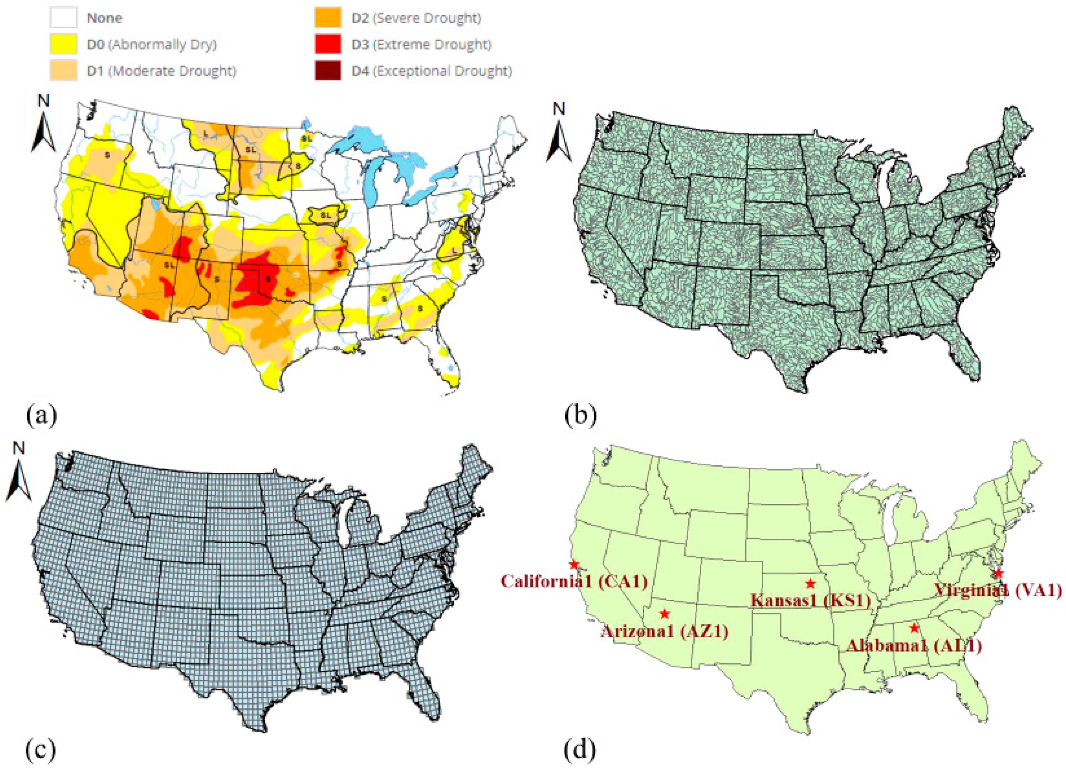
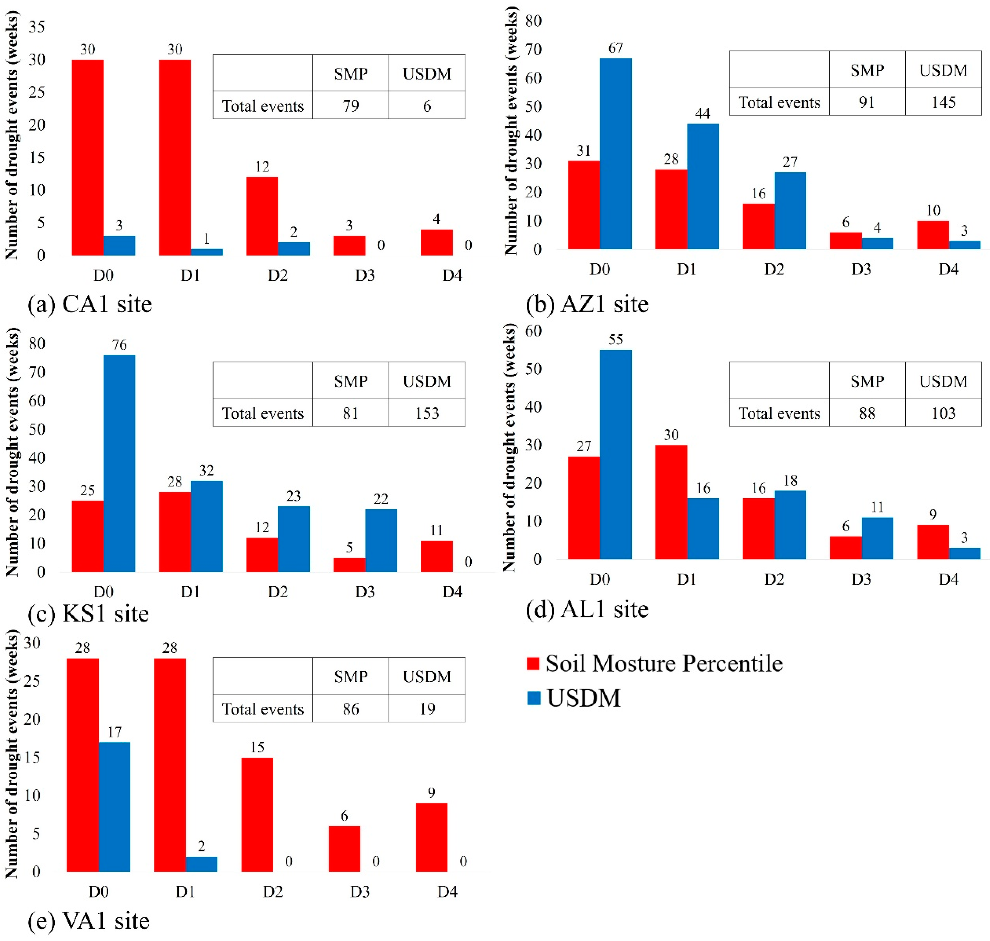
2.1. Study Area
2.2. Hydrologic Models and Data
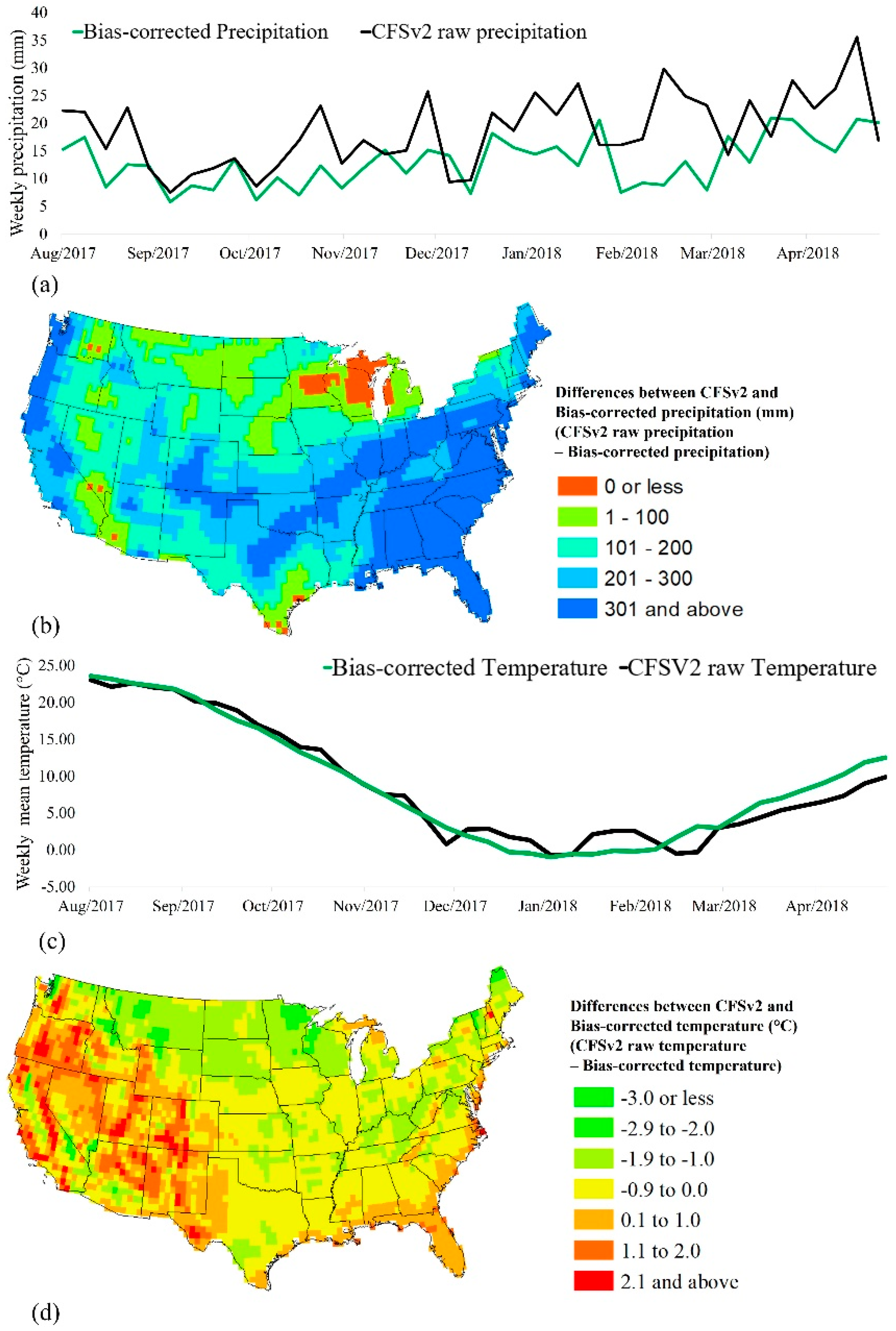
2.3. CFSv2
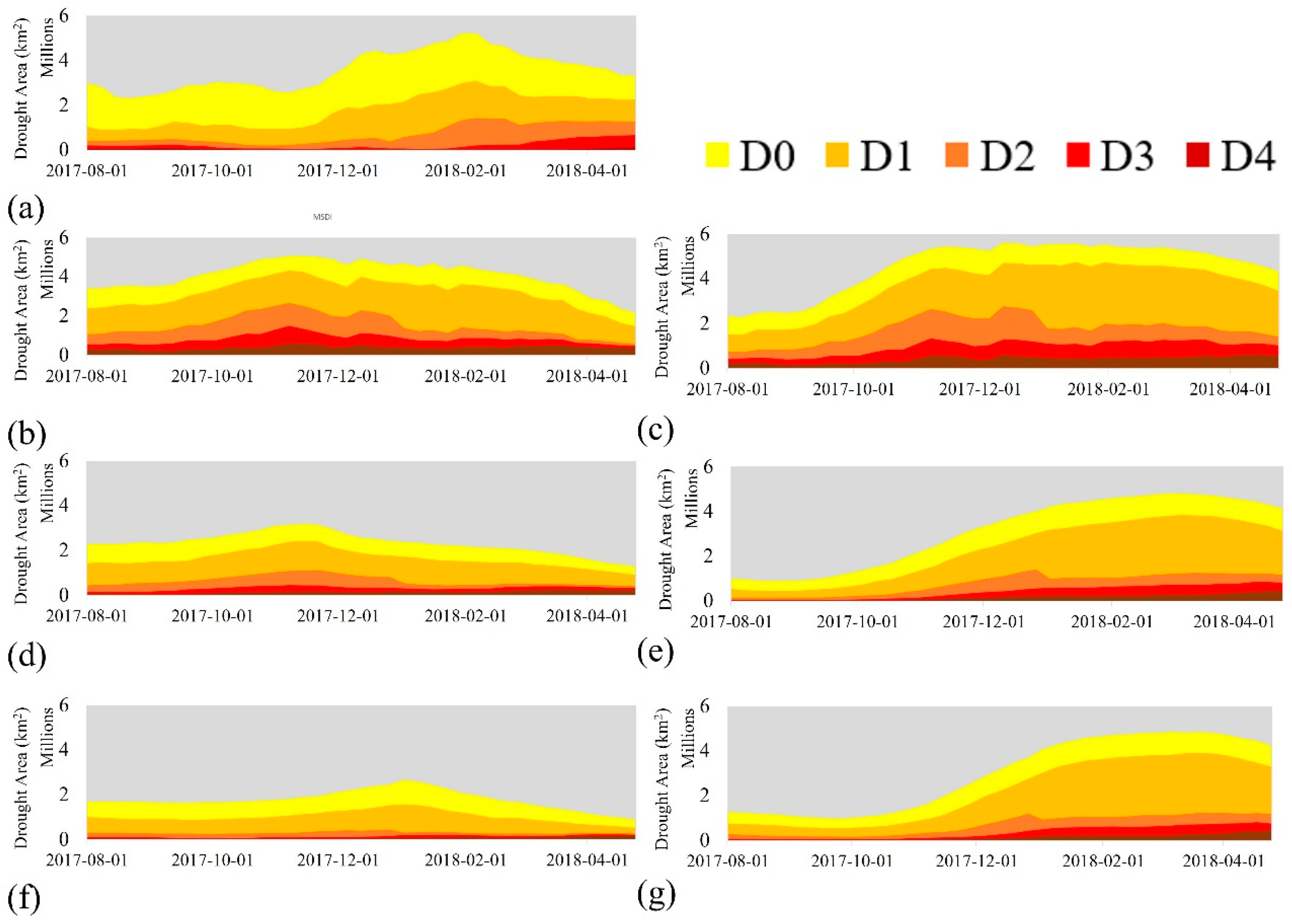
2.4. USDM and Drought Categories
2.5. Drought Indices
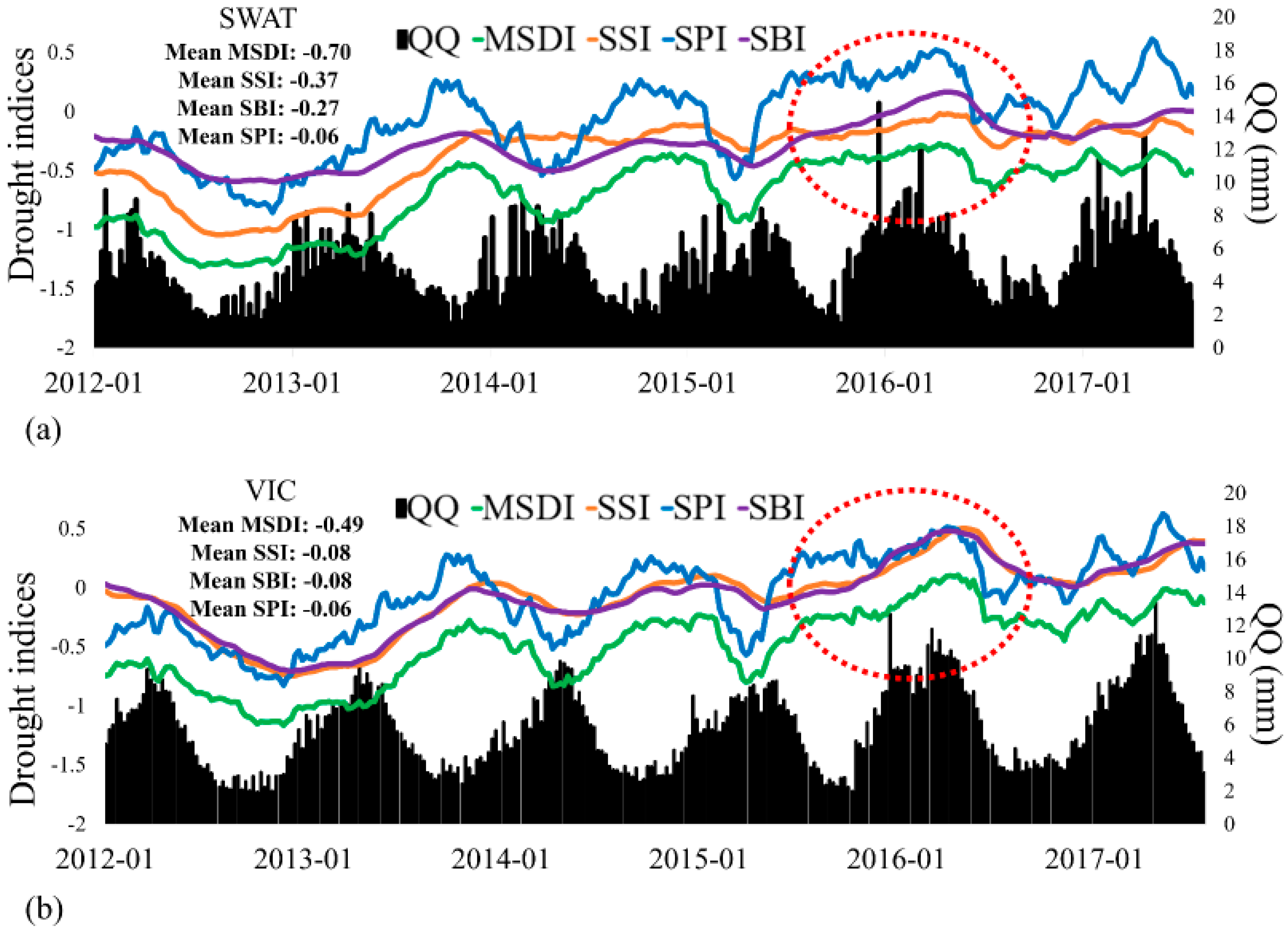
3. Results and Discussion
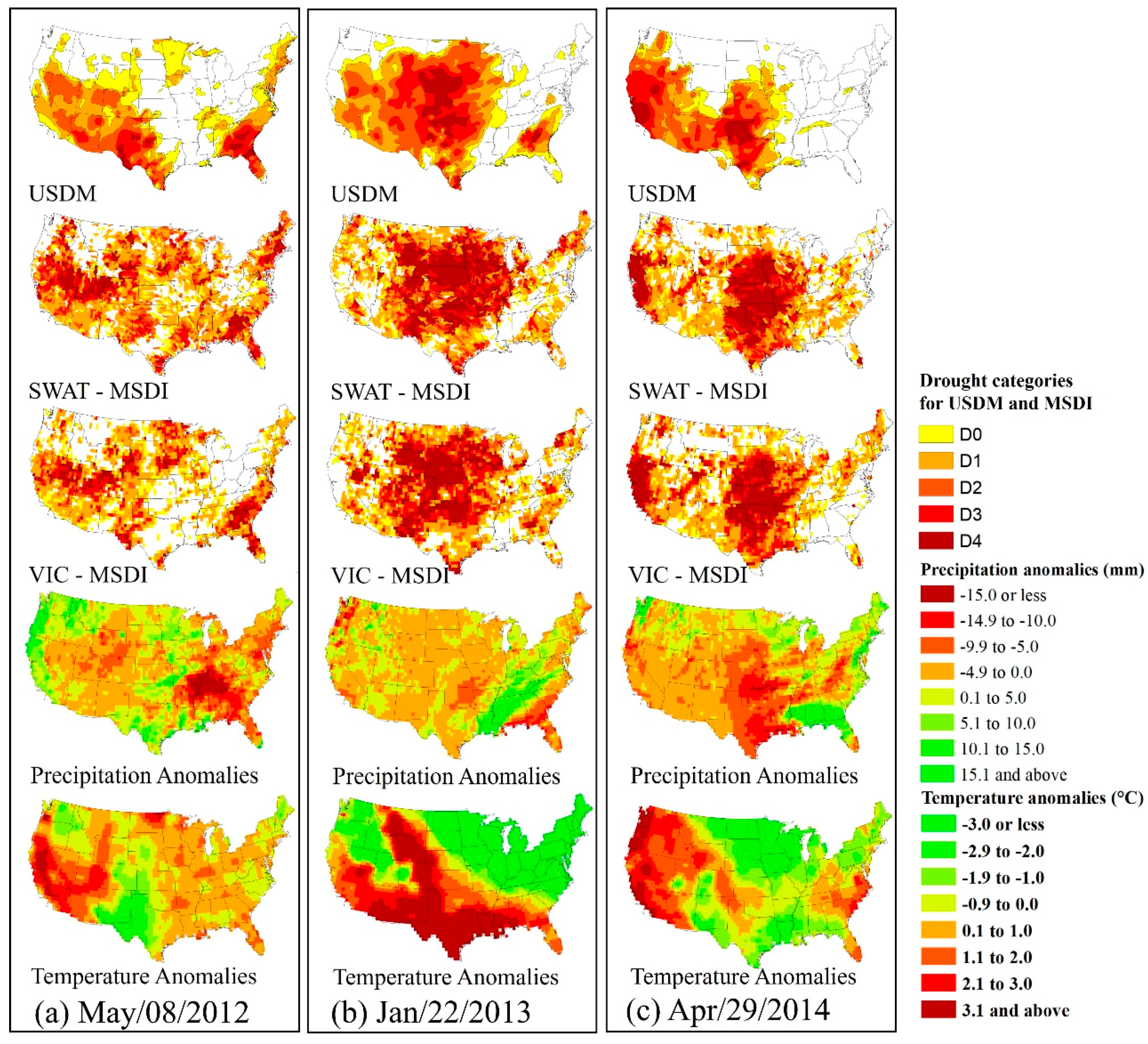
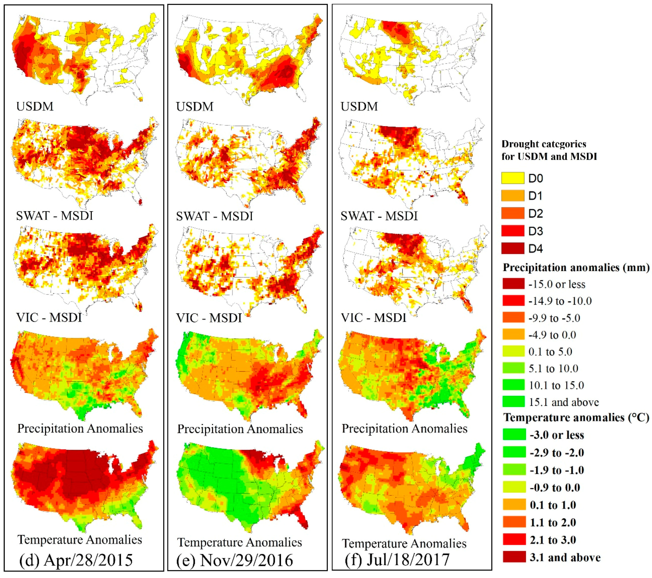
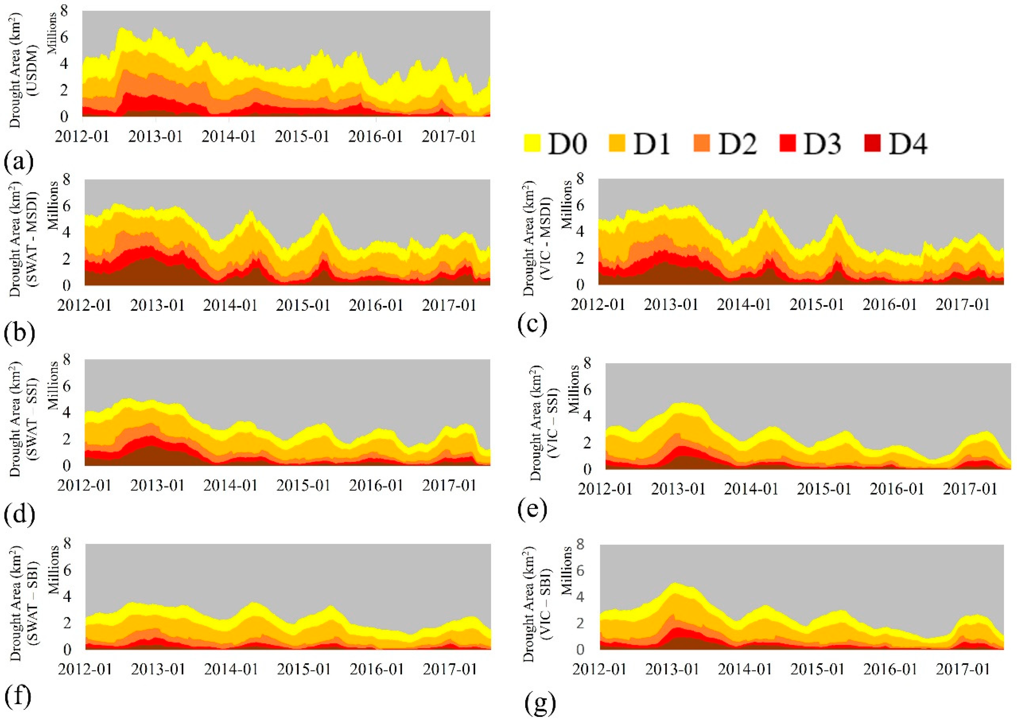
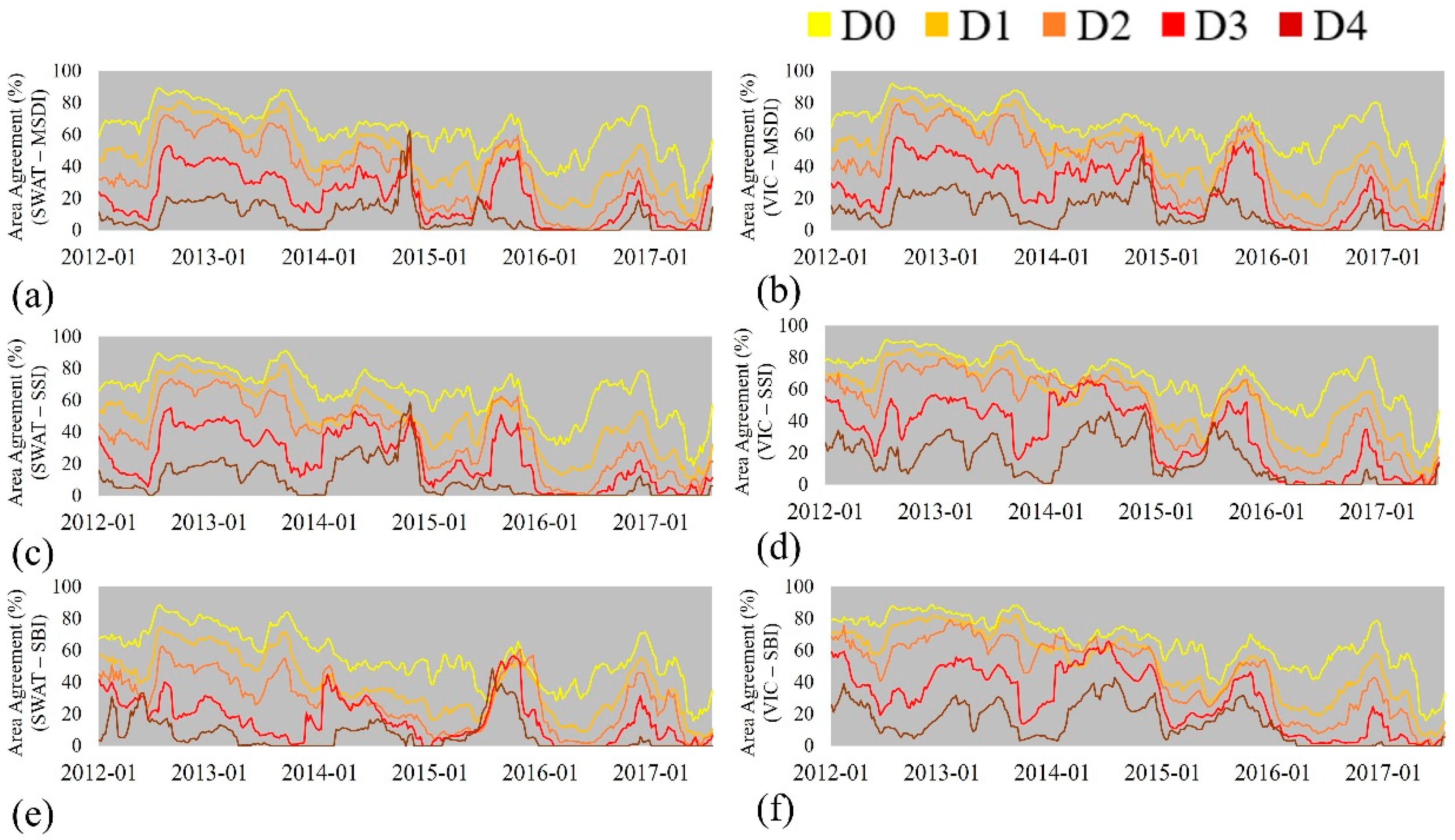
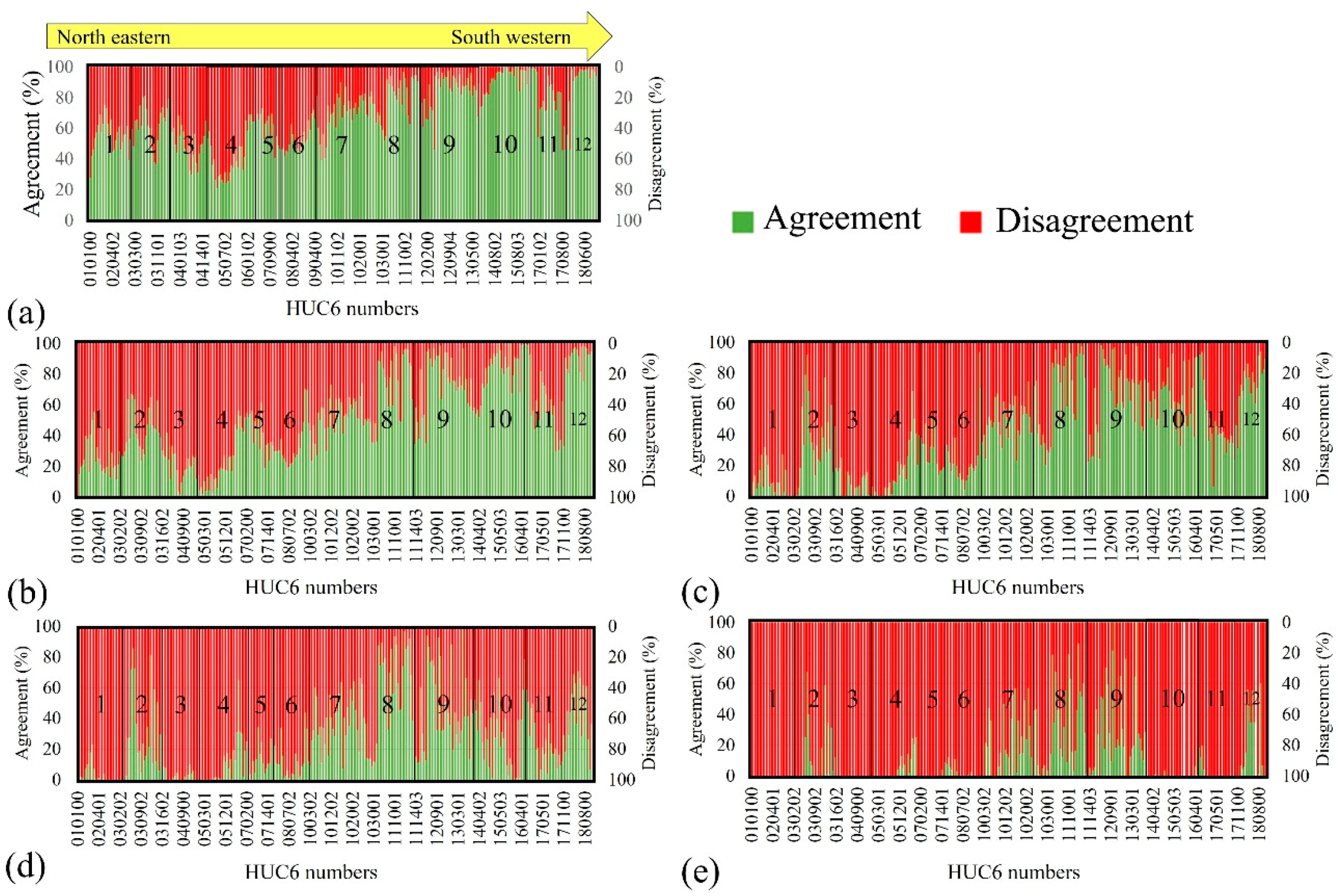
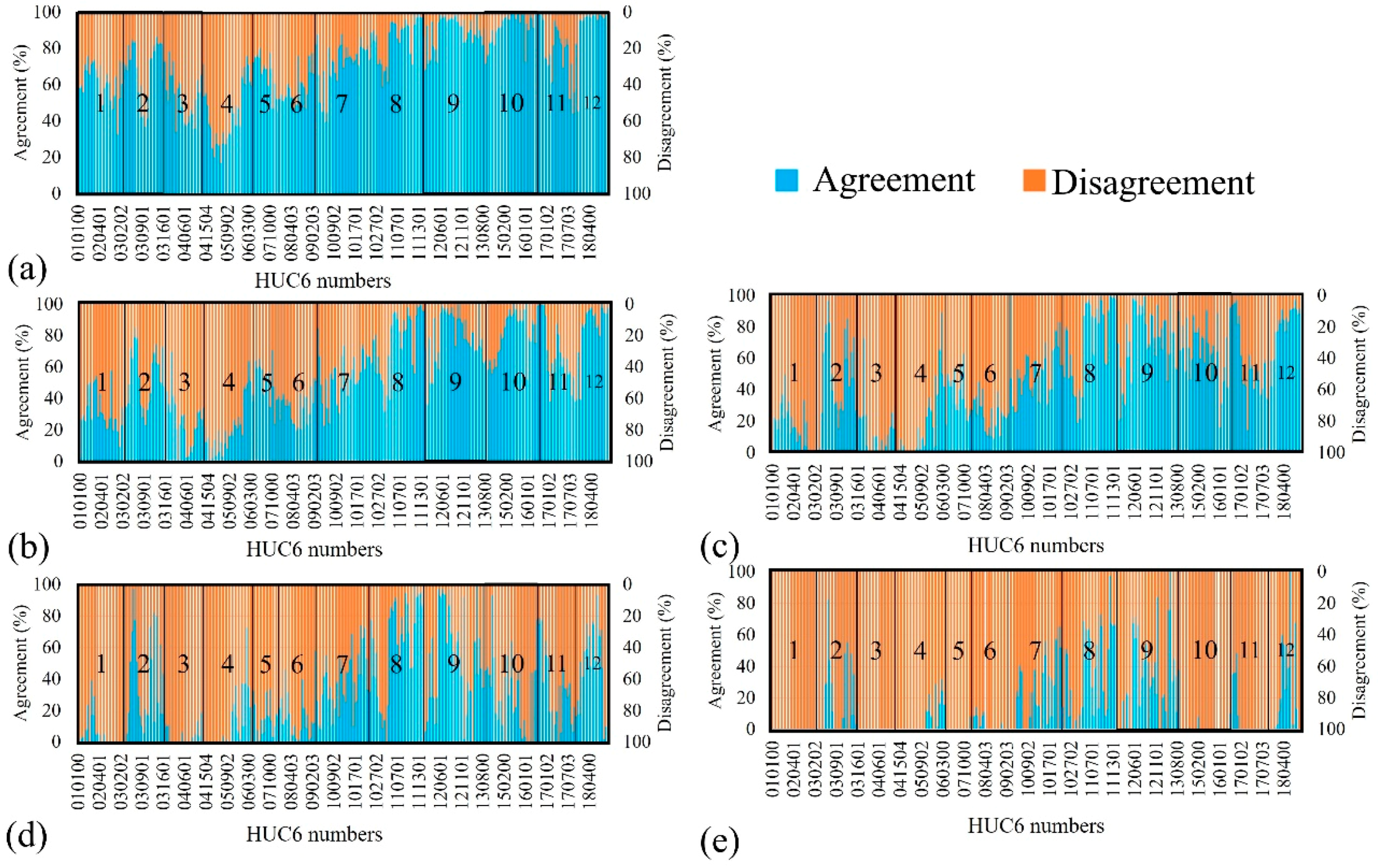
3.1. Validation of Retrospective Drought Conditions with USDM (Drought Agreement Area)
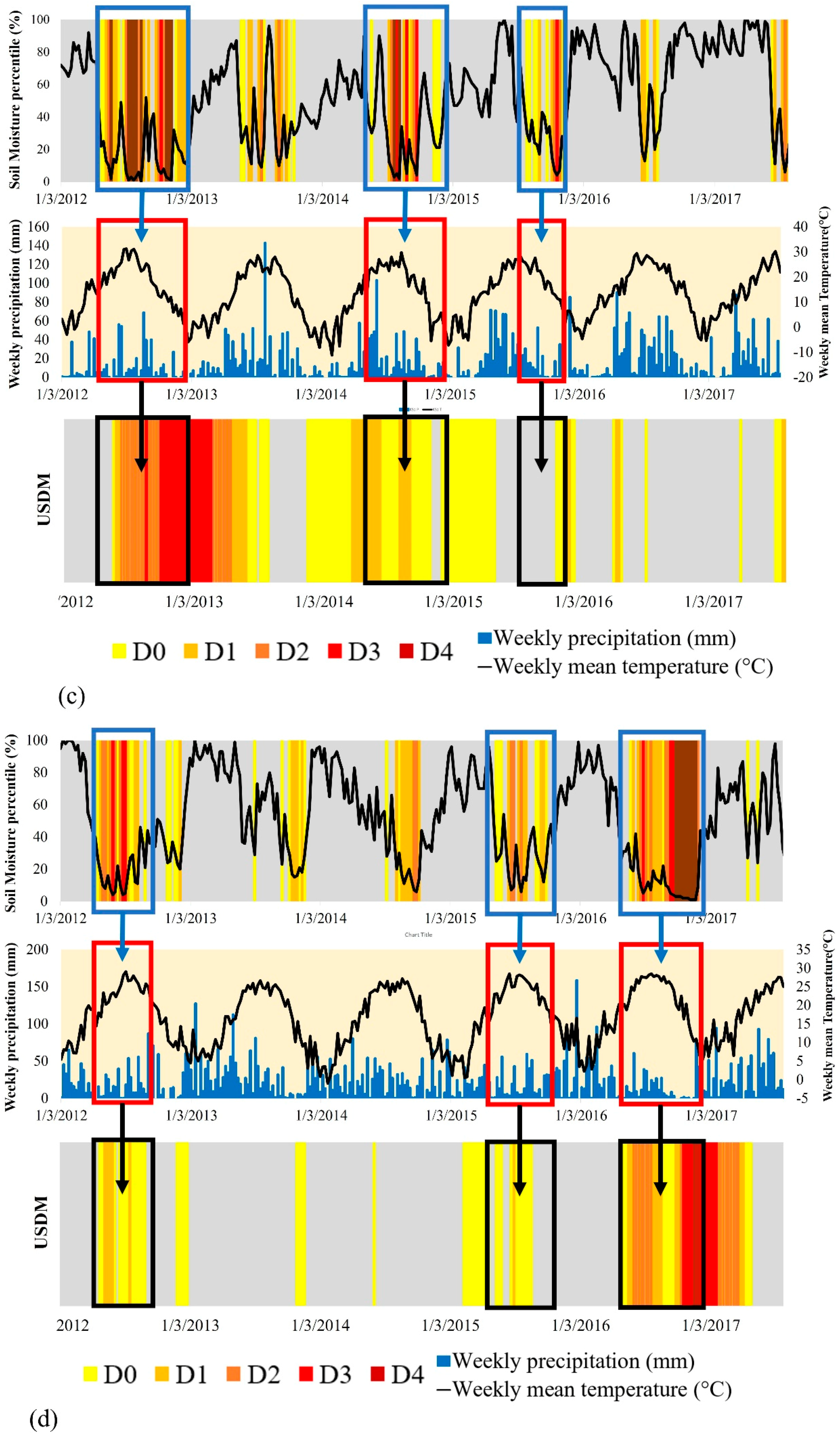
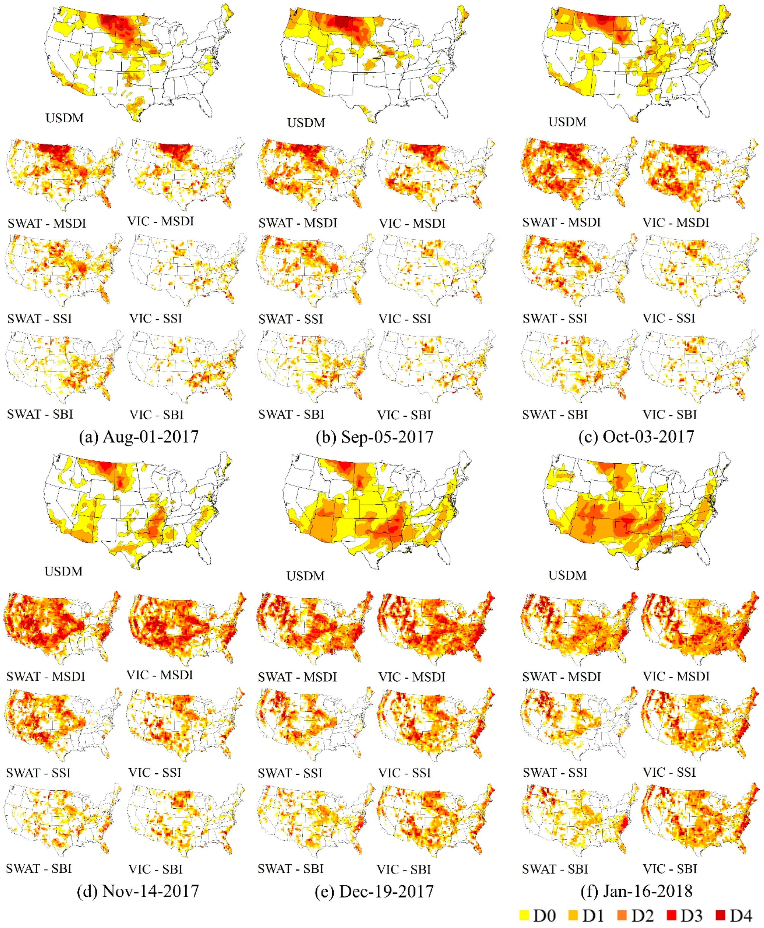
3.1.1. Comparisons to USDM Drought Maps of Drought Areas
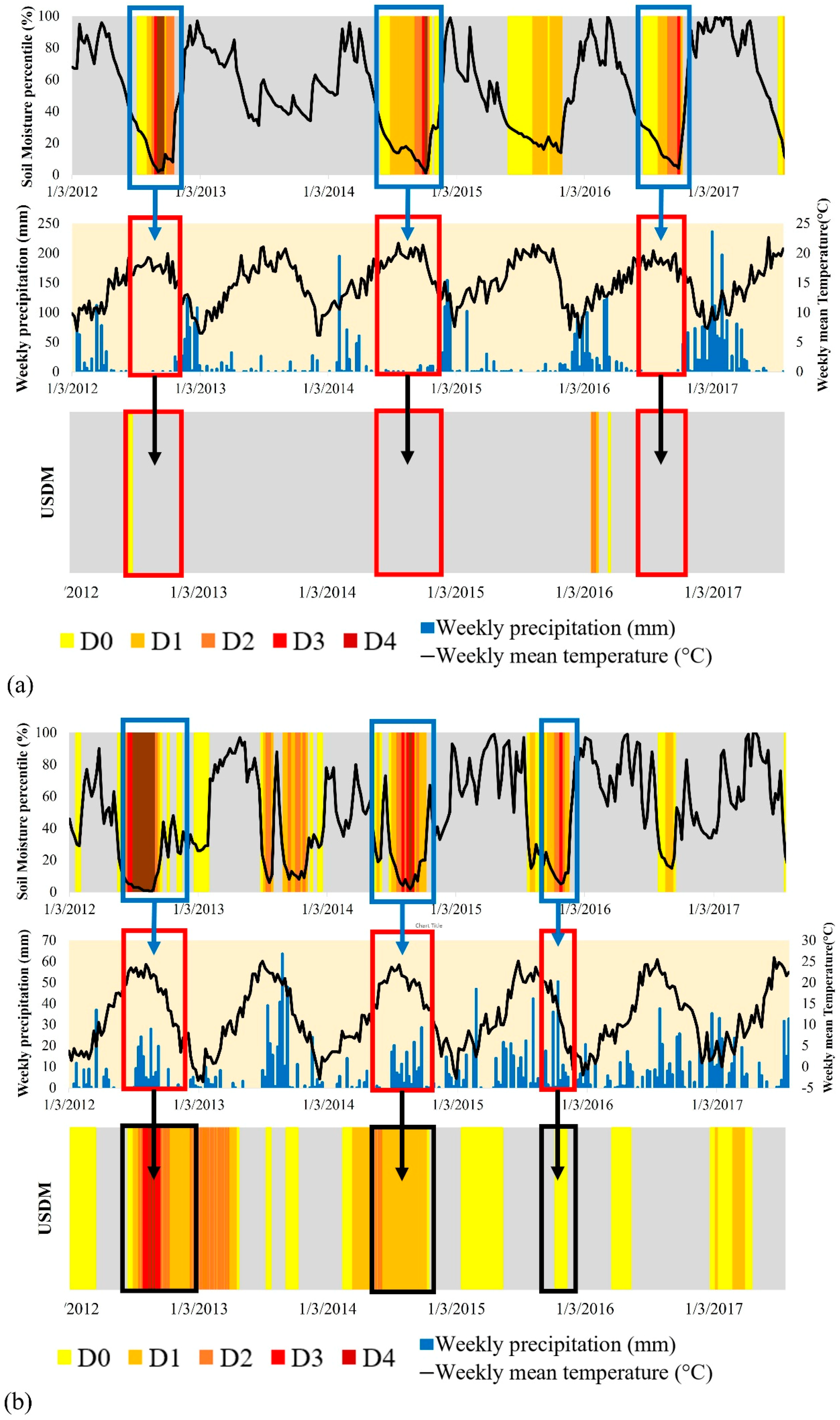
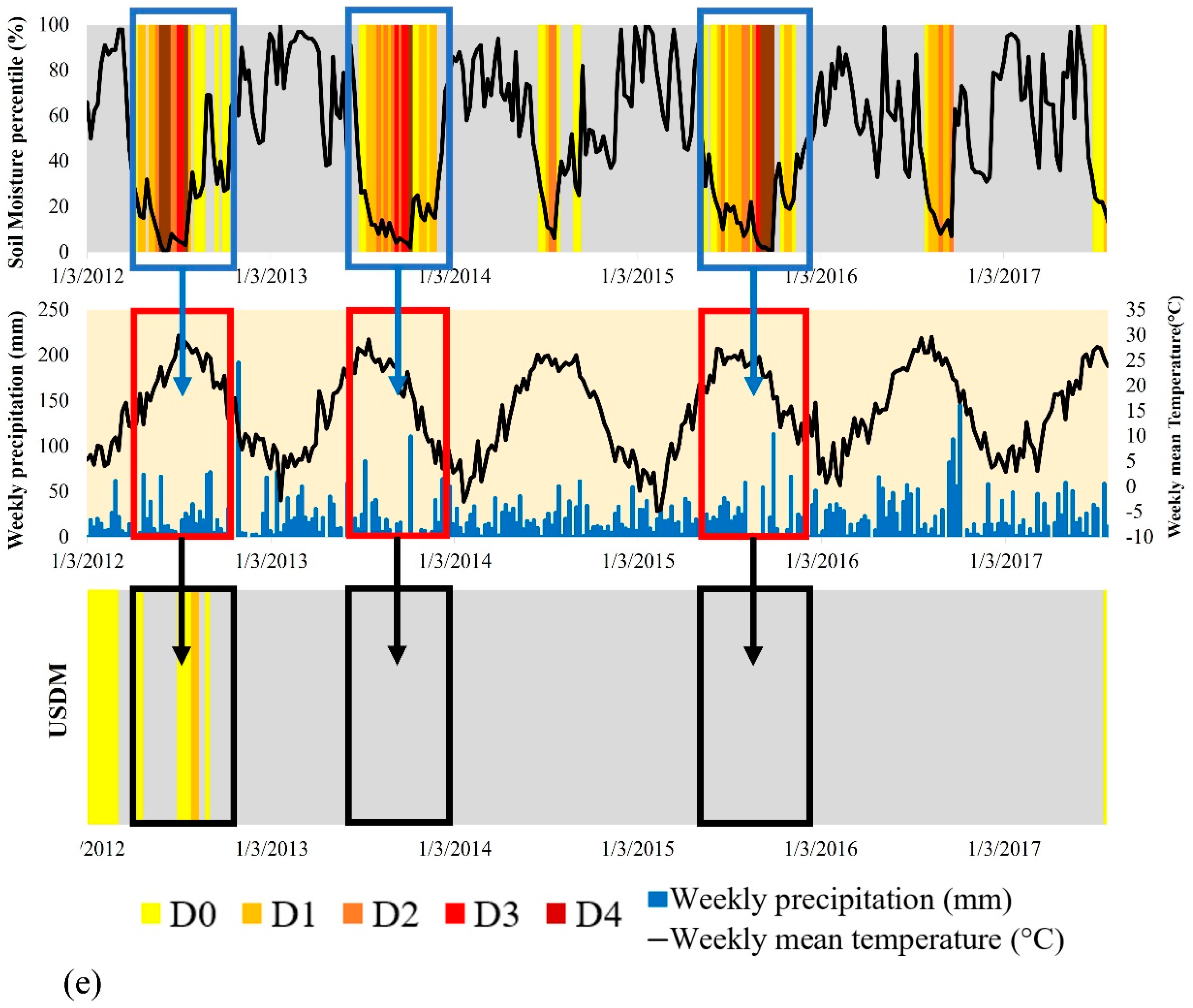
3.1.2. Discussions of Drought Categories and USCRN Observation Sites
3.1.3. Comparisons with USDM Drought Maps (Drought Occurrence-Based)
- (a)
- Index of agreement (IA, Unit: %): Percent of drought occurrences that correctly captured a drought severity of USDM for the total weeks in the watershed.
- (b)
- Index of disagreement (ID, Unit: %): Percent of drought occurrences that failed to capture a drought severity of USDM for the total weeks in the watershed.
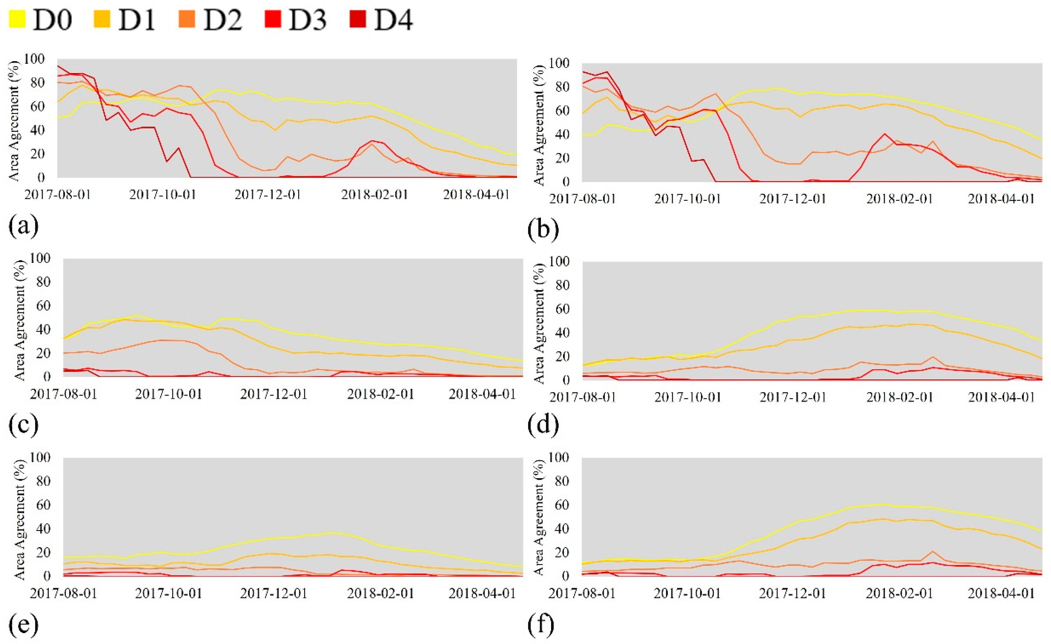
3.2. Evaluation of Drought Forecasting with Weekly Maps of USDM
4. Conclusions
- (1)
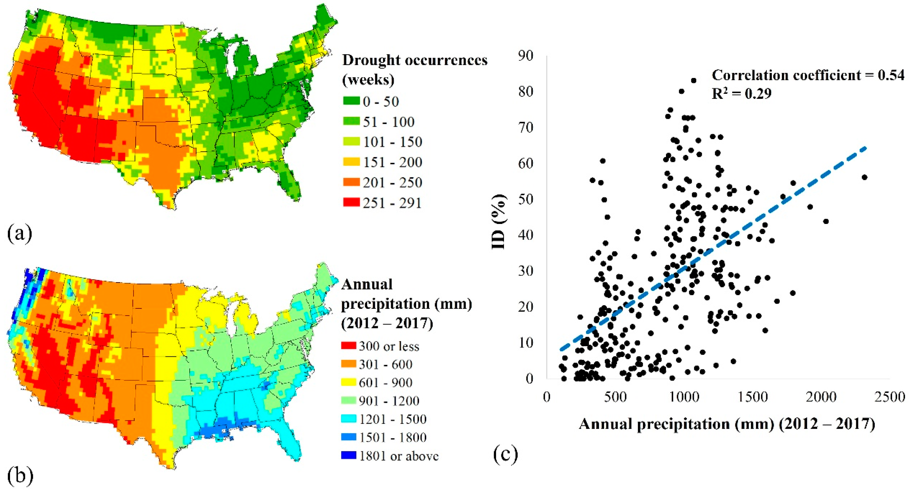
- For the retrospective period, the mean DA values were 63% and 66% for the MSDI simulation from the SWAT and VIC models and were 65% and 66% for SSI simulation (D0 category). In addition, the mean IA values were 70% and 72% for the MSDI simulation and were 71% and 72% for the SSI simulation (D0 category). The results imply that drought simulations with two models and multiple drought indices are useful in monitoring overall drought conditions for the CONUS.
- (2)
- For the forecasting period, the mean DA values were 65% and 62% for the MSDI simulation for the SWAT and VIC models, which indicates that a forecast using the MSDI estimation in the SWAT and VIC models with CFSv2 is capable of reliable real-time drought forecasting. However, the mean DA values were 42% and 35% for the SSI estimation and were 25% and 29% for the SBI simulation from the SWAT and VIC models. Thus, an evaluation of drought forecasting using multiple hydrometeorological components (e.g., precipitation and soil moisture) from multiple hydrologic models would provide an advanced understanding of the characteristics of drought and would reduce uncertainties that arise from using only one model and variable.
- (3)
- Drought forecasting by the MSDI estimation for two months of lead time was relatively reliable (68% and 63% for the SWAT and VIC models). However, drought forecasting with increasing lead-times would be associated with increasing meteorological uncertainty. Additionally, drought forecasting using only one variable (i.e., SSI and SBI) was not predictable even in the first two months (23% and 10% for SSI; 7% and 7% for SBI).
- (4)
- The USDM is commonly conservative in judging an exceptional drought condition (D4), even though percentiles of soil moisture observation were less than 2% (D4 category). However, in the case of other drought categories (D0 to D3), some drought events predicted by the USDM commonly exceeded the results of soil moisture percentiles. Thus, these results would imply an underestimation of exceptional drought area monitoring from the USDM.
- (5)
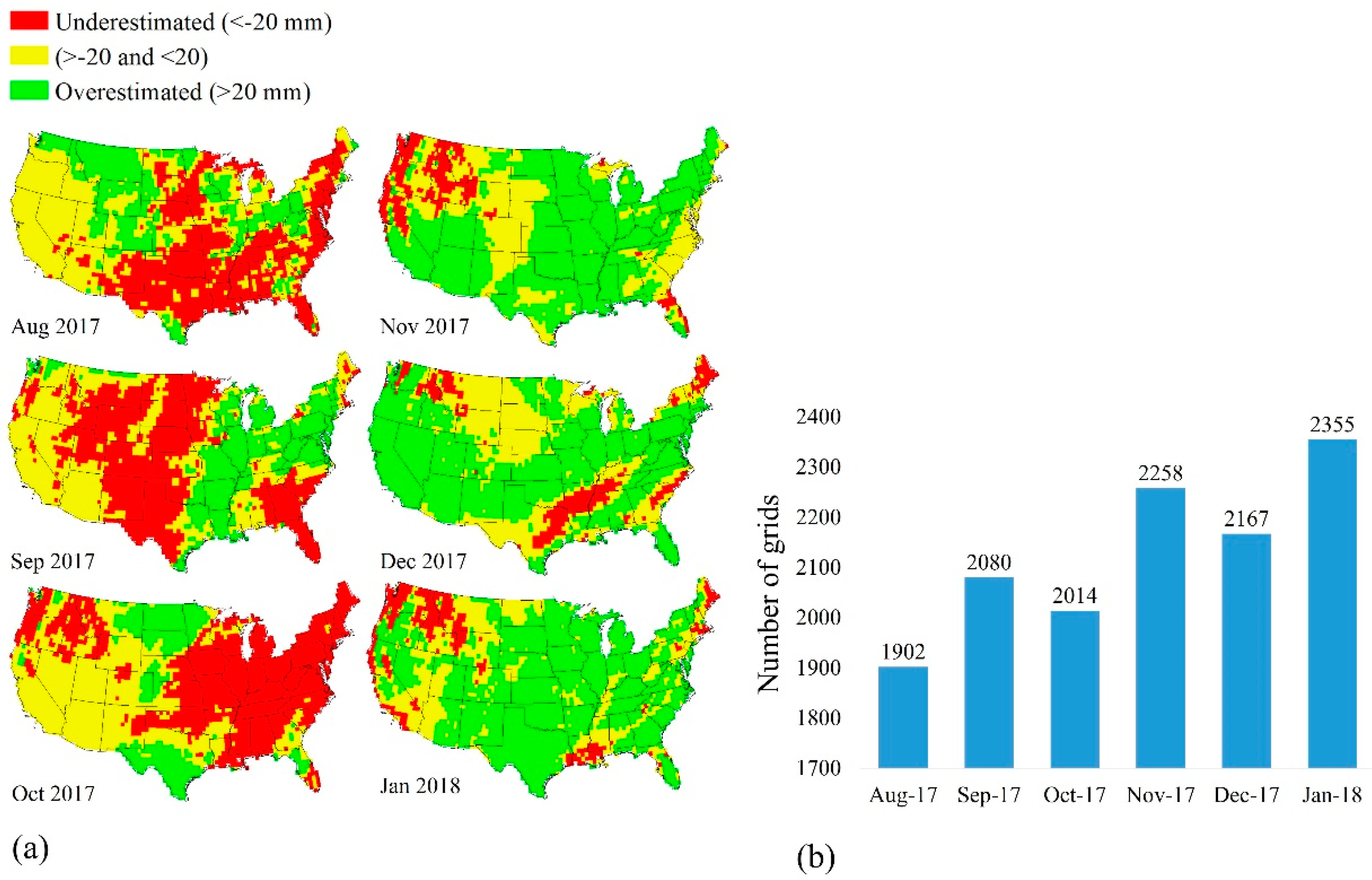
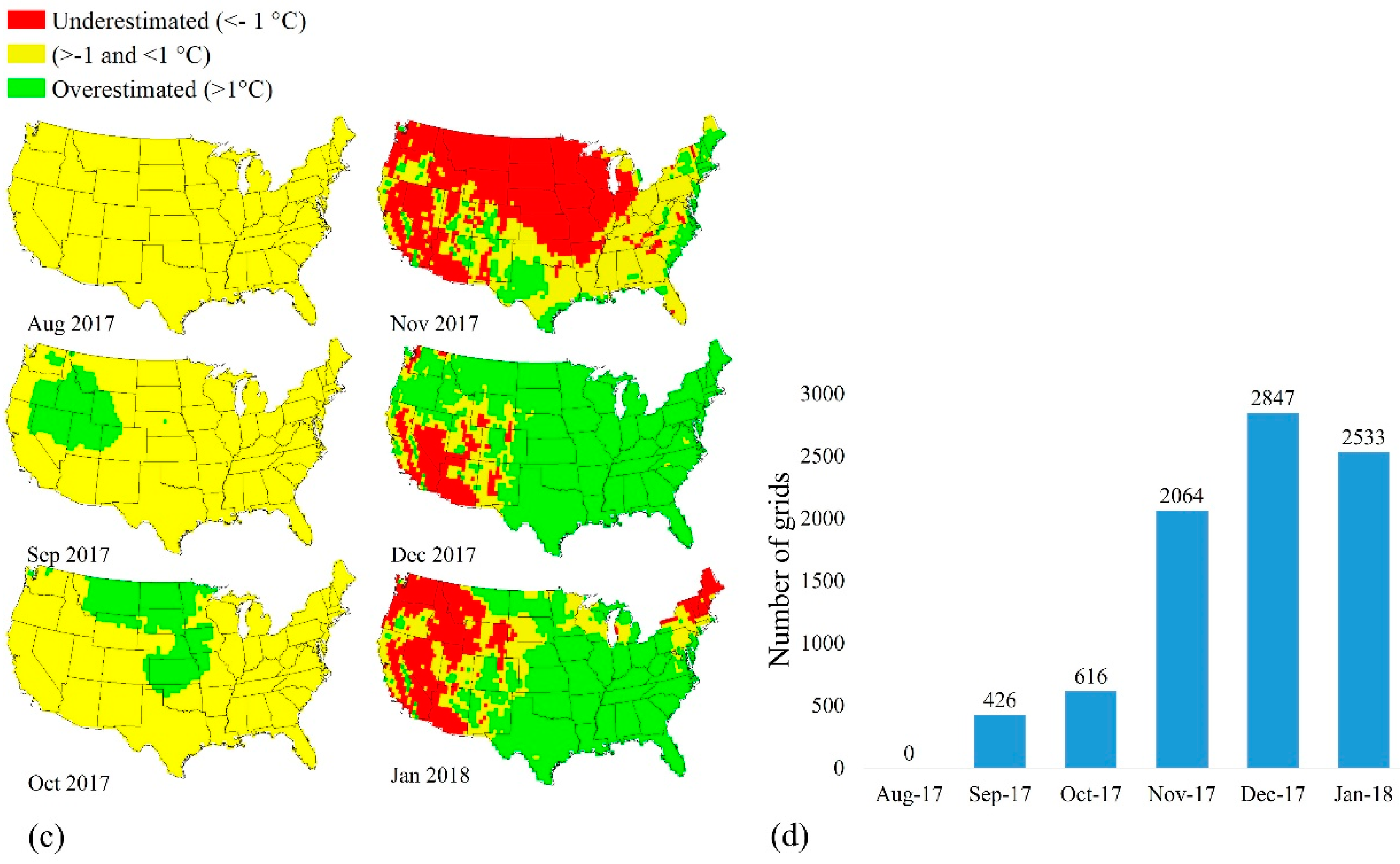
- For the results of retrospective and forecasting periods, the sources of uncertainties can be manifold; (a) USDM uses a more complicated method than the drought indices; (b) USDM may use other meteorological inputs, not just precipitation and temperature from CPC or CFSv2; (c) there are increasing meteorological uncertainties from CFSv2 with increasing lead time; and (d) the spatial resolutions of CFSv2 and CPC are different.
- (6)
- The proposed method provides weekly drought maps, which is better than the current approach which only provides an overall, seasonal outlook on drought trends (e.g., CPC drought outlook). Additionally, weekly forecasting maps for the entire CONUS can contribute to water resource management, crop planning, drought risk management, and adopting drought mitigation strategies in advance.
Supplementary Materials
Author Contributions
Funding
Acknowledgments
Conflicts of Interest
References
- Sternberg, T. Regional drought has a global impact. Nature 2011, 472, 169. [Google Scholar] [CrossRef] [PubMed]
- Sheffield, J.; Wood, E.F. Drought: Past Problems and Future Scenarios; Routledge: Abingdon-on-Thames, UK, 2012. [Google Scholar]
- Changnon, S.A.; Pielke, R.A., Jr.; Changnon, D.; Sylves, R.T.; Pulwarty, R. Human factors explain the increased losses from weather and climate extremes. Bull. Am. Meteorol. Soc. 2000, 81, 437–442. [Google Scholar] [CrossRef]
- Karl, T.R.; Gleason, B.E.; Menne, M.J.; McMahon, J.R.; Heim, R.R.; Brewer, M.J.; Kunkel, K.E.; Arndt, D.S.; Privette, J.L.; Bates, J.J.; et al. US temperature and drought: Recent anomalies and trends. Eos Trans. Am. Geophys. Union 2012, 93, 473–474. [Google Scholar] [CrossRef]
- McEvoy, D.J. Physically Based Evaporative Demand as a Drought Metric: Historical Analysis and Seasonal Prediction; University of Nevada: Reno, NV, USA, 2015. [Google Scholar]
- Clark, J.S.; Iverson, L.; Woodall, C.W.; Allen, C.D.; Bell, D.M.; Bragg, D.C.; D’amato, A.W.; Davis, F.W.; Hersh, M.H.; Ibanez, I.; et al. The impacts of increasing drought on forest dynamics, structure, and biodiversity in the United States. Glob. Chang. Biol. 2016, 22, 2329–2352. [Google Scholar] [CrossRef] [PubMed]
- AghaKouchak, A. A baseline probabilistic drought forecasting framework using standardized soil moisture index: Application to the 2012 United States drought. Hydrol. Earth Syst. Sci. 2014, 18, 2485–2492. [Google Scholar] [CrossRef]
- Hayes, M.; Svoboda, M.; Le Comte, D.; Redmond, K.T.; Pasteris, P. Drought Monitoring: New Tools for the 21st Century; Taylor and Francis: Abingdon, UK, 2005; pp. 53–69. [Google Scholar]
- Steinemann, A.C. Using climate forecasts for drought management. J. Appl. Meteorol. Climatol. 2006, 45, 1353–1361. [Google Scholar] [CrossRef]
- Luo, L.; Wood, E.F. Monitoring and predicting the 2007 US drought. Geophys. Res. Lett. 2007, 34. [Google Scholar] [CrossRef]
- Yan, H.; Moradkhani, H.; Zarekarizi, M. A probabilistic drought forecasting framework: A combined dynamical and statistical approach. J. Hydrol. 2017, 548, 291–304. [Google Scholar] [CrossRef]
- Ribeiro, A.; Pires, C.A. Seasonal drought predictability in Portugal using statistical-dynamical techniques. J. Phys. Chem. Earth 2016, 94, 155–166. [Google Scholar] [CrossRef]
- Mishra, A.K.; Singh, V.P. A review of drought concepts. J. Hydrol. 2010, 391, 202–216. [Google Scholar] [CrossRef]
- Halmstad, A.; Najafi, M.R.; Moradkhani, H. Analysis of precipitation extremes with the assessment of regional climate models over the Willamette River Basin, USA. Hydrol. Process. 2013, 27, 2579–2590. [Google Scholar] [CrossRef]
- Niemeyer, S. New Drought Indices. Water Manag. 2008, 80, 267–274. [Google Scholar]
- Kang, H.; Sridhar, V. Combined statistical and spatially distributed hydrological model for evaluating future drought indices in Virginia. J. Hydrol. Reg. Stud. 2017, 12, 253–272. [Google Scholar] [CrossRef]
- Sehgal, V.; Sridhar, V. Effect of hydroclimatological teleconnections on the watershed-scale drought predictability in the southeastern United States. Int. J. Climatol. 2018, 38, e1139–e1157. [Google Scholar] [CrossRef]
- Thilakarathne, M.; Sridhar, V. Characterization of future drought conditions in the Lower Mekong River Basin. Weather Clim. Extrem. 2017, 17, 47–58. [Google Scholar] [CrossRef]
- Kang, H.; Sridhar, V. Assessment of Future Drought Conditions in the Chesapeake Bay Watershed. JAWRA 2018, 54, 160–183. [Google Scholar] [CrossRef]
- McKee, T.B.; Doesken, N.J.; Kleist, J. Drought Monitoring with Multiple Time Series. In Proceedings of the 8th Conference on Applied Climatology, Anaheim, CA, USA, 17–22 January 1993. [Google Scholar]
- Mishra, A.K.; Singh, V.P. Analysis of drought severity-area-frequency curves using a general circulation model and scenario uncertainty. J. Geophys. Res. Atmos. 2009, 114. [Google Scholar] [CrossRef]
- Zargar, A.; Sadiq, R.; Naser, B.; Khan, F.I. A review of drought indices. Environ. Rev. 2011, 19, 333–349. [Google Scholar] [CrossRef]
- Paulo, A.; Martins, D.; Pereira, L.S. Influence of precipitation changes on the SPI and related drought severity. An analysis using long-term data series. Water Resour. Manag. 2016, 30, 5737–5757. [Google Scholar] [CrossRef]
- Belayneh, A.; Adamowski, J.; Khalil, B.; Ozga-Zielinski, B. Long-term SPI drought forecasting in the Awash River Basin in Ethiopia using wavelet neural network and wavelet support vector regression models. J. Hydrol. 2014, 508, 418–429. [Google Scholar] [CrossRef]
- Bonaccorso, B.; Cancelliere, A.; Rossi, G. Probabilistic forecasting of drought class transitions in Sicily (Italy) using standardized precipitation index and North Atlantic oscillation index. J. Hydrol. 2015, 526, 136–150. [Google Scholar] [CrossRef]
- Hao, Z.; AghaKouchak, A. Multivariate standardized drought index: A parametric multi-index model. Adv. Water Resour. 2013, 57, 12–18. [Google Scholar] [CrossRef]
- Hao, Z.; AghaKouchak, A. A nonparametric multivariate multi-index drought monitoring framework. J. Hydrometeorol. 2014, 15, 89–101. [Google Scholar] [CrossRef]
- Madadgar, S.; Moradkhani, H. A Bayesian framework for probabilistic seasonal drought forecasting. J. Hydrometeorol. 2013, 14, 1685–1705. [Google Scholar] [CrossRef]
- Cancelliere, A.; Di Mauro, G.; Bonaccorso, B.; Rossi, G. Drought forecasting using the standardized precipitation index. Water Resour. Manag. 2007, 21, 801–819. [Google Scholar] [CrossRef]
- Morid, S.; Smakhtin, V.; Bagherzadeh, K. Drought forecasting using artificial neural networks and time series of drought indices. Int. J. Climatol. 2007, 27, 2103–2111. [Google Scholar] [CrossRef]
- Zhang, X.; Tang, Q.; Liu, X.; Leng, G.; Li, Z. Soil moisture drought monitoring and forecasting using satellite and climate model data over Southwestern China. J. Hydrometeorol. 2017, 18, 5–23. [Google Scholar] [CrossRef]
- Sridhar, V.; Hubbard, K.G.; You, J.; Hunt, E. Development of soil moisture index to quantify agricultural drought and its ‘user-friendliness’ in severity-area-duration assessment. J. Hydrometeor. 2008, 9, 660–676. [Google Scholar] [CrossRef]
- Sridhar, V.; Jaksa, W.T.A.; Fang, B.; Lakshmi, V.; Hubbard, K.G.; Jin, X. Evaluating bias corrected AMSR-E soil moisture using in-situ observations and model estimates. Vadose Zone J. 2013. [Google Scholar] [CrossRef]
- Liang, X.; Lettenmaier, D.P.; Wood, E.F.; Burges, S.J. A simple hydrologically based model of land surface water and energy fluxes for general circulation models. J. Geophys. Res. Atmos. 1994, 99, 14415–14428. [Google Scholar] [CrossRef]
- Mishra, V.; Cherkauer, K.A.; Shukla, S. Assessment of drought due to historic climate variability and projected future climate change in the midwestern United States. J. Hydrometeorol. 2010, 11, 46–68. [Google Scholar] [CrossRef]
- Arnold, J.G.; Srinivasan, R.; Muttiah, R.S.; Williams, J.R. Large area hydrologic modeling and assessment part I: Model development. JAWRA 1998, 34, 73–89. [Google Scholar] [CrossRef]
- Narasimhan, B.; Srinivasan, R. Development and evaluation of Soil Moisture Deficit Index (SMDI) and Evapotranspiration Deficit Index (ETDI) for agricultural drought monitoring. Agric. For. Meteorol. 2005, 133, 69–88. [Google Scholar] [CrossRef]
- Shukla, S.; Lettenmaier, D.P. Seasonal hydrologic prediction in the United States: Understanding the role of initial hydrologic conditions and seasonal climate forecast skill. Hydrol. Earth Syst. Sci. 2011, 15, 3529–3538. [Google Scholar] [CrossRef]
- Hao, Z.; Singh, V.P.; Xia, Y. Seasonal drought prediction: Advances, challenges, and future prospects. Rev. Geophys. 2018, 56. [Google Scholar] [CrossRef]
- Saha, S.; Moorthi, S.; Wu, X.; Wang, J.; Nadiga, S.; Tripp, P.; Behringer, D.; Hou, Y.T.; Chuang, H.Y.; Iredell, M.; et al. The NCEP climate forecast system version 2. J. Clim. 2014, 27, 2185–2208. [Google Scholar] [CrossRef]
- Svoboda, M.; LeComte, D.; Hayes, M.; Heim, R.; Gleason, K.; Angel, J.; Rippey, B.; Tinker, R.; Palecki, M.; Stooksbury, D.; et al. The drought monitor. Bull. Am. Meteorol. Soc. 2002, 83, 1181–1190. [Google Scholar] [CrossRef]
- Lorenz, D.J.; Otkin, J.A.; Svoboda, M.; Hain, C.R.; Anderson, M.C.; Zhong, Y. Predicting US Drought Monitor states using precipitation, soil moisture, and evapotranspiration anomalies. Part I: Development of a nondiscrete USDM index. J. Hydrometeorol. 2017, 18, 1943–1962. [Google Scholar] [CrossRef]
- Smith, A.B.; Katz, R.W. US billion-dollar weather and climate disasters: Data sources, trends, accuracy and biases. Nat. Hazards 2013, 67, 387–410. [Google Scholar] [CrossRef]
- DHS. National Preparedness Report; U.S. Department. of Homeland Security: Washington, DC, USA, 2015; pp. 1–87.
- Rippey, B.R. The US drought of 2012. Weather Clim. Extrem. 2015, 10, 57–64. [Google Scholar] [CrossRef]
- Robeson, S.M. Revisiting the recent California drought as an extreme value. Geophys. Res. Lett. 2015, 42, 6771–6779. [Google Scholar] [CrossRef]
- Wang, A.; Bohn, T.J.; Mahanama, S.P.; Koster, R.D.; Lettenmaier, D.P. Multimodel ensemble reconstruction of drought over the continental United States. J. Clim. 2009, 22, 2694–2712. [Google Scholar] [CrossRef]
- Shukla, S.; Safeeq, M.; AghaKouchak, A.; Guan, K.; Funk, C. Temperature impacts on the water year 2014 drought in California. Geophys. Res. Lett. 2015, 42, 4384–4393. [Google Scholar] [CrossRef]
- Mao, Y.; Nijssen, B.; Lettenmaier, D.P. Is climate change implicated in the 2013–2014 California drought? A hydrologic perspective. Geophys. Res. Lett. 2015, 42, 2805–2813. [Google Scholar] [CrossRef]
- Wood, E.F.; Chaney, N.; Sheffield, J.; Yuan, X. Development of an Experimental African Drought Monitoring and Seasonal Forecasting System: A First Step Towards a Global Drought Information System. In AGU Fall Meeting Abstracts; American Geophysical Union: Washington, DC, USA, 2012. [Google Scholar]
- Sheffield, J.; Wood, E.F.; Chaney, N.; Guan, K.; Sadri, S.; Yuan, X.; Olang, L.; Amani, A.; Ali, A.; Demuth, S.; et al. A drought monitoring and forecasting system for sub-Sahara African water resources and food security. Bull. Am. Meteorol. Soc. 2014, 95, 861–882. [Google Scholar] [CrossRef]
- Chen, M.; Shi, W.; Xie, P.; Silva, V.; Kousky, V.E.; Wayne Higgins, R.; Janowiak, J.E. Assessing objective techniques for gauge-based analyses of global daily precipitation. J. Geophys. Res. Atmos. 2008, 113. [Google Scholar] [CrossRef]
- Xie, P.; Chen, M.; Shi, W. CPC Unified Gauge-Based Analysis of Global Daily Precipitation. In Proceedings of the 24th Conference on Hydrology, Atlanta, GA, USA, 18 January 2010; Volume 2. in preprints. [Google Scholar]
- Guttman, N.B. Accepting the standardized precipitation index: A calculation algorithm. JAWRA 1999, 35, 311–322. [Google Scholar] [CrossRef]
- Nijssen, B.; O’donnell, G.M.; Hamlet, A.F.; Lettenmaier, D.P. Hydrologic sensitivity of global rivers to climate change. Clim. Chang. 2001, 50, 143–175. [Google Scholar] [CrossRef]
- Nijssen, B.; O’Donnell, G.M.; Lettenmaier, D.P.; Lohmann, D.; Wood, E.F. Predicting the discharge of global rivers. J. Clim. 2001, 14, 3307–3323. [Google Scholar] [CrossRef]
- Neitsch, S.L.; Arnold, J.G.; Kiniry, J.R.; Williams, J.R. Soil and Water Assessment Tool Theoretical Documentation Version 2009; Texas Water Resources Institute: College Station, TX, USA, 2011. [Google Scholar]
- Arnold, J.G.; Moriasi, D.N.; Gassman, P.W.; Abbaspour, K.C.; White, M.J.; Srinivasan, R.; Santhi, C.; Harmel, R.D.; Van Griensven, A.; Van Liew, M.W.; et al. SWAT: Model use, calibration, and validation. Trans. ASABE 2012, 55, 1491–1508. [Google Scholar] [CrossRef]
- Wang, D.; Hejazi, M.; Cai, X.; Valocchi, A.J. Climate change impact on meteorological, agricultural, and hydrological drought in central Illinois. Water Resour. Res. 2011, 47. [Google Scholar] [CrossRef]
- Ashraf Vaghefi, S.; Mousavi, S.J.; Abbaspour, K.C.; Srinivasan, R.; Yang, H. Analyses of the impact of climate change on water resources components, drought and wheat yield in semiarid regions: Karkheh River Basin in Iran. Hydrol. Process. 2014, 28, 2018–2032. [Google Scholar] [CrossRef]
- Ahn, S.R.; Jeong, J.H.; Kim, S.J. Assessing drought threats to agricultural water supplies under climate change by combining the SWAT and MODSIM models for the Geum River basin, South Korea. Hydrol. Sci. J. 2016, 61, 2740–2753. [Google Scholar] [CrossRef]
- Trambauer, P.; Maskey, S.; Winsemius, H.; Werner, M.; Uhlenbrook, S. A review of continental scale hydrological models and their suitability for drought forecasting in (sub-Saharan) Africa. Phys. Chem. Earth Parts A/B/C 2013, 66, 16–26. [Google Scholar] [CrossRef]
- Jones, C.B. Geographical Information Systems and Computer Cartography; Addison Wesley Longman: Harlow, UK, 1997. [Google Scholar]
- USDA (U.S. Department of Agriculture). Soil Conservation Service, National Engineering Handbook, Hydrology (Section 4, Chapters 4–10); GPO: Washington, DC, USA, 1972.
- Homer, C.; Huang, C.; Yang, L.; Wylie, B.; Coan, M. Development of a 2001 national land-cover database for the United States. Photogramm. Eng. Remote Sens. 2004, 70, 829–840. [Google Scholar] [CrossRef]
- Griffin, D.; Anchukaitis, K.J. How unusual is the 2012–2014 California drought? Geophys. Res. Lett. 2014, 41, 9017–9023. [Google Scholar] [CrossRef]
- Livneh, B.; Hoerling, M.P. The physics of drought in the US Central Great Plains. J. Clim. 2016, 29, 6783–6804. [Google Scholar] [CrossRef]
- Griffies, S.M.; Harrison, M.J.; Pacanowski, R.C.; Rosati, A. A technical guide to MOM4. GFDL Ocean Group Technical Report No. 5. Geophys. Fluid Dyn. Lab. 2004, 5, 371. [Google Scholar]
- AghaKouchak, A. A multivariate approach for persistence-based drought prediction: Application to the 2010–2011 East Africa drought. J. Hydrol. 2015, 526, 127–135. [Google Scholar] [CrossRef]
- Gringorten, I.I. A plotting rule for extreme probability paper. J. Geophys. Res. 1963, 68, 813–814. [Google Scholar] [CrossRef]
- Benestad, R.E.; Haugen, J.E. On complex extremes: Flood hazards and combined high spring-time precipitation and temperature in Norway. Clim. Chang. 2007, 85, 381–406. [Google Scholar] [CrossRef]
- Wood, E.F.; Lettenmaier, D.P.; Zartarian, V.G. A land-surface hydrology parameterization with subgrid variability for general circulation models. J. Geophys. Res. Atmos. 1992, 97, 2717–2728. [Google Scholar] [CrossRef]
- Boughton, W.C. A review of the USDA SCS curve number method. Soil Res. 1989, 27, 511–523. [Google Scholar] [CrossRef]
- Marj, A.F.; Meijerink, A.M. Agricultural drought forecasting using satellite images, climate indices and artificial neural network. Int. J. Remote Sens. 2011, 32, 9707–9719. [Google Scholar] [CrossRef]

| USDM Category | Description | Range of Drought Indices |
|---|---|---|
| D0 | Abnormally dry | −0.50 to −0.79 |
| D1 | Moderate drought | −0.80 to −1.29 |
| D2 | Severe drought | −1.30 to −1.59 |
| D3 | Extreme drought | −1.60 to −1.99 |
| D4 | Exceptional drought | −2.0 or less |
| Model | Drought Indices | D0 | D1 | D2 | D3 | D4 |
|---|---|---|---|---|---|---|
| SWAT-DA | MSDI | 63 | 45 | 35 | 21 | 9 |
| SSI | 65 | 48 | 37 | 23 | 9 | |
| SBI | 55 | 38 | 28 | 16 | 7 | |
| VIC-DA | MSDI | 66 | 49 | 41 | 26 | 12 |
| SSI | 67 | 54 | 47 | 30 | 15 | |
| SBI | 65 | 51 | 44 | 28 | 14 |
| Years | Annual Precipitation | Six Years Mean (1982–1983) | Years | Annual Precipitation | Six Years Mean (1988–1993) | Years | Annual Precipitation | Six Years Mean (1994–1999) |
| 1982 | 848 | 795 | 1988 | 653 | 770 | 1994 | 771 | 800 |
| 1983 | 869 | 1989 | 730 | 1995 | 826 | |||
| 1984 | 784 | 1990 | 812 | 1996 | 858 | |||
| 1985 | 750 | 1991 | 816 | 1997 | 798 | |||
| 1986 | 793 | 1992 | 792 | 1998 | 847 | |||
| 1987 | 729 | 1993 | 819 | 1999 | 699 | |||
| Years | Annual Precipitation | Six Years Mean (2000–2005) | Years | Annual Precipitation | Six Years Mean (2006–2011) | Years | Annual Precipitation | Six Years Mean (1982–1983) |
| 2000 | 686 | 726 | 2006 | 727 | 765 | 2012 | 671 | 754 |
| 2001 | 699 | 2007 | 734 | 2013 | 746 | |||
| 2002 | 699 | 2008 | 789 | 2014 | 750 | |||
| 2003 | 735 | 2009 | 808 | 2015 | 825 | |||
| 2004 | 810 | 2010 | 789 | 2016 | 771 | |||
| 2005 | 730 | 2011 | 741 | 2017 | 759 |
| Site Name | USCRN Code | Longitude | Latitude | Observation Period |
|---|---|---|---|---|
| CA1 | CA_Fallbrook_5_NE | −123.07 | 38.32 | September 2011—Current |
| AZ1 | AZ_Yuma_27_ENE | −112.34 | 35.76 | August 2009—Current |
| KS1 | KS_Manhattan_6_SSW | −96.61 | 39.1 | August 2009—Current |
| AL1 | AL_Selma_13_WNW | −85.96 | 34.29 | June 2009—Current |
| VA1 | VA_Cape_Charles_5_ENE | −75.93 | 37.29 | June 2011—Current |
| Model | Drought Indices | D0 | D1 | D2 | D3 | D4 |
|---|---|---|---|---|---|---|
| SWAT | MSDI | 70 | 53 | 43 | 28 | 12 |
| SSI | 71 | 56 | 46 | 29 | 12 | |
| SBI | 64 | 48 | 37 | 21 | 7 | |
| VIC | MSDI | 72 | 56 | 48 | 32 | 13 |
| SSI | 74 | 60 | 52 | 35 | 17 | |
| SBI | 71 | 56 | 47 | 28 | 12 |
| Model | Drought Indices | D0 | D1 | D2 | D3 | D4 |
|---|---|---|---|---|---|---|
| SWAT | MSDI | 64 | 60 | 47 | 34 | 25 |
| SSI | 42 | 35 | 16 | 2 | 1 | |
| SBI | 25 | 13 | 6 | 2 | 0 | |
| VIC | MSDI | 62 | 61 | 48 | 35 | 25 |
| SSI | 35 | 27 | 9 | 2 | 0 | |
| SBI | 29 | 22 | 9 | 2 | 0 |
© 2018 by the authors. Licensee MDPI, Basel, Switzerland. This article is an open access article distributed under the terms and conditions of the Creative Commons Attribution (CC BY) license (http://creativecommons.org/licenses/by/4.0/).
Share and Cite
Kang, H.; Sridhar, V. Improved Drought Prediction Using Near Real-Time Climate Forecasts and Simulated Hydrologic Conditions. Sustainability 2018, 10, 1799. https://doi.org/10.3390/su10061799
Kang H, Sridhar V. Improved Drought Prediction Using Near Real-Time Climate Forecasts and Simulated Hydrologic Conditions. Sustainability. 2018; 10(6):1799. https://doi.org/10.3390/su10061799
Chicago/Turabian StyleKang, Hyunwoo, and Venkataramana Sridhar. 2018. "Improved Drought Prediction Using Near Real-Time Climate Forecasts and Simulated Hydrologic Conditions" Sustainability 10, no. 6: 1799. https://doi.org/10.3390/su10061799
APA StyleKang, H., & Sridhar, V. (2018). Improved Drought Prediction Using Near Real-Time Climate Forecasts and Simulated Hydrologic Conditions. Sustainability, 10(6), 1799. https://doi.org/10.3390/su10061799