1. Introduction
All models are wrong; some models are useful—as Box famously wrote [
1]. To improve a model, to make the model less wrong, is a central process in the development and practical use of statistical models. When working with a predictive model, a user of the model may accumulate ground truth observations connected to the model inputs and model predictions. Even so, the model may fail in different ways—a model improvement computed on global error measures often performs worse than a model improvement that handles different error types separately.
In this article we describe fibers of failure (FiFa): a method that uses the Mapper algorithm from topological data analysis (TDA) to classify error types based on observed errors paired with corresponding input data. Our method uses the observed errors as a part of the Mapper process in order to construct a Mapper model of the space of possible inputs to the predictive model that separates distinct error types from each other—each error type forms a distinct connected component in the fibers of the map from inputs to error measurements. We also suggest two types of methods—qualitative and quantitative—to use the error types to improve the predictions.
We demonstrate our method on two examples: first on a convolutional neural network (CNN) trained on MNIST digits and then used on a noise-distorted version of the MNIST digits, and next on data from a neural network process that predicts the electrical energy (EE) consumption of an electric arc furnace (EAF). In the CNN case, the classification of error types allows us to construct a prediction correction layer that produces a dramatic improvement in model performance, forming an example of where our quantitative approach performs well. For the EAF case, the quantitative approach is far less impressive. Instead, the qualitative approach—inspecting the error types for information to feed into further model refinements—uncovers actionable characteristics of the material processed by the furnace. Specific materials cause mispredictions, and the metallurgical modeling processes can be improved by using information about the materials that are particularly prone to mispredictions.
The F
iF
a method builds on M
apper, an algorithm from topological data analysis that constructs a graphical (or simplicial complex) model of arbitrary data. The use of M
apper has shown to be successful in a wide range of application areas, from medical research studying cancer, diabetes, asthma, and many more topics [
2,
3,
4,
5], and genetics and phenotype studies [
6,
7,
8,
9,
10], to hyperspectral imaging, material science, sports, and politics [
11,
12,
13,
14]. Of note for our approach are, in particular, the contributions to cancer, diabetes, and fragile X syndrome [
2,
3,
6] where M
apper was used to extract new subgroups from a segmentation of the input space.
More closely related to our work, ref. [
15] used M
apper to analyze the weights learned by CNN models. In their work, they identify meaningful structures in the topology of the space of learned weight vectors internal to the neural network architectures. This differs from our work in that F
iF
a provides a model for the input space to a predictive model, not a model for the parameter space of the model.
A couple of works [
16,
17] have looked at using the output from a classifier as a component in constructing filter functions for M
apper. One study [
16] used M
apper for explainable modeling, with a highly customized method for creating a cover for the filter functions they use. Another study [
17] estimated a filter function from input data and used the result to construct a variation on the M
apper algorithm.
CNN models have shown to be susceptible to noisy and adversarial examples of images they have been trained to predict, with a dramatic decrease in accuracy as a result [
18,
19,
20,
21,
22,
23]. Furthermore, the deep learning research community has recently increased its focus on how to make deep learning models more transparent and interpretable. This includes dedicated workshops at major machine learning conferences [
24,
25,
26,
27], attention from grant agencies [
28], and published papers presenting various interpretability approaches, such as [
29,
30,
31,
32], visualization techniques [
33,
34,
35,
36,
37,
38,
39], hybrid models [
40,
41], input data segmentations [
35,
42,
43], and model diagnostics with or without blackbox interpretation layers [
44,
45,
46,
47,
48,
49,
50,
51] to name a few prominent directions.
Shapley additive explanations (SHAP), a recent development in the field of interpretable machine learning [
52], has previously been used to uncover the effects of each input variable on the prediction by a model predicting the EE of an EAF [
53]. However, SHAP does not reveal subsets of the prediction domain where the underlying model predicts values far off from the true values. All models, regardless of type, are susceptible to errors of one or more distinct types. Locating and analyzing these distinct error types furthers the understanding of the model’s adaptation to the training data. Thus, F
iF
a could help to make the statistical models predicting the EE consumption more transparent by presenting the most significant variables demarcating a distinct error type from the rest of the data. The use of F
iF
a can also help in adjusting the consistent model error biases that are prevalent in the non-linear statistical model, thereby possibly reducing the error of the model in the following step.
2. Materials and Methods
2.1. Topological Data Analysis (TDA)
TDA stems from topology and displays three important properties; coordinate invariance, deformation invariance, and compression [
54]. These three properties differentiate TDA from geometry-based data analysis methods.
Coordinate invariance: TDA only considers the distances between data points as a notion of similarity (or dissimilarity). This means that a topological model can be rotated freely in space in order to enhance the visual analysis of the data. Compare this property with a common data analysis tool, such as principal component analysis (PCA), which ultimately decides the visual outcome of the data due to its projection of the data into maximum variance space of two or three dimensions.
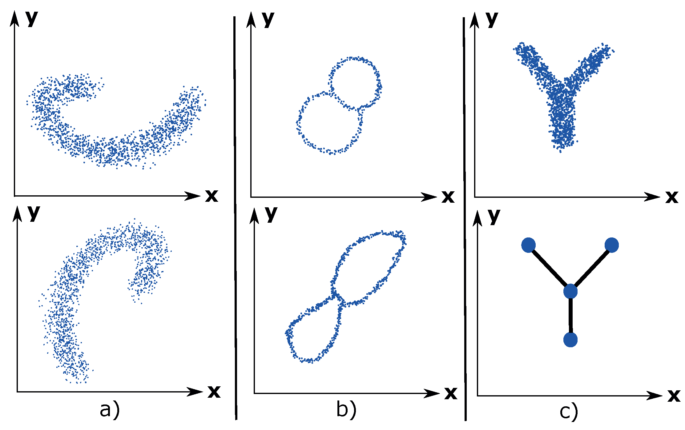
Figure 1a illustrates the coordinate invariance property for an arbitrary dataset.
Deformation invariance: Topology explains shapes in a different way compared to geometry. For example, a sphere and a cube are identical (homeomorphic) according to topology. Likewise, a circle and an ellipse are identical. White noise is inherent to any dataset and can be considered as a deformation of the underlying distribution of the dataset. Due to the deformation invariance property, TDA is a suitable method for analyzing noisy datasets and thus presents a more accurate visualization of the underlying dataset. An example of deformation invariance is the figure-8-shaped dataset in
Figure 1b).
Compression: This property enables TDA to represent large datasets in a simple manner. Imagine having a dataset of millions of data points that have the shape of the letter Y. See
Figure 1c). The compression property enables TDA to approximate the dataset using 4 nodes, which contains the data points, and 3 edges, which express the relations between the data points. This property makes TDA highly scalable.
2.2. Mapper
M
apper has had success in a wide range of application areas, from medical research studying cancer, diabetes, asthma, and many more topics [
2,
3,
4,
5], and genetics and phenotype studies [
6,
7,
8,
9,
10], to hyperspectral imaging, material science, sports, and politics [
11,
12,
13,
14]. Of note for our approach are, in particular, the contributions to cancer, diabetes, and fragile X syndrome [
2,
3,
6] where M
apper was used to extract new subgroups from a segmentation of the input space.
M
apper [
55] is an algorithm that constructs a graphical (more generally a simplicial complex) model for a point cloud dataset. The graph is constructed systematically from some well defined input data. It was defined by [
55], and has been shown to have great utility in the study of various kinds of datasets, as described previously. It can be viewed as a method of unsupervised analysis of data, in the same way as principal component analysis, multidimensional scaling, and projection pursuit can, but it is more flexible than any of these methods. Comparisons of the method with standard methods in the context of hyperspectral imaging have been documented in [
11,
12]. An illustration of M
apper is shown in
Figure 2.
Let X be a finite metric space. The following steps construct the Mapper complex:
Choose a collection of maps , or equivalently some . These are usually chosen to be statistically meaningful quantities such as variables in the dataset, density or centrality estimates, or outputs from a dimensionality reduction algorithm such as PCA or MDS. These are usually referred to as lenses or filters.
Choose a covering of : an overlapping partition of possible filter value combinations.
Pull the covering back to a covering of X, where .
Refine the covering to a covering by clustering each .
Create the nerve complex of the covering : as vertices of the complex we choose the indexing set of , and a simplex is included if . If we are only interested in the underlying Mapper graph, it suffices to add an edge connecting any two vertices whose corresponding sets of data points share some data point.
One fundamental inspiration to the Mapper algorithm is the Nerve lemma.
Nerve Lemma: If X is some arbitrary topological space and is a good cover with index i then , where has simplex if and only if .
Here, a good cover is a cover such that is either contractible or empty for all
If the function f, and the covering are chosen well enough, the covering may well be a good cover, in which case the topology of the Mapper complex reflects the topology of X itself.
The filters act as measures of enforced separation: data points with sufficiently different values for the filter function are guaranteed to be separated to distinct vertices in the Mapper complex, while the nerve complex construction ensures that connectivity information is not lost in the process.
In practice, one particular covering construction has gained widespread use. It creates axis-aligned overlapping hyperrectangles by the following process:
For each , select (1) a positive integer and (2) a positive real number , with .
For each filter where , let and denote the minimum and maximum values taken by , and construct the unique covering of the interval by subintervals of equal length . For the interior intervals in this covering, enlarge them by moving the right and left hand endpoints to the right and the left, respectively. For the leftmost (respectively rightmost) interval, perform the same enlargements on the right (respectively left) hand endpoints. Denote the intervals we have created by , from left to right.
Construct the covering of X by all “cubes” of the form where . Note that this is a covering of X by overlapping sets.
More detailed expositions can be found in [
55,
56].
M
apper has several implementations available: Python M
apper [
57], Kepler M
apper [
58], and TDAM
apper [
59] are all open source, while Ayasdi Inc. (
http://ayasdi.com) provides a commercial implementation of the algorithm.
For our work we are using the Ayasdi implementation of Mapper.
2.3. FiFa: The General Case
In summary, the FiFa method is based on the following steps:
Create a Mapper model that uses a measure of prediction failure as a filter.
Classify hotspots of prediction failure in the Mapper model as distinct failure modes.
Use the identified failure modes to construct a model correction layer or to provide a guidance for model refinement.
The process can be seen as classifying failure modes by analyzing the fibres of the map that goes from the input space to the observed prediction failure—analyzing the fibers of failure.
2.3.1. Mapper on Prediction Failure
The filters in the Mapper function have the effect of ensuring a separation of features in the data that are separated by the filter functions themselves. In the setting of prediction failures, we leverage this feature to create Mapper models that enforce a separation on prediction errors, allowing the subsequent analysis to identify contiguous regions of input space with consistent and large prediction errors.
We name the process of using Mapper with prediction error as a filter in order to classify prediction failures as the fibers of failure method, and the resulting Mapper model we name a FiFa model.
2.3.2. Extracting Subgroups
Subgroups of the F
iF
a model with tight connectivity in the graph structure and with homogeneous and large average prediction failure per component cluster provide a classification of failure modes. These can be selected either manually or using a community detection algorithm. When extracting subgroups manually, the intent is always to extract groups wherein the prediction error is as close to constant as possible. For community detection, most existing work in this area should be applicable. The M
apper implementation we are using uses a grouping method based on agglomerative hierarchical clustering (AHCL) [
60,
61] and Louvain modularity [
62]. This grouping algorithm used by Ayasdi is patented [
63].
2.3.3. Quantitative: Model Correction Layer
Once failure modes have been identified, one way to use the identification is to add a correction layer to the predictive process. This is done by using a classifier to recognize input data similarly to a known failure mode, and by adjusting the predictive process output according to the behavior of the failure mode in available training data.
Train classifiers. For our illustrative examples, we demonstrate several “one versus rest” binary classifier ensembles where each classifier is trained to recognize one of the failure modes (extracted subgroups) from the Mapper graph.
Evaluate bias. A classifier trained on a failure mode may well capture larger parts of test data than expected. As long as the space identified as a failure mode has consistent bias, it remains useful for model correction: by evaluating the bias in data captured by a failure mode classifier we can calibrate the correction layer.
Adjust model. The actual correction on new data is a type of ensemble model, and has flexibility on how to reconcile the bias prediction with the original model prediction—or even how to reconcile several bias predictions with each other. In the example cases used in this paper, we showcase two different methods for adjusting the model: on the one hand by replacing a classifier prediction with the most common class in the observed failure mode, and on the other hand by using the mean error as an offset.
Note on Type S and Type M errors.
The authors of [
64] argue that for model evaluation, the distinction between Type I and Type II errors is less useful than a distinction between Type S (sign) and Type M (magnitude) errors. Drawing on these error types, we will structure our quantitative adjustments in the continuous case with careful attention paid to Type S errors.
To elaborate, if a failure mode is found to have consistently overly-high predictions, adjusting with the observed bias of the failure mode is likely to produce a better prediction for all points in the failure mode. However, a failure mode that has errors in both directions will exacerbate some errors when adjusting for bias in that failure mode.
We apply this philosophy primarily in our design of model correction layers: by restricting bias corrections to cases that have large (handling Type M) and consistent (handling Type S) errors, we can rely on a bias correction to improve prediction for all the observations it corrects.
2.3.4. Qualitative: Model Inspection
Identifying distinct failure modes and giving examples of these is valuable for model inspection and debugging. Statistical methods, such as Kolmogorov–Smirnov (KS) testing, can provide measures of how influential any one feature is in distinguishing one group from another and can give notions of what characterizes any one failure mode from other parts of input space. With examples and distinguishing features in hand, we can go back to the original model design and evaluate how to adapt the model to handle the failure modes better.
2.4. Statistical Modeling
We have chosen specific statistical measures to evaluate prediction errors for the two examples, described here in
Section 2.4.1. For the subsequent qualitative analysis (as described in
Section 2.3.4 above), we use the Kolmogorov–Smirnov statistic, described in
Section 2.4.2, to determine the pairwise degree of dissimilarity between distributions.
2.4.1. Performance Metrics
The metrics used to evaluate the improved performance using the FiFa corrective layer for the EAF EE prediction model will be the coefficient of determination, , and the regular error function, .
The regular error function is preferable over the absolute error function, since an overestimation differs from an underestimation in a practical EAF process context.
The regular error is defined as:
where
is the true value,
is the predicted value, and
.
The coefficient of determination is a measure of how well the statistical model approximates the true data points. It is a function of the total sum of squares,
, and the residual sum of squares,
.
where
and
.
is the mean value of
.
For the MNIST prediction model, which is a classifier-type statistical model, we used the prediction accuracy as a performance metric. MNIST contains 10 classes and the prediction accuracy defined as the fraction of the correctly predicted images in the set of images.
where
N is the number of images in the image set,
,
is the predicted class, and
is the true class.
2.4.2. Kolmogorov–Smirnov (KS) Statistic
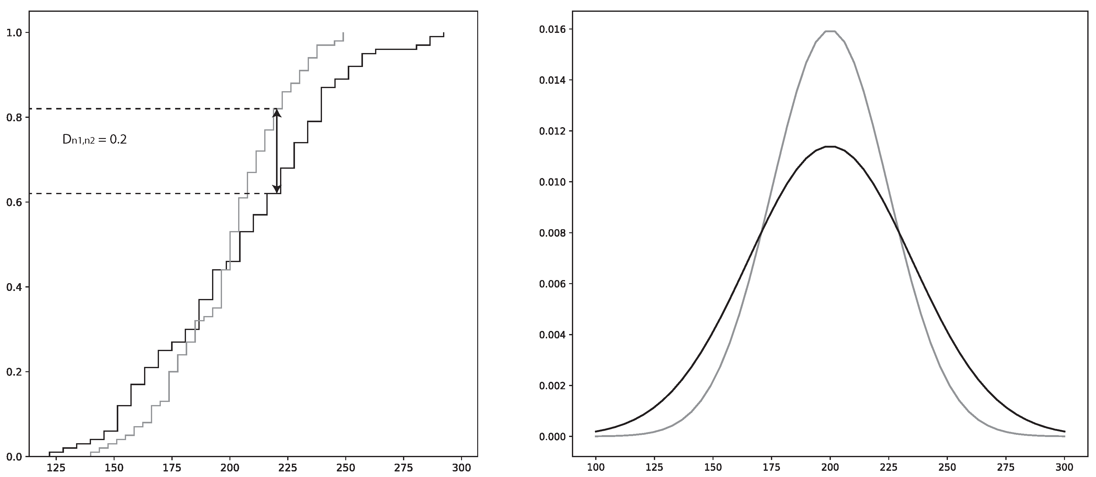
The KS statistic can be used to measure dissimilarity between the cumulative distribution functions (CDF) of two samples. This is specifically known as the two-sample KS test and gives the maximum difference between the two distributions [
65]. The KS-test is a non-parametric statistical test which is favorable, since many of the parameters governing the EAF process are of varying classes of distributions [
66].
To perform a KS test, the KS-value has to be calculated by using the null hypothesis, ; i.e., that the two samples have the same distribution. The confidence level, i.e., p-value, is the probability that the two samples come from the same distribution. The KS-value can have values in the range , where 0 indicates that the distributions of respective sample are identical and where 1 indicates that the distributions are totally different. Hence, a low p-value in tandem with a high KS-value is a strong indicator that the two samples are different
The two-sample KS test calculation proceeds as follows:
where
and
are the two distribution functions.
and
are the number of instances in each sample from the two distributions, respectively.
x is the total sample space. sup is the supremum function.
is illustrated in
Figure 3.
is rejected if the following condition is satisfied:
where
is a pre-determined significance level and
c is the threshold value calculated using
and the cumulative KS distribution [
67].
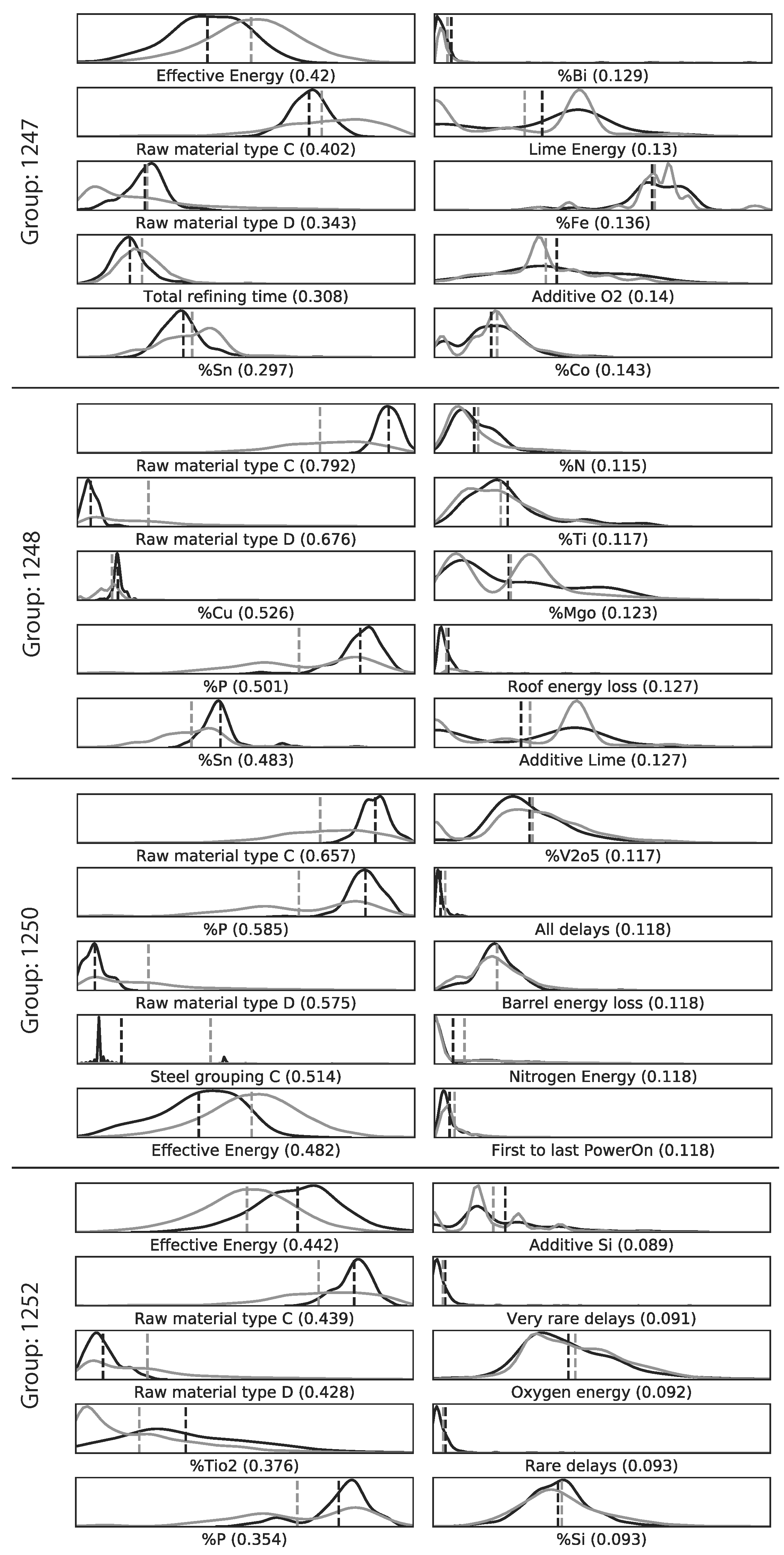
The KS-test is used by FiFa to present the variables that separate a specific error group from the rest of the data. Thus, one of the samples will be from the specific error group and the other sample will be from the rest of the data. Using the KS-test on each variable will show the variables whose distributions are the most different between the two samples.
The main drawback of the KS-test is that it reduces the difference between the two distributions to the point of maximum difference of the CDF. Hence, the maximum difference may not be representative over the complete distribution space. To combat this shortcoming in the analysis, the plotted distributions of the two samples will be provided as a complementary tool.
2.5. MNIST Data with Added Noise
As a first example, we have chosen to work with the MNIST [
68] database of handwritten digits and used the methods from the MNIST-C [
69] test set. In order to provoke prediction failures to analyze, we have used the MNIST database as-is for training purposes, but have created noisy samples for evaluations, using the
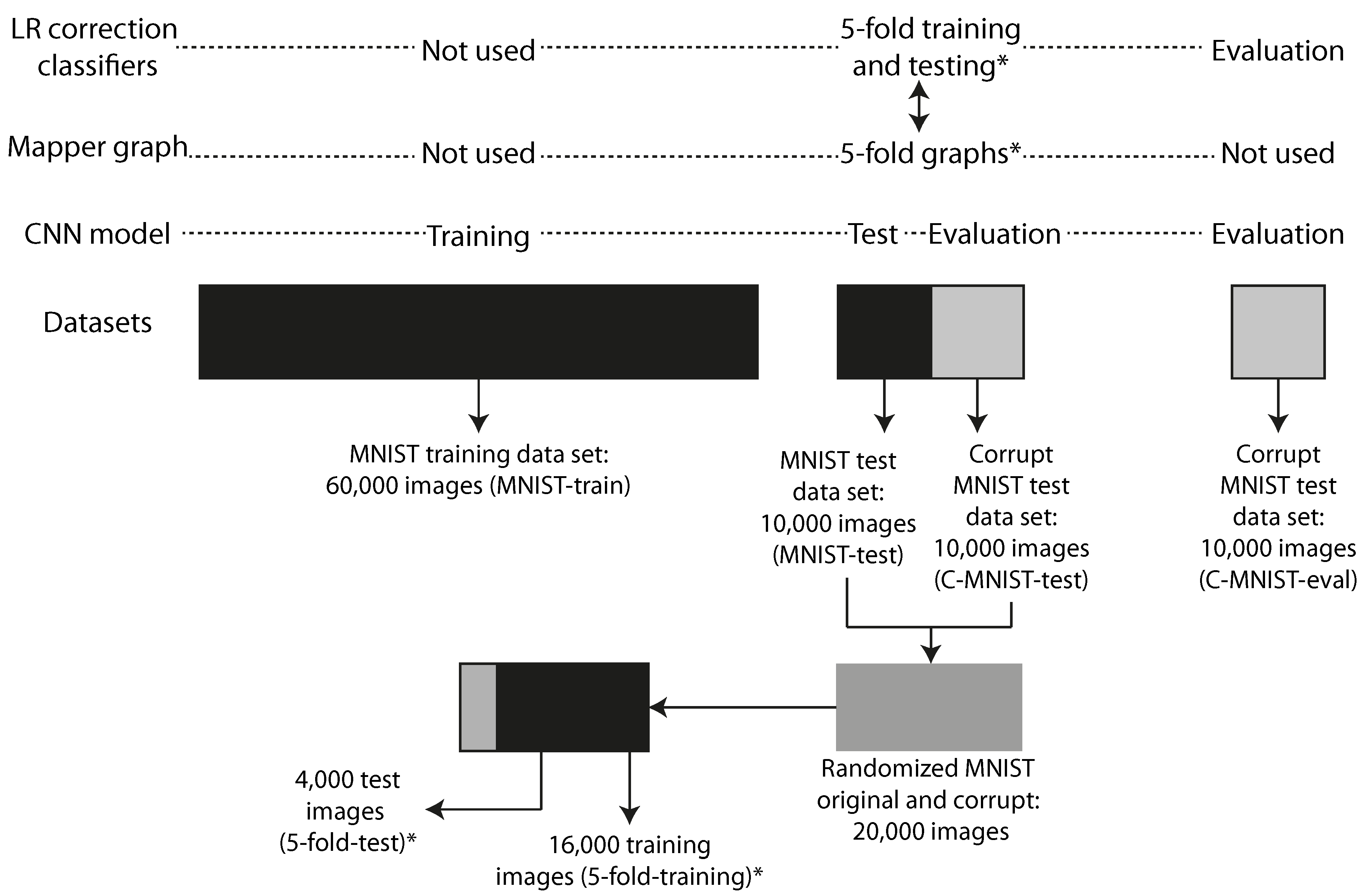
impulse noise method used in MNIST-C: The noise corruption was created by introducing random binary flips on 25% of the pixels of each of the images in the test portion of the database. The predictive model was trained exclusively on clean MNIST images, but then evaluated on its ability to generalize to the impulse noise corrupted images we created. Figure 5 illustrates how the different datasets are related in the experiments.
2.6. Electric Arc Furnace
The EAF process accounted for 28% of the total world production of steel, on average, between 2008 and 2017, and is therefore the second most common melting furnace in steelmaking [
70]. It is a resource and energy intensive process, where electrical energy (EE) can account for up to 66% of the total energy input. See
Table 1.
The amount of EE consumed by the EAF sheds light on the potential to optimize the consumption of EE. The gain is twofold. First, the cost for producing steel will be reduced in tandem with a reduced EE consumption. Second, the environmental impact will be reduced since less energy is needed for each batch of produced steel. Numerous studies utilizing statistical models (machine learning) to optimize the EE of the EAF have previously been conducted. A review on the subject concluded that non-linear statistical models have significantly better performance over linear statistical models when predicting the EE of the EAF [
76]. The main reason for this is that the EAF process itself is subjected to numerous non-linear impositions governed by its physicochemical nature, and delays imposed by downstream and upstream processes. Delays are also imposed by unpredictable events, such as equipment failures. This has been discussed in depth in previous research [
66,
76]. Hence, the choice of a statistical modeling framework has to be adapted to the non-linearity of the process.
However, non-linear statistical models are almost impossible to analyze due to their complex mapping of the input data to the output data. This hampers the process engineers’ understanding, and therefore trust, in the model. It is always of paramount importance that the process operators trust the tools that are used to guide the process towards minimum operating costs and environmental impacts. Previous tools that have been applied to these types of statistical models are permutation feature importance and SHAP [
53,
66]. However, these tools only provide the relative importance of each feature for each prediction, while F
iF
a provides subgroups where the error by the modes is unusually large. Hence, F
iF
a could prove to be a valuable tool in the arsenal of interpretable machine learning methods for the steel process engineers.
2.7. Selected Models for Analysis
In order to produce examples of F
iF
a in action, we have produced two distinct predictive models—one for each dataset described in preceding sections. Specifications about the software used in the experiments can be viewed in
Table A3.
2.7.1. CNN Model Predicting Handwritten Digits
We created a CNN model with a topology shown in
Figure 4. The topology and parameters were chosen arbitrarily with the only condition: that the resulting model performed well on the original MNIST test dataset. The activation functions was “softmax” for the classification layer and “ReLU” for all other layers. The optimizer was Adadelta with learning rate
,
, and
[
77]. We trained the model on 60,000 clean MNIST training images (MNIST-train) through 12 epochs and tested it on 10,000 clean MNIST images (MNIST-test). The accuracy on the test-set of 10,000 clean MNIST images was 99.05%. We created 10,000 corrupt MNIST images (C-MNIST-test) using 25% random binary flips on the clean test images. The code is available in the Supplementary material [
78]. The accuracy on the corrupt MNIST images was 40.45%. The datasets used to train, test, and evaluate the CNN model are illustrated in
Figure 5.
2.7.2. ANN Model Predicting the EE Consumption of an EAF
The chosen model framework was the artificial neural network (ANN), which is commonly used for modeling non-linear problems and has previously been used to model the EE consumption of the EAF [
66,
76]. A grid-search was conducted to find the optimal numbers of hidden layers and hidden nodes, and the most optimal delay variable from a set of 5 variables representing the delays imposed on the process. See
Table A1 and
Table A2 in the
Appendix A for details regarding the grid-search. The variables used in the selected model are shown in
Table 2. The variables were chosen based on their respective contributions to the increase or reduction in EE from a physicochemical perspective. In order to investigate the stability of each set of parameters, a total of 10 model iterations were conducted for each grid-search parameter setup. The strategy employed to select the best model was to pick the model with the highest mean
and the difference between maximum
and minimum
of less than 0.05. See
Appendix A and the software used to create the models.
The selected model parameters using the grid-search had 1 hidden layer with 20 hidden nodes. The delay variable was “all delays”. The rest of the variables are shown in
Table 2.
2.8. FiFa on the MNIST Model
2.8.1. Quantitative
To create the Mapper graph we used the following approach:
Filters: Principal component 1, probability of Predicted digit, probability of ground truth digit, and ground truth digit. Our measure of predictive error is the probability of ground truth digit. By including the ground truth digit itself, we separate the model on ground truth, guaranteeing that any one one failure mode has a consistent ground truth that can be used for corrections.
Metric: Variance normalized euclidean.
Variables: 9472 network activations: all activations after the dropout layer that finishes the convolutional part in the network and before the softmax layer that provides the final predictions. These are the layers with 9216, 128, and 128 nodes displayed in
Figure 4.
Instances: We used 16,000 data points (5-fold-training), and a selection of 4 of the 5 folds from a randomized mix of the MNIST-test and C-MNIST-test datasets. See
Figure 5 for an illustration.
We purposely omitted the activations from the Dense-10 layer as input variables because of the direct reference to the probabilities for both the ground truth digit and the predicted digit.
The following variables were used in filter functions or in the subsequent analysis, but were not used to create the FiFa model:
Ten activations from the Dense-10 layer, which consist of the probabilities for each digit, 0–9.
Seven-hundred and eighty-four pixel values representing the flattened MNIST image of size 28 × 28 × 1.
Six variables: prediction by the CNN model, ground truth digit, corrupt or original data (binary), correct or incorrect prediction (binary), probability of the predicted digit (highest value of the Dense-10 layer), and probability of the ground truth digit.
Hence, the total number of variables in our analysis was 10,272.
From partitioned groups in the Mapper graph, we retain as failure modes those groups that have at least 15 data points and have less than 99.05% correct predictions, which is the accuracy of the CNN model on the original MNIST test data (MNIST-train). We then trained logistic regression classifiers in a one versus rest scheme on each group using the same 16,000 data points (5-fold-training) used to create the Mapper graph. (The one versus rest scheme is an ensemble method for converting a binary classifier to a classifier able to work on more than two groups. For each group, a separate classifier is trained to distinguish that group from the rest of the data. To use the classifier ensemble, the individual classifier results are combined to form a classification of the data.) We used logistic regression (LR) models with the following parameters. Penalty function: . Regularization parameter . The regularization term that corrects the most number of MNIST images on the 5-fold-test dataset will be used.
Using the best performing model ensemble, we evaluated each model on a second dataset, called C-MNIST-eval, which consisted of 10,000 new corrupt images using 25% binary flips on the original MNIST test dataset (C-MNIST-test). The same impulse noise method was used both to produce test images to evaluate the performance of the CNN as input to the M
apper process, and for the final evaluation of the performance of the combined CNN + correction layer model. Hence, we used the same noise pattern as the corrupt images used for testing the CNN model. See
Section 2.7.1 for details regarding the noising methodology.
As we trained the classifiers on groups containing many wrong predictions, it was expected that the classifiers would classify member points with wrong predictions on the test datasets. Hence, we offset the predicted digits in the 5-fold-test and the C-MNIST-eval datasets with the ground truth digit of the group each classifier was trained on. We attempted to exploit the consistent bias of the classifiers to improve the accuracy of the now combined CNN and classifier ensemble.
The F
iF
a procedure was repeated using five different splits of the training and test datasets in order to mitigate the effects of selection bias when creating the M
apper graph. This procedure is equivalent to the 5-fold cross-validation methodology in the field of machine learning used to mitigate the effects of selection bias. Hence, each of the 5 M
apper graphs were created using 5 different selections of 16,000 (5-fold-training) of the available 20,000 data points consisting of 10,000 test MNIST images (MNIST-test) and 10,000 corrupt MNIST test images (C-MNIST-test) using 25% binary flips. See
Section 2.7.1 for details regarding the noising methodology. The rest of the 4000 data points (5-fold-test) were used to evaluate the ensemble correction classifier. See
Figure 5 for a detailed illustration on how the datasets were created and how they are related.
2.8.2. Qualitative
We chose to study the digit 5. From the M
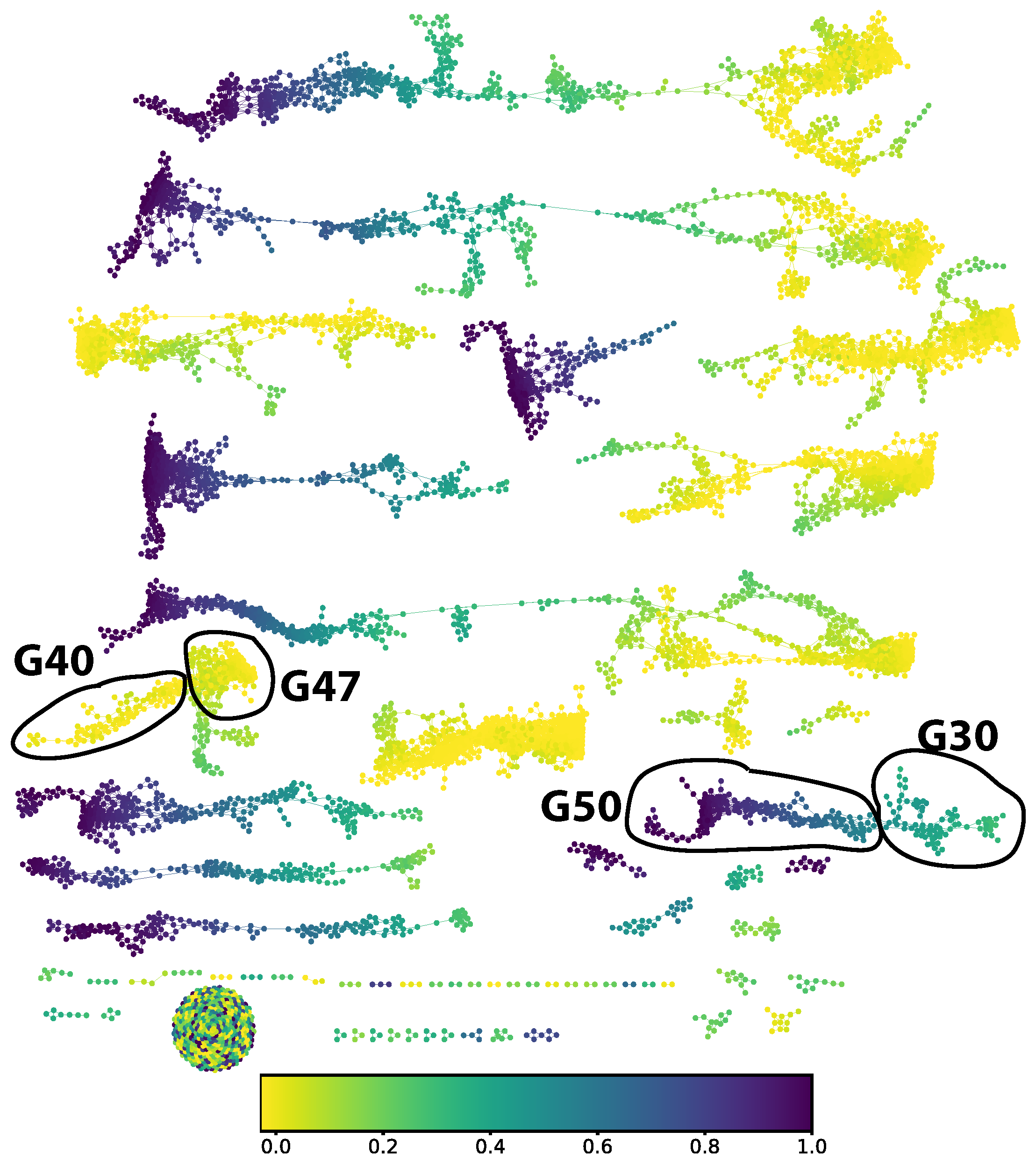
apper graph (in
Figure 6) the part corresponding to a ground truth digit 5 decomposes into two connected components. We split out four groups of approximately locally constant prediction error: groups 30, 40, 47, and 50 in the numbering scheme generated by the community finding algorithm used.
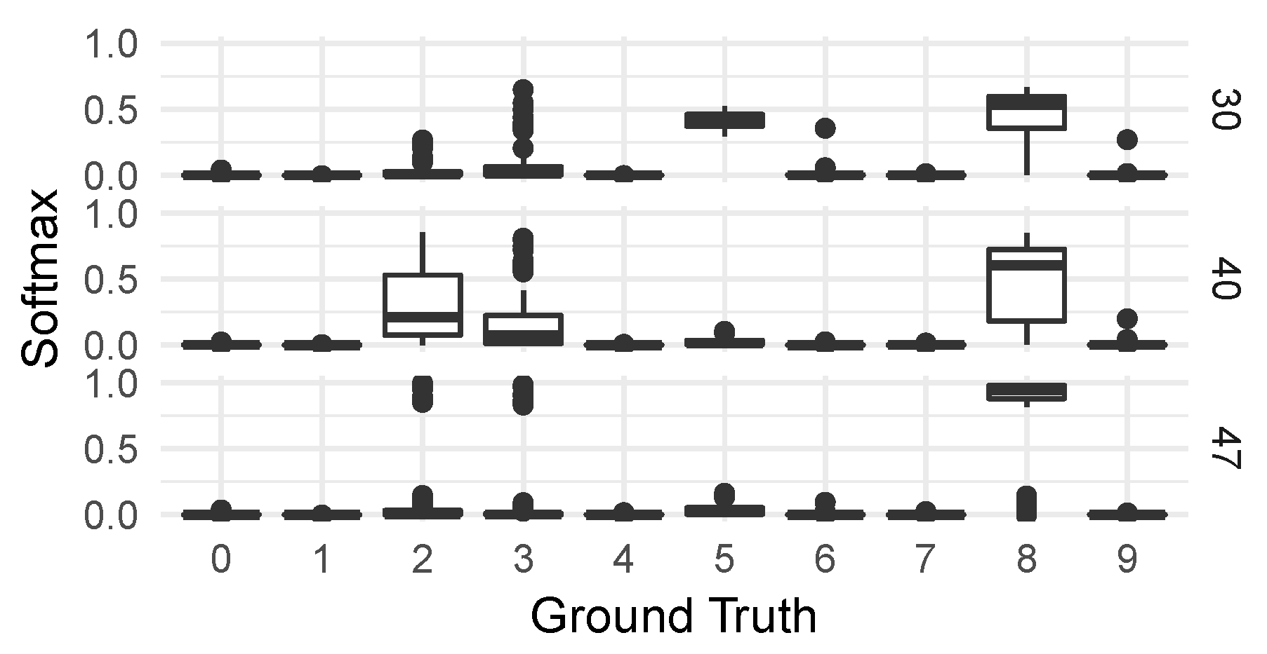
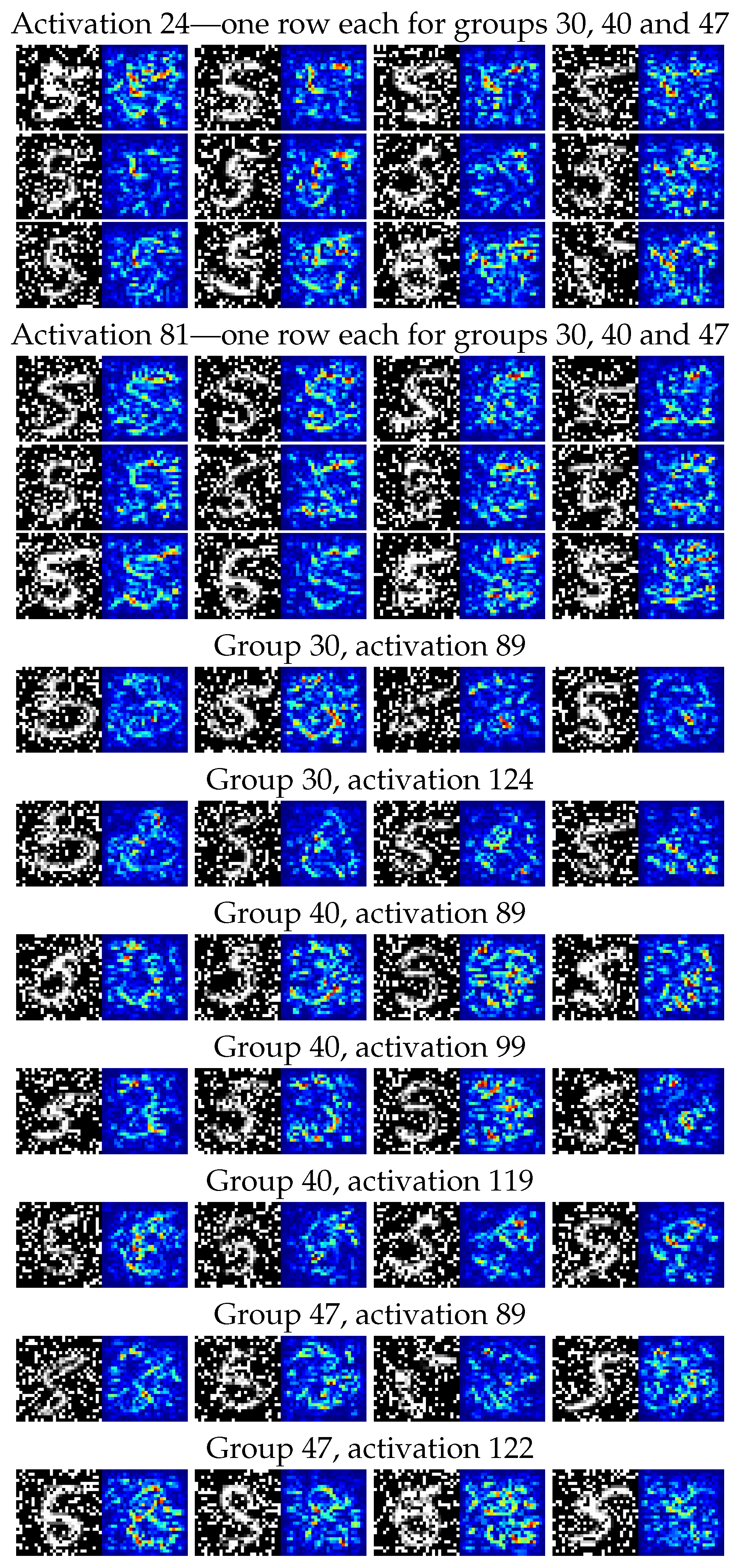
For these four groups of observations, we then generated on the one hand the distributions of classifications from the CNN classifier—seen in Figure 8—and on the other hand a collection of saliency maps [
79] to allow us to inspect the different responses of individual neural network activations to digits in the various groups. We chose activations to inspect by looking for the highest KS-score when comparing each group to the correctly classified group 50.
2.9. FiFa on the EE Consumption Model
2.9.1. Quantitative
The following parameters were used to create the Mapper graph:
Filters: principal component 1, the model error, and the true EE consumption.
Metric: inter-quartile range (IQR) normalized euclidean.
Variables: forty-eight variables; see
Table A4.
Instances: the same data points, from 9533 heats, used to train the ANN model for predicting the EE consumption.
We trained an ensemble of logistic regression classifiers in a one versus rest scheme to identify membership in each of the groups with at least 15 data points in the training data. To make the corrected model more attractive to the model users, we restricted the resulting classifiers to ensure that each classifier would produce explainable adjustments. A classifier within the ensemble is qualified to adjust the test data if the following two conditions are satisfied:
The average error value imposed by the predicted data points on the training data, , must be of the same sign (type S error) as the average group error value, . This is to ensure that the errors of the predicted data points by each classifer are consistent with errors of the groups they have been trained to predict.
The error after adjustment of the group data cannot be worse than the group error,
.
This is to verify that the classifier can identify data points that have, on average, somewhat similar error values as the group it is trained to identify.
The mean error, standard error, max/min errors, and are recorded prior to the adjustment and after the adjustment of the test data. The number of test data points is 2384. The ensemble with the highest decrease in standard error and highest increase in for the test data is chosen. The following values for the logistic regularization parameters, C, were used to determine the best performing classifier ensemble: .
Unlike the CNN model case, the FiFa procedure was not repeated using five different splits of the training and test datasets. A model that is used in practice will predict on data that have been generated from a future point in time with respect to the data used to train the model. Hence, the test data must be selected in chronological order from the training data. Hence, a K-fold cross-validation does not make sense in this case.
2.9.2. Qualitative
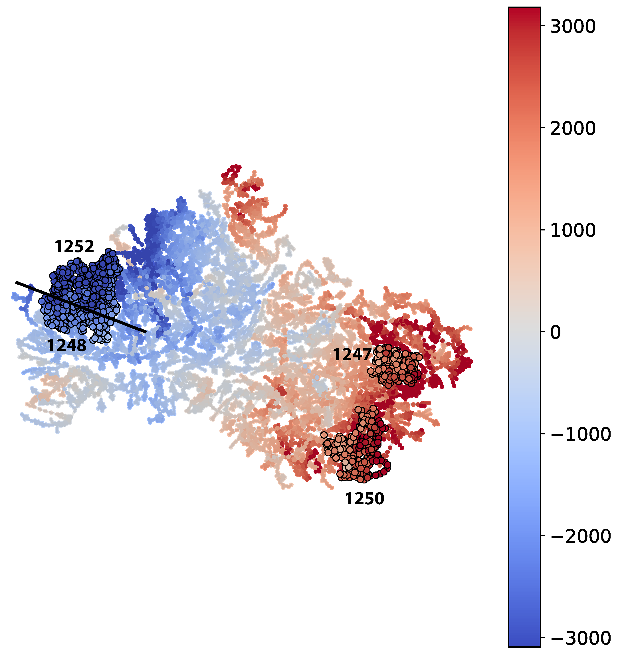
The qualitative inspection for each of the two Mapper graphs was conducted by selecting 4 of the largest groups. Two with the highest -values and two with the lowest -values. Each of the groups was then compared to the rest of the data points. The 5 variables with the highest KS-values and the 5 variables with the lowest KS-values were analyzed further using EAF process expertise to determine reasons behind the model prediction error. The variables were selected if the p-value () was lower than 0.01 in order to reduce the probability of selecting a variable whose KS-value was due to randomness. In addition, the variables were prone to contain extreme outliers. Hence, the distribution plots for each variable are shown for all values that are not part of the 1000-quantile.
4. Conclusions
This study demonstrated the use of fibers of failure, FiFa, to analyze distinct error modes from two predictive processes; namely, the CNN model predicting handwritten digits from the MNIST dataset and the ANN model predicting the EE consumption of an EAF. This was accomplished by using both a quantitative and a qualitative approach on two diverse cases.
For the CNN model predicting corrupt MNIST images (C-MNIST-eval), a 18.43 percentage accuracy increase was achieved using the quantitative path. Using the qualitative approach, the CNN model was prone to misclassifying “5” as “8” for several selected failure modes. This is not surprising, since “5” and “8” have similar “traces” when written by hand. The results from the saliency maps provided further support to this conclusion by highlighting areas of higher and lower activations in the penultimate dense layer of the CNN model.
For the ANN model predicting the EE consumption of an EAF, the qualitative approach provided some interesting insights. It was found that two distinct raw material types out of the seven available raw material types were among the five variables with the highest KS-values for the four selected subgroups. This provides a guidance when improving future models with regard to the two raw material types. However, the quantitative approach did not significantly improve the EE predictions. The performance improvement was in magnitude comparable to added noise by measurement errors in the EAF process.
