
Effect of Elevation and Surface Roughness on Naturalness Perception of 2.5D Decor Prints


Abstract
:1. Introduction
2. Background
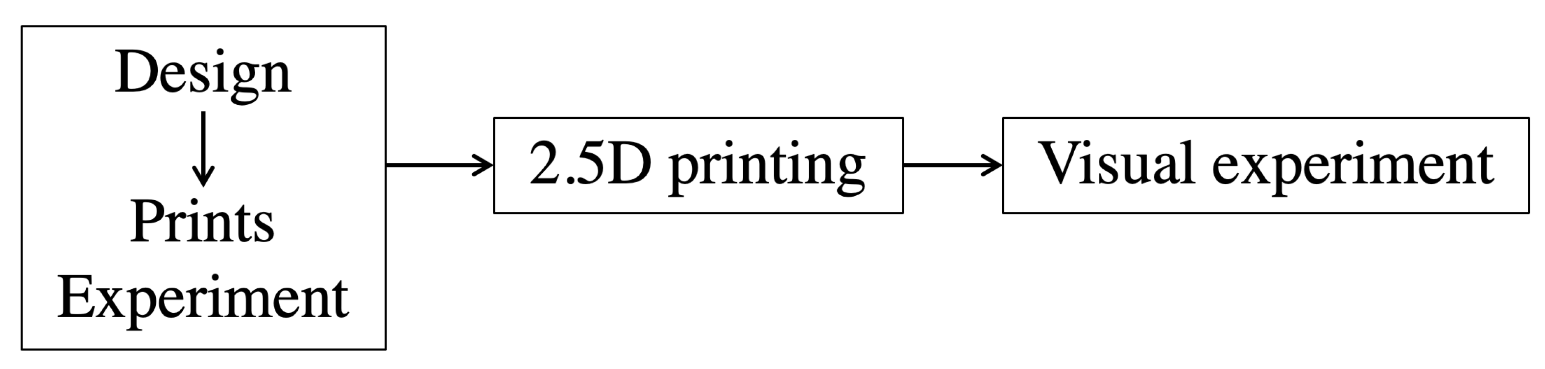
3. Methodology
3.1. Images
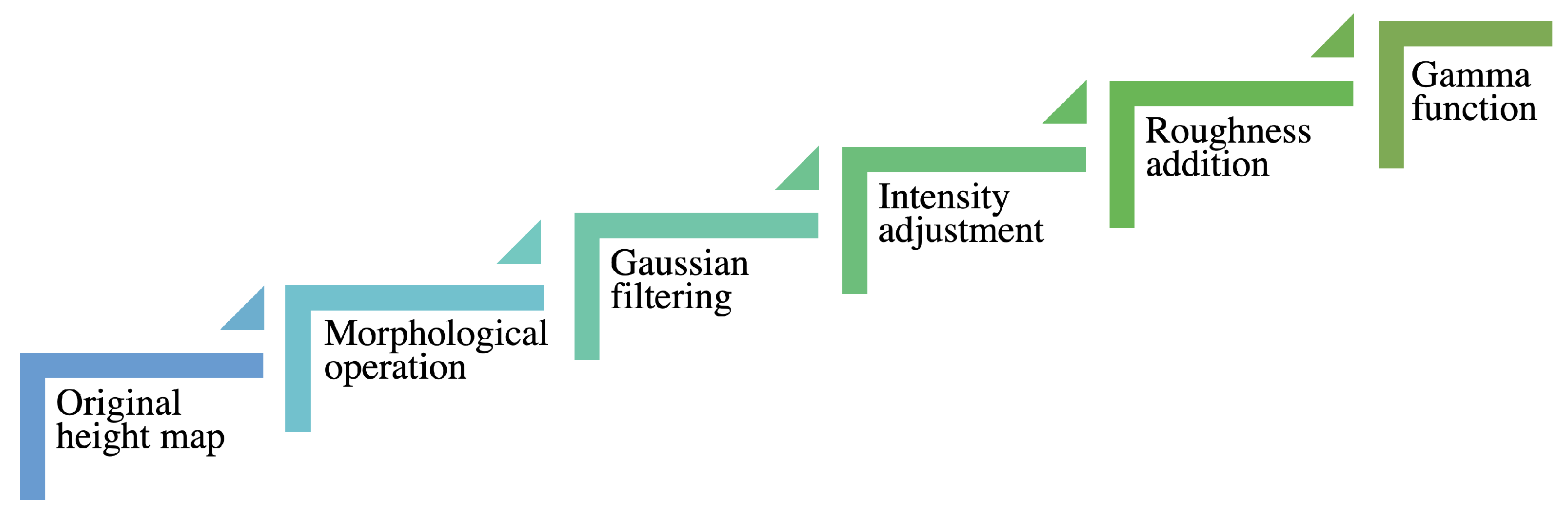
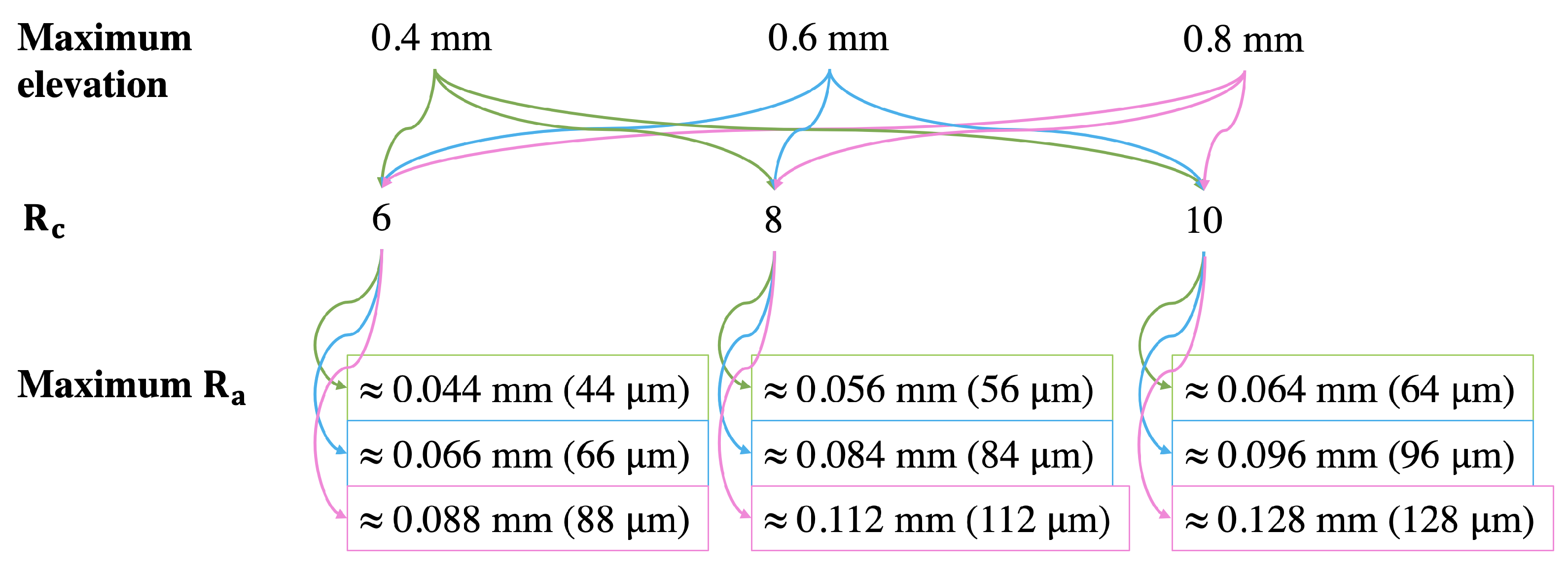
3.2. Elevation and Surface Roughness Levels
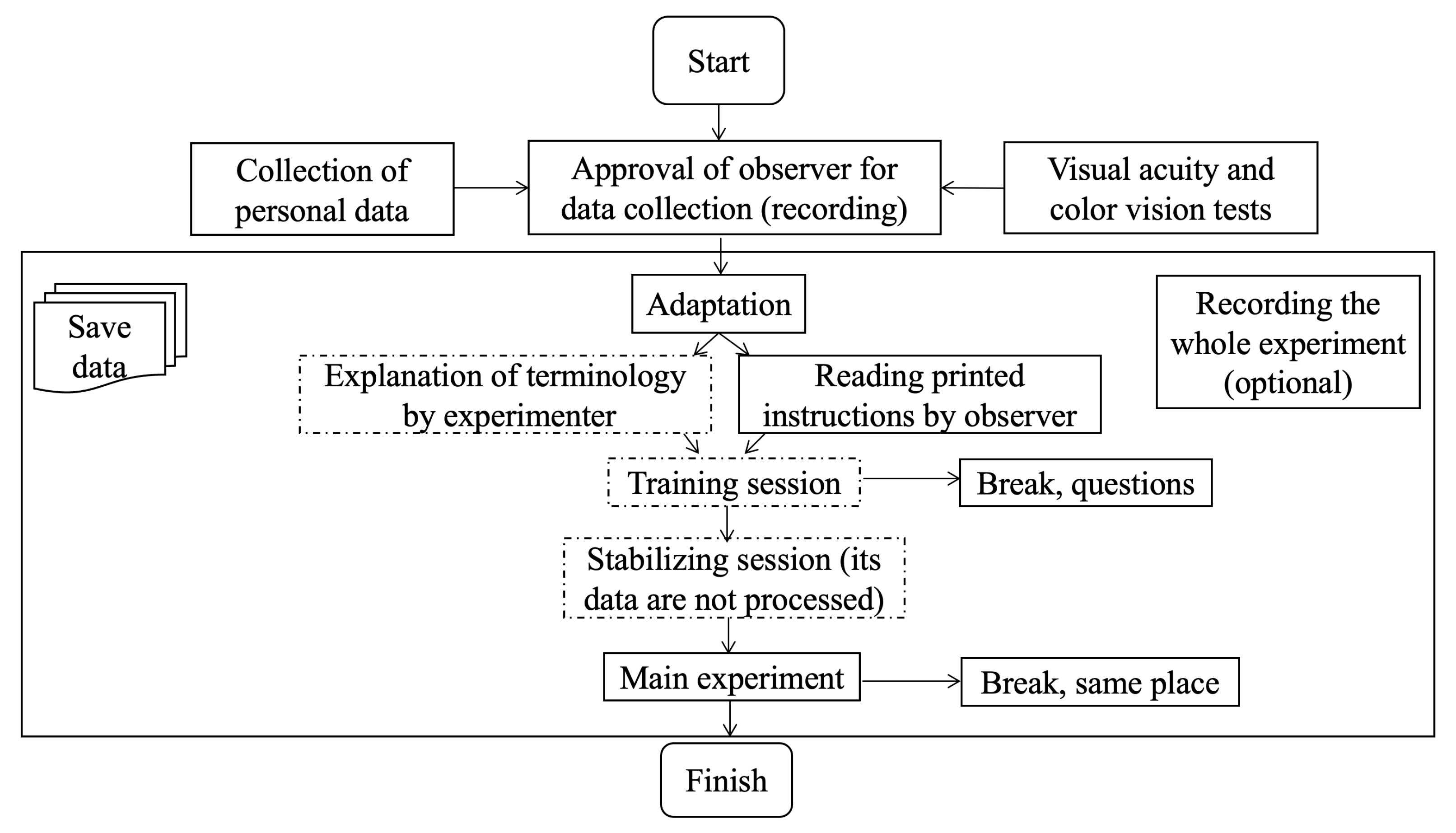
3.3. Visual Experiment
4. Results and Discussion
4.1. How People Define the Naturalness of 2.5D Prints?
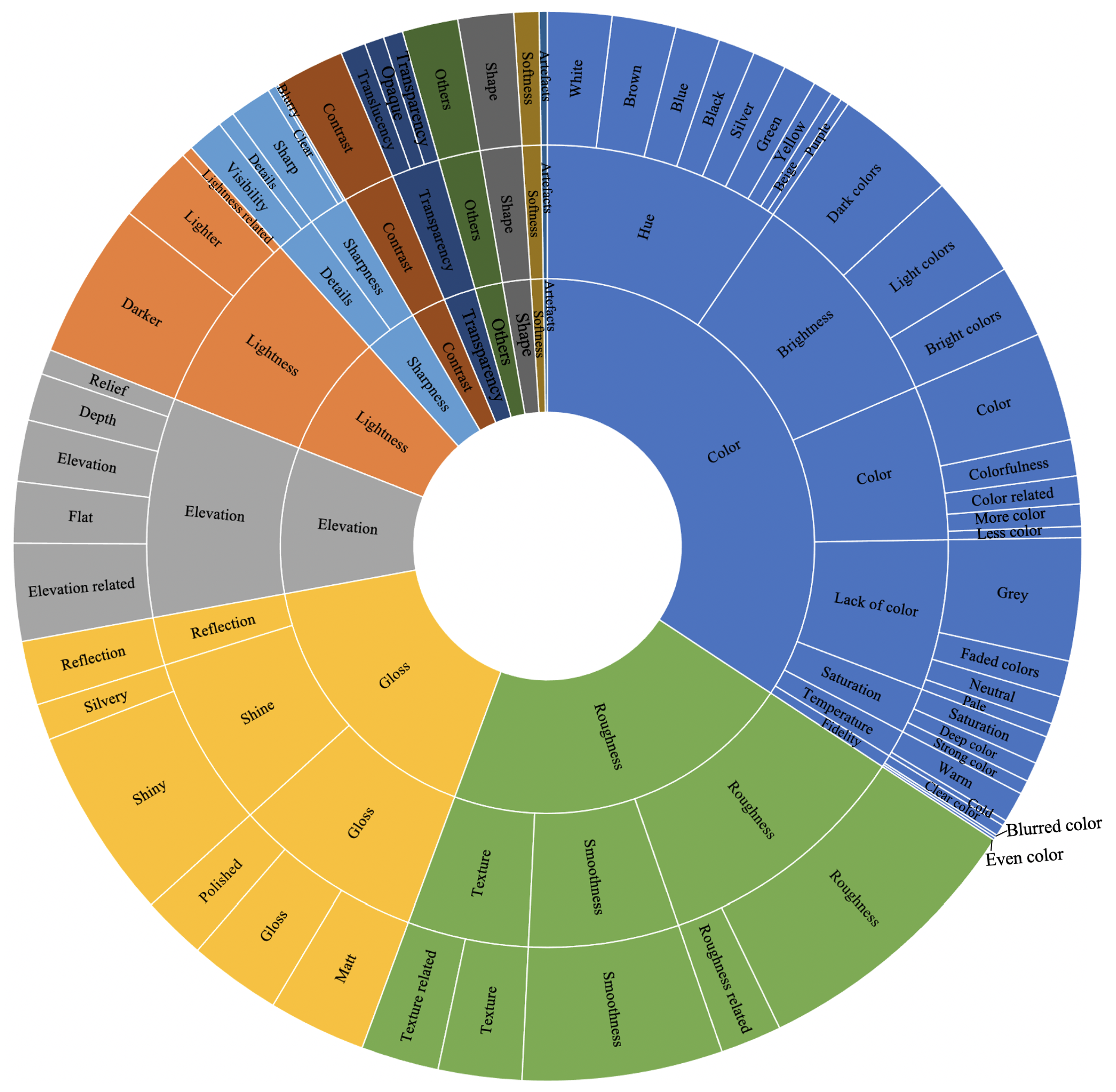
4.1.1. What Are the Perceptual Attributes Linked to the Naturalness of 2.5D Prints?
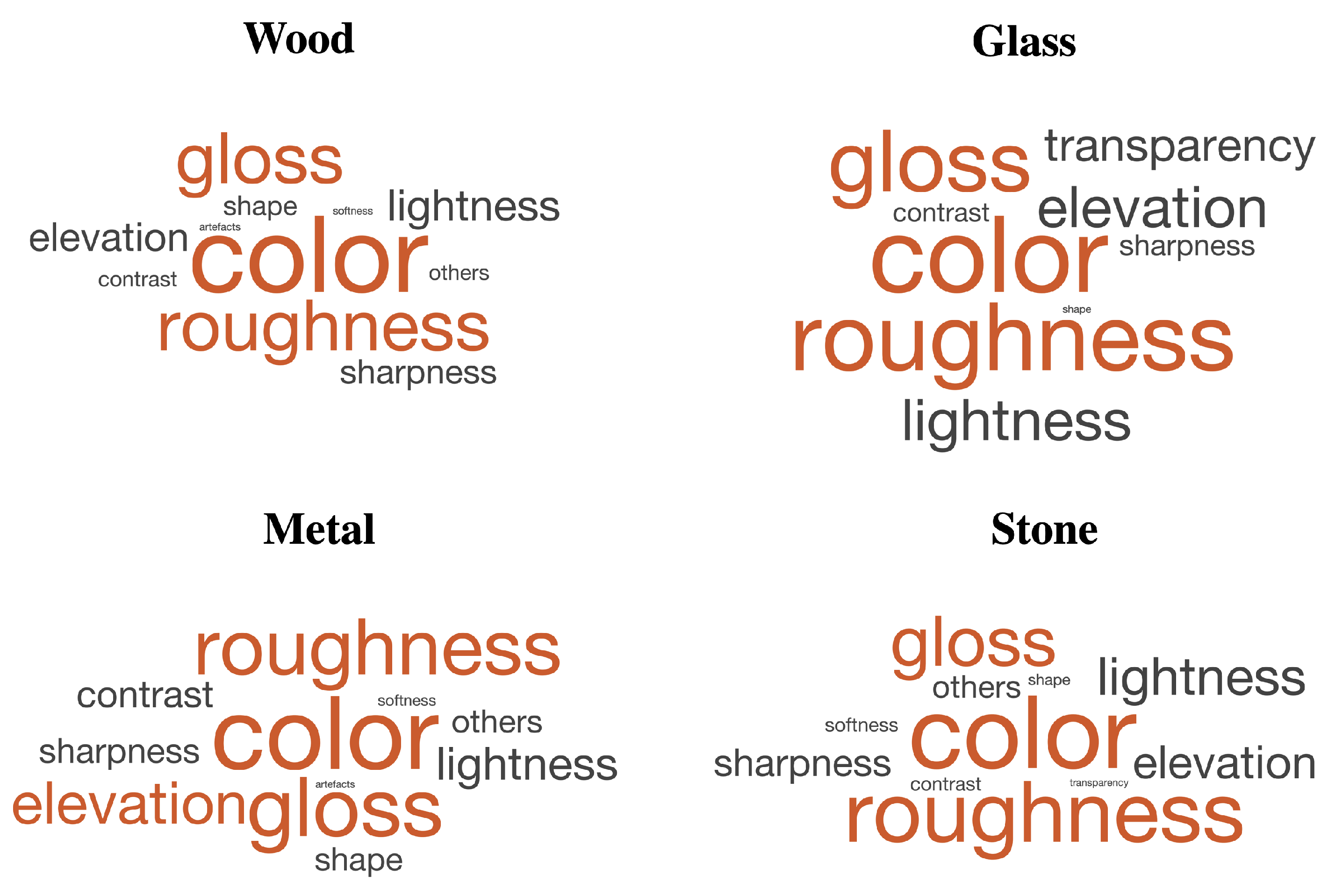
4.1.2. What Are the Most Used Perceptual Attributes Linked to the Naturalness of 2.5D Prints for Examined Material Categories?
4.1.3. How Variations in Elevation and Surface Roughness Can Be Linked with the Used Perceptual Attributes for the Naturalness of 2.5D Prints?
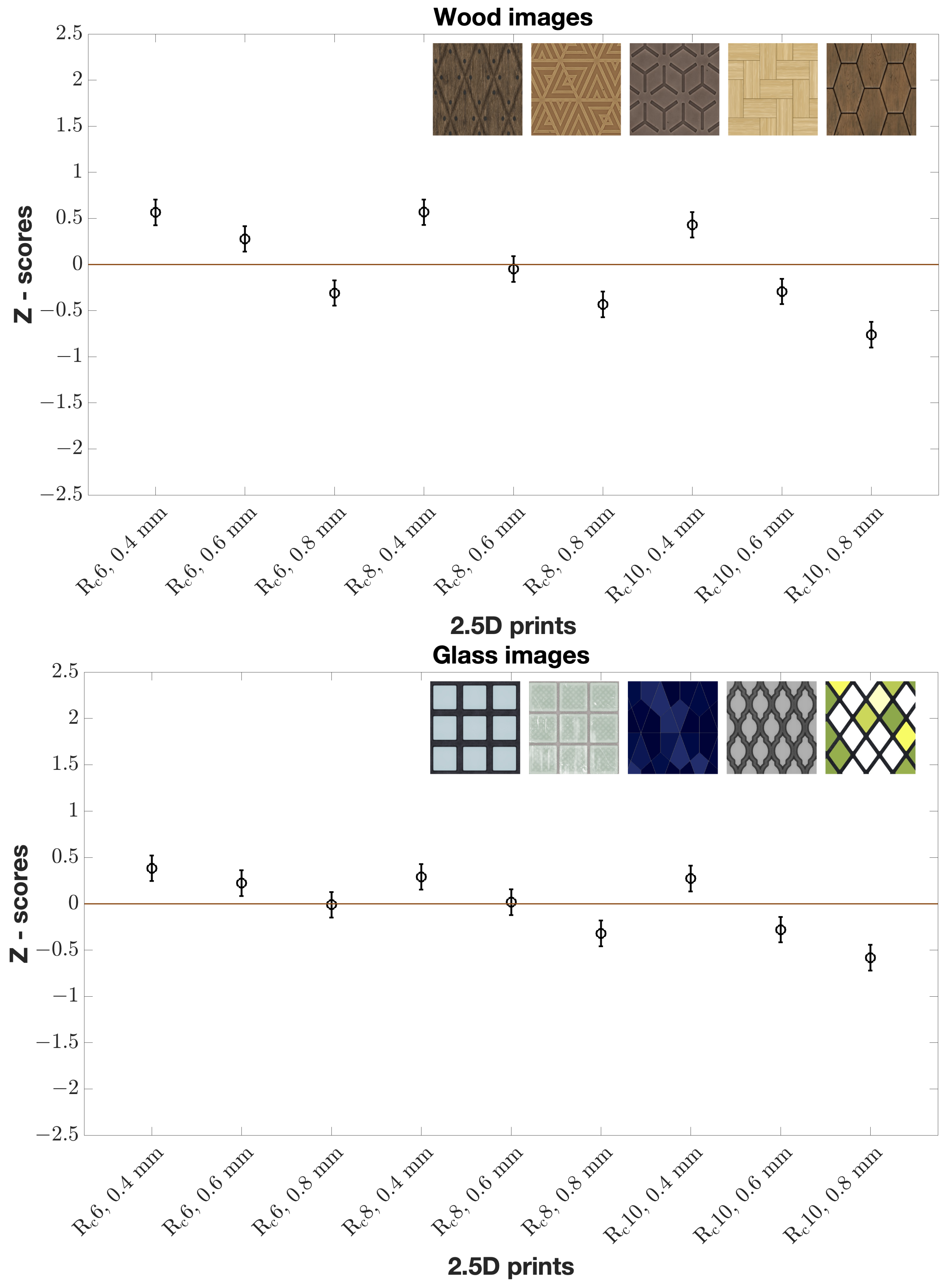
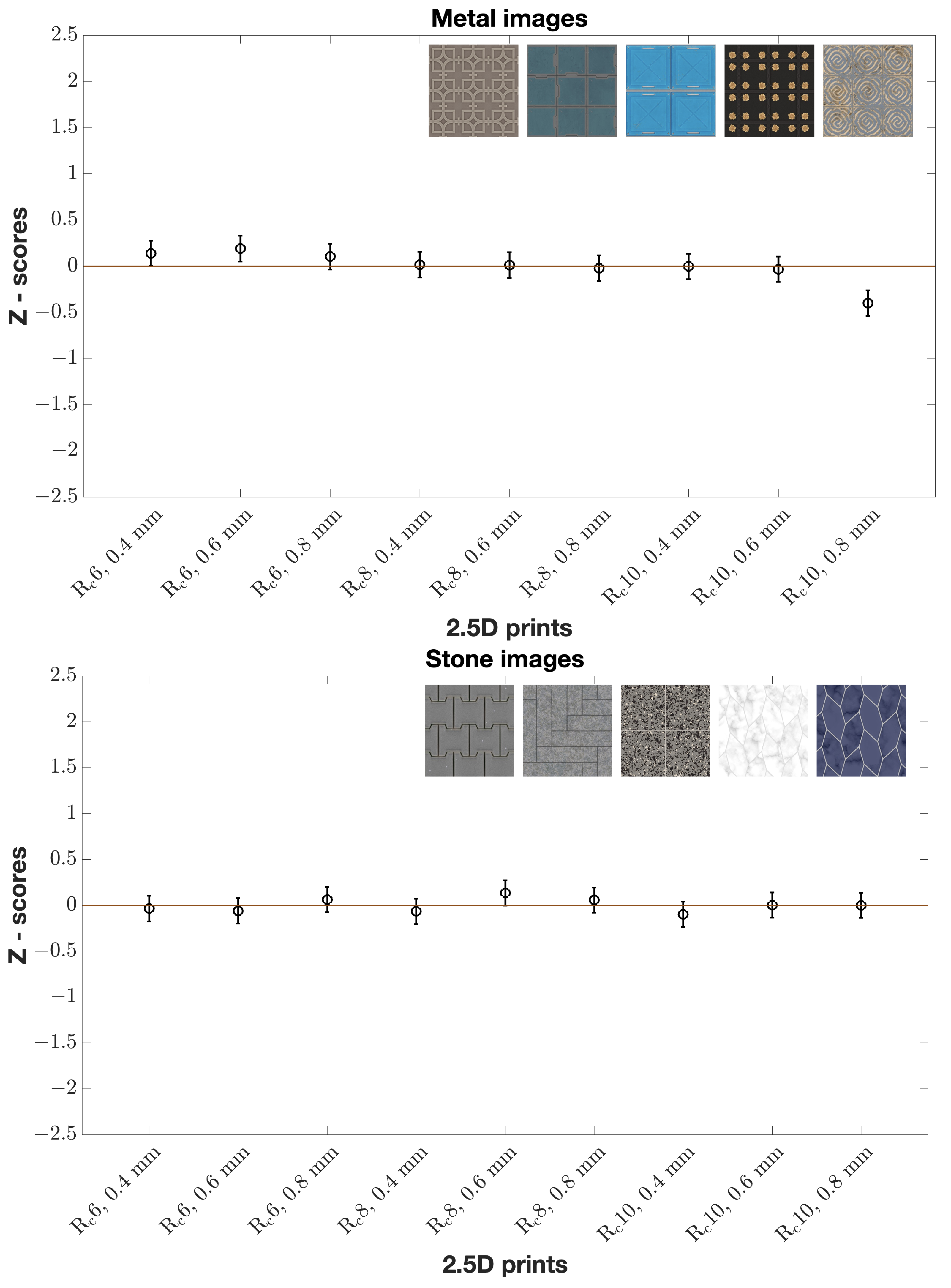
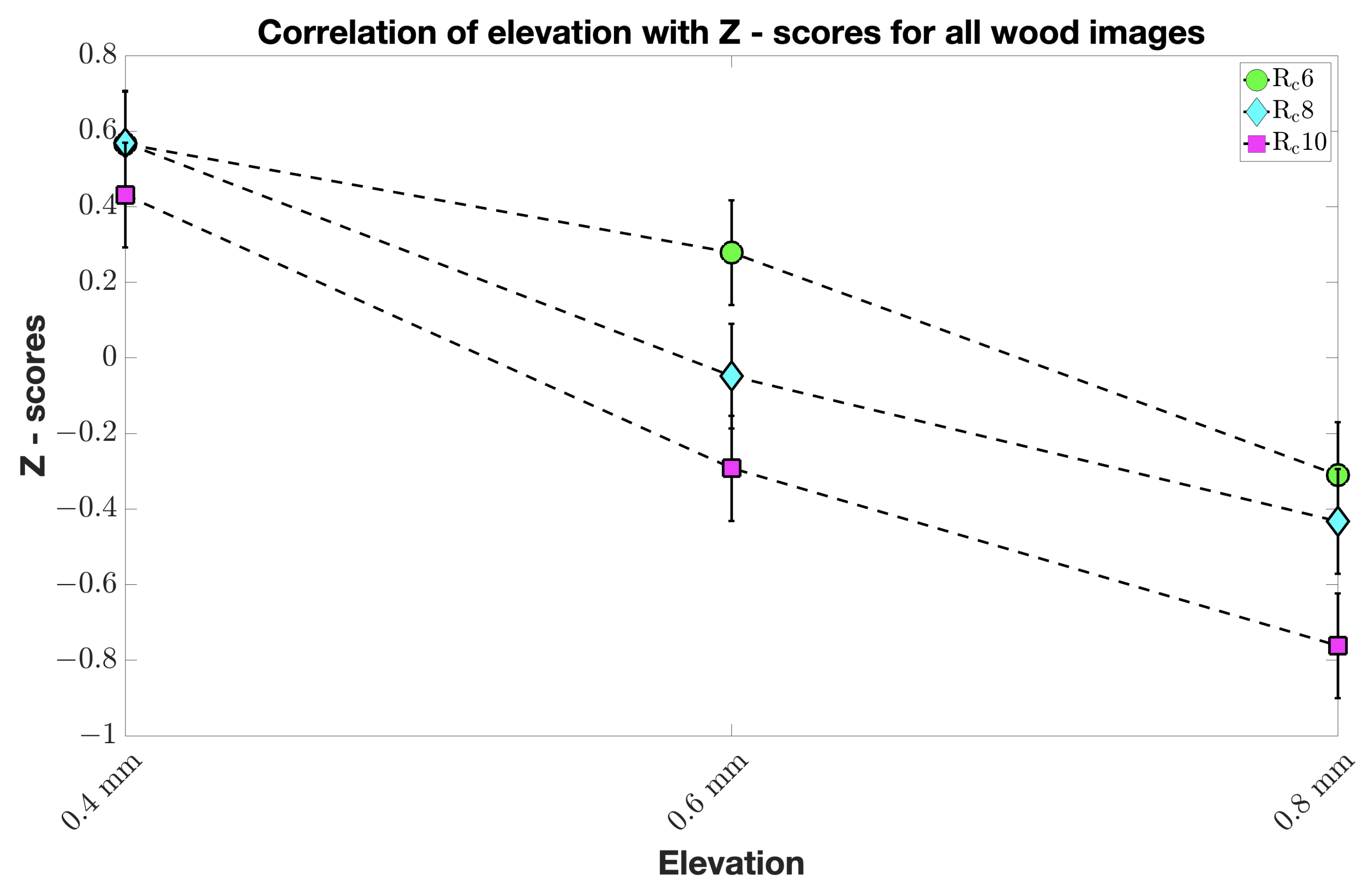
4.2. What Elevation and Surface Roughness Levels Make 2.5D Prints Perceptually Natural for Examined Material Categories?
4.3. Limitations
5. Conclusions and Future Works
Author Contributions
Funding
Institutional Review Board Statement
Informed Consent Statement
Data Availability Statement
Acknowledgments
Conflicts of Interest
References
- Kadyrova, A.; Kitanovski, V.; Pedersen, M. A study on attributes for 2.5D print quality assessment. In Proceedings of the Color and Imaging Conference, Online, 4–19 November 2020; Volume 2020, pp. 19–24. [Google Scholar]
- Janssen, T.; Blommaert, F. Predicting the usefulness and naturalness of color reproductions. J. Imaging Sci. Technol. 2000, 44, 93–104. [Google Scholar]
- Halonen, R.; Westman, S.; Oittinen, P. Naturalness and interestingness of test images for visual quality evaluation. In Image Quality and System Performance VIII; International Society for Optics and Photonics: San Francisco, CA, USA, 2011; Volume 7867, p. 78670Z. [Google Scholar]
- Nyman, G.; Häkkinen, J.; Koivisto, E.M.; Leisti, T.; Lindroos, P.; Orenius, O.; Virtanen, T.; Vuori, T. Evaluation of the visual performance of image processing pipes: Information value of subjective image attributes. In Image Quality and System Performance VII; International Society for Optics and Photonics: San Jose, CA, USA, 2010; Volume 7529, p. 752905. [Google Scholar]
- Leisti, T.; Radun, J.; Virtanen, T.; Halonen, R.; Nyman, G. Subjective experience of image quality: Attributes, definitions, and decision making of subjective image quality. In Image Quality and System Performance VI; International Society for Optics and Photonics: San Jose, CA, USA, 2009; Volume 7242, p. 72420D. [Google Scholar]
- Radun, J.; Leisti, T.; Häkkinen, J.; Ojanen, H.; Olives, J.L.; Vuori, T.; Nyman, G. Content and quality: Interpretation-based estimation of image quality. ACM Trans. Appl. Percept. (TAP) 2008, 4, 1–15. [Google Scholar] [CrossRef]
- Virtanen, T.; Nuutinen, M.; Häkkinen, J. Image quality wheel. J. Electron. Imaging 2019, 28, 013015. [Google Scholar] [CrossRef]
- Yoshida, A.; Blanz, V.; Myszkowski, K.; Seidel, H.P. Perceptual evaluation of tone mapping operators with real-world scenes. In Human Vision and Electronic Imaging X; International Society for Optics and Photonics: San Jose, CA, USA, 2005; Volume 5666, pp. 192–203. [Google Scholar]
- Yeganeh, H.; Wang, Z. Structural fidelity vs. naturalness-objective assessment of tone mapped images. In Proceedings of the International Conference Image Analysis and Recognition; Springer: Burnaby, BC, Canada, 22–24 June 2011; pp. 111–121. [Google Scholar]
- Pedersen, M.; Bonnier, N.; Hardeberg, J.Y.; Albregtsen, F. Attributes of image quality for color prints. J. Electron. Imaging 2010, 19, 011016. [Google Scholar]
- Fedorovskaya, E.A.; Blommaert, F.J.; Ridder, H.d. Perceptual quality of color images of natural scenes transformed in CIELUV color space. In Color and Imaging Conference; Society for Imaging Science and Technology: Kilworth Lane Springfield, VA, USA, 1993; Volume 1993, pp. 37–40. [Google Scholar]
- Drago, F.; Martens, W.L.; Myszkowski, K.; Seidel, H.P. Perceptual evaluation of tone mapping operators. In Proceedings of the ACM SIGGRAPH 2003 Sketches & Applications, San Diego, CA, USA, 27–31 July 2003; p. 1. [Google Scholar]
- Choi, S.; Luo, M.; Pointer, M. Modelling image naturalness. In Proceedings of the Conference on Colour in Graphics, Imaging, and Vision, Terrassa, Spain, 9–13 June 2008; pp. 126–131. [Google Scholar]
- Yendrikhovskij, S.N.; Blommaert, F.; De Ridder, H. Color reproduction and the naturalness constraint. Color Res. Appl. 1999, 24, 52–67. [Google Scholar] [CrossRef] [Green Version]
- Tian, D.; Peng, R.; Chang, C.; Luo, M.R. Models to Predict Naturalness of Images Including Skin Colours. In Advances in Graphic Communication, Printing and Packaging Technology and Materials; Springer: Berlin/Heidelberg, Germany, 2021; pp. 30–35. [Google Scholar]
- Tian, D.; Ji, C.; Luo, M.R. Image naturalness model based on prototypical memory colors (sky, grass, and skin). Color Res. Appl. 2022, 1–14. [Google Scholar] [CrossRef]
- Seuntiens, P. Visual Experience of 3D TV. Ph.D. Thesis, Eindhoven University of Technology, Eindhoven, The Netherlands, 2006. [Google Scholar]
- Overvliet, K.E.; Soto-Faraco, S. I cannot believe this is not wood! An investigation in the perception of naturalness. Acta Psychol. 2011, 136, 95–111. [Google Scholar] [CrossRef] [PubMed]
- Sharan, L.; Rosenholtz, R.; Adelson, E. Material perception: What can you see in a brief glance? J. Vision 2009, 9, 784. [Google Scholar] [CrossRef]
- 3D Textures. Available online: https://3dtextures.me (accessed on 6 July 2021).
- Winkler, S. Analysis of public image and video databases for quality assessment. IEEE J. Sel. Top. Signal Process. 2012, 6, 616–625. [Google Scholar] [CrossRef]
- Kitanovski, V.; Pedersen, M. Orientation modulation for data hiding in chrominance channels of direct binary search halftone prints. In Proceedings of the Color and Imaging Conference, San Diego, CA, USA, 7–11 November 2016; Volume 2016, pp. 32–40. [Google Scholar]
- Series, B.T. Methodology for the subjective assessment of the quality of television pictures. In Recommendation ITU-R BT; International Telecommunication Union: Switzerland, Geneva, 2012; pp. 500–513. [Google Scholar]
- Cui, L.C. Do experts and naive observers judge printing quality differently? In Image Quality and System Performance; International Society for Optics and Photonics: San Jose, CA, USA, 2003; Volume 5294, pp. 132–145. [Google Scholar]
- Green, P.; MacDonald, L. Colour Engineering: Achieving Device Independent Colour; John Wiley & Sons: Hoboken, NJ, USA, 2011. [Google Scholar]
- Bertalmío, M. Vision Models for High Dynamic Range and Wide Colour Gamut Imaging: Techniques and Applications; Academic Press: Cambridge, MA, USA, 2019. [Google Scholar]
- Bonferroni, C. Teoria statistica delle classi e calcolo delle probabilita. Pubbl. R. Ist. Super. Sci. Econ. Commericiali Firenze 1936, 8, 3–62. [Google Scholar]
- Krasula, L.; Fliegel, K.; Le Callet, P.; Klíma, M. Objective evaluation of naturalness, contrast, and colorfulness of tone-mapped images. In Applications of Digital Image Processing XXXVII; International Society for Optics and Photonics: San Diego, CA, USA, 2014; Volume 9217, p. 92172D. [Google Scholar]
- Seuntiëns, P.J.; Heynderickx, I.E.; IJsselsteijn, W.A.; van den Avoort, P.M.; Berentsen, J.; Dalm, I.J.; Lambooij, M.T.; Oosting, W. Viewing experience and naturalness of 3D images. In Three-Dimensional TV, Video, and Display IV; International Society for Optics and Photonics: Boston, MA, USA, 2005; Volume 6016, p. 601605. [Google Scholar]

| R6, 0.4 mm | R6, 0.6 mm | R6, 0.8 mm | R8, 0.4 mm | R8, 0.6 mm | R8, 0.8 mm | R10, 0.4 mm | R10, 0.6 mm | R10, 0.8 mm | |
|---|---|---|---|---|---|---|---|---|---|
| R6, 0.4 mm | - | 0.4839 | 0.2713 | ||||||
| R6, 0.6 mm | - | 0.0069 | 0.0019 | 0.3681 | |||||
| R6, 0.8 mm | - | 0.0124 | 0.1936 | 0.4839 | |||||
| R8, 0.4 mm | - | 0.1936 | |||||||
| R8, 0.6 mm | - | 0.0124 | |||||||
| R8, 0.8 mm | - | 0.2713 | |||||||
| R10, 0.4 mm | - | ||||||||
| R10, 0.6 mm | - | ||||||||
| R10, 0.8 mm | - |
| R6, 0.4 mm | R6, 0.6 mm | R6, 0.8 mm | R8, 0.4 mm | R8, 0.6 mm | R8, 0.8 mm | R10, 0.4 mm | R10, 0.6 mm | R10, 0.8 mm | |
|---|---|---|---|---|---|---|---|---|---|
| R6, 0.4 mm | - | 0.1936 | 0.0019 | 0.4839 | 0.1336 | ||||
| R6, 0.6 mm | - | 0.0124 | 0.3681 | 0.1336 | 0.7642 | ||||
| R6, 0.8 mm | - | 0.0214 | 0.6171 | 0.0019 | 0.2713 | ||||
| R8, 0.4 mm | - | 0.0124 | 0.3681 | ||||||
| R8, 0.6 mm | - | 0.0019 | 0.0124 | 0.0019 | |||||
| R8, 0.8 mm | - | 0.6171 | |||||||
| R10, 0.4 mm | - | ||||||||
| R10, 0.6 mm | - | 0.0019 | |||||||
| R10, 0.8 mm | - |
Publisher’s Note: MDPI stays neutral with regard to jurisdictional claims in published maps and institutional affiliations. |
© 2022 by the authors. Licensee MDPI, Basel, Switzerland. This article is an open access article distributed under the terms and conditions of the Creative Commons Attribution (CC BY) license (https://creativecommons.org/licenses/by/4.0/).
Share and Cite
Kadyrova, A.; Pedersen, M.; Westland, S. Effect of Elevation and Surface Roughness on Naturalness Perception of 2.5D Decor Prints. Materials 2022, 15, 3372. https://doi.org/10.3390/ma15093372
Kadyrova A, Pedersen M, Westland S. Effect of Elevation and Surface Roughness on Naturalness Perception of 2.5D Decor Prints. Materials. 2022; 15(9):3372. https://doi.org/10.3390/ma15093372
Chicago/Turabian StyleKadyrova, Altynay, Marius Pedersen, and Stephen Westland. 2022. "Effect of Elevation and Surface Roughness on Naturalness Perception of 2.5D Decor Prints" Materials 15, no. 9: 3372. https://doi.org/10.3390/ma15093372
APA StyleKadyrova, A., Pedersen, M., & Westland, S. (2022). Effect of Elevation and Surface Roughness on Naturalness Perception of 2.5D Decor Prints. Materials, 15(9), 3372. https://doi.org/10.3390/ma15093372