Enhancing Resiliency in Distribution Power Grids with Distributed Generation Through Application of Visualisation Techniques


Abstract
1. Introduction
2. Power System Visualisation Techniques: Current Trends
2.1. Static Visualisation Techniques in Power Systems
2.2. Dynamic Visualisation Techniques in Power Systems
3. Novel Visualisation Methods for Future Grids
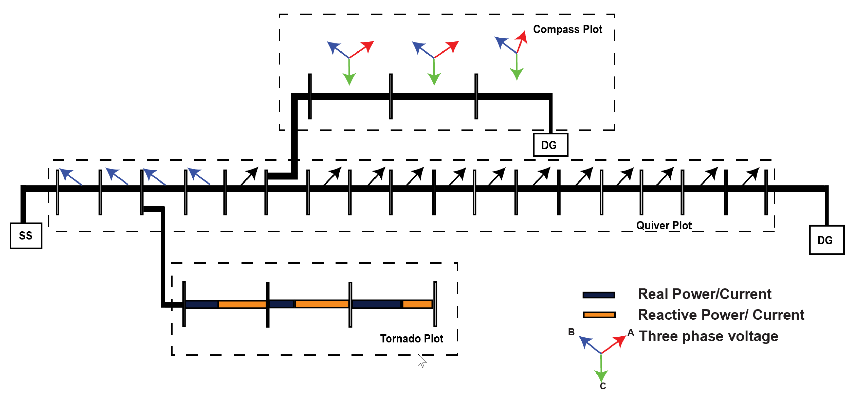
3.1. Matrix Plot
3.2. Tornado Plot
3.3. Compass Plot
3.4. Polar Histogram
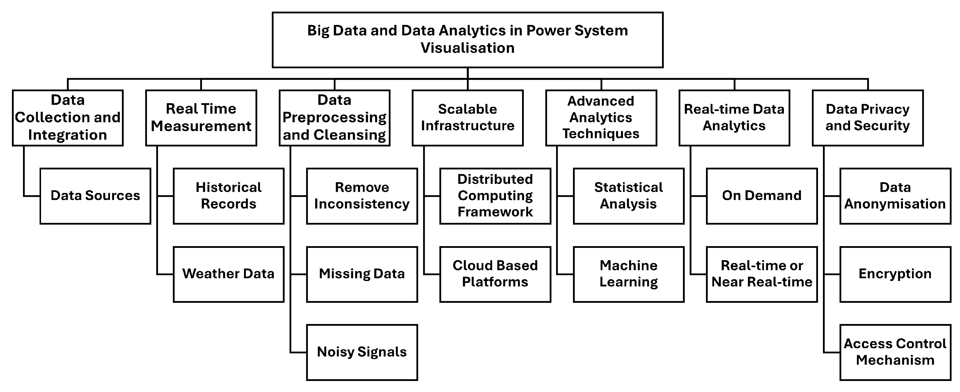
4. Big Data and Data Analytics in Power System Visualisation
4.1. Data Pipeline and Scalability
4.2. Real-Time and Advanced Data Analytics Techniques
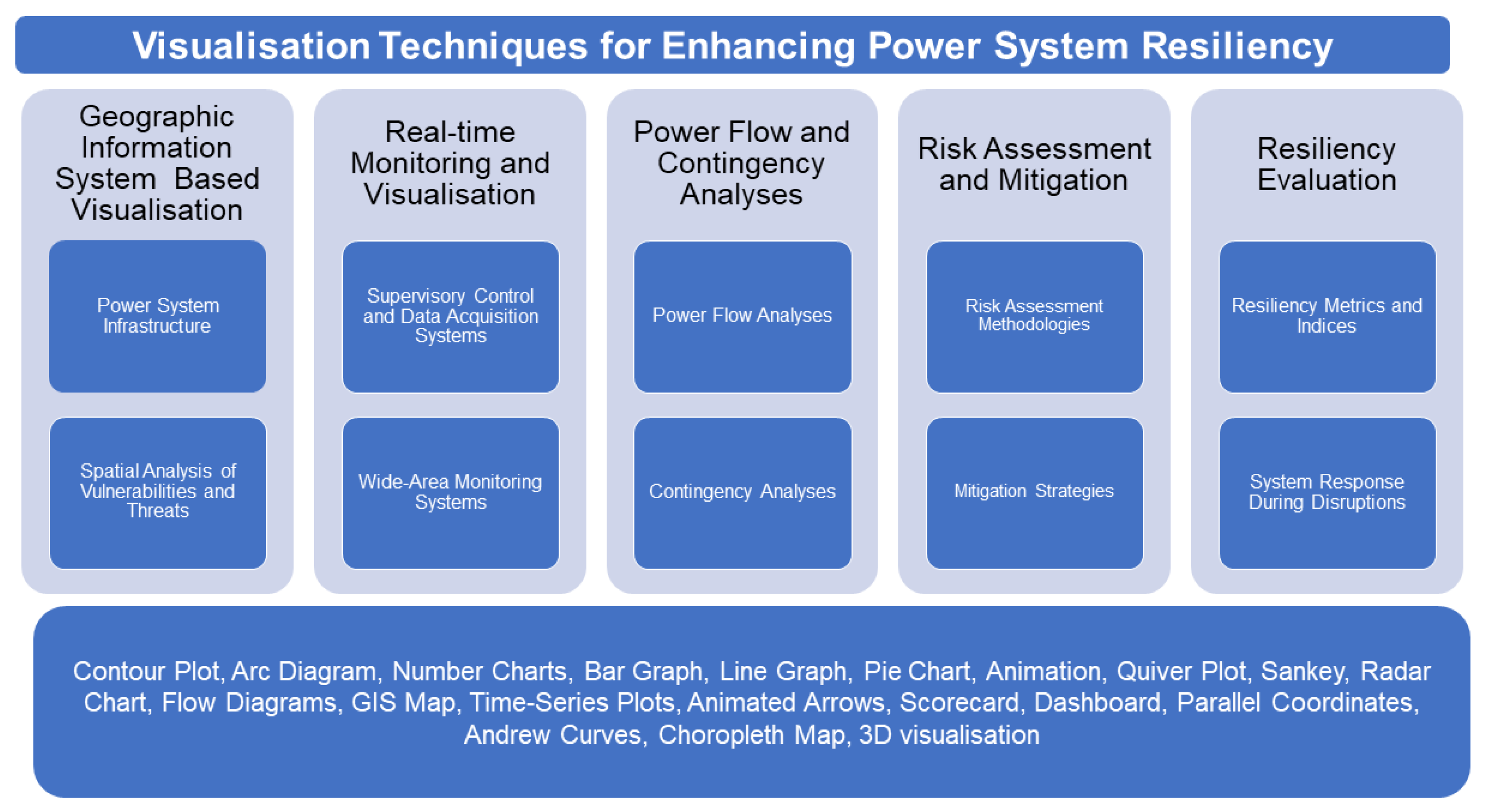
5. Visualisation for Enhancing Power System Resiliency
5.1. Geographical Information System-Based Visualisation
5.2. Real-Time Monitoring and Visualisation
5.3. Visualisation of Power Flow and Contingency Analyses
5.4. Visualisation of Risk Assessment and Mitigation
5.5. Visualisation of Resiliency Evaluation
5.6. Comparison of Visualisation Techniques in Power System
6. Simulation and Results Depicting the Applicability of Selected Visualisation Techniques
6.1. Contour Plot
6.2. Quiver Plot
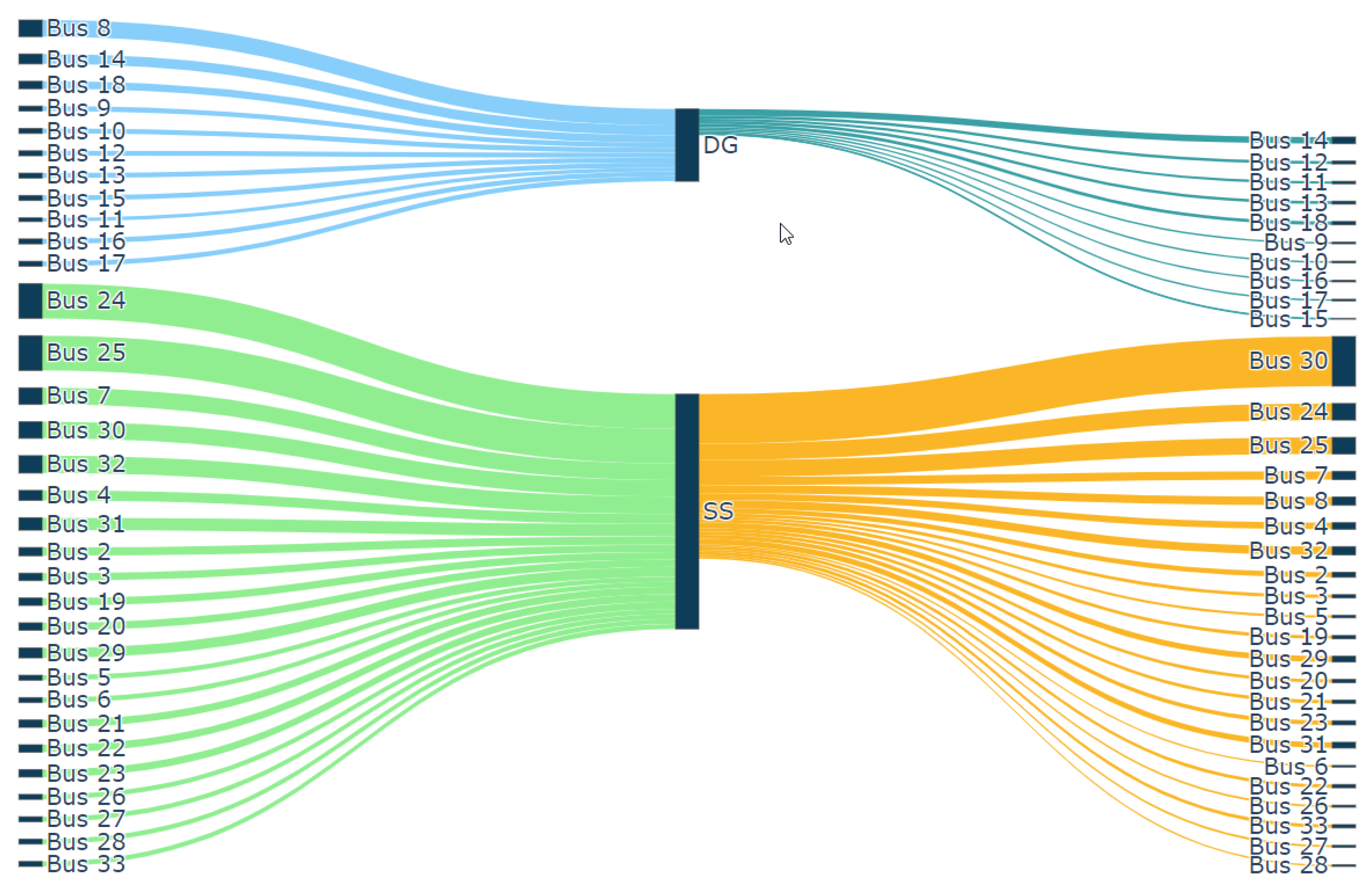
6.3. Sankey Chart
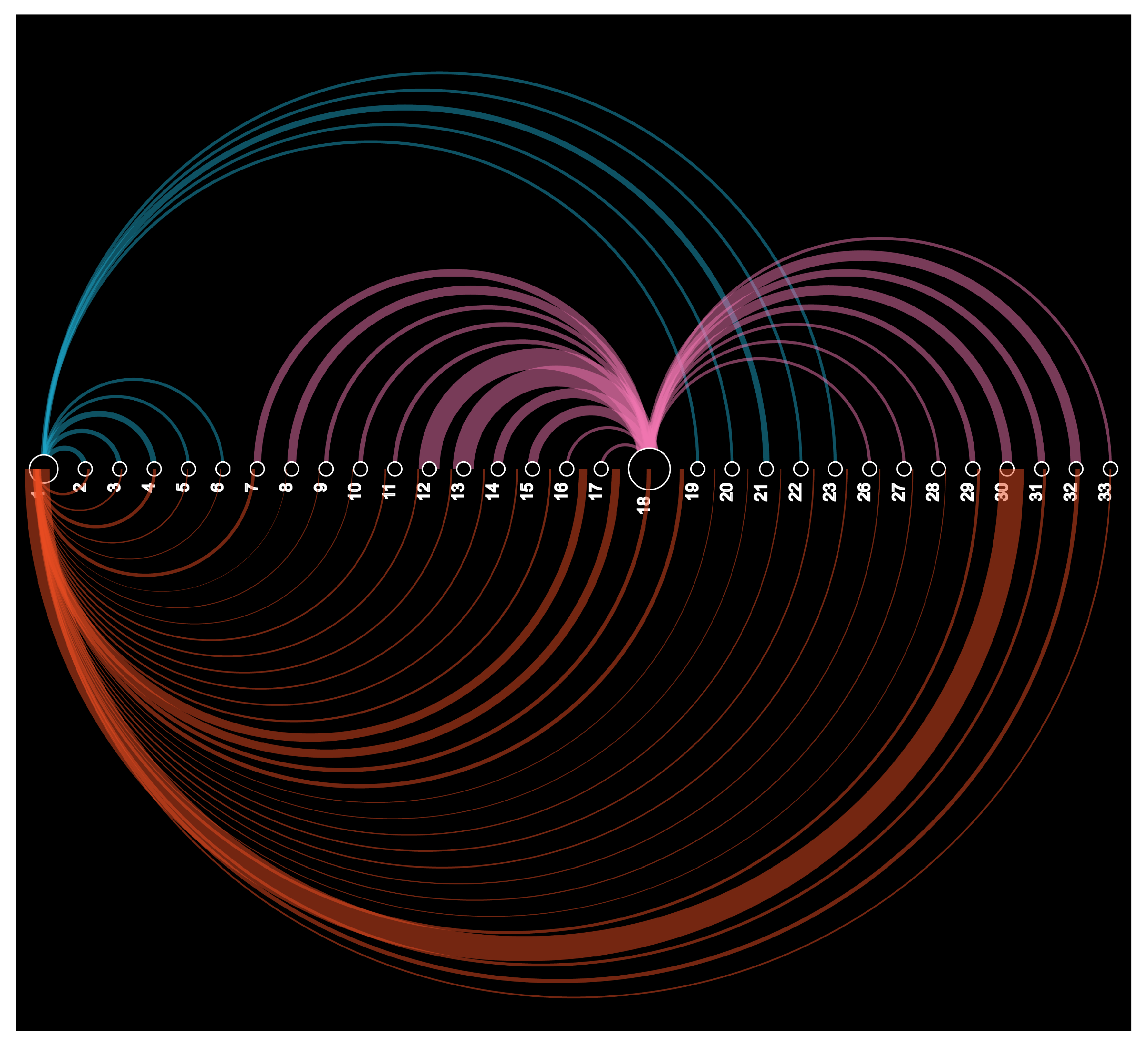
6.4. Arc Diagram
6.5. Comparative Analyses of the Proposed Methods
7. Conclusions
Author Contributions
Funding
Data Availability Statement
Conflicts of Interest
References
- Charani Shandiz, S.; Rismanchi, B.; Foliente, G. Energy master planning for net-zero emission communities: State of the art and research challenges. Renew. Sustain. Energy Rev. 2021, 137, 110600. [Google Scholar]
- Rogelj, J.; Shindell, D.; Jiang, K.; Fifita, S.; Forster, P.; Ginzburg, V.; Handa, C.; Kheshgi, H.; Kobayashi, S.; Kriegler, E.; et al. Mitigation pathways compatible with 1.5 °C in the context of sustainable development. In Global Warming of 1.5 °C; Intergovernmental Panel on Climate Change: Geneva, Switzerland, 2018. [Google Scholar]
- Rogelj, J.; Shindell, D.; Jiang, K.; Fifita, S.; Forster, P.; Ginzburg, V.; Handa, C.; Kheshgi, H.; Kobayashi, S.; Kriegler, E.; et al. Net Zero Plan Stage 1: 2020–2030; NSW Government: Sydney, Australia, 2020.
- Bouckaert, S.; Pales, A.F.; McGlade, C.; Remme, U.; Wanner, B.; Varro, L.; D’Ambrosio, D.; Spencer, T.; Abergel, T.; Arsalane, Y.; et al. Net Zero by 2050 A Roadmap for the Global Energy Sector; International Energy Agency: Paris, France, 2020. [Google Scholar]
- Hossain, M.B.; Islam, M.R.; Muttaqi, K.M.; Sutanto, D.; Agalgaonkar, A.P. Advancement of fuel cells and electrolyzers technologies and their applications to renewable-rich power grids. J. Energy Storage 2023, 62, 106842. [Google Scholar]
- Kharrazi, A.; Sreeram, V.; Mishra, Y. Assessment techniques of the impact of grid-tied rooftop photovoltaic generation on the power quality of low voltage distribution network—A review. Renew. Sustain. Energy Rev. 2020, 120, 109643. [Google Scholar]
- Zhang, D.; Shafiullah, G.; Das, C.K.; Wong, K.W. A systematic review of optimal planning and deployment of distributed generation and energy storage systems in power networks. J. Energy Storage 2022, 56, 105937. [Google Scholar]
- Zou, K.; Agalgaonkar, A.P.; Muttaqi, K.M.; Perera, S. Distribution System Planning With Incorporating DG Reactive Capability and System Uncertainties. IEEE Trans. Sustain. Energy 2012, 3, 112–123. [Google Scholar] [CrossRef]
- Ochoa, L.F.; Dent, C.J.; Harrison, G.P. Distribution network capacity assessment: Variable DG and active networks. IEEE Trans. Power Syst. 2009, 25, 87–95. [Google Scholar]
- Afandi, I.; Ciufo, P.; Agalgaonkar, A.; Perera, S. A holistic approach for integrated volt/var control in MV and LV networks. Electr. Power Syst. Res. 2018, 165, 9–17. [Google Scholar]
- Uzair, M.; Li, L.; Eskandari, M.; Hossain, J.; Zhu, J.G. Challenges, advances and future trends in AC microgrid protection: With a focus on intelligent learning methods. Renew. Sustain. Energy Rev. 2023, 178, 113228. [Google Scholar] [CrossRef]
- Li, Y.; Fu, L.; Meng, K.; Dong, Z.Y.; Muttaqi, K.; Du, W. Autonomous control strategy for microgrid operating modes smooth transition. IEEE Access 2020, 8, 142159–142172. [Google Scholar] [CrossRef]
- Rahman, H.A.; Majid, M.S.; Rezaee Jordehi, A.; Chin Kim, G.; Hassan, M.Y.; Fadhl, S.O. Operation and control strategies of integrated distributed energy resources: A review. Renew. Sustain. Energy Rev. 2015, 51, 1412–1420. [Google Scholar]
- Zhang, Y.; Huang, T.; Bompard, E.F. Big data analytics in smart grids: A review. Energy Inform. 2018, 1, 8. [Google Scholar] [CrossRef]
- Nigar, Y.; Agalgaonkar, A.P.; Muttaqi, K.M. Visualisation of spheres of influence of distributed generation through critical line flow analysis. Sustain. Energy Grids Netw. 2023, 34, 101046. [Google Scholar] [CrossRef]
- Nigar, Y.; Agalgaonkar, A.P.; Muttaqi, K.M. Identification of Sphere of Influence of single and multiple DG Units through Visualisation in Distribution Networks. In Proceedings of the 2022 IEEE Global Conference on Computing, Power and Communication Technologies (GlobConPT), New Delhi, India, 23–25 September 2022; pp. 1–6. [Google Scholar]
- Nigar, Y.; Agalgaonkar, A.P.; Muttaqi, K.M. Identification of Sphere of Influence of Single and Multiple DG Units in Distribution Networks: A Visualisation Approach Involving Sankey Diagrams and Geospatial Mapping. IEEE Trans. Ind. Appl. 2024, 60, 5362–5371. [Google Scholar] [CrossRef]
- Beiranvand, A.; Cuffe, P. Sankey Network Diagrams to Depict Bulk Power Transactions for Operator Situational Awareness. In Proceedings of the 2021 IEEE Madrid PowerTech, Madrid, Spain, 28 June–2 July 2021; pp. 1–6. [Google Scholar]
- Cuffe, P.; Keane, A. Visualizing the electrical structure of power systems. IEEE Syst. J. 2015, 11, 1810–1821. [Google Scholar] [CrossRef]
- Beiranvand, A.; Cuffe, P. A topological sorting approach to identify coherent cut-sets within power grids. IEEE Trans. Power Syst. 2019, 35, 721–730. [Google Scholar] [CrossRef]
- John, J.J.; Beiranvand, A.; Cuffe, P. Clustering nodes in a directed acyclic graph by identifying corridors of coherent flow. In Proceedings of the 2020 6th IEEE International Energy Conference (ENERGYCon), Gammarth, Tunisia, 28 September–1 October 2020; pp. 604–609. [Google Scholar]
- Zhang, T.; Liu, S.; Qiu, W.; Lin, Z.; Zhu, L.; Zhao, D.; Qian, M.; Yang, L. KPI-based Real-time Situational Awareness for Power Systems with a High Proportion of Renewable Energy Sources. CSEE J. Power Energy Syst. 2020, 8, 1060–1073. [Google Scholar]
- Overbye, T.J.; Weber, J.D. Visualization of power system data. In Proceedings of the 33rd Annual Hawaii International Conference on System Sciences, Maui, HI, USA, 7 January 2000; p. 7. [Google Scholar]
- Sun, Y.; Overbye, T.J. Visualizations for power system contingency analysis data. IEEE Trans. Power Syst. 2004, 19, 1859–1866. [Google Scholar] [CrossRef]
- Milano, F. Three-dimensional visualization and animation for power systems analysis. Electr. Power Syst. Res. 2009, 79, 1638–1647. [Google Scholar] [CrossRef]
- Overbye, T.J.; Rantanen, E.M.; Judd, S. Electric power control center visualization using geographic data views. In Proceedings of the 2007 iREP Symposium-Bulk Power System Dynamics and Control-VII. Revitalizing Operational Reliability, Charleston, SC, USA, 19–24 August 2007; pp. 1–8. [Google Scholar]
- Overbye, T.J.; Wert, J.; Birchfield, A.; Weber, J.D. Wide-area electric grid visualization using pseudo-geographic mosaic displays. In Proceedings of the 2019 North American Power Symposium (NAPS), Wichita, KS, USA, 13–15 October 2019; pp. 1–6. [Google Scholar]
- Thiyagarajah, A.; Carlson, B.; Bann, J.; Mirheydar, M.; Mokhtari, S. Seeing results in a full graphics environment. IEEE Comput. Appl. Power 1993, 6, 33–38. [Google Scholar] [CrossRef]
- Mitsui, H.; Christie, R.D. Visualizing voltage profiles for large scale power systems. IEEE Comput. Appl. Power 1997, 10, 32–37. [Google Scholar] [CrossRef]
- Overbye, T.J.; Weber, J.D. Visualizing the electric grid. IEEE Spectr. 2001, 38, 52–58. [Google Scholar]
- Weber, J.D.; Overbye, T.J. Voltage contours for power system visualization. IEEE Trans. Power Syst. 2000, 15, 404–409. [Google Scholar]
- Overbye, T.J.; Wiegmann, D.A.; Rich, A.M.; Sun, Y. Human factors aspects of power system voltage contour visualizations. IEEE Trans. Power Syst. 2003, 18, 76–82. [Google Scholar]
- Zhang, G.; Hirsch, P.; Lee, S. Wide area frequency visualization using smart client technology. In Proceedings of the 2007 IEEE Power Engineering Society General Meeting, Tampa, FL, USA, 24–28 June 2007; pp. 1–8. [Google Scholar]
- Nigar, Y.; Agalgaonkar, A.P.; Ciufo, P. Impact of variable solar PV generation on MV distribution systems. In Proceedings of the 2014 Australasian Universities Power Engineering Conference (AUPEC), Perth, WA, Australia, 28 September–1 October 2014; pp. 1–6. [Google Scholar]
- Overbye, T.J.; Weber, J.D. Visualization of large scale power systems. In Proceedings of the EPSOM’98, Zurich, Switzerland, 23–25 September 1998. [Google Scholar]
- Klump, R.; Dooley, G.; Wu, W. Displaying aggregate data, interrelated quantities, and data trends in electric power systems. In Proceedings of the 36th Annual Hawaii International Conference on System Sciences, Big Island, HI, USA, 6–9 January 2003; p. 10. [Google Scholar]
- Zhang, Y.; Chen, L.; Ye, Y.; Markham, P.; Bank, J.; Dong, J.; Yuan, Z.; Lin, Z.; Liu, Y. Visualization of wide area measurement information from the FNET system. In Proceedings of the 2011 IEEE Power and Energy Society General Meeting, Detroit, MI, USA, 24–28 July 2011; pp. 1–8. [Google Scholar]
- Overbye, T.J.; Weber, J. Smart grid wide-area transmission system visualization. Engineering 2015, 1, 466–474. [Google Scholar] [CrossRef]
- Dutta, S.; Overbye, T.J. Feature extraction and visualization of power system transient stability results. IEEE Trans. Power Syst. 2013, 29, 966–973. [Google Scholar]
- Guo, T.; Alimisis, V.; Milanović, J.V.; Taylor, P.C. Probabilistic assessment of voltage control zones and visualization using choropleth map. In Proceedings of the 2017 IEEE Manchester PowerTech, Manchester, UK, 18–22 June 2017; pp. 1–6. [Google Scholar]
- Zhang, T.; Wang, X.; Li, Z.; Guo, F.; Ma, Y.; Chen, W. A survey of network anomaly visualization. Sci. China Inf. Sci. 2017, 60, 1–17. [Google Scholar] [CrossRef]
- Eschenbach, T.G. Spiderplots versus tornado diagrams for sensitivity analysis. Interfaces 1992, 22, 40–46. [Google Scholar]
- Rueda, J.; Colome, D. Probabilistic performance indexes for small signal stability enhancement in weak wind-hydro-thermal power systems. IET Gener. Transm. Distrib. 2009, 3, 733–747. [Google Scholar] [CrossRef]
- Wang, Q.; Guan, M.; Huang, W.; Wang, L.; Wang, Z.; Liu, S.; Savić, D. Visualisation of the combinatorial effects within evolutionary algorithms: The compass plot. J. Hydroinformatics 2021, 23, 517–528. [Google Scholar]
- Phillips, Y.F.; Towsey, M.; Roe, P. Revealing the ecological content of long-duration audio-recordings of the environment through clustering and visualisation. PLoS ONE 2018, 13, e0193345. [Google Scholar] [CrossRef]
- Nigar, Y.; Agalgaonkar, A.P.; Muttaqi, K.M. Unveiling the Dynamic Influence Zones of Distributed Generation Units Using a Visualisation Approach. In Proceedings of the 2023 IEEE International Conference on Energy Technologies for Future Grids (ETFG), Wollongong, Australia, 3–6 December 2023; pp. 1–6. [Google Scholar]
- Daki, H.; El Hannani, A.; Aqqal, A.; Haidine, A.; Dahbi, A. Big Data management in smart grid: Concepts, requirements and implementation. J. Big Data 2017, 4, 13. [Google Scholar]
- Diamantoulakis, P.D.; Kapinas, V.M.; Karagiannidis, G.K. Big Data Analytics for Dynamic Energy Management in Smart Grids. Big Data Res. 2015, 2, 94–101. [Google Scholar]
- Chen, W.; Zhou, K.; Yang, S.; Wu, C. Data quality of electricity consumption data in a smart grid environment. Renew. Sustain. Energy Rev. 2017, 75, 98–105. [Google Scholar]
- Tu, C.; He, X.; Shuai, Z.; Jiang, F. Big data issues in smart grid—A review. Renew. Sustain. Energy Rev. 2017, 79, 1099–1107. [Google Scholar]
- Liu, G.; Zhu, W.; Saunders, C.; Gao, F.; Yu, Y. Real-time complex event processing and analytics for smart grid. Procedia Comput. Sci. 2015, 61, 113–119. [Google Scholar] [CrossRef]
- Milić, S.D.; Đurović, Ž.; Stojanović, M.D. Data science and machine learning in the IIoT concepts of power plants. Int. J. Electr. Power Energy Syst. 2023, 145, 108711. [Google Scholar]
- Ponnusamy, V.K.; Kasinathan, P.; Madurai Elavarasan, R.; Ramanathan, V.; Anandan, R.K.; Subramaniam, U.; Ghosh, A.; Hossain, E. A Comprehensive Review on Sustainable Aspects of Big Data Analytics for the Smart Grid. Sustainability 2021, 13, 13322. [Google Scholar] [CrossRef]
- Vega Penagos, C.A.; Diaz, J.L.; Rodriguez-Martinez, O.F.; Andrade, F.; Luna, A.C. Metrics and Strategies Used in Power Grid Resilience. Energies 2023, 17, 168. [Google Scholar] [CrossRef]
- Nagel, T.; Duval, E. A visual survey of arc diagrams. In Proceedings of the IEEE Visualization, Atlanta, GA, USA, 13–18 October 2013. [Google Scholar]
- Hossam-Eldin, A.A.; Abdelaziz, A.R.; Fard, A.E.I.A. A simulated annealing-based automation of distribution systems. In Proceedings of the 45th International Universities Power Engineering Conference UPEC2010, Cardiff, UK, 31 August–3 September 2010; pp. 1–5. [Google Scholar]


| Visualisation Technique | Reference/s | Description | Resiliency Categories | Resiliency Aspects | Advantages | Disadvantages |
|---|---|---|---|---|---|---|
| 3D visualisation | [23,24,25,26,27] | Presents power system parameters in three-dimensional space along with topological information. |
|
|
|
|
| Andrews Curve | [39] | Displays multivariate data by mapping variables to Fourier coefficients. |
|
|
|
|
| Animated Arrows | [23,38] | Shows the movement or flow of entities using animated arrows or lines. |
|
|
|
|
| Arc Diagram | [55] | Represents relationships between entities using circular arcs. |
|
|
|
|
| Compass Plot | [43,44] | Displays three phases using radial axes to represent voltages. |
|
|
|
|
| Connectivity Diagram | [19] | Displays electrical distance of the power system. |
|
|
|
|
| Contour Plot | [23,30,31,32,33,34,35] | Depicts three-dimensional data on a two-dimensional plane using contour lines or heat maps. |
|
|
|
|
| Directed Acyclic Graph | [20,21] | Represents a network of nodes connected by directed edges with no cycles. |
|
|
|
|
| Pie Chart | [23,32,35] | Represent line parameters in proportions or percentages. |
|
|
|
|
| Polar Histogram | [45,46] | Displays distribution of flow of real and imaginary current components. |
|
|
|
|
| Quiver Chart | [15] | Represents vector fields using arrows to indicate real and imaginary current components. |
|
|
|
|
| Radar Chart | [22] | Displays multivariate data on a two-dimensional plane using axes radiating from a central point. |
|
|
|
|
| Sankey Chart | [16,18] | Shows the active and reactive power flow of demand or line between nodes. |
|
|
|
|
| Sparklines | [26] | Presents small, simple, and condensed line charts representing data trends. |
|
|
|
|
| Tornado Plot | [42] | Compares the relative importance or impact of different factors using bars or rectangles. |
|
|
|
|
| Aspect | Power Flow Analyses | Sensitivity Analyses | Visualisation Methods |
|---|---|---|---|
| Computational Effort | Moderate to high depending on network size | High as the calculation requires a Jacobian matrix | Low to moderate as visualisation acts a visual lens to view the network at a glance |
| Output type | Numerical and less intuitive to determine DG sphere | Numerical and less intuitive to determine DG sphere | Visuals and highly intuitive to determine DG sphere |
| Advantage | Provides precise DG penetration level | Requires one power flow and identifies critical area of the network and the maximum DG penetration level in all buses | Represents DG impacts zone on DG sizing and siting. Adapts to dynamic network changes |
| Disadvantage | Requires multiple power flow as network condition changes. Difficult to interpret the results | Requires power flow and repeated computation as network condition changes. Generates a vast amount of data and difficult to interpret the results | Visually cluttered in larger systems and requires high dimensional visualisation |
Disclaimer/Publisher’s Note: The statements, opinions and data contained in all publications are solely those of the individual author(s) and contributor(s) and not of MDPI and/or the editor(s). MDPI and/or the editor(s) disclaim responsibility for any injury to people or property resulting from any ideas, methods, instructions or products referred to in the content. |
© 2025 by the authors. Licensee MDPI, Basel, Switzerland. This article is an open access article distributed under the terms and conditions of the Creative Commons Attribution (CC BY) license (https://creativecommons.org/licenses/by/4.0/).
Share and Cite
Abdul Rasheed, Y.N.; Agalgaonkar, A.P.; Muttaqi, K. Enhancing Resiliency in Distribution Power Grids with Distributed Generation Through Application of Visualisation Techniques. Energies 2025, 18, 1847. https://doi.org/10.3390/en18071847
Abdul Rasheed YN, Agalgaonkar AP, Muttaqi K. Enhancing Resiliency in Distribution Power Grids with Distributed Generation Through Application of Visualisation Techniques. Energies. 2025; 18(7):1847. https://doi.org/10.3390/en18071847
Chicago/Turabian StyleAbdul Rasheed, Yasmin Nigar, Ashish P. Agalgaonkar, and Kashem Muttaqi. 2025. "Enhancing Resiliency in Distribution Power Grids with Distributed Generation Through Application of Visualisation Techniques" Energies 18, no. 7: 1847. https://doi.org/10.3390/en18071847
APA StyleAbdul Rasheed, Y. N., Agalgaonkar, A. P., & Muttaqi, K. (2025). Enhancing Resiliency in Distribution Power Grids with Distributed Generation Through Application of Visualisation Techniques. Energies, 18(7), 1847. https://doi.org/10.3390/en18071847