Article

Exploring Augmented Reality HMD Telemetry Data Visualization for Strategy Optimization in Student Solar-Powered Car Racing

by
Jakub Forysiak
1,
Piotr Krawiranda
1,
Krzysztof Fudała
1,
Zbigniew Chaniecki
1,
Krzysztof Jóźwik
2,
Krzysztof Grudzień
1,* and
Andrzej Romanowski
1
1
Institute of Applied Computer Science, Lodz University of Technology, 90-924 Lodz, Poland
2
Institute of Turbomachinery, Lodz University of Technology, 90-924 Lodz, Poland
*
Author to whom correspondence should be addressed.
Energies 2025, 18(12), 3196; https://doi.org/10.3390/en18123196
Submission received: 18 April 2025 / Revised: 27 May 2025 / Accepted: 12 June 2025 / Published: 18 June 2025

Abstract

:
This article explores how different modalities of presenting telemetry data can support strategy management during solar-powered electric vehicle racing. Student team members using augmented reality head-mounted displays (AR HMD) have reported significant advantages for in-race strategy monitoring and execution, yet so far, there is no published evidence to support these claims. This study shows that there are specific situations in which various visualization modes, including AR HMDs, demonstrate improved performance for users with varying levels of experience. We analyzed racing team performance for specific in-race events extracted from free and circuit-based real race datasets. These findings were compared with results obtained in a controlled, task-based user study utilizing three visualization interface conditions. Our exploration focused on how telemetry data visualizations influenced user performance metrics such as event reaction time, decision adequacy, task load index, and usability outcomes across four event types, taking into account both the interface and participant experience level. The results reveal that while traditional web application-type visualizations work well in most cases, augmented reality has the potential to improve race performance in some of the examined free-race and circuit-race scenarios. A notable novelty and key finding of this study is that the use of augmented reality HMDs provided particularly significant advantages for less experienced participants in most of the tasks, underscoring the substantial benefits of this technology for the support of novice users.

1. Introduction

Electric Vehicles (EVs) are becoming increasingly popular, particularly in developed societies, and it is predicted that by 2040, EVs will account for approximately 35% of all new vehicle sales. With the European Union planning to prohibit the registration of new internal combustion engine cars after 2035, nearly all car manufacturers have recently added electric vehicles to their product portfolios [1]. The next milestone in the development and adoption of EVs is the integration of solar power [2]. Although the necessary technology is already available, solar-powered cars remain largely in the development and testing phase and are not commercially widespread. Just as Formula One serves as a testing ground for combustion engines, solar races provide a valuable platform for the development and evaluation of innovative solar-powered vehicle technologies [3]. Car racing is among the most demanding sports, pushing teams to develop cutting-edge technologies. Innovations initially designed for Formula One, such as active suspension systems [4], sequential gearboxes [5,6], and energy control and recovery systems [7], have subsequently been widely adopted in the automotive industry. Similarly, solar racing events contribute significantly to sustainable innovation, pushing teams to maximize energy efficiency and tackle unique engineering challenges in vehicle design.
Competitive races held on both circuit tracks and public roads are a crucial pathway for technological advancement. The most renowned solar competition, the Bridgestone World Solar Challenge, has been held biennially since 1987, covering a demanding 3000 km route across Australia. Fierce competition among solar teams drives continuous adoption of advanced technologies during vehicle design. The car body and chassis are engineered to be ultra-lightweight with superior aerodynamics [8], using carbon composites [9,10], state-of-the-art telemetry systems [11], and specialized lightweight suspension [12]. The streamlined shape results from CFD modeling and collaboration with designers, while interior materials prioritize low weight and high durability. With every second crucial to race outcomes, an optimized race strategy is essential [13,14,15]. Making split-second decisions requires robust, real-time telemetry systems and applications that clearly visualize critical information. Data-driven systems have proven essential in both Formula One [12,16] and solar racing [11,17], enabling real-time vehicle monitoring and rapid anomaly detection by technical teams. Using Virtual Reality (VR) to train people in the design and effective operation of solar energy systems can play a crucial role in the successful implementation of solar technologies. Mixed and Augmented Reality (AR) systems are particularly promising for visualizing strategically important information, with Head-Up Displays (HUDs) now becoming standard in modern vehicles [18]. According to the literature, integrating AR interfaces into automated driving systems (ADS) significantly enhances trust, acceptance, and overall safety [19,20]. Augmented Vehicle Reality (AVR) can further extend a vehicle’s visual awareness by wirelessly sharing visual data with nearby vehicles [21]. The growing interest in Human–Vehicle Interaction (HVI) has driven research into intelligent vehicle interiors aimed at improving user experience, acceptance, and trust [22].
The work presented in this paper was conducted as part of one of Poland’s largest student competition-based projects, which aims to develop a highly efficient solar-powered electric car optimized for minimal energy consumption per passenger and superior race-strategy performance [23]. The main focus is the empirical evaluation of different telemetry data visualization modalities, including classical web-based and augmented reality head-mounted displays, in the context of solar vehicle race-strategy management. We illustrate how these visualization modes support the decision-making process for free and circuit track races using real in-race data. Our work goes beyond traditional telemetry interfaces for solar racing vehicles [24], which typically rely on flat, web-like graphs, by also exploring augmented reality-based visualizations as an alternative modality [17]. The findings demonstrate that while more experienced participants perform well regardless of interface type, augmented reality head-mounted display telemetry data visualization can significantly enhance telemetry data monitoring and performance in specific scenarios, particularly for less experienced users, highlighting its value as an effective decision-support tool in high-pressure environments.
The paper is organized as follows. Section 2 provides an overview of visualization methods for telemetric systems and particular solutions employed in solar racing vehicles. Section 3 presents details of the visualization modes considered in our research. Section 4 introduces the research questions and outlines the methodology of the task-based user experiment employed to evaluate the proposed concepts. Section 5 presents the results, including overall performance analysis and a detailed breakdown of quantitative and qualitative data across different experimental conditions and user groups, as well as self-reported cognitive and physical workload. Section 6 summarizes the key findings and discusses the limitations of the study.

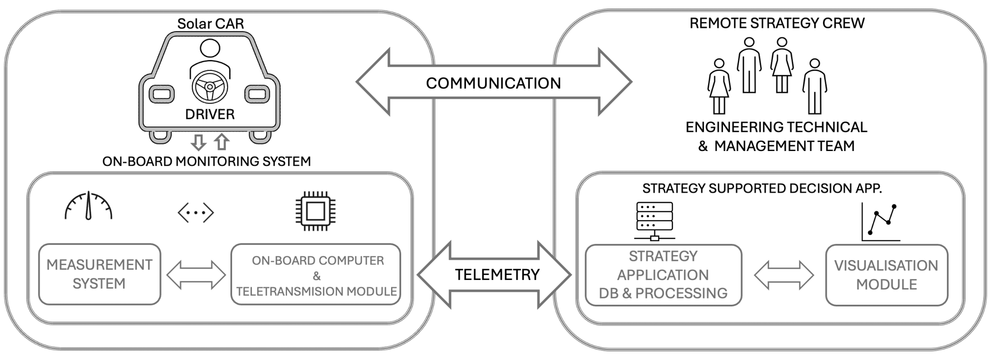
2. Telemetry-Related Work and System Overview

Telemetry is the process of taking measurements from a distance [25] employed within a wide range of applications, including wildlife monitoring [26], engineering [27] and healthcare [28] with variety of modalities from raw analog sensing signals, to audio, to video, and satellite monitoring [29,30]. A telemetry system includes modules for measurements, the transmission of the data stream from remote sensors (typically using wireless communication), visualization, analysis of data, and finally, monitoring of object states. The telemetry system provides direct insights into the data, enabling visualization of spacecraft imaging [31] and observatory operations [32,33] and analytics [34] while also enabling remote interaction with the object.

2.1. Telemetric Data Visualization

Data visualization [35,36] has proven to be a valuable tool for efficient problem analysis [37,38], facilitating the development of strategies for solving real-world tasks [39], including in applications related to telemetry [32,40] and wireless data-based transmission [41]. It facilitates exploration, monitoring, and diagnostics across various fields [27]. Visualization approaches often vary by domain, with researchers developing specialized systems for space exploration [42], oceanography [43], e-commerce and marketing [44,45], healthcare [28], and industrial applications [46,47], as well as for motorsport [48], including car racing [49], or even for autonomous vehicles [50]. The demand for effective data visualization continues to grow in parallel with the increasing volume of data collected by modern telemetry systems.
Effective real-time telemetry visualization and reliable data acquisition are essential for rapid decision-making during races. Several system architectures have been proposed. In [11], the authors described a CAN Bus-based system with four embedded devices monitoring the batteries, motors, photovoltaic panels, and driver inputs. A similar WiFi-based topology consisting of five embedded devices was presented in [15]. Another approach used ZigBee networks due to their significantly lower power consumption compared to WiFi [51]. Distributed architectures, in which multiple devices collect data and transmit it to a central data bus, are not the only possible solution. Some studies [24] propose a highly centralized architecture where a single embedded device is responsible for collecting all telemetry data. However, this approach may pose significant risks, as it lacks redundancy. If the central unit fails, the team could lose access to all vehicle data, making the system neither fail-safe nor reliable under critical conditions.
Once transmitted from the vehicle, the data must be properly received and analyzed by the team, including the remote strategy crew located outside the vehicle. Some studies [17] describe the use of established platforms such as LabView or DeltaV to build basic graphical user interfaces for data analysis. However, these often offer limited customization. Moreover, most existing visualization systems are typically limited to 2D representations [52]. In recent years, Virtual Reality (VR) [53,54] and augmented reality (AR) technologies have gained significant attention [55], opening new possibilities for researchers exploring innovative forms of data visualization, including head-mounted displays (HMD) in medical, training, and industrial applications [56,57]. However, despite growing interest in applying augmented and mixed reality (MR) [58] in various domains, such as sight therapy support [59] and technical tasks completion [60], as well as experiments with gaze- and gestural-mixed reality interaction input [61,62], much of the research has focused solely on static or offline visualization. Real-time telemetry-based AR visualization has remained largely unexplored. In [63], the authors analyzed mobile AR apps for data visualization, noting issues including limited screen space and visual clutter. They recommended combining data types carefully to avoid clutter and ensure user comprehension. However, using tablet-sized mobile applications offers more display space, which can help mitigate these limitations [64]. Another example, described in [65], demonstrated the potential of AR for supporting emergency service, presenting a mobile AR application for flood risk management. Other studies have also explored AR applications in industrial settings for planar and 3D data analysis [66] as well as for production support [67,68]. For instance, in [69], the authors proposed an AR system that facilitates dynamic data exchange between digital and physical production environments. The system features a user-friendly and intuitive interface designed for practical use. Similar approaches have been considered for industrial applications, where AR has been used to enhance system monitoring and operator interaction [61,68].
Taking into account current trends in information visualization and the growing demand for advanced data presentation techniques, a modular, web-based telemetry system has been developed [70]. The system enables both offline data analysis and real-time visualization during races. Additionally, it supports integration with an AR headset, providing an advanced, hands-free method for data presentation and analysis. Details of the system design and implementation are given in the next section [23].

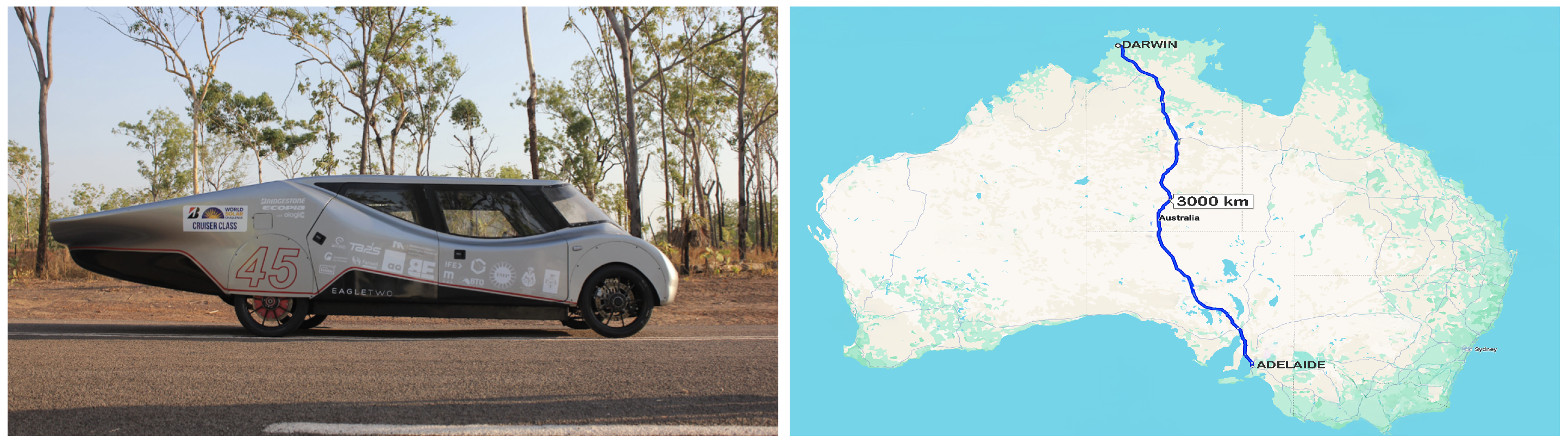
2.2. Telemetric Data Visualization Module for Eagle Two

The Solar Race Car system is divided into the following key main sections, as schematically illustrated in Figure 1: the onboard data acquisition and monitoring module, the strategy crew with data visualization modules, and the transmission system connecting them. Efficient collaboration and communication between these components, along with accurate interpretation of telemetry data by both the crew and driver, are essential for achieving success in the race.

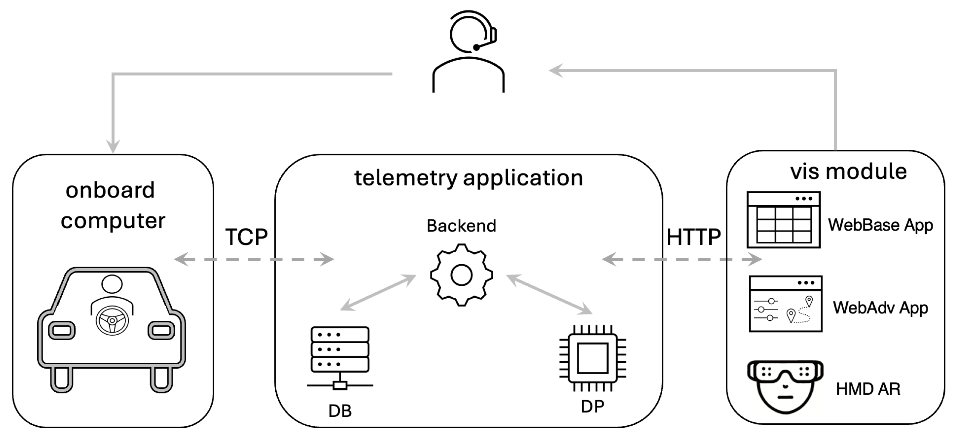
2.3. System Overview

The Eagle Two vehicle is equipped with an up-to-date dedicated carbon monocoque chassis, two independent in-wheel electric motors, a solar power array on the roof, a substantial Li-ion battery set, and a dedicated control system, all designed and implemented to withstand both circuit-type and open-terrain race conditions. Its unique construction results in a low vehicle mass, enabling it to travel up to 1500 km on a single charge, with up to five passengers on board. Figure 2 presents the version of the vehicle that participated in the World Solar Challenge (WSC) 2019 in Australia.
The system design encompasses the driver input interface, car body construction, and electric motor inverter controller. It is also important in such EVs to implement driver assist features, such as cruise control, to monitor and adjust each motor’s torque in real time and maintain the target velocity. The vehicle control systems are based on STM32 microcontrollers interconnected via a CAN data bus for robust operation. This allows both flawless vehicle control and remote telemetric data collection and aggregation. The data can then be used to both inform the vehicle control system and support live telemetry-driven race-strategy decision-making. As CAN is a multiplex, message-based standard that allows microcontrollers to communicate without any central host computer, it ensures real-time communication among all onboard devices, handling control signals and managing external subsystems such as brushless direct current electric motors, battery packs, lights, etc. Moreover, it makes it possible for the race team to access almost on the fly the most important data, including the battery condition, motor status, energy flow, and parameters set by the driver [23]. The telemetry data, including battery status, motor conditions, user inputs, vehicle lighting status, solar power inflow, and charging status, serve as the driving force behind the race-strategy application. The strategy application focuses on providing a comprehensive and efficient overview of vehicle conditions and dynamics. A schematic operation of the strategy application and its visualization engine is illustrated in Figure 3. The application’s core logic module processes and prepares data for visualization. Its architecture allows for direct deployment at the strategist’s workstation or, if necessary, cloud-based operation.

3. Telemetry Data Visualization Mode Investigation

As the Lodz Solar Vehicle project has evolved over the years, consecutive modules have been designed and implemented. Therefore, this investigation is based on previously adopted solutions rather than on new designs or experimental prototype-driven research. In other words, the approach we took was to analyze the existing solutions developed and successively utilized as new features and modalities were incorporated into the project over the years instead of designing different, novel interface visualization modalities to suit the currently proposed comparative experimental study. Three different existing data visualization interfaces were studied.
The first visualization (henceforth referred to as the WebBase App) is a simple, flat webpage that collates all gathered data in the form of an ordered table. It was designed to review and debug all subsystems. The second visualization mode (henceforth referred to as the WebAdv App) is more advanced in terms of graphical data representation. This version highlights the most important selected information in a more graphically appealing way than the WebBase App mode. The third data visualization mode (henceforth referred to as HMD AR) was deployed using augmented reality holographic technology and head-mounted display glasses.

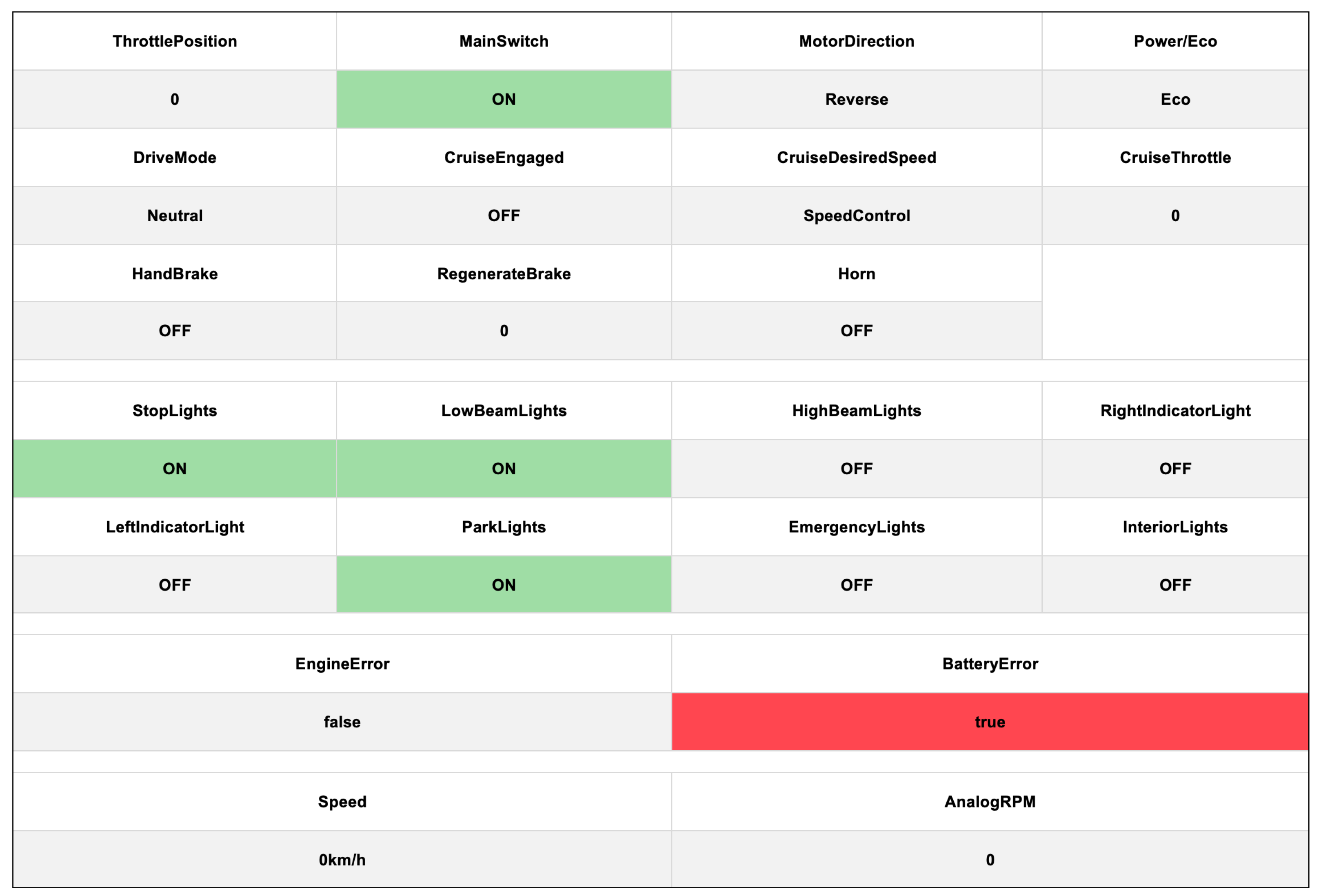
3.1. Basic Web Visualization Mode: WebBase App

The WebBase App was developed using the Angular front-end framework, so as to preserve basic design flexibility. This version of the app was implemented to visualize data using simple tables, as simplicity has been a common standard in solar racing dashboards for years [24]. Such a tabular example view is presented in Figure 4. The table view is split into four main vertical sections: vehicle speed, errors, lights, and miscellaneous data. There are three main types of information displayed: numbers, text descriptions, and status info indicators. It is worth emphasizing that the overall appearance of the interface is structurally well organized but, at the same time, simple and visually dull due to its uniformity.
Status data are highlighted in green when they indicate a positive Boolean value. Engine and battery errors appear against a red background. This simple technique allows users to easily spot any dynamic data changes. The view design makes it possible to present a substantial amount of information on a single screen in a clear, organized manner. As a result, users can view all parameters and a large amount of data on a single screen without switching pages. However, each parameter is displayed in the same uniform manner, without clear distinctions.

3.2. Advanced Web Visualization Mode—WebAdv App

Since some parameters may change more frequently or be more important or more complicated, extra information, such as the physical location of the vehicle on the route, is sometimes needed. Therefore, another mode of visualization was proposed, as illustrated in Figure 5. This interface presents a richer, more diverse view, divided into four main sections arranged across two rows. The upper row consists of a top bar displaying essential information through basic color icons and alphanumeric parameter values. The lower row occupies most of the screen and shows more visually detailed information. There are three widgets presenting the general status of the car on the left part of the top bar. When the green widget is highlighted, the vehicle is ready to drive. Red lights indicate a general battery or motor error. The right part of the upper bar shows other important battery and motor parameters, such as the state of charge, cell temperature, total battery pack voltage, vehicle instantaneous velocity, etc.
A race map is located just below the right-hand section, allowing the strategist to monitor the car’s location on the track in real time. On the left-hand side, four gauges display essential race information, such as car speed and power consumption, in a clear, separate format. By combining different display types, all critical and high-priority information about the car’s current condition is shown. However, this solution does not provide detailed debug information for the car’s systems.

3.3. Augmented Reality Application

The rapid development of AR technology has opened new opportunities for data visualization. Therefore, a new solution featuring this technology was proposed. The team began experimenting with the HoloLens HMD AR device. This augmented reality headset enabled features such as spatial mapping, hand gestures, and voice commands. We implemented the data visualization on a 3D car model, as shown in Figure 6. The left image displays the car’s main components: motors, batteries, and photovoltaic panels. These are highlighted in different colors to indicate their status. For instance, green photovoltaic rooftop panels show that the solar energy collection is near maximum (as indicated with #2 in the left picture). Dark blue rooftop panels indicate lower energy production status (indicated with #2 in the right picture). The motors and battery are highlighted in red to signal any errors.
The right image in Figure 6 shows an alternative view: four gauges displaying car parameters in the foreground, with the control panel visible in the background. The information presented is aligned with the model’s position via the control panel.

4. Evaluation

Solar car races can be extremely demanding, both physically and mentally. Routes often stretch over several days and pass through challenging terrain. Teams face not only race-related risks (e.g., tire punctures) but also potential threats in the environment, such as bushfires or sandstorms. This places significant stress on the entire crew, but particularly on the strategists, who must focus on the team’s current standing while planning future actions. Consequently, continuous efforts are made to enhance the monitoring and decision-support tools used by race teams to improve the overall experience.
One such effort involved deploying augmented reality (AR) technology to provide a more intuitive method for interpreting real-time data. Augmented reality was first adopted by the Lodz Solar Team in 2018 and received positive feedback, although no structured evaluation was conducted at the time. Team members reported performance improvements, yet it was unclear which specific AR features accounted for these gains. To address this gap, the authors later conducted a user study in a controlled laboratory setting. This study used a task-based approach to evaluate the methodology. Participants performed four tasks based on real historical race data presented in three different ways. Because everyone worked with the same dataset, their decisions could be verified against actual outcomes. The participants analyzed data in three distinct visual interface setups and completed four assignments. Their performance was assessed in two ways: by simulating the impact of their decisions on overall race results and by examining specific task outcomes. The first, broader analysis focused on overall simulated race performance, while the second, more detailed assessment included quantitative measures (task completion time, reaction time, decision accuracy) and qualitative indicators (Task Load Index and System Usability Scale).

4.1. Research Questions

Our goal was to investigate how different data presentation methods can enhance the assimilation of information by human operators and improve decision-making during solar car races. The project was guided by assumptions aimed at improving strategic decision-making in solar races and possibly reducing the mental workload on users who rely on AR interfaces, as reported previously by the team members. In addition, we sought to explore more broadly how AR could be utilized in the context of solar car racing, particularly with respect to telemetry data readability and usability. Given that solar car racing is a relatively niche pursuit and that AR holographic glasses are still unfamiliar to most people, we also considered whether personal experience might affect our findings. Accordingly, we formulated the following main research questions:
RQ1:
Does augmented reality-based data visualization for on-the-fly strategy adjustments in solar car races affect overall performance?
RQ2:
Which aspects of AR employment influence individual standard tasks related to the effective execution of telemetry-based Solar Race Car data analysis?
RQ3:
How does the experience level of team members translate into the effectiveness of using information presented in different interfaces?
Building on these main areas, we conducted a user-based study to compare a series of previously developed solutions and draw conclusions about their potential effects on performance, cognitive and physical workload, and usability. We used real datasets from two historic races—one free road race and one circuit track race—and employed task-based emulation to explore users’ reactions and decision-making processes. To thoroughly assess this scenario, we devised a study plan that incorporated both quantitative and qualitative methods.

4.2. User Study: Task-Based Evaluation

To compare various approaches to data visualization, we designed a task-based study involving the analysis and interpretation of telemetric data reflective of real race scenarios. These scenarios mirror typical situations in which the race crew must decide on strategy and response tactics. Four tasks were selected by experienced senior solar team race members to represent the most typical, standard situations that occur during the races. Each task incorporated a short time series of telemetry data recorded during actual events: the 2019 World Solar Challenge in Australia (for tasks T1, T2, and T3) and the 2018 European Solar Challenge in Belgium (for tasks T1, T3, and T4). The results from each task can be analyzed either individually or in aggregate. In particular, the aggregated results from T1, T2, and T3 may provide insight into the prospective overall performance change in free road racing, while tasks T1, T3, and T4 can highlight performance variations relevant to circuit races.
To explore this issue in more detail, four task-based scenarios were introduced, each designed to simulate real-world conditions with increasing complexity. The first task (T1), concerning tire-puncture recognition, is relatively straightforward to perform. However, in an actual race, such an event can lead to catastrophic consequences, including severe accidents on roads or circuit tracks. Because a tire puncture can rapidly compromise the car’s stability and handling, it is essential to monitor all incoming data throughout the race to ensure the safety of both the driver and passengers. The other scenarios involved more complex situations, such as a battery malfunction (T2), deciding whether to increase the vehicle’s speed during the free race (T3), or whether to charge the car during the circuit race (T4). These scenarios require the analysis of multiple, often unconnected, signals. When adjusting speed, the user must also consider previous events and current conditions, while T4 requires determining optimal charging times based on lap counts. Given that these scenarios were derived from historical data, the correct decision for each situation could be determined through documented choices and expert analysis. This enabled the evaluation of participants’ decisions in terms of both accuracy and the time taken, which are crucial factors in this context. Consequently, this approach offered an additional layer of analysis beyond traditional user experience studies.
The evaluation involved four task-based scenarios analyzed under three distinct visualization modes:
  • Baseline simple, web-based application with a table-like simple interface application (henceforth referred to as WebApp Base);
  • More advanced, containing graphical elements, yet still a web-based window view interface application (henceforth referred to as WebApp Adv);
  • A head-mounted display–based, augmented reality holographic interface viewed through HoloLens (henceforth referred to as HMD AR).
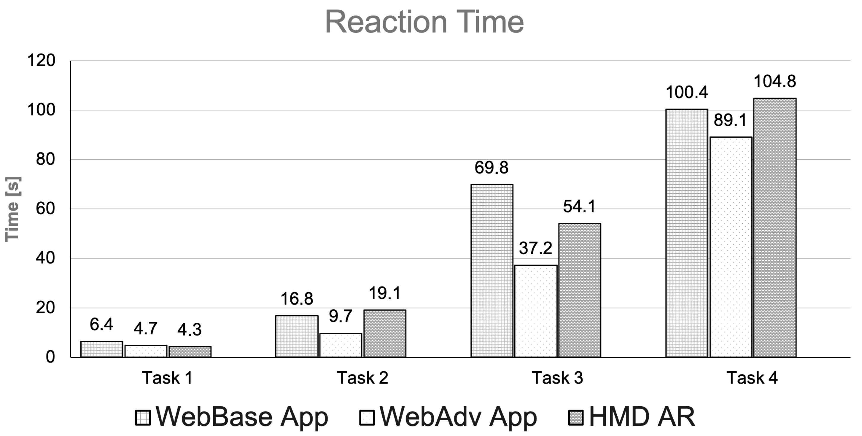
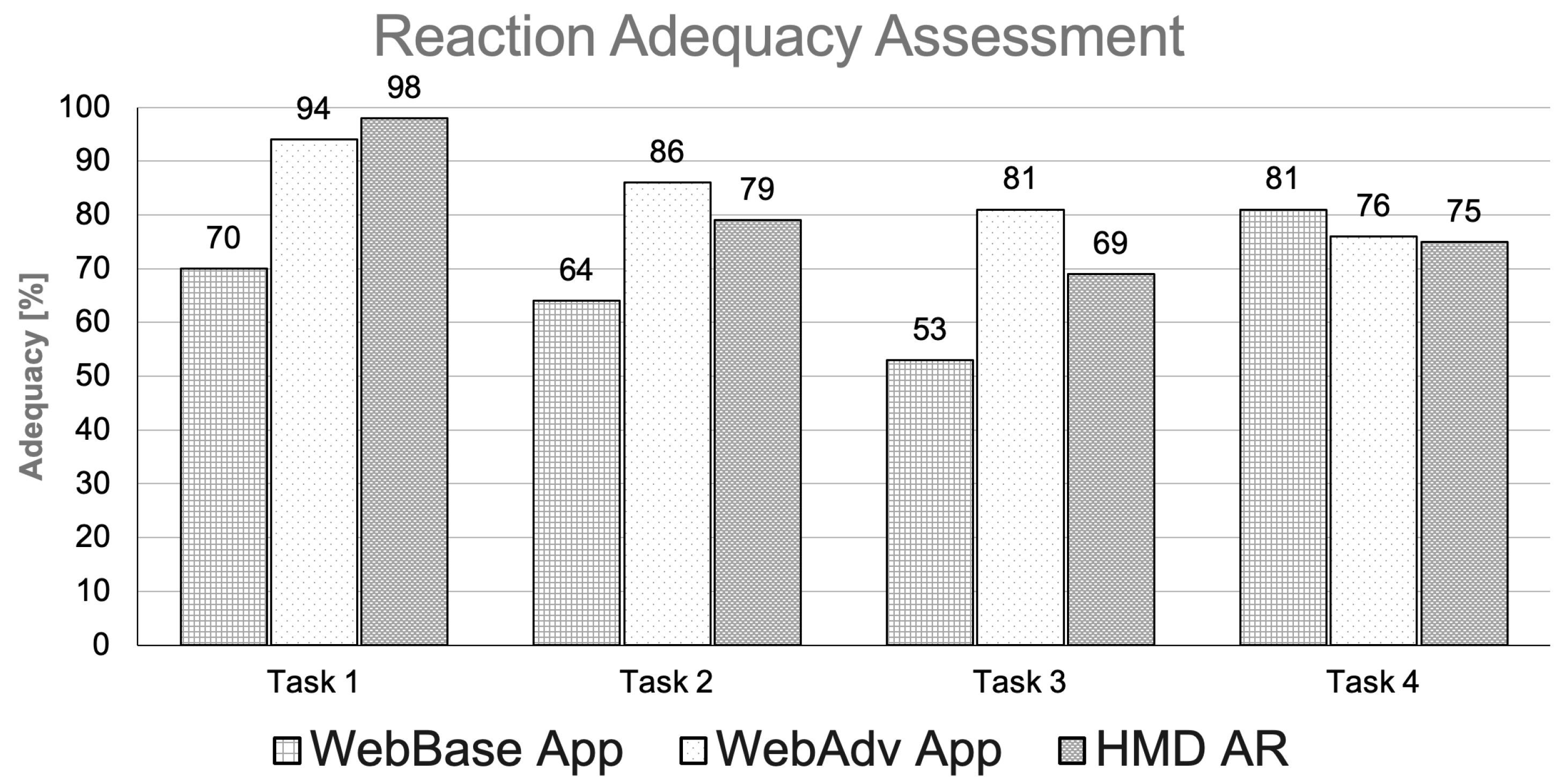
Each of the four scenarios was scheduled to last five minutes. During this time, a predefined event was designed to occur, prompting the participant to detect a system malfunction and/or decide on the appropriate team action. The participants were presented with the following tasks:
T1:
Tire puncture—A sudden drop in air pressure in one of the wheels.
T2:
Battery malfunction—An unexpected voltage drop in one of the battery pack cells.
T3:
Optimal speed decision—Determine the best vehicle speed for the remainder of the race based on the current car condition and race situation.
T4:
Charging strategy—Decide when to charge the vehicle during a circuit race, specifically how many laps should be completed before charging, taking into account the car’s status and race conditions.

4.3. Participants

The study employed a between-subjects design. A total of 60 participants were recruited, including 27 females and 33 males. The participants had different levels of expertise in the analysis of telemetric data from solar vehicles—starting from main strategists in three races with significant experience in this field n s t r = 9, to moderately experienced team members with experience performing other roles in the team n m o d = 18, to those with no previous experience of solar car racing at all n n o = 33. We attempted to recruit as many experienced solar car race contestants as possible and succeeded in recruiting n e x p = 27 such experienced participants, including 20 males and 7 females, all of whom were members of the Lodz Solar Team.
We composed three groups of participants, each consisting of 20 people. Each group was assigned to a different experimental condition, as follows. First, we coded their personal details and divided the participants according to their declared gender. We then differentiated them into three classes of experience level. For each condition, we assigned 3 of the 9 highly experienced users, 6 of the 18 moderately experienced users, and 11 users with no prior experience, bringing the total number in each group to 20 people. On average, the participants had been members of the Solar Team for 21 months, with a standard deviation of 7 months.

4.4. Experimental Setup

The experimental evaluation was conducted in the controlled laboratory settings of the Institute of Applied Computer Science, Lodz University of Technology, Poland. The tasks were conducted using MS Hololens mixed reality smart glasses, which allowed for smooth operation within an augmented reality space with a hands-free head-mounted display. The web-based solutions (basic and advanced versions) were running on a standard PC workstation equipped with 32GB RAM, average i-5 CPU, and basic GPU graphics driving a 27-inch display to ensure seamless operation. We used the original body of the Lodz Solar Team Eagle Two vehicle for all user study tasks. The environment, consisting of HoloLens applications, was programmed in C#, with a web server implemented in C# using the .NET framework and a front-end developed with TypeScript and Angular.

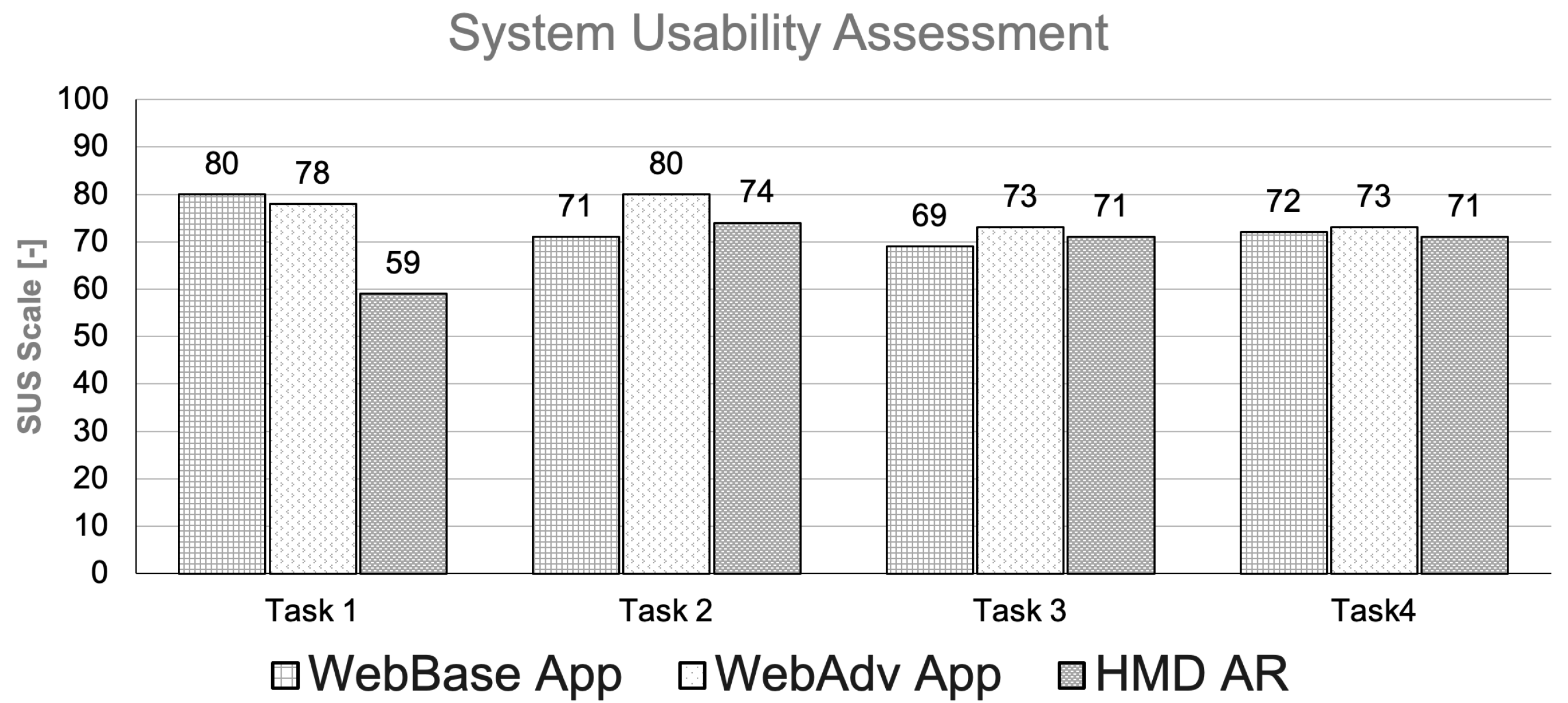
4.5. Quantitative and Qualitative Assessment

At the start of the experimental session, each of the participants gave written consent to take part in the study. Each participant was presented with the functionalities of all the researched applications and given the chance to use each of the systems before the actual experiment took place. Next, the experimental scenario was described to allow participants to better understand the goal of their task. The answer sheets were distributed separately before the start of each task. To ensure counterbalancing and reduce order effects, participants were evenly assigned to starting conditions such that every third participant began the experiment with a different interface modality: one third with the WebBase App, one third with the WebAdv App, and one third with the HMD AR application. Within each group, the order of tasks was randomized to minimize potential learning or fatigue effects. The participants and their answer sheets were anonymized. Their attempts were recorded to allow further analysis. After the completion of the investigation, all the files were deleted.
To check the stated hypothesis, the experiments were designed in such a way that the results could be measured both quantitatively and qualitatively. From a quantitative perspective, we decided to use the popular measures of task completion time and accuracy. Accuracy was measured by comparing the answers given by the participants to the ground truth answer tables. The tables were prepared by former Lodz Solar Team members who had been the strategists in the races. The task completion times for all the tasks were created using the video material from participants’ attempts. From a qualitative perspective, the workload index assessments and participants’ opinions concerning all the systems were taken into consideration. After finishing the tasks, participants completed two surveys on their experience during the task session. To assess the usability of different versions of telemetric data visualization, the System Usability Scale (SUS) was used. According to Bangor et al., SUS results can be translated into adjectives characterizing the assessed system [71]. To measure the effort required to complete each of the tasks, we decided to use the NASA Task Load Index (TLX) [72]. The NASA TLX is one of the most popular methods of measuring the workload needed to perform a task. Finally, after collecting these two questionnaires, we conducted a debriefing interview. We asked the users about their impressions of the AR data visualization and potential contexts in which such presentation of information/data would be useful.

5. Results and Discussion

This section covers the analysis of the results obtained during the user study, compiled comparatively against the historical race data. First, we proposed a pseudo-baseline comparison estimation for the anticipated impact on the overall race performance parameters. The comparison is based on average user study results contrasted with real, historical results recorded for the free and circuit types of races. In this way, we aim to simplify the process of quantitatively assessing earlier reports from Lodz Solar Team members regarding the potential benefits of using augmented reality in-race strategy execution. Subsequently, the results of the user study are presented and discussed in a detailed breakdown of distinct tasks. Additionally, we present a breakdown of the results for different subgroups of participants divided according to level of experience. Although the participants were carefully assigned to the conditions (for each 20-person cohort, as described in Section 4.3), taking into account three levels of experience (experts, moderate experience, no race-experience), the final analysis was conducted for two groups: high-experience users and a group of low-experience users formed by joining the moderately experienced and novice users.
The rest of this section is organized as follows. First, the prospective performance impact of this research is presented in Section 5.1. Then, detailed quantitative and qualitative measures are demonstrated in subsections regarding users’ reaction times and adequacy Section 5.2, cognitive workload, and usability Section 5.3. Finally, performance variance depending on the users’ experience levels divided into visualization modalities is highlighted in Section 5.4.

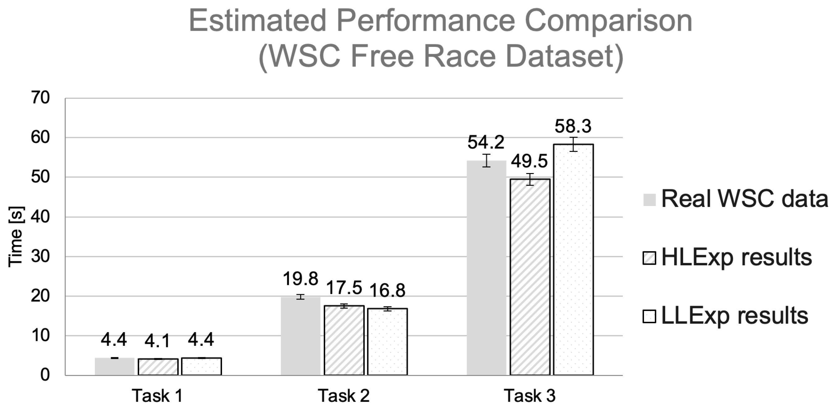
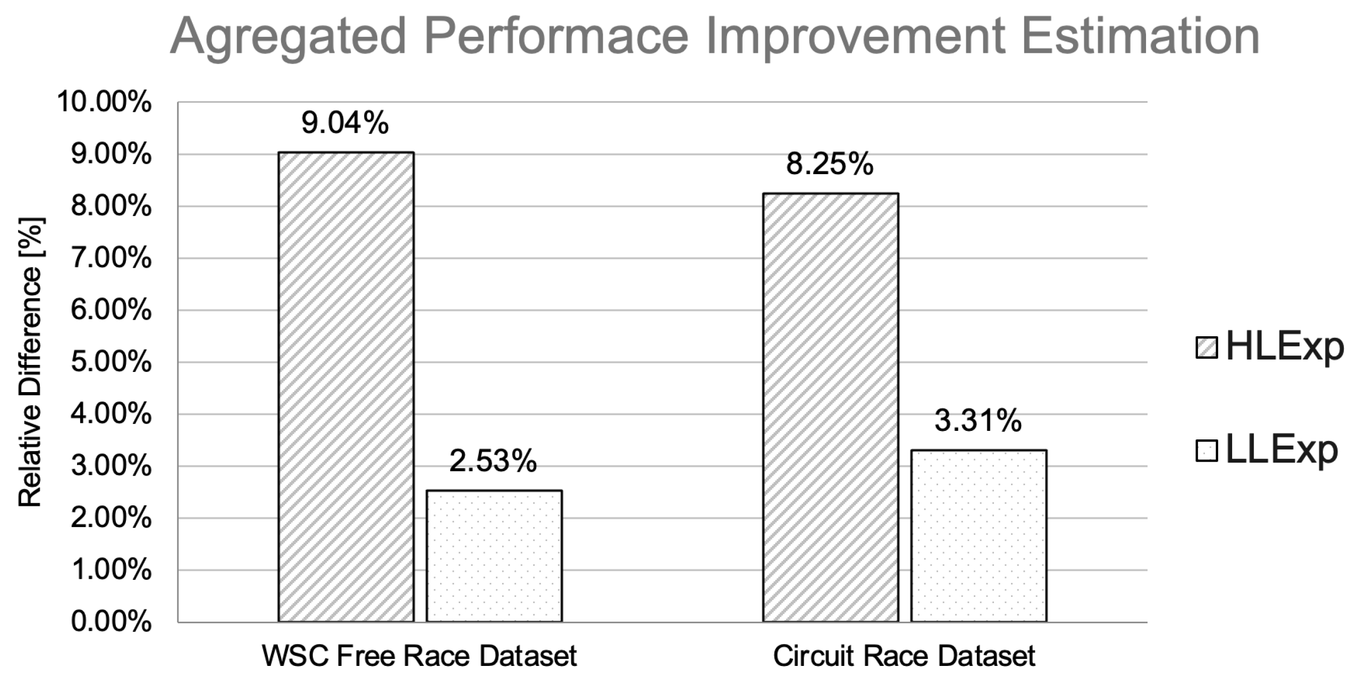
5.1. Prospective Impact on the Overall Performance Variation

The aggregate results for the free and circuit races were estimated, before analyzing the results for individual tasks in depth. Hence, in order to assess prospective performance change, a comparative analysis of the raw, historical race data and the average performance results obtained from the user study was conducted. All the race events within the historical data were analyzed to designate those types that were reflected by the tasks nominated for the user study. To exclude potentially erroneous results from the baseline dataset, the data were curated by a team of three expert users, who reviewed all designated events to eliminate any questionable decisions made by the original team during the specific race. Then, the total numbers of occurrences of each type of event were counted in each of the race (free- and circuit-mode) data sets. The simplified overall performance was approximated by the sum of significant parameters (such as the reaction times and accuracy of the decisions) for all the events. Next, the corresponding sum of the parameter values was calculated for the results obtained by the user study participants. For simplification, average results obtained by the participants for distinct tasks were taken as an approximation. Later, these average parameter values were multiplied by the number of occurrences for each of the event types. Finally, a comparative analysis was conducted to assess the prospective change in overall performance based on the sum of occurrences for the analyzed events.
Figure 7 presents a performance comparison bar chart for the World Solar Challenge 2019 free-race dataset. The three groups of three bars show results corresponding to the tasks T1, T2, and T3 for both real WSC dataset records and the controlled user study. The left bar in each group corresponds to real data. The other two bars in each group show results for controlled experimental data (high-level experienced users (HLExp) and low-level experienced users (LLExp)). To provide deeper insight, user study results for each task are presented with two bars relevant to the two groups of study participants—i.e., HLExp and LLExp.
Figure 8 presents an estimated performance comparison bar chart for the circuit-race dataset. As with the previous figure, the three groups of three bars show results corresponding to the three tasks. However, in the case of the circuit race, the tasks T1, T3, and T4 were analyzed for both the real circuit dataset records and the controlled user study. In the circuit race, T2-type events occurred too seldomly to be included in the analysis. The left bar in each group corresponds to real data. The other two bars in each group show the results of the controlled experiments. Again, the results for each task are split into two bars corresponding to the two groups of study participants—i.e., HLExp and LLExp.
Figure 9 presents an aggregated performance improvement estimation bar chart. The two left bars show results for the free-race data. The two bars on the right show circuit-race data. In each group, the left bars show the calculated total estimated performance difference calculated for HLExp, while the right bars correspond to LLExp.
As can be seen in Figure 9, there is a significant difference in estimated performance improvement for HLExp participants, who scored approximately 9%, while for LLExp users, the difference is less impactful, amounting to only approx. 3%.

5.2. Detailed Quantitative Results

The first quantitative results gathered for the experimental study were the task reaction times and response adequacy, as these were more comprehensive than the usually reported task completion times and error rate. Task completion times were measured for all four tasks performed by the participants. However, the reaction times and response adequacy describe users’ performance more specifically. Figure 10 shows a plot of the average reaction for each task for each application. As can be seen, the measured values differ greatly depending on the task, from a few seconds for T1 and T2 to over a minute for T3 and T4. This difference was expected since T3 and T4 were more complicated than T1 and T2. Users using advanced, graphical, web-based visualization had significantly lower TCT for tasks T2, T3, and T4. For T1, the difference between each visualization mode is not particularly noticeable.
The next and possibly one of the most crucial parameters we examined was reaction adequacy, which corresponds directly to strategy accuracy. We defined the reaction adequacy as a correct response given a timeout set as a multiplied value of the experts’ reaction average time. Hence, on the one hand, it is a strictly defined quantity, and at the same time, setting the particular timeout threshold value provides a certain measure of insight into possible user performance. A timeout value set strictly equal to the experts’ average results would result in a strong demonstration of suboptimal outcomes by inexperienced users. Setting this value to a greater multiply would tend to illustrate less weakness by novice users in comparison to well-versed experts. Therefore, the reaction adequacy defined in these terms is an illustrative parameter of adjustable meaning.
We decided to show the results of this parameter for different data visualization modes set at double of average times measured for experts’ responses. Such a threshold does not reflect most clearly the superiority of individual records for respective conditions, yet it gives a good overview of fluctuations in results depending on conditions for different tasks. The response accuracy for three visualization modes is compared in Figure 11.
Notably, with the reaction adequacy threshold set to double the expert reaction time, the results for all tasks vary by condition and, at the same time, are far from baseline—except for two conditions in T1 (tire-puncture event). For T1, participants achieved as high as 98% adequacy for the HMD AR visualization condition and 94% for the WebAdv App condition. For the other three tasks, the results mostly fluctuated at around 70–80%. The WebAdv App results were most consistent. The WebBase App recorded the worst results, dropping to as low as 70%, 64%, and 53% for T1, T2, and T3, respectively, although T4 with 81% was the highest T4 value among all conditions. Overall, it can be concluded that the WebAdv App mode yields reasonable performance in all cases, similar to the HMD AR condition. The WebAdv App achieved the best results in two tasks, whereas HMD AR did so in only one.

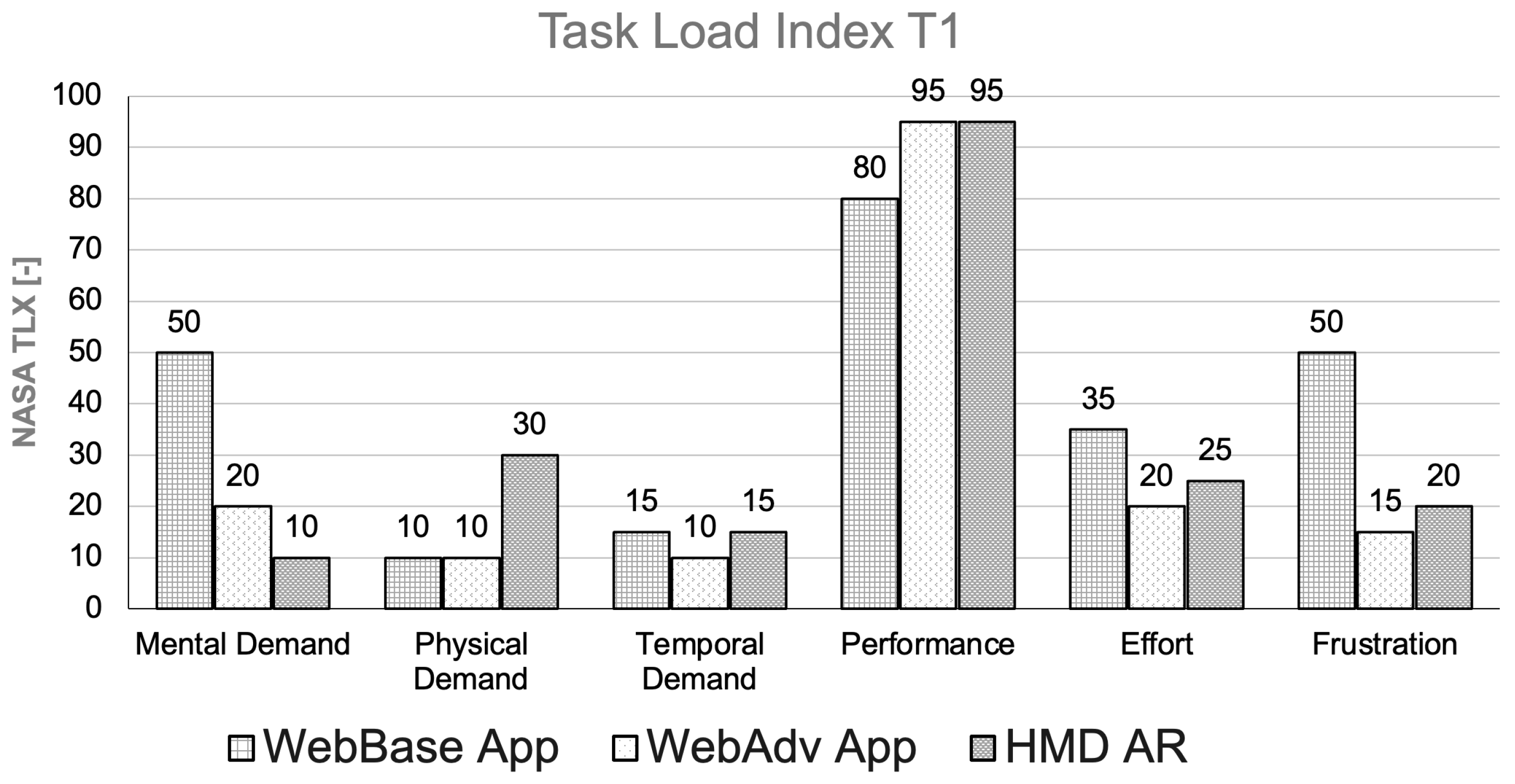
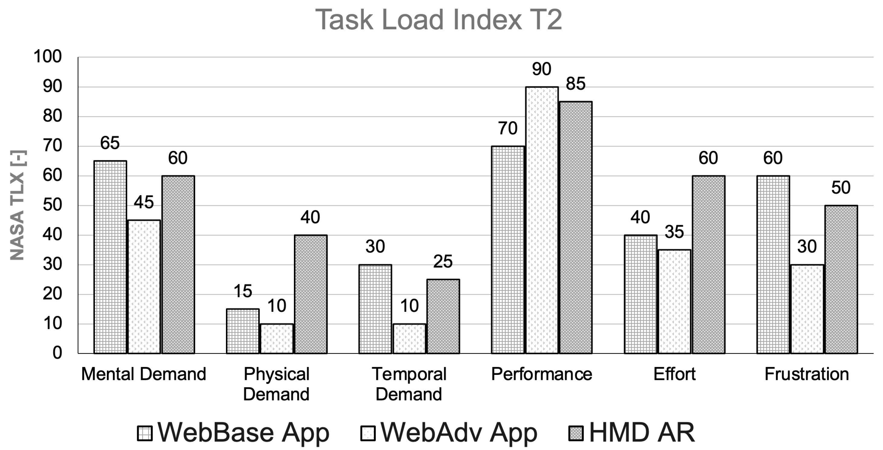
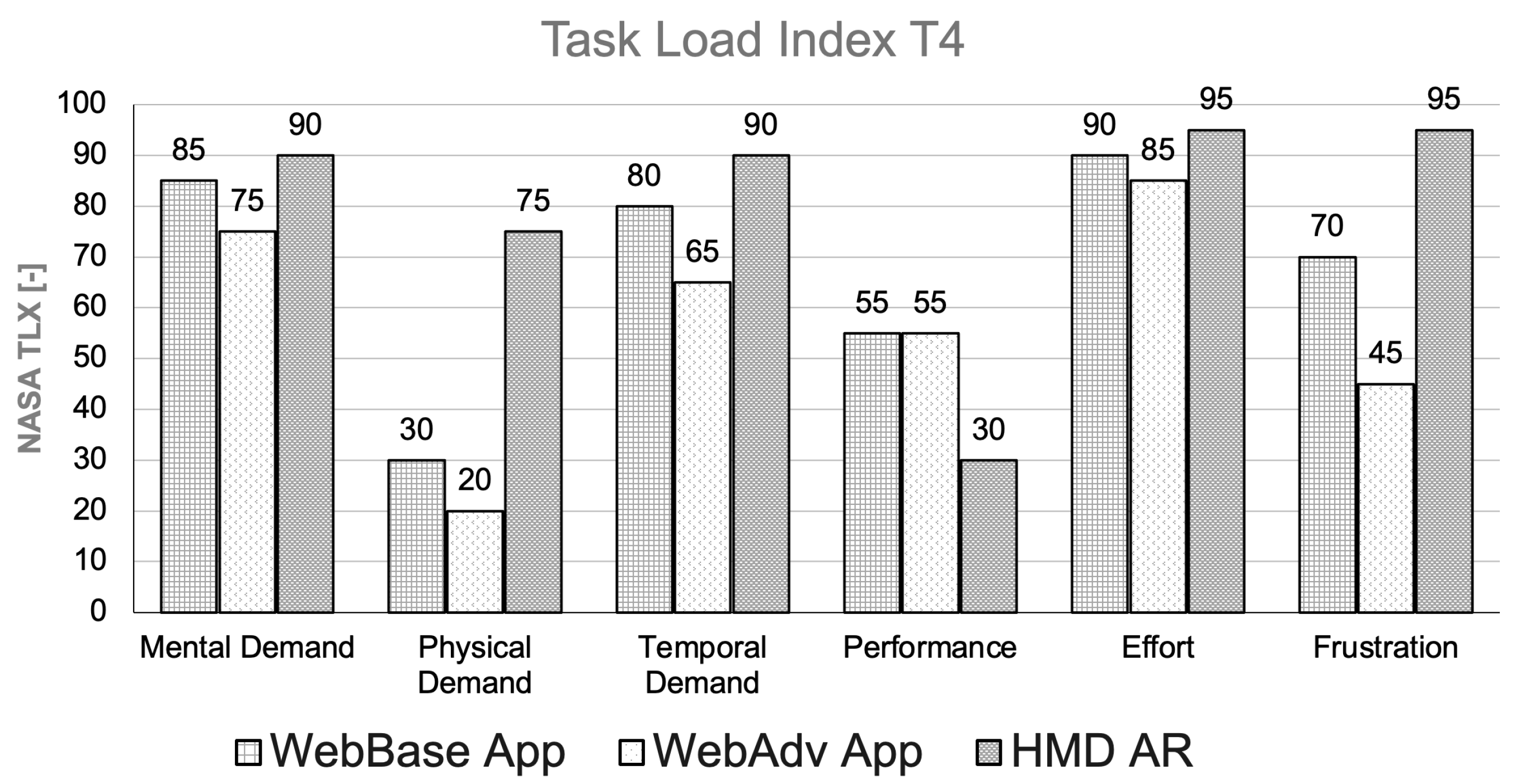
5.3. Cognitive Workload Assessment

Cognitive and physical workloads during all tasks were measured using NASA TLX and SUS methods. The tasks were designed to represent different levels of complexity, to measure the impact of human perception. The results of T2 and T3 were used to compare phenomena occurring with rising levels of complexity. To fully compare the impact of different visualization methods, results should be cross-validated with task completion times and task accuracy scores. The first task, T1, is associated with an important and rapidly occurring event: a tire puncture that calls for immediate attention. Figure 12 presents the results of NASA TLX T1 for all conditions.
Notably, the task load index scores for T1 show relatively high mental demand and high frustration for the simple WebBase App interface. Moreover, the reported effort was the highest for this type of visualization, although it remained at a reasonable level, within 35 scores. Physical demand in using the system was the highest for the AR application interface, as was temporal demand (although the temporal demand level was the same as for the WebBase App modality). Users perceived a high level of performance for all the modalities, with the lowest value of 80 out of 100 for the WebBase App mode. Generally, temporal demand scores can be very low, with values between 10 and 15.
Figure 13 shows NASA TLX results for T2 (battery malfunction detection). The NASA TLX results for T2 show generally more demanding conditions than for T1. As with T1, the WebBase App mode received notable mental demand and frustration scores; however, these scores increased significantly for the other modalities as well. Performance scores were high, yet lower than in the case of T1. Again, the WebBase App received the lowest score of 70. The AR-based solution required noticeably higher effort in terms of both physical and temporal demand than the other two methods.
The mental, physical, and temporal demands, as well as the frustration and effort, were generally higher than for T1, especially in the case of the AR HMD app. Users still assessed AR more positively than the WebBase App in terms of performance. On the other hand, the WebAdv App modality received the best scores in all the categories for T2.
Task 3 was associated with strategic decision-making during an open road race: adjusting vehicle speed according to the current situation and optimizing the predicted remainder of the race. For T3, the NASA TLX scores illustrate even higher numbers in terms of demands, effort, and frustration, with much lower scores for performance assessment (Figure 14). For most categories, the WebAdv App receives the best scores, requiring the lowest mental and physical effort, causing the least frustration, and receiving the best performance score. Overall, users found T3 highly mentally demanding, with scores from 60 (for WebAdv App condition) to 80 and 85 (for WebBase App and AR modalities, respectively).
During Task 4, participants performed the even more difficult task of analyzing modeled dynamic race conditions. Figure 15 shows that this task was significantly more demanding, introduced more frustration, and yielded lower perceived outcomes than T3. From a direct comparison of both tasks, it can be observed that the overall demand increased—as was expected, as the task was, in general, more difficult. A general drop in the participants’ confidence can also be observed as a reported decrease in the subjective performance score. Again, the WebAdv App application scored better than the other two solutions.
As shown in Figure 16, all modalities exhibit comparable SUS results, with only minor variations, except for T1. A significant difference is observed in T2, where the HMD AR application receives the lowest score. This is an interesting finding, as it contrasts with the quantitative results, which indicate the best performance for this modality in terms of reaction times and task load index values. On the other hand, while the results are generally comparable, the WebAdv App consistently receives the highest ratings in the System Usability Scale analysis.

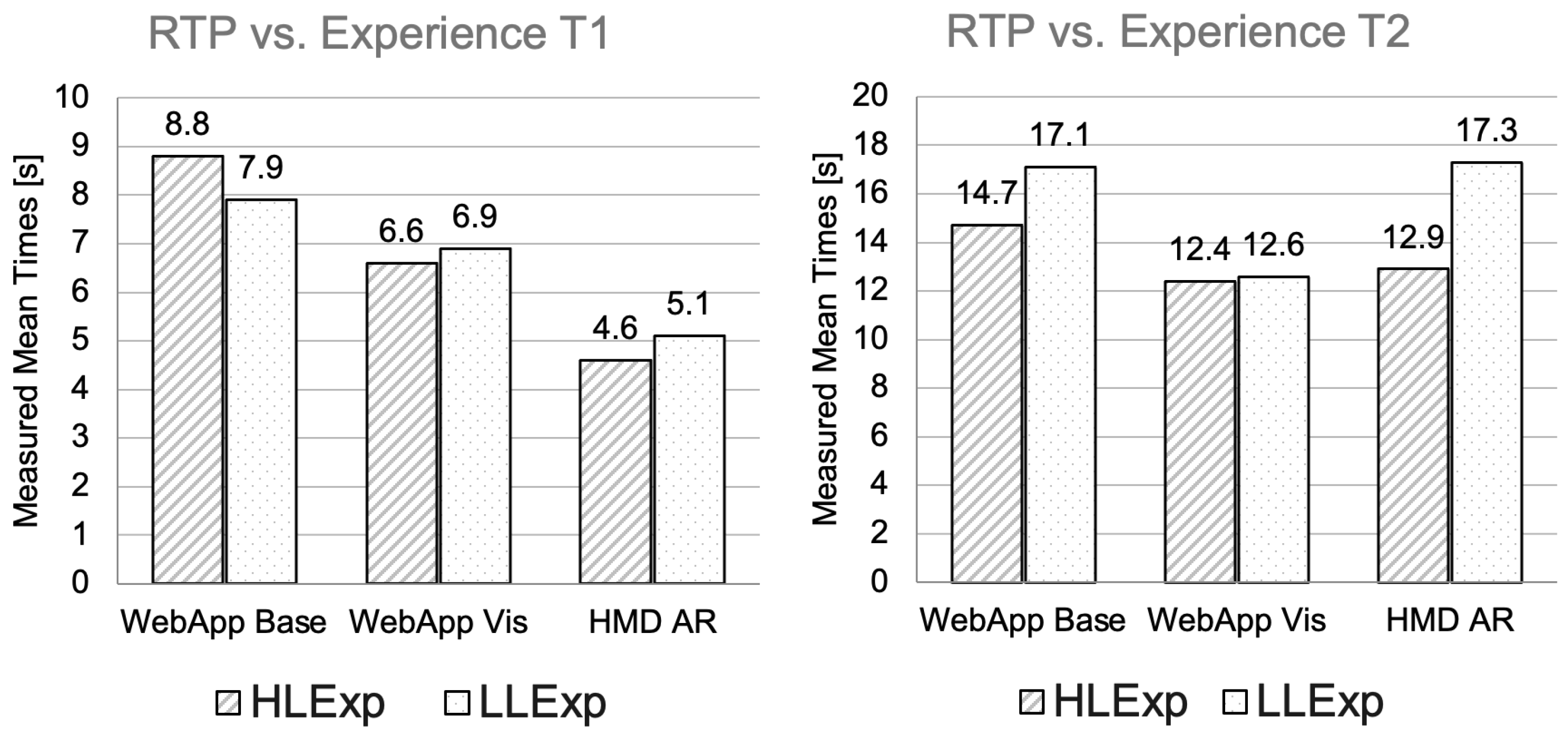
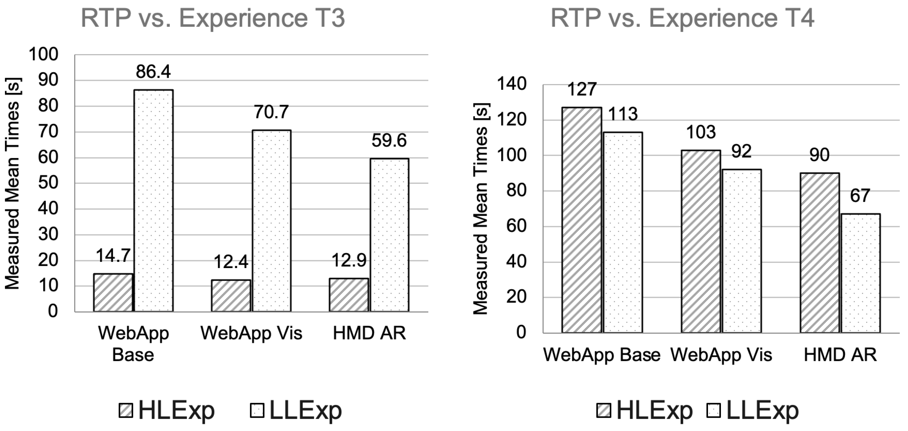
5.4. User’s Professional Experience Level vs. Mode of Telemetry Visualization

To gain a deeper understanding of how data interpretation can influence user performance, it is worth comparing response results obtained by HLExp and LLExp users. Figure 17 and Figure 18 compare the correct response reaction time performance (RTP) to each particular event for consecutive tasks (T1, T2, T3, and T4). Each graph for consecutive tasks shows the summarized results broken down per visualization mode (WebBase App, WebAdv App, and HMD AR).
As shown on the RTP graph for T1 on the left of Figure 17, LLExp users performed better than HLExp users in WebBase App visualization mode but achieved worse results for both WebAdv App and HMD AR modes. Notably, the HLExp users performed worst with the WebBase App, significantly better with the WebAdv App, and achieved the best results with HMD AR, whereas LLExp users performed comparably for all modalities, achieving the best results with the WebAdv App—although still considerably worse than HLExp users. The RTP graph for T2 shown on the right of Figure 17 demonstrates the slightly better performance of HLExp users over LLExp users. However, whereas the results for both Web App conditions show comparable values, HMD AR conditions show significantly worse results achieved by LLExp users.
The results for T3 are shown on the left-hand side of Figure 18. For this task, the differences for all three conditions are significantly better for HLExp users. The HLExp users performed well and similarly for all three modes, while the LLExp users performed best on HMD AR and worst with the WebBase App. However, the average RTP times for HMD AR were still almost 5 times worse than for HLExp users. The results for T4 are shown on the right-hand side of Figure 18. Both groups of users achieved the best results with HMD AR and the worst results with the WebBase App. Interestingly, LLExp users performed significantly better than HLExp users for each condition in T4.

5.5. Summary of Results

To determine whether any discernible patterns align with the racing team’s earlier reports of potential performance differences stemming from various data visualizations, we analyzed the results achieved by participants using three distinct visualization interfaces. The strongest evidence supporting the potential for improving race-strategy performance is presented in Figure 9. However, it is important to acknowledge that there is no definitive evidence that the new interfaces consistently outperform all others in every situation, which would be the ideal outcome in response to RQ1.
We also analyzed the results obtained under experimental conditions to examine whether, how, and to what extent different data visualization modes could enhance user performance while perhaps also reducing cognitive and physical workload (RQ2). Generally, the overall performance difference between the real results extracted from the races and the average results achieved by the participants using the emulated data reflecting those real results visualized using proposed modes showed possible progress, as shown in Figure 7 and Figure 8. The average possible increase in efficiency ranges from 1% to 9%, as can be observed in Figure 9. Interestingly, the reaction times varied and were not always superior over the baseline condition (WebBase App) for other experimental conditions (WebAdv App and HMD AR); yet the baseline never reached the best results, as can be seen in Figure 10. Reaction adequacy analysis revealed poor results for the baseline condition for most tasks, except T4, for which the results for all the conditions were comparable, as depicted in Figure 11. Remarkably, when analyzing the entire group of participants, the HMD AR condition proved superior only for a specific task (T1, tire puncture), achieving an almost perfect score of 98%.
On the other hand, task workload analysis revealed heterogeneous and diverse results across different tasks and conditions. Results for T1, in which the HMD AR condition proved highly efficient, showed significantly higher physical demand compared to the other conditions yet received low scores for mental workload and high scores for self-assessed performance (Figure 12). For the other three tasks (T2, T3, and T4), HMD AR appears to have been more demanding than in T1, and in most cases more demanding than the WebAdv App condition, as can be seen in Figure 13, Figure 14 and Figure 15. The WebAdv App condition was also rated as the least demanding and least frustrating during most tasks, and it was self-reported as providing the best performance, even though it did not actually achieve the top results (as illustrated by T4).
Regarding reaction adequacy, the WebAdv App condition was similar to HMD AR but lagged behind the WebBase App condition for T4. However, it was again the best rated in terms of NASA TLX parameters. System usability results revealed similar relationships as NASA TLX analysis. As illustrated in Figure 16, HMD AR achieved the best results for T1 and performed comparably well to the WebAdv App in T4. The WebAdv App achieved the best scores for T2 and T3, while for T1, the WebBase App achieved particularly low marks. At this point, one might conclude that the study’s outcomes are ambiguous since there is no clear evidence that any single visualization mode is superior to the others; therefore, no strict guidelines can be derived from this study.
However, analyzing the results by user experience level offers a different perspective. As shown in Figure 17 and Figure 18, for T1, T2, and T4 LLExp users achieved significantly better performance when using the HMD AR interface than for other conditions, while HLExp users outperformed them across all experimental conditions only in T3. Therefore, a key aspect of this work involves showing that emerging interfaces such as augmented reality in head-mounted displays can—in some cases and for some users—be highly effective in diverse decision-making scenarios.
Figure 19 presents a summative comparison of three types of results: reaction time (RT), result adequacy (RA), and System Usability Scale (SUS), across all three experimental conditions, divided between more experienced (HLExp) and less experienced (LLExp) participants. The best scores in each category and task are highlighted in bold in the table. As can be seen, these top scores are almost exclusively achieved by HLExp participants (except for the first two T1 measures, RT and RA), although they are unevenly distributed across the different visualization modalities. The fact that the best results are obtained by more experienced users is unsurprising. Moreover, the tendency for traditional interface types to be more effective for these users could be attributed to their longer familiarity with such systems.
However, a deeper analysis of the data reveals additional insights. In the table, cells with a vertically dashed background indicate the best scores achieved by LLExp participants. Strikingly, most of these top results fall under the HMD AR condition (except for one measure: RT in T2, T3, and T4). This clearly highlights the significant potential of augmented reality HMDs to support less experienced users.

6. Conclusions

This article has explored various modalities for displaying telemetry information to support strategy selection and execution during solar car races. The results demonstrate how different data visualization methods reflecting the vehicle’s current status can benefit different user groups to varying degrees. Intriguingly, while standard interfaces provided users with good command in most situations, non-standard interfaces such as augmented reality in a head-mounted display were found to successfully assist certain types of users with specialized tasks. Notably, response reaction times analysis showed that while participant experience is crucial for more challenging tasks, less experienced users can sometimes achieve significantly better results when using an AR HMD than their more experienced counterparts. Moreover, the results suggest the potential for improved strategy execution in at least half of the examined events—i.e., two out of three free-race event types and two out of three of the circuit-race events. While the NASA TLX results were, to some extent, ambiguous, users reported experiencing significant mental and physical load when using the AR HMD. In some cases, they also gave lower scores for self-assessed performance, even when this perception did not align with the actual measured response times.
Therefore, one of the most significant takeaways from this study is the need to pay close attention to users’ experience levels. Our findings show that emerging technologies, such as augmented reality, have notable potential, particularly for novice users. This suggests that well-structured training programs, specifically tailored to specialized tasks performed in AR-equipped head-mounted displays, can be highly effective. By focusing on the unique demands of these interfaces, novice users can quickly develop skills, potentially achieving performance on a par with, or even exceeding, that of more experienced users.

6.1. Limitations

Many limitations exist in the current study, beginning with the controlled environment used during the experiments. In real-life scenarios, the application would be deployed during an actual race, placing users under intense time pressure and responsibility. Moreover, members of solar car racing teams lack sufficient time to rest and recover throughout the event. Hence, the limited timing, employed experimental setup, and calm settings of this study may not fully capture the application’s real-world conditions. The study’s findings are also limited to the tested scenarios only.

6.2. Directions for Future Work

While the presented infovisual interface graphics are imperfect, we did not prototype any new designs for the sole purpose of this study, relying instead on previously deployed visuals to avoid introducing additional confounding variables into this exploratory study. However, for further exploration of the identified research directions, it would be worthwhile to propose specifically designed interfaces and select new experimental scenarios that incorporate these novel elements. Furthermore, as one of the key findings of this study highlights the strong potential of augmented reality as the most effective option for certain user groups, it is essential to further investigate the preferences of novice users in various contexts. This could serve as a foundation for designing and prototyping new interfaces from the ground up, specifically tailored for this group and leveraging the AR modality, namely augmented reality delivered through head-mounted displays. Such an approach would likely lead to significantly improved outcomes. It can also be assumed that there is substantial potential for applying this technology in other domains that require decision-making support for novice users, such as industry and healthcare.

Author Contributions

All authors co-worked in conceptualization, methodology, data curation, formal analysis, and original draft-editing. J.F., P.K., K.F. and K.J. contributed to the design and development of the racing car. J.F., P.K. and K.F. developed and deployed the software apps for the race and study data collection. J.F., P.K., K.F., A.R. and K.G. contributed to the study design. A.R., K.G., K.J. and Z.C. review and editing, A.R., K.G. and Z.C. analysis and discussion, J.F., P.K., K.F., A.R. and Z.C. visualization and results synthesis. All authors have read and agreed to the published version of the manuscript.

Funding

This research received no external funding.

Institutional Review Board Statement

The study was conducted according to local regulations of the institutional ethical approval.

Informed Consent Statement

Informed consent was obtained from all subjects involved in the study.

Data Availability Statement

The original contributions presented in this study are included in the article. Further inquiries can be directed to the corresponding author.

Acknowledgments

Authors wish to pass special thanks to ABB Poland R&D Division and Przemysław Zakrzewski, head of the Poland Division, for their kind and valuable organizational support as well as providing AR HMD equipment for part of the races and experiments conducted by Lodz Solar Team members. The Lodz Solar Team project has been developed for many years with the support of numerous generous individuals and institutions. We are grateful for all the support of this project over the many years of our work.

Conflicts of Interest

The authors declare no conflict of interest.

Abbreviations

The following abbreviations are used in this manuscript:
ADSAutomated Driving Systems
ARAugmented Reality
AVRAugmented Vehicle Reality
CANController Area Network
CFDComputational Fluid Dynamic Modeling
CPUCentral Processing Unit
EVElectric Vehicle
GPUGraphical Processing Unit
HLExpHigh-Level Experienced Users
LLExpLow-Level Experienced Users
HMDHead-Mounted Display
Head-UpDisplays (HUDs)
HVIHuman–Vehicle Interaction
HTTPHypertext Transfer Protocol
MRMixed Reality
NASA TLXTask Load Index
RAReaction Adequacy
RTReaction time
RTPcorrect Response reaction Time Performance
SRCSolar Race Car
SUSSystem Usability Scale
TCPTransmission Control Protocol
TCTTask Completion Times
VRVirtual Reality
WebBase AppBasic web visualization mode
WebAdv AppAdvanced web visualization mode
WSCWorld Solar Challenge

References

  1. European Parliament Document, R. Regulation (EU) 2023/851 of the European Parliament and of the Council of 19 April 2023 Amending Regulation (EU) 2019/631 as Regards Strengthening the CO2 Emission Performance Standards for New Passenger Cars and New Light Commercial Vehicles in Line with the Union’s Increased Climate Ambition. Available online: https://eur-lex.europa.eu/eli/reg/2023/851/oj (accessed on 20 March 2025).
  2. Mohammed, M.N.; Alfiras, M.; Alani, S.; Sharif, A.; Abdulghaffar, A.; Al Jowder, F.; Elyas, K.; Alhammadi, B.; Mahdi, M.; Khaled, N.; et al. Design and Development of the “GU CyberCar”: A Solar-Powered Electric Vehicle Based on IoT Technology. In Proceedings of the 2023 IEEE 8th International Conference on Engineering Technologies and Applied Sciences (ICETAS), Bahrain, Bahrain, 25–27 October 2023; pp. 1–6. [Google Scholar] [CrossRef]
  3. Foxall, G.R.; Johnston, B. Innovation in Grand Prix motor racing: The evolution of technology, organization and strategy. Technovation 1991, 11, 387–402. [Google Scholar] [CrossRef]
  4. Dominy, J.; Bulman, D.N. An Active Suspension for a Formula One Grand Prix Racing Car. J. Dyn. Syst. Meas. Control 1985, 107, 73–79. [Google Scholar] [CrossRef]
  5. Sakai, T.; Doi, Y.; Yamamoto, K.; Ogasawara, T.; Narita, M. Theoretical and Experimental Analysis of Rattling Noise of Automotive Gearbox; Technical Report, SAE Technical Paper 810773; SAE International: Warrendale, PA, USA, 1981. [Google Scholar] [CrossRef]
  6. Soltic, P.; Guzzella, L. Performance simulations of engine-gearbox combinations for lightweight passenger cars. Proc. Inst. Mech. Eng. Part J. Automob. Eng. 2001, 215, 259–271. [Google Scholar] [CrossRef]
  7. Limebeer, D.J.N.; Perantoni, G.; Rao, A.V. Optimal control of Formula One car energy recovery systems. Int. J. Control 2014, 87, 2065–2080. [Google Scholar] [CrossRef]
  8. Bobrowski, J.; Sobczak, K. Numerical investigations on the effect of an underbody battery on solar vehicle aerodynamics. Arch. Thermodyn. 2021, 42, 247–260. [Google Scholar] [CrossRef]
  9. Betancour, E.; Mejía-Gutiérrez, R.; Osorio-gómez, G.; Arbelaez, A. Design of structural parts for a racing solar car. In Advances on Mechanics, Design Engineering and Manufacturing: Proceedings of the International Joint Conference on Mechanics, Design Engineering & Advanced Manufacturing (JCM 2016), Catania, Italy, 14–16 September 2016; Eynard, B., Nigrelli, V., Oliveri, S.M., Peris-Fajarnes, G., Rizzuti, S., Eds.; Springer: Cham, Switzerland, 2017; pp. 25–32. [Google Scholar] [CrossRef]
  10. Vinnichenko, N.A.; Uvarov, A.V.; Znamenskaya, I.A.; Ay, H.; Wang, T.H. Solar car aerodynamic design for optimal cooling and high efficiency. Solar Energy 2014, 103, 183–190. [Google Scholar] [CrossRef]
  11. Walter, E.; Glover, N.; Cureton, J.; Kosbar, K. Telemetry System Architecture for a Solar Car; International Foundation for Telemetering: Palmdale, CA, USA, 2015. [Google Scholar]
  12. Waldo, J. Embedded Computing and Formula One Racing. IEEE Pervasive Comput. 2005, 4, 18–21. [Google Scholar] [CrossRef]
  13. Betancur, E.; Osorio-Gómez, G.; Rivera, J.C. Heuristic Optimization for the Energy Management and Race Strategy of a Solar Car. Sustainability 2017, 9, 1576. [Google Scholar] [CrossRef]
  14. Howlett, P.; Pudney, P.; Tarnopolskaya, T.; Gates, D. Optimal driving strategy for a solar car on a level road. IMA J. Manag. Math. 1997, 8, 59–81. [Google Scholar] [CrossRef]
  15. Shimizu, Y.; Yasuyuki, K.; Torii, M.; Takamuro, M. Solar car cruising strategy and its supporting system. JSAE Rev. 1998, 19, 143–149. [Google Scholar] [CrossRef]
  16. Conti, J.P. Data driven [Comms—Telemetry]. Eng. Technol. 2008, 3, 70–75. [Google Scholar]
  17. Taha, Z.; Passarella, R.; How, H.X.; Sah, J.M.; Ahmad, N.; Ghazilla, R.A.R.; Yap, J.H. Application of Data Acquisition and Telemetry System into a Solar Vehicle. In Proceedings of the 2010 Second International Conference on Computer Engineering and Applications, Bali, Indonesia, 28–30 September 2010; Volume 1, pp. 96–100. [Google Scholar] [CrossRef]
  18. Ba, T.; Li, S.; Gao, Y.; Wang, S. Design of a Human–Computer Interaction Method for Intelligent Electric Vehicles. World Electr. Veh. J. 2022, 13, 179. [Google Scholar] [CrossRef]
  19. Kettle, L.; Lee, Y.C. Augmented Reality for Vehicle-Driver Communication: A Systematic Review. Safety 2022, 8, 84. [Google Scholar] [CrossRef]
  20. Aleva, T.K.; Tabone, W.; Dodou, D.; de Winter, J.C.F. Augmented reality for supporting the interaction between pedestrians and automated vehicles: An experimental outdoor study. Front. Robot. AI 2024, 11, 1324060. [Google Scholar] [CrossRef]
  21. Qiu, H.; Ahmad, F.; Bai, F.; Gruteser, M.; Govindan, R. AVR: Augmented Vehicular Reality. In Proceedings of the 16th Annual International Conference on Mobile Systems, Applications, and Services, Munich, Germany, 10 June 2018; pp. 81–95. [Google Scholar] [CrossRef]
  22. Murali, P.K.; Kaboli, M.; Dahiya, R. Intelligent In-Vehicle Interaction Technologies. Adv. Intell. Syst. 2022, 4, 2100122. [Google Scholar] [CrossRef]
  23. Forysiak, J.; Fudala, K.; Krawiranda, P.; Felcenloben, J.; Romanowski, A.; Kucharski, P. Solar Powered Electric Vehicle Information System. In Proceedings of the 216th The IIER International Conference, Kyoto, Japan, 27 January 2019; pp. 18–21. [Google Scholar]
  24. Mambou, E.N.; Swart, T.G.; Ndjiounge, A.; Clarke, W. Design and implementation of a real-time tracking and telemetry system for a solar car. In Proceedings of the AFRICON 2015, Addis Ababa, Ethiopia, 14–17 September 2015; pp. 1–5. [Google Scholar] [CrossRef]
  25. Sanderson, M. Chapter 40—Telemetry. In Instrumentation Reference Book, 4th ed.; Boyes, W., Ed.; Butterworth-Heinemann: Boston, MA, USA, 2010; pp. 677–697. [Google Scholar] [CrossRef]
  26. Read, A.J. T—Telemetry. In Encyclopedia of Marine Mammals, 2nd ed.; Perrin, W.F., Würsig, B., Thewissen, J., Eds.; Academic Press: London, UK, 2009; pp. 1153–1156. [Google Scholar] [CrossRef]
  27. Rymarczyk, T.; Adamkiewicz, P. Nondestructive Method to Determine Moisture Area In Historical Building. Inform. Autom. Pomiary Gospod. Ochr. Środowiska 2017, 7, 68–71. [Google Scholar] [CrossRef]
  28. Woźniak, P.; Romanowski, A.; Yantaç, A.E.; Fjeld, M. Notes from the front lines: Lessons learnt from designing for improving medical imaging data sharing. In Proceedings of the 8th Nordic Conference on Human-Computer Interaction: Fun, Fast, Helsinki, Finland, 26–30 October 2014; pp. 381–390. [Google Scholar] [CrossRef]
  29. DeCelles, G.; Zemeckis, D. Chapter Seventeen—Acoustic and Radio Telemetry. In Stock Identification Methods, 2nd ed.; Cadrin, S.X., Kerr, L.A., Mariani, S., Eds.; Academic Press: San Diego, CA, USA, 2014; pp. 397–428. [Google Scholar] [CrossRef]
  30. Kaundal, A.; Hegde, V.; Khan, H.; Allroggen, H. Home video EEG telemetry. Pract. Neurol. 2021, 21, 212–215. [Google Scholar] [CrossRef]
  31. Cancro, G.; Turner, R.; Nguyen, L.; Li, A.; Sibol, D.; Gersh, J.; Piatko, C.; Montemayor, J.; McKerracher, P. An Interactive Visualization System for Analyzing Spacecraft Telemetry. In Proceedings of the 2007 IEEE Aerospace Conference, Big Sky, MT, USA, 18 June 2007; pp. 1–9. [Google Scholar] [CrossRef]
  32. Guerra, J.C.; Stephan, C.; Pena, E.; Valenzuela, J.; Osorio, J. SystMon: A data visualization tool for the analysis of telemetry data. In Proceedings of the Observatory Operations: Strategies, Processes, and Systems VI, Edinburgh, UK, 1 July 2016; Peck, A.B., Seaman, R.L., Benn, C.R., Eds.; International Society for Optics and Photonics, SPIE: Bellingham, WA, USA, 2016; Volume 9910, pp. 706–715. [Google Scholar] [CrossRef]
  33. Wang, C.; Ye, Z.; Wu, B.; Yin, H.; Cao, Q.; Zhu, J. The design of visualization telemetry system based on camera module of the commercial smartphone. In Proceedings of the Sensors, Systems, and Next-Generation Satellites XXI, Warsaw, Poland, 11–14 September 2017; Neeck, S.P., Bézy, J.L., Kimura, T., Eds.; International Society for Optics and Photonics, SPIE: Bellingham, WA, USA, 2017; Volume 10423, pp. 348–355. [Google Scholar] [CrossRef]
  34. Ibrahim, S.K.; Ahmed, A.; Zeidan, M.A.E.; Ziedan, I.E. Machine Learning Methods for Spacecraft Telemetry Mining. IEEE Trans. Aerosp. Electron. Syst. 2019, 55, 1816–1827. [Google Scholar] [CrossRef]
  35. Aparicio, M.; Costa, C.J. Data Visualization. Commun. Des. Q. Rev 2015, 3, 7–11. [Google Scholar] [CrossRef]
  36. Card, S. Information visualization. In Human-Computer Interaction; CRC Press: Boca Raton, FL, USA, 2009; pp. 199–234. [Google Scholar]
  37. Jelliti, I.; Romanowski, A.; Grudzien, K. Design of crowdsourcing system for analysis of gravitational flow using X-ray visualization. In Proceedings of the 2016 Federated Conference on Computer Science and Information Systems (FedCSIS), Gdansk, Poland, 14 September 2016; pp. 1613–1619. [Google Scholar]
  38. Romanowski, A.; Chaniecki, Z.; Koralczyk, A.; Woźniak, M.; Nowak, A.; Kucharski, P.; Jaworski, T.; Malaya, M.; Rózga, P.; Grudzień, K. Interactive Timeline Approach for Contextual Spatio-Temporal ECT Data Investigation. Sensors 2020, 20, 4793. [Google Scholar] [CrossRef]
  39. Brown, J.P. Visualisation tactics for solving real world tasks. In Mathematical Modelling in Education Research and Practice: Cultural, Social and Cognitive Influences; Springer: Berlin/Heidelberg, Germany, 2015; pp. 431–442. [Google Scholar]
  40. Talaver, O.V.; Vakaliuk, T.A. Dynamic system analysis using telemetry. In Proceedings of the CS&SE@ SW, Kyiv, Ukraine, 30 November 2023; pp. 193–209. [Google Scholar]
  41. Chaniecki, Z.; Grudzień, K.; Jaworski, T.; Rybak, G.; Romanowski, A.; Sankowski, D. Diagnostic System Of Gravitational Solid Flow Based On Weight And Accelerometer Signal Analysis Using Wireless Data Transmission Technology. Image Process. Commun. 2012, 17, 319–326. [Google Scholar] [CrossRef]
  42. Sakagami, R.; Takeishi, N.; Yairi, T.; Hori, K. Visualization Methods for Spacecraft Telemetry Data Using Change-Point Detection and Clustering. Trans. Jpn. Soc. Aeronaut. Space Sci. Aerosp. Technol. Jpn. 2019, 17, 244–252. [Google Scholar] [CrossRef]
  43. Galletta, A.; Allam, S.; Carnevale, L.; Bekri, M.A.; Ouahbi, R.E.; Villari, M. An Innovative Methodology for Big Data Visualization in Oceanographic Domain. In Proceedings of the International Conference on Geoinformatics and Data Analysis, Prague, Czech Republic, 20 April 2018; pp. 103–107. [Google Scholar] [CrossRef]
  44. Sulikowski, P. Evaluation of Varying Visual Intensity and Position of a Recommendation in a Recommending Interface Towards Reducing Habituation and Improving Sales; Chao, K.M., Jiang, L., Hussain, O.K., Ma, S.P., Fei, X., Eds.; Springer: Cham, Switzerland, 2020; pp. 208–218. [Google Scholar]
  45. Sulikowski, P.; Kucznerowicz, M.; Bąk, I.; Romanowski, A.; Zdziebko, T. Online Store Aesthetics Impact Efficacy of Product Recommendations and Highlighting. Sensors 2022, 22, 9186. [Google Scholar] [CrossRef]
  46. Mazurek, M.; Rymarczyk, T.; Kłosowski, G.; Maj, M.; Adamkiewicz, P. Tomographic Measuring Sensors System for Analysis and Visualization of Technological Processes. In Proceedings of the 2020 50th Annual IEEE-IFIP International Conference on Dependable Systems and Networks-Supplemental Volume (DSN-S), Valencia, Spain, 5 August 2020; pp. 45–46. [Google Scholar] [CrossRef]
  47. Banasiak, R.; Wajman, R.; Jaworski, T.; Fiderek, P.; Sankowski, D. Two-Phase Flow Regime Three-Dimensonal Visualization Using Electrical Capacitance Tomography—Algorithms and Software. Inform. Autom. Pomiary Gospod. Ochr. Środowiska 2017, 7, 11–16. [Google Scholar] [CrossRef]
  48. Parker, M.C.; Hargrave, G.K. The development of a visualisation tool for acquired motorsport data. Proc. Inst. Mech. Eng. Part P J. Sport. Eng. Technol. 2016, 230, 225–235. [Google Scholar] [CrossRef]
  49. Backhaus, C.; Boyer, K.; Elmadani, S.; Houston, P.; Ruckle, S.; Marcellin, M. A Portable Solution For On-Site Analysis and Visualization of Race Car Telemetry Data; International Foundation for Telemetering: Palmdale, CA, USA, 2018. [Google Scholar]
  50. Shah, S.; Dey, D.; Lovett, C.; Kapoor, A. AirSim: High-Fidelity Visual and Physical Simulation for Autonomous Vehicles; Hutter, M., Siegwart, R., Eds.; Springer: Cham, Switzerland, 2018; pp. 621–635. [Google Scholar]
  51. Chandiramani, J.R.; Bhandari, S.; Hariprasad, S. Vehicle Data Acquisition and Telemetry. In Proceedings of the 2014 Fifth International Conference on Signal and Image Processing, Bangalore, India, 31 March 2014; pp. 187–191. [Google Scholar] [CrossRef]
  52. Ahmad, S. Designing a Detailed Telemetry Dashboard for Sim-Racers. In The 39th Twente Student Conference on IT (TScIT 39); University of Twente: Enschede, The Netherlands, 2023. [Google Scholar]
  53. Woźniak, M.P.; Sikorski, P.; Wróbel-Lachowska, M.; Bartłomiejczyk, N.; Dominiak, J.; Grudzień, K.; Romanowski, A. Enhancing In-game Immersion Using BCI-controlled Mechanics. In Proceedings of the 27th ACM Symposium on Virtual Reality Software and Technology, Osaka, Japan, 8 December 2021; VRST ’21. [Google Scholar] [CrossRef]
  54. Andrzejczak, J.; Kozłowicz, W.; Szrajber, R.; Wojciechowski, A. Factors Affecting the Sense of Scale in Immersive, Realistic Virtual Reality Space. In Proceedings of the Computational Science—ICCS 2021, Krakow, Poland, 16–18 June 2021; Paszynski, M., Kranzlmüller, D., Krzhizhanovskaya, V.V., Dongarra, J.J., Sloot, P.M., Eds.; Springer: Cham, Switzerland, 2021; pp. 3–16. [Google Scholar]
  55. Zhang, Y.; Nowak, A.; Romanowski, A.; Fjeld, M. Virtuality or Physicality? Supporting Memorization Through Augmented Reality Gamification. In Proceedings of the Companion 2023 ACM SIGCHI Symposium on Engineering Interactive Computing Systems, Swansea, UK, 30 June 2023; pp. 53–58. [Google Scholar] [CrossRef]
  56. Brown, E.J.; Fujimoto, K.; Blumenkopf, B.; Kim, A.S.; Kontson, K.L.; Benz, H.L. Usability Assessments for Augmented Reality Head-Mounted Displays in Open Surgery and Interventional Procedures: A Systematic Review. Multimodal Technol. Interact. 2023, 7, 49. [Google Scholar] [CrossRef]
  57. Nowak, A.; Woźniak, M.; Rowińska, Z.; Grudzień, K.; Romanowski, A. Towards in-situ process tomography data processing using augmented reality technology. In Proceedings of the Adjunct Proceedings of the 2019 ACM International Joint Conference on Pervasive and Ubiquitous Computing and Proceedings of the 2019 ACM International Symposium on Wearable Computers (UbiComp/ISWC ’19 Adjunct), London, UK, 9 September 2019; pp. 168–171. [Google Scholar] [CrossRef]
  58. Arena, F.; Collotta, M.; Pau, G.; Termine, F. An overview of augmented reality. Computers 2022, 11, 28. [Google Scholar] [CrossRef]
  59. Nowak, A.; Wozniak, M.; Pieprzowski, M.; Romanowski, A. Towards Amblyopia Therapy Using Mixed Reality Technology. In Proceedings of the 2018 Federated Conference on Computer Science and Information Systems (FedCSIS), Poznań, Poland, 9–12 September 2018; pp. 279–282. [Google Scholar]
  60. Nowak, A.; Knierim, P.; Romanowski, A.; Schmidt, A.; Kosch, T. What does the Oscilloscope Say? Comparing the Efficiency of In-Situ Visualisations during Circuit Analysis. In Proceedings of the Extended Abstracts of the 2020 CHI Conference on Human Factors in Computing Systems, Honolulu, HI, USA, 25 April 2020; CHI EA ’20. pp. 1–7. [Google Scholar] [CrossRef]
  61. Walczak, N.; Sobiech, F.; Buczek, A.; Jeanty, M.; Kupiński, K.; Chaniecki, Z.; Romanowski, A.; Grudzień, K. Towards Gestural Interaction with 3D Industrial Measurement Data Using HMD AR. In Proceedings of the Digital Interaction and Machine Intelligence, Warsaw, Poland, 12–14 December 2023; Biele, C., Kacprzyk, J., Kopeć, W., Owsiński, J.W., Romanowski, A., Sikorski, M., Eds.; Springer: Cham, Switzerland, 2023; pp. 213–221. [Google Scholar]
  62. Zhang, Y.; Nowak, A.; Xuan, Y.; Romanowski, A.; Fjeld, M. See or Hear? Exploring the Effect of Visual/Audio Hints and Gaze-assisted Instant Post-task Feedback for Visual Search Tasks in AR. In Proceedings of the 2023 IEEE International Symposium on Mixed and Augmented Reality (ISMAR), Sydney, Australia, 16 October 2023; pp. 1113–1122. [Google Scholar] [CrossRef]
  63. Parker, C.; Tomitsch, M. Data Visualisation Trends in Mobile Augmented Reality Applications. In Proceedings of the 7th International Symposium on Visual Information Communication and Interaction, Sydney, Australia, 5 August 2014; pp. 228–231. [Google Scholar] [CrossRef]
  64. Woźniak, M.; Lewczuk, A.; Adamkiewicz, K.; Józiewicz, J.; Jaworski, T.; Rowińska, Z. ARchemist: Towards in-situ experimental guidance using augmented reality technology. In Proceedings of the 18th International Conference on Advances in Mobile Computing & Multimedia, Chiang Mai, Thailand, 2 December 2020; pp. 58–63. [Google Scholar]
  65. Haynes, P.; Hehl-Lange, S.; Lange, E. Mobile Augmented Reality for Flood Visualisation. Environ. Model. Softw. 2018, 109, 380–389. [Google Scholar] [CrossRef]
  66. Nowak, A.; Zhang, Y.; Romanowski, A.; Fjeld, M. Augmented Reality with Industrial Process Tomography: To Support Complex Data Analysis in 3D Space. In Proceedings of the Adjunct Proceedings of the 2021 ACM International Joint Conference on Pervasive and Ubiquitous Computing and Proceedings of the 2021 ACM International Symposium on Wearable Computers, Virtual, 26 September 2021; pp. 56–58. [Google Scholar] [CrossRef]
  67. Mourtzis, D.; Siatras, V.; Zogopoulos, V. Augmented reality visualization of production scheduling and monitoring. Procedia CIRP 2020, 88, 151–156. [Google Scholar] [CrossRef]
  68. Zhang, Y.; Nowak, A.; Rao, G.; Romanowski, A.; Fjeld, M. Is Industrial Tomography Ready for Augmented Reality? A Need-Finding Study of How Augmented Reality Can Be Adopted by Industrial Tomography Experts. In Proceedings of the Virtual, Augmented and Mixed Reality, Gothenburg, Sweden, 22–27 June 2023; Chen, J.Y.C., Fragomeni, G., Eds.; Springer: Cham, Switzerland, 2023; pp. 523–535. [Google Scholar]
  69. Mourtzis, D.; Zogopoulos, V.; Katagis, I.; Lagios, P. Augmented Reality based Visualization of CAM Instructions towards Industry 4.0 paradigm: A CNC Bending Machine case study. Procedia CIRP 2018, 70, 368–373. [Google Scholar] [CrossRef]
  70. Liu, R.; Gao, M.; Wang, L.; Wang, X.; Xiang, Y.; Zhang, A.; Xia, J.; Chen, Y.; Chen, S. Interactive Extended Reality Techniques in Information Visualization. IEEE Trans.-Hum.-Mach. Syst. 2022, 52, 1338–1351. [Google Scholar] [CrossRef]
  71. Aaron Bangor, P.T.K.; Miller, J.T. An Empirical Evaluation of the System Usability Scale. Int. J. Human–Computer Interact. 2008, 24, 574–594. [Google Scholar] [CrossRef]
  72. Hart, S.G. NASA-task load index (NASA-TLX); 20 years later. In Proceedings of the Human Factors and Ergonomics Society Annual Meeting; Sage Publications: Los Angeles, CA, USA, 2006; Volume 50, pp. 904–908. [Google Scholar]
Figure 1. Telemetry Solar Race Car system overview. The left pane shows the onboard vehicle systems responsible for measurement data acquisition, pre-processing, and data transmission. The right pane illustrates the remote strategy support systems and the race crew communication module.
Energies 18 03196 g001
Figure 2. Lodz Solar Team Vehicle “Eagle Two” photographed in the Australian Outback, 2019 (left picture) and the Bridgestone World Solar Challenge Route of 3000 km (right picture).
Energies 18 03196 g002
Figure 3. Strategy application architecture diagram. The left pane illustrates the onboard computer serving as the data and transmission source to the core application module. The central pane represents the core telemetry acquisition and processing engine. The right pane shows the three modes of information visualization.
Energies 18 03196 g003
Figure 4. Default view of WebBase App displaying telemetry car parameters.
Energies 18 03196 g004
Figure 5. Main view of the WebAdv App strategy application displaying car parameter icons (top and left sides of the picture) and circuit-race location map (preview on the right side of the picture).
Energies 18 03196 g005
Figure 6. Reality HMD interface view for the AR-mode strategy application. Main vehicle hardware components: 1. Battery status; 2. Photovoltaic panel energy production; 3. Motor parameters; 4. Power output and temperature (left). Main on-screen AR interface: 1. Core parameter display; 2. Photovoltaic panel energy production; 5. Control AR application panel (right).
Energies 18 03196 g006
Figure 7. World Solar Challenge (WSC) free-race average performance vs. experimental results estimated for high-level experience (HLExp) and low-level experience (LLExp) participants. The left grey shadow bars show real WSC data average performance results. Middle dashed bars show experimental results for HLExp participants. The right dot bars show experimental results for LLEx participants.
Energies 18 03196 g007
Figure 8. Circuit-race (CR) average performance vs. experimental results estimated for high-level experience (HLExp) and low-level experience (LLExp) participants. The left grey shadow bars represent real CR data average performance results. Middle dashed bars represent experimental results for HLExp. The right dot bars represent experimental results for LLExp.
Energies 18 03196 g008
Figure 9. Total performance improvement estimated for aggregated WSC free-race and circuit-race results. The left dashed bars represent data for high-level experience users (HLExp). The right dot bars represent data for low-level experience users (LLExp).
Energies 18 03196 g009
Figure 10. Measured reaction time for each task per three conditions.
Energies 18 03196 g010
Figure 11. Accuracy of user reaction defined as reaction adequacy for each task per three conditions.
Energies 18 03196 g011
Figure 12. Task load index results for T1 per three conditions.
Energies 18 03196 g012
Figure 13. Task load index results for T2 per three conditions.
Energies 18 03196 g013
Figure 14. Task load index results for T3 per three conditions.
Energies 18 03196 g014
Figure 15. Task load index results for Task T4 per three conditions.
Energies 18 03196 g015
Figure 16. System Usability Scale (SUS) results.
Energies 18 03196 g016
Figure 17. RTP—correct response reaction time performance—Task 1 and Task 2; A—low-level experience users (LLExp); B—high-level experience users (HLExp).
Energies 18 03196 g017
Figure 18. TRT—Task 3 and Task 4; A—low-experience users (LLExp), B—high-experience users (HLExp).
Energies 18 03196 g018
Figure 19. Summary of results for high-level experienced users (HLExp) and low-level experienced users (LLExp) for different data visualization conditions. Bold font indicates best scores in general (for all user groups), one in each row. Vertical dash background highlights the best scores achieved by LLExp participants.
Energies 18 03196 g019
Disclaimer/Publisher’s Note: The statements, opinions and data contained in all publications are solely those of the individual author(s) and contributor(s) and not of MDPI and/or the editor(s). MDPI and/or the editor(s) disclaim responsibility for any injury to people or property resulting from any ideas, methods, instructions or products referred to in the content.

