Article

Advanced Discretisation and Visualisation Methods for Performance Profiling of Wind Turbines

1
EluciDATA Lab of Sirris, Bd A. Reyerslaan 80, 1030 Brussels, Belgium
2
Department of Electronics and Information Processing (ETRO), Vrije Universiteit Brussel, Pleinlaan 2, 1050 Brussels, Belgium
3
Blekinge Institute of Technology, Blekinge Tekniska Högskola, 371 79 Karlskrona, Sweden
*
Author to whom correspondence should be addressed.
Energies 2021, 14(19), 6216; https://doi.org/10.3390/en14196216
Submission received: 13 May 2021 / Revised: 3 September 2021 / Accepted: 19 September 2021 / Published: 29 September 2021
(This article belongs to the Special Issue Wind Turbine Monitoring through Operation Data Analysis)

Abstract

:
Wind turbines are typically organised as a fleet in a wind park, subject to similar, but varying, environmental conditions. This makes it possible to assess and benchmark a turbine’s output performance by comparing it to the other assets in the fleet. However, such a comparison cannot be performed straightforwardly on time series production data since the performance of a wind turbine is affected by a diverse set of factors (e.g., weather conditions). All these factors also produce a continuous stream of data, which, if discretised in an appropriate fashion, might allow us to uncover relevant insights into the turbine’s operations and behaviour. In this paper, we exploit the outcome of two inherently different discretisation approaches by statistical and visual analytics. As the first discretisation method, a complex layered integration approach is used. The DNA-like outcome allows us to apply advanced visual analytics, facilitating insightful operating mode monitoring. The second discretisation approach is applying a novel circular binning approach, capitalising on the circular nature of the angular variables. The resulting bins are then used to construct circular power maps and extract prototypical profiles via non-negative matrix factorisation, enabling us to detect anomalies and perform production forecasts.

1. Introduction

More and more industrial assets as wind turbines are instrumented with monitoring systems generating a vast amount of time series data. Making sense of such data is not always trivial due to the high frequency and level of detail, which might obscure interesting long-term trends and patterns. Clever segmentation and subsequent discretisation allows us to convert the time series into a representation, which might be much more suitable for advanced machine learning and visualisation approaches, enabling us to zoom out and focus on the big picture.
Wind turbines are typically organised as a fleet in a wind park, subject to similar, but varying, environmental conditions. This makes it possible to assess and benchmark a turbine’s output performance by comparing it to the other assets in the fleet. However, such a comparison cannot be performed straightforwardly on time series production data since the performance of a wind turbine is affected by a range of different factors, such as external factors (e.g., weather conditions) and operating modes representing the internal dynamics of the turbine. All these factors also produce a continuous stream of data, which, if discretised in an appropriate fashion, can be used to reveal novel insights into fleet performance and behaviour. For instance, it is not trivial, due to the multitude of influencing factors, which are often also strongly interdependent, to identify a direct relation between certain production performance aspects and distinct operating modes. In the literature, wind turbine performance profiling approaches often consider a single external factor (e.g., wind speed vs. active power) [1,2] and/or do not offer advanced visual representations—for example, supported by some discretisation—to truly convey interesting insights into performance dynamics and dependency on operating modes [3,4,5].
In [6], we have proposed a novel multi-view analysis approach that facilitates the integration of heterogeneous real-world data sets originating from several different sources. The main result of the application of this approach is that the multivariate time series of each turbine in the fleet can be converted into a letter code (as a DNA sequence) by assigning a unique label to each timestamp expressing a distinct operating mode. Based on these labels, one can derive additional insights about the turbine operation and performance by using some advanced mining approaches (e.g., sequence alignment algorithms) or visualisation techniques enabling temporal profiling (e.g., label maps).
In this work, we propose a context-aware profiling methodology, utilising non-negative matrix factorisation and allowing us to extract prototypical profiles of performance behaviour across the fleet. The operating context of any asset in the fleet might substantially change over time, making it very difficult to grasp and make sense of asset behaviour. Therefore, before proceeding with prototypical profile extraction, it is essential to transform the time series data in such a way that meaningful snapshots of the asset performance can be captured and characterised in a context-aware fashion. For this purpose, we have realised a circular binning approach, allowing us to initially discretise the time series data into two-dimensional bins capturing performance behaviour for different operating contexts. The latter is an essential prerequisite for being able to apply non-negative matrix factorisation. In addition, the circular binning facilitates the application of some advanced visual analytics techniques for spatio-temporal data, which we introduced in [7].
Our main contributions in this article are as follows: (1) to explore further the letter code discretisation introduced in [6] for performance comparison and temporal profiling across the fleet; (2) to realise a circular binning discretisation technique that can produce a set of context-specific performance representations; (3) to demonstrate how visual analytics techniques can benefit from the resulting bins, allowing us to gain deeper insights into the production behaviour; (4) to exploit further the circular binning through non-negative matrix factorisation, enabling performance profiling and benchmarking across the fleet. The potential of the proposed discretisation techniques has been illustrated by discussing how they can be utilised in three use cases: (I) visual inspection for detecting trends; (II) continuous anomaly detection and (III) production forecasting.

2. Related Work

2.1. Discretisation of Temporal Data

Time series data can be very granular in terms of frequency, value range and value precision. The more granular data are, the more information, but also noise and artefacts, they can contain. In this context, considering discretisation often leads to advantages in human interpretability, storage reduction, improved accuracy for machine learning algorithms and a lower computation time. Some of the most popular unsupervised discretisation techniques for time series data are equal width discretisation (EWD), equal frequency discretisation (EFD), k-means clustering, symbolic aggregate approximation (SAX) and frequency dynamic interval class (FDIC).
EWD and EFD are very similar binning methods, since both divide the temporal data by the range of one or multiple observed features. In EWD, this feature space is divided into equally sized bins, while EFD aims to achieve bins that contain an equal amount of data points. K-means clustering adds an additional layer of intelligence to the discretisation approach by detecting k natural groups based on the Euclidean distance measure.
The SAX method, introduced by Lkhagva et al. [8], differs from the others since it considers the temporal order of the data. In this approach, time series data are first converted into the piecewise aggregate approximation (PAA) representation. This PAA representation simply takes the average values per fixed-size timeframe. Afterwards, the y-axis is segmented into equally likely bins, which are then labelled with a symbol (e.g., a letter of the alphabet). As a result, the fine-grained time series is transferred into a sequence of symbols with a fixed frequency of choice.
Ahmed et al. [9] have developed the non-parametric FDIC method. In the first phase of this advanced method, initial intervals are constructed based on basic statistical frequency measures. The second phase exploits the K-nearest neighbours labelling method to merge the left-over intervals with the initial intervals [10].
Building further upon the clustering strategies, it is important to mention that, in the real world, multiple sensors often measure different aspects of an asset in parallel. In this way, multivariate time series are obtained, which can typically be arranged into natural groups, each giving a different view or representation of the same phenomena. There has been a great deal of research conducted on techniques that leverage the knowledge of each separate view in order to outperform the basic approach to simply concatenate all views together. As summarised by Liu et al. [11], one can roughly divide multi-view clustering algorithms into three different categories:
  • Each view is clustered independently, after which a final clustering solution is obtained by use of a consensus. This category is often referred to as late fusion or late integration [12,13].
  • Prior to the application of a well-known clustering algorithm (e.g., k-means), the multi-view data are projected into a common lower-dimensional subspace [14,15].
  • The multi-view integration process is integrated directly into the clustering process through optimising certain loss functions [16,17].

2.2. Discretisation Approaches for Wind Data

Murgia et al. [18] indicated that the performance of each turbine within a single wind farm may differ, even if the operational context (received wind speed, ambient temperature, etc.) is equal. For instance, the efficiency of wind turbines may change due to wear and maintenance interventions. The authors used a so-called hyper cube approach to bin the solution space of supervisory control and data acquisition (SCADA) data in three dimensions (wind speed, wind direction and ambient temperature). Based on the performance parameters (e.g., mean active power) considered within these discrete hyper cubes, a context-aware comparison can be performed between different wind turbines or time windows. The outcome of such studies can be used for maintenance planning.
There are other use cases in the wind turbine domain, where binning can result in tremendous advantages. Let us consider equivalence methods allowing us to identify clusters of wind turbines by their operational dynamics. Subsequently, only one model needs to be constructed per cluster of (similarly behaving) wind turbines in order to obtain a reliable wind farm simulation. This approach results in a large reduction in modelling complexity. In recent years, numerous papers have been published on this subject, as illustrated below.
Archer et al. [19] have indicated that the spacing of neighbouring wind turbines is extremely important to avoid high wake losses and maximise the power production. The wake effect is a phenomenon that occurs when, depending on the wind direction and the composition of the wind turbines within the fleet, turbines (slightly) shield wind from one another. Within a wind farm, the wake effect is practically unavoidable. Considering that large-scale wind farms can easily contain hundreds of wind turbines, one can expect groups/clusters of wind turbines to be exposed to very similar wake effects based on their relative spatial composition. Clustering analysis can thus be exploited to substantially reduce the complexity of wind fleet modelling, impacting model size and calculation time. For this purpose, Zhang and Liu [20] made use of the Jensen wake model. This is a physics-based model that defines the wake relationships into sparse matrices, based on the spatial layout of the wind farm and the dimensions of each wind turbine. The authors exploited these matrices by applying the fuzzy clustering method exclusively on the singular values resulting from singular value decomposition (SVD).
Interestingly, Cao et al. [21] have demonstrated that the clustering of wind turbines based on time series exhibits high accuracy. A single-view equivalence method is proposed using the dynamic time warping (DTW) algorithm combined with the density-based spatial clustering (DBSCAN) algorithm. Unlike the k-means clustering algorithm, DBSCAN does not require the number of clusters to be predefined explicitly. Instead, cluster distance is defined by a set of hyper parameters. In this way, typical disadvantages such as a suboptimal number of clusters are tackled. Moreover, DBSCAN is able to identify outliers and arbitrarily shaped clusters.
Han et al. [22] have illustrated that single-view clustering algorithms (typically focusing on only the active power) do miss some information. Therefore, a multi-view approach for incrementally clustering wind turbines by active power, reactive power, current and voltage was proposed in [22].
Another use case where one might benefit from the discretisation of wind turbine data is short-term power production forecasting. Wu and Peng argued in [23] that the volatile nature of wind has a major impact on the forecasting results. The authors proposed a prediction approach utilising k-means clustering of data samples based on historical power production and some meteorological conditions. Subsequently, a bagging technique of neural networks was used to predict hourly power production with a 24 h time horizon.

2.3. Visual Analytics

Visual analytics is the combination of advanced visualisation methods with intelligent analysis techniques. Such techniques empower the exploration of large data sets whose complexity, inherent dynamics and underlying structure are beyond what conventional visualisation methods can handle. Many relevant patterns and relationships from the data cannot easily be revealed even by intelligent analysis techniques. To expose such insights, visual analytics can be exploited to construct intelligent visualisations, facilitating, in this way, the human eye in grasping and interpreting subtle patterns.
Based on the data and the message to be transferred, one can choose from a wide range of visualisation approaches, ranging from very basic techniques (e.g., bar charts) to elaborate dynamic dashboards. In the context of time series data, the most basic plot would be to construct a line plot. Although this might elucidate some insights, the possibilities are rather limited. As shown by Zhao et al. [24], one can use ring maps to capture the continuous nature of a daily pattern. In contrast to line plots, this approach is able to intuitively convey the transition between 12 pm and 1 am. Dhont et al. [7] built further on this idea by constructing weekly fingerprints. In this approach, seven circles are compressed into one circular heat map, where the inner circle represents the typical Monday pattern (e.g., hourly), and the outer circle represents the typical Sunday pattern. In Figure 1, this approach is illustrated for data of vehicle counts collected from multiple locations in Brussels. Such a fingerprint facilitates easy comparison between both different weekdays and consecutive hours. Additionally, a quick overview of the weekly pattern is easily grasped, enabling quick comparisons between multiple weekly fingerprints across different locations.
To facilitate the selection procedure and avoid losing time for selecting the right visualisation tool, one can exploit one of the recommendation tools as proposed by Vartak et al. [25] and Luo et al. [26]. Both methods show promising results in general, but transferring the use-case-specific context to the recommendation tool remains an unavoidable obstacle.

2.4. Non-Negative Matrix Factorisation Approaches

Non-negative matrix factorisation (NMF) is, as the name suggests, an approach to approximate a non-negative matrix into a factor of two (also non-negative) matrices: X = S W . For a more detailed explanation of the NMF method, please consult Section 3.3.3.
Lee and Seung [27] compared NMF with other factorisation methods based on facial image data. In their paper, it is illustrated that a number of the obtained ’eigenfaces’ from a principal component analysis (PCA) lack an intuitive meaning. This can be explained by the fact that eigenfaces are used to approximate the images in a linear combination, typically involving complicated neutralisations between positive and negative values. NMF, on the other hand, only allows positive entries in the matrices. Consequently, the reconstruction of an image is bound to positively weighted combinations. By reconstructing basis images (cf. eigenfaces), distinctive parts of a face (noses, moustaches, eyes, etc.) are clearly depicted. Depending on the nature of the data, the capability of NMF to capture distinct parts can be very advantageous.
Liu et al. [11] proposed to exploit the inherent clustering capabilities of NMF in a multi-view clustering algorithm. In this approach, a smart normalisation technique that is based on probabilistic latent semantic analysis (PLSA) is combined with the NMF algorithm. Due to this prior normalisation, the obtained factors per view can be fused together into a consensus factorisation.
In their research on time series prediction, Lyu et al. [28] proposed a method to perform data-based predictions of COVID-19’s spread. To illustrate their method, a matrix X was constructed by stacking all possible (overlapping) sub-segments with a length of 6 days. Each of these columns contained six (daily) values for three parameters (confirmed, fatal and recovered COVID-19 cases) for six different countries. Next, NMF was applied on matrix X to learn a so-called elemental dictionary S , in which the columns were able tor represent the components of the 6-day evolution patterns from the past. One-step predictions could then be conducted by applying the factorisation on 5-day evolution patterns based on dictionary S . This extrapolation step could be continued recursively with the knowledge that the reliability of each prediction decreased.

2.5. Wind Turbine Performance Profiling

The specifications of manufacturers’ regarding the performance of wind turbines often deviate substantially from real-life performance due to the lack of detailed knowledge about environmental factors (e.g., wake effects) or the internal state of the asset (e.g., wear) [3]. For this reason, it is interesting to profile turbine performance within a fleet or over time. In the literature, turbine performance is typically evaluated by investigating the relationship between the wind speed and the active power [1].
Cooney et al. [2] performed a thorough performance study of a wind turbine with a focus on economical profit compared to the manufacturer-stated performance. An overview of insightful line plots as the power curve (wind speed vs. active power), power coefficient ( C p ) vs. wind speed, maximum power vs. blade pitch, etc., has been produced. Vanderwende and Lundquist [3] continued research on the effect of atmospheric stability on wind turbine performance. They showed that atmospheric convection improves the performance production in terms of the wind speed vs. active power relation. Wagner et al. [4] examined the effect of different wind profiles on the performance. Initially, a wide range of different wind profiles was extracted. These wind profiles were characterised based on wind speeds at multiple heights within the swept rotor area, which allowed the incorporation of information about wind shear and turbulence. Thanks to this distributed measurement of the wind speed, an improved correlation with the active power was obtained.
In our study, we further exploit the state-of-the-art of wind turbine performance profiling by employing advanced visualisation analytics to reveal the performance dynamics as a function of multiple external factors. Moreover, most of the existing literature studies seem to neglect information on the internal state of a wind turbine, while such parameters are typically monitored and offer valuable information about the operating mode of a wind turbine. We propose a context-aware profiling methodology, which extracts prototypical profiles of performance behaviour across the fleet while relying on the operating context.

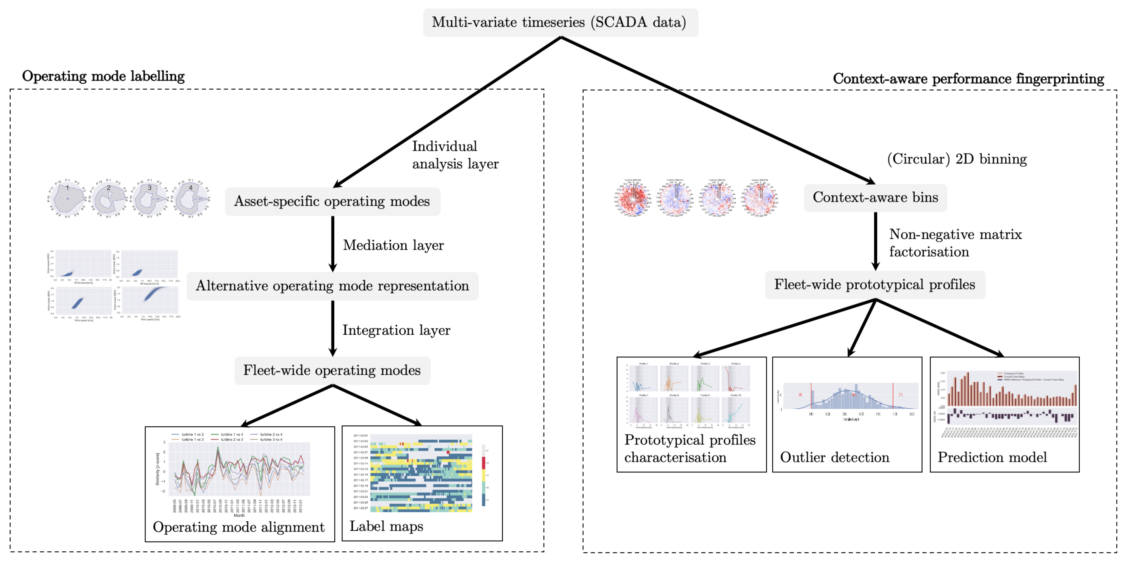
3. Materials and Methods

In this section, we formally describe the different discretisation, visualisation and profiling methods proposed in this article. Section 3.1 provides information and references to the data. The remaining two subsections are devoted to two advanced methods for discretising multivariate time series data. Section 3.2 discusses a method of labelling multivariate time series, while Section 3.3 deals with the division of multivariate time series into context-aware bins. For both methods, novel techniques exploiting further the discretised representation, e.g., advanced visual analytics and prototypical profiling approaches, have been realised. A schematic overview of the major steps in these two methods is depicted in Figure 2.

3.1. Data

The data set used in this research study contains SCADA data generated by a fleet of 4 wind turbines. The wind turbines are located in La Haute Borne (France) and are owned by Engie. The data set contains time series sensor data of 137 parameters (e.g., wind speed, active power, torque, etc.), sampled every 10 min in the period between January 2009 and March 2017 and can be downloaded here: https://opendata-renewables.engie.com/explore/, accessed on 13 May 2021. An overview of the most important parameters can be found here: https://opendata-renewables.engie.com/explore/dataset/39490fd2-04a2-4622%20-9042-ce4dd34c2a58/information, accessed on 13 May 2021.

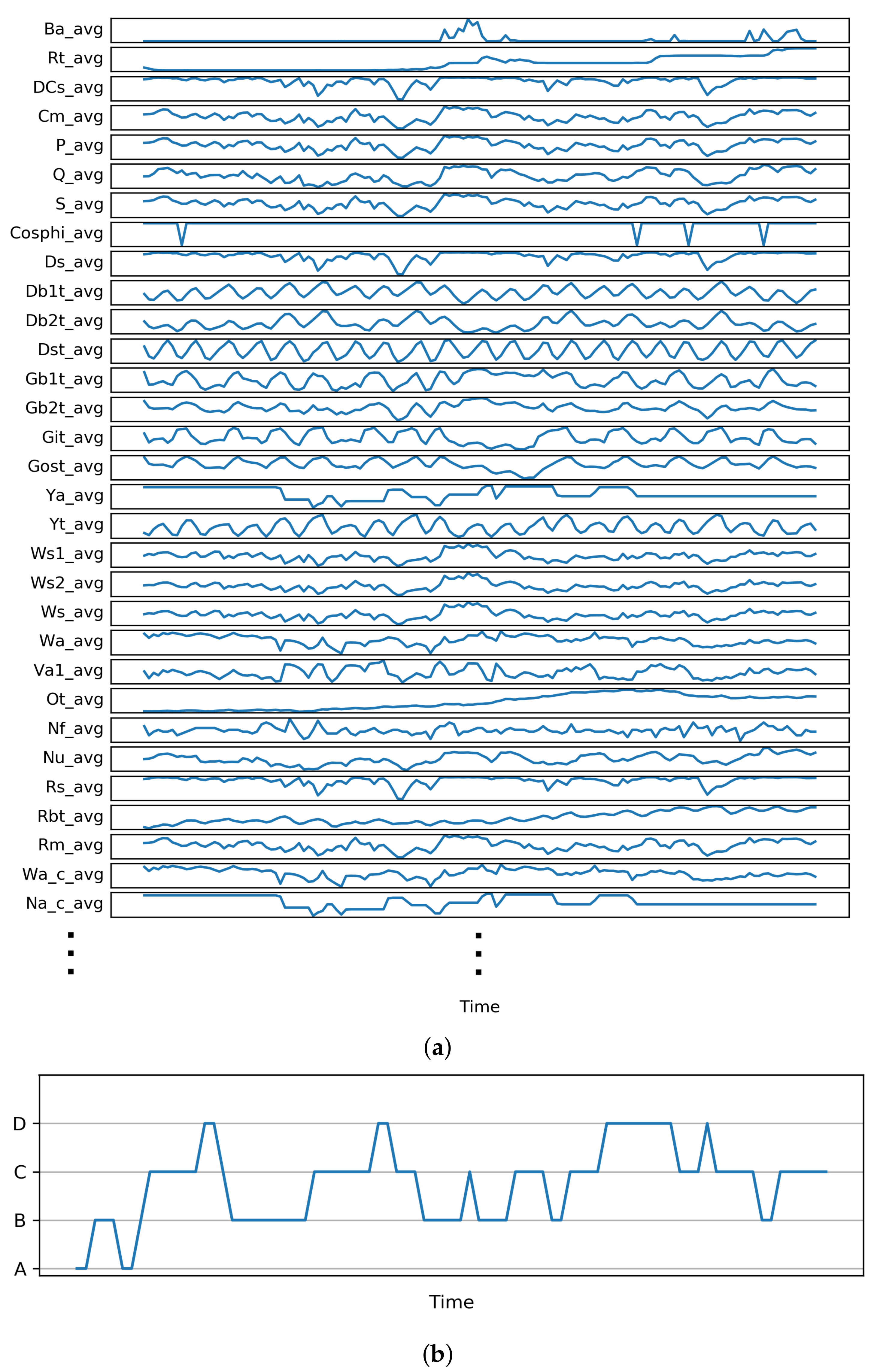
3.2. Operating Mode Labelling

Assets are often monitored by multiple sensors, each capturing a different factor of operational or environmental circumstances, as visualised in Figure 3a. Modelling such systems is often very complex and computationally heavy. Moreover, it can be very challenging to extract insights from raw measurements for both humans and machine learning algorithms. By clustering such multivariate time series data along the time axis (one typically clusters time series), each timestamp is assigned a label. Each group of labels should then represent moments in time with related conditions, independent of the time component, which makes each timestamp more intelligible. Based on the value of the label and the label transitions (see Figure 3b), insights into the condition of the asset can be extracted without the need to inspect all time series (as shown in Figure 3a) in detail. An overview of the sequential steps for the proposed operating mode labelling approach is depicted on the left-hand side of Figure 2.
As demonstrated in the work of Iverson [29], such labels can be used for real-time inductive health monitoring. Iverson used this technique to characterise (label) clusters of timestamps during the training phase, referred to as the knowledge base, using data derived directly from the system or from simulations. Based on this knowledge base, anomalous behaviour could be detected in real time.

3.2.1. Layered Integration Approach

In [6], we have proposed a novel approach that can be used for the multi-view integration and analysis of heterogeneous real-world data sets originating from multiple sources. The approach facilitates the extraction of an explicit relation between the endogenous operating modes (different compositions of the endogenous parameters) and the observed output (e.g., active power for wind turbines) as a function of the exogenous parameters (e.g., wind speed, wind direction and temperature) at fleet level, employing multi-layer integration. The approach has been initially evaluated and illustrated on SCADA data by clustering time series data from a fleet of wind turbines into operating modes. The approach is composed of three sequential steps:
(i)
Individual analysis layer: Apply an individual data analysis per source (wind turbine), solely based on a subset (view) of relevant (e.g., endogenous) parameters.
(ii)
Mediation layer: Represent the results from the previous layer by use of an alternative subset of parameters (e.g., exogenous), allowing a comparison of results across data sources (fleet).
(iii)
Integration layer: Leverage the previous results from all sources in order to derive explicit links between the different views.
Subsequently, the main result of the application of this approach is that the data set of each turbine can be converted into a letter code (as a DNA sequence) by assigning a unique label to each timestamp expressing a distinct operating mode, e.g., underperforming, overperforming or as expected. Based on these labels, one can derive additional insights about the turbine operation and performance. For concrete details of the labelling approach, please refer to [6].

3.2.2. Sequence Alignment
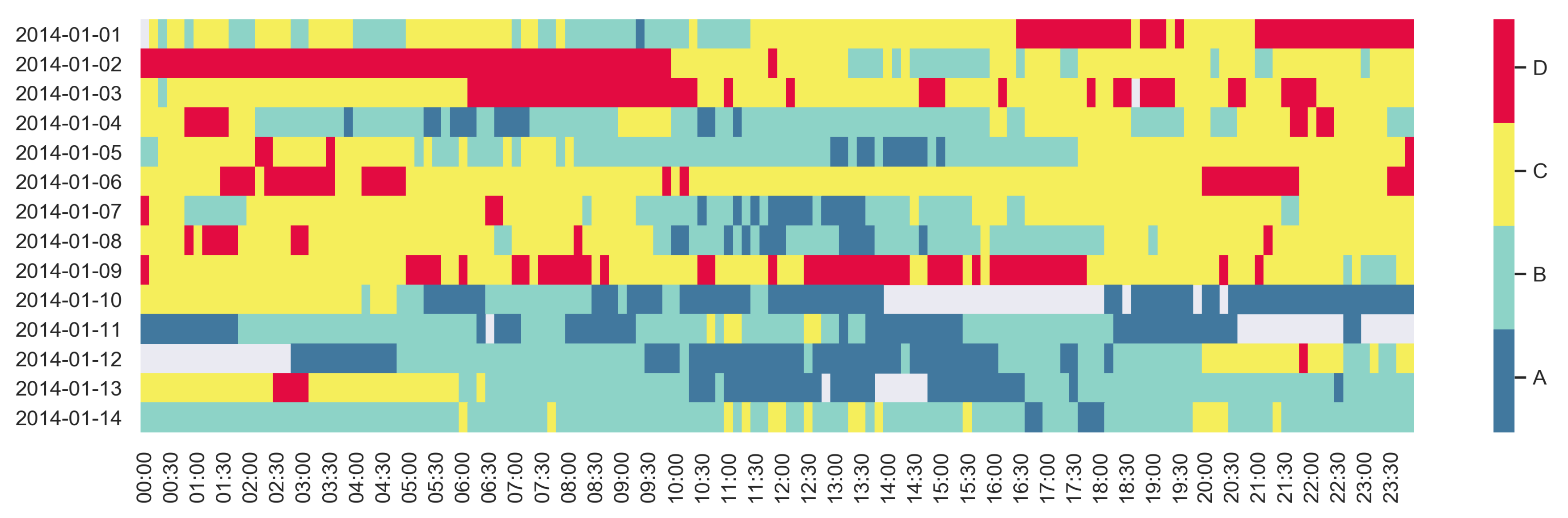
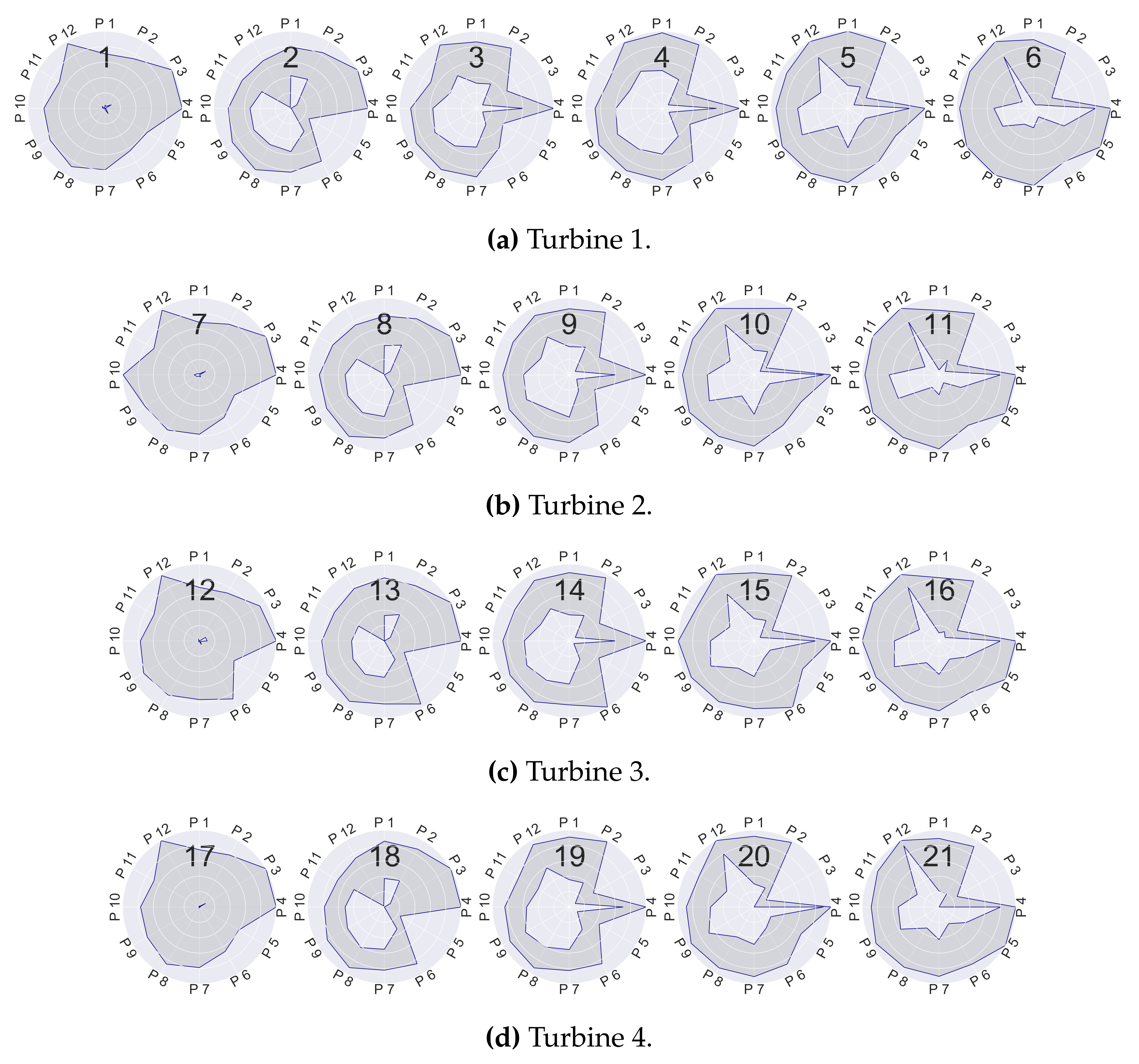
Sequence alignment is very much exploited in life sciences, where the aim is to arrange sequences of DNA, RNA, etc., against each other in order to identify similar or common regions. Sequence alignments are also used in other domains, e.g., for calculating the correspondence between vectors in natural language or in financial transaction data. A wide variety of sophisticated algorithms have been applied to the sequence alignment problem, e.g., dynamic programming or heuristic algorithms and probabilistic methods. The former is very computationally intensive but formally correct, while the latter methods are more efficient but are not guaranteed to find the best matches. One such dynamic programming approach is the Smith–Waterman (SW) algorithm [30], which is widely used in bioinformatics for DNA and RNA alignment. The SW algorithm is guaranteed to find the optimal alignment of two sequences of any length, based on the defined penalty scheme. A fixed penalty should be defined for a mismatch (e.g., −1) while a fixed reward is given for a match (e.g., +2). The SW algorithm also allows gaps within the alignment. Therefore, a penalty for introducing a new gap needs to be defined (e.g., −3) and a penalty for each gap extension should be set (e.g., −2).
In our context, sequence alignment can be employed to study turbine behaviour for different time periods or for comparison with the other turbines in the fleet, based on the obtained letter code representation per turbine, as described above.

3.2.3. Label Maps

In [7], Dhont et al. illustrated how label maps can be exploited to reveal complex patterns and irregularities in temporal data. The visualisation is constructed by positioning the timestamp labels in a matrix-like plot, where the time axis is arranged in a well-considered manner.
In the case of highly correlated daily data, this matrix-like plot should be arranged such that the y-axis denotes different days and the x-axis the hours within each day, as illustrated in Figure 4, where each label represents a specific operating mode of the turbine under study. In order to facilitate the perception and understanding of the map, each label should be assigned a clearly distinguishable colour, which is used to fill the grid of the label map. Such visualisation facilitates and supports the ability of the human eye to identify interesting patterns.

3.3. Context-Aware Performance Fingerprinting

In this section, we propose a context-aware profiling methodology, utilising non-negative matrix factorisation and allowing us to extract prototypical profiles of performance behaviour across the fleet. The operating context of any asset in the fleet might substantially change over time, making it very difficult to grasp and make sense of asset behaviour. Therefore, before proceeding with prototypical profile extraction, it is essential to transform the time series data in such a way that meaningful snapshots of the asset performance can be captured and characterised in a context-aware fashion. For this purpose, we have realised a circular binning approach, allowing us to discretise the time series data into two-dimensional bins capturing performance behaviour for different operating contexts. The latter is an essential prerequisite for being able to apply non-negative matrix factorisation. In addition, the circular binning facilitates the application of smart visualisations via circular heat maps.
The section is structured as follows. Section 3.3.1 describes the circular binning approach, while Section 3.3.2 illustrates how the bins can be structured and visualised in such a way as to allow for effortless interpretability and comparison over time and across assets. Finally, Section 3.3.3 introduces the concept of non-negative matrix factorisation (NMF), followed by an explanation of how NMF can be used for extracting prototypical fleet profiles in Section 3.3.4. A schematic overview of how these components are combined is depicted on the right-hand side of Figure 2.

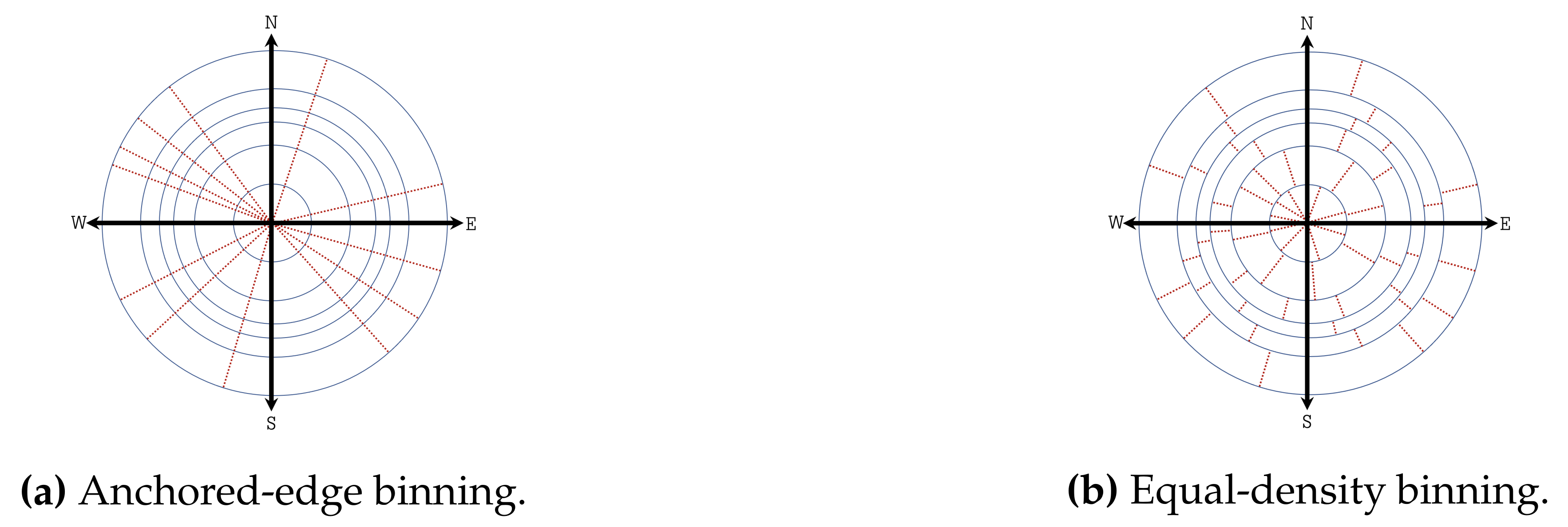
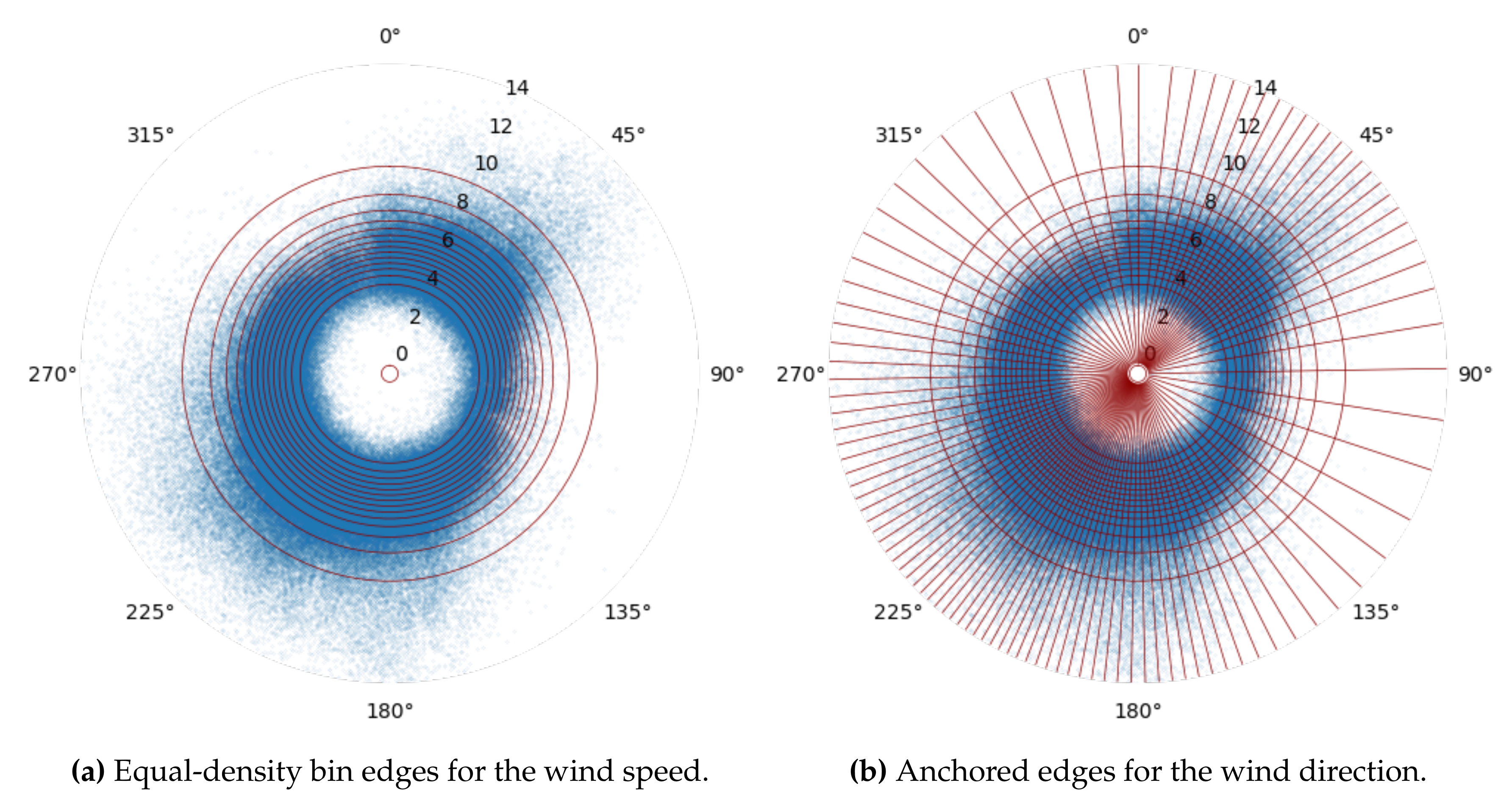
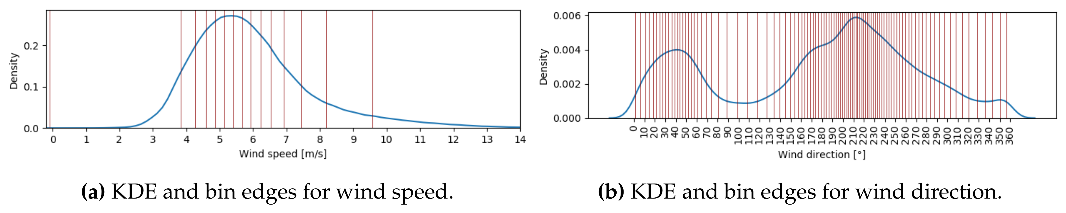
3.3.1. Circular Binning

Traditional binning methods focusing on the time dimension struggle to properly describe how asset performance changes along with the operating context. Moreover, advanced data mining and machine learning methods for exploiting time series data typically extract features that are time-dependent and consequently cannot abstract the real operating context. Hence, it is necessary to extract the operating contexts of the asset by exploring the data associated with the factors (e.g., exogenous) that most impact performance. Subsequently, the ultimate goal is to derive relatively homogeneous two-dimensional windows of operating conditions from which the diverse performance indicators of the assets can be extracted. In the context of wind energy production, our binning approach focuses on the two key parameters impacting performance: wind speed and wind direction. Note that the approach can be applied on any pair of parameters provided that one of them is an angular variable, e.g., ambient temperature and pitch angle or rotor speed and nacelle angle, etc.
In order to extract meaningful and reliable performance indicators per bin, it is important to avoid sparse bins. Sparse bins represent rare combinations of the two parameters of interest, which might be less informative. Moreover, it is essential to aim for adaptive granularity binning, which considers variable bin sizes depending on the data density of the different areas, i.e., smaller bins will be constructed in the areas with high density, resulting in capturing more detailed information.
The proposed binning approach benefits from the fact that one of the considered parameters (wind direction) is an angular variable. All data points are therefore mapped into a polar coordinate system (see Figure 5), where the wind speed is the radial coordinate and the wind direction the angular one. The pole is positioned at radius 0 and the polar axis at an angle of 0 degrees. An important benefit of circular binning is that it is not necessary to have an obligatory bin edge at 0 (or 360) degrees. However, it is not trivial to identify an adequate starting point. The solution that we used is to apply a brute-force approach to identify an optimal starting point by considering multiple starting points (e.g., all from 0 to 10 degrees in small steps). The starting point that generates a partition with the lowest variance of the bin sizes per wind turbine is selected, as this is an indication of how balanced the bin density is. Alternatively, one could use a criterion that is more oriented towards the similarity of features within each bin. One could choose the bin edges where the lowest average (or lowest maximum) variance of the active power per bin is obtained.
The number of slices K and L is defined in advance for wind direction and wind speed, respectively. In order to guarantee parameter-specific granularity settings, the circular binning approach is executed in two subsequent steps, treating each dimension separately. However, wind speed is always processed first since it is directly correlated to wind production performance. Thus, the binning is initialised by partitioning all the data points in the polar coordinate system into L equal-density (in terms of number of data points contained) concentric circles along the radial coordinate (see Figure 14a). Two different circular binning realisations are possible, depending on how the wind direction values are partitioned in the second step.
(i)
Anchored-edge binning: All the data points in the polar coordinate system are partitioned into K equal-density (in terms of number of data points contained) sectors along the angular coordinate (see Figure 5a). This approach treats the wind direction parameter in the same way for each wind speed circle. However, note that the above approach does not guarantee perfectly equal-density bins or non-zero bins.
(ii)
Equal-density binning: All the data points in each concentric circle l ( l = 1 , 2 , , L ) are partitioned into K equal-density (in terms of number of data points contained) sectors along the angular coordinate (see Figure 5b). This approach treats the wind direction parameter differently for each wind speed circle and generates true equal-density bins.
Each combination of the two-dimensional partitions constructed by applying any of the above approaches represents a unique two-dimensional bin p ( k , l ) , where k = 1 , 2 , , K and l = 1 , 2 , , L . In total, K × L two-dimensional bins are composed for each of the approaches.
Note that both of the above approaches generate a set of two-dimensional bins, which satisfies the properties of a partially ordered set, indicating that, for each pair of bins in the set, one of the bins always takes precedence over the other in terms of ordering. This is essential for being able to apply non-negative matrix factorisation later on, since the performance indicators extracted from the different bins need to be arranged as a matrix in which the order matters. Formally, a partial order is any binary relation that satisfies reflexivity (each bin can be compared to itself), transitivity (the end of a chain of precedence relations cannot precede the start of the chain) and antisymmetry (no two unique bins precede each other).
We consider that a bin precedes another bin if one of the following conditions holds:
(i)
the first bin is positioned in a concentric circle that is closer to the pole than the concentric cycle in which the second bin is positioned;
(ii)
the two bins are positioned in the same concentric cycle, but the second bin is situated clock-wise after the first one when considering the polar axis as the starting position.
It can then be easily demonstrated that all three properties of a partial-order relation (reflexive, antisymmetric and transitive) hold for the so-defined bin precedence relation [31].

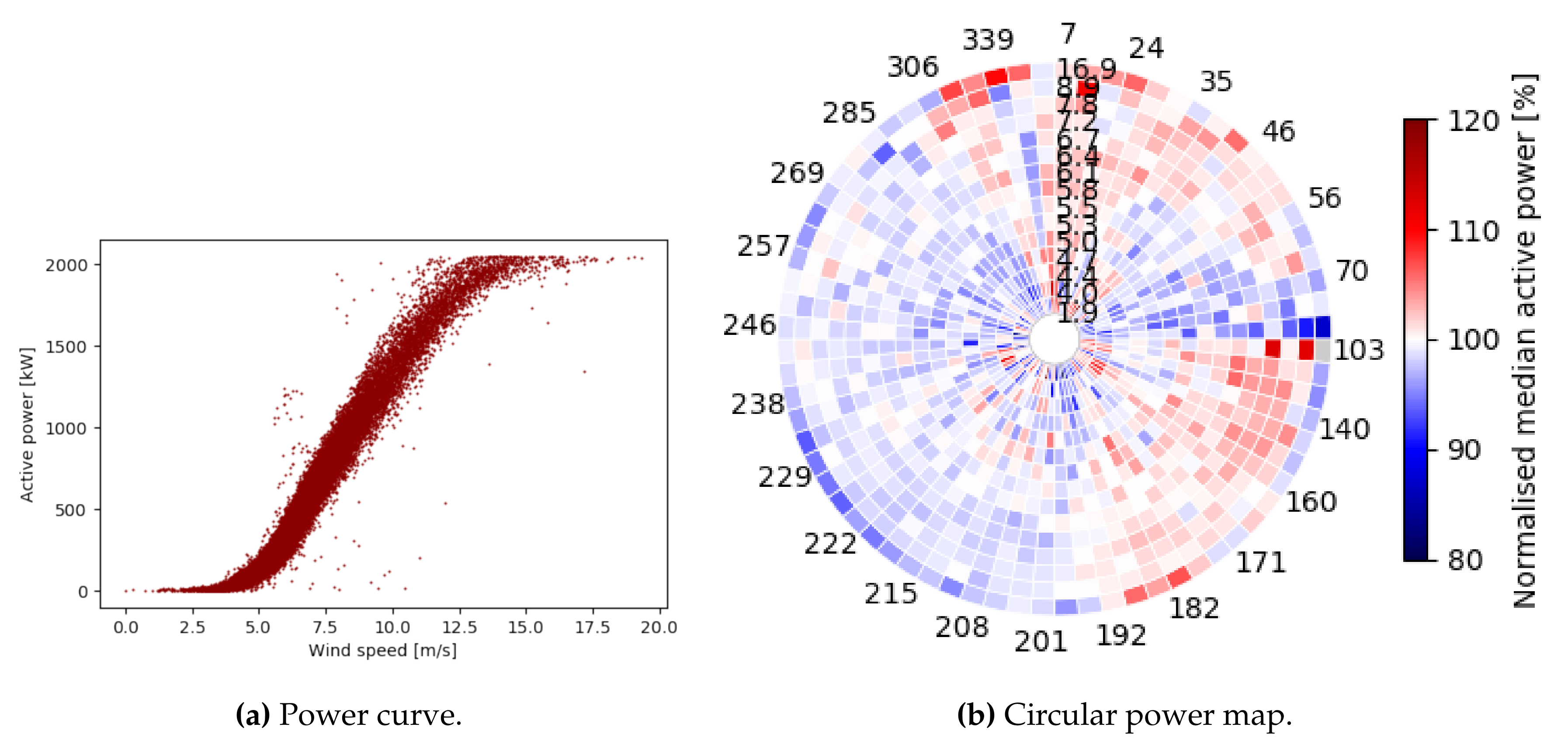
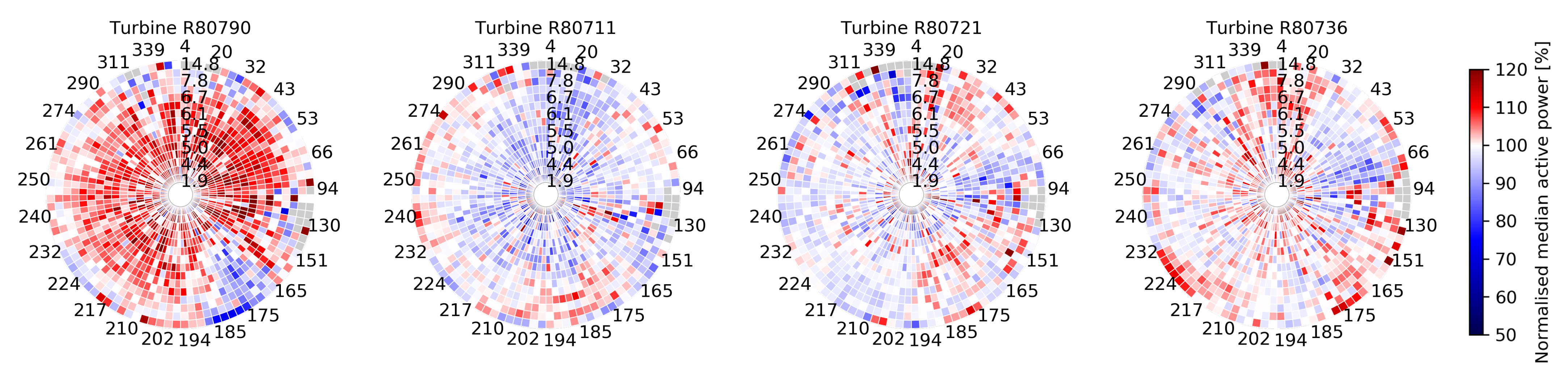
3.3.2. Circular Power Maps

The analysis of multi-dimensional data including angular variables (e.g., wind direction) can often benefit from visualisations using circular heat maps. For instance, using a circular heat map instead of a simple line chart or a classical rectangular heat map makes it possible to depict several dimensions or views therein (e.g., wind direction, wind speed and active power) in a visually very compact format and to treat the angular variable in a very intuitive fashion. Subsequently, each heat map can be interpreted as a characteristic fingerprint, capturing, in visual form, the behaviour of the phenomenon under study for a selected time window and, at the same time, facilitating behaviour interpretation and comparison across time and across assets.
Typically, asset performance is visualised via a scatter plot that shows the relation between the performance value and the factor with the highest influence. In the wind energy domain, the most widely used visualisation method for examining performance is a power curve (Figure 6a) [32,33,34]. The drawback of such visualisations is the inability to capture the mutual dependence of the performance on more than one factor. As illustrated in Figure 6b, circular heat maps offer a very powerful alternative visualisation method that successfully captures the multi-factor aspect.
Figure 6b visualises as a heat map the median power production (normalised by a baseline) of a wind turbine over a set of two-dimensional (wind-speed vs. wind direction) bins obtained following the anchored-edge binning approach proposed in the foregoing section. In this example, the circular heat map depicts the bin partitions along the wind speed as concentric circles, starting with the bins with the lowest values in the inner circle, followed by the next set of bins in the next circle and so on, until placing the bins with the highest wind speed in the outermost circle. The circles are partitioned into 100 sectors corresponding to the bin partitions along the wind direction, ordered clockwise from 0 to 360. This compact representation, referred to as a circular power map, enables the human eye to quickly detect patterns in the data without the need to focus on different, potentially distant points in the figure. This is actually one of the strengths of this visualisation, since it allows us to compare smaller time windows over time while clearly indicating the differences in the two chosen contextual (environmental) factors. The circular nature of the wind direction also enables us to easily uncover patterns occurring at the edges in this dimension (0/360 degrees).

3.3.3. Non-Negative Matrix Factorisation

NMF is a method to approximate a non-negative matrix by two factors. It is often used for dimension reduction, but it can also be a very powerful methodology for data analysis due to its inherent clustering property. In this study, NMF is used to discover latent prototypical components of the data. Since NMF is analytically not solvable (NP hard problem), a variety of alternative approximation algorithms have been developed.
Consider a matrix X that consists of N columns x 1 , x 2 , , x N , where x i R + 1 × M . By use of NMF, two non-negative matrices S and W are constructed to approximate X , as shown in Equation (1).
X S W
The format of these matrices is as follows: X R + M × N , S R + M × K and W R + K × N with K N + . Hyperparameter K must be chosen in such a way that K < min ( M , N ) . The smaller K, the greater the dimensionality reduction at the expense of the reconstruction error for X .
Moreover, each vector x i can be approximated as shown in Equation (2), where w i represents the ith column vector of W . Conceptually, one could interpret the columns of S as the available building blocks to reconstruct x i based on the weights from the ith column of W . [35]
x i S w i with 1 i N
NMF enforces matrices S and W to be positive. Due to this constraint, the reconstruction as shown in Equation (2) is a non-subtractive linear combination of the building blocks (columns) from S . In many real-world contexts, negative components would be unnatural. In such cases, the NMF reconstruction process is a much more natural way to identify the latent structure, compared to approaches such as SVD and PCA [36].

3.3.4. Prototypical Fleet Profiling

This section proposes a method to combine the (anchored-edge or equal-density) circular binning approach introduced in Section 3.3.1 with the NMF approach discussed in Section 3.3.3. In what follows, the median active power in each bin of the circular map for turbine i is denoted as p i ( k , l ) , where i = 1 , 2 , , N , with N being the total number of turbines in the fleet and k = 1 , 2 , , K and l = 1 , 2 , , L being the indices that identify each two-dimensional bin. K and L are the total number of bins for the wind direction and the wind speed variables, respectively.
It is further assumed that the same fixed number of wind direction bins is applied for all the turbines in the fleet. However, the NMF approach considered below allows us to consider a different number of wind direction bins for each turbine. The only constraint is to have a fixed number of wind speed bins across the fleet.
The segmented and discretised active power data of each turbine i for a given time window can be represented as an active power data matrix by unfolding the circular binning map and arranging the bins of each concentric circle as matrix columns. Thus, the rows of the matrix will be composed of the median active power values across the wind speed bins for a fixed wind direction bin (as shown in Figure 5a):
P i = p i ( 1 , 1 ) p i ( 1 , 2 ) p i ( 1 , L ) p i ( 2 , 1 ) p i ( 2 , 2 ) p i ( 2 , L ) p i ( K , 1 ) . p i ( K , 2 ) . p i ( K , L ) ,
where p i ( k , l ) R + , and i = 1 , 2 , , N , k = 1 , 2 , , K and l = 1 , 2 , , L . Subsequently, an active power data matrix can be constructed for the whole fleet that stacks (vertically) all individual turbine matrices under each other as follows:
P = P 1 P 2 P N R + K ˚ × L ,
where K ˚ = N K is the total number of wind direction bins for the whole fleet. As already noted above, the method does not require the same number of wind direction bins for each turbine, i.e., if, for each turbine i, the number of wind direction bins is K i , then K ˚ = K 1 + K 2 + + K N .
Next, we approximate this data matrix using NMF into the product of two non-negative matrices W and S , exploiting the inherent capability of NMF to derive R feature profiles that represent the typical active power behaviour as a function of the wind speed across the fleet:
P W S ,
where W R + K ˚ × R are the weights, S R + R × L are the typical active power profiles, and R is the number of components (to be chosen, trade-off between accuracy and interpretability, as demonstrated later on in Section 4.3.2). Note that, in our scenario, the positions of W and S are reversed in comparison with Equation (1). This has been done since our focus is on reconstructing the rows of the original matrix ( P ) instead of the columns, which intrinsically defines the first factor of the decomposition as the weight matrix.
This decomposition allows us to express the active power data matrix of each individual turbine i as:
P i W i S ,
where S R + R × L are the active power prototypical profiles as a function of the different wind speed bins observed across the fleet, and W i R + K × R are the corresponding weights for turbine i ( i = 1 , 2 , , N ). Each active power profile p i ( k , : ) , with k = 1 , 2 , , K of turbine i, is thus expressed as the weighted sum of the prototypical profiles observed across the fleet, as shown in Equation (7).
p i ( k , : ) j = 1 R w i ( k , j ) s ( j , : )

4. Results

In the subsections below, the potential and the validation of the methodologies proposed in the foregoing sections are demonstrated on real-world SCADA data from a fleet of wind turbines as described in Section 3.1. Considering that the discretisation methods in Section 3.2 and Section 3.3 are intrinsically very different, they can be used to extract complementary insights.

4.1. Operating Mode Labelling

In this section, fleet-wide operating modes are constructed, based on the layered integration approach proposed by Dhont et al. [6], and exploited further via sequence analysis and advanced visualisations.

4.1.1. Data Preparation

As with almost all real-world data sets, the quality and format needs to be reviewed and processed prior to the application of the data analysis itself. Three main techniques have been applied:
(i)
Eliminate correlated parameters: The values of some of the parameters are highly correlated due to several reasons:
(i)
The same phenomenon is monitored with multiple sensors, e.g., for reliability, each wind turbine is equipped with two identical anemometers on its nacelle, both measuring the wind speed.
(ii)
Parameters are derived from other parameters, e.g., the average wind speed is constructed by combining the two nacelle anemometer values.
(iii)
Some parameters have strong internal dependencies, e.g., generator speed and generator converter speed.
To prevent over-fitting, only a single parameter is selected to represent each set of highly correlated parameters in the experimental data set.
(ii)
Remove noise: Considering that we are performing research on real-world data, it is expected that the data set will contain a significant amount of noise, e.g., extreme values and outliers. Several different filters based on the active power are applied in order to discard data points with atypical active power values (with respect to the values of the input parameters). To avoid masking source-specific fluctuations, this is applied on each wind turbine separately. In addition, parameters with too many missing values are completely removed from the experimental data set. For more details, see [6].
(iii)
Standardise: The values of some of the selected parameters have very different ranges (e.g., nacelle temperature varies between 6 and 60 C, while the generator speed has values between 0 and 1800 rpm), and have a different nature (e.g., angular versus linear). This results in parameter values that are hard to compare. For this reason, the sine and cosine transformation is used to convert angular parameters into two linear values. In the case of the wind direction parameter, we scale the outcome of the trigonometric functions by multiplying them with the wind speed. By doing this, the information on both wind speed and wind direction is captured into the two newly created parameters. In addition, min–max normalisation [37] is applied along the time dimension over the period selected for analysis, per wind turbine. Thanks to this, the parameter ranges are scaled relatively within the same wind turbine between 0 and 1.
Subsequently, following the steps above, a data set is prepared for each turbine, covering the whole period from January 2009 till March 2017. Each individual turbine data set is composed of the values of the exogenous parameters (wind speed, wind direction and ambient temperature), the retained endogenous parameters (see Table 1) and the active power per timestamp of 10 min.

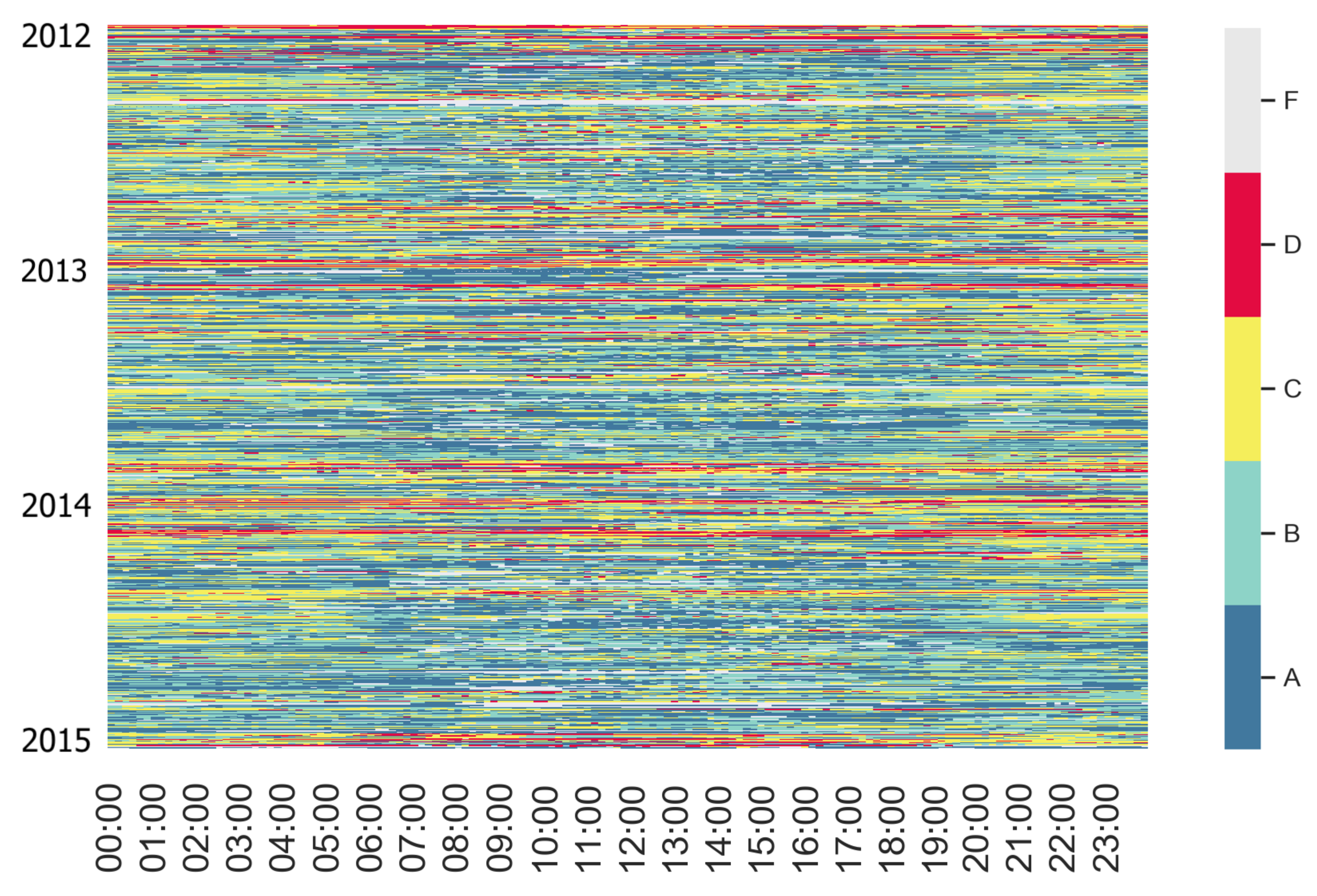
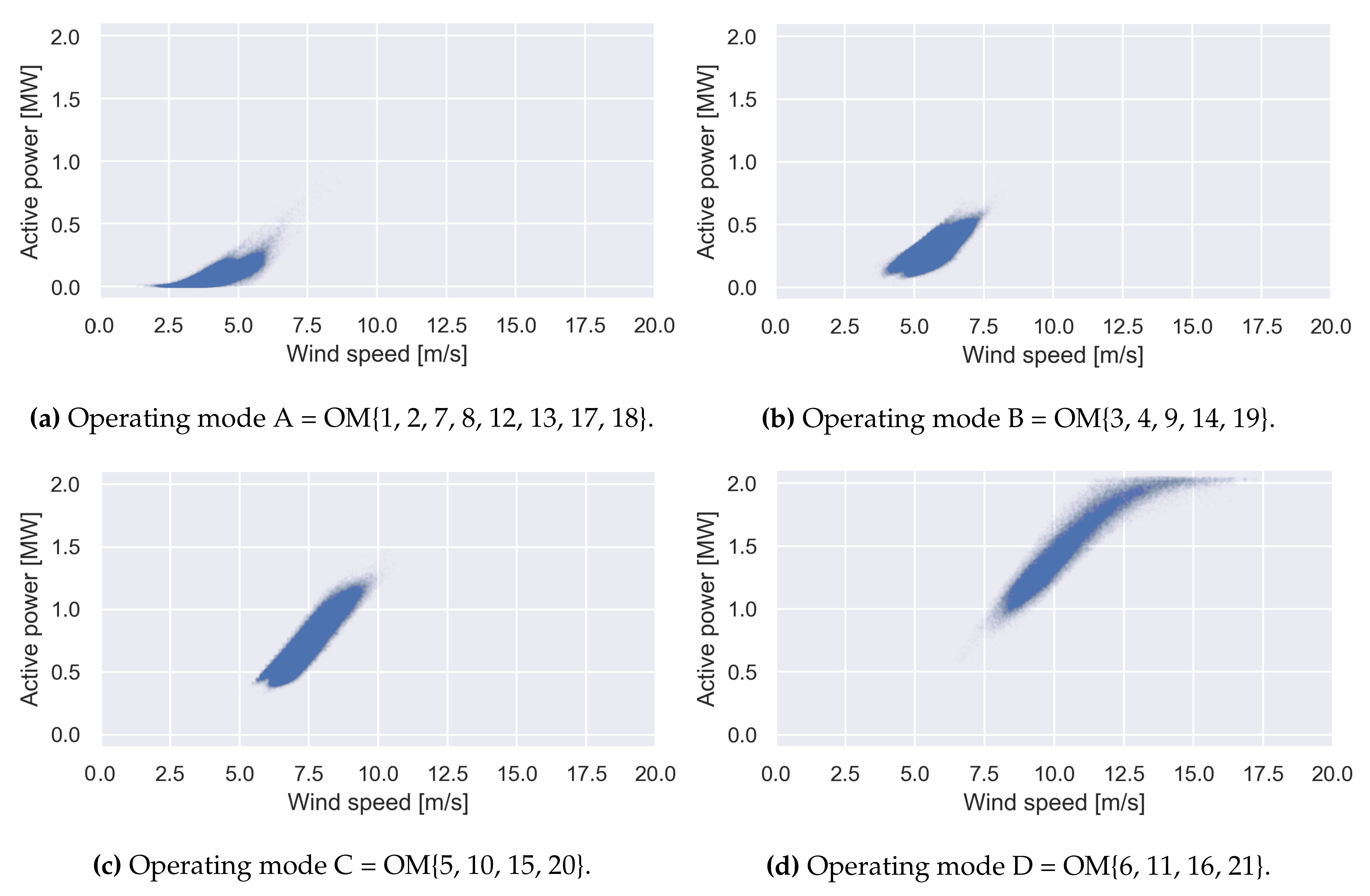
4.1.2. Deriving Operating Modes

The layered integration approach proposed by Dhont et al. [6] is applied on the pre-processed, as described in Section 4.1.1, fleet data. First, the individual analysis layer is executed on the individual data sets of each turbine, considering only the values of the retained endogeneous parameters. The latter is due to the fact that this first layer is concerned with data analysis only from the perspective of the internal functioning of each turbine, while being detached from other influencing aspects. Subsequently, a number of clusters are derived for each turbine, grouping together timestamps for which the values of the considered endogenous parameters are related to each other. The min–max ranges of the corresponding compositions of the endogenous parameters define each of the turbine-specific operating modes (21 in total). The latter are depicted as spider plots in Figure 7, which reveals the presence of several turbine-specific operating modes with similar parameter range compositions over all turbines.
Next, an alternative representation of each turbine-specific operating mode in terms of expected performance is derived within the mediation layer. Namely, for each cluster of timestamps, from the first (individual analysis) layer, a dedicated data set is created, composed of the corresponding values for active power, ambient temperature, wind direction and wind speed. Subsequently, performance profiles in the form of mixture probability distributions are derived for each cluster (turbine-specific operating mode), as outlined in [6]. In the final (integration) layer, the obtained performance profiles (mixture probability distributions) per individual operating mode are pooled together and subjected to k-means clustering. In this way, four different fleet-wide operating modes are derived. In Figure 8, the power curve representation of the four fleet-wide operating modes is depicted. Based on these plots, we can semantically interpret the fleet-wide operating modes (OM) as follows:
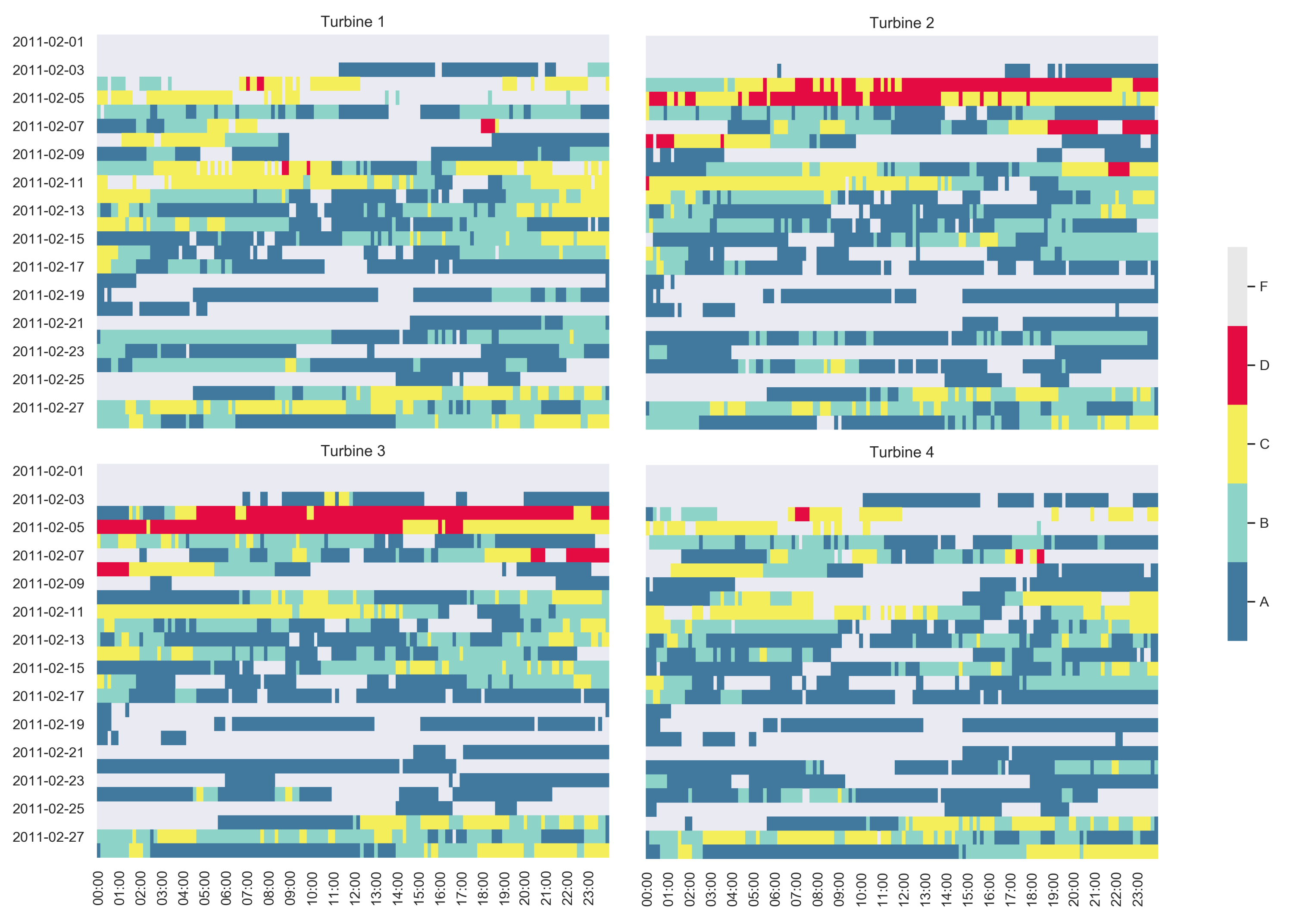
  • OM A. Pre-startup: The wind is relatively low (e.g., wind gust). The turbine blades can start moving but the wind speed is not sufficient to significantly produce energy.
  • OM B. Post-startup: The wind strength is sufficient to start producing energy.
  • OM C. Linear mode: Any increase in wind speed results in a linear increase in energy production.
  • OM D. High production: There is an optimal wind flow, resulting in high active power.
Subsequently, each timestamp is annotated with the corresponding operating mode label (letter), resulting in the conversion of the fleet data set into a label code, which can be further exploited as shown in the sections below.
Figure 8. Power curve representation of each fleet-wide operating mode.
Energies 14 06216 g008
A detailed and extensive explanation of how to apply the layered integration approach can be found in [6], where it has been introduced. Apart from some minor adaptations, we follow here the same approach. Note that the derived fleet-wide operating modes differ from each other in both exogenous parameters (e.g., wind speed and direction) and endogenous parameters (e.g., oil temperature and torque). Thanks to the multi-layered integration approach, a unique link between the fleet-wide and the turbine-specific operating modes is derived (see captions in Figure 8).

4.1.3. Operating Mode Alignment

As already announced above, these discrete operating modes allow us to convert the data set of each turbine into a four-letter code (as a DNA sequence) by replacing for each timestamp the actual active power value with the letter of the corresponding operating mode. The letter code representation facilitates the comparison of the sequence of operating modes of different wind turbines with one another. This can be achieved via sequence alignment, which enables us to characterise the relationship among the wind turbines in the fleet. For this purpose, the Smith–Waterman algorithm (see Section 3.2.2) is applied with a penalty of −2 for a mismatch, a penalty of −10 for a gap (since we know there should not be gaps) and a reward of 1 per match. The so-defined objective function produces an alignment score between the letter sequences of each two turbines, which can be interpreted as a similarity measure.
Table 2 reports the z-transformed similarity scores for each pair of wind turbines in the fleet, obtained by applying the Smith–Waterman algorithm on the operating mode sequences over two different time windows. The latter is necessary since turbine 4 experienced some outages for very a extensive period in 2013, leading to missing values. Thus, the period corresponding to the missing values for turbine 4 in 2013 has been removed, resulting in two time windows: (1) May 2009–February 2013; (2) January 2014–March 2017. It is interesting to observe that, based on these similarity scores for both periods, turbines 2 and 3 seem to be most similar in behaviour, while turbine 1 and 3 seem to be the most divergent. The scores in Table 2 also reveal some (slight) changes in the behaviour of turbine 4 for the second period following the outage, namely the similarity of turbine 4 to both turbines 1 and 2 declined (up to 33% relatively for turbine 1) in the second period after the outage. It is not possible to trace the cause of this change, which may be due to either sensor calibration during repair works or due to some malfunctioning leading to the outage. Note that turbines 2 and 3 became even more aligned with one another during period 2.
Subsequently, in order to verify the consistency of this behaviour over time, we perform the similarity calculation with a rolling time window of 1 month. The obtained results are shown in Figure 9 and confirm that the wind turbine relationships are not dramatically affected over time. The similarity scores per time window are well aligned with the overall similarity scores in Table 2. Zooming in further in Figure 9a, one can observe that the ranking between the pairwise similarities is more or less preserved (with some exceptions) in time, e.g., from the most divergent to the most aligned turbines: (1, 3), (1, 2), (3, 4), (2, 4), (2, 3), (1, 4). As can be seen in Figure 9b, the second period is less consistent in preserving such an order.
Note that the pairwise sequence alignment between the turbines in a fleet, as illustrated in Figure 9, can be considered a sort of dynamic clustering, which, in the case of a more fine-grained rolling window, will also capture implicitly the dynamics of the fleet performance behaviour, including also the wake effect. For instance, if a rolling window of a week or a day is applied, then the pairwise similarity scores can be used to monitor fleet behaviour and facilitate the rapid detection of deviations, e.g., an increase in distance between two turbines that are normally rather aligned with each other may be an early indication of an operating anomaly. This is demonstrated on the fleet data in Figure 9a. It can be observed that turbines 1 and 4 have a very unstable similarity relationship, jumping between the most similar and the most divergent pair for the period of July 2009–January 2010. Subsequently, they are very well aligned with each other, more so than turbines 2 and 3, for an extensive period till September 2012, but are only moderately aligned with each other in the months preceding the outage. Note that the ranking between the turbine pairwise similarities is also disturbed in the months before the outage.

4.1.4. Temporal Behaviour Characterisation through Label Maps

The operating mode labels can be further visually exploited in order to facilitate the extraction of operating behaviour patterns. For instance, a dedicated label map, visualising, in a structured way, the operating mode labels for turbine 2 for the period 2012–2014, is depicted in Figure 10. The label map uncovers some high-level seasonal differences, e.g., frequent occurrence of operating mode D (“high production”) during the year transitions. Next, operating mode C (“linear mode”) seems to occur more often at night. Note that label F denotes missing data. These timestamps are filtered away during the pre-processing step, representing outliers and moments in time where the wind turbine was not producing.
In addition, it is interesting to examine a shorter time window to capture more fine-grained patterns or anomalies, as illustrated in Figure 11, depicting the label maps for the four turbines for February 2011. By combining such zoomed-in label maps into small multiples, we are able to compare the patterns of the different wind turbines for the same time period. Figure 11 reveals that only for two of the wind turbines (turbines 2 and 3), a high occurrence of operating mode D is observed at the beginning of February. This is confirmed by the z-transformed pairwise similarity scores calculated with a rolling window of one day in Figure 12. Namely, for February 4th and 5th, the pairwise similarity scores between turbines 2 and 3 and turbines 1 and 4, respectively, are much higher than the rest, splitting the fleet into two groups of similarly behaving turbines. Apart from these two specific days, the similarity scores are rather alike.

4.2. Context-Aware Performance Fingerprinting

In this section, the context-aware profiling methodology as proposed in Section 3.3.4, utilising the circular binning approach and non-negative matrix factorisation, is subjected to evaluation on the fleet data set considered above. It is demonstrated how prototypical profiles of performance behaviour across the fleet can be extracted and further exploited for performance characterisation. For this purpose, the circular binning approach, as proposed in Section 3.3.1, is first applied in order to derive a robust set of wind direction vs. wind speed bins per wind turbine. For simplicity, the anchored-edge version of the circular binning is used. However, the proposed profiling methodology is perfectly applicable for the equal-density version.

4.3. Data Preparation

A similar pre-processing approach as the one discussed in Section 4.1.1 is applied. However, the context-aware fingerprinting only makes use of exogenous data, i.e., only the values for active power vs. wind speed and wind direction are used in the analysis below. Further, no standardisation step has to be applied due to the very different nature of the conducted analysis. Circular parameters are handled in a natural way, which makes any linear transformation superfluous. Moreover, each parameter is handled separately, eliminating the need to have the same scale over different parameters.

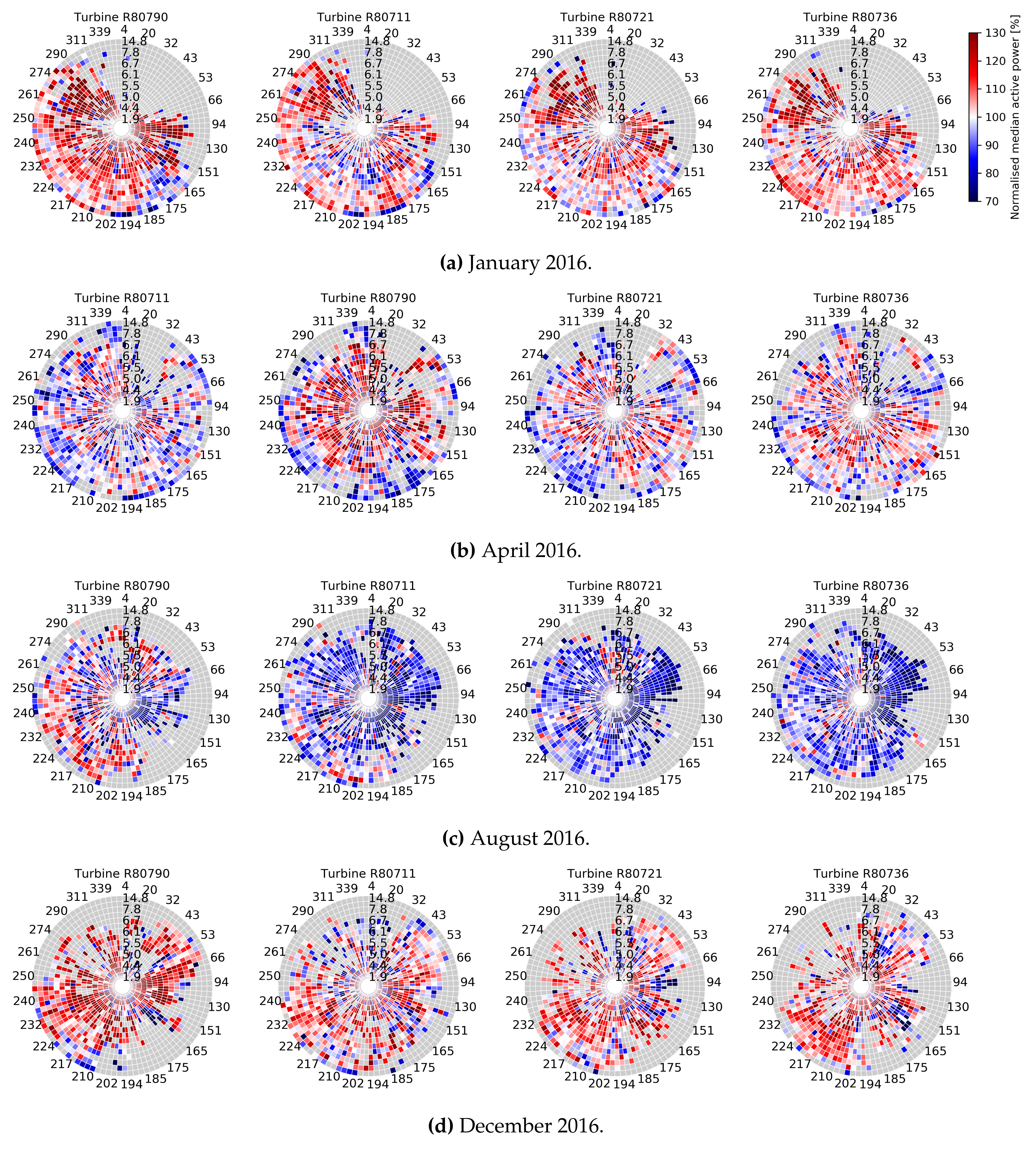
4.3.1. Context-Aware Fingerprinting via Circular Power Maps

Initially, fleet-wide bins are extracted based on all available data in order to determine and fix the bin edges to be used across the different turbines. The derived bin edges for both dimensions are depicted in Figure 13, where the kernel density estimation (KDE) is also visualised (see [6]). For the wind direction, the number of bin edges is manually set to 100, while the wind speed dimension is split into 15 bins. In Figure 13b, two dense regions for the wind direction parameter can be detected, one around 40° and another around 220° (i.e., opposite directions), resulting in smaller bin widths for these regions. For the wind speed (Figure 13a), only one peak around 5 m/s is observed. Note that time points for which no production is recorded are removed during the pre-processing steps. Thus, data points with very low or high wind speeds (for safety) are not included.
The actual bins are visualised in Figure 14 on top of the data of wind turbine 2, where the left-hand plot depicts the 15 wind speed bin edges and the right-hand one overlays the 100 bin edges obtained for the wind direction. A starting edge of 1.5° is obtained for the wind direction bins by applying the brute-force approach, as explained in Section 3.3.1.
Next, the so-generated bins per turbine can be further exploited for analysing, understanding and comparing performance via circular power maps, as introduced in Section 3.3.2. For instance, Figure 15 depicts the circular power maps for the four turbines in the fleet for 2016. The median active power per bin in each power map is normalised by the fleet-wide median active power per bin over 2016. Therefore, the colour intensity per bin represents the median active power for a certain combination of wind speed and wind direction ranges, compared to the fleet-wide value for that bin based on 2016 data. Bins denoted in a grey colour in the power maps indicate combinations of wind speed and wind direction values that did not occur within the selected period. It is interesting to observe that the production of the first turbine is clearly much higher than that of the rest of the fleet.
Further, Figure 16 depicts a set of circular power maps for the four turbines in the fleet, for four different months in 2016. By combining multiple active power maps, one is capable of detecting differences over time and between wind turbines in one visualisation. For instance, Figure 16a reveals that the fleet is hardly exposed to any north-easterly wind in the month of January. Next, zooming into Figure 16b,c, it can be detected that the first turbine clearly deviates in performance from the rest of the fleet, i.e., it slightly underperforms in April and noticeably overperforms in August. It appears that the remaining three turbines have the lowest production in August compared to all the other months visualised in Figure 16, while the highest production rates are recorded for the whole fleet in the month of December (Figure 16d). The latter can be probably attributed to the low ambient temperatures and low air density in the winter, conditions known to be optimal for wind energy production. It is also interesting to observe that the circular power maps for April exhibit an atypical pattern, namely red close to the centre (meaning high production rates at lower wind speeds) and blue close to the outer circle (expressing low production rates at higher wind speeds). This might be due to entailment, meaning that the turbines are limited to a maximum production value (rotation speed) due to a lower energy need. However, there can be other causes for this, which, given the fact that there is no ground truth available for these data, cannot be confirmed.

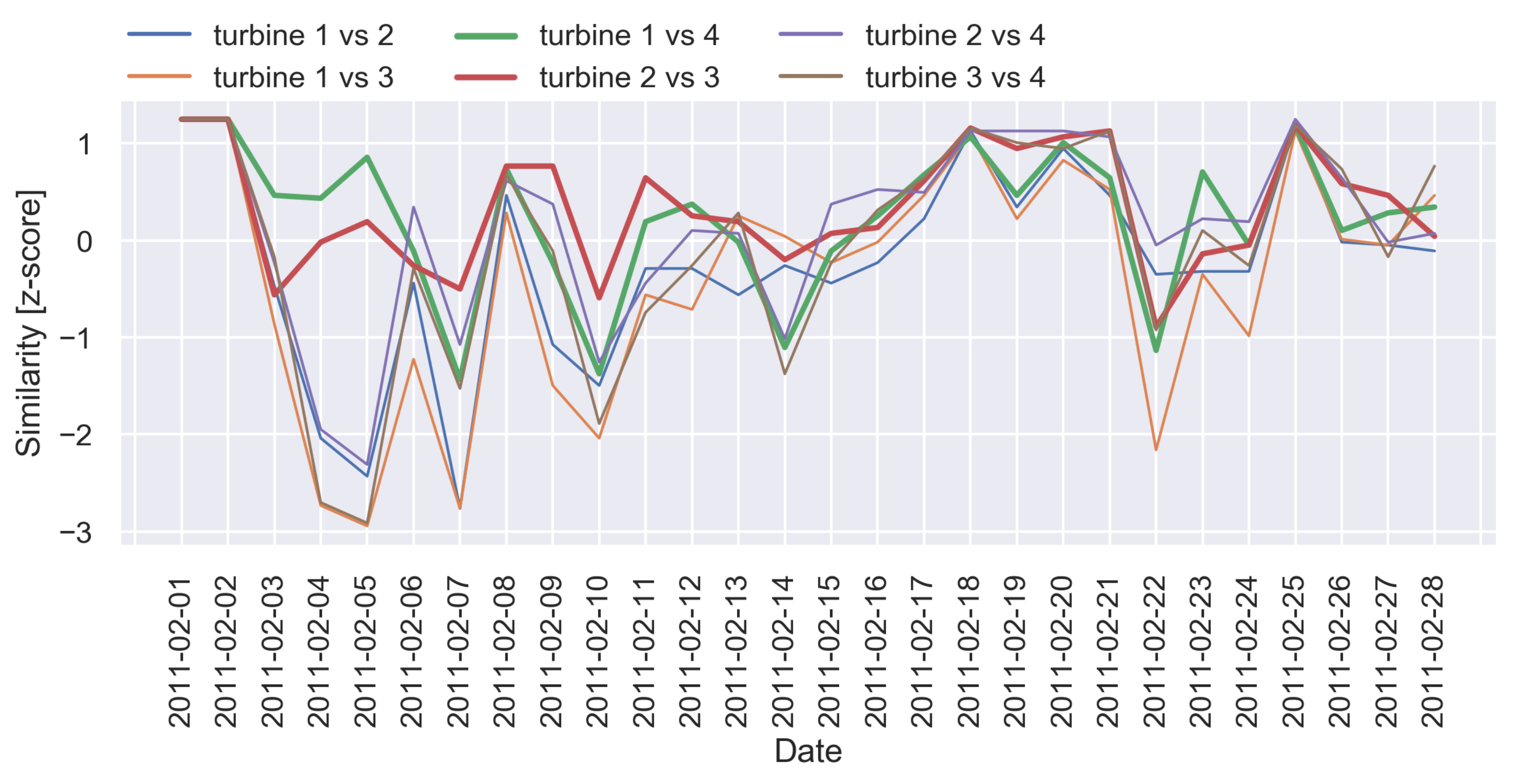
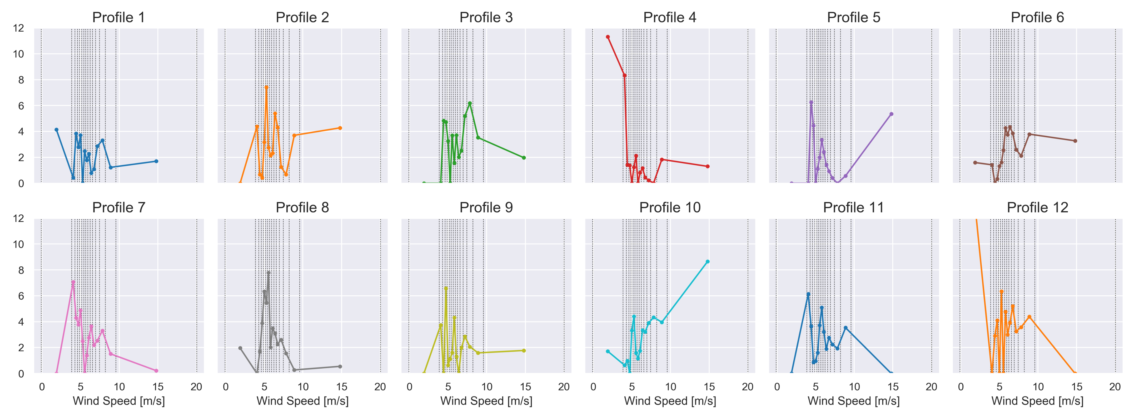
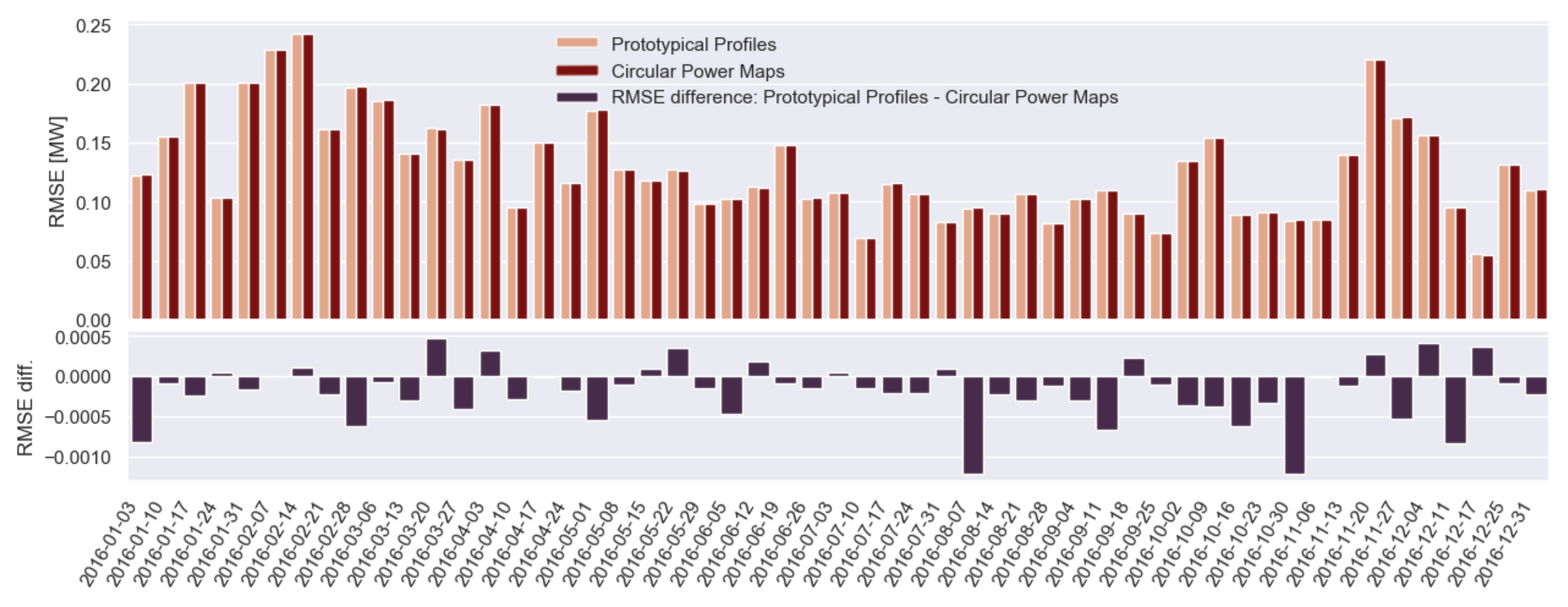
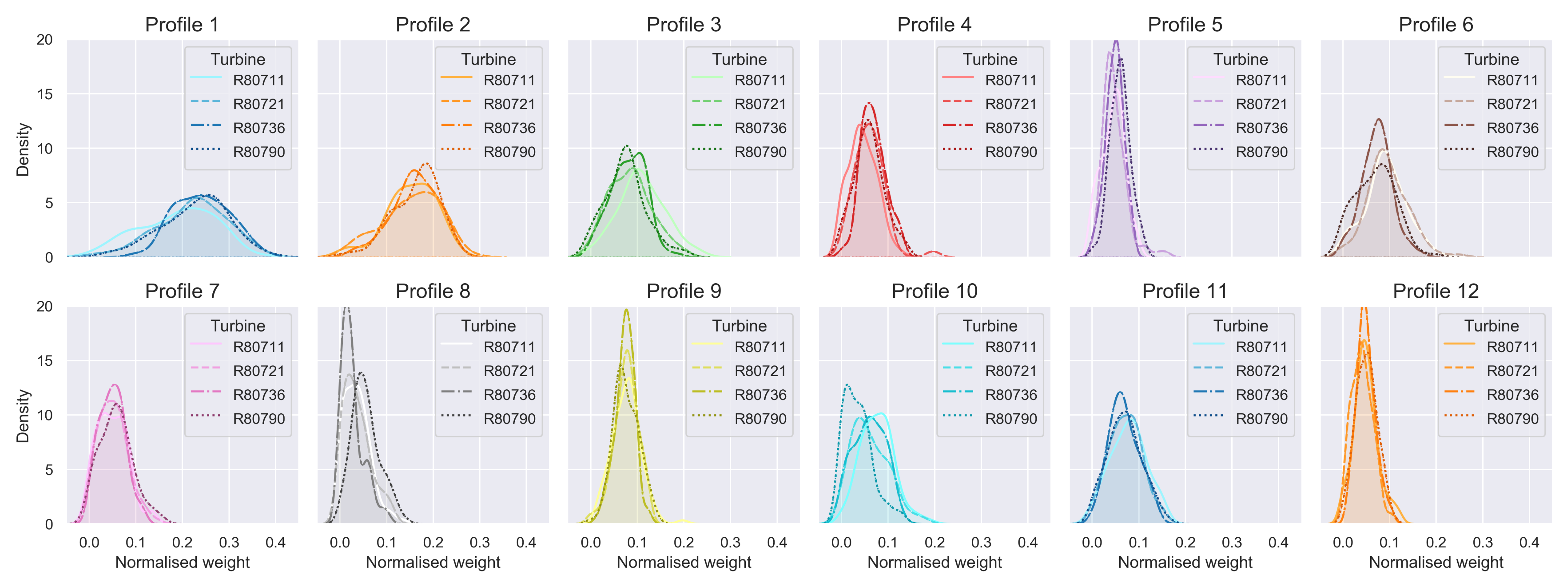
4.3.2. Fleet-Wide Prototypical Profiles

Next, the data generated via the circular power maps can be further exploited for performance prototyping in a more formal fashion, applying the NMF approach as proposed in Section 3.3.4. It is essential to first accurately identify the number of factors (prototypical profiles) R. For this purpose, the following approach is applied separately for each year (from 2009 till 2017): (1) the NMF is applied for a range of different R values, generating the representation P WS ; (2) the explained variance is calculated as a ratio of the variance of WS and the variance of P ; (3) the smallest R value guaranteeing an explained variance of over 95% is selected. In this way, an R of 12 is identified as the optimal one over all the years in order to obtain an explained variance of at least 95% throughout. Subsequently, for R = 12 , the NMF is applied, generating, for each year, both a matrix W representing the weights and a matrix S representing the fleet-wide prototypical active power profiles.

Characterisation of Prototypical Profiles ( S )

Figure 17 depicts the 12 fleet-wide prototypical active power profiles obtained for 2016, each represented as a row of S . Note that each fleet-wide prototypical profile is directly expressed as a function of the wind speed, while the influence of the wind direction is implicitly reflected via the different production behaviours captured in the profiles. More intuitively, a prototypical profile can be interpreted as a building block of the power curve for a specific wind direction bin. Some interesting patterns can be observed, e.g., prototypical profile 4 represents the situations where the low wind speeds induce relatively high production, while prototypical profile 10 represents the opposite. Note that, since we work with non-negative matrix factorisation, the original active power can only be approximated by a positively weighted combination of these prototypical profiles.

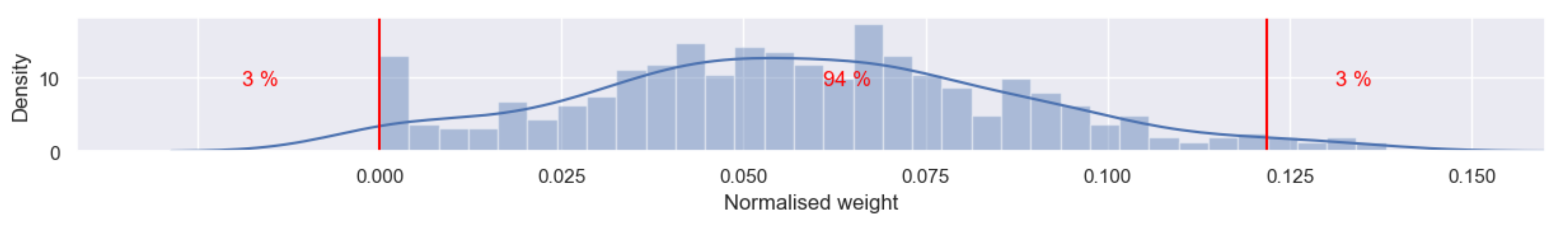
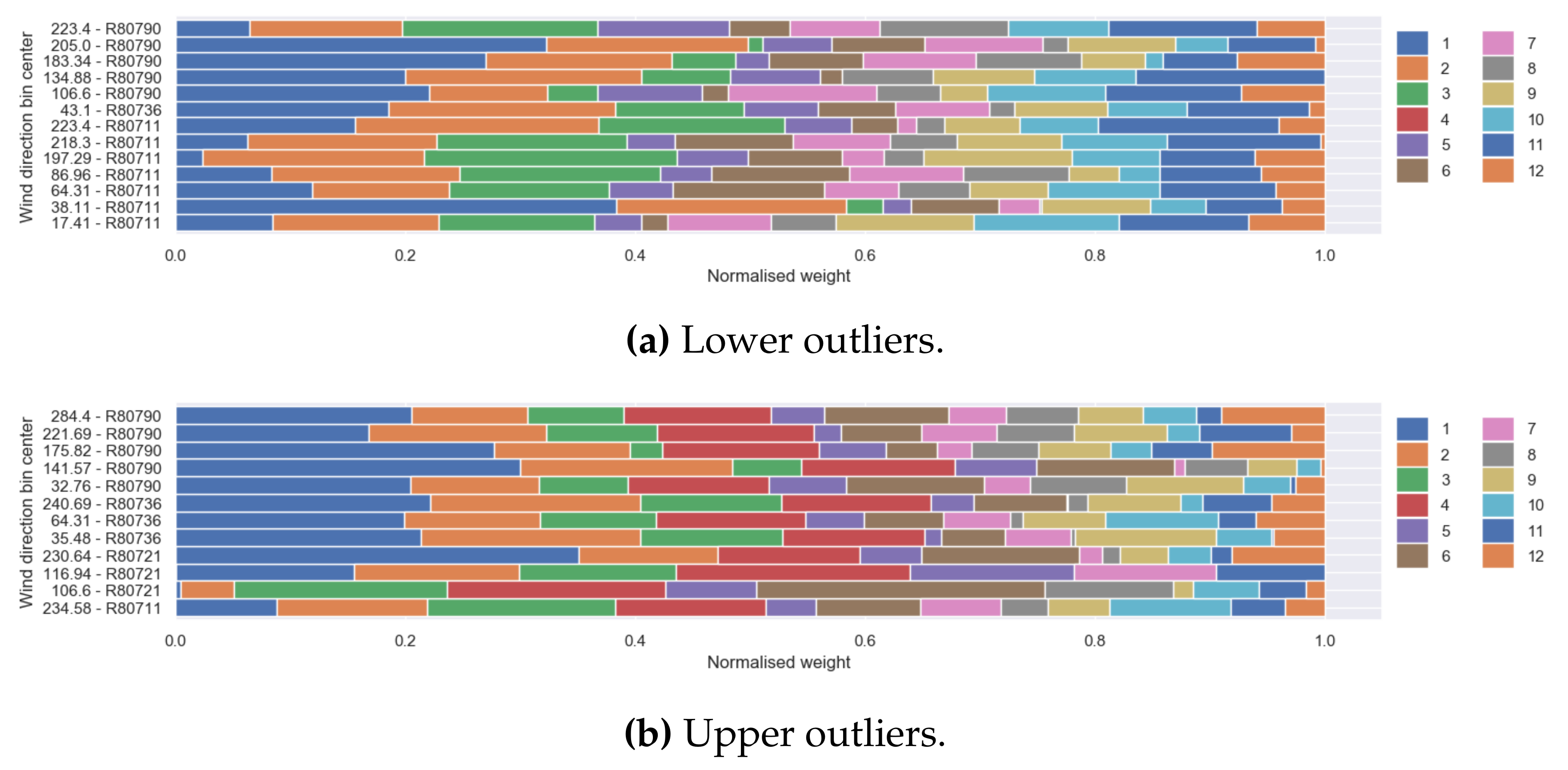
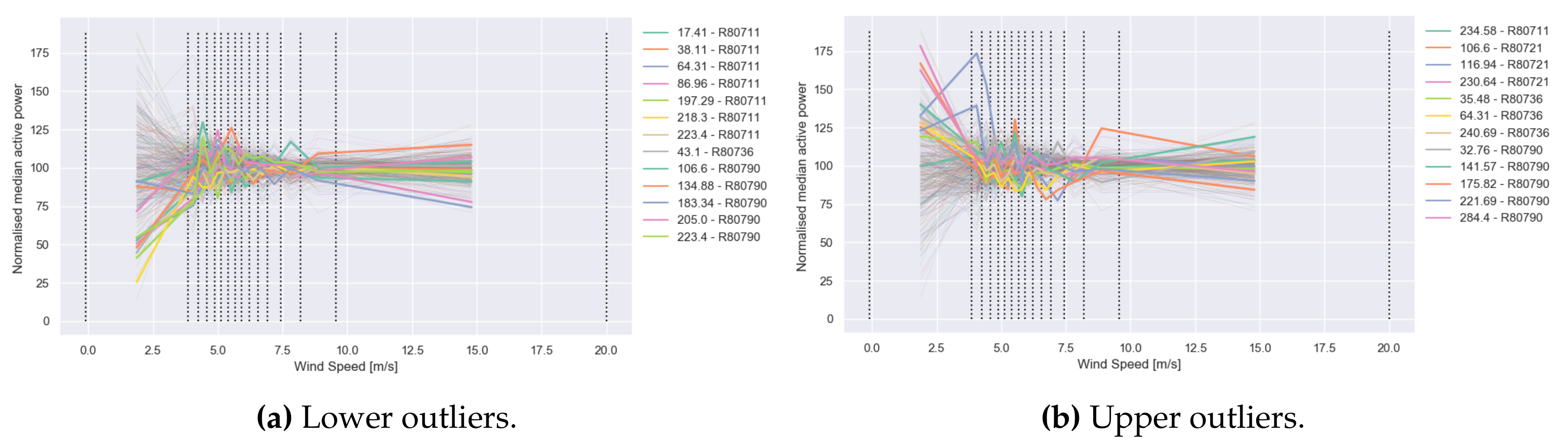
Outlier Detection Based on Weight Matrix ( W )

Each row in the weight matrix W can be interpreted as a weight vector, which can reconstruct a row from the original P matrix by a weighted combination of the prototypical active power profiles in S . Comparing the rows within the same weight matrix W enables us to identify and examine outliers. In order to facilitate outlier detection, the (KDE) distributions of all the weights for a prototypical profile are generated and inspected further. Figure 18 provides a comparative view among the turbines of the weight distributions per profile. It is interesting to observe that, for some profiles, there is considerable divergence between the turbines, e.g., profiles 4, 6, 8, 9 and 10.
Subsequently, for the purpose of demonstrating how the weight distributions can be used for outlier detection, let us focus on a particular profile of interest. For instance, profile 4 is a good candidate since, as already noted above, it captures the atypical behaviour of low wind speeds resulting in relatively high production (see Figure 17). Next, let us select for further examination all wind direction bins where this weight exceeds a threshold or quantile. In Figure 19, both the density and the histogram of the weights for this prototypical profile are depicted. The wind direction bins with the 3.0 % lowest and 3.0 % highest weights are considered outliers and subjected to further examination. Namely, their normalised weights for all 12 prototypical profiles are visualised in Figure 20. Note that the extracted lower outliers (see Figure 20a) concern almost all turbines, except for turbine 3 (R80736), while upper outliers (see Figure 20b) are detected for all turbines.
It is logical to observe in Figure 20a that profile 4 is not present (weight 0) for these wind direction bins. However, it is interesting to note that profile 12, which also expresses high production rates for relatively low wind speeds, seems to have also relatively low importance for these wind direction bins. Profile 5, which denotes moderate production rates both for low and high wind speeds, is also not very dominant.
Figure 20b depicts quite different compositions of profiles. Obviously, profile 4 is clearly detectable. Further, zooming into Figure 20 reveals further differences between the two types of outliers. Besides the first three profiles, which are clearly omnipresent, it can be detected that profile 10 is generally well-represented for the lower outliers (see Figure 20a) and hardly impacts the weight vectors from the upper outliers (see Figure 20b). This seems to align well with the fact that profile 10 captures high production generated for high wind speed, which is the opposite to profile 4.
Finally, the differences between the two sets of outliers with respect to profile 4 can be further observed when overlaying their corresponding original wind direction bin vectors on top of all wind direction bin vectors of matrix P, as depicted in Figure 21.

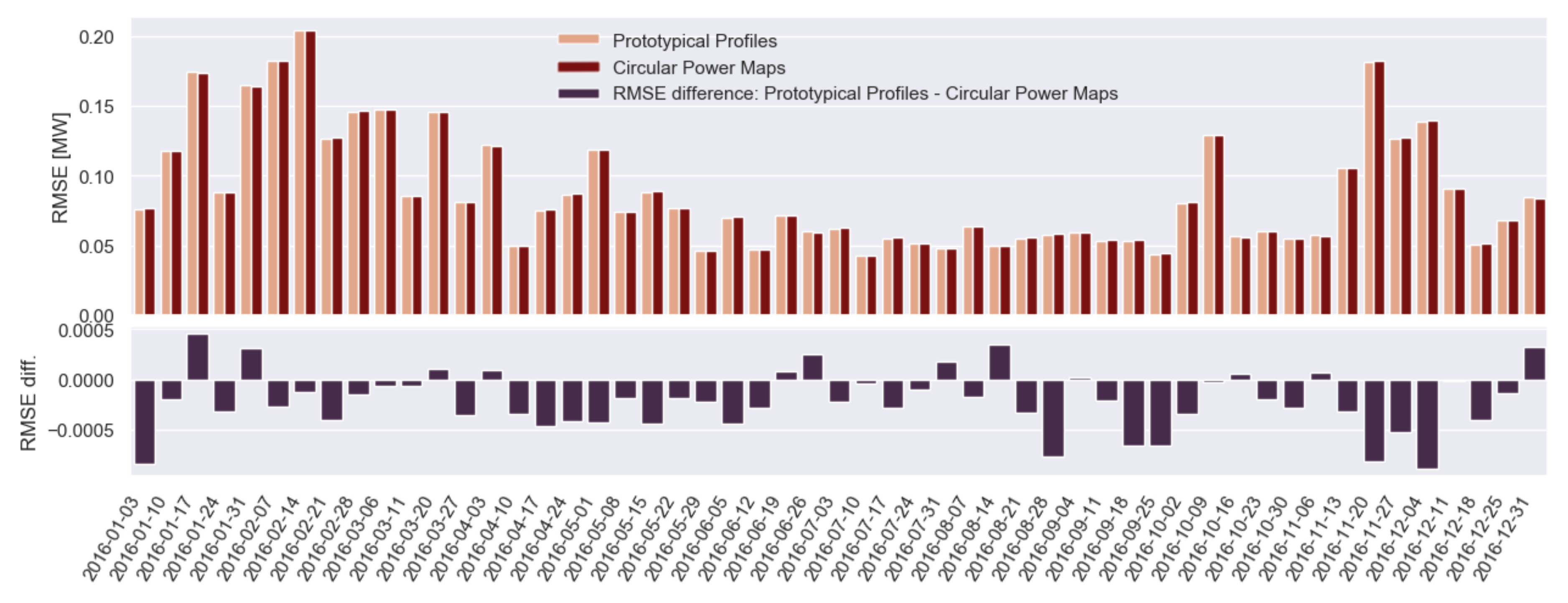
Prediction of Active Power Based on Prototypical Profiles

The circular power maps (capturing, in a context-aware fashion, representative production behaviour) as well as the fleet-wide prototypical profiles (derived via NMF) are an attempt to determine the underlying structures of the energy production behaviour of the fleet. Both methods depend on the two key parameters impacting performance: wind direction and wind speed. As a consequence, both of them can be used as prediction models for power production in the future, provided that the wind speed and wind direction can be forecasted with high certainty. It is expected that the prototypical profiles will be more resilient for small deviations in the true wind speed or wind direction.
In Figure 22, the results of power production predictions for 2016, when using both the circular (anchored-edge version) power maps and the prototypical profiles, are depicted in the form of root mean square error (RMSE) per week. For both prediction methods, historical data from 2014 and 2015 are used, i.e., both the circular power maps and the subsequent extraction of prototypical profiles with NMF are performed on 2 years of data covering 2014–2015. The RMSE ranges between 0.05 and 0.2 megawatts per week, which is evidence for the already relatively good prediction performance achieved for both approaches.
Further, we investigate the difference between the RMSE of the prototypical profiles’ predictions and the circular power maps’ predictions. As can be observed clearly in the bottom part of Figure 22, this difference is almost exclusively negative. This supports our initial hypothesis that the prototypical profile prediction model is somewhat more robust in modelling the real behaviour of a wind turbine compared to the circular power map approach.
In order to test this hypothesis further, we introduce some noise by averaging the input values for wind speed and wind direction per hour for 2016. This strategy is based on the assumption that, in real-world conditions, wind speed and wind direction cannot be estimated in a very granular manner in advance. The so-generated prediction results can be found in Figure 23. The maximum RMSE increases for both approaches to 0.25 megawatts per week. It can also be observed in the bottom part of Figure 23 that the difference between the RMSE of the prototypical profiles’ predictions and the circular power maps’ predictions slightly increases, meaning that the prototypical profile prediction model still provides slightly better predictions than the circular power maps. Overall, both approaches exhibit prediction performance with rather low error rates, which demonstrates promising application potential.

5. Discussion

In this paper, we present two discretisation approaches that are very different in nature and demonstrate how to exploit them by using both statistical and visual analytics.
The first discretisation method was initially proposed in [6] and is based on a complex layered integration technique. In this work, we researched further how the DNA-like outcome of this technique can be exploited via advanced visual analytics in order to facilitate insightful operating mode monitoring. The second discretisation approach is a novel circular binning technique that exploits, in a very elegant fashion, the circular nature of the angular variables. It splits fleet data into bins (clusters) representing different operating contexts. We have demonstrated how these bins naturally lead to the construction of circular power maps, providing a very rich visual representation of mean production rates for different combinations of wind speed vs. wind direction. Ultimately, the proposed circular binning technique enables the extraction of fleet-wide profiles of prototypical production behaviour via non-negative matrix factorisation. The extracted prototypical profiles capture, in a compact representation, the operational behaviour of the fleet and offer opportunities for the realisation of relevant use case applications, e.g., anomaly detection and production forecasting.
We have illustrated the validity and the potential of the proposed discretisation methods on a real-world data set of SCADA data from a fleet of wind turbines. As already stated above, the two methods are very different in nature and their combination might allow the capture of complementary insights. We conclude this paper with a short discussion on the potential usages of the methods.

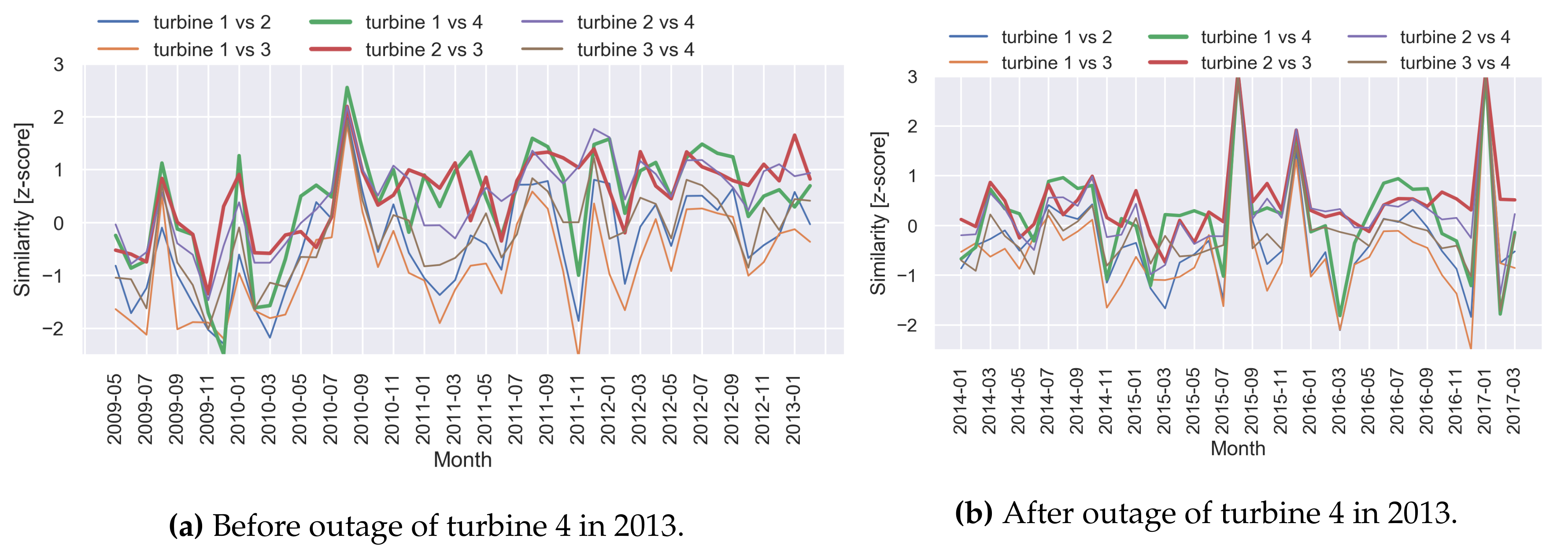
5.1. Visual Inspection for Detecting Trends

A wide range of visual analytics methods have been proposed in the foregoing sections, e.g., the pairwise similarity scores in Figure 9 and label maps in Figure 10 and Figure 11. Both visualisations can be maintained and kept up-to-date on a frequent basis by simply appending the newly arrived information. This feature makes them very suitable as dashboards for condition monitoring and the inspection of operating mode trends. Further, the power maps introduced in Figure 16 allow the study of changes in power production and facilitate the root cause detection of atypical production behaviour. Moreover, the circular power maps can be generated in multiples by constructing a lattice of maps, facilitating the further comparison of production performance across the fleet or the detection of relevant temporal patterns and seasonal artefacts. All the discussed visualisations could be constructed in real time, serving as powerful dashboards to empower and support the monitoring and decision-making process of the human operator.

5.2. Continuous Anomaly Detection

An interesting characteristic of the layered integration technique is that it can be applied even when only a limited amount of data is available, e.g., one could already train an initial layered integration model to detect operating modes as soon as at least three months of data are available. By use of this initial model, new incoming data can be labelled daily or weekly. Subsequently, the resulting operating modes can instantaneously be inspected for anomalies. Periodically (e.g., monthly), one can retrain the model on the full available data set, resulting in a more reliable layered integration model. In addition, this continuous anomaly detection approach blends perfectly with the label maps used for visual inspection, as shown in Figure 10. One can interpret such a label map as an “infinite carpet”, where new operating modes can endlessly be sewn on at the bottom.

5.3. Production Forecasting

Thanks to the smart circular binning approach proposed in this paper, we have been able to extract a set of profiles revealing diverse prototypical production patterns exhibited by the fleet. We demonstrated how these prototypical profiles can be employed for production forecasting and the obtained results confirmed that the prototypical profiles allow us to capture adequately the latent structure of the data. This creates opportunities for robust production forecasting provided that reliable forecasting of the weather conditions can be made, which is in itself a tough challenge.

6. Conclusions

The key message that we would like to convey with this work is that well-considered data preparation and discretisation are essential prerequisites for the successful application of advanced analytics on time series data. We hope that our powerful visualisations and formalised profiling methodologies, whose application potential was demonstrated on real-world fleet data, are able to convincingly communicate this message.
This work has revealed multiple research directions that will be investigated in the future. One interesting opportunity would be to exploit further the potential of the active power decomposition obtained via NMF. For instance, the prototypical profiles could be considered as representative performance models and the corresponding weights as features. Assuming that ground truth is available about the performance behaviour of an individual turbine or of a fleet, e.g., optimal operations vs. degradation, then the features (weights) can be used to train a classifier. In this way, any new incoming data can be used to derive the corresponding features by solving Equation (6) and subsequently classified accordingly, enabling the timely detection of performance degradation.

Author Contributions

Conceptualisation, E.T.; methodology, M.D. and E.T.; software, M.D.; validation, M.D.; formal analysis, M.D. and E.T.; investigation, M.D., E.T. and V.B.; resources, M.D.; data curation, M.D.; writing—original draft preparation, M.D. and E.T.; writing—review and editing, E.T. and V.B.; visualisation, M.D.; supervision, E.T.; project administration, M.D.; funding acquisition, E.T. All authors have read and agreed to the published version of the manuscript.

Funding

This research was funded by the Region of Bruxelles-Capitale—Innoviris through the projects MISTic and ReWind and by the Flemish Government through the AI Research Program.

Data Availability Statement

The SCADA data from Engie used during the study can be found here: https://opendata-renewables.engie.com/explore/, accessed on 13 May 2021.

Conflicts of Interest

The authors declare no conflict of interest.

Abbreviations

The following abbreviations are used in this manuscript:
DBSCANDensity-based spatial clustering of applications with noise
DNADeoxyribonucleic acid
DTWDynamic time warping
EFDEqual frequency discretisation
EWDEqual width discretisation
FDICFrequency dynamic interval class
KDEKernel density estimation
NMFNon-negative matrix factorisation
OMOperating mode
PAAPiecewise aggregate approximation
PCAPrincipal component analysis
PLSAProbabilistic latent semantic analysis
RMSERoot mean square error
RNARibonucleic acid
SAXSymbolic aggregate approximation
SCADASupervisory control and data acquisition
SVDSingular value decomposition
SWSmith–Waterman

References

  1. Uluyol, O.; Parthasarathy, G.; Foslien, W.; Kim, K. Power curve analytic for wind turbine performance monitoring and prognostics. In Proceedings of the Annual Conference of the PHM Society, Montreal, QC, Canada, 25–29 September 2011; Volume 3. [Google Scholar]
  2. Cooney, C.; Byrne, R.; Lyons, W.; O’Rourke, F. Performance characterisation of a commercial-scale wind turbine operating in an urban environment, using real data. Energy Sustain. Dev. 2017, 36, 44–54. [Google Scholar] [CrossRef]
  3. Vanderwende, B.J.; Lundquist, J.K. The modification of wind turbine performance by statistically distinct atmospheric regimes. Environ. Res. Lett. 2012, 7, 034035. [Google Scholar] [CrossRef]
  4. Wagner, R.; Antoniou, I.; Pedersen, S.M.; Courtney, M.S.; Jørgensen, H.E. The influence of the wind speed profile on wind turbine performance measurements. Wind Energy 2009, 12, 348–362. [Google Scholar] [CrossRef]
  5. Byrne, R.; Astolfi, D.; Castellani, F.; Hewitt, N.J. A study of wind turbine performance decline with age through operation data analysis. Energies 2020, 13, 2086. [Google Scholar] [CrossRef] [Green Version]
  6. Dhont, M.; Tsiporkova, E.; Boeva, V. Layered Integration Approach for Multi-view Analysis of Temporal Data. In Proceedings of the International Workshop on Advanced Analytics and Learning on Temporal Data, Ghent, Belgium, 18 September 2020; Springer: Berlin, Germany, 2020; pp. 138–154. [Google Scholar]
  7. Dhont, M.; Tsiporkova, E.; Tourwé, T.; González-Deleito, N. Visual Analytics for Extracting Trends from Spatio-temporal Data. In Proceedings of the International Workshop on Advanced Analytics and Learning on Temporal Data, Ghent, Belgium, 18 September 2020; Springer: Berlin, Germany, 2020; pp. 122–137. [Google Scholar]
  8. Lkhagva, B.; Suzuki, Y.; Kawagoe, K. Extended SAX: Extension of symbolic aggregate approximation for financial time series data representation. DEWS2006 4A-i8. 2006, Volume 7. Available online: https://www.researchgate.net/profile/Yu-Suzuki-2/publication/229046404_Extended_SAX_extension_of_symbolic_aggregate_approximation_for_financial_time_series_data_representation/links/570b819d08ae8883a1ffa123/Extended-SAX-extension-of-symbolic-aggregate-approximation-for-financial-time-series-data-representation.pdf (accessed on 18 September 2021).
  9. Ahmed, A.M.; Bakar, A.A.; Hamdan, A.R. Dynamic data discretization technique based on frequency and K-Nearest Neighbour algorithm. In Proceedings of the 2009 2nd Conference on Data Mining and Optimization, Selangor, Malaysia, 27–28 October 2009; IEEE: New York, NY, USA, 2009; pp. 10–14. [Google Scholar]
  10. Chaudhari, P.; Rana, D.P.; Mehta, R.G.; Mistry, N.J.; Raghuwanshi, M.M. Discretization of temporal data: A survey. arXiv 2014, arXiv:1402.4283. [Google Scholar]
  11. Liu, J.; Wang, C.; Gao, J.; Han, J. Multi-view clustering via joint nonnegative matrix factorization. In Proceedings of the 2013 SIAM International Conference on Data Mining, Austin, TX, USA, 2–4 May 2013; SIAM: Philadelphia, PA, USA, 2013; pp. 252–260. [Google Scholar]
  12. Bruno, E.; Marchand-Maillet, S. Multiview clustering: A late fusion approach using latent models. In Proceedings of the 32nd International ACM SIGIR Conference on Research and Development in Information Retrieval, Boston, MA, USA, 19–23 July 2009; pp. 736–737. [Google Scholar]
  13. Greene, D.; Cunningham, P. A matrix factorization approach for integrating multiple data views. In Proceedings of the Joint European Conference on Machine Learning and Knowledge Discovery in Databases, Bled, Slovenia, 7–11 September 2009; Springer: Berlin, Germany, 2009; pp. 423–438. [Google Scholar]
  14. Chaudhuri, K.; Kakade, S.M.; Livescu, K.; Sridharan, K. Multi-view clustering via canonical correlation analysis. In Proceedings of the 26th Annual International Conference on Machine Learning, Montreal, QC, Canada, 14–18 June 2009; pp. 129–136. [Google Scholar]
  15. Blaschko, M.B.; Lampert, C.H. Correlational spectral clustering. In Proceedings of the 2008 IEEE Conference on Computer Vision and Pattern Recognition, Anchorage, AK, USA, 23–28 June 2008; IEEE: New York, NY, USA, 2008; pp. 1–8. [Google Scholar]
  16. Bickel, S.; Scheffer, T. Multi-View Clustering. In Proceedings of the IEEE International Conference on Data Mining, Brighton, UK, 1 November 2004; IEEE: New York, NY, USA, 2004; Volume 1, pp. 19–26. [Google Scholar]
  17. Kumar, A.; Rai, P.; Daume, H. Co-regularized multi-view spectral clustering. Adv. Neural Inf. Process. Syst. 2011, 24, 1413–1421. [Google Scholar]
  18. Murgia, A.; Tsiporkova, E.; Verbeke, M.; Tourwé, T. Context-Aware Performance Benchmarking of a Fleet of Industrial Assets. Arch. Data Sci. Ser. A 2020, 5. [Google Scholar] [CrossRef]
  19. Archer, C.L.; Mirzaeisefat, S.; Lee, S. Quantifying the sensitivity of wind farm performance to array layout options using large-eddy simulation. Geophys. Res. Lett. 2013, 40, 4963–4970. [Google Scholar] [CrossRef]
  20. Zhang, B.; Liu, J. Wind turbine clustering algorithm of large offshore wind farms considering wake effects. Math. Probl. Eng. 2019, 2019, 6874693. [Google Scholar] [CrossRef]
  21. Cao, M.; Shi, D. Equivalence Method for Wind Farm Based on Clustering of Output Power Time Series Data. In Proceedings of the 2020 12th IEEE PES Asia-Pacific Power and Energy Engineering Conference (APPEEC), Xi’an, China, 24–26 April 2020; IEEE: New York, NY, USA, 2020; pp. 1–6. [Google Scholar]
  22. Han, J.; Miao, S.; Li, Y.; Yin, H.; Zhang, D.; Yang, W.; Tu, Q. Improved Equivalent Method for Large-Scale Wind Farms Using Incremental Clustering and Key Parameters Optimization. IEEE Access 2020, 8, 172006–172020. [Google Scholar] [CrossRef]
  23. Wu, W.; Peng, M. A data mining approach combining k-means clustering with bagging neural network for short-term wind power forecasting. IEEE Internet Things J. 2017, 4, 979–986. [Google Scholar] [CrossRef] [Green Version]
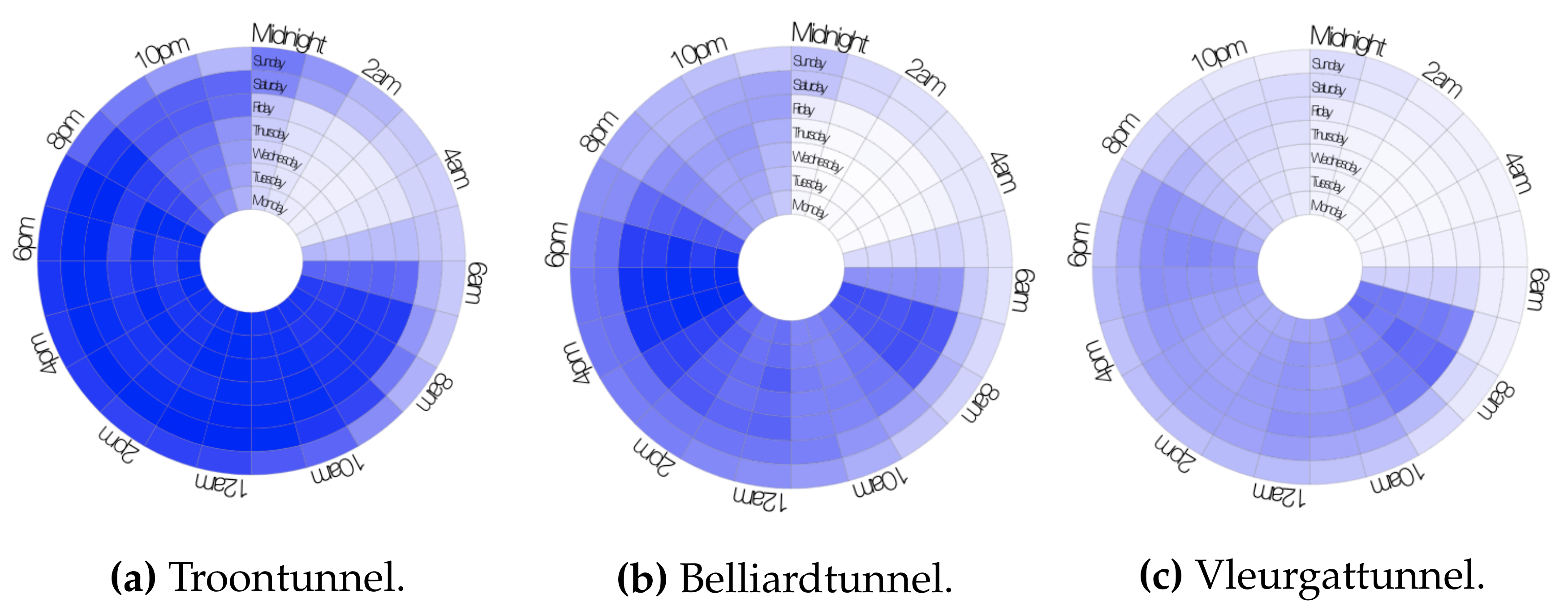
  24. Zhao, J.; Forer, P.; Harvey, A.S. Activities, ringmaps and geovisualization of large human movement fields. Inf. Vis. 2008, 7, 198–209. [Google Scholar] [CrossRef]
  25. Vartak, M.; Huang, S.; Siddiqui, T.; Madden, S.; Parameswaran, A. Towards visualization recommendation systems. ACM SIGMOD Record 2017, 45, 34–39. [Google Scholar] [CrossRef]
  26. Luo, Y.; Qin, X.; Tang, N.; Li, G. DeepEye: Towards automatic data visualization. In Proceedings of the 34th International Conference on Data Engineering, Paris, France, 16–19 April 2018; IEEE: New York, NY, USA, 2018; pp. 101–112. [Google Scholar]
  27. Lee, D.D.; Seung, H.S. Learning the parts of objects by non-negative matrix factorization. Nature 1999, 401, 788–791. [Google Scholar] [CrossRef] [PubMed]
  28. Lyu, H.; Strohmeier, C.; Menz, G.; Needell, D. COVID-19 Time-series Prediction by Joint Dictionary Learning and Online NMF. arXiv 2020, arXiv:2004.09112. [Google Scholar]
  29. Iverson, D.L. Inductive System Health Monitoring; NASA: Moffett Field, CA, USA, 2004. [Google Scholar]
  30. Smith, T. Smith-Waterman Algorithm. Adv. Appl. Math. 1981, 2, 482–489. [Google Scholar] [CrossRef] [Green Version]
  31. Dickson, M. Non-relativistic quantum mechanics. In Philosophy of Physics; Handbook of the Philosophy of Science; Butterfield, J., Earman, J., Eds.; North-Holland: Amsterdam, The Netherlands, 2007; pp. 275–415. [Google Scholar] [CrossRef] [Green Version]
  32. Lanzafame, R.; Mauro, S.; Messina, M. HAWT design and performance evaluation: Improving the BEM theory mathematical models. Energy Procedia 2015, 82, 172–179. [Google Scholar] [CrossRef] [Green Version]
  33. Villanueva, D.; Feijóo, A.E. Reformulation of parameters of the logistic function applied to power curves of wind turbines. Electr. Power Syst. Res. 2016, 137, 51–58. [Google Scholar] [CrossRef]
  34. Wang, Y.; Hu, Q.; Li, L.; Foley, A.M.; Srinivasan, D. Approaches to wind power curve modeling: A review and discussion. Renew. Sustain. Energy Rev. 2019, 116, 109422. [Google Scholar] [CrossRef]
  35. Dhillon, I.S.; Sra, S. Generalized Nonnegative Matrix Approximations with Bregman Divergences; NIPS; Citeseer: Pennsylvania, PA, USA, 2005; Volume 18. [Google Scholar]
  36. Hawkins, D. Clustering scotch whiskies using non-negative matrix factorization. Jt. Newsl. Sect. Phys. Eng. Sci. Qual. Product. Sect. Am. Stat. Assoc. 2006, 14, 11–13. [Google Scholar]
  37. Li, W.; Liu, Z. A method of SVM with normalization in intrusion detection. Procedia Environ. Sci. 2011, 11, 256–262. [Google Scholar] [CrossRef] [Green Version]
Figure 1. Fingerprints of vehicle counts at 3 locations in Brussels, averaged over the 5 last weeks before COVID-19 measures were introduced (20 March 2020).
Energies 14 06216 g001
Figure 2. Schematic overview of the major steps for the two proposed research approaches.
Energies 14 06216 g002
Figure 3. Schematic illustration of operating mode labelling. (a) Example of a subset of time series from wind turbine SCADA data. The exact names of the parameters on the vertical axis can be found here: https://opendata-renewables.engie.com/explore/dataset/39490fd2-04a2-4622-9042-ce4dd34c2a58/information (accessed on 18 September 2021). (b) Example of labelled timestamps. A, B, C and D represent the different operating modes.
Energies 14 06216 g003
Figure 4. Illustration of a label map of fleet-wide operating modes generated for a selected time period for one turbine. The labels (A, B, C and D) are ordered from lowest to highest active power.
Energies 14 06216 g004
Figure 5. Two-dimensional angular binning strategies.
Energies 14 06216 g005
Figure 6. Power curve (production performance expressed as a function of only wind speed) vs. circular power map (mean production rates for different combinations of wind speed and wind direction).
Energies 14 06216 g006
Figure 7. Range of the endogenous parameters for the turbine-specific operating modes.
Energies 14 06216 g007
Figure 9. Z-transformed pairwise similarity scores with a rolling time window of 1 month.
Energies 14 06216 g009
Figure 10. Operating modes (labels) of wind turbine 2.
Energies 14 06216 g010
Figure 11. Operating modes (labels) for the 4 turbines in February 2011.
Energies 14 06216 g011
Figure 12. Z-transformed pairwise similarity scores for February 2011 calculated with a rolling time window of one day.
Energies 14 06216 g012
Figure 13. Fleet-wide kernel density estimation and bin edges per dimension for wind turbine 2.
Energies 14 06216 g013
Figure 14. Anchored-edge binning, illustrated in two steps on the data from turbine 2. The radius shows the wind speed, while the angle indicates the wind direction.
Energies 14 06216 g014
Figure 15. Circular power maps for 2016 (normalised with fleet-wide median active power per bin for 2016).
Energies 14 06216 g015
Figure 16. Circular power maps (normalised with fleet-wide median active power per bin for 2016).
Energies 14 06216 g016
Figure 17. Fleet-wide prototypical active power profiles for 2016. They represent the building blocks to reconstruct the power curve for a specific wind direction bin. Wind speed bin edges are indicated with vertical dotted lines.
Energies 14 06216 g017
Figure 18. Normalised weight distributions per prototypical profile in 2016.
Energies 14 06216 g018
Figure 19. Density and histogram of the weights for prototypical profile 4 in 2016.
Energies 14 06216 g019
Figure 20. Normalised weight vectors for wind direction bins representing very low/high weights for prototypical profile 4 in 2016.
Energies 14 06216 g020
Figure 21. Original (normalised) vectors of P of the outlier wind directions, with all vectors of P in the background.
Energies 14 06216 g021
Figure 22. RMSE (prototypical profiles vs. circular power maps) for weekly predictions of active power for turbine 1 for 2016.
Energies 14 06216 g022
Figure 23. RMSE (prototypical profiles vs. circular power maps) for weekly predictions of active power for turbine 1 for 2016, with hourly averaged input values for wind speed and wind direction.
Energies 14 06216 g023
Table 1. Retained endogenous parameters.
P 1Generator bearing 1 temperature P 7Gearbox oil sump temperature
P 2Generator bearing 2 temperature P 8Gearbox inlet temperature
P 3Pitch angle (sine) P 9Gearbox bearing 1 temperature
P 4Pitch angle (cosine) P 10Gearbox bearing 2 temperature
P 5Torque P 11Generator stator temperature
P 6Rotor bearing temperature P 12Generator speed
Table 2. Z-transformed pairwise similarity scores between the operating mode sequences of the 4 turbines.
(a) Before outage of turbine 4 in 2013.
Turbine 1Turbine 2Turbine 3
Turbine 2−0.81
Turbine 3−1.561.06
Turbine 40.860.91−0.45
(b) After outage of turbine 4 in 2013.
Turbine 1Turbine 2Turbine 3
Turbine 2−0.85
Turbine 3−1.531.37
Turbine 40.580.76−0.33
Publisher’s Note: MDPI stays neutral with regard to jurisdictional claims in published maps and institutional affiliations.

