New Reactive Power Compensation Strategies for Railway Infrastructure Capacity Increasing


Abstract

1. Introduction
2. Literature Review
3. Materials and Methods
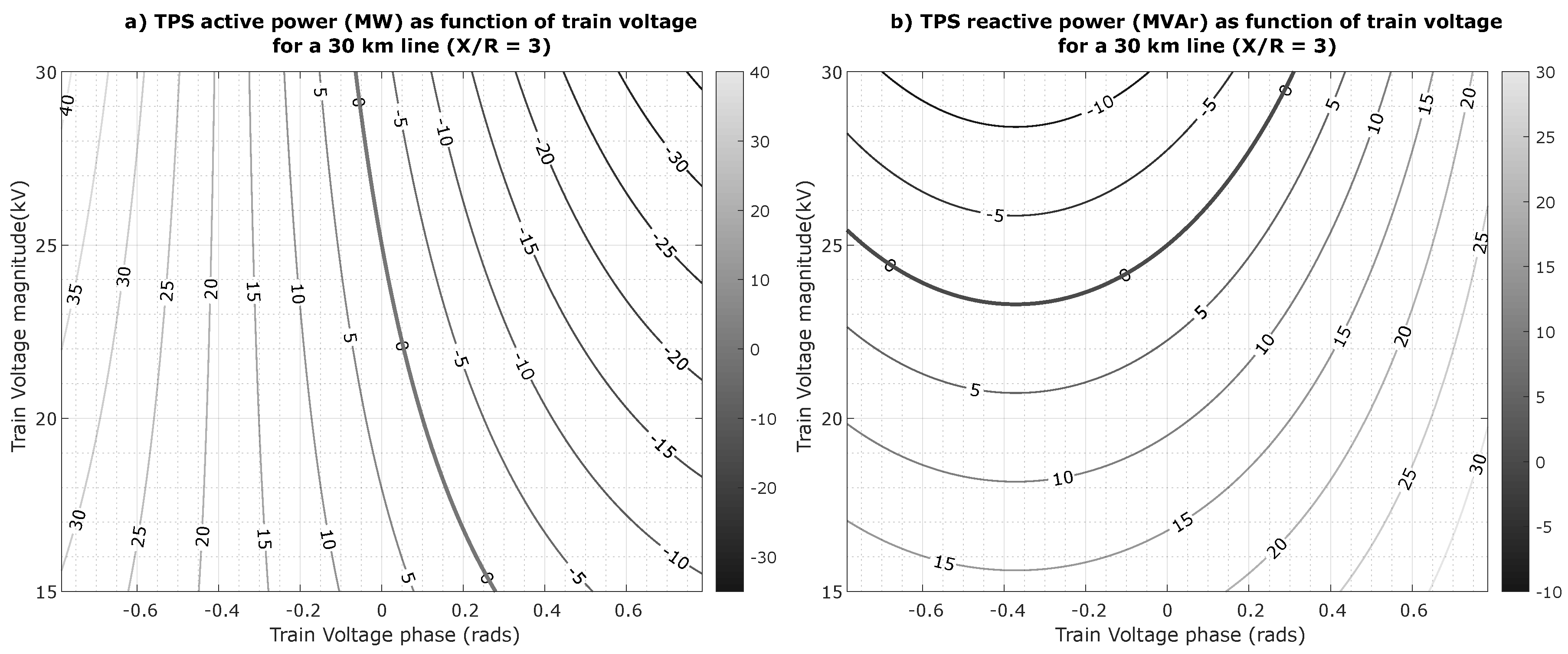
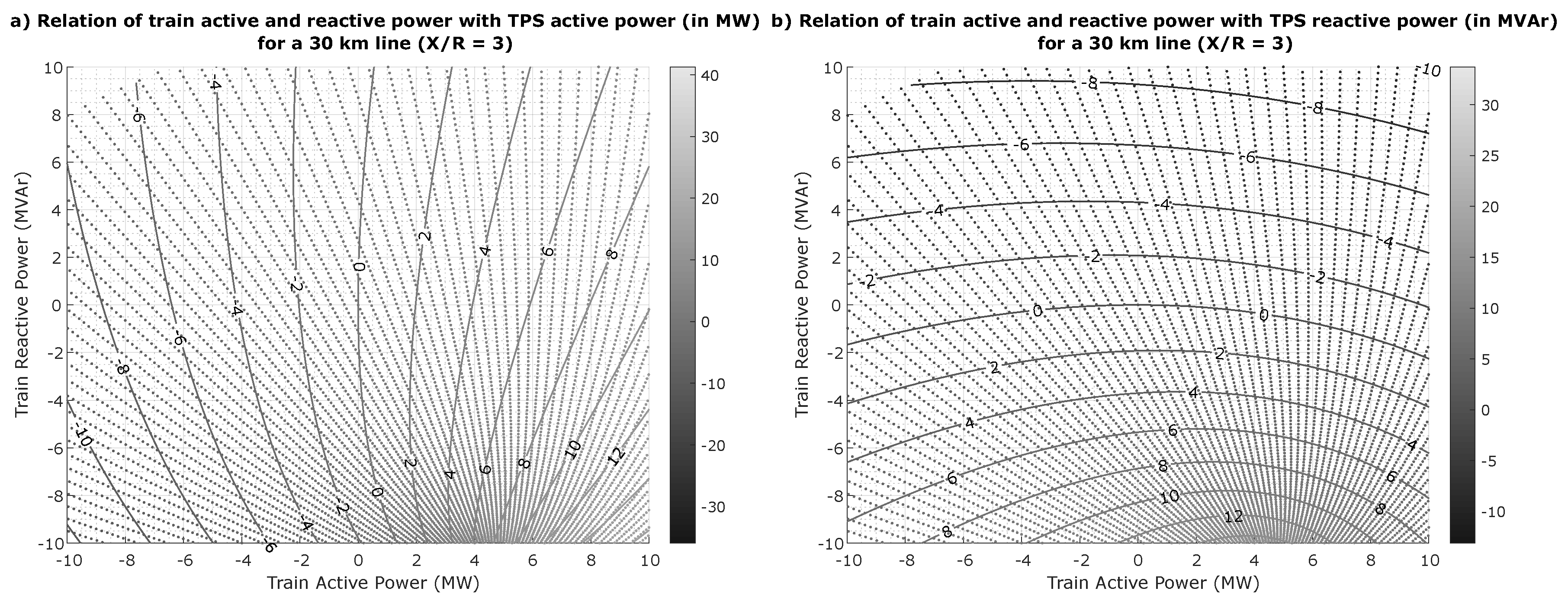
3.1. Basic Model
3.2. Simulation Framework
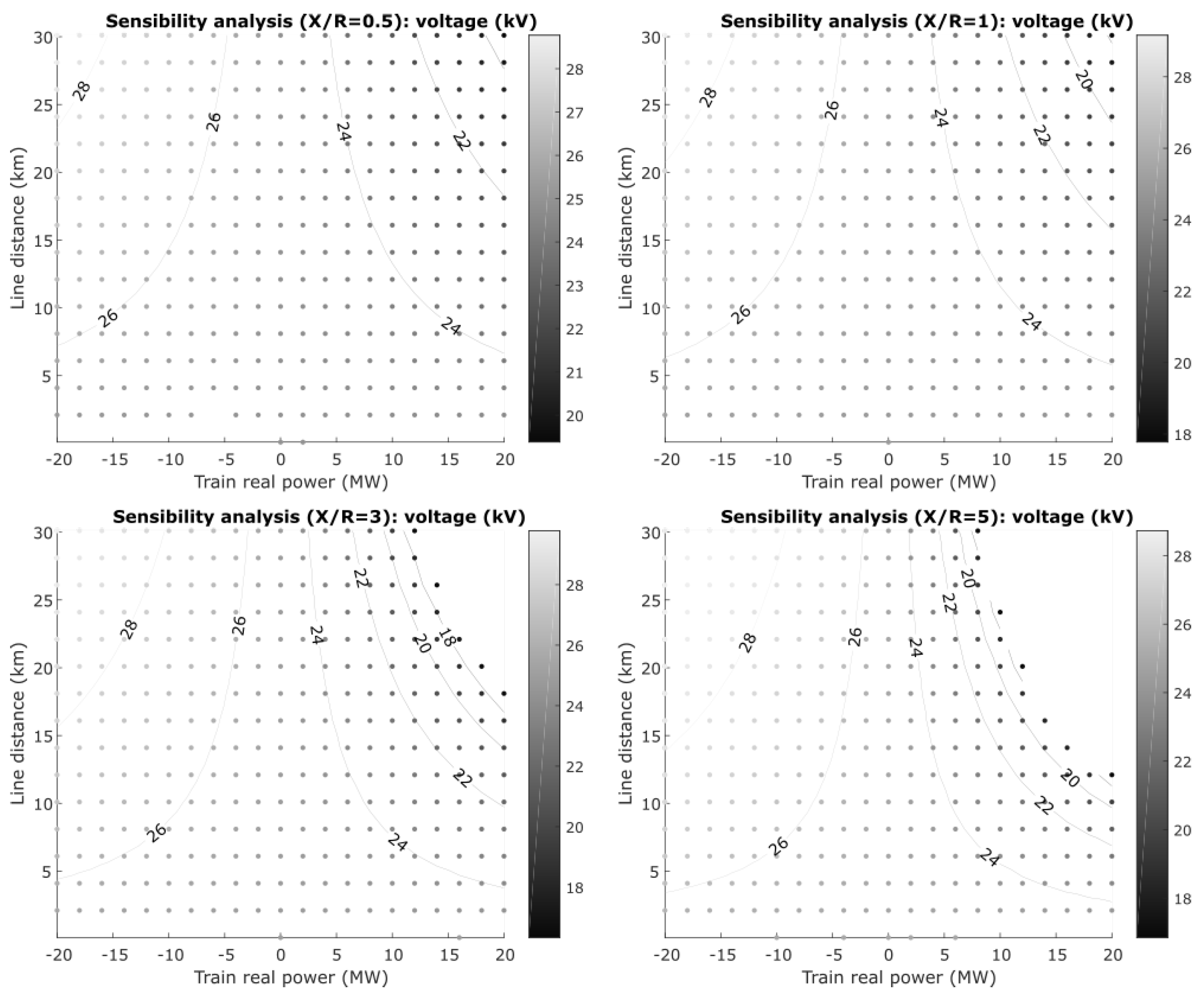
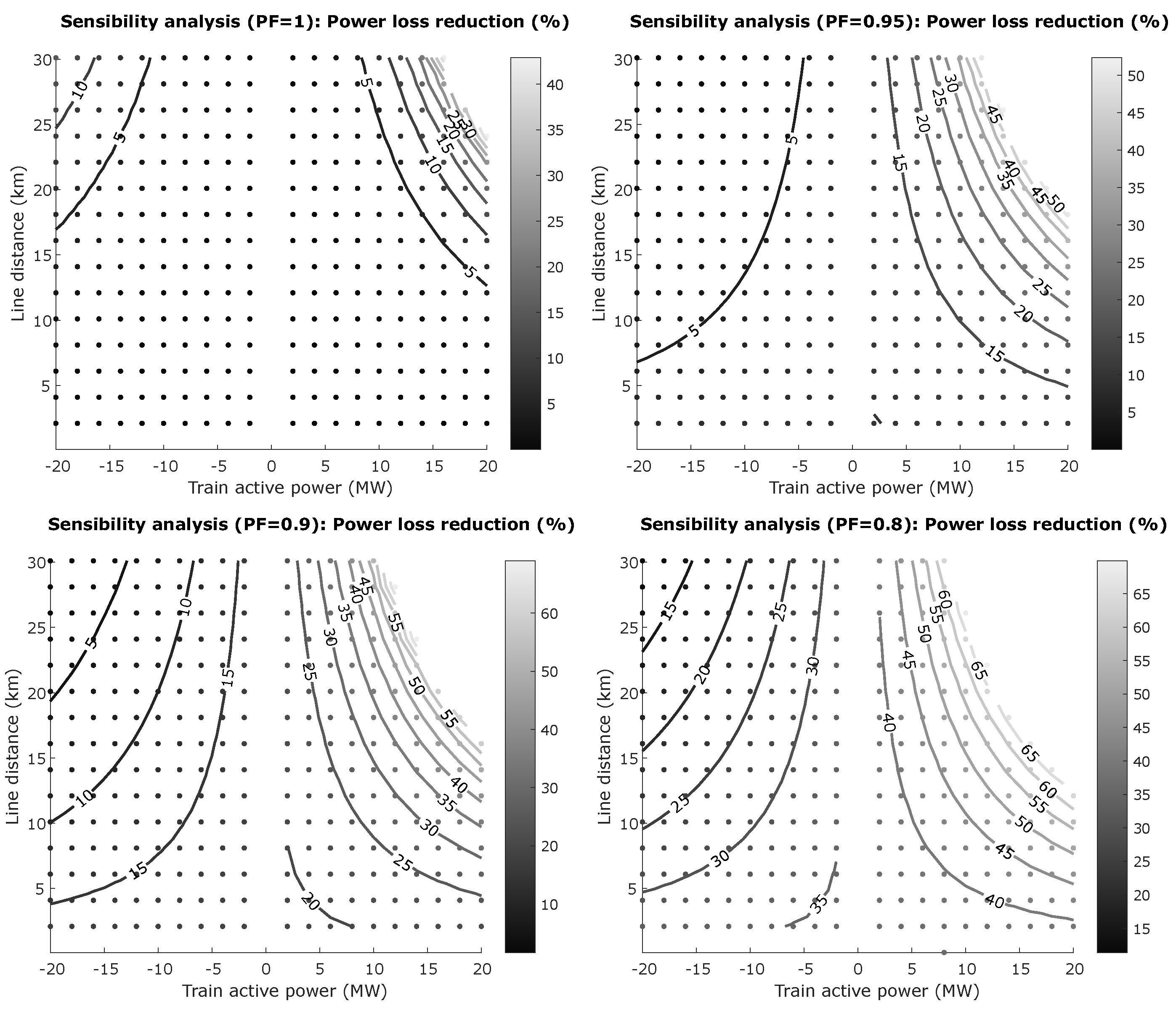
3.3. Sensibility Analysis
4. Reactive Power Compensation
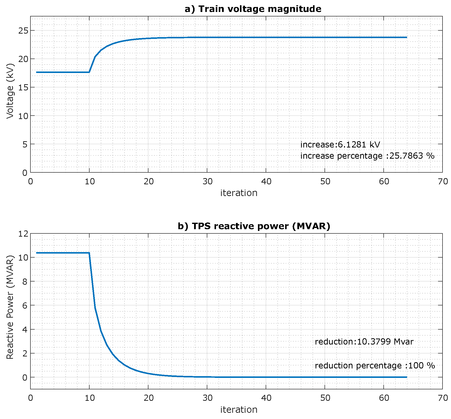
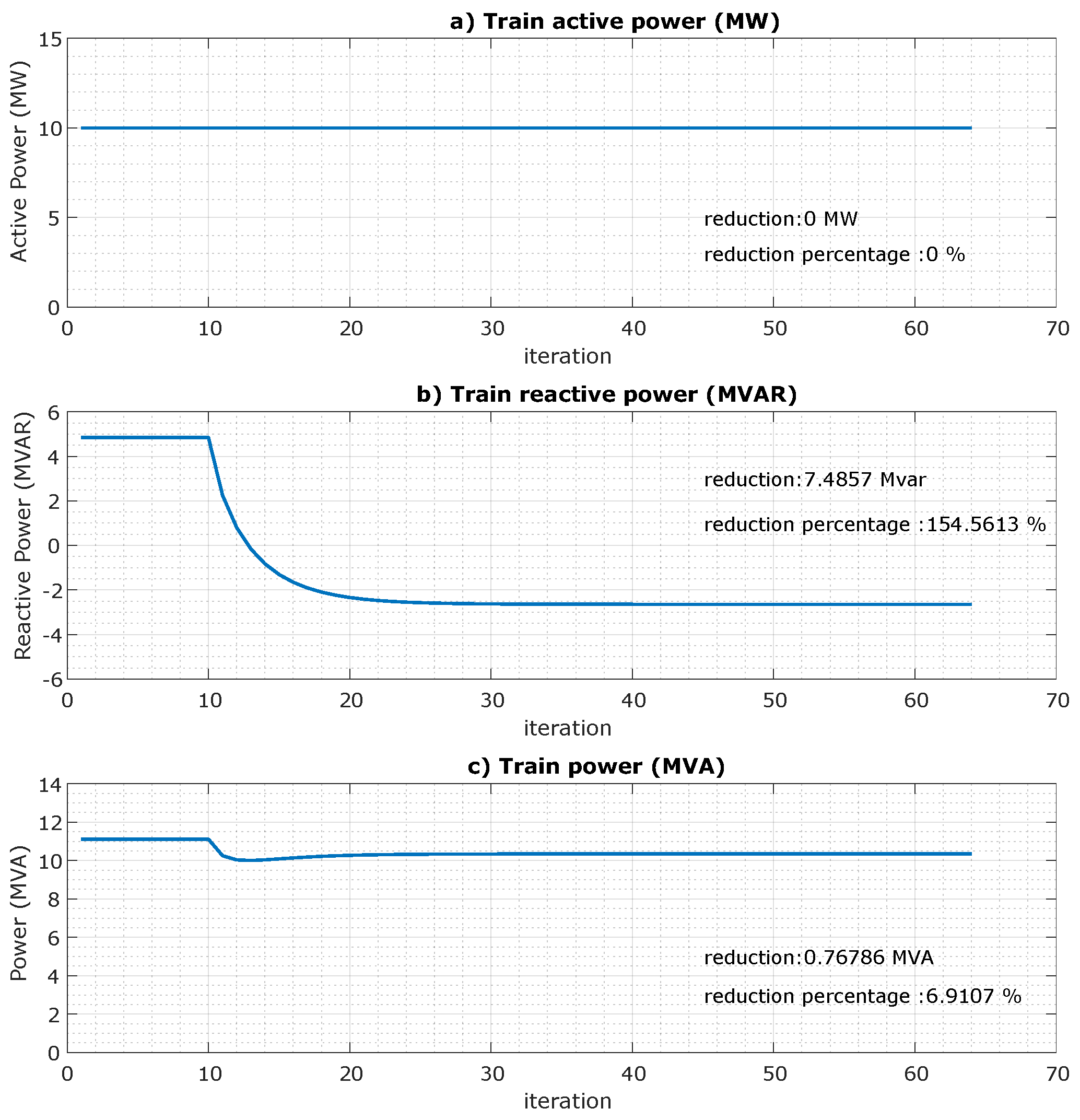
4.1. Algorithm for Reactive Power Compensation
| Algorithm 1: Reactive Power Compensation Using Fixed Steepest Descent Method |
 |
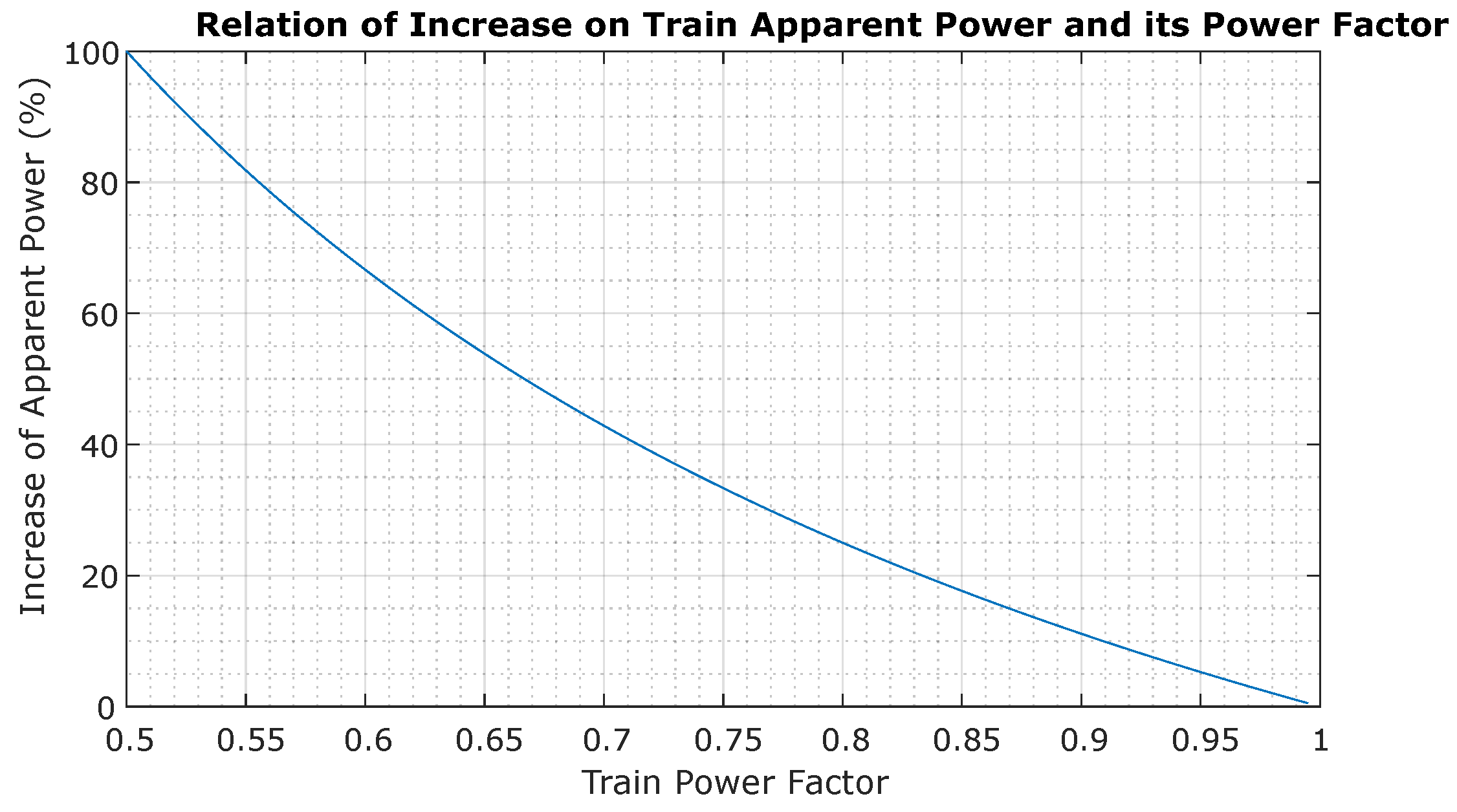
4.2. Sensibility Analysis
5. Increase of the Railway Infrastructure Capacity
- Study of railway capacity without compensation (Baseline);
- Installation of a Static VAR Compensator located at neutral zone;
- On-board compensation in all trains;
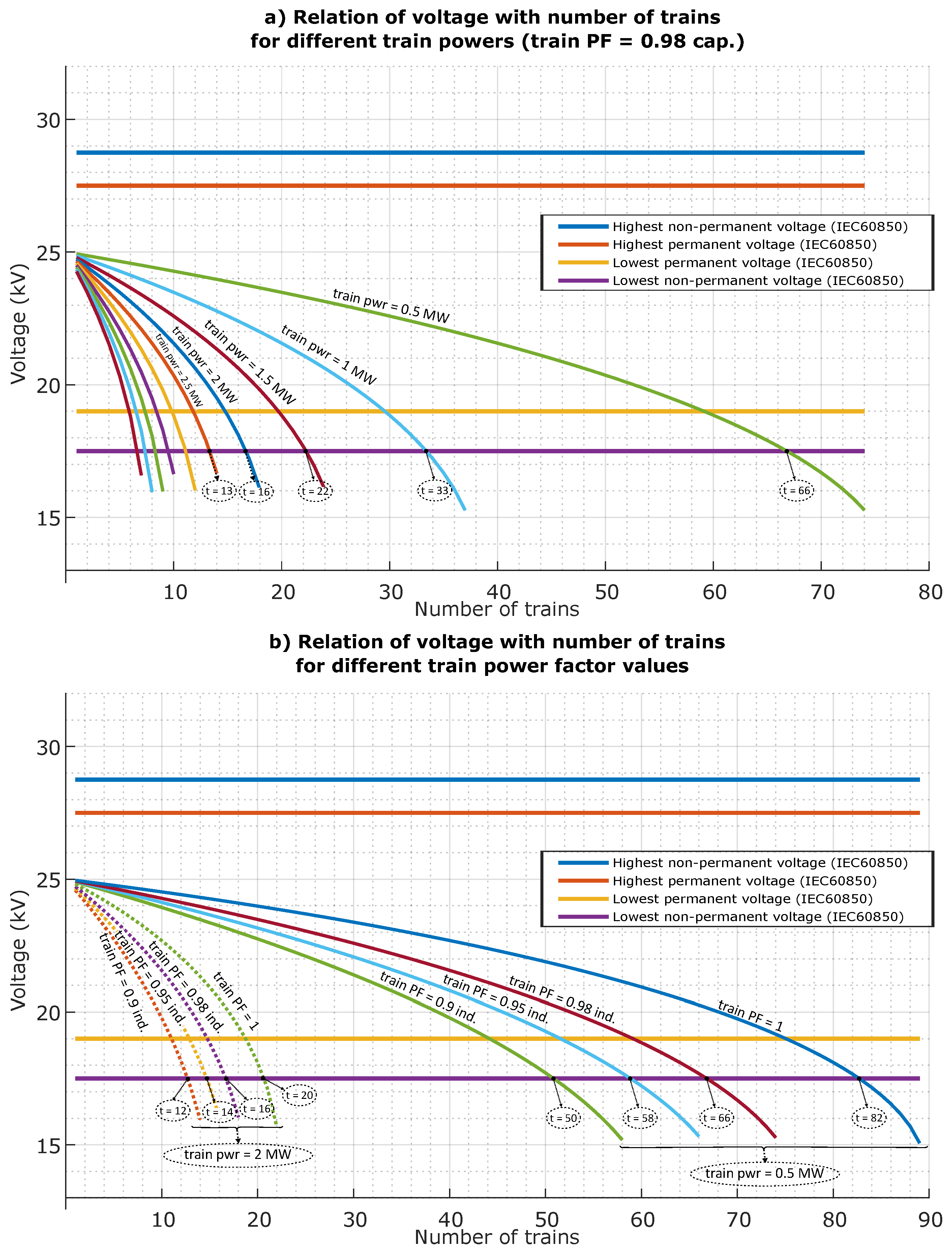
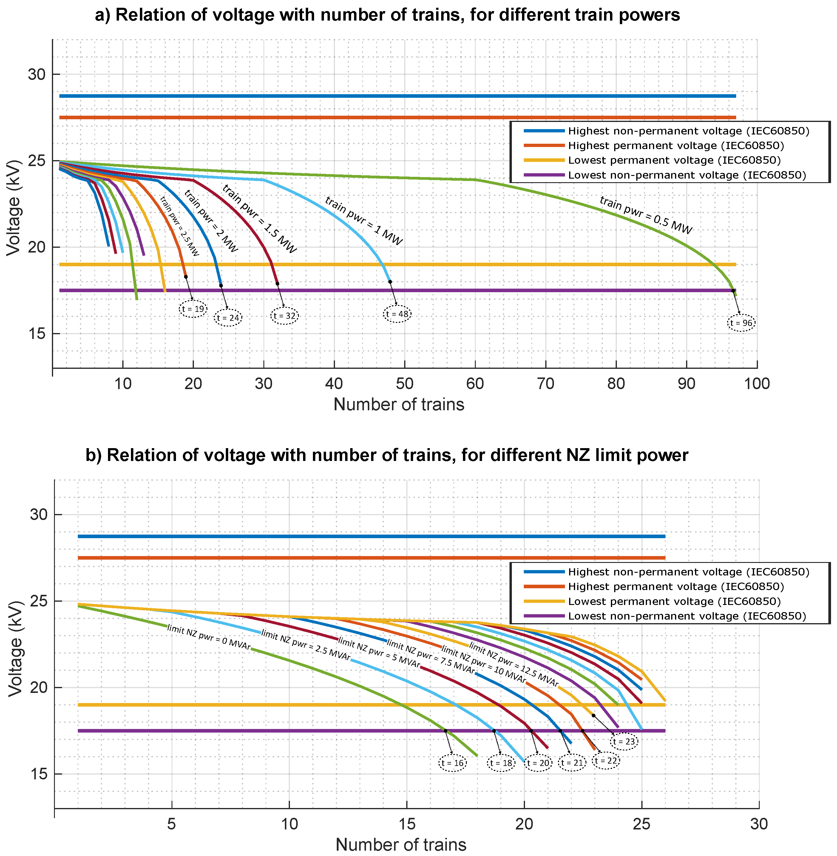
5.1. Baseline: Railway Capacity without Compensation
5.2. Reactive Power Compensation in the Neutral Zone
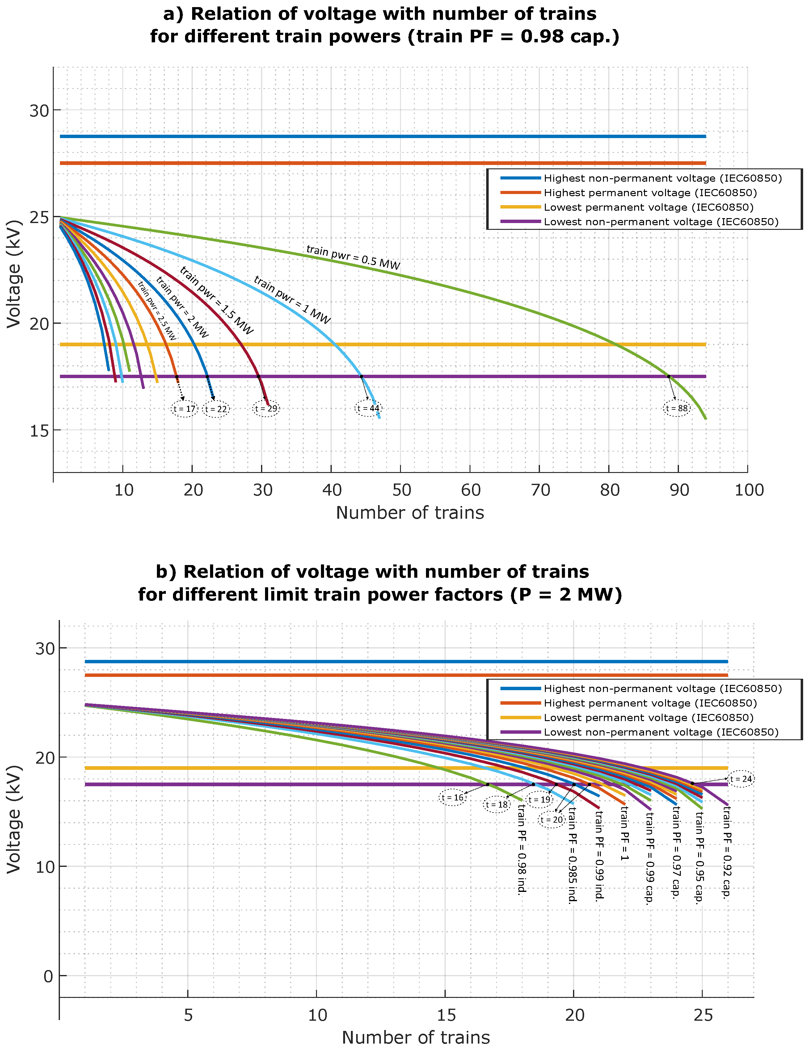
5.3. Mobile Reactive Power Compensation
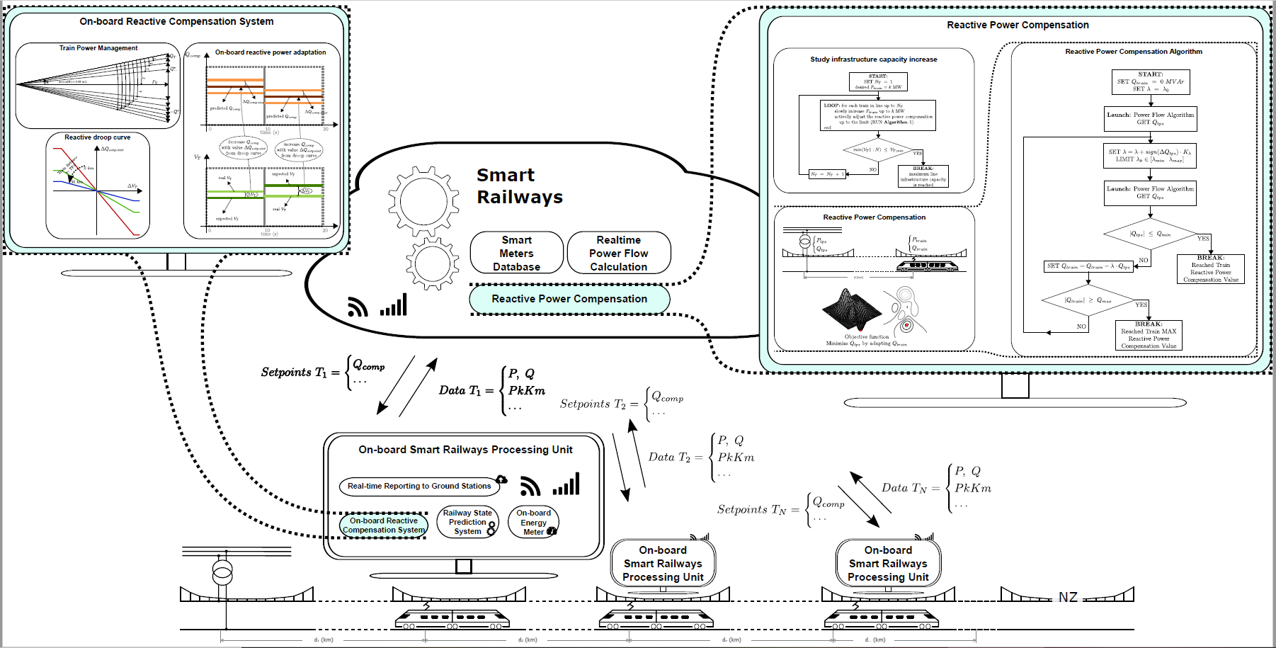
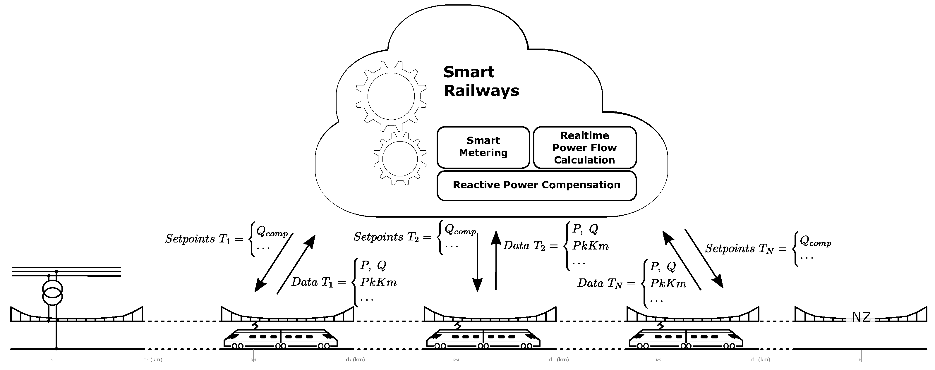
6. Smart Railway Framework
6.1. The Problem of Mobile Reactive Power Compensation
- It requires the implementation of on-board energy meters in all trains (or in the majority) and in the TPS;
- Requires data reporting to a central station (data gathering);
- It is needed to calculate the power flow in each node and dynamically adapt this calculation mechanism to consider all trains in the traction section (power flow calculation);
- In the case of reactive power compensation strategy, the generated setpoints must be sent to each train (setpoints updating)
- All of these procedures must be made within real-time constraints.
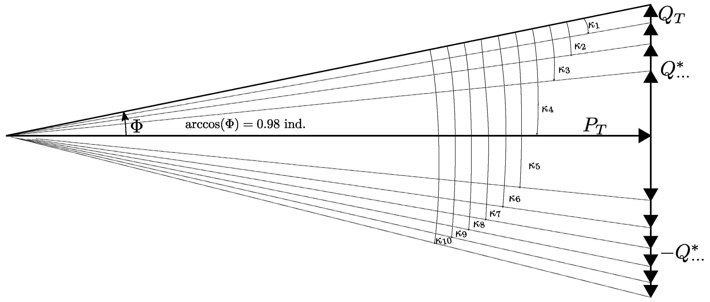
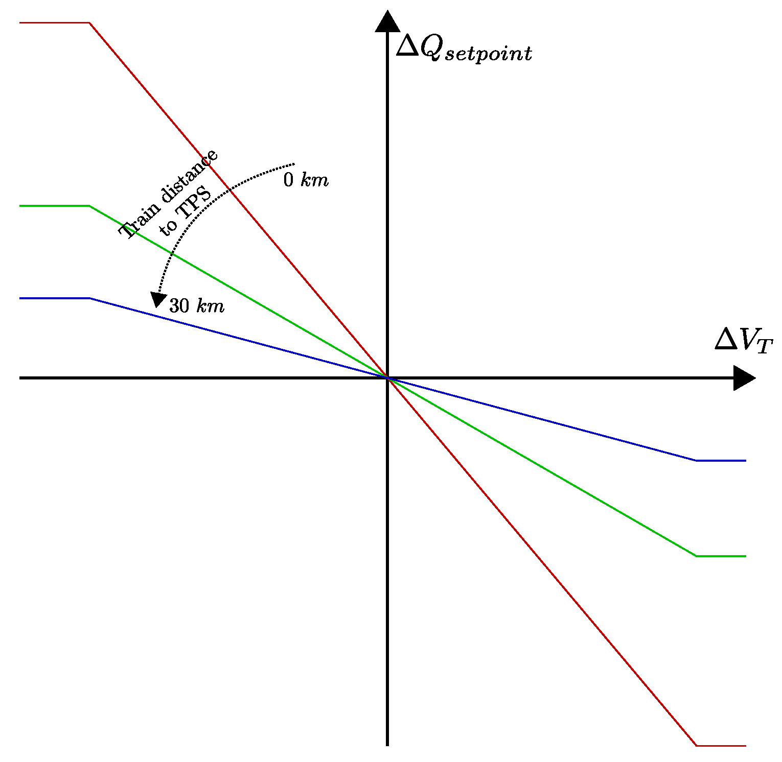
6.2. A Solution for Mobile Reactive Power Compensation
- If the train voltage is above the expected voltage, then it means that the amount of reactive power injected is above the optimal value;
- Then, the on-board reactive power compensation system (viewed as an algorithm that adapts the power factor depending on the desired reactive power value) will reduce the value of reactive power.
- If the train voltage is below the expected, then the on-board reactive power compensation system will increase the injection of reactive power.
6.3. The Path to Reactive Power Compensation
7. Discussion and Conclusions
Author Contributions
Funding
Conflicts of Interest
Abbreviations
| APQC | Active Power Quality Compensator |
| HPQC | Hybrid Power Quality Compensator |
| IRS | International Railway Solutions |
| MMC | Modular Multilevel Converter |
| MRPC | Mobile Reactive Power Compensation |
| NZ | Neutral Zone |
| PF | Power Factor |
| PWM | Pulse Width Modulation |
| RPC | Railway Power Conditioner |
| SVC | Static VAR Compensator |
| TPS | Traction Power Substation |
| UIC | Union Internationale des Chemins de fer—International Union of Railways |
References
- IEA. Energy Consumption and CO2 Emissions Focus on Passenger Rail Services. International Energy Agency (IEA) and International Union of Railways (UIC). Available online: https://uic.org/IMG/pdf/handbook_iea-uic_2017_web3.pdf (accessed on 24 August 2020).
- Shift2Rail Joint Undertaking. Shift2Rail Multi-Annual Action Plan, November 2015; Shift2Rail Joint Undertaking: Brussels, Belgium, 2015. [Google Scholar]
- Geischberger, J.; Moesters, M. Impact of faster freight trains on railway capacity and operational quality. Int. J. Transp. Dev. Integr. 2020, 4, 274–285. [Google Scholar] [CrossRef]
- Pouryousef, H.; Lautala, P. Hybrid simulation approach for improving railway capacity and train schedules. J. Rail Transp. Plan. Manag. 2015, 5, 211–224. [Google Scholar] [CrossRef]
- Bruni, S.; Bucca, G.; Collina, A.; Facchinetti, A. Dynamics of the Pantograph Catenary System; CRC Press: Boca Raton, FL, USA, 2019; pp. 613–647. [Google Scholar] [CrossRef]
- Song, Y.; Liu, Z.; Rxnnquist, A.; Navik, P.; Liu, Z. Contact Wire Irregularity Stochastics and Effect on High-speed Railway Pantograph-Catenary Interactions. IEEE Trans. Instrum. Meas. 2020. [Google Scholar] [CrossRef]
- Wang, Z.; Cheng, Y.; Mei, G.; Zhang, W.; Huang, G.; Yin, Z. Torsional vibration analysis of the gear transmission system of high-speed trains with wheel defects. Proc. Inst. Mech. Eng. Part F J. Rail Rapid Transit 2019, 234, 123–133. [Google Scholar] [CrossRef]
- IEC 60850. Railway Applications—Supply Voltages of Traction Systems; International Electrotechnical Commission (IEC): Geneva, Switzerland, 2007. [Google Scholar]
- Sauer, P.W. Reactive Power and Voltage Control Issues in Electric Power Systems. In Power Electronics and Power Systems; Kluwer Academic Publishers: Boston, MA, USA, 2005; pp. 11–24. [Google Scholar] [CrossRef]
- Brenna, M.; Foiadelli, F.; Zaninelli, D. Electrical Railway Transportation Systems; IEEE Press Series on Power Engineering: Hoboken, NJ, USA, 2018. [Google Scholar] [CrossRef]
- Carson, J.R. Wave Propagation in Overhead Wires with Ground Return. Bell Syst. Tech. J. 1926, 5, 539–554. [Google Scholar] [CrossRef]
- Pilo, E. Diseño óptimo de la Electrificación de Ferrocarriles de alta Velocidad. Ph.D. Thesis, Universidad Pontificia de Comillas, Madrid, Spain, 2003. [Google Scholar]
- Aeberhard, M.; Courtois, C.; Ladoux, P. Railway traction power supply from the state of the art to future trends. In Proceedings of the SPEEDAM 2010, Pisa, Italy, 14–16 June 2010; IEEE: New York City, NY, USA, 2010. [Google Scholar] [CrossRef]
- Langerudy, A.T.; Mariscotti, A.; Abolhassani, M.A. Power Quality Conditioning in Railway Electrification: A Comparative Study. IEEE Trans. Veh. Technol. 2017, 66, 6653–6662. [Google Scholar] [CrossRef]
- Tanta, M.; Pinto, J.G.; Monteiro, V.; Martins, A.P.; Carvalho, A.S.; Afonso, J.L. Topologies and Operation Modes of Rail Power Conditioners in AC Traction Grids: Review and Comprehensive Comparison. Energies 2020, 13, 2151. [Google Scholar] [CrossRef]
- Luo, A.; Wu, C.; Shen, J.; Shuai, Z.; Ma, F. Railway static power conditioners for high-speed train traction power supply systems using three-phase V/V transformers. IEEE Trans. Power Electron. 2011, 26, 2844–2856. [Google Scholar] [CrossRef]
- Dai, N.; Wong, M.; Lao, K.; Wong, C. Modelling and control of a railway power conditioner in co-phase traction power system under partial compensation. IET Power Electron. 2014, 7, 1044–1054. [Google Scholar] [CrossRef]
- Sun, Z.; Jiang, X.; Zhu, D.; Zhang, G. A novel active power quality compensator topology for electrified railway. IEEE Trans. Power Electron. 2004, 19, 1036–1042. [Google Scholar] [CrossRef]
- Lao, K.; Dai, N.; Liu, W.; Wong, M. Hybrid Power Quality Compensator With Minimum DC Operation Voltage Design for High-Speed Traction Power Systems. IEEE Trans. Power Electron. 2013, 28, 2024–2036. [Google Scholar] [CrossRef]
- Lao, K.; Wong, M.; Dai, N.Y.; Wong, C.; Lam, C. Analysis of DC-Link Operation Voltage of a Hybrid Railway Power Quality Conditioner and Its PQ Compensation Capability in High-Speed Cophase Traction Power Supply. IEEE Trans. Power Electron. 2016, 31, 1643–1656. [Google Scholar] [CrossRef]
- Tanta, M.; Pinto, J.G.; Monteiro, V.; Martins, A.P.; Carvalho, A.S.; Afonso, J.L. Deadbeat Predictive Current Control for Circulating Currents Reduction in a Modular Multilevel Converter Based Rail Power Conditioner. Appl. Sci. 2020, 10, 1849. [Google Scholar] [CrossRef]
- Celli, G.; Pilo, F.; Tennakoon, S.B. Voltage regulation on 25 kV AC railway systems by using thyristor switched capacitor. In Proceedings of the Ninth International Conference on Harmonics and Quality of Power Proceedings (Cat. No.00EX441), Orlando, FL, USA, 1–4 October 2000; Volume 2, pp. 633–638. [Google Scholar] [CrossRef]
- Tan, P.C.; Loh, P.C.; Holmes, D.G. A Robust Multilevel Hybrid Compensation System for 25-kV Electrified Railway Applications. IEEE Trans. Power Electron. 2004, 19, 1043–1052. [Google Scholar] [CrossRef]
- Fracchia, M.; Courtois, C.; Talibart, A.; Bordignon, P.; Consani, T.; Merli, E.; Bacha, S.; Stuart, M.; Zoeter, K.; Burrarini, G.G.; et al. High Voltage Booster for Railway Applications. World Congress on Railway Research. 2001. Available online: http://www.railway-research.org/IMG/pdf/278.pdf (accessed on 24 August 2020).
- Zanotto, L.; Piovan, R.; Toigo, V.; Gaio, E.; Bordignon, P.; Consani, T.; Fracchia, M. Filter Design for Harmonic Reduction in High-Voltage Booster for Railway Applications. IEEE Trans. Power Deliv. 2005, 20, 258–263. [Google Scholar] [CrossRef]
- Raygani, S.V.; Moaveni, B.; Fazel, S.S.; Tahavorgar, A. SVC implementation using neural networks for an AC electrical railway. WSEAS Trans. Circuits Syst. 2011, 10, 173–183. [Google Scholar]
- Kulworawanichpong, T. Optimizing AC Electric Railway Power Flows with Power Electronic Control. Ph.D. Thesis, University of Birmingham, Birmingham, UK, 2003. [Google Scholar]
- Kulworawanichpong, T.; Goodman, C.J. Optimal area control of AC railway systems via PWM traction drives. IEE Proc. Electr. Power Appl. 2005, 152, 33–70. [Google Scholar] [CrossRef]
- Tahavorgar, A.; Raygani, S.V.; Fazel, S. Power quality improvement at the point of common coupling using on-board PWM drives in an electrical railway network. In Proceedings of the 2010 1st Power Electronic & Drive Systems & Technologies Conference (PEDSTC), Tehran, Iran, 17–18 February 2010; IEEE: New York, NY, USA, 2010; pp. 412–417. [Google Scholar] [CrossRef]
- Raygani, S.V.; Tahavorgar, A.; Fazel, S.S.; Moaveni, B. Load flow analysis and future development study for an AC electric railway. IET Electr. Syst. Transp. 2012, 2, 139–147. [Google Scholar] [CrossRef]
- Abril, M.; Barber, F.; Ingolotti, L.; Salido, M.; Tormos, P.; Lova, A. An assessment of railway capacity. Transp. Res. Part E Logist. Transp. Rev. 2008, 44, 774–806. [Google Scholar] [CrossRef]
- Morais, V.A.; Afonso, J.L.; Martins, A.P. Modeling and Validation of the Dynamics and Energy Consumption for Train Simulation. In Proceedings of the 2018 International Conference on Intelligent Systems (IS), Funchal-Madeira, Portugal, 25–27 September 2018; IEEE: New York, NY, USA, 2018; pp. 288–295. [Google Scholar] [CrossRef]
- Zimmerman, R.D.; Murillo-Sanchez, C.E.; Thomas, R.J. MATPOWER: Steady-State Operations, Planning, and Analysis Tools for Power Systems Research and Education. IEEE Trans. Power Syst. 2011, 26, 12–19. [Google Scholar] [CrossRef]
- CENELEC EN 50388-1. Railway Applications—Fixed Installations and Rolling Stock—Technical Criteria for the Coordination between Traction Power Supply and Rolling Stock to Achieve Interoperability—Part 1: General; CENELEC: Brussels, Belgium, 2017. [Google Scholar]
- CENELEC EN 50463-2. Railway Applications—Energy Measurement on Board Trains; CENELEC: Brussels, Belgium, 2017. [Google Scholar]
- Mariscotti, A. Impact of Harmonic Power Terms on the Energy Measurement in AC Railways. IEEE Trans. Instrum. Meas. 2020, 6731–6738. [Google Scholar] [CrossRef]
- Hu, H.; Tao, H.; Wang, X.; Blaabjerg, F.; He, Z.; Gao, S. Train–Network Interactions and Stability Evaluation in High-Speed Railways—Part II: Influential Factors and Verifications. IEEE Trans. Power Electron. 2018, 33, 4643–4659. [Google Scholar] [CrossRef]
- UIC. IRS 90930 (Traction Energy Settlement and Data Exchange). Information Published on 9 October 2018 in the UIC Electronic Newsletter “UIC eNews” Nr 617. Available online: https://bit.ly/30Urpsw (accessed on 24 August 2020).
- Zasiadko, M. New Stage of Energy Measuring for European Rail Sector. 2019. Available online: https://www.railtech.com/policy/2019/10/28/new-stage-of-energy-measuring-for-european-rail-sector/ (accessed on 24 August 2020).


| Train Power Factor | ||||
|---|---|---|---|---|
| Train Active Power | 0.9 ind. | 0.95 ind. | 0.98 ind. | 1 |
| 0.5 MW | 50 | 58 | 66 | 82 |
| (−39.0%) | (−29.3%) | (−19.5%) | (0%) | |
| 1 MW | 25 | 29 | 33 | 41 |
| (−39.0%) | (−29.3%) | (−19.5%) | (0%) | |
| 2 MW | 12 | 14 | 16 | 20 |
| (−40.0%) | (−30.0%) | (−20.0%) | (0%) | |
| 3 MW | 8 | 9 | 11 | 13 |
| (−38.5%) | (−30.8%) | (−15.4%) | (0%) | |
| 4 MW | 6 | 7 | 8 | 10 |
| (−40.0%) | (−30.0%) | (−20.0%) | 0%) | |
| 5 MW | 5 | 5 | 6 | 8 |
| (−37.5%) | (−37.5%) | (−25.0%) | (0%) | |
| Neutral Zone Power Limit (for Compensation) | |||||
|---|---|---|---|---|---|
| Train Active Power | 0 MVAr | 5 MVAr | 10 MVAr | 20 MVAr | 30 MVAr |
| 0.5 MW | 66 | 81 | 90 | 100 | 105 |
| (0%) | (+22.73%) | (+36.36%) | (+51.52%) | (+59.09%) | |
| 1 MW | 33 | 40 | 45 | 50 | 52 |
| (0%) | (+21.21%) | (+36.36%) | (+51.52%) | (+57.58%) | |
| 2 MW | 16 | 20 | 22 | 25 | 26 |
| (0%) | (+25%) | (+37.50%) | (+56.25%) | (+62.50%) | |
| 3 MW | 11 | 13 | 15 | 16 | 17 |
| (0%) | (+18.18%) | (+36.36%) | (+45.45%) | (+54.55%) | |
| 4 MW | 8 | 10 | 11 | 12 | 12 |
| (0%) | (+25%) | (+37.50%) | (+50%) | (+50%) | |
| 5 MW | 6 | 8 | 8 | 9 | 10 |
| (0%) | (+33.33%) | (+33.33%) | (+50%) | (+66.67%) | |
| Train Active Power | ||||||
|---|---|---|---|---|---|---|
| Train Power Factor | 0.5 MW | 1 MW | 2 MW | 3 MW | 4 MW | 5 MW |
| 0.98 ind. | 66 | 33 | 16 | 11 | 8 | 6 |
| (+0%) | (+0%) | (+0%) | (+0%) | (+0%) | (+0%) | |
| 0.985 ind. | 74 | 37 | 18 | 12 | 9 | 7 |
| (+12%) | (+12%) | (+13%) | (+9%) | (+13%) | (+17%) | |
| 0.99 ind. | 77 | 38 | 19 | 12 | 9 | 7 |
| (+17%) | (+15%) | (+19%) | (+9%) | (+13%) | (+17%) | |
| 0.995 ind. | 80 | 40 | 20 | 13 | 10 | 7 |
| (+21%) | (+21%) | (+25%) | (+18%) | (+25%) | (+17%) | |
| 1.00 | 82 | 41 | 20 | 13 | 10 | 8 |
| (+24%) | (+24%) | (+25%) | (+18%) | (+25%) | (+33%) | |
| 0.99 cap. | 86 | 43 | 21 | 14 | 10 | 8 |
| (+30%) | (+30%) | (+31%) | (+27%) | (+25%) | (+33%) | |
| 0.98 cap. | 88 | 44 | 22 | 14 | 11 | 8 |
| (+33%) | (+33%) | (+38%) | (+27%) | (+38%) | (+33%) | |
| 0.97 cap. | 90 | 45 | 22 | 15 | 11 | 9 |
| (+36%) | (+36%) | (+38%) | (+36%) | (+38%) | (+50%) | |
| 0.96 cap. | 92 | 46 | 23 | 15 | 11 | 9 |
| (+39%) | (+39%) | (+44%) | (+36%) | (+38%) | (+50%) | |
| 0.94 cap. | 95 | 47 | 24 | 16 | 12 | 9 |
| (+44%) | (+42%) | (+50%) | (+45%) | (+50%) | (+50%) | |
| 0.92 cap. | 98 | 49 | 24 | 16 | 12 | 10 |
| (+48%) | (+48%) | (+50%) | (+45%) | (+50%) | (+67%) | |
| Train Power Factor | Power Increase | Capacity Improvement |
|---|---|---|
| 0.98 ind. | −2.0% | 0.0% |
| 0.985 ind. | −1.5% | 10.7% |
| 0.99 ind. | −1.0% | 15.5% |
| 0.995 ind. | −0.5% | 20.2% |
| 1.00 | 0.0% | 23.9% |
| 0.99 cap. | 1.0% | 28.6% |
| 0.98 cap. | 2.0% | 32.7% |
| 0.97 cap. | 3.1% | 39.1% |
| 0.96 cap. | 4.2% | 40.2% |
| 0.95 cap. | 5.3% | 41.1% |
| 0.94 cap. | 6.4% | 44.9% |
| 0.93 cap. | 7.5% | 46.5% |
| 0.92 cap. | 8.7% | 51.2% |
© 2020 by the authors. Licensee MDPI, Basel, Switzerland. This article is an open access article distributed under the terms and conditions of the Creative Commons Attribution (CC BY) license (http://creativecommons.org/licenses/by/4.0/).
Share and Cite
Morais, V.A.; Afonso, J.L.; Carvalho, A.S.; Martins, A.P. New Reactive Power Compensation Strategies for Railway Infrastructure Capacity Increasing. Energies 2020, 13, 4379. https://doi.org/10.3390/en13174379
Morais VA, Afonso JL, Carvalho AS, Martins AP. New Reactive Power Compensation Strategies for Railway Infrastructure Capacity Increasing. Energies. 2020; 13(17):4379. https://doi.org/10.3390/en13174379
Chicago/Turabian StyleMorais, Vítor A., João L. Afonso, Adriano S. Carvalho, and António P. Martins. 2020. "New Reactive Power Compensation Strategies for Railway Infrastructure Capacity Increasing" Energies 13, no. 17: 4379. https://doi.org/10.3390/en13174379
APA StyleMorais, V. A., Afonso, J. L., Carvalho, A. S., & Martins, A. P. (2020). New Reactive Power Compensation Strategies for Railway Infrastructure Capacity Increasing. Energies, 13(17), 4379. https://doi.org/10.3390/en13174379