
Determination of Population Mobility Dynamics in Popayán-Colombia during the COVID-19 Pandemic Using Open Datasets

 ,
,  ,
,  , , ,
, , ,  and
and
Abstract
1. Introduction
2. Materials and Methods
2.1. Construction of Movement Range Maps by Administrative Areas with Its Exposure Indicator
2.2. Estimation of Changes in Local Mobility
3. Results and Discussion
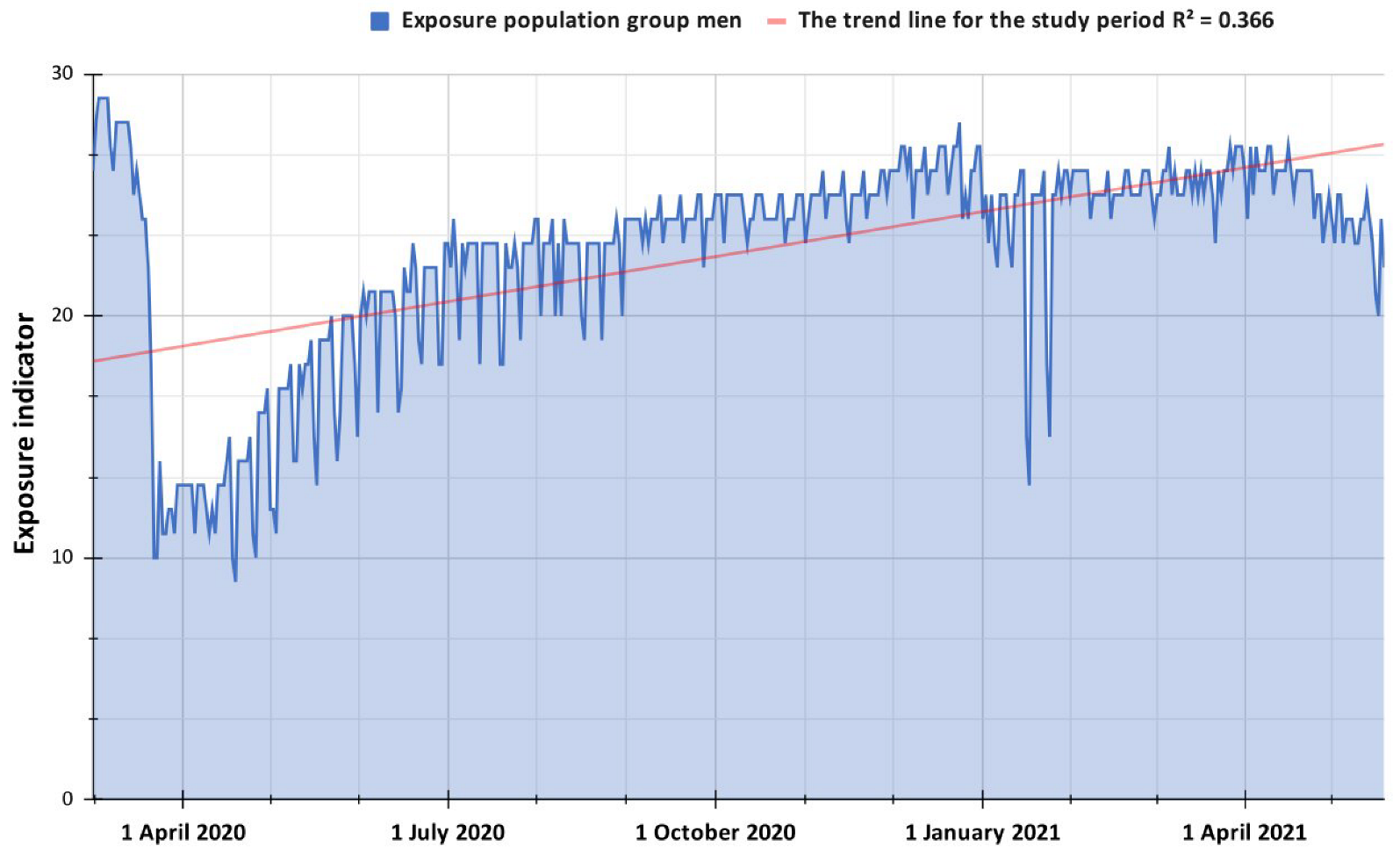
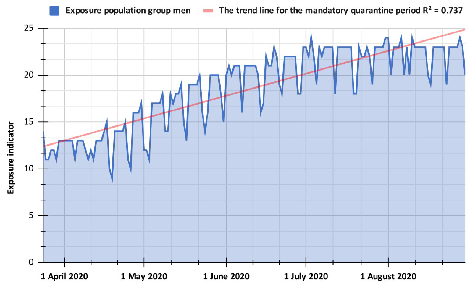
3.1. Exposure Indicator Based on Mobility Data for Different Periods in Popayán City
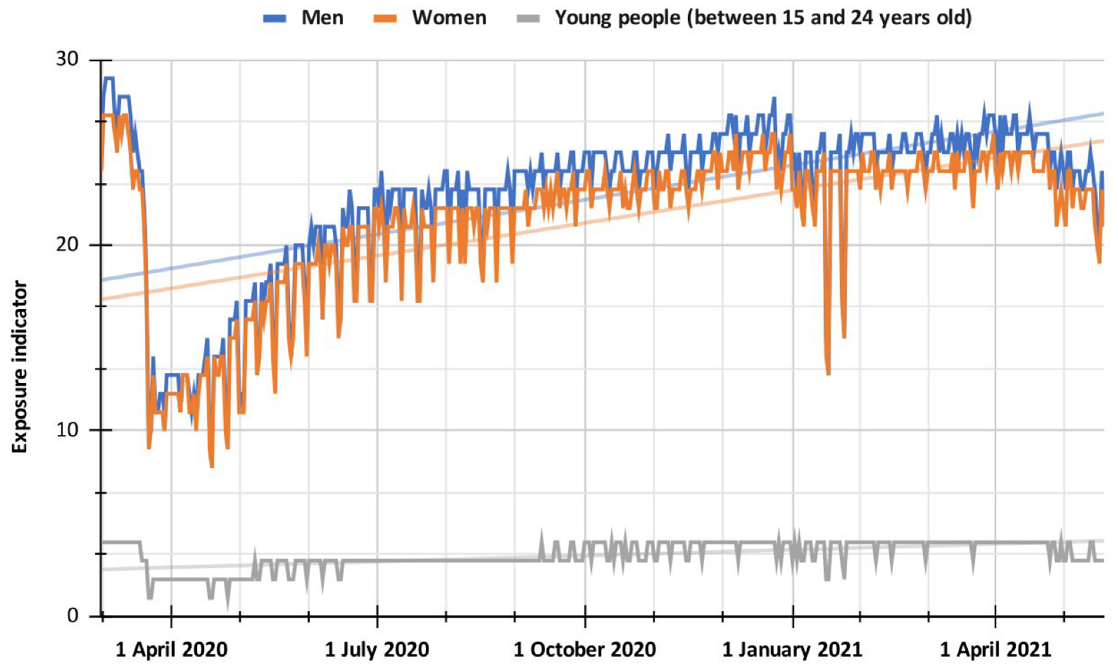
3.2. Comparison between the Different Population Groups of the Popayán City According to Their Exposure Indicator
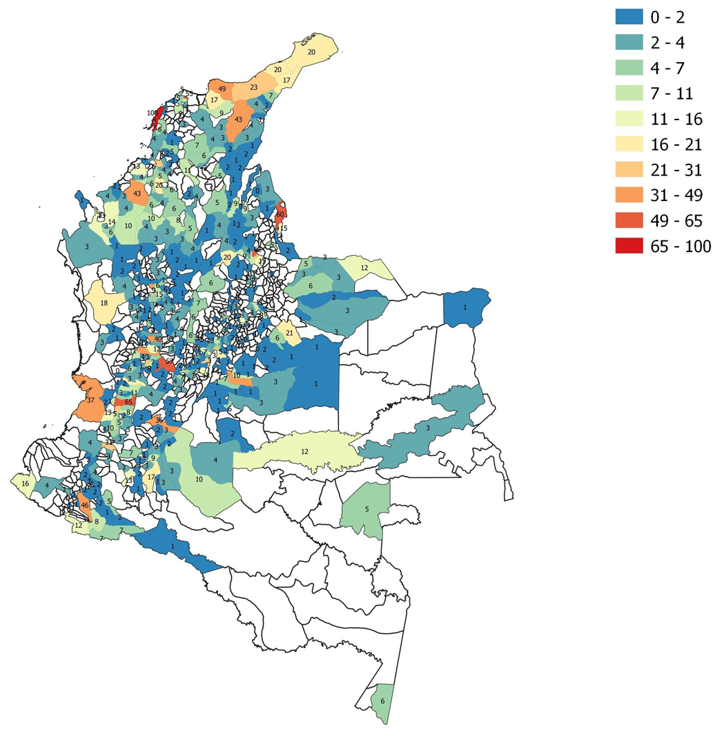
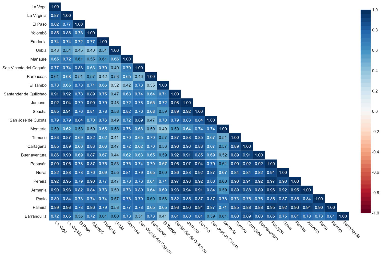
3.3. Comparison of Different Administrative Areas According to the Exposure Indicator
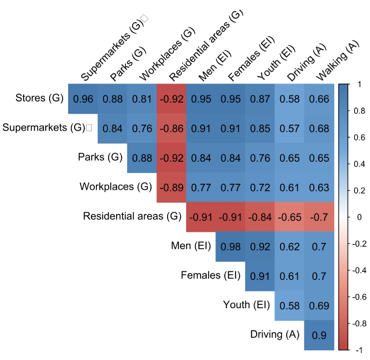
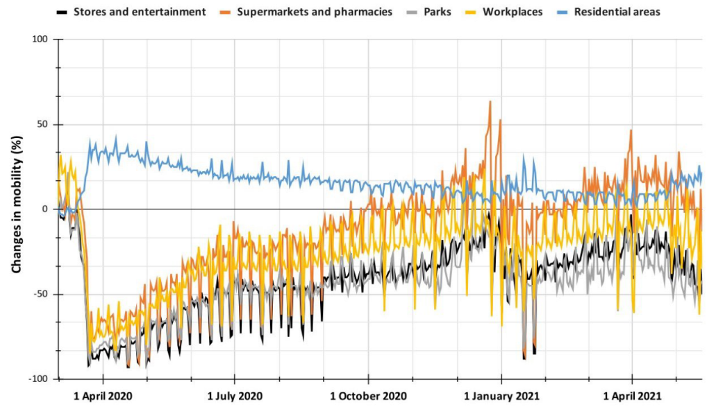
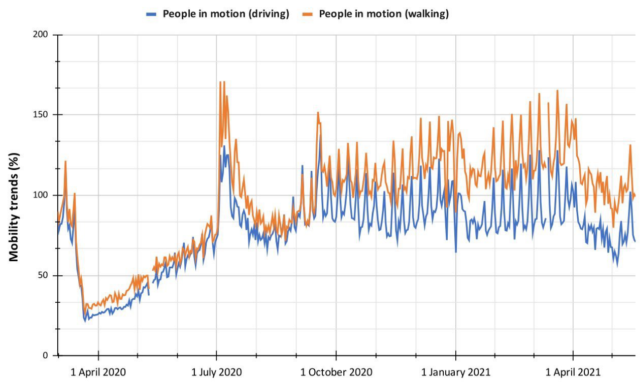
3.4. Comparison between the Exposure Indicator and Mobility Data from Google and Apple
4. Conclusions
Author Contributions
Funding
Institutional Review Board Statement
Informed Consent Statement
Data Availability Statement
Acknowledgments
Conflicts of Interest
Abbreviations
| EI | Exposure Indicator |
| PAST | Paleontological Statistics Software |
| MT | Mobility Trends |
| CM | Changes in Mobility |
References
- Weinberger, D.M.; Chen, J.; Cohen, T.; Crawford, F.W.; Mostashari, F.; Olson, D.; Pitzer, V.E.; Reich, N.G.; Russi, M.; Simonsen, L.; et al. Estimation of Excess Deaths Associated With the COVID-19 Pandemic in the United States, March to May 2020. JAMA Intern. Med. 2020, 180, 1336–1344. [Google Scholar] [CrossRef] [PubMed]
- Hobbs, J.E. Food Supply Chains during the COVID-19 Pandemic. Can. J. Agric. Econ. Can. Agroecon. 2020, 68, 171–176. [Google Scholar] [CrossRef]
- Sarkodie, S.A.; Owusu, P.A. Impact of COVID-19 Pandemic on Waste Management. Environ. Dev. Sustain. 2021, 23, 7951–7960. [Google Scholar] [CrossRef] [PubMed]
- Padhan, R.; Prabheesh, K.P. The Economics of COVID-19 Pandemic: A Survey. Econ. Anal. Policy 2021, 70, 220–237. [Google Scholar] [CrossRef] [PubMed]
- Pfefferbaum, B.; North, C.S. Mental Health and the COVID-19 Pandemic. N. Engl. J. Med. 2020, 383, 510–512. [Google Scholar] [CrossRef]
- Moya, A.; Serneels, P.; Desrosiers, A.; Reyes, V.; Torres, M.J.; Lieberman, A. The COVID-19 Pandemic and Maternal Mental Health in a Fragile and Conflict-Affected Setting in Tumaco, Colombia: A Cohort Study. Lancet Glob. Health 2021, 9, e1068–e1076. [Google Scholar] [CrossRef]
- Uwishema, O.; Lawal, L.; Sun, J.; Hamiidah, N.; Nasir, A.; Robert, I.; Onyeaka, H.; Jain, S.; Akın, B.T.; Tovani-Palone, M.R. Colombia Protests amidst the COVID-19 Pandemic: Implications and Recommendations. Med. Confl. Surviv. 2022, 38, 87–92. [Google Scholar] [CrossRef]
- Gulrandhe, P.; Sahu, A.; Dandale, C.; Naqvi, W.M.; Phansopkar, P.; Kumar, K. Repercussions of Mass Gathering: COVID-19 Pandemic. Int. J. Res. Pharm. Sci. 2020, 11, 946–950. [Google Scholar] [CrossRef]
- Correa-Cuadros, J.P.; Muñoz-Rodríguez, M.A. SARS-CoV. 2/COVID-19 en Colombia: Tendencias, predicciones y tensiones sobre el sistema sanitario. Rev. Salud Pública 2020, 22, 1–9. [Google Scholar] [CrossRef]
- Gawel, A.; Dubé, R.; Surmann, H.; Nieto, J.; Siegwart, R.; Cadena, C. 3D Registration of Aerial and Ground Robots for Disaster Response: An Evaluation of Features, Descriptors, and Transformation Estimation. In Proceedings of the 2017 IEEE International Symposium on Safety, Security and Rescue Robotics (SSRR), Shanghai, China, 11–13 October 2017; pp. 27–34. [Google Scholar] [CrossRef]
- Alam, F.; Ofli, F.; Imran, M. Descriptive and Visual Summaries of Disaster Events Using Artificial Intelligence Techniques: Case Studies of Hurricanes Harvey, Irma, and Maria. Behav. Inf. Technol. 2020, 39, 288–318. [Google Scholar] [CrossRef]
- Kuveždić Divjak, A.; Đapo, A.; Pribičević, B. Cartographic Symbology for Crisis Mapping: A Comparative Study. ISPRS Int. J. Geo-Inf. 2020, 9, 142. [Google Scholar] [CrossRef]
- Martínez–Álvarez, F.; Morales–Esteban, A. Big Data and Natural Disasters: New Approaches for Spatial and Temporal Massive Data Analysis. Comput. Geosci. 2019, 129, 38–39. [Google Scholar] [CrossRef]
- Poom, A.; Järv, O.; Zook, M.; Toivonen, T. COVID-19 Is Spatial: Ensuring That Mobile Big Data Is Used for Social Good. Big Data Soc. 2020, 7, 2053951720952088. [Google Scholar] [CrossRef]
- Mena, G.E.; Martinez, P.P.; Mahmud, A.S.; Marquet, P.A.; Buckee, C.O.; Santillana, M. Socioeconomic Status Determines COVID-19 Incidence and Related Mortality in Santiago, Chile. Science 2021, 372, eabg5298. [Google Scholar] [CrossRef]
- Kishore, N.; Kahn, R.; Martinez, P.P.; De Salazar, P.M.; Mahmud, A.S.; Buckee, C.O. Lockdowns Result in Changes in Human Mobility Which May Impact the Epidemiologic Dynamics of SARS-CoV-2. Sci. Rep. 2021, 11, 6995. [Google Scholar] [CrossRef]
- Zachreson, C.; Mitchell, L.; Lydeamore, M.J.; Rebuli, N.; Tomko, M.; Geard, N. Risk Mapping for COVID-19 Outbreaks in Australia Using Mobility Data. J. R. Soc. Interface 2021, 18, 20200657. [Google Scholar] [CrossRef]
- Heo, S.; Lim, C.C.; Bell, M.L. Relationships between Local Green Space and Human Mobility Patterns during COVID-19 for Maryland and California, USA. Sustainability 2020, 12, 9401. [Google Scholar] [CrossRef]
- Spelta, A.; Flori, A.; Pierri, F.; Bonaccorsi, G.; Pammolli, F. After the Lockdown: Simulating Mobility, Public Health and Economic Recovery Scenarios. Sci. Rep. 2020, 10, 16950. [Google Scholar] [CrossRef]
- Cartenì, A.; Di Francesco, L.; Martino, M. How Mobility Habits Influenced the Spread of the COVID-19 Pandemic: Results from the Italian Case Study. Sci. Total Environ. 2020, 741, 140489. [Google Scholar] [CrossRef]
- Xiong, C.; Hu, S.; Yang, M.; Luo, W.; Zhang, L. Mobile Device Data Reveal the Dynamics in a Positive Relationship between Human Mobility and COVID-19 Infections. Proc. Natl. Acad. Sci. USA 2020, 117, 27087–27089. [Google Scholar] [CrossRef]
- Badr, H.S.; Du, H.; Marshall, M.; Dong, E.; Squire, M.M.; Gardner, L.M. Association between Mobility Patterns and COVID-19 Transmission in the USA: A Mathematical Modelling Study. Lancet Infect. Dis. 2020, 20, 1247–1254. [Google Scholar] [CrossRef]
- Ristoski, P.; Paulheim, H. Visual Analysis of Statistical Data on Maps Using Linked Open Data. In The Semantic Web: ESWC 2015 Satellite Events; Gandon, F., Guéret, C., Villata, S., Breslin, J., Faron-Zucker, C., Zimmermann, A., Eds.; Lecture Notes in Computer Science; Springer International Publishing: Cham, Switzerland, 2015; Volume 9341, pp. 138–143. [Google Scholar] [CrossRef]
- Facebook Disaster Maps: Aggregate Insights for Crisis Response & Recovery. Available online: https://research.facebook.com/publications/facebook-disaster-maps-aggregate-insights-for-crisis-response-recovery/ (accessed on 18 September 2022).
- Saha, J.; Barman, B.; Chouhan, P. Lockdown for COVID-19 and Its Impact on Community Mobility in India: An Analysis of the COVID-19 Community Mobility Reports, 2020. Child. Youth Serv. Rev. 2020, 116, 105160. [Google Scholar] [CrossRef] [PubMed]
- Li, J.; Tartarini, F. Changes in Air Quality during the COVID-19 Lockdown in Singapore and Associations with Human Mobility Trends. Aerosol Air Qual. Res. 2020, 20, 1748–1758. [Google Scholar] [CrossRef]
- Lacaze, B.; Dudek, J.; Picard, J. GRASS GIS Software with QGIS. In QGIS and Generic Tools+; Baghdadi, N., Mallet, C., Zribi, M., Eds.; John Wiley & Sons, Inc.: Hoboken, NJ, USA, 2018; pp. 67–106. [Google Scholar] [CrossRef]
- Solis, A.F.; Revelo luna, D.A.; Campo Ceballos, D.A.; Gaviria López, C.A. Correlación Del Contenido de Clorofila Foliar de La Especie Coffea Arabica Con Índices Espectrales En Imágenes. Biotecnol. Sect. Agropecu. Agroind. 2021, 19, 51–68. [Google Scholar] [CrossRef]
- González-Estrada, E.; Cosmes, W. Shapiro–Wilk Test for Skew Normal Distributions Based on Data Transformations. J. Stat. Comput. Simul. 2019, 89, 3258–3272. [Google Scholar] [CrossRef]
- Song, H.G.; Byeon, S.Y.; Chung, G.Y.; Jung, S.-M.; Choi, J.I.; Shin, H.S. A Systematic Correlation Analysis of Carotenoids, Chlorophyll, Non-Pigmented Cell Mass, and Cell Number for the Blueprint of Dunaliella Salina Culture in a Photobioreactor. Bioprocess Biosyst. Eng. 2018, 41, 1295–1303. [Google Scholar] [CrossRef]
- Chen, Y.-R.R.; Zhao, X. Digital Dialogue in Online Brand Communities: Examining the Social Network Outcomes of Brands’ Dialogue with Facebook Users. Telemat. Inform. 2021, 57, 101507. [Google Scholar] [CrossRef]
- Chang, M.-C.; Kahn, R.; Li, Y.-A.; Lee, C.-S.; Buckee, C.O.; Chang, H.-H. Variation in Human Mobility and Its Impact on the Risk of Future COVID-19 Outbreaks in Taiwan. BMC Public Health 2021, 21, 226. [Google Scholar] [CrossRef]
- Protecting Privacy in Facebook Mobility Data during the COVID-19 Response. Available online: https://research.facebook.com/blog/2020/06/protecting-privacy-in-facebook-mobility-data-during-the-covid-19-response/ (accessed on 18 September 2022).
- Ribeiro-Dantas, M.d.C.; Alves, G.; Gomes, R.B.; Bezerra, L.C.T.; Lima, L.; Silva, I. Dataset for Country Profile and Mobility Analysis in the Assessment of COVID-19 Pandemic. Data Brief 2020, 31, 105698. [Google Scholar] [CrossRef]
- Bravo, K.A.; Alvear, F.; Jiménez, R. National Strike in Colombia 2019–2020: Between “Rumba”, Protest and Cohesion. In Emerging Research in Intelligent Systems; Botto-Tobar, M., Cruz, H., Díaz Cadena, A., Durakovic, B., Eds.; Springer International Publishing: Cham, Switzerland, 2022; pp. 389–396. [Google Scholar]
- Mera, A.; Tabares-Gonzalez, E.; Montoya-Gonzalez, S.; Muñoz-Rodriguez, D.; Monsalve Vélez, F. Recomendaciones Prácticas Para Evitar El Desacondicionamiento Físico Durante El Confinamiento Por Pandemia Asociada a COVID-19. Univ. Salud 2020, 22, 166–177. [Google Scholar] [CrossRef]
- DECRETO No. 20211000000215 Del 18 de Enero de 202. Available online: https://www.scribd.com/document/501750986/Decreto-Toque-Q-5-12 (accessed on 18 September 2022).
- Nieto, H.D. Análisis Del COVID - 19 En Colombia: 27 de Mayo 2020. Hojas El Bosque 2021, 7, 52–59. [Google Scholar] [CrossRef]
- Porcher, S.; Renault, T. Social Distancing Beliefs and Human Mobility: Evidence from Twitter. PLoS ONE 2021, 16, e0246949. [Google Scholar] [CrossRef]


| Phase | Date | Average Exposure Indicator |
|---|---|---|
| Information stage | 01/03/2020 to 05/03/2020 | 28.2 |
| Pre-isolation stage | 03/06/2020 to 03/23/2020 | 24.1 |
| Mandatory quarantine stage | 03/24/2020 to 08/30/2020 | 18.6 |
| Selective isolation stage | 08/31/2020 to 04/27/2021 | 24.9 |
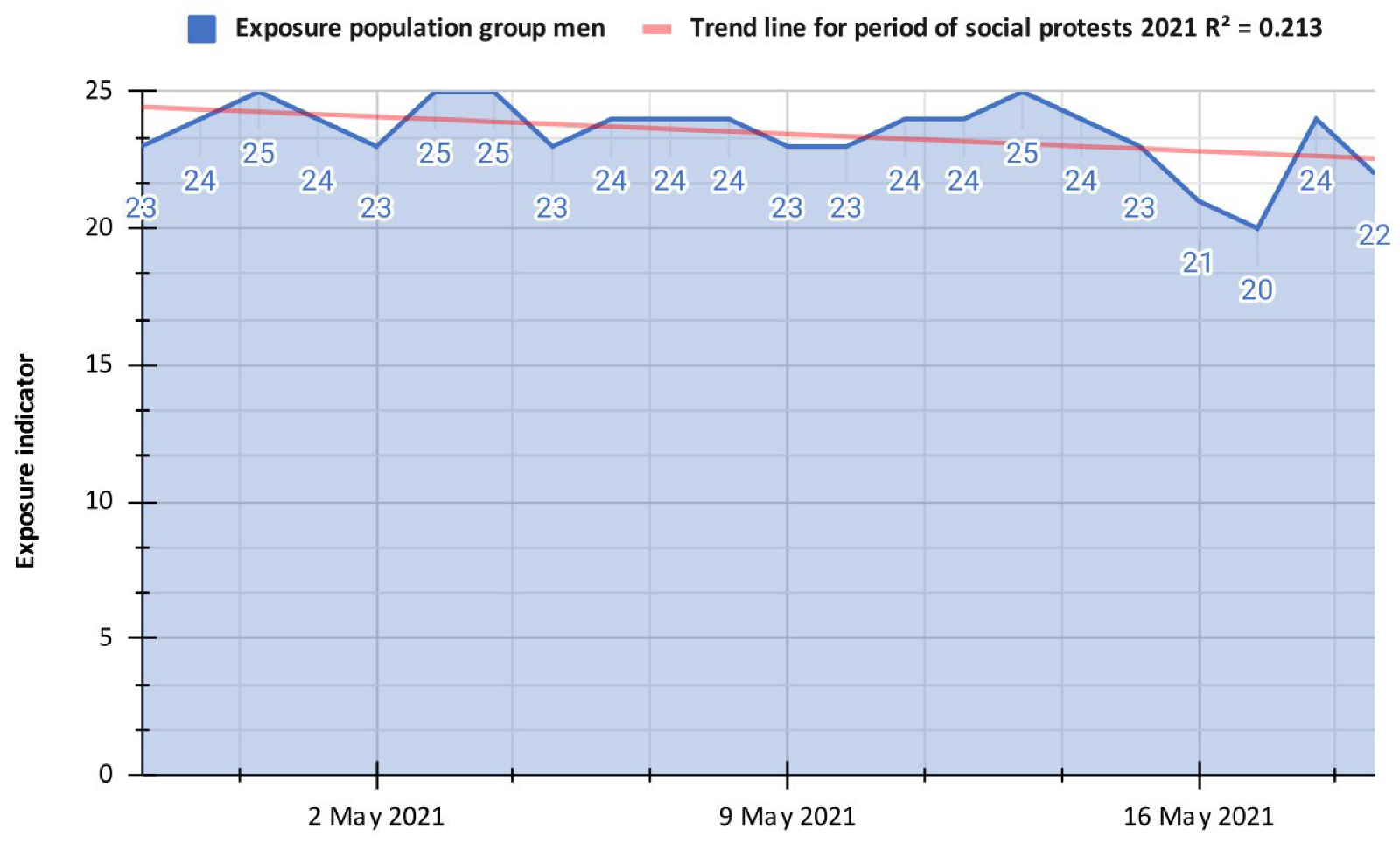
| Social protests in 2021 | 04/28/2021 to 05/19/2021 | 23.5 |
Publisher’s Note: MDPI stays neutral with regard to jurisdictional claims in published maps and institutional affiliations. |
© 2022 by the authors. Licensee MDPI, Basel, Switzerland. This article is an open access article distributed under the terms and conditions of the Creative Commons Attribution (CC BY) license (https://creativecommons.org/licenses/by/4.0/).
Share and Cite
Solis Pino, A.F.; Ramirez Palechor, G.A.; Anacona Mopan, Y.E.; Patiño-Arenas, V.E.; Ruiz, P.H.; Agredo-Delgado, V.; Mon, A. Determination of Population Mobility Dynamics in Popayán-Colombia during the COVID-19 Pandemic Using Open Datasets. Int. J. Environ. Res. Public Health 2022, 19, 14814. https://doi.org/10.3390/ijerph192214814
Solis Pino AF, Ramirez Palechor GA, Anacona Mopan YE, Patiño-Arenas VE, Ruiz PH, Agredo-Delgado V, Mon A. Determination of Population Mobility Dynamics in Popayán-Colombia during the COVID-19 Pandemic Using Open Datasets. International Journal of Environmental Research and Public Health. 2022; 19(22):14814. https://doi.org/10.3390/ijerph192214814
Chicago/Turabian StyleSolis Pino, Andrés Felipe, Ginna Andrea Ramirez Palechor, Yesid Ediver Anacona Mopan, Victoria E. Patiño-Arenas, Pablo H. Ruiz, Vanessa Agredo-Delgado, and Alicia Mon. 2022. "Determination of Population Mobility Dynamics in Popayán-Colombia during the COVID-19 Pandemic Using Open Datasets" International Journal of Environmental Research and Public Health 19, no. 22: 14814. https://doi.org/10.3390/ijerph192214814
APA StyleSolis Pino, A. F., Ramirez Palechor, G. A., Anacona Mopan, Y. E., Patiño-Arenas, V. E., Ruiz, P. H., Agredo-Delgado, V., & Mon, A. (2022). Determination of Population Mobility Dynamics in Popayán-Colombia during the COVID-19 Pandemic Using Open Datasets. International Journal of Environmental Research and Public Health, 19(22), 14814. https://doi.org/10.3390/ijerph192214814