
Granger Causality among Graphs and Application to Functional Brain Connectivity in Autism Spectrum Disorder


Abstract
:1. Introduction
2. Materials and Methods
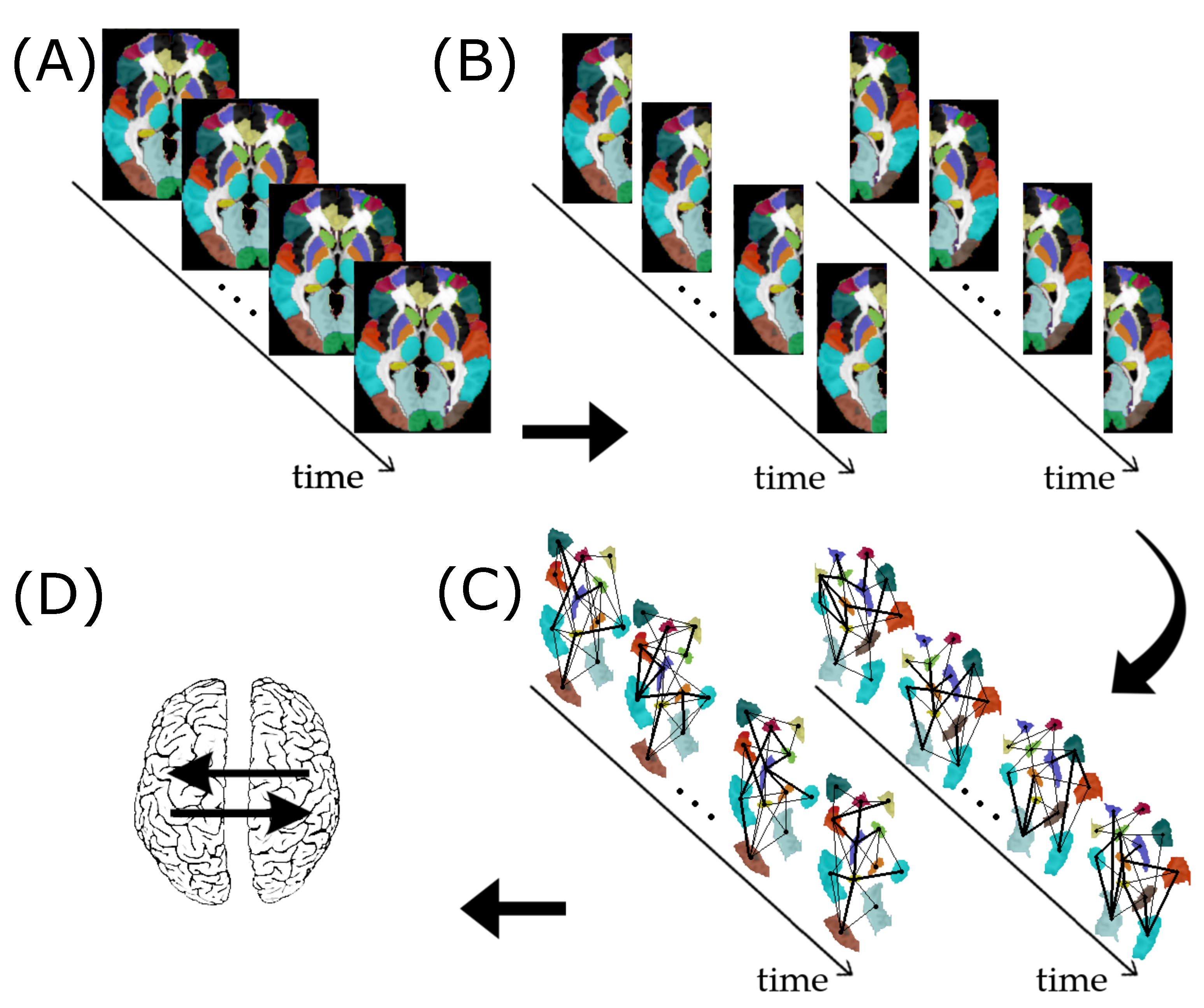
2.1. Graph
2.2. Granger Causality between Graphs
2.3. Vector Autoregressive Model for Graphs
- k be the number of time series of graphs;
- p be the order of the model (number of time points in the past to be analyzed);
- T be the length of the time series;
- be the spectral radius of the ith time series of graphs; and
- be the vector of error terms for the ith graph, normally distributed, with zero mean and covariance matrix
2.4. Statistical Tests
2.4.1. Wald’s Test
2.4.2. Bootstrap Procedure
- Fit the VAR model (Equation (1)).
- Resample with replacement the residuals obtained in step 2.
- To test the G-causality from graph to graph , estimate Wald’s test statistic W (Equation (5)). Then, construct a model under the null hypothesis, i.e., assume a model where the VAR coefficients . The other coefficients remain as initially estimated in step 2.
- Resample the residuals obtained in step 2 and use the model specified in step 4 to simulate a bootstrap multivariate time series.
- Estimate the coefficients of the bootstrap time series obtained in step 5 and calculate Wald’s test statistic .
- Go to step 3 until you obtain the desired number of bootstraps.
- Estimate the p-value by calculating the fraction of replicates of on the bootstrap dataset, which is at least as large as the observed statistic W on the original dataset.
2.5. Random Graph Models
2.5.1. Erdös–Rényi Random Graph
2.5.2. Geometric Random Graph
2.5.3. Regular Random Graph
- a 0-regular graph consists of disconnected vertices;
- a 1-regular graph consists of disconnected edges;
- a 2-regular graph consists of disconnected cycles and infinite chains;
- a 3-regular graph is known as a cubic graph.
2.5.4. Watts–Strogatz Random Graph
2.5.5. Barabási–Albert Random Graph
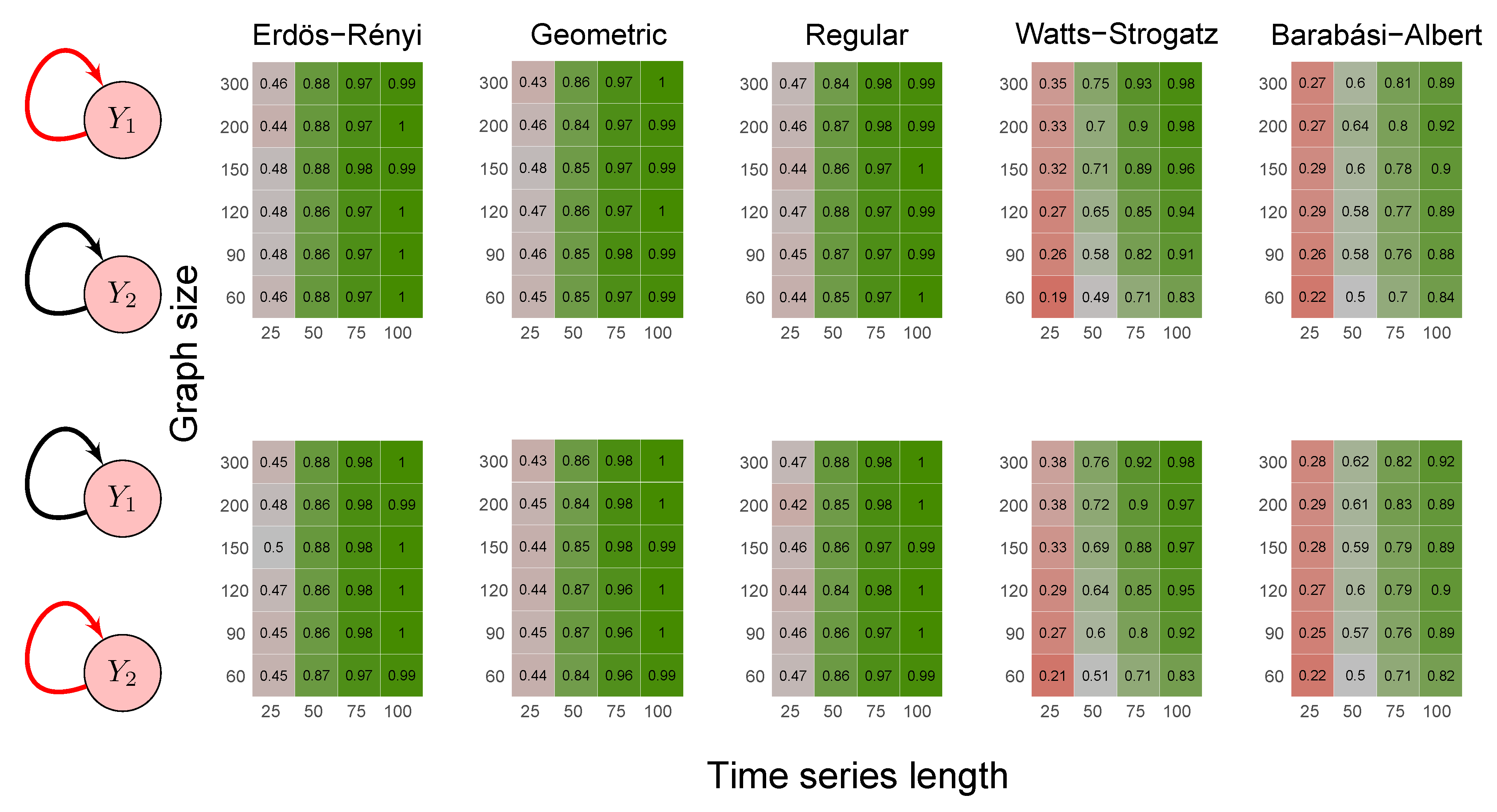
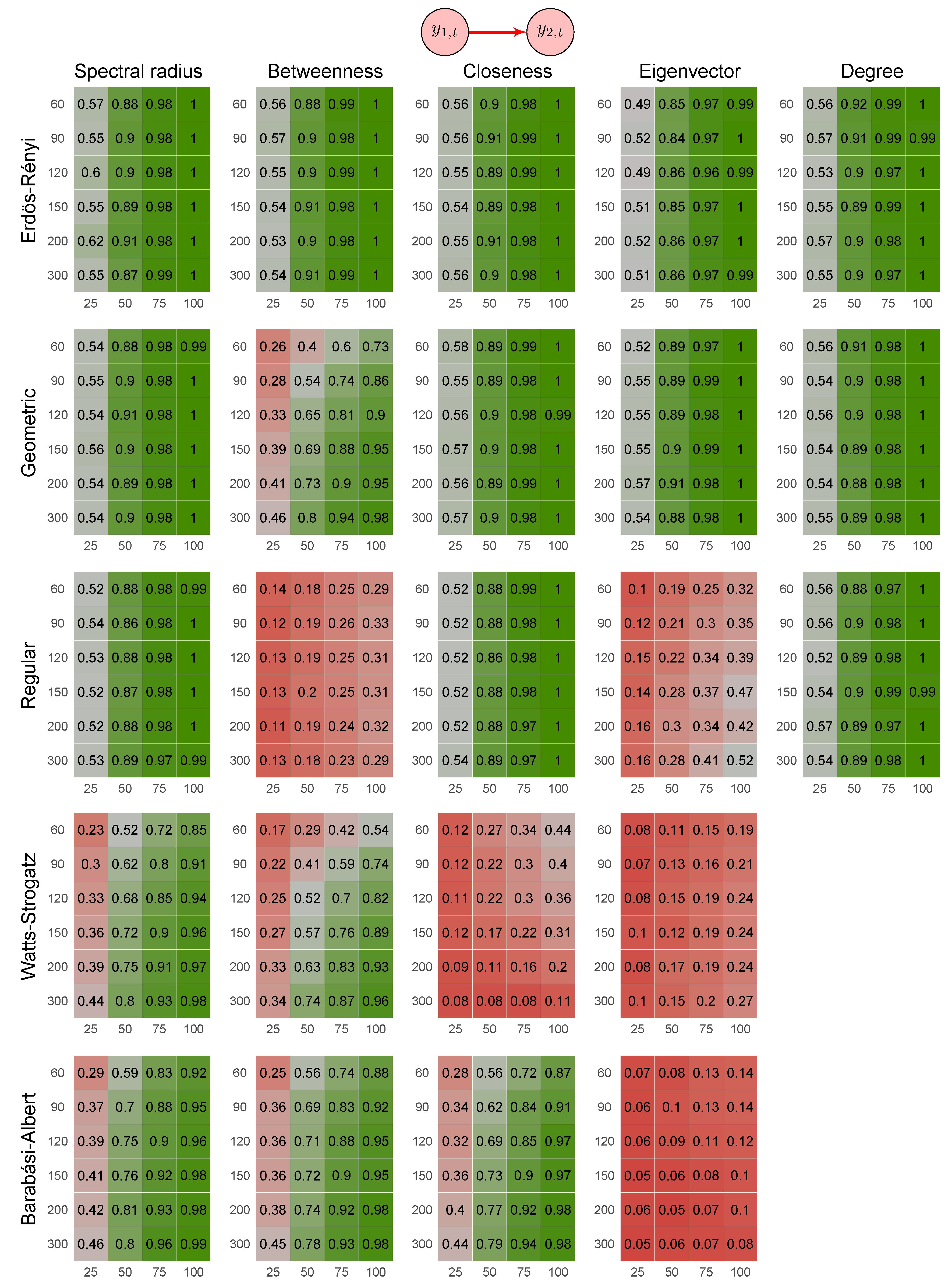
2.6. Simulation Study
- Scenario 1:
- data were generated by the following model where and are not Granger causally dependent:
- Scenario 2:
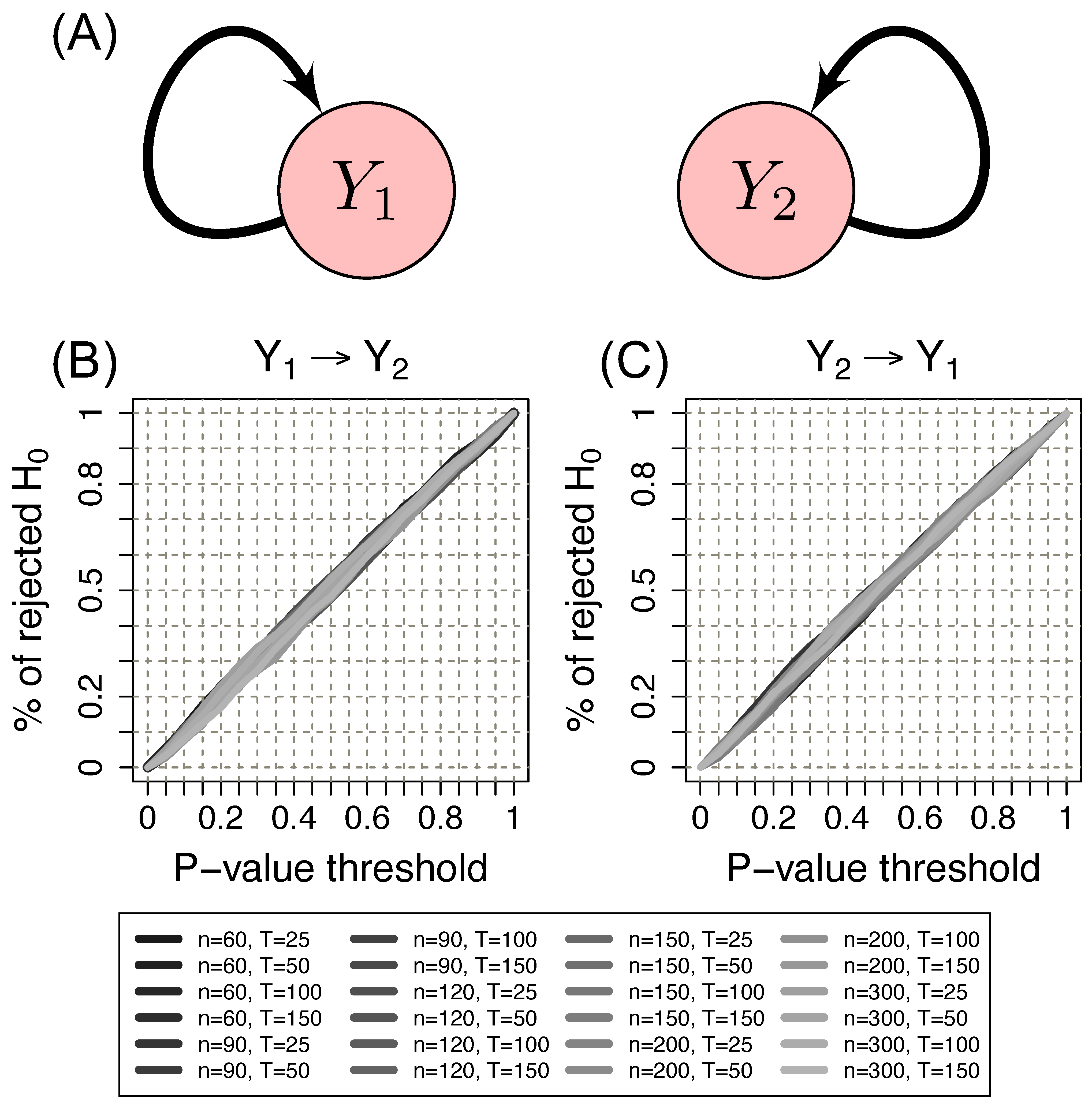
- data were generated by the following model involving a direct Granger causal effect from to :
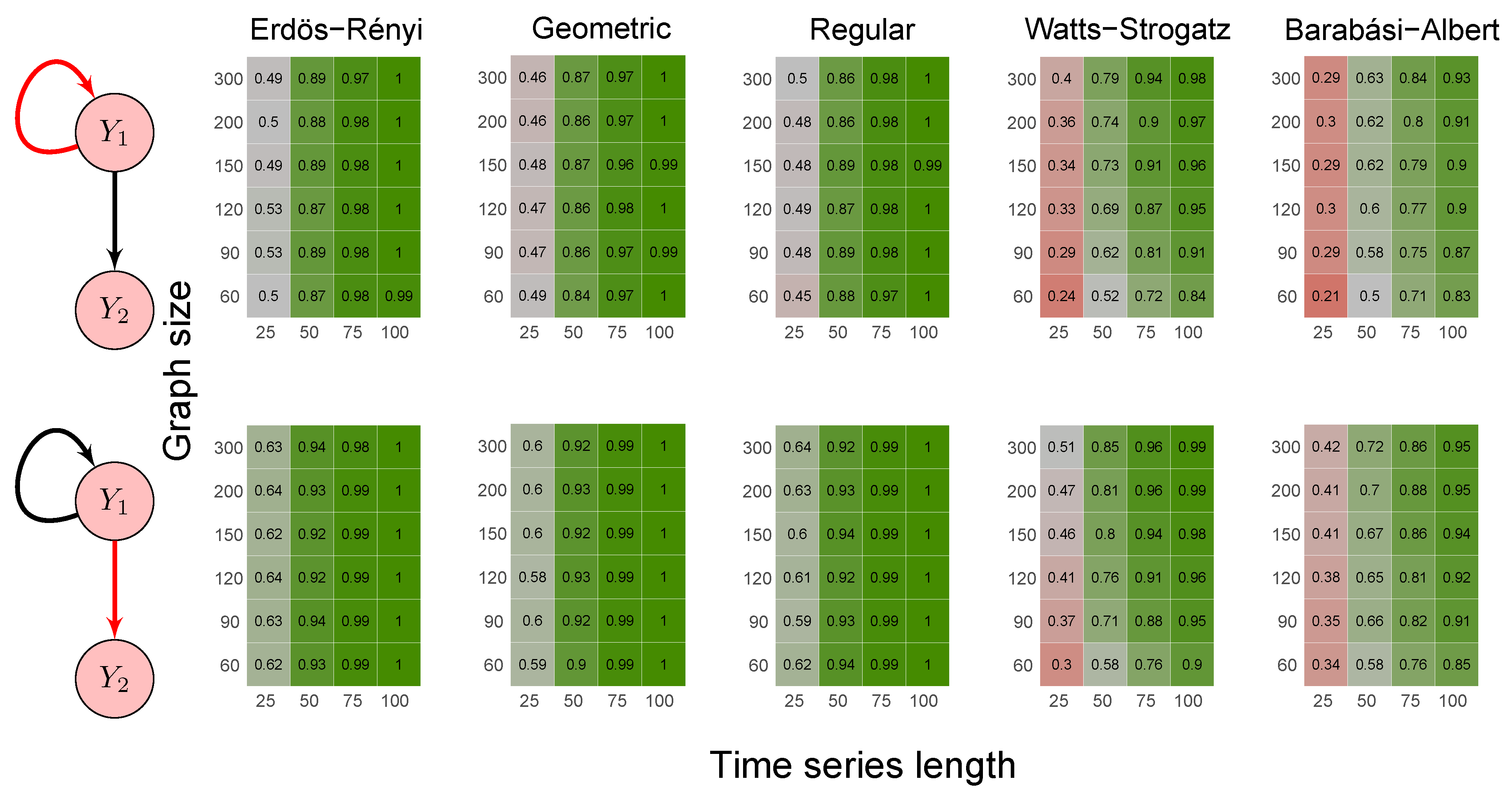
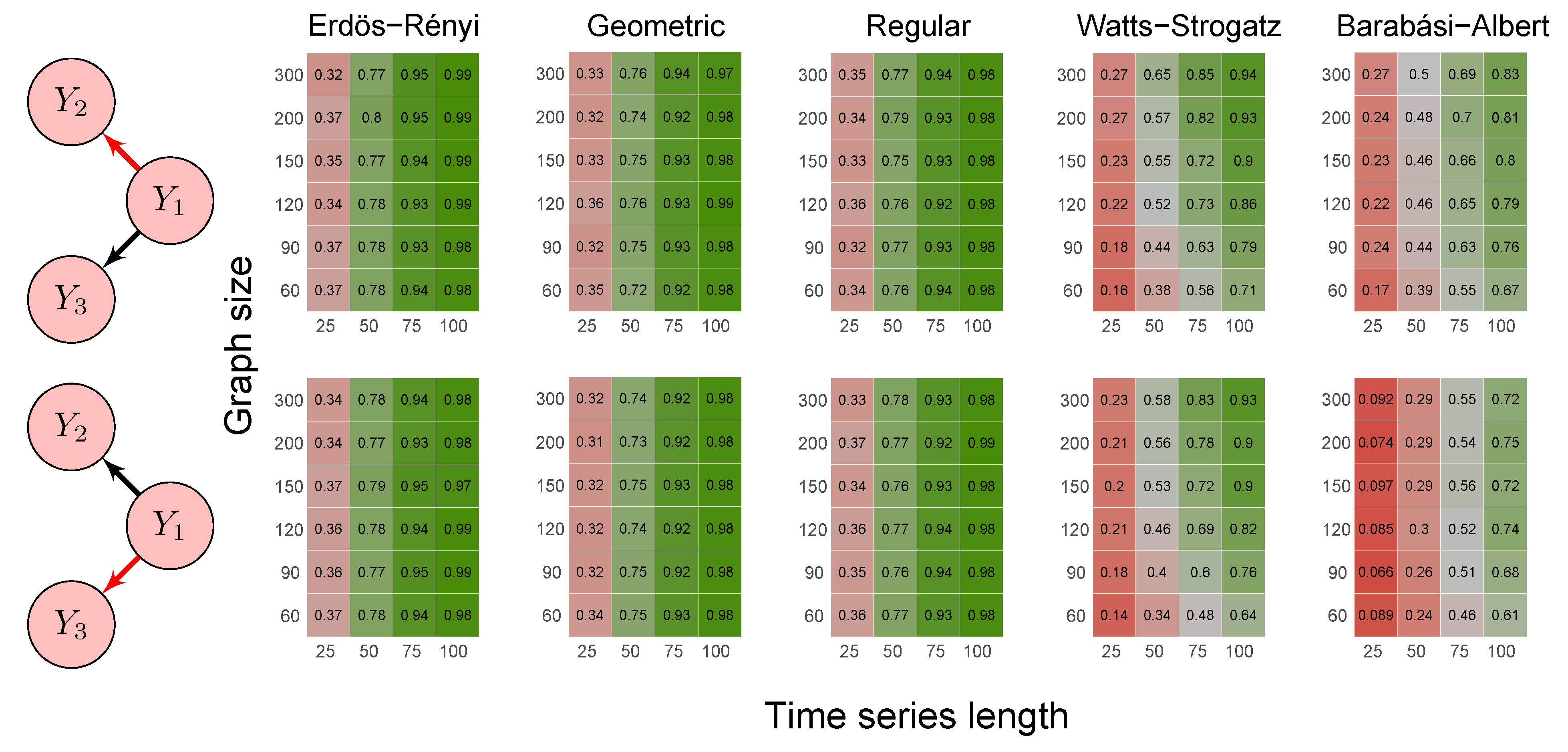
- Scenario 3:
- data were generated by the following model where Granger causes both and :
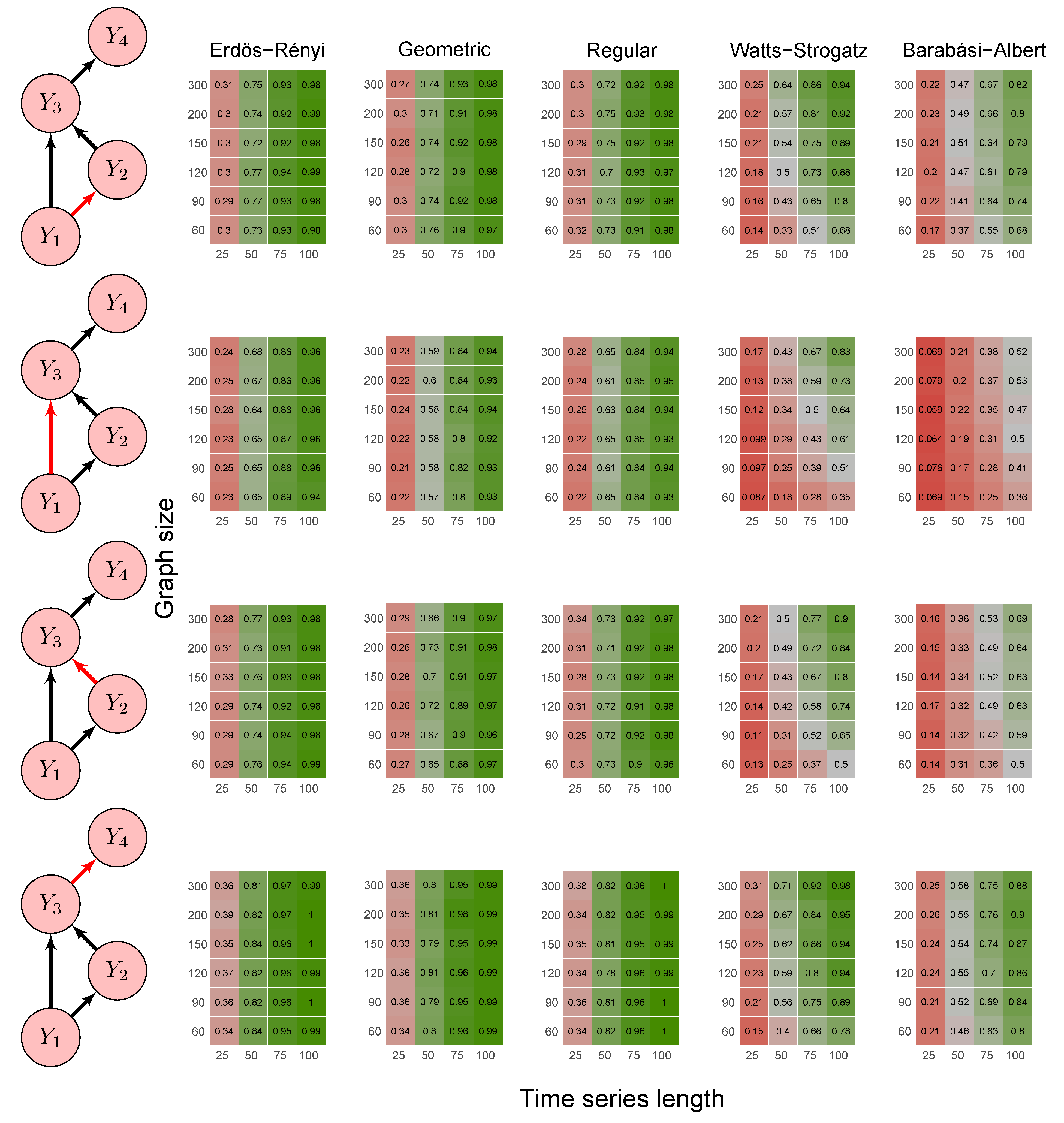
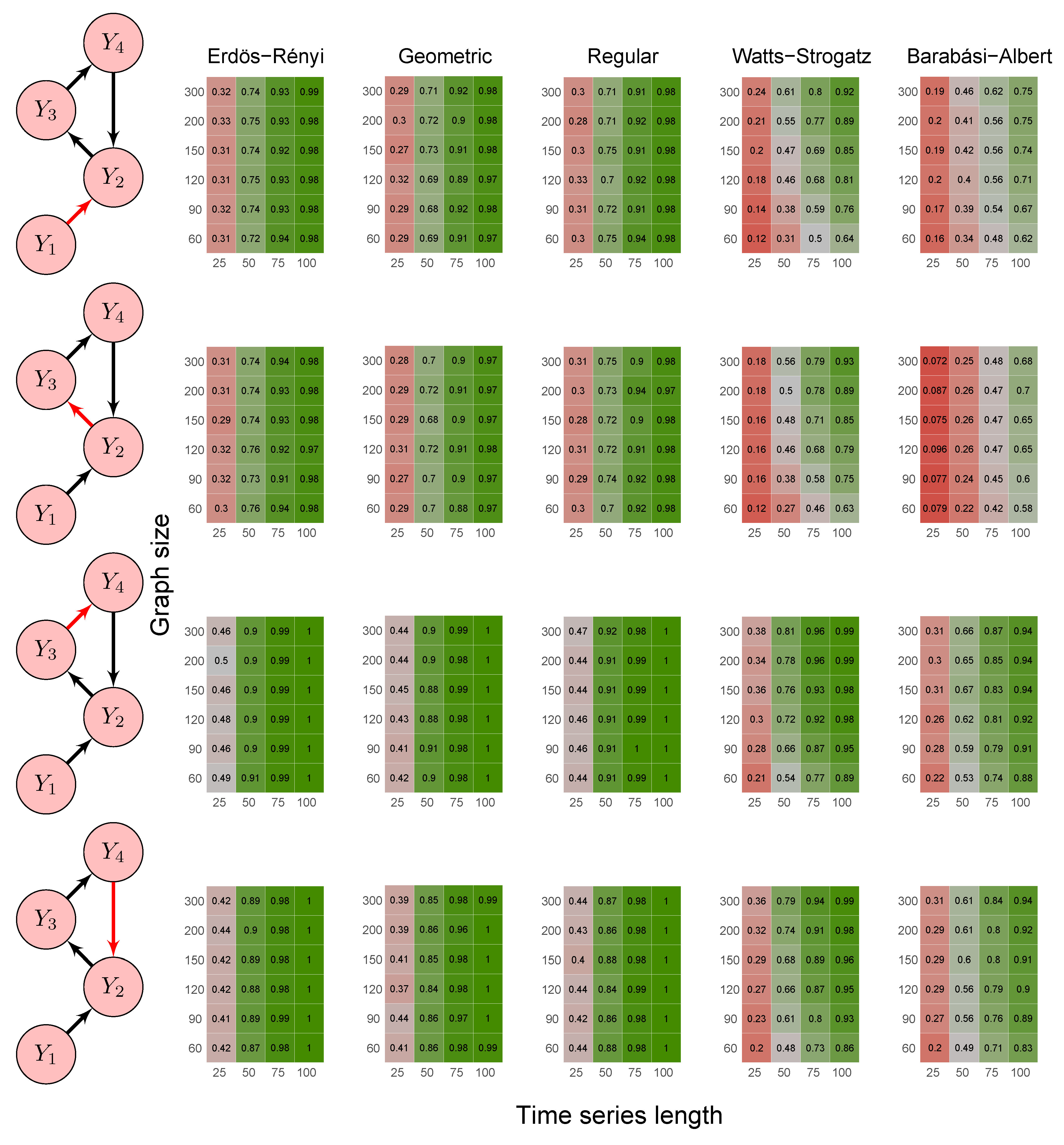
- Scenario 4:
- data were generated by a model involving direct and indirect Granger causal effects (1) ; (2) , (3) , and (4) , as follows:
- Scenario 5:
- data were generated by the following model with a feedback loop :
- Erdös-Rényi random graph: values corresponded to the probability p of two vertices being connected.
- Random geometric graph: values corresponded to the neighborhood radius parameter, r.
- Random regular graph: the integer part of the values after being multiplied by 10 corresponded to the .
- Watts–Strogatz random graph: values corresponded to the rewiring probability, .
- Barabási–Albert random graph: values, after being multiplied by two, corresponded to the power of the preferential attachment.
2.7. Application
2.7.1. ABIDE I Dataset
2.7.2. Granger Causality Analysis
3. Results and Discussions
3.1. Simulation Study
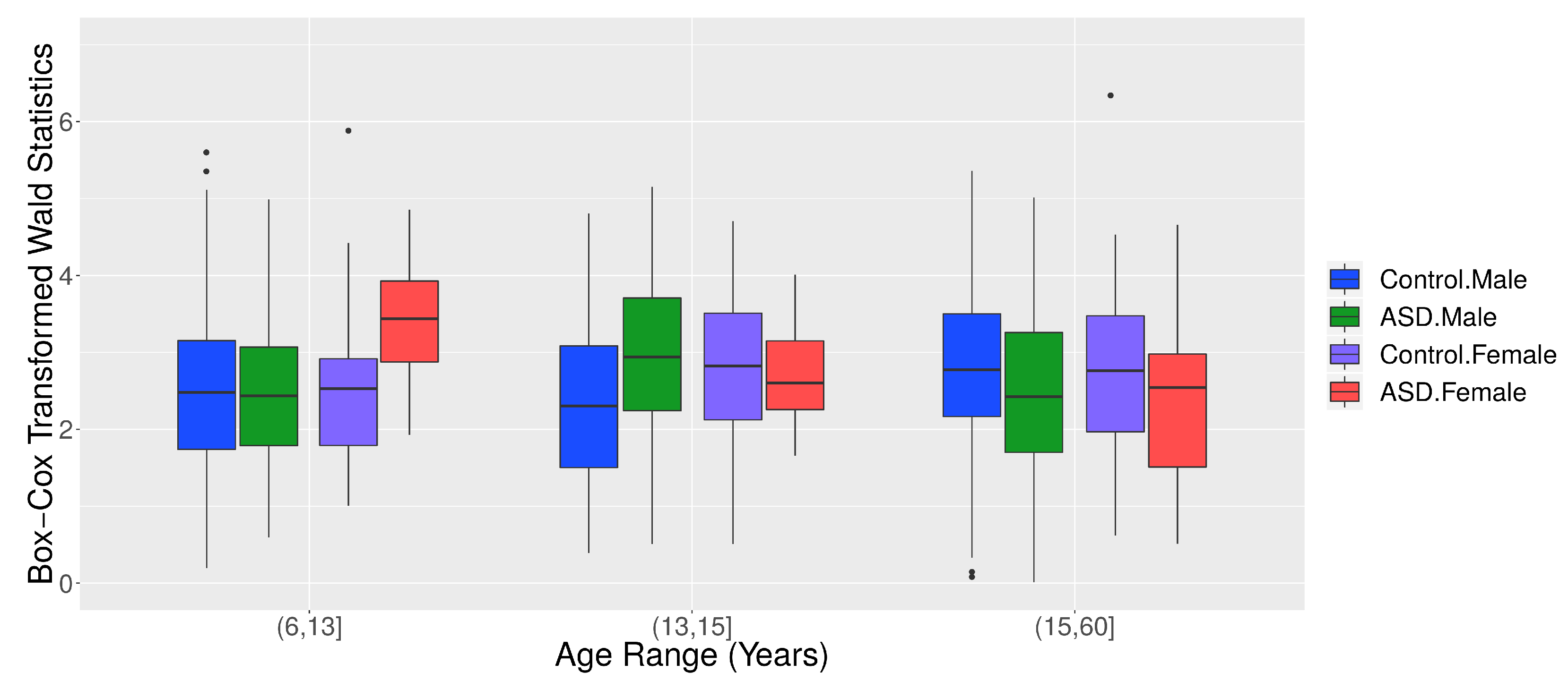
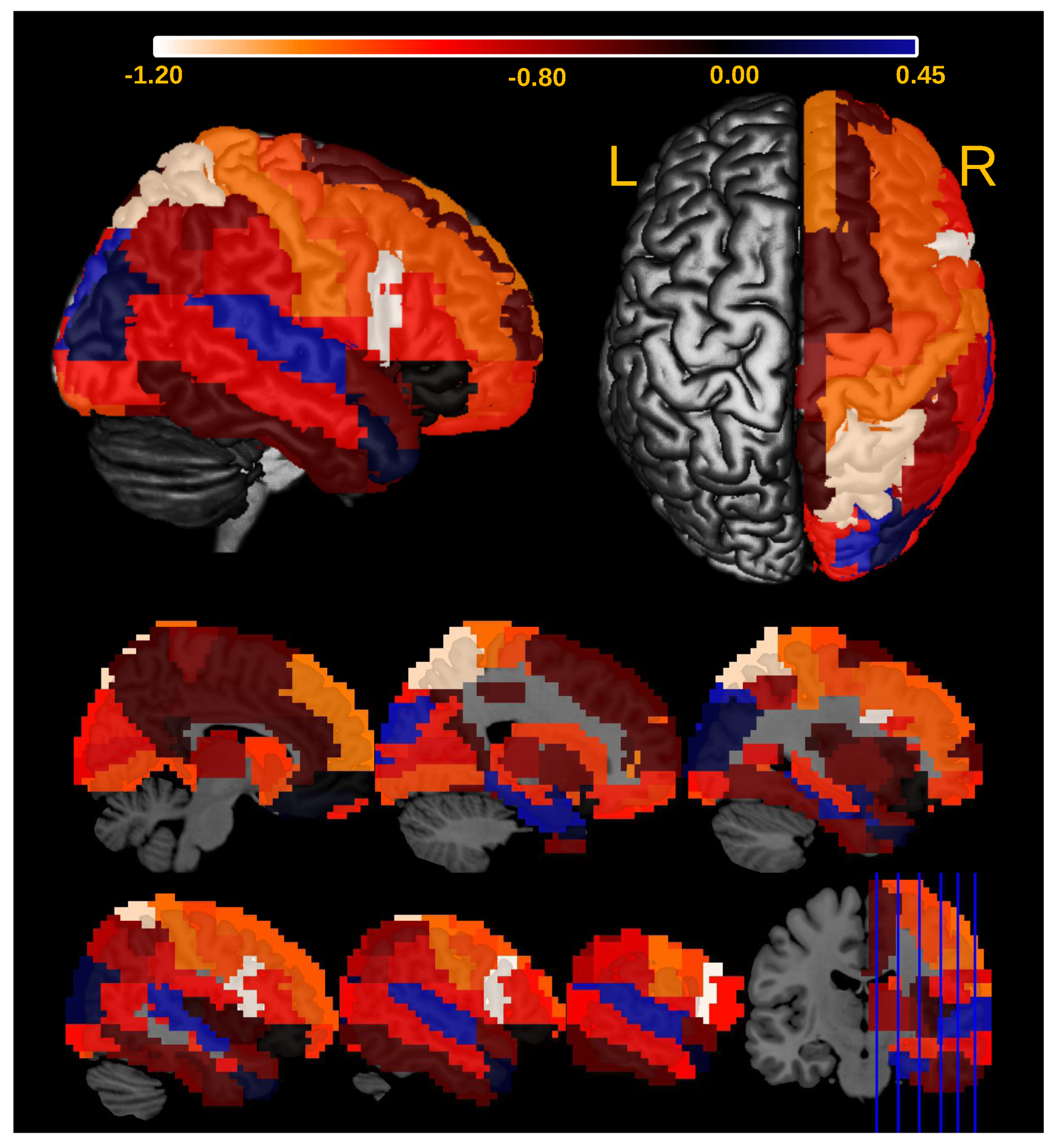
3.2. Application
4. Conclusions
Author Contributions
Funding
Institutional Review Board Statement
Informed Consent Statement
Data Availability Statement
Conflicts of Interest
References
- Karlebach, G.; Shamir, R. Modelling and analysis of gene regulatory networks. Nat. Rev. Mol. Cell Biol. 2008, 9, 770–780. [Google Scholar] [CrossRef]
- Levine, M.; Davidson, E.H. Gene regulatory networks for development. Proc. Natl. Acad. Sci. USA 2005, 102, 4936–4942. [Google Scholar] [CrossRef] [Green Version]
- Newman, M.E.; Park, J. Why social networks are different from other types of networks. Phys. Rev. E 2003, 68, 036122. [Google Scholar] [CrossRef] [Green Version]
- Wellman, B. Computer networks as social networks. Science 2001, 293, 2031–2034. [Google Scholar] [CrossRef] [PubMed] [Green Version]
- Leonardi, N.; Shirer, W.R.; Greicius, M.D.; Van De Ville, D. Disentangling dynamic networks: Separated and joint expressions of functional connectivity patterns in time. Hum. Brain Mapp. 2014, 35, 5984–5995. [Google Scholar] [CrossRef] [Green Version]
- Acer, U.G.; Kalyanaraman, S.; Abouzeid, A.A. Weak state routing for large-scale dynamic networks. IEEE/ACM Trans. Netw. 2010, 18, 1450–1463. [Google Scholar] [CrossRef]
- Granger, C.W. Investigating causal relations by econometric models and cross-spectral methods. Econom. J. Econom. Soc. 1969, 37, 424–438. [Google Scholar] [CrossRef]
- Lütkepohl, H. Introduction to Multiple Time Series Analysis; Springer Science & Business Media: Berlin/Heidelberg, Germany, 2013. [Google Scholar]
- Dungey, M.; Pagan, A. A structural VAR model of the Australian economy. Econ. Rec. 2000, 76, 321–342. [Google Scholar] [CrossRef]
- Pradhan, R.P. The nexus between financial development and economic growth in India: Evidence from multivariate VAR model. Int. J. Res. Rev. Appl. Sci. 2009, 1, 141–151. [Google Scholar]
- Fujita, A.; Kojima, K.; Patriota, A.G.; Sato, J.R.; Severino, P.; Miyano, S. A fast and robust statistical test based on likelihood ratio with Bartlett correction to identify Granger causality between gene sets. Bioinformatics 2010, 26, 2349–2351. [Google Scholar] [CrossRef]
- Sato, J.R.; Fujita, A.; Cardoso, E.F.; Thomaz, C.E.; Brammer, M.J.; Amaro, E., Jr. Analyzing the connectivity between regions of interest: An approach based on cluster Granger causality for fMRI data analysis. Neuroimage 2010, 52, 1444–1455. [Google Scholar] [CrossRef]
- Lu, F.B.; Hong, Y.M.; Wang, S.Y.; Lai, K.K.; Liu, J. Time-varying Granger causality tests for applications in global crude oil markets. Energy Econ. 2014, 42, 289–298. [Google Scholar] [CrossRef]
- Sato, J.R.; Junior, E.A.; Takahashi, D.Y.; de Maria Felix, M.; Brammer, M.J.; Morettin, P.A. A method to produce evolving functional connectivity maps during the course of an fMRI experiment using wavelet-based time-varying Granger causality. Neuroimage 2006, 31, 187–196. [Google Scholar] [CrossRef]
- Tang, C.F.; Tan, E.C. Tourism-led growth hypothesis in Malaysia: Evidence based upon regime shift cointegration and time-varying Granger causality techniques. Asia Pac. J. Tour. Res. 2015, 20, 1430–1450. [Google Scholar] [CrossRef]
- Valdés-Sosa, P.A.; Sánchez-Bornot, J.M.; Lage-Castellanos, A.; Vega-Hernández, M.; Bosch-Bayard, J.; Melie-García, L.; Canales-Rodríguez, E. Estimating brain functional connectivity with sparse multivariate autoregression. Philos. Trans. R. Soc. B Biol. Sci. 2005, 360, 969–981. [Google Scholar] [CrossRef] [PubMed] [Green Version]
- Fujita, A.; Sato, J.R.; Garay-Malpartida, H.M.; Yamaguchi, R.; Miyano, S.; Sogayar, M.C.; Ferreira, C.E. Modeling gene expression regulatory networks with the sparse vector autoregressive model. BMC Syst. Biol. 2007, 1, 39. [Google Scholar] [CrossRef] [PubMed] [Green Version]
- Shojaie, A.; Michailidis, G. Discovering graphical Granger causality using the truncating lasso penalty. Bioinformatics 2010, 26, i517–i523. [Google Scholar] [CrossRef] [PubMed]
- Fujita, A.; Sato, J.R.; Garay-Malpartida, H.M.; Sogayar, M.C.; Ferreira, C.E.; Miyano, S. Modeling nonlinear gene regulatory networks from time series gene expression data. J. Bioinform. Comput. Biol. 2008, 6, 961–979. [Google Scholar] [CrossRef]
- Marinazzo, D.; Pellicoro, M.; Stramaglia, S. Kernel method for nonlinear Granger causality. Phys. Rev. Lett. 2008, 100, 144103. [Google Scholar] [CrossRef] [PubMed] [Green Version]
- Sims, C.A. Are forecasting models usable for policy analysis? Q. Rev. 1986, 10, 2–16. [Google Scholar] [CrossRef]
- Shapiro, M.D.; Watson, M.W. Sources of business cycle fluctuations. NBER Macroecon. Annu. 1988, 3, 111–148. [Google Scholar] [CrossRef]
- Kilian, L.; Lütkepohl, H. Structural Vector Autoregressive Analysis; Cambridge University Press: Cambridge, MA, USA, 2017. [Google Scholar]
- Fujita, A.; Sato, J.R.; Kojima, K.; Gomes, L.R.; Nagasaki, M.; Sogayar, M.C.; Miyano, S. Identification of Granger causality between gene sets. J. Bioinform. Comput. Biol. 2010, 8, 679–701. [Google Scholar] [CrossRef]
- Fujita, A.; Takahashi, D.Y.; Balardin, J.B.; Vidal, M.C.; Sato, J.R. Correlation between graphs with an application to brain network analysis. Comput. Stat. Data Anal. 2017, 109, 76–92. [Google Scholar] [CrossRef]
- Erdös, P.; Rényi, A. On random graphs I. Publ. Math. Debr. 1959, 6, 290–297. [Google Scholar]
- Graybill, F.A. Theory and Application of the Linear Model; Duxbury Press: Duxbury, MA, USA, 1976. [Google Scholar]
- Füredi, Z.; Komlós, J. The eigenvalues of random symmetric matrices. Combinatorica 1981, 1, 233–241. [Google Scholar] [CrossRef]
- Bordenave, C. Eigenvalues of Euclidean random matrices. Random Struct. Algorithms 2008, 33, 515–532. [Google Scholar] [CrossRef] [Green Version]
- Meringer, M. Fast generation of regular graphs and construction of cages. J. Graph Theory 1999, 30, 137–146. [Google Scholar] [CrossRef]
- Alon, N. Eigenvalues and expanders. Combinatorica 1986, 6, 83–96. [Google Scholar] [CrossRef]
- Watts, D.; Strogatz, S. Collective dynamics of ’small-world’ networks. Nature 1998, 393, 440–442. [Google Scholar] [CrossRef]
- Van Mieghem, P. Graph Spectra for Complex Networks; Cambridge University Press: Cambridge, MA, USA, 2010. [Google Scholar]
- Barabási, A.L.; Albert, R. Emergence of scaling in random networks. Science 1999, 286, 509–512. [Google Scholar] [CrossRef] [Green Version]
- Dorogovtsev, S.N.; Goltsev, A.V.; Mendes, J.F.F.; Samukhin, A.N. Spectra of complex networks. Phys. Rev. E 2003, 68, 046109. [Google Scholar] [CrossRef] [Green Version]
- Ecker, C.; Bookheimer, S.Y.; Murphy, D.G. Neuroimaging in autism spectrum disorder: Brain structure and function across the lifespan. Lancet Neurol. 2015, 14, 1121–1134. [Google Scholar] [CrossRef] [Green Version]
- Hallmayer, J.; Cleveland, S.; Torres, A.; Phillips, J.; Cohen, B.; Torigoe, T.; Miller, J.; Fedele, A.; Collins, J.; Smith, K.; et al. Genetic heritability and shared environmental factors among twin pairs with autism. Arch. Gen. Psychiatry 2011, 68, 1095–1102. [Google Scholar] [CrossRef] [PubMed]
- Betancur, C. Etiological heterogeneity in autism spectrum disorders: More than 100 genetic and genomic disorders and still counting. Brain Res. 2011, 1380, 42–77. [Google Scholar] [CrossRef] [PubMed] [Green Version]
- Wing, L. The autistic spectrum. Lancet 1997, 350, 1761–1766. [Google Scholar] [CrossRef]
- Wass, S. Distortions and disconnections: Disrupted brain connectivity in autism. Brain Cogn. 2011, 75, 18–28. [Google Scholar] [CrossRef]
- Stevenson, R.A. Using functional connectivity analyses to investigate the bases of autism spectrum disorders and other clinical populations. J. Neurosci. 2012, 32, 17933–17934. [Google Scholar] [CrossRef]
- Just, M.A.; Keller, T.A.; Malave, V.L.; Kana, R.K.; Varma, S. Autism as a neural systems disorder: A theory of frontal-posterior underconnectivity. Neurosci. Biobehav. Rev. 2012, 36, 1292–1313. [Google Scholar] [CrossRef] [Green Version]
- Frith, C. What do imaging studies tell us about the neural basis of autism. In Autism: Neural Basis and Treatment Possibilities; John Wiley & Sons, Inc.: West Sussex, UK, 2003; pp. 149–176. [Google Scholar]
- Ecker, C.; Spooren, W.; Murphy, D. Translational approaches to the biology of Autism: False dawn or a new era? Mol. Psychiatry 2013, 18, 435–442. [Google Scholar] [CrossRef] [Green Version]
- Tzourio-Mazoyer, N.; Leau, B.; Papathanassiou, D.; Crivello, F.; Etard, O.; Delcroix, N.; Mazoyer, B.; Joliot, M. Automated Anatomical Labeling of Activations in SPM Using a Macroscopic Anatomical Parcellation of the MNI MRI Single-Subject Brain. Neuroimage 2002, 15, 273–289. [Google Scholar] [CrossRef]
- Loomes, R.; Hull, L.; Mandy, W.P.L. What is the male-to-female ratio in autism spectrum disorder? A systematic review and meta-analysis. J. Am. Acad. Child Adolesc. Psychiatry 2017, 56, 466–474. [Google Scholar] [CrossRef] [Green Version]
- Werling, D.M.; Geschwind, D.H. Sex differences in autism spectrum disorders. Curr. Opin. Neurol. 2013, 26, 146. [Google Scholar] [CrossRef] [Green Version]
- Alaerts, K.; Swinnen, S.P.; Wenderoth, N. Sex differences in autism: A resting-state fMRI investigation of functional brain connectivity in males and females. Soc. Cogn. Affect. Neurosci. 2016, 11, 1002–1016. [Google Scholar] [CrossRef] [Green Version]
- Irimia, A.; Torgerson, C.M.; Jacokes, Z.J.; Van Horn, J.D. The connectomes of males and females with autism spectrum disorder have significantly different white matter connectivity densities. Sci. Rep. 2017, 7, 46401. [Google Scholar] [CrossRef] [PubMed] [Green Version]
- Xiao, Z.; Qiu, T.; Ke, X.; Xiao, X.; Xiao, T.; Liang, F.; Zou, B.; Huang, H.; Fang, H.; Chu, K.; et al. Autism spectrum disorder as early neurodevelopmental disorder: Evidence from the brain imaging abnormalities in 2–3 years old toddlers. J. Autism Dev. Disord. 2014, 44, 1633–1640. [Google Scholar] [CrossRef] [PubMed] [Green Version]
- Walsh, M.J.; Wallace, G.L.; Gallegos, S.M.; Braden, B.B. Brain-based sex differences in autism spectrum disorder across the lifespan: A systematic review of structural MRI, fMRI, and DTI findings. Neuroimage Clin. 2021, 31, 102719. [Google Scholar] [CrossRef]
- Stramaglia, S.; Scagliarini, T.; Antonacci, Y.; Faes, L. Local granger causality. Phys. Rev. E 2021, 103, L020102. [Google Scholar] [CrossRef] [PubMed]
- Lurie, D.J.; Kessler, D.; Bassett, D.S.; Betzel, R.F.; Breakspear, M.; Kheilholz, S.; Kucyi, A.; Liégeois, R.; Lindquist, M.A.; McIntosh, A.R.; et al. Questions and controversies in the study of time-varying functional connectivity in resting fMRI. Netw. Neurosci. 2020, 4, 30–69. [Google Scholar] [CrossRef]


| Parameter | Estimate | Std. Error | t-Value | p-Value |
|---|---|---|---|---|
| 2.5270 | 0.2163 | 11.6795 | <0.0001 | |
| −0.9295 | 0.8893 | −1.0452 | 0.2963 | |
| 0.5956 | 0.2291 | 2.5997 | 0.0095 | |
| 0.0082 | 0.0073 | 1.1229 | 0.2619 | |
| 0.2945 | 0.1731 | 1.7013 | 0.0893 | |
| −0.0204 | 0.0089 | −2.2948 | 0.0220 | |
| −0.0290 | 0.0126 | −2.3036 | 0.0215 |
Publisher’s Note: MDPI stays neutral with regard to jurisdictional claims in published maps and institutional affiliations. |
© 2021 by the authors. Licensee MDPI, Basel, Switzerland. This article is an open access article distributed under the terms and conditions of the Creative Commons Attribution (CC BY) license (https://creativecommons.org/licenses/by/4.0/).
Share and Cite
Ribeiro, A.H.; Vidal, M.C.; Sato, J.R.; Fujita, A. Granger Causality among Graphs and Application to Functional Brain Connectivity in Autism Spectrum Disorder. Entropy 2021, 23, 1204. https://doi.org/10.3390/e23091204
Ribeiro AH, Vidal MC, Sato JR, Fujita A. Granger Causality among Graphs and Application to Functional Brain Connectivity in Autism Spectrum Disorder. Entropy. 2021; 23(9):1204. https://doi.org/10.3390/e23091204
Chicago/Turabian StyleRibeiro, Adèle Helena, Maciel Calebe Vidal, João Ricardo Sato, and André Fujita. 2021. "Granger Causality among Graphs and Application to Functional Brain Connectivity in Autism Spectrum Disorder" Entropy 23, no. 9: 1204. https://doi.org/10.3390/e23091204
APA StyleRibeiro, A. H., Vidal, M. C., Sato, J. R., & Fujita, A. (2021). Granger Causality among Graphs and Application to Functional Brain Connectivity in Autism Spectrum Disorder. Entropy, 23(9), 1204. https://doi.org/10.3390/e23091204