Article

The Impact of COVID-19 on People Living with HIV: A Network Science Perspective

Department of Computer Science, Southern Illinois University Edwardsville, Edwardsville, IL 62025, USA
*
Author to whom correspondence should be addressed.
COVID 2025, 5(8), 119; https://doi.org/10.3390/covid5080119
Submission received: 28 June 2025 / Revised: 23 July 2025 / Accepted: 25 July 2025 / Published: 28 July 2025
(This article belongs to the Section COVID Public Health and Epidemiology)

Abstract

People living with HIV (PLWH) faced diverse challenges during the COVID-19 pandemic, including disruptions to care, housing instability, emotional distress, and economic hardship. This study used graph-based clustering methods to analyze pandemic-era experiences of PLWH in a national sample from the NIH’s All of Us dataset (n = 242). Across three graph configurations we identified consistent subgroups shaped by social connectedness, housing stability, emotional well-being, and engagement with preventive behaviors. Comparison with an earlier local study of PLWH in Illinois confirmed recurring patterns of vulnerability and resilience while also revealing additional national-level subgroups not observed in the smaller sample. Subgroups with strong social or institutional ties were associated with greater emotional stability and proactive engagement with COVID-19 preventive behaviors, while those facing isolation and structural hardship exhibited elevated distress and limited engagement with COVID-19 preventive measures. These findings underscore the importance of precision public health strategies that reflect the heterogeneity of PLWH and suggest that strengthening social support networks, promoting housing stability, and leveraging institutional connections may enhance pandemic preparedness and HIV care in future public health crises.

1. Introduction

The dual pandemics of HIV and COVID-19 have placed substantial strain on vulnerable populations, deepening existing disparities in health outcomes, service access, and social stability. People living with HIV (PLWH) have faced heightened risks, including increased susceptibility to severe COVID-19, interruptions in routine care, and intensified economic hardship [1]. These overlapping challenges point to the need for analytic frameworks capable of capturing the complex, intersecting determinants of risk and resilience among PLWH during times of crisis.
Network science and graph theory provide a useful approach to this challenge, offering tools to represent individuals as nodes linked by shared attributes or experiences. This allows for the detection of latent subgroups that may exhibit common patterns of vulnerability or resilience [2]. In contrast to traditional statistical models, graph-based methods can capture nonlinear and multidimensional relationships that emerge from the social fabric of health determinants.
Our earlier work [3], based on a local survey of HIV-positive individuals and their partners in semi-urban and rural Illinois, demonstrated that graph-based clustering could reveal meaningful subgroups with differing experiences of discrimination, healthcare access, and pandemic-related hardship. That study used a small local sample and identified distinct clusters of PLWH facing varying levels of structural vulnerability and community support.
Building on this approach, the current study expands the analysis to a national level, leveraging data from NIH’s All of Us dataset, which involved a large, diverse cohort of participants across the United States. Our focus is on the subset of HIV-positive individuals who completed both the Social Determinants of Health (SDoH) and COVID-19 Participant Experience (COPE) [4] surveys. Although the All of Us dataset is large, the number of HIV-positive respondents with completed COPE surveys during the relevant time window was modest (n = 242), reflecting persistent challenges in capturing timely data on this population.
A key strength of this work is its ability to identify both vulnerability and resilience within the population of PLWH. While some clusters were marked by housing instability, social disconnection, or emotional distress, others reflected relative stability and protective factors, such as emotionally resilient retirees or individuals with strong institutional ties. The recurrence of similar cluster types across three distinct graph configurations lends confidence to the robustness of these findings and demonstrates the capacity of graph-based methods to reveal complex, emergent social structures.
By extending graph-based clustering to a national cohort, this study contributes to the growing literature on syndemic interactions between HIV and COVID-19. It provides a flexible methodological framework for detecting meaningful subgroups among PLWH, with direct implications for targeted interventions and pandemic preparedness efforts. In particular, the results highlight the value of network-based methods in uncovering population heterogeneity that may not be readily captured by conventional analytic approaches.

2. Related Work

Research on the intersection of HIV and COVID-19 has largely emphasized clinical and public health outcomes, with relatively limited application of network science methods. Papers by Grubb et al. [5] and Lopez et al. [6] examined network characteristics in analyzing the spread of HIV. Brown et al. [7] investigated the impact of the COVID-19 pandemic on HIV prevention and treatment services, highlighting disruptions in testing, access to antiretroviral therapy, and declines in viral suppression, disruptions that were particularly pronounced in underserved communities. The present study builds on this work by further examining the social and economic consequences of COVID-19 for PLWH.
Several papers document the compounded vulnerabilities experienced by PLWH during the COVID-19 pandemic. Elevated vaccine hesitancy among PLWH has been noted [8], often linked to concerns about side effects and the lack of tailored information. Resilience-focused care models have been proposed to help mitigate the psychological impacts of the pandemic [9], which include increased anxiety, depression, and social isolation [10]. Mental health concerns are particularly pressing given the preexisting stigma and barriers to care faced by PLWH, now exacerbated by pandemic-related disruptions.
The socioeconomic impact of COVID-19 has also disproportionately affected PLWH, who have experienced higher rates of job loss [11], economic instability, and interruptions in health insurance coverage [12]. Social determinants of health as they relate to PLWH are examined in [2,13]. These trends motivated our decision to analyze COVID-related economic hardship as a central variable in our graph-theoretic approach.
Although the present study is grounded in graph-based methods, relatively few studies have applied network analysis to HIV-related data in the context of COVID-19. Most network science applications in HIV research have historically focused on transmission dynamics, contact tracing, or intervention design [14,15,16]. Social and sexual network analyses have been used to identify high-risk clusters and inform targeted outreach strategies, particularly among MSM and substance-using populations. Graph-based molecular epidemiology, in which transmission clusters are inferred from HIV genetic sequence data, has also become a critical tool for public health surveillance [17].
More recent work has begun to integrate network science with machine learning to uncover the latent community structure and improve intervention targeting. Xiang et al. [18] review the use of artificial intelligence and machine learning in HIV care, highlighting predictive models for diagnosis, adherence, and behavioral risk. However, few of these approaches explicitly use graph-theoretic methods to model inter-individual similarity across multiple dimensions of socioeconomic and health experience, as is performed in the present study.

3. Methods

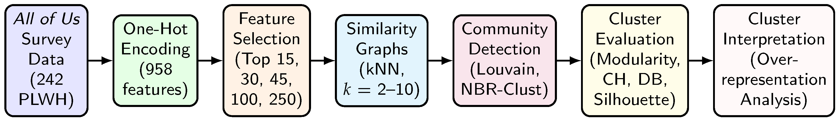
3.1. Network Science and Its Use in This Study

This study applies network science and graph-theoretic methods to identify patterns among HIV-positive individuals during the COVID-19 pandemic. In this framework, individuals are represented as nodes (also called vertices), and connections between individuals, based on their similarity across multiple features, are represented as edges. Each edge is assigned a weight that reflects the degree of similarity between two participants.
We follow the approach used in previous work [3], in which networks are constructed from one-hot encoded survey responses, and community detection algorithms are applied to uncover clusters of individuals with shared characteristics or experiences. This allows us to examine whether certain traits, such as social isolation, economic hardship, or resilience, tend to co-occur and define meaningful subgroups within the population. For an illustrative example of how we convert survey answers into a graph, see Appendix A.
Unlike traditional statistical approaches that rely on large sample sizes to achieve significance, network science enables the detection of structure and community patterns, even in modestly sized datasets. This is particularly valuable in studying subpopulations, such as PLWH, where granular insights are often needed but large targeted samples may be difficult to obtain.
Graph-based methods offer a complementary perspective to traditional regression or latent class modeling by allowing the population structure to emerge organically from the data without prespecifying groupings. The overall analytic workflow, from data preparation to clustering and interpretation, is summarized in Figure 1.

3.2. Dataset: All of Us

To investigate the impact of COVID-19 on individuals living with HIV, we used data from the NIH’s All of Us Research Program [19]. Using the Cohort Builder tool [20], we identified a cohort of HIV-positive participants who had completed the Basics, Social Determinants of Health (SDoH), and COVID-19 Participant Experience (COPE) surveys [4]. These instruments were selected to capture multidimensional aspects of participants’ health, socioeconomic context, and pandemic-related experiences.
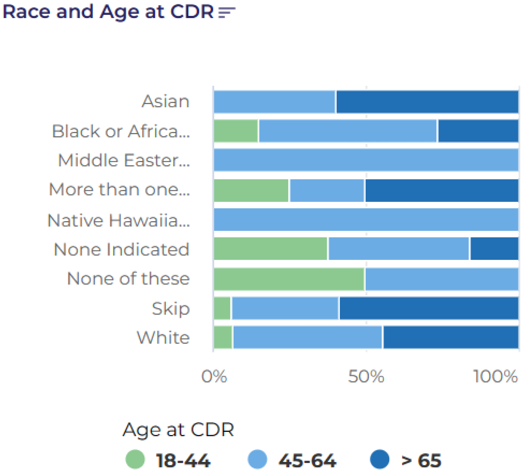
A total of 360 participants met these inclusion criteria. The cohort was demographically diverse, with a broad age range (18–65+) and approximately one-third identifying as Black or African American (Figure 2 and Figure 3). To temporally align the data with the Burden of HIV survey [3], we restricted the responses to those from the February 2021 COPE survey release. This final filtering yielded a sample of 242 individuals, whose survey responses were used for the downstream analysis.

3.3. Dataset: The Burden of HIV Survey

The Burden of HIV survey [3,21], conducted in 2021 and 2022, was modeled on established surveys of HIV and HIV-adjacent populations, including the Sexual Acquisition and Transmission of HIV Cooperative Agreement Program (SATHCAP) survey [22], conducted in 2006–2008, and the Latino MSM Community Involvement: HIV Protective Effects Survey (LMSM) [23], conducted in 2005. Owing to its extensive list of questions and the diversity of the 22 survey participants, the Burden of HIV survey functions more as an ethnographic instrument, documenting changes in social determinants of health, economic outcomes, and social and medical environments since those earlier surveys.

3.4. Data Preprocessing and Feature Selection

All question–answer pairs from the three selected surveys were one-hot encoded, yielding a binary matrix with 958 features representing individual responses. For example, a feature might represent the answer to a question such as “Were you laid off work due to COVID,” where the values are 1 for yes and 0 for no. In this context, features may also be referred to as variables.
To focus the analysis on COVID-19-related economic hardship, we selected a multi-response question (Athena Code: 1333291) that asked participants to indicate whether they had experienced various pandemic-related disruptions, including job loss, income reduction, or difficulties affording childcare [24]. Responses to this question were treated as the binary outcome variable in a logistic regression model, with the remaining one-hot encoded features serving as predictors.
We retained the top 15, 30, 45, 100, and 250 features most positively associated with economic hardship, providing flexibility for later graph construction while reducing the risk of overfitting.

3.5. Graph Construction

We constructed k-nearest neighbor (KNN) graphs based on participant similarity in the reduced feature spaces. For each feature subset (15, 30, 45, 100, and 250 features), the corresponding response matrix was used to compute KNN graphs using scikit-learn’s NearestNeighbors model [25]. Each participant was a node, and edges were formed by connecting each node to its k nearest neighbors, with k values of 2, 3, 5, 7, and 10. The reciprocal of the Euclidean distance between feature vectors was used as the edge weight such that more similar individuals were connected by stronger (higher weight) edges.
All graphs were constructed using NetworkX [26], resulting in 25 undirected, weighted graphs with 242 nodes each. Each graph was fully connected.

3.6. Clustering Methods

To identify subgroups of participants with shared characteristics, we applied three graph-based clustering methods: (1) the Louvain algorithm; (2) the NBR-Clust framework using vertex attack tolerance (VAT) as the resilience metric; and (3) the NBR-Clust framework using integrity as the resilience metric. Each of these methods reflects a distinct strategy for identifying meaningful structure within the graph, helping reveal hidden subgroups, and increasing robustness to methodological biases.
The first method was the widely used Louvain algorithm [27], which detects communities by optimizing the modularity, a measure of how well a network is divided into clusters. Modularity compares the actual density of edges within a cluster to the density that would be expected if edges were distributed randomly, given each node’s degree. Clusters with a high modularity contain more intra-cluster connections than would be expected by chance. The Louvain algorithm operates in a greedy, hierarchical manner, repeatedly grouping nodes into communities and then refining the clustering.
The second and third methods were based on the NBR-Clust framework [28], which uses resilience-based metrics to uncover meaningful subgroups in a network. Specifically, we applied NBR-Clust with two different resilience measures: vertex attack tolerance (VAT) [29,30] and integrity [31]. This approach identifies individuals who act as structural “bridges” in the network, specifically nodes whose removal would fragment the graph into smaller components. By conceptually removing these key individuals, NBR-Clust reveals latent subgroups that are tightly connected, often reflecting distinct patterns of vulnerability, resilience, or social experience.
In a public health context, this approach helps uncover subgroups linked by shared lived experiences, such as housing insecurity, barriers to care, or pandemic-related hardship. For example, NBR-Clust may identify one cluster of participants primarily affected by job loss, another experiencing severe social isolation, and another facing disruptions in healthcare access. These clusters can guide more tailored intervention strategies.
For completeness, the mathematical definitions of the VAT and integrity metrics are provided below. Readers are not expected to follow the formulas in detail; they serve to formalize how these methods detect structurally meaningful subgroups in the network.
V A T ( G ) = min S V | S | | V S C max ( V S ) | + 1 ,
I ( G ) = min S V | S | + C max ( V S ) ,
where S is the set of nodes to be removed, and C max ( V S ) is the size of the largest connected component after removing S.
Each clustering method produced a different number of clusters, reflecting its sensitivity to different aspects of network structure. The combined use of modularity- and resilience-based methods provided a richer view of the population’s heterogeneity.

3.7. Cluster Evaluation Metrics

To evaluate the quality of the resulting clusterings, we computed four complementary metrics using scikit-learn [25]:
  • Modularity, which quantifies partitions based on the edge density.
  • Calinski–Harabasz index [32], which assesses the ratio of between-cluster to within-cluster dispersion (higher values indicate better-defined clusters).
  • Davies–Bouldin index [33], which measures the average similarity between each cluster and its most similar counterpart (lower values indicate better separation).
  • Silhouette [34], which evaluates the cohesion and separation of clusters, defined as
    s ( i ) = b ( i ) a ( i ) max { a ( i ) , b ( i ) } ,
    where a ( i ) is the mean intra-cluster distance and b ( i ) is the mean nearest-cluster distance for each point i.
Together, these metrics guided the selection of the most informative graph and clustering configurations for further analysis.

3.8. Cluster Over-Representation Calculation

To interpret the content of each cluster, we analyzed the frequency of each one-hot encoded feature within the cluster, relative to its frequency in the full sample. The percentages shown in Figure 4, Figure 5 and Figure 6, as well as in Table A1, Table A2 and Table A3, reflect this relative over-representation.
For each feature f, we computed the difference in proportions as follows:
Enrichment ( f ) = Frequency ( f , Cluster ) Size ( Cluster ) Frequency ( f , Population ) Size ( Population )
Positive values indicate that a feature is over-represented in the cluster compared with the overall sample, while negative values indicate under-representation. This calculation allowed us to characterize each cluster in terms of demographics, social determinants, emotional well-being, and pandemic-era hardships.

3.9. Cluster Frequency Analysis

Each graph was clustered using all three community detection methods. For each resulting set of clusters, the performance was evaluated using the four metrics described above. Full results for all graphs and clustering configurations are shown in Appendix B.
To select representative graphs for further analysis, we applied a “Rank Sum” approach: for each graph, the ranks across the four metrics (Davies–Bouldin, Silhouette, Calinski–Harabasz, and Modularity) were summed, with lower totals indicating better overall performance. Ties were resolved by the number of first-place rankings. This process allowed us to identify the most informative clustering configurations from each method.
Based on this selection procedure, the following graphs were chosen for deeper analysis and visualization: the 250-feature, k = 7 , Louvain-clustered graph (Louvain F250K7); the 250-feature, k = 10 , NBR-Clust with VAT (VAT F250K10); and the 15-feature, k = 10 , NBR-Clust with integrity (INT F15K10). Cluster frequency analysis was performed on each of these graphs to identify the over- and under-represented features within each cluster.
The resulting clustered graphs are presented in Figure 4, Figure 5 and Figure 6. In accordance with the All of Us data dissemination policy, clusters with fewer than 20 members are not shown.
In summary, this study used graph-based methods to analyze the patterns of social, economic, and pandemic-related experiences among people living with HIV. The highest-ranked configurations were selected for further analysis, providing a basis for identifying latent communities of vulnerability and resilience, as presented in the following section.

4. Results

Figure 4, Figure 5 and Figure 6 present the clustering results for the three graph configurations analyzed in this study. In each case, we observed distinct subgroups of HIV-positive individuals with varying profiles of housing stability, emotional well-being, pandemic-related behaviors, and social connectedness. As described in Section 3.8, the percentages shown in each figure represent the relative over-representation of traits within a cluster, that is, the degree to which a given trait is more (or less) common in the cluster than in the full sample. Positive percentages indicate over-representation.

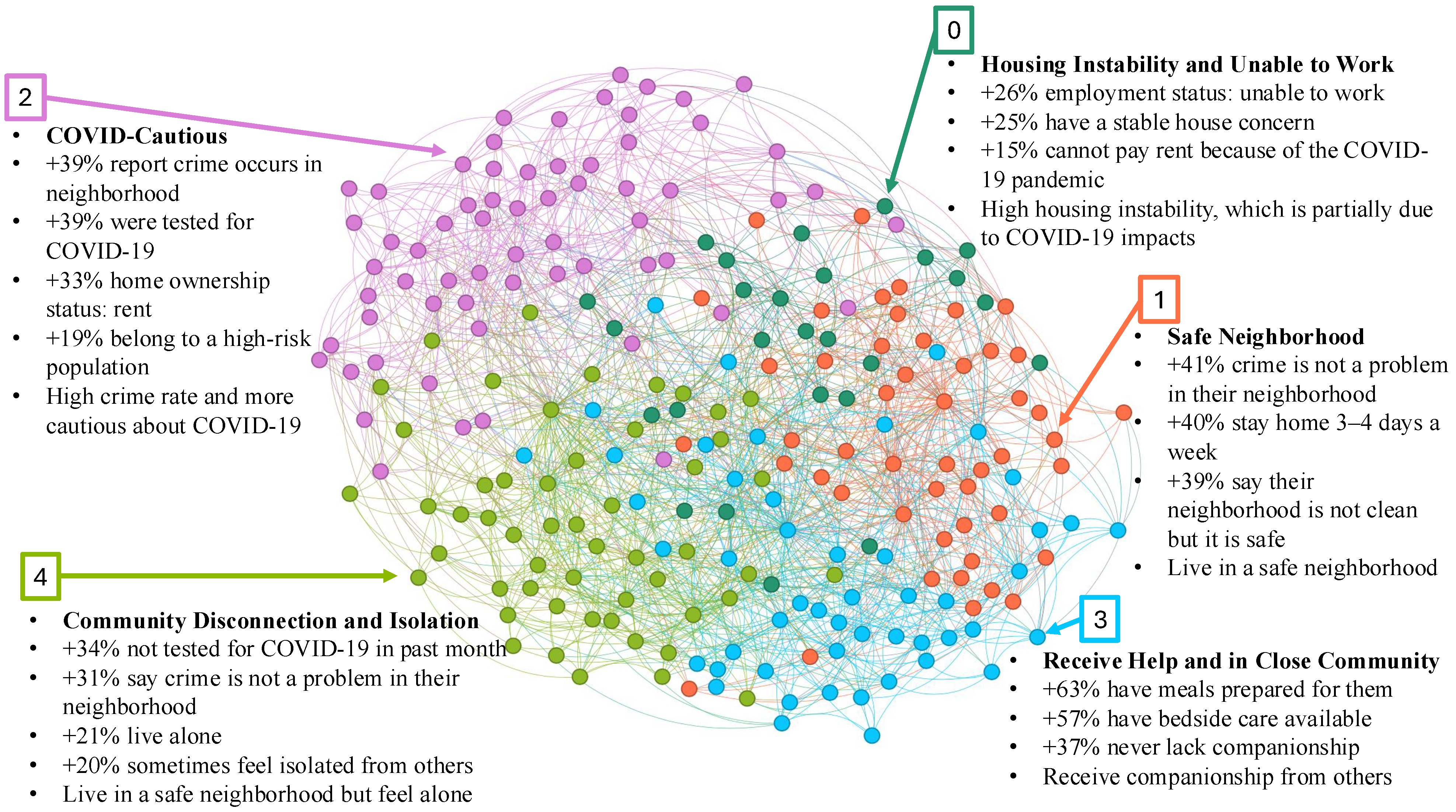
4.1. F250K7 Graph: Clustering with Full Feature Set and Louvain

Figure 4 shows the clustering results from the F250K7 graph constructed from the full feature set using Louvain community detection. This analysis produced five well-defined subgroups.
One cluster reflected housing instability and the inability to work. Participants unable to work were +26% over-represented, housing instability concerns were +25%, and inability to pay rent due to COVID-19 impacts was +15%. This subgroup illustrates the intersection of employment disruption and housing stress among PLWH during the pandemic.
Two clusters reflected contrasting patterns of neighborhood context and social connectedness. The “Safe Neighborhood” cluster was enriched for perceptions of neighborhood safety (+41%), although participants in this group who stayed home 3–4 days per week were over-represented by 40%. The “Community Disconnection and Isolation” cluster was enriched for social isolation (+20%), living alone (+21%), and not testing for COVID-19 (+34%), despite reporting a relatively safe environment. This suggests that objective neighborhood safety does not always translate into social well-being.
A fourth cluster reflected “COVID-cautious” behavior in higher-crime areas. Participants were +39% more likely to perceive crime in their neighborhood and were enriched for recent COVID-19 testing (+39%) and COVID-cautious behaviors.
Finally, one cluster represented individuals that received strong social support. Participants were enriched for receiving meals (+63%), bedside care (+57%), and companionship (+37%). This likely reflects individuals in assisted living settings or those with consistent caregiving support.

4.2. F250K10 Graph: Clustering Based on All Features Clustered with VAT

Figure 5 presents clustering results from the F250K10 graph constructed using NBR-Clust with VAT. This clustering yielded four subgroups larger than 20 participants.
Two clusters reflected isolation and economic hardship, though in different social contexts. The “Poor and Socially Isolated” cluster was enriched for never married (+22%), low income (+15%), and isolation (+11%), though some reported having help when confined in bed (+17%). The “Poor, Diverse, and Isolated” cluster had more women and black participants than average, and showed higher rates of disability (+36%), severe poverty (+31%), and limited mobility (+35%).
Another cluster reflected “Strong Social Support.” The participants consistently reported high levels of perceived and received support across multiple domains: always feeling loved (+47%), having meals prepared (+40%), and having companions for enjoyable activities (+38%).
The fourth cluster reflected “Household and Relationship Stability.” The participants were enriched for partnered living (+41%), long-term residence (+28%), and employment-based insurance (+34%), alongside positive emotional indicators.

4.3. F15K10 Graph: Clustering Based on Integrity

Figure 6 shows the results from the F15K10 graph clustered using NBR-Clust with integrity. Two clusters reflected emotional resilience and low pandemic distress. In the “Low-Anxiety Retirees” cluster, participants not bothered by anxiety were +42% over-represented, with similar enrichment for retirement status (+34%) and reports of being unaffected by COVID-19 (+25%). The “Neighborhood-Satisfied Retirees” cluster was enriched for positive neighborhood perceptions (+79%) and emotional well-being (+43%).
A second pair of clusters reflected institutional connection and proactive engagement. The “Employed and Insured” cluster was enriched for wage employment (+77%) and workplace-based COVID-19 testing (+21%). The “Outgoing and Vaccinated” cluster was marked by active social engagement (+54%) and elevated healthcare access.
Finally, one cluster reflected moderate anxiety with adaptive coping. Participants reported elevated anxiety (+55%) but also higher rates of positive coping indicators.

5. Discussion

This study used graph-based clustering methods to explore patterns of vulnerability and resilience among PLWH during the COVID-19 pandemic using national data from the All of Us Research Program. Across three varying graph configurations, we identified consistent subgroups shaped by housing stability, social connectedness, emotional well-being, and access to institutional resources.
A recurring theme was the importance of social and institutional connectedness as a protective factor. Subgroups characterized by strong relationships, whether through family, household partnerships, community networks, or stable employment, were consistently associated with higher emotional well-being and greater engagement with preventive behaviors, such as COVID-19 testing and vaccination. This is consistent with prior literature showing that relational stability and trust in institutions can mitigate pandemic-related stress and barriers to care.
In contrast, other subgroups faced overlapping challenges of housing instability, isolation, and emotional distress. These patterns reinforce a syndemic perspective [35], in which structural and psychosocial disadvantages compound one another to shape health risks.

5.1. Comparisonwith Prior Regional Study

It is informative to compare these results with our earlier work that analyzed a local survey of PLWH in semi-urban and rural Illinois [3]. That study used a similar network science framework, but was based on a small, locally recruited sample (n = 22), whereas the present analysis draws on a larger, nationally representative dataset (n = 242) from the All of Us research program. Table 1 summarizes the key similarities and differences between the two studies.
Despite the differences in scale and sampling, both studies revealed consistent clustering patterns involving social support, isolation, and hardship. For instance, in both datasets, we observed clusters of PLWH with strong family or community connections who also showed higher emotional well-being and greater engagement in COVID-related care behaviors. Conversely, clusters marked by housing instability or weak social networks were more likely to report emotional distress and reduced access to services. These parallels reinforce the conclusion that relational and structural factors shape both resilience and vulnerability during health crises.
There were also important differences between the studies, due in part to variations in the survey design and sampling context. The Illinois survey included more detailed questions about stigma, healthcare discrimination, and LGBT+ community belonging—factors that were not explicitly captured in the All of Us instruments. As a result, certain themes that emerged in the regional study, such as race-based healthcare discrimination or identity-based community engagement, were less prominent or absent in the national analysis. Conversely, the larger and more diverse national sample revealed new patterns, including clusters of emotionally resilient retirees and subgroups characterized by institutional trust and proactive health behaviors.
These differences underscore both the value and the limitations of comparing regional and national datasets. While the Illinois study offered rich, context-specific insights, the present study complements it by capturing population-level patterns and demonstrating the scalability of graph-based clustering approaches in large-scale public health research.

5.2. Limitations

This study has several limitations. First, although All of Us is a large and diverse national dataset, our analysis focused on a subset of 242 HIV-positive participants. This relatively modest sample size limits generalizability to the broader population of PLWH, particularly given the heterogeneity of experiences during the COVID-19 pandemic. However, the analytic approach employed, based on network science and graph-based clustering, was exploratory rather than inferential, and aimed to detect latent structure and uncover subgroups with shared patterns of vulnerability and resilience. Unlike traditional statistical methods that require large sample sizes to support significance testing, network analysis can reveal meaningful insights, even in smaller, well-characterized samples.
We also acknowledge that our reliance on self-reported data introduced the possibility of response bias, including underreporting or overreporting of health experiences. However, because our clustering approach focused on patterns across multiple dimensions rather than on individual variables, it may be more robust to isolated inaccuracies than methods that rely on precise measurement of single constructs. Additionally, by applying multiple clustering methods across a broad range of graph configurations, we increased the robustness of our findings and were better able to see hidden and hard-to-find populations.
The selection of COVID-related economic hardship as the primary target variable may have overlooked other crucial dimensions of the pandemic’s impact, including healthcare quality, stigma experiences, and more nuanced aspects of social support. These important factors were either not included or not sufficiently detailed in the available survey instruments. Future research should integrate richer measures to better capture the lived experiences of PLWH during public health crises, while also seeking to replicate these findings in larger, more targeted cohorts and explore the broader application of graph-based methods across other public health domains.

5.3. Strategic Opportunities

Taken together, these findings highlight opportunities for precision public health strategies that target support to the most vulnerable subgroups while leveraging existing sources of resilience.
Based on these results, several policy implications emerge:
  • Pandemic preparedness and HIV care programs should prioritize strengthening social support networks. Interventions that build connections, whether through peer groups, family-based support, or community programs, may help buffer isolation and emotional distress among PLWH during future public health emergencies [36].
  • Housing stability should be addressed as a core component of both HIV care and pandemic planning. Stable housing is known to support health outcomes among PLWH and may reduce compounding risks during crises [37,38].
  • Public health systems should leverage institutional touchpoints, including employment settings, healthcare providers, and schools, to deliver pandemic-related services, such as testing, vaccination, and mental health resources [39].
  • Public health agencies should adopt analytic methods that account for heterogeneity. Graph-based clustering techniques can help identify subgroups with complex, intersecting vulnerabilities and inform targeted, equity-focused interventions [40].
For subgroups marked by housing instability, evidence-based approaches, such as Housing First programs and integrated case management services, may be especially effective at reducing both the health risk and social vulnerability. For clusters characterized by social isolation, interventions should prioritize community re-engagement through peer navigation, virtual support groups, or culturally tailored outreach. Meanwhile, subgroups with strong institutional trust and care engagement represent opportunities to reinforce and scale up protective behaviors, such as testing and vaccination, through trusted settings. By aligning intervention strategies with the unique characteristics of each cluster, public health agencies can move toward a more precise, equity-driven response.

6. Conclusions

By applying graph-based clustering to a national cohort of PLWH, this study demonstrates that network science methods can robustly capture latent patterns of vulnerability and resilience. The approach provides a replicable framework for analyzing heterogeneity within public health populations and complements traditional methods by identifying subgroups whose experiences warrant targeted interventions.
Future research should extend these methods to additional datasets and pandemic contexts and further assess their utility in informing precision public health strategies. Despite the study’s limitations, the results provide new insights into the lived experiences of PLWH during COVID-19 and demonstrate the potential for graph-based methods to inform future public health responses.

Author Contributions

Conceptualization, J.M., A.N., P.S., and S.P.; methodology, J.C., A.N., and J.M.; software, A.N. and J.C.; formal analysis, J.C., J.M., A.N., and S.P; data curation, A.N. and S.P.; writing—original draft preparation, A.N., J.M., P.S., and S.P.; writing—review and editing, J.C. and J.M.; visualizations, J.C.; supervision, J.M. All authors have read and agreed to the published version of the manuscript.

Funding

This research received no external funding.

Institutional Review Board Statement

This study protocol was approved as exempt by the Institutional Review Board of Southern Illinois University Edwardsville (protocol code 2342, 7 December 2023).

Informed Consent Statement

Informed consent was obtained from all subjects involved in the study.

Data Availability Statement

The data used are available to approved researchers via the NIH All of Us website at https://allofus.nih.gov/ (accessed on 24 July 2025). The Burden Of HIV survey results and analysis materials are freely available, and others are encouraged to use this data. The code used in the study can be accessed at https://github.com/SIUEComplexNetworksLab/BOHComplexNetworks (accessed on 24 July 2025). The data are available at https://www.openicpsr.org/openicpsr/project/192186/version/V1/view (accessed on 24 July 2025).

Acknowledgments

We gratefully acknowledge the All of Us participants for their contributions, without whom this research would not have been possible. We also thank the National Institutes of Health’s All of Us Research Program (https://allofus.nih.gov/ (accessed on 24 July 2025)) for making available the participant data examined in this study.

Conflicts of Interest

The authors declare no conflicts of interest.

Abbreviations

The following abbreviations are used in this manuscript:
PLWHPeople living with HIV
COVID-19Coronavirus disease 2019
COPECOVID-19 Participant Experience Survey
SDoHSocial Determinants of Health
KNNk-nearest neighbor
VATVertex attack tolerance
NBR-ClustNode-based Resilience Clustering
CHCalinski–Harabasz index
DBDavies–Bouldin index
LMSMLatino MSM Community Involvement Survey
SATHCAPSexual Acquisition and Transmission of HIV Cooperative Agreement Program

Appendix A. Illustrative Example of Graph Construction

To illustrate how participant similarity is represented in graph form, consider the following simplified example. Three fictional participants respond to three yes/no survey items.
ParticipantLost Job Due to COVIDDifficulty Paying RentFelt Socially Isolated
AliceYesYesNo
BobYesYesYes
CarolNoNoYes
Using one-hot encoding, each participant’s responses are converted to a binary vector, where yes is encoded as 1 and no as 0:
  • Alice: [1, 1, 0];
  • Bob: [1, 1, 1];
  • Carol: [0, 0, 1].
The similarity between participants can then be calculated as the distance between their response vectors using a metric such as Euclidean distance. Smaller distances correspond to greater similarity:
  • Distance between Alice and Bob: ( 1 1 ) 2 + ( 1 1 ) 2 + ( 0 1 ) 2 = 1 ;
  • Distance between Alice and Carol: ( 1 0 ) 2 + ( 1 0 ) 2 + ( 0 1 ) 2 = 3 1.73 ;
  • Distance between Bob and Carol: ( 1 0 ) 2 + ( 1 0 ) 2 + ( 1 1 ) 2 = 2 1.41 .
In the resulting graph:
  • Each participant is represented as a node.
  • Edges connect nodes based on pairwise similarity.
  • Edge weights are set as the inverse of the distance so that stronger (more similar) relationships have higher weights.
This example illustrates how survey response data are transformed into a similarity graph, providing the foundation for subsequent community detection and cluster analysis.

Appendix B. Clustering Selection Tables

The results include a table of clustering metric scores for each of 25 graphs containing the clustered respondents. These graphs range from using 15 to 250 features to construct neighbor relationships, and use K values of 2 to 10 to determine the maximum number of neighbors for any one node. After performing clustering and subsequent cluster analysis on each graph for each clustering method (Louvain, VAT, and INT), the following data tables resulted (broken down by clustering method). The graph chosen is highlighted in red.
Table A1. Table of Louvain graph-clustering metrics. The graph chosen for analysis is highlighted in red.
FeatureK-ValueDavies–SilhouetteCalinski–ModularityRank
Counts Bouldin Score Harabasz Sum
F250K75.4590.0084.3300.36326
F250K25.518−0.0062.8120.5630
F250K55.527−0.0083.3960.39335
F250K105.6670.0054.3620.3236
F250K35.535−0.0132.5870.47243
F100K35.547−0.0092.1820.46849
F45K75.922−0.0073.1240.38750
F15K25.119−0.0271.6820.82151
F30K55.725−0.0152.5230.48351
F45K55.624−0.0102.2690.43651
F45K106.197−0.0033.3620.34951
F30K76.195−0.0072.8240.43752
F100K105.962−0.0053.3280.30853
F15K35.704−0.0212.0210.76154
F30K35.426−0.0292.1400.57654
F100K56.008−0.0032.5320.37254
F100K76.4600.0003.1750.33255
F15K76.696−0.0152.2400.64261
F15K106.886−0.0162.5340.59161
F30K105.788−0.0112.3080.34761
F15K56.123−0.0192.0850.69162
F45K25.913−0.0181.9960.60962
F30K25.860−0.0231.8810.65164
F100K25.878−0.0192.0010.57864
F45K36.079−0.0161.9590.50570
Table A2. Table of VAT graph-clustering metrics. The graph chosen for analysis is highlighted in red.
FeatureK-ValueDavies–SilhouetteCalinski–ModularityRank
Counts Bouldin Score Harabasz Sum
F250K103.158-0.0401.6900.20134
F15K35.389−0.0441.6530.51740
F100K32.850−0.0571.4360.37740
F250K72.252−0.0541.4080.19645
F15K74.704−0.0272.1850.08345
F30K54.082−0.0491.5750.35946
F250K32.210−0.0671.3590.36947
F250K52.267−0.0571.3740.25047
F15K104.562−0.0312.0050.06647
F45K53.809−0.0441.4510.30948
F100K73.266−0.0581.5560.23649
F15K23.819−0.0511.3240.75050
F100K23.023−0.0751.3360.47851
F250K21.908−0.0751.3230.40151
F100K103.605−0.0411.4890.05551
F30K74.055−0.0561.5650.24752
F30K33.162−0.0831.3820.44253
F30K23.408−0.0721.2890.53155
F100K53.414−0.0631.3890.24558
F45K102.570−0.0331.1510.00559
F30K105.079−0.0311.4800.02760
F15K54.143−0.0371.3330.17463
F45K23.803−0.0811.2760.48866
F45K33.758−0.0871.3260.41666
F45K73.549−0.0621.2130.05377
Table A3. Table of INT graph-clustering metrics. The graph chosen for analysis is highlighted in red.
FeatureK-ValueDavies–SilhouetteCalinski–ModularityRank
Counts Bouldin Score Harabasz Sum
F15K54.275−0.0411.7140.63133
F15K74.343−0.0331.6920.55633
F15K104.910−0.0221.8960.50633
F250K32.099−0.0461.4960.40335
F250K21.925−0.0541.4170.40344
F250K51.916−0.0411.4210.21644
F100K103.378−0.0401.6920.19747
F250K102.846−0.0411.5170.16348
F30K104.475−0.0361.7800.25649
F30K53.845−0.0481.5610.37051
F30K22.969−0.0621.3560.55453
F100K22.484−0.0661.3590.44653
F45K53.586−0.0441.4550.31954
F15K22.371−0.0861.2300.64455
F250K71.974−0.0481.3570.17056
F45K73.131−0.0601.4950.28557
F100K53.176−0.0521.4930.27557
F100K32.438−0.0661.3840.34358
F100K73.020−0.0531.5130.21458
F45K103.592−0.0531.5390.26459
F15K32.276−0.0891.1520.50760
F45K22.737−0.0731.2710.47960
F30K32.865−0.0801.3060.40365
F30K73.589−0.0631.4460.28068
F45K33.399−0.0811.3230.41970

Appendix C. Cluster Characteristics

Table A4. Table of features for the F250K7 graph, clustered with Louvain. Trait percentages represent over-representation relative to the full sample, calculated as described in Section 3.8. A visualization based on this table is shown in Figure 4, where colors in the table correspond to matching colors in the figure. Positive percentages are shown in green, while negative percentages are shown in red. Data on clusters smaller than 20 are not shown.
ClassNCharacteristicsPercentage
026Were not tested for COVID-19 in the past month29%
Employment status: unable to work26%
Have stable house concerns25%
Do not have enough money to pay rent because of COVID-19 pandemic15%
Stay home every day (under-represented)−60%
None of the days (0 days)—crime concern (under-represented)−53%
None of the days (0 days)—neighborhood clean (under-represented)−51%
None of the days (0 days)—neighborhood safety (under-represented)−35%
153Strongly disagree that vandalism is common in your neighborhood43%
Strongly disagree that crime is a problem in your neighborhood41%
Stay home 3–4 days out of the week40%
Strongly disagree that too much alcohol use occurs in your neighborhood40%
Strongly disagree that your neighborhood is clean39%
Strongly agree that your neighborhood is safe39%
Strongly disagree that people take good care of houses/apartments38%
Strongly disagree with feeling unhappy when withdrawn37%
Received the COVID-19 vaccination13%
249Report that vandalism is not common41%
Report that crime occurs in your neighborhood39%
Were tested for COVID-19 in the past month39%
Had COVID test type: nasal swab35%
Current home ownership status: rent33%
Had no issue getting a test for COVID-1922%
Were tested for COVID-19 to get other healthcare services20%
Belong to a high-risk population19%
Strongly disagree that your neighborhood is clean (under-represented)−37%
Strongly disagree that your neighborhood is safe (under-represented)−35%
364Always have someone to prepare your meals63%
Always have someone to help with daily chores if you were sick61%
Always have someone to help you if confined to bed57%
Always have someone to help you deal with a personal problem52%
Always have someone to love and make you feel wanted52%
Always have someone to take you to the doctor if needed50%
Never feel there is no one you can turn to39%
Never feel lack of companionship37%
Never feel isolated from others29%
Personally know someone who has died of COVID-1910%
450Were not tested for COVID-19 in the past month34%
Disagree that too many people hang around streets near your home34%
Disagree that too much drug use occurs in your neighborhood32%
Disagree that crime is a problem in your neighborhood31%
Disagree that too much alcohol use occurs in your neighborhood29%
Agree that neighborhood is clean29%
Agree that neighborhood is safe26%
Live alone (household size excluding self = 0)21%
Race: White21%
Sometimes feel isolated from others20%
Table A5. Table of features for the F250K10 graph, clustered with the NBR-Clust framework with VAT. Trait percentages represent over-representation relative to the full sample, calculated as described in Section 3.8. A visualization based on this table is shown in Figure 5, where colors in the table correspond to matching colors in the figure. Positive percentages are shown in green, while negative percentages are shown in red. Data on clusters smaller than 20 are not shown.
ClassNCharacteristicsPercentage
072Current marital status: never married22%
Sometimes get help when confined to bed17%
Annual income: 10k–25k15%
Agree that neighborhood is clean15%
Often feel isolated from others11%
Strongly agree that neighborhood is clean (under-represented)−28%
Always have someone to prepare your meals (under-represented)−28%
Always have someone to love and make you feel wanted (under-represented)−28%
Always have someone to help if confined to bed (under-represented)−28%
Always have someone to help with chores when sick (under-represented)−25%
223Employment status: unable to work (disabled)36%
Stayed home all day in last 5 days35%
Annual income: <10k31%
Feels loved by God/higher power many times a day31%
Gender identity: woman27%
Race ethnicity: black26%
Wishes to be closer to God/higher power25%
Gender identity: man (under-represented)−39%
1-person living situation (under-represented)−36%
Sexual orientation: gay (under-represented)−35%
362Always have someone to love and feel wanted47%
Always have someone to help if confined to bed42%
Always have someone to prepare your meals40%
Always have someone to have a good time with38%
Always have someone to take you to the doctor37%
Always have someone to help with chores37%
Always have someone to turn to for help36%
Felt confident about handling problems35%
Never feel there is no one to turn to33%
Personally knows someone who died of COVID-1913%
4261 other person lives at home with you41%
Most of the time have someone to love39%
Insurance type: employer or union34%
Felt nervous/stressed last month31%
Lived 20+ years in current situation28%
Current marital status: living with partner23%
Current marital status: married21%
Received 1 dose of COVID-19 vaccine13%
Medicaid/government assistance plan (under-represented)−29%
0 people under 18 in living situation (under-represented)−28%
Table A6. Table of features for the F15K10 graph, clustered with the NBR-Clust framework with integrity. Trait percentages represent over-representation relative to the full sample, calculated as described in Section 3.8. A visualization based on this table is shown in Figure 6, where colors in the table correspond to matching colors in the figure. Positive percentages are shown in green, while negative percentages are shown in red. Data on clusters smaller than 20 are not shown.
ClassNCharacteristicsPercentage
028Not at all bothered by anxiety/nervousness42%
Employment status: retired34%
Never felt difficulties piling up33%
Sometimes feel outgoing31%
Never felt unable to control important things30%
Current status: retired29%
Never felt nervous and stressed29%
Were unaffected by the COVID-19 outbreak25%
Often feel outgoing (under-represented)−41%
Employment status: employed (under-represented)−34%
640Several days of anxiety/nervousness55%
Sometimes feel things going their way52%
Several days of little interest/pleasure36%
Sometimes feel confident about future29%
Sometimes feel in control of life29%
Sometimes feel optimistic26%
Did not receive the COVID-19 vaccination14%
Not at all bothered by anxiety (under-represented)−39%
Very often confident handling problems (under-represented)−31%
Not at all bothered by stress (under-represented)−27%
729Employment status: employed for wages77%
Employment status: employed (part-time or full-time)74%
Have insurance through employer/union49%
Insurance type: employer/union45%
Currently working34%
Were tested for COVID-19 because of work or school21%
Retired status (under-represented)−38%
No social assistance (under-represented)−32%
Medicare coverage (under-represented)−32%
No days off work (under-represented)−31%
822Strongly agree neighborhood has recreation facilities79%
Not at all bothered by anxiety/nervousness43%
Strongly agree about bicycle facilities36%
Employment status: retired34%
Not at all bothered by lack of interest/pleasure31%
Strongly disagree about neighborhood problems31%
Never felt unable to cope29%
Never felt overwhelmed by responsibilities28%
Received the COVID-19 vaccination19%
Several days of anxiety (under-represented)−29%
921Often feel outgoing54%
Sometimes feel things going their way39%
Some of the time feel supported24%
Have Medicare coverage24%
Were tested for COVID-19 to get other healthcare services22%
Received the COVID-19 vaccination22%
Sexual orientation: straight20%
No social issues (under-represented)−24%
No discrimination experiences (under-represented)−24%
Sexual orientation concerns (under-represented)−24%

References

  1. Bogart, L.M.; Ojikutu, B.O.; Tyagi, K.; Klein, D.J.; Mutchler, M.G.; Dong, L.; Lawrence, S.J.; Thomas, D.R.; Kellman, S. COVID-19 related medical mistrust, health impacts, and potential vaccine hesitancy among Black Americans living with HIV. JAIDS J. Acquir. Immune Defic. Syndr. 2021, 86, 200–207. [Google Scholar] [CrossRef] [PubMed]
  2. Matta, J.; Singh, V.; Auten, T.; Sanjel, P. Inferred networks, machine learning, and health data. PLoS ONE 2023, 18, e0280910. [Google Scholar] [CrossRef] [PubMed]
  3. Matta, J.; Sinha, K.; Woodard, C.; Sappington, Z.; Philbrick, J. Economic and Health Burdens of HIV and COVID-19: Insights from a Survey of Underserved Communities in Semi-Urban and Rural Illinois. In Complex Networks & Their Applications XII; Springer: Cham, Switzerland, 2023; pp. 189–201. [Google Scholar]
  4. Schulkey, C.E.; Litwin, T.R.; Ellsworth, G.; Sansbury, H.; Ahmedani, B.K.; Choi, K.W.; Cronin, R.M.; Kloth, Y.; Ashbeck, A.W.; Sutherland, S.; et al. Design and implementation of the all of us research program COVID-19 Participant Experience (COPE) survey. Am. J. Epidemiol. 2023, 192, 972–986. [Google Scholar] [CrossRef]
  5. Grubb, J.; Lopez, D.; Mohan, B.; Matta, J. Network centrality for the identification of biomarkers in respondent-driven sampling datasets. PLoS ONE 2021, 16, e0256601. [Google Scholar] [CrossRef]
  6. Lopez, D.; Mohan, B.; Boone, L.; Matta, J. Preserving Multiple Homophilies in a Network Configuration Model. In Proceedings of the 2021 43rd Annual International Conference of the IEEE Engineering in Medicine & Biology Society (EMBC), Virtual, 1–5 November 2021; pp. 1781–1786. [Google Scholar]
  7. Brown, L.B.; Spinelli, M.A.; Gandhi, M. The interplay between HIV and COVID-19: Summary of the data and responses to date. Curr. Opin. HIV AIDS 2021, 16, 63. [Google Scholar] [CrossRef]
  8. Roman Shrestha, J.P.M.; Shenoi, S.; Khati, A.; Altice, F.L.; Mistler, C.; Aoun-Barakat, L.; Virata, M.; Olivares, M.; Wickersham, J.A. COVID-19 Vaccine Hesitancy and Associated Factors among People with HIV in the United States: Findings from a National Survey. Vaccines 2022, 10, 424. [Google Scholar] [CrossRef]
  9. Lauren Brown, L.; Martin, E.G.; Knudsen, H.K.; Gotham, H.J.; Garner, B.R. Resilience-Focused HIV Care to Promote Psychological Well-Being During COVID-19 and Other Catastrophes. Front. Public Health 2021, 9, 705573. [Google Scholar]
  10. Chenglin Hong, A.Q.; Hoskin, J. The impact of the COVID-19 pandemic on mental health, associated factors and coping strategies in people living with HIV: A scoping review. J. Int. AIDS Soc. 2023, 26, e26060. [Google Scholar] [CrossRef]
  11. Elizabeth Weber Handwerker, P.B.M.; Piacentini, J.; Schultz, M.; Sveikauskas, L. Employment Recovery in the Wake of the COVID-19 Pandemic; US Bureau of Labor Statistics: Washington, DC, USA, 2020. [Google Scholar]
  12. Ha Nguyen Thu, A.N.Q.; Hai, O.K.; Thanh, H.L.T.; Thanh, H.N. Impact of the COVID-19 pandemic on provision of HIV/AIDS services for key populations. Int. J. Health Plan. Manag. 2022, 37, 2852–2868. [Google Scholar] [CrossRef]
  13. Sanjel, P.; Matta, J. Inferred networks and the social determinants of health. In Proceedings of the International Conference on Complex Networks and Their Applications, Madrid, Spain, 30 November–2 December 2021; Springer: Cham, Switzerland, 2021; pp. 703–715. [Google Scholar]
  14. Latkin, C.A.; Knowlton, A. Micro-social structural approaches to HIV prevention: A social ecological perspective. AIDS Care 2005, 17, 102–113. [Google Scholar] [CrossRef] [PubMed]
  15. Pasquale, D.K.; Doherty, I.A.; Leone, P.A.; Dennis, A.M.; Samoff, E.; Jones, C.S.; Barnhart, J.; Miller, W.C. Lost and found: Applying network analysis to public health contact tracing for HIV. Appl. Netw. Sci. 2021, 6, 13. [Google Scholar] [CrossRef]
  16. Nikolopoulos, G.K.; Pavlitina, E.; Muth, S.Q.; Schneider, J.; Psichogiou, M.; Williams, L.D.; Paraskevis, D.; Sypsa, V.; Magiorkinis, G.; Smyrnov, P.; et al. A network intervention that locates and intervenes with recently HIV-infected persons: The Transmission Reduction Intervention Project (TRIP). Sci. Rep. 2016, 6, 38100. [Google Scholar] [CrossRef]
  17. Worobey, M.; Gemmel, M.; Teuwen, D.E.; Haselkorn, T.; Kunstman, K.; Bunce, M.; Muyembe, J.J.; Kabongo, J.M.M.; Kalengayi, R.M.; Van Marck, E.; et al. Direct evidence of extensive diversity of HIV-1 in Kinshasa by 1960. Nature 2008, 455, 661–664. [Google Scholar] [CrossRef] [PubMed]
  18. Xiang, Y.; Du, J.; Fujimoto, K.; Li, F.; Schneider, J.; Tao, C. Application of artificial intelligence and machine learning for HIV prevention interventions. Lancet HIV 2021, 9, e54–e62. [Google Scholar] [CrossRef] [PubMed]
  19. National Institutes of Health (NIH). All of Us Research Program. Available online: https://allofus.nih.gov/ (accessed on 20 April 2024).
  20. All of Us Research Program. Survey Explorer. Available online: https://researchallofus.org/data-tools/survey-explorer/ (accessed on 20 April 2024).
  21. Matta, J. Intersectional Barriers Among PLHIV in Rural Illinois: Insights from a Pilot QCA Study. Int. J. Environ. Res. Public Health 2025, 22, 1011. [Google Scholar] [CrossRef]
  22. Iguchi, M.; Berry, S.; Ober, A.; Fain, T.; Heckathorn, D.; Gorbach, P.; Heimer, R.; Kozlov, A.; Ouellet, L.; Shoptaw, S.; et al. Sexual Acquisition and Transmission of HIV Cooperative Agreement Program (SATHCAP), 2006–2008 [United States] Restricted Use Files. 2010. Available online: https://krimdok.uni-tuebingen.de/Record/1902791916/Description (accessed on 24 July 2025).
  23. Ramirez-Valles, J.; Heckathorn, D.D.; Vázquez, R.; Diaz, R.M.; Campbell, R.T. From networks to populations: The development and application of respondent-driven sampling among IDUs and Latino gay men. AIDS Behav. 2005, 9, 387–402. [Google Scholar] [CrossRef]
  24. Athena Health Database. Version 1.14.0.32.231116.1843, 2015–2024. OMOP Vocabulary Version: v5.0 29-FEB-24. Available online: https://athena.ohdsi.org/search-terms/terms/1333291 (accessed on 24 July 2025).
  25. Pedregosa, F.; Varoquaux, G.; Gramfort, A.; Michel, V.; Thirion, B.; Grisel, O.; Blondel, M.; Prettenhofer, P.; Weiss, R.; Dubourg, V.; et al. Scikit-learn: Machine Learning in Python. J. Mach. Learn. Res. 2011, 12, 2825–2830. [Google Scholar]
  26. Hagberg, A.A.; Schult, D.A.; Swart, P.J. Exploring network structure, dynamics, and function using NetworkX. In Proceedings of the 7th Python in Science Conference (SciPy2008), Pasadena, CA, USA, 19–24 August 2008; pp. 11–15. [Google Scholar]
  27. Blondel, V.D.; Guillaume, J.L.; Lambiotte, R.; Lefebvre, E. Fast unfolding of communities in large networks. J. Stat. Mech. Theory Exp. 2008, 2008, P10008. [Google Scholar] [CrossRef]
  28. Matta, J.; Obafemi-Ajayi, T.; Borwey, J.; Wunsch, D.; Ercal, G. Robust graph-theoretic clustering approaches using node-based resilience measures. In Proceedings of the 2016 IEEE 16th International Conference on Data Mining (ICDM), Barcelona, Spain, 12–15 December 2016; pp. 320–329. [Google Scholar]
  29. Matta, J.; Ercal, G.; Borwey, J. The vertex attack tolerance of complex networks. RAIRO-Oper. Res. 2017, 51, 1055–1076. [Google Scholar] [CrossRef]
  30. Ercal, G.; Matta, J. Resilience notions for scale-free networks. Procedia Comput. Sci. 2013, 20, 510–515. [Google Scholar] [CrossRef]
  31. Barefoot, C.; Entringer, R.; Swart, H. Integrity of trees and powers of cycles. Congr. Numer 1987, 58, 103–114. [Google Scholar]
  32. Caliński, T.; Harabasz, J. A dendrite method for cluster analysis. Commun. Stat. 1974, 3, 1–27. [Google Scholar] [CrossRef]
  33. Davies, D.L.; Bouldin, D.W. A Cluster Separation Measure. IEEE Trans. Pattern Anal. Mach. Intell. 1979, PAMI-1, 224–227. [Google Scholar] [CrossRef]
  34. Rousseeuw, P.J. Silhouettes: A graphical aid to the interpretation and validation of cluster analysis. J. Comput. Appl. Math. 1987, 20, 53–65. [Google Scholar] [CrossRef]
  35. Shiau, S.; Krause, K.D.; Valera, P.; Swaminathan, S.; Halkitis, P.N. The burden of COVID-19 in people living with HIV: A syndemic perspective. AIDS Behav. 2020, 24, 2244–2249. [Google Scholar] [CrossRef]
  36. Sherr, L.; Clucas, C.; Harding, R.; Sibley, E.; Catalan, J. HIV and depression—A systematic review of interventions. Psychol. Health Med. 2011, 16, 493–527. [Google Scholar] [CrossRef] [PubMed]
  37. Aidala, A.A.; Wilson, M.G.; Shubert, V.; Gogolishvili, D.; Globerman, J.; Rueda, S.; Bozack, A.K.; Caban, M.; Rourke, S.B. Housing status, medical care, and health outcomes among people living with HIV/AIDS: A systematic review. Am. J. Public Health 2016, 106, e1–e23. [Google Scholar] [CrossRef] [PubMed]
  38. Leifheit, K.M.; Linton, S.L.; Raifman, J. Expiring eviction moratoriums and COVID-19 incidence and mortality. Am. J. Epidemiol. 2021, 190, 2503–2510. [Google Scholar] [CrossRef]
  39. Chang, C.H.; Shao, R.; Wang, M.; Baker, N.M. Workplace interventions in response to COVID-19: An occupational health psychology perspective. Occup. Health Sci. 2021, 5, 1–23. [Google Scholar] [CrossRef] [PubMed]
  40. Braveman, P.A.; Kumanyika, S.; Fielding, J.; LaVeist, T.; Borrell, L.N.; Manderscheid, R.; Troutman, A. Health disparities and health equity: The issue is justice. Am. J. Public Health 2011, 101, S149–S155. [Google Scholar] [CrossRef]
Figure 1. Analytic workflow used in this study. Graph-based clustering methods were applied to All of Us survey data to identify subgroups of PLWH with shared social, economic, and pandemic- related experiences.
Covid 05 00119 g001
Figure 2. Race distribution of the study participants (n = 242) based on self-reported responses from the All of Us dataset.
Covid 05 00119 g002
Figure 3. Age distribution of study participants by race based on self-reported data.
Covid 05 00119 g003
Figure 4. Clusters derived from the F250K7 graph (full feature set, k = 7 ). Percentages indicate trait over-representation relative to the full sample. A complete list of traits and percentages for this graph is contained in Appendix C, Table A4. Traits are shown for clusters with at least 20 participants, per the All of Us data dissemination policy.
Covid 05 00119 g004
Figure 5. Clusters derived from the F250K10 graph (full feature set, k = 10 ). Percentages indicate trait over-representation relative to the full sample. A complete list of traits and percentages for this graph is contained in Appendix C, Table A5. Traits are shown for clusters with at least 20 participants, per the All of Us data dissemination policy.
Covid 05 00119 g005
Figure 6. Clusters derived from the F15K10 graph (15 features, k = 10 ). Percentages indicate trait over-representation relative to the full sample. A complete list of traits and percentages for this graph is contained in Appendix C, Table A6. Traits are shown for clusters with at least 20 participants, per the All of Us data dissemination policy.
Covid 05 00119 g006
Table 1. Key differences and consistencies between the Illinois HIV+ COVID-19 study [3] and the current national-level All of Us analysis.
AspectIllinois Paper (Small Sample)All of Us National Paper (Large Sample)
PopulationLocal, semi-urban, and rural IllinoisNational sample (All of Us)
Sample Size19 completed respondents242 respondents
Target VariablesHIV+ status, race (Black), COVID-19 economic impactHIV+ with COPE and SDoH surveys
ClusteringBased on 30 variables chosen for specific targetsClustering across full, VAT-ranked, and integrity-ranked features
Findings Unique to IllinoisPatterns of race-based discrimination, LGBT+ community belonging, and long COVID symptomsThese topics were not included in the All of Us survey items used
Findings Unique to NationalNot applicable (small local focus)Clear patterns of “Neighborhood-Satisfied Retirees,” proactive “Outgoing and Vaccinated” cluster, and widespread “Institutional connectedness” as a protective factor
Overlap/ConsistenciesClusters of isolation with hardship and clusters of strong social supportSame: consistent patterns of isolation vs. support across clusters
Disclaimer/Publisher’s Note: The statements, opinions and data contained in all publications are solely those of the individual author(s) and contributor(s) and not of MDPI and/or the editor(s). MDPI and/or the editor(s) disclaim responsibility for any injury to people or property resulting from any ideas, methods, instructions or products referred to in the content.

